#any ballpoint pen recommendations? preferably that i can get easily
Explore tagged Tumblr posts
Text
How to Plan a Book for Spontaneous Overthinkers - Planning/Writing Tools
Heads-up: This post is a long boi. So I'll start by saying that I am not a published author. However, I have been writing for as long as I can remember and in the past 5 years or so have started taking it much more seriously. After 3 failed Nanowrimo (National Novel Writing Month Challenge) attempts and countless others on my own time, I think I have figured out the best way for me to plan my stories in a way that gives me a set plan without causing me to overthink about planning so writing isn't boring. This first post is literally just on tools I like to use.
Planning Tools
Seeing as how writing is a creative art, a lot of it is left to opinion. So here are my tastes, opinions, and suggestions for writing tools.
Find a Writing Tool You Enjoy: For me this has historically been a typewriter, a fountain pen and a nice sturdy hardcover notebook, or a dip glass pen and ink with a faux weathered journal I got on amazon. For some you may just prefer typing it out on a computer or using a ballpoint pen and a notebook.
If you like typing stuff out on a computer... Google Docs and LibreOffice are my go-tos if you just want a standard writing experience. Google Docs is one you most likely know and lets you store everything in the cloud, but I've noticed it makes my computer run a little slowly and I've had saving issues on multiple occasions since it doesn't have a manual save feature. LibreOffice, on the other hand, is an open-source dupe for Microsoft Office that is completely free, has more features than Google Docs, and lets you manually save. Plus, you'll never have any issues with your Wi-Fi going out and not being able to access your files. If you like being able to do a mix of typing and handwriting, I recommend using OneNote. Despite it being a Microsoft app, it's free and cross-compatible with mobile devices and computers (you do have to manually sync your notebooks sometimes). However, if you use an art tablet with your computer or just a standard touch-screen tablet and a stylus, you can sketch, handwrite, and type all in the same document easily. I use OneNote for most of my planning.
If you like unique or old-fashioned writing tools... Glass or metal dip pens are a fun choice. You do have to do some personal research though based on how you want to write though. For example, I bought a glass dip pen because it had a little bit of a scratchier vibe that I enjoyed and was also better suited for writing in cursive and drawing little doodles when my brain needed a writing break. I got mine on amazon and the brand is called "Freedom of the Starry Sky" It came with a beautiful ink, a carrying case, and a little glass stand to rest the pen on. I don't have any specific recommendations for metal dip pens however. If you want an ink recommendation, however, I use and love the Windsor & Newton Black India Ink, which I got on amazon for about $7. It's great, and its water based so all you have to do to clean the residue off your pen is let it sit in some warm water for a minute and wipe it off.
If you want a typewriter... I am very autistic and typewriters are a special interest of mine so I'll try to keep this brief (spoiler alert, I failed). This isn't the cheapest option by a long shot but I love my typewriter with all my heart so I figured it should be included. Here's my tips: look on Ebay, Mercari, and Facebook Marketplace and try to find one in your budget that is at least mostly functional (my old girl is from the 40s and ribbon doesn't advance but I love her anyway). If you're going to be working at a desk, get a desktop model, but if you're like me and have no clue where you want to type, find one that is portable WITH CASE INCLUDED. Trust me you do not want to be looking for a typewriter case for a vintage typewriter online. Next, determine if you want/need a quieter model. Typewriters will never be silent, but some are made to muffle more noise than others. There is a YouTube channel called Jot and Tittle and they make demos of vintage typewriters where you can hear how loud they are and see how they are to work with. So if you find a specific model you're considering buying, make sure to check there to see if the keys are the right amount of clicky and the write amount of clacky for your needs. You'll also need to find ink ribbon, which you can easily find on ebay. If you have any questions or need to do/have a repair done, I recommend r/typewriters on reddit or finding a typewriter repair shop or other forum online.
Other Things I Recommend:
Random Generators: Whether it be for writing prompts, opening lines, names of any kind you can possibly think of, settings and locations, or really anything, I promise there is a random generator for you. For all things names (locations or people), I use Fantasy Name Generators, but anything you can think of has a generator online if you look.
Baby Name Websites: Sometimes you want a unique but realistic character name and you want to include the meaning or have the meaning of the name be an integral part of the story. If that's you, go to baby name websites. Most of them let you search by meaning or even pick a name you like (for example, a character whose name you like) and find similar names easily.
AI Story Generators: For the love of all that is holy, unholy, or right in the middle, do not publish or post anything written by AI and call it your own. However, if you can't decide how to write a scene or if you need a way to start the next chapter, or anything like that, use an AI generator and EDIT it afterwards. Most of these programs are subscription based or have a free trial or have a limited amount of generations per month, just so you know.
So that's all I have to say on this specific topic, but as soon as I finish this post I will be working on writing the next post on genres and genre expectations using the genres of my own current novel I'm planning as examples, so be sure to check that out if interested. Have a great day and please comment if you have any questions or if you're not going to be an ass. Thanks!
2 notes
·
View notes
Text
some brba sketches i forgot to post !! the references i used are probably obvious even if i didnt stick to them perfectly
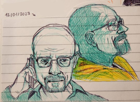
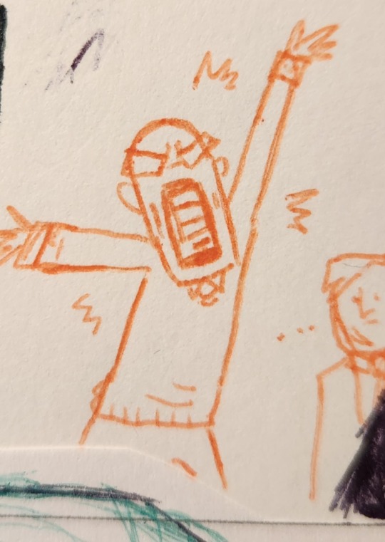
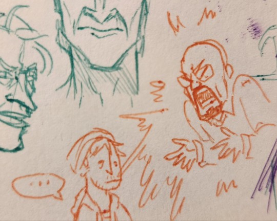
bonus mini angry walts because
#brba#brba fanart#breaking bad#breaking bad fanart#walter white#ballpoint pens#the ballpoint pens i bought have great colors but they keep leaving random ink beads and its getting annoying#any ballpoint pen recommendations? preferably that i can get easily#onyx's art#my art
30 notes
·
View notes
Text
journaling
[I wrote this post in August 2020, and rediscovering this draft September 2021 I finished and polished it somewhat]
Over lockdown I’ve attempted to keep a daily journal, and while I haven’t done very well to make it a ‘daily’ thing I think it’s a worthwhile activity. My thoughts feel a lot more in order after journaling, and I find it quite meditative.
When I go back to school I will also need to be able to write essays well; having had little practise over lockdown, I realised keeping a journal would help me write fluently and with a variety of vocabulary. I aimed to write 750 words a day, but any number was better than nothing.
Here are some tips I’ve picked up so far, if you’re looking to start a journaling habit.
Don’t feel the need to reread at any point once you’ve completed an entry. Don’t worry about whether you sound pretentious, cliché, or anything else.
One thing that held me back when trying to journal was the idea that I might reread it in future and be embarrassed. I also felt it had to be of publishing quality, similar to books written in the style of a diary. Promising myself that I wouldn’t reread it in future, even a day later, helped me to eliminate these mental barriers. You may wish to read your diary in future, of course, but if the thought makes you anxious it is freeing to assume you will never look at it again.
I write my journal in a way that feels pretty pretentious, and I enjoy it. Keeping a journal is for you, not for any imaginary audience.
Find a medium comfortable and even pleasant to write with; this can be digital or on paper.
I personally find it painful to write with a ballpoint pen, and currently I use a fountain pen (the Pilot Pluminix - cheap but comfortable for me) which I enjoy. Other possible options are gel pens, fineliners and rollerball pens, all of which require less pressure than a ballpoint. If you prefer, it is fine to use your phone, tablet or computer - if using your phone I recommend doing so in a way that won’t strain or cause you pain later, by resting it on a table or holding it so that your elbow is bent at an angle greater than 90°.
I alternate between digital and paper journaling, depending on what I feel like on a particular day, what I have access to at that time and so on. I also like to listen to music when I journal, so I don’t get bored as easily.
Consider where and when you want to write; you could incorporate it into part of a routine if you wish.
I like to write my entries before going home from a walk somewhere (a park, cafe, library etc), so I have a pocket-sized notebook to write in. (This also has the benefit of having less space to fill, so journaling seems less of an intimidating task). If you want to write digitally, it might be worth using a site or app you can access from any device, like Google Docs, a Tumblr sideblog, Microsoft OneNote, etc. I’ll link the site I use, along with other links, in a reblog.
Establishing a routine, in time and place where you write every day might be helpful, as with any activity; this might be at your desk before lunch, for example. Forgive yourself if you miss this ‘window of opportunity’, and try again later. It can also make it easier to start and end each entry in the same way — for example, I tend to end mine with ‘it is [time] on [date]’ and then sign off with my name.
Take steps to avoid your diary being found, if necessary.
This is easier to do with a digital diary - it is possible to make a Tumblr sideblog private (link to instructions in a reblog), and using a site in-browser that you need to sign in to access will make it harder to find. Password-protecting files on your computer won’t hide them unfortunately. Smaller paper diaries are easier to hide. This can help you write without the worry of someone else seeing it later and getting curious - but if these steps seem excessive or anxiety inducing in themselves there’s no need to follow them.
Set a word, line, page count or time limit if it helps to motivate you. However, anything is better than nothing - and there’s no need to feel bad for writing nothing on a particular day either.
It might be hard to meet the word count or write for the full time at first - over time it will likely get easier as you ease into the habit. Not all the entry has to be important information either - write anything that comes to mind no matter how trivial, describe your surroundings… I like to note what I’ve already done that day (including little details like the kind of tea I’ve drunk, a song I’ve listened to etc ) if I wanted to, and any plans I have for later.
#journaling#chester writes#student#I hope none of the detail is redundant ! I had too much fun thinking about doing this post to want to keep it snappy#long post
2 notes
·
View notes
Note
i dare you to answer all of them for rocket :)
unusual character questions. [ always accepting. ]

what percentage does your muse start charging their phone at?
the moment it drops below around 35%, she's treating it as though it's gonna die any second.
do they drive? what kind of car do they have?
for the most part, she drives a 2019 audi sq8 (dark grey). it has a 4-litre v8 hybrid-diesel engine, adaptive air suspension, a top speed of 155mph, and can accelerate from 0-60mph in 4.6 seconds. rocket likes cars.
what difficulty mode does your muse play video games on?
she likes to start out on whatever difficulty comes just above the default. and then, if there are any higher and she likes the game, she'll try and work her way to the highest difficulty.
what's their go-to drunk / high snack?
lucky charms.
how many pillows and blankets do they sleep with?
four pillows; two for general head support, one to cushion, and one to cuddle. only one blanket, though, which usually gets discarded halfway through the night unless it's particularly cold. she runs kinda hot, especially when she sleeps.
what's the majority of their camera roll (pets, selfies, screenshots, memes, food)?
it's fairly sparse, but the vast majority is probably screenshots of important things that she needs to have easily to hand.
what's their texting style like?
pretty formal. full sentences, proper grammar, nary an emoji in sight. she has, at the very least, fallen into the all-lower-case trap. she likes the neatness of it.
if your muse is pretty chill, what's something they're weirdly high-strung about?
HA.
if your muse is pretty high-strung, what's something they're weirdly chill about?
rocket tends to be fairly chilled out about the media she consumes; movies, books, tv shows, music... she likes a lot of different things, isn't remotely picky about them, and actually sort of enjoys having things recommended to her. which isn't the case at all in terms of virtually anything else in her life.
do they prefer to write with pen or pencil, or something else?
ballpoint pen. preferably black, though she will settle for blue if it's the only thing available.
what's their sims play style?
one sim. needs kept ridiculously high at all times. house always immaculately tidy. that sim only has friends for the sake of climbing their career path. she refuses to use cheat codes.
what's that one story their parents always tell about their childhood?
n/a. no parents, very little childhood.
if there's a tornado warning, do they get to safety or do they go stand on the porch?
oh, she's watching for sure. what's the worst that's gonna happen, right?
how often do they do their laundry?
once a week, religiously. on saturday mornings, unless she has something else on.
if they had to have a side hustle, what would it be?
she's always loved gadgets, electronics, etc., so with a little research and a lot of practice, she'd enjoy running a repair-gig for phones, computers, small electronics, things like that.
do they still have a baby blanket or childhood stuffed animal?
n/a. and also I am sad.
how does your muse think they'll die?
answered here.
does your muse dream at night? what about and do they remember?
the vast majority of her dreams are just vague little fleeting images that she doesn't recall when she wakes up. other times, her dreams will be more like memories. these have a lot more detail; so much so that when she wakes up, it'll be with old surface thoughts that she had otherwise lost years ago. she'll remember little details about the other kids she grew up with that she didn't even know she still retained, for example, or old feelings she abandoned will start to surface.
how often do they actually think about texting their ex?
answered here.
have they ever gotten in trouble at work? what was the reason?
answered here.
do they have a favourite vine or tiktok sound?
absolutely not. vine is dead and tiktok is for children.
...
'road work ahead? uh, yeah, I sure hope it does.'
if they could pick a superpower, which one would they pick?
not the one she has, that's for sure. if she really, honestly thought about it, she'd settle on a variation, though; one where she could use her healing on other people instead of exclusively on herself. it would make her feel so completely fulfilled if she could take away the injuries and the suffering that people go through on a daily basis.
what's scarier to them: the ocean or space?
the ocean, for sure. unexplored, full of horrifying creatures, and close to home. besides, she loves space.
what does your muse call pill bugs (roly-polies, potato bugs, doodle bugs, etc)?
woodlice.
are they allergic to anything? if so, do they still eat it / keep it around?
none. possibly invoked deliberately.
what do they call their grandparents?
she doesn't.
do they like ice in their drinks? crushed or cubed?
ice adds sensation to her drinks by making them significantly colder, and she's not all that bothered about taste, so she prefers ice. cubed, though, not crushed. she's not a child.
how often do they wash their hair?
every other day. more frequently if there's blood in it, obviously.
what is their preferred streaming service?
dis/ney plus. good chance to catch up on everything she missed out on as a child.
could they eat a person if they would starve to death otherwise?
no. she'd be full of bravado about it, but no, she'd rather just starve. or, at least, see if she can starve.
they get three wishes - what are they? all typical rules apply.
1) she'd like the names and locations of the people behind the facility that she grew up in. 2) she'd like the current names and locations of the other people that she grew up alongside in that same facility. 3) she'd like to get rid of her healing factor. this wish would be made after she'd handled the results of the first two.
what's a weird food combo your muse swears by?
sushi and hot sauce.
what is something that they wish they could do appearance-wise but don't have the confidence or ability to (piercings, haircut, clothing style, etc.)?
piercings! tattoos! she would love to just go absolutely crazy with them.
if they have pets, which one is their favourite?
rocket keeps a variety of tropical fish in a purpose-built aquarium. she tries not to have favourites, but she secretly loves her golden barbs the most.
what's their favourite form of media to consume?
books. specifically the kind of trashy, garbage books that people normally only buy in airports. she can't help it; she loves them and she will never, ever figure out why.
do they crack their knuckles?
absolutely. and those babies crack themselves right back.
have they been diagnosed with any diseases / illnesses?
nope, and she's pretty convinced she's never going to have to worry about that. a therapist might say otherwise, but first you'd have to actually get her to a therapist.
how old is your muse and how much younger and older are they willing to date?
rocket is twenty-two. she wouldn't date any younger than twenty, but she'd be a lot more willing to date someone older. perhaps she's into milfs, who knows?
how do they eat oreos?
peel them apart, eat the cream first, and then nibble on the biscuits.
what's a show that everyone's seen but they haven't yet?
bridgerton. most of the hype, as far as she's concerned, tends to be centred around this guy playing the lead. and how sexy and intimate and erotic it is. honestly, it's putting her off more than actually encouraging her to give it a look.
1 note
·
View note
Text
I was bored and wanted to distract myself from life so I swatched every pen I own :)
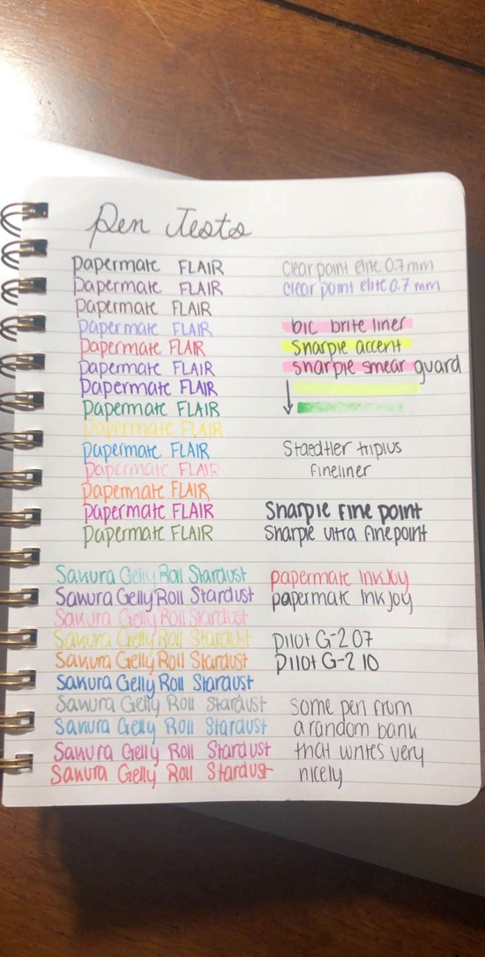
My pen reviews:
PaperMate FLAIR - These are my favorite thin markers of all time! I got them when I was super young (which is why that light pink one is very out of ink) and they’ve lasted extremely well. They don’t really bleed through paper, and all the colors except for yellow are very vibrant and pretty.
Sakura Gelly Roll Stardust - I got these very recently, and I have mixed reviews. The light-colored ones are quite hard to see, but the dark-colored ones are very pretty. Some of the pens seem like they are almost duds (they aren’t very inky and are kind of hard to write with), but the pens that work well look very nice. However, they are very, very slow to dry, so they don’t work well for things that have to be done quickly.
Clear Point Elite 0.7 mm - These are just pretty run of the mill mechanical pencils (they’re made by PaperMate), but they get the job done. I have three gray pencils and one purple (which came in a pack with the grey ones for some reason). They’re very pleasant to write with and I’ve never had a significant issue. One note, however, is that the eraser size is kind of finicky so it’s important to get the correct eraser refills.
BIC BriteLiner - This is my go-to highlighter. It has a brush tip, which I prefer, and it’s a nice pastel color. I keep this on my desk and use it just about every time I take notes.
Sharpie Accent - This is just your average highlighter. It works, but it’s pretty far at the bottom of my list because it isn’t in any way exceptional. Mine is pretty old, so the tip is a bit run down, but it still works.
Sharpie Smear Guard - Please ignore the green one - its cap got left off on accident and it dried out. These are the highlighters that have a clear tip so you can see through them, which I really appreciate. They are a bit lighter of a highlight than I typically prefer, but they work pretty well and they seem to smear less easily than my BIC BriteLiner.
Stædtler Triplus Fineliner - This is the only nicer pen that I own - I believe it cost about USD $6.00. It works very well for the price, doesn’t bleed through noticeably, and gets the job done. I tend to like thicker writing utensils, and this one is a little too fine of a fineliner for my taste, but I could imagine it working very well for someone who prefers finer tips. The tip seems to be square, which does sometimes require reangling your pen, but that’s the only major issue I have with this pen.
Sharpie Fine Point - This is the marker that everyone thinks of when they think “Sharpie.” I don’t have strong feelings about this marker. It’s a permanent marker, and I use it as such. It gets the job done. I wouldn’t recommend using this on paper, however, because it bleeds a lot. I use this primarily for labeling things.
Sharpie Ultra Fine Point - This is a thinner version of the typical “Sharpie” marker. On paper, it looks similar to the PaperMate FLAIR, but it bleeds through quite a lot more than that. I primarily use this for labeling things or writing on thicker paper such as cardstock.
PaperMate InkJoy - This is just an average ballpoint pen. These pens do not smudge basically at all, which is nice when you want to use a highlighter. I tend to prefer more inky pens, and these aren’t very inky. However, I do like them for times when inky, smudgeable pens just don’t cut it. These are pretty solid pens, I would say.
Pilot G-2 07 - This is my second favorite pen. It’s a thin, but still inky pen and it writes quite nicely. Since it is thinner, it’s less smudgeable, but it does still tend to smudge. I find that this pen requires a little bit of effort to write with since it is quite thin, but I’ve never had any significant issues.
Pilot G-2 10 - This is my all-time favorite pen. It’s a thicker version of the pen immediately above, and I love how it writes. It’s very inky, smooth, and pretty. However, it has some significant drawbacks. First of all, it is very inky, so it smudges quite easily. I don’t find this to be a huge issue as long as I wait a little while to highlight over it, but if you’re left-handed or have a hard time with smudgy pens it might be quite problematic. These pens also run out of ink incredibly quickly for some reason. This doesn’t bother me too much as they’re quite cheap (only about USD $3.00 for a pack of 8) and I can buy them at my local grocery store, but it can be a little bit annoying. Overall though, I love these pens so much!
4 notes
·
View notes
Video
youtube
Welcome to day 15!
So, earlier this week I’ve been talking about motivation. And now I’m going to help you with all those steps that we established.
So one of the things the experts recommend is to make a plan and another is to track your progress. It might seem like working out or eating better is all you need to lose weight, but it turns out that there is a lot of prep and continuing… paperwork, for lack of a better word. If you really want to commit to losing weight and getting healthier, and you want your best shot at succeeding, then the “paperwork” is kind of important.
You’ll want to spend a little time journaling in advance, and then some kind of tracking throughout. You might also need/want to return to the journaling as you progress.
So, basically, there are two ways to do these things; analog and digital.
I’ll start with analog. So if you’re more inclined to this, get yourself a journal and/or calendar and/or planner.
I like journaling for the “why” kind of things. You can find all kinds of journals with blank, lined, or dotted pages on Amazon or in any book store. I also keep finding gorgeous journals in places like Michaels. There are even ones with motivational or fitness-related covers, if you want a little extra inspiration.
Another great thing is that you can get them in different sizes and thicknesses. Do you want an index card sized one that fits in your pocket, or a large paperback sized one that fits in your purse? Or a full on notebook sized one that’s in the 8.5 x 11 range? What will you actually keep track of, keep handy, and return to?
So that’s for the journalling side. For the tracking kind of things, I really like a school planner. Even when I was in school I had trouble finding the kind I liked. The kind where you’ve got the month at a glance and then the week breakdown, so you can track in multiple ways. I could always find one or the other, but it was tricky to find both. For this, I like Mead, especially their tropical beaches version. And you can find it both in the printer paper size, small size, and the pocket sized.


As it happens, Roly Mama and I are doing a variation on this right now. We got a big desk calendar

which we’ve hung on the wall, and some great ridiculous stickers from the dollar store. So we’re tracking our workouts on this by adding stickers when we do something.
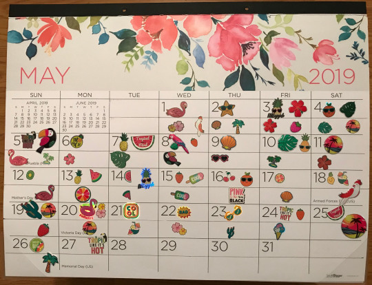
Now, this is just for our workouts and activity, not for food or anything else that we should be or are tracking. But if you’re an analog person, seeing a calendar full of stickers can be really motivating.
You can also combine these things into something like a bullet journal. And I’m going to sorry - not sorry - link you to buzzfeed and these two great articles on bullet journals.
https://www.buzzfeed.com/rachelwmiller/how-to-start-a-bullet-journal
https://www.buzzfeed.com/annaborges/all-the-bullet-journal-ideas?bfsource=relatedmanual
Bullet journals, if you don’t know, are a way of kind of combining calendar, list, and journal into one gorgeous hybrid by people with way more time and way better penmanship than me. They are inspiring to look at, even if I can’t imagine crafting one half as well.
I will, however, recommend my favorite pen: the PaperMate InkJoy. I’m normally not a fan of ink pens instead of ballpoint because they can bleed through, but these don’t bleed as badly as many I’ve tried. And they come in lovely colors. And they have decently soft tubes, so they don’t hurt your fingers. I love them!

Now, personally, I have switched to digital for my scheduling needs, because I do way too much rearranging and copy/pasting, and it made my physical schedules look all messy. I tend to vacillate between two options.
The first is Evernote. I love the way I can do tick boxes, and I can color code the text.

I also love the way I can sort notes into folders and give them tags. Plus I can clip things from online, draw on it, and/or add pictures! Downsides are that columns are non-existent, and that it can get a bit hard to find notes if you have a ton in a single folder or tag.

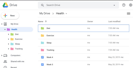
The other one is Google Drive, which I love because I can access it anywhere. And for that I tend to use Google Sheets, because I can rearrange it really easily. I can also color code both the text and the boxes. I also can see a bit more at a glance than I can with evernote. (Because of the aforementioned lack of columns)
There is also apparently a digital version of bullet journalling, called Good Notes, which I just discovered and have yet to try out. If you have, let me know what you think!
Another thing that can help with our weight loss and health goals is tracking our habits. Again, this is the kind of thing that you can track on a calendar or journal, but you can also go digital.
Now, there are also some great apps for this kind of thing. I currently use Habit List.


I love that you can reorder the habits, and you can set them to be daily, on a certain day of the week, or so many times a week. You can also backtrack to fill them in, and look at a month-at-a-glance. If you are on top of your habit, the little bubble is green. If you missed yesterday, it is yellow, and if you are more out of date it is red. Oh, and ones that are optional, like “once a week” are grey. You can even have it send you a reminder at a specific time for a habit. The only downside I have for it is that you can’t archive a habit. You can either change it, or delete it and all of your past check ins.
Another one is Habitica.

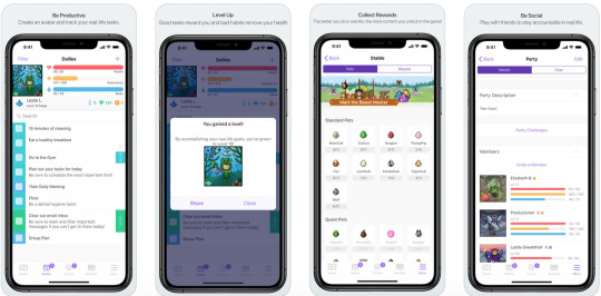
Habitica takes your daily chores and turns them into points in an RPG. It isn’t as customizable as I’d like, but if you’re into sprite era gaming, RPGs, and rewards you might love this one.


Atracker lets you color code your habits, and it will show you your habits on a daily calendar or a pie chart. It has an interesting twist wherein you actually can “start” a habit. And then stop it when you’re done. So you can see how much time you spend on something. But, for habits that aren’t really time specific, or things like meditating as you fall asleep, which you can’t “stop”, this might be less useful. And if you forget to turn it off, it can screw up your numbers. But I do like the daily calendar breakdown aspect of it.


Productive seems to have the best of Atracker and Habit List, with color coding and month-at-a-glance calendars, but you have to pay $30 a year to use it.
There are lots of other habit tracking apps, like Coach Me, Noom, and Any List, so check them out and see what works best for you!

So, these are general habit trackers. But there are also more specific tasks. Now, I’ve already talked about tracking your water specifically, and tracking your exercise and activity as it ties to a fitness tracker.
There are also exercise and diet specific apps, which I am doing a whole episode on as I get to food. But there are a bunch of them. So you can keep track of all of those things to keep yourself motivated.
Again, this is if you want to do it with apps. You can always put all of these things in a physical journal or calendar too.
Finally, one of the recommendations was to celebrate successes, and to have a positive attitude. I have two apps I recommend here, for different reasons. One is Happier.


This is great for posting basically short tweets to the Happier app about things that make you happy that day. You get a little toss of confetti when you post it, and others can smile and comment. The whole app is geared towards positivity and supporting each other.
Now, that’s not to say you can’t post something emotional, or if you’re having a bad day or something. In fact, you can, and you get great support from the community. You can post multiple times a day if you want, and some people seem to post a dozen times every day! You can follow people whose posts you like or find inspiring, and they can follow you.
The second app I like for this is HappyFeed.

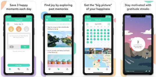
The goal of this app is to basically make a 3 item gratitude list (or happy list) every day. It is private, so no one else sees your posts, and there’s no social aspect. But it helps you build a habit of looking for the positivity and gratitude in life.
I had actually made a goal, because I had been told to in self help books, to note three things I was grateful for every day. And I was doing that in my daily “to do” list or my note app. Then I found HappyFeed, and it fit that goal perfectly!
So these are both great apps for celebrating your successes and for keeping a positive attitude. Check them out!
This is also the kind of thing that can be fun to put on a calendar or journal that you can look back at, if you prefer more analog. Again, I really like making it pretty with colorful pens and stickers and things. It should be something that you can look back at when you’re in need of some extra motivation, so pick something that will motivate you!
So, that is it for today.
This has been Roly Poly Weight loss. As always, I am your host, Roly Poly. Please share your motivations, and your roadblock plans, with the hashtag, #Motivation. And join my social group for support and maybe a little friendly competition by @-ing me!
And please join me next time!
#RolyPoly#Fitness#health & fitness#Exercise#Workout#Working Out#WeightLoss#losing weight#weight loss#Motivation#happier#goals#goal tracking#journal#journaling#bujo#bullet+journal#habits#habit tracker
1 note
·
View note
Text
Tutorial Tuesdays--Getting Started
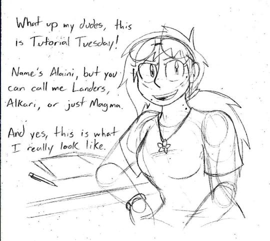
Tutorial Tuesdays is a new block on my blog in which I give art advice and tutorials for anyone looking to improve their art. But before we get into the good stuff, a quick obligatory background.
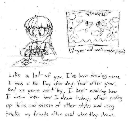
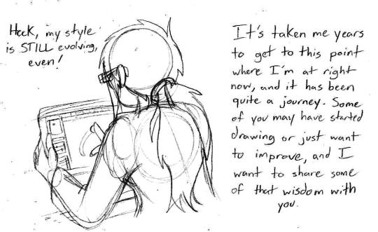
I know it’s tempting to look at my art and the art of people you look up to and come to the conclusion you’ll never get to that level no matter how hard you try, but it is possible to get to that level. You just gotta practice regularly and before you know it you’ll have it down-pat.
These posts will be pretty long, so to save Dashboard space, I’ll put the meat of things under a Keep Reading link so you can visit them in full. Alright, with that out of the way, are ya ready kids? Let’s go get some art tools!

I only say this because I’ve seen people make fantastic things with very limited materials and people with some of the finest tools but don’t use them to their full capacity. Again, it’s not what you use, but how you use it. When I talk about art tools, I’m mostly going off of what I use since those are the tools I’ve worked with a lot.
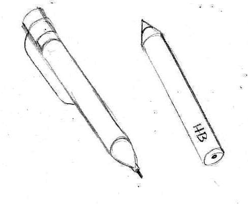
Pencils. Your most basic writing and drawing tool. For sketching and drawing, I use a 0.7 mm mechanical pencil with a good eraser. It’s quick, it’s convenient, and I often stick it in my ponytail when I’m not using it so I have easy access to it. They’re also pretty cheap. For commissions and grayscale shading, I use drawing pencils that come in various hardnesses. The hardness of your pencil will be noted by a number and a letter. A pencil with an H stamped on it will be harder, won’t smudge very easily, and has a very light load when the graphite is on the paper. A pencil stamped with a B will be softer, smudges very easily, and has a darker streak on the paper. The number on the pencil following the letter lets you know how hard or soft it is (4H is a very hard pencil, 8B is a very soft pencil). Your typical No. 2 pencils from school are in the HB category, which is middle of the road. You can find them individually at art stores or in packs. Walmart in my town offers a package of 6 drawing pencils bundled with two animation colored pencils, two markers, and an eraser for about $9. Pretty good deal. Speaking of...
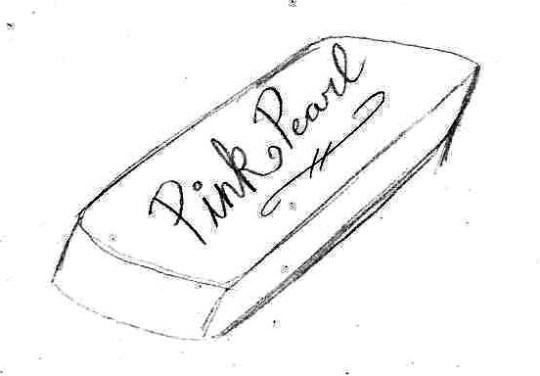
Erasers. A pink rubber eraser will do you just fine, though make sure your pencil has a nice one on it for finer details and while you’re drawing. You can use a kneadable eraser if you have one, they’re squishy, you can mold them to how you see fit and they don’t leave any crumbs to clean up, but I’m not quite fond of them.
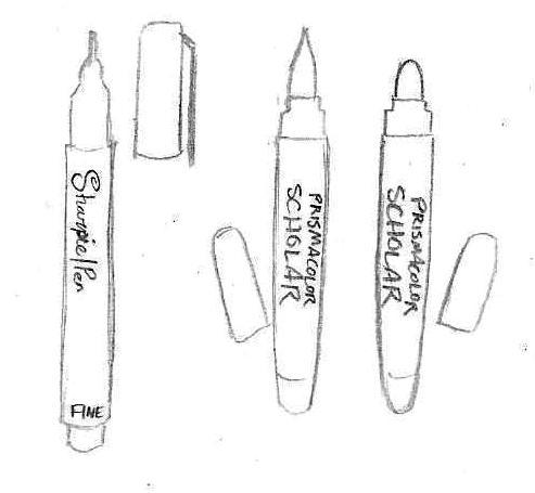
Markers and ink pens. Let me tell you, once you use a pen like one of these, you’ll never go back to ballpoint, which often has far too many broken lines to be practical to use and make your lineart look like trash. I use a Fine Tip Sharpie Pen, preferably in the no-bleed variety so the lineart doesn’t sink into the opposite side of the page. Recently I’ve been using Brush and Bullet tip Prismacolor Scholar markers for comics and good drawings. They’re a bit erratic to use at first, but it takes practice.
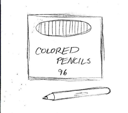
Colored pencils. Now these are my go-to for coloring since they give a wide range of color, combinations, and effects. For best results, I stick with Crayola or Cra-Z Art since the color tend to remain consistent from box to box and you can get a big box of them for a pretty good price. Prismacolors would be nice, but they’re pretty expensive and I don’t quite like the feel.
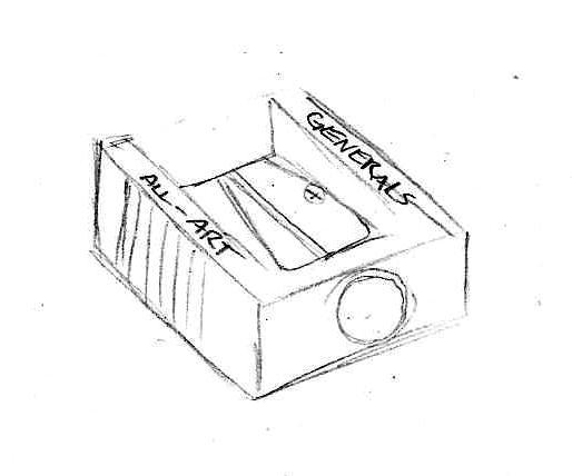
Sharpeners. Electric ones you can just keep at home, but for on the go I recommend a small manual one you can throw in your bag. Bonus if you get one that has a shavings catch so you don’t have shavings making a mess of your space.
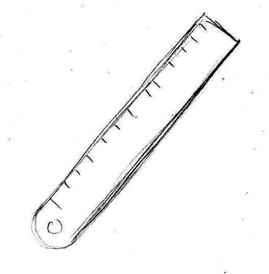
Ruler/straight edge. You’ll want one of these for comic panels, perspective guidelines, and, well, straight lines, though in some cases you might want to practice making straight lines without the use of it. I use a metal one, but a plastic will do you good as well.
And now, the most important thing of all, your drawing canvas!
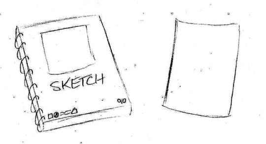
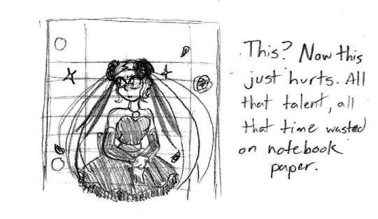
For starters, I recommend you get yourself a good sketchbook. Nothing too fancy, just one of those spiral-bound ones ideal for sketching. For your really good art, copy paper will work just fine. Really any kind of paper (or even cardboard!) will work but I implore you to avoid using loose-leaf notebook paper. I cannot tell you how much it hurts to see something so beautifully drawn wasted on lined paper. Not saying you can’t doodle in your notebook and show off something silly you sketched, but if you’d count a drawing as your magnum opus, your drawing probably deserved being on blank paper where it can shine.
I was considering making this an entry for Digital Art tutorials, but I’ll put these here just in case.
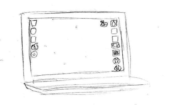
I do a lot of digital art using my HP laptop built with a touch screen. It can’t stream for sh1t but it runs single player Steam games alright and I use it for homework a lot. Before this, I had a desktop computer and used a mouse. I would like to own a Wacom tablet in the future, but until then this setup is nice enough. Remember, it’s about how you use your tools, not the quality of tools at your disposal.
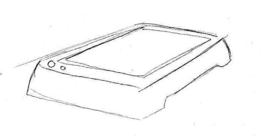
Now this is a scanner that’s used only for pictures/documents. You can’t print or fax anything with it, but it’s good for just pictures. I own an HP printer/scanner combo, but it is pretty finicky and no longer prints. Alternately, you can just use your cell-phone camera to take pictures of your finished piece, but I do not recommend doing so for comics unless you’re giving previews of one panel.
For my programs, these are the three that I use:
Good for doodles, already on your computer (probably), and I use this program to make authentic looking Homestuck drawings (like, you could mistake it for being an actual panel in Homestuck).
My primary art program. Operates much like Paint Tool SAI and photoshop. Very good for general art and comics.
Still learning this one, but it’s just like Medibang and is equipped with tools for animation.
And yes, these three programs are downloadable for free. I do want to try out Clip Studio Paint EX, but the cheapest I can get it is $80 when it goes on sale during the holidays. Normally, it costs $250.
Next time, we go over some drawing basics and some tips that will save your sanity while sketching. Stay tuned!
#tutorial tuesdays#art tutorials and refs#sh1t magma-paint does#getting started#art supplies#art software
16 notes
·
View notes
Photo
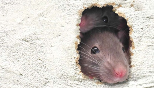
Rats coming from neighbours house - what do I do?
Table of ContentsMy Neighbour Has Mice What Can I Do, What Do I DoHow to Fix Report Rats In Neighbours GardenWhat are the costs for Rats Council ResponsibilityExpert solutions for Rat ProblemRats Coming From Neighbours House, What Do I DoCheap Solution for Rats Coming From Neighbours HouseTrue solutions for Rats In Loft From Next DoorPowerful advice for Rat Problem
Pest problems are frustrating at the finest of times, however they're even worse when the cause is beyond your control. If your neighbour has a pest infestation, there's a high chance it will infect your house, especially if you share a wall or flooring. Preferably, your neighbours will be understanding and similarly concerned about sharing their house with pests, however, regrettably, we don't get to choose our neighbours and a few of them can be difficult even hostile.
If you have reoccurring pest problems and live beside a neighbour who is messy and unhygienic, there's a high chance they're to blame. If your neighbours refuse to comply, you can complain to your council's Environmental Health department, who can check your residential or commercial property and serve a notice requiring that your neighbours act against the problem.
Many homes in London, especially in high-value locations, are 2nd homes kept for investment functions which may be left empty for months, even years. We have actually encountered lots of circumstances where infestations in empty houses have gone unattended and overflowed into surrounding structures. Locating the individual accountable in such scenarios can be difficult, and you may require to look for legal recommendations.
Reporting Rats To The Council, What Do I Do
It only takes a hole the width of a ballpoint pen for a mouse to be able to enter into your house. Even the most well-sealed modern structure can be vulnerable to invasion, while the average duration home supplies lots of paths for curious mice. When examining a mouse infestation, we typically discover mouse holes in adjoining walls.
If they do not, the mouse invasion can simply hop backward and forward in between houses. While mice can slip from one property to the next without being discovered, their bigger, noisier, more damaging cousins are far less stealthy. If your neighbour has rats, you'll probably hear them scampering and gnawing behind the walls or below the flooring.
All rat problems must be treated as an emergency situation. If your neighbour is refusing to take action or to take responsibility, get in touch with the council right away. Bedbugs are tiny, spread out rapidly and are extremely difficult to find in the early stages of invasion. If one property is infested with insects, it should be assumed that all adjacent properties are plagued as well unless a comprehensive study has actually identified they're certainly not present.
Proven advice for Reporting Rats To The Council
This can need a lot of settlement among locals, however if the whole block isn't dealt with then vermins can move from flat to flat and even reinfest the flats that were treated. Clothing moths quickly spread from one home to another, but there's no chance of understanding if a clothing moth invasion has originated from a your neighbours unless they inform you or have actually seen a pest controller visiting them.

How to Fix Environmental Health Rats
We provide totally free, no-obligation clothes moth surveys for both domestic and business customers, so there's no charge to giving yourself peace of mind. To book your complimentary study, call our friendly customer services group now or.Explain the scenario to them, ideally you neighbours will be simply as concerned as you are.
Needs to the council discover an infestation, they can serve a notice requiring your neighbours do something about it. This can be much more tough if your neighbouring home is empty a common consider problems. For vermin problems in flats, it is constantly assumed that the entire block is plagued and must be treated.
How to Fix Report Rats In Neighbours Garden
My brother lives in a 1930s semi-detached house and keeps getting rats. He has actually eliminated loads but they still keep coming. All his drains remain in great order. However, his (semi-detached) neighbour appears to have a collapsed sewage drain. The neighbours let the property and mean moving soon and so are not bothered about the problem.
The regional council environment department wont do anything about the issue unless his neighbours grumble about the problem however are not interested. Rats could be entering my sibling's home through a number of places, including the cavity walls, the loft area, ventilation grills or from under the floorboards. Any recommendations would be much valued.
There are many individuals who believe that just filthy and dirty buildings bring in rats, however that's simply not the case. There are numerous situations in which rats are discovered in clean and neat homes and gardens - rats coming from neighbours house. The reason for this is easy rats need shelter, heat and food. If these criteria are fulfilled, they can live anywhere.
How to Deal With My Neighbour Has Mice What Can I Do
Cheap Solution for Rats In Loft From Next Door
youtube
Correct cleanliness and housekeeping is the very best way to save your home from rat problem. Another good idea is to secure any place in your house or garden that can be utilized as a nesting location to stop them from coming. This might imply sealing any gaps or holes that you have in your brickwork.
that you may be drawing in rats too so be mindful of this when you are creating food stations. All these tips are helpful for homeowners with their own residential or commercial property, but what occurs if you see rats in your neighbour's garden? If you just discover one rat in the garden of your neighbour then there's no need to panic.
To repeat, if you or your neighbour are leaving food for birds and squirrels it is really likely that some rats will pertain to see what's going on as well! However, if you see rats in your neighbour's garden more than once and in numbers more than one you should certainly speak with them.
My Neighbour Has Mice What Can I Do Near Me

Understanding Rats Council Responsibility
If they do not understand how and why they must deal with rats, then there are lots of websites and articles that you can point them to so that they can understand what a possibly damaging issue this truly is. If they still do not act and they are not thinking about bringing in pest control experts the final step is to contact the regional authorities and make them mindful of the situation (rat problem).
Contact your council to discover out if they provide pest control services to remove pests like wasps, rats, mice and insects.
The long nights are upon us, Christmas is simply around the corner, and we are all turning the heating up a little bit higher. This is the time of year you will discover you are sharing your home with rodents. Devoted readers of my blog will remember a couple of years ago I received a call from my partner telling me a mouse was in our Christmas tree (my neighbour has mice what can i do).
How to Deal With Rat Problem
To beat them, you need to understand what the rodent desires. This is very basic: food, heat and security. Your home is warm, you have food, you have products to receive nests, and you have dark areas that provide security. This makes it an ideal target for the opportunist rodent.
NO! The days of tossing nasty chemicals around are long gone. In addition to the security issues over animals, children and other wildlife, using toxins when you don't have the knowledge to totally comprehend the situation you are dealing isn't great for the environment and can, frankly, be a waste of cash It holds true, often, toxin might be the only alternative because as soon as rats or mice have infested your residential or commercial property, they can be really hard to remove.
An expert pest control technician will utilize a combination of rodenticides and conventional traps and will find and obstruct access points to stop the rodents entering your property. The issue is, waiting up until you have an issue and then responding to that problem indicates you are always one-step behind the rodent.
How to Fix Report Rats In Neighbours Garden
Many of things you require to do to put-off an opportunist rodent are relatively easy and should easily enter into your annual home maintenance programme. With that in mind, here are my six leading tips for keeping rodents out of your home this winter season:. Rodents love a free-and-easy meal.
If you keep your food sealed and concealed, they won't be encouraged. Excellent rubbish management is vital. What we believe its inedible, a rodent will think is a banquet. Make sure you use good bin management, with all foods being put in bags in long lasting bins with covers. Your garden is a cash and bring of food and nesting products for a rodent.
Rat problem
#rat problem#rats coming from neighbours house#rats coming from neighbours garden#my neighbour has mice what can i do#report rats in neighbours garden#rats in loft from next door#environmental health rats#reporting rats to the council#rats council responsibility#birmingham#west midlands#united kingdom
0 notes
Photo

It has been a while! ( I always seem to say this but its true (’: )
Here I am, making another masterpost in the hopes that this will help every single one of you :) This time, I will be rambling about stationery because I know it is quite a big topic in the studyblr community and i get quite a few asks about it.
I will try to give some links, but you will typically see most things in your local stationery store (hopefully)
** for muji stationery, i did not link the australian website since you can’t buy online for australia :(
Disclaimer: I personally love pens and stationery, so usually most of my pocket money will go towards that as I feel as if it encourages me to study, you don’t need to have a lot of black pens if one is going to be enough. It all depends on the person :)
Study Essentials (simple with some of my personal thoughts):
Black pen
A black pen is a good foundation for writing you notes, they are plain and simple and can easily be manipulated (highlighted, underlined or annotated with colours to make specific things stand out)
Pens can come in many forms: ballpoint, gel, or ink pens. I smudge with pens but I don’t like the outcome of ballpoints so I choose gel pens.
Some branded gel pens include: Pilot G-2, Zebra Sarasa & Uniball Signo to name a few
There are so many simple black biros at any store that you can get for very cheap!
Red/Coloured pen
I personally think a red pen or coloured pen is essential for marking or to highlight key/other points and annotating
Some cheap coloured pens are the Papermate Inkjoy, other slightly more costly are the Zebra Sarasa ones, the Pilot Juice and the Muji Gel Ink pens
Some brands like Bic and Papermate have a 4 coloured pen so if you did not want to carry 200 pens, you can save room with 1!
Pencil
Wooden or Mechanical pencils???
I like mechanical personally because you don’t need to sharpen them lol, I use the Muji one but I also like the Pentel twist one (kinda expensive but very sturdy)
HB lead is much lighter/harder than 2B :) (2B is softer, and produces more pigment)
There are lots of sizes, the most common being 0.5mm and 0.7mm (0.5 is smaller)
Eraser
Any eraser is fine, I like the Staedtler ones (but they are expensive so I never buy them lol)
I just get the cheap $1 ones from morning glory (very good quality tbh) there is no need to spend so much on an eraser bc it will end up getting lost tbh HAHAHA
Ruler
Many come in 30cm or 15cm, get the size that will fit in your pencil case!
Great help for maths and art!!
White out
There are many types of white out; liquid, tape and even stickers
I personally prefer the tape version because I hate the smell of the liquid and also I always smudge liquid white out, but whatever suits you!
Highlighter
There are many highlighters out there in the market; the mildliners, the sharpie ones, the stabilo ones, there’s a highlighter in every brand tbh
Mildliners are more expensive and aren’t necessary but I really like them for the diverse colour range
A VERY cheap alternative to the mildliners are the Daiso soft markers (LOVE THESE), they have the same shades (less shades though) are only one sided but they give the same effect as the mildliners for a fraction of the price! bless
If you don’t like the bright neon highlighters; try the Daiso soft markers, the pilot frixion erasable pastel range or even the mildliners if you want to splurge:)
Extras that are not necessary but may be useful:
Scissors
Glue stick/Glue Tape
Stapler
Sticky tape
Sharpener (I use mechanical pencils so never need one)
Common Studyblr cult favourites:
Just a warning that even though everyone seems to love these products, it does not mean that you will, try them out at the store and don’t waste your money because you may not like them! (I wasted money buying the staedtler fineliners cries)
Staedtler Fineliners
Stabilo Fineliners
Mildliners
Pilot Juice Pens
Tombow Brush Pens (quite pricy be warned)
Artline Stix Brush markers (I quite like these but make sure you buy the BRUSH markers if you were planning to do brush lettering as I have seen people buy the wrong type, cheap alternatives to the tombows)
Moleskine notebooks
Muji Gel Ink Pens
Stores:
~ = stores I have bought from
* = I have a discount code which you can save 10% off your purchase: ACADEHMIC10 ! there is also free worldwide shipping c:
Common places for people to buy stationery from include:
Muji [ us | uk | sg ] ~
Amazon
Officeworks ~ (for australians only hehe) (I really like their X brand range btw, reminds me of muji!!)
Aliexpress ~
Ebay ~
Bricks x Castle *
Kawaii Pen Shop * ~
Miss Rosie Shop *
Typo (kinda expensive) [ au | us | sg ] ~
Kikki k (so pretty but so expensive ;;;;;;)
Target ~
Even your local newsagency should sell stationery
Daiso! and other asian stores that are similar :-) ~
Some less common places:
Some studyblrs sell some stationery on carousell, however it is mostly sg studygrams/studyblrs
Notemaker (idk they seem pricy)
DailyLike (sells cute washi tape but eXPENSIVE CRIES)
Etsy
Jetpens (tbh expensive, probably benefits americans more than others)
Your local art store (the ones where I live sell things really overpriced rip)
There are plenty of small and big instagram stores which sell cute things :-))
My personal faves:
Favourites:
Zebra Sarasa Clip pen 0.5mm black
Muji gel ink pens in 0.38mm and 0.5mm (I can’t tell much of a difference between these two sizes for these pens) [ muji us | muji uk | muji sg ]
Mildliners (I’ll link places below)
Commonly seen in my studyspo photos:
the dotted notebook that everyone asks me about is this one (that link is australia only but muji sells a notebook exactly the same!!)
Gridded loose leaf paper from Muji [ muji us (this one is the ruled version) | muji uk | muji sg ]
My bujo
I used to use the A5 version of the dotted notebook but I have ran out
Currently using a Whitelines notebook [ my review here ]
Mildliners... Where can I find them?
Kawaii Pen Shop (Only the Pastel, Cool and Warm pack)
Bricks X Castle (Sells all 4 packs, yes the rare pack!!)
Ebay
Popular (in Singapore and Malaysia)
Kinokuniya
Jetpens
My other masterposts:
chinese masterpost
app masterpost
bullet journaling
maths masterpost
advice for new studyblrs
physics masterpost
chemistry masterpost
studygram: acadehmic
This was severely long and I should have placed a read more sorry :’)
I hope this masterpost helped you if you were interested in what stationery I own and what I would recommend for anyone :)
#mine#mine:masterposts#stationery#studyblr#studyspo#supplies#pens#mildliners#studygram#study#notes#tbhstudying#areistotle#elkstudies#academla#emmastudies#morningkou
2K notes
·
View notes
Text
The World of Grimoires, Part II: Choose Your Weapons!
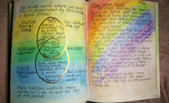
If you’re going to have your very own grimoire, you’ve got to start with some raw materials. These will vary depending on what style of grimoire you have in mind, how you’d like to organize, and what you want it to look like.
Fancy?
Many, many witches over the years have told me the held off on beginning a grimoire until they could find “just the right book” to write it in and just the right tools to write with. Nine times out of ten, the most coveted blank books for grimoires are giant leather (or faux-leather) tomes that resemble something you’d see in a fantasy novel about witches.
Many also want to write in these books with quill pens dipped in magical scented ink, another old-fashioned technique normally seen nowadays in fantasy fiction. I’ll admit that I longed for such things myself when I was just starting my first grimoire, and have felt pangs of wonderment at the thought of owning them many times sense.
There’s nothing wrong with wanting that sort of setup, but anyone will tell you that it’s a bit impractical. Giant leather tomes are expensive and easy ruined by stray splotches of ink. Quill pens are difficult to work with at first, and require much practice to use correctly. Magical scented ink is nice, but can, again, be pricy, even if you make your own.
This is compounded by the fact that many new and experienced witches (including myself at times) have a sort of neatness obsession when it comes to their grimoire, wanting it to be perfect from the start and forever, with not a single splotch of ink out of place.
It often seems that, the nicer and more expensive the notebook or journal, the more perfect and neat we’d like it to be. Given how easy it is to completely ruin a new and expensive leather journal if you’re slinging around magical scented ink from a brand-new quill pen, you can see how this problem snowballs into quite a conundrum.
I won’t tell anyone not to buy an eldritch-looking leather-bound journal if they want, but I will say this: expect imperfections, especially in your very first grimoire. You’ll be getting your feet wet with the concept and are bound to make plenty of mistakes.
Regardless of what notebook or journal you get (if any), make sure it’s something you’re comfortable making mistakes in. It’s pretty horrible to see someone get a nice notebook, spill some ink or rip a page, and shelve the entire thing, afraid to touch it again.
A far better option than a very expensive blank book would be a moderately-priced undated journal such as a Moleskine or other more elaborate creations.I’ve made it no secret which publisher of blank journals I prefer, and have written at length about why I tend to choose Peter Pauper Press journals. These undeniably won’t please everyone, though, and there are many other publishers creating beautiful blank journals.
If you choose something like that, don’t buy it for appearance alone - consider if it’s well-made and will stand the test of time. One thing I always check is that the price sticker is removable and doesn’t leave much residue on the cover. Not everyone will care about this, but I find it neater that way.
I do recommend checking to see if the paper is of good quality. Cheap paper can lead to pens bleeding through, doesn’t handle markers and other decorating tools well, and can overall ruin your grimoire. I’m not saying you need extremely expensive high-quality paper, but just check to make sure it’s thick enough not to experience bleed-through.
Utilitarian?
Many witches prefer a more utilitarian approach, out of necessity or other concerns. This can involve a wide range of materials, and is often quite a bit more discreet than a giant leather book and quill pen. This is advantageous for those who’d rather not attract unnecessary attention to their practices. In truth, a grimoire can look like whatever you want, provided it gets the job done, and this includes appearing completely ordinary, like a normal notebook where you’d find a shopping list or accounting information.
Some are fine using a simple spiral-bound notebook available at any dollar store as their grimoire. If discretion is the most pressing concern, a normal college rule notebook is likely the best bet, but I caution against buying something poorly-made or with very thin paper, especially if you plan on decorating the inside later on.
Another option would be a packet of binder paper and a three-ring binder with tabs. You can create sections in the binder according to subject or whatever other organizational feature you might want to use. A binder has the advantage of being easily reorganized, removing and adding pages when necessary to create the grimoire’s intended structure.
If you want this feature, but still crave an old-fashioned leather-ish look, some suppliers online sell elaborately-decorated binders to suit that aesthetic. Another option is to buy good-quality printer paper and a hole punch. Then, you can actually print digital grimoire pages from your computer and insert them into your binder. If you have a particularly good printer, you can even add elaborate images and colorful decorations with clipart, public domain paintings, and other available artwork. You can even make your own in Photoshop or another program.
Digital?
Printing a grimoire is a great option that plenty of witches use, but just as many prefer to keep their grimoire wholly digital, existing only on the computer itself. If you struggle with handwriting or are simply more comfortable typing, either of these are wonderful ideas.
For a wholly-digital grimoire, I recommend an app like Google Docs, and I also recommend that you separate each entry or section into its own file, and organize them into folders for easy sorting. Google Docs has the advantage of being accessible from almost anywhere.
Another idea would be to purchase a small but high-volume USB drive to contain your grimoire. Some shops even sell rather beautiful USB drives that can be worn as jewelry. I personally know a technowitch who chose this route, and now keeps their grimoire in a small USB locket around their neck.
Increasingly, some witches are using blog sites such as Tumblr to create digital grimoires. If you go this route, be sure that the site you choose has an option to password protect your blog or, if not, that you’re comfortable sharing everything you’ll be writing there with the world.
Open grimoire blogs are quite an amazing and useful trend to have developed recently, particularly on sites where it’s easy to share content, like Tumblr’s reblogging system. These are great because they allow for you to quickly consolidate information provided by others into a sort of digital scrapbook that can be studied later or as needed.
If you create an open grimoire blog, please give credit where credit is due in everything you post. If you copy an incantation from a book, cite the book and author. If you include content (such as spells and rituals) made by other witches online, be sure they’re okay with their work being included in your grimoire.
And, give them the courtesy of linking back to their site when you post it. After all, you’d want them to do the same for you, and, truth be told, you can get into legal trouble for plagiarism. It’s rare, but it can happen, so it’s best to be honest, ask bloggers for their permission if necessary, and always credit them.
One of the advantages of a digital grimoire is that it’s quite easy to add images, and there are many beautiful public domain works of art you can use to illustrate your entries. If you’re good with Photoshop or a similar program, you can also create your own images there, too. If you have any skill with HTML/CSS3 at all, or are just good at copying and pasting, you can style the overall layout of your digital blog grimoire to your heart’s content, as well, using custom theming options available for most blog platforms.
I Have a Pen…
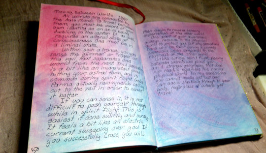
Last but not least, it’s important to consider the writing utensil you’ll be using for your grimoire. You needn’t have one specifically dedicated to that purpose unless you want, but you want to choose a pen that flows nicely, is legible, and doesn’t splotch the pages. For many, a simple ballpoint will do, but I tend to prefer felt tip or fountain pens, myself. If you decide to dedicate a certain pen just for your grimoire, you’ll probably want one that’s refillable and not meant to be just tossed after the ink runs out.
If you’re interested in custom inks (including magical scented inks!), investing in a fountain pen could be a good decision. These pens are easy to use and leave your grimoire with lines similar to what you’d get from a quill pen. Look for one that specifies it comes with a “converter;” this is a small gizmo which will allow you to fill the pen with custom ink, including colors you could mix yourself.
You can purchase scented inks, including stock formulas like Dove’s Blood Ink, from many metaphysical shops. You can even try mixing your own! Many websites and books give instructions for doing so, and I in particular recommend the ink formulas described in Scott Cunningham’s book, The Complete Book of Incense, Oils, and Brews. Make sure whatever ink you’re getting doesn’t bleed through the paper.
Beyond pens, what else might you need? If you plan on illustrating your grimoire, art supplies are a must. If you’re already an artist, you probably have your favored medium on-hand already, but if not, I suggest researching various illustration tools and choosing the one best fitting your personal aesthetic.
Keep practicality in mind, though. I, for example, adore watercolor, but rarely use it in my grimoires because it causes the pages to curl. Instead, I use soft pastels to illustrate over and around what I’ve already written. I’ve only just recently started illustrating the pages at all - all of my previous grimoires stretching back to high school were strictly writing with an occasional diagram.
While I’m not much of an artist, I do find it very soothing to add color to the pages of my grimoire, and the pastels blend to the point where they leave my writing visible beneath them. It’s a bit like a coloring book, but with no lines to worry about, just endless gradients of relaxing colors. This is great for me, as I often need to de-stress and do something fun after I’ve finished studying or writing for the day.
I’ll sometimes draw small illustrations, but they’re quite simple so far. As I’ve mentioned a couple of times, I have dyskinesia and my hands shake sometimes, making fine motions difficult. Still, I hope to learn more about art techniques in the future as I work further on these grimoires, and make them more adorned and beautiful as time goes on.
If you’re unsure what art medium is right for you, I suggest researching and, if possible, trying several. There are also a lot of resources for choosing markers, colored pencils, watercolors and other supplies to be found, oddly enough, on sites about bullet journaling. Bullet journaling, while normally quite simple, does often involve illustration, so the “bujo” crowd is knowledgeable about such things.
620 notes
·
View notes
Text
Muji Rakugaki Notepad, recycled paper includes 50% of re-recycled paper (basically super recycle paper…)
Blank .recycle paper off white
Made in Japan, Muji 無印良品
In the 365 NOTEBOOK PREMIUM A6 YUKI, I mentioned something about very cheap notepad for doodling, so I figured I would talk about Muji’s Rakugaki notepad as an example of a very cheap notepad.
In Japanese, Rakugaki (落書き) means doodle.
I don’t know if you can get this particular notepad in the US as easy/cheap as if you were in Japan or Taiwan, but this is a perfect example of a cheap practical notepad that’s very utilitarian and not so intimidating. Sometimes I give people notebooks as gifts, and the first thing they say usually is “I am afraid to use this because it is so special and fancy.” But not this one. This is designed to be rogue like notepad, and you get this to USE IT. You can run it over with your car if you like, but that’s not very nice.
The visual appearance of this notepad gives an earthy aura because of the paper material (recycle paper with 50% re-recycle paper), very simple and practical. Cheap in price but not cheap visually. The binding is Tape Bound, and you can tear pages without having the notepad fall apart, but the torn page isn’t smooth on the connecting edge.
Since it’s not designed to be fancy but practical, there is a indescribable satisfaction when using it and after using it for a while. You know the fulfillment and accomplishment that you get after you finish a notebook? I get that feeling every time I use this guy.
LAMY Safari (F nib) with Montblanc oyster grey ink: Not good. It has a lot of feathering and bleeds like crazy. Also, it will drain your ink if your nib is bolder, so unless your writing is big, and you enjoy changing your ink every day, go for it…I don’t recommend using fountain pen on this notepad.
Customized Super fine nib fountain pen (Kaweco Brass Sport Fine Point): Again, even though the nib is much finer than the LAMY Safari, it still has a lot of feathering and bleeding.
Pentel orenz 0.2mm mechanical pencil: Not a good choice, the paper is too weak to handle such fine and hard lead. The fibers on the paper are too loose and get caught on the 0.2mm lead easily, so the paper will be torn by the lead.
Rotring 800+ 0.7mm mechanical pencil: This will be a better choice of writing instrument for this type of notepad, a thicker lead mechanical pencil or a dull pencil. Since the lead isn’t so fine, the fibers don’t get caught on the lead as much. Also, I used a Tombow MONO eraser, and the paper fibers didn’t come off easily. (this is the eraser brand I prefer to use when I am using graphite, I think it’s the best eraser ever…I have used this brand since I was a little kid)
A ballpoint pen: No problem when writing on the paper, but it will leave dents on the next pages if you push hard when you write. However, I personally like dents because they are so personal and kind of like an evidence of your thinking process.
Uni STYLE FIT roller ballpoint 0.38 mm gel-base ink: (Why is it gel? it’s more like a roller ball I feel…) It was alright, not amazing but alright.
Crayola Ultra-Clean Washable crayons: since this notepad is for doodling, I figure we should test it with crayons. It’s great. 🙂
Visual aesthetics: 3.47 Practicality: 3.87 Overall, a 3.67 out of 5 Star product.
Pros: Very cheap and accessible, light, the binding isn’t too weak, eco-friendly if you are into that type of thing, earth ftw. Good with ballpoint and pencil. Can be opened 180 degrees flat.
Cons: Weak paper material for fine nib/lead. Not fountain pen friendly AT ALL. (and I don’t think Muji’s design team intended to make this notepad for fountain pen users) When you need to tear the paper, it creates fibers and doesn’t have a clean edge.
Early-notes30
Disclaimer: All of these items (mostly notebooks) were purchased with my own money. I am not receiving any compensation from any companies.
Muji Rakugaki (doodle) Notepad B5 Muji Rakugaki Notepad, recycled paper includes 50% of re-recycled paper (basically super recycle paper...) Blank .recycle paper off white…
0 notes
Photo

New Post has been published on http://www.lifehacker.guru/im-anant-agarwal-ceo-of-edx-and-this-is-how-i-work/
I'm Anant Agarwal, CEO of edX, and This Is How I Work
One of the indisputable virtues of the internet is the availability of free online courses that enable anyone to educate themselves. edX is one such outlet, founded by Harvard and MIT, and offers free, open source courses that are allowing people around the world to get an education that would otherwise be out of their reach.
At the helm of edX is Anant Agarwal, who is also a professor of electrical engineering at MIT. He’s been a longtime advocate of MOOCs (massive open online courses) that enable thousands of people to participate in courses from universities ranging from Harvard to Berkeley and even schools abroad. He’s also co-founded several companies and continues to travel the world while helming edX. But, as we learned, his favorite work spot isn’t a glossy office; it’s a humble greasy spoon diner. Here’s how he works.
Location: Cambridge, MA Current Gig: CEO of edX, Professor at MIT One word that best describes how you work: Obsessively Current mobile device: My most mobile device is my ballpoint pen, but I supplement that with an iPhone 7 and a mini iPad. Current computer: Samsung 900X Windows notebook
What apps, software, or tools can’t you live without? Why?
I travel pretty frequently (or dare I say constantly?). With over 100 global edX partners, it’s not uncommon for me to be in Miami one week and Mumbai the next, so I rely on my iPhone hotspot to stay connected no matter where I am in the world. I also use my my Gmail app, Google Drive, and remote desktop a lot, too. It’s not all work when I travel, though—I can’t live without my flashlight and magnifier app, since I need both to expand the print on menus when dining out! I’m also a fan of the Slingbox app—I use it to watch the Patriots play when I’m traveling.
What’s your workspace setup like?
Outside of my office in the edX HQ in Kendall Square, Cambridge, Massachusetts, my most important office is a diner called Frescafe in Natick, right down the road from the town where my family and I live. On the weekends, I spend at least two hours a day in the place—just me, my laptop and many cups of decaf coffee. The greasy breakfast joint has been my haunt for twenty years—I wrote my co-authored textbook on electronic circuits there in the early 2000’s and they haven’t been able to get rid of me since! I’ve also been known to strike up conversations with fellow diners and wait staff. On numerous occasions, the edX sticker on my laptop has been a conversation starter and I’ve had the pleasure of hearing stories from edX learners who happened to visit or work at the diner. There’s no better motivation to really crack on with a difficult proposal or review a long deck than hearing inspiring stories from real-life edX learners.
What’s your best time-saving shortcut or life hack?
That’s easy! Procrastinate. When it comes to work, my life hack is ‘if it can be postponed then postpone it.’ Even though I know it’s not the most perfect way to go about managing my time, it works for me. It probably also makes my colleagues mad at me! Sometimes I find that the work was unnecessary and can avoid it altogether, but usually what happens is that I end up having far too many things to do close to a deadline, so I have to prioritize and be super efficient and minimize the time I spend on things, while maximizing the thoughtfulness and energy I put into them. Can I caveat this answer by saying that if there’s one thing I’d like to do better, it would be time management?
What’s your favorite to-do list manager?
The piece of paper I have currently crumpled up in my pocket. It’s not high-tech, it is super portable, never runs out of charge, works on airplanes, but you better believe that if I add a task to this scrap of paper, then it will get done!
Besides your phone and computer, what gadget can’t you live without and why?
During conference calls or meetings, I can’t live without an analog desk clock in clear view. I tend to love deep diving into rabbit holes during conversations and can lose track of time. I don’t wear a watch, and prefer not to have my phone or laptop or any other device out to distract me during meetings, so my usual sources of time are unavailable. So, an analog clock keeps me on track, as I can keep my eye on how much time I’ve spent talking without opening my phone or laptop.
What everyday thing are you better at than everyone else? What’s your secret?
Making Kerala fish curry. Mine is unparalleled!
Also, I used to do stand up comedy in school, and I think being funny and being able to find the humor in things is critical to being a good leader. You can disarm people with humor even if they are going to be unhappy with a decision.
What do you listen to while you work? Got a favorite playlist? Maybe talk radio? Or do you prefer silence?
I listen to talk radio when I drive and am not on the phone. But, having grown accustomed to a VERY noisy dorm at IIT Madras during my undergrad years, I can work practically anywhere. These days, I can still shut out the noisy background of the world while working. Once, I even missed my Air Canada flight as I sat hammering away on the keys of my laptop opposite the boarding gate even as they called out my name several times. To avoid this, I now set the alarm on my mobile phone!
What are you currently reading? Or what’s something you’d recommend?
Probably something by John Grisham.
How do you recharge? What do you do when you want to forget about work?
I think about working out and that tires me, but I really need to start exercising. A greasy breakfast at a diner or going out for pizza is always fun. I also turn to Netflix, when I need to escape into a movie.
What’s your sleep routine like? Are you a night owl or early-riser?
I can sleep very easily at any time. I can, in all honesty, sleep standing up. I try to get six to seven hours of sleep a day.
I am absolutely a night owl and I love to work late into the night. I despise the early morning! I’d much rather stay up all night to make a 5am meeting than face a 5am wake up call.
Fill in the blank: I’d love to see _________ answer these same questions.
Some of our edX students like Battushig or Amol Bhave. They are truly inspiring and their accomplishments never cease to amaze me! Both took my MIT Circuits course on edX as high school students in Mongolia and India, respectively, and aced it! Then, they got into MIT, and are now in their senior year. They are young, but their ambition and talent are just incredible. I’d love to know how they do it all!
What’s the best advice you’ve ever received?
The best advice I have ever received is to always act on your curiosity. Throughout my career, curiosity has served me well. Believe it or not—it started with a visit to a family friend’s chicken farm when I was a teenager. After the visit, I was curious about chicken farming, so I started a small farm of my own. The farm thrived, as I expanded its reach by selling eggs to neighbors and in bulk to a local restaurant. You could say I discovered B2C and B2B early! The curiosity to start and develop this endeavor helped lead me to create several high-tech startups later on, and the importance of following your inquisitiveness has remained with me throughout my professional life.
Recommended Stories
I’m Richard Wong, Head of Engineering at Coursera, and This Is How I Work
I’m Natalie Amrossi, Photographer, and This Is How I Work
I’m Arden Hoffman, Head of People at Dropbox, and This Is How I Work
©
0 notes
Text
How Different Materials Affect the Drawing Process
The following article by Dan Gheno, about the pros and cons of various drawing materials, appears in the winter 2017 issue of Drawing magazine. You can see the full list of articles in the issue, and you can get your copy here or download a digital version here. You can also subscribe to Drawing.
~~~
How Different Materials Affect the Drawing Process
by Dan Gheno
There is no substitute for skill and experience. A quill pen did not draw Study of a Male Nude—Michelangelo
did. The identical pen and ink in the hands of a rookie would not produce a similar masterpiece. But it’s also true that if Michelangelo had used a ballpoint pen or a No. 2 pencil, the drawing would not possess the same depth of value or volume. The choice of materials is a vital part of how an artist approaches his or her work, and it’s critical to pick the right drawing instruments, surfaces and other tools to fit the needs of your artistic vision.
Study of a Male Nude, by Michelangelo, ca. 1503–1504, pen-and-brown-ink, 16 1/8 x 11 1/4. Collection Casa Buonarroti, Florence, Italy.
If there’s one thing I’ve learned over the years it’s that you shouldn’t try to make a material do something it can’t. Just as you can’t force a cat to bark or a dog to meow, it’s impossible to force your materials to do something against their essential nature. For instance, graphite, sanguine chalk and colored pencil all yield less contrast than compressed charcoal or ink, so if you’re interested in deep, divergent contrasts, you want charcoal rather than graphite. However, when the goal is a more delicate form of rendering, charcoal can work, but I personally prefer graphite or colored pencil, which I find more readily suited to this goal.
This article will chronicle the advantages and pitfalls of the drawing materials I’ve personally grown to know over my decades as an artist. We’ll examine the pros and cons of media including graphite, colored pencil, charcoal and ink, along with surfaces and other tools. We’ll discuss when to use them, when to avoid them and what you can expect (or not expect) from each medium.
A sample of my favorite drawing materials. At top, from left to right: mechanical pencil; ballpoint pen; holders for large crayons and graphite sticks; various colored pencils and pencil holders; oil-based, charcoal, carbon and chalk pencils; and pointed eraser. Middle: vine charcoal. At bottom, from left to right: compressed charcoal, sharp single-edge razor blades; and two block erasers—one for colored media, another for dark media.
Graphite
If you discount the mural I drew with Crayola crayons at age 4 on the side of my older sister’s 1951 Chevrolet sedan, my first experiences in drawing were rendered with a yellow No. 2 pencil, a common first experience. Because of this early familiarity, graphite pencils remain the most comfortable and safe choice for many artists until they start taking art classes. Well-meaning teachers sometimes try to get their students to kick the graphite habit, forcing them to use charcoal instead. But I usually encourage novice students to work with what’s familiar to them at first. When trying to grasp such challenging issues as human proportions and value shapes, it doesn’t help to struggle with the technical problems of a new medium as well.
Known mostly as a linear medium, graphite is more flexible than many artists and teachers give it credit for. You can actually get some very fluid and painterly effects with it, for instance by applying powdered graphite to the paper with a brush or chamois. Graphite also comes in sticks of various shapes, sizes and hardness, which allow for a variety of delicately blended masses or broad, assertively expressive strokes.
Contrapposto Male Figure, by Dan Gheno, 2016, graphite, 17 x 8. All artwork this article collection the artist unless otherwise indicated.
The main drawback to graphite is its inability to achieve the intensity of darkness that you can get from compressed charcoal or paint. You can go only so dark with graphite before the material builds into a reflective sheen that actually looks lighter instead of darker. In fact, the more you try to rub and grind graphite into one area of the paper, the more you will burnish it into a dense, shiny mass, canceling out any sense of realistic value and atmosphere you have achieved elsewhere in the drawing.
I don’t often use graphite anymore, but when I do it’s usually for precise rendering or for analyzing complex shapes or anatomical forms on the body that I find confusing. Indeed, when graphite was first developed as an artistic medium by the English in the mid-1500s, it was promoted as an easier, more practical and more fluid alternative to metalpoint for detailed, analytical drawing. Graphite doesn’t drag on the paper as metalpoint does, so with graphite artists can apply value masses in a more natural, fluid manner. But one thing missing from graphite is metalpoint’s varied depth of line, which can seem to pulsate in a three-dimensional manner.
Colored Pencil
For me, colored pencil seems to combine the strengths of graphite and metalpoint. Some brands of colored pencils impart a similar delicacy and depth of line as metalpoint, and although colored pencils aren’t quite as erasable as graphite, brands such as Stabilo Original and Caran d’Ache have much of graphite’s potential for revision and sensitive ease of application.
Colored pencils are particularly suited to exacting linework. Many brands of colored pencil can be sharpened to pinpoint precision using a razorblade. I use a mid-value sanguine color for most of my colored pencil drawings, particularly when drawing on white paper. It allows for a delicate touch, but upon pressing harder I can get a darker, more assertive line. I will often use a darker sepia color when working on toned paper.
Reclined, Looking Over Shoulder, by Dan Gheno, 2014, colored pencil, 18 x 24.
Colored pencils share graphite’s limited range of value contrast, but I find this can work to my advantage, forcing me to take my time to analyze the model’s light and dark patterns as I render them. I usually prefer to build up my values gradually, shading across large shadow shapes with succeeding sweeps of tone, until I reach the desired darkness. Working in successive layers can allow one to better maintain the weave of the paper and help to impart a sense of atmosphere.
Colored pencils can require a gentle touch. They are often fragile and prone to snapping in mid-stroke if you press too hard, leaving an unerasable skid mark on the paper. If you try to push your values too dark all at once, they will become dense and shiny. With certain colors the hue may even change with heavy pressure or when you let your pencil point get too short, allowing the wood casing to chafe your linework.
Chalk and Charcoal
Whether you’re using them in pencil, stick or powder form, pure black chalk and charcoal provide the greatest value contrasts. I often like to work with them in a loose manner, starting with a broad value mass that relates to the big, gestural shadow shape found on the model. Some artists prefer powdered charcoal for this initial stage, but I frequently begin my sketches in a faint, linear manner with vine charcoal because it’s so easily erased or adjusted. I then follow up with a more permanent compressed charcoal pencil or stick, which usually works as a sealant, holding the more ephemeral, easily smudged vine against the paper.
Twisting, by Dan Gheno, 1995, sanguine chalk, 11 x 24.
Charcoal pencils come in several grades of hardness, like graphite. Softer charcoal is often good for building up masses on large, expressive drawings, whereas harder compressed charcoal or carbon pencils, such as H and HB, are more suited to line work on a smaller scale. Hard charcoal pencils, which are easy to sharpen to long, sharp points, can be used to quickly render thick and thin lines by varying the position of your hand, and you can build toward your dark value masses with a rapid weaving of strokes. Broad, lineless tones are possible as well. Holding the pencil to the side, you can glide the long portion of the charcoal shaft across the page, gradually building up the tone into a broad value mass, much as you would when using a colored pencil.
Female Figure in Shadow, by Dan Gheno, 2003, charcoal, 24 x 18.
You might notice that vine charcoal tends to be a bit warmer than compressed charcoal. When using both, I often need to go back into my drawing at the end, sweeping over my value masses with one or the other to harmonize between cool and warm. For the same reasons, it’s not a good idea to mix white pencil or chalk with black charcoal (or graphite), unless you do so systematically throughout the drawing. Otherwise, the mixed-up results will look cloudy or just plain chaotic, especially on toned paper.
Tip: When working in compressed charcoal or in graphite, keep to a limited range of pencil hardness to maintain evenness and texture harmony in your toning. Jumping between divergent grades—for instance from an HB to a much softer 6B—can result in a distracting cacophony of rough and smooth textures.
Crayon
Perhaps it was the sense of shame I felt for drawing on my sister’s car—and the adverse conditioning that came from the hours of elbow grease I spent rubbing out my scribbles—but it was a long time before I renewed my interest in grease- or oil-based drawing instruments. When I did, using a variety of brands from Cretacolor to Faber-Castell’s Pitt, I found the medium offers a handy compromise between the darkness achievable with softer chalks and pastels and the smoothness of colored pencil and graphite. When drawing with crayon I generally use a sanguine color.
I’d recommend not combining different brands of crayon in one drawing. Hues differ greatly between manufacturers, even if they have the same name.
Scanning the Distance, by Dan Gheno, 2016, oil-based crayon, 10 x 10 1/2.
Ink and Ballpoint
Over the years I’ve worked with a variety of inking tools, including brushes, dip pens, fountain pens, ballpoint pens and Rapidograph pens.
During the 1970s, when I did drawings such as Woman Seated, Looking Away, my favorite way to work was by using a fountain pen to render the lines and a felt brush marker to wash in the big value masses. I normally dipped my “fountain” pen into a bottle of ink so that I could use a dark, heavy ink that would otherwise clog up the pen. I used an italic point held sideways, which offered a delicate fine line and provided thick-thin variation. I also used a grinding stone to sharpen and reshape my pen points to get extra fine lines. Water-based felt brushes, such as the one I used to lay in masses in this drawing, wear out quickly. Instead of throwing them away I open their tops and fill them with watered-down ink to rejuvenate their wells. I often prefer the more watery effect of these recharged brushes to the results I get with a new one.
Woman Seated, Looking Away, by Dan Gheno, ca. 1974–1975, ink, 16 x 11.
Although I still work in this technique on occasion, today when I work in ink I usually use ballpoint pens, most often for eye-hand coordination exercises. Because ink is irrevocable, it’s a great training tool, reinforcing the habit of thinking before you put down a line.
I was first attracted to ballpoint pens for their ability to replicate fine, etch-like lines. Over the years, however, manufacturing standards have diminished, and today many brands of ballpoint spurt out unexpected blobs of ink—usually at the worst possible moment. I recommend you experiment to find the best and most consistent brands. (I’m a fan of the Pilot EasyTouch .7mm fine pen and its refill catridges, which can even be used on their own.) In all cases, you’ll need to get in the habit of regularly cleaning off the paper detritus that builds up around the pen point, which can produce splotching after only a few minutes of work.
I find it helpful to locate the beginning and end points of the objects I’m drawing in ink. For instance, when drawing a hand on the hip, I might place dots at the shoulder, elbow and hip and then draw in between these points. If you don’t put placeholder points for all the major beginning and end points or at least try to imagine them in your mind, it’s easy to underestimate any foreshortening and draw a line too long. And with ink, of course, there’s no erasing your mistakes.
Artist, by Dan Gheno, 2016, ballpoint pen, 7 1/2 x 7 1/2.
Mixing Media
There’s no need to confine yourself to one medium. Don’t be afraid of mixing unrelated media, combining different colored pencils or exploring unorthodox approaches. For example, I sometimes like to combine graphite and colored pencil with ink, starting loosely with pencil and finishing with ink.
As you experiment with combining media you’ll learn to work within some important limitations. For instance you may find it difficult to apply a chalkier medium on top of a slicker medium such as graphite or colored pencil. You’ll also discover you can’t splash heavy washes on thin paper. In fact for many mixed media approaches you may want to consider tougher surfaces such as canvas, sanded paper or pastel cloth. These provide wonderful traction, grabbing onto both dry and wet media and allowing combinations such as charcoal and paint, as we see in Robin Smith’s Marmadu, that wouldn’t be possible on most papers.
Marmadu, by Robin Smith, 2015, oil, charcoal and white chalk on canvas, 14 x 14. Private collection
Paper
Some artists delight in rummaging through stacks of unusual and expensive papers, but I’m not a paper connoisseur, and I prefer the smooth bond-paper surface that I’ve drawn on since I was a child. Bond paper is not hard to find in letter size, although it takes a little detective work to find my preferred size of 18″ x 24″. Different manufacturers sell large-format bond papers that are acid free and archival, but they vary greatly in tooth and paper weight—try out different brands until you find one that feels right for you. Among the ones I use are Borden and Riley No. 39, a 16-lb layout bond paper that comes close to the smooth, bright-white surface of photocopy paper; and 50-lb Canson Sketch paper, which has a slightly warmer and darker surface. It’s also a little rougher, which I sometimes prefer for the way it grabs my pencil, producing darker lines and value masses.
Embrace, by Dan Gheno, 2015, charcoal and carbon pencil with white charcoal on toned paper, 22 x 16.
Slick bond surfaces are not always conducive to vine charcoal or pastel-based media. Believe it or not newsprint is perfect for these. It grabs onto the materials, giving a smooth, gliding effect to one’s value massing and linework. Unfortunately newsprint is also highly acidic, making it yellow and decay rather rapidly. I know many artists who love this ephemeral surface but are forever in pursuit of an archival substitute. The best replacement I’ve found is Arches Text Wove, which shares most of the same properties. I also find that absorbent printmaking papers such as Rives BFK take charcoal and pastel in a similar manner. Take care to work gently on printmaking papers, which don’t have much sizing. Their fibers are delicate and start to pill when erasing or applying material with a heavy hand.
Figure Sleeping, by Dan Gheno, 2016, colored pencil and white charcoal on toned paper, 18 x 24.
Many good options are available for artists who want to work on toned paper. When I’m working on a toned ground I gravitate toward smoother surfaces, such as Strathmore’s 400 Series Toned and Artagain, as well as Canson Mi-Teintes, preferring the silky, blotter backside of this paper over its more textural front. They allow for delicate, blended rendering, as well as distinctive linework. I’m also fond of the lightly textured surface of Strathmore’s 500 Series Charcoal Assorted Tints paper. You can create a clean, shimmering effect on this paper if you’re careful not to press too hard and fill in its textural valleys. I like to stroke my dark and white pencils gently along the top surface of the paper texture, allowing the resulting tones to vibrate against the color of the paper.
Erasers and
Other Tools
Some teachers ban erasers in an effort to get students to look closely and commit before making a mark. Certainly an eraser is no substitute for failing to look closely at the model and thinking before you put down a line, but I firmly believe erasers are an important tool when not overused. I subscribe to the view of America’s greatest draftsman, Thomas Eakins, that drawing is a process of revision, that you put down something and then adjust this estimate toward greater accuracy as you work. Just remember to look closely at the model and draw lightly so that you can more easily erase later on.
Erasers are not all created equal, and I’ve found that the best type of eraser can vary depending on the media and paper you’re using. Kneaded erasers are usually effective for adjusting small vine charcoal shapes. Plastic erasers such as those made by Tombow and Staedtler are more efficient at lightening or removing colored pencil, compressed charcoal and carbon pencil from smooth paper. There are also long, pointed plastic erasers that look like mechanical pencils—such as those made by Tuff Stuff and Tombow—which I’ve found indispensable for cleaning up small details and sharpening the edge of a shape. Even though you can roll a kneaded eraser into a sharp point, it won’t give you as clean a shape. Rather these soft erasers create a more blurry edge—which can be useful when you want such an effect.
Fast Sketch, by Dan Gheno, 2016, sanguine chalk, 17 x 12.
Unfortunately, erasers harden and become worthless as they get older; they can even smear or rub a line deeper into the paper. Additionally, it doesn’t hurt to reserve separate erasers for black media and for colored pigments, and you should clean erasers frequently to prevent smudge-making pigment from accumulating on them and leaving stains where you want clean paper.
When you keep your erasers new and clean, you will find that they are excellent drawing tools, not only for removing unwanted marks but for making wanted ones, as well. I often lay a broad tone of chalk or charcoal across my figure drawing and then draw light hatch lines into the mass with a pointed eraser to create a modeled effect, much as you might use a white pencil on toned paper. I will sometimes blend a tonal mass with the flat side of a block eraser. On occasion I will press down with a kneaded eraser to lessen the assertiveness of a line. Sometimes I’ll thin out a line by chiseling at its edge with a pointed plastic eraser, making some of the marks more delicate and fainter than other lines for rhythmic purposes. I often do this to imitate the effects of form and light, particularly where the boundary line of a volume faces the light source, or to indicate a softer fleshy form compared to a more distinct line of a projecting bone.
There are many other tools to consider. Razor blades and sandpaper are useful for sharpening pencils. Many artists like to use chamois and stumps to blend charcoal, pastel and graphite for even tones. I prefer to use my fingers for blending small, delicate masses, and I’ll use a facial tissue (sans ointment) to get a broader, even value mass. When using your fingers, it’s important to keep them clean and dry—I usually wipe my finger on a paper towel before each use—otherwise the oils of your skin will interfere with the drawing.
Tip: I find it makes a difference what order you employ various erasers when using more than one type in a single drawing. If I try to erase a deeply inscribed line with a kneaded eraser first, the line becomes even more resistant to subsequent attempts by a plastic eraser. I avoid using the smaller pointed plastic erasers on large areas, since they can embed the pigment into the paper; I’ve found the larger plastic erasers better suited to such tasks.
Changing Things Up
It’s natural to have a favorite material, but try not to become too dependent on any one product or brand. It never fails: After you get used to one type of pencil or paper, it gets discontinued! It’s happened to me many times, for instance with my favorite charcoal pencils and sanguine chalk. Speaking from my experience, I would advise you to experiment with various brands of your favorite drawing medium so that you’re not left in the lurch when a material changes or becomes unavailable. I also advise holding on to pencil nibs—if you’re caught off-guard by a surprise cancellation, you can put them in a pencil extender and get quite a bit more mileage out of them.
Even if they don’t stop making your favorite drawing utensil, you might find it useful to change media once in a while. It’s quite possible to fall into complacency when using the same materials for too long, and switching things up can help maintain your sense of enthusiasm. It can also help break bad habits that might be creeping into your work—many artists develop muscle memory based upon the traction and resistance that the same pencil has against the same paper. After continually using the same materials, you may find that your hand wants to go at the same speed and angle regardless of the subject matter. These habits can get in the way of seeing your subject’s specific shapes and size relationships and can even interfere with the drawing process, for instance by demanding a heavy line when your goals demand delicacy, or vice versa.
Sometimes the change of material can be something as minimal as a change of color to jumpstart your visual perceptions. If you find that your line weight is too heavy for your goals, you might switch to a lighter color, say from a heavy black charcoal pencil to light sanguine pencil. You could also try the opposite tack by using an even darker material to train your hand to back off and use a lighter touch.
Three depictions of the Farnese Hercules by Hendrick Goltzius, ca. 1591–1592. From left: engraving; black chalk on blue paper; red chalk.
There’s no doubt that one’s choice of materials will impact the superficial look of a drawing, and the drawing materials mentioned here are just some of those I’ve found helpful to my particular vision. But in the end it’s the artist who makes the drawing, not the materials. Consider Hendrick Goltzius’ multiple versions of the Farnese Hercules. Whatever material he was using, Goltzius’ intense interest in sculptural volume makes the artworks compelling, giving the images power and lasting artistic importance.
~~~
Dan Gheno is a New York artist whose work can be found in collections including the Museum of the City of New York and the New Britain Museum of American Art, in Connecticut. He teaches drawing and painting at the Art Students League of New York and the National Academy School of Fine Arts. His book, Figure Drawing Master Class, is available for purchase at NorthLightShop.com.
~~~
If you’re curious to learn more about art materials, take a look at this video, featuring painter Craig Nelson explaining some of the most important differences between acrylic and oil paints. For more videos on drawing materials, painting materials and lots of other subjects, visit ArtistsNetwork.tv.
youtube
The post How Different Materials Affect the Drawing Process appeared first on Artist's Network.
from Artist’s Network http://ift.tt/2ktjVGJ
http://ift.tt/2l01Ym2
0 notes
Text
How Different Materials Affect the Drawing Process
The following article by Dan Gheno, about the pros and cons of various drawing materials, appears in the winter 2017 issue of Drawing magazine. You can see the full list of articles in the issue, and you can get your copy here or download a digital version here. You can also subscribe to Drawing.
~~~
How Different Materials Affect the Drawing Process
by Dan Gheno
There is no substitute for skill and experience. A quill pen did not draw Study of a Male Nude—Michelangelo
did. The identical pen and ink in the hands of a rookie would not produce a similar masterpiece. But it’s also true that if Michelangelo had used a ballpoint pen or a No. 2 pencil, the drawing would not possess the same depth of value or volume. The choice of materials is a vital part of how an artist approaches his or her work, and it’s critical to pick the right drawing instruments, surfaces and other tools to fit the needs of your artistic vision.
Study of a Male Nude, by Michelangelo, ca. 1503–1504, pen-and-brown-ink, 16 1/8 x 11 1/4. Collection Casa Buonarroti, Florence, Italy.
If there’s one thing I’ve learned over the years it’s that you shouldn’t try to make a material do something it can’t. Just as you can’t force a cat to bark or a dog to meow, it’s impossible to force your materials to do something against their essential nature. For instance, graphite, sanguine chalk and colored pencil all yield less contrast than compressed charcoal or ink, so if you’re interested in deep, divergent contrasts, you want charcoal rather than graphite. However, when the goal is a more delicate form of rendering, charcoal can work, but I personally prefer graphite or colored pencil, which I find more readily suited to this goal.
This article will chronicle the advantages and pitfalls of the drawing materials I’ve personally grown to know over my decades as an artist. We’ll examine the pros and cons of media including graphite, colored pencil, charcoal and ink, along with surfaces and other tools. We’ll discuss when to use them, when to avoid them and what you can expect (or not expect) from each medium.
A sample of my favorite drawing materials. At top, from left to right: mechanical pencil; ballpoint pen; holders for large crayons and graphite sticks; various colored pencils and pencil holders; oil-based, charcoal, carbon and chalk pencils; and pointed eraser. Middle: vine charcoal. At bottom, from left to right: compressed charcoal, sharp single-edge razor blades; and two block erasers—one for colored media, another for dark media.
Graphite
If you discount the mural I drew with Crayola crayons at age 4 on the side of my older sister’s 1951 Chevrolet sedan, my first experiences in drawing were rendered with a yellow No. 2 pencil, a common first experience. Because of this early familiarity, graphite pencils remain the most comfortable and safe choice for many artists until they start taking art classes. Well-meaning teachers sometimes try to get their students to kick the graphite habit, forcing them to use charcoal instead. But I usually encourage novice students to work with what’s familiar to them at first. When trying to grasp such challenging issues as human proportions and value shapes, it doesn’t help to struggle with the technical problems of a new medium as well.
Known mostly as a linear medium, graphite is more flexible than many artists and teachers give it credit for. You can actually get some very fluid and painterly effects with it, for instance by applying powdered graphite to the paper with a brush or chamois. Graphite also comes in sticks of various shapes, sizes and hardness, which allow for a variety of delicately blended masses or broad, assertively expressive strokes.
Contrapposto Male Figure, by Dan Gheno, 2016, graphite, 17 x 8. All artwork this article collection the artist unless otherwise indicated.
The main drawback to graphite is its inability to achieve the intensity of darkness that you can get from compressed charcoal or paint. You can go only so dark with graphite before the material builds into a reflective sheen that actually looks lighter instead of darker. In fact, the more you try to rub and grind graphite into one area of the paper, the more you will burnish it into a dense, shiny mass, canceling out any sense of realistic value and atmosphere you have achieved elsewhere in the drawing.
I don’t often use graphite anymore, but when I do it’s usually for precise rendering or for analyzing complex shapes or anatomical forms on the body that I find confusing. Indeed, when graphite was first developed as an artistic medium by the English in the mid-1500s, it was promoted as an easier, more practical and more fluid alternative to metalpoint for detailed, analytical drawing. Graphite doesn’t drag on the paper as metalpoint does, so with graphite artists can apply value masses in a more natural, fluid manner. But one thing missing from graphite is metalpoint’s varied depth of line, which can seem to pulsate in a three-dimensional manner.
Colored Pencil
For me, colored pencil seems to combine the strengths of graphite and metalpoint. Some brands of colored pencils impart a similar delicacy and depth of line as metalpoint, and although colored pencils aren’t quite as erasable as graphite, brands such as Stabilo Original and Caran d’Ache have much of graphite’s potential for revision and sensitive ease of application.
Colored pencils are particularly suited to exacting linework. Many brands of colored pencil can be sharpened to pinpoint precision using a razorblade. I use a mid-value sanguine color for most of my colored pencil drawings, particularly when drawing on white paper. It allows for a delicate touch, but upon pressing harder I can get a darker, more assertive line. I will often use a darker sepia color when working on toned paper.
Reclined, Looking Over Shoulder, by Dan Gheno, 2014, colored pencil, 18 x 24.
Colored pencils share graphite’s limited range of value contrast, but I find this can work to my advantage, forcing me to take my time to analyze the model’s light and dark patterns as I render them. I usually prefer to build up my values gradually, shading across large shadow shapes with succeeding sweeps of tone, until I reach the desired darkness. Working in successive layers can allow one to better maintain the weave of the paper and help to impart a sense of atmosphere.
Colored pencils can require a gentle touch. They are often fragile and prone to snapping in mid-stroke if you press too hard, leaving an unerasable skid mark on the paper. If you try to push your values too dark all at once, they will become dense and shiny. With certain colors the hue may even change with heavy pressure or when you let your pencil point get too short, allowing the wood casing to chafe your linework.
Chalk and Charcoal
Whether you’re using them in pencil, stick or powder form, pure black chalk and charcoal provide the greatest value contrasts. I often like to work with them in a loose manner, starting with a broad value mass that relates to the big, gestural shadow shape found on the model. Some artists prefer powdered charcoal for this initial stage, but I frequently begin my sketches in a faint, linear manner with vine charcoal because it’s so easily erased or adjusted. I then follow up with a more permanent compressed charcoal pencil or stick, which usually works as a sealant, holding the more ephemeral, easily smudged vine against the paper.
Twisting, by Dan Gheno, 1995, sanguine chalk, 11 x 24.
Charcoal pencils come in several grades of hardness, like graphite. Softer charcoal is often good for building up masses on large, expressive drawings, whereas harder compressed charcoal or carbon pencils, such as H and HB, are more suited to line work on a smaller scale. Hard charcoal pencils, which are easy to sharpen to long, sharp points, can be used to quickly render thick and thin lines by varying the position of your hand, and you can build toward your dark value masses with a rapid weaving of strokes. Broad, lineless tones are possible as well. Holding the pencil to the side, you can glide the long portion of the charcoal shaft across the page, gradually building up the tone into a broad value mass, much as you would when using a colored pencil.
Female Figure in Shadow, by Dan Gheno, 2003, charcoal, 24 x 18.
You might notice that vine charcoal tends to be a bit warmer than compressed charcoal. When using both, I often need to go back into my drawing at the end, sweeping over my value masses with one or the other to harmonize between cool and warm. For the same reasons, it’s not a good idea to mix white pencil or chalk with black charcoal (or graphite), unless you do so systematically throughout the drawing. Otherwise, the mixed-up results will look cloudy or just plain chaotic, especially on toned paper.
Tip: When working in compressed charcoal or in graphite, keep to a limited range of pencil hardness to maintain evenness and texture harmony in your toning. Jumping between divergent grades—for instance from an HB to a much softer 6B—can result in a distracting cacophony of rough and smooth textures.
Crayon
Perhaps it was the sense of shame I felt for drawing on my sister’s car—and the adverse conditioning that came from the hours of elbow grease I spent rubbing out my scribbles—but it was a long time before I renewed my interest in grease- or oil-based drawing instruments. When I did, using a variety of brands from Cretacolor to Faber-Castell’s Pitt, I found the medium offers a handy compromise between the darkness achievable with softer chalks and pastels and the smoothness of colored pencil and graphite. When drawing with crayon I generally use a sanguine color.
I’d recommend not combining different brands of crayon in one drawing. Hues differ greatly between manufacturers, even if they have the same name.
Scanning the Distance, by Dan Gheno, 2016, oil-based crayon, 10 x 10 1/2.
Ink and Ballpoint
Over the years I’ve worked with a variety of inking tools, including brushes, dip pens, fountain pens, ballpoint pens and Rapidograph pens.
During the 1970s, when I did drawings such as Woman Seated, Looking Away, my favorite way to work was by using a fountain pen to render the lines and a felt brush marker to wash in the big value masses. I normally dipped my “fountain” pen into a bottle of ink so that I could use a dark, heavy ink that would otherwise clog up the pen. I used an italic point held sideways, which offered a delicate fine line and provided thick-thin variation. I also used a grinding stone to sharpen and reshape my pen points to get extra fine lines. Water-based felt brushes, such as the one I used to lay in masses in this drawing, wear out quickly. Instead of throwing them away I open their tops and fill them with watered-down ink to rejuvenate their wells. I often prefer the more watery effect of these recharged brushes to the results I get with a new one.
Woman Seated, Looking Away, by Dan Gheno, ca. 1974–1975, ink, 16 x 11.
Although I still work in this technique on occasion, today when I work in ink I usually use ballpoint pens, most often for eye-hand coordination exercises. Because ink is irrevocable, it’s a great training tool, reinforcing the habit of thinking before you put down a line.
I was first attracted to ballpoint pens for their ability to replicate fine, etch-like lines. Over the years, however, manufacturing standards have diminished, and today many brands of ballpoint spurt out unexpected blobs of ink—usually at the worst possible moment. I recommend you experiment to find the best and most consistent brands. (I’m a fan of the Pilot EasyTouch .7mm fine pen and its refill catridges, which can even be used on their own.) In all cases, you’ll need to get in the habit of regularly cleaning off the paper detritus that builds up around the pen point, which can produce splotching after only a few minutes of work.
I find it helpful to locate the beginning and end points of the objects I’m drawing in ink. For instance, when drawing a hand on the hip, I might place dots at the shoulder, elbow and hip and then draw in between these points. If you don’t put placeholder points for all the major beginning and end points or at least try to imagine them in your mind, it’s easy to underestimate any foreshortening and draw a line too long. And with ink, of course, there’s no erasing your mistakes.
Artist, by Dan Gheno, 2016, ballpoint pen, 7 1/2 x 7 1/2.
Mixing Media
There’s no need to confine yourself to one medium. Don’t be afraid of mixing unrelated media, combining different colored pencils or exploring unorthodox approaches. For example, I sometimes like to combine graphite and colored pencil with ink, starting loosely with pencil and finishing with ink.
As you experiment with combining media you’ll learn to work within some important limitations. For instance you may find it difficult to apply a chalkier medium on top of a slicker medium such as graphite or colored pencil. You’ll also discover you can’t splash heavy washes on thin paper. In fact for many mixed media approaches you may want to consider tougher surfaces such as canvas, sanded paper or pastel cloth. These provide wonderful traction, grabbing onto both dry and wet media and allowing combinations such as charcoal and paint, as we see in Robin Smith’s Marmadu, that wouldn’t be possible on most papers.
Marmadu, by Robin Smith, 2015, oil, charcoal and white chalk on canvas, 14 x 14. Private collection
Paper
Some artists delight in rummaging through stacks of unusual and expensive papers, but I’m not a paper connoisseur, and I prefer the smooth bond-paper surface that I’ve drawn on since I was a child. Bond paper is not hard to find in letter size, although it takes a little detective work to find my preferred size of 18″ x 24″. Different manufacturers sell large-format bond papers that are acid free and archival, but they vary greatly in tooth and paper weight—try out different brands until you find one that feels right for you. Among the ones I use are Borden and Riley No. 39, a 16-lb layout bond paper that comes close to the smooth, bright-white surface of photocopy paper; and 50-lb Canson Sketch paper, which has a slightly warmer and darker surface. It’s also a little rougher, which I sometimes prefer for the way it grabs my pencil, producing darker lines and value masses.
Embrace, by Dan Gheno, 2015, charcoal and carbon pencil with white charcoal on toned paper, 22 x 16.
Slick bond surfaces are not always conducive to vine charcoal or pastel-based media. Believe it or not newsprint is perfect for these. It grabs onto the materials, giving a smooth, gliding effect to one’s value massing and linework. Unfortunately newsprint is also highly acidic, making it yellow and decay rather rapidly. I know many artists who love this ephemeral surface but are forever in pursuit of an archival substitute. The best replacement I’ve found is Arches Text Wove, which shares most of the same properties. I also find that absorbent printmaking papers such as Rives BFK take charcoal and pastel in a similar manner. Take care to work gently on printmaking papers, which don’t have much sizing. Their fibers are delicate and start to pill when erasing or applying material with a heavy hand.
Figure Sleeping, by Dan Gheno, 2016, colored pencil and white charcoal on toned paper, 18 x 24.
Many good options are available for artists who want to work on toned paper. When I’m working on a toned ground I gravitate toward smoother surfaces, such as Strathmore’s 400 Series Toned and Artagain, as well as Canson Mi-Teintes, preferring the silky, blotter backside of this paper over its more textural front. They allow for delicate, blended rendering, as well as distinctive linework. I’m also fond of the lightly textured surface of Strathmore’s 500 Series Charcoal Assorted Tints paper. You can create a clean, shimmering effect on this paper if you’re careful not to press too hard and fill in its textural valleys. I like to stroke my dark and white pencils gently along the top surface of the paper texture, allowing the resulting tones to vibrate against the color of the paper.
Erasers and
Other Tools
Some teachers ban erasers in an effort to get students to look closely and commit before making a mark. Certainly an eraser is no substitute for failing to look closely at the model and thinking before you put down a line, but I firmly believe erasers are an important tool when not overused. I subscribe to the view of America’s greatest draftsman, Thomas Eakins, that drawing is a process of revision, that you put down something and then adjust this estimate toward greater accuracy as you work. Just remember to look closely at the model and draw lightly so that you can more easily erase later on.
Erasers are not all created equal, and I’ve found that the best type of eraser can vary depending on the media and paper you’re using. Kneaded erasers are usually effective for adjusting small vine charcoal shapes. Plastic erasers such as those made by Tombow and Staedtler are more efficient at lightening or removing colored pencil, compressed charcoal and carbon pencil from smooth paper. There are also long, pointed plastic erasers that look like mechanical pencils—such as those made by Tuff Stuff and Tombow—which I’ve found indispensable for cleaning up small details and sharpening the edge of a shape. Even though you can roll a kneaded eraser into a sharp point, it won’t give you as clean a shape. Rather these soft erasers create a more blurry edge—which can be useful when you want such an effect.
Fast Sketch, by Dan Gheno, 2016, sanguine chalk, 17 x 12.
Unfortunately, erasers harden and become worthless as they get older; they can even smear or rub a line deeper into the paper. Additionally, it doesn’t hurt to reserve separate erasers for black media and for colored pigments, and you should clean erasers frequently to prevent smudge-making pigment from accumulating on them and leaving stains where you want clean paper.
When you keep your erasers new and clean, you will find that they are excellent drawing tools, not only for removing unwanted marks but for making wanted ones, as well. I often lay a broad tone of chalk or charcoal across my figure drawing and then draw light hatch lines into the mass with a pointed eraser to create a modeled effect, much as you might use a white pencil on toned paper. I will sometimes blend a tonal mass with the flat side of a block eraser. On occasion I will press down with a kneaded eraser to lessen the assertiveness of a line. Sometimes I’ll thin out a line by chiseling at its edge with a pointed plastic eraser, making some of the marks more delicate and fainter than other lines for rhythmic purposes. I often do this to imitate the effects of form and light, particularly where the boundary line of a volume faces the light source, or to indicate a softer fleshy form compared to a more distinct line of a projecting bone.
There are many other tools to consider. Razor blades and sandpaper are useful for sharpening pencils. Many artists like to use chamois and stumps to blend charcoal, pastel and graphite for even tones. I prefer to use my fingers for blending small, delicate masses, and I’ll use a facial tissue (sans ointment) to get a broader, even value mass. When using your fingers, it’s important to keep them clean and dry—I usually wipe my finger on a paper towel before each use—otherwise the oils of your skin will interfere with the drawing.
Tip: I find it makes a difference what order you employ various erasers when using more than one type in a single drawing. If I try to erase a deeply inscribed line with a kneaded eraser first, the line becomes even more resistant to subsequent attempts by a plastic eraser. I avoid using the smaller pointed plastic erasers on large areas, since they can embed the pigment into the paper; I’ve found the larger plastic erasers better suited to such tasks.
Changing Things Up
It’s natural to have a favorite material, but try not to become too dependent on any one product or brand. It never fails: After you get used to one type of pencil or paper, it gets discontinued! It’s happened to me many times, for instance with my favorite charcoal pencils and sanguine chalk. Speaking from my experience, I would advise you to experiment with various brands of your favorite drawing medium so that you’re not left in the lurch when a material changes or becomes unavailable. I also advise holding on to pencil nibs—if you’re caught off-guard by a surprise cancellation, you can put them in a pencil extender and get quite a bit more mileage out of them.
Even if they don’t stop making your favorite drawing utensil, you might find it useful to change media once in a while. It’s quite possible to fall into complacency when using the same materials for too long, and switching things up can help maintain your sense of enthusiasm. It can also help break bad habits that might be creeping into your work—many artists develop muscle memory based upon the traction and resistance that the same pencil has against the same paper. After continually using the same materials, you may find that your hand wants to go at the same speed and angle regardless of the subject matter. These habits can get in the way of seeing your subject’s specific shapes and size relationships and can even interfere with the drawing process, for instance by demanding a heavy line when your goals demand delicacy, or vice versa.
Sometimes the change of material can be something as minimal as a change of color to jumpstart your visual perceptions. If you find that your line weight is too heavy for your goals, you might switch to a lighter color, say from a heavy black charcoal pencil to light sanguine pencil. You could also try the opposite tack by using an even darker material to train your hand to back off and use a lighter touch.
Three depictions of the Farnese Hercules by Hendrick Goltzius, ca. 1591–1592. From left: engraving; black chalk on blue paper; red chalk.
There’s no doubt that one’s choice of materials will impact the superficial look of a drawing, and the drawing materials mentioned here are just some of those I’ve found helpful to my particular vision. But in the end it’s the artist who makes the drawing, not the materials. Consider Hendrick Goltzius’ multiple versions of the Farnese Hercules. Whatever material he was using, Goltzius’ intense interest in sculptural volume makes the artworks compelling, giving the images power and lasting artistic importance.
~~~
Dan Gheno is a New York artist whose work can be found in collections including the Museum of the City of New York and the New Britain Museum of American Art, in Connecticut. He teaches drawing and painting at the Art Students League of New York and the National Academy School of Fine Arts. His book, Figure Drawing Master Class, is available for purchase at NorthLightShop.com.
~~~
If you’re curious to learn more about art materials, take a look at this video, featuring painter Craig Nelson explaining some of the most important differences between acrylic and oil paints. For more videos on drawing materials, painting materials and lots of other subjects, visit ArtistsNetwork.tv.
youtube
The post How Different Materials Affect the Drawing Process appeared first on Artist's Network.
from Artist's Network http://ift.tt/2ktjVGJ
0 notes
Text
I was recently hand-me-downed a gorgeous mirror that I knew would look wonderful in our office/spare room once it’s finished, but there was one little hiccup…the particularly unwelcoming shade of gold it would be, sitting next to all of our brushed nickel finishings.
Thing you’ll need:
Mirror or frame to revamp
Painter’s tape
Old newspapers/magazines
Spray paint
Step 1: Protect the mirror plate surface
Use the painter’s tape to first cover the mirror plate at the edges flush against the frame. It’s very important to be as precise as possible without leaving any mirror exposed or frame covered by tape, or you’ll end up with paint on the wrong spot, or not where you need it.
You’re better off with just a little too much tape at the frame edge than not enough. I used a ballpoint pen to tuck in the extra very easily:
Next, add newspaper to cover the rest of the mirror plate that is exposed, finishing the newspaper edges with more painters tape to ensure the frame is fully sealed off from the mirror plate (below).
Once everything was prepared I wiped down my frame with a very slightly damp wash cloth because it had been sitting around gathering dust and was in storage for who knows how long before that. Spray painting dust just for it to fall off and leave gold spots is ultimately a colossal waste of time but also leaves me uneasy knowing I possibly adhered dust permanently to a nice, ‘new’ piece of decor.
Step Two: Spray painting the frame
Time to make it your own! I suggest bringing the project outdoors; lots of newspapers, your mirror, and your spray paint of choice. Set up a work area where you can cover the surface with newspaper but not worry if the wind carries the paint (I recommend in the grass because it will get cut eventually, your driveway or sidewalk may be wearing that color for a while if it gets on the conrete).
I however, did not have time before the rain on the day I did this to set up shop downstairs (I live on the third floor and the mirror is pretty heavy) so I overly covered my deck with newspapers and it was fine. Still would always prefer and recommend the grass if possible though, with some sort of tarp/newspapers.
The Outcome? It took about 2 coats, plus some extra attention in certain areas, but it all covered just fine in the end.
Pro tip: The areas that are giving you trouble should dry completely before adding more spray paint or it will just move around the already not-sticking spray paint even more. Spraying from a longer distance as opposed to right on top of the frame really helped too, it goes on lighter and sticks better.
The finished product!
Noticeably not on a wall yet. That’ll happen once our office/spare room is done (one day).
I liked how the mirror turned out so much that I grabbed my bar cart mirror tray and taped it up quickly and sprayed that too in the same easy, two steps. See a before and after of the re-finished bar cart look here.
Morale of the story- a can of spray paint can go a long way for your mismatched decor.
Refurbish your old furnishings easily | foodwinediy.com I was recently hand-me-downed a gorgeous mirror that I knew would look wonderful in our office/spare room once it's finished, but there was one little hiccup...the particularly unwelcoming shade of gold it would be, sitting next to all of our brushed nickel finishings.
#antique#brushed nickel#brushed silver#crafting#DIY#foodwinediy#frame#furniture#gold#homemade#mirror#ornate#painting#projects#refresh#refurbishing#renew#reuse#revamp#silver#spray paint#tape
0 notes