#anthonyeaston
Explore tagged Tumblr posts
Text
Expanding the Circle: Robert Davidson and the Ancient Language of Haida Art
February 11th to May 28th, 2017, Art Gallery of Hamilton, Hamilton, Ontario.
By Anthony Easton
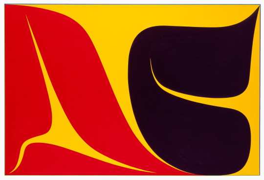
Robert Davidson, Xyaalang (Dancing). Acrylic on canvas, 2013. Photo: Kenji Naga
The new Robert Davidson show at the Art Gallery of Hamilton is called Expanding the Circle: Robert Davidson and the Ancient Language of Haida Art. Careful attention should be paid to that subtitle, as there is more Haida art than there is Davidson work, and by sheer numbers, much of the work is tourist carvings from the McCord collection. If one was expecting something similar to the big retrospective of Davidson’s paintings at the Seattle Art Gallery a few years ago — an exhibition which positioned him as a significant modernist figure whose formalism re-aestheticized a complicated set of Haida/Tlingit narrative traditions — they would be disappointed.
In Expanding the Circle, figuring out what is traditional work, what is work intended for indigenous audiences, what is tourist work, and what is work inspired by these traditions but updated are unresolved questions. The Seattle retrospective made the argument that Davidson updated Haida tradition in an abstracted, European sense. The ongoing problem of what indigeneity means visually is complicated in this space but is less interesting than the show in Seattle, or the recent exhibition of Michael Nicoll Yahgulanaas’ Haida Manga at the Glenbow in Calgary, or Beat Nation, the Indigenous hip hop show that was shown at both the Power Plant in Toronto and Musée d'art contemporain in Montreal. Each of those made arguments about tradition and history; Expanding the Circle does less of this contextualizing.
Haida work from the 19th century was absorbed by tourists. From that point onward, the intersection between work intended for western audiences and work intended for the Haida could never really be sorted out cleanly: the colours, the anthropomorphized sweetness of the shapes, the fleshy curve of spoon or bentwood box, the overwhelming size of the totem pole. Haida and Tlingit work was sometimes made for white audiences, and sometimes made for use in indigenous circles. Sometimes it was intended as a ritual object, and sometimes it was intended as a tchotchke for settler consumption. The stone carvings of totem poles when intended as tourist pieces were not intended to be read as ritual objects, as opposed to the large poles made from cedar which were taught as a kind of narrative. Often these totem poles were torn down by white settlers. Some of their ritual practices, including potlatches, were forbidden by law. Children were sent to residential schools. Coastal first peoples were encouraged to make tat for tourist trades. Finding a clear route between all of these ways of creation continues to be confusing — about what is art and what is ceremonial, or which work is intended for white audiences and which audiences are intended elsewhere. The ambivalence of all of this is made especially murky when considering contemporary Haida work— work that can be seen as possible abstractions of abstractions.
Davidson’s absorption of a visual style, in the second or third generation after 19th century settler encounters, could be seen as an attempt to make these complicated aesthetic discussions more precise, to list the rules of the games being played, and to formalise a flirtation with western sources.
Davidson is a fourth-generation Haida/Tlingit ritual artist: he carves, paints, and draws. His work is very much about the revision of ritualized potential. Davidson makes clear that the shapes he uses are their own kind of language, such as how the circle of the moon and the oval of an Orca’s eyes could translate across media: in cedar, bronze, acrylic on canvas, or argillite. This is especially true in 2006’s Red, a cedar carving slightly larger than a piece of foolscap, where two eyes are painted on a rectangular board. The board curves and buckles, so both the circle of the eye, and the whorl in the wood have a mutually-reinforcing formal relationship. That Red is installed next to a bronze statue of an Orca tail, which plays with a similar kind of encircling flatness, suggests a curatorial rigour.
However, the rigour often fails. The show has too many small pieces in too many small rooms. There are works intended for ritual practice such as spoons and baskets, a simple bent wood box and an excellent mask, but also a variety of tourist pieces, including dozens of models of totem poles. The show came from the McCord in Montreal, and unlike the aforementioned retrospective in Seattle, the absence of quality material is clear. The exhibition includes too many tourist pieces, too few masks, and could have featured more of Davidson’s signature prints. Even including the work of Haida artists a generation post-Davidson, such as Sonny Assu’s billboard-sized commission for Supercrawl last year (an ironic graffiti reclaimation of Emily Carr’s westernized Haida forms) might have provided a path into Expanding the Circle, which has too much to see, and not enough to analyse.
Anthony Easton is a writer, artist, and theologian. They are interested in class, sex, gender and the west. They have been published in Spin, The Atlantic, Pitchfork, Globe and Mail, and others. They have presented at conferences throughout North America, and in Europe. Their art has been shown in Toronto, New York, Chicago, and is in the collection of the library of the National Gallery of Canada. They will start a PhD at the University of Aberdeen in 2017.
#criticalsuperbeast#hamont#artcriticism#anthonyeaston#robertdavidson#agh#artgalleryofhamilton#haida#tlingit#sculpture#painting#sonnyassu#indiginousart#firstnations
9 notes
·
View notes
Text
Critical Superbeast 2016 - 2018
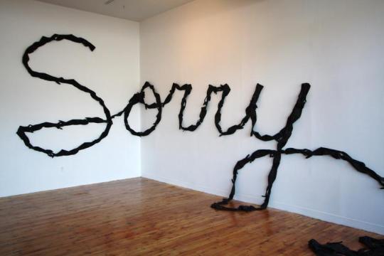
Critical Superbeast was an online critical writing forum based in Hamilton, Ontario, from 2016-2018. Through (mostly) weekly posts, various writers covered the works of artists from the local scene and beyond, including exhibition reviews, thoughts on visual culture topics, studio visit musings and more. It was founded by a group of arts workers and artists in Hamilton.
We felt the need for more critical dialogue in this city, which is increasingly enlivened by working artists. An editorial board was struck not to vet content but rather to coordinate the logistics of a rotating group of writers and editors, handle our call for submissions and organize the content for the blog posts. Facebook posts reached anywhere from 150 to 1000 readers. We’re proud of what was accomplished: the attention brought to the art scene and the hard work of artists (who often toil away without much public feedback), plus the encouraging occasion for writers to conceptualize and deliver a piece to be published.
The group has now wound down due to various other commitments on the part of the organizers. Rest assured that the commitments are all still heavily related to art creation and/or criticism. But we are all proud of what was accomplished with Critical Superbeast:
Forty-four essays written, covering the works of emerging and established Hamilton artists, plus a few living further afield.
Writers were all volunteers, and most of them played an administrative role at some point as well. The list includes: Jen Anisef, Gabriel Baribeau, Melissa Bennett, Aimee Burnett, Tara Bursey, Greg Davies, Anthony Easton, Tor Lukasik-Foss, Jeremy Freiburger, John Haney, Daniel Hutchinson, Amanda Jernigan, Emma Lansdowne, Ingrid Mayrhofer, Sally McKay, Sylvia Nickerson, Caitlin Sutherland, Karen Thiessen, Svava Juliusson, Alana Traficante, and Stephanie Vegh, (Apologies for any omissions).
Artists covered in the writings include: Jennifer Angus, Heather Benning, Katinka Bock, Danny Custodio, Robert Davidson, Erika DeFreitas, Levine Flexhaug, Andrea Flockhart, V. Jane Gordon, Laine Groeneweg, John Haney, Joseph Hartman, Catherine Heard, Thaddeus Holownia, Michele Karch-Ackerman, Sean Kenney, Suzy Lake, Elad Lassry, Steven Laurie, Trisha Leigh Lavoie, Claudia Manley and Liss Platt, Nancy Anne McPhee, Martin Messier, Sylvia Nickerson, Hélio Oiticica, Vicky Sabourin, Giancarlo Scaglia, Judith Scott, WhiteFeather, Benita Whyte, and Marlene Yuen; plus more in various group exhibitions such as Art Spin’s first venture in Hamilton.
Rest in peace, ‘Beast.
[image credit: Andrew McPhail, Sorry, performance and text piece with rubber gloves, 2009-ongoing. Installation view at Artspace Peterborough, 2011. Courtesy of the artist.]
#jenanisef#gabrielbaribeau#melissabennett#aimeeburnett#tarabursey#gregdavies#anthonyeaston#TorLukasikFoss#jeremyfreiburger#johnhaney#danielhutchinson#amandajernigan#EmmaLansdowne#IngridMayrhofer#sallymckay#sylvianickerson#caitlinsutherland#karentheissen#SvavaJuliusson#AlanaTraficante#stephanievegh#hamilton#art#criticism
1 note
·
View note
Text
Joseph Hartman The Artist Studio
Art Gallery of Hamilton – Jun 17 - Dec 31, 2017
By Anthony Easton
It is understandable why Melissa Bennett and Alana Traficante curated Joseph Hartman’s photographs of artist studios at the Art Gallery of Hamilton. They are gorgeous prints, and tell interesting narratives about Canadian art, how it is made, and where it is constructed. Hartman is also local, the son of John Hartman, the legendary Hamilton painter. Considering Hartman’s 2016 show at the McMaster Museum of Art featured Hamilton landscapes, working on both a smaller (as in an interior) and larger scale (studios from BC, to Nova Scotia; from Kinngait to Toronto) suggests movement as an artist.
This is a crowd pleasing show: the c-prints printed well, the compositions elegant, and the regional variation well constructed. Hartman’s technical skill as a photographer is unparalleled. There is also something engaging in seeing an artist studio, for those for whom it is not a regular occurrence. Not only does it say something interesting about the methodologies of creators, it offers a certain, Wizard of Oz, peek behind the curtain quality.
Even as someone who has worked as an artist, who has written about art, and curated–who has been welcomed into studio spaces as places to do business and to socialize–there is a distinct thrill to seeing the small details of artists’ lives: an old fashioned slide projector in a basket below Mary Pratt’s easel; the elegant light of a late Yukon summer floating through Joseph Tisiga’s outdoor studio, or the old fashioned CD player on the edge of Tim Pitsiulak’s large desk. The work holds up.
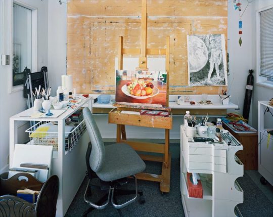
Mary Pratt, Chromogenic Print. 2014
But part of that holding up adds to the complications of what it means for a visual artist to make work in a very specific space, especially in the space of a dedicated studio. These images have obviously been stage managed. The work that is half completed, or is pinned up on the walls, are very much intended to tell stories, but the stories could do with more nuance. The work made in Kinngait, for example, is a large diptych, with Tim Pitisiulak on one side and Shuvinai Ashoona on the other. The statement next to the photo suggests that he chose to present this as a diptych because of the collective nature of the studio. But these works were printed digitally and having them as two prints, as opposed to a larger print, might function conceptually better, as an example of two artists sharing both physical and psychic space (a stated goal of this work).
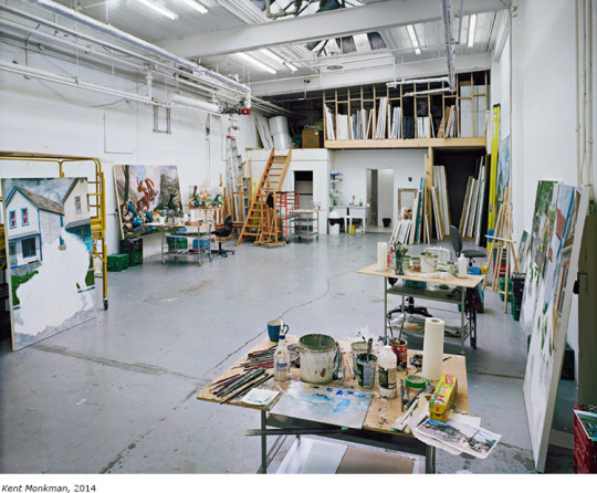
Kent Monkman, Chromogenic Print. 2014
I am also curious about how few people are in some of these shots, and by extension, what it means to represent an artist as a singular producer of a work, when it is an open secret that much well known contemporary painting is done by assistants, or interns. When seeing a half painted work in Kent Monkman’s studio, what does it mean when we just read it as a Monkman? When seeing work in Robert Davidson’s gorgeous cedar studio, what does it mean when we do not note the fabricator?
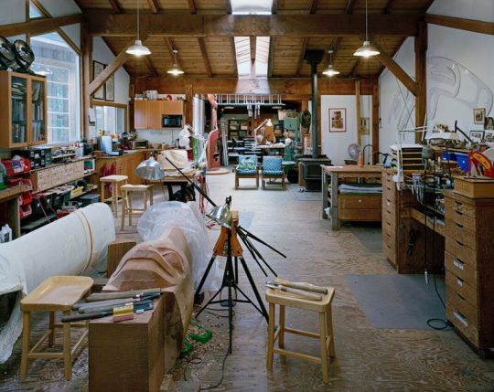
Robert Davidson, Chromogenic Print. 2014.
I know the arguments – about renaissance studios, drapery painters, the post identity of art after Duchamp. I know I am naive to think that all artists work alone, or that seeking help from studio assistants or fabricators dilute the creator’s singular vision, but these photos compound the romantic nature of studio spaces, both by ignoring complicated questions of authorship, and by extending the myth of a singular painter alone in their garrett (an idea further propagated by how many painters Hartman has chosen to depict).
These depictions often ignore the possibility of performance work, internet art, post studio art, or work that is done at home, or by guilds or unofficial collectives. I wonder what Hartman would do with the practices of someone like Jess McCormack, now teaching at Emily Carr, whose work is largely digital, as much about emoji laden memes as it is about paint on a canvas; or the gif work of Toronto artist Lorna Mills, whose international reach and post-material skills should be rewarded with a retrospective.
The work is elegant enough, and art adjacent enough, printed with a material sheen perfect for corporate collections or condo lobbies–thus, blown up big. But seeing them on his Instagram (https://www.instagram.com/jhartmanphoto//) or seeing them in the handsome, accompanying catalog had as much of a visual punch as seeing them as prints, framed on the wall. They are excellent photographs, both as aesthetic objects and as clues to how art is practiced now: limited in their ideological way, but as material objects, they lose nothing in how they are constructed. Considering how unusually smart Canadian post-digital media is, the assumption of a show that places studios above almost anything else, can be seen as disappointingly backward seeming.
Anthony Easton is a writer, artist, and theologian. They are interested in class, sex, gender and the west. They have been published in Spin, The Atlantic, Pitchfork, Globe and Mail, and others. They have presented at conferences throughout North America, and in Europe. Their art has been shown in Toronto, New York, Chicago, and is in the collection of the library of the National Gallery of Canada.
#criticalsuperbeast#artcriticism#anthonyeaston#josephhartman#artiststudio#artgalleryofhamilton#kent monkman#mary pratt#robertdavidson
0 notes
Text
Raising Kain
The Living Room: Self Made at the Art Gallery of Hamilton, June 17 - October 15, 2017. Hamilton, Ontario.
By Anthony Easton
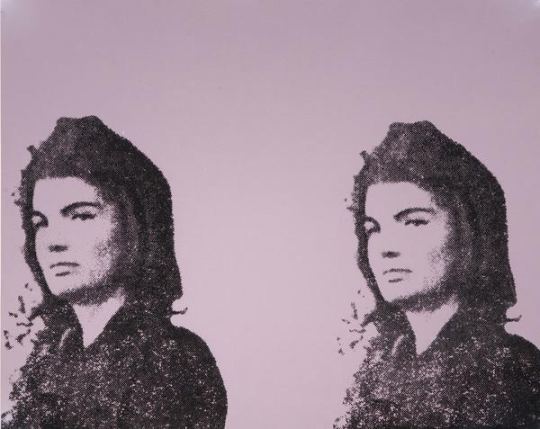
Andy Warhol, Jackie II, 1966. Screenprint on paper, A/P. Collection of the Art Gallery of Hamilton. Gift of Dr. and Mrs. Harold J. Hoffman, 1984. Image courtesy of the Art Gallery of Hamilton.
“Bad taste is real taste, of course, and good taste is the residue of someone else's privilege.”
― Dave Hickey, Air Guitar: Essays on Art and Democracy
The Art Gallery of Hamilton has turned one of its galleries into something called The Living Room. It is intended to be a social space, with a rotating collection. Right now, in it, they have put up three Warhol screen prints, which function as an essay on taste.
One is a double Jackie Kennedy on newsprint; one is a Marilyn on newsprint. The Jackie doesn’t mean as much as the larger ones: two Jackies instead of twelve; black on brown paper instead of black figures on a blue colour field printed on canvas, small size instead of epic scale. The quick and dirty quality of this small Jackie avoids the genderfucking of some of the other Jackies, like the Jackies whose mourning veils look like Wilgefortis beards. Warhol was epic, Jackie was epic, canvas is epic. Even divided, they function as a Mater Dolorosa for an America about to lose innocence. The smaller double print does none of the heavy lifting.
The Hamilton Marilyn is also on newsprint. Drag-ish pink lips printed separately from Monroe’s face– none of the subtlety, none of the care. The material lessens any attempt to push forward ideas of taste. It doesn’t make Warhol any more famous, and it doesn’t make Marilyn any more famous. It’s not even interesting in a vulgar way, like the green on pink ones that were done a few years later.
While these two were facing off, another was placed behind a half wall like a shameful secret.
It screamed Warhol. Jackie and Warhol compound each other’s fame. Marilyn and Jackie compound each other’s aesthetics. They require a kind of mutuality. The 80s Warhol portraits are all about the fame and aesthetic of Andy; they do not push against anything but his personae. Cultural critic Wayne Koestenbaum has tried to defend these works, and art historian Robert Rosenblum’s introductory essay in the book Warhol Portraits has talked about them. When he has something to paint, 80s Warhols have an unapologetic camp vulgarity where pure material pleasure obliterates less corporeal pleasures. His Dolly matches camp step for camp step; his series on living queens has a post-queer wink-and-nod; his Blondie is sexy; his Drag Queen series is properly tawdry.
The Karen Kain portrait behind that half wall does nobody any favours. There is a reason why it is almost hidden. Bob Colacello’s biography of Warhol, Holy Terror, tells about how Warhol would corner vain and insecure women to do portraits, and he would offer them excess. If they wanted more colours, it would cost more; if they wanted glitter, it would cost more; if they wanted more than one variation, it would cost more.
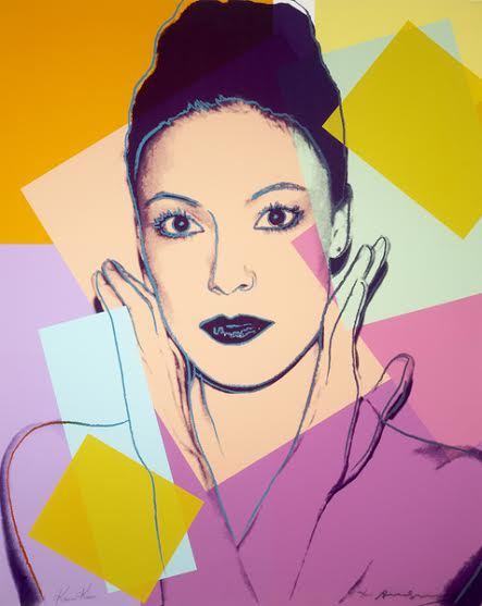
Andy Warhol, Karen Kain, 1980. Screenprint on paper, ed. 46/200. Collection of the Art Gallery of Hamilton. Gift of William S. Hechter, 1987. Photo courtesy of the Art Gallery of Hamilton.
I have no idea who paid for the Kain portrait initially, but it is a four-on-the-floor, super luxe, Cadillac of mid-1980s Warhol vulgarity. 10 colours. Glitter eyeshadow. Glitter lipstick. Highlighting around eyes, hairline, nose. It is an artful example of insecurity: Warhol worried about losing his skill or his fame, and spurted virtuoso excess to prove that he was capable of doing something– anything– new, while ballerina Kain wanted to prove that she was a worthy subject of the artist. Kain was not as famous as other New Yorkers; many of the portraits that Warhol did in the 80s were arriviste or b-list people who did not know how to properly operate in worlds of moneyed taste. In this portrait, artist and subject collide in an upstairs/downstairs moment.
Warhol had great, complicated, theoretically-viable work in the 1980s. It is churlish to judge an artist by their worst work. But Canadian museums and galleries are filled with third- or fourth-rate Warhols. Bought by dentists or doctors, donated to cultural institutions for the tax breaks, Warhols like the Gretzky at the Art Gallery of Alberta are worse than the Kain, mostly due to the lack of glitter. There are six of Gretzky, with each print run numbering hundreds more than the Kains.
But vulgarity is compelling. Luxury is compelling. Sumptuousness is compelling. Being out of fashion is compelling. Committing to complete bad taste is compelling. The worst work by the best artists can tell us something interesting. How we collect can tell us something. This Kain is compelling.
The 80s work of Warhol’s that has been redeemed by critics include prints from the series The Shadows, which are about death, paintings made from piss-oxidized copper, which are about abjectness, and his polaroids, which hold their vulgarity in a tight and tiny little ironic package. The big, whorish, 80s work is still embarrassing. In our hyper-capitalist world, being gauche about money is still considered in bad taste, but not in a slumming, winking style of bad taste. Warhol called this art business art. It was supposed to be about making money, and it did.
This work is so ugly and so vulgar, it is without redemption. Money is toxic, and work so purely about money is toxic. This print is an example of the aesthetic value of capital, but it is a seductive one. Liking things that are bad for you is a good time.
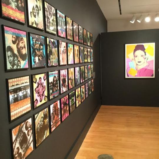
Installation view of The Living Room, Self Made: Stylo Starr’s 89 Dames with Warhol’s Karen Kain at right. Photo courtesy of the Art Gallery of Hamilton.
These three Warhols are in the same room as local Hamilton designer and artist Stylo Starr's 89 Dames. A collection of prints of African diasporic "glamour stars" from the 1950s and 1960s, Starr's work is different than Warhol, and I am not quite sure it is derived from Warhol's work. Starr's 89 Dames are screen prints that kind of look like Warhol's work but lack Warhol's flatness, with collaged lace around some pieces adding complicated texture. They do not play with problems of fame.
Most importantly, even with his Marilyns or Jackies, Warhol's work was always more news than history. Starr's screen prints depict people from the 1950s and 1960s. The choices Warhol made were choices of the market, while the choices that Starr makes are more intimate. Her work develops a canon not so much from the world, but against the world. Lastly, the tension of class and taste in Warhol and the camp self-awareness of the Starr pieces are gorgeous, but prove that bright, or even clashing, colour and patterns can be in good taste. The vulgarity and fame of Warhol does a disservice to the political, subtle, tenderness of Starr.
While the Art Gallery of Hamilton seems embarrassed by that Kain, it reminds me of an Elizabeth Taylor story:
Liz was having dinner with Princess Margaret, and was wearing one of her diamond rings. The diamond on this ring was extravagant. Margaret called it vulgar; Taylor asked if she wanted to try it on. After Margaret put it on, Taylor said “it’s not that vulgar now, is it?”
I feel that way about the Kain: so much to hate about it, so much to think about, so many ways that it is completely wrong.
But, trying it on, it’s not so vulgar, is it?
Anthony Easton is a writer, artist, and theologian. They are interested in class, sex, gender and the west. They have been published in Spin, The Atlantic, Pitchfork, Globe and Mail, and others. They have presented at conferences throughout North America, and in Europe. Their art has been shown in Toronto, New York, Chicago, and is in the collection of the library of the National Gallery of Canada.
#criticalsuperbeast#hamont#artcriticism#anthonyeaston#artgalleryofhamilton#selfmade#thelivingroom#andywarhol#screenprints#jackieo#marilyn#karenkain#stylostarr#portraiture#taste#aesthetics#camp#celebrity#printmaking#mixedmedia
0 notes
Text
Wrestling with Vernacular Print
By Anthony Easton

Wrestling showcard from Hatch Show Print. Photo courtesy of the author.
I spent most of this month throughout the American South. It included a stop in Nashville. I write about, and love country music of all varieties, and so going to the Country Music Hall of Fame was a must. The Hall of Fame includes Hatch Show Print, and for an extra twelve dollars, you can have a tour of the print shop.
Hatch has been around for more than a hundred years. It is still a going concern, printing posters for clients, large and small. It’s also surprisingly affordable. The smallest run is 100 prints, maximum three colours, for about 400 dollars. The tradition of a jobbing print shop is something Hatch exemplifies. Hatch argues for a continued tradition of hand printing, and that they are doing work now that is similar to work they were doing a century ago. Being in the Hall of Fame, and even how they make prints, suggests a more rarified atmosphere. This might not be the case.
They still make gig posters for most of the big acts that come through Nashville, and they make posters for clients ranging from fried chicken restaurants to politicians. The posters they make have a continuity of aesthetics, and a form that is familiar. Walking around Broadway, the tourist neighbourhood of Nashville, Hatch prints are framed in most of the honky tonks and bbq joints. The fonts, photo-reproductions, and a retro style from the 1950s is immediately recognizable. They are made with care, and have a gorgeous, hand-hewn look. But, we cannot argue that they are making museum pieces, and that the hand-hewn look continues the tradition, but the look often does not move past the 1950s. Traditions renew, but these seem a deliberate simulacra of a historical form. The posters they make are intended as collector’s pieces, hocked at merch tables. The fried chicken restaurants are Kentucky Fried Chicken more than the small shacks dotting East Nashville. The posters of politicians are as likely to be Anderson Cooper than Roy Acuff, a ready symbol for the representation occurring over the real.

Elect Roy Acuff Governor Poster (reproduction), Hatch Show Print, 13 1/2" x 21 1/2". Image found on the Country Music Hall of Fame and Museum online store.
The tension between the local and the international, or between actual Nashville and the idea of Nashville, can be seen in their Roy Acuff posters. Acuff was a country music star from the 1930s to the 1950s. When he attempted to run for governor, he commissioned a poster from Hatch Print. Those printings kept the company in business. The failure of Acuff’s campaigns were successes for the print shop. It is a ready metaphor for Nashville (or at least Music Row) being thought of as a one industry town. It didn’t matter much if Acuff was successful as a politician or a musician, as long as he was commissioning work from Hatch. Commissioned work required a constant churning, it was work that rested on both an immediacy and an ephemerality, literally a business model that thought of itself as trash. The print shop tour told stories of old printing blocks being used for drawers, that the hand-carved blocks were repurposed after having lost their use.
When Hatch moved from Broadway to the Hall of Fame, a model which rested on this churn of ephemeral product ended. It was replaced with a model which prioritized making the ephemeral archival. So, they would break apart the shelves, returning the blocks to printing, and by extension prioritizing a historical form. For example, when a concert poster would be discarded after a show, now it was carefully framed. This move to an archival understanding, is useful—a gorgeous print of FDR from his first presidential run is now reprinted. I am glad that we have that FDR form, but I am conflicted in the ongoing problem of the ephemeral.
It would also talk with some amount of shame, about how in the 1970s, the shop would print wrestling posters for regional promotions. But, those posters are sold in the gift shop, so the shame cannot be that deep. I am not quite arguing against preserving that which has been thought to be disposable, but recognizing that a tension exists in this recreation of historical forms. Buying a twelve dollar reproduction of a 1970s poster, in one way helps Hatch keep printing, but they print material that is either historic, or retains enough of the aura of the hand printed that an authenticity loop retains like a perpetual motion machine. It begs the question: How does Hatch prevent doing museum work in a literal museum?
The problem of this authenticity loop comes not only from the product, but from the material culture in which they are produced. The machines at the Hatch Show Print are at a minimum fifty years old. They have to be cared for, and one of the ways to care for them, is to make sure that they continue to be used, otherwise they will decay. But in this act of preserving, and renewing, means de facto, that they are historical work. It is one of the central paradoxes of contemporary craft, imbued with a century of modernism. Looking at Hatch, one is confronted by the problems of preservation, of the cult of the new, of the difference between making work for jobs and making work for art, but also, about how to keep traditions and tools alive. It is a vexed place.
The wrestling posters is a good example of this vexation, or the posters they make of clowns. These are beautiful posters—well designed, and carefully thought out. But, the rings of wrestlers and circuses are intended to be torn down, to move on a circuit from one small city to another. I don’t want to dispute the nature of these posters, to take anything away from Hatch, or other legacy printers. I think that the nature of jobbing work means you take the clients you take in order to preserve something that is worth preserving. The work-a-day, intensely practical nature of these histories is not preserved when they are formally aestheticised. This is not the collection of folk work, and it is not the curating of ready mades—it is making a new product.
But it is a product whose creation depends on a historical memory of people who are dying or close to dead. But, it is not a rarefied form either. No matter how highly aestheticized the new posters coming out of these places are, they still advertise concerts, and fried chicken, and new records. But, in order to make these new posters, they also reprint old posters. To commission a “new” poster from Hatch, is to commission not only the use of historical machines, but the cultural heritage of these old machines. After almost a century of arguing over Benjamin’s “The Work of Art in the Age of Mechanical Reproduction,” the weight of the aura here depends on the refusal of the mechanical. But, the power of that refusal occurs with the ubiquity of digital forms. The tension between the ongoing problems of that which is saved and that which is discarded is a central problem of how we remember that which we reproduce.
Thinking about this, I wonder if I am being a bit of a hypocrite. Not because I bought the posters, not because I was profoundly happy in that space, not because I think that Hatch should be preserved, and vernacular history must be kept. I collected ephemera on my trip for a friend who is a graphic designer—and the ephemera I chose were mostly pricey examples of well-considered, expensive, slightly blank work. Work whose design was foregrounded as art, and not merely as a function of craft. I wonder what happens if we think of writers and designers more like plumbers or welders, if we will retain that ephemeral sense by refusing to be precious about form.
Sometimes when I walk around Hamilton, considering how to make these forms less precious, I wonder what we will keep. Not what we will find beautiful, but what will maintain the sheen of aesthetics after the use function seeps out. What does craft look like in the digital age? Part of the reason Hatch continues to function is because people buy into the idea that the hand-made is more genuine, more real, than the digital realm. It is the place where aesthetics has a moral component. It is the reason why high-end coffee shop staff wear Carhartt aprons, one of the reasons for the farm-to-table movement, why an international chain like KFC thinks it can sell a local product (Nashville Hot Chicken) to local people using local methods (the poster but also how this chicken is made), when it is not local (this has existed for a long time, though--see the Colonel).

Immortal Kombat 5 Poster, www.alpha-1wrestling.com
Hamilton has a wrestling league. The posters are printed full colour on printer paper, and taped to light standards around town, about a month before the shows. The shows are held at halls and high school auditoriums, just as they were in the 70s. The posters are made in Photoshop, and I often see them curled in the wind, or rain-soaked to the point of illegibility. They are garish, with bright colours, odd type choices, crowded with people, sometimes difficult to read. I wonder what will happen in the next few decades, to make them in good taste. Hatch is important because it preserves blue-collar aesthetics. But, that preserving requires a significant staff and capital outlay. It even did when they were producing the original posters. Alpha-1 posters require less outlay. the shift to digital forms and digital aesthetics means it can be done not in a formal shop, but by one person, in their bedroom. The working class aesthetic has gotten more intimate, and smaller.
But that doesn’t mean that regional wrestling in Tennessee, and Alpha-1 wrestling in Hamilton do not need to have their own space, their own aesthetic, and their own histories. The presence of Hatch, should not be in opposition to a more digitized aesthetic, but a recognition of the tension between ephemerality and institutional memory; between the desire to preserve, and the refusal to allow this preserving to be nostalgia for nostalgia’s sake.
That tension might be a productive one, and and this set of questions needs to be carefully considered. I will do this considering under the watchful eye of my two wrestling posters—one taken from a light post near Barton, and one bought for 20 dollars at the end of that Hatch tour.
Anthony Easton is a writer, artist, and theologian. They are interested in class, sex, gender and the west. They have been published in Spin, The Atlantic, Pitchfork, Globe and Mail, and others. They have presented at conferences throughout North America, and in Europe. Their art has been shown in Toronto, New York, Chicago, and is in the collection of the library of the National Gallery of Canada. They will start a PhD at the University of Aberdeen in 2017.
#anthonyeaston#hatchshowprint#usa#nashville#tennessee#print#letterpress#posterart#printingpress#countrymusichalloffame#vernacularprint#class#aesthetics#wrestling#royacuff#walterbenjamin#ephemera#hamilton#criticalsuperbeast#artcriticism#hamont
0 notes