#and you can't edit text boxes after you add them on there
Explore tagged Tumblr posts
Photo
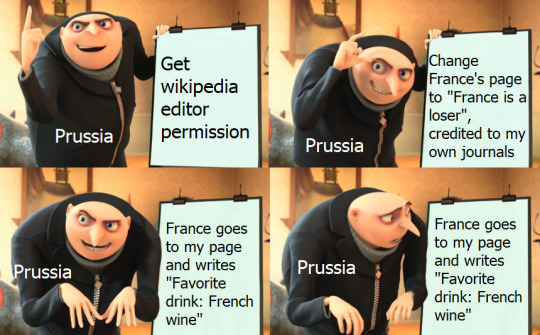
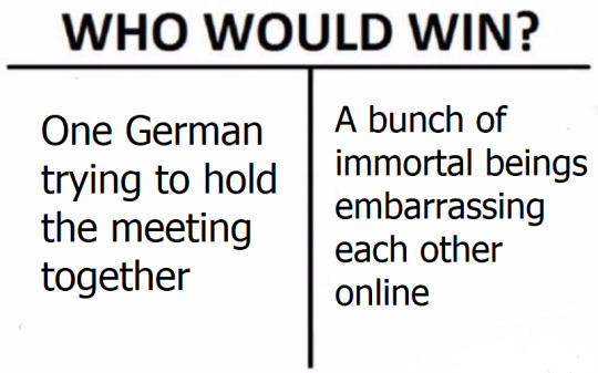


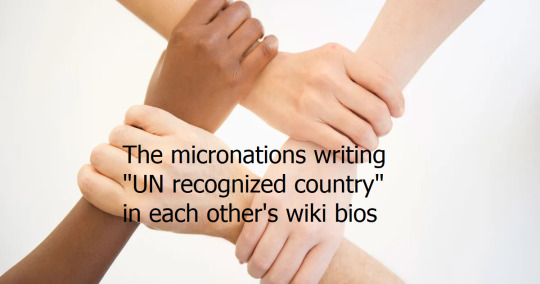
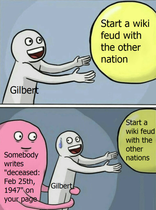
I had the idea for the in-universe memes/public nations memes that someone (Gilbert) would get Wikipedia editor permissions so he could write his own page, discover that the subject of an article cannot edit their own article, and then decide to use his new power for evil
It spirals from there
#I'm noticing so many typos#but I don't have any image editors besides Paint#and you can't edit text boxes after you add them on there#in universe memes#public au memes#hetalia memes#hetalia#hws prussia#hws america#hws canada#hws england#hws france#hetalia micronations#hws sweden#hws denmark
1K notes
·
View notes
Text
Domesticity (Evening Edition)
―Just some small, random evening moments.
Featuring: Bokuto Koutarou, Sakusa Kiyoomi, Akaashi Keiji x reader
Note: you have a daughter in Sakusa's

BOKUTO KOUTAROU
You skim the shelf for a few moments, then reach for a familiar looking package. It seems like every time you shop, there are more new varieties. It makes it difficult to keep track. "These are the ones you liked, right?" You ask, giving the box of protein bars a slight shake. There's no answer.
"Kou?" You look around, but your boyfriend is nowhere in sight. You bite back a sigh and toss the box in the cart anyway. If he can't stick around long enough to choose, he'll get what he gets. Pushing the cart along, you glance down the next few aisles. There's still no sign of him. Where would he have even wandered off to?
Just as you reach for your phone to send him a text, you feel a hand come to rest on the small of your back, and Koutarou is leaning around you to deposit something in the cart.
"Where did you go?" You ask with a frown as he sneaks his arms around you, slipping his hands into the front pocket of your oversized Jackals hoodie. "Koutarou," You add sternly as you can feel the warm press of his hands through the soft material. "We're in public."
Despite your warning, he doesn't make any move to pull away. "Just went to grab some apples," He says, hanging his chin over your shoulder. "You said this morning that we needed more, and I realized we were already past the produce, so I went back to get some."
You should really stand your ground and pull away, but you can't help it. There's no one around you to see the sudden closeness, and he was right about the apples. The warm press of his chest against your back is familiar and reassuring.
"Thanks for remembering," You say softly instead, reaching up to rest your hand on his cheek for a few moments.
"'Course," He nuzzles his other cheek against yours.
"Alright," You finally say, stepping away after savoring the moment for just a little while longer. You can hear the sound of another shopper's cart turning the corner. "Let's finish up so we can get home."
"And cuddle before bed?" He asks hopefully.
You can't help but smile. "I don't see why not."

SAKUSA KIYOOMI
You've just pulled out a onesie and are reaching for a clean diaper when you hear Kiyoomi enter the room behind you. You'd spent the last 15 minutes tidying up your daughter's room while he gave her a bath.
You turn with a smile to greet them, and a snort of laughter sneaks out before you can stop it. Your husband's t-shirt is soaked from the chest up, and there are water droplets slipping from his curls. Your daughter is babbling happily from beneath the hood of her ducky towel, oblivious to the less-than-pleased expression on her father's face.
"Oh, wow. Miyu one, Daddy zero, huh?" You ask, successfully holding back any further laughter.
"I don't think you can win bath time." He hands her over to you and mops a few drops of water from his cheek with the towel he'd slung around his neck. You lay her down and start putting on her diaper.
"Maybe not," You agree with a twitch of your lips, "But from the looks of it, you can certainly lose." He opens his mouth, then closes it with a shake of his head.
"Well, she had fun, anyway." He finally says, the slightest hint of a smile playing on his lips. "Right?" He asks, expression softening as he leans over to give her pudgy cheek a gentle pinch. She grins up at him, showing off her two and a half teeth, and he rests his hand on the top of her still-damp, downy curls.
"You're such a little stinker," He adds in the softest tone, never mind your heart that already feels fit to burst. You snap the last button on the onesie, picking her up and pressing a kiss to her irresistibly soft, freshly-washed cheek. Between the warm bath and the evident fun she'd had playing in it, she's already half asleep.
"Someone's ready for bed," You croon, then turn to him. "Go ahead and get changed. I'll put her down and be right out."
"Okay," He hums, leaning in and pressing a kiss to her forehead, "Goodnight, sweetheart," He murmurs, "I love you so much." He turns his head just enough to give you a tender kiss before he pulls away. "I love you," He adds.
"I love you too," You say softly, taking just a moment to run a hand affectionately through his damp hair before turning to put your daughter to bed.

AKAASHI KEIJI
"My love," you're woken by a soft whisper and the gentle squeeze of a hand on your thigh. "We're home."
Blearily, you turn to see Keiji in the driver's seat, and realize the car is parked in the driveway. That's funny - the last thing you knew, you were just pulling onto the highway. He's looking at you so intently that you almost feel the need to duck your head.
"Sorry, didn't mean to fall asleep," You eke out, rubbing your eyes in an effort to wake yourself up.
"It was a long day," He hums, the hand still resting on your thigh giving it another gentle squeeze. "So let's get inside and get to bed." It doesn't take much more prompting for you to follow him into the house.
You fight the warm sleepiness pulling at you long enough to change into your pajamas and brush your teeth, finally reaching for the covers when Keiji stops you. "Did you wash your face?" He asks, and you groan.
"I'll do it in the morning," You promise, turning down the covers.
"Come on," He says, reaching for your hand and gently guiding you back into the bathroom. "You'll feel better if you do it now. Here," He pats the closed toilet lid, and you obediently sink down onto it as he puts some of your cleanser on a cotton pad. His fingertips tilt your chin upwards, and you let your eyes slide closed as he begins swiping the soft pad across your face.
"Don't fall asleep," You hear him prompt as he works. You manage a hum to assure him that you won't, as relaxing as this is. Finally, you feel the press of lips on your forehead.
"All done," He says, and you open your eyes. The look on his face is so warm and gentle that something bubbles up in your chest.
"Thanks, Keiji," You say, tugging on his t-shirt until his lips meet yours. "Love you," You add against his lips.
"I love you too," He cups your cheek briefly with a soft smile. "Now, weren't you the one who was so eager to get to bed?"
You haven't forgotten. In mere moments, you're snuggled up against his chest under the covers. There's no place else you'd rather be.
#haikyuu#haikyuu x reader#haikyuu x you#haikyuu fluff#bokuto koutarou#bokuto x reader#bokuto koutarou x reader#sakusa kiyoomi#sakusa kiyoomi x reader#sakusa x reader#akaashi keiji#akaashi keiji x reader#akaashi x reader#moon writes
576 notes
·
View notes
Text
💫 HTML for pretty colors tutorial 💫
Hello sweet beans! Since my last tutorials have been yeeted into oblivion with deactivating my previous blog @/benkeibear I figured I repost them onto here! (Mind you, my old blogs are ahead)
I'm lowkey shocked to see blogs gatekeeping this knowledge but yeah. Make your blog pretty! Match your text to dividers or just have it as colorful as you'd like!
First of all, you can not do this on the mobile app! You need to either use a laptop or your phone / tablet's internet browser (in my case safari)
You start by logging into your account and either you make a post or you edit a post. I recommend making the post on the app first because editing is certainly faster & easier!
This is our starting point! For the fancy fonts you can use messletters


1. I will now log into tumblr on my web browser and click on "edit this post".
2. You then have to click on the little gear icon in the top right corner to change the settings on your post.
3. There you have to click on "rich text" to change it to "HTML"

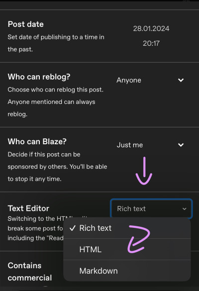
Your post should now look like this:


A quick rundown on html.
You always start with a letter or code in brackets. to end what you're doing it's </>. The slash signals the end.
P= paragraph <p> and to end </p>
I= italics <i> and to end </i>
b= bold <b> and to end </b>
Now tumblr will automatically do this for you if you made a text bold/in italics on your mobile post but to keep this tutorial simple i left that out here. You can always edit your text in the app after! Just not the color.
And as you see, the fancy text is now in coding. But we get to that later!
To colorize your text it's easiest to just use this website as it gives you lots of options!
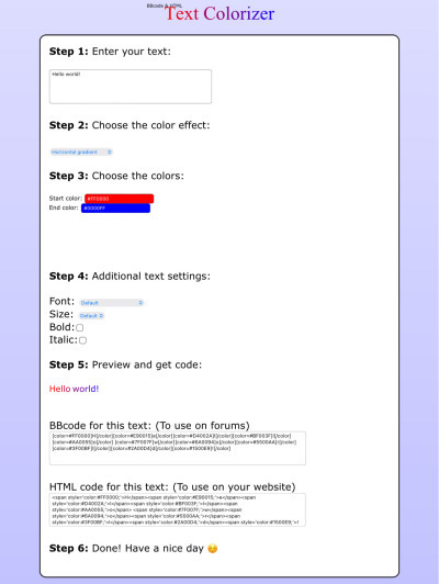
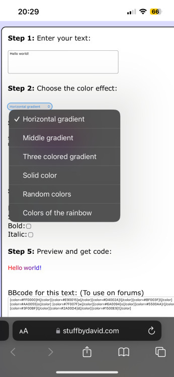
1. First i will be choosing the option of "solid color" and you can then put in the hex code of your desired color into the color box.
2. In the top box you will have to put the text you will color - for this tutorial it's "Testing"
3. Then you copy the box HTML code and paste it into tumblr where your word(s) are. Do not remove the <p> and </p> in front and after your word/ sentence!
4. For the sake of this tutorial I marked the html code for colors in pink and the words in blue
Your code will now look like this:

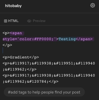
For the gradient you can simply choose horizontal gradient or three colored gradient on the website above and copy/paste the html text.
Mind you that every single letter will get its own color code now so the word gradient suddenly looks very long in html.
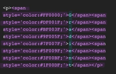

If you save the post it will now look like this!
Important to know is that you can color the fancy text only solid as the website can not color it as it is and putting the letter codes in the box above does not work either.
To color the fancy letters you simply copy the color code instead of the whole text - which looks like this:

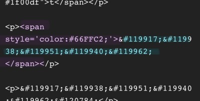
Don't forget to add </span> behind the word/the codes you're coloring to signal that this is where the color stops! If you forget to add it, nothing will be colored.
If you decide you still want to have the fancy lettering in multiple colors you have to color letter code by letter code manually like this:
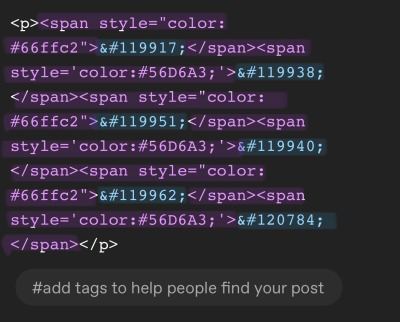

(I made a very poor choice on 2 different greens but oh well)
If you'd like to change your text, you can always do that on the mobile app like you usually would. You just can't change the color unless it's into a default color. But you can still change the size or make it bold for example.

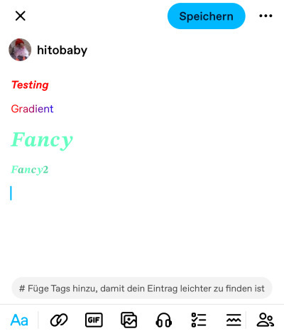
Anyhoot, this is the whole magic behind html. It's a lot and might be very complicated at first but you will eventually get the hang of it! Took me weeks and hours until someone sat me down and went through it step by step.
If you have any questions or something doesn't work as you thought it would please don't hesitate to reach out - I'm always happy to help!
#dividers by adornedwithlight#blog resources#writing resources#tumblr tutorial#html tutorial#gradient text#gradient text tutorial#gradient tutorial
120 notes
·
View notes
Text
Subtitling Tutorial
This one goes out to you @weirdosalike 🙌🏾
As a disclaimer, my program of choice is Photopea, but this is so simplistic it definitely works for Adobe Photoshop as well. The first thing to do, of course, is find the cap you want to place subtitles on.
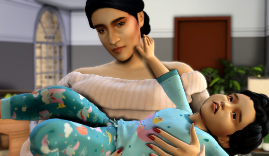
My caps are huge, so the size you want your subtitles to be is ultimately dependent on what you think corresponds with your image size the best. However, readability is everything. So, you want them large, but at the same time you don't want them to be overly big especially if you plan to have other characters speaking in the caption. (Enormous text is only what I do when I'm having characters really scream or be in an emotional state, it shows emphasis.)

Generally, my setting for text look like this. The bold thickens the text and the size works well for my images. Usually, I use white and golden colors for my speakers, but if it's a scene with numerous characters I splash color to indicate who is who.
Example:
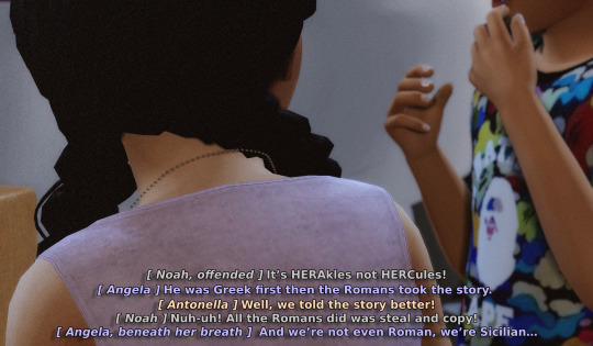
On that note, I try my hardest to choose light colors for my speakers because it can ideally show against the background well opposed to if I used darker hues. Ultimately, I don't think I'm the best at color picking so discovering what works and what doesn't work is like trial and error but for the most part? I believe that light colors are the way to go.
But let's go back to our original cap.
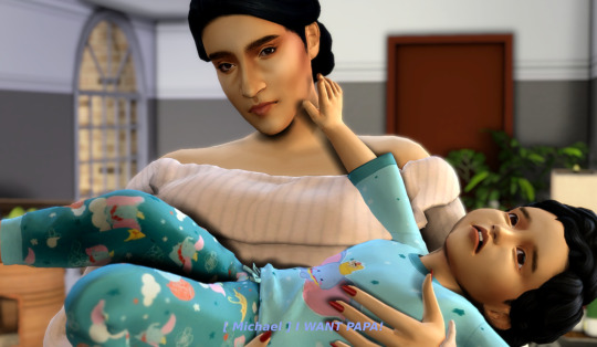
You can't read this at all! So what we're going to do is put an outline around it. By clicking the effects button you'll see this list of options
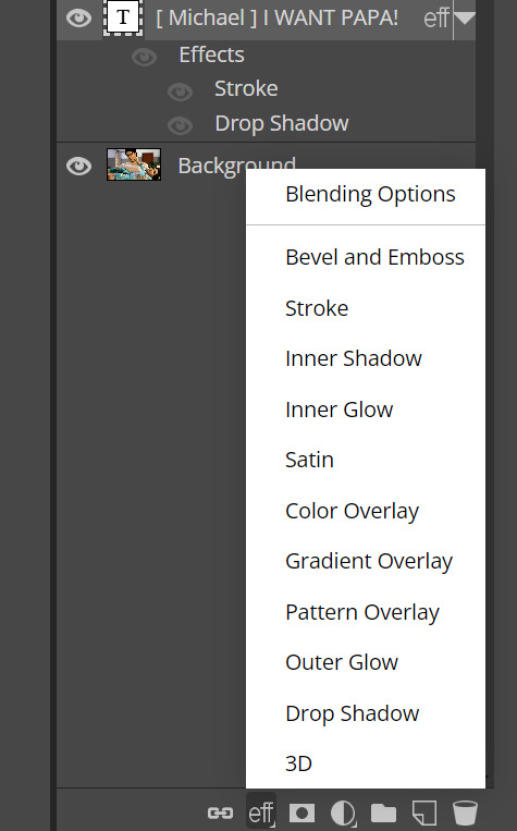
What you want to click is stroke, which will show you these settings.
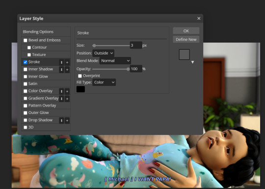
This is how the font now looks with an outline. But it's still not quite readable, so I add a drop shadow to create a contrast.
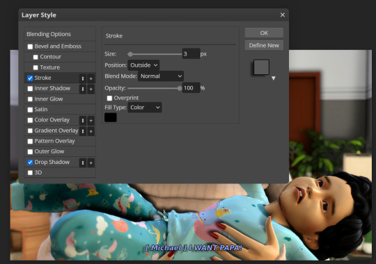
It stands out more prominently, although you may personally want the font to be a bit bigger. And after clicking okay, this is the outcome!
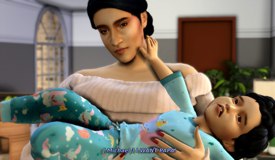
Sometimes I consider new forms of editing like having a faded black box behind the text, but I'm not fully committed to the concept. But this is the fun of editing; figuring out what works and what doesn't work! Hope this is helpful.
42 notes
·
View notes
Text
Ok! Notes from the first Orange panel at AX 2024! They were discouraging photography and video so this will just be text (mobile Tumblr hates my photos, anyway). But first, a bit of a TL;DR.
TL:DR: While they talked about Trigun: Stampede, Beastars, and their new upcoming title Leviathan, they mostly focused on Leviathan since Stampede has its own panel later. (I'm not sure about Beastars since I haven't been following the show as closely.)
Ok, on with the notes!
(Edited to add links.)
Studio Orange Presents: Beastars, Trigun, and...
The panel guests were Kiyotaka Waki (producer at Orange) and Yoshihiro Watanabe (producer at Orange and also played translator for Waki), as well as Justin Leach (producer for Eden and Star Wars: Visions).
They started off the panel by noting that exactly zero of the people on the panel (including the mod) slept the previous night.
Then they showed a sizzle reel in honor of Orange's 20th anniversary, highlighting all the stuff they've done in that time. There were a lot of cheers for Trigun, Beastars, and Land of the Lustrous in particular.
After the reel, they talked briefly about the history of Orange, how they'd gone from animating mecha for other people's shows (like they did for Evangelion and Code: Geass) to doing entire properties themselves. They're particularly proud of how their studio has grown from 4 people to... I forgot how many. Much more than 4. And they can now work on multiple titles simultaneously.
On to Trigun! They didn't get into it much since it's getting its own panel at the con, but they did show some pages from the Trigun Bible on Plants, and Watanabe noted he'd post them up on the bird app later today. (Edit: You can find them here.) Watanabe also said they can't release the whole Bible yet, which may just have me thinking hopefully, but hey, there's a chance! He seems to genuinely love sharing pages from it, at least.
On to Beastars! They read a thank you letter from the director to the fans, and also showed a subtitled video that I'd guess was also a thank you from someone else, but I was too far back to read the subtitles. (An ongoing problem with watching anything subbed at this con is the subs being entirely blocked by other people's heads unless you're in like the first few rows... but I digress.) They also showed a new key visual (which I'm sure is gonna be floating around social media somewhere at this point) and noted the third and final season of the show will air on Netflix in December. Waki noted he started reading the manga in 2017, and he's thrilled to get to work on a full adaptation of the story since it's rare to get to do that.
On to Leviathan! I'm gonna break this one up a bit because it's long. This is Studio Orange's new upcoming title in collaboration with Netflix and Qubic Pictures (the studio that did Eden, which was a great story overall and I definitely recommend it). They also worked extensively with the author of the original work, Scott Westerfield, who helped keep them consistent with the characters and themes.
The story is a dieselpunk alternate world WWI story about a runaway Austrian Prince named Alec who meets this Scottish girl, Sharp, on a bioengineered airship, and the relationships these people from disparate backgrounds have with others and each other.
The German/Austrian side of the conflict is a faction known as the "Clankers," who focus on mechs and technology to conquer the world via machines, while the faction Sharp belongs to is called the "Darwinists," who focus on DNA modification of creatures as a way to connect with nature.
They showed a preview of it that honestly looked really cool, but again, no recording. It had flying whale ships. Like... whales they strapped a box to and fly around on.
Orange is excited to get to "go back to their roots" with this and work on a Mecha title again, especially since this title will be theirs this time.
They acquired/absorbed (I'm not sure on the details) a team that specializes in background art for this project, and yeah, the backgrounds are detailed and amazing.
They noted a lot of animators reflect their own lives in their work, and they feel Leviathan is no exception. The international collaboration (they also have people from Europe working on this) lends itself well to a story about people from disparate cultures coming together and realizing they have more in common and more similar passions and desires than they have differences.
They'll be talking more about Leviathan at Otakon in August.
That's all for now! I'll try to update on the other Orange/Trigun panels if I get into them!
35 notes
·
View notes
Text
๋࣭⭑ Devlog 36 | 11.26.23 ๋࣭⭑
:rises from the dead: I'm.... BAAAAACK!!!!!!
Long time, no talk (kinda) everyone! I hope you've been happy, healthy, and well since we last saw each other and that the wind-down for the year is being kind to you all <3
We have a lot to catch up on, so let's do just that ^^ This is.... so long. I'm really sorry in advance tbh---I thought I hadn't done much because break, but there's quite a bit to show.

It's been a while since a formal update on the routes, so I'll start by telling you all where they officially stand. Before I do, it might be helpful to tell you all how I define percentage completion in my head. Basically, when I finish the draft of a route, I consider it 70% complete. This means I could ship it as is. I wouldn't be happy with the product, but it's playable and makes enough sense---just not the best quality.
When Wudgey finishes their edits, a route is 80%-85% complete, meaning I could ship it as is. I think it'd be pretty good actually and players would be happy. Beyond this point, I am just making fine tuning edits to incorporate more player interaction, polishing the flow of things, etc.
After that, there's basically only Elm and Vi's edits left. When Elm finishes, a route is 95% complete. Again, I think at this point, it's good. Like edits from this point onwards are purely for polishing purpose. After Vi, it's 98% complete. Then the last review comes back to Elm and I for it to be 100% complete. Right now, this is where the routes stand:
Kayn: 98% Complete
Fenir: 95% Complete
Druk: 80% Complete
Etza: 60% Complete (Still working on their draft!)
Do Not ask me about Kuna'a or Aisa LFMASOEIDJ
So most of the routes are actually looking pretty good! They're just getting bounced around to different editors at this point, but the changes made for most of them are basically small. Fenir and Kayn especially could be shipped as is in my eyes if I really wanted to.

Art recently has mostly been focused on commissions. Vui actually is almost done with ALL of the BGs for Alaris!! Isn't that crazy?? In about a year, he was able to create almost 25 BGs with daytime variations!!! He's a phenomenal artist, and I couldn't be happier to be working with him. It's also a bit bittersweet (and alarming??) to know that part of development is already close to ending! q.q
The most exciting art update I have is that we got the GUI assets finished and I've started coding them into the game!! AAAA!! These were the final updated assets I needed, and seeing the fully revamped demo come to life has been so.... Emotional HAHA! It's crazy to see how far Alaris has come from when I was first making it with my little fingies and throwing things together like paper mache. I'm incredibly in love with how all the assets look together, and I couldn't be more grateful for the artists who helped me update the assets!
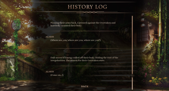
Updated History Log. Please say you like the dividers between entries---I'm most proud of those
I'm still making my way through coding everything, but here's a couple screen previews so you all can see how things now look in the game!!
First off, is the Dialogue/Choice Screen. You can see that we have a brand new dialogue box (She's Stunning) and Choice Screen! I'm hoping to add some sfx for the choices when you hover over them, and sfx for the new UI in general so there's more user feedback when you click and hover on things. But for now, enjoy this preview of the new dialogue box, choice screen, and the new personality indicators!

Updated Dialogue/Choice Screen: You can't see it as well in GIF format, but the BG also has particles floating around, so there's a tiny bit of animation going on in some of the BGs as well!!
Next, we have the Free Time Screen. I actually posted this on Twitter recently but I don't think I posted it on Tumblr! ISN'T SHE STUNNING... ESPECIALLY WITH THE NEW BGS.... I'm especially happy with the text animations that show up at the bottom when you hover over the different choices! I was inspired by a couple other devs (specifically GUI god, @siyo-koy, and renpy animation master @just-a-carrot) to start incorporating animation style elements into my GUI. And I really like how it adds a little ~something~ to the feel of everything ^^
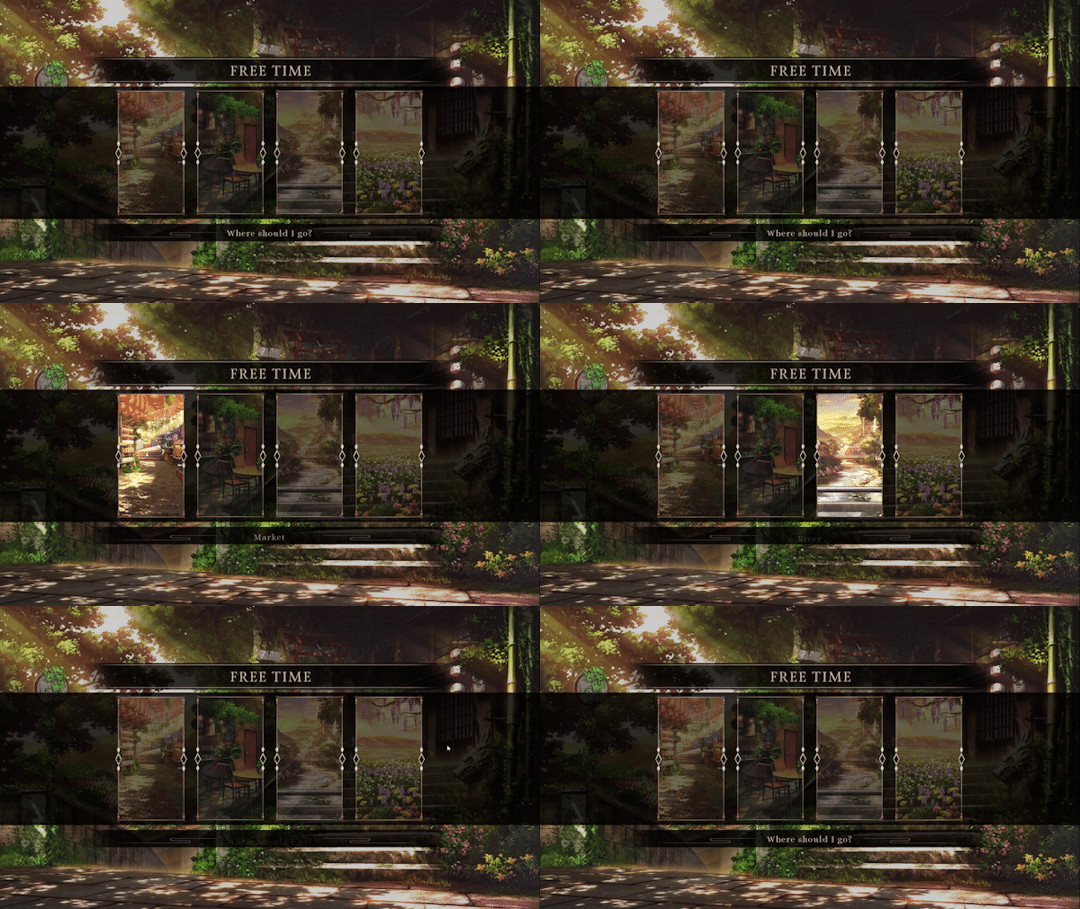
Updated Free Time Screen: begging someone to say they like the text animation so I feel validated for finangling with it
Finally, for our last preview, we have the Save Screen! While it looks new obviously with the new assets, I also did a lot of backend coding revamping for how it actually functions since my coding experience is a bit better now compared to when I was first fighting for my life figuring out save/load screens. The biggest change for you all is that there are now chapter markers so save slots will tell you what chapter that save file is from! And instead of screenshots, it's now a custom icon inside that shows the chapter card. I think it'll make the save screen look more cohesive now and hopefully more intuitive as well!!
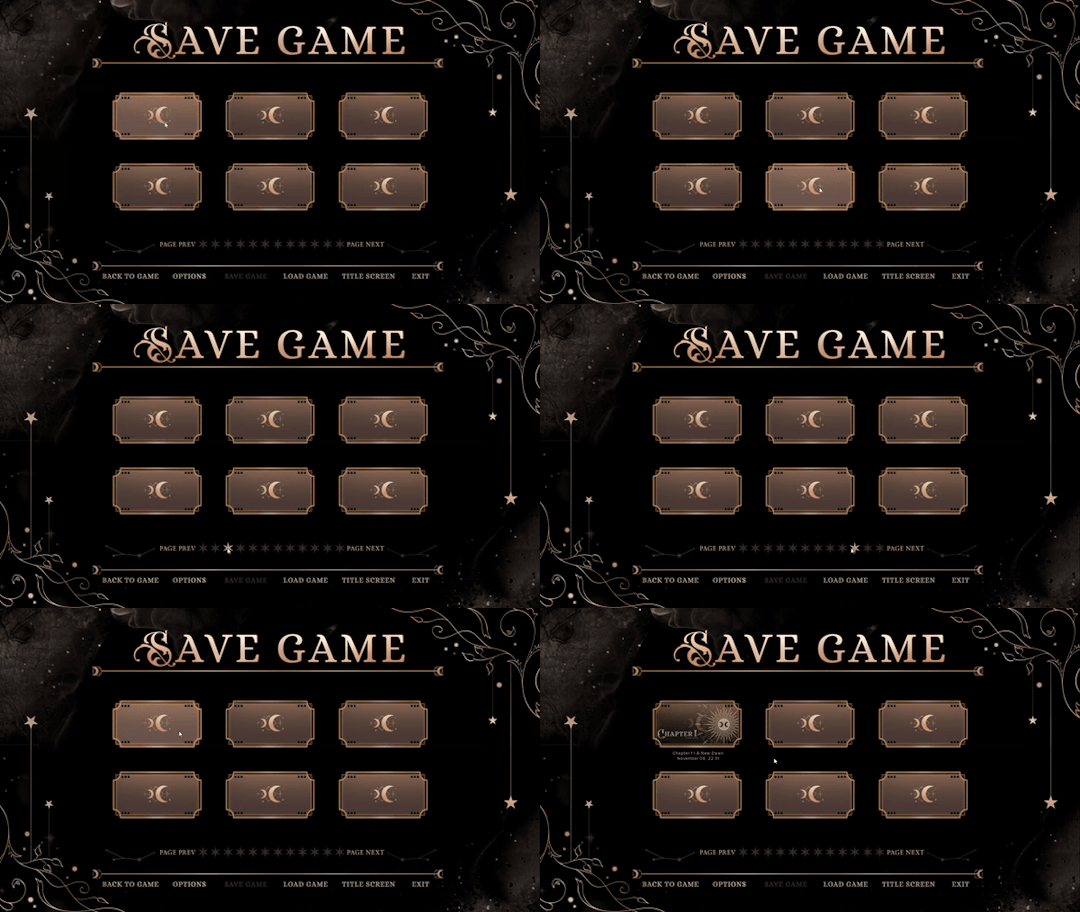
Updated Save Screen: With a sprinkle of updated Chapter Card screen preview

That was long. Are any of us surprised, considering I had two months' worth of devlogs piled inside of me, begging to burst from the seams?
Anyways. Only two miscellaneous updates. One is that all soundtracks have been completed for Alaris! Peter finished the last of them recently, and they're all beautiful!!! For ppl who love piano soundtracks... :holds hand in piano lover solidarity:
Other update is that I finally fixed that godforsaken sprite bug that was associated with the energy vision feature from the demo!!! FINALLY!!! AFTER.... SO LONG. Extremely huge thanks to @robobarbie for taking time out of their day to do that; everyone please say thank you!!!!! OGs know how long that bug was bothering me!!!! Robo also gave me a pretty new rain code, so I'm showing you how both look in the new demo so you can appreciate them with me!!
Last miscellaneous update is more on a.... logistical development level?? Basically, now that I have new GUI assets to code, that means I can get a beta build of the routes currently written out. I was feeling really overwhelmed by that idea because most of this year has been focused on writing and making assets, not really coding. Knowing that I can Code and get Playable Builds out to people was stressful because I have to divvy up my time a bit more.
After an extremely insightful talk with beloved and admired Esh of @steamberrystudio I decided I'm probably going to be shifting how development goes from here on out. Instead of focusing head low on getting as many words written for the remaining routes everyday, I'm going to be making smaller but consistent progress and spend the rest of my time coding so that I can have more of a continuous cycle of production going on (e.g., writing a bit, making playable builds, gathering playtester feedback, etc. instead of doing each stage in blocked, sequential order).
I'm mainly telling you all this because it means writing updates will probably seem slower from this point on, but I think production overall will be more efficient because of it! This is also exciting news for playtesters and/or early access backers/patrons because it means you'll have playable content in the near future for content outside of just the demo :')

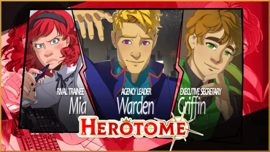
have u all heard of wudgeous of herotome. of course u have. they r all i talk about at this point
No market research because I've actually been addicted to BG3 LFMAOLSDJF. Actually, I'm taking some inspiration from it for the personality mechanic but eh.
On a more important note, @herotome demo is coming out December 2nd!!!! PLAY IT WITH ME. Wudgey is my editor, so you might think I'm biased but I'M NOT!!! I WAS A FAN OF HEROTOME BEFORE WUDGEY EVEN WORKED W ME!!! They have an exception eye for detail and player experience, and they are actually one of the devs that inspired me to even get into game development.
I just know the demo is going to blow everyone's socks off. OG Herotome prologue build fans know exactly what I'm talking about. Please mark December 2nd on your calendar---you will not regret it.
This was so unbelievably long, but I hope it's appreciated since there was no real devlog update for a hot minute. As always, Thank you all for your patience and continued support. With the year ending soon, I'm getting wrapped up in my feels in usual Crescence fashion. I am a Cancer so no one is surprised.
Next month will probably be more of an end-of-year devlog rather than the usual format. I know the devlogs of late have been all over the place, but once we get into the new year, it will be back to business as usual! Hope you all have a wonderful end to your year; I'll talk to you soon! <3
#alaris#devlog#bitches don't stop talking#aka me i'm bitches#also why did i shout out so many devs in this devlog#usually its like only one#that one being seyl of ravenstar games who i share a codependent relationship with#SODIFJ
87 notes
·
View notes
Text
On culture-specific gender words
I just had a bit of a ramble about this topic in the latest progress report, and I'll repeat it here for context.
I've been reading the feedback as it comes in, and based on some of that feedback I've been pondering the issue of culture-specific gender words. It's a very difficult issue, because:
If I add an umbrella term like "culture-specific gender" I feel like that won't help as much as people think. I think when you get right down to it there isn't a strict line between a general gender word and a culture-specific one.
I think a lot of people will check that box that the feedbackers were not intending, because when you get right down to it every term is culture-specific really, isn't it?
Marginalised groups relating to culture/region are by their nature fewer in number, which also means that their gender words are very unlikely to be entered frequently enough that they'll end up on the checkbox list.
The checkbox list is just a list of the most commonly-entered words, to make data-processing easier, but to an extent that creates a self-fulfilling loop of culture-specificity - people in marginalised groups come to the survey, don't see their genders in the checkbox list, immediately feel out of place, and check out again. Then their gender words are never anywhere near the top of the list.
So maybe it doesn't feel like the right approach to modify the checkbox list, but maybe the design of the survey can be improved to help people from marginalised groups feel more welcome and to encourage them to type in their culture-specific gender words, to address that bias.
This is something that comes up year after year, and it's always niggling at me, and I would really like to find a solution that feels satisfying! So, I'm thinking about it, and I will keep thinking about it.
Shortly after posting it, I updated some of the text on the front page of the survey a little bit. The previous wording had never sat right with me, and I realised that I could feed two birds with one scone.
Original wording: "As far as we know, most people fit tidily into one of these categories: [gender binary man/woman descriptions]"
New wording: "According to the white Western model of gender called the "gender binary", everyone fits tidily into one of these categories: [gender binary man/woman descriptions]" [See edit, below!]
I didn't announce this, but less than an hour later I got this in the feedback box:
"Not a complaint about the survey itself; Just wanted to say that dropping something like "white Western model of gender called the "gender binary"" maybe isn't the best idea. Not to mention that it's completely false. You probably only meant it as a joke or were trying to be edgy, but maybe think about what you're actually saying/writing beforehand."
I obviously can't take it into account or act on it at all, because they haven't given me any information about what's wrong with what I said or any corrections, they're just being passive-aggressive and ~vaguely ominous~
So I'm posting this as an example of the kind of feedback that has literally zero effect, and I'm inviting some feedback that is more informative and useful. How do you know a statement that I made is false? Why isn't it the best idea? In what universe is it "edgy" to point out that maybe the binary model of gender might not be universal in a survey aimed at people whose genders don't conform to the binary model of gender? I need multiverse co-ordinates, people!!
Anyway, obviously Tumblr is terrible for messaging, so the best way to send me feedback is to reply to this post (because it's all in one place), but if you want to contact me less publicly you can email me: hello AT gendercensus DOT com. For obvious reasons I am more interested in your thoughts on this if you're a person with a culture-specific/-exclusive gender, but basically all thoughts are welcome.
Edit, a few hours later: I've removed the "white Western" part now, because it didn't feel like a particularly constructive thing to include, and because I can't back it up with sources off the top of my head. I want to keep the introduction to just the pertinent information, as common-sense as possible.
So now it says:
According to one model of gender called the "gender binary", everyone fits tidily into one of these categories: [gender binary man/woman descriptions]
And I think I feel better about it. It implies that it's one of several models of gender, without raising it above other models, and race or region are not a factor but anyone not white or Western will hopefully read that and be reassured.
Further thoughts welcome, here or by email!
120 notes
·
View notes
Text
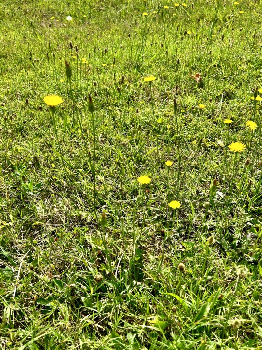
The project is simple: Dear World Rage Emotion Box. One photo, one text dump. Raw thoughts. Minimum editing. Fuck typos. Fuck perfection. No masking/curbing/appeasing. No apologies. I don't care how this sounds. Not sure why it needs to be public. I do know why this needs to be public, but maybe it always won't. Maybe I delete these ten seconds after I post them. Maybe I print them out and make fucking wallpaper. Not creating yet another account for this, either. I've officially forgotten too many versions of myself to add another.
///
Dear World 2,
You don't have to save them.
They probably don't even want to be saved.
Fact is, one of the most devastating results of abuse, neglect, and trauma is that long after it's over, you still want to become the person you thought they wished you could be. Because if you could be that person, then it would stop. They would care. They would love you.
They would understand.
But it's bullshit. The nature of abusers--no matter how deliberate or benign or oblivious or well-meaning--is that they don't care about YOU. They don't care about themselves, either.
They care about what they WANT. And what they want is a mercurial, ever-shifting target that has to do with getting back whatever they thought was taken from them. Usually by force. Typically by people just like them. However deliberately or benignly or obliviously or well-meaning.
Abuse isn't about you.
It's about them.
Which means that the person you're trying to become? The thing you most want to be? They didn't want that, either.
They didn't want you smarter, braver, less gay, more independent, less troublesome, invisible, smaller, bruised, or broken.
You weren't a person; you were a means to an end. Even if it was just for those few moments where they thought of themselves, first, instead of you.
Abuse doesn't have to take years. It can take seconds. It's a flaw of human nature that we can inflict life-altering damage with the turn of a cruel eyebrow. A harsh look. One sentence. One word.
Wrong.
No.
Shame.
Bad.
Quiet.
Stop.
Useless.
Fat.
Skinny.
Ugly.
Dumb.
Inconsequential.
It's abuse if they don't say sorry. It's abuse if they didn't know how wrong they were. It's abuse if they turned the other way. It's abuse if they let you cry and scream. It's abuse if they didn't. It's abuse if they treated you like you didn't matter one percent of the time. It's abuse if they hit you. Abuse if they didn't. Abuse if they forgot about you. Abuse if you wished they would. Abuse if it's twenty years later, they realize more than they ever have before, you talk, you let it go, and yet the feelings linger.
It's abuse if they leave you feeling like you were never going to be enough unless you became the thing you thought they wanted.
They don't know what they want. The thing they crave is power, safety, control, oblivion, silence, recognition, and to keep running and never get caught.
You can't let yourself become a product of wishful thinking.
There are one-thousand-and-one ways to apologize. All of them help balance the wrongs done. None of them erase what happened and none of them negate the feeling like you should have done more.
You can't save them.
I can't save her.
It was never my job. It was never meant to be my life purpose. I have to stop letting it put me on hold and through hell.
He did to me what was done to him and thought that words of warning would sway me to a path he never found.
She placed in me faith that could have been her own remaking.
One was dark. One was merely misguided. Both of them hurt.
This is me.
Putting that shit down.
/D
Photo: Weeds in grass. Hope springs eternal. Life finds a way. Nothing is ever useless or meaningless because everything is actually useless and meaningless. Life is not potential and purpose. It's what springs up where you don't expect it. Felt like freedom.
Also:

2 notes
·
View notes
Text
yknow making stuff to feed my milgram obsession somehow has taught me quite a bit about image editing. or at least, image editing using a program that is not quite optimized for it.
struggles with firealpaca aside, i was going through my files the other day and realized that i don't tend to share a large amount of my edits. part of that is due to the fact that many of these are parts of a larger project, so i never really considered sharing them since i want to get to the bigger thing. but another part is due to the fact that the edits are not quite up to the standard that i want them to be at, so i don't feel like they're worth sharing. but looking back at some of these, even though the edits aren't quite to par or are pretty useless, they're still alright, so here's a little showcase of some of the edits i've done thus far!

there's this pan shot in kotoko's s1 mv, and i went "oh boy! that's an easy edit!" so whipped this together in like 10-15 minutes. i think i just wanted to use this as a banner for something? but that never happened.
[more stuff under the cut]
---------------
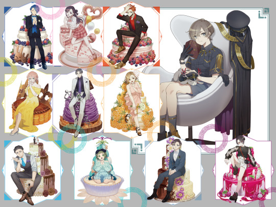
edits of the birthday arts from the amnibus store announcements! these were part of my bigger series of birthday wallpaper edits. these files exist because of some technical layer stuff with the wallpapers. i was more focused on recreating the patterns for that series rather than putting the art on, so these edits weren't really worth sharing.
---------------

in the milgram server i'm in, a person kinassigned the prisoners flowers, and that gave me the idea for these edits! i gave up because it was surprisingly difficult to find flower photos that i could actually use. i'm proud of how yuno's came out, though!
---------------

i needed the emblem-logo for an art i was doing, but because i'm really bad at geometric stuff, i did the only logically thing: edit it! back in season 1, the character page had a graphic with the milgram logo right behind the box where es and jackalope would be, so i took some time to edit that, then spent way too much time on the emblem. the emblem itself is a little plain, but it did well enough for the art i was making.
---------------

back in season 1 after we got some verdicts, i used the verdict arts from the judge page for this one. i can't find the files i used for this edit, but i think i used haruka's and fuuta's verdict arts for this? trying to edit out the characters to just have the sheep and goat symbols with the words around was a bit tricky, so the text ended up a bit scuffed.
---------------

the artist for the milgram light novel cover released a version without the text over it on their twitter and i really wanted to use it for my phone wallpaper! but the dimensions weren't right for it so quiet and gentle were cut off. i thus made an edit to make it fit better. i'm really bad at recreating art styles though, so when it comes to extending images like this, my solution is to make it burry so you can't see my bs. i think the thing i put the most effort into was extending the book on the floor.
---------------

this thing took so. much. time!!!! to make. this was partly because i wanted this to be as in tact and clear as possible, so blurring wasn't an option. both of the stars on the desktop and mobile files had parts cut off, so i needed to mash them together and edit out the bg on the mobile version. also as much as i love them, es's head is in the way of the bottom point in both stars, so i needed to reconstruct that bottom part and a part of kotoko that was cut off in both stars by throwing more prisoner stars at it and using kotoko's character art. also fun fact: both desktop and mobile version of the prisoner stars has their top points cut off, but the mobile version less so. but there's no way i'm going to edit out the background again if i have to, so i'm using my edit of the initial star to add the points to the transparent desktop version. and if you've seen my recent word art edits involving the stars, yes i will be doing this for all the prisoners for s2. or at least, i'm planning to. yet despite all the hours i put into it, the seams still are too obvious, so leaving the stars as is isn't really something i want to share, thus why i'm only releasing these as my word art edits for the time being. can you tell from my ranting that these stars left me v tired?
---------------
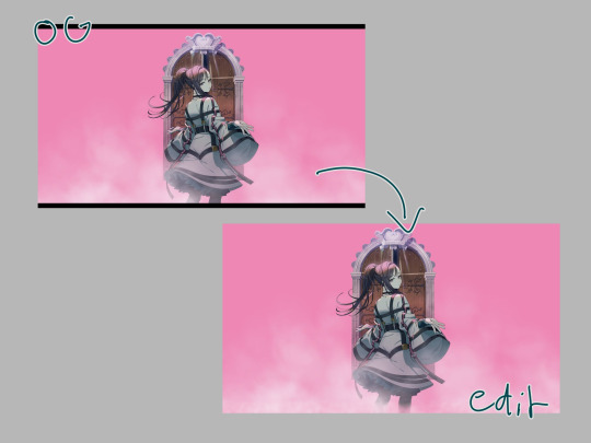
the most recent edit. i had the idea to use the max resolution thumbnails from the album trailers as my pc's wallpaper, but there was a problem with yuno's. haruka's (and now fuuta's) thumbnails were extended at the bottom so the art took up the whole 16:9 aspect ratio, but yuno's thumbnail wasn't. instead, it only has those black bars on the top and bottom. of course, i wanted the version with the extension on the bottom, so i extended it myself. trying to recreate the fog effect was tough, and where the og stops and my edit starts is obvious, but it works for my purposes!
---------------

ainandesuyo~
#that's my file dump for now#might retry some of the edits sometime#especially the sheep goat one#i want to do more with the 'magazine' cutout edits#those are so funny#milgram#ミルグラム#edit#my stuff
16 notes
·
View notes
Text
Whenever One Of Those Disney Remakes Comes Out...

This was originally a Twitter thread that I wrote the other day, and wanted to repost it here because I... Accidentally deleted the first tweet, haha...
Anyways... Regarding "shallow" Disney romances, plot elements of the animated films that supposedly don't add up, and how these remakes supposedly "improve" on them or "add depth"...
For all the talk about some Disney romances happening in such ostensibly short amounts of time or feeling kind of halfhearted... It becomes apparent when you step back and think about it, possibly... but there's a reason the stories hold up and work despite this perceived issue... That's animation and lyrical storytelling bypassing what's supposed to be realistic. That's one of the medium's very special abilities...
Like, most people watching those Disney animated classics back when they came out were so engrossed in the stories and even the romances, because animation like that is really on its own plane of existence, operating on a unique wavelength that really makes it all register so seamlessly. But there's also plenty of substance & depth in what's being told, as it's woven in there by the visual (and sometimes visceral) storytelling itself. That's a big thing for me with Disney's animated movies, that they can establish so much in such short bursts in an 80-90min runtime.
A lot of what's often said about certain animated films reminds me of "style over substance", which is a phrase I absolutely can't stand. The style *can* be the substance, actually... it's there if the one watching is on the film's wave. Otherwise, it's just pretty pictures and noise to them.
A lot of my favorite Disney animated movies play this game very well, going all the way back to Walt's output. That there can be so much feeling, emotion and ideas in mere drawings mixed w/ music, dialogue, editing choices, etc. It's often hard for me to explain, but I naturally feel it whenever I watch it.
And that's not even getting into the language of fairy tales and fantasy stories, often laden with symbolism and metaphors and such, which are also on their own wavelength entirely. I feel, when you try to take all of that so literally, to make it "realistic" and feasible in another medium, let alone apply these ideas completely to *real life* itself... you're breaking it apart and overdressing it. Hiding its unique essence, ripping it away even. The fantasy element is dialed down, which kind of takes away from the whole appeal?
As I get older and I really try to nail how I write fantasy stories myself, I find the connection between this kind of fantasy and reality fascinating, how they in different ways inform each other. Not in the sorta "cute" ways that you can put into a neat little box ("Disney movies once taught me-"), but much more complex than that.
I'd say in terms of a recent live-action fantasy movie, one of the most interesting was David Lowery's THE GREEN KNIGHT, an adaptation of Arthurian legend, which really embraced a kind of lyricism and dream-like logic that you don't often see these days. Even in mainstream animated movies that favor talking heads scripting over this kind of thing. Naturally, it was "confusing" for some. I know I was kinda lost when I first saw it, but I couldn't stop thinking of the intricate texture of the piece after I left the theater. It's a feat when a movie of any kind can preserve that onscreen, not what was only in the text.
Of course, a classic animated movie isn't immune to criticism, but sometimes I think a lot of what I see written online is done out of misunderstanding of the animation medium (does that peer pressure from when they were 10 years old still linger in their heads?), and there's a lack of media literacy there as well. As if the CinemaSins crew are in charge here, nitpicking small things that don't matter while missing the much bigger picture. Animation and fantasy like this require a nuanced perspective to dig in, I feel.
Animation itself, when executed like this, is just really on a whole other field... And those who dig the films so much, I feel they naturally get it and don't knock the movies for these perceived "issues". Nor make rash generalizations about a whole body of work, which is also common with some folks who talk a good show about Disney animated movies. Even Disney themselves, which is always concerning, but this is nothing new. As far back as the late '80s/early '90s, various people who worked for them or on their movies echoed these kinds of weird reductionist sentiments, too... And I feel it really all boils down to... These movies are animated. Thus shallow, for children, lacking, without much substance...
If not that, then I feel it's a misunderstanding of how these outlandish stories work and what level they are on... Almost like it's being reduced to a "that was weird!" MCU-level joke, or- Again, fodder for CinemaSins or some garden variety Nostalgia Critic-style video.
4 notes
·
View notes
Text
King's Quest VII: The Princeless Bride | Part 1
The Adventurer’s Log
King’s Quest VII: The Princeless Bride Part 1
Release Date: 1994
As always for King's Quest, not a blind play.
Introduction:
It's time for King's Quest VII, the last game I'll be doing in this series, at least for a while.
A couple of notes:
ScummVM allows for subtitles. Unfortunately, the game's subtitles were never completed and were taken out but ScummVM adds them back in. Except it warns of errors, not always matching and that they're not complete, so I left them off. They were also quite ugly. Definitely a let down after VI! It would have been nice if they'd learned from VI and kept it up…
No dead ends! At least not intentional ones. There are apparently a couple spots you can glitch and get stuck, but otherwise far more forgiving. No point system either as far as I can tell.
As for other changes, well: there have been some shifts in the series from text parser to point and click with verbs and of course graphical changes. VII brings another shift as quite a lot has changed.
We now have a very cartoony, Disney inspired style. It's still a point and click, but a lot more streamlined (too much so in my opinion) which I'll get into more when we get into the game proper.
This game alternates between two protagonists! We get Rosella back, but now it's finally time for Valanice to get her time too. It's funny: shortly before I decided to get King's Quest VII I was grumbling a bit that all the Daventry family get their time except for Valanice and lo and behold I just needed to wait for VII.
The game is split into chapters each one focusing on one of our pair. And, well, I'll let the intro speak for itself. I apologise for the sound quality. That's just how it was and I don't know if there was something I could have tweaked, or just. old. And not the best quality. The actual game is better.
youtube
Rosella laments the possibilities of incoming marriage and wants more adventure. She and Valanice discuss suitors - "Prince Throckmorton!" Boring! Rosella gets distracted by an odd winged seahorse critter and lured into a pool. Valanice takes the plunge and dives after leading them both into some kind of portal tunnel until they get separated.
And so we begin with Chapter 1.
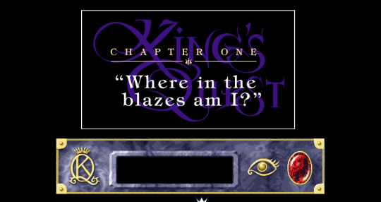
Chapter One - "Where in the blazes am I?"
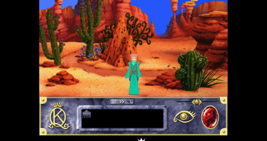
It's Valanice time! Okay, so interface stuff:
It can't be seen here because a scene was still playing but when you're playing the cursor is a wand. When you're at a hot spot it sparkles. There are no verbs to select, you just click and she'll take the appropriate action.
Got our inventory in the black box there. The eye is for looking. You drag an item over and you get an image that you can rotate around to see it all from angles. Like so:
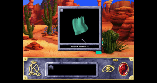
The red gem is the menu. The slider above lets you pan the scene side to side but I mostly ignored that. It also slides as you're moving so I think it may be meant to give you an idea of when you're hitting an exit of that particular scene? Maybe? The cursor also turns into an arrow at exits too.
Tech talk aside before I get back into the game proper.
Now, I would like to say I set off for adventure! Except I ran into a hiccup of my own making. I've been using ScummVM for a long time now mostly to run Monkey Island. Then after the special editions of the first two games came out it essentially became my Curse of Monkey Island launcher. So, while I've been using it for ages I had a set up that worked for me and (almost, this almost being key) never looked back. All that to say I don't really have a good understanding of how things work. Going through King's Quest has taught me a little, but still very much a total amateur.
A while back I got the OpenGL + xBRZ scaler for Curse of Monkey Island and it's great for it! Cleans things up nicely without making a smoodgy mess or anything like that. So, I thought in my infinite wisdom of not knowing what I'm doing, it might be good with another cartoon-y 2D game like KQ VII and switched to it.
That was a terrible idea. I didn't see much if any difference and I've rarely if ever heard my computer fans go that loud. After some panicky and baffled moments of wondering how the hell a game from the 90s could be making my computer sound like it wants to explode I realized I had that shader going. I switched back to 2x and all was well again.
There might be better shaders to use for it. After having some issues with recording the intro and then that, I just wanted to get on with actually playing the game and left things at that. Live and learn.
Back to the game!
So Valanice appears in this desert in a whirlwind, but there's no sign of Rosella. She calls for her. She walks around looking around and gets her petticoat caught on a cactus which tears it because it's really not Valanice's day. On the other hand that petticoat piece became an inventory item so that's always good! She now has Rosella's comb and a piece of ripped fabric. Right after the tearing a jackalope bounds by being very annoying and obnoxiously laughing because again, it's not her day.
I wandered off to the left first and found a giant statue and a pool.
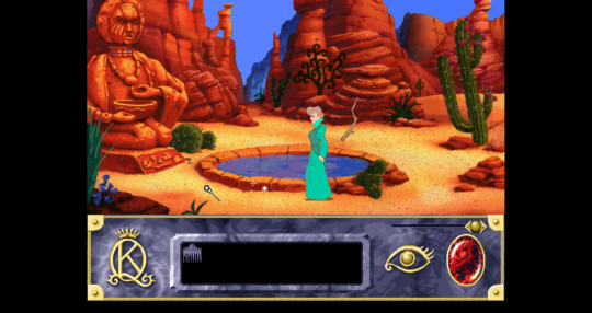
There were several points of interest here. I grabbed the stick. The sparkles were salt crystals and I took some of those. Looking into the pool shows a scene of another little statue holding a shallow bowl with two pieces of something in it. And you also get a view of the stairs going down.
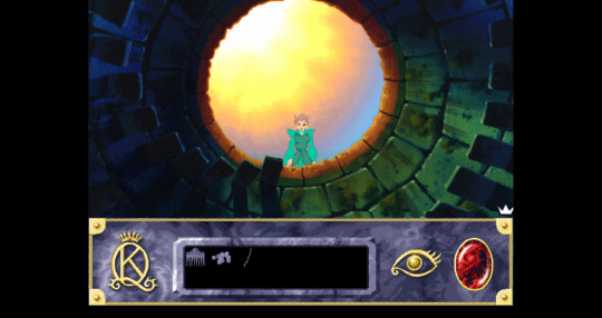
Checking the pool again leads Valanice to trying a little and discovering it's salty.
As for the statue itself there's an inscription at the base that gives some clues.
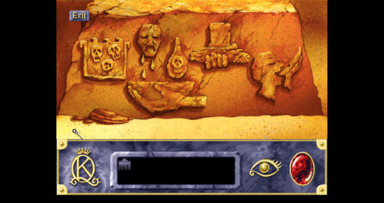
The blue beads around the statue's neck can be moved around and the head itself can be twirled to create either the current head which I guess is the moon? Because the other is definitely a sun.
There wasn't anything else I could do there so I carried on. I briefly dipped into full blown desert dunes and noped out of that.
Going the other way I found a stone temple or shrine. However, I didn't get to explore before a giant scorpion showed up and I got my first death.
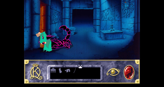
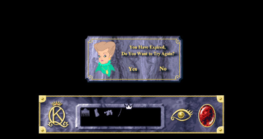
Deaths work a little differently in this game. They're more forgiving. Not much of a message by text but Valanice (or later Rosella) will make some comment related to the death and sometimes a vague sort of nudge about what to do. When you try again it puts you back right before you did whatever you shouldn't have done.
Also in this case there's a small window of time where you can run away back outside. Which I did on the retry.
From there I found another screen with two holes and a little door in a house built into stone with a sign saying Rare Curiosities the proprietor of which is Ricardo Eduardo Rodriguez Roo Rat.
Knocking on the door let me meet Mr. Roo Rat himself! But the poor little fellow has lost his glasses and can't see so he wasn't willing to converse much, but it didn't stop him from speaking in rhyme. After he disappears inside, the darned jackalope pops out of the holes and what a shock, he has the glasses.
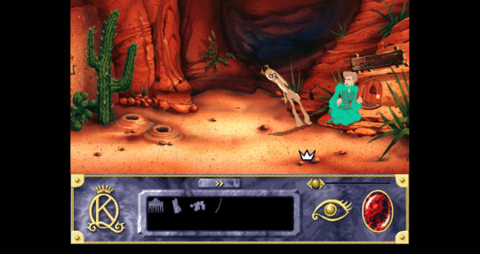
I caught this mid-jump for quite the shot... Jerk also kicked up a bunch of sand at Valanice and laughed some more before disappearing back down its burrow. What a jerk.
I continued to explore finding an area with a cave, damp sand where water was dripping down and a gourd. There were also more paintings with clues on the one wall. I couldn't do much here yet.
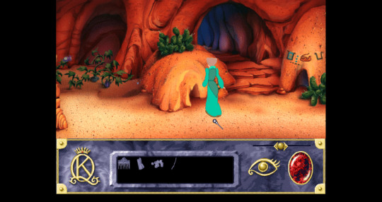
And going further to left leads to another statue.
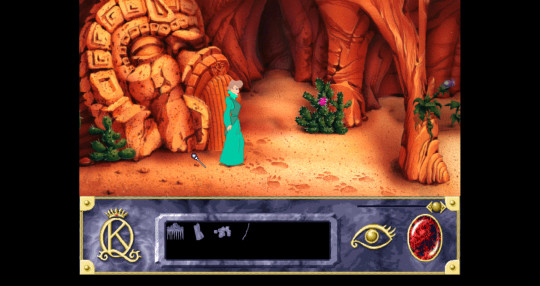
There's an arrow-like indent that can be looked at more closely.
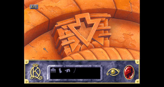
So clearly I needed something to fit in there.
Further exploration outside led me to another patch of desert area against stone walls, very similar to a spot in KQV actually. There I met a ghostly man.
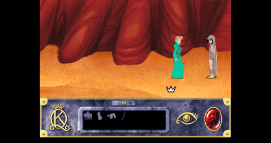
This fellow died and is wandering the desert in perpetual thirst. He warns Valanice away after she asks if there's anything she can do, but he also mentions a portal out of this land through mountains--the mouth of a great statue that was closed by an evil enchantress. That we've seen! Valanice protests leaving him, but the thirst drives him mad and he doesn't know what he might do, so go, go. Then he leaves.
I had a collection of things to do by now:
Get water for the spirit
Find a way past the scorpion
Get the glasses back for roo rat
Find the piece for the closed statue door
First thing's first was the water. I knew that inscription that was on the statue by the pool would help.
I went back to the area where the wet sand and cave was. I entered the cave where I found a basket inside of which was a corn kernel. There was also a row of pots. The first few kept breaking leading to a very annoyed Valanice.
But I was able to pick up the final pot.
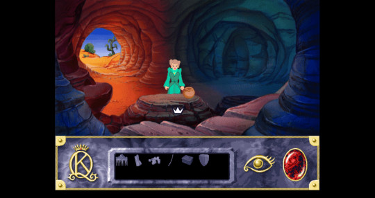
Outside I planted the corn kernel in the wet sand and it grew into a full plant and I was able to pick an ear of corn.
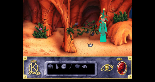
I had everything I needed for the pool statue. I used the pot to get salt water from the pool and poured that into the statue's basin. Using Rosella's comb on Valanice causes her to think of Rosella and cry, so then you use the comb on the basin and Valanice cries into the basin. Put the corn in the statue's hand and twirl the head and voila. The water is purified.
I went back out to the desert, this time into the dunes, which I started to regret, but thankfully found the thirsty spirit very quickly and gave him the water.
In thanks for the water he led me to his remains and gifted me with the choice of a rope or bug reducing powder.
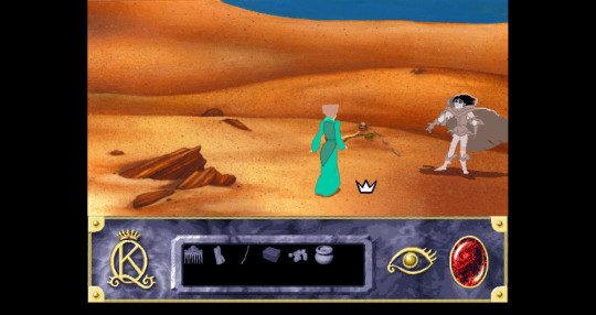
I took the powder. Then he faded, now at peace.
There was also a hunting horn which I took too.
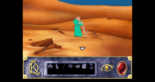
Had to blow the sand out of it. Valanice comments on the usefulness of being long-winded sometimes.
All going well! ...except I got lost in the desert trying to get back and stayed long enough to die of thirst. And I must make it clear that it's a lot more generous than KQ V about that, but I just could not find my way back. Retrying brought me back to the remains and I then found my back very quickly... Oops.
I went back to the temple-y place where I could fearlessly confront that scorpion. Bug reducing powder go!
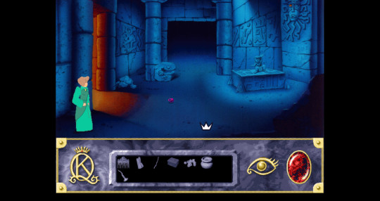
Who's a cute a little itty bitty fellow. Off it scampered.
I then went to examine that statue? Structure? Altar? There was also a carving of a face on the wall with one eye partly opened letting in some light.
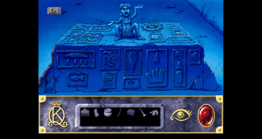
And I didn't know what to do with it yet so I left it for now.
Instead I went back to the curiosities shop and the jackalope and got my revenge.
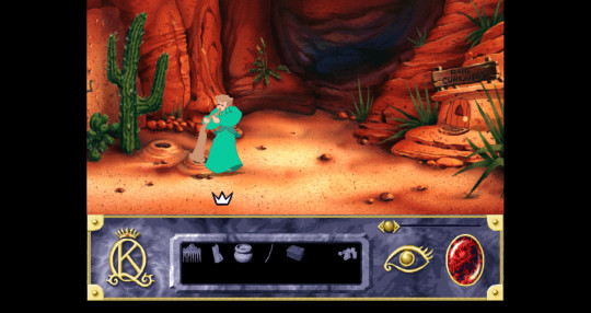
Blew the horn into the burrow. The jackalope flung himself out, the glasses were tossed and he dived back into his hole though not without losing a little fur to the cactus (which I of course grabbed too). Valanice seemed satisfied and I sure don't blame her.
I returned the glasses to Ricardo Eduardo and he was willing to start trading with me. For most of my stuff he only offered junk, junk that rhymes mind you, but still junk, that Valanice refuses in various ways. However, offering the comb leads to some information, if not a trade because Valanice doesn't want to part with it and the return trade was more junk. However, information: he heard of a princess in the west and that the troll king lost his heart and plans to wed a princess, a foreign princess. Valanice thinks that could be Rosella and he says she'll have to go beyond the woods and far below. There was much rhyming here.
While I was around this area, I ended up back near the corn and discovered the gourd had split open revealing a gourd seed. I took the seed and was able to trade it to Ricardo for a turquoise bead.
I knew there had to be something I could do with that shrine place so I went back to try again and realized I could have pressed the big water droplet in the centre. That caused the orbs to rise and I could move them around until I got the correct configuration.
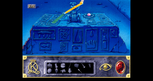
This was the final configuration that gave me a piece that looked just like the indentation on the sealed door statue. I gotta be honest: I don't understand this puzzle. The beam colours change depending on where the orbs are based on colour mixing but otherwise I got nothing. I just fiddled until something worked. I'm sure there is a logic here with all the symbols but I'm just not really seeing it.
I got my key piece anyway! Except it was too small to fit in the indent, so I was missing another piece.
All I had left was the pool. I got stuck here for a bit. I had the clue painted on the wall:

I figured the blue circles probably corresponded to the beads on the statue neck and I knew needed to empty the pool.
There was wandering and fiddling until I found out you could click on the statue's wrist and it flips the bowl upside down. I didn't wave my cursor around enough! Missed that hot spot. With the beads aligned correctly and the bowl flipped the water was drained.
I went down the steps to another statue.
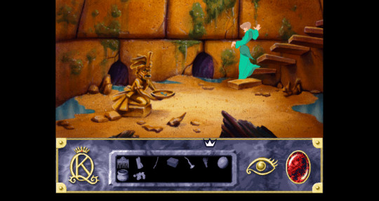
Once again I'm glad to have stairs I don't have to do myself.
Got an offering bowl here holding two turquoise pieces. If you just take one water floods in and drowns you. So that was another death. I put in the turquoise bead and took one of the pieces that looked like my piece and all was well until I tried taking the other piece too. Hello flood waters and death 4. So you gotta pick the right piece and that piece only. Combine with it the piece I already had and presto, one complete piece that fits in the statue.
And the statue's mouth opened into a door leading into a tunnel. Nothing can be so simple however, and a creature comes out and menaces Valanice
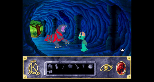
So ends this chapter.
And chapter 2 begins.
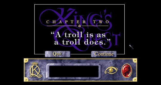
Next time: Chapter Two - "A troll is as a troll does."
--
Deaths: 4 Time: 1:15
Kind of miss listing my points. This feels emptier.
4 notes
·
View notes
Text
why are people on the internet so mean.
so the sims released the trailer for their new pack today and i was really excited for it, and my favourite sims youtuber, kayla (lilsimsie) was too when i watched her reaction video. in the video tho she missed a little text box that said one of the new items allowed you to summon the grim reaper at will, a feature i knew she'd be really excited about.
so then i went onto twitch and opened her livestream since i knew she was live and wrote in chat "pls tell me y'all told simsie about the summoning the grim reaper at will thing in the trailer after she missed it three times", to which a couple people very nicely replied "yes!" and "she did!", to which i replied "yay! I knew I could count on y'all!". i initiated this because I was excited for the feature and I knew Kayla would be too, and I hoped to spark a conversation on stream about it since I like her being excited about things.
I'm about to close the stream after this when I hear kayla say my username and start talking about what I just put in chat. she was perfectly nice and not targeting me in any way, just pointing out that so many people had brought up that she missed it. but then EVERYONE in the chat is going "people are so toxic" like constantly on repeat everyone is saying it. also, whole Kayla is talking someone says "you've done it now y'all you've broken her". and then kayla says "truthfully I did notice in editing I was just trying to get the video out quick and also I didn't want to take the time to add something onto the end because I had just found out my parents dog had cancer."
meanwhile, people are still yelling in the chat that people are so toxic for bringing this random feature up repeatedly (I'd just opened the stream I thought it would have already come up and i wasnt expecting kayla to respond to my comment if it had cos in that type of scenario she would just ignore the comment if shed already seen a similar one)
so basically the entire chat is yelling at me for bringing something up (in a very friendly way btw) because i thought kayla would be excited about it, and they're all making me feel shit about it and then I get the news that the reason kayla didn't go back and add it in afterwards is bc she found out her parents dog had cancer. which is really sad and obviously im sorry about that and kayla didn't do anything wrong in this situation.
but the CHAT oh my lord why were they so mean ;-; Kayla was perfectly nice about the way she addressed it, as we're the chat mods when they informed me that yes kayla had in fact been told about it, but the rest of chat were so freaking mean ;-; how on earth does this situation make me toxic. I was excited about the new feature. I knew Kayla would be excited for it too. I just wanted to hear her talking about it. I had no way of knowing if shed already been talking about it since I hadn't previously been watching the stream. but I'm toxic. great.
and then afterwards I knew I needed to rant about this whole situation bc it was pissing me off and I can't let go of things until I say them outloud (or type them ig) and I considered my boyfriend, but he was offline, and I considered my mum, but she was asleep, and then I realised I don't have a best friend to rant to. it got so bad I even considered twitter even tho I almost never use it anymore. eventually I decided on tumblr even tho I don't have a following who would be interested so no one's gonna reply to this being like "oh I'm sorry that happened that sucked" or whatever, which is fine ofc, but I just which I had someone in my life who I could be saying this rant to instead of saying it to an empty corner of the internet.
1 note
·
View note
Text
for those of you on the android app:
there's no easy way to nuke ads, but there is a hard way to get some of them including the big auto play video currently at the top
if you use a phone-wide ad and tracking blocker like personalDNSfilter you can zap a lot of the ads by adding specific hosts to the host file config
most default lists don't have all the tumblr ad servers in them (too obscure maybe lol). you can use something like pcapdroid to watch process traffic in tumblr and grab all the suspicious urls from it. it's time consuming but it does work for a lot of them. I had an extremely long list of them before ad free was available and I saw only blank white boxes where ads would be
the majority of the current one piece video ads are being served from tumblr's own video service unfortunately which means you can't zap them without zapping all videos, however the big one at the top can be zapped with the highlighted url below (the others are suspicious ones I saw while finding that one which may rid you of some of the other ads)

it'll still leave the 'ad' placeholder in place but the video will be broken which, to me, would be a vast improvement
it's a pain in the ass to keep the filter list updated whenever they start serving ads from new sources, but if you hate ads with a seething passion it does help
edit: you can also add this url which may mean you never have to worry about hitting a certain snooze button again. I haven't texted it extensively but it does seem to make it vanish after a few seconds of confused spinning load wheel animation


ublock origin my beloved
step 1: install ublock origin extension if you haven't already
step 2: use element picker (eyedropper) from the ublock menu to select the clown (element zapper should work too I believe)
step 3: you defeated
important note: you may have to close your current tumblr tab and open a new one for this to stick, otherwise you will be reclowned on page refresh
#had to turn off ad free briefly to find the url#it was awful#how do y'all live like that#the fuckening of tumblr#mp
34 notes
·
View notes
Text
Spirit Box Radio is Crowdfunding for Season Two!!
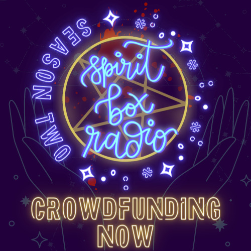
Atmospheric and engaging, Spirit Box Radio is an audio drama which will lull you into a false sense of security before pulling the rug from under your feet. If you loved the creeping sense of unease of The Magnus Archives, the weird whimsy of Welcome to Night Vale and the LGBTQ+ representation of Hello from the Hallowoods, you'll love Spirit Box Radio.
Now launching it's second season, Spirit Box Radio has been shortlisted for a People's Choice Podcast award for Season One. The full cast and original creator are back, and determined to make Season Two even better.
Donate £20 (or equivalent in your currency)
Check out the crowdfunder page
More info under the cut, plus at the bottom a more detailed Image ID than the ALT description has space for!!

Spirit Box Radio is an indie horror audio drama which follows Sam Enfield, the unlikely host of Spirit Box Radio, a show for witches, arcanists, and the magically-inclined. Sam took over the show after the mysterious disappearance of his mother, the Illustrious Madame Marie, a renowned psychic. With no penchant for the Arcane Arts, Sam struggles to find his feet, and as he does, he discovers that Spirit Box Radio may be haunted by something much worse than ghosts: secrets.
Season One followed the mystery of Madame Marie's disappearance and uncovered Sam Enfield's true place in the conspiracy surrounding it. In Season Two, Sam, his sisters - sardonic Kitty and cynical Anna - and his snarky immortal boyfriend will try to unearth the mystery of the Man Who Walks Here and There (AKA The Man in the Flat Cap and Shell Suit, or The King of the Blood Rose Crown) whose many titles are found under almost every stone they turn. It's a story steeped in mystery, horror, trauma and grief, with plenty of softness on the side.
The show is made primarily by its creator, Pippin Eira Major, who wrote, directed and edited every episode in Season One.

Spirit Box Radio wouldn't be possible without the incredible cast of the show. Now 15 Voice Actors strong, the cast of Spirit Box Radio brings to life an array of characters, including; a shady but eloquent florist who cant be trusted; an Ominous Phone Guy; a trio of Inconvenient and malevolent entities; and numerous others.
Just like the characters in the show, our cast is mostly LGBTQ+ and many of us are young and trying to break into the industry. Here's who we are:
Pippin Eira Major (he/they) as Samael Apollo ‘Sam’ Enfield
Jessie Jeffrey (she/her) as Ekaterina Erzabet ‘Kitty the Investigator’ Enfield
Alex Peilober-Richardson (she/her) as Anastasia Morgana ‘Anna’ Enfield
Will Cummings (he/him) as Oliver ‘the Florist’ Boleyn
Billy Bray (he/they) as Scourge
Beca Barton (she/they) as Indi
Tais Grimberg (she/her) as Bliss
Kay Watson (he/she/they) as Ingra
Ellie Ripley (she/they) as ‘the Bog Witch’ Rhytidia Delphus and Stykler Snr.
Daisy Major (she/they) as Regular Caller Beth
Elinor Wood (they/them) as Additional Voice
Gary Major (he/him) as Additional Voice
Mars J Brown (she/them) as Stykler Jnr.
Rose Eke (she/her) as the Mystery Caller
Freya Meldrum (she/her) as Show-Caller Emily
If this crowdfunder is successful, we're also hoping to add five more fantastic VAs to our cast!

Being such a tiny studio, Hanging Sloths can't afford to compensate our cast for their amazing work and provided the amazing performaces you hear in Season One on a voluntary basis. They've all agreed to come back for Season Two on a Profit Share model, where they'll all get a percentage of the money made on this crowdfunder. Here's a handy graphic breaking that down:

Our main priority is to make sure the cast are making something for their hard work on the show. Up to our main goal amount, we'll be splitting the money like this:
- 50% towards the actors' profit share (which exludes me, Pippin)
- 25% towards guest writers and directors
- 25% towards other essential costs including hosting the show on Acast.
Our initial goal amount (£2500) has been worked out to make sure everyone (besides Pippin) who is providing acting, directing or writing for the show can be paid an industry standard amount.
If we don't make our full goal, whatever we DO make will be divided up according to the percentages you see above!
Anything made above that will go towards compensating Pippin for his work on the show, too.
A brief personal statement from Pippin on why the payment is being structured this way:
'As creator of the show, it's my main concern that everyone else who provides Voice Acting talent, writing, and directing is priotised for the amazing work they do. If we're able to raise enough that I can start to compensate myself, too, that would be amazing, but the main focus is on raising enough funds for everyone else.'

Please ensure you add your email to your pledge so we can contact you about your rewards!
Any amount - a huge thank you from the entire cast and crew of Spirit Box Radio Season Two! You're helping make indie audio drama happen.
£5.00 - your name in the credits of one of the first episodes of Spirit Box Radio Season Two
£10.00 - Name a Faithful Listener! Choose your name or any you can think of to be a writer or forum user in the show.
£20.00 - Advanced Edition of the Spirit Box Radio Season Two Official Soundtrack!
£40.00 - All the rewards above, PLUS a copy of the Spirit Box Season One Soundtrack
£50.00 - All the rewards above, PLUS annotated scripts for episode one (on day of episode release)
£100.00 - All the rewards, PLUS a personalised letter from Pippin, creator of the show.
£200.00 - All of the rewards, PLUS a private chat with Pippin (limited to 3) (no you don't have to chat with me directly if you don't wanna!)
£500.00 - All of the rewards, PLUS a producer credit on the show

£3000 - 'HOW NOT TO HOLD A SEANCE' BONUS MINI-SODE
This short, extra episode will be fully sound-scaped and completely finished, and will be set in the gap between Season One and Season Two.
£3500 - 'THE LIFE AND DEATHS OF OLIVER BOLEYN': A DIGITAL COLLECTION OF SHORT STORIES
A digital collection of short stories penned by show creator Pippin Eira Major, telling tales from the as-yet mysterious past of the immortal florist, Oliver Boleyn. Amongst these tales will be stories from his time at the palace of Versailles, a chance meeting with a renowned poet which may or may not have led to the creation of a certain book about a particular cursed painting, and a perilous voyage at sea.
£4000 - 'RHYTIDIA HOSTS THE SHOW' BONUS MINI-SODE NO.2.
In this bonus Mini-Sode where Rhytidia Delphus (voiced by the spectacular Ripley) will host an episode of the Enlightenment Segment (or so she thinks).
£4500 - MUSICAL MINI-SODE
A short, bonus musical episode of Spirit Box Radio, with original songs written by Maybe Wednesday and performed by members of the cast of the show.
Donate £20 (or equivalent in your currency)
Check out the crowdfunder page
[IMAGE ID: a square image of the words 'Spirit box radio' glowing in blue, like a neon sign. it's on top of a glowing yellow pentagram, trapped inside a more brightly glowing yelllow circle. behind these, a red splatter of blood. Around the circle, glowing in pale purple, a variety of stars and sparkles around 'Season Two'. Under this image, glowing yellow, it reads 'Crowdfunding now'. The background is deep purple, broken by teal grey constellations and a pair of hands, cradling the neon words from behind. END IMAGE ID] [BANNER IMAGES: Puple backgrounds with pale consetellations and yellow neon caps-locked words as described in the Alt Text]
#spirit box radio#spirit box radio podcast#audio drama#crowdfunding#sbr#sbrp#lgbtqiia+#lgbtq creator#trans creator#nonbinary creator
35 notes
·
View notes
Note
This is embarrassing but I am bad at reading. I only read graphic novels sometimes but as a kid I always hated reading since my dad forced me to read those classics. I want to get into reading novels but I want to start easy. I want a book that's for an adult but the writing is for like a 12 year old. I also can't stand anything that's like 100 pages but I don't wanna read kid books since I want adult topics. Is there anything like this?
Hi lovely anon! ♥
Okay I'm THRILLED you asked this question because I get to put on my librarian thinking cap. :)
First, I want to say right off the top there is absolutely nothing to be embarrassed about.
People have different ways that they learn and absorb information and that’s perfectly fine! I really wish the publishing industry took into consideration other readers besides a generic population because so many readers are left behind and miss out on some great stories because they can’t access them for whatever reason.
Graphic novels get a bad rap for some reason, but they are FANTASTIC works of art. They connect visual storytelling with action, movement, and dialogue.
When I worked at my local library, it was so, so painful to watch parents ridicule their child for picking up a book that interested them but it didn't *fit this box* (wasn't their exact reading level, wasn't "educational" etc.)
For kids with ADHD or other learning problems, or just the way they interacted with the world...graphics novels were sometimes the ONLY thing that held their attention. They needed different stimulation - the art helped them visualize the story better than pages and pages of text ever could.
If you like something, read it. Enjoy it. That's the point of literature! ♥
Also, I really, really love illustrations with books. I like the visual aspect that adds extra punch to the story and I wish more adult literature had illustrations because I miss that so much. Graphic novels are badass so definitely don't feel bad about enjoying them! :)
I’m going to do my best to recommend some things here. I haven’t read everything on this list so take it with a grain of salt! Because most publishers require a set word count/page count, 100 pages or less might be a bit difficult to pin down. But I’ll see what I can do! :)
Anthologies/Magazines -
Anthologies and short fiction magazines are great because the stories are short - most of the time around 40 pages or less - and you get a range of authors so you can sample their writing styles.
Some anthologies/magazines I would recommend include:
Clarkesworld
They post their back issues online so you can read them AND listen to an audio recording of them for FREE.
Fantasy and Science Fiction Magazine
I recently picked up a few of their copies and I’m really enjoying the range of author styles they include in each edition. They include poems, short stories, and novelets (longer than a short story, shorter than a novel). The whole thing is roughly 200 pages but you can always stop reading after one story and get a satisfied ending :)
Podcastle (audio)
This is an honorary mention because of the compact storytelling they aim to cultivate. Podcastle (fantasy) and it’s branching publications - EscapePod (science fiction) and Pseudopod (horror) - publish stories via podcast. It’s not quite novels, like what you’re looking for, but they do look for stories that grab your attention and can be read well aloud. If you’re looking to spark an interest in a wide range of fiction, this might be a good resource to browse! :)
Fiction -
The Murderbot Diaries by Martha Wells
I personally haven’t read this one yet - it’s on my to-read list! - but each book is around 150 pages told through the eyes of an increasingly self-aware robot that has nicknamed itself “Murderbot.”
Wayward Children Series by Seanan McGuire
This adult series is about a home for wayward kids who regularly come and go through magic portals to other worlds. Each book is fairly short, a little under 200 pages.
Binti by Nnedi Okorafor
Binti is the first of the Himba people to go Oomza University - one of the best institutions in the galaxy. But learning comes at a price and her journey won’t be an easy one (96 pages, book 1 of the series)
The Gunslinger by Stephen King
This was 50-50 for me. I liked the concept, the ending was a little...too out there for me to grasp. But it’s 230 pages, a little gritty, a little grimdark, with action.
Honorable Mentions -
I’m not sure what genre of graphic novels you’re reading (humor? dark fantasy? superheroes?) but if you want to venture into some fun fiction that’s a little longer, here are some authors that have taken me on a wild romp across the pages -
Terry Pratchett
Neil Gaiman (I like some of his stories, others are a miss for me, but he explores a wide range of fiction so you can dabble in lots of different things! :)
Adrian Tchaikovsky (particularly Spiderlight, lots of epic high fantasy adventure)
A.J. Hartley
Jeff VanderMeer (Annihilation)
I hope some of these help a little! Good luck! :)
17 notes
·
View notes
Note
Hey I have an idea for a mod! I really want to edit the functional laundry mod(s) - the original is by Rebekah and various edits have been made by iCad, Gummilutt & Mustluvcatz. Instead of getting an instant boost to needs, I think it would be way better if using the washer/dryer gave sims a token for slower hygiene/comfort decay for like 3 days instead. I was hoping to do this myself but I can't figure out how to even start! What do you think? Do you think its something you could do? :)
Update 1: Optional cooldown from using the machines if you already have the tokens, optional notifications when the effects run out, 3t2 compatible version and optionally you can’t use the dryer if you haven’t used the washing machine beforehand.
Hey!
I agree, doing laundry basically being a replacement for having to bathe doesn’t really make much sense.
As requested, I’ve made a version that slows down comfort decay for 3 days after drying clothes and hygiene after washing them and optionally doesn’t increase fun:
SFS
Laundry Day by mustluvcatz compatible version:
SFS
Replace the packages in the original with these ones, you will need the original which can be found at MTS For this one I disabled visitors from autonomously using the machines, but you can reenable this by going into the replacement packages with SimPe -> Pie Menu Functions -> Check the “visitor” box on all functions.
These effects can’t be stacked or reset, as not to make the machines as easily spammable. You will have to wait out the 3 days for each effect.
In case anyone is interested in the original mod by Rebecah, it’s available here: AffinitySims
Tuning:
“BecksWashingMachine.package” - Tuning BCON Hygiene Modifier - Default 70, Max 100: How strong the decay modifier is. Hygiene Modifier Duration (Hours) - Default 72: How long the decay modifier lasts in hours. Fun Gain - Default 0, originally 60: How much fun you gain from using the machine. Cooldown (Y/N) - Default 1: Are you allowed to use the machine if you already have the need decay effect?
“BecksDryer.package” - Tuning BCON Comfort Modifier - Default 70, Max 100: How strong the decay modifier is. Comfort Modifier Duration (Hours) - Default 72: How long the decay modifier lasts in hours. Fun Gain - Default 0, originally 60: How much fun you gain from using the machine. Cooldown (Y/N) - Default 1: Are you allowed to use the machine if you already have the need decay effect? Only Allow Drying With Washed Token? (Y/N) - Default 0: Are you only allowed to use the machine if you already washed your clothes?
“ld_BecksLaundryMotiveDecayController.package” - Tuning BCON Show Token Expiry Notification? (Y/N) - Default 1: Whether to show a text notification when a Sim’s slower motive decay from doing laundry expires.
Rundown:
I hadn’t dabbled into modifying motive decay temporarily via gameplay before, so I cloned the “Controller - Token Decay” object to see how the game handles this. I could gather that tokens are added to Sims that track how much time is left for the decay modification and it is reduced accordingly.
Once that timer reaches zero, the respective motive decay modifier found in the Sim’s Person Data is subtracted by the value it was initially added to, setting it back to normal. The token creation and some other parts of it relied pretty heavily on Lua scripts that decompiled to really cryptic messes, so I was better off creating a custom controller and token rather than trying to reverse and utilize the built-in system.
Token:
I made a token that holds the remaining duration for the effect in property 1 (I learned the hard way that apparently you have to start from 1 instead of 0 when utilizing token properties), the kind in 2 (0 would mean hygiene, 1 comfort) and in 3 the modifier amount.
Controller:
Then I made a global controller object (global meaning that it spawns on every lot), and in the main function every hour it loops through all Sims, checks if they’re in the active family as not to rob visitors of their motive decay buffs they might have gotten at home while you were playing them, loops through the new token in their inventories and if one is found, its duration gets reduced and once it reaches zero it checks the kind in property 2 to reduce the respective need modifier in the Sim’s Person Data by the value in property 3 and finally removes the token.
Machines:
Now the behavior I introduced in the machines is pretty straightforward; I added a new BHAV (Sub - Add Motive Modifier) that cycles through the new token in the Sim’s inventory, if none is found then it adds to the Hygiene or Comfort Decay Modifiers found in their Person Data, otherwise then it is only done if the found token is of a different kind, so that you can get the comfort and hygiene ones together but you can’t stack multiple ones of the same kind. Then it adds the new token to the Sim and sets its properties to the appropiate values (Time left, kind and modifier amount). This BHAV gets called in place of the original code that maxed out hygiene and comfort.
168 notes
·
View notes