#and this gifset and the next one are NOT going to the edit tag lmao nooOooOoO
Explore tagged Tumblr posts
Text

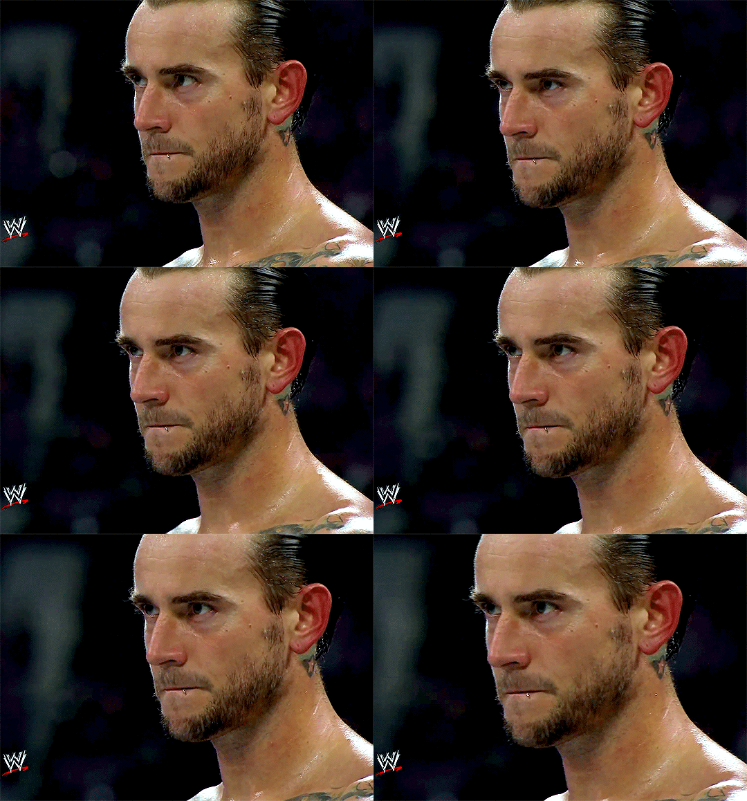
#john cena#cm punk#punkcena#tagging the ship just in case someone want to blacklist!!!#and this gifset and the next one are NOT going to the edit tag lmao nooOooOoO#anyway mr. cena what is that nod. WHAT IS THAT NOD#flashing tw#*#*cena#*punk
94 notes
·
View notes
Text
I think I might have finished the 9k+ word 'oh my god these two idiots will not shut up' West Wing fanfic that I mentioned the other day, if only because I off-loaded what I had originally conceived of as the other half of that conversation into a sequel fic. The first bit -- I've been calling it The Don't List and I think that name is going to stick -- is currently sitting at 9559 words with no missing bits, and an actual ending that I'm pretty happy with.
There are a couple of places that I made a note to myself to go back and make a little edit, and I probably just need to do an editing pass on the entire thing before I put it in front of anyone else's eyeballs. But it is one long 9559 word conversation without a break or a pause anywhere in the ~19 pages of dialogue, so trying to edit it in one go is exhausting. I really like the conversation flow and the gradual emotional shifts from the beginning of the fic to the end, but it's like the dialogue equivalent of that 'do you like the color of the sky' post, I stg.
Which is all the more reason to use the natural ending that presented itself, and let the reader take a little breath before the next part. Part 2 of what will apparently be a series is called The Calendar's End, and as of now I'm just over 2k words into that, in two chunks of dialogue that are currently disconnected but will eventually get stitched together into one conversation.
I've got just a couple hundred words for a third part, The Catalogue of Scars, and ideas for a couple of other parts in this series that I'm currently calling The Scrapbook Of All Our Days. Each part would be a one-shot in this long conversational style, focusing on one important conversation that drives the overall plot forward. No real idea of an end point for the series as of now, just these characters who will not shut up.
The series is centered on Josh and Donna, with appearances from other characters after the first part, all set in late season 7 or post-series, in the sort of AU that might be canon if you squint, or might end up significantly diverging from those final episodes, I'm not entirely sure yet. I'm just enjoying the writing mojo while it lasts.
The West Wing isn't exactly a new fandom for me -- I watched everything after first season way back when the episodes were airing live -- but beyond reading fanfic and reblogging gifsets lately, I haven't ever really been actively involved in the fandom. The Josh/Donna tag on AO3 is deep but not terribly fast moving right now, with only 20 or so fics that have posted or updated since the beginning of this year. I have to admit to being a little bit nervous about dropping this 9600 word one-shot in the tag as my first (er, well, second, if you count this very old fic from 2005, and holy shit my writing style has changed a bit in 20 years lmao) entry into the fandom.
I think part of my nervousness at posting this is also because I'm not sure if I'm going to be able to get Jack to beta-read this one for me. He's been editing all of my fiction writing for six or seven years now, but he's never watched an episode of The West Wing and it's not really his thing. Even if I am able to get him to read it, he's not familiar with the character voices or the long history that Josh and Donna have by season 7, so he won't be able to give me feedback on that aspect of an entirely dialogue-based story.
In the past I have posted un-beta'd fanfics, and I've posted fanfics in fandoms that I haven't been vocally active in before, and I've posted one-shots longer than this one will end up being -- but I've never posted a fanfic that hits all three of those. I really love how The Don't List is turning out, and the shape the whole series is starting to take, so I think I'm just going to have to work through my nerves and the long arduous task of editing this thing, and then just grab some courage and post the damn thing.
(If anyone actually made it this far in reading this post, and you'd be interested in a sneak preview of the fic, lemme know!)
#my writing#process thoughts#The Scrapbook Of All Our Days#The Don't List#The Calendar's End#The Catalogue Of Scars#and yes I'm an American writing for a very American fandom but I like the 'ue on the end of catalogue and dialogue#and my spellcheck is just going to have to deal with it lol#The West Wing#tww fanfic#Josh and Donna#I cannot believe I'm writing for this fandom again after a literal 20 year gap#but hey my writing is a lot better now I think#so maybe there'll be people who actually like this fic
8 notes
·
View notes
Text
got in A Mood and decided to browse my edits tag
a few thoughts/observations/rambles:
i've had this specific blog since 2016 and i've been doing various screenshots, gifs, moodboards, etc since i made it almost exactly 7 years ago. i have 109 pages in my mine: edits tag: - 54 of those pages are from 2016-2021 and encompass about half a dozen or so fandoms. - the other 55 pages? run from july 2021 until now and are almost exclusively cyberpunk (and more specifically, almost exclusively valerie and/or goro). the amount of ~*content*~ i made over the course of 5 years for 6-10 fandoms is almost the exact same amount of ~*content*~ for one game in the span of about a year in a half? like damn. if that doesn't just perfectly capture the brainrot.
it was very heartwarming and enlightening looking at some of my OCs/ships that i consider more or less "retired" at this point, like my ryder and jaal or my inquisitor and cullen. it was nice looking through all those sets again and having some warm fuzzies and seeing how they influenced later OCs/ships but also being content to be like yeah, that's it. we had good times, but we moved on just like we needed to.
on the flipside, it was also interesting going through some of them and seeing the OCs/ships that I'd like to revisit at some point. or possibly rework into cyberpunk. i think i could see some themes i had wanted to explore with my sole survivor acting as a foundation to really develop valerie's mother, whomst i haven't talked much about here but i have a lot of thoughts on. (although audrey (sole) and ava (valerie's mother) are kind of the antithesis of each other in that audrey never wanted a kid and wanted to pursue a career but ended up living the opposite whereas ava wanted a kid and felt pushed into the corporate world BUT ANYWAY I DIGRESS)
it was also kind of cool for me to see how my screenshot/vp style developed over the years. i wasn't even familiar with the term "virtual photography" until cyberpunk--i just thought of it as fucking around with a flycam and taking screenshots. the 'photography' element didn't even really click with me. but i can see where some of the stuff i was doing 6-7 years ago, even with moodboards, definitely influenced how i approach vp in cyberpunk.
and number/performance-talk, because even if i make stuff for me, i still think it's interesting to take note of trends and whatnot: - i definitely experienced a pretty noticeable drop off in notes post-2018 and the great tiddy purge. that shit really hit hard, damn - i remember in past fandoms i often felt like stillshots didn't get nearly as much love as gifsets (especially gaming scenery gifsets), and based on my own stuff, that does seem to track. i think the two big exceptions for me there were mass effect andromeda and now cyberpunk. which are very pretty games with very pretty characters and compatible with decent cinematic tools so idk, maybe they just work better in that format than, like, muddy potato-y dragon age origins, lmao.
anywhoooooo i also filled my queue up with some old posts so get ready for some vintage wench content over the next few days uwu
10 notes
·
View notes
Note
not sure if you’ve answered this before, but what’s your process look like when you make an amv? i’m just curious and in constant awe of ppl who can make videos like you do :)

hello all!!! i have answered this before and i have a vid help tag with other asks i’ve gotten about stuff like this! but i’ve gotten several more messages along these lines so i’m just going to answer a bunch of them together (under a cut since i love to ramble about editing lol). i do just wanna say i’m definitely not the authority on video editing and obv everyone has their own techniques!
edit: i just finished typing all this up and it’s SO long so sorry in advance LMAO god bless anyone who reads this entire thing
so i work in news tv and we have a very specific workflow for writing scripts, sourcing video, producing, and editing. i’ve just applied that to making amvs! for every video i make, i copy the song lyrics into a google doc and adjust them to match the song i’ve cut (i often will trim songs for time and/or content purposes). then i start planning! i’ll mark down what clip i want to use for each lyric next to that line, and any sound bites i want to use (with episode numbers!). i’ll color code between video and sound bites and lyrics, so my scripts end up looking something like this (for my honeybee amv):

doing the planning ahead of time makes everything much easier when it’s a video that spans the whole show or involves a lot of sourcing, like honeybee or sports analogies. that way when i get to the actual editing process, i already know what i’m going to do and have a game plan. for videos like happy ending or believe it or not, where i’m mainly just pulling from a few episodes, i can just plan it in my head as opposed to writing it all down, and produce as i edit. obviously i do make in-the-moment decisions while editing—sometimes a shot doesn’t work the way i thought it would, or i go where the video takes me—but planning ahead definitely helps. i know some people use spreadsheets as well, with columns for lyrics, video clips, and sound bites if applicable. once you find a system that works, it actually goes pretty quickly.
as for sourcing clips themselves/finding clips within episodes, i talked about that here and kind of here. the short version is that transcripts are a must, and the supernatural wiki is hugely helpful by cataloguing all the hugs, prayers, phone calls, etc. in the show. gifmakers that tag episode numbers on their posts are your friends. it gets easier the more video you make—that’s another huge reason i make the google docs for each video (even the ones i plan in my head, i end up going back and making a loose script with episode notes just for reference). if i can’t remember where something is but i know i used it in another video, i can easily reference past scripts!
i also cut all my videos in the same project in premiere pro, so i can flip between them easily. instead of checking a past script, i can just go to the video sequence itself and copy the clip i’m looking for! this was especially helpful when i match cut together the 5x18 and 4x22 wall slam shots for my bestie video, and then stole it from myself for honeybee hahaha. at any given time i have at least 8 sequences open:

because of the sheer volume of videos i make, it’s worth it for me to download the entire show—i have all 327 episodes in HD, plus deleted scenes. if you think you’re only going to make a few videos, i’d start with scene packs. you can usually just google “destiel [or whatever ship/character you’re looking for] scene packs” and there will be any number of ones you can download. if you need other specific scenes, you can always download/torrent individual episodes or screen record netflix (that’s what i did before i got HD download links). i’m happy to share my links if you DM, but be warned it’s a lot of disk space (about 500GB on my hard drive). someone also compiled every destiel scene, downloadable here.
having every episode already loaded in premiere for all my projects also makes it a lot easier to source clips. once i use a clip in a video, i’ll put a marker on the episode file, so that after a while i have most of the important scenes/lines marked to easily find them. to give you an idea, this is my episode file in premiere for 12x10 lily sunder has some regrets (markers at destiel scenes, the car fight, hot girl cas, etc.). markers are the green tabs along the bottom:
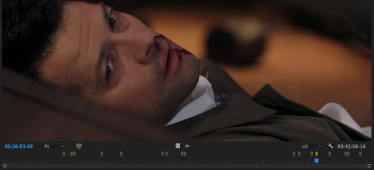
premiere also lets you color code and name markers, so ONE DAY i will go back and color code them all. the ones above are all the same color, but in a perfect world, i’d have a myraid—for destiel shots like hugs, touches, looks; for important pieces of dialogue; for action shots; etc. but for now this works ok for me, so that’s a project for another time!
between detailed scripts, one giant premiere project, markers, the wiki, and my own memory, i have so many points of reference that i can usually find any clip i need in about 2 minutes max. sound bites are often harder to start out, or tiny specific shots i haven’t used before, and that’s when i turn to tumblr gifsets or beloved mutuals to crowdsource. but if you’re as obsessive about marking/keeping neat scripts as i am, it gets easier and easier with every video you make. that’s part of why i’m able to cut videos together so quickly. (also i want to stress i do this for a living and have to produce/edit a new piece for my show every day so i’m used to it. and compared to constantly updating content/sources and news that changes every day, 327 highly documented episodes that never change are much easier to handle hahaha)
this is all great for me since i make so many videos and plan to continue doing so, but if you’re only making a few, this level of work isn’t worth it imo. really it’s all about developing a system that works for you. whatever you do with episodes/sourcing, though, i cannot recommend planning things out in a script ahead of time enough.
everything i just mentioned is producing, though. for the editing process, i usually do it in this order:
music first. any parts i want to cut, i make sure it all sounds smooth
then soundbites. i usually try to weave them into the lyrics—i have characters talk in breaks between lines or instrumental sections as much as possible. i’ll sometimes go so far as looped/extending an intsrumental part to make room for the soundbite i want there lol. if i do have dialogue over a line, i do the sound mixing/levels at this point as well to make sure everything is audible/one doesn’t overpower the other. (also i always include the video that goes with these bites when i drop them in, and decide later if i want to show the character speaking or have other clips cover the dialogue)
once i have all the audio locked in, then i bring in all my other video clips. sometimes i edit completely chronologically, sometimes jumping from section to section—it depends on the song or how i’m feeling
double check sound mixing. i usually listen to my videos through a few times, with headphones and without to make sure it’ll sound good no matter how people watch it
once i have picture and audio lock, i go through and color correct my clips. i’m basic and just use lumetri color in premiere, and usually just play with brightness, saturation, temperature, and tint until i like it
render and export! :)
i always have several audio tracks, but i try to keep my video tracks condensed. i’ll drop clips on a V2 level, and edit a section there, and drop the whole chunk down to V1 so i know it’s finished. that way when i leave and come back i can know where i left off/what’s done/etc. to give you an idea, this is the timeline for my what the hell video:

i always render as H.264 with high bitrate, and make sure to check “render at maximum depth” and “use maximum render quality” for the best quality. i’m sorry, but i don’t know what the equivalent options are in final cut, imovie, kdenlive, etc. i post on youtube mostly so i don’t have to sacrifice quality, but usually just using a lower bitrate will get you under the tumblr file size limit and it’ll still look good.
as for the anon who asked about “polishing”: first of all, thank you!! second of all, it’s in the details. all of this is a matter of taste and my own insanity, but here are some little things i always try to do:
after i color correct, i blur out any credits from the starts of episodes. i use gaussian blur for this, but really any blur tool works
as much as possible, i avoid clips where we see a character’s mouth move but don’t hear the words. in tv/film we call it “lip flap” and i just think it looks messy. also i’m trained to avoid it at all costs at work hahaha. it’s more for serious videos that this matters a lot to me (e.g. i think i did a really good job eliminating lip flap in my happy ending amv)—for comedy videos i don’t sweat it as much
i put audio fades on the start and end of every single audio clip i use, even if i don’t think i need it, to make sure everything sounds smooth
i use markers for timing, especially in action-y videos like what the hell. i’ll put a marker on the clip i’m using at the exact moment a punch lands, and in the song on the beat. if i have the magnet/snap in timeline tool on i can just easily snap them together instead of having to spend time finagling it
this is such a small thing but i dip/cut to black for a tiny bit at the start and end of every video. this way if i post with tumblr video player, there’s black between the loops, and it gives you a beat before the video restarts. i do this even on videos i post on youtube, just because i think it looks nicer/more professional
this is 1,500 words so i’m going to stop myself before i pull something. if you have follow-up questions feel free to ask and i’ll continue to add them to the vid help tag, but any more questions about sourcing clips or my process in general i’ll just link this post going forward. anyone who made it this far, i am sending to a telepathic kiss. thank you for reading and happy editing!
76 notes
·
View notes
Text
gif coloring tutorial
for @sappho-mia
a photoshop tutorial on how to make gifs that look like the ones in this gifset. I will only explain how to do the coloring, so if there’s any other part of gifmaking that you’d like for me to explain, let me know and I’ll make another tutorial or send you some tips!
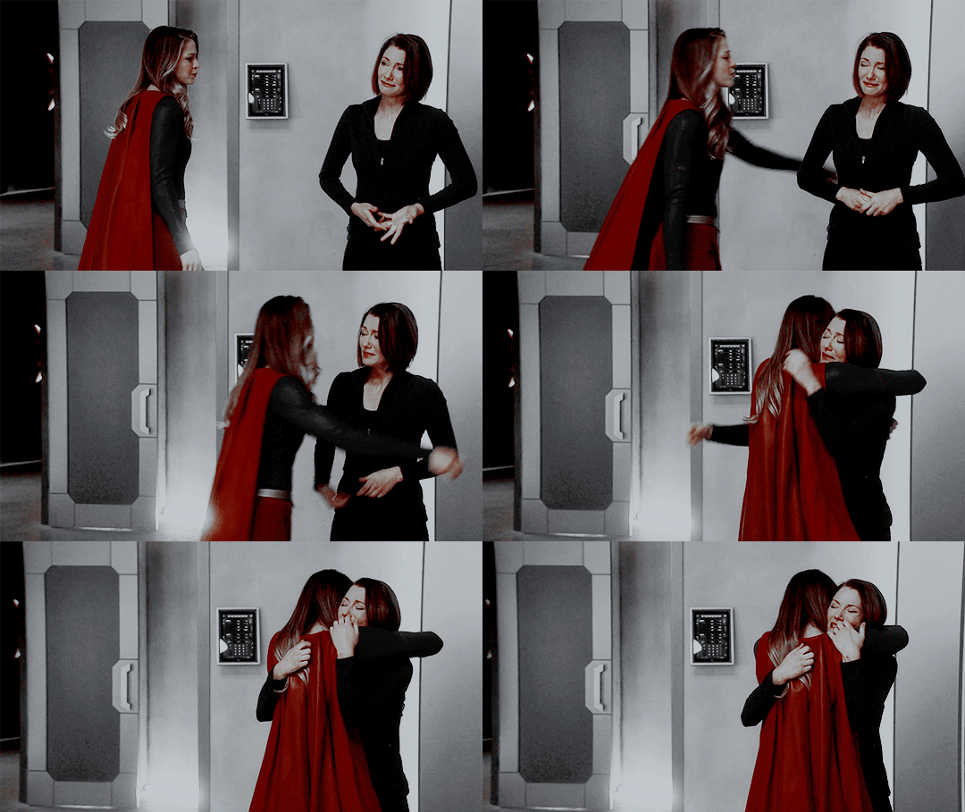
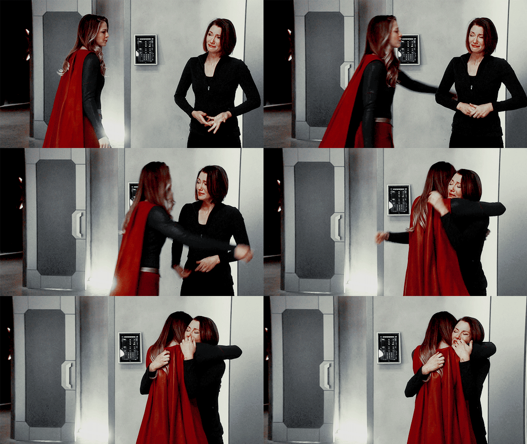
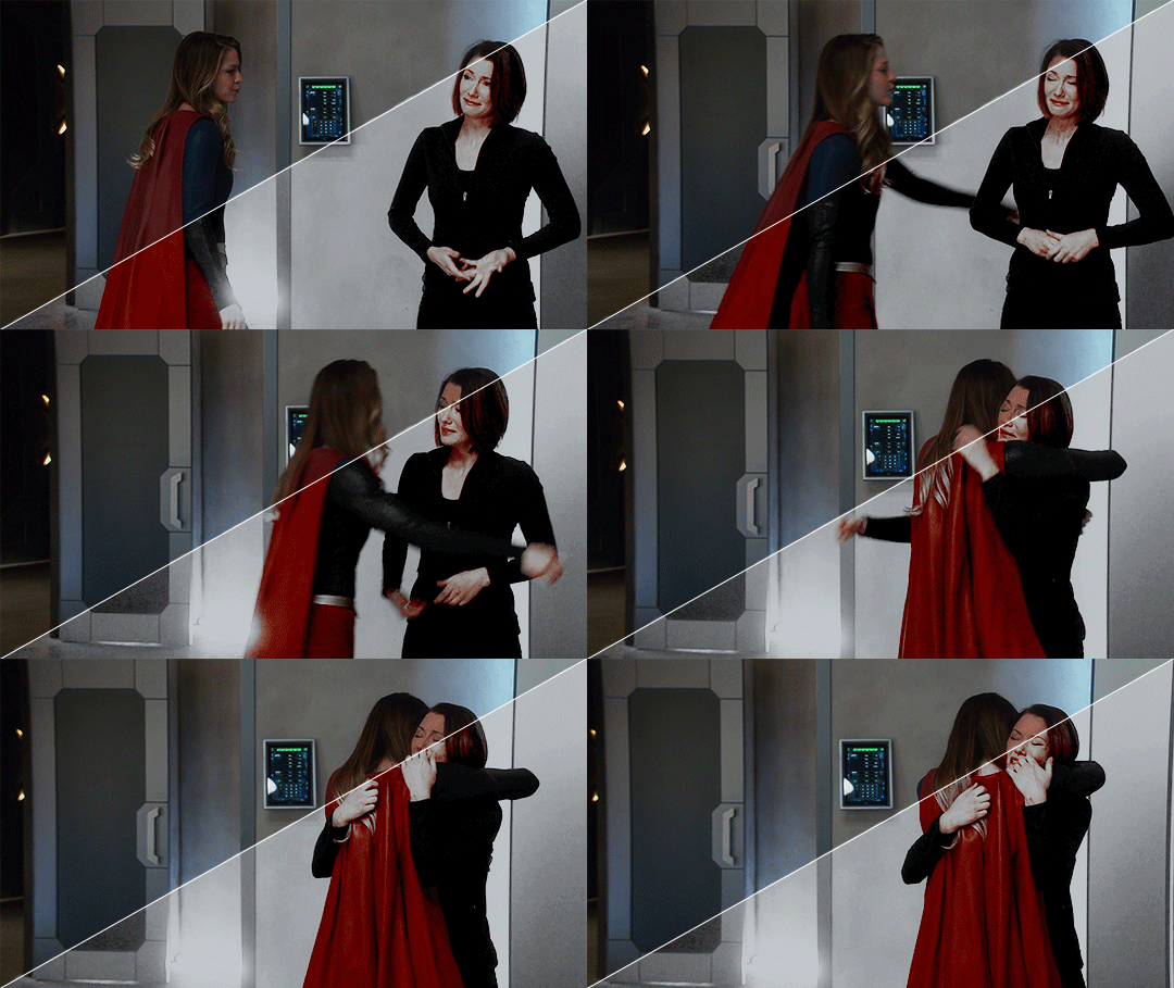
I’ll show you how to go from this:
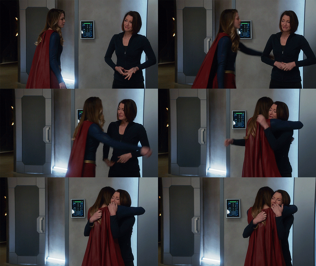
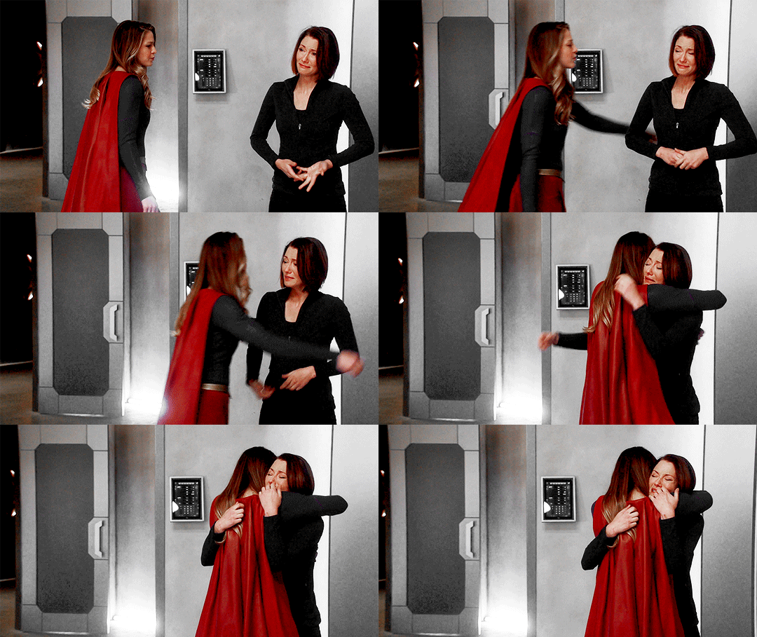
to this:
1. exposure
shows have the lovely habit of underexposing every scene, but you don’t want people looking at your gifs like this
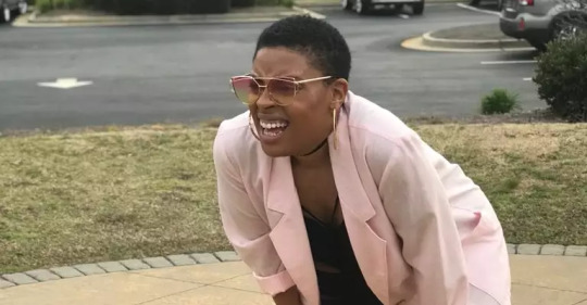
so: time to brighten that shit up!
I have a psd (an edited version of the one in this tutorial by @redkrypto) that I use and adjust for basically all my gifs, but for the sake of this tutorial I’ll do this step by step.
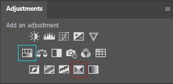
photoshop has a few good options for changing the exposure. first, go to window > adjustments to get this:

which is your biggest friend. the ones on exposure are these 4:
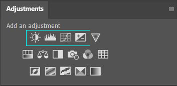
I’ll be honest, I have no idea what the difference between levels (the second one) and curves (the third one) is. they both adjust the tone of your gif - with the option to make the dark tones, the light tones and the midtones either brighter or less bright, separately. this’ll make your gif look less flat!
let’s take a look at levels:
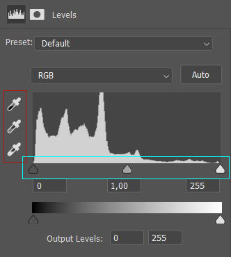
this might look daunting but I promise I don’t really know how to read the histogram either, I just use the little sliders (cyan) and see how it looks. you can also use one of the eyedroppers (red) and click on a part of your gif that you want to be black, white or grey, and the rest of the image will adjust to this. it might be a little too intense - in that case you can lower the opacity of the layer (see image below).
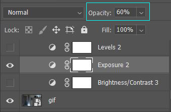
then there’s brightness/contrast and exposure. the difference between these two is that brightness will mostly affect the parts of your image that are already bright, while exposure will affect the whole image. the exposure window has another option I use often too, gamma correction. with gamma correction you can change the gamma levels of your gif, and I have no idea what that means but it sure does look good lmao
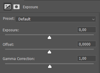
there not one ‘right’ way to do this, so just play around a little and see which ways you like the most :)
after brightening, our gif looks like this. yay!

for comparison:

2. coloring
I remember feeling very overwhelmed with all of photoshop’s options at first. I will discuss all of the ones I used to create this gif, but you definitely don’t have to use or understand all of them in order to make beautiful gifs!
two adjustments I use in pretty much every gif are hue/saturation (cyan) and selective color (red).
first, selective color. selective color basically gives you the option to single out a color in your gif and change it. the most important thing to understand here is which colors are opposites: red and cyan, green and magenta, blue and yellow. so if you’d want your yellows to be green, you use the magenta slider.
for the gif we’re making, we want kara’s cape to stand out, because red is going to be the only color left. these are the settings I used:

now it’s gonna look a little oversaturated, but we’ll fix that later on. I also made the yellows more red and less yellow and increased the blackness a little.
another way to make a color stand out is by removing the other colors -- the background is mostly yellow, green, cyan and blue. so we’re gonna go to hue/saturation and completely remove their saturation, which will make the wall behind them look gray.
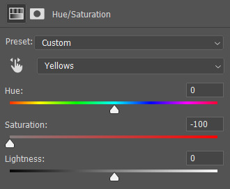
in the saturation window, you also get the option to reduce the lightness (and the hue, but we’ll get to that later). reducing the lightness does not do the same thing as increasing the blackness in selective color: reducing the lightness will give it more shadow, while increasing the blackness in selective color will make for example a lilac go to a purple, or a red to a deep red.
for our gif, I reduced the lightness (-13) and the saturation (-3) of the reds. now it looks like this:
the next step will make the gif look weird at first but after we add the other layers, it’ll look better. go to adjustments > photo filter and select ‘sepia’ (it’ll be a warming filter first - click on that and you’ll see all the other options). then increase the density:

next, we’ll move to channel mixer. channel mixer is one of my favorite adjustment layers because it’s the easiest way to make your colors look really different. there are three channels (red, green and blue) and the best way to use it is to just try things out and see how it looks. my settings for this gif were:

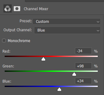
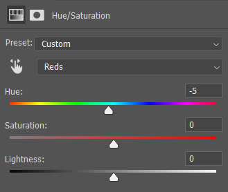
then I added another saturation layer and reduced the saturation for the yellows, greens, cyans and blues, and removed the saturation completely for the magentas. for the blues, I also decreased the lightness, and for the reds, I changed the hue a bit so it looks less yellow:
another selective color layer (with opacity and fill both at 65%):

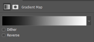
then add a gradient map (bottom right in the adjustments window). make sure it goes from black to white, and isn’t reversed. this will make the gif look a little softer! opacity: 20% fill: 50% (or your whole gif will be black and white)
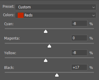
increase the red saturation a bit and increase the blackness with selective color, so it’ll look like this:
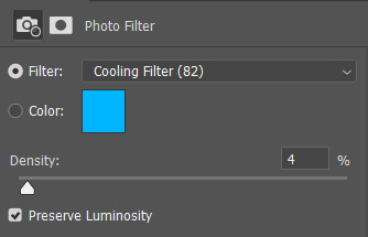
see if your exposure needs some tweaking, remove all the colors you don’t want (the background is mostly yellow now) and add another photo filter, a cooling filter this time, and set it at 4%.
finally, one last selective color layer:
and that’s it, we’re done!!

3. some final tips
it matters which layer is on top. if you use selective color to turn all the green into cyan and put a saturation layer on top of that, not a lot will happen if you increase or decrease the green saturation. but if you increase the cyan saturation, every part that photoshop recognizes as cyan now will become more saturated.
some scenes are a lot harder to color than others, and you’re allowed to just ignore the existence of those scenes. :-)
use folders or “groups” to put layers together. my psds are very chaotic but this helps me find things!
when making a set, your gifs should look good together, not just on their own - sometimes seeing my gifs together makes me realize I need to change the coloring / brightness in some of them. to make sure this realization doesn’t happen when I’ve finished all of them already, I always put them in a tumblr post in my drafts while I’m still working on them.
use creator tags when posting your gifs. so don’t just tag it as “supergirl” but also “supergirledit” and not just “kara danvers” but also “karadanversedit” - this is the easiest way for other people and other creators in your fandom to find you! if your set doesn’t show up in the tags (when you search supergirledit and click on “recent”), send me a message and I’ll help you figure out what went wrong.
try to make your coloring match the ‘mood’ of your gifset - is it dramatic? soft? angsty? romantic? should there be intense contrasts? lots of reds, or calmer blues? same goes for the font you choose, but that’s a whole other tutorial (that I am probably not qualified to give haha, but I can point you in the direction of some people that are really good at it!).
you’re going to make a lot of gifs you don’t like, and that’s okay. it doesn’t mean you’re not good at it, it means you’re learning and improving! and it can also mean that you forgot to turn off the night shift on your laptop and your ‘red’ gif turns out to be... definitely not red. lol

if you have any questions, don’t hesitate to ask!! good luck & have fun :)
#completeresources#allresources#gif tutorial#coloring tutorial#photoshop#photoshop tutorial#ps tutorial#dailyresources#mytutorials#I didn't use color balance for this one but that's a very useful one too!#and vibrance too#though that one makes ALL of your colors more vibrant and that's not always ideal
148 notes
·
View notes
Text
#showyourprocess
From planning to posting, share your process for making creative content!
To continue supporting content makers, this tag game is meant to show the entire process of making creative content: this can be for any creation.
RULES - When your work is tagged, show the process of its creation from planning to posting, then tag up to 5 people with a specific link to one of their creative works you’d like to see the process of. Use the tag #showyourprocess so we can find yours.
sabrina @lanwangiji tagged me to show how i made my zayn’s birthday edit! check out her explanation on this mesmerizing zayn’s edit
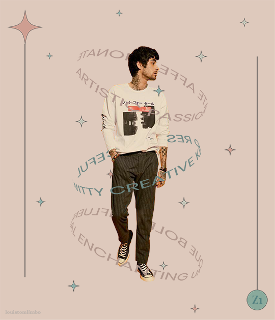
1. PLANNING
It’s Zayn’s birthday, I ought to make something because so far I have made birthday posts for Louis, Niall and Liam. I didn’t participate in his birthday challenge so I had more time to create something for his birthday. I saw this post by @spaceniall and instantly fell in love with it. It's so clean, so neat, an amazing edit. I had that post tagged for inspo and because my Louis’s birthday edit was a bit “grand”, I thought I should make something simple.
I went to look for some photos of Zayn everywhere. Literally e v e r y w h e r e. I saved every photo I found beautiful and there were a LOT. I asked my friends for adjectives that describe Louis best and added them on my Louis’s birthday post, and I followed that approach for this edit. I asked several friends what they think of Zayn and collected the adjectives.
This was a time where I haven’t used trello board, so I put all the adjectives in a google doc. Seriously I swear by trello board, they make my life easier.
After I had all the photos and the adjectives, I went to pinterest to look for the color palette. I forgot how and why I came up with this color scheme, but I believed I wanted something pastel and muted color.
I had this idea to make an evergreen birthday post. I didn’t want to state any “happy birthday zayn” or his age on the graphic. I didn’t want to make all the edits to have his face because I wanted to showcase my graphics and typography style lmao. So I came up with 2 pictures with Zayn’s face and one central picture with his name. And I’m obsessed with space stuffs so this birthday edit is space themed.
2. PROCESSING
This is one of my earliest edits that I made in Illustrator, though I used Photoshop as well.
2.1 REMOVING PICTURES BACKGROUND
Remember I saved a LOT of Zayn’s photos? Yeah? Well I had a hard time choosing the right one. I asked Sabrina to help lmao. After I agreed with myself which photos I would use, I opened Photoshop and prayed it won’t crash after 5 min.
I uploaded the 2 photos and then I used selection on Zayn and then clicked inverse and deleted the background. Recently I found this website who can delete your background in 1 min, tbh that’s a life saver. I recommend using them, if you hate removing backgrounds with Photoshop.
I saved the backgroundless Zayn’s photos as png. And we’re moving on to the next step
2.2 THE TYPOGRAPHY
I only used Photoshop to remove the backgrounds. Now onto Illustrator. Always pray it won’t close by itself every 5 min.
I don’t really remember which dimension I used, but I suspect it’s 600x700 px. I made 3 artboards and loaded the color palette I found from Pinterest. I made 3 rectangles as the backgrounds for each picture and filled them with my desired colors, 2 pink and 1 green. Green being the standalone was put in the middle.
A bit of excursion based on my experience
When you open an artboard in Illustrator, you’ll see a white background. When you save the file you’ve worked on, it’ll actually be transparent. That’s why I always draw a rectangle as a background so it has a solid color.
I focused on ZAYN (middle pic) first because I wanted that to be the main focus. I don’t remember the font I used and I already deleted all files. I followed this tutorial to make the text. Basically you write your text first and choose effect > 3d > extrude and bevel > isometric top. Changed the colors according to my color palette.
I moved on to the first picture, Zayn and the adjectives. I uploaded his photo to the artboard and put it in the middle. I wanted the adjectives to encircle him. I just followed this tutorial on how to make the effect. I made that text effect because that reminded me of the saturn ring lmao.
2.3 THE GRAPHIC DETAILS
Once I got the typography done, I made stars and moon to make the edits merrier and more space themed.
For the stars you can follow this tutorials. For the moon I made 2 circles, one of them was bigger. I put the smaller one in front and click minus front (I think). For the saturn planet, I made a circle with filling and an oval with stroke only, putting the oval infront of the circle and delete the back part of the ring (I hope this makes sense).
I have these lines around Zayn, my intention was to make Zayn pop and kind of crown him or give him a glowy effect sort-of.
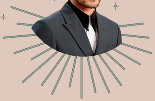
All I did was follow this tutorial and delete the lines at the top, because I didn’t want it to be too crowded. Then I put some stars and planets at the top to balance it.
2.4 FINISHING TOUCHES & EXPORTING
I rearranged some things, zoomed out the artboard so I could see everything as one post and picked and deleted some unwanted things. After I was satisfied, I added my watermark and it was my old url, I just typed louistomlinboo. (Now I made a logo-ish and use that as my watermark and the logo is not dependent on my url)
Ok I lied I used Photoshop again… so I had these adjectives in 2.1 that encircled him right but some parts of the texts are above him. I exported my Illustrator file as a psd, uploaded it on Photoshop and used layer mask magic to delete the texts that were above him to create an illusion that the texts went around and under him you know. See the picture below, some texts are beneath him.
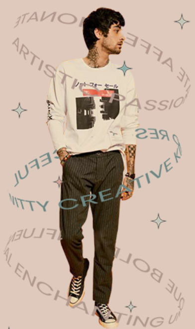
For this picture I exported the png file from Photoshop, the rest directly from Illustrator.
This was when I learned I needed to scale up, because on Illustrator they all look good in terms of quality. But when I posted it, the quality was reduced. That time I just exported as big as the dimensions and I was disappointed with the quality when it’s on tumblr.
3. POSTING
I uploaded the 3 pictures I have on tumblr and chose “happy birthday zayn” with star symbols/emojis to keep up with the space theme.
So I always write out what my caption will be with the “rich text” option.

Then I go to this color html website to add the gradient color in the caption and remove the “;” with “ “ in here. Once I have everything, I change rich text to html so I can put the text with color in html mode.
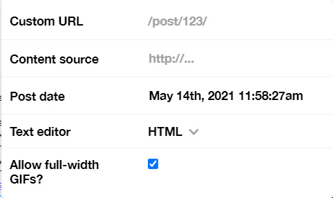
Put some tags related to Zayn. (self promotion time lol. i have compiled tags for 1d creators check them out here)
I finished I think a week earlier before Zayn's birthday so I saved it on draft. I posted around midnight (my timezone is CET), because oh boy it is a competition with birthday post lmao. That’s what I feel like at least. You know, everyone wants to make a birthday post, I feel I have a better chance If I post something first. Whenever I have something done earlier before a certain due date, I either save it on draft or schedule it so it’ll be posted automatically.
Yeah that’s it! It’s not as detailed as before I think because the files are deleted sorry!
i’m tagging:
@spaceniall for this wonderful niall’s birthday edit
@she-fearlesss for this magnificent louis’s birthday gifset
@finewalls for this mesmerizing animation
@louitomlinson (i know you’re not that active but if you want and can!) for this amazing edit
and @tomlinsun for this cool edit
21 notes
·
View notes
Text
Gif Maker Appreciation Tag
rules: answer the first half of the questions with gifsets of your own, then answer the second half by tagging gif makers you love!
tagged by @iridescentides @miriammaisel @molinareggie ty loves!
LINK A GIFSET...
Link a gifset you’re really proud of:
reggie + flower symbolism . it took me a bit to research and pick out the flowers but i think it really paid off! i love the way it looks and i should do more things like it i think
Link a gifset where you tried something new:
luke patterson + quotes . i just love having little doodles next to lettering when i do them in my sketchbook so i thought it would be cool to have a gif version of that! so thats what i did!
Link a gifset that features your favorite character or celebrity:
charlie gillespie edit! i’m really proud of how this came out tbh! i like the vibrancy of the colors and the b&w contrast next to it. plus i really like doing shaped gifs? idk i just think it turned out nice
Link a gifset that you want more people to see:
my julie molina pink + purple gifset. i worked on this for a while trying to get the colors right and it took me forever to find a typography set that i liked. i just really love the way it looks
Link a gifset that you had fun making:
jatp 5 songs ! i actually really love drawing/writing lettering and i think it always looks cool to digitalize it! so i did that here and tried to convey the energy of the song with the typography and i think it worked? idk to me i think they match well
Link a gifset that you created as part of a meme, challenge, or series:
jatp women - julie/flynn gifset! i think this might honestly be one of my best gifsets. the colors are nice, the text is pretty, and i just love everything about it. i def want to make more gifs like this in the future
Link a gifset of yours that makes you smile:
nick anderson + being confused. a simple edit, but i just think his facial expressions are so funny lmao
Link a gifset that you made for someone else:
my wonder woman gifset i made for @owenjoyner ! im still super proud of this set and i think it turned out really well :’)
TAG SOMEONE WHO...
Tag someone who inspired you to start making gifs:
@laufeysons daphne was one of the first people i followed here and i remember seeing her gifs and telling myself “i wanna do that one day” and now look at me!!! i’m doing it, ma, i’m doing it!
Tag someone who makes great vibrant gifs:
@iridescentides and @dani-clayton both make such amazing and vibrant gifs! vibrancy is something i can be very scared of so i’m always in awe when these two pull it off so beautifully!
Tag someone who makes great pale/pastel gifs:
@molinareggie alexis uses pale colors for her color palette gifsets and they still manage to turn out bright? like its not washed out or anything, its a nice pastel-y feel to the whole sets.
Tag someone who gifs for a fandom you love:
@alinastarksov valentina makes some of the best jatp edits out there tbh. the coloring is always so nice and the mix of serious + funny gifsets is amazing.
Tag someone who uses text/typography really well in their gifsets:
@andstitch uses text very well!! not only is everything easily legible, but it always helps convey the overall tone of the gifsets!
Tag someone who motivates you to step up your game:
is it a cop out to say literally everyone on this site? i’m not even joking. seriously, i’m in a lot of tags and i see edits ranging from people who have been vigorously giffing for years vs people who just started and every single edit inspires me to keep going. i would not be where i am with giffing if it weren’t for the support i get from people or seeing beautiful edits every single day.
Tag someone who you have taken inspiration from:
@owenjoyner and @bisexualsdean diana and el both have such creative minds that i often find myself tagging everything they make with my inspiration tag! the way they format their gifs especially influence me!
Tag gif makers who you admire and appreciate! (Put as many people here as you want!):
@stilestilinskies @denalifoxx @owenjoyner @bisexualsdean @alinastarksov @inejghafta @sambuckv @laufeysons @spencershastings @lizzie-mcguires @abigailshobbs @kellyabbott @oretsevmal @inej-g @austin-mahones @malikjavaddzayn @bukleys @dani-clayton @madeline-kahn
18 notes
·
View notes
Text
even more reflection and review
thank you @momentofmemory for the tag! ✨
what fandoms did you create for?
this year it was pretty much only the batfam, 9-1-1, and teen wolf
how many works did you make this year? fics (ao3, tumblr, wherever), edits, gifsets, moodboards, playlists, fanart, vids, meta?
i wrote and published 53 fics on ao3, i've made two playlists for 9-1-1, and i've made a pinterest board for the space pirates AU im writing for 9-1-1 as well as one for my original fantasy story i'm working on.
what are you most proud of?
it varies but i really like this my post s4 teen wolf fic
any stats you wanna tell us about?
in 2021 i wrote a total of 249 031 words on ao3, which is pretty neat
what inspired you this year? any specific works or creators?
my friends @dottie-wan-kenobi @littlescarletstar @aknifespoint were a large source of inspiration for the 9-1-1 fandom. we've come up with so many AUs on discord and without them i definitely wouldn't have decided to write the 9-1-1 space pirates AU.
what's a piece you didn't expect to make? why?
every single one of my teen wolf fics lmao. i wasn't even expecting to watch teen wolf this year but here we are, and i guess i can't complain, it's fun. this fic especially i was not expecting to write (though it's definitely now one of my faves)
what are you excited to work on next year?
i'm excited to finish my whumptober prompts and my bthb. i'm not going to commit to anything set early in the year bc i'm very busy and stressed rn, but i have many projects i need to work on! :3
no pressure tags- @fanfictiongreenirises @whistlemist @geminibabyhere and anyone else who wants to do this <33
5 notes
·
View notes
Text
content creator: year in review
tagged by @touyax and @mazusu tysm for tagging me guys!!💞
1. First creation and most recent creation of 2020: this hmc edit was the first anime edit of the year (the very first one was red queen edit but it’s lit related so I’m not gonna link it here) and this itachi edit was the most recent one.
2. One of your favorite creations from 2020: probably this noragami edit. I love how it ended up looking especially the coloring since what I had in mind was totally different from the final result
3. A creation you’re really proud of: this team 7 edit and this itachi edit cause I stepped out of my “comfort zone” there and tried out some new styles and techniques so I’m really proud of making something that actually pleased me.
4. New style you tried this year and a gifset that uses it: i tried painting style!! I think i used it a little in each of my edits hehe but this bnha edit and this karasuno edit use it the best:))
5. A creation that took you forever: this bnha edit. I couldn’t get any motivation or inspiration plus i had exams back then. whatever i did i did like in 15 minutes and went to bed thinking i liked it. but the next I ended up hating the whole thing so it took at least 3 weeks (maybe even over a month) to finish it.
6. Your creation from 2020 that received the most notes: this noragami edit. I know this isn’t much but i didn’t even expect it to receive half of that amount lmao.
7. A creation you think deserved more notes: the most underrated of my creations are this fairy tail gifset and this itachi edit. I mean all of the creations deserve more notes and I’m not only talking about mine rn but eh guess this can’t be helped.
8. Creation with a favorite scene/quote: this hmc edit cause i don’t think there’s any other edit i created for a scene/quote hskshsj
9. A new fandom you joined and a creation you made for it: lmao I started watching animes in 2020 so each fandom I’m in rn i joined last year so every edit of mine can be put here gskagsjsh
10. A creation you made that breaks your heart: umm here’s a little problem I don’t think have an edit that “break my heart”. sure some panels can really be put into the category for example in 5th panel of itachis edit the mangacap is from when itachi said goodbye to sasuke during the war and that scene really made me cry but those emotions aren’t put into an edit as whole so I don’t consider it to be “heartbreaking” and the same goes for the other edits.
11. A ‘simple’ creation that you really love: this kageyama & hinata duo edit. It’s really simple and took me like an hour or two to finish it (it usually takes me at least 2-3 days😔) but i really like it!!
12. A creation that was inspired by another one (add both your creation and the one that inspired it!): this noragami edit was inspired by @/dicennio’s incredible edits (yes i mean all of them).
13. A favorite creation created by someone else: this is gonna be long so bear with me please
kuroo | spirited away | dabi by @kiyomie
pm100 | oikawa | samurai champloo by @noxdivina
nanami | oikawa | lois lane by @choutarouootori
snk | dabi | hxh by @mob-psycho
dabi | kurapika | gon freecss @dicennio
kuroo | fma | setter by @celiabowens
shouto | oikawa | matsuoka @runwiththewind
alphonse | yato | bakugou by @elriccs
bakugou | hawks & dabi | mizuno by @svmeragi
psycho pass | dimitri blaiddyd | psycho pass by @zenien
persona 5 | jjk | ping pong by @25th
kurapika | hinata | znt by @emperanas
lucy heartfilia | dabi | killua by @mazusu
nakahara | hange zoe | kageyama by @koujis
mp100 | inumaki | kurapika by @tcmiokas
tomioka | karasuno | bokuto & akaashi by @katsukes
gojo | dabi | jshk by @sukerokus
hanako-kun | edward | tomioka by @gojosattoru
jjk | bloodborne | jjk by @jidai
oikawa & iwaizumi | given | jshk by @feativen
bsd | oikawa | bsd by @bokuroo
spirited away by @rosehathway
bnha (idk who made it tho😔)
(NOTE: I just LOVE all of your creations okay? all of you are amazing creators and I really adore all of your edits/gifs/colorings. and trust me when I say I admire your talent I mean each and every one of you. and the only reason I linked the creations I did was because they were the first I found while searching for my fave edits or else I would have to link your creation’s tag because of my inability to choose from all those incredible and awesome creations you made this year♡)
14. Some of your favorite content creators from the year: ok the list is pretty long and I literally have fish’s memory so I might (and most definitely) will forget to mention someone but here we go
@25th @biscuitwalk @bokuroo @celiabowens @choutarouootori @dicennio @elriccs @emperanas @feativen @gojosattoru @iamyou @inejkaz @jidai @katsukes @kiyomie @koujis @mazusu @mob-psycho @noxdivina @princesskittten @ramenpng @runwiththewind @sukerokus @svmeragi @tcmiokas @zenien
15. And for good measure, another a couple more creations of yours that you love: well I love all of the edits I’ve already linked but from those that I haven’t mentioned yet are this fulmetal alchemist edit and this konoha edit.
tagging everyone I’ve mentioned here!!
#c: game#th: tag game#m: mentioned#this certainly took a wile but i enjoyed doing this a lot!!#anyways hope i haven’t missed anyone#or any of the incredible edits you guys created this year!!!
23 notes
·
View notes
Photo
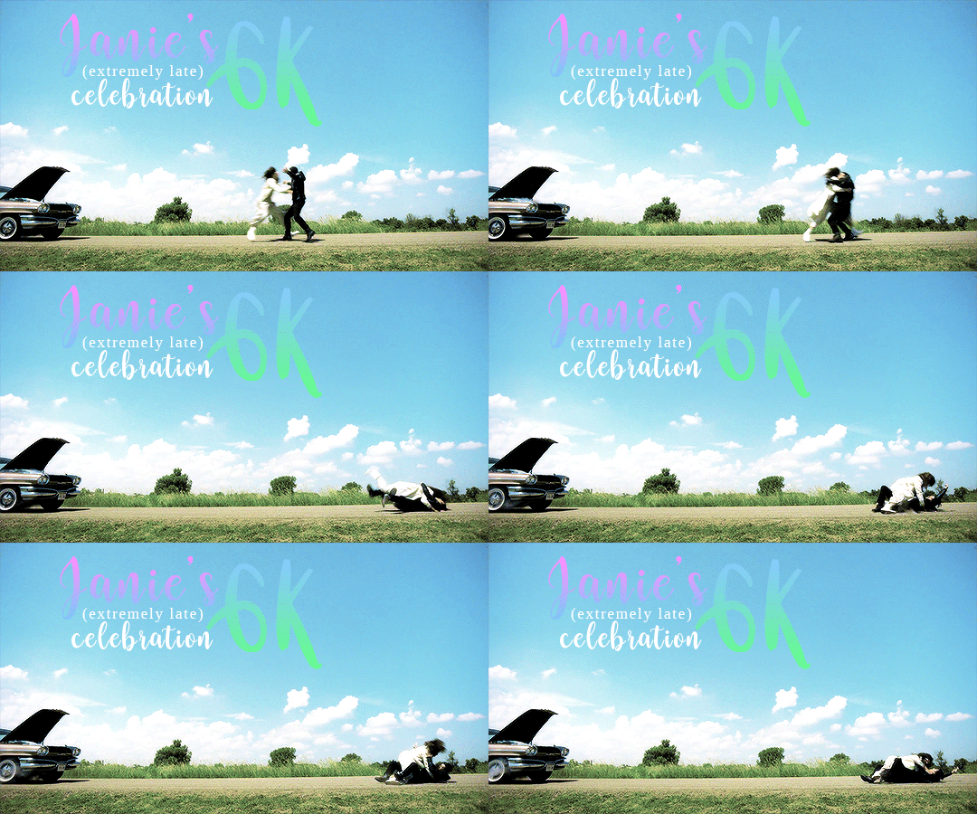
I was looking through my blog and came across a follower celebration that I was supposed to do and definitely never did for some reason and uh. That’s definitely not happening now but I did want to just do something, so I thought - I follow a lot of great content creators, so why not highlight them?
A lot of people do multiple things even if I only put them in one category so check out their tags and their work. <3
Glorious Gifmakers:
@olisgifs makes such fantastic gifs (and she did this lovely header)! Her gifs are so thoughtful of the characters and who they are as people, and you can tell that she really loves all the characters. || Favorite set || Favorite series ||
@anya-chalotra has some of the most amazing gifs I’ve seen on this site. She experiments with such a cool style and every gifset I’ve seen of hers has absolutely taken my breath away, they’re amazing! || Favorite set ||
@tuafives honestly the fact that she believes in Hufflepuff Five already makes them a fantastic blog, but her gifs in general are just fantastic! The coloring is always so pretty and I’m obsessed with them. || Favorite set ||
@charmingqueenie I’m always hit with a blast from the past from her gifs in the best possible way. Some of the best Charmed gifs I’ve seen honestly, and her LNC series has my whole ass heart. || Favorite set || Favorite series ||
@inappropriateexplosions Experiments with such different styles and I love it! [meme voice] She has the range, dahling! I love seeing what different style she’s going to do next and it’s always absolutely lovely. || Favorite series ||
@challengerblue Her gifsets need more love and it is a crime, because LOOK at her edit tag!!! These are all such beautiful gifsets and I am obsessed with each and every one! The coloring! The scenes chosen! The talent! || Favorite set ||
@captain-flint Every time I see one of their sets: “Oh the talent jumped out huh?” Has so many lovely Buddie sets and Eddie sets in general and I love them all!!! || Favorite set || Another Favorite ||
@joel-miller honestly I’m getting repetitive here but I can’t help that every single gif-maker is just so so talented. Has fantastic sets and probably my only mutual who also gifs TLOU which??? I love!!! || Favorite set ||
@chloedoeslucifer has such lovely sets!! I’m a particular fan of her parallel sets because she picks up on SO many parallels that I didn’t even notice and it’s amazing. || Favorite set ||
@i-am-irondad Libby’s sets make me so emotional??? Such great Iron Dad/Iron Fam content in particular and it feeds my soul, I just love these sets and the found families that she gifs. <3 || Favorite series || Favorite set ||
@stevenrogered I think the one good thing about the “since you’ve been gone”/”in your orbit” feature is that I got to see their awesome gifs for SO many fandoms that I’m in (and also made me think I was following them for a very long time and I was so sad when I realized I wasn’t lmao). Just fantastic gifs all around! || Favorite set ||
@diegohargreves I love love love the coloring used in these gifsets! The yellow in particular is always fantastic and I rarely see it used in gifsets, so I appreciate seeing it - they’re always so vibrant and lovely sets! || Favorite set ||
@felicityollies has gifsets that I admire from afar now that I don’t watch Arrow anymore lmaooo but there’s always going to be a part of me that still ships Olicity and that part of me dies with how good her gifs are! Genuinely just *chef’s kiss* || Favorite set ||
@vaughnsgreenwood I also look at Dannii’s sets from afar because we don’t share many fandoms but her skills are just FANTASTIC. Also, even though I’m not going to watch the new Charmed her gifsets make me ship Harry and Macy so thanks for that lol. || Favorite set ||
@marcomardon graciously lets me call her Canada since I had very little reading comprehension when I read her blog, and also makes great sets! I love her stuff, especially when it comes to the rogues!! || Favorite set ||
Amazing Artists(/Graphic Makers):
@undead--hotmess has such lovely art! I’m so in awe of the talent, their paintings I’ve seen I’d say would look like real photographs like...it’s amazing || Favorite piece ||
@superbandnerd99 Okay real talk idk if she has more works on tumblr but I just need to share this one because it’s beautiful and everyone should see it and I’m 1000% updating it when she has the final piece out!!
@the-maidofmischief like some of THE best icons I’ve seen??? I love them all so much??? They’re so vibrant and colorful and absolutely beautiful and I’ve made it a mission to have basically all of her icons on my different social media accounts lmao || Favorite piece ||
@fengshuismirke her art is just. SO good. I was so blown away by a Martin piece that I’m tagging in here but I’m just in awe of her work!!! Check out her “my stuff” tag because she also writes! || Favorite piece ||
Wonderful Writers:
@ginnxtonic Ho boy. Ginny’s fics.....her writing is so good that I am now invested in the lives of AU children of Theon/Sansa in Game of Thrones. That’s how invested her fics will get you. They’re so wonderfully in character and she puts real heart and work into her fics and it shows. || Favorite work || Favorite series ||
@aprilthegayqueen has such wonderful fics! The ones I’ve read have been slice-of-life and character studies and I absolutely love them. They’re also in fandoms I haven’t been in for a while and they make me want to immediately rewatch. :’) || Favorite work ||
@zaritomaz hnnnng Mina has written some of my FAVORITE works of all time. She has such a talent for writing and it’s always just so beautiful, poetic, and lovely. || Favorite work ||
@nightskywriter has such lovely fics!! I personally have read through all her TUA fics and they’re *chef’s kiss* fantastic. She has a very fun style of writing and it really shines through! || Favorite work ||
@incendiaglacies Has such a long and varied history of writing and it’s awesome! I sadly don’t share many fandoms with her anymore but I’ve seen her Dream Movie challenge and I’m reading through her book and she’s just such a talented author with such cool ideas! || Favorite work || Check this out! ||
@hedgiwithapen the ANGST hedgi writes oh my goodness. I’m pretty sure a common tag on multiple people’s blogs for Hedgi’s fics is “dammit hedgi” lmao! Amazing stuff (even if they fill me with pain). || Favorite work ||
@deadtedkord Meg’s writing....it is just......so so good. They’re pieces upon pieces of just fantastic writing and literally any compliment I give here would not measure up to how awesome her fics are. || Favorite work ||
I’m sorry if I missed anyone, know that even if you’re not on here it’s bc I have no brain cells and that your work is awesome (and please send me your stuff, I love to see it)! Be sure to give these folks some love, tags, and comments. Thanks to all the content creators out there, you guys are awesome. <3
#janie's 6k celebration#so fun fact#this is like 2 years late bc i realized i'm close to 7k now and i was like 'hm what did i do in previous celebrations' and realized#'oh. did not do this celebration at all' but y'know#even better bc i get to highlight even more folks!!!!
56 notes
·
View notes
Text
creator tag game
Rules: answer the questions and then tag 10+ other creators to answer the questions!
first creation and most recent creation of 2020: first and most recent
one of your favorite creations from 2020: this is probably my favorite gifset ive made this year just bc he’s............. so pretty and the coloring looks good and it’s just!! brilliant
a creation you’re really proud of: this one, which is one of my most recent sets... it just looks good to me? and it was something new i tried this year (and yes its the one from the next question) and it turned out nice and i just? really enjoyed it??
a new style you tried this year and a gifset that uses it: i started using actual typography in edits in like. the last couple of days lmao which i did here and here, i always thought sets w typography were so cool and i. wanna learn to do it more
your favorite coloring: this the boys set looks really good imo and i’m super proud of the coloring (blood tw) also this dash and lily set has really nice coloring and also i really like this the modern age: my week with cameron collier set very much it looks pretty
a creation that took you forever: this blue set and this red set both took a really long time (and was also a new style i tried this year) and im v proud of them
your creation from 2020 that received the most notes: this dash and lily nick jonas cameo one and once again i must say thank you nick jonas
a creation you think deserved more notes: this jack and dean set just bc like... they predicted covid y'all
a creation with a favorite scene/quote: this xander harris set!!! the zeppo is one of my absolute favorite buffy episodes and this scene just.... hits real hard for me
a new fandom you joined and a creation you made for it: dash and lily!! but also i kinda got heavy on the austin abrams fandom lmao i’ve made a lot of things for both (including an entire austin abrams source blog which IS linked throughout this post) but as far as dash and lily goes im really happy with this lily wardrobe gifset bc its like. idk it looks good to me and im proud of it and its also almost my most popular set of the year
a creation you made that breaks your heart: this escape the night s4 death scene absolutely kills me because tana did Not deserve to go out like that, also this dash and lily set kills me every time
a ‘simple’ creation that you really love: this gifset is literally just a few gifs of an outfit but i adore it very much, this set is also just a one second clip put into two very simple gifs with barely any coloring but i adore it v much
a creation that was inspired by another one (add both your creation and the one that inspired it!): okay i literally just posted this set but....... i love it ok and it was inspired by this set by @lorelaigilmo
a favorite creation created by someone else: okay i have. a lot of gifsets i ADORE from this year but immediately coming to mind are this set by @anakin-skywalker which has such pretty coloring and such an awesome layout, this set by @zoeyxjoan and tbh i havent seen the show its from but the coloring and typography and everything about this set is so GOOD, this set by @meliorn is so pretty i havent seen this show but the rainbow coloring has me weak, this set by @stupidape is so pretty i havent seen lotr but its such a pretty set the colors and typography and everything i love it, this set by @msjessicaday is so pretty i could scream the rainbow colors are so nice and the layout is so cute i love it, this set by @eddiediaz has me going insane its so pretty and so well done and i could scream, and this set by @robintunney is super cool and i love the cutouts!!
some of your favorite content creators from the year: there are so many but people ive really loved especially in the past few months are @nomoregoldfish, @jakeperalta, @danslevy and @cerealbishh
for good measure, another a couple more creations of yours that you love: this ani achola set bc she’s very pretty and a Good character and also i just like how the set turned out, also this ani achola set again bc she’s pretty, this charlie st george set bc its adorable, this chalex set where charlie’s being protective af, this the boys set bc the development... i could sob, this dash and lily set is hilarious, this one is also hilarious and dash said gay rights
i was tagged by @danslevy but i’m too nervous to tag people skdfjhsd but if u wanna do it pls do and say i tagged you!!
9 notes
·
View notes
Photo
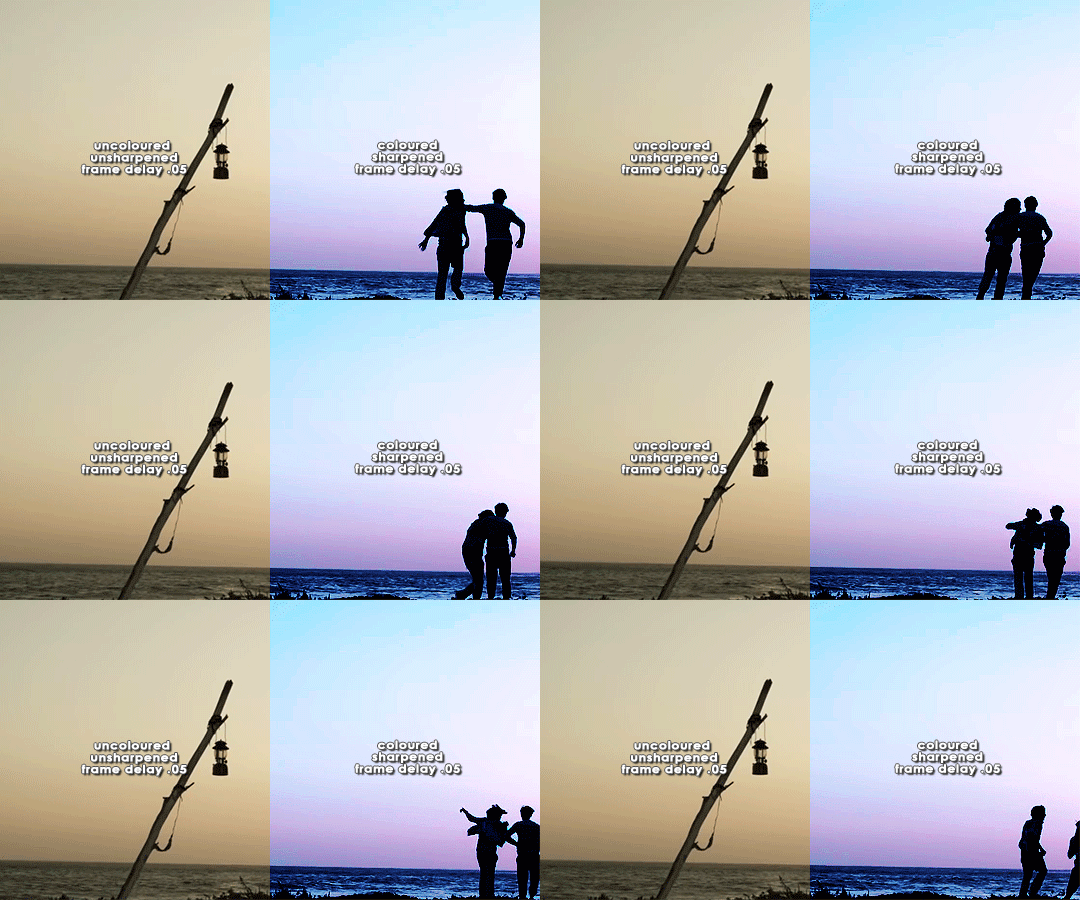


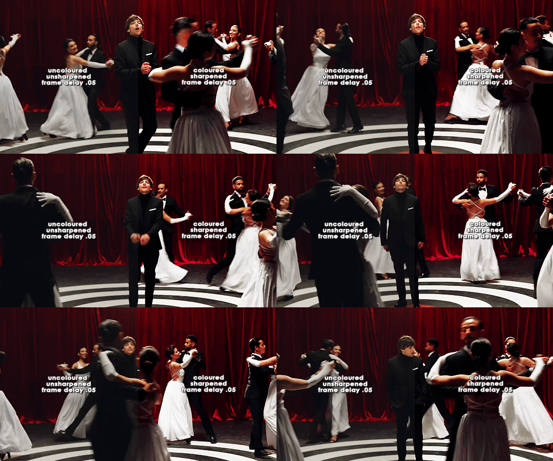
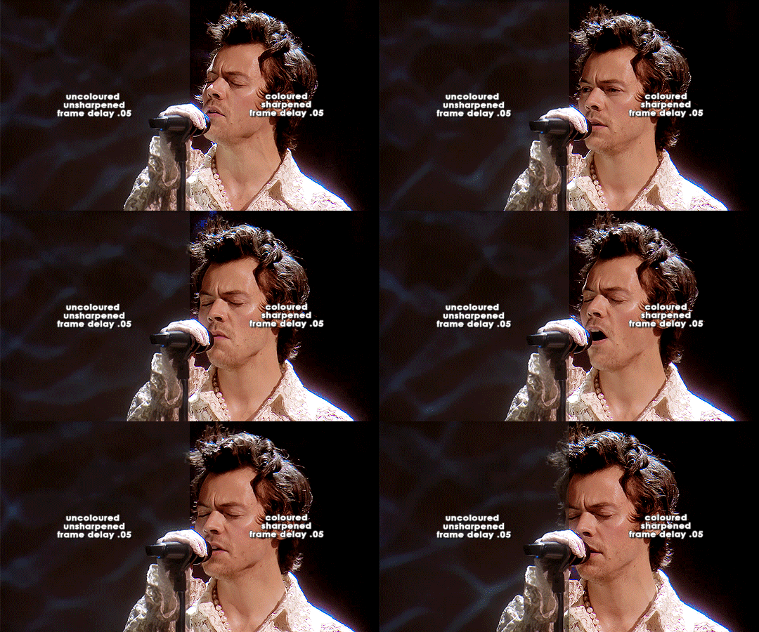
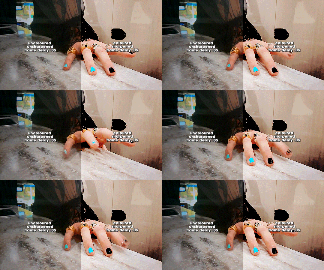
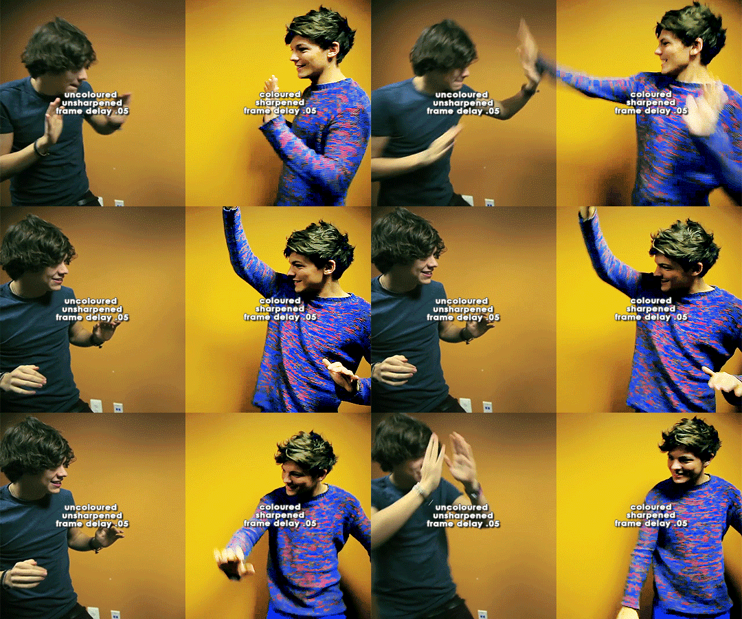
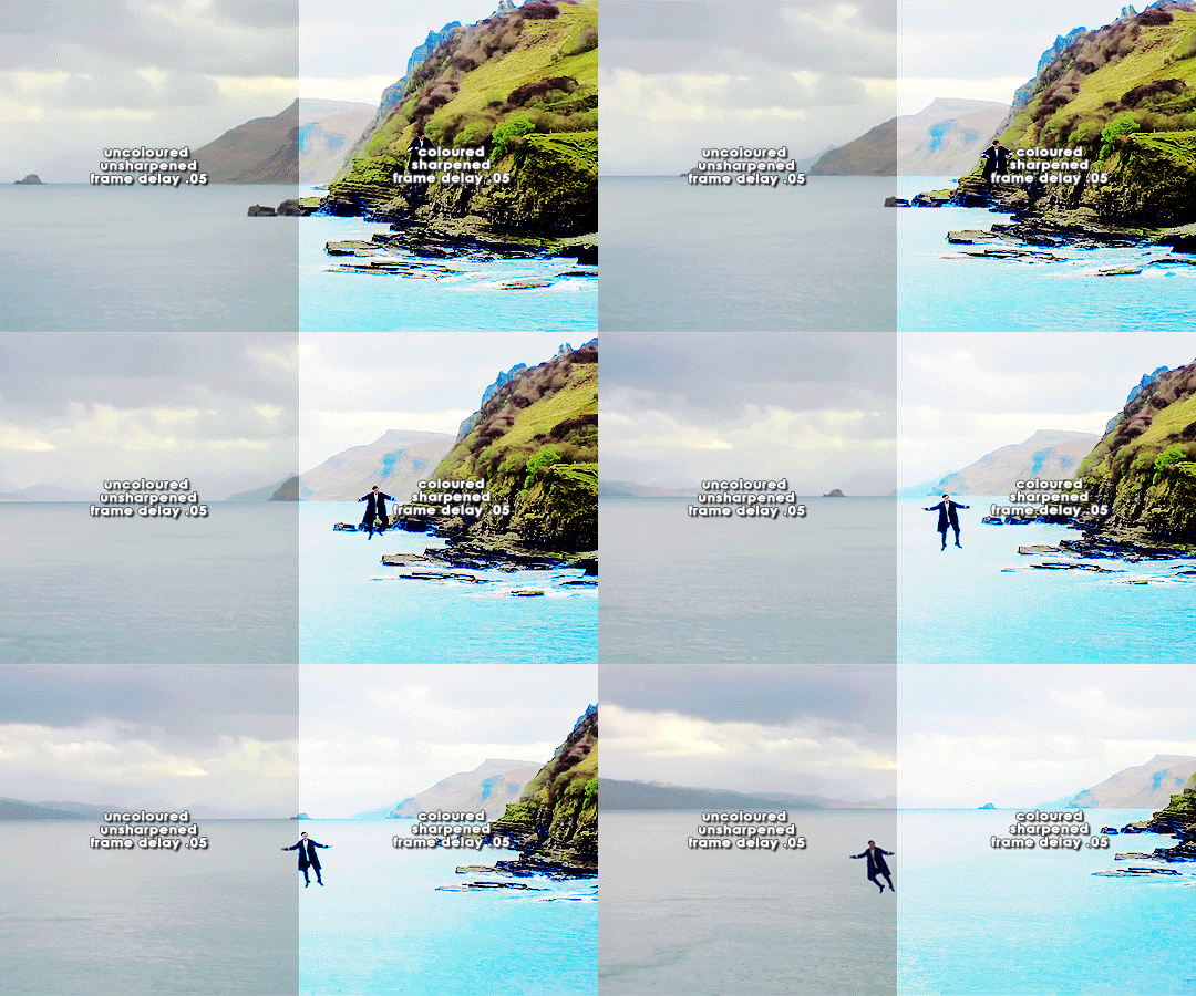
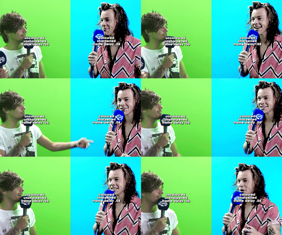
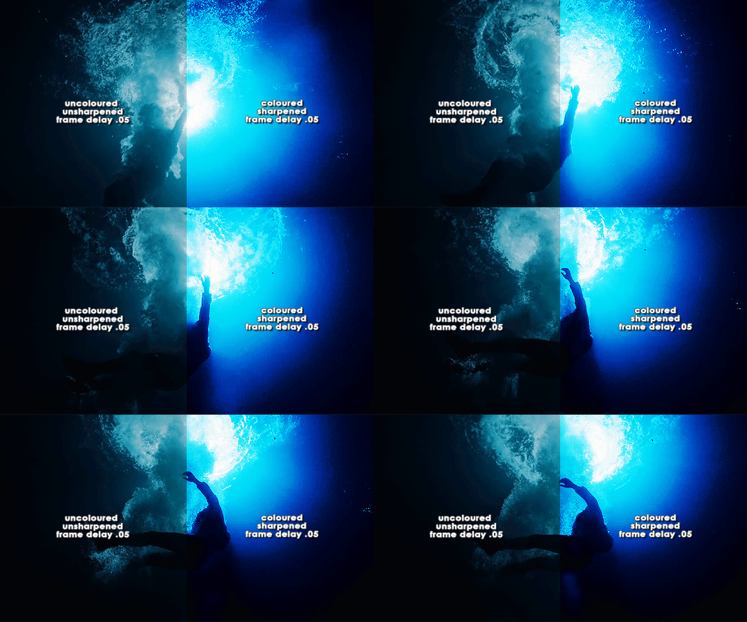
ORIGINAL → EDITED
gif making process
thank you so so much to the lovely and talented @pridesobright and @supportivehusbands for tagging me :’) reading about your processes was so interesting!!
LEFT: cropped, resized (height 300px; width 540px), unedited, unsharpened, frame delay set to 0.05
RIGHT: cropped, resized (height 300px; width 540px), edited, sharpened, frame delay set to 0.05
ideally, 1080p is what i’d use for everything, but sometimes you just have to settle for what you can get (and if you’re cursed…………. you have to battle with less than 480p……….. im looking at you, miss ‘now kiss me you fool’ footage). for this post, i made gifs from ten separate videos to illustrate how even though your source materials are wildly different from each other, the resulting gifs can still be stylistically similar. this is why it’s so upsetting to see people steal gifs like it’s nothing. we put so much thought and care and time into our posts and i can’t even put into words how discouraging it is to see people act like crediting gif makers is a hardship.
i have a note filled with ideas for lyric sets, parallels, etc etc that i work from, but sometimes i’ll just sit down and pick a random video and play around with whatever idea i have in the moment. (that’s how this set came to be!)
after i’ve imported the footage to photoshop (i use cc 2019, although i first started out using cs5 and it’ll always have a soft spot in my heart), removed any redundant frames, and cropped it, i’ll resize it (to 540px more often than not), and set the frame delay to 0.05. when all that’s done, i can colour.
i colour every gifset from scratch — i’ve never had much success with using the same psd on other gifs. it totally works for gifs from the same source, but when you’re using like six different videos for the one gifset, you have to take much more care in making them all correspond to the aesthetic you’re planning for the post. i tend to choose a dominant theme or colour to work from, like blue, green, magenta, pastels, rainbow, etc.
i usually begin with curves and levels until im happy with the brightness. then i’ll move on to either selective colour or colour balance or vibrance, depending on the original colours of the footage. i almost always skew my gifs towards blues and cyans and magentas rather than yellows and greens (i lean more towards coolness or neutrals rather than warmth). and im just really fond of blue, which is apparent if you’ve ever seen anything i’ve made lmao especially if louis’ eyes are involved. this is definitely where i spend the most time messing around with different settings (like increasing cyans and blues and blacks in general / increasing cyans in whites if i want the sky to look more blue / decreasing the blacks in whites for contrast / decreasing the cyans in reds to make them really red / decreasing the yellows across the board, but most definitely in blues and cyans / decreasing magentas in greens if i want Very Bright greens). sometimes i lose my mind a little and i end up with like twelve selective colour layers and im like This Is Fine . skdjfskjf anyways, when everything looks as vibrant and colourful as i want it, i’ll go back to curves or levels or add a contrast layer to make everything look stronger. i also might go back to selective colour or vibrance with incremental changes at the end, just as a final touch. [tl;dr: curves > levels > colour balance > vibrance > selective colour > contrast > go back for any little amendments] for black and white gifs, i’ll start with a gradient map and then continue with curves, levels, etc. after all that’s done, i’ll convert to video timeline > select all layers > filter for smart objects > either sharpen with this action or use these smart sharpen settings > add text if the post calls for it (if it’s a concept/lyric gifset, i like to play around with the settings — although century gothic is my favourite font for this — and if it’s a captioned gifset my standard is arial bold italic / drop shadow to 140 degrees / grey stroke / adjust font pt according to the size of the gif) > export > save for web. et voilà!! one gif down, probably nine to go sdkfksjdfhsjdf
the double edged sword of making gifs for one direction fandom is the sheer volume of footage available to you: on the one hand, you have a whole decade’s worth of moments to gif (and that’s incredible!!!), and on the other, it’s so difficult and time consuming to colour all of these separate moments in a cohesive way that hopefully expresses your own unique creative style. so sometimes it’s frankly impossible to make certain things look the way you want them to. maybe you can’t find high quality footage (the absolute BANES of my existence are the rtl footage where they reacted to themselves playing football at boston common and the louis is loud……loud……….and……..loud footage where you can see harry’s face close up. it’s a TRAVESTY that they don’t exist in 1080p and i WILL scream it from the rooftops), or the moments you want to gif simply refuse to look good next to each other because they’re so wildly dissimilar in hue that no matter what you do, they look strange and disjointed when juxtaposed (in those moments i do tend to either give up or choose to make them black and white). but honestly? the obstacles i’ve come across while making gifs for this fandom have been amazing learning opportunities for me. i’ve grown into and experimented with my style way more than i ever did anywhere else, and i continue to feel inspired by this fandom every day, so thank you to every single creator for your ingenuity and hard work!! 💖💖💖💖
i think y’all have been tagged or done this already, so im just going to tag everyone i admire to say you’re legends and i love your content very much a lot!! @caparius @sunflowrsix @jimmytfallon @stylex @tmlnsn @cuddlerlouis @2tiedships2 @moonshinelouis @ltpolari @itsastorm @finelinee @ltwalls2020 @half-lightl @fallenwalls @tomlinsun @louisbravado @tattooedlovers@lordtomlinson @livehabit @halosboat @thepeacering @alinok
#photoshop#gif tutorial#kinda idk ?? sfkjhskdfjdfg#gif making process tag#the first gif is almost jarring to look at . like sometimes i forget how aggressively i remove warmth from the wmyb video dskfjhdkfjhdjgf#one direction: yellow/warmth. me: NOT IN MY HOUSE#anyways sorry this was so long i just got so excited kskdjfhskhdf#i love making gifs!!! even when i fucking despise it!!!#**#*#creations
93 notes
·
View notes
Text
content creator , year in review 💌
tagged by the lovely @yeolville tysm precious bean !
1. first creation and most recent creation of 2020
my first creation was a gifset of chanyeol during his power photoshoot ! it wasn’t the best thing because i was quite new to giffing and didn’t know anything at all about colouring or other effects, but i’m still proud of myself. and for my most recent creation, i’ve tried checking dates to see when i posted because i don’t remember at all sjjd but i’m assuming it’s most likely this lavender!yeol set i made ? because it’s the last one i recall making ajsjjd
2. my most favourite creation of 2020
it’ll definitely have to be my betcha gfx i made for the exolrevival ahh i absolutely love this edit so much , it was probably the first time i looked at something and thought wow i’m so proud of that ! and baekhyun oof he looked so adorable in the colours and the shoot it self, he made it all so much better !
3. a 2020 creation that you’re really proud of
following my last answer, after the gfx it’ll have to be the heartyeol set the colouring just makes me so soft and i remember deleting it so many times and having a strop about giving up, but look at him ! he’s there ! and he’s giving it his all and being a bean aah
4. a new style you’ve attempted this year
ahh this is my favourite question ! i tried some digital journaling and it was quite hard because it was all on a device but i think i did well and i love the outcome ! i think i did various different spreads but my favourite is the chanyeol spread ! it was just so much fun to go back to different videos and watch him hop around and be the sagittarius he is
5. a creation which took you forever to make
that’s probably the edit i did for baekhyun day mostly because my mind was so blank and partially because i had no motivation to even breathe at the time sjdjjd it took me forever in a negative sense i guess and it’s definitely showing throughout oof-
6. a 2020 creation which received most notes
it’s literally a picture set of god park chanyeol himself looking like perfection which i made at like four in the morning because i wanted to be able to look back at the pictures the next day lmao
7. a creation which i think deserves more notes
bold of you to assume i would think that when i don’t even believe they deserve rights djdjf i’m just glad to be able to have somewhere to share my creations to be honest
8. a creation you made for a new fandom
the first wayv set i ever made omds it was for my fav person in the whole entire world and i absolutely just loved how it turned out even though the quality was dreadful and it was grainy djdjjf wayv have my heart and i’m so glad i made this set and looked into them some more because now i’m just here loving them
9. a creation you made which breaks your heart
probably the quiet universe chanyeol set because it was his last broadcast and like i’m sad just thinking about it oof but then we were hit by the sechan duo news and i was instantly gassed again !!!
10. a simple creation which you really love
the kaibaek anatomy spread i made for exolrevival it was really easy and relaxing to do unlike some of the other creations i’ve mentioned like i didn’t think too much about it and i loved the overall result
11. a creation that was inspired by another
i remember nothing but i remember watching some sort of tiktok and then this neozone set came to life yes i hate myself too sjdjdj
12. a favourite creation created by someone
i could never pick i love every creation i come across ! they’re all so different and filled with talent c:
13. for good measure , more creations you love
i’m already running out pls ahh but i really liked this un village set i made for my fav bean ! i also had the series where i made duality moodboards - kai’s and chanyeol’s were the only ones i could find but my baekhyun one was definitely my favourite !!
i’m going to tag @taexkai @yeoldontknow @sefuns @artsyeoll @yukbaeks @delhyun @captivatesme
4 notes
·
View notes
Note
When you get this, you must publicly post something nice about at least 5 different people you follow, then copy and paste this in each of their ask boxes :^)
okay so here we go, i’m kinda scared this will turn out to be just a mess but i wanna give all of you all my love so let’s get it!!!
first of all, @zuura you are a literal angel anto 💖 when i first followed you and kept seeing all your kind and supporting words in the tags of the posts you reblogged, that left a huge impression on me and made me realize that now that i’m back here after this long time, this is what i wanna do here, i want to show others support and love for their creations (and maybe that’s even what kept me here once again). it completely shifted my values of being here, not only to pressure myself and create content to compete (like i thought when i was a dumb teenager lmao) but to appreciate other peoples’ works and just enjoy them and the personalities behind them. so you will forever have a special place in my heart <3 (right next to kono oto tomare sidbfjs)
@hinosreis i think you might be one of the very few ones who not only just BARES my bleach obsession, but is even fond of it lmaooo. although our interactions are small, i hold them very dearly and i find myself looking for you on my dash when i haven’t seen you for some time, it’s kinda not the same when it’s missing you. i am terrible at social interactions, especially being the one initiating them but i still hope and wish that we can get a bit closer, you’re very lovely! 💕
@byakuyas MY BLEACH GIFSETS LIFE SAVIOR!!! thank you for gracing my dash with your gifs <3 and for being such a kind and sweet human being!!! you’re also someone i find myself searching for on my dash when i haven’t seen you for a while. also your tattoo is so beautiful, i just loved it from first sight!!! (and i’m glad i got to know someone who doesn’t get all the code geass hype as well lmao)
@elriccs i can’t believe i always end up pushing your ego, i wanna be that sassy bitch i really am inside bc i know i can show you her, BUT I ALWAYS END UP WANTING TO PROTECT U AT ALL COSTS WOMAN SMH. i already told you but i will say it again, it was so nice how quickly i got comfortable talking to you, it’s a nice feeling when you just instantly click with some people (bc at least for me, it doesn’t happen very often). thank you for listening to all my stupid whiny work stories and all other whiny stories i told you, i am surprised you haven’t blocked me yet. momma loves you 😌🤍 (and stop talking shit about your edits, i know sometimes you just don’t like them and sometimes it just be like that blah blah but i’m still in awe with them all)
@kiyomie cristen i can’t say anything else than: you’re just a beautiful soul. ALSO A LIL SASSY as i found out today (and i very much approve of that omg that dumb bitch convo was hilarious) but that makes me like you even more. i am so thankful of that time you were comforting me and it will definitely stay with me. stay the way you are, we are lucky to know you 🤍 (and your graphics are just 👌🏼 sometimes i’m scrolling through tumblr and i see an edit and without even looking at the name i’m just “yup cristen did again, a masterpiece)
#THAT IS LONG#and i still got two more of these#but it's also very nice to say those things for once#ask#zuura
10 notes
·
View notes
Note
Favorite Creator Challenge! List your favorite: fandom gif creator (with your favorite creation from them), fandom artist (with your favorite piece of artwork), fandom/fanfic author (with your favorite story that they've written/posted). Show your favorite creators some love! Tag 5 of your friends to complete the challenge!
What a cute idea!!!! Thank you so much for sending this because I love nothing more than complimenting people on here haha. Unfortunately I found this extremely difficult to narrow down to choose only one person, and so I had to choose multiple :P
Favorite fandom gif creators:
@yocalio for her perfectly crisp gifs and tireless Dany love back when GoT was a thing. She also consistently gifs my favorite movie of all time so I’d say my favorite edit is this one of Commodus in Gladiator.
@bilyrusso for consistently feeding my unslakable Ben Barnes thirst. This appreciation post for Billy Russo’s hair is the gift that never stops giving.
@bennskywalker / @striveforgreatnessss for making beautiful gifs from SO MANY fandoms, it would honestly be hard to pick a favorite. She makes things that are beautiful and colorful and aesthetic all the time, but my favorite is actually something that I love for content more than aesthetics lol. This salty anti-GoT gifset absolutely ROASTING season 8 added years to my life.
Favorite fandom artists:
@xla-hainex for SO many different reasons. Her art is absolutely beautiful and I’m obsessed. I was lucky enough to commission her a long time ago for a Jonerys piece and it’s still very special to me today. She has created beautiful artwork for so many of my fandoms including Mass Effect, Dragon Age, and the Grishaverse. My favorite piece is probably this Kanej art. It’s just so beautiful and evocative and I get choked up every time I look at it. Amazing.
@lilithsaur for consistently blessing us with Darklina and Darkling art! So grateful to share a fandom with this talented artist. My favorite piece is this spicy Darklina one. I can’t tell you how long I’ve stared at it lmao it’s just so hot.
@kwonbomi whose Jonerys art is such a huge part of the fandom. When I was still active in that community she was so supportive of other creators and so kind about my fanfics. I commissioned a piece from her during an event where she kindly donated her time for commissions, but gave the proceeds to a charity. Since it was my own personal request for one of my stories, it will always be my favorite.
Favorite fanfic writers:
@muttpeeta for writing the hottest and best fanfic I’ve ever read. I’m so glad she starting writing for Jonerys because if it weren’t for that we wouldn’t have met, and she’s now a dear friend of mine. Yes, that makes me biased, but her work is amazing and stands on its own merits regardless. The first thing I ever read from her will always be my favorite: The Bittersweet Between My Teeth.
@thefairfleming for her story On the Knees of My Heart. This was the first piece of fanfic I ever read in the GoT fandom and probably a huge part of the reason why I stuck around to read more and write some myself. She’s a beautiful writer and an amazing person in general.
@khirsahle for writing All I Ask of You, which is my favorite piece of fanfiction of all time. When I don’t have time to do another playthrough of Dragon Age, I go back to this story. In fact, I go back to this story all the time for no reason other than the fact that I love it haha. It’s just beautiful and sweeping and romantic and fanciful. It’s really sexy, too :D
Thank you for giving me the opportunity to recognize some of my favorite people, anon! And honestly, there are so, so many more creators of all types that I absolutely adore here. It was hard to even narrow it down this much! I guess being surrounded by too much talent is a good problem to have <3
Edit: I forgot to tag five people to do this next. Oops! @muttpeeta @adecila @lucreziaa @dreadwollf @thatbluebox
15 notes
·
View notes
Text
i was tagged by vero @nitsumii! thank you~
Rules: It’s time to love yourselves! Choose your 5 favorite works you created in the past (fics, art, edits, etc.) and link them below to reflect on the amazing things you brought into the world. Tag as many writers/artists/etc. as you want (fan or original) so we can spread the love and link each other to awesome works!
i dont want to dig too far so im only going to put edits i’ve made after i came back from my most recent period of hiatus, which started from around the end of may. this was very fun to do, i love sharing my editing life struggles!!!!
01. tsukishima - i literally made this yesterday kjahsdlgkj. i wanted to make something from what is already in my laptop, and hq s3 was one of few anime i have. and ofc i chose this gold moment!! tsukki is my best boy and hearing his YOSHAAAA,,,, i am moved to tears. anyway i think this one is pretty neat? i love the typography, the gifs are good, the colors are pretty nice too. even though this was born out of impulse its probably one of my faves right now lmao.
02. goro - made this for his birthday! i do not know how to make graphics (please can someone teach me). i was solely driven by the amount of love i have for this boy and the need to celebrate it. but in the end i think this one is quite nice! i like the colors i used here, and the black borders are so good. the 2 top pics are my favorites. i can only make minimalist gfx because i have no textures saved and even if i do i dont know how to use them haha... ha......
03. orange - a very simple edit but i love the colors so much!! it is so warm and 'orange' lol. i like how the 1st and 3rd pics turned out. i remember spending some time in the 4th pic because idk what to do with the amount of empty space i had, and in the end i just added a flower from a brush set akjsdgk (does anyone remember that set i think it was pretty famous back then). simple and neat if i do say so myself.
04. psycho pass ed - i spent more time trying to get this to appear in the tags compared than actually making it. i had to remove a makishima gif im sorry you didnt deserve this. i made a gifset of this ending years ago and this time i wanted to try something different, so i tried making every gif have a different color. bless hue/saturation adjustment layer for making this possible. i think this turned out good, and some people said the gifs are hq which i kinda agree with haha.
05. mafuyu - i finished watching the entire season of given in 2 hours at 2 am. after i wake up i started making given gifs and realized i do not vibe with the anime's coloring, its just hard for me to color?? i do not know how to color mafuyu nicely. i scrapped multiple colorings for this gifset because they look bad. in the end this is what i achieved. i thought it looked bad when i posted it (i was Tired) but when i woke up the next day i was like huh. this aint too bad.... kinda soft and the red/oranges are pretty nice..... yeah i kinda like it asklgdjalsk.
+ honorable mentions: bsd ed, chrollo, persona 5 masquerade, kogami.
tagging: @katsukls @mafuyuh @katsukes @25th @shoto-doroki @krshima @svmeragi @monsteous @noxdivina @klavoir @emperanas @koujis @ohreigen and anyone who wants to do this. as usual, feel free to ignore!
13 notes
·
View notes