#and they all fit color palette wise
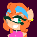
Photo

Anson and Darah Mount with their daughter for Halloween
Anson Mount posted on social media: "I don't do Halloween," I said. "I only dress up when I get paid," I said. "I absolutely, categorically will not put on a costume."
Source: Anson Mount official Instagram, October 31 2022
#anson mount#darah mount#*edit#it's GRAPE!ANSON#love how anson's head is basically#one of the many grapes forming the fruit :D#i find that brilliant#his face and the little hat are the best :))#awesome fruits related family costumes <3<3#and they all fit color palette wise#bless the fam
95 notes
·
View notes
Text


Now for the 1920s reimagining of Jonathan Crane !
sorry this explanation is even longer lmao
As everyone's been saying, I should do the rest of the Dork Squad to match 1920s Jervis, and so here is my Jonathan! Easily the hardest to draw out of the three-- but I must say! Despite being outside my expertise, I'm a little surprised how much it looks exactly like I was imagining! Even if it took me ages but that's just procrastination lmao.
Anyways! What is his deal? Well, for one, design wise I did go a more drastically different direction from his usual look by doing a literal scareCROW. He's much more bird like, with a plague doctor mask being common imagery in steampunk, but he's still very southern themed with his messy broken overall strap and patchwork coat. Even his wings are rustic. ( he can't fly just glide btw lol ) Also! I leaned hard into the color orange instead of his usual green gas because it..... bugs me that both Crane and Nygma have a bright green in their color palette. I just want them to have distinct colors if they're going to be a trio. And look how vintage halloweeny he looks !!
So why is he so well dressed out of costume? Well! This Jonathan Crane is not a psychologist at all, here he is the very successful grandfather of horror movies in the silent film era. ( An illustrious origin, i hope canon Crane would be proud lmao ). This is referenced in how his face looks, he's wearing white powder and black makeup that's usually meant to emphasize key features on blurry film like his upper lip and around his eyes. And yes, he just keeps his makeup on during most events, and people just accept he's a little on the... eccentric side.
To me, the archetype of the mad artist fits Jonathan's vibe perfectly. When it comes to striking fear, he's a perfectionist, a trait that drove him to learn every single skill necessary himself, from costume design to props to making his own cameras to mechanical engineering, to.... a "fear gas" that was supposed to gently encourage immersion in the audience but ended up becoming a dangerous chemical weapon.
For his origin crime I am thinking !! Full blown Scooby Doo style monster mystery!! With some nuance!
Crane, as a first impression, gives off an immediate air of pompous, aggressively impatient, pretentious director type. His presence is big and dramatic, but its distinctly not southern-- in fact, he seems to play up something between a hollywood accent and a thespian one. But this is all to cover for his farm hick background that he was once very ashamed of.
As a child of a failing farmhand during an infamously dry and dusty era, Jonathan developed an extreme resentment for his country existence from both the bullying of other children for all his strange quirks and the severe verbal and physical abuse of his father, driven to alcoholism by the stress of poverty and the loss of his wife. Originally offering his artistic ideas as a means to help them, he grows sick of their closed mindedness and berating and runs away to learn about the emerging potential of film in Gotham City.
Its been many years, Jonathan now in his early 30s, he finds himself surrounded by the shallow, champagne aristocrats that reflect his childhood bullies. Feeling wrong in his own skin, he develops a sightly unhealthy obsession with the escapism he finds in performing as the monsters in his movies.
But upon discovering that the corrupt rich of Gotham plan to push legislation that would negatively effect farmers like his own history, and that they expected him to be amongst those who support it, his irritation with the shallowness of society reaches its limits. In day, he would feign support for their behavior to cover his tracks, but at night he would don the mask of the Scarecrow, rumored to be the vengeful spirit of a farmer who was hanged, and who he believes to be a more freeing expression of himself than his true face, targeting not just the rich but striking fear in their laborers to scare them off land. And it works. So, he tries bending the will of society more.
Is he doing this out of any moral conviction or just spite and a love for the role? It's... hard to say.
As the Scarecrow, his methods are so effective he's near uncatchable, even by Batman. Its only by solving the mystery of who is under the mask are they able to catch him. They surprise him during one of his screenings, jump him in the dark, and prove his subtle use of fear gas in the theater to the police once he's cornered. Instead of being angry, he goes to the mad house applauding Batman's performance.
What an interesting character they play. He's very inspired.
#( anyways uh I hope you like what i came up with ! lol )#batman scarecrow#batman villains#1920s gotham#1920s#1920s Scarecrow#vintage#fanart#dc comics#Jonathan Crane#scarecrow
499 notes
·
View notes
Photo
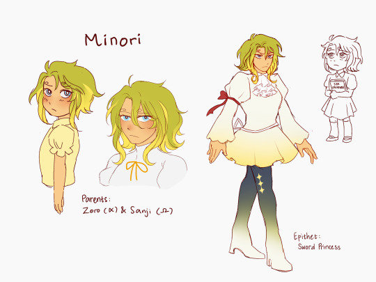
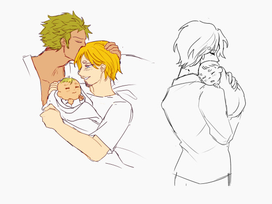


I’ve been playing around with omegaverse ZS lovechild concept for a while and now here she is! Her name is Minori, she was born sometime during the Strawhats’ voyage so she was practically raised in the Sunny. She exists in an omegaverse canon-divergent AU where the plotline is basically the same as canon, diverging post-Wano and post-Strawhat Jinbe (similar to Film Red situation).
Ramblings below:
I created her with the idea of a lovechild who is different from Aoi, the first ZS lovechild that I created. Aoi is an exuberant, happy-go-lucky person, with a tomboyish appearance and a more “unkempt” look that she imprinted from Zoro. Minori is reserved and quiet, if not somewhat shy, with a more feminine, neater appearance and overall looks that is inspired by Sanji, and by extension, Reiju and Sora. Minori is also set in the canon universe and raised on a pirate ship, in contrast to Aoi who is set in a modern AU One Piece and grew up in a family home.
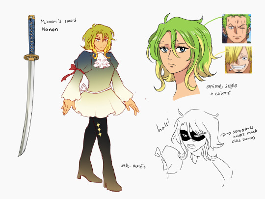
I originally planned her to use rapier as her main weapon at first, but then I thought it would be a little weird for Zoro’s kid to choose a different type of sword, so I decided to scrap it. The name and the general color palette of the sword remains the same, though.
Additionally, her name was originally supposed to be “Marisol” since it can mean “sea and sun” in Spanish and also because I want to try giving her a more European-sounding name. I decided to scrap it since it won’t fit with the rest of the Strawhats’ naming custom; most of the Strawhats have easy-sounding names that are easy to pronounce both in English and Japanese (Luffy/Ru-fi, Na-mi, Zo-ro, etc), and most of them only consist of 2-3 syllables. Marisol is 4 syllables long when pronounced in Japanese (Marisoru), so I decided to change it to a simpler name.
My Japanese VA headcanon for Minori is Yui Ishikawa. She has the type of voice that gives off “elegant and sophisticated lady who can kill you” energy especially when voicing Mikasa from Attack on Titan and 2B from Nier:Automata.
She spends most of her childhood in Thousand Sunny, and then her early teen years to the rest of her life in Sanji’s floating restaurant in All Blue together with her parents, Zeff, and the rest of the Baratie crew. She would then travel to other islands by herself from time to time, sometimes saving people and getting into fights on the way, and send letters back to her parents that tell of her adventures.
Personality-wise, Minori is a calm, collected person. She tends to keep her emotions at bay and rarely overreacts to anything, and likes to solve problems in an analytical way. Deep down, Minori is also a kind and considerate person, and is especially very compassionate towards those who are in need. She has a strong sense of justice, and believes in the notion that the strong must protect the weak. She is also a bit socially awkward, having trouble befriending people normally as they would usually get scared of her first.
Minori is very inquisitive as a child, often questioning many things and finding solace in reading books. Because of this, she looks up a lot to Robin, whom she thinks is very intelligent and “all-knowing”.
Because she grows up in Sunny, aside from Zoro and Sanji themselves, she is practically raised by everyone in the crew and so has imprinted some of them as well. She appreciates Robin’s morbid humor, has a slightly extensive knowledge in first aid from Chopper, can differentiate between a good and a bad lie thanks to Usopp, and comes to love music from Brook.
People would often call her the “Miracle Child” due to the exceptional circumstances during which she was born. She is a child born into a pirate crew, with that pirate crew being the Strawhat Pirates and her parents being two of their strongest members nonetheless, and she is born when Sanji is being held hostage. (I’ll delve into that soon. Later. One day.)
As a result of spending most of her childhood on a pirate ship, Minori has a much more hardened outlook in life, having learned how to fight and defend herself against enemies. She can be downright vicious when circumstances warrant it, especially when dealing with cruel and powerful enemies.
She trains swordsmanship under Zoro, and as she grows stronger and more skillful in it, she begins to develop her own fighting style utilizing her enhanced speed, agility, and dexterity, of which she inherits from Sanji.
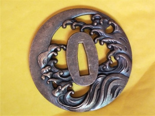
Her sword’s tsuba (hand guard) is circular-shaped and has a wave pattern that looks something like this:
Her epithet “Sword Princess” comes from her exceptional swordsmanship, her fighting style that’s been described as being “elegant”, and her overall wardrobe aesthetic that heavily resembles a princess.
She is noted to have exceptional beauty, and many people have praised her for it. Sanji has been notable for furiously beating people up if he catches them ogling or talking to her inappropriately.
Her name written in kanji would be 美緑, consisting of 美 which means “beauty, beautiful” and 緑 which means “green, greenery (the colors of trees and grasses)”. I think it’s an amusingly fitting name for Zoro and Sanji’s child.
Since she technically exists in an A/B/O universe, she does have a secondary gender as well, which is Beta.
1K notes
·
View notes
Text
edit: i made a new charlie design and a post-finale vanessa design!
---
viv is not a good person and i don't support her, but ive got a hyperfixation right now and im gonna make that everybody else's problem
besides, separate art from the artist or whatever
hazbin has a shit ton of mistakes, problems, same body and hell, even same clothes syndrome. does hell only have one shop or something???
but i just kiiiinda enjoy (?) it for what it is
and ive seen a lot of people do redesigns and that seems really fun and honestly, the characters have a lot of potential that's just blatantly ignored by the show
aaaanyways, after all that out of the way, i present to you...
finished refs for two of my redesigns for the cast!!! did the main couple first, naturally
soo, here's charlie

age: about 22 in human years
and vanessa!

age: about 25 years old. not sure if angels age differently but that's her age in human years
some notes under the cut
Charlie
- yep, i made her non-binary. just get a lot of non-binary energy from xer. besides, i like the hc of them preferring the name charlie over charlotte because it sounds more gender-neutral
- i like to imagine xer a bit on the bigger side complexion-wise. like, i don't know if you could call her chubby but she is a bit plump and really soft to the touch not only because of the fur. i feel like being soft and having more soft edges in buns design would fit buns character more
- she's not freakishly tall anymore!!!! like.. i don't mind her being tall because she's the princess of hell after all.. also have you seen how tall lilith is???? but i feel like sometimes it's TOO much... also honestly it also just fits them more imo??
- they're a redhead now. I MEAN LIKE. both lucifer and lilith were described with red hair in old paintings.. i just had to.
Vanessa
- yeah yeah i made her a demigirl... her original color palette just screamed demigirl. like. it was literally the demigirl flag color palette.
- i thought of naming her violet but that'd be a little too on the nose i think- gave her actual hips!! and not whatever was going on in her original design (the waist just going straight into the legs)
- also made her a little more.. (uh i guess the appropriate word is "thicc") overall- yeah i also redesigned the angelic spear a bit. not too proud of it but i think it gets the idea across
- i don't usually.. draw noses, but i figured it was a pretty big/most recognizable part of her design so i gave her one.
- oh yeah btw she's not gray anymore!!!! yippee!!!!! like what's even up with viv and making poc characters gray. anyways since she's a fallen angel i figured giving her a more human appearance would make sense. we've seen winners in heaven and a lot of them look pretty human. even if we only look at exorcists, lute looks pretty human too.
writing notes
okay, so, i wanna give you some notes about the writing, but before i do - i am NOT a professional writer, im just a kid who has some criticism for the hellfire of a show hazbin is
with that out of the way...
chaggie's writing
okay so. chaggie am i right.
so, ill just get this out of the way - it's boring
like, really boring
chaggie defenders will say they're just "casual" and im an asshole for wanting more from them but you can be casual and not be FUCKING BORING
like.. all of their interactions just go the same waythey comfort each other or hold hands or vaggie is trying to convince charlie to do something and she NEVER. FUCKING. LISTENS. like seriously.
the only time she actually listened was when vaggie convinced her to be more assertive but she was trying to do it anyway... and she changed vaggie's words and did her own thing anyways
they don't even have that much chemistry. and they're like, the main couple. they're supposed to have chemistry.
hell, emily and charlie had more chemistry in one episode they interacted in than vaggie and charlie in the whole damn show
vaggie's writing
vaggie's writing.. it's... sigh.
she doesn't really feel like a separate character when she's with charlie
they're just. doing the same thing. over and over again. all of their interactions are the fucking same. like.. i wanna care but i just have no reason to. i just DON'T FUCKING CARE.
even vaggie's whole deal in "whatever it takes" is her just?? dedicating her life to being charlie's partner?? and not even being her own person and living for herself??? like. what's up with that. maybe i just didn't pay enough attention??? i can't be bothered to rewatch any chaggie scenes in episode 2 because they did not deserve that drama and i just don't care enough
im supposed to care but i don't
the show just. doesn't give me any reason to care.
vaggie interacting with ANY other character is so much more interesting - i don't know what to expect, i can't predict it!
vaggie interacting with alastor? hell yeah! we never know alastor's intentions and seeing vaggie not taking any of his shit is really entertaining!
vaggie interacting with angel dust? sure! id love to hear the bickering or maybe them having to put up being alone with each other for an episode? maybe both of them having to put up with charlie's shenanigans and bonding over that?
vaggie interacting with niffty? okay sure! a lil gremlin and an involuntary caretaker maybe with vaggie seeing niffty can take care of herself? or vaggie trying to put up with her insanity?
vaggie interacting with husk? oh hell yeah, they both seem to be the straight man in any situation (despite neither of them being straight but whatever), maybe they can have a drink or two together.
vaggie interacting with pentious? yes please! she'd not take any of his shit, but honestly? pentious' obliviousness with vaggie's seriousness could be a very fun dynamic!
but charlie? yeah i can just. predict any interaction they'll have.
and that's not really a good thing with the main couple
because it just gets old really quickly
and we see them all the time, so after some time they can just start to irritate people
how would i fix it?
MAKE THEM INTERESTING, DAMN IT
maybe make charlie listen to vaggie more often??
or maybe vaggie getting a bit irritated because charlie doesn't take her advice seriously
or maybe actually show us how they fell in love?? not just love at first sight or whatever they had in the flashback
like, id love to see actual chemistry develop!or maybe make their interactions not as predictable??
or maybe actually show us how they work together
have an episode dedicated to them
that's the problem with trying to fit everything into one season - the character and relationship developments can end up rushed and just. not very good.
like.. the season we got could be easily stretched out into two or three, WHERE ARE YOU GOING SO FAST, SHOW?? why so fast
this show doesn't know about the existence of filler episodes and we NEED filler episodes
to actually get to know the characters, to explore dynamics, to get to know the world around them
the season is just way too short to tell the story it's trying to say
and if i didn't care about a character from the start and the show doesn't let me meet them... im not gonna just start caring.
---
anyways, that's about it! im definitely gonna do more, i even have angel and pentious ready:) niffty, husk, alastor, emily or adam are next after them, i already have them sketched out
idk what order im gonna post them in but we'll see i guess
---
bonus:
some concepts


#hazbin hotel#hazbin hotel critical#hazbin hotel redesign#hazbin hotel rewrite#(?)#chaggie#chanessa#charlie x vaggie#hazbin#tw hazbin hotel#tw hazbin#cw hazbin hotel#cw hazbin#charlie morningstar#charlie hazbin hotel#vaggie#vaggie hazbin hotel#vanessa#vanessa hazbin hotel#my hazbin redesigns#shokolart
57 notes
·
View notes
Note
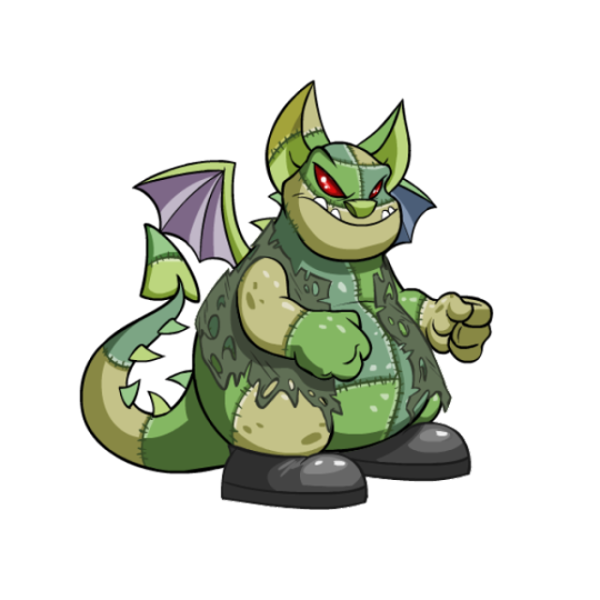
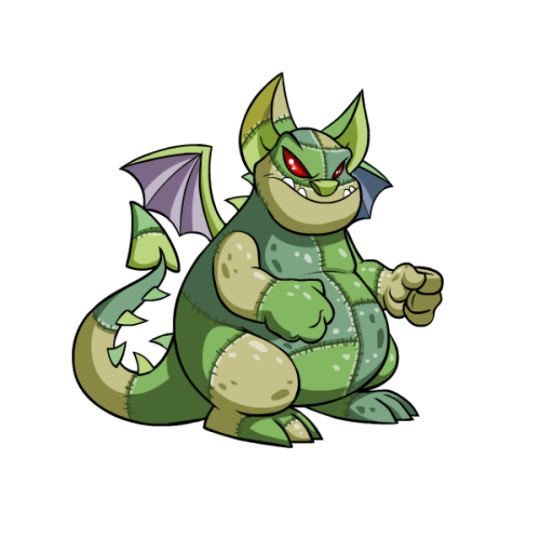
Neoreviews for the Skeith?
Out of the four (4) dragon Neopets we have, I gotta say, the Skeith might just be my favorite. It's not my favorite aesthetically as it's fairly underwhelming compared to something like the Draik—no real markings makes the body very plain–but what it lacks in design it makes up for in personality. Skeiths instantly stick out as one of the heaviest Neopets, and have a gluttonous, lazy personality to match (they can even eat non-food items on the site itself). They're like the personifications of the greedy, princess-eating parts of dragons, and I love it.
In terms of design Skeiths are fairly straightforward. Outside being fat, the main thing that stands out are their noses; while the majority of their features are standard dragon ones, they unexpectedly have an almost dog-like nose, making them feel like the pug equivalent of dragons. It's honestly great, and I just wish the rest of the design had more interesting twists like that. That said, there's nothing wrong with what what we got, either.
Customization-wise, I honestly can't decide if they came out on top or not. The design itself remained virtually unchanged aside from larger tail spikes, but the pose changed drastically, going from quadrupedal to bipedal. I don't mind them being bipedal necessarily, but at the same time them being quadrupedal really made them stand out among the other three bipedal dragons. I also think the super plain design works better when they're quadrupedal, as there's more focus on the yellow accents and less focus on the unmarked stomach area. Also, one fist is bad enough, but two is right out.
Favorite Colours:
Royal: I talked about these guys once before, but these are just great designs. The Queen of Hearts design for the royal girl is just so fun, and it looks great visually with the white base and yellow/red accents. I also appreciate that both designs are good and feel equal, unlike some royal pets where one design is clearly better than the other.
Biscuit: Biscuit tends to be one of the more boring Neopet colours, so it's really surprising that the biscuit Skeith is so good. Not only does it have beautiful shading and great texturing, with gooey chocolate chip spikes and a nice crumbly cookie base, but they went the extra mile by making it so it took a bite out of its own arm in boredom/hunger. It's just perfect for the species and it even comes complete with crumbs on the chin. I don't know why they went so unnecessarily hard on a biscuit pet of all things, but pop off I guess.
Halloween: Another one that just fits the species perfectly. The Frankenstein's monster look is great and reads really clearly, with a nice alternating tan and green palette that break up the Skeith's normally solid-colored body. The only thing is that I'm not sure if I like the clothes (a shirt and shoes but no pants just feels weird), but those are optional wearables anyway so it doesn't really matter. Also the underside of the wing probably should've been tan, but that isn't a big deal either.
BONUS (8-bit): hehe clown :)
53 notes
·
View notes
Note
just me or is Husk super miscast in Hazbin? I couldn't figure out what was bothering me so much about the voice so I did the obvious thing and went back and watched the pilot
pilot Husk has this gruff voice that sells the idea he's hard drinking and older than most of the cast (paranoid DJ has one dub of a comic where Angel wakes him up after a bender and Husk actually sounds like he's been hitting the bottle all night - he's super hoarse and rough and that energy's pretty absent from most of hazbin from what I can see)
I'm sure his Hazbin VA is great in other things but his voice sounds way too high, it just loses that whole jaded edge he used to have. hazbin husk just feels drained of edge and charisma - he used to be flawed like the others and now they just kind of mention he lost his Overlord status offhand and have him be the wise You Know What Your Problem Is? exposition character
side note, rewatching the pilot also made me long for the pilot designs, especially the ones with better/simpler color palettes like Angel Dust or especially Vaggie, who actually stood out due to not being red or pink
Literally the only thing Husk has going for him is the fact that people (rightfully) love Keith David. It doesn't fit him, it doesn't make sense with his character, everything about Husk is a mess, but it counts where it matters to Viv...big names, lots of money going into it.
41 notes
·
View notes
Text

My first draft of a Halloween Town Vor design. Just a doodle while I try to figure it out. (She's a fairy and a sphinx).
Though this probably won't be the final design, and I may even change my mind about the creatures I picked, here's some design notes to explain my current thought process:
Nomura has stated that his Halloween Town designs for Sora, Donald, and Goofy mix two different creatures together to create a more unique design (Goofy is Frankenstein's monster and a werewolf, Donald is a mummy and an invisible man, Sora is a vampire and an imp) so for the sake of pursuing authenticity, I wanted to make sure that my design incorporated two creatures as well.
Though a fairy may seem like an odd choice at first and something that would fit Christmas Town more (sugar-plum fairies and all) I'm thinking of the more traditional concept of a fairy that is mischievous and a little bit dangerous. (Though certainly if Vor were to visit Christmas Town, I think her design would become that more benevolent and cutesy kind of fairy.) Which I think fits Vor pretty well: she seems small and sweet, but don't underestimate her.
I wanted to balance the mischievous side of Vor with her observant/wise side (she's named after a wise Goddess after all), so I thought a sphinx would work there. Thus the lion paws and tail. In addition, the sphinx is known for asking people riddles, which I felt made for a nice reference to the Magic Mirror that's so important to Vor's story in the game, since it, too, speaks in rhymes and riddles. The sphinx also has eagle wings along with their lion body, which I think allows her sphinx and fairy side to be incorporated together well enough, since both creatures share the design element of wings. (Also, the big rope bow on Vor's back in her original design kinda resembles wings already). I tried to do something sort of similar with her ears, giving her the long ears of a fairy but adding fur to the tips to give it that cat-like appearance. Again, trying my best to marry two different creatures together that have vastly different visual aesthetics. Could be better, though? It's kind of hard to mix them together and make it look good/cohesive, I think.
I noticed two things about Sora's Halloween Town design that I felt were relevant and important for Vor's design: one, though Sora's design is drastically changed from his default KH1 design, the silhouette and shape of his clothes is mostly the same. And two, Sora's crown charm still exists on his Halloween Town design, it's just been changed from a necklace to a brooch on his bowtie. In light of these two things, I tried to keep Vor's clothes relatively the same shape with just some minor changes here and there (such as simplifying her big collar and making her shoes look more whimsical and fairy-like). And much like Sora's crown, I kept her "Terra's Mark" emblem (that's the canon name for it apparently), and just changed the ribbon around it to be more curly and Halloween-esque.
Vor has two different prints/designs on her original design: a column of circles on her sleeves, and curved rows of circles on the bottom of her jacket. I changed the sleeve design so the bottom-most circle is a yellow cat eye, which I think feels appropriately sphinx-like and Halloween-y. As for the design on the bottom of the jacket, I'm not quite sure I like it. I just changed it to a simple spiderweb design, because (1. I thought it would look nice there and (2. Sora's Halloween Town design has the jack-o'-lantern mask, so I felt like a more "cliche" Halloween motif was needed somewhere on Vor's design; the eyes just wouldn't cut it. If I end up refining this design more, the cobwebs may be exchanged with something more fitting.
And finally, the most obvious and simple to explain change...her color palette is now much more desaturated to match Halloween Town's gloomy, dark atmosphere. Though I did depart a bit from Nomura's approach here: for Sora, Nomura made his color palette almost completely black/grey/white. For Vor, however, I felt her original purple and gold color palette already lends itself well to Halloween, so I decided to keep her color palette relatively the same, just desaturating it heavily. I also simplified her palette in areas, such as making her belt a plain blue instead of its usual brown/gold/white, and removing the gold from her shoes.
131 notes
·
View notes
Note
As a huge PMD lover, I absolutely adore your Hisui PMD AU. However, my one and only complaint and question is : why are all the characters colors so muted? Like, it fits Ingo, since he's an old ghost type and all, but Akari is so grey and dark. I like the detail with the tips of her ears being blacker to fit with her canon hair color, but the rest of her body is very dark and unlike an Eevee (though if she evolves into an Umbreon then that'd be cool foreshadowing). Even Rei as Pikachu, his yellow fur is much less vibrant.
I'm not saying everyone has to be all vibrant and neon colors with the saturation cranked up to 300% ; Ingo as Typhlosion is a good example of a muted color scheme, and I love it when artists add their own creative flare to OG Pokemon designs (have you seen any of those 'Ability forms' of Pokemon changing slightly depending on their ability? It's really cool). But it's just an interesting color palette I noticed with the majority of your designs that I couldnt help but ask the reason for them.
Ironically, the brightest character here color wise is Silvally Volo. But it makes sense, with his whole "Arceus pls notice me" schtick.
Again, LOVE the PMD AU, and I cant wait to see more!
Hey! Glad you like the AU, thanks!!
And to answer this, it really comes down to two things, I think; mainly, it’s just naturally part of my artstyle. I just gravitate towards more muted colors as I like them, they’re easier on the eyes lol. I know it’s probably not easy to tell I like them though, as most of my art is entirely greyscale. And I will color pick from the characters a lot when I usually draw them with color, but for these, I did not.
And second, colors appear differently on my devices, so sometimes they end up with a little different colors than I intend. I notice my colors usually look a little different on mobile and desktop than they do on my drawing tablet. (Also why I’m apt to color pick from refs)
But some of it is just stylistic choices too! I intentionally made Eevee Akari’s fur darker than a regular Eevee’s, so that the blackish ears and paws don’t clash so much with a lighter color. (I did originally try the default eevee colors when making her design, and didn’t like it because of that).
And as for Pikachu Rei, I just made his fur closer to the colors I use usually for their satchels, since that was the most prominent yellow in their survey corps uniforms. ^^
Thanks for the ask, again I’m really glad you like the AU! ^^
#wayward’s asks#HISUI PMD AU#and I could ramble a lot lol about this but also Akari’s just generally a pretty muted brown because it look more natural with the black#to me at least#a saturated brown with black (on the greyscale spectrum) didn’t look as good#compared to compromising by sliding the brown more towards the greyscale end#they worked a little better together like that#to me personally at least#again I’m biased towards muted colors#I could ramble about all the color choices I did for all the characters cause I enjoy the thought process a lot but then the ramble would#never end lol
25 notes
·
View notes
Text
I think the Dark Urge canonical white dragonborn sorcerer set up is frankly perfect for him. Here's why:
Let's start off with the class. Sorcerers are rightfully memed as trust fund babies of D&D for getting all their magic from their parents as inheritance. And for a character who's story is all about taking on his daddy's family business or rejecting it? The one who has a butler following him the entire time? There is no better fit.
Now with the race, Dragonborn in Forgotten Realms lore wise aren't related to dragons, but fuck that, they still obviously invoke the idea of a dragon. And dragons are monarchs of the d&d universe. They horde wealth, amass servants and embody many ruler archetypes depending on their colors. Which play SO well into the whole nobility and world conquest thing.
Then there is a fact that it's a white dragonborn specificall. And white dragons are naturally closer to wild animals then other kinds, they are more aggressive and less contemplative, which is supported nicely by durges cruel animal like nature and his possible quest to fight against it.
And finally the red on white color scheme parallels greatly with Orin's white on red, communicating both that they are the same and opposite of each other at the same time.
And that color scheme is really good too, because of color theory.
Seriously though, red, especially the shades and shapes it takes on their models invokes the idea of blood, or violent death, of murder, which is all appropriate to the Bhaalspawn. And white makes the red stand out even more. White is used to signal purity because how easily it stains, and here it makes it seem like there is nothing but red to these people, it's only their blood only their violence that matters.
But white is also a stand in for innocence and it that what it also interplay nicely with the story of Orin and Durge. Because they were born this way through no choice of their own, Orin most definitely, but Durge probably too were manipulated and abused to mold them into their roles. And Durge looses memory at the beginning of the game, you don't know why any of this is happening to you for the longest time.
And of couture Durge the one with the most white in there color palette, is the one who it is possible to redeem.
24 notes
·
View notes
Text
so the mutant mayhem series...
look im happy to get another show and im open to watching it and i will give it a chance.
but some stuff in the trailers really rubs me the wrong way.
april saying "isnt your whole thing a costume" in reference to ...just their bodies is icky and im dissapointed her kinda being mean to them is gonna continue. like- its not an initial shock thing like with 2003 and 2012 april its just "sure we're friends but im gonna call out how different you are even though your WHOLE goal is to fit in and be accepted.". i like her design and her story seems interesting and i hope she gets a real arc unlike a lot of aprils but like- the comments are un-necessary and it feels like shes making fun of them instead of being a supportive friend. [if theres an episode where the guys get fed up and talk to her, possibly having a lesson about expressing to your friends when youre uncomfortable with what they do then ill be overjoyed because that message NEEDS to be in kids shows and it would clarify april just didnt know it bothered them and would tone it down because she doesnt wanna hurt her friends]
in a trailer the others got praise and when it was mikeys turn someone was like "oh what do you do?" and mikey doesnt have a real answer. as a mikey fan i just cannot stand the constant dismissal he gets. if the series is gonna expand on that and take it seriously im totally in though.
i didnt mind the movie artstyle. its not something i enjoy and it kinda gave me a headache in theaters but objectivly there is nothing weong with it and a lot of work and talent was put into it. the show style is...ehhh? i dont like it. i dont hate it. i dont really enjoy the color palette. its not appealing to me and an art style can really change how much i enjoy a show.
and why does leo sound so much older. i cant be the only one hearing that right? like i know thats fairly standard for the shows but the movie had all this hype about the guys sounding and acting their age so???
and structure wise i feel like this is going to feel more like kim possible and spiderman instead of tmnt? cause like ...a HUGE part has always been theyre a secret and they work in the shadows cause theyre ninjas and now theyre just in the open. im ok with change- all franchizes NEED to change and adapt but im not gonna get hopeful till i see it done well int he actual show
speaking of that this is a reminder i by no means think the show will be bad. i want it to be awesome and fun and make its mark like other tmnt shows and films have! i just had to get this off my chest cause it was bothering me. im sure the show WILL be good cause i havent watched a tmnt show i outright disliked yet. the trailers just rubbed me the wrong way.
#tmnt#teenage mutant ninja turtles#tmnt mutant mayhem#tmnt ramble#tmnt rant#mutant mayhem#restating in tags i do like these versions of the characters#i like april- i like the guys#im just mixed on the show from what ive seen
17 notes
·
View notes
Text
There’s something that has been irking me in the past few months... /That/ part of the fandom (that mostly was NOT here when the manga was still published weekly and when it got cancelled by SJ) changed the narrative about our reaction to the ending.
Now it’s all ‘omg mean IR shippers who are bitter over their ship not being canon!! They are terrible people!!!’ and calling us us bullies when no, you weren’t there back then where there were daily d*ath th*ats and rude asks sent to us... Not to mention we were mainly angry at the way the ending was so rushed and poorly written. We didn’t even know whether I//sshin, R//yuken, G//rimmjow (AGAIN), U//rahara and Y//oruichi were still alive or not because it was never said IN THE MANGA (because we only got an answer in light novels years later but majority of people only read the manga, not the novels that are semi-canon at best). We were angry over U//rahara’s “forgive me, K//urosaki, K//uchiki, for leaving everything to you” was somehow forgotten and the final fight with I//chigo, R//ukia and U//ryuu (who had THE silver arrow) VS Y//hwach never happened. We were angry because C//had ended up fighting for profits (profesionnal boxing) and U//ryuu ended up alone (again), overworked and working as a doctor just like his father and that go against their character arcs. We were angry because there was a whole arc and hints in the final arc clearly showing how I//chigo didn’t fit in the human world anymore and yet stayed there in the end. We were angry because the Sokyoku, the symbol of S//oul S//ociety’s old ways and injustice that I//chigo destroyed, was REBUILT. We were angry because M//ayuri was still a Captain and not in jail for his crimes. We were angry because we loved and cared for the story and the ending went against the main and side characters’ arcs and against the s//hinigami’s new ideals represented by I//chigo and R//ukia.
And yes, we were angry for the pairings too because it was so badly written but most of us were fine with an open ending or IR and ISH ending but the new ‘IR would be nothing without anime filler moments’ argument is so ridiculous because even if you only look at the manga, IR was great, developed and made sense. Weirdly enough, the ones repeatedly shouting that filler “argument” aren’t saying a word about R//ukia’s scenes getting changed/deleted in the anime rn despite being the deuteragonist as if her erasure hadn’t been bad enough in the manga vers. of the final arc (same for B//yakuya scenes to a lesser extent)... But yes, our anger is mainly aimed at how poorly written the ending was, not only shipping-wise but in general. And now it’s irritating to see new fans act as if criticism that were there for a decade is not allowed towards the story or the mangaka.
While I’m watching the anime so far and I’m happy with the added scenes (especially the ones with U//ryuu concerning his heritage and the conflict he feels over the whole situation), I must say I don’t like how they deleted R//ukia scenes and B//yakuya scenes on purpose. I prefer the old characters designs as well and though and color palettes are now closer to the manga’s, the body proportions often look wrong (B//yakuya’s face, U//ryuu’s jaw to mention only a few exemples) and the lighting is horrible. I’m watching because I want to see EBTR, R//ukia’s bankai, U//nohana’s true self etc. but I do understand why fans who were in the fandom back then aren’t watching the anime or simply left the fandom given how we’re being treated and how some people are changing the narrative.
(And before my words get twisted... There’s nothing wrong with being a new fan, just don’t make up a new version as to why we dislike the ending/how we react(ed) to it. The criticism towards the writing is also more than fair and has existed even before the last arc even started.)
#tagging the ships just in case because you know how it goes here even if it's not mainly about them#anti bleach ending#anti bleach 686#anti bleach fandom#ichiruki#ishihime#text post#long post#elena talks#/that/ part of the fandom being dudebros/inc*ls and you know who#not tagging the characters' names and putting / everywhere bc i know what will happen lol#y'all know i've been here for so long and i see moots/ppl i knew in the fandom leave it bc it's getting tiring... it's even worse on twt
237 notes
·
View notes
Text
alright so i know i already made that post detailing foreshadowing with larrys design. but i would also like to have a new post going more into character design of him just because i find myself obsessed once more
so to start, larry is designed to be clearly reminiscent of a businessman/salaryman/etc. obviously this choice is to go with the normal type theming for his gym, because whats more normal than a plain old office worker? in addition, working for the league seems to be fairly normal, given the abundance of suited npcs scattered around paldea. his eyes have lines under it, and combined with his general personality, serve to portray him as somewhat tired despite his dedication
however, he has a few details that play into his actual elite four status. first and foremost is the cloudy tie. its blue with white clouds, resembling the sky. hes got a string of buttons on his cuff that seem to be similar to a feather, and two triangle details in his lapels that give them a vague wing appearance. additionally, the flyaway hairs on his head, along with the black bit that wont quite stay flat, help to make it feel like hes standing in wind with the air blowing his hair about. these flyaways also seem to resemble grey hairs, as if larry started going grey due to the fact that hes always working so much
for his color scheme, hes overwhelmingly using black in both his clothes and his actual hair/eye color. black is the ‘typical’ color one might think of for a suit, even if it is not the only color they can be. dark hair and eyes are also extremely common traits with people, falling on more prominent genes compared to something like light eyes or hair. it fits well with the everyman concept, making him blend in more as just some worker. black is a color of formality, yet also mystery and power, which fit well with the suit and the fact hes a member of the elite four. grey fits with his dress shirt and the flyaway hairs on his head. its far more minor in use, and seems to be a bit blue. greys a neutral color that can seem dull, slotting in once again with that ‘boring guy’ vibe. though because of the blue tinge, it helps keep his over all palette more cool and match better with the sky blue tie. blue can be seen as a more calm and collected color, and personality wise larry is definitely one of the less energetic characters in the game
for shape language, larry seems to be built with a focus on squares. squares are a dependable shape, but can come off rigid and boring depending on their use. they have a sense of stability and strength, yet also clumsiness because they can seem a bit unnatural at times. larry as a character seems to be reliable for his job in a more roundabout sense; hes dedicated to it, but hes not known as the best worker, according to his pregym encounter description. hes the normal gym leader, so using a shape that can be ‘boring’ works well. in addition, larry also seems to stumble over when he throws his pokeballs, before jumping back into a more rigid standing position. there is the use of a few triangles in the design too, which are used with his hair especially. triangles can be used to suggest movement, which with how the hair is shaped, checks out. the lapels and collar of his shirt serve to frame his tie, and the smaller darker triangles further serve to point it out. theres a bit of circles used to help soften his design, although not many. hes rigid with his schedule, but not entirely inflexible

now for a more fun analysis of the design, i feel like some aspects can relate to his pokemon, either in a more obvious or more abstract way.
first up is his hair. larrys bottom flyaway strands seem to be similarly shaped to braviarys lowest head feathers, while the top feel more flowy like altarias. the sides of his hair give me the impression of the sides of tropiuss head in terms of placement, but the general concept of hair in front of more hair is reminiscent of braviarys feather crown in front of the plumage. staraptor is the only pokemon to have a feather hang downward in the middle of the head, matching the lower middle strand of grey hair.
now to the suit. his tie with clouds easily connects to altaria, who has a cloud for wings. however i believe this can be further stretched to komalas rounded tufts of fur, given their color and shape. flamigo and komalas nose/beak could be behind the rounded shape of the suits buttons. the triangular bits on staraptors tail feathers could be referenced in the lapels on the suit. oricorios head feathers are set in threes and rounded, just like the feather detail on the suit sleeves. dudunsparce has a general rectangular theming to it, which fits well with the rectangular pockets adorning the suit.
in fact, dudunsparce also has rectangular eyes, which fits with larrys quite well. komala has thick eyebrows, and while not exactly in the same shape as larrys, id say they seem to be about the same thickness for the widest section
the shoes are probably more of a stretch, but the very top rounded bit reminds me of the front toes on tropius
color scheme wise, the blue grey of komala seems awfully close to the blue grey used in larrys hair and shirt. the blue of the tie also seems to match up more with the altaria. but that would be going strictly off of concept art, as his in game model renders these shades far differently
its actually kind of insane just how much you can pull from a character who seems incredibly simple on the surface design wise. some of these points are likely to be stretching it just a bit, but im definitely sure that this man was designed with a lot of intent and purpose given his role in the game and how hes shown off
#pokemon#pkmn#gym leader larry#elite 4 larry#larry pokemon#pokemon larry#elite four larry#pokemon scarlet and violet#scarlet violet spoilers#pkmn scarlet and violet#sv#scarvi#scarvio#scvi#scarlet and violet spoilers#scarlet and violet#pkmn sv#pkmn scvi#pkmn scarvio#pkmn scarvi#pokemon sv#pokemon scarvi#pokemon scvi#pokemon scarvio#sv spoilers#scarvi spoilers#scarvio spoilers#scvi spoilers
176 notes
·
View notes
Note
A few thoughts and questions about Chiara and Evangeline (maybe these thoughts will somehow help you develop and reveal these girls in the future):
1) While I was doing aesthetics for these two, I noticed that Evangeline's palette is warmer and more earthy (by "more earthy" I mean that her aesthetic is more like that of a human girl than that of a star girl), while Chiara's palette is colder and more magical. This gives me the idea that the sisters embody a classic couple (not in a romantic sense!) Suns and Moons (Evangeline is the Sun, Chiara is the Moon).
2) Can Chiara change skin color? This would explain the reason why she looks different in Kingdom of Wishes than in Pinocchio (as far as I remember, you yourself said that Chiara is the Blue Fairy). Or is it a reference to the Disney remake of Pinocchio?
3) Has Chiara ever been jealous of Evangeline? After all, the youngest daughter of Asha and Aster had her advantages, being a human: she does not need to fulfill a thousand wishes every night, and even more so she will not live for a billion years. Besides, Evangeline can spend more time with her parents, because she is a human, not a star.
4) I am haunted by Aster's phrase from the rewritten song "Knowing What We Know Now", namely: "The sky and land now shall unite to fight". If we forget about the events in which this line was used (namely, when the heroes went to battle against the king and queen) and imagine the line in a romantic sense, then the Asha/Aster pair just represent the union of heaven and earth (Prince of Heaven (Aster) + Princess of the Earth (Asha) in Disney style). And Chiara and Evangeline, as the fruits of their love, also represent heaven and earth, since one girl is a star, and the other is a human.
That's all for me, I just needed to express my thoughts that have been visiting me for the last few days. English is not my native language and I sometimes used a translator while I was writing this text. I hope you have understood everything that I wanted to tell you. If you answer, then answer each question point by point, please.
P.S. Do not forget to check out my aesthetics for the star sisters (I do not know what to call their sister duo), please. I hope you have understood all my thoughts and questions correctly.
It's a really nice contrast between the two that really does help them stand out design wise. I do see them as one being more warm and "earthy" while the other is cooler and ethereal, which is also a nice nix between Asha and Aster, which makes sense since they're their parents. I really love how you've captured their vibes through these images!
Like all wishing stars, she can change her whole appearance whenever she comes to earth, so there's not exactly a definitive look for her, she just appears however she likes, but when visiting her family she does look more like Asha
You got that perfectly, yeah if I got to write a story with them I'd like to focus on that. How Chiara seems to have a perfect life as a wishing star but Evangeline doesn't see she has her own struggles, like having to grant so many wishes and also being immortal, it would be a dynamic like Mirabel and Isabella, with Evangeline learning to see things from a different point of view
That's a beautiful thought. It reminds me of that line from The Little Mermaid 2 when Ariel says Melody is daughter of sea and land (or something like that) which just fits the context perfectly.
I've loved your thoughts and your aesthetics! Sorry I take so long to reply, but I really appreciate it!
14 notes
·
View notes
Text
Okay I'm up, feelin good, so now it's time for a second sectuin of art-dumping:
Forkface.
It is just mainly Forky, but hear me out:
While I was gone, I began thinking: What if I made a VR Model of Forky (my design)?
(I have no 3dmodel-making experience mind you XD)
So I began scheming!!
Firstly, I made these reference sheets for Forky!!
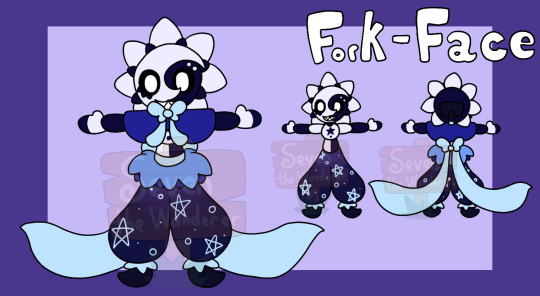
(Also Forky's colors for each different form) (I'll add IDs for each)
I imagined for this model for Forky that they'd also have a few accessories/abilities:
Firstly, their face plate does open, and they do have an option for a nightcap
...I still haven't gotten a design idea for those, however...
(also I did imagine for the hat a bit though, if they wear it with the rays, 7 of the rays - 3 big, 4 small - would go down for the hat to fit mostly, instead of stabbing through the hat. It'd also have a poofy end, not a bell)
Secondly, Forky would have an option to pull out a clown horn!!
Yes I did get this idea from them playing Lethal Company
(I know I shared the image here already, but I'll share it again just to show what I mean again:)

I also decided they'd have:
A sign (and markers)!!
This was also based on them playing Lethal Company
But ye they can write down on a sign what they want to say!!
(since I originally drew it based on a Lethal Company Moment, here's those drawings:)


(I did also make a third sign one for them, but more as a joke, rather than a reference: Smug)

(yes this one is a blank one that can be filled in, I did like... 10 examples, I just kinda don't feel like posting them all)
(some examples though were one that just said "*Breathing Noises*", one that said "Balls.", and another that was just a drawing of among us)
If this did exist in VrChat (which I don't even know if a model w/ a whiteboard would work in actuality), they'd probably be able to change the color of the marker they use. The whiteboard could also be dropped & picked up by others
Finally (I think finally?), I may or may not have imagined them to have another form based on this video (which I kept watching too much cus I found it both cool and hilarious):
They have a nightmare/dream form
(honestly I forgot the stars on the pants cus I didn't feel like coloring it so I did quickly color & forgot the pant stars)
But yeah this form of Forkface only would appear in people's dreams/nightmares (lore-wise), but as a model would just be another form they can swap to.
(they can also still change color palettes in this form, but I didn't color that in)
(I also may or may not have imagined for the dream form I made that Forky can actually breath a faint lavender-colored gas to cause someone to dream or to have a nightmare... like Catnap...)
I believe that's it, I don't know, but that was basically all I imagined for if my Forky design had a Vrchat Model
#my art#please don't steal my art thank u!!!#SAMS Forkface#Forky#Sun and Moon Show#SAMS#it's funny also tho I imagined all this if my design had a VR model#and I don't even have Vrchat#let alone a VR headset XD#I just imagined this all for funsies tho#(I did also try to make a 3d model of Forky... but that just proved even more I have no idea how to work 3d models lol)#but yeyeye that's everything#(also I misspelled 'Section' at the start but I found it too funny to fix)
16 notes
·
View notes
Note
For the ask game: 002 about Mr hat maybe? Is a character that intrigues me a lot alongside phantom striker but I'm brainrotting on the mad hatter
| Give me a character & I will tell you
How I feel about this character: Okay, so I didn't think too much about Mr. Hat for most of Treasure Trove. I figured he was just a rich loon who really, really, reaaaaaaaaaally love hats.
And then King of Cards reintroduced him as this absolute menace of maddening audacity that I hesitate to even consider him a mere human (or animal person, or some any kind of mortal, etc etc.) Like you meet him in the mountains where his shop lies. The mountains, which I remind you, is soaked with a sense of mystery and magic the likes that we mere mortals cannot possibly answer. The same mountain range where Plague's minions found... whatever the fuck Oolong is.

Occam's Razor detect the shop is there because he is so completely out of tune to normal human interaction that he has no idea that the average person is not going to climb a damn mountain to get to his haberdashery.
The more out-there theory: Mr. Hat is of fae origins. I can't claim this theory as some SK fans have since taken it upon themselves to use as their personal headcanon prior to me stumbling upon that idea. But I've taken a large shine to it and now consider it an adopted headcanon, too. Like, he's just so inhumanely unnatural.
Mr. Hat is bizarrely obsessive in his quest, has zero boundaries or knowledge of proper societal interaction, and extraordinarily strong that he can literally lug his store like his personal backpack. Of course the easiest explanation is that this is just for the Rule of Funny (and that's likely YCG's canonical reasoning behind the mad hatter), but I love the implication that Mr. Hat is a fairy who is trying to fit in with man, but is shy a crayon or two or three or half the pack, to convincingly pull it off. And now you get stories ruminating in your head, wondering why he thinks these mortals are so fascinating (answer: the fae is too predictable for him, mortals are Shiny and New.)
Along with his highly expensive prices, it's no surprise the kind of people he can attract the most are out-of-touch nobles and rich bastards who have no concept of reality either. I love how Mr. Hat evokes the image of a rich man, but his coat looks drabby and dull-colored, a severe contrast to the colorful palettes of actual noble attires. It's as if he's imitating them, but can't quite pull that off either.
Basically, the more alien and mysterious Mr. Hat is, the better. And I hope the games never, ever, EVER explain what his deal is other than... hats. He simply exists to be questioned and never answered.
All the people I ship romantically with this character: I don't, actually. I don't know, maybe he and Meeber had a thing before even she, a fairy, thought he was too bizarre even coming from a fairy. But I can't picture anything romantic or sexual coming from this guy.
I hear he's married his entire hat shop. Yes, his hat shop is his wife. That's my headcanon now.
My non-romantic OTP for this character: I've actually taken a liking to the Wandering Travelers grouping up and protecting the Valley for a while, and the complicated, often funny relationship that forms from it. Not quite a found family, but more like an RPG party that's heroic enough to get the job done, but not without foibles with possible trails of unintended destruction they leave in their wake.
Phantom Striker would be the leader, wise and experienced, if not too straitlaced for his own good; Baz is the childish manchild who nonetheless Is Trying To Do His Best; Reize is an up-and-coming hero who looks up to his older friends for training and advice...
...Mr. Hat just barged in and hung around as the wild card. I guess he helped. The group putting up with his antics is partially Reize thinking he should be given a chance (much, much frequently than Striker would have allowed) and partially Mr. Hat pulling unexpected trump cards here and there that effectively saves the day, convincing the group to keep him for another day, even if they have no damn clue what the hell this fucker is going to pull next.
My unpopular opinion about this character: *shrugs* I don't think I have one.
One thing I wish would happen / had happened with this character in canon: See above: Just never, ever explain WHAT he is. Dude might be a regular man with bizarre means. He might be an immortal trickster God. I don't know, I don't care. Never explain who he is: Mr. Hat simply wants hats, that's all we need from him.
(I act like YCG would threaten to do otherwise, but he's always just been a funny little NPC and probably will just stay that way, free of any background lore.)
my OTP: See second question.
my cross over ship: N/A
a headcanon fact: I've incorporated Mr. Hat in my Specter Knight of the 10,000 Year Future, being one of the OG characters from Shovel Knight to still exist in the future.
I'm not sure if I plan to add anything more to this guy other than he's still around being a fucking jester to everyone, but I like the idea that out of all the characters that have been alive since the events of the canon games, he's the one who has changed the least.
He is still Mr. Hat. Only... the population of the world has dwindled severely, so there's not as many hats around and the ones he can find intact are rare. It's gotta be a bit sad for Mr. Hat.


KING SHIT.
⭐(Ask Me for my Hot Takes on fictional characters!
https://neoyi.tumblr.com/post/739152893490364416/estelanel-001-send-me-a-ship-and-i-will-tell) ⭐
12 notes
·
View notes
Note
thoughts on the skeith? or elephante? whichever isn't in your queue yet
(The Skeith review can be found here.)


Ironically, despite its incredibly original name, the Elephante is actually not just a regular elephant; it's bipedal, it has small semi-vestigal wings/a fluffy tail, and it has a fancy headpiece with a gemstone in it. I'm not always big on "default" clothing on Neopets, but the hats here actually look pretty nice and are passable as fancy jewelry that anthro characters could potentially wear.
Color-wise, the default Elephante colours are mostly solid, though the toenails, hats, and tail break things up a bit. I do wish the default colours had more cohesion—like the gemstones matching the base color instead of always being red—and the pink snout feels ever-so-slightly out of place, but otherwise they look fine.

Elephantes definitely benefited from customization. Their lineart was cleaned up considerably, which helped fix some of the jankier elements like the wings and legs. Another big benefit of customization is the ability to remove the default clothing, which is always appreciated.
I also like the change in expression—the old Elephantes always felt a bit weird, like they burned down the house while you were gone and now they're trying to act normal while they figure out how to break the news to you.
Favorite Colours:
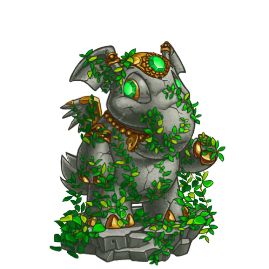

Relic: The relic Elephante just released earlier this year, and I gotta say, I really like it. The base is nicely shaded and textured with plenty of cracks, and it's then complimented by beautiful bronze metal accents. The body is also covered in leaves, which match the green of the eyes and hat, which are slightly lighter to make sure they pop. Great stuff. The base also looks great with just the little bit of bronze around the iris.
My only minor issue is that the amount of plants feels just a smidge too much. They are removable, but it's an all-or-nothing situation. I wish the ones on the body were separate from the ones on the base—especially because that could open non-relic Elephantes to wearing them.

Candy: Peppermint swirls aren't technically anything too fancy, but the sutble texturing here is great and really makes it look like hard candy. I also love how the stripes properly fit with and conform to the body shape, which is something a lot of Neopet colours forget to do. Also, the extra little peppermint in the hat is absolutely perfect.


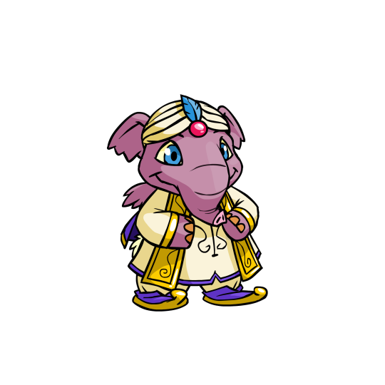

Royal: Neopets evidently decided to take the "Indian elephant" idea to its logical conclusion by giving the royal Elephants things like sari wraps. Granted, I'm not sure what region India would be considered in Neopia, but hey, it's a fun concept and it looks beautiful. Between the two I think I like the royal girl more just for the palette, but both are solid.
UC/styled versions also exist. These versions obviously have more personality, but thankfully the converted designs are pretty spot-on save for the strange lack of fingernail polish.


BONUS: The zombie Elephante is shockingly gory for Neopets all things considered, only rivaled by the zombie Jubjub. Exposed skull, giant gaping wounds, stitches, ripped ears and wings—you name it. It looks fantastic and properly undead, and the whole thing is nicely drawn and shaded. It comes with clothing but the base itself is also solid (it's a bit strange that the skull is considered a wearable, but it's a play on the normal hats so I suppose that's why).
My only issue with it, and the reason it's a bonus, is that the expression is WAY too cheerful. The irises needed to be way smaller, less focused, or just plain missing, and the mouth looks too smile-ly. If it had a slightly more haunted expression it would've been perfect, but as is, it's still pretty good.
28 notes
·
View notes
Last Seen Blogs

yourscentedcollectioncrusad-blog
an argument
abubakrj
Abubakr J.
tuvienivia-conme
effe.

nicicon5
The Blogging of Garza 535
ask-the-red-head
Run Meg, Run!