#and some of the camera angles and points of view were interestingly chosen
Explore tagged Tumblr posts
Text
Monkey Man was Rad as Hell
#spoilers ahoy but.........#really enjoyed the scene where all the trans women came in to fuck shit up to a metal song#and dev patel is so fucking hot like i knew this already but jesus christ#anyway. depression isnt cured but the line 'the pain will leave you once its finished teaching you' is gon lna live in my head for a bit#blah#great soundtrack too#also loved the training montage with the drums and how the drums come back in the final fight#and some of the camera angles and points of view were interestingly chosen#i gotta see it again
6 notes
·
View notes
Text
Week 4_ Weekly roll / Photographic studio
CONCEPT_02
The second model I had was Daniélle. I didn't have any pre-planned concepts for her and decided to have more of a play around with lighting as by this stage I had troubleshooted a few things with lighting and exposure and felt more comfortable doing different framing, lighting, focal lengths combinations. She's a super bubbly person so I let that direct what I did a little (with the exception of some shots for the sake of lighting direction). In comparison to more serious shots I took of Aurelia, Daniélle was more bright and colourful in clothing, expression and body movement.
I shot half of the photos of Daniélle in the large white studio which I had booked for the first half of the day and then I moved to the small white studio for the latter half. Initially Cornelius explained that the middle studio isn't suited for people photography due to the amount of space you're restricted to but I did find this pushed me to try some more experimental combinations.


The first 6 shots were taken with the same set up as the last few shots from Aurelia. I then changed to the 50mm lens and expanded my frame of view a bit to do some full body shots. During this set up I started to have a play with some props I bought with me (some $4 plastic table cloths in gold, silver, rose gold and transparent irredescant) which I brought in more in later shots. Around the middle I also discovered the gels and starting playing with the different effects they have on lighting (learnt that they dull the light significantly - especially the darker ones).


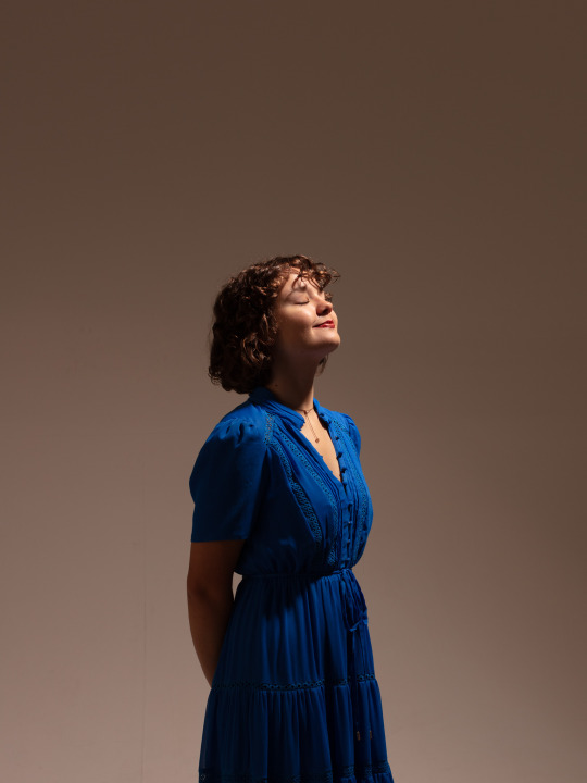
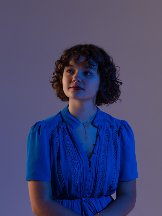

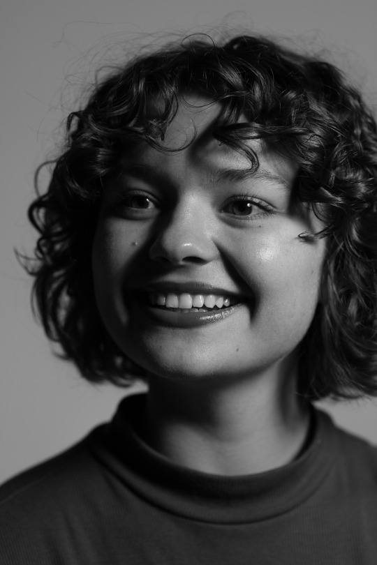


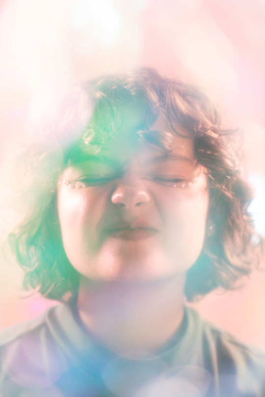
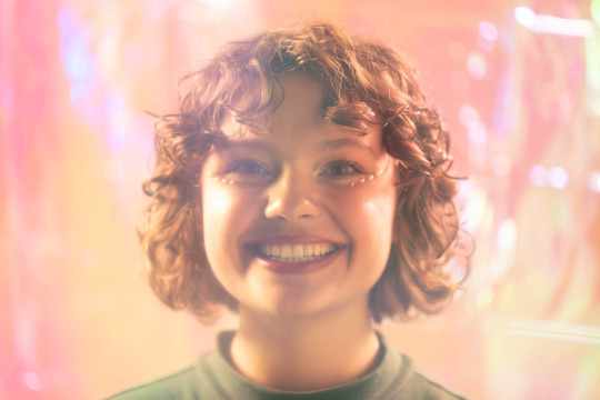

My chosen shots from concept 02.
I explored the most diverse range of lighting situations with Daniélle. Definitely had more fun the later shots using the irredescent plastic.
I will make note on a few of the shots above...
(1) this lighting situation was great but ended up feeling too stark and artificial. I definitely had the fill lighting quite bright on this and could have knocked it down. The wider angle I was working with (the 50mm for this one) was a nice change from the tighter shots I was getting with the 100mm. I think to complete my vision of this shot I would've liked a colour background - which for the scale of this assignment is a bit much but would've suited the style I was going for.
(3) Could've done with better loop lighting around the nose and under the chin.
(7) Definitely a higher contrast/high key image. I like the Rebrant lighting i got with that angle though and the catchlight brings out her dark eyes as well.
(8) I think an improvement on this shot would be turning the subjects head to get more rembrant lighting on the left side - either in the direction of shot (7) or more font on. I think by this point though I had more than enough front facing shots.
(9-10) More depth + contrast > lower aperture?
CONCEPT_03
The third model I had was Joel (more of an impromptu model). But got some more playful/experimental shots when he sat in the set up.
During this part of the shoot both Joel and I got some shots of our own however, I took mine of the studio camera (so the lights were used). Whereas Joel got his using the modelling lights and shooting around the subjects and interacting with the props. Interestingly Joel's photos got some really interesting angles and lighting situations. I noticed the same thing occured with Aurelia when the lights weren't syncing with the camera - there was an interesting dynamic with the lights. I'm interested to revisit the studio and explore shooting around just using lighting situations I can create with the modelling lights.
When I was in both studios I had the room lights turned off so it would be interesting how everything would look with them on and see what effect they have to the ambient light in the room. I would also be keen to take my reflector in with me to see what difference that could make in the space (beyond just having a black or white reflector). I think in these shots below they would have helped to create the depth I wanted.
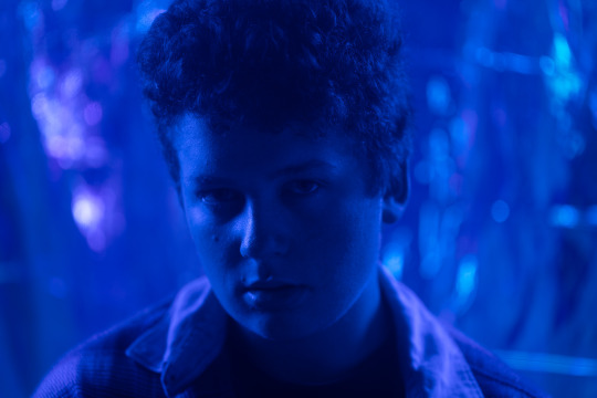

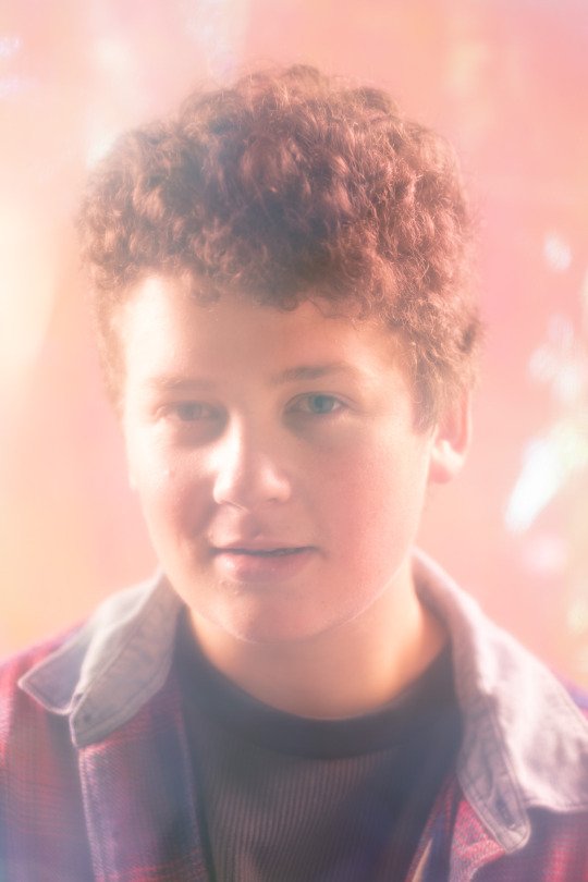

My chosen shots from concept 03.
These were definitely impromptu shots I got at the end of the day so at this stage I was just having fun with different gel combinations.
Critically I would say the top shot with the dark blue gel was a really nice one, however I don't think there's enough contrast on the face and between the background and subject. Increasing the intensity of the key light on the right as well as the fill light on the left just for this shot would have helped that. The reflector dish light illuminating the backdrop was just right, enough to bring out some highlights. Perhaps even more intensity to create a backlight around the subjects hair would also distinguish him from the backdrop. I am yet to use one of the lights as a kicker for this effect so that would be good to try next time. I think also getting catchlight in one eye would create more depth too (like the next photo).
This shot is slighting over exposed on the left side of the subjects face and has no lighting on the opposite cheek. The lighting doesn't illuminate as much of the right side as I would've liked and perhaps more intensity of that light would have create better light on that side. I do like the DOF in this shot - with his face forward from his chest there are interesting points in focus.
This and the final shot I chose turned out pretty well - especially in combination with the colours Joel was wearing. I think the improvement here, as with similar shots I got of Daniélle would be to reduce the key and fill lighting a little and/or reduce the backlighting to create more depth.
0 notes
Photo
“The Flag House” | Directed by Michael Klick

Right off the block, we would not be HYH if we didn’t note the hat! In this opening sequence it is clear that Quinn is confused and beginning to remember the diner. Klick (who has been the show’s line producer since the series started) and David Klein (director of photography) choose to portray his confused state with the blurry diner as Quinn’s face enters the camera from the right.

It’s not every Sunday we see Quinn checking out a woman’s behind and, well, this just had to be included for posterior posterity. Also, note how the patron is also flirty and the background is a bit dreamy and unfocused as Quinn begins to recall Nicki and his surroundings.
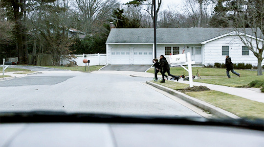
The children were shown playing basketball twice and, it seems clear, there was more to it than simply setting up Quinn’s later conversation with the boy. We know that basketball is Quinn’s sport from “Separation Anxiety,” when he said, “I see you like to use potassium chlorate… but the smell reminds me of the visitors' changing room at a high school basketball game.” Who knows if Quinn ever really played high school basketball given the backstory we have for him now but it seems clear these children, happily and carelessly playing, may represent everything Quinn did not have.
Note that Klein chose to make these shots relatively colorless and stark. The tones are muted with a predominance of gray.

One of the first camera angles Klick and Klein depict of the flag house is, interestingly, from the point of view of the flag itself. One could interpret this as patriotism literally blocking our perspective, or maybe Klick and Klein just thought it would look cool!
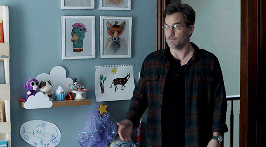
The Works of Franny Mathison #1: “A Cat”
We’re fairly certain the set designers weren’t thinking about Laura’s cat from season five but we just appreciated Franny’s drawing (bottom left) so we threw this in. We’re wondering how many of these were drawn by the twins themselves.
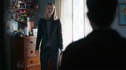
The Works of Franny Mathison #2: “Very Big Mommy”
And while we’re touring the Mathison Progeny Art Gallery, any child psychologists care to ring in on the drawing above the dresser? Carrie is very large compared to a very small and very red Franny. We’re happy Carrie is smiling!
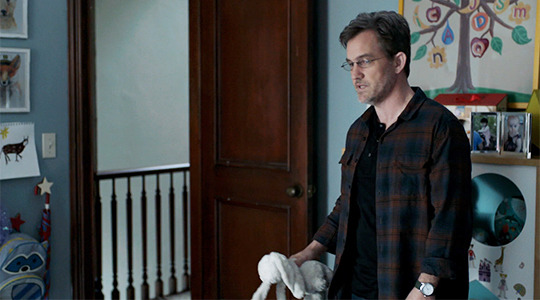
The Works of Franny Mathison #3: “Quinn & Mommy Living in a Tree, K-I-S-S-I-N-G”
Franny uses the evocative color of purple to represent and link those whom she loves the most. We’re kidding, but the “C” and the “Q” in Franny’s tree are the same color. We get that the star nightlight shown early in the season was just a star but this…
maybe, just maybe
(It’s possible Franny didn’t actually draw this one but the artwork in this kid’s room is certainly not to be ignored.)
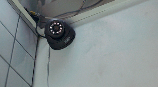
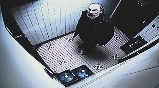
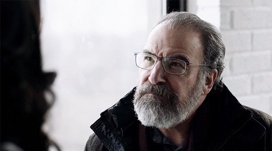
This is pretty standard Homeland with its themes of watching and being watched. Here, however, Klick and Klein shoot Saul looking up at the camera almost like the trapped animal he is. The grey colors are almost prison-like. Saul is, narratively and physically, in a small place, a cornered man in every way.

This, too, is a fairly simple shot of Carrie coming to a dramatic realization. Carrie has a choice: seeing her child or giving a deposition in which she will compromise Dar. Situated almost perfectly between two black and white windows, we understand how she’s caught in the middle.

And, well, the videographer was just plain creepy and reminded us of all those weird side characters on The X Files.
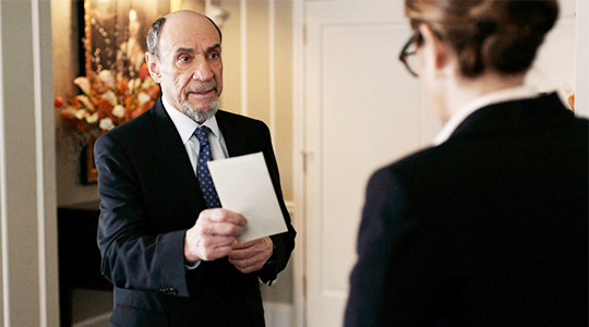
Okay, the letter is just starting to seem very, very weird. Dar is constantly offering, pocketing it, unfolding it. (We know of another letter that seemed to mean a great deal...) We’ve even seen the names when he was in the car last week. First, Dar, please consider email. Second, we’re wondering if there’s more to the letter than meets the eye. Is Dar trying to covertly communicate something to Keane with these names? Are they characters for next season? Any other theories?

Keane’s pose jumped out here as provocative. It’s “man spay” in every way (there are legit warnings against this pose on NYC subways in order to allow seat space for people). Some of us considered this to be a nonsexual version of Sharon Stone’s iconic Basic Instinct pose but regardless, this girl is clearly not bowing to the boys without a fight. Klick likely intended her to look masculine and dominating.

Once in awhile we must take a moment for a man with the solemn hubris and pedigree to pull off what F. Murray Abraham does here. It was a beautiful acting moment. Nothing more or less. Except, perhaps, these may be our last moments with this fine actor who has made us feel so much anger, confusion, and interest over the years.

Again, the flag house is filmed from the inside out with the boy--and, yes, we’re gonna say it--the symbolic maybe-fill-in for a young Quinn John. Quinn was looking at those boys playing basketball with much nostalgia.

It’s a dangerous game of ding dong ditch this boy is playing… and didn’t we all think it was about to be more of a crisis than it was? By the way, what’s the phone number of the CIA landscaper? This winter has been mild in NYC, but still, that’s some nice upkeep.

Arguably the lighting for Quinn’s flashback is rather forced with its blaring yellow tones. This shot, however, is decidedly evocative, with messiah levels of light chosen by Klein. And, again, the window.
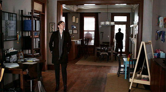
More framed artwork adorns the Mathison household, but this caught Sara’s eye because the photo on Carrie’s desk on the far left is the same one of her and Franny from season four. Sometimes prop continuity is nice.

If we’ve learned from set spying, it’s this: they don’t shoot any frame on accident. So… the church steeple as savior Mira is rushed to Saul may have been intentional. The gray winter landscape and colorless cars (part of the call sheets) were also intentional as Klick painted a wintery, bleak visual narrative.
This is the final scene with Mira (ever?) and, Manhattan hazy behind them, she she stands over Saul and asks him, “When has that [humiliation] ever made the slightest bit of fucking difference to you?” God bless you, Mira Berenson.
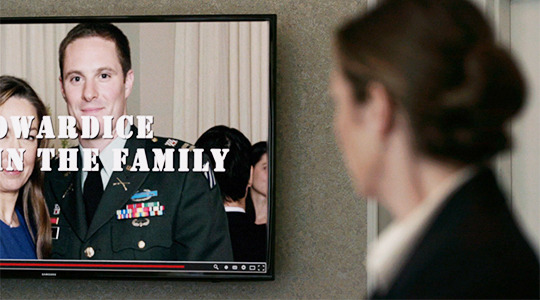
Klick keeps the camera on this shot for a surprisingly long time. Note Andrew, his medals and honors displayed across his chest and the word “cowardice” sitting just above them, his gaze fixed squarely on his mother.

Klick has several frames of the sock puppet troll images cast onto the figures of O’Keefe and Dar. These men are, literally, wearing their own lies. Also, note the continuation of the gray tones within the Onyx scenes.
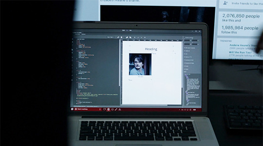
We’re not sure what to say about this but it sure has the fandom buzzing (is Quinn going to be framed?) so we thought we’d throw it in.

These shots were simply beautiful; Saul (in a possible callback to... My Fair Lady? A Streetcar Named Desire?) is almost calling to the sky (the gods?) in search of Carrie in the first shot. The second shot shows the seemingly endless brownstones with Saul at his ultimate destination, Carrie’s home. Note that Carrie’s house lights--on the right of the shot and beside the steps--are the only ones lit on the darkened street. One could argue that it’s Carrie’s home which is the light of “truth,” considering what Saul discovers inside.

Some have argued that it’s meaningful that Saul gets into Carrie’s home from the hole that Quinn, in his paranoia and depression, created in “The Man in the Basement.” Quinn claims to have thought “someone was trying to break in” and it’s ironic that Saul is ultimately the one who does.

Klick chooses several shots of ascending stairs in this episode, and we suspect this is important as all the characters seem to be rising out of the swamp of murkiness as they unravel the conspiracy. The very first shot of Carrie features her and Max making their way up the stairs to Franny’s room. In this sequence, Saul is first shown ascending the basement stairs and then after tea (!) ascends the second set of stairs to Carrie’s hidden room. Finally, when Carrie goes to Quinn in the final scene, she is again shown climbing stairs. (The caveat here is that NYC is a very vertical city.)
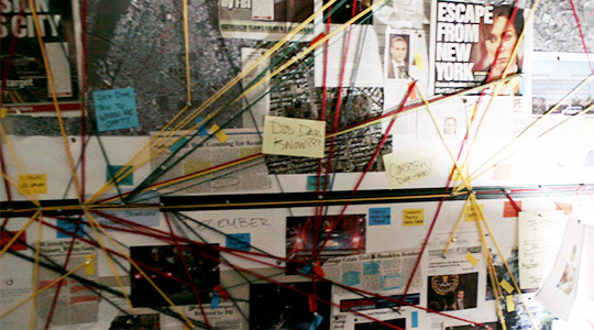
The sweeping panorama of Carrie’s bulletin boards was almost exactly how they shot Onyx’s enormous sock puppet reveal last week. Together with Sean Callery’s score, Saul and the viewer are given access to this surprise underworld of Carrie’s mind: a different kind of conspiracy this time, one in which fragments of truth, instead of lies, are uncovered.

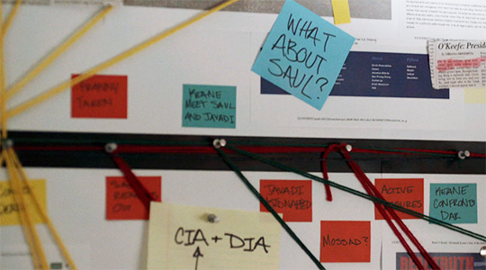

The production designers put plenty of thought into Carrie’s bulletin board. Note that the strings are in primary colors and actually represent a certain kind of logic. The strings and sticky notes that are blue represent Keane (Democrats take note!) while the red represents Dar (Republicans take note!). Yellow seems to represent the FBI.
Fun fact: The news article above has a by-line of John Kretschmer who has been the production designer on Homeland for years.

Again the direction here plays with the glare of Keane’s laptop screen. The lies aren’t projected onto her, as they were with Dar or O’Keefe, but literally reflected back at her (much as they have been with Max). In one of the most heartbreaking moments of the season, Keane comes face-to-face not only with these lies but with her own decision to bring her son out from the shadows and into the light.

As pointed out in past Director Chair features, Klein loves his blues, and the final scene was beautifully backlit with the blue tarps surrounding the house creating almost a sci-fi feeling. Blue, notably, is often associated with clarity as all the pieces start to fall into place (which is the actual logline for the finale, by the way).
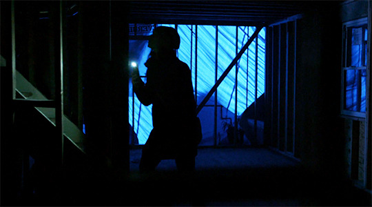
As noted earlier, Carrie ascends the stairs to get to Quinn who has his own truths to reveal. The use of her cell phone light here is almost star-like. That’s likely a notable choice by Klick and Klein because so often flashlight sequences depict a long beam of light. In this shot, however, Carrie emits a single point of light.

Only Homeland could make a close-up of an assault weapon seem so beautiful. Note, again, the circle of light in the distance.

One of the final shots of the episode depicts Belli in the bullseye in an eerie mirror of his own targeting of Astrid in “alt.truth.” Strangely, Belli appears to be looking upward, not at the group seated all below him, but across the street to Carrie and Quinn, who are waiting in the wings.
34 notes
·
View notes
Link
Xiaomi's Redmi phones have pretty much established themselves as the de-facto choices at nearly every price point in the budget space. The Chinese brand, once considered a tiny upstart, has consistently launched smartphones that deliver tremendous value for money and make their competitors look overpriced. We've repeatedly wondered how far Xiaomi can push this formula, and whether any other company will be able to come in and steal its thunder.
That has happened to some extent at the upper end of the low-cost market this year, with players including Asus, Oppo (and now its spin-off Realme), and Infinix launching disruptive models that have earned praise from us. The bottom end, though, is still where Xiaomi dominates. The brand new Redmi 6 models have been launched specifically to reinforce that position, and the Redmi 6A is the very lowest priced model of them all.
Starting at just Rs. 5,999 — though this is an "introductory price" — the Redmi 6A neatly replaces the Redmi 5A (Review) and brings just enough updates and new features to fend off newer competitors. Let's see what's new, and whether this phone is still the best choice for people on a shoe-string budget.
Xiaomi Redmi 6A design
The first thing you'll notice about this phone is that Xiaomi has brought a fashionable 18:9 screen to the very bottom of its price ladder. The front of this phone is simple and plain, and when it's off, the front camera and earpiece are the only things that will indicate which way is up. The screen has very slightly rounded corners, which is a nice touch. You don't get a bezel-free look at this price and there's quite a bit of space to the top, bottom and sides of the screen, but the overall look is still fairly slick.
The body of the Redmi 6A is all plastic, which shouldn't come as any surprise. This phone is available in four colours — black, blue, gold, and rose gold. Our black review unit looked good, though some smudges did become apparent on the rear over the course of multiple days. There's a camera bump, but thankfully it isn't too noticeable. The body's curves and contours somewhat mask its 8.3mm thickness and make it very easy to live with. This phone weighs just 145g, which helps as well.
The power and volume buttons are on the right, and both are well within reach. On the left, there are two individual trays - one for a single Nano-SIM, and the other for another Nano-SIM and also a separate microSD card. You'll find a 3.5mm audio socket on the top and a Micro-USB port on the bottom, plus microphone pinholes next to both. The speaker is on the lower rear which means that your ringtone and alerts could be muffled when this phone is lying on a bed or other soft surface. There's no fingerprint reader — while we have seen phones with fingerprint readers at around this price level, Xiaomi has chosen other priorities.
Xiaomi Redmi 6A specifications and software
There usually isn't much to get excited about in the budget market, but Xiaomi has found at least one little advantage to give its latest entry-level phone. Rather than the predictable Qualcomm 400-series, Xiaomi has switched to MediaTek's brand new Helio A22 (MT6762) processor. This marks the debut of a new Helio A-series branding scheme for MediaTek's entry-level offerings. The Helio A22 has four ARM Cortex-A53 cores running at up to 2GHz and is manufactured using a power-efficient 12nm process. This could give battery life a significant boost.
The Redmi 6A is available with either 16GB or 32GB of storage, and both variants have 2GB of RAM. Our review unit was the 16GB version, and we found that we had just under 10GB of usable space when setting it up. If you aren't planning to carry a lot of music and videos around with you, this much should be fine, but you'll need a microSD card otherwise, with cards of up to 256GB capacity supported.
The 18:9 screen measures 5.45 inches diagonally and has a resolution of 720x1440 pixels. Xiaomi has packed in a 3000mAh battery. The rear camera has a 13-megapixel sensor, f/2.2 aperture, and PDAF, while the front one has a 5-megapixel sensor. The Redmi 6A can use 4G data on either SIM. VoLTE HD is supported on only one SIM at a time, regardless of which slot it's in. There's also Wi-Fi 802.11b/g/n, Bluetooth 4.2, and GPS. Interestingly, you get the standard ambient light and proximity sensors as well as a digital compass.
One of Xiaomi's defining smartphone features is its custom MIUI software, which has a vocal legion of fans. The Redmi 6A runs MIUI 9.6 which is based on Android 8.1. Our unit had already received the August 2018 Android security patch. There's no official word on any release timeframe for an update to Android 9.0 Pie. MIUI hasn't changed much over the years, and with stock Android One gaining popularity, it's beginning to show. We missed common features like the ability to long-press an app icon for quick shortcuts and notifications.
There's a lot of preloaded bloat and redundant apps, for example you have UC Browser, Chrome, and Xiaomi's own default browser. Facebook, Amazon, PhonePe, Netflix, Opera, and a few other third-party apps are preloaded, and several more are "promoted" right within the MIUI interface. The default Facemoji keyboard has a lot going on with emojis, stickers, GIFs, themes, and more. Then there are also Microsoft apps and assorted Mi utilities. The one big thing that immediately jumped out at us was the amount of advertising that's now baked into MIUI.
We saw a few spammy alerts from the Mi Apps store using peer-pressure tactics to try to make us download specific apps. Moreover, there were full-screen interstitial ads whenever we launched the Themes app or used the Storage Cleaner function within the Settings app, and there were ads in the Security app as well. Very few of these apps can be removed. Mi Music and Mi Video are also full of promotional content. There’s even spam in the Gallery app — sporadically, after playing a video clip we had recorded, we saw a screen of suggestions for Hungama videos.
We were extremely disappointed to see how much advertising there was. Much of it only became apparent after a few days of use, so it's possible that there's even more, deeper beneath the surface, waiting to jump out at users. If this is the tradeoff for low-cost phones, we wouldn't be surprised to see even hardcore Xiaomi fans gravitating towards stock Android.
That isn't to say that MIUI is all bad. It still has loads of features including Ui customisation options, the ability to clone apps, fine-grained display colour tone adjustment, useful gestures, and the ability to lock apps. There's face recognition, but Xiaomi warns that it might be defeated by a photo of you.
Xiaomi Redmi 6A performance, battery life, and cameras
This is an entry-level phone, and we know that it isn't meant to be pushed too hard, but basic usage still needs to be smooth. Thankfully, we can say that the Redmi 6A — for the most part — was not frustrating to use. There was some lag when flipping through the task switcher or exiting from apps back to the home screen, but we could live with that. We also quickly learnt to avoid Xiaomi's Mi apps because the extra steps needed to dismiss ads all the time became too annoying.
On rare occasions, it took a second or two for many apps, including the basic Messaging app, to be usable after loading. You can hide the on-screen Android navigation buttons and use gestures instead, but we found that to be extremely slow. The keyboard was also a bit of a problem, but Google's Gboard is preloaded and ready to go as an alternative. MIUI is strained with with only 2GB of RAM, and we noted anywhere between 650MB and 1.2GB free during use.
The screen is good enough for watching videos and playing games on, and we had no major complaints in terms of vibrancy, colour reproduction, or viewing angles considering the price of this phone. The speaker on the back isn't very clear and music doesn't sound great, but voices in videos come through well enough.
Benchmark tests gave us pretty decent results. We got 61,053 in AnTuTu, and 765 and 2,306 respectively in Geekbench's single-core and multi-core tests. The 20fps score in GFXBench's T-Rex test shows that 3D games won't run all that well, but you should be able to play casual puzzle titles without any trouble. 3DMark's Ice Storm Extreme test gave us a score of 5,451 and the Slingshot test score was 453.
Xiaomi's phones have always surprised us with great performance in our HD video loop battery life test. The Redmi 6A ran for 13 hours, 22 minutes, thanks to its 3000mAh battery, the efficient SoC, and MIUI's optimisations. Our everyday usage consisted of a bit of light gaming and video streaming, and we comfortably made it through a 10-hour working day and the rest of the evening. If you don't use your phone for much more than calls, messages and social media, you should be able to stretch to a day and a half between charges. On the downside, a full charge from zero took us nearly three hours.
Camera quality is typically where low-cost phones struggle the most. The Redmi 6A is obviously not going to be ideal if you need great photos, but it should be enough for people who just want to share their lives through social media and messaging apps. Our sample shots came out looking relatively good with acceptable levels of detail and sharp focus. There are a few shots in which we could see that focus had not locked on the ideal spot, and small bright objects or parts of the frame did get blown out quite badly. Colours were generally bright and vibrant too.
At night, we definitely had to be careful about standing still and not shaking the phone, but shots were still fairly decent as long as there was a light source nearby. Areas in the shadows just came out looking completely black. One problem we found was that no matter what conditions we were shooting in, the Redmi 6A often took a full second or more to save a shot, leaving us waiting before we could take the next one.
Video recording goes up to 1080p but it is shaky and a little jerky with constant minor focus shifts. Video taken in bright sunlight looked a bit artificial and oversharpened. The front camera does a serviceable job but again, this is entry-level quality and nothing beyond that. The camera app has time-lapse and panorama modes. Nice touches include an auto HDR setting, an on-screen level overlay to help you frame shots, a tilt-shift filter, and multiple scene modes. There is a manual mode as well, and buried within the settings panel are a few options for exposure and metering control.
Verdict The Redmi 6A is a fairly good update to the Redmi 5A, which itself was barely any different compared to the Redmi 4A (Review). You now get a tall screen, better processor, and improved polish overall. However, the price has gone up — Rs. 5,999 is still very good, especially considering the recent slide in the Indian Rupee's exchange rate, but it isn't quite as tempting as the Redmi 5A was at Rs. 4,999. This is also just an "introductory" price, and we don't yet know how long it will last or what it will increase to after that.
With this generation, you get 2GB of RAM across the board, rather than 3GB with the 32GB storage variant. If you can spend a little more money and want to step up the ladder, chances are you'll find the 3GB/ 32GB Redmi 6, with its fingerprint sensor and better processor, the better choice. As for the competition, the Redmi 6A delivers a superior experience compared to the equally priced Coolpad Mega 5A (Review) and the more expensive Honor 7S (Review), and even if its price rises by Rs. 1,000, we think it will remain the better option.
MIUI has so far been very well received, and it is one of the most polished non-stock Android UIs we've seen. However, that goodwill can and will evaporate if Xiaomi continues pushing ads and spam like this. The company isn't competing with the likes of Intex and Micromax anymore, but with Android One and Android Go models. We hope that Xiaomi takes note before it's too late.
0 notes