#and so it's like a collage where pieces are glued together in new and interesting ways
Explore tagged Tumblr posts
Visit Tumblr Blog
Explore Tumblr blogs with no restrictions, modern design and the best experience.
Last Seen Tumblr Blogs


Fun Fact
Forty percent of Tumblr users are between the ages of 18 to 25.
Text
Sometimes a person follows me on Letterboxd (a movie tracking and reviewing site/app) and I'm absolutely baffled by why they would do so.
Here's a list of some of the things that made me go O.o
Movies they didn't like that I really really love (4.5+/5 stars): Knives Out, Spider-Man: Across the Spider-verse, Deadpool, Birds of Prey, Midsommer, THE Suicide Squad, Friday the 13th,
Movies that they're meh about that I love tremendously (4.5+/5 stars): Pearl, Scream, Batman Returns.
It doesn't even look like they watch shitty horror.
I rate movies by how much I enjoy them which means a lot of shitty horror movies get 3 stars. In fact, of the last 10 movies I logged and rated, only one 1 movie got below 3 stars. 5 of them are shitty horror movies. And two of them are just outright weird (The Lighthouse and The Timekeepers of Eternity).
Like, I just don't get it. Why are you here, following me? What of my last 10 ratings made you decide to follow me when we have such different tastes in movies? I desperately want to know the answer to these questions.
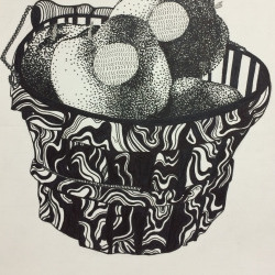
#geeky talks#if you haven't seen the timekeepers of eternity yet#(and it feels like no one has because it's honestly just so weird)#and you're looking for something short (it's only 64 mins)#and that's really weird and creative and interesting#then i highly recommend it#someone took a bad stephen king miniseries#and tore it into pieces to redo the story#and so it's like a collage where pieces are glued together in new and interesting ways#this isn't doing it justice at all#just know that the torn paper/collage aesthetic really works#seriously go watch it the cinematography is so original and interesting
4 notes
·
View notes
Text
Texture & Pattern
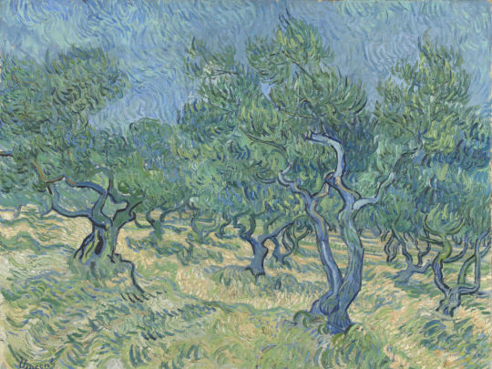
Vincent Van Gogh
Texture Texture refers to the surface quality of an object. Texture is an important component of a successful composition because it appeals to our sense of touch. This is true even when we do not actually touch an object our memories provide the sensory reaction or sensation of what that object might fell like if touched. Texture becomes one more element for us to think about when we look at any composition.
In effect, the various light and dark patterns of different textures are visual clues for us to enjoy the textures vicariously. Of course all objects have some surface quality even if it is only unrelieved smooth flatness. The element of texture is illustrated in art when an artist purposely exploits contrast and surfaces to provide visual interest.
There are two categories of artistic texture - tactile and visual (actual and illusion).
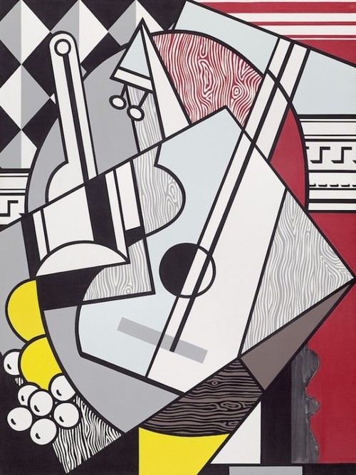
Roy Litchenstien, cubist still life, oil on canvas, 1974
AIGA poster
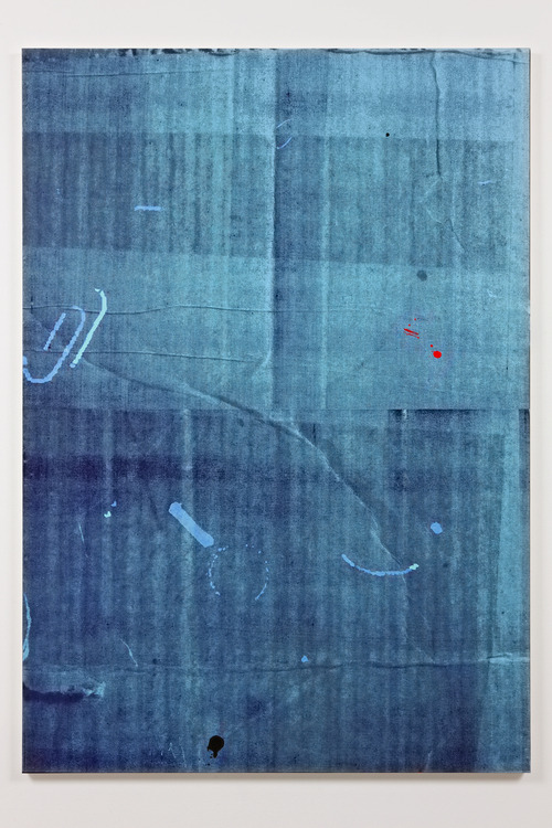
Alex Hubbard, SK 23, Silkscreen print, oil and enamel on canvas /wooden stretcher, 72.05 x 50 x 1.57", 2009
Tactile Texture Tactile texture is texture that can actually be touched. In painting texture describes the uneven paint surface. In graphic design texture can add a sense of reality “realness”. Things that seem more real to life often result in a more emotional response from the viewer, and can in turn be more memorable.
Architecture and sculpture employ actual material and have what is called tactile texture – texture that can actually be felt. In painting the same term describes an uneven paint surface, when an artist uses the paint (a technique called impasto) so that a rough, three dimensional paint surface results.
Consider Vincent van Gogh‘s painting from the top of this lesson. Texture is not just created through the pattern of short brushstrokes, but it is also created through the ridges and phrased edges of the paint strokes that are obvious to the viewers eye. The painting is revealing what it truly is– Paint on surface– Not just an illusion. Same goes for Thiebaud’s painting below:
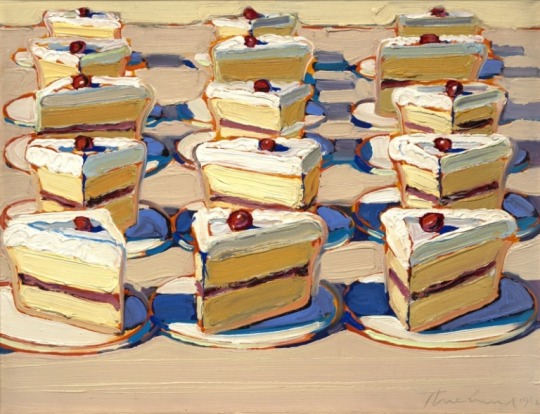
Wayne Thiebaud, “Boston Cremes”, 1962
As we’ve been exploring through this class a traditional idea of a collage is gluing down pieces of colored and textured papers cloth and other materials. Collage moved from a folk art to A fine art in the 20th century. Collage allows us to Play with compositional arrangements more easily by cutting reshaping and altering images and moving them around before pasting them down.
Anne Ryan worked mainly in collages of cloth. Her closet show various bits of cloth and contrasting leaves and textures interspersed with some scraps of printer paper. The light and dark pattern is interesting but her attention is mostly drawn to the contrast of tactile textures. See below:
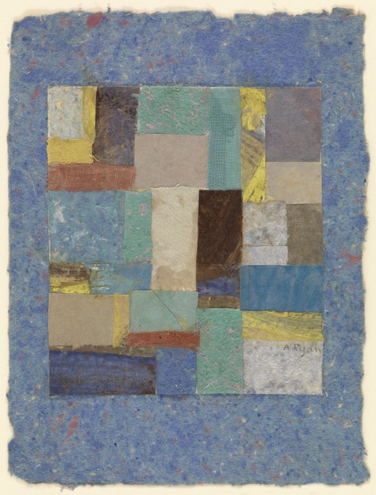
Anne Ryan
VISUAL TEXTURE:
Anslem Reyle, Untitled, mixed media on canvas, metal frame, 256x205cm, 2007
Texture can also be created through the illusion of texture. By reproducing the color and value of patterns of familiar textures, artists can encourage us to see textures where none actually exist. Visual texture carries the same visual punch as Tactile texture. Visual texture can also be created with photography, used on its own or as a filler for a shape, foreground or background.
In painting artist can create the impression of texture on a flat smooth paint surface. By reproducing the color and value patterns of familiar textures painters can encourage us to see textures where none actually exist. This is called visual texture. The impression of texture is purely visual – an illusion - it cannot be felt or enjoyed by touch. It is only suggested to her eyes. Artists use this as a way to stimulate the composition and move your eye around the surface. Various textures can convincingly be re-created. Visual texture can be an interesting design element even without subject matter or any pictorial reference.
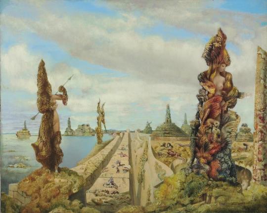
Max Ernst, Surrealist painter
The ultimate point in portraying visual texture is called trompe l’oeil the French term meaning to for the eye. This style is commonly defined as deceptive painting. In trompe l’oeil the objects in sharp focus are delineated with meticulous care. The artist copies the exact visual color and value pattern of each surface. A deception occurs because the appearance of objects is so skillfully reproduce that we are momentarily fooled. We look closer, even though our rational brain identifies the image as a paining and not the actual object.
Robert C. Jackson
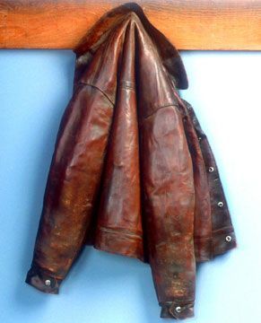
20th century artistic emphasis has been on abstraction, distortions, and non-objective patterns. But in much art the trompe l’oeil tradition continues And is not limited to painting. Marilyn Levine works in ceramics as seen in “Thom’s Jacket” from 1989 below. it is incredibly realistic but again it’s made of ceramics and is an illusion.
Texture and Pattern It would be difficult to draw a straight line between texture and pattern. We immediately associate the word pattern with printed fabrics such as plaid, stripes, polkadots and floral patterns. Pattern is usually defined as a repetitive design, with the same motif appearing again and again. texture, too, often repeats, but it’s variations usually do not involve such perfect regularity. The difference in the two terms is admittedly slight. material such as burlap would be identified right readily as a tactile texture. Yet the surface design is repetitive enough that a photograph of burlap could be quite a pattern. Once a visual texture is represented within the confines of a space or shape it often may look flat to our eyes and take on the characteristics of a pattern.The essential distinction between texture and pattern seems to be whether the surface arouses our sense of touch or merely provides designs appealing to the eye. While every texture makes a sort of pattern, not every pattern could be considered a texture.
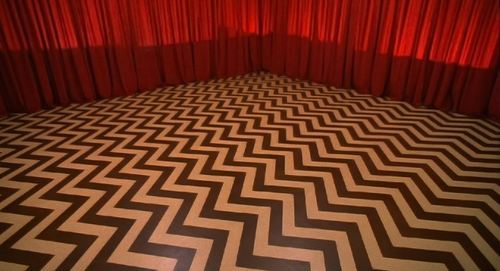
David Lynch, Twin Peaks, film still, 1990
Pattern is a great way to distinguish between areas of contrast on an image and compositions.
Barry McGee
Pattern inspiration There are many artists, designers, and architects that employ beautiful, intricate and complex patterns. I’ve compiled the “best of” collection to inspire you for your Patterns Assignment. Each image is accompanied by a short description of the artist/designer/architect/etc., and each name is hyper-linked to their website (if applicable), so you can get more details on the people that inspire you the most.
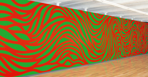
Sol LeWitt, whose deceptively simple geometric sculptures and drawings and ecstatically colored and jazzy wall paintings established him as a lodestar of modern American art.
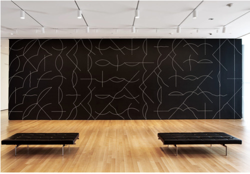
Installation view of Sol LeWitt’s Wall Drawing #260 at The Museum of Modern Art, 2008. Sol LeWitt. Wall Drawing #260. 1975. Chalk on painted wall, dimensions variable. Gift of an anonymous donor.© 2008 Sol LeWitt/Artists Rights Society (ARS), New York. Photo © Jason Mandella
Sol LeWitt, Drawing 915.013
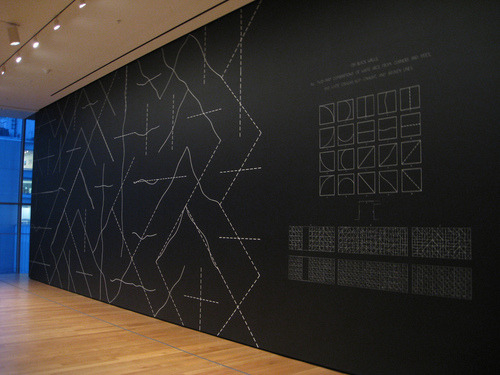
Sol LeWitt, Wall Drawing #260
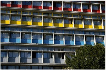
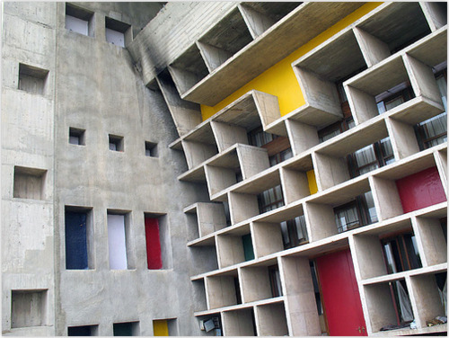
Le Corbusier (born Charles-Édouard Jeannere) was a Swiss architect, designer, urbanist, writer and painter, famous for being one of the pioneers of what now is called Modern architecture or the International style.
Bridget Riley British painter and designer. She shows a complete mastery of the effects characteristic of Op art, particularly subtle variations in size, shape, or placement of serialized units in an overall pattern.
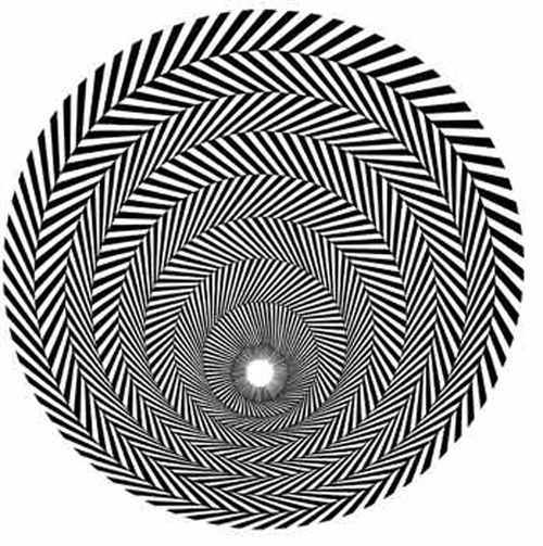
Bridget Riley,
Blaze 1, 1962
, Emulsion on Hardboard, 43x43 in
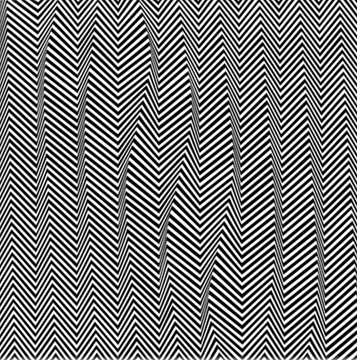
Bridget Riley,
Descending, 1965,
Emulsion on Hardboard, 36x36 in.
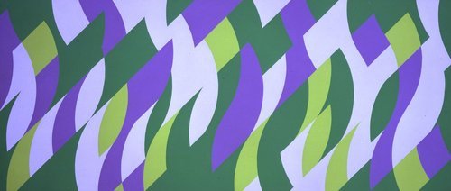
Bridget Riley, Parade I, 1999-2000, oil on linen, 89 5/8 x 206 ½ in / 227.7 x 524.5 cm
Robert Zakanitch paints lace and embroidery. His patterns are beautiful and speak to the shifting instability of texture.
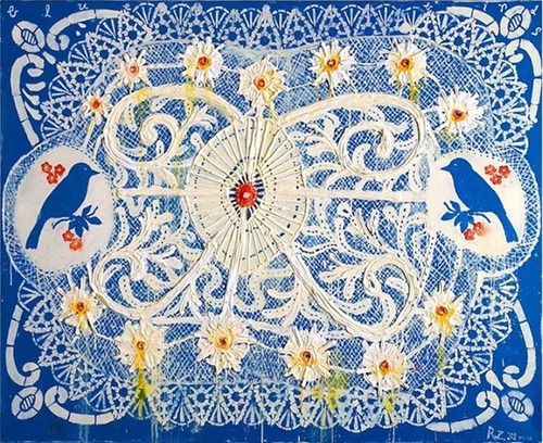
Blue Birds (Lace Series) oil on panel, 2001.
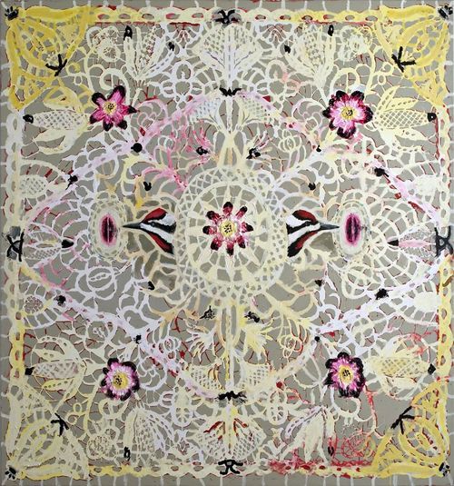
Flowers doily painting. Robert Zakanitch
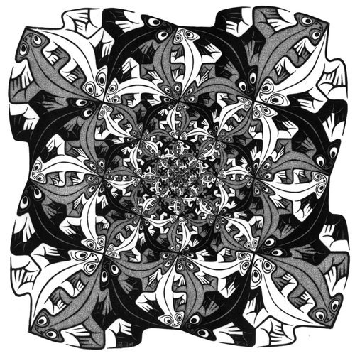
Take a close look at the figure-ground relationship in the works by M.C. Escher, who is most known for his impossible architecture and landscape drawings, showcasing his play on perspective and point of view to create structures which ultimately cannot exist. I have always been more captivated by Escher’s pattern works. His ability to create a fluid and seamless plane of repeated images fitting perfectly together is both unrivaled and inspiring.
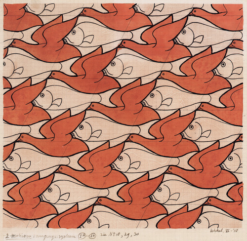
Bird/Fish, June 1938, Drawing, 228 x 243 mm (9 x 9 5/8’’)
Smaller and smaller, drawing 1956.
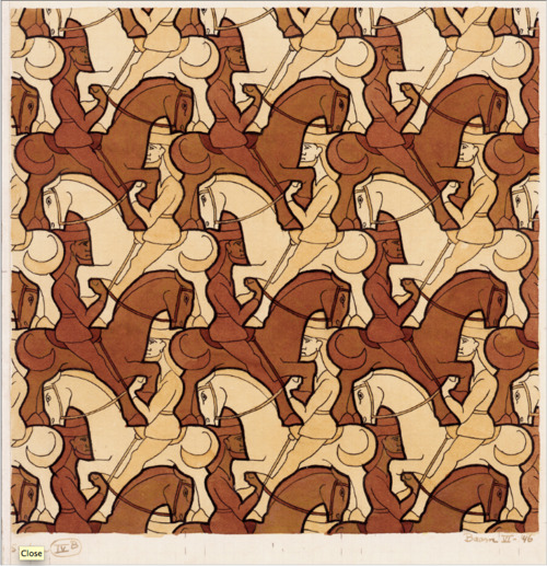
Horseman, June 1946, Drawing, 213 x 214 mm (8 3/8 x 8 3/8’’)
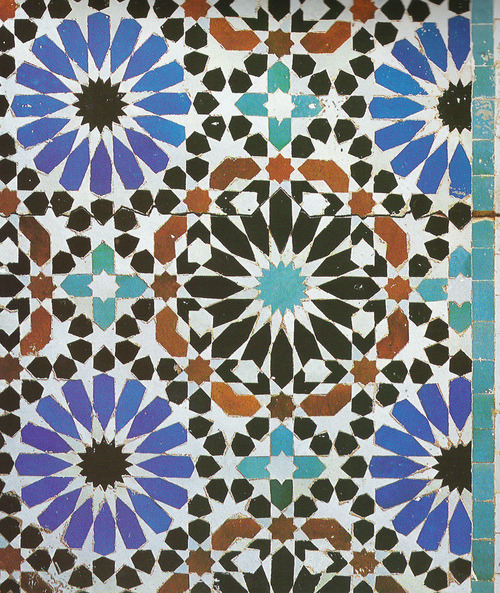
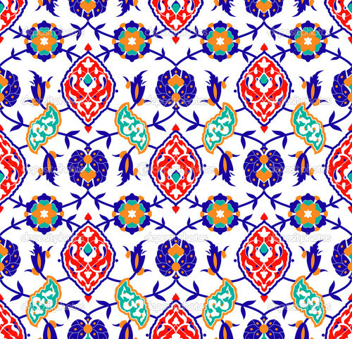
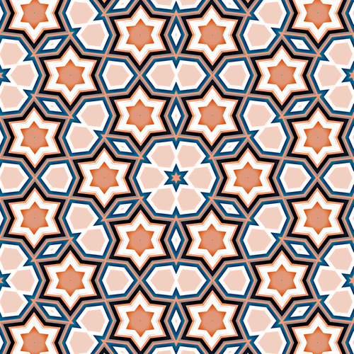
Another great example of pattern can be seen in Islamic art & architecture.
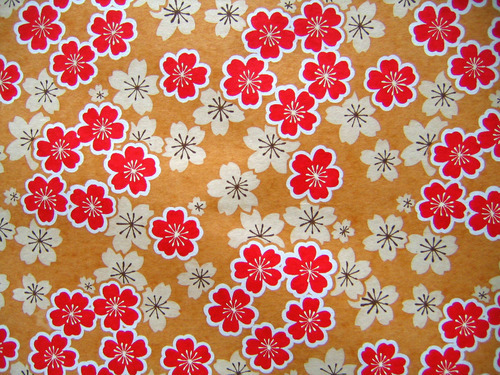
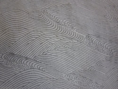
Japanese paper is another beautiful source for pattern inspiration.
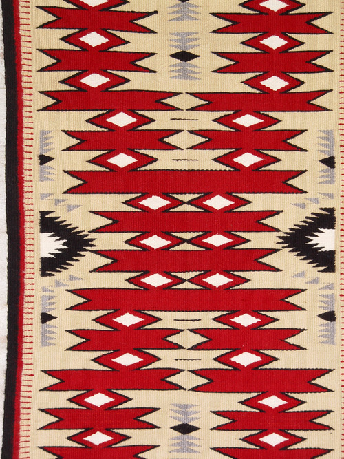
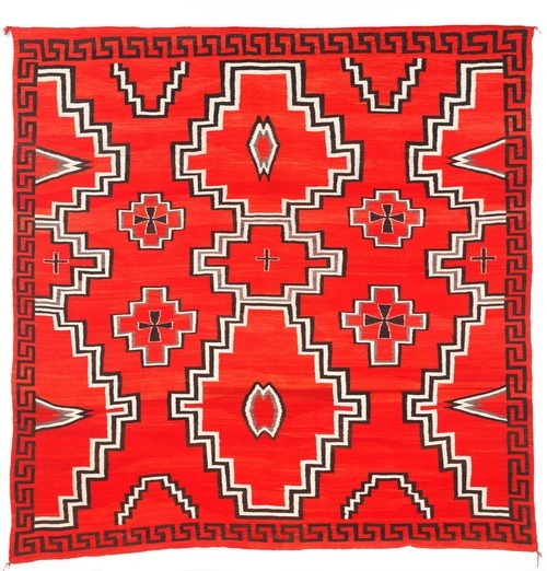
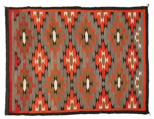
Navajo Weaving has a unique look, drawing from its Spanish and Pueblo history and nomadic way of life.
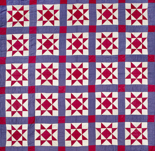
Traditional Amish Quilts lend patterns that have beauty in simplicity. Modern quilt artists are using black with solid colors and discovering the beauty in such basic designs.
Stephen Westfall
African Textiles are infused with spiritual and mythical meaning in the actual pattern designs on the cloth. Specific patterns are also used as a form of identity with each tribe having their own unique patterns.
A man’s cloth of the Asante peoples, Ghana, c. 1960. Photo: E. G. Schempf.
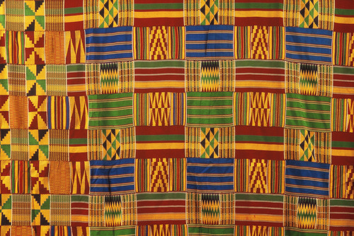
A man’s cloth of the Asante peoples, Ghana, c. 1960. Photo: E. G. Schempf.
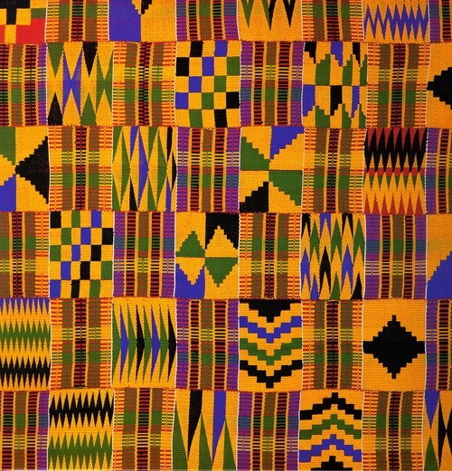
Kente Cloth, Woven by men on a narrow loom. Found among the Asante in Ghana and associated with royalty. Both silk and cotton are used.
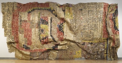
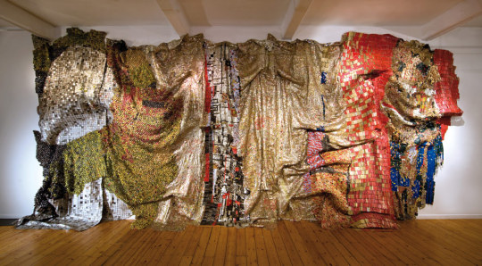
El Antasui
Takashi Murakami
Polly Apfelbaum

Marc Handelman
Katherine Bernhardt
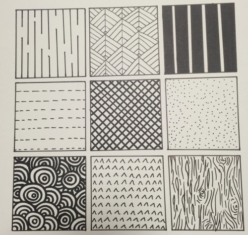
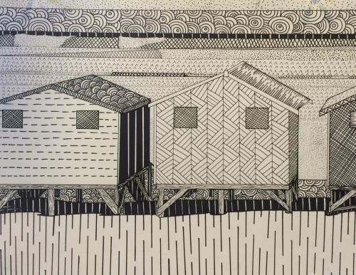
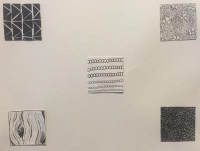
Texture/Pattern Project 1. In your sketch book draw out at least 4-5 distinct textures or patterns. Play and experiment. Look at the textures you might have around the house. How could you translate them onto a two dimensional surface? Draw each texture or pattern in a thumbnail shape (no less than a 1″x1″ square) this that you do not have to fill an entire page.
2. Once you have created your patterns and textures you will find an image that is of interest to you from a magazine, newspaper, picture, image you print out, etc.
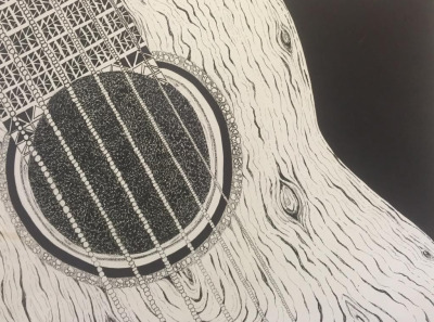
3. You are going to recreate this image on a piece of bristol paper (if you don’t have access to your bristol you can use a piece of computer paper). You will recreate this image using the textures and patterns you created with your thumb nails. Each texture or pattern you use must replace a color/value in your original image. You must choose your textures or patterns appropriately to convincingly recreate the value changes in the image with only a texture or pattern. Therefore you may want to tweak your original texture and pattern designs to account for apparent value changes in you image. If there is a darker area on your original image, you might want to make your pattern more condensed and smaller. If there is a lighter area on your original image, you might want to make the pattern larger and less condensed.
Also depending on your image you may need to create a few more textures or patterns. (Textures or patterns can also be specific to the image, for example: if wood is representing in your image then you may want to create a wood pattern for these areas of your image - you do not have to though.)
4. Your recreated image will be in back and white using the different patterns and textures to distinguish the areas of value. This project should be done in micron pen and sharpie. All colors and values in your image must be translated to a texture or pattern.
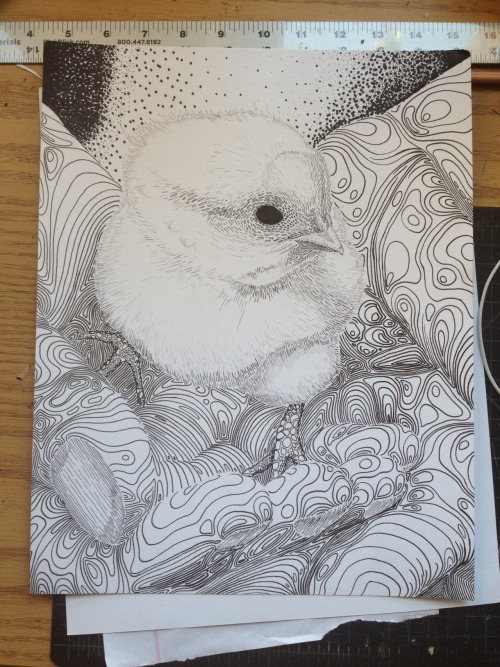
Project examples

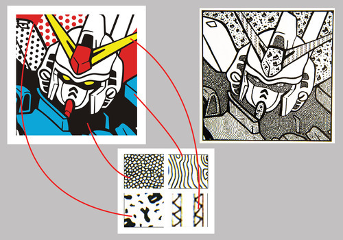
Final Product In the end you should have 3 part for this project. 1. The original image in presentation format on a piece of bristol paper. 2. Thumb nail sketches. 3.The final recreated image (on bristol paper) with all values converted to textures and patterns.
*Again if you do not have access to your bristol paper you may use computer paper.
9 notes
·
View notes
Text
Spider-Man Life Story #1 Thoughts
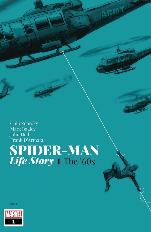
Well...this was odd.
I have profoundly mixed feelings about this story.
That is owed to this comic being a collision of so many different things.
It is a period piece. But period piece that only half uses the period.
And I mean that on two levels.
It’s a period piece in the more general sense because it is set in the 1960s. But it is also a Spider-Man period piece because it uses 1960s Spider-Man continuity.
And it only half uses both in both cases.
Basically this issue was Chip Zdarsky’s Spider-Man AU fanfic that is a giant what if deviating from the Romita era...that is also set in the 1960s.
That is honestly the only way I could sum up this story. And by the looks of it things are going to get MORE complicated next issue because we move into the 1970s which implies each issue will be set in a different decade and this is confusing because if Spider-Man’s history played out in real time starting in 1962 then modern stories would only maybe be in the early 1980s.
Basically I guess this is more a general What If series that each issue will be talking up topical issues from each decade.
Which is seriously NOT how this mini was advertised to readers so that sucks hard.
But okay AS what it actually is trying to be...is it any good.
The answer is...kind of.
There is more good than bad.
Now you all know I do not like Zdarsky’s work on Spider-Man, so when I say there is more good than bad I’m not damning with faint praise.
On a general sense, the pacing is REALLY good. A lot of story happens in one issue. Granted it’s extra length so maybe that is why. The dialogue is perfectly fine, nothing rings untrue to the characters’ voices (except Gwen but we’ll get there). There is a respectable amount of introspection and exploration on Peter’s part and this is THE best Mark Bagley art in a very long time.
IIRC Mark Bagley once said that when he did the Ultimate Clone Saga and got to draw Richard Parker, he modelled him upon Gil Kane’s take on Peter Parker from the 1970s, and felt he got closer to that than he was trying to do in his 1990s work. You can very much feel that here now that he’s drawing Peter in literally the same setting that Kane drew him in.
Okay lets talk about other things that worked.
· Flash’s characterization and Peter’s relationship with him. It felt very realistic in spite of not being how things played out in the original comics
· Norman Osborn was very much in character in being devious and frightening
What didn’t work.
· Peter’s quick assumption of Norman’s amnesia. He kind of just presumes Norman has lost his memory on the basis of little evidence. Now granted his spider sense later corroborates this, but it’s still...kind of lame. Especially compared to the original story in ASM #40 wherein Peter figured Norman lost his memories because he was referencing an event from his past that he’d just finished relaying to Peter.
· The blurb at the start of the issue says Peter was 15 when he got his powers in 1962. And then we cut to 1966 where Peter says that this happened 4 years ago. On the very next page he claims he has a year left of collage. Er...what? Maybe I’m out of the loop on the American college system (in the 1960s) but if Peter was 15 in 1962 and it’s 4 years later then he’d be 19. Collage lasts four years meaning Peter wouldn’t be graduating for another 2-3 years (depending upon how close he is to turning 20). He should be in his FIRST year of college, 1965-1966, and would be graduating in 1969, the school year beginning in 1968. WTF?
· Gwen. Zdarsky has constructed a conundrum for himself here. This is the Romita era Gwen but with shades of Ditko Gwen but also shades of more modern revisionist versions of her and Emma Stone and also he’s now taking her in a MASSIVE deviation from the established Spider-Man history. It’s all a mess, and speaks to where Zdarsky’s shipper flag is planted btw.
· Peter’s attitude to Flash at his leaving party. In the original story, ASM #47 Peter in a wonderful moment of maturity held no grudge against Flash and wished him well sincerely. There was no ‘triggering’ on his part.
· The focus upon other superheroes like
· Frankly the fact that this is not clearly either a What If deviation from established history or a true blue period piece using the established lore.
And really that is THE big dilemma with this story. It’s not really committing to being one of those things or the other and is as a result kind of compromising both things.
It’d be one thing if Spider-Man’s history was going in starkly different directions as a RESULT of Zdarsky using the historical setting, like if Peter was drafted for example.
But that isn’t what happens. Gwen finding out Peter is Spider-Man and Peter turning in Norman Osborn are things that could have happened in any contemporary What If issues (if What If was around back then).
And it’s not that these are uninteresting deviations to explore, but they feel undercooked because the book is also examining Peter’s introspection about joining up to fight in Vietnam. And THAT stuff is really interesting too, the discussion with Flash and Captain America serving as opposing arguments for Peter’s decision is REALLY good.
But again it feels undercooked because we’ve got this plot about Norman Osborn knowing Peter is Spider-Man brewing.
And the thing is I can’t decide if it’s a case of the story itself being at fault or the advertising for it being flawed.
Let’s put aside discussions about whether the story being Spider-Man’s history just presented in real time would’ve been better than this or not.
The fact is it WAS sold to readers that way so when you view it through that lens all the What If deviations seem weird and out of place, like distractions.
But hypothetically if this was just advertised as a What If mini ‘What if Peter turned in Norman Osborn and Gwen found out he was Spider-Man before she died’ then the focus upon Vietnam would’ve felt much the same.
But I don’t know if the series advertising EXACTLY what this mini seems to be would’ve mitigated this sensation from the reader. Or if the story itself is just really just two types of stories glued together.
I suspect it actually is the latter though for two big reasons.
The Vietnam plotline places a lot of focus upon Captain America and Iron Man. Their conflict is in fact the shocking cliffhanger of the entire issue. So you know...something that isn’t about Spider-Man himself. That felt more like Zdarsky trying to do Watchmen but in the Marvel universe. Which gets complicated because that opens up a whole can of worms for the relative realism of the MU, not least of which being how could the heroes ever allow things in the war to get to the point that it did.
The other reason is that the deviations from established history aren’t done the way of a traditional What If, wherein the in-universe history is identical up to a certain point then a single change sets off a new direction.
Here Zdarsky is just remixing various different elements from Romita Spider-Man to create an impression of that era and then deviating from the ‘general knowledge’ of that era.
Norman dropping Harry off at school cribs from ASM #39, Norman’s amnesia cribs from ASM #40, Flash’s party cribs from ASM #47, the Scorpion and Spider Slayer stuff treats ASM #20 and #25 as big parts of the past but the threat of Jameson’s exposure cribs from Stern’s 1980s run. Norman wanting Peter as his heir cribs from Revenge of the Green Goblin in the 2000s.
But these elements, much like Spider-Man: Blue, are not remixed in a way that chronologically line up with how things happened. They’re all jumbled together so now Norman found out who Peter was (somehow?) but kept that in his back pocket to bring it up at Flash’s party and then announced he wanted Peter as his heir.
It’s all so...weird.
Look it isn’t an uninteresting what if but it’s also like...just a fanfic basically.
Not badly written fanfiction but it’s also like...what point is there to this really besides BEING Zdarsky’s fanfiction?
Another problem is that this story, along with not fully committing to the period piece aspect, simultaneously plays things with an intrusive degree of hindsight and imposes revisionism.
I’ve already spoken about this with Gwen but it’s also true with Harry and Norman’s relationship being cribbed from the Raimi movies the incredibly obvious ‘Norman will kill Gwen!!!!!!’ foreshadowing along with the ‘Professor Warren is a bad guy’ stuff; to say nothing of how Warren’s character design is inaccurate to the period.
That stuff imposes a present day hindsight of the Romita era whilst also overlays that with truisms brought about by adaptations being in the zeitgeist.
This applies to the Vietnam war stuff too. The book frames the war in a way that we look back upon it as opposed to framing it the way people in 1966 America probably actually viewed it. The final page is the biggest example of this.
Finally...didn’t we JUST see this from Zdarsky with his time travel arc in Spec?
Like wasn’t this a very similar idea. Spider-Man’s history but deviated because Norman Osborn’s identity is exposed differently and Peter and Gwen wind up as endgame?
Over all I can’t say that I disliked this. But nor can I say I was that thrilled with it. It’s not what we were promised and honestly...what we were promised sounded a lot more compelling. Moreover there are much better examples of period piece superhero stories out there.
· Spider-Man Blue frames the early Romita issues the way they might’ve happened in the 1960s as they existed rather than Marvel universe 1960s
· ASM Annual 1996 is DeFalco, Frenz and Romita Senior presenting an untold tale so good it could be downright mistaken as being MADE in the 1960s
· Busieck’s seminal Untold Tales of Spider-Man series as a whole
· The last 2 issues of Webspinners by DeFalco and Frenz which serve as a lost arc from their 1980s era
· X-Men: Grand Design
I think this is something you just gotta pick up and taste for yourself, but again...just be aware this isn’t what it was advertised as.
#Chip Zdarsky#Spider-Man#Mark Bagley#Gwen Stacy#Peter Parker#Captain America#Iron Man#Steve Rogers#Norman Osborn#Green Goblin#John Romita Senior#John Romita Sr.#John Romita Sr
16 notes
·
View notes
Text
Spotlight on Local Artist Trey Reis
Interview by Francess Dunbar
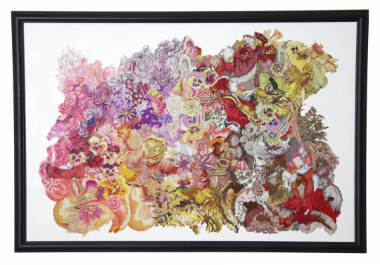
Trey Reis, A Study in Disrupting Old Patterns: Red, 2018.
Though your association with the word collage may be cutting and pasting magazines with a glue stick in high school, technology has opened many doors in this medium, expanding the definition to include many other interpretive works that combine several pieces. Local artist Trey Reis creates his collages both in the conventional paper-and-glue style and with sound fragments.

Deb Anders-Bond Collage Workshop, 2014 Roach Motel Zinefest
Trey was influenced by another local artist: Deborah Anders-Bond. Anders Bond chooses her images from used books and magazines, an environmentally friendly practice that recycles paper & ink which would otherwise be burned or buried in a landfill. It also ensures that her work is full of unique and interesting imagery centered around a color scheme though she was careful to specify that the collages “build themselves” rather than having a unifying theme or idea behind them. When asked about her impact on Trey’s work, she was modest, saying that she thinks he has surpassed her influence. “Trey’s work becomes more and more abstract, although the separate images are visible upon close inspection,” said Anders-Bond. “I think we both tend to use a certain color or color range and stay within it as we build our collages. In comparison, I might say my collages are personally symbolic, although that might not translate to viewers.���
Read our interview with Trey below and be sure to check out Deborah Anders-Bond’s collage booth as well as Reis’s new exhibition at the Art Terrarium Pop-Up Market on Saturday, June 23.
As an artist, you work in many mediums to create collages, including sound. How do these different mediums affect your work and its meaning?
For me, the collage medium is all about deconstruction and recontextualization. It’s analyzing the content and form of objects removed from their intended framework. I think this is what St. Thomas Aquinas was getting at with his writings on essence and existence. It became the main process behind my “Piece” exhibit on display at the Art Terrarium this month.
The sound collages begin with that same process but the end result is quite a bit different. After I’ve found and isolated my individual sounds, I work them into repeating loops of varying lengths and that’s what forms the layers of my sound collages. The application of effects to these loops is how I dissect them. Different filters allow me to draw forth sounds that can oftentimes be hidden by the mixing process, and that’s how familiar noises are turned into rhythms and melodies that reveal themselves in different ways as they repeat.
I don’t put much thought into meaning. If I work with something long enough, it always gains meaning to me through connotations or repeated thoughts I have when working on it. If these ever become complete concepts or ideas, it’s often long after the work has been finished, and is usually connected to something I may have watched or read or heard that otherwise felt entirely unrelated to what I was working on.
Do you feel you're pushing the boundary of what can be called a collage?
No, but I do try and approach collage with techniques from other mediums. People often look at collages as puzzles, which is appropriate, but I find them to be more like paintings. Aside from associations we may have with color or texture, paint has no context until applied to the canvas. This is how I feel when I’ve cut out all of my pieces and am beginning the gluing process for a collage.
Oftentimes, specific colors can take on musical qualities in any given piece. How darker colors can serve percussive or rhythmic purposes, or how a hint of a bright color somewhere can feel like a melodic embellishment.
What local artists have influenced and inspired you? What about artists from other places?
Iowa State University professor, Alex Braidwood, designs these listening tools that invite listeners to question how and why we hear the things we do. I think this is a useful study for all of our senses. It helped me learn to perceive things beyond their intrinsic meaning or purpose, instead focusing on secondary qualities, which I believe is where a lot of the connectivity between our sensory experiences exists.
Bruce James Bales, my studio mate and local filmmaker, has this ability to deconstruct a location down into its unique details and then build up a narrative that weaves these details into the framework. I’ve always found similarities between that approach and the way I will flip through books looking for materials for a new collage. It’s a way of removing the context from things and instead focusing on their sensory values. I think it’s important to watch films with your senses instead of your brain, and I think that method can be applied to a lot of different artistic mediums.
Looking at Deb Anders-Bond’s collages throughout the years taught me to break down what I see into texture, form, and color, which was a very important starting point for much of the work I’ve done in Des Moines. I used to find the individual pieces in collage work that I saw. The way Deb blends her pieces together really helped me see how collage pieces can forgo their intended purpose in favor of something with larger capacity for connectivity.
Jordan Zantow’s paintings bridged the gap for me between psychedelia and punk, blending maximalism with messiness. He was one of the first great local artists I knew, and I met him when I was much younger, long before I ever thought I was going to be an artist.
Field recordings and sound collage techniques have been used more and more in contemporary electronic music, and I draw more inspiration from music than anything else. Musicians like Kaitlyn Aurelia Smith, Arca, and Onehotrix Point Never are among some of my lasting favorites. I really enjoy some of the older weirdos like Lonnie Holley and Laraaji, who were even too out there for much of the New Age crowd at the time.
I read something recently on this meditative/healing music from Morocco called Gnawa and I’ve been listening to a lot of that lately. It’s very rhythmic and repetitive and the details are subtle, so it feels very familiar with regard to my own collage work.
What are you doing for Art Week 2018?
After nearly two years of assembly, I am finally exhibiting my visual collage work at the Art Terrarium during Art Week. The exhibit is called “Piece: A Study in Disrupting Old Patterns” and will be on display during the Art Terrarium’s open hours throughout the week, as well as during their Local Art Pop Up Market on Saturday, June 23. The exhibit will run through the end of July.
4 notes
·
View notes
Text
London Design Museum - Primary Research
In this post I will be discussing and reflecting on our recent trip to the Kensington Design Museum in London, where I was able to gain some primary research supplying me with loads of ideas for my FMP.
On this trip I was able to record some different pieces of art that give me a great insight to the history of Graphic Design. This trip was able to give me a visualization of the different styles of design, from prints to model making to architecture.
It is important that I am able to get out in the real world rather than viewing it from behind a computer screen it as it allowed me to appreciate the little details that you can’t see or value.
A good example of this was the architecture in London. I don't often go into the centre of London so I am not able to look closely at the architecture throughout the city with all of its different styles.
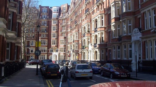
While we didn't walk around the whole of Kensington, at lunch we were able to go out of the building and walk down a couple of the streets. It is interesting to looks at all the different styles of architecture, especially compared to where I live. I am not used to seeing these terrace style buildings. The architecture is very interesting to me and I am intrigued how the architecture of terrace-styled houses/developments compares to detatched buildings.
Carrying on from this, The Design Museum itself perfectly represents its contents. The building is very clean and built up to a high standard finish.

As you walk towards the front door, there is a sculptural piece by Eduardo Paolozzi, a British artist who was known for having a large influence on pop art.
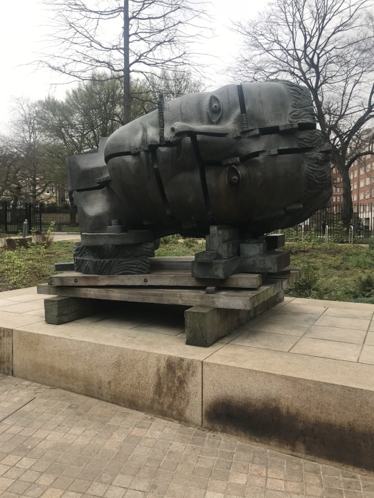
Even this sculpture above could be linked to our theme of collaging and assemblage as you can see pieces of the face have been chopped up and put together. He produced both 2D pieces as well as sculptures. The pieces slotted in-between the gaps of the face have words on them. The back of the head has machinery parts on it. This could be a metaphor that the human head is like a machine with all of its cogs winding to make it work. This is one of the best things about working in 3D, from one angle the piece looks like something, but from another angle it could look like something else. With flat, 2D pieces the work will most likely only have one perspective or meaning. The size of the sculpture also makes it enjoyable to view as you don't realise its stature until you see it in person.
The Building/Structure
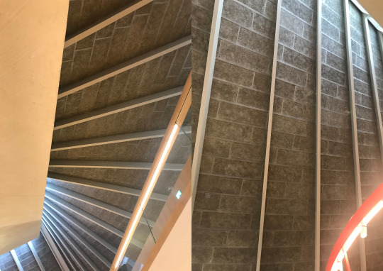
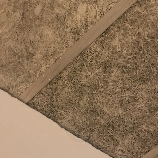
As I entered the building I noticed straight away the material the ceiling is made out of and the style of its shape. This roof is something called hyperbolic paraboloid.
Hyperbolic paraboloid meaning: A hyperbolic paraboloid is an infinite surface in three dimensions with hyperbolic and parabolic cross-sections.
The material it is made out of looks as though it is panels of reinforced straw glued together. Im guessing that these materials are recycled and that there is also a sturdy material such as concrete under them. I think it actually looks quite effective.
John Pawson was the architect who designed the interior building, he is well known for his minimalist and modern style.

John Pawson: ‘I love clear spaces. I love the absolute minimum’.
This ties in with the previous research I have done throughout this project. I stated that it more in fashion for things to be very simple now, and this is starting to become the norm in almost every part of our lives; buildings, art, technology, vehicles etc. Even as you look at the car manufacturer ‘Tesla’, their vehicle designs are being stripped down to be very simple, consisting of one central screen that shows the driver all the information they could want.
The museum, whose total cost will be £83m, has most of Pawson’s characteristics, with a palette of oak, stone and white paint. Its centrepiece is a big square hall, around which stairs and galleries take people to the exhibition spaces.
Designer/Maker/User
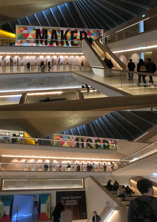
‘Designer/Maker/User’ is the name of the exhibition held at the Design Museum which was the focus of our trip.
As you enter the building, one of the first things you see it the rotational wall that switched between the words of the title of the exhibition. I really like the use of different coloured triangles for the back ground as that bring with it a light, friendly emotion.
At the design museum there was a variety of different objects, designs and themes I either saw or began to think about during my time there.
It showcased the every different form of graphics, even ones that before this I had never really though about before. Things such as sign posts or cutlery.
The exhibition covers a broad range of design disciplines, from architecture and engineering, to the digital world, fashion and graphics.

An interesting part of the exhibition was the wall consisting of loads of random objects such as chairs, clothing, rubber gloves, £5 bank note and loads more. These are all things that have been deisgned by someone with the customers best interest at mind. You can see an image of the wall below.
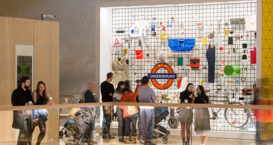
It is interesting when you think about the fact that everything in front of us has been designed by someone. Even the pathways we walk on have been planned out by city planners along with the rubbish bins we use.
This wall consisting of the collection of random, donated items could be strongly linked with out display boxes. These random objects have been carefully considered in terms of layout and positioning, which is similar to the process with out display boxes.
The exhibition consisted of 3 sections; Designer, Maker and User.
Designer explores the ways in which the thought-process of the designer informs projects at every scale, from the smallest to the largest. Including the 1:1 scale prototype for the new London tube train.
In Maker, the exhibition traces the evolution of manufacturing, from café chairs to Ford Cars to robotic arms. As well as this it consists the process of mass customisation and 3D printing.
This section is where I found the collection of these visually unique chairs:
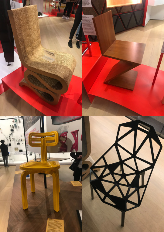
These chairs above really captured my interest as they were all made out of different materials using different process, each emitting completely different emotions towards the viewer, yet they all have the same purpose, for someone to sit on.
Chairs are an sub genre of architecture and are something that I could look to explore in detail through this project, as I haven't chosen a specific theme yet.
Finally, the User section of the exhibition. It explores the interaction between people and brands that have come to define the modern world. Features include a vinyl player, Apple, Sony and Walkman products throughout history, as well as a typewriter; all demonstrating how design has changed how we communicate.

What did I get from this trip?
The importance of this is achieving an understanding in all three of the aspects which will carry your work from something which is made to ‘look good’ to something with a real impact.
When creating my outcomes, I must consider the audience it is for and the reason I am creating it. What is its purpose? Is it practical for this purpose?
This trip provided a new element of research to my project in the form of primary investigation. It was a lot more engaging for me as a viewer reacting to the work first-hand as it was intended to be viewed.
It is important to gather both primary and secondary research throughout this project. Primary as it means I am able to get a first hand response about certain pieces, and secondary as I am able to find out more information in a shorter amount of time.
The magnitude of pieces adds to the statement the piece is making and makes the work seem a lot more meaningful. Large works like these keep me interested to look at because there is often more analyse.
The Design Museum offered a unique outlook on the evolution of technology and how this aided the production of design. One of the most interesting parts of the museum was to see how the 3D printer worked, and to find out how cheap of a process it is to product production on a mass scale. I am sure this is the future of production and a huge breakthrough in technology is happening before our eyes.
0 notes
Text
How did photomontage add another dimension to Photography - By Harry Sweeney
Photo montage is the name for the process of gathering two or more photographs and, cutting rearranging and gluing them to make a new composite image, that is often photographed, copied or scanned to make it a seamless photographic print.
Although the roots Photo montage can be traced back to as early as the mid victorian period with Rejlander producing what he called ‘Combination printing’ Photo montage and photo collage as we know it today was first developed in the early 20th century, In 1916 George Grosz and John Heartfield experimented with pasting pictures together, this technique was later named Photomontage.
George Grosz wrote, “When John Heartfield and I invented photomontage in my South End studio at five o’clock on a May morning in 1916, neither of us had any inkling of its great possibilities, nor of the thorny yet successful road it was to take. As so often happens in life, we had stumbled across a vein of gold without knowing it.” This marked the beginning of using Photo montage as a form of modern art.
In the 1930s John Heartfield began using photomontage to tell a story, he produced book and magazine covers in berlin using photomontage and typography. He began producing political pieces that spoke up against and mocked fascism and the nazi party during the lead up to the second world war earning himself a spot on the Gestapo’s most wanted list. This is an early example of using photomontage as a weapon against corruption and policies disagreed with by the artist, a technique that has been widely used since. The invention of photoshop and other editing in recent years has made photomontage accessible to the masses.
I’ve chosen to work with photomontage in this project as I am interested in how it can dissolve the boundaries a normal photograph has. For instance a normal photograph lacks the ability to show the viewer an object or event from multiple perspectives. Photomontage allows you to achieve this by shooting multiple perspectives before layering, and positioning them together to make a new piece.
In the production of my own Photomontages i’m hoping to discover that there are very few limits to what you can achieve with Photomontage. And if it allow you to add the dimension of time to your pieces. Im also interested in weather Photomontage can allow you to represent the third dimension by shooting the same object from multiple different perspectives rather than only one as a normal photograph does.
Artist Research
The early photographer I have selected is Hannah Hoch. She was born on 1 November, 1889, in Gotha, Germany. From 1912 she studied in the Berlin School of Applied Arts and in 1915 went on to study at the Museum of Applied Arts in Berlin. Hoch was a pioneer in photo collage and photomontage and an important member of the Berlin Dada movement. Splicing together images taken from popular magazines, illustrated journals and fashion publications.
Hannah Hoch’s work focused on themes of gender and the political and cultural climate of berlin after the first world war in Germany. She expressed her opinions on major issues in a comical and artistic way through collage, something that was seldom seen before the dada movement in berlin.
The contemporary Photographer I have chosen is John Stezaker. Stezaker is an English photo-conceptualist/conceptual artist. He was born in 1949 in Worcester, England and continues to make art today aged 67/68. He uses pre-existing photographs such as old postcards and photographs of early Hollywood stars, and combines and juxtaposes them in a way that generates a new meaning, often eerie and surreal.

Hannah Hoch - Untitled, From an Ethnographic Museum (1930)
This piece was produced by Hannah Hoch in 1930 and is said to be inspired by a trip she took to an Ethnographic Museum. Its central figure is a black and white photo of non-western sculpture of a woman with a western photograph of a western celebrity from a popular magazine. One of her eyes is a larger distorted eye from a different photograph that gives the whole piece a more surreal and dreamlike feel that is typical of artwork from the dada movement. Although the central focal point is black and white and sepia tone, the background is a deep red which makes the figure stand out. The blue semi-circle at the bottom of the piece works like a plinth for the new statue she has created and works together with the red background as a second primary colour making the piece more eye-catching as a whole. The message that Hoch tried to put forward with this piece is about attitudes to women in Weimar Germany during the 1930s and the role of the ‘New Woman.’ The anonymous female body in combination with the magazine cut out challenges the objectification of females and the use of bold primary colours serves as a way of highlighting the importance of this issue.

Pair IV, 2007 Collage, 19.5 25.2 cm
This collage was produced by conceptual artist John Stezaker in 2007. Its consists of an old black and white photograph of a couple kissing that was likely taken from an old hollywood poster or magazine. In the center where the couple meet stezaker has meticulously overlaid a landscape photograph of a river carving its way through a valley, to the left of the river is a boardwalk with a figure standing on it and looking out. John Stezaker produced this piece in response to his beliefs that this sort of portrait photography is a symbol of modern culture but juxtaposes this with the landscape to show its ever-changing nature. Although this piece is a simple combination of two photographs it generates a lot of meaning. I feel that the fact that the two people kissing are anonymous is significant as it objectifies them as nothing else but a couple. The river running through the center of the image suggests the depths of their relationship unknown to anyone else. Not only this but it could represent their differences that will never cease to bring them further and further apart just as a river carves through a valley.
COMPARISON
The most striking difference between these two photomontages is that Hannah Hoch’s has an abundance of bold colour, whereas the Stezaker piece has no colour but only black and white and sepia tones. However, both pieces pair black and white images with sepia images to give them an old fashioned and traditional feel. Another difference between the two pieces is that Pair IV simply pastes one image in the center of the other to change its meaning whereas Hoch’s piece has cut out objects from multiple different sources to generate a new and specific meaning. In terms of their composition these two pieces are somewhat different. Hannah Hoch’s piece has a central figure that is blatantly its main focus, in contrast to this John Stezakers piece has two main figures. The use of composition in both pieces influences what we think about their meaning. Hochs piece puts all our focus on the central statue whereas Stezaker’s composition straight away makes us consider the relationship between the two figures, this is made even clearer with the central image connecting them. There are both similarities and difference when it comes to the meaning of these two photomontages. They both have themes of gender and human connection. Stezakers piece focuses on the nature of relationships and how they are viewed by people and Hoch’s piece focuses on the role of the female in the Weimar republic and how they were viewed by people. I feel the Photomontages are successful in communicating their concepts and do so in a way that is aesthetically unique and pleasing.
CONCLUSION
Writing my coursework essay has taught me a lot about John Stezaker and Hannah Hoch. Firstly that they both use photographs in an unconventional way to challenge what we think about the limits of photography. Hannah Hoch was one of the first to make use of multiple different images to generate meaning or express an opinion that she couldn’t with put forth a single traditional photograph. Not only this but she was doing this in 1930s Germany, one of the most significant times in modern history. I have learnt that John Stezaker being a contemporary artist, has simplified the photomontage that people like Hannah Hoch pioneered and uses it as a tool to express his opinions on modern day issues. It is clear that Stezaker, among others has been influenced by the work of Hannah Hoch as she revolutionised the combining of different photos to express an opinion. A clear link showing the influence Hoch has had on Stezaker is that they both make use of images from magazines and posters. Hannah Hoch made use of the popular press being released at the time whereas uses older archived photos from around the time of Hannah Hoch, making it clear that she influenced his style. I believe the work of both of the Artists has longevity. We can be sure that the work of Hannah Hoch does as it is still famous today, this is due to its historical significance and Hoch being an important player in the Berlin Dada movement. I think that Stezaker work also does as his style is very likeable and unique and the messages he sets out to put forth are timeless.
My work has been influenced by both of the artists I have studied for my coursework essay. I would say John Stezaker work has influenced me more so than Hannah Hoch’s. The way Stezaker matches and carries some of the lines from the initial image onto the image he pastes on top helps his pieces come together as a whole. I was very much inspired by this technique when producing my own photomontage. I was also inspired by the combination of black and white with sepia tones used by both artists.
In the production of my own Photomontages i have discovered there are very few limits to what you can achieve with Photomontage. It allows you to add the dimension of time to your pieces by taking pictures of the same object seconds, minutes or even years apart and pasting them on the same background. It also allows to to add the third dimension to your pieces by shooting from multiple perspectives and producing a sort of ‘net’ of the object in question this was a technique used by Cubist painters such as Picasso and Juan Gris in the 1920s that David Hockney bought into photography in the early 1980s.
My own work

This piece is made up of two images that I shot on illford hp5 black and white film of a girl washing her hands. I took the two images in a bathroom in Paris. One of the images is landscape and shows the sitter washing her hands. The other image is portrait and reveals more of what the bathroom mirror is reflecting. I was inspired by David Hockney in the way that it is two perspectives on the same event, giving the viewer a better idea of the event in question, allowing them to feel more involved. I was influenced by both Hannah Hoch in the way that i combined sepia and black and white so the viewer can tell the images apart, but they still work well together. Similar to John Stezaker i made sure the line at the bottom of the mirror ran through both of the photographs to make the piece seamless as a whole. I feel this also changes the meaning of the piece. One image being sepia shows that the real world on the outside of the mirror is different to that inside the mirror, suggesting that all that we see of ourselves is our reflection in mirrors, and this may differ from the outside world and how others see us.

This piece is made up of two photos i shot on colour film at cambridge leisure. One of the images is shot from directly in front of my friend standing and talking. The other image that i have placed on top of the first is shot from a side on perspective of the same event. Not only this but the second image is closer up and reveals some of the details of the scene, like his ring and the cigarette and can of coke he is holding. This combining of two photos allows us to get an overview of the scene whilst also viewing the details within it, something that cannot be achieved with a single photo. I was again very much inspired by the photography of David Hockney in this decision. I used the lines within each photographs and the creases in his hoodie to join them seamlessly as John Stezaker does using the drawstrings of the hoodie to differentiate the two images. I feel the meaning of this piece is about discovering the details of everyday life that usually would go unnoticed. This message could be compared to the messages of Ed Templeton who i was inspired by throughout my project.
0 notes
Text
Primitive. Messy. Low Quality: An Interview with Latvian Artist Figūras
I read somewhere a little while ago about the link between electronic music and the historical and artistic movement of post-modernism; that some of the greatest and most interesting electronic music has deeply rooted influence and perhaps elements of post-modernism within it. Said elements were defined as heightened forms of musical abstraction, minimalism, avant-garde and experimental to counteract the ‘blandness’ of the previous period (Modernism), and many more. It was an interesting read that concluded with the claim that those aforementioned segments were still very ripe in the modern music industry. And although these characteristics seem lengths away from the special facilities of mainstream music and culture, their echo can still be heard in the back corners of the Internet and the musical underground of alternative music. With this in mind, you can imagine my interest when I listened to the sounds and music of Latvian based musician and artist Figūras.
Figūras is an electronic artist whose practice encapsulates several elements of post-modernist music. Over the course of seven experimental mixtapes/EP’s and albums the Latvian artist has explored the realms of outsider electronic music and avant-garde soundscapes. Among his many releases, Figūras exhibits elements of minimalism, the more alternative and underground genre of lowercase music; which was invented by experimental composer Steve Roden on the infamous Forms of Paper album, and even flourishes of noise and power electronics music. These sub-genres, combined with the industrial and minimalist art featured on the cover of subsequent releases, make Figūras’s music an experience to listen to.
For example; a mini-album length release simply entitled Laptop showers the listener with engaging abstracted sounds and the crunch and churn of electronic noises in a collage like appearance. Another release, entitled Mixtape I: Reminiscence of a Past Void, compacts an outsider, electronic form of free jazz music and several slow passages of droning ambient music into two lengthy tracks. And just like the philosophical, musical, artistic and architectural response to ‘blandness’ and former linear constructs of Modernism, Figūras’s music is never a linear genre or musical format. In fact, over the length of a track, a Figūras song can morph into several different genres; at times sounding quiet and meditative before filling your ears with industrial noise and warped samples.
LAPTOP by Figūras
The artist himself claims a kind of retrospective distaste for the concept and namesake of post-modernism, but maintains his practice contains portions of the movement thoroughly. His love and interest of lengthy, improvisational pieces has also lead the way for a kind of live performance art, and his love for jazz has inspired an undercurrent of the genre throughout his music; while maintaining a prevalent factor in his music is art as a visual medium.
How would you describe your music?
Primitive. Messy. Low quality. Long. My hope would be for it to never start and never stop.
Who are your main musical influences?
As a kid I was probably most influenced by Jean-Michel Jarre that my father listened to while driving. Later on, I got into everything I could get my hands on - Iron Maiden, drum'n'bass, noise, hardcore, Aphex Twin, jazz and even Phil Collins. I lived in a very isolated world in a way - pirated CDs and BBC1 broadcasts were my windows to the outside world in 90's. Later on, after getting tired of sequenced music I started to get into improvisation - we did 30 hours or so of improvised noise with Mārtiņš Roķis (known also as N1L) about 10 years ago and I gradually got into improvisation. Figūras started with extensive use of delay only recording live improvisations. Terry Riley was a huge influence in doing that, also new age music, stuff that Sound Forest festival brought to Riga over the time.
Mixtape I: Reminiscence of Past Void by Figūras
What instruments/electronics do you use to create sounds and music?
I've used different things over the time - laptop, reel-to-reel, cassette players, old Soviet guitar, vintage church organs (that I actually tried to carry to gigs which now seems incredibly stupid). Now I've settled with couple of synths - Soviet Kvintet with dis-functional A key, archaic RMIF TI-5 synth (early 90's Latvian made analog synth that sometimes goes out of control), Electribe for sampling and a looper/delay pedal. I still use the laptop every now and then but I prefer actual knobs and keys as it becomes more mystical in a way. I used a PC for many years and just got tired of gluing patterns together without any live action. The process is what makes Figūras function.
Are you inspired by visual art or sound art at all?
During the daylight, I'm actually an artist and curator. I also co-run a gallery 427 in Riga. So, in a way Figūras was a way to blend my visual practice with sound, I do a lot of endless drawings and so sound was in a way continuing that. I actually see Figūras as extension of my artistic practice.
Your music features elements of post-modernism (musical abstraction, minimalist compositions, an evolving and experimental sound) would you consider your music post-modernist?
I actually dislike the word "post-modernism" - I guess it's some kind of high school trauma of being obsessed with post-modernism as I was discovering the whole wide world. But on the other hand, yeah, why not. I don't like labelling, so in a way I don't really care what you call it. But of course, it's more influenced by stuff that happened after WW2 rather than modernist music, though I still like Erik Satie and Dadaists and stuff like that. If you want to categorize it I guess there's more connection with minimalism, conceptualism and even partly Fluxus.
I hear some characteristics of jazz in your music. Are you at all influenced by jazz?
Oh, that's interesting, I don't see that, but could be so because I used to listen to jazz a lot. My favourite LP of all time is Raubiško's Jazz Trio's “Images of Ancient Egypt”. I like the repetitive elements in jazz, gradually changing over the time, the improvisation.
Who are some of your collaborators?
I'm collaborating with Vivienne Griffin every now and then. I have recorded some music with Viktor Timofeev and Quantum Natives; we just released our first album under the name Zolitūde (http://www.ofluxo.net/zolitude/). I think in a way we share the same interests in sound. In both cases we also share interest in contemporary art. And also in both cases it's very tricky since they both live somewhere else.
I used to do stuff with Mārtiņš Roķis as we were discovering our interest in improvisation, we also did a radio show together about 15 years ago. I've also played with Mona De Bo, amazing Latvian band and some other Latvian artists.
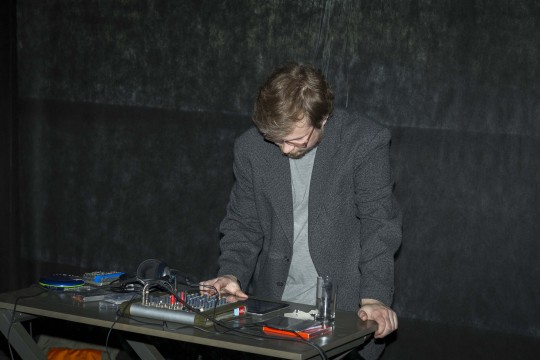
What does a Figuras live show look and sound like?
Sometimes I have some cut-up videos of Police Academy in the background, often times there's not much else. I've done two concerts that I called Never Ending - the idea was to start with the opening of a bar and end with closing, both times it lasted about 10 hours and no one, not even bar tenders, saw the whole thing.
youtube
I like the idea of not fully grasping the whole piece, for each listener to have a different perspective. It also helps me to go into a sort of routine/trance where little things matter less and less, notes blend into each other, the structure morphs and everything can go alter the sound. I like mistakes and errors (not technical though).
What’s next for Figuras?
I was just in Bucharest, doing a performance with Vivienne Griffin, Cian McConn, Katrina Damigos and Paul Dunca. It took place in National Museum of Contemporary Art that's located in People's Palace, 4th biggest building in the world. It was built by Communist leader Ceaușescu in 80's and is a massive monument. While rehearsing I did a lot of recording of my own stuff with Vivienne Griffin tuning in every now and then and I'm planning on releasing four or five releases with music recorded in People's Palace. I also have some other material lying around. Maybe another never ending concert is on its way. We'll see - I do music when I have time, so the what’s next is very vague. But I definitely want to overflood the internet with Figūras music – as I said it's never ending.
Many Figūras releases may be heard here, via the projects Bandcamp page as well as live performances which can be viewed and listened to here.
By Cam Phillips
2 notes
·
View notes
Text
Journal - The Art of Rendering: Duy Phan on Creating Powerful Architectural Visualizations
Byron Cai is the lead editor at Archi Hacks, a platform dedicated to architecture visualization, portfolio, and design tips and tricks for students and professionals.
Duy Phan is the winner of the Ronen Beckerman TMRW 2020 Challenge and his project “Orchard Jenga” was honored to win two out of ten best-commended entries from One Rendering Challenge by Architizer.
I first came across Duy Phan’s work while browsing through the finalist gallery of Architizer’s One Rendering Challenge. His images immediately stood out to me for their bold expression of color and uniquely crafted narratives.
I would describe his style of visualization as ‘hyperrealism’; the prefix “hyper” being defined as above-and-beyond or ‘enhancing reality’. Robin Eley, Nathan Walsh, and Emanuele Dascanio are excellent examples of hyperrealist artists.
The ARM at Hudson Yards; design and visualization by Duy Phan
I think it is important to mention that hyperrealism, even though it is often mistaken as a term to be synonymous with photorealism, is not the same as photorealism. Rather, hyperrealism is the clever synthesis of color, composition and atmosphere with a hint of the avant-garde that ultimately invokes a heightened sense of emotion and mood. Duy Phan’s work does it all, and its exemplified in his winning entry for the Ronen Beckerman TMRW Challenge 2020.
I had a chance to reach out to Duy Phan and ask him about his work, methodology, and any insights he may have about ArchViz.
Byron Cai: How did you initially become interested in the field of architectural visualization? What made you decide to pursue architectural visualization or even architecture to begin with? Did you have a background in traditional art or digital art?
Duy Phan: Things started back in my high-school days when I got too addicted to drawing imaginary comic scenes and my Mom discovered that I designed and drew the little buildings I put in my images so she encouraged me to apply and study architecture. It is not that architectural design bored me, but on the contrast, having to portray and represent my ideas glued me so tight to the chair.
It made me as the question — how do I convince the project viewer to explore my work further by showing powerful images just like all the legendary architects and visual artists do? Genuinely speaking, the more I refined my project images, the more it helped me to realize my path as an ArchViz illustrator in the future.
The ARM at Hudson Yards; design and visualization by Duy Phan
Your renderings often invoke a unique sense of mood. Is photorealism the goal, or are you striving for something more?
I believe Photorealism is more of a tool rather than a goal in order to chase the outcome. Understanding and using physics in visualizing images could help the shot be more convincing, but the most realistic image might not be the most interesting. Since we observe our world with all its lights and materials daily, things become curious if those realities are stretched a bit to promote certain ideas. I have to keep reminding myself about the message I would like to convey in the image to help me collect the ingredients, and photorealism usually plays a main part here.
Urban Farm Temple; design and visualization by Duy Phan
What I find interesting about your work is that each image has its own unique quality. Where do you get your inspiration from? Does it differ from image to image?
I’m really glad that you found my works differ from one to another, as I love to try and bring something fresh to the table each time. Besides following and studying visual images from profound studios, I love to spend a bit of time everyday exploring photography sites such as Flickr and Unsplash, training my eyes to see how all physical elements attach together in a beautiful shot. At the same time, I note interesting moods that are present in some adventurous photographers’ work.
I keep these random inspirational images in a cloud drive, where I can access and note any ideas I have during my free time. Later on, when touching base with a specific image, this resource helps remind me of some concepts, and I explore whether it could fit the project brief and is worth developing further.
The ARM at Hudson Yards; design and visualization by Duy Phan
One thing that stands out immediately are the beautifully selected color palettes for each render. How do you decide which colors to use?
Color in an image is like the alphabet of our language. Letters and words are picked and organized to help us demonstrate our thoughts. In the case of visualization, considering which color to go with sis dictated by what feeling the painters would like their viewer to have. Studying the color palette and how it connects to the narrative of the image concept is key. Collecting reference images by both photographers and other rendering artists can help pre-production go in the right direction.
What is your favorite rendering that you have done so far?
Orchard Jenga is my most memorable image, which happened to be a career guide for me when I was finalizing my thesis project in university recently.
Orchard Jenga image development; design and visualization by Duy Phan
What kind of software do you use? How did your choice of digital mediums change between your school education and the ArchViz industry? Vray or Corona? Something else?
At the moment I mostly use Sketchup, 3ds Max, Corona and Photoshop. I found it was quicker for me to build my concept and preview it quickly in Sketchup, playing around with it by adjusting the Style tab features before moving on to 3ds Max. Corona got me hooked straight away when I first tried it after using Vray for a while. It’s more of personal preference when comparing these two; we can barely distinguish between them when looking at high-end renders by the masters in this industry.
Though I continually learn new techniques in 3D software, the more images I have a chance to work on, the more I lean toward 2D resources to get the result pictured in my head. Hence, the digital mediums might not change, but the proportion of time I spend on each step is changing in my workflow.
Orchard Jenga image development; design and visualization by Duy Phan
You obviously have your own creative approach to an image. Your work-in-progress images can look very different from the final result. Can you describe the process you go through for an image?
In the brainstorming process, if I didn’t model the design myself, I simplify the 3D file and then import it to Sketchup. Personally, I have found the user interface in Sketchup helps me explore and invoke more potential concepts by playing with basic light and shadow, lines weight and fog. With some images, I could go straight to Photoshop from a shot I captured here and matte paint the rest, but usually the next stage is moving to 3ds max for rendering.
From the sketched concept, I replicate the angle similar to what I had in Sketchup using Corona cam, and start with sun, lights and materials. I always keep all the lights separated in Corona Lightmix so that I can quickly find a potential mood by messing around with the light setting. As an example, two versions of the Orchard Jenga both came out of a single rendering, but differ by custom lightmix. I try to balance the time I spend in 3D and 2D; if I can solve a problem using Photoshop, I will not invest too much time in the CPU burning process.
The ARM at Hudson Yards (gallery view); design and visualization by Duy Phan
Can you describe the influence of matte painting and how you use it in the visualization process?
In my case, I think matte painting is more about eye-training rather than hand-training, just like in the old days when painters had to mess up the palette to find out which color is most similar to nature. Attaching and gluing all the pieces together to create a beautiful image is a time consuming process, and requires knowledge about any brush or montage we choose to put in.
Fully relying on 3d software sometimes gets us to forget how reality works and makes us hesitant to pursue the original concept because there is a limitation of technology, or we simply can not find the right 3d model.
The ARM at Hudson Yards (matte painting); design and visualization by Duy Phan
Are there different visual approaches that you use depending on the kind of architecture you are portraying?
Yes there are a few ways to approach a specific image in my case. A good example for this is with a birds-eye view, I would spend more time studying the surrounding context, if not in person then by google map and local images. This sometimes results in capturing good images for a photomontage, or otherwise provides me heaps of information to build the context from scratch, either in 3D or using matte painting.
Then there are interior images, where I spend more time on looking or making the right materials which happen to be exposed within the scenes, again things could be purely done from the render engine but I found it always needs a quite decent of touches when moving onto post-production process.
Interchange Oasis image development; design by Xpace, visualization by Duy Phan
Tatiana Bilbao controversially said that renderings are “dangerous and damaging” in a recent Dezeen article. Do you agree with her reasoning?
I partly agree with Tatiana about holding ideas from further development after seeing a realistic render. As I understand, from a design concept to built reality, it has been and will always be a constantly communicating process, back and forth, between designers and decision makers. Realistic renderings, collages, physical models, technical drawings or any other presentation mediums are considered as a method to convey the message from one mind to another.
Choosing to use any of these mediums is dependent on an architecture studio’s culture of demonstrating their thoughts, and this should be uniquely tailored to that studio’s type of project and their clients. Hence, in Bilbao’s studio, with a very interesting story about an old client and their potential clients, it makes sense that they found a new way to express their process.
From the viewpoint of architects, using renderings is just one of the tools to achieve their goal for a specific client or public community. When a project suits the need of making compelling images that communicate ideas, that is where ArchViz artists can help.
Where do you see the future of ArchViz going?
The more developed technology is, the easier it is to produce renderings for architectural designers. For illustrators, this should be a more positive thing rather than a competitive thing. There are always good, very good and super good images. Those who recognize the differences between them tend to value the manual work and effort put in to portray the unbuilt.
Nonetheless, this raises the bar higher for the industry. Better tools help artists unveil their potential skill set and discover more hidden inspiration in the corners of their imaginations. As a result, we will see more and more stunning work that will define new boundaries.
The post The Art of Rendering: Duy Phan on Creating Powerful Architectural Visualizations appeared first on Journal.
from Journal https://architizer.com/blog/practice/tools/the-art-of-rendering-duy-phan/ Originally published on ARCHITIZER RSS Feed: https://architizer.com/blog
#Journal#architect#architecture#architects#architectural#design#designer#designers#building#buildings
0 notes
Text
thesis
Stitched Together
Anna Owens
Stitched Together is a collection of works that embodies themes of love, familial history, nostalgia and community. In this thesis I discuss how these themes are rooted in my work and how the medium of textiles has been my form of expression. I’ve researched the art of quilt making and contextualize how different communities and movements have influenced my work. I will be talking about my journey as an artist and important pieces of work that I’ve made that have lead me to create Stitched Together.
The Thread of Love
Love is the thread that ties all my work together. This expression of love has come through in all mediums I’ve worked in, but I’ve found it most successful and tangible for me in my current practice of textile work. Researching the history of this art form I’ve found it’s heavily connected to ideas of community, femininity, design, and family history which have always been important to me.
Throughout my life I’ve always been surrounded by creative energy that has influenced the way I interact with the world. My parents, who are the most influential artists in my life, would constantly make cards, paintings, collages, prints, boxes etc. for my brother and I as gifts for holidays or sometimes just because. I haven’t, until recently, fully understood that in these gifts there was, and continues to be, a constant stream of love. This is how I have learned to create and express love, the two go hand in hand and cannot be separated for me.
These relationships are the backbones of the work I have created. Relationships are the most constant and confusing thing in my life so I have always created work to attempt to understand them. I enjoy the process of embodying intangible and unexplainable feelings I have attached to relationships. Part of being an artist for me is projecting exactly how I am feeling. This expression of the intangible has been successful with my work in fabric. When I am creating I’ll be holding a memory, a person, a moment, an overall feeling and I’ll be projecting it onto a pieces. The time I take in contemplation of color, material, and form is connecting to understanding the feeling I have inside of me.
Influential Moments of Art
As expressed, art has always been part of my life, but I first became interested in studying it in the Summer of 2016 while I was living in Providence Rhode Island. I got an internship at the Rhode Island School of Design and spent my days working in the conservation department polishing silver for an upcoming exhibition. Each day a new group of people who worked in various departments in the museum would come into a small room and we would polish silver together. Through our conversations I learned that many of them were art majors. They told their stories of how they became interested in the arts and what had lead them to the work they do now. This day after day meeting was something similar to what happens at events like quilting bees, the gathering of a community and the sharing of stories while creating something. After this experience of being fully immersed into the arts I was sure that this was what I was going to be studying.
The spring of 2018 was a time of experimentation and challenges as it was my first time creating work independently, and not from a prompt in a class. The work I began to produce was about human connection and ideas of home. This is an idea I had been interested in printmaking the fall of 2017 where I had made a book of prints that had maps connecting my family members to specific places. This piece was embodying an overall idea of connecting people and place. This was a huge leap and risk for me as I was working with shaved plates, a tedious printmaking technique that I had never worked with before. This piece was detrimental in ideas for the work I continued to make.
Everything I create is for someone, embodying a feeling, a person, a moment, a friendship, a connection, love in general. I am constantly trying to understand the role I play in relationships and why they are such a part of me. Through my life, and practice, I have had an interest with communities. Being brought up in a small place with a tight knit community I grew amongst the same people. I formed deep relationships that have continued to impact me and shape me to this day. The beauty of growing with someone and the importance and innocence of those friendships have let me see what I value in my life.
Jumping back into the spring of 2018 I wanted to express the feelings I had of connecting myself to people and places. I began to create plaster forms that were abstracted maps from where I grew up. I cut out shapes of cardboard and stuck them into 3 inch deep plaster creating an indent and together an outline of the shapes of a map of Hamilton, New York. I liked the abstractness of the work, but there was a stiffness to them. I painted them colors imagining each pocket in the plaster as an individual, and with color tried to bring them all together. The pieces I made from this period were a continuation of exploring maps. However, it didn’t feel like I fully expressed my ideas in these works and wanted to continue to push this concept.
Through looking at maps I find resonance of the ideas of home in them. I’ve used printmaking processes mixed with plaster forms to capture the mystery of maps. In this earlier work, I looked at the structures of maps and compiled lists of places that evoked feelings of safety, which I discovered was very connected to home for me. I experimented with printing techniques layering map images onto different papers, with different colors building up the depth and texture of the image. During this time I was starting to experiment with size, being heavily attracted to largeness of work. My experimentations with plaster were really about wanting to be sculptural rather than flat. So, with the prints of my maps I glued them together making a large map that measured about 2 feet by 8 feet. To make it sculptural I hung it in a doorway where light also played a role in interacting with the different papers, illuminating some parts of the map print. Subsequently, I added more prints, cut out pieces, and hung it in different locations to try to transform it. I realize now that this was my first quilt like piece. The final piece measured about 2 feet by 12 feet. I continued to push scale, however, in seeing this work on a large scale, I missed the intimacy of my earlier work.
Thinking about intimacy in my work I created a book of prints called Home. Behind all my works exists a story of purpose. I’ve always strived for a connection between myself, the artist, and my viewer. This interactive book I created in the Spring of 2018, was filled with prints of safety. I wanted to explore more the idea of home, and how the sense of safety connecting myself and my viewer in one location, the artwork. The cover had a hand stitched envelope on it and inside was a print of my thumb. This represented my own unique map. In the book were prints of my drawings, images of my hometown, words from a letter my dad sent me, and drawings of a caterpillar’s metamorphosis into a butterfly. I experimented layering creating obstruction of the image, overall tying them all together. With the layering of images I found myself telling the story of change and rebirth in a place, while also revealing how constantly changing ideas of home actually are.
The Journey to Stitched Together
Fall 2018 ~ Spring 2019 Works
The work I began to produce in the fall of 2018 was full of energy. I was working in photography and textiles, two new mediums for me. I was energized by the newness of everything, constantly absorbing and learning. Being inspired by photographers like Sally Mann and Nan Goldin, whose works are heavily narrative, I started thinking about capturing that unspoken story in my own work. Creating my own worlds became a heavy theme as I transformed spaces coating them with fabrics and photographing people interact with them.
I discovered fabric was a narrative in itself. I researched textile artists like Aminah Robinson, who combined the mediums like painting, collage of found objects, and textiles to create magical works of art. She called her entire life’s body of work “Aminah’s World” which is a journey that confronts struggle, oppression, and despair and that also celebrates joy, freedom, and hope for the future. Each work is busy provoking thought within the viewer as your eyes jump from painted images, to text, to fabric, to found objects like shells, buttons, twigs, and more.
In the fall of 2018 after an internship in New York City for the summer, I projected my feelings about the art world that I experienced into a first piece, “The Bed Project.” Inspired by Tracey Emin’s, “My Bed” where the artist took her exact bed from her room with all it had on it clothes, empty alcohol bottles, trash, and displayed it. I created my piece titled Plagiarism. For this project I bought a blanket from a thrift store that had Norman Rockwell image knit into it and then screen printed my signature, along with Denison University’s code of conduct onto it. I was questioning the idea of ownership in art which had been an ongoing conversation over the summer. Was this blanket now mine because I had bought it and then put my signature on it? Interesting conversation came up when it was displayed, specifically people asking me if I had made this blanket.
This was my transition into the world of textiles. I realized that what I most liked about my Plagiarism piece was the sculptural feel of it. It was large and hanging on a wall, and later found it in the studio being used as a rug and blanket. I appreciated how approachable the work was, and how it didn’t feel like this untouchable art piece, but usable and transformative in different spaces. I started to looking at artists working with quilts and was very inspired by Tracey Emin’s work. Emin has been appropriating the quilt, which is seen as strongly associated with domesticity and the feminine, by adding bold narrative text. Specifically I was attracted to Emin’s first quilt, Hotel International. On it Emin had appliquéd the names of the significant members of her family and places in her life together with small sections of handwritten text recounting stories and events. Capital letters cut out of felt and sections of fabrics – brightly colored squares, printed flowers, hand-written text and drawings printed onto fabric – are all stitched to the base with deliberately large uneven stitching. Edges are left frayed; there is no attempt at a needle woman’s meticulous craft. Instead, Emin’s quilts represent the idea of appliqué as a form of collage. The intimacy, but also boldness of this work was what I was attracted too, bring modernity to the art of quilt making.
Girls Just Want to Have Fun (Part 1)
Inspired, I went to the thrift store to collect fabric to make a quilt of my own. I collected towels, sheets, blankets, pants, shirts, and other fabrics. Purple, as a favorite color, was the theme of this piece. Through this color I see myself, all the fabric being purple was a representation of myself. Intimidated by the idea of sewing, I cut out squares and glued them together in the structure of a quilt. I then put a line from Cindy Laupert’s song “Girls Just want to Have Fun” reading in bold orange letters, “Father yells what you gonna do with your life.” I was going to include more lines of the song, but I found this one to be very powerful and thought provoking as it was seen alone with no context of the song. I displayed it draped over a couch giving it a quilt like, warm, inviting feeling, but then having a harsh contradictory statement on it.
The piece felt like a breakthrough as I finally felt my grasp on materials. Connecting it to my map piece I had been restricted in the realm of paper, but now I had full access to diverse textural materials that I had always longed for. Putting it together was satisfying as well, as its scale was new and appealing to me and I had always struggled in working large in the mediums of printmaking and plaster. There was also something intriguing about the possibilities of learning and working in this new medium.
I became fascinated with the innocence of my work through sewing, as I being untainted by any knowledge I had about it. As I taught myself I started stitching and slowly moved into using a machine. It was more frustrating then not as my stitches were uneven and inconsistent, but I was obsessed with the process. The time it took to make something was not as immediate as I had experienced with process in my other work. Because of this it gave me more time to contemplate what my work was about in content and physicality.
Girls just want to have fun (Part 2)
This piece was created in the Spring, months after Girls Just want to Have Fun (Part 1). I had been thinking alot about lyrics and the power of them in songs, but also when they are removed from the song. Like in my first piece the words “Father yells what you gonna do with your life” removed from the catchy pop song become more powerful. From this piece I wanted to create another piece that was in conversation with this that read another line from the song “Mother says when you gonna live your life right.”
Girls Just Want to Have Fun (Part 2) was partly documentation of the accomplishments I’d made in the medium of sewing. The Part 1 was glued wonkely and unevenly together. There were canvas strips holding each square together. On the five square by six square purple quilt popped fraying orange text which was glued onto floral fabric. Part 2, being made months later had a more sophisticated approach. I used green fabric from the thrift store and cut it all into squares and sewed them together. The red text was appliqued onto a pink border leaving the center of the piece a grid of green.
I contemplated the placement of the two pieces in this space, knowing I wanted to create a conversation between the two. Girls Just Want to Have Fun (part 1) had been so successful on the couch that I wanted again to place them in a domestic like place. I finally decided on placing one on a bed. This has many meanings, connections, and associations for me. Firstly, it connects to Tracey Emin’s Bed, displaying the everyday life, the bed a lived in habitat. I started thinking about the space in association with the lyrics. In my own life I can often times feel the pressure of everything, the feeling of not succeeding, me asking myself what am I doing with my life? I usually have these anxieties when I wake up in the middle of the night feeling paralyzed by fear. The bed is a stoppage of time, where you are alone with your collected thoughts from the day, and replaying what has happened or planning what is next. This is where these pieces belong. Their energy and message lives in this space of anxiety, but simultaneously comfort. Just like the pieces themselves, a quilt; an object of comfort with a phrase; a message of anxiety.
Fort
As mentioned earlier in the fall I began for the first time experimenting with photography. In this work, I sought out creating an alternate world within my photos. I had created scenes and had people interact with them, and in the end was using a lot of fabric in my images. In one if my projects I created a tea party scene covering objects in fabrics and scraps of fabric, ribbons, buttons, spilt all over the table creating a chaotic scene. I wanted there to create confusion for the viewer. My goal was to bring textiles and photography together to create a world of its own.
Simultaneous to this photographic work, I created additional works to bring the viewer into a different world, but more literally and physically than the photos. This brought me to make my piece Fort, which combined my interest in childhood, material, textiles, and scale. Using different fabrics I created my own world of an entanglement of memories. I brought the viewer into this different world by interacting with the piece. I returned back to the color of purple thrift store fabric, as it reveals a true expression of myself and my autobiography. My childhood room was purple and I wanted this piece to connect to my childlike ideals of the world. I have memories of creating forts with my older brother when we were younger. We’d raid the linen closet and pile all the sheets, blankets, and quilts we had in the center of a room. We’d then construct a structure taping sheets to bookshelves and chairs, stacking books on top of blankets to to keep them in place, and blocking out any light that could creep in from a room. We created a fort that was our own, a secret, remote, exciting place that always felt far far away from everything and everything even though it was set up in our living room. You’d crawl in and we would be in a spaceship, or a submarine, taking a journey to a far away place. Anything felt possible and I always felt safe inside those forts. At the end of the day the walls of our fort were folded and placed back in the linen closet and there was no trace that our magical fort had ever existed. Thinking about how special these memories are in terms of how beautiful our imaginations were, I wanted to recreate these forts.
Fort was a wonky hand sewn, folded, glued and pinned wall that went from floor to ceiling. I wanted to give these fabrics new vibrant ways of existing together as a whole. Each one was a different size mostly rectangular shapes, glued together in the same fashion as “Girls just wanna have fun.” In the center of it there was a door with another piece of fabric covering it that the viewer could walk through. From each side you couldn’t see what was on the other side. Watching people disappear into the doorway and onto the other side felt like the really were entering a different world, and made people want to follow questioning what is on the other side? This interaction between the viewer and the work is what I was attracted to in my artist book “Home.”
Community
Community brings people together. We are constantly surrounded and part of communities that help us navigate the world and ourselves as human beings. We are part of a community of the place we live, the school we attend, the career path we choose, the classes we take, the things we are interested in. Each one is uniquely special and a place of learning and growth.
I’ve been extremely grateful for the communities I’ve been part of, as they’ve helped me navigate through my own life. Community is very tied into the history of quiltmaking, another reason why I became so interested in it. I’ve researched quilting bees, sewing circles, stitch n’ bitches, which are all groups that have been around for centuries where primarily women gather and create quilts together.
The Community of Gee’s Bend has had a huge impact on me. I have become fascinated in Gee’s Bend because of their performative artistic practice of life. Located in Alabama, Gee’s Bend is an isolated community of 700 people. The community originated out of a plantation and has had a long history of hardship specifically in relation to their isolation and impoverishment. Because of these factors the community had limited access to the outside world. They repurposed and found material to make houses out of, they grew and raised all of their food, and they most famously created quilts together. This limitation of resources brought the community closer together in the act of creating as they had to collect material and scraps of fabric from wherever they could find it, recycling old clothing and scraps and giving them a new life for their quilts. Throughout the years they developed a distinct style which was based off of geometric shapes and simplicity. Their improvisational approach to creating quilts derives from their personal vision and have lead them to create works of interesting patterns, unexpected colors, and a rhythm like no other.
Stitched together, a community project
After researching Gee’s Bend specifically and learning about their collaborative quilts I knew I wanted to have a community project of my own. I did a lot of research on community art projects learning about The AIDS quilt which is one of the most successful and largest community art projects in the world. Each handcrafted quilt is commemorating someone who has died of AIDS-related illness.The goal of the project was to spread awareness of what aids was, and help people understand the devastating impact of the disease. It also was a way to bring families and friends of those who were lost to mourn and grieve. Each quilt holds a story of love and captures a person’s life. The panels are accompanied by letters, biographies, and photos. This project has redefined collective quilt making in contemporary times and serves to memorialize many of those who were discriminated against during their lives. The quilt itself has become a wonderful historical record of human life
Being inspired by art making through community I created, “Stitched Together, a community project.” For my project I sent out a flyer to family and friends asking them to create a 9 inch by 9 inch square which would be part of a larger quilt. My goal was to inspire people to create. I kept the prompt vague as I wanted each work to be a true expression of the artist. Through this I’d hope that people would be excited and inspired by the creative process and continue to create works of their own.
I’ve received an overwhelming number of squares. They’ve been sent to be from across the country from friends, family, even people I don’t know who heard about the project. One of the most special parts of this is the emails, messages, texts, letters, and notes I’m receiving along with the squares. People are sharing their excitement about the project. A few people have said that they’re so happy they’ve been able to get back into sewing, reminded of memories of sewing from when they were younger.
My main goal was to bring people together in the act of art making. I was interested to see how people would read the prompt and think about community. I strived to make everyone believe that they can create and through art express themselves. I think this connects back to never thinking I could draw which lead me to automatically be intimidated and scared of art classes. However, in college that barrier of what an artist is was broken down and I learned to express and be myself through creation. I want everyone to believe in themselves as artists and see that their art can be part of something larger than themselves.
Quilts
I became interested in the popular contemporary artist, Yayoi Kusama, who has transformed rooms into colorful optical illusions. This work embodied everything I was exploring, bringing the viewer into a confusing world of color. I did heavily enjoy her rooms filled with polka-dots and pumpkins, but I was most inspired by her paintings. Her paintings are as overwhelming as her rooms, they brightly bring the viewer into a different world. I became obsessed with connecting her paintings to quilt making as they helped break down the barrier of what a quilt should look like. Her painting, “I Who Cry in the Flowering Season” immediately reminded me of a quilt in the layout of the canvas. However, colorful shapes that were blossoming all over the canvas had no pattern to them, like a quilt usually would inside a boarder.
Even though I did not discover Kusama’s paintings until after I finished my piece Memory Clouds, I still heavily associate the two together. I started creating this piece with just cutting out one shape and having another shape grow from it. I tried different shapes balancing the size and weight of each element contemplating how each would play a role in the whole. The piece kept growing and growing and with the addition of a shape an entirely new whole was born. It had no pattern, no planned out shape, and no end goal for its size, it just kept growing and growing until I felt it was complete. Each shape holds a memory, a moment, that grows into a new one each playing a significant role in the whole.
Before making this piece I was thinking a lot about how things keep changing and redefining themselves to us as we grow. At this time, I had been re-reading significant stories from my childhood and observed how their meaning had transformed for me. Specifically, I associate Dr. Seuss with my childhood. His stories were a constant stream of imagination and inspiration to me as I’d imagine inventions, animals, places, worlds of my own. I wanted to create something that, like these stories, was representative of specific time for me. For Memory Clouds I used the colors from “Oh the Places you’ll go” by Dr. Seuss as it is a story about the infinite beauty of the future. This piece is a combination of a childhood dream, but also representing the future and how it can also be as playful, creative, colorful, and imaginative as the past.
Along with this being my first all sewn piece it also was a breakthrough for practicing concepts of design. In The Fall of 2016 I studied abroad in Aix en Provence France where I studied painting and drawing. This is where I learned about color, form, balance, harmony, and how these elements each play an integral role in the whole. While creating Memory Clouds I was actively weighing each shape of color balancing them to create a whole. Working the medium of sewing let me add or remove shapes to see what would work.
The piece itself
This conversation of the craft of quiltmaking and art has been an ongoing one throughout my research. I do not know how to technically quilt which is why my work holds a lot of power in the context of what a quilt is. I do not use templates or quilt designs, I just start cutting fabric and sewing it together. Me categorizing my work as quilts and not tapestries, paintings, or drawings adds to the ongoing conversation in the art world of the legitimization of the quilt as art. Quilts are seen as craft, as something your Grandmother does in her free time, as women’s work, as something that belongs on your bed, but what if quilts were seen in the same light as a medium such as painting? Why aren’t they? This is an integral question that’s been at the root of my research.
As I researched quilts from throughout the 1900’s and even earlier, I found beautiful works of art. Quilts made by the women of the Gee’s Bend community are some of the most groundbreaking pieces in thinking about color and design. What’s dumbfounding to me is that in society these were never considered art, and the quilters would have never considered themselves artists. This slowly began to change in the late 1950s and early 1960s as female pop artists used textiles and patchwork in their work as an early feminist connection to handicraft traditions. University art programs began incorporating craft programs into their curriculums. In 1971 the Whitney Museum of American opened their exhibition, Abstract Design in American Quilts. This opening changed the way the quilt would be seen forever. Quilts had never been in contemporary art museums until this exhibition, which triggered a wave of artists to start working in the medium of quilt making.
Still today there is an ongoing conversation about quilting and weather it holds the label of art. I believe that artists like Tracey Emin who make political feminist statements through quilts are helping legitimize quilts as an art form. Through working in the medium itself I believe my work is adding to the conversation and pushing people to redefine what a quilt is in society.
Functionality
“A lot of people make quilts just for your bed for to keep you warm. But a quilt is more. It represents safekeeping, it represents beauty, and you could say it represents family history.”
~ Mensie Lee Pettway, a Gee’s Bend community member and quilter
There is more to a quilt then just to keep one warm. When making my own quilts functionality has been an interesting aspect. Where does a quilt live? Some of the work in my show has been placed on the wall because that’s where they lives, but others on beds. The range of placements of each piece represents the vast functionality and purpose of quilts themselves. Quilts function as explorations of design, as objects to keep us warm, as storytelling devices. Connecting back to the quilts of Gee’s Bend, they combine aesthetic and unique design with their function being to keep people warm in unheated houses. Their work has also been a role in changing the way quilts are seen in the art world, challenging ideas craft and art. These quilts have been unique stories which are blurring the lines of verbal and visual. Women were writing their lives through their quilts and I’ve followed the story of love through each work.
Memories
In my house there’s a banister between my upstairs hallway and my staircase. Growing up a quilt was always draped over it. The quilt had colorful flowers meticulously stitched into it. I never knew what the quilt was, but I knew it was special and precious because it was always placed on display on the banister instead of on our beds. One day it wasn’t there anymore. I don’t remember why or if I ever asked where it went, but now looking at it it’s this strange idea of making a quilt an art form in my household.
This quilt was made by generations of women on my mom’s side. My great Grandmother started it with my grandmother and then it was given to my parents as a wedding present. The meaning that is held in this blanket is sacred. I discovered that it was hand stitched and had taken on new meaning through generations. To me, I see it as a sacred art piece rooted in my families history. My great Grandmother, who I never met, started to make this quilt that I now have in my possession. Like a family heirloom, a blanket can hold significance and memories. As I associate this with the memory of sprinting passed it as a child in my hallway, my mom associates it with her wedding. The rebirth of new meaning within an object is fascinating to me specifically in the stories it holds and the transformation of it being a household object into a sacred piece of history.
Storytelling Through Materials
Through materials I’ve been able to tell my own stories in a non literal place. I’ve found this medium a place of exploration and experimentation. Even with adding text into some of my pieces the meaning behind the piece is still ambiguous. Learning how to sew throughout this year is captured in my work, the slow understanding and playful innocence of a new medium. I’ve also been drawn to the history behind the medium and fascinated in discovering how connected it is to my interests.“Fabrics offers a familiar space on which to share stories that need unraveling. There is no wrong was to tell a story on cloth, the tactile, even comforting, nature of textiles can conjure memories and inspire people to share them.”
Tying into storytelling Fabrics themselves hold stories for me. A lot of the fabrics I’ve used are from my home, old curtains, blankets, reupholstered chairs, my parents shirts and sweaters, sheets etc. These items are heavy with memories and specific times in my life. Using them in new creations is giving them a new life while simultaneously connecting back to a different memory and time in my life.
Along with the memories and stories fabric can hold there is something about the physical quality of a piece of fabric that helps me better understand the whole of a piece. Also, the slowness of working in the medium of sewing has made experimentation thoughtful and deliberate. I can contemplate form and color by taking pieces out and placing new things in. I can compare this understanding to my work in printmaking as it was also a time heavy process full of contemplation. However, I am successful in the textile realm in relation to a non literal body of work and my grasp on color.
Design
Considering the tie between design and textile work Anni Albers was a revolutionary leading inventor of modern abstraction, bringing together the ancient practice of weaving with modern art. Anni Albers was a designer, weaver, writer, and teacher who dedicated her practice to expanding the boundaries of weaving and how it could be understood as an artistic medium. Studying Paul Klee’s practice of learning structural composition, patterns, and compositional themes such as rotation and reflection, her work is based in elements of design and visual aesthetic. She found a freedom of independent experimentation, and developed a way of working called “Back to Zero.” This philosophy was derived in her early work in weaving which was mostly self taught. Even though she was enrolled in a weaving program Albers found the medium a place of experimentation since she knew nothing about it. There was a innocence and excitement about the possibilities of the new medium, she said, ". . . a free way of approaching a material seems worth keeping in mind as far as the work of beginners is concerned. Courage is an important factor in any creative effort. It can be most active when knowledge in too early a stage does not narrow the vision."
Albers throughout her life continued to redefine weavings meaning. Seen as ancient women’s work and then into a medium of artistic expression based in structure, color, and texture. She emphasized that Ancient techniques could continue to revitalise contemporary practice. As a teacher and artist she always thought about process and the foundational start of things. She said in her writings on weavings, “Beginnings are usually more interesting than elaborations and endings. Beginning means exploration, selection, development, a potent vitality not yet limited, not circumscribed by the tried and traditional. . . . Therefore, I find it intriguing to look at early attempts in history, not for the sake of historical interest, that is, of looking back, but for the sake of looking forward from a point way back in time in order to experience vicariously the exhilaration of accomplishment reached step by step. . . . This is learning. And I try to take my students also on this journey back into early time, to the beginnings of textiles. How did it all begin?”
Thinking of Alber’s work and philosophies in connection to quilting I believe that there continues to be this barrier of the quilt as this crafty women’s work and an artistic practice. My piece Memory Clouds explores elements of structure, color and overall design as each shape of color is balanced with another. I’ve also done studies of color in my watercolor series, exploring the relationship of color, and how the image changes when it is looked at from different perspectives. Quilting has been a fascinating way to study shape and color. I’ve been able to place and re-arrange shapes of color contemplating what works and doesn’t work and questioning why. I’ve discovered the harmonious idea of balance with shades of colors and what can overwhelm a palette. All of these ideas have been tangible with quilting because of my visual and physical understanding with pinning fabrics together and staring at something for days, and then changing it.
Conclusion
0 notes
Text
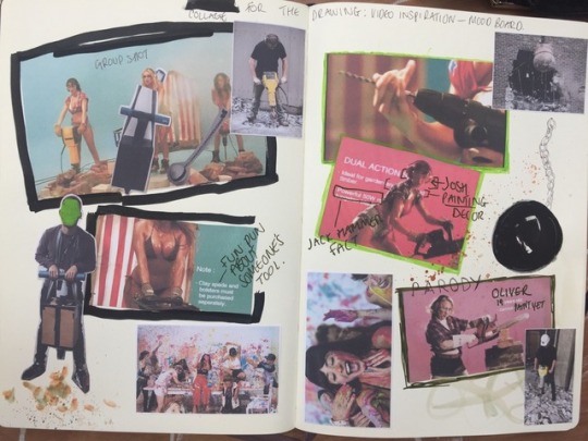
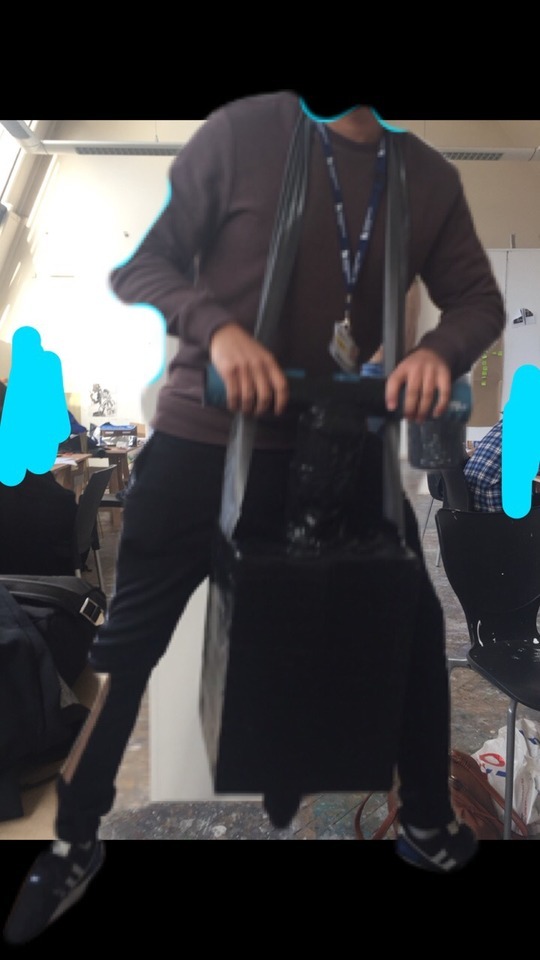
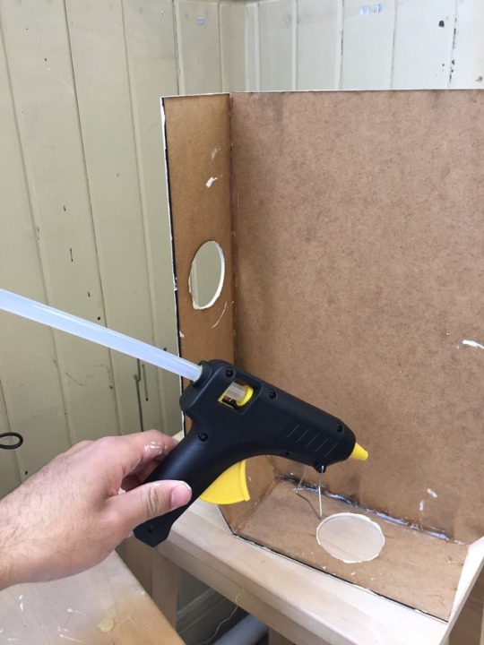
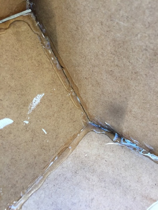

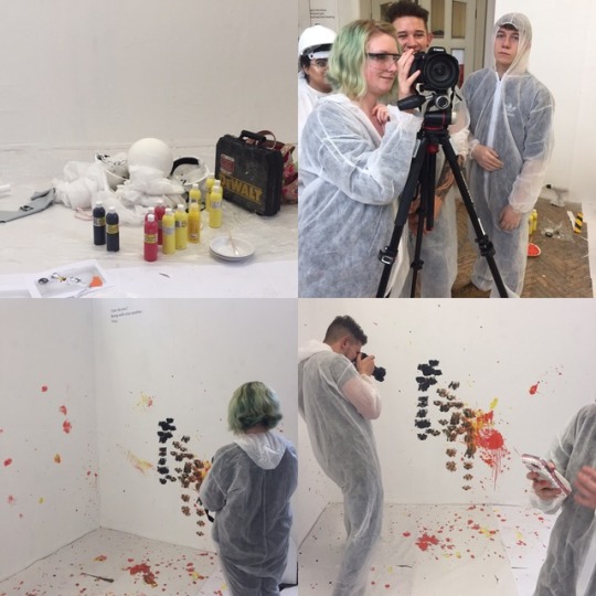
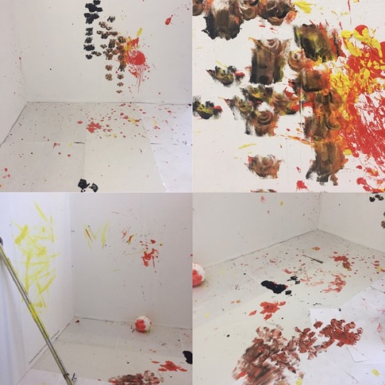

Drawing machine commenced with artist discussions: talking about artists and researching artists whom used drawing machine to construct art. We looked into a variety of artists such as Rebecca Horn (she created many drawing machines such as a giant balloon with charcoal-pencils attached to the outside which would then draw onto the walls as the user would move around inside the balloon). Rebecca also created a drawing machine which included the user to wear a helmet (strapped around the head) with pencil attachments to it. Click the link to see the YouTube video: Rebecca Horn Performance II – YouTube
We then looked into the idea generating strategies such as selecting keywords: ‘Drawing’ and ‘Machine’ writing down words that relate to each one of these keywords. We also brain stormed propositions from Drawing Machine and came up with many ideas such as, ‘Performance: Orchestra and tools of the trade’ and simple ideas such as ‘filling water balloons with paint; gravity-based machines and mirrors and reflections.’ We also developed a few of these ideas by extending on them exploring methods to achieve additions such as adding restrictive wear, extending limbs and asking what if questions to try to gather new interests/ideas.
We settled with Tools of The Trade. Evolving this idea further by creating lists and adding additional ideas to it. We wrote a list of tools and started to draw some tools which we thought could be interesting and could add some interesting features in terms of mark making. Items such as drills and a jackhammer were what first came to mind which we then started to discuss how we could get them to operate.
Reminding each other of new what if questions and jotting them down, we finally came up with a what if question that suited the team’s work.
‘What if an Art degree was taken as serious as Industrial Degrees?’
A drill could be manipulated quite well by taking advantage of its rotating facility. Adding a 3-way function or a 4-way function where 1 extended body could be holding a brush, the other a pencil, a sponge and the other filled with something. We started to sketch this idea out and then discussing our ideas and sharing the ideas between our group. We also took advantage of creating a group chat to help with planning/idea generating when we were at home or unable to make it into the studio at the same time as the other group members.
We then started to make prototypes of our ideas. I made a prototype of a jackhammer and put it to the test. I wasn’t completely satisfied with the prototype, so I thought of ways that I could make this more interesting. So, I added a restrictive band to add more effort into the mark makings when I push the jackhammer down towards the floor. I felt that this would have an effective/serendipitous way of making different marks on the drawing surface when we decided to film our process of the Drawing Machine. I used duct tape all around my Drawing Machine to hold the shape and to allow people to see the design clearly. This also added strength to the machine when testing.
The idea of creating a mood board/collage of our ideas was a great way to boost inspiration. We wanted to produce something that is a performance rather than a documentary type of product something that has inspiration from current/past videography. We research many works that used tools/’Drawing Machine’ in video performance. Benny Bennasi - Satisfaction Foxes - Let go for tonight
After thoroughly planning our work, putting methods into place and discussing what our plan/outcome was, it was time to put together our Drawing Machines. I used the workshop, CAD/CAM and Laser Design. I drew out my idea as a rough sketch in my sketchbook with measurements. The design was then drawn onto Adobe illustration and transferred to a different software, ‘Rhino’. I then drew the drawing on Rhino and turned it into a 3D drawing with the help of the Laser cutting Technician. The drawing was then transferred over to the Laser cutter and the process then began onto MDF wood.
I then painted all the individual pieces of MDF wood cuttings with white acrylic paint, but these needed many layers as I found that MDF is very thirsty and like to draw in all the moisture from the paint. I then started to fix these pieces together with the glue gun which was a fiddly situation. During this process, I realised that I needed to find out how to get the handles and the hammer attached to this build. So, I used my PVC piping and made some simple cuts in the Wood Workshop. I used a 3-way attachment elbow to hold them all together. I hot glued them securely so that they wouldn’t fall out of the elbow. I then fixed them into position (inside the machine) and continued to hot glue the machine together.
I felt that the drawing machine would be too fragile if I just hot glued the sides, so I made the decision to hot glued the seams like you would if you were sealing with silicone. This added to security and kept a firm body to the product.
The team then started to collect together resources for the project. Creating additional collages and collaged timeframes, but we felt that we didn’t want to create a complete timeframe as we wouldn’t completely follow it and the video would look better with organic ideas rather than a structured idea.
The first shot we filled was the Wrecking Ball colliding with the wall, covered in paint. It was very successful and created some beautiful marks, textures and weights within the surfaces of our space.
We progressed to filming and photographing each section of the set up. I also was taking some photos/videos from my phone to capture some interesting shots. Creating a Gif of the saw was a nice touch and also close ups if the drawings. Each drawing we made with the Drawing Machine was simply beautiful and would look amazing as a drawing on its own; an installation or even a collaborative product. I love the contrasting marks the machines left behind each press and movement. I particularly like how the drill made nice smooth, curved and opaque marks and how the paint filled tube made a thick splatter across the wall, producing a new weight to the drawing. Once recorded and the video was slowed, it was amazing to see the paint particles move through the air onto surfaces where they came into contact with to create interesting markings.
Unfortunately, I didn’t like the final results of the saw. I felt it could be developed to a further level where it could have extra properties such as: restrictions, drawing outcomes and the size of the saw, could it have been made bigger or heavier? However, I do love the idea of replacing a blade with brushes which still has the traditional painting influences.
I also wish that I developed my jackhammer by adding a section to my design where paint will dispense when the design was pushed down, a longer distance between the base to give clear significance of a jackhammer. I think being more rigorous with the designs would also help to improve either the machine performance or the quality of print making the machines make: Suspension (making the movement of each press smoother which could possibly mean smoother markings or rougher depending how the suspension was made) and Pressure (increasing pressure or reducing pressure to change/play around with opacity).
Filming time:
Following the video plan, we started to organise the set up and where we needed to stand during filming time and what space each of us needed. After practising what we wanted to shoot (without paint) we began with the filming. We were overwhelmed with how well the tools were working; trying to control our excitement as the paint covered wrecking ball collides with the wall and the beautiful patterns every other tool was making. We didn’t expect the results to be this way. The paints we selected had a beautiful juxtaposition to the white drawing surfaces, allowing the drawing to stand out vividly.
Documenting each scene was a great strategy because we were able to see how interesting the drawings are now that they’re starting to develop into one giant collaborative drawing.
Post filming, we took the footage to the Lensed Based media suite to begin with editing. Although we had attended the induction for this workshop, the group still found it daunting. We decided to not do the obvious and to just begin editing so we could find our own way around the software (Adobe Premier) we were using to edit and produce our film. Being mindful of the scene transition editor, we used a selection to introduce and end each scene in the footage was a great way to make the footage to appear finalised and professional. Each step we made in progress for the video, we had to deeply consider the placements of each clip and any photos we wanted to add as this would determine the quality of the video. As soon as the music was added to the footage, everything just started to fall into place and began to run smoothly. Day 2 of video editing, it was decided that added credits then a ‘slug’ (a blank space between 2 scenes) would be an effective way to make the audience think that the show has finished, but when the ‘bloopers’ start playing, the become excited to see more. Adding the bloopers was fun, but we also had to consider the placement and the correct music. Using the music from the music video that inspired the video was a practical way to significantly link artist work to our work in a less obvious way. It finally began to feel rewarding.
In conclusion, I’m exhilarated of the final outcome of the video as it broadcasts the drawing machines by perfectly exhibiting the drawings the machines create. Working with the use of highbrow and lowbrow was a fun way to make the project fit accordingly with potential audiences and sharing amusement. Presenting our film to the class was exciting. Everyone collected chairs together in front of the big screen with snacks ready for teams to share what they have made. When it was time to stage our video, the combination of tension and excitement was the current experiences for our team members. As soon as the video started to play, I could see how well the video engaged every individual in class. After the title displayed on the screen, the giggles started to begin. The relief. Receiving positive feedback by class members and lectures, it made the group so fulfilled and eager to create more videos! I will be taking skills that I acquired from this project into every future project.
Now here’s the link to ‘Creative Construction’, enjoy.
0 notes
Text
A Technical Study of Picasso’s Construction Still Life 1914 Jackie Heuman Tate Papers no.11
This technical study helps to explain how Pablo Picasso made one of his earliest cubist constructions, Still Life 1914 (fig.1),1what his intentions were and how he achieved them, and how the work has changed with time. Conservators have published technical studies on Picasso’s paintings,2 but less attention has been paid to his early sculptures. This article suggests ways in which Picasso controlled his materials to emphasise the basic, almost crude, effect he sought. The artist’s failure or refusal to efface evidence of the way the work came into being gives the impression of hasty or rough workmanship, and at the time Still Life was made, this was unusual, even shocking, in a serious work of art.
Picasso, however, left clues that give insight into his working method. Close inspection and analysis of Still Life reveals a level of control in the construction that is not immediately obvious. There are indications of effort and deliberation that support the argument that Picasso intended this work to have an unfinished look. Connections between some components in Still Life and those in other constructions from this period are examined here; but other comparisons may illuminate more about the artist’s working methods and the chronology of these early works.3 Although Picasso received no formal training in sculpture, he produced several early works in which he used traditional materials and techniques, such as modeling clay and carving wood to make Figure 1907 (Spies 19) and Standing Man 1907 (Spies 20). But it was not until 1912 that he began to use other materials. He made about a dozen sculptures in the years 1912–14, but Still Life was the only one shown publicly during his lifetime.4
Still Life is a relief constructed from partly recycled and partly carved wooden elements with the addition of a piece of textile. Like many of his cubist collages and constructions, Still Life takes its subject from the café and everyday life. Introducing a workman’s lunch into a work of art was in keeping with Picasso’s subversion of ‘pure art’. His identification with the life and work of ordinary Parisian artisans probably influenced his subject matter.5 Most sculptures produced in the nineteenth and early twentieth centuries idealised the human condition, and the skill of the sculptor was clearly evident. For Picasso, along with the change of subject-matter, came the desire to reveal the creative process, or at least not to hide it. This construction is made from twelve pieces of pine and poplar wood,6 nailed and glued together to form a table that supports a knife, a piece of bread with two slices of sausage and a glass. A segment of upholstery fringe is fixed to the table’s edge, suggesting a tablecloth.
The painted depiction of food was common in paintings up to the period when Still Life was made, but was never a favoured subject for sculpture. Picasso’s decision to represent prepared food may be symbolic but it also reflects an interest in everyday activities. The artist himself is known to have lunched on bread and sausage while painting, and Jaime Sabartés refers to the significance Picasso attached to food: ‘In conversation, too, he often recurs [sic] to food as symbolic of a situation or to colour his expressions … In his writings there is a profusion of names of dishes, recipes, vegetables and fruit’.7 Just as the snack on the table in this construction represents a moment in the process of consumption, the workmanship also appears to be a moment in a process of production.
Four of Picasso’s constructions were published in Guillaume Apollinaire’s avant-garde publication Les Soirées de Paris in 1913 and provoked uproar.8 Many subscribers cancelled their subscriptions in protest. Criticism was based on the desultory finish, the use of ignoble materials and on the perceived inappropriateness of the subject matter. This hostile response may have expressed a sense that the sculptural canon was being subverted by popular culture. When asked whether the constructions were sculptures or paintings, Picasso replied: ‘now we are delivered from Painting and Sculpture, themselves already liberated from the imbecile tyranny of genres. It’s neither one thing nor another.’9
It is widely acknowledged that these constructions changed the course of modern sculpture.10 Picasso broke the rules by using found materials to make individual elements, each with their own identifiable form. As the art historian Elizabeth Cowling has pointed out, this construction technique allowed Picasso to create open planes which would have been much more difficult if sculpting from a solid mass.11 Until this time, sculpture was largely figurative, but perhaps more significantly it was expected to look ‘finished’, a demonstration of an artist’s technical skill. Did Picasso use whatever happened to be at hand or did he plan his constructions? There is no evidence of a preparatory sketch for Still Life, although other drawings show Picasso’s ability to think in three dimensions.12 Curator and Picasso scholar William Rubin suggested that there was almost always a secret metaphorical value in the objects Picasso used.13
These constructions were launched at a time when Picasso had become deeply interested in tribal art.14 Ethnographic artifacts use a mélange of materials, including found objects, and their presence undoubtedly had a profound influence on him. In 1912, around the time he was working on Still Life, the artist bought an African Grebo mask (fig.2), which has a flat wooden plane onto which elements of the face project outwards, creating in a sense a sculpted relief; this may well have influenced Picasso in his early reliefs. Even though these constructions were not publicly exhibited, they were seen by friends and colleagues and became an inspiration to contemporary artists. The implications of Cubist innovation were being explored by figures such as Tatlin, Boccioni, Archipenko and Laurens. Boccioni’s famous Development of a Bottle in Space 1912 (Museu de Arte Contemporânea da Universidade de São Paulo) marks a breakthrough in the subject matter of sculpture, as did Picasso’s constructions.15 In 1912 Boccioni published his Technical Manifesto of Futurist Sculpture in which he advocated using almost anything as sculptural material. However, Picasso was less interested in the materials themselves than by the way in which found objects could be transformed.16
A rectangular piece of pine, one centimetre thick, acts as the backboard or wall to Still Life and might have originally come from a food or wine crate, as both front and back are roughly hewn. The sides of the board have been unevenly cut, probably with a panel saw, and no attempt has been made to finish or paint the splintered rough saw marks.17 (fig.3) Paradoxically, the top and bottom edges are very straight but are hidden behind the attached elements. Since the backboard defines the space of the composition, Picasso seems to have consciously opted to expose the more uneven sides, forcing the viewer to contemplate the rough-cut wood as part of the making process. A favourite motif found in Picasso’s paintings and constructions from this time is the pedestal table. A photograph of his studio from 1911 shows a real pedestal table with a fringed tablecloth. He was known to have loved passementerie (fringes and tassels used on curtains and furniture). Picasso once spoke passionately for twenty minutes to William Rubin about tasselled furnishings.18 The table in Still Life is sawn from a piece of one centimetre thick pine, and is angled at about 45 degrees, which alters the perspective so that we view the scene almost from above, with the table tipping dangerously forward. This effect is created deliberately by supporting the table from beneath with two pieces of wood nailed to the backboard. The table surface has an underlying cream colour with a top layer of dark grey paint.19 By exposing the underlying cream colour, Picasso suggests the shadows cast by the knife and glass. The underside of the table, although not visible, is neatly painted cream.
Picasso conflates the iconography of a working-class lunch with that of bourgeois home decoration using a piece of tasselled fringe. The tassels are tied twice forming a small onion shape and are referred to as ‘onion’ tassels: Picasso might have been aware of and enjoyed this visual food pun.20 The admission into the work itself of selected but otherwise untransformed fragments of the real world meant that art was not only addressing the everyday but being visibly invaded by it, challenging the concept of art as something precious and valuable. The craftsmanship evident in the work echoes this view.
Picasso glued the textile on one side to the table edge and on the other side introduced two nails to crudely hold it in place. The yellow, brown and pink textile consists of silk, cotton and wool twill patterned braid with ten dangling tassels.21 The segment originally had eleven tassels but one has obviously come off, confirming that it was not new when used. Where the tassel was missing, Picasso crossed the braid over on itself. Paradoxically, the attempt to present the trim evenly is done in the crudest manner: a nail is hammered through two layers of textile into the wood. The back of the textile, which has been protected from light, retains a golden pinkish colour while the exposed fringe has faded significantly. The motif of the fringe and the gold colour might well refer to the heavily decorated gold frames surrounding old-master paintings.22
The salami sausages, made from pine wood, appear to have been fabricated by sawing slices with a coping or bow saw by hand from a 40 mm diameter wooden dowel, perhaps originally from a chair leg or curtain pole. The two slices of sausage, both of the same diameter with the end grain painted reddish brown, rest on a thick square wooden slice of bread, marked by carved depressions representing air pockets. The grooves and chisel marks vividly capture the movement of Picasso’s fingers as he gouged bits of wood using a 7 mm gouge, and possibly a carving knife, to create ten dimples.23 Splinters of wood remain in the indentations and have been painted a cream colour, contrasting with the brown upper surface and grey edges. Picasso exploits the different qualities of the paint, accentuating the contrast between the matt surface of the bread and sausage with the smooth glossy surface of the glass and table.
The strip of moulding was probably a found piece which Picasso revived by painting it blue. The medium of the paint was absorbed by the rough-sawn surface causing particles of paint to be left without a binding medium, which can be seen in cross section.24 A carved white, red and black motif painted in trompe l’œil is executed in artists’ oil paint and textured brushstrokes are visible in this area.25
X-radiography reveals an abundance of more than fifty factory-produced nails in this small construction (fig.4). While they are all functional, some also become integral to the design. The most inventive use involves those that secure the knife to the table. The knife is most probably of poplar and measures the same thickness as the glass and bread, suggesting they all came from the same piece of wood. The knife was probably made using a saw, flat chisel and knife. (Picasso perhaps enjoyed the idea of using a real knife to make a wooden one). Once assembled, it was painted white and a black circle was then painted around each of the three 2 mm nail heads to simulate rivets on the handle (fig.5). The slices of sausages are secured to the bread with six nails; three nail heads were also painted black to represent the variegated spots found on sliced sausage. Rather than trying to conceal this dual function, this feature appears to emphasise the fact that Picasso enjoyed and wanted to share it. His appreciation of simple, skilful manipulation of materials is evident in his description of some found wooden boxes: ‘I saved them from a dustbin tonight on the way home. That boxes could be so ingeniously and yet so simply made is quite marvellous! Look how clever they are! The lids open and close with just two little nails in the place of hinges. Real works of art’.26 This inventive use of nails can be seen in other works from as early as 1907 as in, for instance, the eyes in the wooden Doll (Spies 21) which are made of metal studs or nails,27 and in Violin and Bottle on a Table 1915–16 (Spies 57, fig.6) in which the three nails that hold the violin strings become part of the instrument. How he arrived at this method is not known but it is possible that he was influenced by tribal artefacts which incorporated nails into their design.
Picasso’s characteristic repetition of motifs in different media can be seen with his verres à pied, fluted glasses with stems. They appear so often that most historians agree that they, like the guitar, have anthropomorphic associations with attributes of the female form.28 Picasso made a group of exploratory studies of the fluted glasses, experimenting with scale, medium and surface finish. Five versions of wooden glasses and numerous paper glasses can be identified from around 1914, but only the glass in Still Life appears to have been carved from one block of poplar, made with a chisel, saw, gouge and plane. The square shapes in the wood’s lower section would have been cut with a hand-saw and the base would then have been further shaped using a chisel. The fluting appears to have been made by pushing a 7 mm gouge downwards to form each of the four flutes. At least three applications of cream-coloured paint were then applied to the glass.29 The level of the liquid in the glass is created by a wedge-shaped piece of wood, probably cut from the disc that represents the glass of the lip. Here Picasso plays with ideas of transparency and opacity by nailing additional pieces of wood to the glass. The top piece which articulates the lip appears to have originally been a recycled disc (1.2 cm thick by 0.8 cm diameter), as it was made with a lathe and has a counter-sunk hole in the middle (fig.7). This might originally have been a wooden wheel from a child’s toy. Perhaps Picasso expected the viewer to recognise the object after its metamorphosis and enjoyed leaving candid references to the origin of the material. His delight in the more playful aspects of his techniques extended to using related pieces in other early constructions. Just as he created new paintings out of elements from previous images, he also incorporated pieces from one construction to create another. Violin and Bottle on a Table has a wooden wheel matching that found in Still Life.30
http://www.tate.org.uk/research/publications/tate-papers/11/technical-study-of-picasso-construction-still-life-1914
0 notes
Text
Craft Media
Hey guys,
Craft is a very intriguing topic for me! I feel like the word “crafts” has been used pretty broadly in my lifetime. For instance, when I think of “crafts” I think of everything from gluing noodles to a piece of paper, to weaving looms, to making collages, to small sculptures. I also feel like “craft media” the way it was described in this week’s readings and artist interview is much like sculpture. The biggest difference I saw with craft was when I watch the artist interview with Kimsooja. Therefore, I am going to start my post with her!
Kimsooja is an artist much different from those whom we have viewed thus far. She developed and ”starred” in her own video performances titled “Little Woman in Tokyo.” These were very interesting tapes, as she focused on things around her-but she did not face the camera. Instead, the camera was always placed on her back and the lens that focused on the things in front of her were meant to look as though they were being seen through her own eyes. One of the most influential lines that she spoke within the video were “ ...it’s not about showing identity...not to see the face.” This means that she wanted to be one with the people and surroundings, in my opinion. Below, you will see a picture interpretation of my words.
That being said, one of my FAVORITE pieces thus far this semester was her work in the crystal building. Here, Kimsooja took an amazing piece of architecture and incorporated her own breathing sounds in it. Then, viewers were able to feel and see the light, sounds and reflections around them. This is a very meditative and serene scene. The whole piece together is absolutely breathtaking. I would love to experience something like this in person in the United States.
However, as the Hyperallergic article about the Smithsonian explained to us, true “Craft” as a distinct field of discipline (meaning as a distinctive art) is losing credit. In this article, I felt extreme grief coming from the writer, as he had travelled through this museum for numerous years with numerous amounts of students, and was shocked at his new findings.
Craft, as the text explains to us, uses main media such as clay, metal, wood, glass and fibers. My favorite media in this chapter was tough to choose from but I would have to go with clay because I find pottery to be beautiful. I absolutely love going to arts and crafts fairs and seeing all the handmade, local pieces that we have in our area. Sometimes, you will even see artists at work as you stroll through. What makes clay so neat to me is the many different ways you can work with it to create your piece. I love pottery wheels. I would enjoy learning how to create pieces with them, which I have heard is very difficult. Once an artist has created their piece or finished “building” it, they then glaze it and fire it to maintain its appearance and lifetime.
That brings me to my relevant artist for this week, Beth Cavener Stichter. This artist was born in California, but recently moved to Montana where she continues her work. Her medium of choice is clay, and I have noticed that many of her pieces are of animals. I have a soft spot for all types of animals, so I naturally had to choose her. Below, I will post a picture of one of her works of a rabbit. If you look closely, you can see each intricate detail perfectly placed to create the rabbit’s facial impression. She does wonderful work!
My second favorite media this week is glass. I have always been blown away by crafting glass, especially blowing glass. I find it to be breathtaking and an extremely difficult type of art to master. I could imagine in takes quite a bit of time to become an expert, know exactly what temperature to heat, blow and then finish crafting. Below is an example of a blown glass piece. Look at how each piece is unique from the other-no one is the same. It is incredible!
Thank you everyone :)
0 notes
Text
Red Number Two
Xaviera Simmons’ photograph feels so authentic, and in the moment. She claims ownership over these moments and does not deny them because some things she just can not control. It makes me think about how spontaneous our actions are, even when we try to control situations. Every reaction we make is different, like she cannot control the wind from blowing or the board from falling, she must work with it. The concentration of the images compared to the landscape background focuses the dynamics of our control over the environment. She managed to layout these cultural images on the board and place them where she thinks they belong. But she cannot place the mountains where she wants them, they are immovable. These images she documents within the photographs also show the culture that belongs in these mountains, but are not always apparent.
What stands out the most to me is the red board that is glued or taped together. Her carrying it makes it feel like there is an entire culture of pain and violence we do not see when we seem the forward images of the pieces of culture in the paintings. It is the people who bear the burden of that culture who can actually feel and see the extreme pain and oppression in the red, which is why she is carrying it. We can only see the glimpse of what it must feel like, but we cannot experience it because we do not carry it. We are not there. All we can see is the landscape and the things that once belonged there. For that moment, they had control over that land, but lost it until someone else comes to reclaim it.
I feel like if I were to just jump in this photograph, I would be framed into an artifact and added to her collage. People would look at me for a few seconds but never really see my details because I am small in regard to the big picture, especially next to the red frame. I do not have control, and I can’t move… at least I have beautiful scenery around me…that I can’t explore. Hey, but think I look interesting and nice, so isn’t that enough?
Let me trade places. So now the woman is the artifact and I am the woman, the woman in control. I can maneuver the collage in any way I want to; so I will move them in a way that makes them happy. I can move the pictures in a different arrangement so they can meet new artifacts and create new relationships. They will like me because I give them more opportunities to be different things, and they would never stay still. But if I really loved these pictures, I would set them free and let them flow in the air to explore on their own. Through the mountains they can wonder.
0 notes