Don't wanna be here? Send us removal request.
Text
Hi there,
I was really intrigued by Tim Hawkinson this week, as well. I did not particularly like his massive piece shown at the end that used the organ to distort sound, but I loved the mechanics and engineering behind his pieces.
That being said, I can understand why he said he would like to go back to school. With all the mechanical pieces, wiring, electrical, etc. it would be quite difficult to perfect pieces without the knowledge behind tem.
I also wanted to touch on One Square Inch of Silence. I thought this to be extremely interesting and beautiful. As I stated in my post, I was not aware that dense rainforests existed in the United States, such as the one shown in Washington State. I loved the quiet, serene feeling that I felt when listening to all the natural sounds. My animals were next to me when I was listening to the clip, and they too were very interested in to what was going on with the sounds.
Great choice for a relevant artist this week. Isn’t it interesting how most of the pieces used to construct sound are large, obtuse, odd looking pieces? I feel like most of them look like they were designed by NASA!
Thanks,
Morgan
Tim Hawkinson was a weird artist to watch. The piece with the face controlled by light on the TV was weird but I liked the way he used the external world to show how we are controlled by it. I liked the meaning much more than the piece. Drips was really quite cool. I loved how he used the sound of drips to be a drumming machine. It was music in art. The signal originates from gears and the machinery behind it was very intriguing. He seemed to be a builder as much as an artist. I loved how he thought that he said that he should go back to school to figure out how to make the parts that go bad last longer. He doesn’t seem to have the background one would think necessary to create what he does. Outside of the audible component I thought that his work filling 50,000 square feet at MASS MOCA reminded me of the critical review I did for Curious Constructions.
The article by Robert Worby really made me think. The piece made me think of the concepts of Buddhism. Thinking that we are more concerned by the objects than the sound itself resonated with me. I think that there are times when I listen to a song and there is this perfect note, harmonic, or lyric that stands out above the rest and that is what he is talking about to a degree. It’s no longer just a song or a guitar riff, it’s that one perfectly placed note. The tradition and history of sound art was interesting too how some artists feel the necessity to align more with the fine arts and some take their cue from radio and broadcasting. I think this gives this part of the art world a very broad meaning. I heard rhythm and music in Tim Hawkinson’s Drips and he even stated that he wanted to create something that you could dance to. Breaking the circle of pure sounds was interesting too. There are so many more sounds that can be pleasing than just an instrument. I think I would love to visit some installations of this sort. The thought of them seem to be very immersive and like you could lose yourself by attending an installation.

One Square Inch of Silence was a bit of a misnomer I feel. It wasn’t silent but it was pure and free of all the things that are constantly in the backgrounds of our lives. I could have fallen asleep listening to this, except for the buzzing of an insect. The piece was relaxing and I understand its use as a conservation tool but I am unsure of how much I would view this as art. Maybe it’s close to Ansel Adams hyperreal photography but it seems like it is only a recording. I’ve been to Olympic National Park and loved backpacking and not seeing other humans for days on end and so I think I could have accomplished this by taking a tape recorder and not a camera.
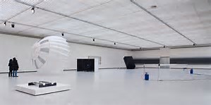
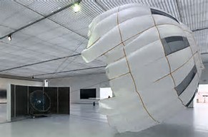
Carsten Nicolai is the artist I chose this week. One piece that I found that had an audible component is Pionier 1. This is made with soundproof paneling, a wind turbine, and a parachute. The piece is designed that the parachute is open during the installation. I’m not sure how this really makes me feel. I couldn’t find any audio clips but I’m sure it sounds like a big fan. I should have looked at another artist but I thought writing about this may provoke more for me than it did.
1 note
·
View note
Text
Week Fifteen
Hi Guys,
This week was quite interesting for me, as I never knew sound art existed. I always found musicians to be artists, as many of them take their time to learn and perfect their pieces. Then, they perform them in some way to audiences. However, I didn’t realize that people took “sound” so seriously, and twisted the way in which people hear things to create new, different sounds and meanings.
“Sound Art” is a relatively new art form that began to gain light in the 1990’s. After a bit of research, I learned that sound art made its first appearance in Italy quite a few years earlier-in the early 1900’s. One artist actually dressed himself up, then made noises that made no sense. It was almost like he was talking in jibberish. It does not seem as though his performance was well-received, but it was definitely noted in history books. Thee reading, “An Introduction to Sound Art” wanted to emphasize the importance and distinction between hearing and listening. Listening is a psychological act that humans must WANT to do. In other words, they must take the time to fully listen and comprehend what is going on in their surrounding environment.
I wanted to start with the artist interview this week about Tim Hawkinson. What an interesting, intriguing man. I loved being able to watch the engineering aspect behind his works of art. There is quite a bit of time and research that goes in to perfecting his pieces, such as making sure the right equipment is used. We saw this with his piece of the dripping water. He used metal buckets, but noticed the sound was quite louder and more distinctive when a pie pan was added to the bucket. However, I will say I did NOT like the large installation piece we saw at the end. Here, he took musical notes from an organ, and blew them up with the use of machines and balloons to make many different, new sounds. For me, I had a hard time focusing. There was so much going on between the actual sculpture and the sounds that it was somewhat hectic for me to experience.

I found myself contemplating the same thoughts when looking through the relevant artists this week. As I stated before, I really do enjoy the engineering aspect behind these pieces. You can tell that the artists are extremely passionate, and want to make the best sounds possible, and probably learn through quite a bit of progress and error. The relevant artist I chose this week is Haroon Mirza. I chose this man because he has actually won international acclaim awards for his work with sound.

Mirza works with lights and sound to create beautiful kinetic sculptures. To put it simply, when there is noise or drone in a room, the lights become quite bright. Then, when there is silence, the room will go dark. I found this to be a very interesting way to display sound to viewers. This would be a piece that I would enjoy seeing in person. If I were to view a piece like this, I would be loud on purpose to see the changing of the light, then slowly become still to watch the dimming take place. This was very neat!!
Lastly, I wanted to touch on “One Square Inch of Silence” in the Hoh Rainforest. First of all, (it may be funny to some) I was not aware that rainforests existed in the United States today. However, it does make sense as this one is found in Washington State, where dense forests and wetness are common. I sat and listened to the recording for about twenty minutes, with everything off at home. I really loved listening to the sounds of the forest, animals, trees, wind, etc. There was something distinctly calming to this, for me. I have a cat and a dog and noticed them, too, listening intently, laying very still, yet alert, at the new sounds. I do hope that this bit of the forest remains untouched, as it is such a gift to humans.

Thanks,
Morgan
0 notes
Text
Hi there,
This week’s readings and video were definitely among some of the more difficult to digest and stay interested in. In terms of Tania Bruguera, I really enjoyed her pieces that were titled “ Tatlin‘s #5“ and “Tatlin‘s #6.“ I love how she initiated a relationship between typical crowd viewers and her pieces of art. She allowed them to “have their own voice“ and see things from a different perspective, which could be very moving to those involved.
I love the idea of social practice in art. I am assuming it would be very difficult to perform and come up with pieces that are well-received by viewers. I love the picture you chose by Vanessa Beecroft. It is such a moving piece if you take the time to look and understand the process and point she is trying to make. I noticed immediately how the bottom of her dress looks as though it was burned. I wonder what her ultimate meaning was?
Great job,
Morgan
Week #13
This week, learning about social practice wasn’t my favorite. It’s an art medium that focuses on social engagement, inviting collaboration with individuals, communities. Even though it wasn’t my favorite to learn about I think the concept of it is intriguing.
This week’s video on Tania Bruguera was probably my least favorite video. For me it didn’t catch my attention like other ones in the past. I do though like that she explores the relationship between art, activism, and social change I think that those things are very important in today’s world. I do like how she says at the end of the video that “Art is not for the museums it’s for the street and for people’s life.

Harrell Fletcher is an American Social Practice and relational aesthetics artist. One of my favorite projects he has done is called The Best Things in Museums Are the Windows. I didn’t understand this at all when I first read it, but after learning about it and seeing that he said, “The idea that you go to a museum and look at the paintings- which is great- but then you look out the windows and see how you can apply what you’ve learned in the museum to the world outside”. I really like that and feel that, that should happen with more than just art. Vanessa Beecroft is an Italian Performance artist, Photographer, and Painter. I love this piece by her. You can tell by her face that she loves those two babies. To me in a way she kind of looks like an angel that is protecting them, and looking out for them.

6 notes
·
View notes
Text
Social Practice in Art
Hey guys,
I really enjoyed this week’s readings and information provided. I learned quite a bit about relational aesthetics and what it means in terms of art. To start, relational aesthetics was described as “a way of looking at things, as a guiding principle and as an approach to artmaking.” What made this week so interesting to me was the fact that this type of art requires actual engagement from viewers. What I mean by this is that the art isn’t just seen. In order for the piece to be seen as relational aesthetics, the artist and viewers must interact in some way.
I am going to start with my relevant artist of choice this week, Harrell Fletcher. Fletcher has produced a wide variety of socially engaging artworks throughout his time as an artist. His works have been shown all over, in many different museums and exhibitions. He received his BFA from the San Francisco Art Institute. One of my favorite pieces that I found was titled “Mt. Hood Walk.”

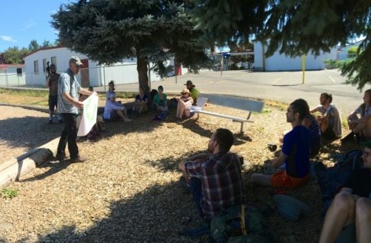
In this art form, he took a group of his college students, through a summer course, on a five-day project through Oregon’s regional history. Their time was spent walking, camping and presenting in different areas. Then, many of the activities were captured through photography. In this sense, his work and “viewers” interacted constantly through means of the actual project being completed. I found this to be quite a bit like Tania Bruguera’s work.
In her artist interview, Bruguera was quoted to say that she likes to “go beyond art by trying things that aren’t considered art.” Therefore, through relational aesthetics, she converts things that aren’t considered art into beautiful interactions between artist and viewer. She likes to focus on important political issues, especially those within her home of Cuba. She takes issues, and constructs them in to her own art pieces, and intends for viewers to engage in the art. I found one of her pieces to be extremely stunning and eye opening. It was titled Tatlin’s Whisper #5.
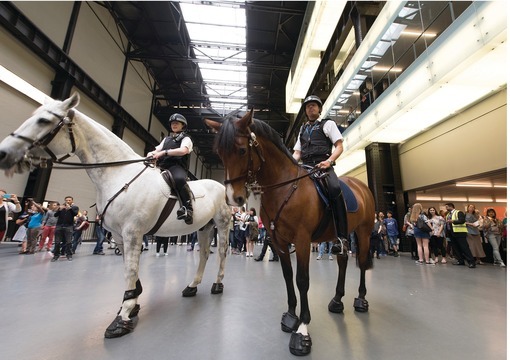
Here, she took police officers on horses, and stuck them in a museum. Normally, when one sees police officers on horses, they are meant to contain large crowds-often of rioters, parades, protests, etc. It is not very often that normal citizens interact with the police officers. However, in this instance, Bruguera used the police officers on horses to create her piece. Their job was to treat the onlookers at the museum as if they were involved in the crowd. They told people to move, back up, stop standing where they were, leave, etc. Bruguera wanted people to understand the feeling of being told something by a police officer, and doing what they say as soon as they say it.
I found this to be groundbreaking. She wanted people to feel the emotional pull of being one of the crowd. She wanted them to experience the wide array of feelings of anger, confusion, guilt, etc. as people do in certain political situations. It is very neat stuff!
Then, we have the essay and picture by and about Kevin Carter. Here, we also see political issues brought to light, but in a very different, difficult manner. Through the use of photojournalism, Carter tried to raise awareness to grave issues going on in global society. The picture of the Sudanese girl proved this-by a devastating picture of a ghastly malnourished girl, with a vulture behind her-inherently waiting for her death. The goal of photojournalism is to raise awareness to important issues. Unfortunately, it can often be misconstrued or not seen at all. In today’s society, it is too easy to just “unsee” difficult things, as we are able to scroll right past them or quickly change the channel. However, we all have a duty to embrace these things, learn from them, and take a stand against them in some way.

Thanks everyone,
Morgan
0 notes
Text
Performance
Hi Guys,
I wanted to start with saying that I really did not enjoy the topic of Performance Art at all. I found it to be very weird and sort of disturbing. Therefore, my views may differ from some of yours. Performance Art challenges the traditional visual art forms by coming up with new and sometimes controversial ways to get certain points and opinions to viewers. This form of art came to be in the 20th century, particularly the 1960′s. Many of their ideas and views were spiked with Futurism, Dada, and Surrealism.
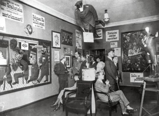
Dada was extremely interesting to me, and sort of disturbing. Through a bit of research about Dada, I learned it was brought about to challenge ideas of “typical” or “normal” art found in museums, galleries, etc. The picture below clearly proves this point, as it is an absurd image that is hard and difficult to digest. I found myself having the same predicament with the artists mentioned this week.
Bree Newsome made news when, on June 28th, she climbed a flag pole and took down a Confederate flag in South Carolina. She ended up being arrested for her act of art. It was viewed as a media stunt, instead of an artistic performance. There was quite a bit of emotion behind the piece that was obviously not viewed or realized as such by many people. It was stated in the article that Newsome “acted as a metaphor for the dismantling of institutionalized racism.” After reading the article and that particular statement, I was able to make sense of her reason behind it-however I do not agree with the way she went about it. To me, if you risk persecution for your actions (or prosecution, for that matter,) it may not be worth it. Nonetheless, Performance Art is just that-artists that engage in this type of media do so to relay a particular message. As quoted by Favianna Rodriguez in the same article, “artists and other cultural workers are essential to creating significant and lasting social change.” With this quote, I will move to the next section-the artist interview and readings of Janine Antoni.

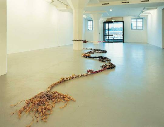
I started with reading the interview of Janine Antoni about “Moor” and “Touch.” I found her thoughts in these two pieces to be beautiful. She really digs deep in to an emotional, spiritual place in her body and soul to create pieces that are important to her. “Moor” was developed when she created a beautiful rope made of pieces from people she loved. They varied from fabric from her grandmother’s Christmas dress to electrical wires from friends. She also had many of her friends and loved ones involved in the making of her pieces, which was really neat to me. After the creation of “Moor,” she began to wonder how incredible it would be to physically walk on the rope she created. Then, she learned how to walk on a tight rope with the help of a circus and professional tight-rope trainer. “Touch” was created based upon this knowledge. She took her rope home to the Bahamas, and intricately placed it so the camera would view the rope, ocean, and horizon in the distance. Her thought was that sometimes, when dangerously walking and almost losing balance, she would touch the horizon. Antoni viewed that exact horizon growing up, and for her, the horizon meant endless possibilities, and reaching whatever she would want to in her lifetime.
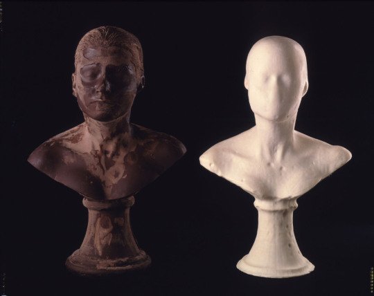
Then, I watched her interview, and I was shocked. Her work with the lard and chocolate was almost appalling to me. Antoni made two sculptures of her face-one of chocolate and one of lard after contemplating how interesting it was that soap that cleans our bodies is made of a body. First of all, I would have never thought about that in my lifetime without watching this piece. I just can’t wrap my mind around it. She physically licked the chocolate sculpture of herself to ”feed herself,” and washed herself with the lard sculpture to bathe herself with herself. In the end, her point was to prove something about physical appearance and slowly erasing yourself or your body. It was a very interesting, different idea than anything I had ever thought of. Below are both of the pieces after the bathing and licking.
I also found the same to be true with the relevant artist I chose this week, Tehching Hsieh. I chose him from the information I learned through research. His father was an Atheist, while his mother was a devout Christian. I thought that his childhood life must have been complicated, just based upon that little bit of information. After his service in the army, he had an art show of his paintings. Shortly after that, he quit painting and chose to work more with his body. His performance action in 1973 was titled “Jump Piece” and depicted him literally jumping out of a building-which led him to break both of his ankles. In order for him to create the work he wanted, he risked grave danger and physical bodily harm. I found that many artists use their own bodies for performance art, regardless of the risks. However, there sometimes can be negative consequences to this, as in Hsieh’s situation. You couldn’t pay me enough money to convince me to jump out of a building, haha.

Thanks everyone,
Morgan
0 notes
Text
Hi there,
I really enjoyed this week’s chapter! Architecture is a very intriguing subject to me. I could not imagine the difficulty of having to coordinate with so many people to accomplish your work. Also, architects hold the sole responsibility of making sure humans are comfortable with the space to which they will be dwelling! What a daunting task!
I really liked the information you shared about the relevant artist, Andrea Zittel, this week. I can agree that choosing one artist is difficult, especially with such a small understanding or liking for the craft. However, you did a great job! It is very neat how she started by designing clothing. In terms of the picture, I couldn’t imagine staying in such a small place. I think I would feel extremely claustrophobic. In a way, it seems that is exactly what she is looking for. She does not want the inhabitants to be “comfortable.” This is weird to me! Why create something that would make people feel “less than satisfied?”
Great job!
Morgan
Week Eleven Blog Post
When I read that we’d be learning about architecture this week I wasn’t very enthused, to say the least. I guess I’ve never really gotten into looking at a building and saying “Wow, that’s a really nice building!”; but after reading and watching this week’s materials I was a bit more interested in the process of architecture and how it fits into everyday buildings.
In the reading this week I really enjoyed how they brought up that an architect is a civil servant and the fact that it’s not just their visions that they have to consider. With that notion I suppose being an architect could be a difficult job considering that you have to contemplate other people’s opinions and preferences. I guess another factor in this light would be thinking about the use for the building and the amount of space you have to work with. I really enjoyed reading the section called “Socially Responsible Architecture” because it talked about the different ways architects in general can make ecofriendly buildings. In some ways ecofriendly doesn’t always mean affordable and I think that’s another huge responsibility to being an architect, knowing how to incorporate affordability and environmentally conscious buildings.
My choice of relevant artist’s this week was hard because after reading the chapter I still felt like I didn’t have a complete understanding of architecture as a whole but upon looking through the rest of them I found that Andrea Zittel seemed to be the one I could understand the most. I read an article published by the New York Times, on October 30 of this year. The writer was taking a page out of Zittel’s book and exploring the world of solitude in the California desert. Zittel, as an artist, has explored several different aspects of the art world. She used to have a studio in New York where she spent her time making clothing. When she moved to California she let her mind open and started making art with the earth. Instead of moving the earth she placed things above it, such as creative workshops and housing. Zittel owns about 60 acres of land where she tests her ideas and works out on people by letting them stay. In the article it showed a picture of one other experimental living cabins that the writer would be staying in. The picture is below. I just wanted to point out how small the space is. Zittel’s philosophy “I don’t want people to feel uncomfortable, but I don’t want them to be comfortable, either. You know when you’re alone with yourself and you feel jangly and on edge? But in a way it’s the most cathartic thing in the world? Almost painful, but so good.”

This week’s video I found to be truly inspiring because Maya Lin was so young when she became a huge artist. The little park project was one of my favorite parts of the video because it showed that she could turn something so sad and washed up into something beautiful. I also really enjoyed her cat.
2 notes
·
View notes
Text
Architecture
Hey everyone,
This is another great topic for me! When I was younger, I always said that I wanted to be an “architectural engineer” when I grew up-even though I had no idea what that meant. As I became older, I realized the great wealth of work and knowledge that went in to such an expertise. For our “Critical Exhibition Review” due December 1st, I chose to visit the Frank Lloyd Wright exhibit in Milwaukee, Wisconsin as I have always found his work to be incredible! I had done a few research papers about him over the years, so I thought seeing some of his pieces in this manner would have been perfect!
To start, I wanted to describe some of architecture’s history. What is so incredible to me is the sophistication behind such ancient pieces, like the one in Machu Picchu pictured below. Even though times were almost prehistoric, manmade pieces such as this were made possible. Technology was inexistent as we know it, and the work was done by hand and pure strength. The intricacy placed behind the delicately crafted stones is unbelievable. Inevitably, a structure like this took a great amount of people to create. Another fact that amazes me is the amount of years and weather pieces such as this have sustained. So, not only did these ancient architects create beautiful pieces, they also created strong, durable pieces that have withheld the years.

What intrigues me so much about architecture are the many pieces that designers must place together in a way that makes their viewers and inhabitants happy. That is, architectural designers must make sure the piece is comfortable, strong (structurally sound), and appealing. They must also ensure that the outside is as appealing as the inside. Designers usually start on a small scale (paper, sculpture, etc.) to craft their pieces. Then, construction workers are brought in to build the piece. This means that there is generally a wide array of expertise brought together to complete one structure.
For example, the relevant artist I chose this week is Frank Gehry. He is a Canadian-born American architect. First, I chose this artist for his personality, as when I googled images, I found a picture of him flipping off a camera with a smile on his face! I loved this. Upon further research, I realized what an incredible mind this man has. He is definitely one of the founding fathers of modern architecture. His pieces seem almost harsh on the outside, with obtuse angles, metals, and colors. They almost look as though they were built for show. However, that is not the case. The first picture that stuck out to me was the “Lou Ruvo Center for Brain Health” built in Las Vegas. It almost does not look real by the pictures. However, the Cleveland Clinic actually sent a team out to work functionally in this building-which holds an event space, as well as an office building.

Next, we have the “Stata Center” in Cambridge, Massachusetts. This building was built for computer, information and intelligence sciences. Another incredibly unique building, it holds masterful minds. This is one of his best known pieces throughout the world. Frank Gehry has been awarded prizes such as the Pritzker Architecture Prize in 1989. I have also noticed that his pieces are not native to the United States, but have been built all over the world. This man has worked with thousands of people, from many different places, to beautifully construct and master his pieces.

I found much of the same information with the artist interview of Maya Lin this week. I had never heard of her before, and was kind of disappointed in myself for this when I realized she constructed the Vietnam Veteran’s Memorial. This piece is well-known throughout the United States-even to people who have not physically seen it, such as me. I love how Lin incorporates “naturally occurring phenomena” into her pieces, such as geography and landscape. We can see this to be true in the memorial pictured below.

In the interview, Lin was commissioned to create a piece by the Frye foundation in the city of Grand Rapids. The location of the piece was a run-down old park. She constructed a skating rink, but had to make sure she also built bathrooms, thought about lighting, etc. Again, we have another example of the importance of tying many different professions together. What is so great about the skating rink in Grand Rapids is the way she tied in something very natural, that humans see daily-the sky and stars at night. She physically put lights in the ground where the skating rink would be found-which were lit at night. This created a beautiful scene.

Thanks everyone,
Morgan
0 notes
Text
Hi Katie,
I found quite a few similarities between sculpture and craft as well. It is very interesting how many subcategories art has. However, when you think about it, many fields of study have numerous categories. For instance, there are like thirty different types of math courses you can take-and then another numerous amount you can major in on a college level. I think it is only normal that major fields of study be divided in many different ways, even though they might seem quite a bit alike.
I really enjoyed learning about “crafts” because I feel like it is a word I have used quite frequently throughout my life and heard a lot in different art classes, etc. As I mentioned in my post, when I think of crafts I think of everything from painting to gluing macaroni to a piece of paper!
We chose the same artist this week-but for very different reasons! Kudos to you to having such an open mind to art. I found her pieces to be beautiful because of the detail and time that goes in to them and their facial expressions, poses, etc. However, for me, this piece seems quite unrealistic and out there. I can’t get a good connection with it!
Great job,
Morgan
Week 10: Craft
This week’s class about craft reminded me a lot about our week about sculpture. In my opinion, I find them to be very similar. It’s kind of crazy and weird to think that art has so many sub categories. The things I viewed in the chapter this week, such as the stoneware pot with lid or even the White Butte, I would have considered those to be sculptures. However, after doing the reading, I have a better understand of the differences between sculpture and crafts. One of my favorite types of crafts that I read and saw in the chapter this week, were metal works. For instance, the door handle on page 351. Door handles and door knockers are just so unique sometimes, I just really can appreciate those types of work.

The video this week on Kimsooja’s art was not my favorite. I think I wasn’t too fond of her work because I still don’t quite understand what she was getting at. I understand that she was comparing her body to a needle that threads through space and time; and that is why she had the people passing by in slow motion. However, I don’t understand how that was considered to be art. Part of me can kind of understand because it’s almost the same category as music videos, and I think that is art. I just didn’t grab the concept of that particular piece by her. I’m still trying to understand what her obsession is with the whole needle and thread concept because she seems to roll with it a lot.
I got really excited seeing the list of relevant artists this week. I remember a few weeks ago I had mentioned my favorite sculpture that I’ve seen in person was inappropriate. Well, I get to post a picture of it today because the relevant artist I chose this week is Beth Cavener Stichter. I was able to see a few of her pieces in person when I visited the Chazen Art Museum in Madison, WI in spring of 2016. I like her art particularly because it has a huge focus on animals. Without further a du, my favorite piece is A Rush of Blood to the Head. This piece is of two deer like animals making out and each animal has an erection. I would assume that’s the whole reason for the name of the piece. I read a review that someone was shocked that Chazen, being a private museum, would accept “such a piece of work.” When it comes to art, I think people need to have more of an open mind. Art is meant to be expressive and it’s meant to be raw. That’s why I think art museums like this should be for more mature audiences. Don’t bring your children to places that are meant to be quiet and for the intellectuals. A couple other of her pieces that I got to view when I was at Chazen were L’Amante and The Question That Devours. If you ever have a chance to see these pieces in person, I highly recommend it.

4 notes
·
View notes
Text
Craft Media
Hey guys,
Craft is a very intriguing topic for me! I feel like the word “crafts” has been used pretty broadly in my lifetime. For instance, when I think of “crafts” I think of everything from gluing noodles to a piece of paper, to weaving looms, to making collages, to small sculptures. I also feel like “craft media” the way it was described in this week’s readings and artist interview is much like sculpture. The biggest difference I saw with craft was when I watch the artist interview with Kimsooja. Therefore, I am going to start my post with her!
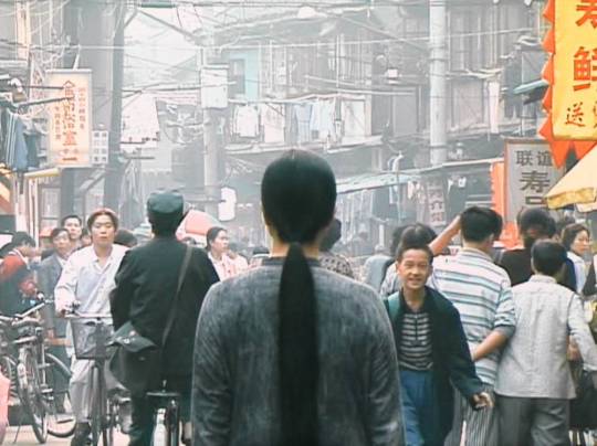
Kimsooja is an artist much different from those whom we have viewed thus far. She developed and ”starred” in her own video performances titled “Little Woman in Tokyo.” These were very interesting tapes, as she focused on things around her-but she did not face the camera. Instead, the camera was always placed on her back and the lens that focused on the things in front of her were meant to look as though they were being seen through her own eyes. One of the most influential lines that she spoke within the video were “ ...it’s not about showing identity...not to see the face.” This means that she wanted to be one with the people and surroundings, in my opinion. Below, you will see a picture interpretation of my words.
That being said, one of my FAVORITE pieces thus far this semester was her work in the crystal building. Here, Kimsooja took an amazing piece of architecture and incorporated her own breathing sounds in it. Then, viewers were able to feel and see the light, sounds and reflections around them. This is a very meditative and serene scene. The whole piece together is absolutely breathtaking. I would love to experience something like this in person in the United States.
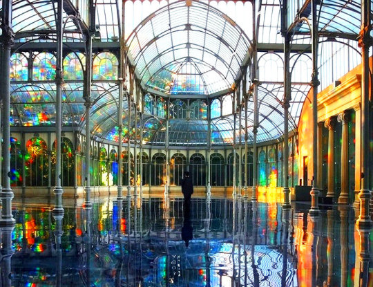
However, as the Hyperallergic article about the Smithsonian explained to us, true “Craft” as a distinct field of discipline (meaning as a distinctive art) is losing credit. In this article, I felt extreme grief coming from the writer, as he had travelled through this museum for numerous years with numerous amounts of students, and was shocked at his new findings.
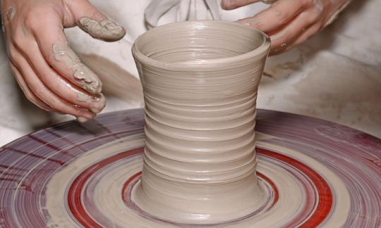
Craft, as the text explains to us, uses main media such as clay, metal, wood, glass and fibers. My favorite media in this chapter was tough to choose from but I would have to go with clay because I find pottery to be beautiful. I absolutely love going to arts and crafts fairs and seeing all the handmade, local pieces that we have in our area. Sometimes, you will even see artists at work as you stroll through. What makes clay so neat to me is the many different ways you can work with it to create your piece. I love pottery wheels. I would enjoy learning how to create pieces with them, which I have heard is very difficult. Once an artist has created their piece or finished “building” it, they then glaze it and fire it to maintain its appearance and lifetime.
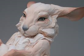
That brings me to my relevant artist for this week, Beth Cavener Stichter. This artist was born in California, but recently moved to Montana where she continues her work. Her medium of choice is clay, and I have noticed that many of her pieces are of animals. I have a soft spot for all types of animals, so I naturally had to choose her. Below, I will post a picture of one of her works of a rabbit. If you look closely, you can see each intricate detail perfectly placed to create the rabbit’s facial impression. She does wonderful work!
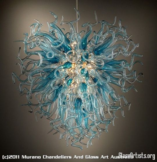
My second favorite media this week is glass. I have always been blown away by crafting glass, especially blowing glass. I find it to be breathtaking and an extremely difficult type of art to master. I could imagine in takes quite a bit of time to become an expert, know exactly what temperature to heat, blow and then finish crafting. Below is an example of a blown glass piece. Look at how each piece is unique from the other-no one is the same. It is incredible!
Thank you everyone :)
0 notes
Text
Hi Shianne,
I really enjoyed this week’s reading too. Installation pieces leave so much for its viewers to ponder. They are huge and consist of many different types of materials. Viewers can walk through them, lay down and view them from above, etc. Oftentimes, viewers find something new and interesting each time they take a look at the piece.
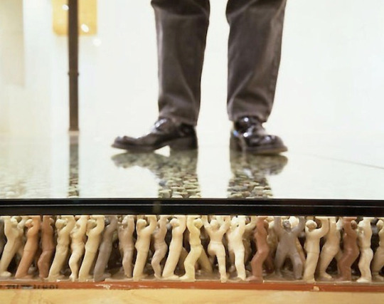
My favorite piece was the floor also!! Suh meticulously placed the human figurines with their palms facing upward to symbolize “bearing weight.” What an interesting concept!! I could not imagine the amount of time Suh took in creating and perfecting this piece. I really enjoyed his installation with the military uniforms as well. There was so much symbolism and deep meaning with it.
The sun tunnels are extraordinary! I love how you can see the sun through them, and it looks so distant and miraculous through the tunnel. Even the hilly terrain farther out looks as if it was meticulously placed in such a manner!
Great job,
Morgan
Week #9 installation
I learned a lot this week about installation. I never knew what installation was before this unit. Installation art can be either temporary or permanent. This kind of art has been constructed in exhibition spaces such as museums and galleries, as well as public and private spaces. Installation art is almost always large enough for us to enter with our whole bodies. One artist I found very interesting is James Turrell. He began a monumental project at Roden Crater, an extinct volcano in northern Arizona. He sculpted the dimensions of the crater bowl and cut a series of chambers, tunnels and apertures within the volcano that heighten our sense of the heavens and earth. If I look at it a certain way, it reminds me of a planet’s surface.
I really enjoyed this week’s video on Do Hu Suh’s installations, I thought it was very interesting. You could tell that he puts a lot of meaning behind each installation he creates. My favorite piece of his is floor. This piece has a whole bunch of little people holding their hands up supporting the glass and whoever walks on it. I really enjoy this that people can walk on one of his pieces. To me it makes me feel that if I were to stand on it, it would make me feel that I have so many people holding me up and that people care.
One thing I really like about installation is that it can basically be anything and everything. Nancy Holt was born in Worcester, Massachusetts in 1938 and grew up in New Jersey. Shortly after graduating from Tufts University in 1960 as a biology major, she moved to New York. This is where she began working in film, video, installation, and sound art. With her novel use of cylindrical forms, light, and techniques of reflection, she developed a unique aesthetic of perception, which enabled visitors to her sites to engage with the landscape in new and challenging ways. As an artist exploring the human perception of time and space, earth, and sky. She built the Sun Tunnels as a unique art project completed in 1976. The four tubes laid out in an X shape, each drilled with holes to pattern the constellations of Draco, Perseus, Columbia, and Capricorn. They are nine feet high by 18 feet long. They sit in a remote valley in the Great Basin Desert, West of the Booneville Salt Flats. Two of the tunnels align with the setting and rising sun during the summer solstice and two line up during the winter solstice. It reminds me of when people say there’s always a light at the end of the tunnel.

2 notes
·
View notes
Text
Installation Art
Hey class,
Installation art is incredible! Artists from all over build these pieces from many different materials with one vision in mind-a large, abstract piece that takes up quite a bit of space. This type of art is often site-specific-meaning the artist knows the location of the piece when they are building and configuring the work. We have a large, permanent installation piece quite close to us in Chicago called the Cloud Gate or the “bean.”

However, some of these pieces can be quite temporary, built in museums or taken down like we learned with “Tilted Arc.” My favorite part about this type of art is the fact that viewers can often completely interact with the pieces. They are able to walk around or walk through them-visually sensing many different things around them. There is often so much going on with these pieces that we are never bored or uninterested in them. I found this to be very true with Do Ho Suh’s works.
Do Ho Suh is a Korean artist who moved to the very crowded New York City to further pursue his artistic career. Suh’s artistic abilities run in the family, as his father was a successful artist. He is most famous for his pieces that he makes out of transportable fabric, like the house shown below.

One of the installations that meant the most to Suh was the replica of his parent’s house made of the same type of fabric. He enjoyed the idea of being able to carry “home” with him wherever he went. He took his internal memories and placed them in real-life, for viewers to enjoy in a beautiful, unique manner. However, some of his pieces were somewhat depressing to me. In his artist interview, we learned that all boys once they reach middle school must be taught in military-like manner. At this point, they were no longer called by their names-but by numbers. Then, they were forced to shave their hair, which was quite traumatizing to many of these young men. The boys were also to wear military uniforms, which was the focal point of one of his installations. Again, Suh draws his installation pieces from very emotional places in his life. Magnificent!
Suh is responsible for my favorite piece of artwork I have seen thus far this semester, pictured below. This piece blows my mind. Suh intricately placed thousands of figures with the palms of their hands faced upward-to symbolize “bearing weight.” Then, he put what appears to be thickened glass over the piece for admirers to actually walk upon-to better grasp the symbolism. Each figure was meticulously placed to perfection.

I found the same type of perfection sought with Karen Black’s works. Karen Black is an abstract artist who uses very unique materials to create her work. Such materials include powder, soap, gels and pastes, as well as more stream-lined materials like plaster, chalk, paint and paper. What drew me to Black the most was the unique materials she created some of her pieces from. I could never pick up a container of gel and assume I would create a masterpiece from it. Oftentimes, she mixes interesting materials with more streamlined ones to complete the installations. Magnificent!

Thanks everyone,
Morgan
2 notes
·
View notes
Text
Hi Jay,
I really enjoyed this week’s reading about sculpture. My favorite type of sculpture involves wood. I believe how artists use the grain of the wood as an added focal point to be extremely beautiful. Also, I found it incredible how historians have found wooden sculptures dating to be more than 4,000 years old. The fact that something so fragile can withstand thousands of years is extraordinary.
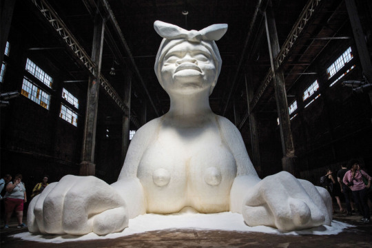
I really enjoyed the artist interview this week as well. Kara Walker looked in deep detail at the surrounding sugar factory, and based her design for the sculpture upon it. I found it awesome how she mixed actual sugar and water to make the syrup or paste used for the piece. I also found it very interesting how she took the “leakage” of the melting sugar and incorporated it into her pieces-instead of trying to clean it up or hide it. It was also very neat how many of her design ideas were scattered from various different pictures-from very provocative females to historical pieces.
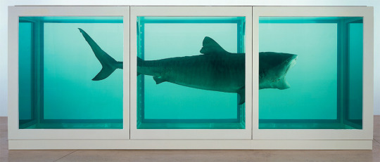
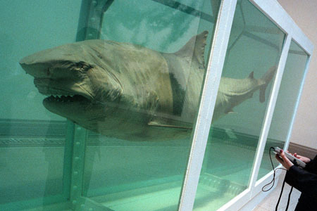
The artist you chose this week to do a more research on was very interesting. For me personally, I do not enjoy the shark sculpture at all. It is too bulky and fake for my liking. However, the skull that you pictured above is beautiful, and clearly made out of outstanding pieces. The price behind the skull is out of this world. I can not imagine creating a piece of art that added up to be this expensive and “wanted” internationally.
Great job,
Morgan
Blogpost Week 8
Chapter 8 introduces an art that we have pondered - sculpture. Webster dictionary defines sculpture as “the art of making two- or three-dimensional representative or abstract forms, especially by carving stone or wood or by casting metal or plaster.” From this definition, the word ‘especially’ stood out to me in context to, but not limited to, stone, wood, metal or plaster.
The reason this stood out to me is attributed to our latest artist Kara Walker. In our video this week we learn that A Subtely, is a reference Walker used in context to sugar sculptures used as decoration or food. This is extraordinary! When I hear the word sculpture i think of the marquee materials listed above, but never sugar! Walker’s thought behind and investigation of the history and origination of sugar shows her passion for her work; this truly an example of what art essentially is! Walker’s presentation intrigued me and enabled me to research different substances that can be used to make sculptures. From plaster to terracotta and salt dough, the list is endless!
The notable artist I chose this week is Damien Hirst. Hirst is an English artist, entrepreneur, and art collector most prominently known as a member of the Young British Artists (YBA’s). The YBA’s primarily consisted of 6 artists, Damien Hirst, Tracey Emin, Sarah Lucas, Jake and Dinos Chapman, and lastly Marc Quinn. Hirst, more specifically, produced the artworks The Physical Impossibility of Death in the Mind of Someone Living - A 14 foot shark in a tank - and For the Love of God - a human skull encrusted with over 8 thousand flawless diamonds, including a pear-shaped pink diamond located in the forehead that is known as the Skull Star Diamond. Hirst’ thought behind The Physical Impossibility of Death in the Mind of Someone Living was to “fry the mind by setting up a direct and visceral experience of which the shark remains the most outstanding. [The shark] is simultaneously life and death incarnate suspended and silent, in its tank. It gives the innately demonic urge to live a demonic, deathlike form” (Damienhirst.com). The shark alone costed $12 million.
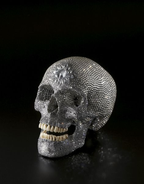
His though behind For the Love of God was to create a “glory and sadness in a Memento mori, or reminder of the mortality of the viewer” (Damienhirst.com). This piece costed £14 Million (appx. $16.6 million) to produce.
3 notes
·
View notes
Text
Sculptures!
Hey everyone,
This week’s literature and artist interview focused on sculpture. Before reading and doing some research on the medium, I did not realize the process that sculptors went to in order to produce their pieces. I am going to start this week with the interview of Kara Walker. She was working on a piece called “A Subtlety, or a Marvelous Sugar Baby.” This piece was manufactured in a sugar factor in Brooklyn, New York. Walker explained a bit of the process of how she designed the piece. One of the most intriguing aspects, to me, were the pictures and other pieces of art to which she based her work. Some of the pictures were quite provocative, depicting women in little clothing. She also incorporated some monumental, historical pieces. Then, she saw molasses dripping from the rafters and had another interesting idea-which was allowing the pieces to drip, giving an almost melting look. My favorite part was the actual use of sugar in the sculpture. She mixed sugar and water together to make a paste, which was majorly used in her work. I found a picture of Walker with the piece, which I will share below.

When Kara Walker was designing her piece, she built it in a much smaller model which is called a maquette. This was my favorite part of the sculpture unit. Before reading, I did not realize that sculptors may create many drafts of pieces before actually building, carving, or etching away their final piece. I found these miniature sculptures a work of art in themselves. It would be very interesting to see some of these in real-life. I am amazed by some of the intricacy of the designs. Below, you will find an example of a maquette-and the incredible detail to which it carries. (p.s. I know the image is a bit blurry, but you get the idea!)

Once the artist has developed a suitable maquette, they begin to actually craft the art. My favorite material that I found was wood. This seems to also be one of the harder materials to use in sculpture and carving, as the artist must pay careful attention to the grain of the wood, etc. I also enjoyed the historical aspect of wood carvings. There have been pieces found that were determined to be over 4,000 years old. The durability of wood, therefore, is unbelievable in my eyes. The smooth surfaces are very appealing to me, which I am sure takes many hours of devoted labor between revealing the grain, etc. John Livingston is an artist who focuses on wood pieces like the one pictured below. After taking some time to research the piece, you can see the different directions of the grain. Lastly, I just wanted to mention the bit about stone material. I had no idea that every stone-even the toughest, can be polished to a smooth, sheen look. Some rock, in my eyes, just does not seem able to adapt in this manner. It is incredible to me that some of these artists can look at a material and see a beautiful, smooth, finished piece.

Artists may also use many different types of objects together to create a piece-which is called assemblage. This is one of the coolest bits of sculpture to me. Here, they may find objects from buttons, to rocks, to appliances, paints, linens, etc. and build them in to a piece of art. The most amazing part is, again, the artist’s inner eye and being able to picture the piece in a finished form. This reminds me a bit of the section of “collage.” Whenever I think of scavenging to find things to create a piece, I automatically think of that term.
The disunity in the assembled pieces is wonderful to see and experience. It leaves the viewer continuously contemplating the work, finding something new each time they gaze across the image. Also, some of these assembled pieces can be ginormous, and take up entire rooms. When this is the case, they are called installations. After viewing Judy Pfaff’s work on page 343, I decided to look more in to other pieces of hers. With the first picture below, I was unable to find the name of the piece. Nonetheless, I found it beautiful and very busy to observe. The second picture is just one of an entire installation called “Somewhere After.” The installation was incredible, with more than ten different pieces like what you will see below.


This was my favorite fun read so far. It was very easy to understand and interesting throughout.
Thanks,
Morgan
0 notes
Text
Hi Shianne,
I really enjoyed the picture that you chose from your relevant artist this week. It is a younger girl filled with sass! It looks as though she is the “ring girl” or leader of the pack. The attitude in her features shows that she is a force to be reckoned with.
The “Hot Beach Babes Aim to Please” short film was very intriguing to me. At first, you are looking at a body of water. Then, appears the actress (who I believe to be the artist) and I was a little taken aback. Given the title, I was expecting to see some blonde, tan, perfectly clad woman. Instead, we saw a beautiful female that may not have met the “beach babe” title. Flies begin to appear among the woman, as you said, in everywhere but her face. I LOVE how you interpreted this information and translated it in to such a meaningful idea. We should spend less time focusing on a person’s body, and instead focus on everything else-mind, intellect, natural beauty, etc.
When I had my senior pictures taken, I remember feeling super uncomfortable. I am not someone that likes to pose in front of a camera for others to look. I remember changing outfits, laying my body in weird positions, and hoping I didn’t look distorted. Then, on top of it, my big mug ended up on a billboard to advertise for the company! I am a pretty quiet person, who sticks to myself. So, for me, this unwanted attention was a lot to sink in! Looking back, I see quite a few differences from myself then and now.
Great post,
Morgan
Week 7
The artist that I want to talk about is Sally Mann. I really do love her work, because to me it seems to capture the simple things of life. The picture that I was to focus on it “Jennifer at the Rodeo”. Personally to me I picked this because I thought this stood out. Its an image of a younger girl with her hand on her hip staring into the camera. Now behind her are three men who aren’t in focus. I like this because I like to think what the girl is thinking. It looks like shes thinking hard, just makes me wonder what shes think about. I really enjoyed Mann’s artwork, not only that but I really like how she includes her family in her own work.

Really want to talk about is by Jillian Mayer, and its titled “Hot Beach Babe Aims to Please”. For one, that title alone captures your attention. Personally before this short flim even started I thought I was going to not like it. Because I assumed it was just like the title, a woman with the “perfect body” running around on the beach. In some aspect I was correct. But she has the woman covered by flies, almost the whole time the woman is in front of the camera. Now look where the flies are at though? Not once does it cover the womans face. Personally I think this is saying how we need to stop look at bodies, and see the real beauty , the face.
Now the second short film I found just as interesting. At first when the screen is blank, I already knew it was a funeral. The music playing gave it away. Then it goes to the man in the back who appears to be very nervous. He is breathing heavy, and keeps moving around. Then we find out why, it was his mother that passed. Now when he talks, it makes me upset. His siblings couldn’t make the funeral. To me that’s odd. The more he keeps talking, you can see how nervous he is. He rambles, sometimes and I know it may sound bad but I laughed. It was awkward. He was awkward, then he broke out in song and danced a little to it. Just kind of chuckled. Its so strange how such a short film can still produce such feelings. I think that would to me be harder to produce, you have shorter amount of time to get your point across.
My favorite thing to read about in this chapter was photography. Personally just because I think its really important. This is capturing images, and be able to look back on them and remember the memories you were making while that shot was being taken. Personally, Im not a big fan of some of the creativity end of digital imaging. I love how far we’ve come in this world that we can change, and tweak different aspects of something. One of the thoughts that first runs through my head is senior pictures! I had an experience where some of my pictures were “too altered”. My teeth got whitened, heck I think she even thinned me out! But I didn’t like that. I bet some people do! But for me I wanted to remember what I looked like my senior year, and to me those pictures weren’t the real me. Now I do think that great things are done with the editing of pictures I really do! Sometimes I just think it can be a bit much at times.

1 note
·
View note
Text
Photography and Filmmaking
Hi everyone,
I loved this chapter! I have always been fascinated with photography, but have never been interested in attempting it myself. When I was younger, I used to participate in the UD for Kids program in the summers. One year, we focused the whole week on photography, taking pictures from different angles, and processing the film ourselves. At this point in time, digital cameras were just becoming a “thing.” Instead of seeing the images immediately, we processed the film ourselves and then chose our favorite pieces. Now, I know quite a bit more about the history of photography and film.
One of the most interesting parts of this week’s reading was how colored photography was often added in by hand. In other words, a photographer would take a picture in black and white, then intricately place colors in the photograph. Another great part of this week’s reading about photography was how the Farm Security Administration in the United states would hire documentary photographers to take pictures of “problematic issues” to raise awareness. These issues majorly concerned social welfare, like this infamous photograph below by Dorothea Lange. I have seen this picture numerous times, on the internet, television, in books, etc. However, I did not know that it was of a “migrant mother and her children who spoke to the heart of every mother, was ‘camped on the edge of a pea field where the crop had failed in a freeze.’” (p. 283.) Photography has played a major role in mass media since it became a strong enough medium to do so, and the invention of digital photography made mass media even more accessible.

To add to photography shedding light on “problematic issues,” the featured artist I chose this week is Robert Mapplethorpe. He is known for his black and white pictures, and shedding light on controversial subjects, much like the image below of two men kissing. Some of his work included celebrities and self-portraits. Unfortunately, Mapplethorpe died at the early age of forty-two from complications of HIV/AIDS. However, his photography was somewhat ground-breaking for the gay community during the time period in which it was featured.

Now, on to filmmaking. A motion picture film takes multiple single shots and places them together to produce a moving image. Standing alone, the single frames look like a picture. However, when they are put together, they change dramatically. This was the start of something much bigger, cinematography, which is “the application of photography to moving images.”(p. 295.) I think everyone has watched television or a movie at some point in their lives, if not daily or multiple times per day. To me, the reality that photography and filmmaking are relatively new inventions is crazy. Films continue to develop and improve over time. Even watching cartoons in the early 90’s when I was a kid to today’s cartoons-you can see the major difference and improvements. I found Julia Pott’s film this week to be very neat. Her film was cartooned characters that looked like morphed animals. For instance, some looked like the head of an elephant with odd shaped bodies. Then, when the character displayed a certain emotion, his body would fall apart or cut in half, and then be morphed back together. It was very neat to watch.

I also found Jim Cummings’ short film “Thunder Road” to be a very funny watch. In this short story, we see a grieving man over the loss of his mother. We see a wide arrange of emotions-from anger, to sadness, to happiness, to remorse. This was a very raw account of something that could be very real. When I lost my best friend to an accident in high school, I was supposed to be with him the night of the accident. I remember feeling all different types of emotions, and thinking people would think I was crazy. However, people cope in different ways. What Cumming’s captured, in my opinion, was real and a very good depiction of a sad event.
To sum up this week, photography and filmmaking have stepped up the game of life as a living, breathing human. We, as humans, are able to turn on our television, laptop, tablet, smart phone, read a book, magazine, billboard, etc. and see pictures and film every single time. Even though this invention is somewhat new compared to painting and drawing, it may have the biggest influence in today’s culture.
Thanks,
Morga
2 notes
·
View notes
Text
Hi Erik,
I enjoyed this week’s reading also. Printmaking seems like a very complex form of art, with many steps and a vast amount of time needed to complete some of the works. It is very interesting how an artist can take the same print and alter it ever so slightly. Then, each time, the artist is making a brand new “original” work in a sense!
I found John’s art to be very neat and a little disturbing haha. The images of the “famous” or well-known people found in newspapers etc. were very unique. At first, he took these images to alter them slightly. Then, he found himself disgusted as to how many people were accomplishing things. Next, he took price stickers and covered up their faces. His remark to this was nothing short of saying “Well now they’re nothing. They’re replaceable.” I believed this to be a somewhat dark twist to his art!
Personally, I have never enjoyed Andy Warhol’s work. I never found him to be extremely unique or creative. I always thought he was taking already known images, and altering them slightly-then calling them his own work! He does use a lot of bright, vibrant colors in his pieces which are appealing to the eye. That is probably my favorite part of his work!
Great job!
Morgan
Week 6
This week we read about printmaking and graphic design. I personally loved reading the technical aspect of making a print of a image, but most of all I found it most interesting that you can change the image ever so slightly while printmaking an image. Due to this I found Monotype most interesting because I find it so incredibly interesting when you take a simple image and every time to make it you change it ever so slightly. When it comes to Graphic design I love the selling aspect of it where a person designs wrappers, boxes, and advertisements to catch a persons eye and to get someone to notice a product.
John’s art is interesting to say the least. I found it most interesting that he uses a printmaking style in some of his art by layering images on top of each other, and in others he uses a typography or graphic design style by using colors to draw attention to certain shapes of parts of his art. His use of stills from movies most surprised me and interested me as they show a uniqueness to his work. Over all from the video John clearly has a great passion for his art, and I loved watching him.

My relevant artist is Andy Warhol. Andy did a lot of art I found it most interesting, but the one piece of art I found the most interesting is his Campbell’s soup can work. Its simplistic design is brilliant in my mind, and each time I look at it I see something different. Photocopying is part of Andy Warhol’s art and his Marilyn Monroe piece is beautiful. The use of light and colors brings Marilyn Monroe to life even after her death, and just like the Campbell’s soup can piece I take something new from each viewing of the piece. I have always loved Andy Warhol’s work and enjoyed looking over some of his art.

5 notes
·
View notes
Text
Week Six :)
Hey everyone,
What an interesting/difficult read this week! I am going to start with Chapter Six about Printmaking. First of all, I found the different approaches to printmaking to be very time consuming and intricate. I could not image the amount of time it would take to perfect these pieces of art. The relief technique is one in which a block of wood is carved so that the lines to be printed are raised above the areas that will stay blank. I believe this type of printmaking could be related to stamping, as most pictures on stamps are raised above the actual object it is placed on. Then, we have intaglio, which is the exact opposite of the relief process-where images are actually carved INTO an object instead of carved OUT of it. With lithography, prints are made on perfectly flat surfaces-nothing is raised or sunk in. Offset lithography is when “illustrations are converted to systems of dots that give the effect of different tones.” (p. 261.) This type of lithography is used very commonly, as it is how many books/papers are printed. Then there is stenciling, which hides areas that are not to be printed. I worked in a t-shirt shop that my friend owned a couple of years ago, and this was the process they used in screen-printing. For example, in order to make a multi-colored logo, we would stencil or hide an area while we printed the first color. Then, on the next stencil, we would show the next color and print it, and so on and so forth. Photocopying is used every day in thousands of offices worldwide, so it is not surprising that it has been made in to an art.
The most classic relief process is woodcut, which is where I also found my favorite piece in this week’s literature. “Matthew’s Lily” by Joseph Raffael is pictured below. Here, the artist used twenty-eight colors. The process sounded absolutely excruciating and time consuming. I would not think there would be much room for mistakes when adding multiple colors. There are guides to assist artists in printing correctly. Usually, when artists use multiple colors, they start with the lighter shades and work their way darker. This way, when colors overlap, they tend to blend well together.

Next, we have Chapter Seven, which talks about Graphic Design. Graphic Design came about in the latter half of the twentieth century. Posters were one of the first, biggest pieces of this art style. Here, you would see posters depicting film, theater, operas, etc. They were big, brightly colored pieces of art that brought light during the midst of social oppression. Graphic Design is extremely intriguing to me, as the artists must keep up with social trends, in a sense. They want to appeal to people-so they must be aware of their surroundings. “Typography is the art of designing, sizing, and combing letter forms on a printed page.” (p. 272.) This type of design appeals to me the most, as I love crisp, clean letter forms. There are so many different types of fonts and writing that have been developed, so to see them craftily produced is very appealing to me. Below, I’ll place a picture of typography placed in a creative form to show the production of this type of graphic design.

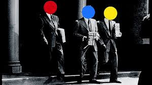
The artist interview this week featured John Baldessari. He started his life wanting to be a social worker, but instead got an art degree. Then, he became a teacher to sustain a living for himself. Through his teaching, he was continually creating different pieces of art. I have noticed in the video, in some of his exhibitions, there is evidence of typography. For instance, among many of his works, you will find a poster on the wall with influencing words. The most interesting piece I found about Baldessari was his work with stills from movies or cut-outs from magazines, newspaper articles, etc. First, he began taking these pieces to play upon the famous people, and rearrange images to create a new piece altogether. Then one day, he was looking at all these people who had done something influential, and became “repulsed” by their images. He took price stickers and covered their faces with them. Now, he had a brand-new piece with a brand- new outlook. The person was no longer famous, they were nothing! In this, he meant to create meaning in that every person is replaceable. Below is an image of faces that he “stickered” out.
Swoon is a street artist who uses recycled prints and cut-outs of human figures, much like Baldessari did. However, Swoon had a completely different outlook. She also uses what is called “wheat paste” in her pieces. Wheat paste is simply a gel or liquid adhesive made from flour or starch and water. This type of paste is a lot like wall-paper paste, and can be used in many artistic forms, such as paper-mache. I found Swoon’s pieces to be very intriguing. Her most famous piece is entitled “Anthropocene Extinction.” I have pictured it below. This piece is made entirely out of recycled paper. The amount of intricacy to detail is unbelievable, as this piece is incredibly large! She is a very influential mixed media artist this day in age!

Thanks everyone,
Morgan
0 notes