#and just the general lighting + shading
Explore tagged Tumblr posts
Text

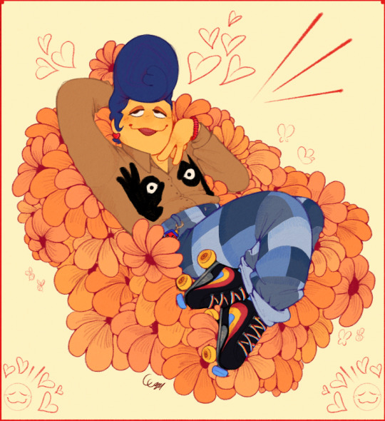
saw some choice clothes on pinterest and Had to indulge <3 ngl i had the song Golden Dandelions playing in my head when i sketched this
#both light and dark versions cause i couldnt decide!#man... i wish I could lay on a bed of plush flowers. that'd be heavenly#also: lmao eye nips#& unshaded bc really? you expect me to shade all those petals? not a chance babey!#plus i think it would've started to look cluttered#scribble garnish#welcome home#welcome home puppet show#wally darling#this was a fun pose! and just a fun scribble in general
1K notes
·
View notes
Text

Happy 2k followers @rorydrawsandwrites !!
I meant to draw this way sooner, but admittedly I only had motivation to start properly drawing this 2 days ago. I've had this idea for what to do for this picture for around a week now so I'm glad I finally sat down and drew it!!
Rory, you are such a creative person and very sweet the few times we've talked! I can't wait to see what you do in the future! Just do not feel obligated to post about Puppeteer if you have no motivation even if it did gain you some popularity. :]
#art#tadc#the amazing digital circus#digital circus#digital circus fanart#tadc fanart#digital circus au#tadc au#puppeteer au#jax#tadc jax#jax fanart#puppet jax#gangle#tadc gangle#gangle fanart#puppeteer gangle#anyway im very proud of this#the background is#basic#and the shadings/lightings not great#but im just generally proud of how gangle and jax look#i think i did good on their posing and such#also i sketched this first on paper a week ago#and when asking rory about isles pomnis design#i sent a picture of her with gangle barely seen in the corner from this#so yeah#rory if you read this far that was infact gangle#very silly indeed#happy 2k followers tho
346 notes
·
View notes
Text
sha-fallen angel 2: fallen again


redid this drawing from almost a year ago to try and improve it lmao. maybe went a bit overboard with the chromatic aberration but i think it looks cool
original under the cut for comparison:


#total drama#td#td lightning#total drama revenge of the island#tdroti lightning#tdroti#total drama all stars#tdas#art#fanart#td fanart#total drama fanart#cw eyestrain#cw scars#cw lightning scars#cw burn scars#besides just general technical improvements eg anatomy and shading i also wanted to get a bit more experimental with the style and colours#instead of just the weird faux-realism i had going on with the original#i also wanted to do the scars differently as the refs i was using in the first one showed lightning scars on light skin#and i wanted to make it more accurate to darker skintones#overall? im happy with this#might redo it again next year- see if ive improved#im specifically really proud of how i did his torso here lmao
68 notes
·
View notes
Text
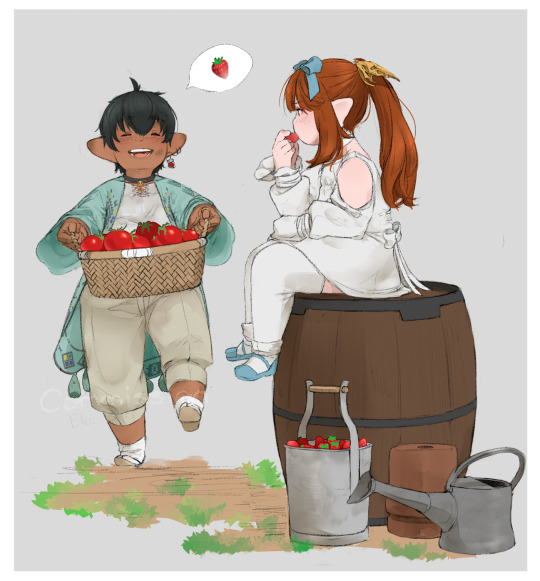
Commissioned by @/tomate_xiv on Twitter of their absolutely adorable lala siblings!! I'm so proud of how this whole thing came out, I'd been super looking forward to drawing them and working with this idea ‹(⁽˙́ʷ˙̀⁾ )›♡ Thank you so much again for commissioning me!!
#final fantasy xiv#ffxiv#lalafell#my art#flynns commissions#look at how good the shading and lighting on those tomatoes came out#my friend had to teach me how to do it and i feel like she gave me a super power#ALSO THE SHADING JUST IN GENERAL I'M SUPER PROUD OF PUFFS UP CHEST#the pose too i thought of it and i got so excited i was like i hope they approve cuz i wanna do it so bad
202 notes
·
View notes
Text
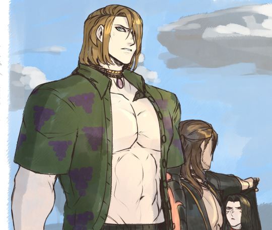

Chance encounters in Costa del Sol.
#ffxiv#sketch#zenos yae galvus#meteor survivor#titus yae galvus#arrecina wir galvus#oc#tsukiko date#camilla lunae#imagine trying to get drinks at the bar only to look over and see your presumed dead great uncle/great nephew standing right next to you#meteor- five seconds away from a heart attack looking over at titus#that moment when youre the spitting image of your father and the warrior of light was *not* aware of that fact#the galvus' are not allowed to have normal vacations#or... well retirement in Titus' case#I am simply here to draw the unaccounted for garlean royals lmao#eventually i'll draw zenos' half sibling(s?) and varis' retainers annia and julia out of their armor#but for now you guys just get to see my silly bullshit of sixty something y/o titus deciding that with nerva gone he's just gonna retire#mans is done with it#im probably gonna end up writing him as the legatus of the 8th- and probably a machinist that eventually becomes a gunbreaker#after lucius passes this man is over all of it#no nonsense machine commanding leader ect ect.#probably dual wielding the gunblade with an actual gun tbh lol#old man doesnt look like wrinkly solus because he spent his life taking care of himself to deal with just... the galvus family in general#dont let the strands deceive you all his grey hair is hidden under the rest of it all lmao#the galvus family brain rot continues and its not going to let me go v-v#(also dont mind meteor teasing tsu for hiding in his shade she does this a lot)
57 notes
·
View notes
Note
What are asgore and spades favorite colors

#deltarune#asks#drawings#asgore#spade#king of spades#spade king#asgore dreemurr#spadesgore#technically#king spade#no one asked but i want to elaborate#asgore describes colours in pairs not just because it might be the only colour theory he knows#but because thats also how he generally just sees. people and their traits#as if everything needs something to compliment#hence why he feels so out of place and useless to himself when hes not married/in a relationship#the way he describes yellow and purple are a good way to describe him and toriel in undertale#royal colours that are tied to hope but they only shine when theyre constracted against the grim tragedy that shaped them#with blue and orange it kind of describes sans and papyrus especially with how their comedic timing works#like when youre alone with sans in mtt resort the tone is a LOT more somber - colder#but when papyrus is by himself hes all jumpy and shit and he hardly seems as down to earth as he does with sans around#and red and green imo are the most important in analysing asgore specifically bc his weapon is red#but his shirt colour in post pacifist and deltarune is pink - literally a softer version of the cruelty we KNOW hes capable of#he describes it as just sort of -fitting- with the greenery he surrounds himself with and i think that mostly has to do with what he WANTS#all the plants and the greenery are ALIVE but almost toxic. meanwhile someone else most prominantly associated with red is rudy#the guys whole gimmick is having a bright red nose#its like asgore surrounds himself with the colour that would compliment the person he wants#or literally wearing their colours a la him and toriel having the same shade of blue on in undertale#and spade? hes just emo. he likes black because its a lack of colour - a lack of light#the reason he works as a good parallel to asgore in this sense is because he breaks asgores dychotamy and forces his own
101 notes
·
View notes
Note
how do you get the angle & fov so close to the original!! is it just trial & error or do you superimpose the photo atop the game somehow
recently ive been tracing the outlines of the rooms in Clip Studio Paint, and then capturing both CSP and the game in OBS and changing the blending mode for CSP to multiply!
i use CSP's perspective ruler tool to find the horizon in the reference picture and then compare it with any doors in the image (theyre very consistently 2m tall) to find the height at which the photo was taken, and then make a little platform in the game so the pov is at the same height
i then trial and error the approximate position by putting down square tiles and lining it up with the floor in the picture. i'll then build up the walls (theyre usually around 2.5m tall, so i just make them 13 blocks/2.5m tall and use the resizable cube to get the ceiling to the right height). then i do even more trial and error to find the FOV, focusing on matching the angle of vertical lines near the sides of the screen.
i use a kitchen cabinet inner corner piece to "save" my position, i'll back into it to get to the exact same spot every single time. i'll also place a small item (usually a clothing hook) on the wall on the spot my cursor needs to be so i can always face the right way!
often the images have to be rotated very slightly for the horizon to be perfectly horizontal. i'll always note down by how many degrees, and when i'm cropping the final screenshot to the correct aspect ratio i'll also rotate it to match :)
#not an interior#behind the scenes#i'd take screenshots to illustrate but it's starting to get late here#this new method is a lot more efficient than the perspective grids i used in that behind the scenes ask from may 21st#i think the most tedious part of this process is finding the view direction and the FOV#they affect each other so its a lot of back and forth#but once ive got my corner and hook set up i'm good to go :)#ACTUALLY the most tedious process is lighting/color matching#so much mixing & matching of similar paint shades and color temps. specifically getting white to look right is way harder than youd think#the next build ive got lined up for yall has all white walls and will be a great example!#it has both shades of orange and blue/green due to the lighting and ive just had to settle with matching the general brightness
57 notes
·
View notes
Text
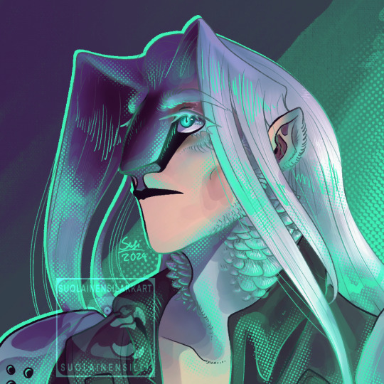
Finally figured out how I want to draw Sephiroth and then accidentally stayed up until 7 am to finish this as a test. Whoops
#doodles#fan art#ffvii#ff7#sephiroth#ffvii sephiroth#ff7 sephiroth#very vaguely inspired by @/yeahsoapy's sephiroths i saw on twitter a while back theyre REALLY good#anyway. hes like a weird bird to me. he deserver more feathers and to just look a bit more inhuman in general#dramatic face shading halftones and green accent lighting seems to be a running theme for me. hm. not my fault it consistently looks great
60 notes
·
View notes
Text

obligatory almost-late mershark foolish bc its mermay
#kind of sort of a redraw of the one i did last year but not really its just the same general concept lmao#i dont really wanna compare them bc i put way less time into this one like its not shaded at all besides the light gradient lol#foolish gamers#foolish#foolish fanart#my art#also dont ask why hes holding a trident lol i just didnt think too hard abt the pose and it made more sense for him to be holding smthn
25 notes
·
View notes
Text
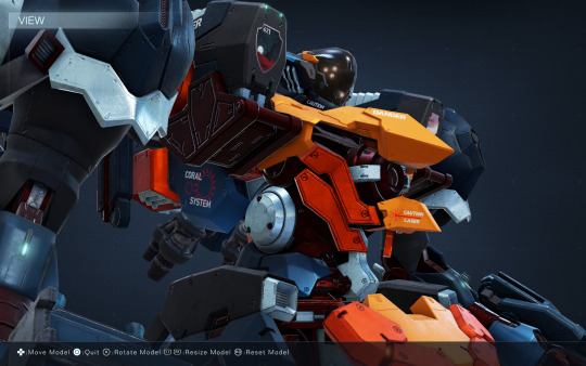
gotta show off my latest mech, FRENZIED ALACRITY / CRESTING DAWN, a super speedy pulse blade user i've had a lot of fun making decals for (more screencaps under the cut i couldn't pick one)
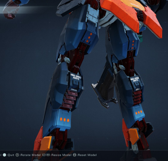
look at my gradients boy the warning was gonna say HIGH SPEED ACTUATION but that's a long word to fit on the mech
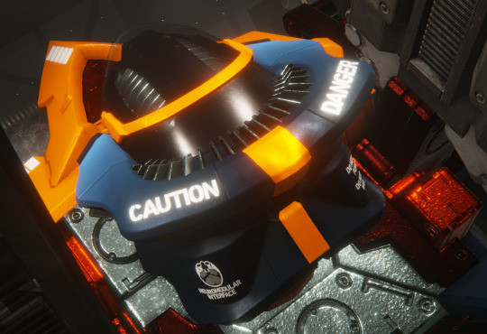
worked too hard on the mri scan decal for where i wound up putting it.... you really have to look for it
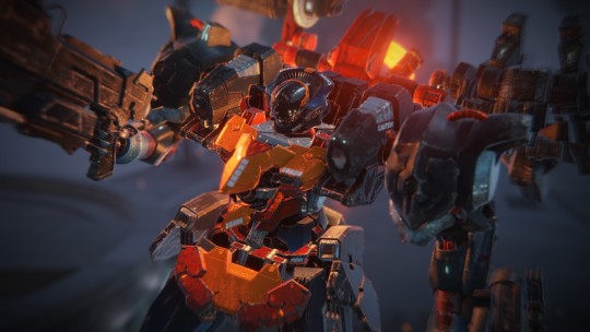
quick balteus s rank to make sure i was happy with the build and the appearance :3 i am definitely still a reverse joint legs stan but i like how zippy you can get on the alba legs
#dibi#armored core#i think the blue gradients were worth it#they're not amazingly visible but they do add something#my usual reverse joint build is called KNIGHT ERRANT / THE LAST WILL#it's a rusty grey and brown medium-light build#mind beta legs alba core melander c3 arms shade eye head#zimmerman shotgun and explosive thrower on the arms#and the 6 shot missile launcher and trueno on the shoulders#i prefer talbot fcs san tai generator and alula boosters personally#san tai is very heavy and slows you down a fair bit but man having 4420 EN is just. it's just comfy
52 notes
·
View notes
Text
just bought a cute lil dress for my bday as if i’m actually gonna go out and do anything…
#[𐐪— rheya talks. 𐑂]#it’s fine i’ll just wear it for the plot yk#i will say it’s different from the colors and styles i usually wear#i dont do dresses in general bc i feel like they don’t flatter me at all#but i’m trying to get more comfy w them#this one is light pink which is also so different bc i tend to stick with dark colors#but i love this shade so i said fuck it#me and my roommates will be the only ones to see it lmao
5 notes
·
View notes
Note
☕🍪 🧡
hi hello ty for the ask!!!
coffee or tea?: I’m actually not a big fan of either! I’m more of a hot chocolate gal. I love the smell of coffee because it’s lovely and nostalgic, but I’m more likely to drink tea, my favorite I’ve ever had being this apple cinnamon kind. That being said, I’ve been content with just. Warm water with lemon and honey. I was really sick and didn’t actually want to eat/drink anything so I just threw stuff in a cup.
if you were a cookie, what kind of cookie would you be?: I feel like sugar cookie is too on the nose, so I’m gonna go with oatmeal chocolate chip :) they’re my favorite kind to make (I found the best recipe ever) and they’re just generally rly good. Lotsa chocolate but not overwhelming, and it has a better texture then just plain chocolate chip
a color you can’t stand?: I really really dislike this one specific shade of pink that’s like a vibrant, dark color that borders on purple. This is the closest I could find on a short notice

It just hurts my eyes :( and my math teacher wouldn’t stop using it for worksheets, so I hated doing the work because everytime I looked up, everything was green :(((
#asks!!!!!!!#ty for the questions they were fun :))#I don’t think there’s many colors I don’t like from the og rainbow there are just certain shades that make me upset#but I love colors a lot sooooooo#it’s only like. this pink and a really neon yellow#neons in general just aren’t my vibe#unless it’s black light style in which case WHEEEEE
3 notes
·
View notes
Text
now that's it's over (for now). why DID they make Vernestra that color
#lovedddd rebecca's vernestra she felt on point to me#was she stiff? yeah but she's 116+ not everyone can be general viess#but my main problem was the color#why was it so#...ugly?#it's not how she looks in thr#just looked through the bts pics i posted earlier and it's not a shitty shade of green#yet it looks really bad and doesn't feel vernestra enough#she shouldn't be as light green as hera was but like#she should look good. imo
3 notes
·
View notes
Text

looking at the difference skin tones arjuna has on his offical art by pako trying to think if one is better than the other
#theyre all really close tbh#the anni costume one is more orange overall (his hair also is)#for some reason alter is a shade darker-not sure if its just the lighting but then the 1st and 2nd ascension dont match saturation wise so#who knows actually#generally i just pick the og but hmmm#my post
22 notes
·
View notes
Text
Bc i never plan my art unless its for a zine idk how to further proceed w that gym piece i never intended for it to have a background but i felt called out by the post that mentioned the things artists who dont draw bgs/dont often draw bgs do and i didnt wanna just post another Ace art of him standing in a void but now i have to adjust the colours and most modern gyms are like greyscale with one highlight colour and its driving me insaneeeee
#like the bg will stoll be blurred to shit but im just fuuuck i already chose Ace’s colours and i like them but#😔😔😔😔😔😔😔 maybe im over thinking it too hard#bc i take so long to do lineart in general i never think abt backgrounds bc thats gonna be even more lineart which pains me further#to think about but#i do want to stage characters more and do better lighting#but im just gettin stressed bc i didnt intend for this particular piece to have a bg and now it does and its#i have to make them work now which is a nightmare#maybe i should just scrap the bg fuck#finish the shading at least on Ace move on to other stuff#i tried a ton of methods last night but nothing lmao#maybe i was tired maybe i was distracted by ear pain#hoping to get it checked today bc my jaw hurts now 😭#and im still so tiredddd#i slept nine hours wtf#whiny xam hours im sorry#shut UP xam
14 notes
·
View notes
Text
i made a vid of my art on my youtube!
#saiki k#saiki kusuo no psi nan#teruhashi kokomi#now why havent i changed my pfp to that image yet? and the answer is#look i love how the new one shows improvement but im lazy and i think the old one is better for a pfp anyway#like it has bigger eyes/no shading etc#the redraw was just to see how much i improved in general not in pfp making#anywayssss hope you enjoy the vid!#saikers art#flashing images#flashing colours#flashing colors#flashing lights#flickering images
31 notes
·
View notes