#and it looked so bright and eyecatching and COOL
Explore tagged Tumblr posts
Note
If you don’t mind me asking, what traditional outfits would each turtle (family web au) like wearing?
I’m thinking like they have an outfit they specifically wear for a season (doesn’t have to be their favorite season just the season they wear it) or a social event.
Like Raph having this heavy layered with fake fur outfit for the winter. Idk I’m suppose to be sleeping right but I’m not, I’m thinking about turtles in fashionable clothing.
I'm actually really bad when it comes to fashion lol. (personally and with art. My idea of a cool outfit is when my hoodie and teeshirt match fandoms lol)
But i've got a few doodles of some types of things they would wear on like normal days.
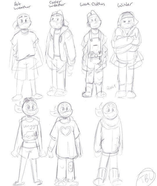

Donnie pretty much lives in teeshirts and like those really comfy jeans that fit perfectly along. If he wears his jacket unless the weather is very much against it. He wears more protective clothing when he's working on mechines and the like. Usually overalls with at least a teeshirt, though he'll wear longer sleeves and gloves if he's doing something particularly dangerous. Winter, he has his regular jacket, a lighter winter jacket and a hat and boots. He doesn't like wearing scarfs or particularly bulky clothing, especially if he's working.
Mikey, on the other hand, loves bulky clothing. Bulky and patched and basically anything with some personality to it.
Leo will do either bulky shorts or skinny jeans, there's no inbetween. Usually some sort of tank top/sports jersey. He doesn't really like the cold, so his winter clothing is being bundled up to the point the only thing you can see is his eyes. Also a long ass scarf b/c he like how weird it is.
Raph actually dresses fairly nicely once Mama got him clothes tailored to him. (he was excited to finally be able to wear stuff that wouldn't rip the second he put it on). But for a while he wears button up shirts with vests and nice pants b/c he liked the way it looked and he hadn't worn anything like that before without destroying it. FOr winter he wears a lighter jacket than the rest, a scarf, and some earmuffs : )
for fancy parties, i'm not entirely sure. I think Mikey would wear as bright of colors as he could. Raph would wear something nice but not particularly standout-ish. Donnie something very basic without a tie or bowtie (b/c i don't think he likes fabric wrapped around his neck.) Leo is a bit of a gamble. He's either wearing the most eyecatching thing he could get his hands on, or he somehow got away with wearing sweatpants in protest. Depends on how agreeable he's feeling about said party lol.
Anyways, Thank you!!
34 notes
·
View notes
Text
Buddy Daddies character designer interview
Interview with Enami Katsumi (character designer)
Interviewer: This time, you were in charge of character design for an original series - how did you develop the designs for Kurusu Kazuki, Suwa Rei, and Unasaka Miri?
Enami: For Kazuki: I wanted to clearly get across the idea that, despite being an assassin, he's the caretaker figure for Miri and Rei. I was always working towards that, right from the start. Once I had a rough idea of his face, I tweaked his hairstyle and clothing according to requests, to nail things down.
For Rei: In the first draft, he was a well-built, tough-looking guy - the spitting image of an assassin. But once I heard the staff requests and got a better handle on his personality, I changed course and made him a slim man with a gloomy air.
For Miri: Since she’s the heroine, I very much wanted her personality to stand out. So I gave her facial features and hair that brought out her unique traits very clearly, and made her seem a bit older. I don't draw children all that much, so it was quite a struggle.
Interviewer: What did you consider the most important aspect in each of their designs?
Enami: For Kazuki: He's "a mother". I was told this at every planning session, so I made sure to bring out a certain softness in his physique and expressions - something like a mother's tolerance.
For Rei: I aimed to make his duality - of the shut-in otaku and the cool assassin - apparent at first glance. And I made him relatively slim, in order to bring out a clear difference between him and Kazuki.
For Miri: With "an ordinary innocent young child" as my goal, I cut back on the eyecatching characteristics, and made her hair shorter, so that her liveliness would come through more clearly, and her expressions would be easier to read. At first, I thought she might have ended up too plain, but I figured I would leave things up to the animation and voicing. I was really blown away when I saw her fully-voiced and in motion.
Interviewer: Was there anything else you got especially hung up on when it came to Kazuki, Rei, and Miri?
Enami: For Kazuki: The contrast with Rei was crucial, so I definitely wanted to give him a bright, slightly lighthearted air.
For Rei: When it came to Rei's assassin mode, I was thinking along the same lines as the rest of the staff, and so his attire and hairstyle were decided quite easily. Then I aimed to highlight a gap - I wanted his "off" mode to be idiosyncratic enough to be immediately recognisable.
For Miri: I was told that it was important for Miri to have an ordinary childishness and innocence, and so I was careful to give her childlike body proportions that would make it easy for her to express suitably childish actions.
Interviewer: Apart from the main trio, are there any characters you're especially attached to, whether because you're fond of their designs or for some other reason?
Enami: Ogino [Ryo]. Drawing quirky old men is something I really love, and in the final version, after weaving together all the staff's requests, he ended up looking even quirkier than I'd imagined. So he became my favourite.
Interviewer: When you first saw the complete footage of the characters in motion, what impression did you have?
Enami: Kazuki was exactly as I imagined, so my reaction was, "This! Yes, this!" Rei's "off" mode honestly surpassed my expectations. If I have the chance to draw him from now on, I definitely want to draw him with this sort of vibe. Miri's voice really is a full blast of childishness - I was amazed how thoroughly it makes up for the parts that couldn't be conveyed through the drawing.
Interviewer: Enami-san, do you think there is some common charm that the "Buddy Daddies" characters share?
Enami: We get to see their daily lives, and personalities that make them seem like the most unlikely assassins, and that makes them very endearing. And once Miri is thrown into the mix, all three of them display all sorts of delightful expressions - I want to keep watching them forever. Since them being assassins is built into the premise, we're bound to see a completely different side of them in future; I'm looking forward to it.
Interviewer: By the time this is posted, episode 3 will have aired. Are there any scenes from episodes 1 to 3 that you found memorable, or that you're especially fond of?
Enami: The scene where Miri says to Kazuki, "I hope Mama's not too lonely…" When they're talking about the difference from her mama's Hamburg steak, you can sense Miri's emotions brimming over; it's incredible.
Interviewer: Please tell us what you think are the selling points of this series "Buddy Daddies".
Enami: I think ultimately, it's the interactions among the trio. I hope that, as the story unfolds, people will enjoy watching the changing relationship between Miri and the two men under her thumb. Personally, my favourite thing is watching Rei in his "off" mode.
Interviewer: Finally, please give a message to everyone who is enjoying this series.
Enami: This is my first time designing characters for an original anime. I grew attached to these characters, and I'll be very happy if you become fond of them as well. I hope you'll thoroughly enjoy the main trio's adorableness.
175 notes
·
View notes
Note
are there any artists that inspire you?
oh!! easy question easy question for my entire artistic career I've always looked up to @/ solkipp !! when I was first starting out, he seemed so cool and unreachable, and even still I take soooo much inspo from her art. I honestly have no idea what my art would look like without her HAHA and than, for other more inspo,, @/ hoofpeets and @/ wasyago !! I really really adore hoofpeet's color choices, his work always seems so bright and eyecatching, and I take a lot of brush choices from him as well. Wasyago has really really lovely motion in their art, cannot get enough of the posing!! And I like taking anatomy from both of their art, specifically the weight of characters,, it's super inspiring!! I also take inspo from @/ pankiepoo , though it's more fun's sense of humor HAHA, think funs art is super silly,, have drawn a few things directly inspired by his style. [these people are all on tumblr]
4 notes
·
View notes
Note
What made you decide to create your own color palette for trolls? Genuine question asked with zero judgment, I’m just curious about how you started experimenting with that and what inspired you!!
Honestly, it started off because I'm actually a big fan of mostly monochrome designs - usually just black-grey-white and then an eyecatcher colour.
But fantrolls always had the orange horns/sclera, and it always just... slightly bugged me a bit? I'm not the most experienced with advanced colour theory so whenever I tried to make a more cool-toned image, the warm oranges would always throw it off, even when I tried to desaturate or add blues or purples to them. It'd look muddy.
Back in 2015, I drew two images of Cereba and Aelynn and really only wanted to use monochrome + blood colour, so I ended up with this palette.

I used this a few more times over the years in other drawings as well and honestly, I still like it but I think making the sclera blood-coloured looked. Hm. It just wasn't compatible with some of the stuff I wanted to do and could look bad because of the iris being blood-colour too.
There was a brief time where I had it so the horns were black and the hair was black too, but they just blended in too much, and that's when I experimented with changing the hair. For a little while, I just added a tint of blood colour and then I was like NAH GO HARD
And also! I just got sick of always drawing black hair! I think black hair is nice and all, but it's limiting when it's seen as the rule especially when you have so many characters! I really like bright colours! I like the contrast between the clothes and the hair! I like the ability to have colour or black and have that seen as something not unusual! Having that limited to the clothes only wasn't enough for me!
Most importantly, I just think it looks nice. :D
#i realise i didn't need to type this much but here's my full brain stuff anyway!#ooc#yeah i don't know if you wanted all this but anyway thank you for asking#i've really come to love this palette and it makes me happy to see#sometimes a friend of mine uses it too and it makes me //slide on the floor like i just scored a goal in football#long post
3 notes
·
View notes
Text
god i fucking hate art
#i dont!!! understand!!!!#ok so i was in the middle of drawing somethin with a certain brush and shading style#but i got bored and doodled something with a different brush to the left and it looked so fucknig GOOD#it made me so happy bc it wa with a sharper brush and a more hard shading style as opposed to soft#and it looked so bright and eyecatching and COOL#so i thought 'aw nice this brush is cool maybe i should go over thi lineart with this brush!'#so i make a new layer and start to try and it looks SHIT#im so fucknig mad they're oth drawings of peope WHY ISNT THIS WORKING#I THOUGHT I FINALLY FOUND A BRUSH/STYLE BUT IT'S A FLUKE APPARENTLY :^)#i hate this i hate feeling like im in between styles i feel so incosistent i just want a good brush!!#i just want to find a style i can use!! one i like!!!#im genuinely upset over this i just want to draw and be decent but i cant even find a decent fucknig brush#i just wanna draw but i fucking cant it's not fair
0 notes
Photo

decided i missed having stuff tied around my wrist (ive basically always had *something* there but when my last bracelet broke a few years ago i just..never replaced it?) and also that i need more rainbows in my irl life (but went for a slightly darker/muted rainbow bc im not a very Bright Colours person wrt clothes)
but man did i forget how long these take to make. this is like 2 1/2hours and its about 3 inches long so is like, half done
#that justification sounds weird to me but i cant word it right.#muted colours feels Better bc if u see it cool but i dont really care about it being like..eyecatching?#esp for a thing thatll be in my peripheral vision a lot#idk i dont know why i feel the need to justify it at all lmao#luv the bright pride flag but not for clothes for me#also in the corner you can see one i started before i came to that realisation#but it also had a pattern to it but im v rusty at this so it looks very Wonky bc getting even knots is hard so i gave up
2 notes
·
View notes
Photo


Dome home mansion in Minnesota is so cool. Part space ship, part fun, and lots of murals.

It has lots of light via artfully placed triangular windows.

Open concept living/dining/kitchen areas with a blue fireplace in the middle.

The fireplace can be enjoyed from any area.

More windows in the ceiling.

Two toned kitchen cabinets. Nice retro chairs in eyecatching red.

Hidden pantry.

Spiral stairs lead up and a rounded staircase leads down.

The family room has round windows that look like a space craft or ship.

View from the 2nd floor mezzanine.

There’s another way down, besides using the stairs. You can use the bright yellow slide.

The slide leads to a stage where kids can play or sit and read.

The master has triangular skylights above the bed. A strategically placed scarf shields it from the sun.

Master shower is just the right size.

This bedroom looks like a geodesic dome and has a fun ladder to a loft.

All the children’s rooms feature lofts.


They also feature murals.

What kid wouldn’t love a room like this?

The children’s bathroom.

This may be a guest room, or the room of an older daughter, and it also has it’s own loft.


The home theater features chaises that the family can stretch out on.

And, there’s also a kitchenette.

The indoor golf putting green.

Exercise room.

And, ping pong.

This looks like fun.

Firepit on the patio and sheltered outdoor dining.

There’s also a deck over the garage.
via facebook
119 notes
·
View notes
Text
The art of being seen
I'm not too knowledgeable on this one but I'll do my best!
- try wearing something eyecatching. like maybe bright colours or swanky glasses/sunglasses, interesting hats may also do the trick
- the one thing i can reiterate here is noisy shoes. shoes that go click are good for getting people to hear you
- shiny things or things with cool graphics on them may be helpful. interesting jewellery or cool pins, stuff that would catch people’s eye easily
- posture? if you look like you mean business but in a friendly way it might be handy
- knocking something off a shelf would be a good way to draw people’s attention to you but you also might get in trouble for it so take that with a grain of salt
- if you like fancy clothes perhaps try a cloak? or a top hat? interesting and unique clothing items will make people look at you
This is pretty short and I’m sorry about that, I tried consulting the internet but there weren’t many good tips. Regardless, I hope this helps! Godspeed with your endeavours
107 notes
·
View notes
Text
Asemic writing
Today we created our own abstract messages and secret script (asemic writing) by layering wet and dry media and creating opportunities for suggestions of letter forms by weaving slices of writing together. we used our articles to inform what our initial writing would be and researched Pokras Lampas, Simon Williams, Cecil Touchon, Fabio Zanino and Jerry Iverson to take inspiration from and create ideas from their form of asemic writing.
Simon Williams
Simon Williams is a contemporary painter who mainly uses Alkyd oil and acrylic paint to create his abstract painting. He takes inspiration from many things such as childhood comic books, propaganda posters and graffiti art, which personally I think really shines through in his work due to the large sweeping curves and the bold colours shown throughout.
Texture is a very prominent thing within his work as there are many brush strokes where it appears as though the brush didn’t have that much paint on it and therefore the brush has left a scratchy texture. This contrasts with some of the very smooth round shapes created in his work which have an almost 3d look to them due to the way the paint has been applied. I really like the curves and flow of the lines in this piece and that is something I would like to achieve in my own work at some point.
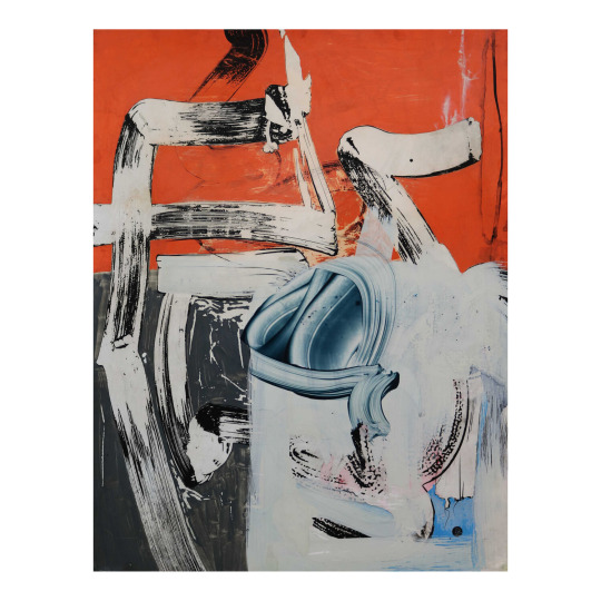
I also like the use of colour in this as Williams has put the majority of the vibrant colours in the background, leaving the foreground to be mainly black and white. This intrigues me as it is something I have never thought about doing in my own work but definitely something I should experiment with. I really like the simplicity of this piece and how the shapes created could suggest letters but it is not obvious from which language or alphabet the are derived from, since they don’t actually exist. This is the exact effect I want to create in my own work.
The piece below is my favourite because of the colours found within it. While the main colours appear to be teal and purple, a small amount of pink and red can also be found within the black which is very interesting to me as it makes me wonder why Williams decided to include such a small amount of a warm colour which contrasts the cool colours throughout the rest of the piece. In my opinion it could be to send the message that a warmth and hope can be found in every cold bleak situation.
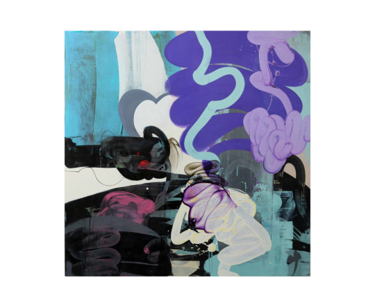
This piece is also different to the previous piece as there is colour in the foreground and the background. There are also much more hues of all the colours used, which is something I would like to do in my own work along with creating textures similar to how Williams does in is work, with very dry brushes containing only a small amount of paint. I would also like to create a general theme with the shapes I create as Williams only uses very round curves and I would like to only use one type of shape in my work, possibly the opposite shape, with many angles and straight lines.
Pokras Lampas
Pokras Lampas is a graffiti artist from Russia who has created many large scale installations and worked with many brands on advertising campaigns due to his eyecatching patterns which resemble letters. His lines have a very calligraphic style to them and usually follow an overall uniform shape for example lines of the asemic writing forming circles in a similar way to a mandala.
I really like the colours within his work and how it is usually a black background with colours over it as I could achieve this effect by inverting some of my own work which is going to be made on white paper. I also really like the large scale and versatility of his work as it works on many different surfaces such as walls, cars and even people in a very detailed and interesting way as by using these different canvases the intricacy isn’t lost.
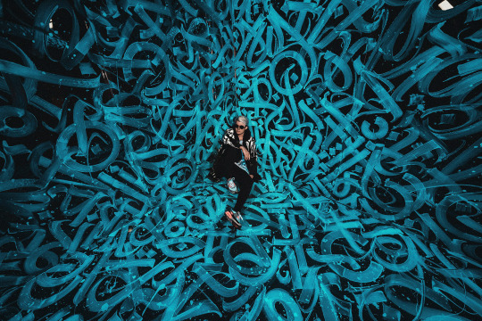
I particularly enjoy the piece above as the brightness if focused surrounding man and the art gradually gets darker and more shadowed towards the edges of the photograph. I also like the way this has been captured as by having him sit in the middle of the art it displays the central focal point and how large the installation really is in a photograph which prior to him sitting there wouldn’t have made clear the scale of the piece.
The campaign and product below are some of the most visually appealing pieces by Lampas that I have seen due to the variety of colours used in the body paint and how vibrant everything is. The way the lighting makes the shadows appear as pink ties the whole photograph together as without the adding neon pink it would’ve appeared rather bland.
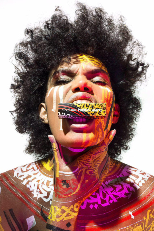
The shapes of the the letters in Lampas’ work remind me a lot of blackletter and therefore if I wanted to display something old and ancient in my own work I could use shapes similar to this o=to do so as Blackletter is the oldest typeface.
I do also like the combination of red and yellow and how the shapes fram the neck and shoulders in a similar way to how clothes do. From looking at Pokras Lampas’ work I have learnt that in my own asemic writing I should think about what shapes my asemic letters are making and whether they form any other shapes such as circles in his work.
Cecil Touchon
Cecil Touchon is an artist who creates abstractions based on typography. The he creates hints at letters and has much depth to it due to the way he makes the rectangles and rounded wedges overlap and interact with eachother. He uses billboard fonts as inspiration for the type of font he is subtly adding into his work and this makes for some big bold shapes and colours that are very striking to catch people’s attention as billboards typically contain adverts and are definitely made to be noticed.
I really like how he has mixed a very natural colour such as tan with a bright periwinkle blue in this piece as I could use this in my own work to portray the messages of my articles as many of them draw parallels between 2 very contradicting subjects, for example nature and technology. The colours also remind me of the sea and a beach and therefore the dark areas could be pollution, or the white and blue could be the sky and the tan could be the ground.
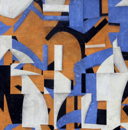
I really like how colours and shapes carry over many of the rectangular shapes and connect them all together, creating very abstract shapes in the process. In my own work I could use this as I could think about how long I want to continue a line for and how much I want the shapes within my work to overlap and affect eachother as by not having them overlap I could end up with a very different outcome than if I did.
The second piece I looked at by Touchon is very different to the first one as it contains no colour and the shapes of the letters are much more similar to letters usually seen in everyday life. We took inspiration from this in our own work as we started our pieces by weaving together some black and white type. This piece reminds me slightly of David Carson’s work as it has the same elements of a glitchy sort of type and scramble up words that his work commonly contains.
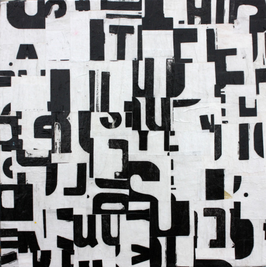
This also reminds me of the tomato project due to the black and white and bold lettering which is making shapes in an unnatural way. I think it would be very fun to try and create a piece similar to this in photoshop as I could splice together words and then use the threshold tool to make them very dark and computerised, which would work well for many of my articles, especially the one about robot flies as that is very technological and I think that the outcome could be very technological and futuristic.
Fabio Zanino
Fabio Zanino makes sculptures which are created from objects which he has broken apart and then put back together but only using certain pieces to give the entire object a new identity. He calls this work “Decostruzioni” as he deconstructs things and reassembles them to give them a new purpose and makes them abstract artworks.
I think Zanino’s work is extremely interesting in the way that he will take something which already had a purpose, destroy it and separate it from the original purpose and somehow rebuild it in a way which makes it yet again purposeful. By ridding the objects words and textures of their meaning he can then manipulate them by changing the shape and arrangement of the object and make the textures be interpreted in a completely different way.
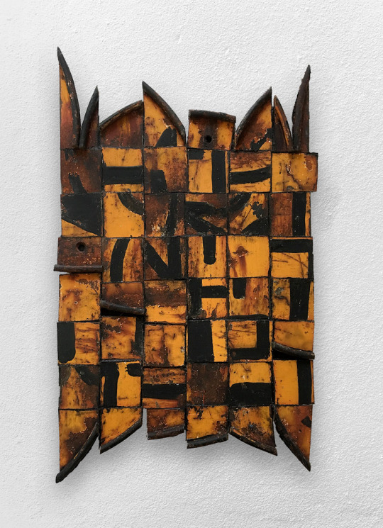
Unlike the other artists researched today, Zanino doesn’t necessarily create asemic writing all the time as not all of his pieces contain text, but the way in which he works is similar to that of asemic writing and we took a lot if inspiration in how we worked from him as we disfigured our own writing and our own work and then rearranged it to give it new meaning and new purpose, and I then even went on to rearrange and reweave the asemic pieces I had already created and manipulated them further giving it a third layer of hidden meaning.
Jerry Iverson
Jerry Iverson creates art based on the balance and grace if Asian calligraphy. To do this he uses many layers of paper ink and glue to chop up the words and experiment with how black lines can look like words even if they mean absolutely nothing. I really like this nihilistic approach to asemic writing where the intention is to have it be meaningless as it more or less gives Iverson the freedom to do what he wants without having to think about context. This may have been why there is no colour in this piece as while many of his pieces aren’t colourful some have very subtle colour and this has none to show how it means absolutely nothing.
I really like the texture created by a dry brush and ink in this piece and that is definitely something I could put into my own work and maybe even create something similar using oil pastel or charcoal as they both have a very scratchy texture similar to this.
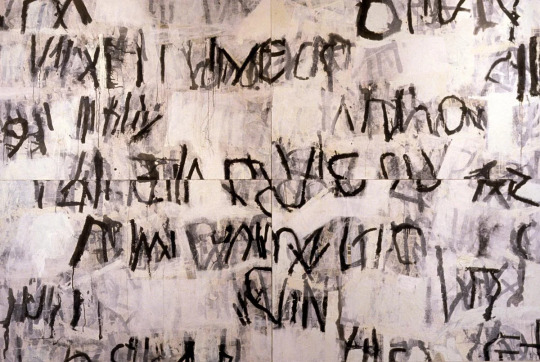
I also really like how a lighter wash of ink has been used in his work to create a shadow like image behind the harsh black lines that replicates them. The shapes in this piece are something I would like to use in my own work as they are very harsh fine lines with lots of texture which really appeals to me as texture is something I want to include more of in my own work. I also like the way he has copied some of the lines in a lighter wash to add depth as it makes he entire piece more visually appealing in my opinion due to the use of many tones.
The piece below is from the series “Line Bombs”, based on the wars in Iraq and Afghanistan and the disruption they have caused. Iverson has displayed this disruption very successfully by using many layers and textures in a very messy way which is effective for showing an explosion. The ink splatters could represent the corruption and damage that the bombs and wars are doing.
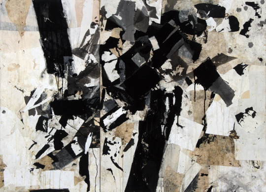
The choice of applying ink in this way could also be to display the aggression and anger associated with war and the way that the ink interacts with the other media on the page could be as a representation to how that anger goes on to affect people unknowingly as you cant plan how ink is going to react to the page you are putting it on.
I really like the use of many shapes and textures and the way that Iverson chooses to layer his work as it makes interesting compositions with lots of depth and many different shades from black to white, I also like how he doesn’t opt to use gradients and instead applies colour in a more jarring way to send the harshness of the messages he is portraying across.
My asemic writing
For my own asemic writing I decided to based all on my article about mammoths being revived, as I haven’t done much work concerning this subject and alspo I thought it could work well for asemic writing due to them being ancient and how I could link them to cave drawings.
For all my pieces I first started off by writing words rather largely on an A4 piece of paper repetitively to then be cut into strips to weave together and hide the message. The words I chose were “mammoth revival extinct animal restoration” as they all link to the chosen article and almost make sense as a phrase. When slicing my words up I decided to do it lengthways down the paper to allow myself longer strips to weave together as I wanted to weave across most of the page and this would be easier to do with longer strips.
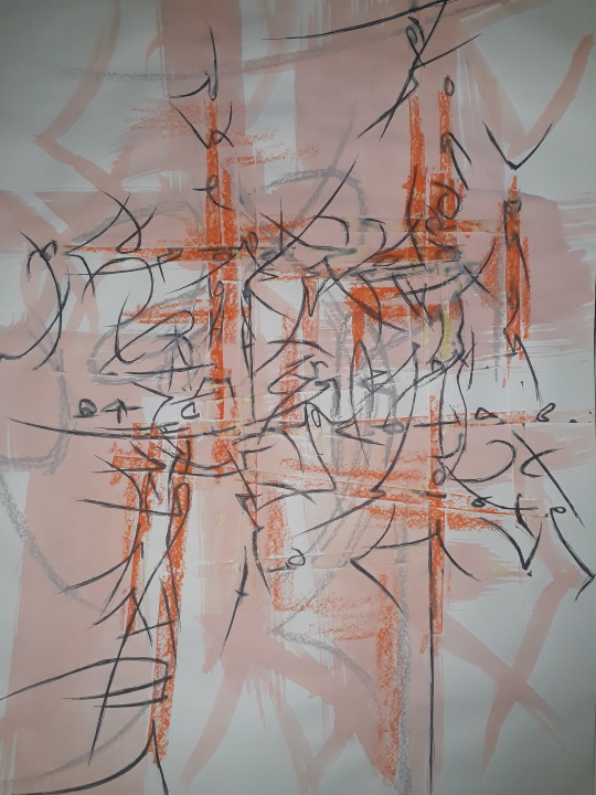
I then went on to create the asemic writing and I did this with a biro at first just to extend the lines and shapes created by the sliced up letters and continued the shapes they made, overlapping and connecting some of them in a way which reminds me of Pokras Lampas. I also wanted to replicate something which looks like It could’ve been made in caveman era, but I don’t think I achieved this in my writing very well as it reminds me more of Asian or Russian architecture and the patterns seen on that. I did however make the ends of all my lines very scratchy and not uniform to hopefully replicate some of the textures which could been seen in very old cave drawings.
After continuing the lines I added some oil pastel to create the rocky scratchy texture I was trying to achieve. I think it did a successful job of adding texture and following some of the weaving which was glued down on the page already. Because of the ridges in the paper due to the weave it made very interesting depth as the oil pastel would pick up more in some areas than others. I then also used oil pastel to highlight some of the shapes I created and enlarge them in grey in a similar way Jerry Iverson. I think the grey and the orange look very nice together as it is a warmer grey and therefore more on the brown side than the blue side.
Finally in this piece I added an ink wash of a very pale peachy orange colour which ties the whole thing together as it makes the whole think have a colour overall. I got this idea from looking at Simon Williams work as he using long sweeping strokes and I tried to make my brush not too wet to display some of the brush texture like he does. I also used the ink to further replicate some of the shapes I saw and give the piece a border with shapes that make sense in context to the rest of the piece. Overall I believe this outcome was very successful and other than the writing not looking exactly as I had Hoped I really like how the textures turned out and I believe I achieved my goals regarding texture and composition as it all works in harmony with eachother.

In the second piece I wanted to aim to have the writing be more reminiscent of the textures and shapes seen in caves so I used oil pastel instead of biro to do the original asemic writing and I do think this helped overall give the entire thing more of a rocky texture. I then went on to add some blue oil pastel too as mammoths lived in the ice age and I though it would make sense to use blue as blue is a cold colour associated with ice. I like how the blue oil pastel turned out so I added more blue and this is where it all went wrong.
When adding the blue ink I added too much of it and completely covered the whole piece, overwhelming it, which is not at all what I wanted to do, so I tried to fix this by adding white acrylic paint. I like how the white acrylic looks as it adds a frosty look to the blue but it didn’t many to fix the mistake I made and therefore I don’t like how this outcome ended up. If I was to do this again I would use a small brush for the blue wash or maybe I would choose a different colour than blue altogether or maybe a different shade as it doesn’t look like ice as I hope and instead looks much more bright and possibly happy.
On the other hand I do like how this composition started and how the oil pastels looked when used as the original writing and I do believe that there are many appealing textures within this which the addition of acrylic helped a lot with as it made the piece even more rough and scratchy which is overall the appearance I was aiming for.
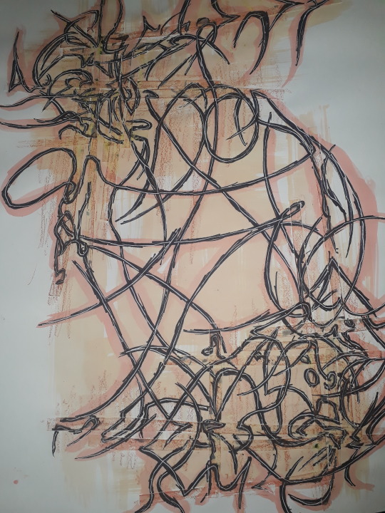
For my final piece of asemic writing I wanted to create an overall shape and have all the lines I created be inside of it. To do this, when I was placing the weave I considered how I could frame the page so I decided to put the weaving in 2 corners diagonally from eachother so I could connect them with lines through the middle of the page, I used a black sharpie to do the base writing and I made the lines very thick to develop onto them later. I made them very sketchy as well to create a similar effect to the previous piece but in a different medium. Some of the lines got extended very far across the page to connect both halves together. I really like the way that placing the weaving in this way affects the lines as it makes both corners much more full with lines than the middle and I think this works very effectively in creating a balance across the whole page.
I then used oil pastel on the weaving to dark the corners, causing the middle of the page to be a break of light in the darkness. This also added a lot of depth in areas where I wanted it and worked just as I had hoped it would. From doing all these pieces I have learnt I really enjoy the textures which oil pastels can create and how using them subtly can change the entire theme of the whole piece.
I then added ink washes in the shape of the piece and I think it worked very well to tie the whole shape together and emphasise how the piece shows and follows an overall shape, which is something I started to consider in the first place because I looked at Pokras Lampas.
Finally I added white down the centre of each black line which made the overall piece have lightness where it needed it so it wasn’t tot dull. Overall the outcome of this composition is something I enjoy very much and I think it was very successful in the way that it flows from one side of the page to the other, If i was to fix elements of it I would’ve made the white lines much less jagged and more smooth compared to the way that it is so that they could contrast the jaggedness of the black lines they are surrounded in.

As an additional composition I photocopied my first piece and put it into negative as well as one normal photocopy and I weaved them together as I had been with the rest of the pieces. I really like how this turned out as the contrast between both pieces is very visually appealing to me. If I was to fix any elements of this I would’ve cut the pieces into strips more neatly as they look rather jagged and not in straight lines the way I wished they are. I do really like how I weaved from one side of the page to the other as that is something I think make the page very balance in a simple way.
1 note
·
View note
Text
My friend who live sent the reactions to Fresh is now watching Heartcatch. I have been waiting months for this and I bet you have too.
For episodes 31 through 34, I will be doing the direct, unedited copy-paste that I did when I posted the reactions to Setsuna’s arc.
☾━━━━༺☾❀☽༻━━━━☽ ☾━━━━༺☾❀☽༻━━━━☽ ☾━━━━༺☾❀☽༻━━━━☽
EPISODE 31
Imma watch episode 31 now
Well, this is an exciting start!
WOOP!!!!
Cure Blossom: "Your withered heart flower has been used! Return to your former self!" Desertrian: *confusion*
"Same thing, over and over again!" Is this lampshading or--
Welp, that's the end of that fight. New record for earliest time in an episode for a fight to end! Unless I'm forgetting some older episodes that also started with a fight and finished quickly. But I THINK that this one is a new record.
"A flower can be this beautiful?" 0_0
Ooooh, is this showing possibility for redemption???? don't answer that
Theme song time!
Fly on the tree
Oh, hey Yuri!!
caught "Yuri-san" when overhearing (and not looking at of course) the title [context: when she started fresh, i advised her to close her eyes when the title card pops up because of spoiler titles being very common]
So these flowers are called amaryllis. They really are nice aren't they
Ooh, echoing footsteps. And dang, won't even let the fairies so much as touch her now
Aw, Potpourri doesn't look too happy about the rejected hug
"We can't procrastinate until the last second like what happened to summer homework." Learned her lesson with that and hung onto it. Good for her. Wish I could say the same for myself, but... :-/
they have their heads hung with their faces cast in shadow
Oh! :-D :-D Well that's awesome!
"Let's have Momoka-san come as a special guest!" Are...are you guys sure about that? Welp, okay. Wait she's gonna ask Yuri too????
I mean...she's not wrong
This should be interesting
Wait, who's THIS
They have glowy glasses
"Mr. 2nd place"? 2nd place in what?
Saintani. Interesting how if you take out the "I"s and the first "N" you get Satan XD Oh dang that guys is a fast typer
Next test?
The shiny wobbly eyes from Yuri after Tsubomi says the theme is "A New Myself"
...Look at all the staaarrrs (*o*) (*o*) (*o*)
OH FRICK
HOLY FRICK HOLY FRICK
Talking to Dune again. Hmm.
"I've got them in my palms already." You liar.
"Maybe I should go on a journey?" Ooooh, a journey? THIS should be good
*both her teammates look at her* *Cobraja's face mask cleanly peels off*"What's wrong with you?" "Is it love? But you can't fall in love with me. I'm too pretty for you."
Oh hello Dark Precure. Haven't seen YOU in awhile...
Dark Bracelet?
"When you use this, the Desertrian will turn dark, bad, and violent immediately." What????????
JFKHNFIONGIJORGNWRJKNWRJGBERNJGKLRBNGJKISBNINJUKBGWRJLGHWRJOGBHJOGRWNBGOIWRBGIOFNHJRKLGNSFJKGBNSWOGIRUWBNEOUINGRWBRWGIOWRBGORUWBGOUJRWUGBNERJBGURWNJGNRWGJRWLBNJORWGHNRWIJGRWNG
SASORINA, NO!!!!1!
D~= D~= D~= D~= D~=
Wait, Yuri...LOST her Heart Flower???
Oh...
"But do you want your fairy to stay like this?" Stay like...what... Wait, is she talking about...
Yeah. I'm sure if she can start to heal again it'll come back.
*sings like Gumball and Darwin* Do do do do do!` Commercial break!
Well THAT was a mood whiplash
They're out in their pajamas? XD and Itsuki's fully dressed and bright-eyed without hairs sticking out or anything
Mm. Yeah. Maybe give her a bit of time.
XD fairies inching along the ground like caterpillars XD XD XD XD XD XD
Saintani's exaggerated "NAAAANIIII?!?!?!?!" XD XD XD XD XD !!
"I'm losing my conviction..." Okay, the way he sounds just...sad, saying this, not even frustrated or anything. Hmm. And Sasorina's walking up.
Yuri?
!!!!
Well frick she got him. And this time she has the Dark Bracelet...
Transformation time!
YEAH! WOOP! YEAAAH!
"A loser should just give up. Just accept that and go crazy." FRICK NO THEY SHOULDN'T! Y--wait, I'm realizing this could be like a parallel? To Yuri? Because Sasorina called her a loser reminding her of the fight she lost? And if Saintani shouldn't give up just because he keeps losing than Yuri shouldn't give up either and--
But, like, also the thing he keeps "losing" at is...studying? And as satisfying as it must be to come in first there, though second does mean he still came ahead of lots and lots of people, competing isn't really the point of studying, is it? the point is to learn and stuff. Right?
Yessss Blossom! Preach!
Oh no
No, no, NO--
NO !!!!!!
STOP STOP STOP
There's gotta be SOME way to stop this before it's too late--!!!!
REHIOGBHRWIOGWHRBGIOURWBGOIURW
GHWRJOIGBRWOUGBHROUGRWBNGJRWNGIJRWNGJWONGWIOGHEWIONGRWEOGNWR
WHAT ARE THE FAIRIES DOING
Come on guys, come on, you can get out of those things...
YES!!!! Y E S ! ! ! ! ! ! ! !
WOOOOOOOOOOOOOOOOOOOOOOOOOOOOOOOOOOOOOOOOOOOOOOOOOOOOOOOOOOOOOOOO
YEAAAAAAAAAAAAAAAAAAAAAAAAAAAAAAAAAAAAAAAAAAAAAAAAAAAAAAAAAAAAAAAAAAAAAAAAAAAAAAAAAAAAAAAAAAAAAAAAAAAAAAAAAAAAAAAAAAAAAAAAAAAAAAAAAAAAAAAAAAAAAAAAAAAAAAAAAAAAAAAAAAAAAAAAAAAAAAAAAAAAAAAAAAAAAAAAAAAAAAAAAAAAAAAAAAAAAAAAHHHHHHHHHHHHHHHHHHHHHHHH YES YES YES YES YES YES YES YES YES YES
"So annoying, the bonds of Precure! I'll defeat you next time!" she says as she hangs upside down in a tree
"Someone said this in my dream. 'What's important is climbing right back up when you're down, a strong heart.'" she's right you know. And you could take that advice yourself Yuri.
Wait, SPINACH?
Twerk-and-poop time
Chartreuse. Nice.
<3 <3 <3 <3 <3<3 <3 <3 <3 <3 <3 <3 <3 <3 <3 <3 <3 <3 <3 <3 <3 <3 <3 <3 ToT ToT ToT ToT ToT ToT ToT !!!!!!
end theme!
EPISODE 32
And we start with Cure Blossom and Cure Marine punching evil monkeys! And Cure Sunshine exploding them! WOO!!!
What...what is going ON
It looks totally EPIC but like WHAT is going ON =~O
HNDUFOBEWIOGBRWIOGBRNGJOLNOUGSJKLBGSIOBRWIOGWBJWHBRWJUHWEOIHWUOHWIOGHWOUGHNHJSBJKDSNUJBUGRWBGOIUWBGRWIOJNDSJKGBSNDJHKGNSGUIWBGUIWGEWUREWOUGBHJFKBNSJKSBDG
SERIOUSLY FLASH BACK RIGHT NOW
Wait was this a vision her grandma had of the future darkest moment in the climax before they save everything?
Why we zooming in on her necklace
Theme song time!
Gotta wonder what Sabaaku's face looks like under that mask...
Coppe-sama is large and fluffy <3
Hmm. Yeah, keeping on fighting Desertrians under the effects of the Dark Bracelet could be challenging to say the very least. And the stakes have definitely been raised.
"And then we remembered that Cure Flower had some really awesome powers!" OOOOH like what!
Heartcatch Mirage? What is THAT
"It's a mysterious item that gives the Precure unlimited power."
Unlimited power...mm. In my experience with media that sort of things doesn't come without some kind of price...
Oh wow I was hoping we'd get a glimpse of what she looked like as Cure Flower
Dune was a menacing-looking dark glowing giant with long flowing hair a claw fingers and stuff? The small glimpses of him we've seen had him looking like a teenager. Maybe this is him at full power and he's currently not at full power?
Oh wOw
Precure Palace?
I'm a little uneasy about this idea, but the Desert Messengers ARE getting stronger and there don't seem to be any other options.
A terrible test? Ohhh THIS should be good... OOOOH ENCHANTED TREE DOOR
Yes, go with them Yuri!
(*O*) (*O*) (*O*) (*O*) (*O*) (*O*)(*O*) (*O*) (*O*) (*O*) (*O*) (*O*) (*O*) (*O*) (*O*) (*O*) (*O*) !!!!!!!!!!!!!!!
"The palace of Dune, the King of the Desert Messengers, draws near." What ??
(*O*) (*O*) (*O*) (*O*) (*O*)!!!!!!!!!!!!!!!!!!!!!!!!
The place is really beautiful
Welp, transformation time I guess
I remember it took me awhile at first to stop expecting them to say "freshly picked" before their cure names
Treasure hunt
"It's too high up!" Y'all can give yourself glowy capes that make you fly, remember? If you fall you can just do that... except for Yuri I mean... *awkward pause* wELP imma just keep watching
Wha-- Ohhh it's the Heart Tree!
"Just like that time." Huh?
"The Heart Tree comes to watch over the test to receive the Heartcatch Mirage." Ohhh. Cool! I wondered why it was here.
Flashback!...Oh... Oh wow...The inside of the palace is pretty too
HDJSHFJRHGEJORJUGH That's...not really her, is it
Defeat her?
*sings like Gumball and Darwin* Do do do do do! Commercial break!
You've got this, guys!
So there WERE generations of precure before Cure Flower (I forget if we'd learned this for certain already or not, only that there were none between Cure Flower and Cure Moonlight)
"I do not wish to fight you too, Tsubomi, even if this is only a test." </3 <3
Him? Who's--? *jaw drops at the sight of the rose petals* =~O =~O =~O =~O =~O =~O !!!!!!!!!!!!!
Harsh way of saying it...but I mean, she's not wrong.
And, I have wondered why he appears like this. Why he has the rose-petal powers and everything.
Yeah, why IS he here in the Precure palace... And they seriously call him "mysterious hot guy" or "hot guy"
You can do this, guys!!!!
*pours more goldfish crackers* YES GO GO YOU CAN DO IT
YES YES YES YES YES YES YES YES
YEAAAAAAAAAAAAAAH WOOOOOOOOOOOOOOOOO
YES YES YES YEAH
WOOP!!!!!!!!!!!!
YEAAAAAAAAAAAAAAAAAAAAAAAAAAAAAAAAAAAAAAAAAAAAAAAAAAAAAAAAAAAAAAAAAAAAAAAAAAAAAAAAAAAAAAAAAAAAAAAAAAAAAAAAAAAAAAAAAAAAAAAAAAAAAAAAAAAAAAAAAAAAAAAAAAAAAAAAAAAAAAAAAAAAAAAAAAAAAAAAAAAAAAAAAAAAAAHHHHHHHHHHHHHHHHHHH
Coppe-sama! I knew they were magical doppelgangers of some kind
wait WHAT IT WAS COPPE-SAMA THE WHOLE TIME NDJSLFHDSJFHJUBURHJURHGJUHJUHRUJHHJKDLSHFIOW
"Another lost love"? Somecreature who looked exactly like your grandpa?
=~D
*sings* You gOtta take the UpgrAyAyAyAyADE! Gotta take the UpgrAyAyAyADE--
(*O*)(*O*) (*O*) (*O*) !!!!!!!!!!!!!!!!!!!!!!!!!!!!!!!!!
I thought I saw something like this in the eyecatch...
Yeah! She could! (and she will if the opening and the eyecatch are anything to go off of)
*screams into pillow*
WOOOOOOOOOOOOOOOOOOOOOOHOOOOOOOOOOOOOOOOOOOOOOOOOOOOOOOOOOOOOOOOOOOOOOOOOOOOOOOOOOOOOOOOOOOOOOOOOOOOOOOOOOOOOOOOOOOOO
*collapses backward grinning ear to ear and laughing*
☾EPISODE 33☽
Cool start
Flashback!
"I...I didn't do much to help you." I mean, you're part of the reason they actually ended up going to do this...
"You girls overcame the test with your strong bonds of friendship." Mm. Yeah. True. They did that together themselves without her help.
"So very different from I, who fought alone."
Are you sure it's impossible? I mean, it's okay if you're not READY yet either way but like, IS it?
"Use it and see my Heart Flower!" Ohhhh, right, that
Oh...
Cologne? THAT'S her fairy's name?
Wait, was that Cologne talking just now??????
Theme song time!
How did her dad know about the Heart Tree though...
Upperclassman? They have school? I mean, I probably shouldn't be surprised... And Cologne's voice did sound older and less cutesy, if that was Cologne earlier
Where WAS Cologne then...also how did Cure Moonlight know Shypre and Coffret
=~O
NO NO DON'T TELL ME HE--???
D~= D~= D~= D~= D~= D~= D~=
*sobs*
*sobs rainbows when Erika hugs Yuri and they all tell her they heard about Cologne and all* ToT ToT ToT ToT ToT ToT <3 <3 <3 <3 <3 <3 <3 <3
"We want to bring back your Heart Flower! One more time!" "We want to be the source of your power!" *crying rainbows all over the place*
Ooh, they designed clothes for Yuri? Let's see 'em! Ooooh! :-D
Oh hey Coppe-sama
GLOWY HEART!!!!!!!!!!!!!!!!!!!!!!!!!!
They all drop down and Potpourri's the only one who doesn't know when to stop and just hits the ground XD
What happened?
Oh hey there's Dark Precure
IT'S GLOWINGGGG
*sings like Gumball and Darwin* Do do do do do! Commercial break!
Among the cacti
Cologne!!!
So they call the container of Heart Seeds the Heart Pot. For some reason I can't help but think of... Chamber pots
"Tell Cologne your feelings"?
That sound...
Aaaand yyep it's Dark Precure
It stopped glowing?
Transformation time!
"Where is Tsukkikage Yuri?" Ho ho ho, wouldn't YOU like to know
"Too bad! She's not here anymore!"
Cologne! :-D
He's a ghost
"Thanks to Cure Blossom and Cure Marine gathering the Heart Seeds, I can stay like this"
It wasn't your fault, Yuri ;^; </3 <3 <3
"You've been working too hard by yourself"
OHHHHHHH ='-O So there was a point when Cure Moonlight WAS offered the option of having teammates but she didn't think she needed them... And she was so, so wrong
ToT ToT ToT ToT ToT <3 <3 <3 <3 <3 <3 </3 <3 <3
"You didn't want to hurt anyone. You only wanted to take the pain yourself."
=~O =~O =~O !!! ToT ToT ToT ToT </3 <3 </3 <3 </3 <3
"Accept yourself, Moonlight. Accept your kindness and our sympathies towards your partners." *sobbing rainbows all over the place*
So she CAN be a precure again now?? ='~D ='~D ='~D Do iiiiiiiiit
OH FRICK
Totally forgot in the midst of that feelsfest
YEEESSS GO GIRLS DO IT FOR YURI
YEEEEEEEEEEEEEEEEEEEEEEEEEEEEEEEEEEEEEEEEEEEEEEEEEEEEEEEEEEEEEEEEEEEEEEEEEEEEEEEEEEEESSSSSSSSSSSSSSSSSSSSSSSSSS I LOVE THE SHINING POWER FORTISSIMO
VDSHFVGSYFBEVWIUJERHGOIERJGEIGHJIOGHJRIOGEHRNIERHGJLKSHNIKG
D~= !!!!!!!!!!!!!!!!!!!!!!!!!!!!!!!!!!!!!!
Do it Yuri!!!!!!!!!!!!!!!!!!!!!!!!!!!!!!!!!!!!!!
(*O*) (*O*) (*O*) (*O*) (*O*) (*O*) (*O*)
(*O*)(*O*) (*O*) (*O*) (*O*) (*O*) (*O*) (*O*) (*O*) (*O*) (*O*) (*O*) (*O*) (*O*) !!!!!!!!!!!!!!!!
(*O*) (*O*) (*O*) (*O*) (*O*) (*O*) (*O*) (*O*) (*O*) (*O*) (*O*) (*O*) (*O*) (*O*) (*O*) (*O*) (*O*) (*O*) (*O*) (*O*) (*O*) (*O*) (*O*) (*O*) (*O*) (*O*)(*O*) (*O*) (*O*) (*O*) (*O*) (*O*) (*O*) (*O*) (*O*) (*O*) (*O*) (*O*) (*O*) !!!!!!!!!!!!!!!!!!!!!!!!!!!!!!!!!!!!!!!!!!!!!!!!!!!!!!!!!!!!!!!!
TRANSFORMATION TIME TRANSFORMATION TIME
HEART SEED RESTORED!!!!!!!!!!!
YYYYYYYYEEEEEEEEEEEEEEEEEEEEEEEEEEEEEEEEEEEEEEEEEEEEEEEEEEEEEEEEEEEEEEEEEEEEEEEEEEEEEEEEEEEEEEEEEEEEEEEEEEEEEEEEEEEEEEEEEEEEEEEEEEEEEEEEEEEEEEEEESSSSSSSSSSSSSSSSSSSSSSSSSSSSSSSSSSSSSSSSSSS THIS TRANSFORMATION SCENE IS EPIC!!!!
THEY'RE GONNA END IT LIKE THAT????
next episode NOW
EPISODE 34
And we start by replaying that awesomeness!!!!
EEEEEEEEEEEEEEEEEEEEEEEEEEEEEEEEEEEEEEEEEEEEEEEEEEEEEEEEEEEEEEEEEEEEEEEEEEEEEEEEEEEEEEEEEEEEEEEEEEEEEEEEEEEEEEEEEEEEEEEEEEEEEEEEEEEEEEEEEEEEEEEEEEEEEEEEEEEEEEEEEEEEEEEEEEEEEEEEEEEEEEEEEEEEEEEEEEEEEEEEEEEEEEEEEEEEEEEEEEEEEEEEEEEEEEEEEEEEEEEEEEEEEEEEEEEEEEE
I just held down the E key for almost the whole henshin
Skip the theme song
Guess we're getting to THAT part of the series now
The expression on Dark Precure's face as it cuts back and forth between closeups like that is PRICELESS
This extended flashback of THAT day is just...wow
Seriously though in present day I absolutely LOVE seeing Dark Precure be this SHOOK XD You didn't think you actually just killed her now did you
YEEEEEEEESSSSS GO GO GO GO GO
WOOOOOOOOOOOOOOOOOOOO
YEAAAAAAAAAAAAAAAAAAAAAAAAAAAAAAAAAAAAAAAAAAAAAAAHHHHHHHHHHHHHHH
WOOWOOWOOWOOYEAAAAAAAAAAAAAAA
Oh hey these three are here now
WOOHOOOOOOOO
Cure Moonglight effortlessly slapping his cards away with one hand like that YES
HOLY FRICK HOLY FRICK
This entire fight so far has been HDSOUNOIUJRGPIBOUBFNJKLNGRIGBNRWOUGBWRGOUHRWNFGJKSNGJKSNGHIOERJLWHSFOJNSAKLFNWSJKLGNSJKLFSHGJRWLOBHRWIOGNRWJKLGDNSJKNGIOWRBGNRWIOGBNRWIORNBSGIORWBIWRKGBNRWILRWNGIKWNGIOHNRW and it looks like it's only getting started
"The Dark Bracelet isn't just for powering up Desertrians. They also give us power!" Yyyeah, I guessed that after seeing Cobraja use it like that without having a Desertrian in this fight
Sasorina used mega-braid of power! Kumojacky used insta-sword! WOOHOOOOOOOOOOOOOOOOOOOOOOOOOOOOOOOOOOOOO
I love the clashing good guy bad guy power explosions!!!
"A beautiful one like you, Sunshine, is most fit to be my partner." *le disgust*
CRITICAL HIT
D~= !!!!!!!
MORE critical hits!!
WOOOOOOOOOOOOOOOOOOOOOOOOOOOOOOOOOOOOOOOOOOOOOOOOOOOOOOOOOOOOOOOOOOOOOOOOOOO SILVER FORTE WAVE VS DARK FORTE WAVE YES YES YES YES
"Dark Precure! Why do you hate me so?!" I was kinda wondering about that too. She does seem to have some serious vendetta against Cure Moonlight specifically.
"You are...You are me, that's why!" ...What????????????????????
"As long as you remain the moon's light, I remain the moon's darkness!" "When darkness swallows the light, the moon becomes one!" That answers and raises questions at the same time
You've got this, Moonlight! Get up!
Ooooh, is that gonna be a catchphrase??
WOOOOOOOOOOOOOOOO GO GO GO GO GO YEAAAAAAAAAAAAAAAAAAAAAAAAAAAAAAAAAAAAAAAAAAAAAAAAAAAAAAAAAAAAAAAAAAAAAAAAAAAAAAAAAAAAAAAAAAAAAAA WOOOOOOOOOOOOOOOOOOOOOOOOOOOOOOOOOOOOOOOOOOOOOOOOOOOOOOOOOOOOOOOOOOOOOOOOOOOOOOOOOOOOOOOOOOOOOOOOOOOOOOOOOOOOOOOOOOOOOOOOOOO THIS IS TOTALLY EPIC!!!!!!!!!!!!!!!!!!!!!!!!!!!!!!!!!!!!!!!!!!!!!!!!!!!!!!!!!!!!!!!!!!!!!!!!!!!!!!!!
YEAAAAAAAAAAAAAAAAAAAAAAAAAAAAAAAAAAAAAAAAAAAAAAAAAAAAAAAAAAAAAAAAAAAAAAAAAAAAAAAAAAAAAAAAAAAAAAAAAAAHHHHHHHHHHHWOOOOOOOOOOOOOOO
*sings like Gumabll and Darwin sped up* Dododododo!Commercialbreak!
WOOOOOOOOOOOOOOOOOOOOOOOOOOOOOOOOOOOO
what? What's THIS?...Dark Precure? There was this purpley glow going up around her and then she fell over and fizzled lightning? ...Is that just what it's like when she's beaten?
Oh hey Sabaaku
"You're Dark Precure's..." Dark Precure's what? Dad? Creator? Pet mongoose?
Cure Blossom!!
*shakes head in disapproval at Sasorina* I was so enjoying the possibility of a heel-face-turn imminent for you. But, welp...
WOOHOOOOOOOOOOOOOO YEAH!!!!!!!!!!!!!!!!!!!!! WOOWOOWOOWOO
HA HAAAA YYYES XD
Kumojacky's attack exploding in his face so he flies into the water fountain
XD WOOP
GO CURE MOONLIGHT GO YEAAAAAAAAAAAAAAAAAH
XD And now the other cures finish it off!
YEAAAAAAAAAAAAAAAAAAAAAAAAAAAAAAAAAAAAAAAAAAAAAAAAAAAAAAAAAAAAAAAAAAAAAAAAAAAAAAAAAAAAAAAAAAAAAAAAAAAAAAAAAAAAAAAAAAAAAAAAAAAAAAAAAAAAAAAAAHHHHHHHHHHHHHHHHWOOOOOOOOOOOOOOOOOOOOOOOOOOOOOOOOOOOOOOOOOOOOOOOOOOOOOOOOOOOOOOOOOOOOOOOOOOOOOOOO
It's official... ...the gang's all here.
WOOP
The sun rises and all the water is gold now...
This isn't a school day, right? 'Cause y'all got no sleep all night...
Her heart flower's already reviving!
<3 <3 <3 <3 <3 <3 <3 <3 <3 <3 <3 <3 <3 <3 <3 <3 <3 <3 <3 <3 <3 <3 <3 <3 <3 <3 <3 <3 (-: (-: (-:
What just happened? He's still there, right? Just can't be seen now...
"You are a true crybaby, you know?" XD
the others crying too <3 :'-)
Yep. That was definitely a lot
I'm...gonna guess there's a yes coming for Yuri being their fashion model
Yep!
"Who do you think I am! I can tell her measurements without even taking them!" Wait, really?
XD Erika scuttling around like a crab
While Yuri stands there with a poker face
SHE DID IT?
XD
End theme!
3 notes
·
View notes
Photo


Ryunosuke Tsunashi 24H Photogenic Life Rabbit Chat Part 2: Team Animal
Part 1 | Part 3 | Part 4 | Part 5
Ryunosuke: Good work, Tsumugi-chan. Thanks for today's costume fitting.
Tsumugi: Good work, Tsunashi-san!
Tsumugi: Thank you for today, as well!
Ryunosuke: They finally decided our teams for the shoot. I'm in Team Animal.
Tsumugi: The same team as Tamaki-san and Riku-san! I look forward to it!
Ryunosuke: Yeah. So do I.
Ryunosuke:

Tsumugi:

Tsumugi: You got to wear a polar bear shirt!
Tsumugi: A fluffy polar bear suits someone as kind and reliable as you very well!
Ryunosuke: Really? I'm glad to hear that!
Ryunosuke: My usual shoots involve sexier costumes.
Ryunosuke: I like getting to wear something more casual every now and then.
Tsumugi: Speaking of which, you, Tamaki-san, and Sogo-san were showing off your outfits and laughing together..!
Ryunosuke: You saw that!? I'm getting a little embarrassed, lol
Ryunosuke: We were talking about how different our outfits looked based on the teams we're in.
Tsumugi: I see!
Ryunosuke: Mitsuki-kun's in Team American, so his outfit had a cool rock 'n' roll vibe.
Ryunosuke: Gaku and Momo-san were also in that team, and they looked great, too!
Tsumugi: Yes! You were all really cool!
Ryunosuke: Team Macaron had a cutesy pastel theme.
Ryunosuke: That's Sogo-kun, Nagi-kun, and Tenn's team.
Tsumugi: Exactly! And Team Marine is Iori-san, Yamato-san, and Yuki-san's team.
Tsumugi: Their clothes had a refreshing blue theme, just like the sea!
Ryunosuke: Every team has their own special and stylish look.
Ryunosuke: I feel like Tenn and Gaku would've been a good fit for my team, too.
Tsumugi: Team Animal?
Ryunosuke: Gaku's like a big, wild lion. He's our leader, after all.
Ryunosuke: Tenn would be a cheetah, I guess? Supple, strong, and really eyecatching.
Tsumugi: Lions and cheetahs are very cool animals!
Ryunosuke: Yep. TRIGGER is really cool.
Tsumugi: I think so, too!
Tsumugi:

Ryunosuke: But they've both got a cute side, like when they roll on their backs and take a nap under the trees, lol
Tsumugi: Strength and cuteness are both part of an animal's appeal!
Tsumugi: By the way, what did you think about the other teams?
Choices/outcomes:
1. Who do you think matches Team Macaron's style?
Ryunosuke: Mitsuki-kun. He's always so bright and cheerful. Just like a colorful and delicious macaron, right?
2. Who do you think matches Team American's style?
Ryunosuke: Yuki-san, maybe? I could see him standing in Park Avenue, or a skyscraper in Manhattan.
3. Is there anyone who matches Team Marine's style?
Ryunosuke: Nagi-kun. His eyes are such a beautiful blue. Sometimes, I'm fascinated by how foreign he looks.
Ryunosuke: Oh yeah. We talked about what we usually wear to bed at the costume fitting.
Tsumugi: I see!
Tsumugi: What do you usually sleep in?
Ryunosuke: I tend to like comfortable clothes, like sweats.
Tsumugi: Nothing beats relaxing sleepwear.
Ryunosuke: But Mitsuki-kun and I talked about how fun it is to wear more special clothes at home sometimes.
Tsumugi: Special clothes?
Ryunosuke: Like an outfit you really like, or the fashionable roomwear from our fitting.
Ryunosuke: Clothes can really affect your mood, even when you're just sleeping in them!
Tsumugi: You're right, it would be exciting to wake up wearing something nice!
Tsumugi:

Ryunosuke: Now that the fitting is done, I guess I'll see you at the shoot.
Ryunosuke: I look forward to my sharehouse experience with Tamaki-kun and Riku-kun!
Tsumugi: Thank you! I'll let them know that.
Tsumugi: I'll see you at the shoot!
39 notes
·
View notes
Text
Lair review for @denu-rising ! Thank you for buying!! Candyclan’s first page is pretty and I had to stop myself from picking only dragons from there lmao

First up is Stardust. The accent alone is beautiful, but the combo of eyecatching colors chosen, from the shiny primary to the darkened purple of the eye that matches the wings’ hexagons, has everything put together in one way or another. And then for bonus bright points, the layering of the two halos gives it that pop of light. I love all these colors, and I love them more all put together like this.

Next up is Elysia! I don’t know if I have the words to describe how I feel looking at the colors and apparel choices (I love the visual of layering the arctic boots with the rose apparel) and then you picked such soft little stuff to frame the bigger stuff- I nearly missed the earrings but now that I see them I love them
(There’s also such pretty art in the bio ;o;

Next is Flutter, who I picked exclusively because of this combination of apparel. The wig, the flowerfalls, and the starsilks says fancy. The butterflies and the jester socks say the kind of fancy that doesn’t take their self seriously. The colors? Say gorgeous sunset with a margarita in hand, don’t be late, wink
Also I literally didnt notice until now but the way the butterfly mask on the head looks like there is a black hat with wings on the snout is uh. sure is something

My appreciation to this dragon lay EXTREMELY in how well these colors go together and how the glimmer gives additional orange similar to how the constellation does. And then the flames add another burst of orange. And the eyes!! You can barely see them!! they look so cool like that!! Overall this is a pretty dragon that I am in love with

This is another dragon that I love for the colors, specifically for the beige. It’s one of my favorite on site colors and the blue accents are played off really nicely in the fire and the Highland Scavenger pieces. The eyes aren’t the same shade as the other blues, but I think it makes it even better! Gives a nice little bit of contrast to the outfit, and, pardon the pun, really draws the eye to it

Last, but certainly not least is Perwinkle! I love seeing different ways people dress up their ‘wizard’ characters, and Periwinkle’s outfit borders the ‘boring but respectable’ wizard trope and ‘kind and parent-like’ wizard trope. I know it’s dangerous to trust people’s dragons based on just looks, but I cannot help it. I trust Periwinkle with my life. Heck, even with my pet’s life
#originals#flight rising#jacks lair reviews#would minimoose be pleased with her life being in periwinkle's hands#probably not#thank you again!!!
2 notes
·
View notes
Note
do you make your own headers and covers for your stories? if so then hooowww teach me your ways!

First things first I’m an amateur, graphic designer enfant terrible without professional editing tools. But scarcity makes you creative so i developed some principles to abide by. If you love making things look appetizing stick around, I try my best to delineate some tricks.
banners: you might think not too large/too slim makes the difference, however to me it’s secondary. what matters more is whether you have a golden ratio and interesting, balanced distribution of objects. what promises safety is pleasant to the eye. what is dangerous will unsettle and dynamize. asymmetry is essential in either case. it’s natural, symmetry will bore since it doesn’t make the glance roam. click through the a-z series, you can see how it plays out there. i don’t have a set height, the visual focus of the image and given resolution will tell me where to cut.
faces attract the eye, but they’re hard to format. so i often pick another type of eyecatcher which is food. that means aphrodisiacs for smut posts. i have a sweet tooth so my schtick is picking an image of dessert as of recently. fruit are gratuitious. they have strong color, variety, notable shapes. and again: safety factor.
when cropping, i make sure to have objects in halves and quarters present, not just whole fruit for instance. what you don’t see is the most thrilling part, it’s like clothing.
also: it needs interesting lights and shadows, more 3D bits.
if i do want a face i rotate by 90° to have like a horizontal torso. that also leaves space for a title font in the middle because the face and focal point is at the side of the banner.

note the placement and striking character of g and t. that is deliberate. letters are naughty folks if you want them to be. yes, i also like disturbingly bright red.
don’t be afraid to let font cut at the side of the image if you have to, or it makes the image more vivid.
something about the ethics here. when it’s a face, you won’t see someone who is supposed to be y/n. the reader insert has to be as ambiguous as possible. i’d rather have bts featured 😊
you can google up transparent vectors to include shapes, silhouettes, things that fit the theme of the post.
a thin white line as a frame can look classy. the sublime series has that one. things overlapping with the frame give you more 3D layer effects.
avoid sepia, bw makes for better contrast with fonts.
you can try to capture the atmosphere of the fic with color (disturbingly bright red is always good when you write bdsm er this is my conviction but its on shaky grounds). boss witch always had a greenish, eerie banner. trophy boyfriend has classy gold and brown. it mirrors a sense of the environment.
an object from the fic can be a good banner. boss witch has the abandoned roller coaster, trophy boyfriend the ridiculously embellished CEO desk.

think about how your banner will look like on your theme. the more consistent your color palette, the more it’ll fit together harmoniously. also: tumblr’s blue. underestimated factor. i stay away from orange because of it, the contrast hurts even more than the disturbingly bright red.
separators: a different color gradient of the original image always brings visual closure to me at the bottom of a post. other separators that are much thinner should be more innocuous, but maybe have a matching gradient. always crop the separators from the original image because of that, no matter how slim they are. saves time, too.

any cropping i do with SnapNDrag, it gives me a whole library of screenshots, other than that it can’t do other things i need for editing so i do the rest with previewing the image on mac where i can also place the text.
careful with copyright, the images are best when wallpapers. also: bts’ photoshoots work. other than that, i consult with rubens for a fic aesthetic. careful with nudity and flesh-toned things there, tumblr might flag it big time.
resizing works via mac, but befunky can do that as well.
for resizing gifs, should you need them for a collage or something, ezgif has all the editing options you need. careful with the gif owners/makers, ask for permission.
for collages, i throw images into befunky that gives me a grid. there’s not much more magic to it. i pay attention to whether the colors match in terms of cool and warm, bright VS muted, and so on. the balance of where objects are located in the individual grid creates a lot of balance or tells a story, not putting them into the center aids that effect.
for fonts: dafont helps. very recommendable. great free fonts all over the place.
if all else fails use disturbingly bright red ✊🔴
33 notes
·
View notes
Text
How to screenshot Part 1.
I don't mean to toot my own horn, but I've been told on more than one occassion "I wish I could take screenshots like you" and "oh my god youre so good at screens." and I always tell people the same thing - "Practice practice practice."
Case in point:

(Yes - thats my archive where I store my ffxiv screenshots. Yes, the folder for 2018 has 5,756 files. Yes. that means 5,756 screenshots.)
But that doesn't mean that there aren't certain things to bear in mind when taking eye-catching screenshots. Yes, there are tools out there that will help you along the way - multiple mods exist, as well as Reshade, but an artist is more than the tools at their disposal. There are certain things to look out for that no addon or reshade setting will fix for you.
Of course, by no means is this the ONLY way or the BEST way to take screenshots. I am just here to walk you through a part of my process.
PART 1. Camera Angles, Distractions, Color Filters and Body Language.
Lets start with an amateur screenshot.
This is a picture I have seen a million times - a male miqo’te in the quicksand. ORIGINAL. Of course, this is my own character @rgael looking rather unfortunately BORING in this shot. I see this exact shot SO often when people are making a new character and wanting to make RP connections. It physically pains me when I see this picture.

So whats wrong here. 1. The composition is boring 2. Distractions 3. He’s blending in 4. No expression, a basic bitch pose. These 4 issues are what I’m going to tackle in this tutorial - how to overcome each of them. So lets start at the beginning. The composition. Dull. Boring. There is a time and a place for having a character placed in the direct center of a screen, with a head-on camera angle like this - but cool screenshots is NOT IT! Distractions. - I hate those lamps. They offer nothing to the overall image. They’re not aesthetically pleasing - theyre not even symmetrical. Theyre brighter than he is, leading your eye away from him. He’s blending in. There is nothing eyecatching about this, the picture has very little contrast. No expression. A Basic bitch pose. Look, lets not kid ourselves. This is a stock miqote pose. Everyone can do it. and many do. Body language is so important, and there’s nothing about this that portrays R’gael the way I want to. From this view, there appears to be NOTHING unique about him - and why would that capture ANYONE’S attention? It wouldn’t. And it shouldn’t. this is a bad screen. Now, lets take that EXACT same pose and location and see what we can improve on.
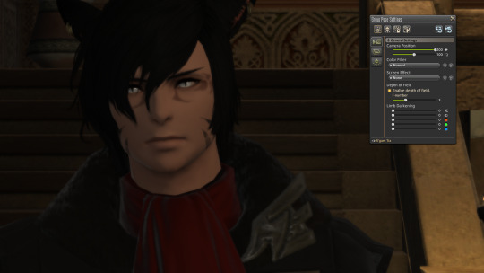
Just zooming in, we’re already looking a bit better. At least we can see his face clearly. The lamps are cut out, but I’m not crazy about that railing to the right. Still, the colors are kind of washed out, and Gael’s most striking feature is his eyes - I want to draw attention to his eyes whenever I can. So lets discuss color filters for a second.
THEY ARE MOSTLY TRASH.
I only use a few of gpose’s color filters - ever.
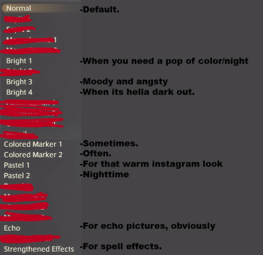
There is no official rule when some will be better than others. It depends on your subject matter, the time of day, etc. These are the only effects I use, ever. Anything thats crossed out is either never used, or used by me so little that its not even worth including on the list. I like Colored Marker 2, Pastel 1, and Pastel 2 the most. Lets try Colored Marker 2 in this picture.

Nice. It’s a subtle effect, but his eyes are brighter, the contrast is a bit higher. we’re getting closer to a more acceptable screenshot. Lets mess with the angle.

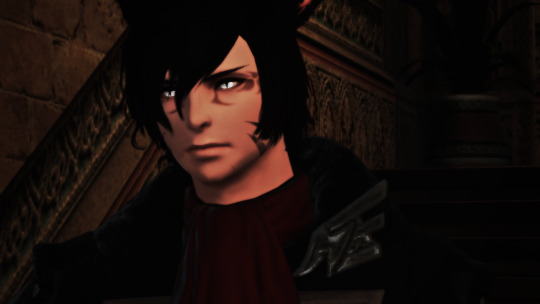
By just adjusting our camera angle a few degrees, we’ve eliminated the annoying distractions. Also note how the lines in the background are literally guiding the eye to the focal point of the image - his face. This is already looking a lot better as a portrait, but its still kind of boring to me.

This is looking better. As a portrait, this is much more expressive. His body is turned one way, but his face is looking another. The expression is unchanged technically, but there is a billion times more emotion shown here.
PROTIP: You can use the spacebar in gpose to make your character look at the “camera” in many poses - try making them look one way, then adjust the camera angle after. They dont always have to look at the camera, that gets boring.
Just look at the comparison tho.


for emphasis - I didn’t change anything the character is doing - its the same pose, in the same location, with the same expression. Lets do it again - this time I’m picking another location. Gael wears a lot of black, and I want him to stand out. I’m going to go somewhere bright - I have an apartment in the mists, so I’m going down to the beach.
Cool its raining. So since its raining. I’m gonna go for something angsty. Lets try crossing our arms and being sad. the /sad emote is a little too bitch-ish for gael - so lets try /disturbed instead. Basic standing pose, /disturbed emote, and Bright 3 for that blue and moody atmosphere.

awful. Again, dull composition. the emotion..it just doesn’t make sense. His face says sad but his body language is confident. And a bad background. Play with combining emotes and expressions. The male miqo’te /doze is my go-to for R’gael. Look at what a different this makes if you combined it with /disturbed and pause it at the beginning.

This is a MUCH more interesting pose! His head is tilted to the side, his weight is shifted to the side, his ears are tilted BACK. This body language portrays emotion much better. Its way more natural. Lets play with this.
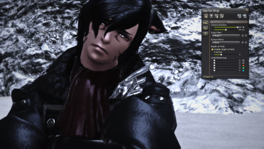
Okay, we’re head-on now. Its still not great. I can do better.
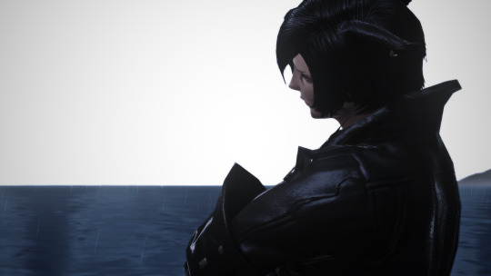
Shifting the composition to the side. by moving the camera around him - its a crisp, clean background (Though the mountain to the right is a little annoying. I would be torn about using this in a post, I feel like the mountain would bother me too much.)

Now this one I’m digging - we’re zoomed in close, its an intimate picture. It has excellent contrast against the background - we can sort of see the emotion on his face - but its concealed. We’re cropped in so close that we dont even see the top of his head - its very personal. We’re up in his shit. I like this one. I would use this.
Again, these two images are the same pose, the same face, the same filter. All thats different between them is the position and angle of the camera.
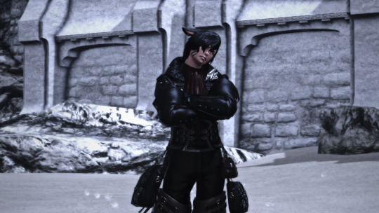
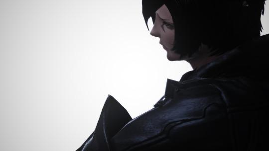
I hope this has provided a little insight into some of my process. If there is enough interest, I’ll make more “guides” like this in the future. Touching on the Rule of Thirds, Tumblr Image post composition, reshade filters, Gpose lighting/screen effects, couples, color composition, choosing locations...basically whatever people want to see lolol.
177 notes
·
View notes
Text
Honestly Seventeen’s Oh My! era had some of my favorite styling I’ve seen on them, ever. Here are my thoughts. Even though no one asked. And it’s super late now. I only included the members with outfits that stood out to me, some people’s just looked good every time.
X = credit O = performance
S.coups

I kind of dislike the hairstyle (excluding the color!) but everything else? Really good. I like the colors, his soft peachy eye shadow, the jeans + belt + baggy shirt combo. He hasn’t really been given a cute style like this in a long time so it’s really nice to see again.
Jeonghan x o

He’s my wrecker, and I was seriously feeling it here lol. Jeonghan looked so nice in this. I love the stars, and the texture they add. I love the t-shirt with the pop of red but otherwise muted colors. I love the white pops of the belt and the distressed trim of the jacket. His hair was so cute too!
Hoshi o

I couldn’t really get any good screenshots of his full outfit but I’m in love with this one so I posted it regardless. He looked so glowy, and I realized that I love earthy colors on him. I feel like the colors all really complimented each other, and his hair even added to it. The pattern of the shirt, with the little stripe detailing too, is very cool.
Woozi x o

I love this outfit. The light denim with light hair and white? It’s really fresh and matches the concept so well. I like how the zipper for example makes it look more structured and masculine, as well as the belt. So does the distress on the jeans.
DK o

I loved him in so much, it was so hard to pick. I love him in all the yellow shirts, and the sunset-colored shirt, but there’s something about this one! I love his hair like this omg.
Seungkwan x (I think this was just for his MC role rather than a performance)

Honestly, I loved so many of his outfits, so it was hard to pick. But this one is so cute. I love kimonos and was so surprised to see him in one. I like the dark blue meeting the light blue, the thin necklace, and the belt. He looked so good this era so it was really hard to pick. >.<
Dino x o

My second bias wrecker fourth bias, and again, feeling it. This here was the most superior look and I really love it. When I first saw him in this, I was so happy. The outfit itself is simple but he seems so confident in it and he looks so good?? I love the colors of the shirt, they’re so bright and summery and really make the simplicity work. The white of the T and belt is crisp, and the denim color suits this concept really well. His makeup matches his hair and it’s so cute. His hairstyle itself is also so nice?? And the jewelry is eyecatching too. Excuse me before I write more.
2 notes
·
View notes
Text
Interesting Information With Regards To Daith Earrings
These rings are a addition to my Jewelry amoire. All these are stunning and the graphics do not do justice to them. They arrived packaged in a cute box with a black bow. Safely fastened in a jewellery box. check my blog discovered was the crystal like a diamond. The gold is shining and perfect for no defects. The alloy is sleek slick, and hypoallergenic. When worn Cause me from being thick, uncomfortable or bulky ear ache. These are a bass hook for example style, therefore no pressure of the clasp. No heavy weight pulling back on my ear lobes. No downtime once they're removed at night. If I did not know better I would think that these easily originated from a designer jewellery store.

Collection of emerald earrings is waiting for you personally! Emerald is intriguing gemstone that has been discovered centuries ago and nowadays its own quality and also amazing elegance still brings folks all over the world. Extreme green color of emerald rings provides allure and unique charm into the look and tends to make them beautiful. Looking at emerald independence may be felt by us and re-member spring-time. Life, love and Attractiveness meet in emerald's green and earrings that are stunning really capture the eyecatching. Modest and big, stud and hoop, dangle and drop emerald earrings on your disposal would be together with other layouts. Luminous green of Cleopatra gemstone in order to come across your emerald rings that are perfect here. We offer you the very affordable prices for the optimal/optimally quality gold and silver silver emerald ear rings.

Contemporary and distinctive our Ruby gem rock earrings are certain to be great add-on to almost any jewelry set. Ruby is a rock rendering it best for practically any occasion and vacation season. Show her you care with a gift which will compliment her style. As always using most of our services and products that this thing comes in packaging rendering it all set for gifting as soon because it's amazing thing is brand new and comes with complimentary gift packaging suitably picked to rival the thing you purchased. The packaging ranges from dainty foam insert packaging to luxury leather insert cherry wood boxes. Every order is completely guaranteed regardless of significance. This insurance coverage protects you from damage or the loss of one's item during transit. The Transportation and Handling prices include the insurance therefore there is no requirement to pay for separately for the insurance . These earrings that are dainty and small are truly a enjoyable print font that's super cool and awesome. Pick a couple of the stud earrings for yourself or should you know somebody who'd like these, gift a pair to these! If you would prefer to or just a single letter for the two rings, Opt for a single different initial for every ear-ring! Want earrings that is likely to make a dab? All these Monogrammed Earrings would be the ideal add-on! Wear your monogram earrings in any time to put in a stunning and personal touch with your outfits! We are devoted to deliver the best products and the optimal/optimally customer services to the clients. We promise to allow it to be all right When you have an purchase issue. Every couple of earrings is handmade in my own home studio at Southern California, also each is exclusive and hand-shaped. The design on those studs had been etched in to the coating with a laser engraver. The glass has been fired from the kiln. The silver bail is glued on the rear Your earrings will likely be shipped in a cotton-lined present box. It is difficult to catch the beauty of dichroic glass at a picture. The color might not look the same also the glass may appear somewhat different than at the graphic although I try to choose the best photos possible. I figure that my motives for needing a ear-ring would be my urge reveal just a tiny design and to show optimism. The simple fact which I desired to have both my ears pierced did have no sort of inherent, profound meaning behind it was it a statement of my sexual preference or promising of any sort of team. read page with my hairstyle and three evening beard - I tried out it, liked it kept it. I remember all the bling that Oil Can Boyd wore onto the pitcher's mound. Starlight claimed it. A few folks think that guys wear earrings to highlight their individual style , or merely to accompany fashion. Below are some of the evaluations: -I didn't consider it. Pearl rings can class a pair of jeans up or may be worn with a outfit for a night in the city. A theater even a dinner or experience with good friends. The thought of supplying pearl earrings as a gift is the one which is very properly thought out since there is a pearl. A pearl for each mood is the reality. You may well be feeling dark and mysterious and desire a more pearl or playful and exciting. The combinations are infinite, and so they are going to draw style to anything you wear.
youtube
The earrings are created from sterling silver because of several advantages provided. These earrings are a favorite of women and also beautiful bits. The advantages of silver earrings studs are substantial durability or strength. It has also been made to be a strong sufficient for use in jewelry manufacturing. It is possible to likewise be assured that your silver rings will continue you. They are available to accommodate for virtually any price range. They generally cost less than gold. Incase you hadn't noticed, tassel earrings are the hottest trend taking the fashion world by storm. There are many styles to choose from. Earrings are a fun way. A pop of increasing a monochromatic look or color to a LWD. I believe tassel rings are among the accessories as they have been interesting and comfortable when wearing them. They are not too heavy, leaving your ear-lobe happy and nice. I have a hard time wearing dangling rings that are heavy and also have a small tear in my left piercing. I tend to gravitate toward lightweight chandelier earrings or studs. These coral tassel rings that were lengthy have been in my jewelry box for some time now, I really like the bright shade plus they're light like a feather! Exotic crystal earrings may alter in value from cheaper to alternatives that are expensive. It all depends upon the crystal cut, which is accuracy cut to give the ear rings light refraction that is dazzling and faceting. Crystal fittings are hence the ultimate choice since they arrive in exquisite designs and cuts. Attention along with Professional craftsmanship to detailing are , so as to ensure the piece of jewellery matches the taste of every buyer. Shop our magical selection of Austrian crystal earrings for accessories to match along with your evening and daylight ensembles.
1 note
·
View note