#and how they let you draw out elemental features from a story in new and different ways from the original
Explore tagged Tumblr posts
Text
The thing about art and storytelling is that anything is possible. I'm not convinced there's a single story out there, in any medium, that can't be adapted to another medium.
People are bringing up cartoons as an example, specifically Disney. But there's nothing inherently special about the story in a cartoon that means you can't adapt it to live action. Just because recent filmmakers have failed doesn't mean it's not easily and obviously doable; it only means that proper care wasn't taken to do it legitimately and well. Look at what they achieved in Avatar, and compare it to the laughable, decades-old CG appearance of the live action Little Mermaid. They could have made something gorgeous and spectacular.
They chose not to.
Besides that, it's one single half-hearted attempt. You can't say it can't be done unless you have hundreds of failures.
It's true you can't translate the experience of the original medium. Your live action anything is never the same as a cartoon. Your book isn't the same as an interactive computer game. They never will be. The second telling is also never going to compare to your first experience.
But that's not the point. The point and the art is to take what's meaningful about the original and develop it through different tools. It's an art for a reason. You have to understand the story and you have to know what your tools do, and you have to be committed to using your tools well.
The story you think you hate in live action already exists in a gorgeous comic, or a series of still sketches, or a flip book, or a poem, or an animatic, or a song. It's already there, successfully, in another medium. Just because a filmmaker failed doesn't mean it's not already done or that it won't be done again.
Any artist worth their salt in their chosen medium can happily prove you otherwise.
I firmly believe that some stories can never be translated into a different medium and that's okay
#something about the beauty and the power of all the artistic mediums#and how they let you draw out elemental features from a story in new and different ways from the original#all stories are malleable and fluid by their nature#you can lay them onto any medium you want#success is only a matter of skill and opinion#commentary
66K notes
·
View notes
Text
Let's Talk About Codee!

Codee is your partner who will join you as you adventure across the Lorian plane in Boundless: The Lost Scripts! He is a mysterious little boy with a connection to the strange scripts that have appeared across the land.
You'll get to know him and learn more about him in game, but I'd like to take a moment to discuss him as a character. Just like Boundless, and specifically Boundless: The Lost Scripts, Codee is a character that has seen significant changes throughout the years. Codee as a concept was created around the time that PRA became Boundless and was one of the first changes made to patch over the story gaps created by the separation of PRA from PR.
Those of you who have been around since the comic days / saw the posters in the secret room in SPR may remember the old title design:

If that didn't make it obvious enough, Scriptliss was supposed to be your partner in The Lost Scripts. TLS originated as an idea for a PR2.5, which aimed to introduce bosses and flesh out the story told in PR2. It eventually evolved into its own thing, becoming a story that still took place in between PR2 and SPR, but was something that had its own story instead of simply being a redo of an existing one. Thus, PRA:TLS was formed, which would have featured Point (the old protagonist) and Scriptliss adventuring through the 'Dreaming World', a mirror dimension to the 'Waking World' which was where PR2/SPR took place. You can read the unfinished comic to get an idea of how things were going to go.
I can discuss more about PRA:TLS's original storyline once Boundless: The Lost Scripts is more complete, but for now I'll have to hold off since it would be spoilers.
As the title suggests, though, even at this point, the story featured mysterious scripts scattered across the land which our heroes would journey to collect. As far as I can remember this was purely based on the 'script' part in Scriptliss's name, as he actually isn't associated with scripts or coding in PR canon (the mistakes are just magical crumpled paper balls after all...)
But, back to the point at hand, Codee. When the split occurred, suddenly, there was no partner! At this point, the framework of The Lost Script's storyline was established. There was a villain named Error and his henchmen using the scripts for their own nefarious goals. With the code element well established, I decided to lean into it and create a code based partner!

And thus, Viro was born! These are some of the very first drawings of the character that would eventually become Codee, all the way back in 2018. Originally named Viro (Virtual Hero) the name would almost immediately switch to Codee, which was a name being considered simultaneously.

(Yellow use to be the frightened color! Now it's the joyful one. The new frightened color is purple.)
The scarf and the color changing gimmick have been around from the very start, but as you can see, Codee has gone through quite a bit of development from his early days.


Just like with Page, I aimed to make his design more original but was still keeping to the same general elements of his design: A striped shirt, black pants, big scarf, and a tuft of hair. This is the design he had all the way back in the Unity phase of development, and the one that would have been known this entire time had tumblr not rejected the gif I planned to use for his reveal. Boundless would continue to develop, and it wouldn't be for another three years until his design would receive another major update.

(Look at the size of that noggin...)
In 2021, he achieved a critical development point: The Action Pajamas. I wanted to make him seem less like an ordinary (albeit color changing) boy and more like something that seemed otherworldly and out of place at first glance. He still kept his color changing gimmick, but it was planned that whenever he'd use his special powers, golden accents would appear on his clothes. I liked the blue and gold so much I ended up just making the gold bits a constant part of his design in the end.

(These were drawn on an ipad! I didn't realize I had the canvas rotated...which is why some of them are at an angle, whoops!)
Wanting to push his design further and make him something even more special, I wanted to make him cuter and give him a motif. Specifically, a bug motif! In case it wasn't clear yet, Codee's design is actually based on a firefly! This decision will hopefully make more sense once more details are revealed.
I played around with his proportions and his design, trying to give his action pajamas more of a space suit vibe along the way. After a bit more refinement, Codee ended up with the design you see today!

He's come far from his initial design, but at the same time, his original essence is still there, now fully reborn into something new and original the way the series has been as well.
Touching back upon his role in Boundless compared to the original partner role in PRA; despite filling the same role Codee is not meant to be nor is he written in the way I would have written Scriptliss for PRA (yes, I'd be willing to discuss my approach to Scriptliss's character as I remember it, but later!). His characterization as well as his relationship with Page is completely different than it would have been between Point and Scriptliss in the original draft of PRA. Codee is no Scriptliss, sure, but he is an original being that allowed me to create an even richer and more involved story not just for him but for Boundless as a whole. I can safely say Boundless far exceeds the story and world I could have ever created for PRA while working under the original series' limitations. Codee is dearly beloved by me, and I hope everyone will come to love him as well once you get to know him!
Thank you for reading this far, and as always, if you have comments or questions, the inbox is always open!
17 notes
·
View notes
Text
Fake Scenarios In My Head #32
Casey gave herself one last look in the mirror, feeling a mix of confidence and nerves as she adjusted her posture and smoothed the perfectly tailored suit. The jacket hugged her shoulders just right, and the crisp white shirt underneath made everything pop more than she’d expected. But the tie—well, that was another story. She had fussed with it endlessly, turning and adjusting it, but somehow it still hung a bit crooked. With a frustrated sigh, she was about to leave it as it was when she felt a gentle touch on her back and the familiar warmth of Alex beside her.
Her gaze lingered on Casey’s reflection for a long moment, and a small smile crept across her lips as she took in the sight of her usually laid-back girlfriend looking slightly—and very charmingly—out of her element.
“You really went all out tonight, didn’t you?” she teased. Her tone was playful, but there was an edge of warmth to it, a look in her eyes that told Casey she liked what she saw.
Casey gave a small, self-conscious smile. “I figured… why not mix it up a bit? Try something new. What do you think?” She met her gaze in the mirror, a hint of nerves in her expression.
“It looks good on you,” she murmured, her voice softer, a note of something deeper threading through her words. “Very… compelling.”
She stepped in close, her hand resting softly on her girlfriend’s shoulder before she moved between her and the mirror. She gently brushed Casey’s fingers away from the tie. “Let me,” Alex murmured, her eyes focused as she undid the knot Casey had tried to make, carefully straightening the fabric. Casey’s heart skipped a beat at the calm assurance of Alex’s hands, the way she adjusted the ends with such precise, practiced movements.
Casey could barely breathe as Alex finished the knot, concentrating in a way that made her cheeks flush. Once the tie was perfectly centered, Alex gave a small tug, then smoothed it down with her hand, her fingers lingering just a moment longer than necessary before she looked up, a sweet smile on her lips.
“Where did you learn to do that?” Casey asked, her voice barely above a whisper, laced with curiosity and something more.
A hint of nostalgia softened Alex’s features, and she smiled, her fingers still absently tracing the tie’s edges. “I used to watch my mother fix my father’s tie every morning before he left for work,” she said quietly, her gaze dropping to her hands. “She would do this exact thing—adjust it, make sure it was perfect, then give him a little kiss before he went out the door.” She looked up, her eyes meeting Casey’s, a gentle warmth in her gaze. “It’s one of my favorite memories of them together. It always felt like… an unspoken promise.”
“I think I like this tie thing, then,” she murmured, her lips curving into a soft smile.
Alex’s eyes gleamed with something mischievous, her hand tugging gently on the tie, pulling Casey just a bit closer so that their faces were inches apart. “Oh, I think I like it too,” Alex replied, her voice low and teasing. Her gaze trailed down, taking in the way the tie framed Casey’s collar, the slight flush in her cheeks. She let her hand wander slowly down to the end of the tie, fingers curling around the fabric, giving it a playful tug.
Casey raised an eyebrow, catching the glint in Alex’s eyes. “Something on your mind, Counselor?”
“Plenty,” Alex said, her tone both sultry and amused. “And all of them involve this.” She gave the tie another light pull, drawing Casey so close she could feel the warmth of her breath.
Casey’s breath hitched as another shiver ran down her spine. She held Alex’s gaze, and it was clear just how much this new look affected her. “You know,” she murmured, “I think this tie might come in handy later on tonight.”
Alex’s laugh was warm as she gave the tie one last, lingering tug before she finally let it go, stepping back to admire the full effect. The playful glint in her eyes deepened as she flashed Casey a flirtatious smile, her expression a mix of admiration and desire. “And yes,” she replied, her voice laced with promise, “that tie is definitely going to come in handy later.”
38 notes
·
View notes
Text
holy shit this year marks 10 years of this blog and moz!! i can't remember the exact date i started posting here - my archive says i have one post from november 2013 but let's disregard that - but i do remember it was around late 2014/early 2015 :)
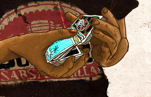
^ one of the very first moz art pieces i ever drew, for fallout week 2015!!
memories and art through the years under a read more bc it got long
2014 → baby's first rpg!! i started playing fnv on my cousin's jailbroken xbox late 2013 and finished mid 2014 and i loved every minute of it. i remember waking up at 8am and playing almost nonstop until 2am the next day haha!
i didn't play moz on my first playthrough - but i did start creating a character that would eventually become her: a shorthaired ex-boxer who punched her way through obstacles when diplomacy failed. i remember she spent a lot of time with boone. i liked him then, because he saved my ass more times than i can count. but i digress. this is draft 1 moz essentially
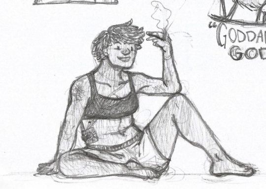
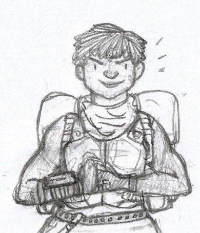
2015 → this is the year that i was doing my thesis so i could graduate but i was so depressed and stressed about it that i distracted myself by replaying fnv on pc, where i played through the dlcs for the first time. i fell in love with the dlcs' oversarching story; particularly ulysses, who i became obssessed with, especially since i couldn't find any content of him at the time. in the game, i played as moz; i had most of her personality and choices down, but her backstory was still up in the air.
fun fact: this was an existing sideblog that i remade to be a fallout blog so i could look for ulysses content, and when i couldn't find any, i made some myself, featuring moz as my main courier six. originally, i didn't ship them, but eventually i ended the year as a courier/ulysses otp shipper.
this was the year i started drawing digitally - my uncle let me borrow a drawing tablet and i used an old copy of photoshop i pirated hehe
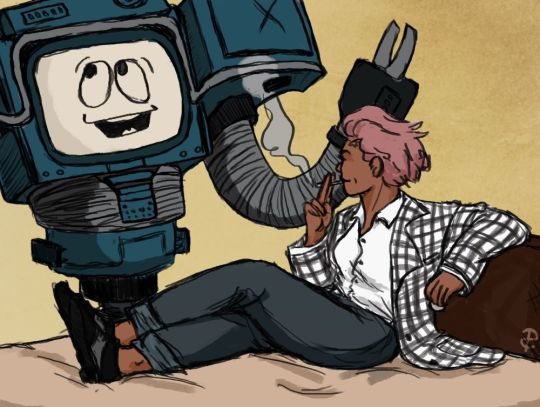
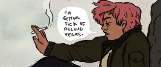
2016 → i graduated this year!! and promptly fell deeper into my depression. this was the year that it got so bad that i had to be medicated. through it all, this blog and moz and ulysses and my fandom friends were with me. and for that i am truly grateful :) this was the year i figured out how to lock transparent pixels so that i could color my lineart lol
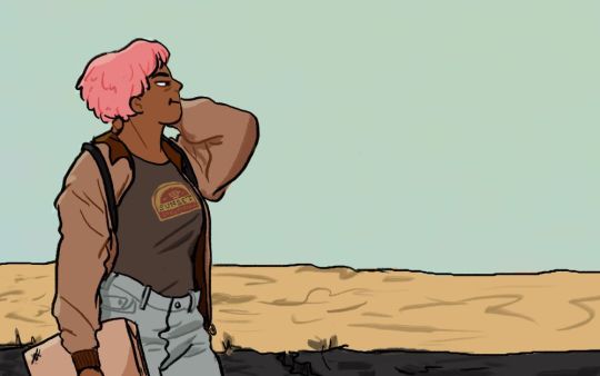
2017 → i started hammering out moz's backstory this year i think. there's a lot of sketches of her and her family in my files. i experimented with shading and backgrounds here but that experimentation was pretty short-lived
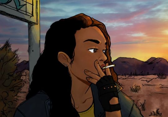
2018 → i started using references seriously!!!! i did a lot of oc on oc kissing this year, featuring mostly moz and many friend ocs haha

2019 → didn't draw much this year. actually this year was a blur and i can't remember much from it except from it being the year of my terrible no good bad copywriting jobs... anyway i did manage to continue my courier/ulysses brainrot and make this piece, which i'm still proud of
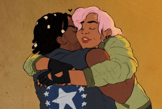
2020 → pandemic time. i spent a lot of time asleep at home and i think this was also the year i started doing commissions?? shoutout to anyone who has ever commissioned me - thank you so much, i truly appreciate it!!

2021 → i switched from my old-ass pirated photoshop to clip studio paint and never looked back. also i did a bunch of commissions for my grandmother's surgery, which failed, and i distracted myself from the sadness by drawing my ocs over and over and playing disco elysium

2022 → by this year, i've got moz down pat and have started vaguely developing other ocs instead. but she's still always at the back of my mind

2023 → i bought new brushes from true grit texture supply and immediately found new favorites that i started using for everything. i tentatively started incorporating background elements in some pieces!
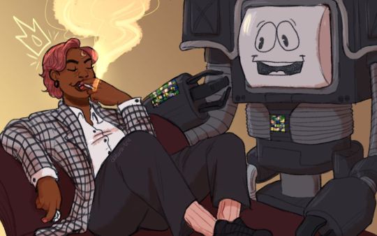
2024 → while it's still too early to say where this year will lead me art-wise, i will say that i started experimenting in realistic paint studio (which i bought in 2021, the same time as clip studio paint) a few days ago and i'm liking the results so far. we'll see!

all in all, these last 10 years have been quite a ride, but i'm glad i stuck around and i'm glad you guys stuck around too!! much much love 💖💖💖
#shh peri shhh#god. look at that old art... i took the ones that i still kinda liked but the rest...#well i don't hate them. but they're old and of their time and i wish i could redo them lmao#my art#moz
96 notes
·
View notes
Note
ik there are in-canon reasons for wolfgang's missing finger, and this may tie into things as well, but i'm curious as to if you had a reason for choosing the left ring finger specifically? i got to wondering what with that being the finger wedding rings are commonly worn on in western cultures (? but also i know there's cultural variation w that so i'm not sure lol)
i always get your asks literally the minute i get ready to go to bed---
but yeah you are right on the money with where your mind went with it! the left ringfinger is very much tied to the institution of straight marriage, particularly for me its role in history in the west and the way women were treated as property to be exchanged between men. in broad strokes it serves as a signifier of a binding vow, in even broader strokes it's conforming/assimilating to the state/church.
these themes are core to who Wolfgang was and the setting in general; commodification of bodies, being bound to someone else's will and treated as a property to be used and discarded.
going back to the point about the missing finger in-universe, i like to hint at things and let people wonder about it until, if ever, it comes up in a scene and Wolfgang themself is not too keen to talk about what led to that happening. the symbolism is there to hopefully communicate they broke out of something that was "until death do us part". not marriage in a traditional sort of sense, but they were bound to an institution as a tool and later that same binding was used to trap them. the only way out was to cut it off, which in turn in the eyes of civilized society TM forever marks them negatively. a little bit of a caged animal gnawing off their own foot to escape. ...and from the meta perspective, well one day i drew them without the finger on a whim and then i was like hm! and it became a permanent part of their design. iirc this old sketch is that first time 🙈
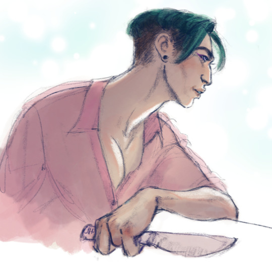
if my twitter wasn't fully cleaned out, there would be some older art out there possibly without some features i now consider distinct and important part of their design but so it goes, such is the process!
tanget incoming, but i tend to design characters with the method of "throw stuff in there that feels interesting to draw and see what sticks over time" and don't hold myself too close to the original design until i feel like it's "settled". so there's a lot of development they go thru over time.
for example here are some initial explorations of a new iteration of Bastien from very early 2023 i think. i had some ideas i started to throw on the board without having any solid clue of why its there, like all the scars on his face or the starburst of a bullet hole scar on his shoulder. then these elements would either reveal their importance (-ie the nike swoop from Wolfgang cutting his face when they first met) or they would fade out. OR secret third option, which i enjoy a lot, eventually some of these design elements come back in the future for story relevant reasons that weren't there at first (like he gets the cut over his nose waaaay later, after essentially being kidnapped, held hostage as bait and beaten by the people looking for Wolf see here and here )
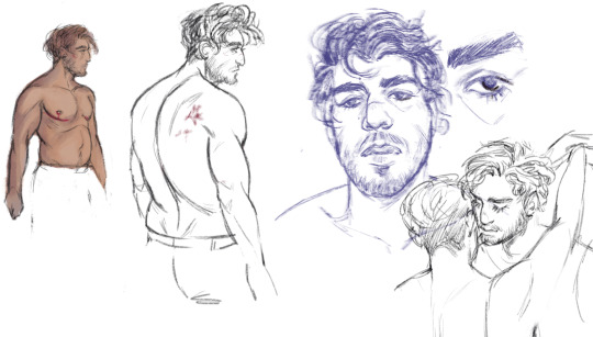
funny to see how much immediately changed about his face and body and proportions etc between this and his current design, but MAN i got that sad profile down in one good sketch lmao
#thank u for asking !!!#enjoy these babby sketches#i say a new iteration of Bastien because theres another older version of him from 2018 that i dont think anybody has ever seen#answered#ramble#i dont know if this is what you wanted to know but here it is nonetheless
9 notes
·
View notes
Text
Masterpieces in Pixels: The Best of Digital Photo Artwork
When Technology Meets Imagination
Once, the masterpiece was born of brush and canvas. Today, some of the world's most breathtaking compositions begin with a stylus and screen. Welcome to the world of digital art painting, where creativity knows that there is no limit and pixels do not become poetry.
This article is a celebration of the digital renaissance - showing iconic digital photo artifacts, spotting impressive artists, and revealing how the technique is changing the visual stories.
The Rise of Digital Art: A New Chapter in Art History
The development of art has always been powered by equipment—stone, charcoal, oil, and acrylic. The digital era brought a new set of devices: graphic tablets, photo-editing software, and 3D rendering engines.

Why Digital Art Painting Deserves the Spotlight
Critics once rejected digital art as "less real," but the world of art has moved. Today, digital photo artwork is displayed in major galleries, collected as NFTs, and used in gaming, film, fashion, and advertising.
Here’s what makes it stand out:
Versatility: From photorealism to essence, digital equipment suits every style.
Efficiency: Premous, again, and layers use the experiment risk-free.
Exception: Artists worldwide can cooperate, share, and sell their work.
Digital Masterpieces That Inspire
Let's dive into some standout examples that show the emotional and technical depth of digital art painting.
1. “Portrait of the Future�� by Artgerm
A hyper-detailed science-fiction portrait that mixes Eastern aesthetics with the Western comic book effect. The signature of the artgerm is possible with the work of the complex layer in Photoshop.
2. “City of Light” by Beeple
One of the most famous digital artists of our time creates a dystopian world with quality like Bipal cinema. Their daily rendering leads the boundaries of digital storytelling.
3. “Dreams in Bloom” by Ross Tran
This colorful, chaotic, and joyful piece shows how digital equipment can reflect an artist's personality. Ross's bold brushstrokes and unique character design make their work immediately recognizable.
Behind the Scenes: How Digital Art Paintings Are Created
Creating a digital work includes more than just software. It is a process filled with vision, technology, and story.
Step-by-step Process:
Sketching the concept —just like traditional art.
Blocking in shapes and color —using layers for flexibility.
Adding depth and lighting—digital brushes simulate texture and light.
Refining details—highlights, shadows, effects, and final polish.

Meet the Masters: Influential Digital Artists
Loish (Lois van Baarle)
Known for its dreamy characters and expressive brushwork, depiction and animation of bridges in a vibrant digital style.
Feng Zhu
Concept artist for games like Star Wars and Transformers, Feng brings cinematic flair to every digital stroke.
Magdalena Pagowska
Their fantasy-themed digital photo artifacts featured a mixture of realism and imagination, often accompanied by ethereal light and flowing texture.
How to Appreciate Digital Art
It is not certain how to read digital paintings. Here are things to see:
Brush technique: Is it painterly, smooth, or textured?
Lighting: Does it evoke a mood?
Composition: How are the elements balanced?
Emotion: What story is it telling?
Digital does not mean. In fact, with repetition and the ability to use it, digital art often captures deep emotional nuances.
Getting Started: Become a Digital Creator Yourself
Inspired? You can try your hand at digital art painting even as a beginner. Here’s how:
Beginner Tools: Try free apps like Krita or use an iPad with Procreate.
Learn the Basics: Study traditional drawing—digital is just a new medium.
Take Courses: Platforms like Skillshare, Udemy, and YouTube are goldmines.
Join the Community: Reddit, ArtStation, and Discord groups provide support and feedback.
The best way to improve? Just keep creating. Even the best artists started with stick figures.
The Digital Canvas: What's Next?
Technology leads the limits of creativity.
AI-assisted painting tools are helping artists generate ideas faster.
Augmented and virtual reality art is becoming more interactive.
NFTs and blockchain have created new art markets and collector experiences.

Celebrating Creativity in the Digital Age
Digital art painting is proof that artistry is not limited by medium. Whether it is painted on a canvas or prepared on a tablet, what matters is the story that tells it, and it is a feeling.
In Pixel, these works reflect the same passion, technology, and surprise that are hanging any oil painting in a museum. So next time you see a digital artwork, look closely - you can gaze into the future of art.
4 notes
·
View notes
Text
'...Stuart McIntyre's video for the title track of the new Sam Fender album has a lot in common with previous Fender videos - and one important difference.
The singer-songwriter's anthemic songs tends to inspire visuals that are big cinematic experiences, with a strong emotional core. McIntyre's promo for People Watching follows that pattern, and then adds a special ingredient: the main protagonist happens to be played by one of the world's best screen actors.
In various roles - from Sherlock to Fleabag to All Of Us Strangers to Ripley - Andrew Scott has been a mesmerising presence. In the People Watching video he brings his trademark intensity, and compelling ambiguity, to his role as an apparently rootless character, drifting through small-town America, engaging in a series of brief encounters along the way. But this time he burns up the screen without a word of dialogue.
As the song reaches its crescendo, McIntyre brings in other elements, flashbacks to the past - the home movie footage of a young boy, and a sick woman in bed - into a bravura sequence where the Scott character is overwhelmed by their emotional turmoil. It's a remarkable, transcendent moment to express the potentially crippling impact of grief.
In fact, bereavement runs through the course of the project. It inspired Fender's song, and as Stuart McIntyre explains, it has affected both himself and Andrew Scott in recent times...
Can you tell us a bit more about how Andrew Scott became attached to the project?
SM: Andrew came on board after we were greenlit. I don’t know the exact details of how the label reached out, but my understanding is that Andrew was already a fan of Sam’s work. However, it was the song itself that truly resonated with him. Having recently lost his mother, its themes of grief and remembrance felt deeply personal, and he may have seen an opportunity to explore those emotions through the film.
That personal connection brought an unforgettable authenticity to his performance, making this collaboration all the more meaningful for everyone.
Was there a lot of discussion between yourself and Andrew about his character before the shoot?
SM: Andrew and I spoke at length about the character - before the shoot and throughout. His motivations, his grief, his quiet longing. But more than that, we talked about our own experiences.
One idea that resonated deeply with both of us was how this character is always reaching - for touch, for connection, for something to hold onto. Whether through hugs, holding hands, even through conflict, he’s grasping for something just beyond his reach. Trying to fill a void. Trying to tether himself to the world. That ache sits inside him, unspoken but ever-present.
But the real turning point came when Andrew shared a sketch he had drawn of his mother. The moment I saw it, I knew - that was the heart of the film. That was what he had been chasing all along. Throughout the story, we see him sketching, but we never quite see what he’s drawing, until the very end. That realization gave everything a deeper weight, an emotional throughline that felt inevitable.
It must be said, Andrew gave a lot to this film. More than I could have ever asked for. He allowed himself to be vulnerable, to let the camera see him. That kind of bravery doesn’t happen without trust. And for me, for all of us on set, it was essential to create a space where he felt safe enough to let go, to explore, to give himself fully to the moment.
And you feel it. In every glance, in every silence, in every flicker of his eyes—there’s something raw, something searching. A longing that never quite finds its answer. It’s beautiful. It’s heartbreaking. I’m so grateful.
And did you have much (or any) direct communication with Sam Fender during the process? If so, at which point did he make a valuable contribution?
SM: I didn’t have the chance to speak directly with Sam, but I collaborated closely with creative director, Semera Khan, whose insights became a guiding force in shaping the film’s heart. She shared Sam’s vision, his hopes for the piece, and, most importantly, the weight of the song’s meaning - the love and grief intertwined in his tribute to Annie Orwin, his godma.
Sam’s presence was profoundly felt through Samera’s guidance, in every note of the song, and in the raw emotion he infused into it.
From our very first conversation with Andrew, we kept returning to grief, loss, and the delicate responsibility of honouring those we’ve lost. But this wasn’t merely about telling a story. It was about capturing something unspoken, something that belonged to Sam and Annie yet resonated with all of us. Everyone on set carried their own experiences of loss, their own quiet understanding of its weight. That shared knowing united us, urging us to create something honest, something that mattered.
Since its release, I’ve been overwhelmed by messages from people navigating their own grief, sharing how this film has touched them. It’s a profound reminder of why we create—to connect, to console, and to remind each other that we don’t bear our grief alone.
I’m incredibly proud to have helped bring this story to life, to have crafted something that lingers beyond the screen.'
3 notes
·
View notes
Text
Pygmalion and Galatea Tarot Pick a Pile
In the Greek myth of Pygmalion and his sculpture Galatea who through divine intervention becomes a real woman, we are presented with an artist king of Cyprus who has spurned love, women, and desire for companionship. Completely turned off by the women of his country he decided that he would never marry or find love. However, depending upon the version of the myth he either creates or is given a statue of such beauty that he calls upon the Goddess of Love, and the patron of his island to bring him a wife that is of equal beauty, having found that he wants to have a companion just like her. Aphrodite turns the statue into a person and the two get married and have a daughter.

Photo by Quino Al on Unsplash
Like all Greek myths this myth has many iterations, but they all follow a similar theme even if some elements change. One element that has been added over time is naming the statue. In the myth, the statue isn't named, but over time we have given her the same name as a nymph who is the unrequited love of Polyphemus. Galatea means "Milky White" which would be the color of the marble she would have been sculpted out of. Another key feature is that Pygmalion decides he no longer wants the type of love that the women of Cyprus are willing to give. He finds them depraved. This has been read in many ways and all are valid. Misogyny, that he only wants a woman who can't speak to him, or he is a misogynist who learned the error of his ways and wants companionship from women at the end. Or another form of narcissism, the artist who can only love something that is a reflection of himself.
While all those are valid interpretations of the myth. I'd like to explore the story in a different way. Aphrodite is a goddess of Love and Beauty. Pygmalion lived on Cyprus, her home island and he shunned love and the rest of his people on the island to create his statues. He created his own beauty because he decided the people were too ugly and vulgar. The statue of Galatea is often a divine inspiration, not something he decided to create but something that is created in a manic drive. He falls in love with the statue's beauty and asks Aphrodite to bring him a wife as beautiful as the statue. In the end, the statue is brought to life and he marries Galatea and has a daughter with her, rejoining his community. How many of us turn away from everyone and everything when we decide that things have turned too ugly for us to face. To me, this can also be interpreted as a story of facing the fear of the ugliness of the world to accept the truth of the beauty that is also found in it. Because we can't lock ourselves away, no matter how badly we want to.
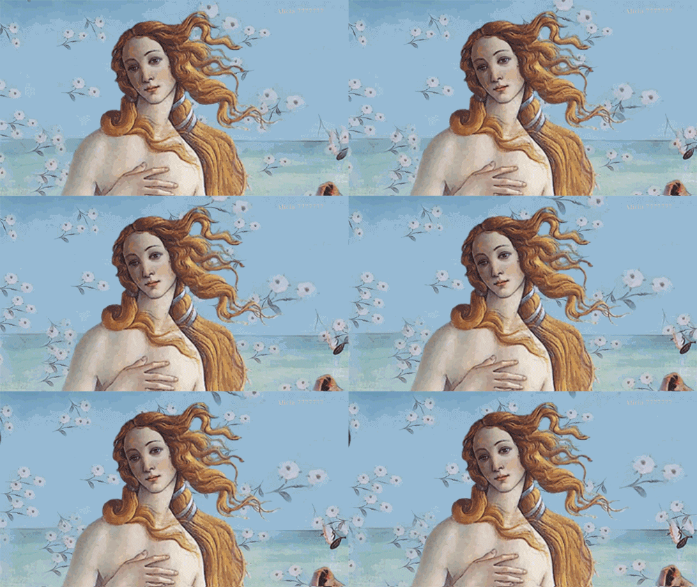
I know that this is a bit of a more positive spin than a lot of the interpretations you might encounter, but I am not a Greek mythology scholar. Just someone who has fun with literary interpretations and tarot readings. So I will also do a tarot draw today based on this interpretation of this story. Today we are going to do a three-card reading of what fear you need to let go of, what it is you need to help you succeed, the guiding muse on this path
Pick one of the three images of Pygmalion and Galatea and your reading will be below
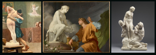
1. Pygmalion and Galatea by Jean Leon Gerome(1824-1904)
Two of Wands, Page of Swords, Six of Wands
You have a fear of making a big decision that could push you further ahead toward a big reward or some type of goal that is outside your comfort zone. Making changes is difficult, scary, and change can be hard to process. But without necessary change there can be no growth, without taking risks there can be no rewards. What can help you process your fear and the thing you need to focus on is all your exciting new ideas and all the amazing new adventures that can be had if you do take that risk. Sometimes it can help to try to look at something with fresh eyes and from a different angle or even seek out advice from someone who might not have the same level of investment or experience to get a whole new perspective on your situation to help you reframe everything and overcome the fear you are experiencing that is stopping you from moving forward. Your guiding muse is knowing the type of recognition and acclaim you will receive at the end of this process. You will be celebrated for the work you have put in and that fuels you to continue on.
2. Pygmalion in love with his statue by Jean-Baptiste Regnault(1754-1829)
Eight of Swords, Eight of Cups, Ace of Wands
Your fear is consuming you with negative thoughts. It is like you have been caught up in life's game and you are nothing but a pawn to be played with. Just a piece to be cast aside or sacrificed when it is useful. The fear of catastrophe is crippling you and keeping you from living your life to its fullest. You need to let go of everything that isn't serving you and move on from it. Whether it is a relationship, a job, or a project, the Eight of Cups is calling you to move on. It can be hard, but the negativity of the situation could be contributing to the catastrophic thinking and world outlook you are having difficulty escaping from. Look to your muse which could be anything from a new opportunity to something new that entered your life that is bringing a spark of inspiration, and open yourself up to new passions and inspirations in both the physical, emotional, and spiritual realms.
3. Porcelain Group of Pygmalion and Galatea by Etienne-Maurice Falconete (1716-1719)
Five of Cups, Six of Pentacles, King of Pentacles
The fear that plagues you is that you might be a disappointment, that your actions might cause you regret, or that your endeavors might end it a total failure. This fear of disappointing those around you or disappointing yourself causes you to not act, or to not be as open as you might want to be. However, it is important to remember how much you have to give, and how much people appreciate you and what you do for them. You have a lot to offer, even if it doesn't feel like much to you, or it feels inadequate. Utilize your guiding muse here and have confidence in your knowledge and abilities. You are successful and have a proven track record. People trust you and when you make mistakes and own them people trust you more. If you are feeling unstable, look to someone who embodies the qualities you also want to bring into the world, it will help be a beacon for you.
Thank you all for reading my Greek myth interpretation and then the tarot readings. I've been trying to combine the things I love in different ways and I hope you all enjoy it too!
Please share any info or any of your favorite myths from anywhere with me or any of your favorite divination or witchy stuff. I love learning about things.
#tarot#tarotblr#witchcraft#witchblr#greek myth#greek mythology#pick a pile#just for fun#pick a picture#divination#pygmalion#pygmalion and galatea
8 notes
·
View notes
Text
someone i follow posting about pokemon got me thinking about it again so im just gonna make my own post. but like. personally? im so bored of playing pokemon. now i say this as someone whose first mainline game was sun/moon, but i find every time i pick up a pokemon game, i play it for maybe a month or two and then get bored and drop it again before i can even finish it. i own plenty of pokemon games but have only beat i think two. see the thing with it is i love the concept of pokemon - collecting creatures, battling with them and evolving them - but the gameplay and the repeated narrative formula are what im tired of.
i think what pokemon needs to draw me back in for real is to do a TOTAL refresh. clean the slate of pokemon and introduce new ones without bringing any back (except MAYBE a few like the obvious pikachu), have a whole new narrative, please no gyms this time but im ok with defeating bad guys; maybe even rework the battle system a little, have a way to level up mons that's not tedious and maybe even fun, have more ways to INTERACT with your mons oh my god. honestly just combine elements of pokemon interaction from the past 3 gens. i want to pet AND feed AND wash AND play with them. AND more character customization. especially body type and facial features for the love of fuck. and let us dress up our mons too that would be fun. it can be purely cosmetic. let my starter wear a little hat in battle. i would also love to see more prominent personalities in mons?? imagine if they had different behaviors based on their personalities instead of it just affecting stats.
actually, they dont need to nix gyms entirely, but i'd prefer they not be REQUIRED for progression. like i like how the last gen had the 3 different paths but you kinda had to do all of them for the story, right? i like the idea of having different options for doing things with your pokemon, but i think the best way to execute it is to have the player choose which one they want to mainly pursue and make the rest optional. like how some gens had pokemon contests but they weren't required for progress like gyms. i'd say keep gyms, bring back contests, maybe throw 1-3 more options in (one of those could be filling out the dex), have the player choose one to focus on to track progression while they work through whatever the main story is.
just, i want them to make it NEW, and make it FUN. i think their first mistake was choosing to repeat the basic plot structure of the first games anyway
(alternative idea though: pokemon game that involves traveling the WHOLE world. visiting ALL the regions instead of being contained in one. imagine that)
#game freak should hire me. i can be their ideas guy#30 bucks per one idea. no less#would love to make my own creature collector game but im not super interested in being a game dev
6 notes
·
View notes
Note
ask on anon bc side blog. sorry advance dont words good okay to delete no understand
hi! saw one of your mr robot posts mention hot carla and the book. love love love red wheelbarrow book wondering if you have any thing to share you like from reading it. puzzle fun and seeing burn not actually burn writing but printing words. love love love that! also how elliot / mastermind / how ever he call himself, write about mr robot. good book
I am sad that I did not get a physical copy of the book we listened to the audiobook narrated by a trans actress playing Hot Carla and reading her red ink inserts as asides. She does a phenomenal job, especially in the parts where her commentary is displaying empathy for Elliot's situation.
But as we did not have a physical copy I was unable to participate in the ARG elements of the book but I have seen scans of the puzzles and I appreciate that the show was kind enough to put solutions to some of the ciphers in episode 11 of season 2.
I adored the little things like how Elliot and Mr Robot's handwriting shifted when Elliot was starting to get into a rant during the FUCK SOCIETY pages.
The thing I liked most about the book was just getting a feel for the little nuances of Elliot's prison life. Leon working at the library and getting to learn more about the shows he watched before reaching Sienfeld or having Elliot react to the news of what Darlene and FSociety are doing while he's incarcerated. I understand the Prince of Thieves moment in Time Square could have been expensive to shoot if it were in the show but I do like the color it added to Darlene's character, particularly during her short time as the leader of a misguided revolutionary group.
I also appreciate how much we got to learn about Magda during the book. She is not really featured that much in the show proper. I am pretty sure the imaginary version of her in Elliot's mind (and in the prison) get more screen time and personality than the actual woman herself. The story with the cat really helps paint Darlene's "Moth to the Flame" moment as well as the previous episode's declaration that being kidnapped was her happiest childhood memory.
If I have one complaint though it's that Hot Carla was effectively used as a tool for Elliot's quest for justice and redemption. The only reason it doesn't ruin the book for me is that I respect the absolute terror that went into Elliot giving her the journal to read and the fact that we are reading it by way of Carla's forgiving him for endangering her.
Elliot was an absolute idiot for what he did but Carla found it in her to forgive him despite how horrible the consequences of his noble intentions were. But that's the show in a nutshell, isn't it? Elliot can't action his way out of his problems and outsource them. Season 2 is too early for him to have learned that lesson, though.
I suppose another complaint is that I did not enjoy how juvenile and vulgar Mr Robot was with his drawing dicks all over the journal. I never viewed him as that immature in the show. He's abrasive and an standoffish arsehole for certain but he is not a teenager...
Well. Except in the "child's idea of an adult" kind of way, but I just don't see him being the dicksdicksdicks guy.
I guess it stands out more when the drawings are detailed by Carla describing them.
Anyway, it's a fantastic addition to the show and though it's not mandatory reading by any stretch, it gives us more Leon and lets us see more of Elliot and Mr Robot's inner workings which is always a win in my book.
5 notes
·
View notes
Text
October 2023 Wrapup
Dread Month draws to a close! The spookiest of nights, the dawn of the dead, the uh, thing! We shed our shackles and dance in our bones, and tomorrow, go about the business of being people, once again, sloughing out into the drawing heat and the growing, burning, hateful light of a sun that resents us and we celebrate in spite of it. You know, the normal and natural way everyone relates to this time of the year.
Alright, let’s do the Game Pile articles!
Don’t Go In There, a dice chucker board game made in a charming dice tower
Backwater, a really interesting TTRPG about a post-apocalyptic vision of the parts of America that are allowed to stay permanently soggy
Phantom Ink, a hidden information ghosty game in the vein of Mysterium
Carrion, a video recreation of one of my favourite articles to read aloud from 2020
Then there’s the Story Pile!
Bloodthirsty Hearts, a fiction podcast about queer girls fighting gargoyle vampires at a convention in which they learn the valuable lessons that all systems of privilege and power aren’t as important as talking to your gay crush.
The Lighthouse, a black and white movie about what enters you when you take yourself far away from everything and empty yourself.
Jujutsu Kaisen, spoiler-free, a contextualising post about how a great Shounen Battle Anime with horror elements make the idea of shounen anime nonsense.
John Carpenter’s Halloween, from 1978, a movie that is both way better than I expected, and full of all sorts of deliberate choices that people seem to replicate for no good reasons.
Willy’s Wonderland, which is, unironically a Five Nights At Freddies fan movie made by Nicolas Cage in a month and really quite good!
This month also featured a somewhat bumper load of D&D content. First, I did some worldbuilding for Cobrin’Seil, both in revealing a new location, Uxaion, which is a necrocybermagepunk city. It’s an adventure city where you can contend with economic harm and threats, and where you can also just murder your way through cops that only respect the utility of your body as a potential undead – it’s a place for wight privilege. Then I also presented the player backgrounds for characters you could make from the Szudetken province. Along with that, I made an article about Evil Gods, and the antisemitism built into the framework of the D&D Lich, and since I was just in the territory, I made fun of the 4e D&D Vampire character class, even though I think it’s a great idea. Then, in this month’s How To Be article, where I got to hold high Harrowhark Nonagesimus, drowned sad vomiting goth of the Locked Tomb franchise, I also gave a long-form discussion of how to translate a prominent, small-cast character’s vibes in a team based game.
Up here, there’s also room to talk about an OC, Z3R0, and about the ongoing, relentless onslaught of capitalism in the creation of more than half of all valid Commander cards in the past five years.
This being October, I once again did a set of Dread Readings. I know that a lot of my friends have never partaken of a lot of classic, historically important horror media. At first, Dread Readings were Lovecraft Stories, trying to make the difficult readings of his old texts into something more approachable. Then, the year after, I started picking up short stories from other, equally classic horror material that could help – in my opinion – familiarise people with different kinds of horror that you know, didn’t just continue being Lovecraft.
This year, the four Dread Readings are:
HP Lovecraft’s The Thing On The Doorstep, which I bring up as the time Lovecraft dabbled in issues of gender.
A chapter excerpt from Kenneth Grahame’s The Wind In The Willows, in which Mole and Rat meet the Horned King, a totally normal thing to randomly have in an otherwise pretty Christian book!
Destiny’s No Rez For The Weary, a lore tab entry from a videogame. I liked it because it’s horror in a science fantasy space that isn’t
Paul Jenning’s Granddad’s Gifts, a haunting story from an Australian kid’s author. This is a story I really like as an example of horror used to a different romantic effect than just fear.
It wouldn’t be October, the ongoing Dread Month, without some real downer articles. Do you want to read me being a huge downer? No? Okay, well, here are links anyway. I wrote about the Silent Hill Wiki Circumcision Incident, about how we examine the death toll of Chernobyl, about the way we all live the life of Lovecraft’s horror, about the creation of an alternate reality in the form of all media that wants to pretend the Pandemic never happened, and most of all, the horror of a history seeing suicide by immolation become more common. Know what really sucks? Since writing that article I remembered the Arab Spring was kicked off by another one!
Next up, what about this month’s T-Shirt? Since I’ve been watching Jujutsu Kaisen, this horse meme and the narrative of the series came together:
This design was one of those ones where I, with enough work, was able to put together a few variations. Redbubble lets me stick things in collections, and so, here! Have a collection for your consideration of which version looks best to you.
Work-wise, this month is the tail end of semester, which means I have been, I think, marking student work every single day of this month. I’m trying to make sure my students are getting attention they need, and still also provide plans to my cohort of teachers about how we can refine these subjects going forward. This is in addition to my phd work, which…
It’s weird?
I’m excited to work more on my phd tomorrow morning. Like I am genuinely thinking about the stuff I stopped working on today and want to pick up tomorrow. There’s a mindset shift on that front that’s been really hard to get my head around. I’m glad of it.
I’m also kind of boiling with game ideas, and without a theme – and with the upcoming no effort november vibes I’m aiming for… we might see more chill vibes going forward!
Check it out on PRESS.exe to see it with images and links!
6 notes
·
View notes
Text
Burgers TNC - Restaurant Webflow Website Template
A stunning and user-friendly website is essential for any restaurant looking to attract new customers and build a strong brand presence. For burger joints, fast food diners, and casual eateries, Burgers TNC stands out as one of the best Webflow website templates available. It combines style, functionality, and modern design trends to create a digital experience that’s as mouth-watering as the food you serve.
Visit: Restaurant Webflow Template

Tailored for Burger Restaurants
Burgers TNC is specifically crafted for burger spots, fast food chains, and casual dining restaurants. The layout and visuals are geared toward showcasing delicious food items, combo deals, and menu highlights. From bold hero sections with high-resolution images to intuitive menu displays, this template instantly grabs attention and makes visitors hungry for more.
The design features a clean, modern aesthetic with just the right amount of flair. Whether you're showcasing juicy cheeseburgers, crispy fries, or decadent milkshakes, Burgers TNC gives you the perfect canvas to let your food shine.

Responsive and Mobile-Optimized
In the fast-paced world of food delivery and on-the-go browsing, having a mobile-responsive site is critical. Burgers TNC is built to look amazing and function seamlessly on all screen sizes—from desktop to tablet to smartphone. Your customers can easily browse your menu, check your hours, and find your location, all from their phones.
This mobile-first approach ensures your business stays competitive and provides a seamless experience to users no matter how they access your site.

Easy Customization with Webflow
One of the biggest advantages of using the Burgers TNC template is its seamless integration with Webflow’s visual builder. Whether you're a restaurant owner with minimal technical experience or a professional web designer, the template is incredibly easy to customize. Change images, tweak colors, update text, and rearrange layout elements—all without touching a single line of code.
Webflow’s powerful CMS (Content Management System) also allows you to manage your menu items, blog posts, and team profiles with ease. Add seasonal specials or promote limited-time offers without needing to hire a developer.
Essential Features for Restaurant Success
Burgers TNC comes packed with essential features to help you run your online presence effectively:
Menu Section: Clearly display your food offerings with images, prices, and descriptions.
About Us Page: Share your story and connect with customers on a personal level.
Contact & Reservation Form: Make it easy for visitors to reach out or book a table.
Instagram Feed Integration: Keep your site fresh with live social media content.
Blog Support: Share food tips, event updates, or behind-the-scenes stories.

Conclusion
If you’re looking to launch a professional, engaging, and highly functional website for your burger restaurant, Burgers TNC – Restaurant Webflow Website Template is an excellent choice. It’s visually appealing, incredibly user-friendly, and optimized for performance across all devices. With Burgers TNC, you can focus on what you do best—serving great food—while your website takes care of drawing in new customers.
#design#web development#webflow#business#web design#home & lifestyle#template#aesthetic#restaurant website#burger king#crypto#cryptid
0 notes
Text
Love and Deepspace: Caleb's Floating Floraletter - New LIMITED 5 Star Memory
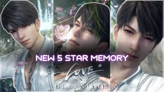
The Love and Deepspace community is buzzing — and if you haven’t jumped in yet, now’s the time. With only two days left before this event ends on May 18th, fans are racing to experience the gorgeous 5-star interactive memory Caleb’s Floating Floraletter. This isn’t just another collectible — it’s a romantic, emotionally rich story that’s quickly become a fan favorite. Let’s break down why this event is worth your time and how to make the most of these final moments. ⏳ Only 2 Days Left to Join the Event! Don’t Miss Out
In this Article:
A Special Chapter in Love and Deepspace Caleb’s Floating Floraletter : A Romantic Ride You’ll Never Forget How to Join the Event Unlock Even More with Memory Growth Bonuses What Players Are Saying A Memory That Stays With You

A Special Chapter in Love and Deepspace
From April 30th to May 18th, this limited-time event introduced five beautifully crafted 5-star memories. You get to choose three out of five, upping your chances of drawing the memories that speak to you most. The lineup includes: - Xavier: Inflorescence Imprints - Zayne: Fragrant Possession - Rafayel: Wisteria Waltz - Sylus: Valleydream Bloom - Caleb: Floating Floraletter 🌸 But the real standout? Without a doubt, it’s Caleb’s Floating Floraletter — and time is running out to make it yours.

Caleb’s Floating Floraletter : A Romantic Ride You’ll Never Forget
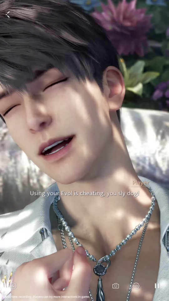
In this memory, Caleb whisks you away on a gentle boat ride through floating petals, symbolizing love, longing, and homecoming. The storytelling is poetic, with moments that tug at your heartstrings and visuals that are nothing short of breathtaking. One line that’s stayed with fans is: “Fallen airplanes become cradles. New sprouts grow from barren earth.” It’s a message of healing, renewal, and deep emotional growth — all told through an interactive experience where you feel closer to Caleb than ever before. And with just two days left, now is your final chance to step into this story.
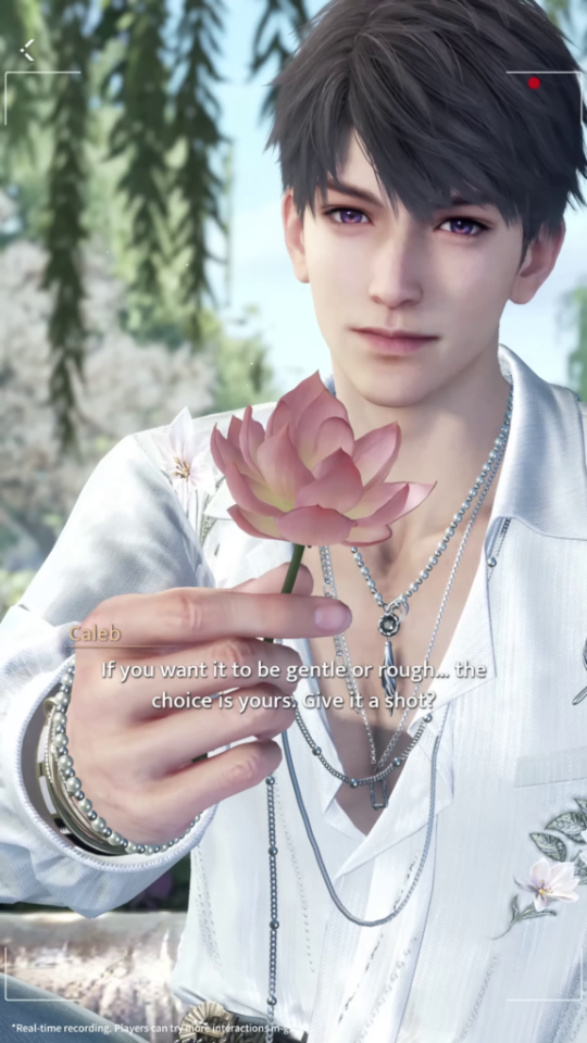

How to Join the Event
To participate in the Love and Deepspace event, players must engage in the wishing system within the designated event duration. The event features a precise wish system with a pity mechanic, ensuring that over time, players have a higher chance of obtaining the coveted memories. Each time a player obtains a 5-star memory, there is a 75% chance it will be one of the three memories they have selected, adding an element of excitement and anticipation.
It's important to note that after the event concludes, these event-limited memories will not be obtainable through other means. They will not enter the permanent wish pool, making this a unique opportunity for players to expand their collection with rare and exclusive content. Players are encouraged to make the most of this event to secure the memories they desire. To join the event before it wraps up on May 18th, here’s what you need to do: - Use the event wishing system - Select your top 3 preferred 5-star memories - Enjoy a 75% chance of getting one of your chosen ones each time you draw ✨ You can also earn cumulative rewards like: - Universal Headwear "Overbloom" - Deepspace Wish: Limited x20 - Memory-Themed Outfits - A selectable event-limited 5-star memory 📣 Important: These memories, including Caleb’s Floating Floraletter, won’t be available again once the event ends. They’re not entering the permanent pool, so if you want them — this is it!
Unlock Even More with Memory Growth Bonuses
Once you unlock a memory, there’s more to explore. Completing tasks tied to your memory grants you materials and even special-colored character outfits. For Caleb fans, this means a stunning look tied directly to Floating Floraletter — and it’s just as romantic as the story itself.

What Players Are Saying
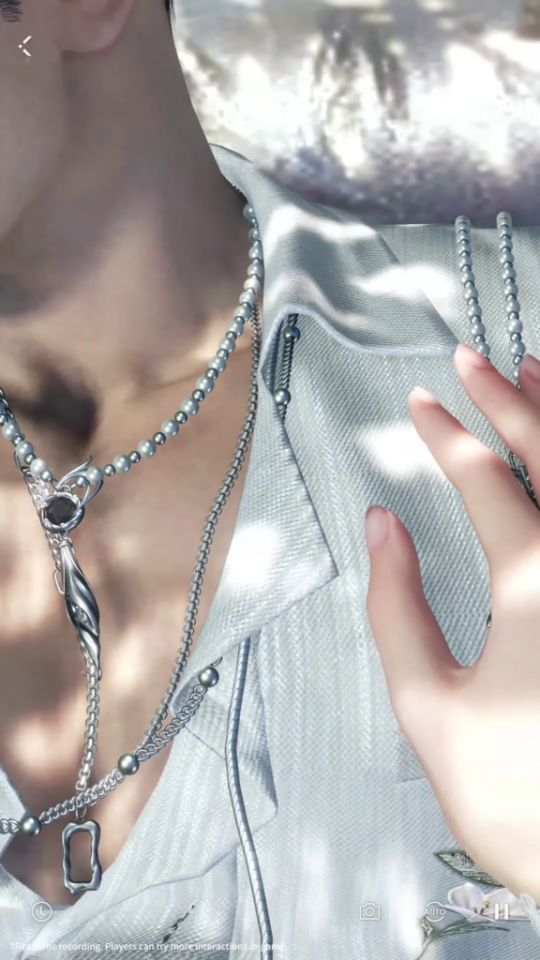
Players can’t stop talking about how deeply Floating Floraletter has touched them. From the quiet moments with Caleb to the small visual clues (like the missing necklace 👀), there’s so much to unpack — and only a little time left to experience it all.
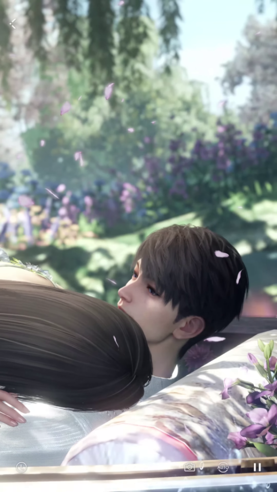
Plus, with talk of Caleb and the protagonist getting closer than ever, fans are hoping this event sets the stage for even more emotional developments down the line.
A Memory That Stays With You
With just two days remaining, don’t miss your opportunity to experience Caleb’s Floating Floraletter. Whether you’re here for the romance, the visuals, or the storyline, this memory is truly unforgettable. So go ahead — log in, make your wishes, and join Caleb on one last boat ride before the petals drift away. 🌸 For more Love and Deepspace News click Here. Read the full article
0 notes
Text
Styling Statement Jewelry: How Elephant Motif Necklaces Are Defining Indian Fashion
There’s a new wave in the world of Indian jewelry — one that’s equal parts traditional and daring. And at the center of this stylish storm is the elephant motif oxidized necklace. From fashion influencers to bridesmaids to art-loving Gen-Zs, everyone is embracing this trend that effortlessly balances cultural richness with bold, contemporary vibes.
If you’re looking to update your jewelry game with a piece that is expressive, iconic, and symbolic, let us introduce you to your new obsession: the handcrafted oxidized silver necklace set adorned with elephant charms and colorful gemstone accents.
Elephant Motif Jewelry: A Symbol of Power and Protection
In India, elephants are more than animals — they are spiritual icons. Seen as protectors of temples and symbols of royalty, elephants are deeply associated with power, peace, and wisdom. In Hindu mythology, Lord Ganesha, the elephant-headed god, is known to bless his devotees with prosperity and remove obstacles from their path.
When crafted into jewelry, elephants carry this divine symbolism with grace. A necklace featuring elephant designs is not just beautiful — it’s a statement of inner strength, elegance, and tradition.
The Necklace That Speaks Volumes
The featured oxidized necklace set isn’t your average piece of jewelry — it’s a wearable story. Here’s what makes it truly stand out:
Material: Crafted in high-quality oxidized silver that gives a timeless antique finish
Design Elements: Detailed elephant motifs, symbolizing strength and cultural heritage
Gem Accents: Embellished with deep emerald green, sapphire blue, and ruby pink stones
Pearl Drops: Delicate pearls hang from each charm, adding softness and feminine balance
Matching Earrings: Echoing the necklace's design, completing the regal ensemble
This is the kind of jewelry that draws attention — not because it’s loud, but because it’s rich with meaning and artistry.
When & Where to Wear It
One of the best things about oxidized elephant jewelry is its versatility. Whether you're styling a saree for a wedding or throwing on a boho dress for a music festival, this set delivers in every context.
✅ Festivals & Traditional Celebrations
Perfect for occasions like Navratri, Raksha Bandhan, or Diwali. The intricate detailing shines when paired with a cotton saree or a printed lehenga.
✅ Wedding Functions & Mehendi Ceremonies
Tired of the usual gold bling? Opt for this unique silver piece with a pastel or earthy-toned outfit. It adds a rustic royal touch, especially if you love unconventional looks.
✅ Everyday Ethnic Wear
Style it with a long kurti, oxidized bangles, and juttis for a comfortable-yet-stylish office or college look.
✅ Fusion & Indo-Western Fashion
Love mixing styles? Throw it over a black tank top and denim jacket or pair it with a long maxi skirt and crop top. The result? A bold, artsy, Instagram-worthy outfit.
Why Oxidized Silver Jewelry is a Must-Have
If you don’t already own oxidized jewelry, here’s why it should be in your collection:
Anti-Tarnish Finish: Retains its charm over time without the high-maintenance of polished silver
Budget-Friendly: Affordable luxury without compromising on aesthetic
Artisan Made: Often handcrafted using traditional techniques
Earthy Appeal: Perfectly complements Indian skin tones and natural fabrics
This style is perfect for women who love tradition but hate clichés.
Tips to Care for Your Oxidized Jewelry
A little care goes a long way in preserving the beauty of your jewelry:
Store it in a dry box or cloth pouch
Avoid spraying perfume or water directly on it
Wipe it with a soft, dry cloth after each wear
Keep away from humidity or sunlight to prevent dulling
With proper care, your elephant necklace set can remain a heritage piece for years to come.
Why Every Woman Needs a Statement Piece Like This
Jewelry is personal. It can uplift your mood, start conversations, and express your individuality. This elephant motif oxidized necklace isn’t just a festive accessory — it’s a powerful extension of your identity.
Whether you’re drawn to it for its mythology, symbolism, or stunning artistry, it’s a must-have for anyone who loves fusion fashion with a story. You don’t just wear this necklace — you own the energy it carries.
Shop the Statement
This unique elephant motif oxidized silver necklace set is available now at 🛒 Aviana Store 🌍 Pan-India & International Shipping 📸 Follow us on Instagram @avianastore for style inspo & new drops 💬 DM for styling help or custom orders!
Final Note: In a world flooded with generic accessories, choosing jewelry that reflects culture, craftsmanship, and character makes all the difference. Let this elephant necklace be your next statement — one that’s rooted in tradition, and made for now.
0 notes
Text
Creating a Strong Brand Presence with Custom Printed Coffee Pouches

In today’s competitive coffee industry, product quality is only one part of the success equation. The other? Exceptional packaging that captures attention and communicates your brand message instantly. This is where custom printed coffee pouches become invaluable. These pouches offer a powerful combination of functionality and visual impact, making them an ideal choice for coffee roasters and retailers seeking to stand out.
This article explores how tailored coffee packaging helps businesses thrive, what features matter most, and why these pouches are a practical investment for growing brands.
1. Why Custom Coffee Packaging Matters
1.1 The First Impression Counts
Before a customer tastes your product, they see your packaging. A thoughtfully designed pouch can evoke premium quality, sustainability, or artisanal craftsmanship—all in a single glance. Custom printed coffee pouches serve as your first marketing tool, drawing attention both online and on physical shelves.
1.2 Tailored for Your Brand Story
From minimalist aesthetics to bold, colourful graphics, custom designs give you complete control over how your brand is perceived. You can align packaging with seasonal promotions, limited editions, or your core range to create a consistent brand presence.
2. Functional Benefits of Custom Coffee Pouches
2.1 Designed for Freshness
Coffee is sensitive to moisture, oxygen, and light. These pouches often come with multi-layer barriers that lock in freshness and flavour. One-way degassing valves can also be added to allow gases to escape without letting air in, which is essential for freshly roasted beans.
2.2 Convenience for Consumers
Most pouches feature zip locks, tear notches, and resealable closures. These features make daily use easier and help maintain the coffee’s aroma and texture over time, enhancing the user experience.
3. Key Design Elements to Consider
3.1 Material and Finish
Choosing between matte, gloss, kraft paper, or metalised films affects the visual impact and tactile quality of your packaging. Each finish creates a different impression and can reflect your brand values, whether you're aiming for earthy, luxurious, or modern vibes.
3.2 Panel Layout
Coffee pouches typically offer front, back, and side panels for design. This allows you to strategically display branding, brewing notes, origin information, sustainability credentials, and barcodes—without cluttering the layout.
3.3 Printing Options
Digital, rotogravure, or flexographic printing methods provide varying levels of detail and customisation. Digital printing, for instance, is ideal for small batches or designs with intricate artwork.
4. Applications Beyond Retail
4.1 Cafés and Boutique Roasters
Small-batch roasters and cafés benefit immensely from packaging that reflects their niche appeal. Whether it’s a bold, urban brand or an organic countryside roaster, custom pouches elevate the entire product experience.
4.2 Subscription and E-commerce
In the booming online coffee market, presentation is critical. Well-branded pouches enhance unboxing experiences and encourage social sharing—often translating into word-of-mouth marketing and repeat purchases.
4.3 Events and Gifting
Limited-edition or event-themed packaging offers a creative way to engage customers. It also helps with branding in gift packs or corporate hampers where visual appeal is just as important as the product inside.
5. How to Get Started with Custom Coffee Pouches
5.1 Start Small with Digital Printing
If you’re trialling a new blend or brand concept, digital printing offers flexibility without high minimums. This approach helps you test designs affordably before committing to large runs.
5.2 Work with a Reputable Supplier
Choose suppliers who understand food safety standards, offer quality assurance, and are willing to collaborate on customisation. Their guidance on design layout, print resolution, and material selection can save time and money.
5.3 Plan Ahead
Lead times vary depending on complexity and print type, so it's smart to plan your packaging needs in advance. This is especially important if you're working around product launches, events, or seasonal sales cycles.
Conclusion
Custom printed coffee pouches are more than just packaging—they are a brand-building tool, a freshness protector, and a powerful marketing asset. In an industry where quality is expected but presentation sets products apart, customisation can be the key to customer engagement and retention.
From artisan roasters to major retailers, investing in personalised coffee packaging ensures your product is memorable and market-ready. Whether you’re refining an existing brand or launching a new label, these pouches offer the flexibility, function, and flair your coffee deserves.
0 notes
Text
How Custom Fiberglass Statues made by Plutus Art can elevate your Brand
Introduction to Plutus Art and their custom fiberglass statues
In a world where branding is everything, standing out from the crowd can feel like an uphill battle. Enter Plutus Art and their stunning custom fiberglass statues. These eye-catching pieces are not just decorative elements; they are powerful tools that can elevate your brand to new heights. Imagine captivating your audience with vibrant, unique sculptures that tell your story and embody your values. With Plutus Art’s expertise in crafting exquisite fiberglass statues, you hold the key to transforming how people perceive and connect with your brand. Let’s explore how these remarkable creations can make a lasting impression on potential customers while enhancing brand visibility like never before.

Benefits of using custom fiberglass statues for branding purposes
Custom fiberglass statues serve as powerful branding tools that captivate audiences. Their vibrant colors and unique designs instantly grab attention, making them ideal for attracting foot traffic. These eye-catching pieces can effectively convey your brand message. Whether it’s showcasing a mascot or representing a core value, custom sculptures create memorable experiences that resonate with customers. Fiberglass statues are versatile and durable. They withstand various weather conditions, ensuring your investment remains intact over time. This longevity adds to their appeal, providing continual visibility without the need for frequent replacements. Additionally, these statues foster engagement on social media platforms. People love sharing photos with visually striking art installations, broadening your online reach effortlessly. Incorporating custom fiberglass sculptures into your marketing strategy creates an emotional connection with potential clients while enhancing overall brand recognition in innovative ways.
Examples of successful brand campaigns with Plutus Art's statues
Plutus Art's fiberglass statues have played a pivotal role in various successful brand campaigns. One notable example is their collaboration with a popular beverage company. The vibrant, oversized statue of the drink’s mascot became an Instagram sensation, drawing crowds and boosting social media engagement. Another campaign featured a retail brand that utilized custom sculptures to enhance its store façade. Shoppers were instantly attracted by the eye-catching designs, leading to increased foot traffic and sales during peak seasons. In addition, local businesses have leveraged Plutus Art's creations for community events. A festival showcased whimsical animal statues that represented each sponsor, creating memorable photo opportunities for attendees while promoting brand awareness. These real-world applications highlight how strategic use of fiberglass sculptures can resonate deeply with target audiences. They invite interaction and create lasting impressions that extend beyond mere advertising.

The process of creating a custom fiberglass statue with Plutus Art
Creating a custom fiberglass statue with Plutus Art begins with an idea. Clients share their vision, whether it’s a unique character or a larger-than-life replica. Next comes the design phase. Skilled artists at Plutus Art turn concepts into detailed sketches, ensuring every aspect aligns with your brand's identity. Feedback is crucial here; adjustments are made until you’re satisfied. Once approved, the sculpting process starts. Using high-quality materials, artisans craft a durable mold that captures intricate details. This step requires precision and creativity to bring your vision to life. After molding, they pour in fiberglass resin for strength and flexibility. Once cured, the surface gets polished and painted according to your specifications—color choices can really make an impact. The final touch involves adding protective coatings to ensure longevity against various elements while preserving vibrant colors. Each statue reflects not just art but also the essence of your brand’s message.
Factors to consider when choosing a design for your custom statue
When designing a custom fiberglass statue, think about your brand’s identity. What message do you want to convey? The design should reflect your values and resonate with your target audience. Scale is crucial too. A larger statue can create an impactful presence, while smaller pieces might fit better in intimate settings. Consider where the statue will be displayed; visibility plays a significant role in effectiveness. Colors matter as well. Choose hues that align with your branding palette for cohesion. This helps reinforce recognition and strengthens brand recall. Durability is another essential factor. Ensure that the materials used are suited for both indoor and outdoor environments based on where you plan to showcase it. Budget constraints can influence design options. Discussing these limitations early on ensures realistic expectations without compromising creativity or quality.
Maintenance and care tips for long-lasting use of your custom statue
To ensure your custom fiberglass statue from Plutus Art stands the test of time, proper maintenance and care are essential. These statues are designed to be durable, but a little attention can go a long way in preserving their beauty. First, regularly clean your statue using a soft cloth or sponge with mild soap and water. This prevents dirt buildup and keeps the colors vibrant. Avoid abrasive cleaners as they can scratch the surface. Next, consider placing your statue in an area protected from harsh weather conditions. Direct sunlight may fade colors over time, while rain or snow could lead to damage if not treated properly. If possible, cover it during extreme weather events for added protection. Check for any signs of wear or damage periodically. Addressing small issues right away can prevent more significant problems down the line. For example, tiny cracks might be repaired easily without needing extensive work later on. Use caution when moving your fiberglass sculptures to avoid chipping or cracking them accidentally. With these simple tips in mind, you’ll enjoy the artistic impact of your custom fiberglass statue for many years to come—enhancing both aesthetics and brand identity alike.
0 notes