#and gesso on wood
Explore tagged Tumblr posts
Visit Tumblr Blog
Explore Tumblr blogs with no restrictions, modern design and the best experience.
Last Seen Tumblr Blogs


Fun Fact
Kazakhstan’s Minister of Communications and Informatics has blocked the Tumblr site because it contained 60 sites of terrorism, extremism, and pornography in 2015.
Text

R.H. Quaytman, Acorn, 2019-2020 Rubber, oil, and gesso on wood 12 3/8 inches x 12 7/8 inches
18 notes
·
View notes
Text


AN EGYPTIAN GESSO-PAINTED WOOD FUNERARY MODEL OF A BOAT MIDDLE KINGDOM, 11TH-12TH DYNASTY, 2087-1759 B.C.
#AN EGYPTIAN GESSO-PAINTED WOOD FUNERARY MODEL OF A BOAT#MIDDLE KINGDOM#11TH-12TH DYNASTY#2087-1759 B.C.#ancient artifacts#archeology#archeolgst#history#history news#ancient history#ancient culture#ancient civilizations#ancient egypt#egyptian history#egyptian mythology#egyptian art
426 notes
·
View notes
Text

Parking lot trash
#artists on tumblr#art#nekos dumb art#acrylic paint#painting#traditional art#acrylic#traditional painting#nitw#nitw fanart#nitw gregg#gregg lee#gregg nitw#night in the woods#gesso
40 notes
·
View notes
Text

Inner coffin of Amenemopet Period. Third Intermediate Period, Dynasty 22, ca. 975–909 B.C. From Egypt, Upper Egypt, Thebes, Sheikh Abd el-Qurna.
Wood, paint, gesso
#reddit#Mysterious_Sorcery#artefactporn#coffin#egyptian#975-909 bc#egypt#upper egypt#thebes#sheikh abd el-qurna#wood#gesso#paint#sarcophagus
6 notes
·
View notes
Text


An Egyptien Gesso-Painted Wood Funerary Model of a Boat,
Middle Kingdom, 11TH-12TH DYNASTY, 2087-1759 B.C.
31 ¼ in. (79.5 cm.) wide.
Courtesy: Christie's / Mougins Museum of Classical Art.
#art#history#design#style#archeology#sculpture#figure#egypt#paint#gesso-painted#wood#funeral#boat#middle kingdom#11th Dynasty#12th dynasty#christie's#mougins museum
35 notes
·
View notes
Text
I’ve been having an inexorable urge to craft at all hours of every day
3 notes
·
View notes
Text
Collection of the Dallas Museum of Art
Source: Google Arts & Culture


~ Kara Shi Shi (One of a pair of Fu Dogs).
Date: A.D. 1200–1300
Medium: Wood with traces of gesso and pigment.
327 notes
·
View notes
Video
Chinese, Seated Bodhisattva Avalokitesvara (Guanyin), 11th century, wood, gesso, 8/9/23 #StlArtMuseum by Sharon Mollerus
#Saint Louis Art Museum#Seated Bodhisattva Avalokitesvara (Guanyin)#Missouri#gesso#StlArtMuseum#Chinese#11th century#8/9/23 StlArtMuseum#wood#St. Louis#MO#flickr
0 notes
Text

Hisashi Tenmyouya — Qilin (black gesso, acrylic, lacquer, wood board, 2004)
757 notes
·
View notes
Text

Cornflowers Under The Stars - Jennifer Taylor , 2023.
Welsh , b. 1982 -
Oil and textured gesso on MDF wood panel, triple primed ,
1K notes
·
View notes
Text
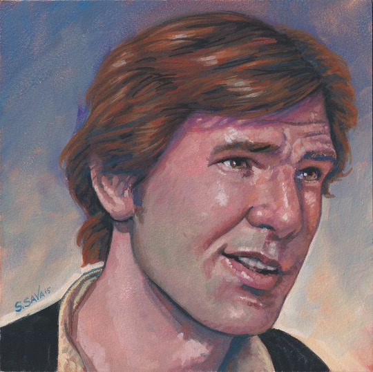
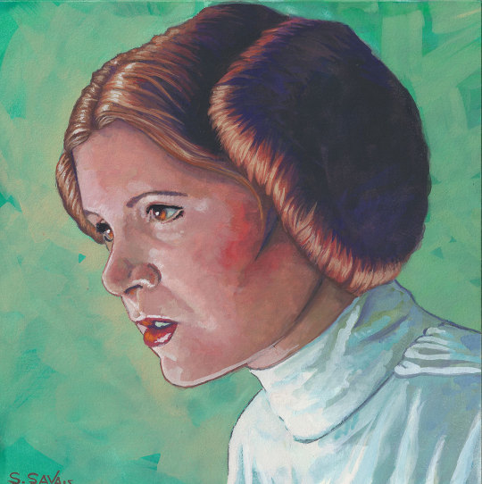
Happy Wednesday, All!
Back in 2015, I was still teaching myself gouache and I decided to do a few Star Wars portraits.
These are 6x6 inches Aquabord... which is like a gessoed piece of wood.
My style has changed quite a bit since... but I still really like these.
Sending Big Hugs from the Hobbit Hole. ♥♥♥
Scott
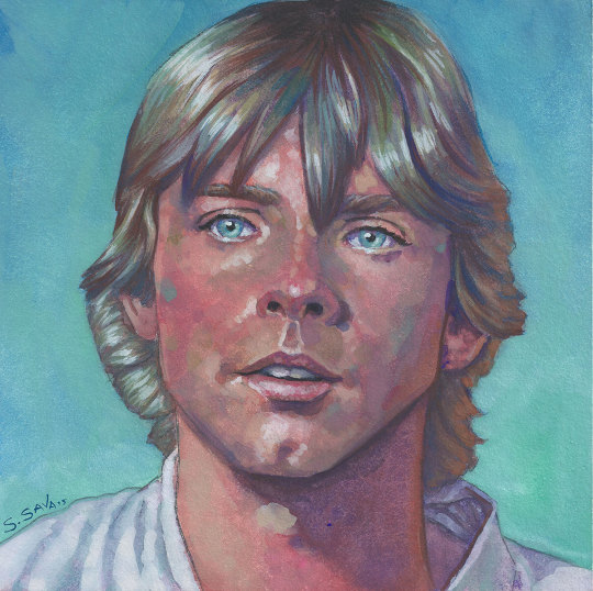

#art#traditional art#artists on tumblr#drawing#gouache painting#star wars#star wars art#star wars fanart#a new hope#han solo#obi wan kenobi#luke skywalker#princess leia
1K notes
·
View notes
Text
Viktor x Reader Personal Pigments (Part 9) -Lavender Tinted Gesso
Okay so I said this like 2 chapters ago, but this is the longest chapter now. Find my imagine that inspired it here. Previous and next chapter will be linked at the bottom. Thank you for reading <3
╔═*✧ ✦ ✧.·:·.*.·:·.✧ ✦ ✧.·:·.*.·:·.✧-✦-✧.·:·.*.·:·.✧ ✦ ✧.·:·.*.·:·.✧ ✦ ✧*═╗
Viktor is annoyed, a feeling he has grown quite familiar with these past few days. No one had done anything to cause it, that he could identify anyway. That did not stop him from being annoyed with Jayce for making him go rest. He knew that his partner meant well, he knew that it was needed. But it didn’t change the fact that they were finally making progress and putting that roll on hold, even for a few hours, felt like an impossibly wrong decision.
When you mentioned wanting to feel connected to the process, your process, something clicked in him. Especially after that passage he had shown Jayce. They wanted to improve lives with Hextech, but they needed to know how to do it. With the more they learned about magic and runes, they were getting closer to solutions for all sorts of problems. Piltover was supposed to be the ‘city of progress’. They needed to find ways to connect people. If Hextech could be used for travel it would blast things wide open for medicine and education. His mind was running all over again with the potential for solutions.
Still, he settles in his bed this time instead of the couch. The covers are soft on his skin. His head is heavy on the pillows. If he slept for more than the agreed upon 5 hours, he knows that no one would be upset. He does truly trust Jayce to find answers to the questions he’s posed. His eyelids are heavy already. Were his eyes always this dry?
“Viktor?” He ignores the sound of your voice in his head. He had a tendency to replay thoughts, sounds. “That he liked.” The frown that settles there is deep, it pulls at his cheeks. Viktor turns with a huff, landing on his good leg as he lays on his side. He’d been falling asleep to that sound since that night. He thought it would pass after that first time, and that the weird guilt would not be so heavy in his chest when he saw you. But you were there the next day, all soft smiles and patiently explaining your process to Jayce. Giving him knowing looks. He did not notice the way you poked at the drying sludge at your station. He did not notice your disappointment when it hadn’t been fully dried on the second day.
“Bio-material always clogs up filters and holds moisture.” Jayce had said to you when you sighed over it. You told him you knew, but admitted patience was not your strong suit. Information he did not hold on to.
“Ridiculous.” It slips out in a whisper, caught by the wall in front of his face. “This was ridiculous.” He lays flat on his back now, the ceiling staring back at him. It doesn’t match his scowl. And despite the way annoyance is pooling as tension in his jaw, he closes his eyes again. “Viktor?” It was like an ear worm he couldn’t get rid of. A beetle burrowed under his skin. It replays again, the moment when you woke up. Golden light and swirling dust and dried drool. There was nothing special about that moment, but it haunts him anyway. He falls asleep.
✧⋄⋆⋅⋆⋄✧⋄⋆⋅⋆⋄✧⋄⋆⋅⋆⋄✧⋄⋆⋅⋆⋄✧⋄⋆⋅⋆⋄✧⋄⋆⋅⋆⋄✧⋄⋆⋅⋆⋄✧⋄⋆⋅⋆⋄✧⋄⋆⋅⋆⋄✧
The wood had made it to the studio yesterday, and so did the sonophone from your room. You’d be damned if you had to work with nothing but the sounds of your struggling. Your record collection was small, mostly instrumentals of varying genres that you had grabbed over the years. It was hard to justify expanding when you had so much work to do, especially now that most of your work was done with other people around you. Today you could treat yourself to the background melodies. Because you were punishing your hands for your career choice.
You had managed to get the wood cut to size. That was honestly easier than you had thought. The frame took maybe 4 hours to put together, drying time of the wood glue included. You even got the support bars in place. But it did mean that you had to face the real trials ahead. Stretching the canvas.
Canvas stretching was an arduous process, lots of crawling around on your hands and knees. Pulling and pulling and pulling the fabric taut over the edge of the wood. Pulling that meant the joints in your hand were screaming two hours in. You had to move around all four sides, all four corners, and the spaces in between them to keep the surface even. Don’t get you started on the folding in the corners for hidden edges. Curses were muttered under your breath every few minutes. Occasionally yelled, echoed back at you by the walls.
Pulling, letting go, pulling, letting go, crawling, hammering in, pulling, letting go, pulling, letting go, hammering in. Focus only for the task in front of you. You didn’t hear the knock on the door, or when it slowly opened and tentative steps made their way in.
✧⋄⋆⋅⋆⋄✧⋄⋆⋅⋆⋄✧⋄⋆⋅⋆⋄✧⋄⋆⋅⋆⋄✧⋄⋆⋅⋆⋄✧⋄⋆⋅⋆⋄✧⋄⋆⋅⋆⋄✧⋄⋆⋅⋆⋄✧⋄⋆⋅⋆⋄✧
It took some convincing (bribing) to get Viktor to come with him. Jayce had told him about your note the day before and he had seemed uninterested in visiting.
“We have work to do.” Viktor is still looking through books when Jayce meets him in the lab. Seemingly settled in his chair.
“Getting our notes in order is hardly work. And something we can definitely do over there.”
He gets a sigh. Viktor is gathering notes and papers into a folder. It’s not heavy but it is overfilled by the time Jayce adds his collection to it too.
“You have the drinks, yes?” He smiles at that. Jayce nods and raises the carrier. Three drinks nestled together, all iced, as it was starting to warm up. Spring was fast approaching Piltover, some would argue that the season was already here. The walk to your studio is filled with a lot of sounds. And smells. Most of the doors are wide open, laughing and music in some. Mostly the smell of turpentine and various oils that waft towards them. Windows were flung open but it did little to quell the strength.
“Less ventilation here than in our labs,” he notes aloud. Viktor simply nods in agreement, looking the walls up and down. The two of them were curious, there were more artists involved in this program than they thought. You had not really spoken much about the Institute or your peers. Jayce is holding the note, making sure to count the doors on the right side of the hall while Viktor peeks into whatever empty rooms they pass. Cane in one hand and a folder of notes in another. As they approach what should be your door, they can hear banging. A soft repetitive noise that gets louder as they close the distance. He looks at Viktor when they get to your door, it’s closed. There’s another bang, the sound sharp and dull at the same time.
“Are you fucking kidding me??”
It’s muffled by the door, but it’s definitely your voice. Jayce looks to Viktor, brows raised and an almost laugh escapes him. Viktor looks back, a little less bewildered, he shrugs in response. He gestures with the folder for him to knock on the door, face contorting as if to say “this was YOUR idea”. It was, but now he’s doubting himself. You seemed busy. He knocks and it’s drowned out by a resumed banging. After a few seconds he tucks the note under his arm and slowly turns the knob.
Once the door opens they can hear music. You don’t turn to face them. You’re… on the floor? Nails all around you, a hammer in your hand. There’s a huge wooden frame in front of you. Fabric, canvas? Canvas in your other.
“Whatchya doin’?” Jayce speaks first. Sing-songy and sweet. You whirl around, a nail in your mouth hitting the floor as you lower the hammer.
“What are you guys doing here?” Your smile is bright and surprise honeys your voice. There is a redness in your cheeks. From frustration or from working. He isn’t sure. Viktor looks away to the very empty walls of your studio. You stand up to greet them, grimacing at the numbness in your knees and calves.
“You’ve had a studio this whole time? Then why work with us?” Yet another question that Viktor asks you, that he had not meant to ask. It comes out harsher than he intends. Your smile falters but doesn’t fall.
“I thought you knew I had one?” Jayce nods, he knew of it from Heimerdinger and Mel. Viktor doesn’t answer, just continues to look around your very empty space. You answer his question anyway.
“I want to learn about both of you. Good art is infused with many things, but knowledge is one of them. I want to know you both past the invention, it brings the work to life.” This was the first time you’ve stood in who knows how many hours since you’ve started. Your joints felt stiff as you stretched, standing on the tips of your toes to get the feeling back in your body. Jayce also looks away as your top lifts when your arms are reaching for the ceiling. He’s less subtle with it though, and you notice the way his eyes dart wall to wall. Trying not to laugh, you speak. “To answer your earlier question Jayce, “ he jumps at his name, “I’m building a canvas for the painting.”
He and Viktor look at your project on the floor. The frame seemed sturdy. You were almost done, dozens of nails along the sides. You move your sonophone out of the chair closest to you. The music skips a little when you jostle it. Asecond chair opposite had cut wooden pieces and a saw.
“You built this yourself?” Jayce puts the drinks down on a clean table and circles it. He steps around it slowly, careful of the nails on the floor . He can appreciate good craftsmanship as a blacksmith. The studs were evenly spaced, your canvas was loose in maybe four or five spots where you obviously needed to hammer in the last of your nails. “It looks really good! Didn’t realize it was going to be so big.” You hum noncommittally as you empty the other chair. Viktor approaches it too. Setting his folder down by the drinks, he leans against a wall after walking around. There were red spots around all the edges. Spots that were almost as evenly spaced as the nails, but the spaces were smaller. Set in groups of four. His brows furrow.
“What are those?” It comes out quietly, and Jayce notices what he’s asking about. Viktor looks at you as you settle in an empty chair with your drink in hand. A hand with bloody knuckles. You don’t miss the way his eyes widen.
“It’s fine, I promise.” Canvas is a rough material, you had meant to get handwraps on your trek to the market to avoid this but it had slipped your mind. Jayce is walking over to you now. He puts a hand out expectantly. A non-negotiable look on his face. “Guys, I’m fine.” You offer a hand anyway, trying not to wince when he turns it over so your palm faces the floor.
“How long have you been at this?” There’s no judgment in the question, yet you still feel like you’re being scolded.
“Long enough.” You pull your hand back. “I’ll bandage up in a second, I’m almost done.” The defensiveness in your tone annoys you, a tight feeling in your chest. Heat rises in your cheeks. “What are you guys doing here anyway?”
Viktor nods to the drink in your hand. Right. Well now you felt even more like a child, pouting after a treat. It’s Jayce who gives you a verbal answer. “Well you gave us directions.” He taps the note. “Plus, Vik and I have some notes to present to Heimerdinger soon. Thought you’d want to hear us sort them out.” His voice is gentle, he stands by the chair in front of you. Viktor meets his gaze and grabs the folder to sit in front of you. He’s already opening it and pulling papers onto the table, not waiting for your response. You stand, putting your drink down. Jayce and Viktor share a look, like they’re worried you’ll say no. “Cute.”
“I’d like that.” You give both of them a soft smile when they visibly relax. “Just let me finish this, I don’t want you guys having to talk over the hammer. You can talk all you want while I gesso.” Viktor quirks a brow at the word. “You’ll see in a second.”
He watches wordlessly as you sit on the floor, picking up the hammer and getting back to work. You’re gritting your teeth as the exposed flesh of your knuckles brushes against the canvas. He smiles softly to himself. He respects the desire to work past your limitations, a familiar urge to him. And then frowns when he remembers that you’re bleeding. He glances at Jayce, who’s pretending to read a paper. Pretending, because he’s looking at Viktor. Wide-eyed like he realizes something. Caught. The hair on the back of his neck stands, a warmth spreading down his back. He quells the feeling. Willing the redness to stay below his collar. Jayce tilts his head at him in question. “What was that?”
He ignores him. The wrong decision. It seems to confirm something in Jayce. He tilts his head again, eyes going even wider. “What. Was. That?” Emphasizing the silent question with a shake of his paper. Viktor gives him a dead stare like he has know idea what he’s not talking about. He starts sorting out notes on the table. Ignoring another paper shake. You’re hammering away totally unaware of their battle of wills. By the time you’ve finished Jayce has given up. He’s rummaging in a corner of the room when you’re standing, wincing as you flex your hands.
You should clean and wrap your hands, but you could also just start gessoing. You’re already opening up the tub to weigh your options when someone clears their throat. It’s Jayce holding a first aid kit.
“All of the rooms are provided one. Academy policy.” He looks apologetic, like he knows what you were thinking about. He nods towards his empty chair in front of Viktor. No choice then. You take the seat when he asks you a question. “Why is it so empty in here? I thought you’d have this place decked out.” You stiffen at the question. Embarrassment flooding your veins. Called out.
“If I’m going to start something, I want it to be something worthwhile.” You’re honest, and it feels good to say it out loud. A tension you didn’t know you were carrying leaving your shoulders. Jayce is handing the kit to Viktor.
“You know, someone told me once that if you’re going to change the world, don’t ask for permission.” Viktor gives a quiet chuckle at that, opening the kit and pulling out alcohol swabs and bandages. He motions for you to get closer.
“I’m not changing the world, I’m painting.” You laugh too.
“About people changing the world?” Jayce nudges your shoulder as he walks past to look at your finished canvas. He spies the tub of gesso you opened up. “It’s purple?”
“Think of it as a pre-tone. Before I do the underpainting. It helps me get over the fear of starting on a blank surface.”
“But it'll still be empty” says Jayce.
“Trust me it's different.” You're hissing that last word out. Not out of anger but pain. Viktor had started applying the alcohol to cleanse your knuckles.
“Sorry broučku” He's muttering under his breath. You don't recognize the word but you don't have time to question him when he dabs another piece of alcohol soaked cotton on the next knuckle. You tell him it’s fine and try to ignore the sting behind your eyes everytime he touches you with the swab. You look at Jayce, “Instead of me starting on a perfectly white canvas, I can start with something else. I’m still starting the painting on a clean surface, but I’ve technically started the work that way.”
He hums and comes back to stand behind you, a warm hand on your shoulder. Viktor’s working on your other hand now. You wince again, “Almost done.” he whispers.
“So,” Viktor looks up when you speak this time. You meet eyes. “Tell me about this presentation.”
╚═*✧ ✦ ✧.·:·.*.·:·.✧ ✦ ✧.·:·.*.·:·.✧-✦-✧.·:·.*.·:·.✧ ✦ ✧.·:·.*.·:·.✧ ✦ ✧*═╝
--------------.·͙*̩̩͙˚̩̥̩̥*̩̩̥͙ ✩ *̩̩̥͙˚̩̥̩̥*̩̩͙‧͙ Part 8-.-Part 10.·͙*̩̩͙˚̩̥̩̥*̩̩̥͙ ✩ *̩̩̥͙˚̩̥̩̥*̩̩͙‧͙ .---------------
------------‧̍̊·̊‧̥°̩̥˚̩̩̥͙°̩̥‧̥·̊‧̍̊ ♡ °̩̥˚̩̩̥͙°̩̥ ·͙*̩̩͙˚̩̥̩̥*̩̩̥͙· Master Fic List *̩̩̥͙˚̩̥̩̥*̩̩͙‧͙ °̩̥˚̩̩̥͙°̩̥ ♡ ‧̍̊·̊‧̥°̩̥˚̩̩̥͙°̩̥‧̥·̊‧̍̊--------------
#fanfic#fanfiction#arcane#viktor arcane#viktor league of legends#x reader#viktor lol#jayvik#slow burn#jayce arcane#jayce talis#arcane jayce#jayce x viktor#jayce league of legends#jayce lol#viktor#arcane viktor#and they were lab partners
95 notes
·
View notes
Text

Colijn Strydom - Combination Blue 1, 2023 - Acrylic paint and ink on wood, primed with gesso
228 notes
·
View notes
Text


💙A finished Oil painting on wood pet portrait 💙
💙This is a on a 5x7 gesso prepared wood panel
💙Commissions and DMs Open!
💙Free Shipping in USA for sizes 8x11 and under
☕People and pets welcome!
#artist for commission#art#artists on tumblr#oil paint#oil painting#portrait#drawing#pet portrait#cats#cute cats#cats of tumblr#cute animals#painting#traditional art#traditional drawing#hand drawn#craft#sketch#paint#artist#animals#cute dog#pet#cottage aesthetic#dark academia#wildlife#cat mom#fur baby#dogs of tumblr#marvel
44 notes
·
View notes
Text

gloves by nina royle, 2021, ink & oil on a shaped wood & gesso panel, 40 × 36 centimeters
75 notes
·
View notes
Text

Lorna Simpson Darkening, 2018 Ink and screenprint on gessoed wood 274.3 x 243.8 x 3.2 cm / 108 x 96 x 1 1/4 in
at Hauser & Wirth
32 notes
·
View notes