#and for sure the first one without any lineart at all
Explore tagged Tumblr posts
Text

🌼💐
#my art#fkmt#kaiji#kaiji itou#tonegawa yukio#tonekai#look what I found!#I bet that Kaiji just picked a random one from a flower bed#this is one of my first full goache paintings#and for sure the first one without any lineart at all
52 notes
·
View notes
Note
Just wanted to ask, please forgive me if you've already answred this, what program do you use? Your art fucks HARD and like. I was looking at your art of the two moths over the city they die in and I was hit with the wave of "oh that looks really fucking fun actually." Like i know my art program can't do some of those effects and like, I'd love to try fucking about with them.
hi there, thank you! all my art is done in procreate and paint tool sai
because you mentioned that drawing in particular i thought it would be fun to break it down and show ppl what exactly went into each part of it so check this out
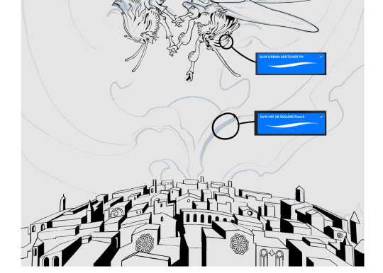
sketch & lineart - the brushes come from georgbrush.club and the urban sketcher is my most commonly used lineart brush, it has a nice irregular shape. the square brush is nice for big blocky sketches.
the cityscape was REALLY hard but basically I got a photo of the skyline of florence, traced some basic building shapes, then bullshitted the rest using the vertical symmetry/mirror tool to cut down on the amount of work (so i only had to sketch one half of the city). then for lineart I turned off vertical symmetry, turned on the two-point perspective tool, and got this:
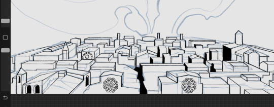
the rose windows were made using the radial symmetry tool.
I didn't like it being so flat, so I used the liquify tool to make a kind of fish-eye effect (limited success tbh). I liked how it looked but the buildings in front needed something to cover them up to make the liquification less obvious...
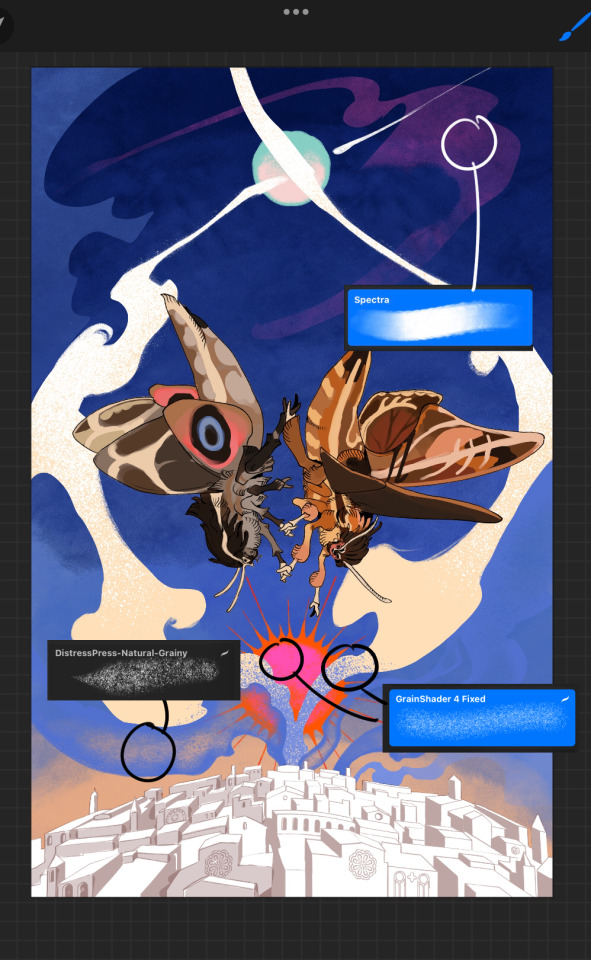
first pass colours. I felt they were very washed out, aside from the sun which i loved. I use the spectra brush (default procreate) for skyscapes a lot, I love the texture. Although the clouds were filled in using the lasso selection tool, I softened the edges using the square pencil again and added texture using true grit sampler grainy brushes. The translucency effect comes from my setting the brush as an eraser. The sun rays come from the radial symmetry tool.
Blocking in the moths' colours was done with the urban sketcher again.
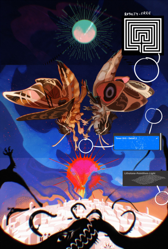
Something people may not have noticed is the labyrinth hidden in the sky! yeah I had a bunch of versions where it was more obvious but I found that it clashed a bit and was too busy, so I made it subtle. But yes. I searched for "royalty free labyrinth" and picked one.
The toner grit brush is one you've seen before if you've looked at any art on tumblr lately (this is such a popular brush) and it's from the true grit fast grit set. The pointillism brush is from the true grit free sampler pack, like my grain brushes.
I added shadows to the moths, increased saturation overall, and changed the clouds to a translucent blue (you can even see in the sun where I forgot to block in the sun itself because the clouds over it used to be opaque lol). Moon rays were drawn using the radial symmetry tool but this time with rotational symmetry off. I also moved the moon down closer to the moths because I felt that it was a bit far away, and this served to visually divide the drawing into three equal parts, so I chose to lean into that and divide the sky colours too, to show passing time, or an endless moment - morning, evening, night, etc.
And then the oroborous, I tried a few different effects on it because I wanted it to be very clearly separate from the main scene - I settled on a dot matrix newsprint texture, using procreate's onboard tool, and some heavy chromatic aberration. This is because the oroborous isn't real, it's purely symbolic and the moths' demise started when they became photographers so I liked the print media aspect there as well. The story itself is about grief without closure, cyclical violence, and sunk cost fallacy, while everyone explores an endless labyrinth, so an oroborous fits I think
what makes art fun to me is thinking up ways I can tell a story using just a single image. and sure a lot of it will be lost to an audience who isn't familiar with the characters or backstory but i want to leave enough in there that even complete strangers to my work will be able to construct a narrative about what's happening here, rather than it just being a cool image. that's my goal.
Finally I exported it to sai on my pc to give it a once-over. this is really important because the retina display on an ipad is oversaturated on purpose, to make everything look amazing and vibrant. but what this means is that on other screens, your work might look washed out. it's especially bad at displaying yellows! so i look at it in sai on my pc and i make minor adjustments, in this case I actually added another multiply layer on the moths and an overlay on their non-shadowed parts to increase the contrast there.
finally if you've read this far, I played a little trick with the caption of the drawing. yeah, THEY die... but only one of those moths is a theythem pronoun haver... the other has to survive. he isn't given a choice in the matter.
#fr you will never catch me trying to mystify my process i will explain literally everything#brushes
467 notes
·
View notes
Text
Nemi’s 100 followers Art Raffle!
I’m holding this event as a way to thank you all for getting me to 100 followers :D
I’d like to give a special thanks to: ( @loser-jpg @spookyavenuestreet, @lemonchuu @artistnettles, @nyx-of-night, @celestcelest, @vauxxnm (and so many more i cannot @ in one go due to the tag limit but you know who you are!! I'll be tagging more ppl in the reblogs!) for supporting me on my journey all the way to 100 followers! Thank you for always interacting with my posts <3
EVENT RULES:
No harassment is allowed. You will be taken out of the raffle and blocked.
If you have multiple accounts, be sure to link your other account(s) in your bio or intro post.
Do not ask me when I will be starting the pieces. I have a busy schedule and do not know when I will have the time.
No NSFW & suggestive requests allowed!! No furry & mecha requests, I do not have the skillset to draw these.
The winners must send me(preferably multiple) references and or descriptions of what they want drawn. Any overly complicated details and or clothes will be simplified.
The winners will be allowed 2 changes when I check in with them with their pieces.
GUIDELINES + INFO:
This event will be held for a week from (July 23 12:00 am - July 30th 11:59pm est time) and I’ll randomly select the winners at the end of the week via the wheel of names (https://wheelofnames.com/)
To enter, all you need to do is to reblog this post with the tag “nemi 100 followers event”! Each username will apply as an entry. While multiple reblogs are appreciated, you’ll only receive one entry to give everyone a fair chance! Any follows during this event are greatly appreciated
There will be 5 winners selected in total
The 1st & 2nd place winners get to choose one of the options I've given and the rest of the winners will get their respective prizes. Once the 1st & 2nd place winners have selected their choice, it cannot be changed.
I will be tagging & DMing the winners so make sure you have your dms opened! If there is no communication from the selected winners within 24 hours, I will select someone else for that slot.
Prizes:
1st place: (choose only one of these options!)
Full body colored/rendered piece w/ a simple background
2 characters simple interaction bust shots in one drawing sketch/clean lineart (can be characters or ocs but no color!)
one character colored bust shot w/ simple background
examples below!:


first piece(from left -> right) is full body example, 2nd one is of the bust shot, 3rd one is the type of rendering I'll be doing, 4th one is an example of the sketch I will be doing
2nd place: (choose one only)
a full body sketch/lineart piece w/ no color & background
one character bust shot w/ no color & background
examples below!:


ignore the doodles around the first piece, but that will be somewhat what a full body no color will look like, 2nd piece is closer to what the style might be in & is also what the bust shot looks like.
3-5th place: one character bust shot w/ no color & background
If you're curious on what my current art style looks like, go through my recent posts or master list! The examples I gave aren't 100% accurate to how my art looks like right now.
link to masterlist: here
I would like to give another special thanks to @/celestcelest @glidiaxoxo @raguiras @twistedwonderlandshenanigans for helping me with this event. Go show these people some love!! This event would not be possible without their help!!
Good luck to everyone and thanks for participating!!
#art raffle#nemi 100 followers event#twisted wonderland#twst#twst art#twst fanart#twst wonderland#art#raffle#art event#100 followers event#nemi rambles#nemi draws
86 notes
·
View notes
Note
Do you have any tips for drawing?
OKAYY this has been sitting for a while my apolocheese... i thiiink i might have answered a similar ask before (i did in fact) with some drawing tips... so this time i think i'll give some art advice on avoiding or coping with burnout <- guy who has spent most of its 20s with burnout, art block, and building a new relationship around art while working full time
one thing for sure i had to learn was how to trick myself into looking at art as a fun hobby and not more work, and it took a long time but it worked for me. takes some mental discipline, but well worth it. art comes easier when you see it as something fun throughout the whole process, and not more work. you have to want to do it.
don't always force yourself to finish something all in one go, especially without breaks. take breaks to get up, stretch, eat, drink, take care of yourself. you'll associate art with feeling better that way too. also, not everything needs to be done in one day, especially when it's for you. i stopped finishing things in one day a long time ago and it helped me find time to draw even on days i work. i always have time for art if i don't put pressure on finishing it the same day!!
NEVER force yourself to draw if you don't want to, same goes for writing or any creative endeavor. you'll burnout faster by forcing yourself and it'll feel like a chore and you'll grow a negative connection with your art which will make it harder and take longer to heal from. its taken me Years to remind myself of this but now i can come home from an 8 hour shift and still want to sit down and draw after i get home and take care of myself first.
if you feel like you're burning out or there's a creative wall preventing you from doing anything, ride it out. it sucks and it's upsetting, but the best thing to do when you want to make something but just Can't is to let it be, and gain some perspective doing something else for a while. play some games (especially new ones), watch new shows, new movies, try a new craft. Honestly, dabbling in anything new that shows other peoples' creative processes, and doing something new to create something, does wonders for art block. you get a new perspective on things and you'll come back to your creative process with a new lens on things and new solutions as well.
i think this one's most important but oh my god. please. please. love your art. love what you make. be proud of it. i save all my art to my phone and look at it all the time, even older pieces from years ago. find what you love about your art, yeah you'll find mistakes but that's not bad either. learn from them, grow, but oh my god please love the process as much as the outcome too. love the way you sketch things, the way your lineart changes details as you go along, how much the colors make it come to life, and be proud of the end result. loving your art and the time you spend to make it makes all the difference, it's not a chore, it's a form of self expression and that's what makes it all worth it. LOVE YOUR ART.
okay that was my sentence i hope you liked it. (:
#asks#art advice#i gueesssss... i mean it's all a part of the process#art is a process and a journey and we all go through it differently
28 notes
·
View notes
Note
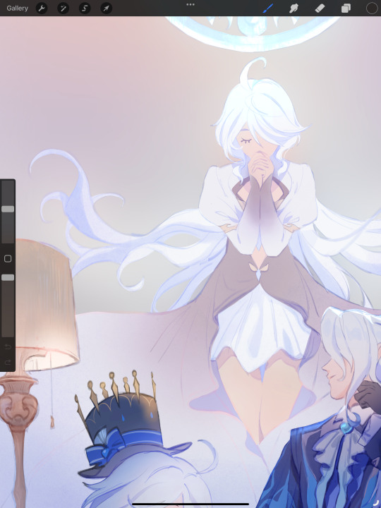
Hi, I'm sure you get this often but I really love your recent genshin artwork, do you think you could explain your painting process? I love the colouring effect in that piece especially. Thank you.
Thank you so much! I got a few messages like this from my previous piece (thank you guys for the staff pick & blaze btw, I really didn't expect all the support😭) so I thought I'd share a bit of my process below as thanks.
I always do my lineart first because it feels less daunting to me when applying colours. I will do some rough colours first so I can easily adjust it to my liking.
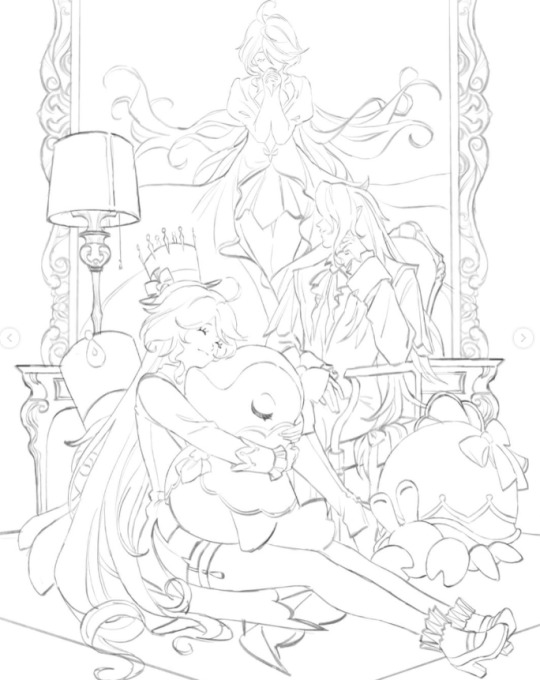

Next, I make sure to separate each character into different layers when I clean it up. I like to work one character or object at a time, it's less overwhelming for me that way, and I can use clipping masks for ease of rendering.

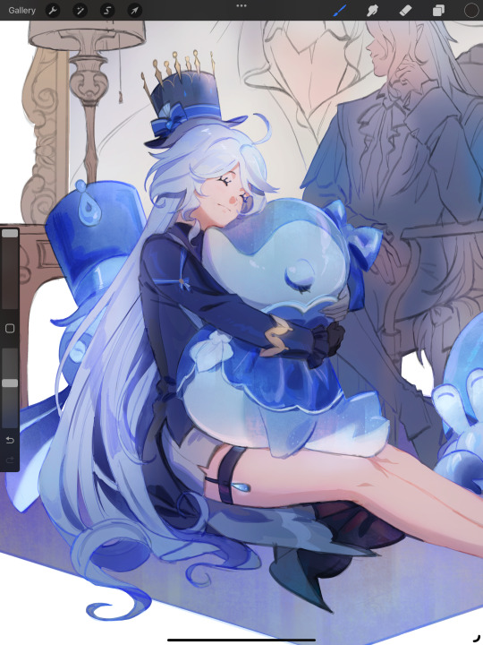
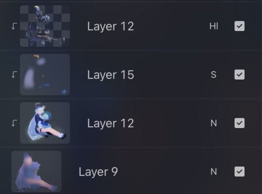
I'll usually apply some adjustment layers on top of the base layer for shadows and highlights. When I say base layer, I just mean a layer of the colour without any effects.
I like using 'hard light' for shadows, and 'screen' for highlights, but you can really use whatever clicks with you.
Rinse & repeat this process for every character in the illustration. Note that I make Furina the focus so everything behind her will be less rendered than the elements in front of them (Neuvillette is a lot less rendered compared to Furina, and the painting in the back barely has much shading).
Once I render out each asset in the illustration and add shadows & highlights to my liking, I then to merge foreground/ midground/ background elements so I can make the overall illustration clearer to read. I don't want it to feel messy or overcrowded, and I think it's easy to get tunnel-visioned in small details and lose the clarity of the entire illustration.
Make sure to zoom out constantly and make your illustration B&W to check the values to see if the drawing is clear.

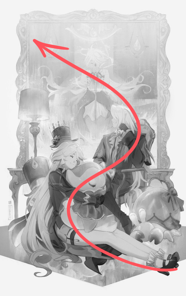
I created a simple S curve with the values for readability, and have the foreground elements have darker values & contrasts.
As for the BG, I wanted to add more textures into the drawing, particularly the painting in the back. Here's an image of it when I only added in the base colours.
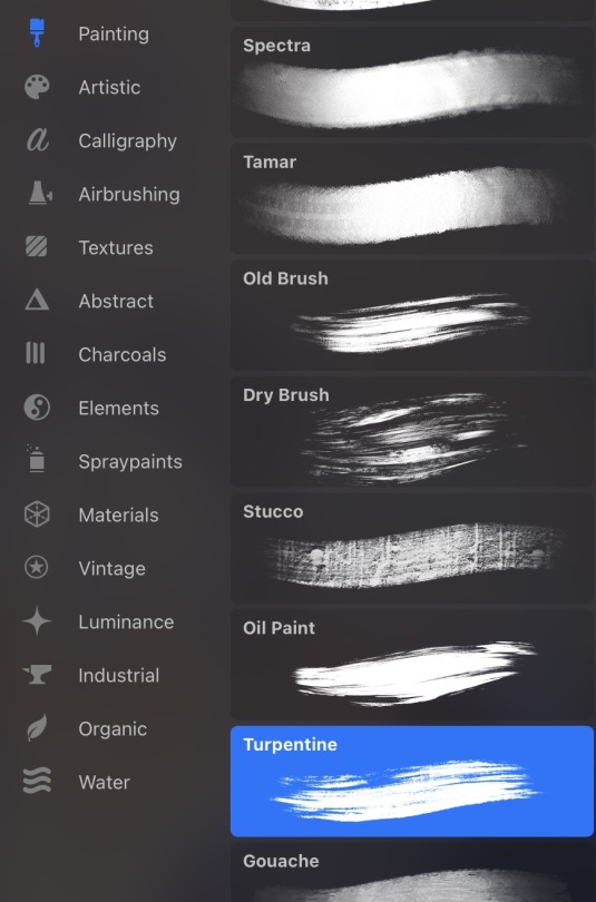
I use the smudge tool to create more texture once I fill in the base colours. Since I don't really 'paint' anything with the textures in, I just put in the base colours and take a textured brush to smudge it. However, over-smudging can lose the painterly texture I want, so I usually smudge vertically or horizontally in a single stroke to create a sense of movement.
Another thing to note is that I only textured the BG, I thought it would help it blend into the background a bit better. I usually wouldn't do this for the foreground because I want those elements to be clearer.
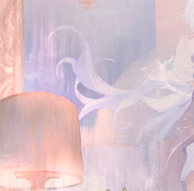
At the very end, I tend to spend a fair bit of time just fiddling with more adjustment layers, various filters (such as blur, or noise), or liquify small details to really finalize the piece. Just vibes...basically this is me

Anyway, I hope that was helpful & it made sense!! Feel free to message me if you have any other questions & I'll try my best to answer! I might've glazed over a lot since I didn't wanna make this too long.
237 notes
·
View notes
Text
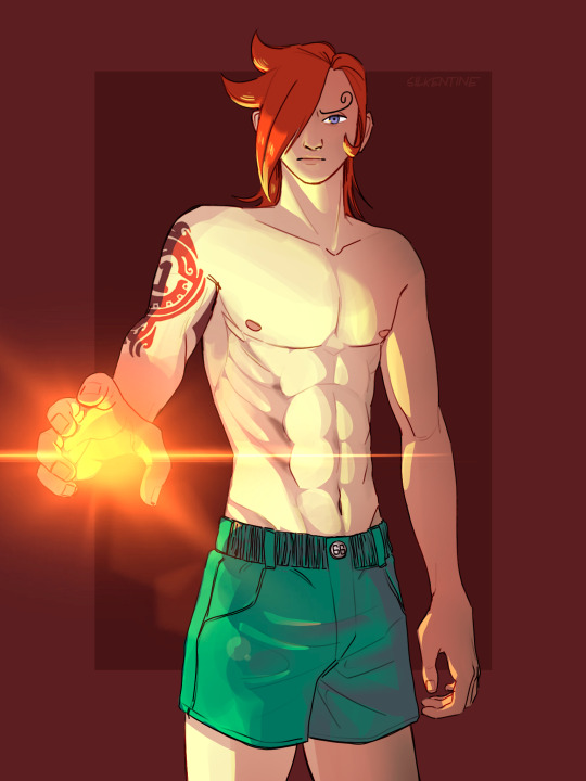
An anatomy and lighting practice that turned into Ichiji! 😊❤️🎇✨🔥 I’ve been really inspired by @dannymans66 lately so I’ve got #1 on the mind.
ALSO!!! I HAVE AN OPPORTUNITY TO WIN A FREE COMMISSION BELOW (Check it out and see if you can win!)
So I jokingly shared the lineart for this piece with my friend and said that it looked like a page from a coloring book and the idea humored me so much that I decided to hold a competition. I’ll give you all TWO WEEKS (ending June 4th 2024 at 23:59 EST) to color this picture of Ichiji using the blanks provided below and submit your illustrations here on tumblr with the tag #ichijirecolor (and it’s probably best if you @ me as well @silkentine). I’ll judge all the submissions (with the help of my unbiased mom) and the one that I like the best* will receive a free commission from yours truly :) anything you want!!! Feel free to color outside the lines, add stuff to the illustration, use the “wrong” colors, print it out and color it traditionally, whatever floats your snail-boat! 🐌 The only requirement is that my original illustration is included in some way (it doesn’t even have to look like Ichiji at the end, I suppose!)
*If my first place winner declines the prize or fails to respond with a week of the announcement, I’ll move on to the second place and so on and so forth.
Below the Read More, I’ve provided two versions of the lineart with and without the tattoo. Also, they are all 1526x2048 pngs either with a white background or no background at all. To color using a white background, place it as your top layer and set it to a Multiply blending mode, then you can add colors on a layer below without having to fuss with the lineart or delete the background. I’m not going to check if you keep the original size or ratio of the images; I like to work really big, so feel free to compress it if necessary. Feel free to move the watermark around, and it would delight me so if you added yours alongside mine!
Thanks in advance to all who decide to participate!!! I’m so excited to see what you can create!!!
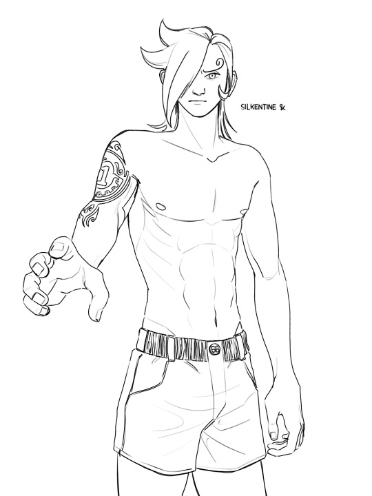

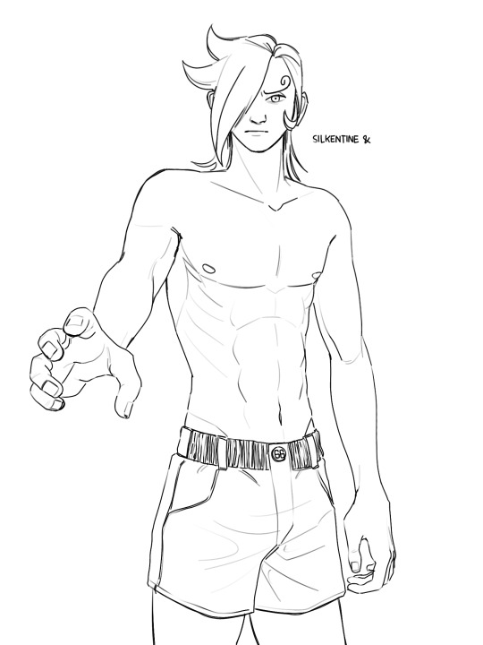

Also here’s my version without any shading, you could use this too if you wanted to but isn’t it more fun to start blank? Idk I just think this is fun to look at.
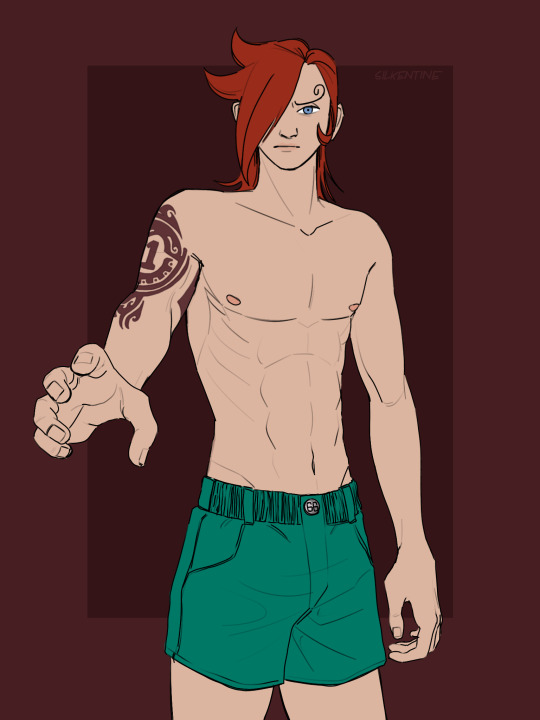
If you made it this far and you’re still not sure if you want to participate or not, let me sweeten the pot and let you know that I’m a very small creator and I’m not expecting to get many submissions, so your chances of winning could be much higher than usual with these kinds of things!!! I’m not someone who judges on technical skill either, it’s purely my own taste that will decide the winner, so don’t let your skill level hold you back! I love funny things and getting to know people in the One Piece community!!! This is all my selfish attempt at making some new friends hahaha!! Thanks for reading all of this 😋🥰 you mean the world to me.
#ichijirecolor#vinsmoke ichiji#art challenge#coloring page#digital art challenge#one piece#one piece fanart#op fanart#germa 66
104 notes
·
View notes
Text
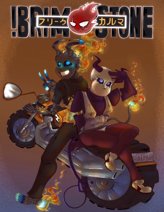
Context- I had been commissioned for this piece. Being in a financial pickle I picked it up and immediately set to work on it. Since I’m in need of money I put my all into the request to make sure it checked every box they could need. It turned out amazing I think! However I just checked our chat where I put the almost finished piece to find their account deleted. What’s worse is I had given them an update without my signature on it since it was unfinished and all…so if you see it floating around please message me!
Without further adeu~ the piece!
╔══*.·:·✧ ☎️ ✧·:·.*══╗
Information
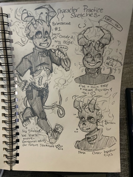
I was messaged by the user Freaky (later changed to Dust) for the commission of their two Characters Brimstone and Karma. Ecstatic we began consultation!!
They decided on a photo reference from the anime “Soul Eater”. They liked the old anime style and requested their piece would be similar. That meant a full body with simple background but a lot of technique put into the old anime style! Ofc I wouldn’t shy away from the challenge (since my bills won’t shy away from me- the apple did not work on the doctor….no matter how hard I threw it)
Upon requesting their budget they said between 130-200$ which worked fine with me. I always tend to under charge anyhow. Due to my needs this time was no different. I assured they would receive updates to let them know how the piece was going and that I would collect their input on any fixes needed. They agreed and without further wait I began.
『•🪱•✎•🪱•』
[ T o o l s ]
✦ Cheap sketchpad
✦ Mechanical Pencil 7.0 lead
✦ My Phone (to send to the iPad)
✦ Fathers IPad (Im broke don’t judge)
✦ Procreate
✦ Color Pencil procreate brush pack
✦ Lineart procreate brush pack
✦Paint procreate brush pack
*ੈ✩‧₊˚ˏˋ°⁀✎ 🫎 P R O C E S S 🫎 *ੈ✩‧₊˚ˏˋ°⁀✎
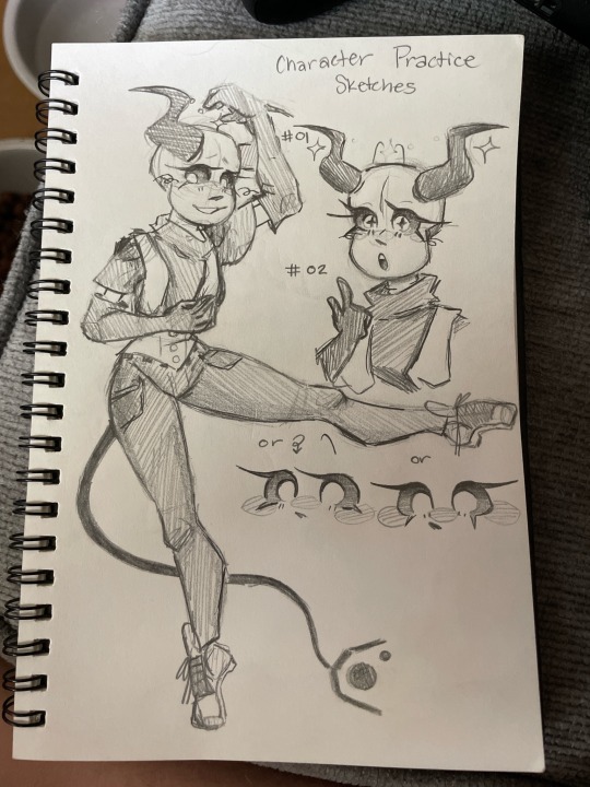
Once saving the many provided refs I began by creating character reference sheets. Due to the customer not being artistic they provided me with several other commissioned pieces of their characters. Not all…looked the same… so I created these sheets to compile the parts that fit the personalities portrayed. Then I checked in with the user to figure out which features looked most like what they imagined for the characters.
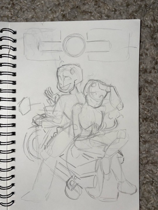
Then I continued with the base sketch of the pose. The original reference for the pose didn’t entirely fit the characters so I chose to tweak it. I think I like the way they interact on the piece. I even made them doing rock paper scissors if you pay close enough attention! Karma lost but well…Brimstone would get what was coming for it later lol.
After all that it was finally digital art time!!! So I put my color references sent to me before adding the anime ref and my character refs. On the iPad I started with adding the details of the characters and sketching the pieces in further.
When that looked good I shifted the background a little to see it all before doing the motorcycle. (This is the first one I’ve ever drawn too- I know it’s funky! Don’t look too close)
Once the sketch was confirmed I began lineart. The title was changed to say Brimstone in big and in Japanese it reads “Freak Karma” the user of the customer and their second character.
Following that was color blocking which absolutely murdered me! I simply started with a big blob and did Alpha lock. Then I continued to block out base colors. Probably the worst experience of my life…goodness..
After I did a big dark brown layer with the opacity lowered for the look of a darker environment. From there I lightly erased the spots for lighting.
Then it was additional coloring and shading to the color block layer followed by additional erasing on the shadow layer. Building it up until I was satisfied.
Finally I did two layers- a layer for specific color lighting such as the flames reflection and the color to their skulls and a layer for the black and white liner.
All that was left was adding noise, Bloom, and a little bit of halftones to achieve the desired look.
With everything done I added my signature into the mirror on the bike!
ALL THIS ON ONLY 4 LAYERS! Due to the sheer size of the canvas (6000 pixels by 5000 pixels (ish)) I was only able to have 4 MAX layers. So pain…
🪳✨ Time ✨🪳
//this is the longest I’ve ever spent on a piece btw! (These are timed and rounded down to the simplest form. So these are all slightly UNDER what I actually did.)
Ref sheets 🎨 45 min
Layout Sketch 🔆 24.3 min
Digital Sketch 🛏️ 1 hour 30 min
Lineart 🍿 8 hours
Color Blocking 🥲 23 hours
Lighting + Final touches 👍 1 hour 25 min
Total- WAY TO FREAKING LONG! This has 26,543 strokes on it!!!!
Anywho! I hope you enjoy the piece as I sure as heck have not due to my suffering and now lack of money that I now have to try and find elsewhere with bills gripping my now every thought.
If you’d like to commission me I’ll have to ask for a base payment upfront now due to this situation. I am unable to spend such time to provide my very best just to be left when I truly need the money.
Thank you for your time!
#undertale au fanart#au undertale#sans undertale#undertale au#undertale#alternate universe#au sans#au fanart#sans au#soul eater#commission#scammers#digital art#digital illustration#digital drawing#anime art#anime au
23 notes
·
View notes
Note

Hey so what’s your drawing process?
GET OUT MY HOU---
I have never been asked this b4! :-O Im drawing at the moment so it wouldnt hurt to explain how i do my refs for example heehoo
First i shallablamkdabdomdb I Think. I brainstorm. Im like. How does this character behave and act towards their everyday surroundings. 🤔🤨.... and then im like BAM I GOT YOU NOW!!!!! Sooo for the ram , for example- shes around 17 and is like ,, Shes very messy yet energetic ,, a god of war at her age makes her very energetic and outgoing since she has all this power (and well i guess it doesnt help she has adhd but-) so i was thinking about her pose as something rlly silly and dynamic
As i got used to drawing poses it was actually smth i learned from a couple of my moots- one of my moots got a similiar ask like this nd i took it with a big bag of rice and RAN ,,, Its all about me wanting to make dynamic poses- im not the best at fluid bests For Now but IM GETTING THERE ,

But yes sorry; thinking about my poses, sketch it twice, begin linearting- but after i finish lineart, i create different layers of coloring because my brain (ocd) tells me things and if i dont do This Thag Way I Will Be Killed On Spot With A Nuclear Ray From The Sky
I do lineart first, draw the face over on another layer, do hair color first, then body color under the hair color,, after im finished with that i then go HEEERRRM. NOW. Does it deserve a little razzle dazzling? A little speckle spackle? Do i want to render it? Do i want to change the lineart color to highlight the characters main color scheme? Yap yap yap my process isnt ALWAYS like this but its usually that way-

For allure though i can use a good example for this- when drawing allure—if i want to line their hair with the darker beige—i create two more layers and then draw over their hActually this doesnt make any sense I MEAN. WELL. I COULD PROBABLY JUST SHOW THE TIMELAPSE. Oh yeah I overuse the undo and redo button as well as using a FUCK ton of references from pinterest
But heres what my canvas looks like atm :-] if i want to make size comparisons i lower the opacity of the finished art and sketch over that with how tall or small the character is- aaliyah here is the shortest and smallest so to make sure i did her height and body size right i use the transform tool to slide her across the grid and go "is she smaller than i made her ??? Is she TALLER than i made her?? Did i manage to do her body weight correctly???" Etc etc

,,
Okay maybe nothing i said made actual senseMAYBE ILL TALK ABOUT MY OTHER EXAMPLES...? Im Digging
For something like this i actually kept th sketch BWAHAHA- i didnt really feel like tracing over it again (at least more or so properly-) so i shrugged, went Fuck It, then made my sketch the lineart layer. I put the flat color beneath it afterwards, put Alpha Lock on so i can shade, and bada bing Bada Boom ,, background comes after everything else (BAD HABIT) (COMPOSITION AND PERSPECTIVE R HEAVILY INFLUENCED BY WHERE MY CHARACTER STANDS-)


Uhh what elseOhYeah if its a standalone sheet for me or a friend- i draw the two poses that come to mind first, write down all the information i was provided (eithet myself or a friend), and then draw anything else i want to next to the poses if theres space left,, this is my brothers lamb and so i went back nd forth asking doll if what was okay and what wasnt okay to add-

ABSOLUTELY YAPFESTING . SORRY. I HOPE SOME OF THAT MADE SENSE. I know this wasnt an advice ask but if people ever needed advice from me i usually fuck it up cuz my Very Own process confuses me sometimes-
I usually either take 1 hour or 2 days to finish something (yes im That chronically online and insane to draw for 48 hours straight without sleeping)
That or if i hate something i go insane (negatively) over it and refuse to ask for peer review (at least sometimes-) so im like Okay Fuck This Wip. This Doesnt Exist Anymore
#sydneys asks#sydneys doodles#sydneys wips#i guess that counts here-#i did not read over my own words so in all honesty my english has been pretty fucked up as of recent so if this is ineligble then i am Sorry#OH YEAH I PRIORTIZE SHAPES. UM. NOT SHAPE LANGUAGE. MAYBE SOMETIMES THOUGH. IT DEPENDS ON HOW IM FEELING#I need to go eat somethingThats Unrelated
16 notes
·
View notes
Text
Replies
About nkgw and about the Idia sketches! And also one about fem!Azul drawing from a while ago.
Anonymous asked:
hi! If you don't mind me asking, are you the creator of Ń̸̞●̸͔k̴̙●̷̠g̴͍ą̶́ẇ̵̠a̴͈ stories on twitter? If so, is it part of something bigger or is there any more lore or backstory to the town/universe?
Hi, Anon.
Yes, I am! We didn’t really want to tie the author identity to this project if that makes sense (to keep it somewhat cryptic), but it’s an open secret anyway: it’s our project, and I am the one both writing and drawing it with Katsu’s assistance, guidance and sometimes ideas.
Our intention with Ń̸̞●̸͔k̴̙●̷̠g̴͍ą̶́ẇ̵̠a̴͈ stories was to create a series of small self-sufficient comics that could be read in any order, like small bites of kind of spooky kind of weird something in your timeline to go “huh?” for a moment or two; so there isn’t really any backstory or lore... But who knows, maybe some mysteries are going to get a little more context to them! Or not. The recent detective storyline is the first actual ongoing storyline that Ń̸̞●̸͔k̴̙●̷̠g̴͍ą̶́ẇ̵̠a̴͈ has. We are still thinking about the way we’re going to go around it, so it’s subtle for now. (I’m pretty sure Katsu also said it while replying to a similar ask today)
I don’t mind the theories though! It would be interesting to read what people think about things that are going on there.
What I can also say for sure is that I really enjoyed drawing an undressing game for it last year, so if possible and when we have more time for it, I’d love to draw something interactive again.
It’s also in a little impromptu hiatus right now because of my deadlines, but we’ll be back soon! Thank you so much for reading it and enjoying it. It tickles and inspires me a lot to hear that someone is interested in what exactly going on in this weird little town.
Anonymous asked:
How the hell do you draw so fast??? The new Idia ssr pjs JP card came out and you drew 2 amazing ones before I got his tsum and broom ones on the English servers within 3 hours of its release. And now another one??? God hands right there
Thank you, Anon!! I just draw a lot! lol
Well, there is also some planning involved. I started sketching around when the teaser for Idia’s ssr pjs just came out, coming up with poses and ideas and stuff. And now I just have to clean, fix and colour those sketches… since I am not doing lineart for them, it takes much less time! Well, it still takes a couple of hours of course, don’t get me wrong, but it’s not like I have to be as clean or precise as when I draw something similar to our recent Cater (he took ~4 days).
So yeah, a combination of me drawing pretty much all day and Katsu being smart about our time management and posting schedule lol
Anonymous asked:
Are we cycling through all the main Idia fuckers of the blog with the pajama drawings?
I think we are! It was unintentional at first though, so Azul’s and Ortho’s sketches are pretty…vague, without the second person actually being depicted. I kind of got carried away with the other guys… (yes it’s a little teaser lol). We’ll probably draw something for the vague boys again though, it’d be only fair...
Anonymous asked:
plushie nice and big
yessss, perfect plushie
Anonymous asked:
It's bright blue eyes disturb me so
Anonymous asked:
Like it's staring into my very being
Reminds me of doll Rook dare I say, they should be friends
Oh no, another cursed toy…!
I think this one is a little more judgmental, isn’t it? Doll Rook was so friendly and cuddly!
And Azu-plush just wants to cuddle with one person only and still be pouty about it somehow.
Anonymous asked:
For the latest Fem!Azul drawing is she wet or is she *wet*?
Yes.
And both options are equally dangerous…
15 notes
·
View notes
Note
Is there any particular artist, show, game, or movie that inspired ur art style? It’s so pretty ^^
I have so many!!! I definitely can't name every single one but heres a few that have been extremely influential to me!! This took me 2 hours to write i am SO sorry lmao
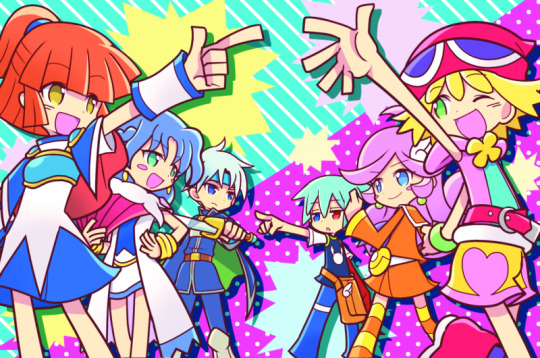
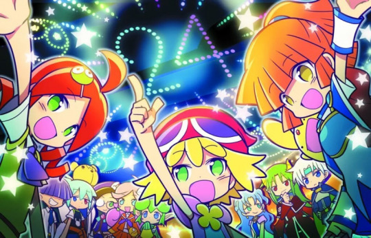
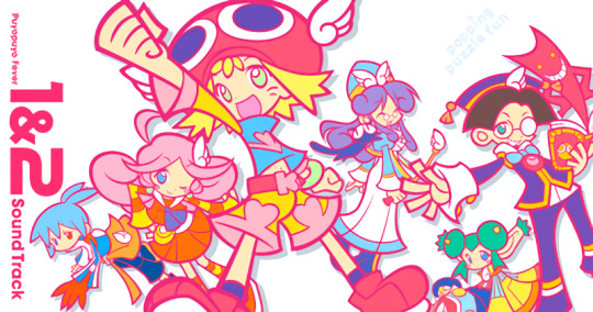
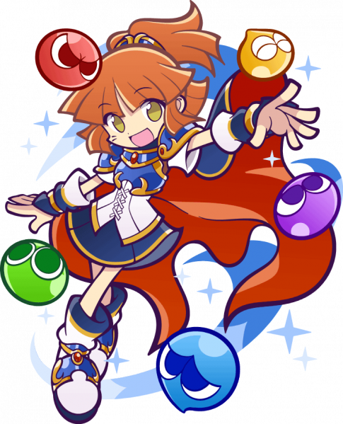

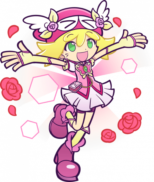

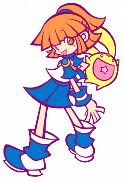
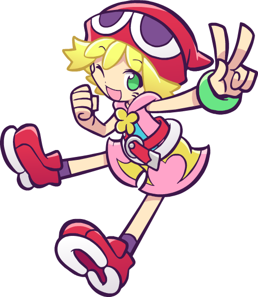
Puyo Puyo (Specifially Fever, Quest, and Tetris)
CUTESY BRIGHT BRIGHT COLORS!!!!!! Thats everything I love!!!!!! I'm pretty sure I talked about this when I first got into puyo puyo but I for SURE instantly decided that yep Im steering my style in this direction sorryyyyyy!!! I just think its so fun and silly and cute and rahhh it makes me so happy.
Especially for the work I do most often, which is character portraits without backgrounds, I will often look at puyo puyo posing just to get ideas!! (I've drawn Arle's dumbfounded pose 100000000 times becus I love it so much). The puyo puyo anatomy has very noodly arms and legs but with big ass shoes and accessories which is probably my favorite design thing in the world....
I seriously recommend just looking through the Puyo Puyo Nexus wiki for pose ideas (if you want something cute/silly of course) because every single one is just perfect. I am trying to get out of some dumb art habits of my own right now, but hopefully in the future you'll be able to see more goofy poses with sillier effects :3
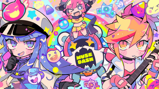
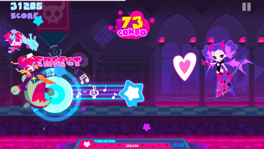
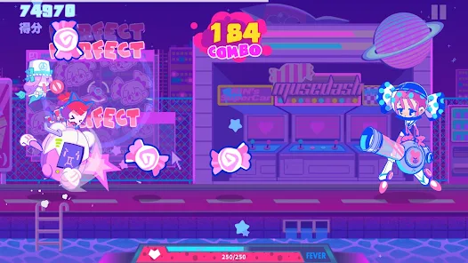
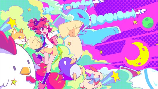
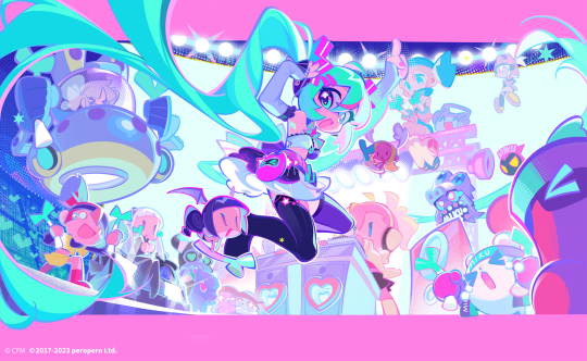
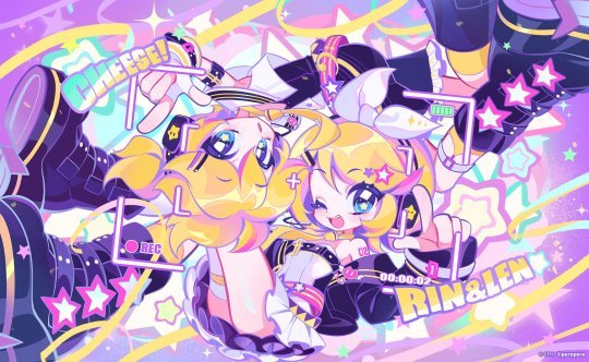


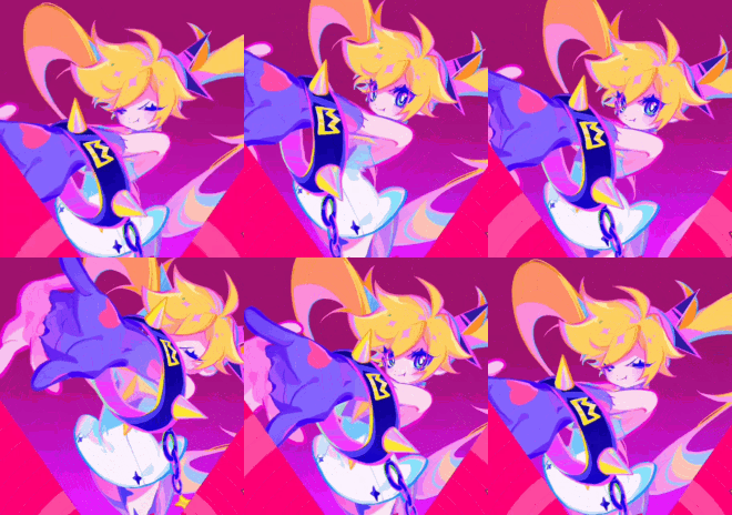
Muse Dash Again I want you to look at the COLORS. Its so bright and this time you can really tell where I took my shading style from. I dont want my shadows to be dark I want them to be PINK or PURPLE. thank you. For my own art, I really try to make it so the darkest "black" is actually a deep purple or blue, and as I keep making art that dark color keeps getting just a bit lighter haha...
This is also the reason I color my lineart the way I do. I just really want to add as many colors as possible into the image. And if the image looks a bit more pink after that then thats just an extra perk!!
I also need to bring up the animation because they're just so bouncy and alive!!! This is like an instant stunlock for me, I have to look at them, theyre so BOUNCYYY!!!!!! I don't do much animation but every other week I get the sudden urge to try tweening again just to eventually get to the point I can make something similar to these for my own ocs lol


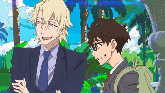

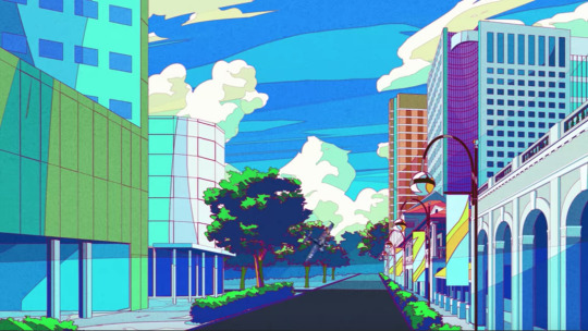
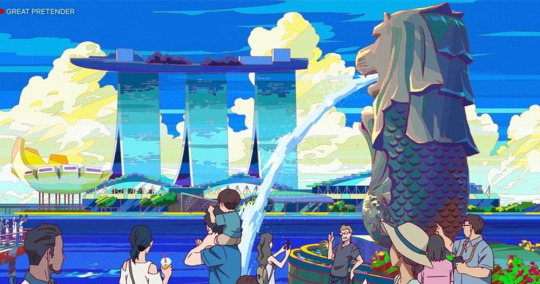
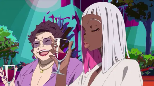
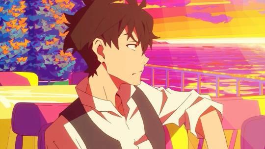
Great Pretender This show has some of the most gorgeous art ive ever seen. All the backgrounds are so bright and colorful. I dont usually draw art with backgrounds anymore sadly, but when I used to I really tried to study these for them. And I hope in the future I can make more art and show how far I've come.
Though I;ve changed to a more chibi style in recent times (thanks puyo puyo), this was still one of the first times I had ever watched a show and said "Oh my god I love this artstyle I need to get better at art" and Its always in my mind for that reason.
Ive definitely stolen lots of elements from the style. Though they've gotten more subtle over the years. I dont really know how to describe it any further but I hope you understand what I mean by looking at these screenshots,,,
19 notes
·
View notes
Note
I just downloaded procreate on my iPad (finally) and I’m so excited to start using it. You’re like the Timbern master in digital art and I know the cliche saying of “practice makes perfect” but do you have any tips for using procreate for beginners (i.e. best canvas size for sketching, best pencils/pens, how to do line art)
I can give some tips for sure!
The bigger the canvas the better, but keep in mind depending the size is the number of available layers you will have for your art, so just look at the way you make your art and ask yourself “Am I a multiple layer fiend or an all in one layer monster?” I do use multiple layers so my default canvas is 4000px X 2500px this gives me 63 layers to work with, I could go higher if wanted but I know myself, I do love my layers
Always remember RGB for online posting art CMYK for printing, regardless of digital or printing always go for 300DPI for better quality.
If you plan on using the time lapse option in procreate make sure it is set to 4k resolution and Lossless quality so it is crisp and beautiful.
Talking about video once you have saved the video on your device delete it from procreate to save storage.
Brushes is up to you friend, I would suggest try first the default brushes in procreate, there are many great ones, I personally use the brush Dry Ink for sketching and lineart myself. But there are also many free brushes online you can download. Try them out and once you are more comfortable with the app you can look into the brushes you have to pay for to use.
If you are just starting with lineart I suggest checking the brush settings and make sure it has some Stabilization, it will help you at first, I do think you should also practice without it, so you are not too reliant on it, this is one of those “practice makes perfect” kind of things.
Hope this helps!
99 notes
·
View notes
Text
August Magma Session!
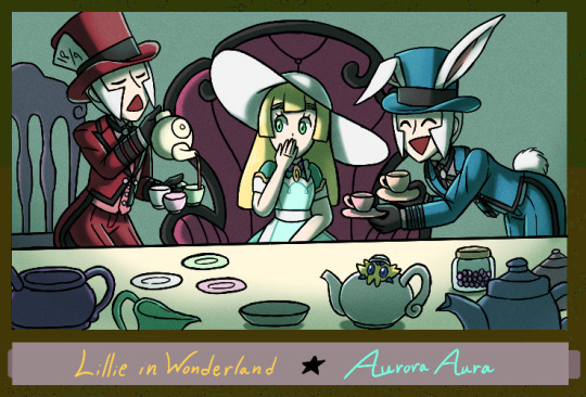
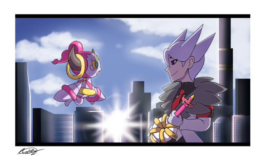
Drew two pieces for @choochooboss's August session! The theme this time around is....movies!! Such a fun topic-
I shall add some commentary of each piece below! :D
The first one is inspired by Alice in Wonderland, where our main heroine ends up in the Mad Tea Party. Have a Merry Unbirthday, Lillie! (A confession: I...actually had to redo the lineart to it's entirety!! Sadly it was due to some unforeseen lag in Magma preventing me from undoing the huge error. I'm glad I managed to do it without any issues and it didn't end up looking bad or rough.) The second one was done in the doodle session! This is another reference to...a pokemon movie! I'm sure those who have seen the XY/XYZ anime films could recognize this shot... (Another confession: I actually am interested on doing a fun little Screencap Redraw project with a lot of these films and do it based on the overarching pokemon au my friend and I have! Let it be related to the Twin Princes AU or... well, the drawing already shows the two characters I wish to do screencap redraws with. Hehe! I think that's a good enough clue for now.) I wish I could've done more, but with classes and wanting to be smart with my usage of time- I could only do so much...! Perhaps next time- For now, I hope you all enjoy these! Thank you for hosting this even Jun!
#pokemon#submas#subway bosses#pokemon lillie#pokemas#prince lear#pokemon lear#hoopa confined#pokemon hoopa#pokemon masters ex#aura's art#jun's magma events#t'was a fun time as always- thank you for hosting jun!
56 notes
·
View notes
Note
the way you color stuff is AMAZING!!! I MEAN IT! mind explaining how you make colors look so good?? its ok if you dont want to :)
Hi, thank you so much!!! <3
Generally, I try to go for softer, more pastel like palettes, and that helps make the drawings seem more "consistent" and pleasing to the eye.
First tip: if you use Clip Studio Paint, definitely get this tool. It saves so much time on filling out lineart, and it's crazy accurate. If you're having trouble figuring out how it works, here's how I do it: I put the lineart layer in a group, add another layer below it (still in that group), and then use the tool on that new layer. Make sure the tool is set to refer to layers in a group though. Then I erase some areas that were "enclosed" by the lineart.

As for the actual coloring process. First of all, I use the mechanical pencil brush from Clip Studio Paint, the same one I use for the lineart, except this one has random color jitter per stroke. It adds slight variety to the base colors, which helps making them look less flat.
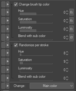
Here are the settings I use, but I recommend playing around with them if you want less subtle results.
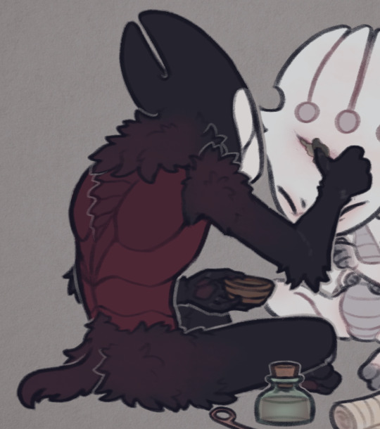
For a comparison, here is one of my drawings with regular flat colors vs one colored with the brush I mentioned:

A pretty important part of the process isn't actually related to the coloring itself, but the layer effects I add to the finished drawing, as well as the paper texture (which you can see in the background; I add it twice, to the background and on top of all the layers).
Here are the layers I usually go with, I'll explain each of them below.
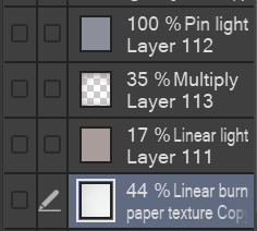
I'll start from the bottom. The paper texture is almost white with some very subtle warm tones, and it's set to linear burn, which works the best for this kind of texture. Like I mentioned, I use this overlay twice, but both use the same layer mode.
Next is the brown-ish linear light mode layer. This is to give the drawing more subtle contrast while also tinting it with a sepia-like tone. You can use any color for this, but I find this light brown color to work the best for my artstyle, since it makes the drawing look softer and gives it the old photograph kind of look which I tend to go for.
The multiply layer is mostly transparent aside from the edges. This is for the vignette effect, not much aside from that. It's definitely a personal preference thing.
Lastly, there is the pin light layer. This one is a bit weird, but I really like the effect. It's hard to explain it, but I use it to tint the dark tones of the drawing with a slight blue color. You'll see what I mean in the examples below. Occasionally, I'll add another layer with a darker base color, since pin light kind of works in reverse: if you use a light color, it will target the dark shades on your drawing, but if you use a dark color, it will instead only go for the light shades. Note that it's pretty strong in this drawing in particular, I usually make it a bit more subtle. If you look at my recent drawings you'll see it.
Here is the same drawing, with each of the layers applied in the order I listed (left to right order):
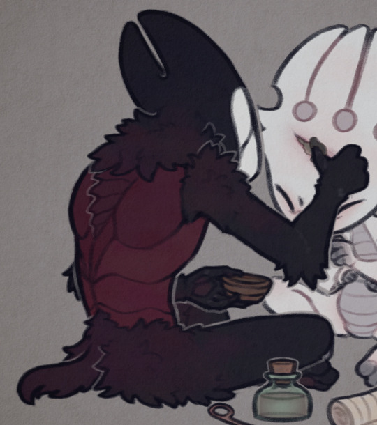


I'd also like to mention the lineart, which actually plays a big role in making my drawings look softer. I color the lines on the "inside" with a darker shade of the base color, though I often make it more saturated to really bring them out.
For example, here are the colors I use for FPK's lines. Not including his eye colors or the tips of his fingers/feet, since I don't color the lineart there. And a comparison of what he looks like with and without those lines colors, just to show how big of a difference it makes.

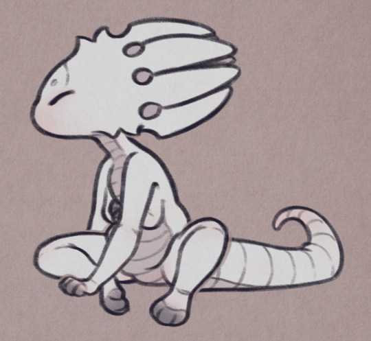
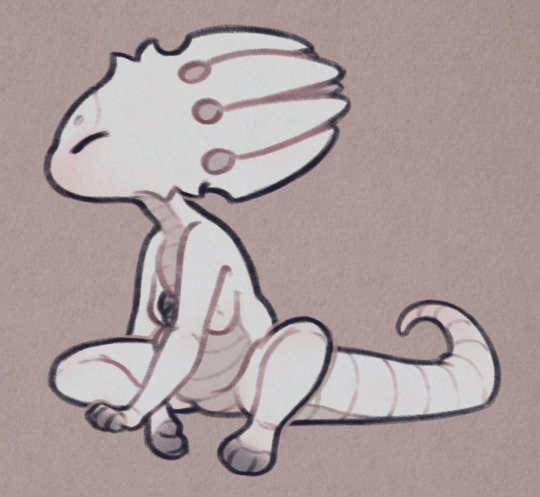
And to go back to the previous drawing, here is a similar comparison.

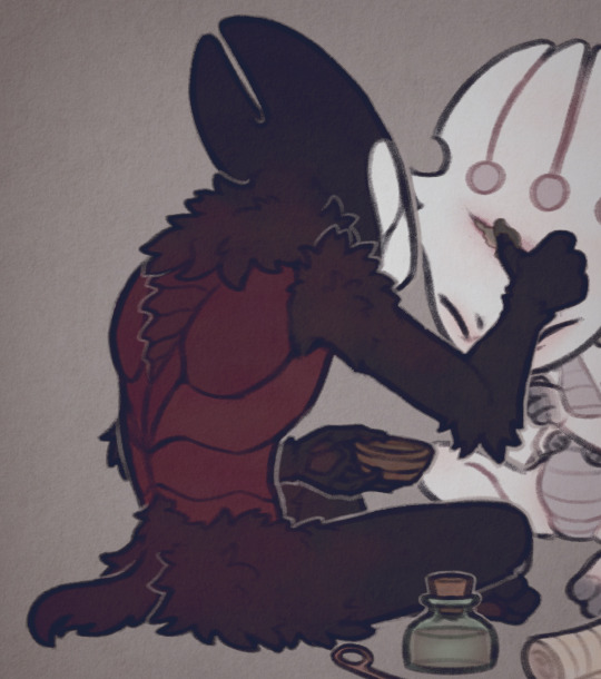
One thing to note is the additional white lines on the darker areas of Grimm's arms, the lines blend with the base color so I like to make them slightly lighter to help them pop out.
And lastly, I'll mention the light outlines you probably noticed by now. I add them as the final touch, they're the same color as the background though I sometimes lower the opacity if I feel like they're too much. They're meant to help with colors that blend together too much, and to highlight the silhouettes of the characters, as well as adding more dimension to the drawing. I think you'll see what I mean when I hide them in this final comparison:


Hope this is helpful! Sorry if you didn't expect that long of a post, I wanted to go through each step in my process so that I can explain it the best I can haha
40 notes
·
View notes
Text
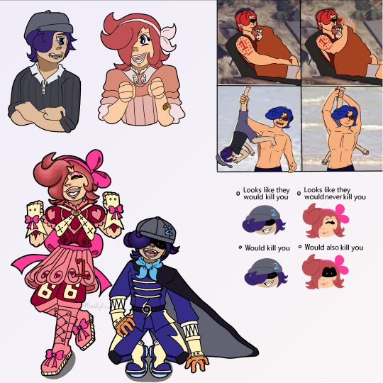
appears looking at you with autism creature eyes. hello @sangerie your vs bros fankids (one of which i had a hand in making bc. glances at the reblogs/notes in @loopyarts post. i have confessed there fskakfafsga) are really really neat .u.
SPEAKING of loopyarts ty for allowing me to take inspo for nijis kids raid suit fit!! i really liked the softer yellow and the thicker lightning bolts on his pants you gave him so tysm for letting me yoink it <3
uh uhh individual pieces and also design/character rants under the cut bc. i wanna.
RAID SUIT RAMBLING TIME bc i spent the most time on those. also you might be asking 'why is only their hair rendered in those pieces?' well the answer is because i am Lazy. moving on . (/HJHJ i AM lazy but also rendering it further would mess up the colors and i didn't wanna do that lmao. carrying on..)
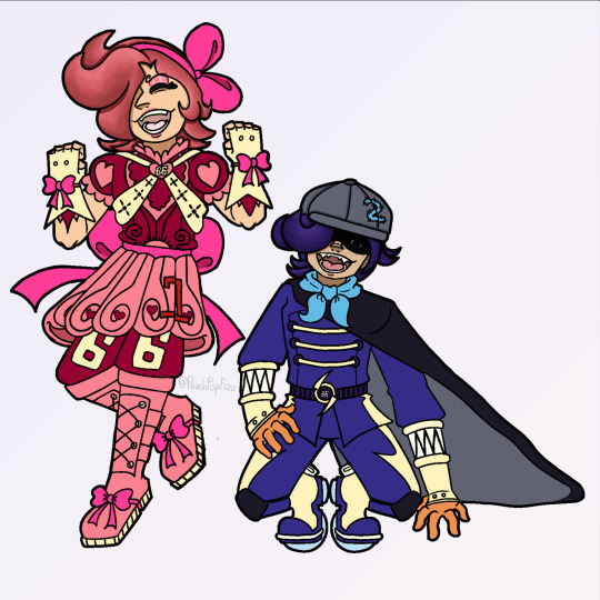
Ichiji's daughter i am so SO proud of her fit. i did not look up a reference or even inspo ideas at all, that all came from the ole noggin baybeee. anyways she is obviously based off a magical girl(s) fit bc she wants and DESERVES to be. also since Reiju doesn't have any kids of her own (based wine aunt) i also decided to let Little Red have some of her motifs instead of just purely Ichiji's!! primarily the 66 on her pants but also all the pink on her instead of just red :) and obviously she has her dads number and while she DOES have a (white? bc like daddy shes a special little princess /aff) cape i didn't include it here bc it looked reallly bad lmao. but she does have one tucked into the bow probably!! there she is, Sparkling Red Neo!!! (get it.. sparkling instead of sparking... bc magical girl.... im funny i think.) onto Little Ocean Boy
OKAY LET ME TALK ABOUT THE MOST MINISCULE YET MOST IMPORTANT DETAIL TO ME AND ME ALONE FIRST. that being the symbol on the brats belt. it was actually inspired/based off of this post which really stuck with me with me after reading it which i later realized was bc the "that something has been completely reversed" REMINDED ME OF THIS POST OF YOURS. i don't think im especially good at theory crafting but. idk i think there could be Something about how after judge came and turned germa into mercenaries their symbol turned from what once symbolized 'purity' into the skull of war mongers and then BACK to purity after 0124 get germa on the right path... poetry or smthn. ANYWAYS yah shoe shiners got a pretty basic fit bc like i said in the og ask, hes a sora warrior of the sea fan, once he saw the raidsuits irl methinks he'd want to stay pretty close to the og design. HOWEVER he refuses to drop the hat (much to Niji's dismay) and i came up with a reason besides 'its one piece and therefore there's GOTTA be a kid with a weird hat that they're attached to': and that is the fact that it hides his eyebrows. Little Red has the curly brows, all of Yonji's cabbage patch does too, and the brats the only one without. even if literally no one else notices or cares, he wants to hide the fact that he doesn't have em because it Separates him. and he doesn't want that. at all. he really, Really wants to be a part of this family (oh no i made it. angsty). ANYWAYS UHH YAYYY HE HAS A TWO ON HIS HAT (that he sewed on himself which is why i made sure you can see the stitch-lines) BC NIJIS HIS DAD WAHOO YIPPEE :D:D:D Dengeki Blue Neo: little shoe shiner edition!!
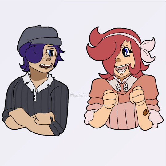
UHH second image is just a refined piece of that first doodle i sent you. with lineart and a better color pallet and all. actually looking at it again now i realize i forgot little brats freckles and i am now punching the air bc its too late to fix. just act like they're there. please :,,,) edit: nvm its the next morning i fixed that kjahsdah
i don't even have much to say about the last two because i Think i am Rightgksfjgasjkfa but for the third i think the brats a bad influence on Little Red especially. ALSO FOR THE FOURTH NO I DIDNT FORGET ICHIJIS TATTOO. I AM JUST LAZY. (and I also forgot his tattoo :]) ANOTHER edit: i also. fixed this :]
CHRIST i am incapable of contacting you on Tumblr via any way that includes anything less than 250 words i am so sorry sangerie.. i hope you like these tho cause i really do tbh :3 (PS you have to take literally NONE of what I said here [mostly about shoe shiner] as like.. canon about them?? these are YOUR ocs obvi so please, change Little Red's raidsuit design if you find it unappealing!! make shoe shiner have a backstory of your own!!! i hope that isnt weird or rude to say, i just thought it was important too bc i threw sm at you so strongly ^^' okay thats all tysm for reading this it means to world to me byebye <3)


#one piece#vinsmoke ichiji#vinsmoke niji#one piece ichiji#one piece niji#others ocs tag#vinsmoke siblings#my art#im so happy with how the raid suits especially turned out like i can't get over it#i haven't been truly proud of an art piece for MONTHS this is so refreshing#like this aint perfect in a lotta other places but that alone is carrying this for me#also sangerie i am SO sorry if it looks like im virtually stalking you fjagskdakfsfa first the trans vs sisters and now this..#i promise im not there's just not a lot of ppl in the Vinsmokes tags and you and your stuff is really cool 😭 im normal i prommy /irony#okay ive literally said enough in the post im shutting up now gday or gnight take care#OH WAIT YEAH throwing in a#scopohobia tw#scopophobia cw#bc little brats eyes are borin into ya#OKAY now gday/night <3<3
32 notes
·
View notes
Note
hi hi! first off thank you so much for always serving looks. your art is phenomenal and your style feels like it belongs on the walls of a luxury fashion HQ.
stunning stunning stunning
i was wondering if you ever get the time, would you mind (please) showing us any tips on how to achieve that rich variety of textures you have on so many of your fits? the one you did recently of the three Tifa fits, for example, has so many different textures represented. I wouldn't even know where to begin achieving that!
no pressure of course! if it's a trade secret then please do keep it. I'm just so impressed and curious and had to speak up
thanks so much, keep up the beautiful work x
Hello!
First off, thank you so much for your wonderful words! Working in the fashion industry is my dream so this means a whole lot to me.
I can totally share! I'll try my best to explain my process because it varies quite often, especially now that I switched from Photoshop and Procreate, but if I were to give my step by step, it's this:
sketch> lineart> color> shade> paint over> texture/grain/sharpen/contrast
The unique coloring I had a few drawings back came from working with an Adjustment Layer with a Gradient Map on Photoshop. But now since I use Procreate, my main trick is making the colors much darker than I want initially, and then putting a bunch of highlights with a Color Dodge layer with a textured brush.
Now, my main thing is that I never use blending brushes and my brushes (outside of color blocking) are always textured. Charcoal, pencil, grainy, grungy etc, that is what you're looking for. If you need something slightly softer, watercolor brushes that mimic real ones are ones I use as well, just not as often as the others.
My latest Tifa piece uses all official Procreate brushes that come with the app. The Rosette brush, which is under the Textures brush folder, and the Flicks brush under the Spraypaints folder. (Also Derwent, 6B pencil and Gloaming for sketching and lineart)
General rule of thumb with shine is that it can only get so light, so make sure your base is on the darker side.
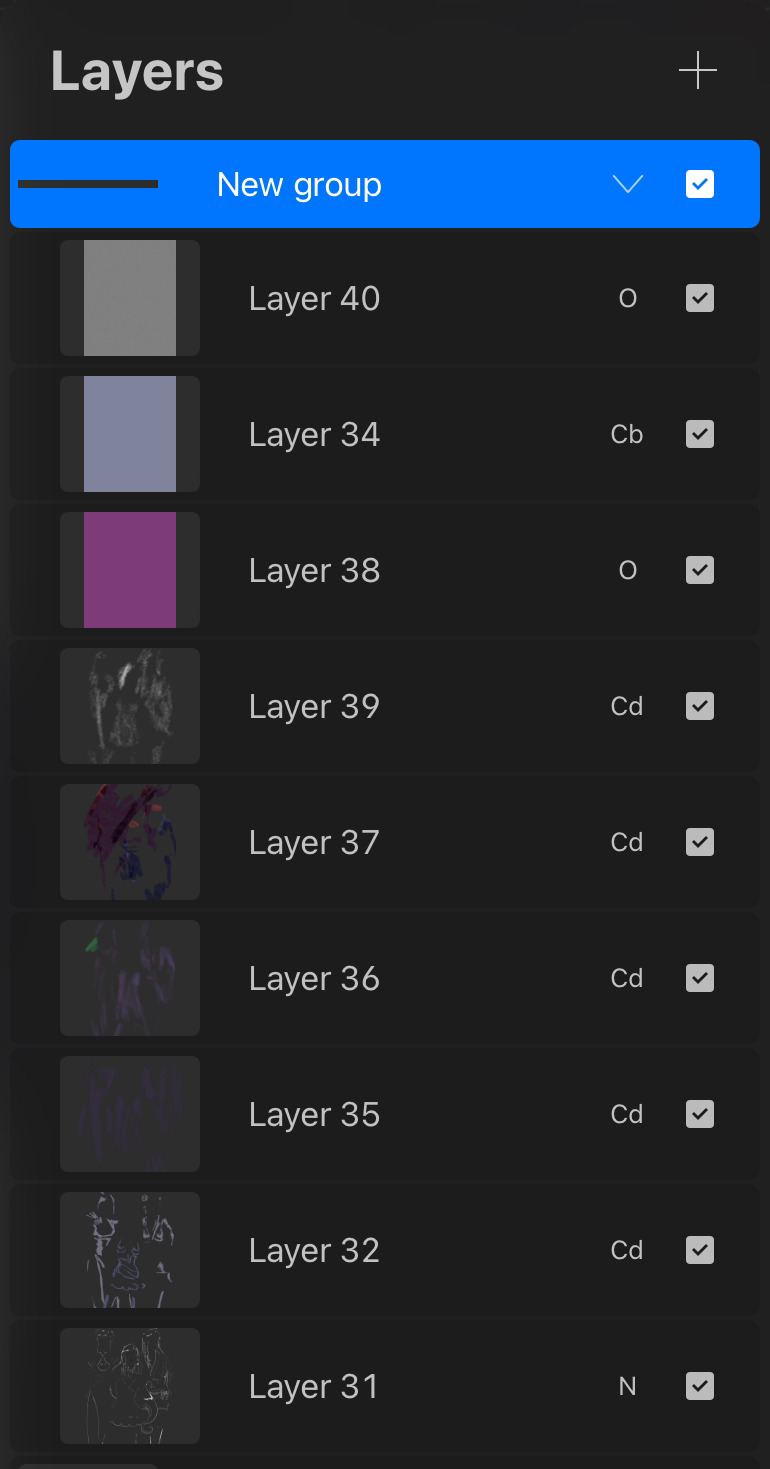
Here is my effects folder. That's where I add highlights, mood and texture. I've also been enjoying the noise and sharpen feature on Procreate, and I apply them all on a grey overlay layer on top of all of my art. Also a bunch of color burn and overlay layers.
For reference, here is the art without the effect folder compared to the final art.

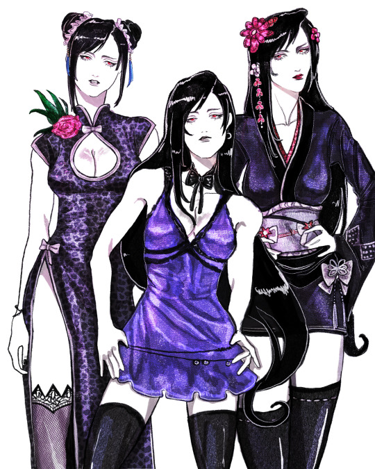
Hope this helps! ❤
25 notes
·
View notes
Text
Some art, for once!
For context, we fucking hate doing art most of the time. I say that with love! Art is wonderful, it's a good way to self-express, it just... is so difficult. We're perfectionists, collectively, and we're prone to looking at something we've barely even started and going "Oh, well this sucks. I'm trashing it."
But lately, we've been working on an AAC. Which is also a big deal, and completely unrelated! Long story short; we've wanted something like this for a while, and now that we know it's a few specific people in our collective, it's easier to dismantle the internalized ableism for their sake. But there's a lot of anti-endo emote/AAC symbol blogs. Like... a lot, actually. It's disheartening. We're not endogenic, but we aren't comfortable using symbols/emotes from someone who has Endos in their DNI. We think that this sort of thing should be accessible regardless of stance on anything. So we've started drawing our own symbols for the buttons we lack in, if we don't think any of the blogs we like will take a request for it or feel like we'd be bugging them with too many "simple" requests.
And, within a week or so:
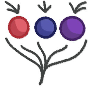
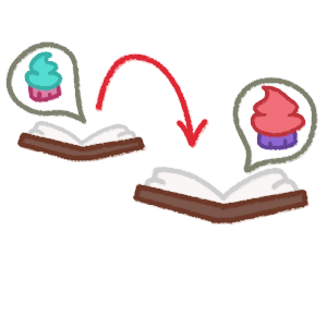
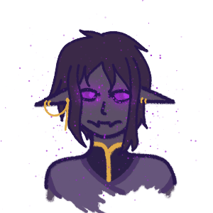
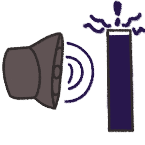
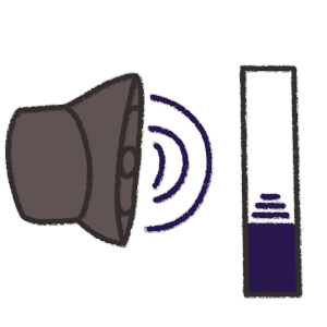
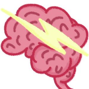
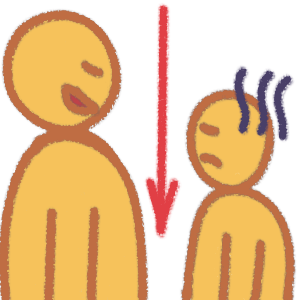
In order: Any, Based on, Enderfolk, Loud, Quiet, Seizure, Short.
The Enderfolk has to be my favorite, and is honestly the first time any of us have ever drawn a character without experiencing a lot of frustration. The one for seizures is because we have them, and based on how it was explained to us as a kid! "A lightning storm in your brain." And the short person looks annoyed because... Well, our friends call us short all the time and we're always (playfully) pissed at them for it.
If for whatever reason anyone wants to use these, you absolutely can! We... might even take requests for these, if anyone's interested since we really are trying to enjoy art more and therefore make art more. Plz just send us an ask if you use them and are comfortable doing so, because we'd like to know, or if you'd be interested in requests! I'm not sure we'd post enough to justify a whole entire sideblog for it, but I don't think we'd spam this one too much.
Our art certainly isn't very skilled, nor is it objectively "good," but I think we're starting to feel a little less like it's objectively terrible and I consider that one hell of a win.
OH ALSO obligatory disclaimer: Please, don't come at us for copying someone's style. We fully haven't. We took note of what we liked in art for AAC stuff (Colored lineart, softer color palettes, softer brushes) and went from there. We're not taking inspiration from anyone specific, although if someone is upset about art style or something they can DM us.
-Trixie (A member of a subsystem, which we've forgotten to post about. Whoops.)
#plus we're able to enjoy it now which we couldn't before#art was stressful#now it's not so far#we haven't drawn complex things but that's sort of the point#maybe someday we'll try our hand at a full character but first it's simple things to build a foundation#uhhhh#emoji#emote#custom emote#aac emoji#aac symbol
5 notes
·
View notes