#and I’m trying to get back into that painterly style I had for a bit last october
Text
In other news, I have a very interesting book arriving on my birthday which I’m DEFINITELY going to be using as inspiration for some fun Terzo art soon👀
#the band ghost#shitghosting#I’m still working on the Antichrist Copia drawing. it’s just taking a while bc it’s pretty big#and I’m trying to get back into that painterly style I had for a bit last october#also I got too excited to started working on the Zombie Queen poster and it’s kicking my ass!
3 notes
·
View notes
Text
a retrospective of my art of 2022
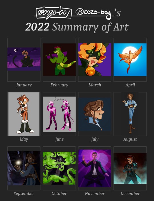
i love that you can tell what i’m hyperfixating on judging by the art. more detailed explanations below the cut!
january
i started off 2022 with a redraw of a piece from april of 2021. for christmas of last year, i got an ipad and apple pencil, so this was largely me exploring procreate and the feel of a new way of drawing. there’s a lot about this one that i still like, particular chat noirs cute lil face, but there’s so much i would do differently now that i’m more comfortable with the medium.
february
i was still finding my footing with this one. i was really into fnaf, and naturally, monty. the shine on the ass was using one of the in-app stamp brushes, which was quite fun to play with. honestly, going back, i would just add more depth and complexity to this one. i stand by the bones of this one.
march
this one was done so i could have a fancy new pfp. to be completely honest, i’m not a fan of this one. it’s a redraw of a screenshot from the show itself, and even at the time i was unsatisfied with how this turned out. in retrospect, i would’ve started the sketch small and then scaled it up so it would look a bit more,, normal. i find my art comes out much better when i start small.
april
this drawing is for a worldbuilding project i like to work on when i’m not obsessed with anything else at the time. in this world, there’s a city with a whole festival for phoenixes, and a legend involving a raven falling in love with the sun, but i won’t get into that right now. if i’m remembering correctly, one of my references for this one was a swallow. i still like the way the sun shines through the feathers and the more painterly style. i still stand by this one 100%.
may
oh boy may. this was when my apple pencil broke, and lined up with me getting into sonic, after watching the movie. one of my friends sent me a picrew, birthing this little nameless character. i’m still quite happy with this one, i think i got the style really good while still making it a little bit my own. my short lived sonic hyperfixation is still visible in the way i draw eyes while sketching, which i think it pretty neat. i wonder if, had my apple pencil not broken, i would’ve gotten more into the franchise.
june
AHHHHHH. sorry, this is from when i got back into a set of my ocs, affectionately dubbed “the sin boyz”. they’re all based on the seven deadly sins, and this is asmodeus, embodiment of lust. he’s definitely the most fun to draw because of him being quite high energy, and i’d love to come back to these characters once again. i don’t have much to say about the drawing itself, other than still liking how cartoony it is.
july
i’m not entirely sure what sparked this, but i got really back into the arcana, a game which i’ve been into for years now. this little fella is my character for the game, named zephyr! this piece is actually based on a sketch from i think a few months earlier. i still like this one, with his cute little face. i adore how his eyes turned out, and i’d love to try returning to that style, even just to experiment.
august
this is actually a reference photo for zephyr, but i wanted to fully render it to try to demonstrate some of the fabric textures. i still adore just about everything about this, aside from how his face turned out. i’ve always struggled a little with placing eyebrows too close to the hairline, dating back to my art from when i was like,, 12, where the eyebrows would actually float above the head. aside from that, i still love this.
september
when i made this, i was actually rereading lucio’s route (i’m obsessed with it in a train-wreck way) and found the imagery of the player investigating his abandoned room super compelling. the background from this is actually from the game itself, which is something i had never done before. i even slightly edited the background the reflect some of his magical light! this one is much less colourful and saturated than my other stuff, and i have mixed feelings about it. still though, i’m proud of it, and i think this style of lighting is reflected in what i make today, even if the colours are out of my comfort zone.
october
this is probably one of my favourite pieces of ghost fanart i’ve made. the lighting is a little unpolished in relation to the smoke, but i couldn’t care less cause i just think it looks so freaking cool. i was directly inspired by mummy dust, both in the vision in my head when he growls “duuuuustl, but also in the green stage lighting when it’s performed on stage. i love how swirly the smoke looks, and even now, i’m obsessed with drawing characters lit from below. it’s one of my favourite things i’ve ever made.
november
so uh,, i was a very passionate voter in the american music awards, and the news of ghosts win was so wonderful. i, like many others, was and still am obsessed with the outfit tobias forge wore, and found it super inspiring. i was really worried about this one, cause i basically never draw real people and really wanted it to actually look like him while still being my art style, and i think i did pretty good. this was also new for me because it has two light sources! this presented a really fun challenge and i’m still so proud of this, aside from the lighting on the glass part of the award itself. also, three.
december
i got a new apple pencil for christmas! i immediately had to make something with it and the wonderful pressure sensitivity. i was mostly just playing around with this one, and doing back i’d change a few things, even if it’s only from a few days ago. nonetheless, i had a lot of fun here and really like the colours.
summary
oh boy i sure did draw this year! i think i’ve improved a lot, specifically in shading and rendering. i went outside of my comfort zone a lot with lighting, like things with multiple light sources and coloured light. next year, i wanna go outside of my comfort zone in different ways, particularly with things like backgrounds and character interactions. if you’ve read this far, i hope you enjoyed my self-analysis, and i hope 2023 brings you joy!
3 notes
·
View notes
Text
What's the News, Vamp?
Good morning everyone, happy Monday! Welcome to July! Yesterday, July 2nd, is the exact half-way point of the year — how has your last six months been? I truthfully have not had time to reflect on them, but I’ll be doing a little bit of that in this newsletter with you all here. Before we get too far into that, though, here’s this week’s schedule:

Under Strange Suns
There’s an art house studio (a studio that provides art to other companies, in this case for video games) that I’ve been following for a little over a year called Atomhawk. Atomhawk does a contest every year to lift up promising artists, and also provide an opportunity to get your artwork seen. This year, their theme is Under Strange Suns. If you’re an artist, I encourage you to check out the contest here. It’s a wonderful opportunity for growth, and there are some amazing prizes that could really prove helpful if you win. I personally like entering contests, because it gives me something to strive for as well as a brief to follow. It keeps my skills sharp and, if I receive feedback, then it gives me something to work on and strive to better in my work.
If you are planning on entering, then let me know on the Discord! I’m planning on chilling in the voice chats if people would like to work together.
I have several personal IP that I can use for this kind of theme, and I’m thinking I’m probably going to enter this year. I want to push myself and come up with something that I can be proud of, and also I want to see how much my skills have grown. I’m trying to change how I approach bigger projects and really push my ideas to where they shine. It’s my hope that I can make something that will catch the eye of the judges, but also I’ll be happy even if whatever I make is something I can look back at and be happy with a year from now.
Last year their theme was Forgotten Creation, and I did enter last year, but I was way less confident in my art back then and my skills have grown exponentially since. This was my entry last year:

I still really enjoy this piece, and I like the concept, though I know that I can do something better if I put my mind to it. I can also see where I could make improvements; how certain textures would help to enhance the mood, or a less boring composition would have really highlighted the story elements of the doll waiting for her human. Maybe I can use this piece as a litmus test; re-do it one of these days in a better composition and style. A lot of what I do lately is similar to this, but this was me doing my absolute best last year, and now this is my base line. It’s my hope to be able to push into a more painterly realm, and have something a little less static this year. If I can nail a dynamic composition, that’s half the battle. The other half is to stop overthinking the rendering and stopping before I start.
And speaking of stopping before I start…
After the Parade Prints
I almost didn’t put these up, despite promising them at the end of the video. I’ve been feeling pretty down about my art in the past few weeks, but I’m pushing past the feeling. Usually when this happens, it’s because I’m close to a breakthrough — I just have to ride the wave of this rollercoaster until I’m flying high again.
There are posters available now in the shop! Posters are a nice way to have a large print of this. I also have framed prints and canvas prints available in the same size. Also, I’ve put it on the cover of a spiral notebook for my stationery lovers out there. I’m still working on finding a good source for higher quality giclee prints that are print on demand, but if I can’t find them, I may release a limited run of them that I source ahead of time. If I do this, the prints will be numbered and not offered again once they’re gone.
Reflection — The Last Six Months
The last six months have been a hell of a whirlwind. There is a lot that I’ve done successfully, as well as a lot that I’ve failed at. There has been a huge emotional rollercoaster this year between my little brother’s situation, the successful reboot of our theatre program, a massive falling out I had with a friend group, and my acceptance into the mentorship I’m taking this fall. This year has been the worst year business-wise since I’ve started in 2020, and yet, I’m feeling the best I’ve ever felt about my prospects. I’ve been working hard on my craft and my mental health, and I’ve been able to makes strides this year that I never thought would be possible for me. I’ve been able to work consistently throughout all of the ups and downs, and have seen mass improvement in my art despite everything. I am happy, and I am doing the best that I can do to stay positive and keep trying to pivot so that I can reach my goals.
I am also, admittedly, exhausted. I’ve been needing a break for the last month or so, despite being able to keep trucking on and doing the things that I need to do. The problem is, I don’t know what that break entails. I do know that I’ve been starting to notice myself cutting corners with my art, or skipping studies, and not being able to shake this exhaustion no matter how much time I give myself. So last week I skipped a few studies and just worked on what I wanted to work on. This made me feel a little lost, but I’ve thought about it a bit and have landed on what this year has taught me so far and what my next direction is.
So, What’s Next?
For the last several years, I have decided everything on a whim. I think it might be time for me to step back and regroup.
In the past I’ve decided random directions like the ambition to “create a tarot deck”. This is also how I’ve approached my comics and other projects. The problem with approaching things like this that are huge projects, is that there is no planning involved, just a goal without any direction. With that being said, I’m going to be working on my tarot series again soon — I did start to re-draw one of the cards I had already drawn, but I think I’m going to wait on any big projects like this until after I do my mentorship this fall. Working hard on things like this without any direction defeats the purpose of working hard. I need to ideate, to plan, to come up with solid themes and ideas instead of just an arbitrary goal. I also know that my artwork and style will be much more refined after the mentorship this fall, and I don’t want to work on my big projects just to feel the need to re-do them in a few months again. When I start them, that’s the last time. If I don’t finish, I don’t finish, and I can’t keep putting them off.
That being said, don’t worry! I’m not going anywhere. I’m going to put my energy into my commissions, refining my artwork, and creating a better workflow for the rest of the year. I’ll still be doing my studies, though they may not be daily, and I’ll still be putting things up on Youtube and doing tutorials, speedpaints, and vlogs. High resolution downloads of pieces will still be available to Ko-Fi members, and will still be around Discord and social media. I may be around a little bit less in those spaces, but I’ll be there!
I have a vacation coming up in a few weeks that I desperately need, and I’m hoping that I’ll feel a bit more refreshed after that happens. After we’re back, I’ve got two weeks before the mentorship starts, and I’ll be working on smaller things before that happens. I’ll be more seriously looking at my bigger projects, my portfolio, and re-tackling the studies with more of a design focus when I’m back. I can work on my rendering while I’m keeping my design skills sharp, so I’ll be figuring out what I want to do as I go.
Fiverr
Fiverr has been delayed for the last two weeks — I need to iron out my pricing scale before I publish things, so I’m triple checking everything and making sure I’m happy with what I’ve put together. I’ll stop talking about it on the schedules, and get it put together and announce it once it is.
Closing Thoughts
I’m skipping the In Case You Missed it this week, because there isn’t much to share. I did two studies and a contest entry for Hardy Fowler’s discord. That being said, I’m hoping that everyone has a fantastic start to their week, and if you have Tuesday off, a lovely holiday. Take care of yourselves, everyone. Drink your water and do what you can.
I love you all.
1 note
·
View note
Photo
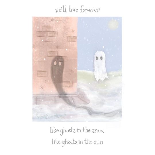
Ghosts of Snow and Sun
----------
Sneaking in one last wintry art piece for the month ❄️
I had this idea for ages inspired by a line from 2 different My Chemical Romance songs—Vampires Will Never Hurt You and The World is Ugly, and tried a softer, more painterly style to bring it life 👻 (Unlife?)
I’m still not sure which of the two versions I ultimately ended up with is better, but I am happy with the overall results. 🎨
Shall we talk about that dilemma? ⬇️
⭐️ Like My Art and Want to see more of it? Here's All My Links! ⭐️
----------
As sorta said before: This looks a bit different, no? 😆
This odd little artwork is one I had in the back of my mind for months, ever since I whipped up Echolocation back in July. I made the sketch back then toying with the idea of bringing it to life in gouache, but after getting the iPad for Christmas...Well, okay, at first I thought I'd end up using this other art app called "Art Set 4" because its reputation is all about how über-realistic the textures it has for things like oil paint are, but after reading up on the app and getting a mixed impression, I went back to Procreate and just found some oil paint replica brushes for it instead and combined those with the few default paint-like brushes Procreate comes with to get roughly the look I wanted. It's still not quite as textured as I think I might've gotten with the other app, but it's close enough all things considered.
To that end, this was my first proper attempt at digital painting, as my usual approach to digital art would be considered drawing or illustrating, I think. And it was the fact that I had such a strong image in my mind of what I wanted that allowed me to switch gears with any sort of confidence I could pull off something passable in the end.
As for where exactly that imagery came from, settle in for story time, Sparklers!
To begin, the words on the piece (which once again are not a font, but rather hand-written and then a few letters copy & pasted because Procreate continues to delight me for hand-lettering) come from two different My Chemical Romance songs, Vampires Will Never Hurt You, and The World is Ugly. And the whole idea was born not only out of a desire in me to make more MCR fan art that has to do with individual songs/lyrics instead of just whole albums or well-known imagery from the band, but also because there's just something about "Ghosts in the snow, ghosts in the sun," that lurks in my brain like a crow after a shiny object.
This is a very literal interpretation of the words, obviously—having an actual ghost in the snow and a shadow, which is effectively a ghost made by the sun—but A. I thought it was cute, and B. This was one of those rare times where the final artwork popped into my head 95% complete, and I do so hate to waste those opportunities when they come along.
Truthfully, there's not much else I can say about the making-of process, though. 😅 Digital painting, as it turns out, at least for me, is a lot like the rare occasions where I paint with acrylics IRL. Once I have my basic shapes and outlines where I want them, there's a lot of "put paint on, blend it out to the point it almost can't be seen, realize what I've done, add more paint, try to add more noticeable shading but blend it out again when it starts to look too hard," rinse and repeat. And repeat. And repeat. And repe
But I did find trouble in that just about when I thought I was finished with the whole thing, I stared at it and couldn't help but feel what I'd managed to accomplish still wasn't close enough to the picture in my mind; The ghosts were too small, the background behind the white/snow ghost was too distracting, all the colors were still a bit more saturated than I was imagining, and why was the shadow ghost facing completely the wrong direction if that orb in the background is indeed the sun and not and early-rise moon? All that and more. 🫠
So I decided to tweak what elements I could to try and get closer to the version in my head as well as make what was there make slightly more logical sense.
My mistake was that I did my tweaking on the original painting file without making a copy and really didn't preserve the "before" in case I changed my mind later. (I had saved a .PNG, but not a file with all the separate layers to make future editing possible without basically re-painting the whole thing anyway.)
And truth be told, I'm still not sure which version I like better. Just while typing up this description I've changed my mind about 3 times as to which one I'll end up posting. 🙃
The tweaked version, as a friend of mine pointed out, has a more minimalist feel, and I can confirm the vision in my head definitely spoken to minimalism. But there's a certain charm to the original, even if it doesn't make as much visual sense, and I can't help but wonder if this is one of those instances where ignoring the logical aspects is worth it for the overall impression--Like how in Frozen there's that tiny moment where Elsa's hair clips through her shoulder. In normal viewing, you probably won't notice it, and it was necessary so her hair could transform without breaking the character model (at least if what I've heard via the internet is accurate, it might not be, but we'll pretend it is to prove my point) and so even though in real life hair can't clip through body parts like that, ultimately that inaccuracy was worth everything else it allowed to happen.
I hope that makes sense and I didn't just ramble on for a whole paragraph for nothing. 😅
Which version did I end up going with? In the end, I settled for the tweaked version because...well, mostly reasons I've already stated, but also today when I woke up and had to finally decide, there was an unknown something ("je ne sais quoi") that kept me coming back to it in my fight to decide. I'm still not entirely sure if this is the "right" choice, but I really wanted to have this posted today and if I keep putting it off to debate which version it should be, it's likely it'll never go up at all and that's worse than picking the "wrong" version in my eyes.
Either way, I do still like both versions, and I think that speaks to why just picking one was so hard--It's not that one version is technically worse than the other, it's that they're both good in their own ways and which one better fits the overall image I want other people to see is where I'm struggling.
I think, if and when I can find the time, I might actually be interested in making a third version from scratch (well, from that initial sketch I had, anyway rather than from either of the two painted versions I've described) that leans even more minimalist and see if that serves as a sort-of tiebreaker, but I have other projects I want to move on with for a while first before I commit to that, which means it'll have to wait a while if it happens at all.
At least in the meantime, I can take solace in knowing I accomplished my goal of a more painterly look and doing some lyric-specific MCR art. 🤷♀️
Now, I'm off to work on some of those "other projects" I mentioned because I have so very many ideas lately and not nearly enough time and motivation to do them all...😅
----------
Artwork © me, MysticSparkleWings
Vampires Will Never Hurt You / The World is Ugly Lyrics © My Chemical Romance
----------
⭐️ Like My Art and Want to see more of it? Here's All My Links! ⭐️
#my chemical romance#mcr#mychem#mcrforever#mcrmy#my chemical return#vampires will never hurt you#the world is ugly#mcr lyrics#ghosts in the snow#ghosts in the sun#digital paiting#digital art#procreate#procreate art#digital oil painting#pastel#ghosts#shadows#snow#snowy art#wintry art#winter#wintry#minimalistic#xxmysticwingsxx#mysticsparklewings
8 notes
·
View notes
Text
It’s midnight which means it’s time to share my thoughts on the first two episodes (and the OP + ED) of Sotsu! It’s been a few hours since I watched them so bear with me as I forget things LOL.
Thoughts on the OP:
Music is a BOP. I love it. The visuals are awesome too!! I love the colors, and the switch to having Satoko run. I don’t know why Hanyuu was out here uh,, having a good chunk of her clothes ripped off but aiight. I also liked the little visual of Eua yawning idk it was cute. Very big Satorika vibes in the OP. Like a choose your favorite chaotic lesbian deal. I just really loved the OP a lot.
Thoughts on the ED:
Yay pretty painterly style is back! This one had some gorgeous colors and as usual great visuals. Admittedly I have not watched it as much as I watched the OP, so I cannot remember everything about it, just that I liked it oop.
Thoughts on the episodes:
I really liked them! Rena’s POV is so interesting here; just following her around and seeing her thought process before and after getting injected with the syndrome. I loved her facial expressions too, just a fun and interesting variety. They really made me feel for Rina though how they gonna do that to me. Like she GENUINELY wanted to make things right, but I knew things weren’t gonna end well. I did love the whole, Rena slowly chasing after her with a psychotic expression thing though. Just a nice bit of horror that makes me think of slasher films LOL, even though walking slowly but menacingly towards your target probably isn’t the best tactic.
Aside from the big focus on Rena, the Satoko and Rika scenes here are so pure it hurts aaaa. Satoko is being a damn gremlin 😔 what else do I remember hmm; oh I didn’t see HANYUU!!! : (
I can’t remember much else at the moment, at least nothing that I immediately have a comment for oop. I definitely feel like I’m gonna have to go back and rewatch Gou along with Sotsu though just to see the parallels! Cause I can’t remember a lot of specifics.
Also I might try posting my thoughts after each episode, I know that’s definitely extremely interesting (sarcasm) but I like talking about it all haha
#higurashi#Higurashi Sotsu#higurashi spoilers#text post#home post#higurashi no naku koro ni#when they cry
21 notes
·
View notes
Text
Lava’s Art Masterpost
Hey, all! Welcome to my art masterpost! I have no idea if this is a thing that is done typically for art, but oh well, I like organizing things, so here we are! What you’ll find here is mostly Dragon Age, with a few non-DA pieces in there, and there’s a range of styles I like to use, depending on my mood. But a lot of what you’ll see will most likely combine lineart with some other form of coloring/shading.
Feel free to browse at your leisure, and I hope anyone who stumbles upon this enjoys what they find! :D And thank you to anyone who sees this and likes, or reblogs, or even just stops by to peruse a bit!
All that said, away we go!
Digital Portraits:
1. Portrait of Nameless Woman, 2020 - This one is just an experiment with a watercolor brush that I did. It’s not anatomically perfect, but I enjoyed playing around with shading.
2. Sketch of Aja Amell, 2020 - This one is basically sketch practice with my Amell~ Not really the most expressive pictures, but it’s a start toward drawing her more expressively. Full disclosure: Aja is one of those OCs of mine that I have had trouble with deciding on a definitive appearance for several pictures, and I really want to work on upping my level of consistency when drawing her.
3. Long-Haired Fenris, 2020 - Exactly what it sounds like; this was for practice drawing Fenris’s features (I love how distinct they are), but with long hair because I am weak for it. This one was a fun piece to shade, and mixing the stylized lineart that I normally use with a greyscale shading spectrum was really enjoyable.
4. Portrait of Ilorin Lavellan, 2016 - This is an oldie. Basically practicing expressions, and it is technically a WIP, but I’m still very happy with how the shading turned out, especially because this is actually (aside from the unfinished hair) one of the more minimal pieces I’ve done in terms of lineart It’s still there, and it still shapes the flow of the picture in some ways, but it also ends up flowing with the shading instead of standing out next to it, which I like. (Both styles are good, though, and I love seeing other artists try both too.)
5. Old Portrait of Aja Amell, 2016 - Much older picture I did of Aja; she... honestly looks very little like the newer one, I think, and that consistency is something I’m still working on, but this one was the first picture of Aja with that particular hairstyle I drew. What I like about this picture is how young she looks; it fits with her image as a fresh and sheltered Circle mage who’s only about 20 years old at the time of DAO.
6. Old Portrait of Trilyn, 2016 - They very first piece of art I posted to tumblr~ It’s not exactly how I envision Trilyn anymore, but it was still very fun to draw, and helped me get a feel for drawing him in the future.
Dynamic Movement Pictures/”Moment’s in Time”:
1. Tabris in Arl’s Estate, 2020 - TW: blood. I am super proud of this one. My ultimate goal is to draw all of my Warden DAO OCs, and I could not believe I’ve never drawn my Tabris, and so here she is. This was, in large part, practicing expressions because I absolutely love art that depicts characters in motion, or capturing some kind of expression.
2. Velyn in the Rain, 2017 - This one was actually based on some art that I saw in a Teen Wolf fic! It was an experiment with a more expressive style (and one of the first pieces I did without lineart left in the finished version) and it was a huge step out of my comfort zone. But overall, I am extremely happy with how it turned out.
3. Jem Nocking an Arrow, 2016 - And here is the lineart version. This was entirely an excuse to draw my DAI baby, Jem, and to do a cool archer pose because archers are my fav, and I love characters in motion.
4. Solas Teaching Trilyn Fade Magic, 2016 - This one was a painterly picture that was also (like the Velyn picture) something which I tried to keep lineart out of. Overall, I am proud of a lot of parts of the pic, but I think I would definitely go back over it and change a few things now if I had the patience.
5. Trilyn Closeup WIP, 2016 - TW: injury, blood, mention of abuse in the author’s note. A lot of early pictures I have are of my OC, Trilyn, and this is one of my absolute favorites. His entire upper body is technically in the picture, but I hadn’t finished rendering it yet, so this was what I posted. And it was an experiment with a cross-hatching style with the pencil tool for some texture, with air brush shading and a blurring tool. It’s a style I had fun playing around with!
6. Trilyn Blood Ritual, 2016 - TW: blood, injury (the slight cut used to supply the ritual with blood). This one was definitely a sort of “captured moment” from a backstory I gave Trilyn, and I think what I was really going for was an atmospheric piece that could fit with any potential fic I wanted to write for Trilyn. And then it ended up being practice for extreme lighting/shading techniques, and drawing the blood and the gross mass of demon ichor (or whatever the heck that is) turned out to be highlights of making the piece for me.
Art + Text:
1. Freedom and Control, 2020 - TW: scars, but very difficult to see. This one was ambitious for me! It started originally just as Solas and my Tal-Vashoth OC, Saara, facing each other, because I love the dynamic I’ve built for them in my head, but then it turned into an attempt at a tarot-esque background, and just sorta grew from there... Overall, I’m happy with how it turned out, especially with how Solas and Saara themselves turned out. The version you can actually see a larger view is here.
2. Marianna and Delia Codex and Art, Pt. 1, 2020 - I love writing my own codex entries, first off, and I love combining art with text to create a (hopefully) seamless work. This work was an attempt to flesh out these OCs of mine with both art (because unique facial structures are hard for me to get down, but so important regardless) and text (because writing~). I think it turned out well overall, but there are elements of the portraits that I might at some point touch up a bit.
3. Marianna and Delia Codex and Art, Pt. 2, 2020 - Part 2, with what I refer to as a “DAI Outfit Change” because I have always loved seeing fans show their own OCs as they look in DAO, DA2, and then finally DAI. So I absolutely wanted to jump on that bandwagon myself. The skin tones are a little off (and I’m sorry about that!) because I was playing with the watercolor brush at that point, and it dilutes the colors I use. Still working to figure that out, but I was very happy with the overall lineart and structures of the faces.
4. Alistair/Aja Amell Picture with a Blurb, 2017 - Ooooold, old, old, old, OLD! I still love the art, and I’m soooo happy with how the interaction between Alistair and Aja turned out (drawing kisses is extremely difficult for me; I always end up creating a distorted weird lip-creature, instead of realistically puckered lips...). I’m not as happy with the blurb that went with it? At that point, I was still very much figuring out my own DAO worldstate, and the characterization for everyone, so, eh. Take it with a grain of salt!
Unfinished Costume Designs:
1. Ancient Elvhen Armor with Dwarven Influence, 2018 - People who do costume design work are amazing and mystical beings, and I wish I could do what they do. This was an attempt at merging the Keeper robes from DAI with a more dwarven armor aesthetic, solely because I created an ancient elvhen character, Ceda, who was taken in by the Cad’halash dwarves mentioned in the Witch Hunt dlc, and I wanted this character to have a mix of the elven style of armor and the dwarven style. I’m overall decently happy with it, but there’s still that persistent level of self-criticism present.
2. Herald of Andraste Outfit WIP, 2016 - This was a very old picture, not one I showed around a lot, but the idea for this was entirely born of my intense interest in how fashion and outfit designs could be used to create a symbolic image for the Herald of Andraste. In general, I love the combination of ceremonial armor with long and flowing cloth, so that was what I went for here. I’m still actually very proud of how this came out, and headcanon something similar for my Herald in my canon DAI worldstate.
Pencil Sketches:
1. Quick Saara Sketch, 2019 - TW: saarebas mouth scars. Exactly what it says; very quick sketch of Saara I did in a small notebook I carry around with me. This was basically a test for myself to see if I could manage to draw Saara with the features and facial structure I envisioned for her without needing to use a lot of references.
2. Mass Effect Character Sketch; Jesse, 2018 - Similar reason for drawing this one as the above Saara sketch! With these characters, I love sometimes the way they can turn out with the specific character creator used for them, and when I draw them, I enjoy trying to create a definitive look for them using what I get from the CC, and my own knowledge of Hooman Faces.
3. Saara Sketch, 2017 - TW: saarebas mouth scars. A more detailed sketch of Saara than the one above, and one I definitely put more time into overall. It’s currently the profile picture I’m using for ao3, and is the definitive go-to reference picture I use whenever imagining Saara in a fic, or for other Saara pics I make. I am extremely proud of this picture, and feel like I should work in graphite more often. It’s such fun, and the texture is so nice to look at.
4. Sketch of Nameless Alamarri Woman, 2017 - This was a sketch I did of what I envisioned some Alamarri tribes to look like; I used artistic depictions of Gaul tribes and hairstyles for inspiration, and have used this as a go-to reference for my version of Alamarri tribes. Nothing super notable about this one, but I really liked the way the shape of her face turned out.
Events and Gifts:
1. Another Scar, 2020 - TW: blood, injuries, gore. The most recent piece of art on the list, and a gift for @cartadwarfwithaheartofgold; featuring sisterly love between Rica and fem!Brosca, which was her requested prompt. This was a tough piece for me because of the difficulty with the lighting I dealt with. For some reason, that one particular element of it gave me so much trouble. Overall, I’m very happy with how it turned out, though, especially the skin tones of the sisters; Brosca I always sort of like as having this greyish, more gaunt look to her, while Rica I like seeing with a darker, richer, and warmer tone to her.
2. A Very Cousland Christmas!, 2019 - This was for a holiday exchange for a server, and I drew a friend’s Cousland (Elissa, the girl on the left) with my Cousland (Gazza, the girl on the right). I love kid-fic, and I love kid-art, and so I decided... baby Cousland art! Drawing kid proportions was the toughest part, I recall, and I thiiiink it turned out well, and I’m still quite proud of it overall. Elissa’s design came entirely from my friend, but I added the holly~
3. Exchange Gift with Dis Brosca and Mabari, 2018 - This was an exchange gift for @fanfoolishness, using her lovely Dis Brosca, and was my first real attempt at backgrounds... I struggled with the coherence of the foreground and background a bit, but I’m still very proud of how it turned out, especially with the colors I had to work with. What I also really enjoyed working with was the lighting and the expression on Dis’s face. Backlit subjects are always fun to play around with!
4. Inktober Picture, “Deep”, 2017 - TW: scars, injury, mentions of abuse in the author’s note/attached dialogue snippets. This was for an Inktober prompt (the only one I’ve ever done, sadly... because I am bad with deadlines...), and again features Trilyn. Trilyn’s backstory has him a former slave in Tevinter, and a lot of the early works I do for him are sort of deep-dives into his life there. It’s all meant to be an exploration of the things he endures, and then those moments when he overcomes it all and takes back his own autonomy and self. This art is definitely provocative, and I can understand if not everyone likes it, but to me, I just wanted to show just what he faces (without glorifying it) before showing the moment of his own triumph.
5. Christmas Holiday Picture with my Brosca and a Friend’s Amell, 2017 - This was a piece of art drawn first by a friend of mine, @nanahuatli~ She drew the Amell, the background, the mistletoe, etc. All I did was add my Brosca to the mix to finish the image. It was a lot of fun to do, 1) because it was fun trying to match her style so that the picture looked cohesive, 2) because I love doing collabs with friends, and 3) because it was just such a fun thing to imagine my surly short Brosca, looking at this weird plant/fungus/thing dangling over some puckering human! It was an absolute joy to do this collab with her!
6. OC Kiss Week Pic of Jem and Saara, 2017 - TW: saarebas mouth scars. A spur-of-the-moment thing meant to demonstrate just what kind of dynamic my OC, Jem, has with my other OC, Saara (both of whom are members of Leliana’s network in DAI). This was a very quick picture (deadlines...) and was mostly just to have fun drawing these two characters interacting, and to see if I could make them look like themselves. I think I did a decent job with it overall, especially with Jem’s kissy-face! (Again... drawing kisses are the bane of my existence, although hands and feet take a close second.)
11 notes
·
View notes
Text
Tattoo Gun
Summary: After waiting forever, you finally got your first tattoo. What you didn’t expect was breaking the artist’s tattoo gun, nor getting his number at the end...
*Pairing: Jung Hoseok x Reader
*Word Count: 937
*Genre: Fluff
*Warnings: None
Hoseok was on his phone as you walked through the door of his studio. Today you promised after coming with a friend to get a tattoo instead of just watching. He smiled as you shook out your nerves. His heart smile warming you as you walked up to the front desk.
“So, first tattoo?” He asked with a twinkle in his eyes. His arms covered in soft tattoos, flowers, things from his childhood, things like that. Whenever your best friend came in to add colour, fill in, lining, etc, you’d always tag along. Hoseok would always give you a glance longer than a second, as you settled in the waiting area. A sketchpad on your lap, doodling on paper rather than skin the way he would with his tattoo gun.
You scratched your head, chuckling nervously as you brought out that same sketchpad. You let him flick to the page that had a corner folded inward, opening to a full-page sketch complete with colour from pencils, of a picture of Totoro and yourself on his back. It was in a painterly style. Simple silhouette and not much detail. Your own figure the same, bare of too much detail, enough to make out who was who. It was a small thing, but entirely your own. Hoseok’s sunny grin as he looked it over was cute to you. You loved how he asked questions.
After a bit longer, he closed the sketchbook and handed it back to you.
“Looks like everything’s ready to go! What do you wanna do?” Hoseok questioned, a little excited.
You paused, staring at his tattoo of a sun wearing sunglasses; a similar style to what you sketched. Simple, not much detail.
“Well…could we start today?”
Hoseok tilted his head curiously, “Are you sure?” He rested his head on his hands, wonder in his eyes, “Rushing you wouldn’t be good you know. I want to make sure you’re comfortable,” He said warmly.
“I-I’m sure. Pinky promise!” Hoseok chuckled at the childish assurance. Directing you to the tattoo table.
“I’ll set everything up first. Wanna make sure it’s sanitised and all,” Hoseok remarked. He added, “Oh and, since this is mostly colour, it’ll take a bit!” You nodded and replied it was okay.
______
“Seems like you’re here with your friend a lot. Mind if I ask the reason you tag along with your friend every time Y/N?” Hoseok asked as he placed the stencil of your tattoo on the top of your arm.
“Well...” You began, “Hae-Won really enjoys getting tattoos… She begged me to come with her for her first tattoo, and I guess I came with her ever since.” He laughed, filling the room. Careful hands jerking away the moment he did.
“How come she isn’t here now then?” He questioned, continuing by swiping alcohol disinfectant over where he was going to tattoo.
You paused, answering a little sad, “She was busy with work. Her boss has been really hard on her.”
He hummed at that, a low melancholy note, “I see…”
You quickly continued, “But it’s okay! Really!” You jerked a little bit more than Hoseok intended you would. He pulled the tattoo gun too far back and had flung it across the room in surprise.
He muttered shit under his breath, sighing as he walked to pick it up.
“I’m so, so, sorry…”
Hoseok looked back at you, taking a deep breath in, “It’s okay. I have a spare one in the back. Give me a moment.” He excused himself to the back room of the studio, carrying the broken tattoo gun and returning with a not broken one.
“Hoseok I-”
He cut you off, “Really Y/N, it’s fine. I needed to buy a new one anyway. We’ll have to make do with this one though, “ Hoseok held it up to show you, “It’s an older model so the pain will be a bit more, hopefully you’re okay with that?” He added softly, a little worried.
You nodded, mostly out of shame. He gave a half-smile and got to work.
______
It was a couple hours later, Hoseok had repeatedly shut down your apologies as they came up. You felt really bad and had offered to pay for the replacement. During a difficult part of the tattoo.
“Hoseok, I’ll pay for it,” You said while grimacing.
“Nope. Not hearing it.”
He isn’t going to let me say anything more, huh?
“But why?”
“Feeling like you want to pay for something over feeling bad isn’t what I wanna hear Y/N. What I do want to hear is that you’ll come back,” He replied casually as he wiped the excess ink off your skin.
You did a double-take, “W-What?” Trying to twist your head to see his reaction, yet he huffed, giving you a look.
“You’re joking, right?” Hoseok chuckled, filling in the whiteness of Totoro’s belly.
“Why would I joke about it?”
“Pulling my leg?”
“None of the sort,” he stammered humorously. You rolled your eyes.
He kept up with working on your skin. Humming a simple tune, expertly adding the small details that would wove together the piece.
You would occasionally yelp, despite choosing a relatively painless spot, you were a bit sensitive regardless. Hoseok didn’t mind and would try soothing you. All in all, the tattoo was done after a couple hours. By the end, he was sweating.
He wrapped up your arm tattoo with glad wrap, handed you some cream and you paid. Before you left, Hoseok made sure to include his number on the back of the receipt, along with a note above it.
“Call me <3”
What I imagine the tattoo looking like:

By Ovenlee on Instagram
#jung hoseok#jung hoseok x reader#hoseok x reader#tattoo artist hoseok#bts x reader#bts#bts fluff#hobi#bts fan fic#jhope x reader
27 notes
·
View notes
Text
ASO’s Knuckles Endangered Species #1 Behind the Scenes (Color Edit)
Alright y’all. As promised, I’m going to tell you the ins and outs of everything that went down with this comic, but only the colors... because that’s what I did. This issue took yeaaarssss to come out and I’m so very glad it finally did and to a pretty positive reception too. Good work everyone!
So I’m not sure if any of you remember but I made a post back in February 2017 that I tried out for this fan run comic called Archie Sonic Online. I, of course, put my best foot forward and drew up some panels and posted it for the tryout:


Kinda cartoony, pretty colors, kinda meh, was trying to emulate Tyson Hesse in terms of color style. But my art has changed a lot since then, in fact if I were to draw and color the exact same thing now...

Pretty big difference.
So you can imagine a comic taking place in between these two styles. Did you see the differences in the pages? You might’ve noticed the drawings were different half way through, as Gigi had drawn 1-4, 6 and 5, and the remainder of the comic was drawn by Riggo. Both are really great artists, check out their work!
Gigi:

Riggo:

One style has a lot of detail and small spaces in between lines, and one utilizes larger spaces, chunks if you will. Looking back up at the examples I had for my coloring style, you can kinda guess which art style worked best for me.
The theme of the comic, in my eyes, was very dark and gritty, we’re fighting a sort of civil war here. So, I believed the colors should be dull and mud colored.

The colors here, though considered painterly by many, were clearly segmented into their own little shapes. The most blending you’ll see here is the feathered edge around the colors.

This style continued, moving slowly onward, until a bit after Riggo took over. There was a loooongggg hiatus and then I hopped back in to work (because of the appearance of new management). But at that point, my art style had already shifted, the kind of shading I had been doing at that time looked like this:

Neon saturation, paint brush tools, the style had changed.
I looked back on the previous pages I had done for ASO and shuddered. I loved this new style, but in order for the comic to look more cohesive, I tried my best to use the same old brushes I had used before.

This led the coloring to look smoother in terms of dual colors being used as the base while still using the hard edge feather tool to mimic the coloring style of old.
The new neon saturation I had taken a liking to also crept in to make some interesting blends:
pre-hiatus:

post-hiatus:

As we slowly chugged along, we started to get smoother panels that were more cohesive in color and also used the smooth highlight style like these
(irritating texture brush still in use)


*fun fact: See that mural in the back? All those pretty stones... this was the line art for that panel:

Now imagine, coloring the whole thing, not knowing what it’s supposed to be, and then being told later that it’s supposed to be a stone mosaic.
fun
I’m glad it turned out pretty good, though.
As we came closer to the end as I became more confident in the fact that I shouldn’t try to color like old me, or my interpretation of Tyson Hesse, the pages started becoming more like what I usually color (still used the ugly feather pen tool tho)


*added spit... it looked more raw that way*


...and way more fun to do.
Overall, juggling SPF, school, work, and ASO together was stressful. But I made some great friends and learned to despise coloring (kidding, if you know SPF you know I’m kidding)
Anyway, that’s my take on behind the scenes of Endangered Species,
Check out the original behind the scenes post where they talk about the writing and reasons for being etc here!
hope you enjoyed it ^^
#Archie sonic online#Archie#sonic the hedgehog#knuckles the echidna#comic#fancomic#project#Endangered Species#behind the scenes#aso#long post
202 notes
·
View notes
Note
I realize how stupid my question was when I look at the tags lmao but what I was trying to say I guess is,,, you work with so many lovely textures and you blend them together so well!! you just manage to make it look so organic, I was wondering what your process must be like/how did your style evolve into that?? I personally just feel kind of stuck with mine lately and yours honestly feels so authentic and refreshing, it sort of gave me hope for my own expression evolving in the future ;w;
No no dude!! Your question wasn’t stupid at all!! I’m sorry I didn’t get to it yet - but please don’t worry about that! I knew what you meant and I appreciate all your kind praise!! I’m honestly so flattered that my work is organic and authentic feeling - that’s so kind of you to say ahhh ;; w ;;
With digital brushes, I tend to gravitate to a lot of oil brushes and dry media like pencil and crayon! I want to play with dry media types even more but always tend to fall back into the oils - so I need to spread out a bit more myself to see what other effects I can achieve!! But I 100% recommend just playing around! Doing shape/blob exercises can be really fun too to help practice without feeling like you have to make a bigger piece! I use Kyle Webster’s brushes, but now since his brushes aren’t sold publicly anymore - I definitely recommend poking around on gumroad and seeing what kind of brush packs people are selling! There are lots of excellent brushes to be had!!
I apologize if I rambled a bit ahhh but I hope I’ve been a little helpful in your question dude - just to say again that the best way to improve or find what you like is to just keep making art! Don’t sweat on making big pieces! Just do little fun things! Blob exercises, shapes, portraits, etc. Create work that’s fun for you to make - then that way it doesn’t feel like a chore!! I hope you have fun as you find your expression dude!! I wish you the best!!
23 notes
·
View notes
Note
I really like how you color things! Do you think you could make a tutorial, maybe? I'm trying to get better and I'd really like to learn from you :D
Thank you! I’ve never made a tutorial before, but I’ll try. I experiment A LOT with every piece, so I don’t have a 100% set in stone process. (Always experiment! You might find something new that works for you!)
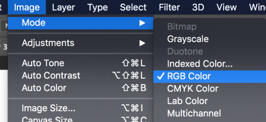
First off, make sure you’re working in RGB color mode. This is so you can abuse Camera Raw Filter later, and you really should be in RGB mode anyway unless you plan to make prints.
So start with your line/sketch on a multiply layer, or even just a normal layer mode if you want. My lines are usually dark blue but I often change them later on.
Use the wand tool (w) to select the negative space around your lines, invert your selection (command>shift>i), and on a new layer use the bucket tool (g) to create your base layer. On this layer, go to (filter>other>maximum) and set the radius to one or two pixels. This will clean up the base a bit so you don’t get a weird halo around your lines.
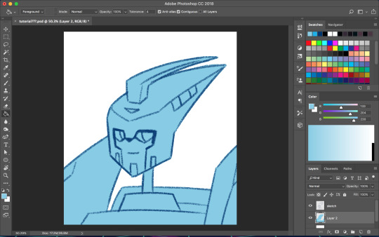
Before you start adding colors, change the background color to a mid-tone grayish color. This is to better judge tones and contrast. This doesn’t have to be the end color of your background; you can change that towards the end. If you actually are drawing a background, you might want to choose the general color of that background instead, but checking your colors against a gray background periodically can still help.
Now is when you start using clipping masks. Make a new layer directly above your base. Make this layer a clipping mask by right clicking on it and selecting “create clipping mask” from the pop up menu. Do this for every base color.
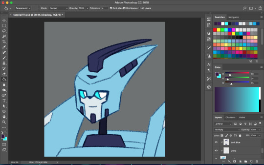
As you choose your colors, try to visualize what you want the end result to be. If you want a warmer or cooler piece choose colors accordingly. I do this mostly by eye, so I don’t have a specific process. You can play with each color by going to image>adjustments>hue/saturation.

Once you’re happy with your base colors, create another clipping layer over all the base color layers (except for glowey bits like optics/biolights), and set it to multiply (sometimes another layer mode will be better but I usually go with multiply). This will be the shading layer, so now is the time to figure out where your light source is. You can add your shading using the brush tool, but I tend to visualize lighting better by erasing where the highlights are, so I just fill in the entire layer with the bucket tool and start erasing. Change the opacity of the layer to whatever you think is best. A higher opacity creates more dramatic lighting and a lower opacity makes softer lighting. For the shading color I usually choose a darker, desaturated color, like purple or brown, but again you can just play around with the hue/saturation until it looks right. Sometimes I will make a second shading layer to add even darker shading in areas.
So now the shading is done! If you want, you can make another layer for highlights but I don’t always do this. I don’t have a specific way I do highlights except that I usually add them only in the most intense lighting or on the most reflective areas, but do whatever works best for YOU. If the subject is backlit, adding highlights around their silhouette can add a dramatic effect.
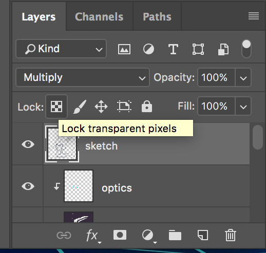
I usually leave my lines as a single color, but sometimes I will use multiple colors over each base color. I did that for my last piece of idw Blurr. To color your lines, lock the transparency of the layer using this button, or make another clipping mask over it. A lot of the time changing the layer mode to overlay will make the new colored lines look nicer. You may need to touch up some of the darker colors though.
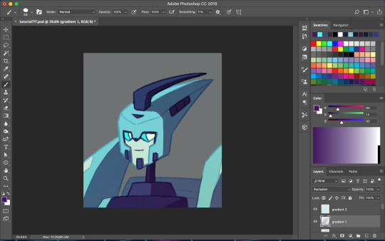
Next is when we start getting really experimental, by which I mean I have no idea what the fuck I’m doing. I make one or twenty new layers with various gradients over all the colors and play with layer styles. These layers are to soften the shading, bring colors together, etc. Something fun I do a lot is set the gradient tool mode to dissolve and then play with the layer mode and opacity on that to get a textured effect. If you still have a gray background switch to your actual desired bg color. Upon doing this you might want to make even more adjustments. If you have any glowey bits like optics, make a new layer for that. I usually use the gradient tool or a blurry brush at a low opacity around the glowing parts and set the layer mode to screen, but again experiment. You can also add reflected light from these secondary, less intense light sources onto the surrounding surfaces.
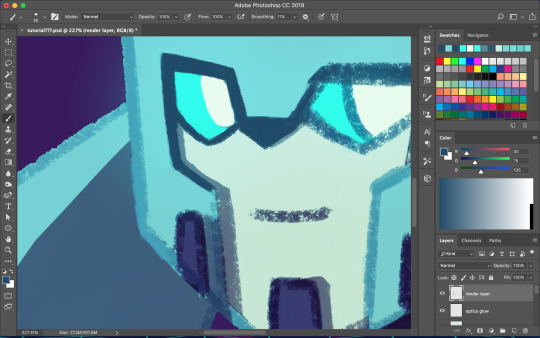

I don’t always work with clean lines and end up having to render and clean up a lot towards the end. I do this on a new layer above everything. Rendering is tedious but can make the end result look a lot softer and painterly, or sharper and more defined, depending on how you do it. Make use of the dropper tool (alt+left click) here to grab colors as you go and define shapes. This step is only necessary if you are going for a painterly look (or you were lazy with the lines and now regret it like I often do). This step must be done only when you are as certain of your color choices as you can be, because after having used the dropper tool to color grab, you will not be able to adjust the layers individually.
So hopefully, you’ve chosen colors that work well and you are happy with how they look at this step. If not (like I usually am), you’re going to cheat with Camera Raw filter. It’s like hue/saturation adjustments but better. Make sure you’re happy with how everything other than color looks here because we’re going to do the thing where we suddenly work deconstructively and probably regret it later. You might even want to do this step on an entirely new canvas so if you fuck up you still have the version with all your layers. There’s always control+z, but if you end up playing around a lot it could be annoying to go back.
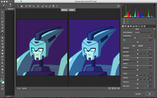
Flatten your image. You can do this by right clicking any layer and selecting the option from the pop up menu. Now that everything is merged into one layer, go to filter>camera raw filter (or command+shift+a). There is a lot you can do here. You can change the temperature of the whole piece and play with values and clarity until things look nicer. You can even go into HSL adjustments and tweak individual hues. I also use camera raw filter to add grain or a vignette sometimes (not color-related but still nice to mention). Also, when I want the piece to look really soft, I lower the clarity to give it a soft, glowing look. I did this for the idw Blurr also.
So now hopefully the colors you weren’t happy with look better, but you can still play with gradients even after this step. Sometimes this last step barely changes anything and other times the colors will be wildly different from what you originally had planned.
So to be honest, my colors are mostly all experimental. I’m constantly changing and adjusting colors as I go along. Try to put thought into your initial color choices, but also it’s fine to change things if you need. I mostly go on instinct, so I’m sorry if this is a lackluster explanation.
If you have any specific questions or don’t understand something I said here feel free to ask! I’ll try my best to clear things up!
#Anonymous#tutorial#my art#it's also like 6 am so this probably is confusing im sorry lol#my art process is mostly me doing something and being pleasantly surprised it worked lmao#the images look like shit on desktop but fine on mobile????#ok tungle thanks
20 notes
·
View notes
Note
dude ur art is rlly quality it srsly reminds me of disney rwtwyeyqr
Thank you, keysmashing fan! The first things I drew and posted online was actually Lion King fan art back in pre-youtube days:

(this was done in mspaint with a mouse lmao...)
At that time I was really dead set on trying to have a TLK-ish style and you can still see it a bit esp when i draw animals. My fave online artists at the time also had a similar disney-esque style early on, and I really looked up to them too. I REALLY really liked ones that had a specific gradient-shading style that I sometimes try to do on my finished pieces:

(this is by Evana )
When I got into art school I tried branching out and took in more painterly stuff. This was during the big deviantart-tumblr migration of the early 2010s. I posted less finished pieces online bc I was discouraged but I was CONSTANTLY sketching. It was a nice time but I feel like I was pressured to not emulate certain styles (’anime’ was still pretty taboo, with both teachers AND my peers) and I regret that a lot. Got decent at anatomy and actually drew humans and studied from life regularly for once. I didnt have any human characters til I was like...18 LOL:


I liked where my art was going for a time, but I kind of got sick of it shortly after I graduated. I felt like it didn’t represent me as an artist so I actually went through a really bad art block late 2018- mid 2019 partially bc I just didn’t feel like my art was ‘mine’ anymore, or if it ever really was.
The only good thing about this period (2015-2017ish) was that furaffinity REALLY liked my art so I did really well with getting comms from there (at least until the security breech, oof.)

I would say that I didn’t truly reclaim my art til like..this Summer LOL. I incorporated more than just Disney and Bluth; like cartoon network stuff, cartoony humor, more graphic comic styles, CLEAN LINE, and finally, a hint of anime flair that I’ve always wanted in my work:


Disney is more or less still the foundation of my work, but the more you look at it the more you can see other influences. I’m still really into the mock-screenshot look and I hope I get commissioned to do more pieces like these, but most importantly I’m glad I’m okay with experimentation and indulgence now. Art is truly fun again.
6 notes
·
View notes
Text
N'Pressions: Netflix' Carmen Sandiego
I will admit my past experiences with the Carmen Sandiego franchise is a mix of both enjoyment and frustration. My first encounter with the series was that my grandpa had the original black and white game installed on his Mac II and half the time me and my brother were guessing and constantly losing because who knew you needed the accompanying Almanac to go with it. Also I was like six and my brother four and we didn’t even know what an Almanac was. We did sporadically watch the game show; both the geography and history ones, when our mother let us watch TV and well as the cartoon that came up on the Fox. To memory the only other game we ever owned was the USA specific one that we played to heck out of.
I was not even aware that there was a reboot in the making until I had gotten an email from Netflix about some shows I might like. I glanced at the trailer on YouTube and admittedly was not exactly enthusiastic about the premise. From what it appeared to be, we were following Carmen specifically and that, while she was still a thief, she stole from other thieves. Sly Cooper. They were essentially premiering a Sly Cooper type show. Why didn’t Sly get his own show?! Okay so the Ratchet and Clank movie tanked, but you have a bit more wiggle room with a show guys! Heck technically there is 2D animation in the Sly series, it would not look out of place. Well despite my disappointment, I decided to give this a fair shake.
The theme song is meh. Honestly it just doesn’t stick with me like the previous three version. And yes, as corny as it was, I still like the Where in Time theme. I get what they’re trying to do though; invoking a jazzy tone like in the James Bond series, Pink Panther, or Catch me if you Can-it just feels very generic to me. Which is an honest shame because the animation for the opener is beautiful. The black and white cut out backgrounds with the trademark red coat gliding through and the title character eluding capture is just a treat. Again it works really well with the mood and tone of the show; a spy-action chase theme traversing the world. Like I said it does feel like they’re trying to invoke that classic thief/spy films. It’s just the theme doesn’t stick with me.
And as for the reboot itself, the show decides to elaborate and remake Carmen Sandiego’s origin. Now I don’t know if people were clamoring for this, but I never really came across any howling dissent like with She-Ra or Powerpuff Girls when this news came out. Most of the reactions I’ve seen were either excitement or hesitation. And let’s face it, any time there is a reboot there is reasonable grounds for reluctance. Now with Carmen there is a bit more of a leeway here. After all, at least to my memory, a set personality or origin for her. You knew she was a thief that wanted you to know it was her, someone who enjoyed the chase, and was very crafty and intelligent. Also mysterious.
So the new concept is that Carmen, or Black Sheep as her former name, was an orphan found by one of the V.I.L.E faculty members, Ms. Blunt and raised on V.I.LE Headquarters island where she had a series of various tutors who taught her geography, history, and world culture. She also learned a few other things by osmosis from other members of the organization and was also a bit of a prankster and precocious. Eventually she is allowed to train in the next school year where only 40 thieves graduate per year (clever pun). And it’s here where we meet some of the her schoolmates who will eventually her antagonists for the season. And if I may put in aside her, this show does this SO much better than She-Ra. The show actually does take the time to make them more or less fleshed out characters so you know the kinds of threats they will eventually be later on in the show. With She-Ra they’re more like set pieces then anything else (save for Catra, but whatever). Anyway the school is run by five faculty members each with their own personality and gimmick to their methods of crime. And watching these guys is very enjoyable. The best comparison I can think of is the Kingdom Hearts series where if you compare the organization of Disney Villains and Origination XIII in terms of interaction and entertainment. The former classmates are more like Organization XIII. Sure they have their own gimmicks and personas, but they don’t stand out as much and their interaction with Carmen is more professional and serious. The only exception may be Tigress-but she’s more of a rival. Also I am convinced two of those guys are gay and it actually feels natural because it’s not their most outstanding feature. With the Faculty, it is a lot more personal. Plus their egos often clash with one another and they’ve got no qualms taunting or flaunting others’ failures and their own successes. There is someone of a sixth member, who is the bookkeeper for V.I.L.E. Fun fact, she is voiced by the original Carmen and the reboot Carmen steals her soon to be trademark hat and coat from her. That is one of the cleverest pass the torches EVER.
Anyway, Carmen is flunked from the course and is forced to take it over. However she stows away on the place heading for heist where she learns the true face of V.I.L.E. She doesn’t have a problem with theft, it’s the fact that the organization is willing to kill to get what it wants. There are other atrocities but I won’t spoil them here. So finding this out, she escapes the island with stolen data with the help of a hacker named Player and vows to destroy V.I.L.E by stealing thigs before they do and or steal back from them.
For the rest of the series, it plays itself out a straightforward heist and chase show. At the same time either Carmen or Player will drop factoids about each place they visit either to each other or to Carmen’s two assistants: Zack and Ivy. They are also perused by Interpol agents Chase Devineaux and Julia Argent. Chase is a by the book officer who is persistent in pursuit and isn’t too interested in history and cultural facts. I would not call him stupid but rather he’s focused on the hunt and will do what he has to in order to keep up the chase. Also he has some of the best comedic lines in the show. Julia is more the bookworm and slow burning patient partner. ACME is also part of the chase as well as a shadow organization dedicated to tracking down and stopping VILE. When I first heard the two agents mention Chief I was super excited to see the return of the Chief and…shrugs. And nothing against Dawnn Lewis but she doesn’t strike me with authority the same way Lynne Thigpen did. Also I am kinda sad that they went the more generic men in black look. Sure the old red and yellow coats were cheesy, but they’ve stuck in my mind more than anything. Plus with VILE’s color schemes being mostly green, black, and grey it would have made for the perfect contrast.
The show goes more for of a cutout style along the vein of shows like 6teen and Chaotix season 1 (yeah remember that show?) with coloring resembling more of a painterly style. Basically similar to the style of the opening but a bit more simplified. For the most part I don’t mind it too much; but it tends to be not always as flexible when it comes to the action sequences. This is more noticeable with it comes to sequences that involve impacts, but they’re too brief to really notice unless you’re actively looking for them. Same thing goes for other things like follow through and squash and stretch. But for a first season especially with this kind of animation, I will give them credit that more the most part its consistent and nine times out of then it doesn’t feel stiff and awkward. If I have a minor nitpick it’s more the character designs themselves. I feel like a lot of these designs I’ve seen in other shows and none of them really stand out to me. Sure the old VILE agent designs from the show and games were kooky and sometimes questionable in design choices, but they still felt a bit more individual.
And now on to Carmen herself. Honestly, she’s fine. Sure they changed her to more of a grey hero but they didn’t toss off what made people like her. She’s fast on her feet, able to use what the situation gives her, and she is a skilled thief even when pitted against members of her own class. The only ones who really give her great trouble that she has yet to really outmatch are when she’s going against facility members head on. Which makes sense as they are more experienced than her. Hell, she almost gets hugged to death in one episode. Admittedly the humor in the show is 50/50. I laughed at a few jokes, but most were minor shrugs. At least there was not anything that made me cringe or face palm.
I honestly enjoyed myself and I felt the show was in the spirit of the original series. While focusing on Carmen and making her a Robin Hood-esque character was an odd choice they didn’t forget what the core of the series was. Globetrotting heists, geographical education, and just good old straight forward action. Also thank you so much for just focusing on being good educational entertainment. For actually being something that a broad spectrum can genuinely enjoy and not feel talked down to or pandered. I am very excited for the next season. So good job guys. I’m Noctina Noir and I’m one Nox of a Nobody.
8 notes
·
View notes
Text
Tony Potts of The Monochrome Set gives us the details! (interview by Steve Michener)
I started writing a weekly post on Facebook about two years ago, wherein I would pick a song from the extensive catalog of The Monochrome Set and write a few words, trying to hep people to their fantastic music. It became a fun, online conversation with friends and fans and the band would sometimes join in, adding to the story or correcting my (frequent) historical errors. I was presenting myself as a TMS scholar when I was really just a doofus with a love for the music. The FB feature eventually led to my volunteering to drive the band on the West Coast swing of their recent US tour, which was a total blast.
Recently, I came up with the idea of interviewing various members of the band and when I initially hit upon this plan, the first person I thought of was Tony Potts, their early ‘5th member.' Tony added another dimension to the band’s early shows by projecting films onto screens (and sometimes the band), helping to differentiate the band in the crowded post-punk music scene of the late 70s/early 80s England. I never personally saw any early TMS shows so I missed out on his contributions until last year when I attended the TMS 40th anniversary shows in London and got to experience his visuals along with the music (albeit from a laptop now instead of a Super 8 film). I’ve always been intrigued by his role with the group and he was nice enough to answer some of my email questions about the early days of the band, his art, and, of course, his favorite TMS song. Tony’s Facebook page is one of the most entertaining around; he doesn’t hold back much, whether it’s about his cancer diagnosis, politics, or the state of the Great Western Railroad. TMSF and now Dagger Zine present the Weird, Wild and Wonderful World of Tony Potts!
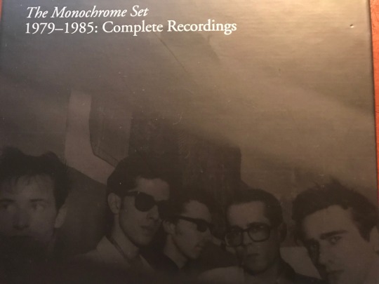
That’s Tony far right
Q: How did you come to be involved with the Monochrome Set? What drew you to them and them to you?
Ah, now there are two answers to this question. The first is terse and accurate, although less interesting than the second. Well, I knew John, J.D. Haney. That's the terse answer. However, in the interests of interest, and name-dropping, we have to travel back to about 1974. The story illustrates I think, how our lives are built upon great swaths of happenstance.
While studying on my pre-degree arts foundation I became close friends with Edwin, later Savage Pencil, who later still formed The Art Attacks. After some itinerant drummers, including Ricky Slaughter of The Motors, and Robert Gotobed of Wire, JD became the Art Attacks drummer. Now, Edwin didn't know him, so I can only guess, at this great distance, that I put his name forward. But again, we must spool back in time. How did I know John? After Edwin left for London, and still at my provincial art school, I became good friends with two fellow student artists like myself, Andy Palmer and Joy Haney. They both became founder members of Crass, under the names N A Palmer and Joy De Vivre, and are now exceptionally good fine artists.
It was through my friendship with Joy that I meet her brother, the aforementioned JD, when he came down from university in the summer of '76. We hung out with his college chum, Jean-Marie Carroll, later to join The Members, and discussed narrow neckties and casual trousers. Then Joy, Andy, and I went off to the Greek islands for the summer, before returning to London to take up our degree course at Chelsea School of Art.
Thus it was, with us all now in London, that I believe I introduced JD to The Art Attacks, with whom I worked until their demise, at which point JD took up with TMS. Due to mutual creative interests in art, I was invited to display my films at their gigs. That was late '78, with my first gig with the band being at Acklam Hall, Notting Hill, on 22nd February 1979. Thereafter we fell together and I started to make films specifically for the live shows. It’s worth pointing out that the TMS was not formed in an art school, or by art students. It is lazy journalism that perpetuates the Art School band epithet. Both Bid, the main song writing power behind the longevity of the band, and the other key lyricist, JD Haney, have never been anywhere near an art school.
Q: What were your films like? Who were your art-school influences at the time? What were you doing with the Art Attacks?
I was studying fine art painting, and painting was my main interest. Although I loved films, I never expected to move in that direction. As a painter, I was a devotee of the Russian Constructivists like Tatlin, but mostly the geometric forms of El Lissitzky, and the Suprematist Kazimir Malevich - best known for Black Square and White On White. My paintings were an amalgam of geometric forms in the vein of Lissitzky on grounds inspired by Malevich's painterly surfaces. With the rise of the Punk movement in London, I somewhat changed direction, moving into filmmaking that had a quasi-narrative style, intended to be more emotional and poetic. Although driven by what was happening in music during ‘76/'77/'78, ironically, my films couldn't be any less punk if I tried. Well, not to punks anyway. These days I regret that I never resuscitated my painting practice.
At the time of the Acklam Hall gig, I had made one large scale Super8, and two 16mm works. I think it must have been 'Strange Meeting', which in part was about aliens and The Red Army Faction murders, which we showed at that gig, but as a support. I had previously made some other 8mm films, and I might have used them during the band, but I can't recall. However, I now have vague memories of projecting B & W film over the whole stage and band. With The Art Attacks, I didn't have a creative role, I just supported the band in rehearsal and at gigs with Paul Humphries their manager, and the initial manager of TMS. Paul, JD and I all shared the same squat in Brailsford Road, Brixton. So, with TMS I had something more creative to do.
Q: For those of us who weren't able to see those shows, describe for us what you were doing with the films during the shows. How were the films received by the audience?
As I said, initially I used the films that I had made in another context, and they were added to the performance to create an overall ambiance, a statement of presentation that was not about a band energetically leaping about on stage, as was the order of the day. Soon I started to make Super8 material specifically for TMS performances. This included the scratched and bleached footage for 'Lester Leaps In', or images filmed on the road, like the Berlin footage used for ‘Viva Death Row’, or staged material of the band getting up to also sorts of antics, like the beach ball larks and bits of animations I would make with no specific aim. In the early days, I made two roller blind screens in long boxes, [we took them on the first two US tours] with one on either side of the stage as space allowed, with film projected onto them so the band members were often in silhouette, although it bled onto them also. The stage was very dark, lit by blue footlights, which I made. I think Mark Perry of Sniffing Glue/Alternative TV said something like it was the most brilliantly depressing thing he had seen. That was always the irony at that time, the music was pert and poppy and uplifting, but the show wasn't. What a laugh, we all thought.
The shows became increasingly more elaborate with more screens, more projectors and a theatrical lighting rig. At this time we were using Ground Control, Bowie's original PA, run by a lovely guy called Robin Mayhew. Using the theatre lights allowed me to focus and shape controlled beams of light exactly where I wanted them. For example, I could just illuminate Bid's face or other small areas with geometric shapes, while leaving the stage largely unlit. Then the film screens could glow and flicker in the dark. The lads tended not to move a great deal. A tradition assiduously upheld by Mr. Warren.
As to reception, well some people liked it, and others couldn't see the point. I think it mostly worked as a spectacle, an integrated whole, a total experience, but for those just into the music, it was probably irrelevant. I mean, they are a great band, so nobody missed me when I didn't set up, like at the M80. That stage was toooo big, man.
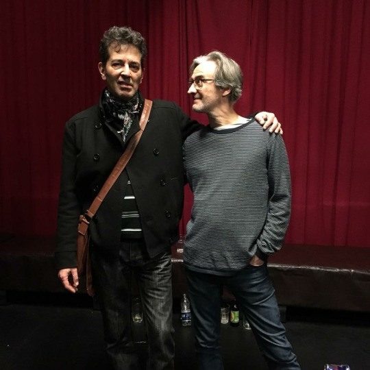
Bid and Tony
Q; As the 'Fifth Member' whose focus seemed to have been on the live performances, how did you fit in with the band in the recording studio?
Yes, my key role was the live performance; anything else was a bonus for me. I was at all recordings from the second Rough Trade single to the end of the second album, as an enthusiastic supporter and admirer. Of course, I chipped in with the odd suggestion or noise and was probably ignored where and when necessary. Being musically incompetent, my timing is off by a good margin so I'm not sure my handclaps ever made a final mix. You can hear me on TWWWWofTP. I've got quite a pleasant singing voice, also, just not in public. Bid once marked out the chord changes for Ici Les Enfants on a plastic organ I had, to fill out the live sound, but after the first chord change, I was lost and bewildered.
Q: You've done promotional videos for the band. Can you talk about a few of those projects? Do you have a favorite video?
The first promotional film I made was the one for Dindisc, and called Strange Boutique, not after the title of the first album as many think, but coincidentally, after the name of a pair of corduroy trousers! Actually, that may not be true. So, this was conceived as a short film, with two songs and a Rod Serling type piece to camera as a linking devise. Done on the very cheap. Unfortunately, there were syncing issues with some of the dialogue and the master got damaged, scratched, and I'm not sure if I still have the original film, or not. It's on our DVD as a complete piece as far as I remember, but it turns up on YouTube, usually cut down to either of the two songs LSD and Strange Boutique, without all the linking material.
We then waited a long time until I was commissioned by WEA to make the promo for 'Jacob's Ladder' with the release of 'The Lost Weekend' album. The deal was negotiated from a public phone box on Clapham Common tube station. It was somewhat compromised by cock-ups at WEA which meant I was forced to hand it over before it was fully edited to my satisfaction. I seem to have made a style out of technical imperfections; at least that's what I'm saying. At the time Top of the Pops had a video preview section, and a short clip of Jacob's Ladder was shown. That’s primetime TV, folks!
And then, of course, I was delighted when Bid asked me to make the official MaisieWorld video for ‘I Feel Fine’, which I was very pleased with. All these projects were very personal to me, not just the execution of a job, and the first two were part of my life at the time of making.
Q. The only footage I've seen of you actually playing with the band is the Old Grey Whistle Test TV spot. Was it common for you to join the band onstage?
Well, I was usually visible on stage, controlling the projectors, which needed constant manipulation, like a DJ scratching, changing speed and switching images, fading and mixing. Also, there might be some little set piece we had devised, which required me to do something. At one point, during the Ground Control days, I remember I had my own mic so I could interact with the stage, which didn't last that long. So, to some extent, I always had a relationship with the stage as both performer and technician. Once, when Lester Square had had enough, I did perform the encore, He's Frank, by incessantly plucking one string of his guitar. Pretty good, actually! Music and Maths very similar to my mind, no sooner do I believe that I have mastered the execution of some small calculation, but I soon discover that I haven't.
Don’t shake the ladder, Tony gettin’ down to work.
Q: Tell us about your film education and your career in film and video outside the band.
I made a living of sorts working commercially in film and video production, and teaching, but as I mentioned before, I actually trained in fine art. My art foundation took a very academic approach and involved copious hours of life drawing and other drawing classes, while being given time to develop one's own particular discipline and style.
I made one Super8 film based on geometric elements in my painting. I had made three other 8mm film before this. It wasn't until I was on my degree course that I started making more moving image work, but this stemmed from a fine art perspective, so I didn't ever have any film school type training. My own work I would categorise as poetic experimentalism, that is under the general umbrella of artist film and video. Just a reminder that you can catch up with lots more detail of everything I've said at my website, http://tonypottsloopform.altervista.org. Although it has all the history of the films and staging, as well as the making of Jacob's Ladder, it's rather old and not up-to-date. That site includes all the art projects I've worked on, the history of TMS film, and my own films. My creative life can be divided into three separate but overlapping strands. The first being, my personal practice as an artist/film maker, the second, my skills and knowledge deployed in the service of collective artworks and community arts projects, and those same skills employed commercially in film and video production and teaching.
Q: It's obvious from FB that you are a big film fan. Who are some of your favorite directors/favorite movies?
With a few exceptions, I'm not much interested in modern Hollywood, old Hollywood is better, and pre-Hays better still. My film tastes are somewhat esoteric for most folks. I prefer silent film, particularly that of the classic German period of the twenties, Lang, Murnau, Pabst, Dreyer. Then in the sixties, PP Pasolini, Robert Bresson, Akira Kurosawa, soviet era Tarkosky and Parajhanov, plus a host of even less well know eastern European directors like Miklos Jancso, Jan Nemec, or Frantisek Vlacil. Don't you wish you'd never asked?
Q. You live in Wales, pretty far away from the London of your youth. How did you end up there and what appeals to you living there?
Well, we split our time between London and Pembrokeshire at present, while my wife Rachael is still working. In a few years, we'll move out completely, I think. I can't relax in the city anymore. I need some more space to feel comfortable. I've had as much London as I can handle. Rachael is Welsh, although Pembrokeshire is known as little England beyond Wales, and we are fortunate to own her childhood home there.
Q. You were recently diagnosed with cancer and posted your experience on Facebook. How did you discover that you had cancer and how are you doing now?
Yes, that was unfortunate. The prostate gets larger as us men grow older and so puts a bit of pressure on the bladder, changing the way you take a pee, like urgency and frequency. So any chap of a certain age should cut along to a doctor if they have persistent symptoms of this type. Our neighbour in Wales insists on calling it prostrate cancer, but I refuse to take that lying down, and firmly pronounce it prostate, but to no avail. But seriously, although it's a slow-growing cancer, the sooner you act, the sooner you can get the appropriate treatment. I had to have surgery, but it's not necessary for everyone. As my cousin, who luck would have it is a cancer specialist said, do you want to be erect or dead? Haha, what a great choice!
Q: Since this is a TMSF, after all, can you pick a favorite song and say a few words about it?
My choice of song to end this pleasant excursion is 'The Devil Rides Out', from the 'Eligible Bachelors' album. By the time of recording this record JD had left the band and was living in NY, and I was also spending a great deal of time in that city also. I was still contributing to the occasional gig or short tour, but I certainly wasn't around when this album was recorded. Christ, what do you expect for a record made in Luton?
So it is the live performances of this song that I recall, since it was in the repertoire well ahead of it being recorded. Although I could say it of many other songs, the open chords of 'The Devil Rides Out' always gave me a buzz as I waited to play in whatever the film images were [I can't remember]. Even if the audience or critics found the films superfluous or unimportant, I usually enjoyed watching the way that a set of otherwise unrelated images somehow meshed and synchronised with the music and gave the illusion of a premeditated vision. Of course, it was premeditated in as much as I knew what pieces of film would be used for a particular song, but beyond that, there was a lot of slack in the system. With the various parameters of the live installation, having to follow the cue of the band and the hand manipulating the projectors [no computers], there were great possibilities that the extemporisation would result in entirely unique sets of images and sound on each occasion.
Well, I should say something about why I like the song. It's one of a number of Bid's more esoteric lyrical compositions. He had previously pushed the Latin boat out with Adeste Fideles [not everyone's favourite song title to pronounce], and my spell checker isn't too keen on the words, either. In this case, the bridging line is rendered in Latin, but with the exception of the 'Hails', this is written in the ancient language of Sanskrit. Or at least that is my understanding and belief. Whatever the lyrical origins are, this is a classic TMS arrangement, altogether thrilling, incomprehensible and mysterious, yet totally pop, totally accessible and it dumps from a very great height those chart-topping household names who have followed in their wake.
And of course, I can never resist a song that features a sleigh bell, The Devil Rides Out and The Stooges 'I Wanna Be Your Dog' being the two finest examples.
http://tonypottsloopform.altervista.org
www.themonochromeset.co.uk
www.tapeterecords.de
www.facebook.com/themonochromeset
1 note
·
View note
Text
Giving Instructions
I chose to make an illustration on the category “getting to my house”. Ironically I got a bit lost with this exercise, it was the first project somewhat similar to the representative illustrations of the last course section, so I was a little overwhelmed trying to apply advice from my tutor feedback along with deciphering the instructions. I have a slightly different way of interpreting language than others since I’m on the autistic and adhd spectrum so one of the key challenges of a distance learning course is making sure I’m reading the instructions properly and staying focused on the brief instead of getting kind of carried away in other directions that I might find more immediately rewarding. So because I can find it hard to follow instructions, a task about giving instructions with as few words as possible was tricky! Balancing informative and aesthetic interests was challenging too, since if I was looking for directions I’d find the clearest map possible. Similarly as someone who plays musical instruments, it’s easiest to learn music from sheet music...and making a cup of tea is such a basic thing I don’t know why you’d need instructions for it. These were my initial personal reactions at least. Just now writing this I’m thinking, ok, so who would the audience be for tea-making instructions? And actually they could be useful to a lot of people - people learning to make tea, or people who benefit from visual reminders for everyday executive functioning tasks. Or for a specific tea recipe, like a London Fog or chai or fruit iced tea. Or if the tea-making steps were presented in a really striking graphic design it might work as a print to hang up in the kitchen for people who are really into tea? With hindsight and these factors in mind I think with “Getting to my house” I chose the most complicated and challenging category for me personally, and there’s probably a good lesson to learn here about starting my Learning Log posts off right at the start of the project so I can work through some of these things as I go instead of after.
Initial artist research, style inspiration
Johnny Hannah’s Darktown - suggested by my tutor, a fictional town formed of memories and inspirations and obsessions. I thought maybe I could be inspired to represent my home town in a similar way, bring in some of this magic realism and let my inspirations and experiences colour my depiction of my way home. Looking at his art style, together with Tim Smart’s, another artist suggestion from my tutor, served as a reminder that illustration can be bold and anarchic and expressive and that interesting mixture of aesthetic “flaws” and technical prowess. I particular loved the wonky perpestive and atmosphere of these pieces by Tim Smart, they feel so atmospheric and dramatic from his use of lighting, coupled with bold colour and scribbly textures. I also was really enjoying Jeffrey Alan Love’s use of strong shape/silhouette and texture. These three artists inspired me to try a way more messy and expressive illustration style in this exercise.
Style exploration/mark-making
Mini studies from Carson Ellis’ “Home”, some from details of Darktown book (A)
Determining steps (B)- after some brainstorming notes I drew a map of the village to get my bearings a bit. Some very big and scrawly paper sheets trying to work it out. Eventually I went very very literal and took photographs along the whole route home to refer back to in the hope I could figure out which shots would be most key in giving someone else directions.
More markmaking and style experiments kind of following on from my Carson Ellis and Johnny Hannah studies (C) none of these really appealed to me, at this stage I was just playing with mediums and seeing what stuck.
James Gurney Light and Colour house watercolour painting (D)
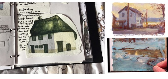
After my more cartoony experiments I tried painting a house on my route home with watercolours in a more realism-inspired technique, and I found this really rewarding. I’m really attracted to super bold zingy colours but this can get in the way of creating the kind of moodier atmospheres I’d like, so I’ve been reading James Gurney’s “Colour and Light” and watching his gouache process videos to learn how he creates these gorgeous heightened, almost magic realism paintings. As I was painting this house I tried to begin to apply what I’ve learned from him regarding how atmospheric light affects colour saturation and temperature, and how your eyes can trick you as to what colours you’re actually looking at.
Specifically with my green and white house painting, I found I actually needed a cold blue gray for the longer wall, with a little bit of purple added to warm it up just as it comes to meet the side of the house lit by the sun. For this wall I used a warmer creamy sand tone wash.
James Gurney on the benefit of “gross” colours - “More paintings suffer from the “fruit salad disease” of too much pure colour rather than from murky mud....the cure is good value organisation...a well-placed gray makes pure colour sing.”
Final inspiration moodboard for drawing my route steps - Johnny Hannah kind of folk-punk roughness, Andrew Wyeth-inspired dirty smudgy winter textures and restricted colour palette, bringing in a bit of gothic dark folktale inspiration from the art style of the animated show Over the Garden Wall, which combined a painterly grisaille style rendering with large swathes of block fill shadow for the background art. This had the dual benefit for the background artists of restricting the amount of painterly detail and looking really really cool and spooky.
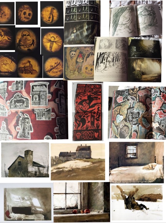
I did some more style experiments following the ideas above, from this moodboard (E) I also had an idea inspired by Johnny Hannah of using quotes/song lyrics/poem extracts. I could use these to tell a story along the route, I like the scrawly handwriting writing with a brush pen makes (F).
Really rough route thumbnails (G)
Drawings from my route photo steps - plastic wallet
Digital work below - layout experiments/format
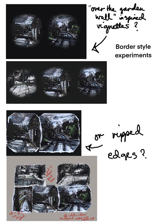
Development ideas
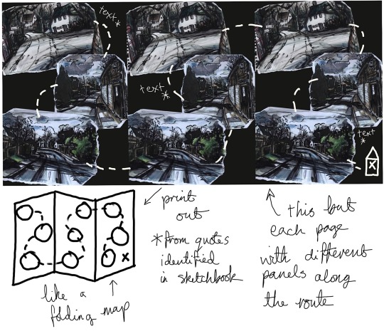
1 note
·
View note
Note
sorry if this is too personal -- are you on hiatus from DV because you're bored of it or because of something else (don't need to specify if it's personal)? you were the one who got me hyped up for DV so if it's because you're bored as well... then RIP
Hey friend! No worries at all. (Is the internet not for oversharing and being too personal?) Kind of a mix of both to be honest. The “something else” part is that I had a really shitty job IRL that sucked all the life out of me, and then got a new job that I am really enjoying and have been doing other things with my life / playing other games that are more interesting to me (any of yall gonna play fallout 76? hmu).....
The “bored of it” part isn’t just strict boredom, again it’s kind of a mix of reasons. I still love a lot about Dappervolk but I think there are a lot of fair criticisms about it. I’m definitely... not the only one who’s grown a little distant from it. I guess I wish there was more interaction besides “click 1000 and read through this story”--for example, I just finished Visindy’s first part of the Silvie’s Mine storyline (yeah, yeah, that’s how far behind I am). There was a part in the story where it said something like “you look around and the cave is shining with crystals all around” (or something like that) and I thought, damn, how cool would it have been if there was an image that popped up, even if it were in the painterly style/not super detailed, that gave us an idea of what we could be picturing and what this cave looks like? Idk, I guess maybe some others would disagree and would rather picture it on their own? But for me I would love more visuals and things like that.
But I just don’t feel as engaged with the story and characters as I would have liked to and a lot of it does seem a bit grindy, and I’m not sure if I feel like it’s worth it to spend all the time grinding, because I don’t really know what I’m grinding for. Maybe once the premium shop comes into effect and there are big ticket items, but otherwise idk. And not to say that I dislike grinding, I’m fine with grinding, as long as it’s enjoyable.... but after you’ve created 500 “1 nip for 1 nip” trades it gets a lil bit tiring. Also in games, I like exploring, finding new things and locations, etc. It would be cool if there were new secret locations on the map that we could unlock by doing or completing certain things that weren’t part of the main storyline. I think I would be much more into the game if housing/guilds were around, so that’s one thing I can think of for official launch that I could get really into. Especially if I could interact with other players in real time. Don’t get me started about the issues with Adventuring. I hope to see a big improvement by the time official launch comes around, and I’m certain the staff will do so.
Also with the whole “datamining” accusations I just got so tired lmao. I felt like some folks were not-so-subtly hinting that I was an asshole for gathering info/spoilers or finding a cool thing and posting excitedly about it to keep the hype going (”we wanted this to be a surprise but SOME PEOPLE had to go ruin the fun for everyone” or acting like grabbing a image URL from a page was equivalent to hacking into the site) and tbh I got a lil bitter because of it. Not saying that I wasn’t in the wrong, I followed the rules afterwards and apologized, it was my bad, and I understand that the staff was upset and not everyone wanted to see easter eggs/spoilers. I’ve just never been on a site that had a rule against it before, or be so strict about it what is and isn’t “datamining”. So I kinda stopped working on spreadsheets and such because the energy and passion wasn’t there anymore (a super lame thing to say about spreadsheets, yeah, that’s my life).
Anyway, I’m sorry that you’re also feeling bored/detached from the site (that’s what I think you’re saying). And sorry that I can’t give you any reason or motivation to get back into it. :C Maybe after full launch things will be better? God I hope I’m more invested seeing as I invested hundreds of dollars into the site..... /sweatdrop I don’t have any plans for any more spreadsheets or polls, or to edit/finish any of the current ones I have out there, but maybe in the future I will. Also sorry this got so long, you sent me an ask right at the time I was looking into getting back into the site to finish out the story for beta (although I’m stuck at a part I literally can’t beat in time for the end of beta, so fuck me I guess) and reminiscing about things that have happened the past few months. If you want to discuss anything, feel free to hit me up again on here or on Discord. I guess this is kinda drama-y, sorry if this starts anything. I’m really not trying to start anything; I can honestly say I don’t care enough to do so.
#asks#personal#drama#delete later probably#long post#sorry if this causes drama i'm just rambling#anonymous#dv
8 notes
·
View notes
Note
Oooh for the ask meme how about all for Routine Maintenance??
All? Right, then. *cracks knuckles* Routine Maintenance it is! There’s a lot of questions, so most answers will be under the cut. Got a question about a fic? Ask!
1. What inspired this fic?I had just gotten into the Voltron fandom the month before and spent most of that time greedily digging through the archive for anything gen (there wasn’t a lot of it). I found some good gems, but the one thing I really wanted to see and hadn’t was a story about Shiro dealing with his prosthetic arm. There were plenty that covered the “mind control” style story-line, or dug into the angsty flashbacks of how he got it in the first place, but none of them went into ongoing day-to-day life of just...having an alien prosthetic forcibly attached to you. You know what they say--if it doesn’t exist, make it yourself! So that’s what I did.
2. Where did the title come from?It came specifically from Hunk’s part of the story (which was first), all about literally maintaining Shiro’s arm and teaching him routines for it. It’s also a phrase. And it seemed to fit!3. What part was most difficult?Probably any emotional moment in the fic (most notably in chapter 6). I can do medical research, I can write action, but bringing in feelings is just hard.4. What are you most proud of?A lot of little things, really. I like the painterly descriptions of Lance’s chapter. I like how I managed to convey phantom pains in Pidge’s chapter. That entire last chapter was just a behemoth to organize but I think it came out really well. 5. What do you like best about this fic?I like the overall concept. Even as far back as S1 we knew Shiro was a character with a disability, who lives with it but doesn’t let it stop him, but nobody ever really explored it. I’ve had people thank me since writing it because they had something to relate to, and I’m glad I was able to do the theme justice.
6. What do you like least about this fic?That it’s still the one I’m known for the most. Routine Maintenance was my first foray into the fandom and was written almost 2 years ago now. I’ve learned a lot since about both the characters and about writing, and on a reread there are parts of it that feel weak. I have much stronger fics that have much better defined themes since, but Routine Maintenance is still usually they one I’m known for.7. What’s a reference you’ve made that no one has picked up on yet?Honestly, I don’t think there are any, if we’re talking non-Voltron media references. I tend to avoid things like calling out movies, books, comics, etc when writing fanfiction, since it can sometimes alienate viewers who haven’t engaged with that other material. 8. What’s a bit that sums up your take on a character?From the last chapter of Routine Maintenance:
He’s never been more proud of any of them. And he’s not going to let them down, not now. As frayed and on edge and exhausted and in pain as he is for all the same reasons, they’re looking to him now more than ever for stability and support. Their entire world has just been violently smashed into the ground and thrown upside down like the shipwreck that had taken them there, and Shiro is just about the only thing they have left to cling to so they can try and stay standing. He’ll hold on for their sakes until they’ve regained their own footing. He owes them that much. So he stands guard over them, in a very literal sense. What’s left of his right arm his throbbing, his ribs protest, his head hurts, and his whole body aches with soreness and fatigue, but he refuses to sit, not even when Hunk begs him to take a break. He stands guard over his fallen crew members, ever vigilant, keeping an eye on the odd colored trees and the Galra wreckage. If an enemy comes he is their only real line of defense, and he does not intend to let anything hurt his crew further than they’ve already been hurt. Most important of all, no matter how scared he is for all of them, he maintains his outwardly calm and controlled appearance. He talks as normally as possible to Hunk and Lance, repeatedly reassuring them every time they start to look more nervous or afraid. He checks on Keith and Pidge regularly, and despite his growing concerns when neither wakes, and when Keith grows steadily paler, he keeps his expression neutral. And inwardly, the entire time, he begs, please let them live. Please let them all make it out of here okay. Please don’t let me lose one of them again.
Honestly, I feel this sums up Shiro in a nutshell, even now several seasons later. Shiro’s exactly the type to hold himself together and project outward confidence and control no matter how badly he’s falling apart inside. Most of the actual fic is about him getting caught in this and the others helping him, but when they need that support, he’s going to give it. 9. Favorite line(s) of dialogue? Two years later I’m still stupidly pleased with the pun I slipped into the middle of a dramatic situation in the last chapter:
Lance shudders at the words, and his hand tightens on Shiro’s. “But if…if it isn’t—I can’t—I can’t be a paladin without—I can’t even go home like this—““Shhh. Lance, calm down. Listen, even if it does come to that, and I’m not saying it has, it’s going to be okay. There’s no way in hell any of us would leave the leg of Voltron without a leg to stand on, okay?”Lance’s lips actually twitch slightly at the wordplay that he might have enjoyed more in any other circumstance. Shiro suspects it’s a shock-fueled, scared smile more than anything else. “R…right.”
Honestly it’s always the first line I think of, even if I know there’s more serious conversations and good dialogue elsewhere in the fic. I still just think of Shiro making a dumb joke to calm Lance down about the horrible thought that he may have just lost a leg.10. Favorite line(s) of prose?Lance wins out on this one too. My favorite descriptions happen in chapter 2:
But the bitter end’s getting closer. It’s already dark and difficult to see, and his eyes are still stinging in the mineral-crusted water, but he can tell his vision is starting to get blurrier and grayer around the edges. His body tries to force him to breathe again, and he chokes slightly with the effort of not. His right arm is starting to throb at the port from the tugging strain the prosthetic puts on the connection point of his flesh. Spots start to dance in front of his vision, bright streaks that seem to bob through the gloom as they get steadily bigger before his eyes…No, he realizes after a moment. It’s getting harder to think, harder to focus, due to the lack of air, but he comes to the baffling realization that those spots aren’t actually spots at all. It’s not his vision failing due to a lack of oxygen; there’s really something moving through the water, coming towards him from above, trailing teal streaks through the gloom. At first his thoughts conjure hazy visions of phosphorescent fish he’s seen in documentaries and aquariums, and it takes his weakening mind a precious long time to remember he’s not on Earth anymore, and he doesn’t remember seeing any wildlife like that so far. It takes him even longer to make out the white patches through the murky darkness of the ocean, dulled to a more grayish color in the near lightless water, but after a moment he’s able to make the connection—teal light strips and white patches. Paladin armor. It takes him longer to make out the color, because the blue melds so well into the ocean. Lance is only a few feet away before Shiro recognizes him, largely in part due to the way the helmet’s mask lights up his face just slightly in the darkness.
I honestly just loved the entire description of Lance just appearing out of the gloom of the dark water and Shiro taking a while to realize what he’s seeing because he’s so close to passing out. This entire scene had a very painterly feel in my head and I loved trying to transition that to prose. 11. Where there any points where you were trying to do something specific with sound, vocabulary, or rhythm? I’m basically always doing this--that’s my writing style. I did have fun with vocab/rhythm in Pidge’s chapter, though, specifically with the phantom pains. Shiro describes trying to clench and unclench his hand a lot, but I deliberately kept from making it clear it’s due to phantom pains at first. I wanted to make it confusing on purpose, since by all accounts it’s confusing in real life, so I didn’t want to draw a distinct line between Shiro recognizing his metal hand was different than the phantom hand that’s all in his head. The reader should end up understanding what’s really happening at the same time that Pidge does as a result, even though the story is from Shiro’s PoV. The same thing later too, when trying to describe the sensation of fixing the problem.12. Imagery that is important to the fic, either while composing or in the fic itself? Again, imagery is always big for my writing style, and there’s too much in the fic to go into the details. How about we talk imagery themes instead? Several readers have noticed that Shiro rescues everyone in chapter 6 in the same order they help him in chapters 1-5. What less people notice is how each of the ways they help Shiro are also reflected in counter-point in the way he saves them:
Hunk helps him with a non-functional arm that was full of sand and grit while Shiro can barely move it. Shiro later frees Hunk with an arm that is still able to function despite having been impaled, while Hunk himself can’t move.
Lance reaches out to Shiro in an unreachable location and the first way Shiro recognizes him is by the lights on his armor. Shiro later finds Lance by the same lights, and reaches him in an unreachable location in turn. The arm that dragged him down is now the only thing that can lift up the weights now dragging Lance down.
Pidge helps Shiro with his phantom pains, by providing a solution that’s so simple and so close, and yet so far away. Later on, Shiro has the same problem rescuing her: she’s just out of reach, and just beyond his range of senses to be able to tell if she’s alive or not. He even tries to use a different arm (in this case, directing Lance’s) to solve the problem, to no avail.
Pidge actually has a second subtler one too: during her chapter Shiro recognizes he can’t actually feel or register his Galra arm as ‘his’ and tends to think of it as an object. At the time, it’s disappointing. During the very start of chapter 6, Shiro’s Galra arm is impaled, but he finds it doesn’t really bother him (or hurt him), since it’s just an object, it’s not really his.
Shiro tries to warm both himself and Keith with his Galra arm and warns Keith not to touch it as it will burn him badly, although this doesn’t work. Keith has to help keep him from freezing to death. Shiro later rescues him by using that exact thing he warned Keith about to save him, and it’s an exact parallel from freezing to burning.
13. How many drafts did the work go through?It’s hard to say. I don’t really have separate drafts in the traditional sense. I reworked the outline at least 1-2 times because that’s standard for me, and I probably spent a week editing the final results. But for the most part nothing too much changed. 14. Where you listening to anything while writing the fic? If so, what?Hah, I was listening to the Voltron soundtrack, actually. On repeat. 15. What were you most worried about during the composition? If I was handling disabilities right, and if chapter 6 in particular was a little too bloody for the fandom. With the former, I did plenty of research of course. But since I’m not an amputee nor do I have PTSD, there was always that little voice in the back of my head muttering, “You better hope you’re doing this right.” With the latter....it’s always hard to tell when going into new fandoms how well they’ll handle extreme injuries or wounds. Some fandoms eat it up, and in others it will get your fic basically ignored. I wasn’t really sure where Voltron fell, and chapter 6 does get pretty brutal, between Lance and Pidge being crushed, Lance’s compound fractures, and Keith needing to be cauterized. Keith’s scene in particular I wrote and re-wrote half a dozen times and I was extremely picky about the vocabulary used, because it was a very tricky line to write it in such a way that I was conveying Keith was suffering, but that Shiro wasn’t torturing him and wasn’t happy with the situation either. That meant adding some more emotional comfort aspects, which I am bad at. The whole thing was just a difficult mess and I basically wasn’t sure about it right up until the point I actually got comments talking about those scenes specifically. 16. If you used a beta, what did you agree or disagree on?I don’t use a beta, so nothing!17. Did anything surprise you during the writing?It got a lot longer than I initially planned on. Especially that last chapter. This really shouldn’t have come as a surprise though.18. Were there any alternate versions of this fic?Not really alternate, but Parasite Knight was a scrapped concept for the +1 part of the 5+1 idea (originally, with the whole team helping Shiro). But it didn’t seem to fit the theme of the 5+1, since the +1 tends to turn the theme on its head, so I went with the current version and recycled the idea of a soul-eating arm for another fic. Turns out that was a good idea since Parasite Knight turned into a beast of a fic in its own right lol. I did also shuffle a few characters around from their original plans. Before I’d decided a chapter about sinking due to Shiro’s heavy arm was going to be a thing, Lance was actually slated to be the one helping Shiro with frostbite (since his Lion has the whole water/ice connection). But Lance fit better for a drowning theme, and Keith ended up taking over the frostbite theme instead. That never actually started to get written, though.19. Were any parts written under the influence?I don’t drink or do any kind of drugs, so nope. 20. What did you learn from writing this fic?No real writing technicalities. I was able to verify I was handling disabilities well, based on readers’ feedback (something I’m always cautious about if I don’t have any background in the disability in question--I like to treat these situations as respectfully as possible, but sometimes it’s just hard to know if you really are without any scope of understanding). Honestly what I learned the most was that there was a niche in this fandom that I was actually welcome in. Many times I’ll write 1-2 fics in a fandom and that scratches the personal itch. But there’s never really any response from the fandom itself, so I move on to the next interesting thing. But Routine Maintenance had such overwhelming feedback, in a couple cases from some big names in the gen corner of the fandom, that it was encouraging enough to actually make me stick around. And in sticking around, THAT’S where I really learned more technical writing skills. So I guess RM didn’t teach me anything specifically, but it made sure I stuck around enough to learn things anyway. PHEW! That’s a lot of questions! Got a question about a fic? Ask!
14 notes
·
View notes
Last Seen Blogs

sis-ranjitha12084-blog
Untitled

siren-x
Drowning In Fandoms

moreraventhanothers
burning oceans and biting possibilities.

sirladystitch
SLS's Sewing Spot

coburgworld
Untitled