#and I draw almost exclusively with the pencil tool
Explore tagged Tumblr posts
Visit Tumblr Blog
Explore Tumblr blogs with no restrictions, modern design and the best experience.
Last Seen Tumblr Blogs


Fun Fact
In 2020, Tumblr had 29.4 million users in the US.
Text
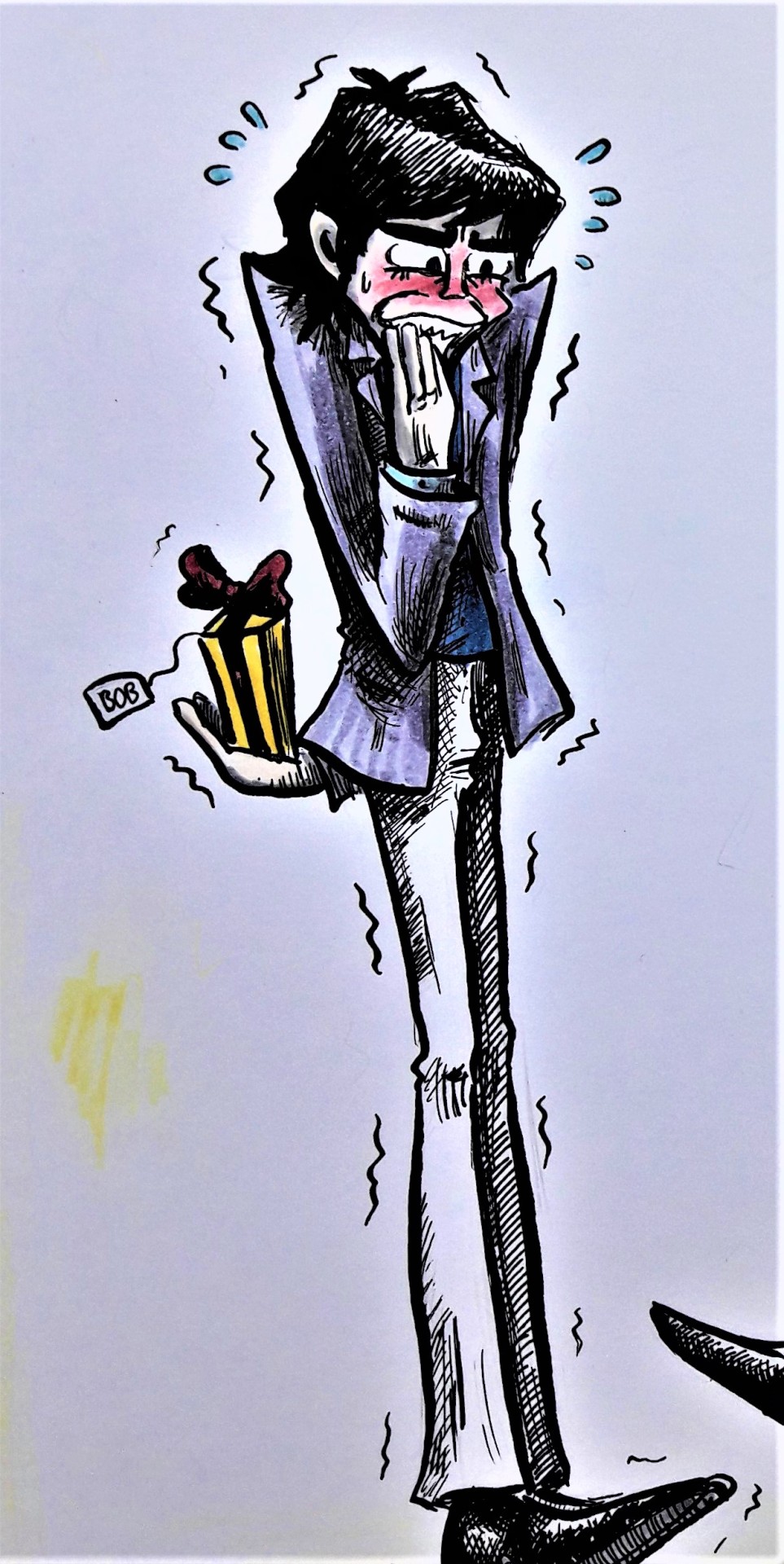
The "dorky expression" thing reminded me of a robot OC I've been working on recently! So glad you want to see robot OCs bc I was gonna reblog abt him anyways
Also! Your character without the screen reminds me of an old scuba diving suit, which I think is cool whether it's intentional or not :)

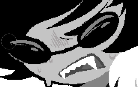
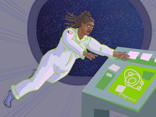
This is Roy! He is a lovely fellow who was in a spaceship with 2 (or 3? idk yet) other people in his crew. The ship crashed, and Roy, likely the only survivor (again, not figured out just yet), was stranded on an empty planet. He was able to use the remains of his ship and his own scavenging skills to survive until a researcher ship came across the planet and adopted him into their crew.
(jo1stuff, if you are reading this, there are Roy-bot lore spoilers, don't read ahead)
Here are some close ups of his face. (he's technically a human in a robotic spacesuit, but the crash injured him and he's very reliant on the suit to help him survive) (his new crew has no idea he's human under there)


I really like the contrast between his usually derpy robot face and what he's actually like underneath. The crash also injured the speaking software in his suit so he just sounds like a bunch of beeps when he talks. You'd have no clue he's actually swearing under there lol (if you know the Wild Life minecraft series, he sounds like the lifers when they failed the quizbot and became a robot)
And finally, here are some other faces I made for him


oc art gets me absolutely NO attention on this app but WHATEVER!!!
please send me ur robot ocs i need to see them. robots,,,,
#I made all of these drawings in Magma.com#and I draw almost exclusively with the pencil tool#so it's a bit pixely#but I like it :)#oc#ocs#art oc#art#digital art#artwork#character art#my art#drawings#drawing#my artwork#original art#my oc art#my ocs#oc art#oc artwork#oc design#oc stuff#original character#magma.com#magma doodles#magma art#art digital#digital artwork#oc artist#robot
679 notes
·
View notes
Note
Hiii I really love your art and was wondering if you wouldnt mind showing what kind of brushes you use for your recent drawings thank you so much and i look forward to your future arts!
Of course! I've answered this a few times before but have never really tagged it properly, and I also realised that I've never actually explained what I use each brush for so I'll do that now!:
I'm gonna go through each of these brushes in order (and if i remember correctly, I'll link the top two since they arent default CSP brushes). (NOTE: almost all of these brushes have anti-aliasing turned off so that it can look more crispy and pixely!!! there is one exception to this that I will get into)
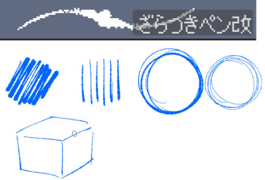
For this brush, I exclusively use it for sketching, it's advertised for inking digital manga panels, but with how the pen pressure is I feel like it adds form to my sketches
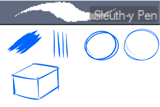

This brush, Sleuth-y Pen, is what I use mostly for MSPFA panels, mostly for lining, but sometimes for sketching too if I'm having a hard time with my usual sketching pen. It's really good if you want to replicate the homestuck style, and good for broad strokes on smaller canvases. The only issue is that the brush isn't great for that style if you use it on a larger canvas (ideally you would want 650 x 450) and can be especially messy if you're trying to get smaller details, such as open mouths, and certain facial details. I use another brush for that, which I will get into soon.
My second use for the sleuthy pen is for lineart on larger canvases in my usual artstyle! It has a texture to it that I like, as I like having my art appear a little rough around the edges, and the issue regarding small details isn't nearly as prominent of a problem
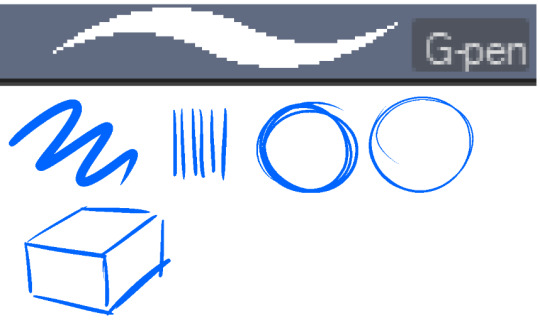
Almost done! Now we have the G-pen, a default CSP brush! This used to be one of my top 2 pens, along with its counterpart "Real G-pen" but nowadays I use it for two things: clean-up during rendering (usually getting those smaller details done that the sleuthy pen has difficulty with) and for doing SOME MSPFA panels (Vast Error, for example)
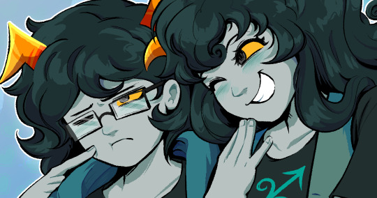
As you can see here, Liaaam's face is a little smoother than the rest of him, that's because I use the G-pen for those details, to keep things a lot cleaner! As for my other use, Vast Error's style from my understanding is a lot more "smooth" and "clean" which is why I exclusively use the G-pen for it, you can also make a lot of thick, juicy brush strokes with it which I feel works really well for the hair and folds in the clothes!
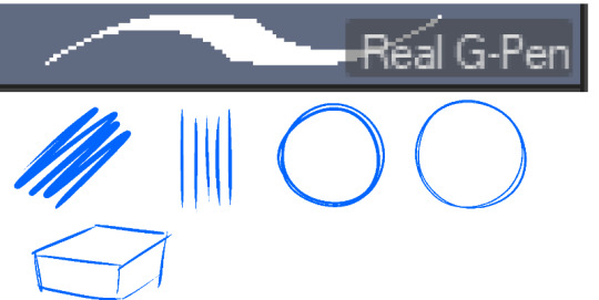
Finally, the Real G-pen, another default. This one is very similar to the last, its only differences are that it's slightly sharper and ever so slightly more messy. It's almost like a medium between the sleuth-y pen, and the g-pen.
I'll be honest, I don't use this pen much anymore, BUT, I still consistently use it for one thing and one thing only: Friendsim sprites. If you want to make friendsim sprites I highly suggest this pen, and making sure it's set to "weak" antialiasing. If you want to go the extra mile, I like to use a lasso-fill tool to block out shadows in all of my art, although if I'm using a rougher brush I'll usually do that manually. There's also other brushes I've been using more for rendering full pieces, such as a "rake brush" and a "design pencil" with low pressure to get details like blush down without making it too intense. That's basically it! I'll link the brushes below if I can find them: sleuth-y pen textured pen rake brush
147 notes
·
View notes
Note
Hii, sorry if you answered it before but what do you use to sketch?? Thanks!! 💕
Hey!! Recently I've started to use oil-based ballpoint pens and bristle brush pens for sketching almost exclusively. I like the soft and a little dry look it gives to the drawings and that the sketch lines won't smudge or disappear completely after coloring. I add color and toning to my works with inks, so I need the media I use to be waterproof, which narrows down the list of possible tools quite drastically 😩 Ballpoint pens are rather cheap, so mostly I buy every set that has brown/orange color in it, lmao, and for brush pens I use either those that can be filled with your own ink like fountain pens or buy a set of "watercolor" brush markers with a fine bristle tip, wash all ink out of it and fill it with waterproof ink instead. It's a bit of a headache, but it's totally worth it for me. Sometimes I also use colored pencils, but rarely, since I'm not a big fan of pencils in general.

#ask#art tips#actually this is also what I use for lineart as well#with addition of fountain pens/gel pens/fineliners for crisp strong lines
53 notes
·
View notes
Text
Artfight Postmortem
as you may know, i am prone to reflection on my art and process and progress. herein, i'm gonna navel gaze a bit about artfight 2024.
top line: really enjoyed myself, did a bunch of new things and this was "The Year of Artist Friends" which is spectacular.
i completed 20 attacks this year, including my first ever mass attacks! altogether I drew 28 different characters (incl 4 of my own).
for the first time, I had *users* i wanted to attack, rather than just characters i'd gathered via search or discord. honestly, three years ago when i picked up the stylus i was just excited at the prospect of drawing for other people, period. artfight was a cool way to be in community without prerequisites. i didn't quite dare to dream i might make some real connections and make proper friends. and yet :) here we are! i went in with three 'art friends' and i'm leaving with at least three more
in addition to being the year of artist friends, this could be "the year of clip studio paint was on megasale a week before artfight" because i knocked out like 2 practice pieces before July 1st so i wouldn't be starting with completely unfamiliar tools, but i used/learned csp for the vast majority of my attacks. one i finished in krita (lonnie), and my final attack i only used krita.
definitely trial-by-fired myself! but it motivated me to explore csp, and most important, gave me a reason to practice practice practice. last year i drew almost exclusively humans, lots of full bodys, because i wanted to get a better grip on anatomy and drawing a variety of faces. it worked then, and, well, i think i learned more of csp in one month of artfight than i would have if i was just plodding through my personal projects for 33 days :) *looks at my wip folder with months old files* pretty sure.
ok i'm gonna look at a few faves/standouts now:


came in hot with 0tt0 here! the main brush for this one (froggy pencil) was a mainstay for the whole month. so versatile!!! and lovely texture. this isn't quiiite brat green but this was what made me go, hmm, what if i... did a few pieces inspired by this album i can't stop listening to?
and then i took a huge turn and just used a soft round brush for Desa and Iryna for my dear friend @bobomcfoe bc i really wanted to turn these out in something approaching my "usual style" of late and i feared getting too deep into the temptations of csp if i put them off. and, um, yeah i love them. i got sooo close to matching that angle but ahh i can see the tilt now! nonetheless, love these two, not least bc brookie has some of the most pleasing color palettes to work w :)


then on to Rosé and baby's first vector lines! you can RESIZE lines in csp. did you know that? i didn't know that. i did forget to use it as much as i could have in later ones though, so i still only kinda know it ig. and halftone shading! bc why not? another thing i really only did this once, but want to experiment with more
Rook here, for my new friend @gender-premium-tm, was me realizing how to use filters/filter layers in csp. now THAT is something i used a lot this month! also something i use often in krita. i must say, though the csp options are slightly more limited (afaik), they have oomph!


okay these two are my "explicitly brat pieces"! artfight keeps you moving, which i find really valuable, bc i could have dithered foreverrr over Lonnie's gif here. like, do i add his arm? maybe he should be wearing a shirt? or, what if i just draw him twice, instead of splitting the expressi--see it just never ends. and as i am always going on about, art is so precious bc it is a reflection of us when we make it. maybe for some future artfight i'll redraw this (as Lonnie's artist @wenmistry did for me with Ebon this year), but for july 2024, i'm amazed at how well i executed this for just 2.5 days of work! (i did forget his glasses, which realization gave me a different take on the composition, so this is high on my list of potential redraws)
and then Aagatha. this is in my top 3 for this year. the pink just works so well with the green and her artist added the song to her character playlist AND added the necklace to her actual dnd inventory. like. omg. the impact your art can have!!! how freaking cool is that???


two mass attacks! i was in a silly goofy mood. i feel like i really got a handle on vectors w the anthro mass attack, i adjusted every single point on that one by hand. weird what hyperfocus makes you do sometimes, but i learned a lot from that. mainly that i will probably never user vectors as my main linework tool. there are circumstances it is perfect for, and outside of that i'm good w my raster lines lol
which is exactly what i used for this other mass attack, featuring mostly my ocs. hey, sometimes you need to shake things up! i can see here the style starting to hew back to my "usual style", though i'm thinking that might have a lot to do with drawing 5 people very quickly. falling back on practiced techniques. and by this time i apparently knew csp well enough to reproduce them pretty closely! ooh, one thing this made me miss was the transform tool in krita. that floor was ROUGH to wrestle into place in csp.


purple and green turned up a lot this year!
Echo is my crowning achievement with the froggy pencil, most of the shading here is just layers w that. and one last nod to brat green :)
i've worked in the paper cut style before (both my pfp's use it) but i really exploited csp's clipping layers to make Scraps here. they did make me briefly forget how they work in krita when i switched back, so well done w that
i played with gradient maps a little earlier in the month but for Okanar i actually made my own gradient! really a useful tool for ref'ing real human skin tones to make non-human ones, without muddying them up too much.

finally, Chaos. this actually might be my favorite! ironically this is the one that i made in krita. it was like, ahh, yes my old friend. wait where is the scroll bar. ah, okay, yes my old friend... the line layer is set to burn which just makes the whole thing so warm (and the cause of the red outlines on the earrings). used my old sable brush, a pattern fill set to overlay... my old stomping grounds! but plus a rendering technique i picked up this month and some other random habits i picked up in csp (like copying a detail to a new layer, moving it where i want a copy, and drawing/tracing it back onto the original layer in the new position. nothing i couldn't have been doing in krita all along, but made easier by the tool layout in csp, and therefore now discovered by me. amazing how one integrates new knowledge. it's like magic sometimes!!!)
that was a good roundup! if you actually read this to the end, wow! and thank you! i hope it was interesting... and inspiring! bc i want to read about your process and reflections too! yes you! and plz tag me, i'm always down to gush about art XD
7 notes
·
View notes
Text
the use of "everyone can make art" specifically to deny people tools that make it possible for them to make the art they want to make, really gets me man. i think its cuz i am a huge proponent of the sentiment in many ways, i am very invested in the idea, that yeah everyone can make art and everyone can explore it and being Good At Art really shouldnt be about any one designated area such as drawing people. but it feels like in the case of people using it to make an anti-ai "just because you physically cant hold a brush/pencil/pigment/whatever doesnt mean youre allowed to bypass that! look at [disabled painter]!" its all limited to "everyone can make art so long as their method of choice doesnt threaten me and doesnt make me feel like the effort ive put in is No Longer Special And Exclusive". because if someone can use a tool thats accessible to them that wouldnt make them have to suffer, then that makes our own effort and suffering null, right? god. repackaging of "why did i even learn all this anatomy stuff if someone can just paint a square and they put that in the museum?" but with an ableist condescending spin. do you really want everyone to make art if the "everyone" in question should by default be barred from certain types of expression, and certain areas of art should just be Off Limits to anyone whos not willing to suffer and prove their merit in a very arbitrary exclusionary way?
and since people like to include an "i'm X and i do Y, you guys have no excuse" type disclaimer in such statements--i'm a traditional & digital artist whos been doing this for most of my life and managed to get a degree in easel painting (and almost died several times in the process) and who puts a lot of effort and studying into this shit, and who suffers from bouts of complete aphantasia due to brain damage lol which makes creating visual art difficult, but i choose not to use ai as an artistic tool because idk thats just not what i do and i personally dont find using it for art enjoyable or inspiring. so those are my Qualifications before someone unfamiliar with above information is like 'why do you hate Real artists' or 'you just defend ai to make yourself feel better about using it'
36 notes
·
View notes
Text
I realized I'd never made a process breakdown for my pixel art (at least, not one in a long time), so here's one for a test asset for a project I'm working on.
My current software of choice is Aseprite, and I almost exclusively use the pencil brush at 1px and the bucket tool. I use my mouse for everything but the sketch; tablet strokes are too unruly.
Images enlarged x4 for visibility; actual size is in the top right.
Sketch
I tend to start it like any other digital drawing, then scale the sketch down to the size I want the sprite. These aren't usually coloured, but this one wasn't originally intended for pixel art.
Lines & Greyscale blocking
Depending on the sprite, I'll do one or the other of these first, or do them at the same time. This is where I define the basic shapes and values (which parts are light and dark). In this case, I did the lines first and then blocked in the values.
I sometimes work with colour right away, but not usually.


Shading & Anti-aliasing
These are also things I work on simultaneously, usually moving from one area of the sprite to the next. I start by "softening" the internal linework by making it lighter greys depending on how much its meant to blend with the adjacent shape. Next, I block in the shadows and highlights, and add anti-aliasing pixels where I want it to look smoother.
During this step, I often end up making small changes to the shapes and linework as I refine the sprite. Readability is key to a good sprite, and precision is key to readability.


Colours
While on sprites like this I'm not keeping to a super restrictive palette, I do try to use as few colours as possible. I like to use "websafe" colours for the bulk of the sprite, but sometimes I use shades halfway between them for anti-aliasing.
I start by mapping the main gradient I want to use over the grey values. I use the bucket tool with "contiguous" disabled so that every pixel of the same colour is affected. My colour-picking philosophy could get it's own post, so I'm not going to go into detail about that here.
Next, I go over any areas that are meant to be different colours with their own gradients, trying to have at least some overlap with main palette. Finally, I tweak the anti-aliasing where necessary.

And there you have it. Here's the finished sprite at actual size:
Hope you found this helpful!
(Also disclaimer that the project this sprite is for is super early in development and all design elements here are subject to change lol)
#pixel art#art process#art reference#artists on tumblr#pixel art tutorial#Salem's clever art tag#long post
45 notes
·
View notes
Note
Idk what your art says about you but you feel like one of the people who started using the pencil brush really early and have barely if ever used anything other than it for line work
That’s so funny because early on when I was making digital art I actually almost exclusively only used clean/smooth linework
I think it wasn’t until I bought procreate that I finally started experimenting with more textured brushes
And even then in the beginning I still stuck to nontextured brushes for a while until I decided to mix it up and try out different brushes
Nowadays I go absolutely bonkers over textured brushes and yes, that pencil/sketch brush you usually see me using is indeed one of my favorites. I often use it for lineart because I like the way it handles when I use it. Strangely enough, that brush comes from a random free brushpack I downloaded

[IMAGE ID: A screenshot of a brush set on Procreate titled “Anime” (The title is not shown within the screenshot). The first brush is called “Sketch Brush💕1” and is circled in red. Written next to it is a note saying “I love this stupid brush <3”. /END ID.]
Right now I usually either use the sketch brush for lineart or a felt marker-like brush interchangeably, for a request I got I’m actually using this brush… which is from another free brushpack, simply called “Texture.”

[IMAGE ID: A screenshot of a procreate canvas showing how the brush handles. There is a large, thick squiggly line on the left and several smaller, thin lines next to it. The thick brushstroke shows more of the brush’s soft edges, while the thinner brushstrokes look more sharp and less fuzzy. Both have a taper to the end on both sides of the brushstroke. There is a doodle of the cat face emoticon using thick lines and a doodle beneath it of my character Saul, using medium lines. All the brushstrokes are blue. /END ID.]
For coloring, I usually use a brush that doesn’t screw with the bucket tool to fill things in and then for shading and details I go crazy and do whatever feels right
This turned into a whole ramble haha
(Old art under the cut. Now you too can see just how my art looked wayyyy back when)
September 2020

[IMAGE ID: A drawing of an anthropomorphic lion. It is brown and has a golden mane. It is standing and waving. It has golden jewelry and red, orange, and yellow tattoos on its tail. The linework is smooth and the colors used are shown on the side. /END ID.]
October 2020

[IMAGE ID: A drawing of a humanoid/anthropomorphic vampire squid. It is a reddish/brown color and has light green accents. Its arms are tentacles and its hair is chin-length, webbed and fin-like. A less detailed doodle next to it shows that its tentacles do not have fingers. Another doodle of it, in a smaller chibi version, shows it floating with a tiny shadow beneath it, with the note “Floats above ground”. The linework is smooth. /END ID.]
January 2021

[IMAGE ID: A drawing of a humanoid demon with orange skin and orange hair. It has a dark brown tail, a long tongue, dark brown horns, pointed ears, and a third eye that is yellow. It wears a cloth around its waist and wears lots of jewelry, holding more jewelry and valuable items in its hands. The linework is smooth. /END ID.]
July 2021

IMAGE ID: A drawing of Arthur Kingsmen from Mystery Skulls Animated. He is drawn from the side view and is looking at his hand, which is glowing, bloody, and green. There is also blood coming from his shoulder. His eyes are glowing and he is smiling. The linework is smooth and in the corner, there’s a watermark that says “3lec_tric”. /END ID.]
#elec rambles#asks#answered#answered asks#den-of-evil#described#i described the screenshot of procreate and then i was like hmm might as well describe my old art then too
3 notes
·
View notes
Note
I got inspired by your doodle of me, and wanted to ask- how do you do your art? I really wanna get better, but i don't know how. I use FireAlpaca, and i could really use a more "focused" pencil rather than the "smudgy" one in my profile picture art. I mostly wanna draw to make my friends and partner happy, so you don't have to go into the most complex stuff i you don't want to x3
hi! sorry for taking so long to answer!
so i use almost exclusively ibispaint x for my digital drawings, and use a tablet or my phone to draw, so I can't help you with the technical aspects of the program you use but I can tell you a bit about my drawing process! apologies if this doesn't make a lot of sense, english is not my native language so my words may sound a bit weird.
so for drawing first you should make a sketch, which for many is the best part as it's the most fun part of the process. for this I usually do it on paper as pencils are more natural for me, but sometimes I do it digitally too. my suggestion is to go wild with the sketch! draw many lines one on top of the other, use the eraser freely, move things around however you like. once you're happy with your sketch you lower the opacity and create another layer for the lineart.
here is the part where you choose the brush you want to use for the drawing. depending on how finished you want it to look, you can use a more sketchy shape or a more geometric one. in ibispaint, I use a brush called marker that has a round shape. for clean lineart, you should use a brush that has an opacity of 100% and a geometrical shape like a circle. if you want a more sketchy look, you can use a brush that has an irregular shape and different opacity, like for example a pencil brush.
for flat colouring I get lazy so I just use the bucket tool in a different layer, and then I create another layer that I set to Multiply to do shading. but shading is pretty complex so I won't get into more detail.
as for getting better at art, my recommendation is to use lots of references and practice a lot. personally I got better by tracing comic panels with a paper on my mum's computer screen. also I drew lots of dragons because I had a special interest in them, so I drew them over and over and over. eventually I got good enough that I could branch to more complicated things like humans. last week i read a story of someone learning to draw using naruto characters as reference. everyone's learning process is different, so you should draw what you like! if the drawing process is fun, you will do it more, which means getting better.
so this is it! I really hope this makes sense and it's useful to you :}
5 notes
·
View notes
Text
Hey guys what do you keep in your toolkits? I'll go first, here's my pencil pouch!

Top left: black pens, with one grey marker. I use them mostly for art but the far left one is for art and note taking. The last two towards the right are for practical things like writing on cardboard and making labels in a pinch
Top right: colored pens (+laptop pen). These ones are almost exclusively for annotation. I don't have much other use for them
Bottom left: tools. Those scissors have been with me ever since I stole them from the teacher's supply closet in the 1st grade. My dad took some forceps from work and I took them from him in turn. The Copic marker is dry and I use it more as a handy stick. Good for burnishing leather. The ruler only has inches marked which kind of sucks but it works for scraping and cutting stuff. I took that from my grandpa's room
Bottom right: pencils and an eraser. Three 0.7s, five 0.5s, and one 0.3. I prefer to use the red and white Pentel 0.5s but I keep all the other ones in case I wanna change it up. The 0.7s are for lending to other people. I don't use the 0.3 all that often
You can answer even if you haven't been tagged, I really like stationary so I'd love to hear what everyone uses, but if you don't use pens and pencils that much I'd also like to hear what other kinds of toolkits you use (like crochet hooks, spindles of thread, different colors of clay, paint trays)
@megacarapa @ramdraws cuz you said one time you liked drawing traditionally
#talking tag#when you read this you may wonder#'but Leon why do you end up having to work with leather often enough to carry around a tool specifically for that?'#and to that i answer#what are we all if not premature leather suits
18 notes
·
View notes
Text
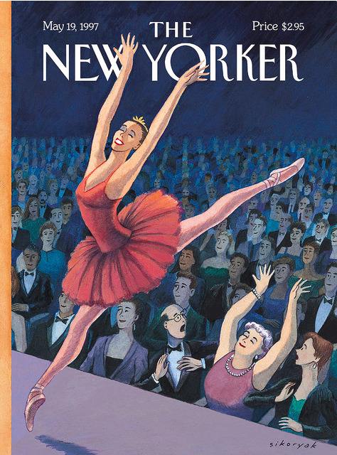
R. Sikoryak.
Bio: R. Sikoryak is a cartoonist whose graphic novels include Constitution Illustrated, Masterpiece Comics, Terms and Conditions, and The Unquotable Trump (Drawn & Quarterly). His adaptations of literary classics have appeared in The Best American Comics 2015, The Graphic Canon, Drawn and Quarterly, and Fable Comics.
His comics and illustrations have appeared on the cover of The New Yorker, Fortune, LA Weekly, and Harvard Business Review, as well as in The Onion, MAD, SpongeBob Comics, Nickelodeon Magazine, and many other publications. He’s illustrated the books The Tao of Bill Murray, The World According to Tom Hanks, and Kindness and Wonder: Why Mister Rogers Matters Now More Than Ever, all written by Gavin Edwards. He's also drawn for television, including The Daily Show with Jon Stewart, and worked on storyboards and designs for various animation projects with Augenblick Studios.
Sikoryak teaches at Parsons School of Design and previously at The Center for Cartoon Studies. Since 1997, he's presented his live cartoon performance series, Carousel, around the United States and Canada. He lives in NYC with his spouse Kriota Willberg.
Find this print here!

Find this print here!
Tools of choice: When I started working professionally in the late 1980s, I would often switch up my materials according to the assignment. I love to play with different art styles and different forms of comics. So I might use pastels, colored pencils, watercolors, or gouache for my illustration work. Or I would try out different ink nibs, pens, or brushes for my comics. When I began doing freelance work at the animation studio Augenblick around 2009, I started using a Wacom Cintiq and pen to draw digitally. I recognized it would greatly increase my productivity, especially when making comics. So I began to lay out my comics in Photoshop, doing the equivalent of “pencil" drawings, then I’d print those out in pale blue ink on bristol board, and ink with traditional brushes. Over the years, I have transitioned to working almost exclusively on the Cintiq. It’s a great tool, as I can layout text in Indesign (using fonts I design) and do all the drawing in Photoshop (using the many great brushes available). And I can use my other screens to display my visual reference.
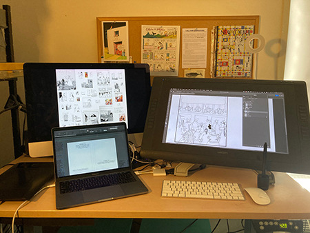
All my New Yorker covers from the 1990’s were drawn on paper or vellum using traditional media (such as watercolor or pastels), while my most recent cover from 2019 was drawn entirely digitally.

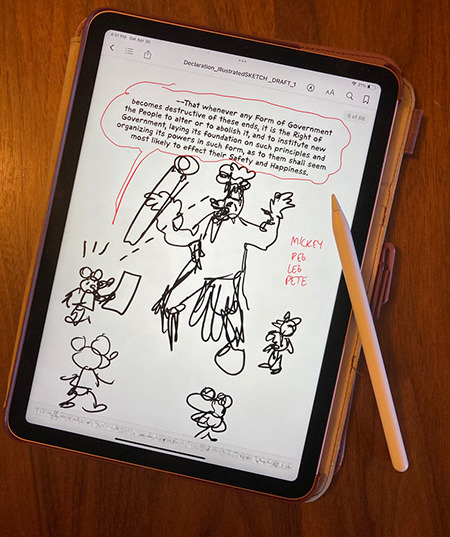
Sometimes I make notes or sketches for my comics on my iPad, and for that I just use the Apple Pencil.
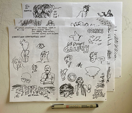
But not quite everything is digital! I often go to lectures by artists, and I make sketches from their slideshows. For that, I generally use a Pigma Graphic 1 pen on printer paper, as it’s easy to scan or photograph to share online.
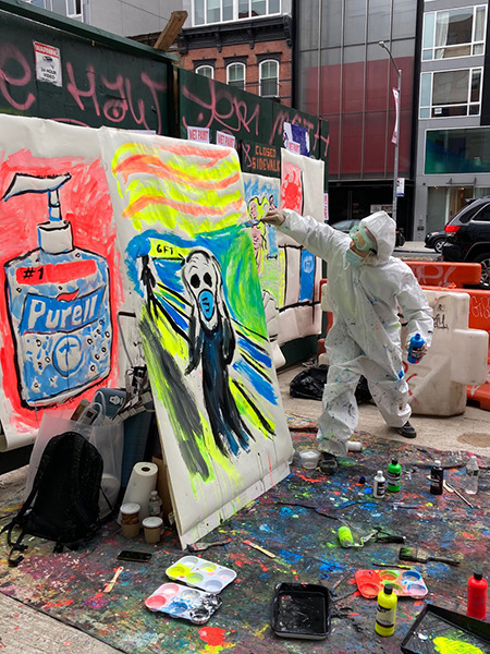
Tool I wish I could use better: It would be great to get back to painting. I sometimes do large, live paintings for performance events (using tempera), but those are pretty quick, gestural pieces. If I had the space or time I’d enjoy playing more with that form.
Tool I wish existed: The only tool I can think of is a time machine! I’d love more hours to experiment.
Tricks: Because I draw in so many comics styles, I love to create fonts to match. I like using sites such as Calligraphr or Your Fonts, where you can generate a reasonable looking font very inexpensively.
Misc: For many years, I’ve been hosting a live show called Carousel, featuring readings and performances by cartoonists and visual artists. I present the shows at clubs, galleries, and festivals in NY and beyond. It’s been a great way to introduce audiences to new work, and stay involved in the community.
Here’s the website.
Website, etc.
rsikoryak.com
Twitter
Instagram
Carousel Slideshow
----
If you enjoy this blog, and would like to contribute to labor and maintenance costs, there is a Patreon, and if you’d like to buy me a cup of coffee, there is a Ko-Fi account as well! I do this blog for free because accessible arts education is important to me, and your support helps a lot! You can also find more posts about art supplies on Case’s Instagram and Twitter! Thank you!
4 notes
·
View notes
Note
so I have a note8 to draw on and I love it so much but I wanted to upgrade and was able to afford an ipad mini with apple pencil and even if it's small compared to ipad pro I love it so much 😭 and I still doodle on my note8 when I don't wanna bother putting on the ipad. What I'm trying to say is if you can afford it I totally recommend a cintiq upgrade it'll be so nice.
I've been almost exclusively drawing on my phone since 2015 out of preference--I really do enjoy working on a small screen w simple tools.
I can afford the cintiq model that fits my purposes, but I don't want to drop that kind of money on something I might not use. Invested in a surface book a few years ago for art and I still end up only drawing on my phone out of habit 👁️👁️;
3 notes
·
View notes
Photo
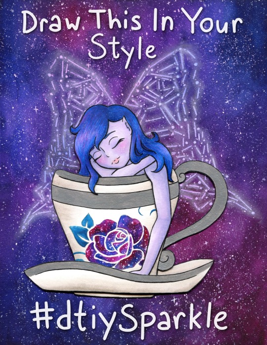
Draw This In Your Style!
Draw/Recreate This In Your Style, post the original art alongside it (on platforms that support it, elsewhere you can just link back to the original instead), and either tag it with #dtiySparkle or tag me, MysticSparkleWings (xxMysticWingsxx on Twitter) directly and I'll retweet/share/etc. it! No deadline, just create at your own pace!
____
You know, I constantly go back and forth on "celebrate milestones!" vs. "don't be that person that won't shut up about how many followers they have and the numbers and etc." Mostly because I usually find it annoying from other artists, even if I don't find the artist themselves annoying. It's complicated. I know it's important and in many cases helps grow a following further, but it also just gets exhausting, you know? Both to see it and to try to do it.
Still, I've been wanting to make a "Draw This In Your Style" (DTIYS) for a while now, but it didn't seem like the kind of thing to just do on a whim. It felt like there should be a reason for at least the first one, provided it went well enough to make me want to do more. I noticed a few weeks ago that I was approaching 1,000 followers on Twitter* and I saw an opportunity, knowing that 1. It would take me a while to finish the artwork (go big or go home, yes?) and 2. It would take a few days for the numbers to stabilize so that I would actually hold steady at 1,000+ and not be 1,000 one minute and 998 the next. (Followers go up and down like a see-saw over there)
*Thanks exclusively to Art Shares. I'm very sure I'd still have less than 100 if it weren't for those--and please don't be fooled by that number. 1,000 isn't teeny tiny, but in-depth interaction from a handful of people will always mean more to me than zero or minimal-at-best interaction from thousands/millions/etc, and frankly, my interaction over on Twitter is basically non-existent compared to the interaction I get here on dA, which precisely is why I prioritize dA over all other social media. It means more to me; it feels infinitely less passive.
But...I kinda didn't want that to be the only reason for the DTIYS. It just seemed...I don't know, cliche? Not right, somehow. Fortunately, the Twitter milestone happens to coincidence with I think I've finally stabilized around 300 followers on Instagram (after being stuck between 250 and 290 for months, consistently going up and down 2-3 people at a time), and I've also garnered over 400 watchers right here on dA.
The Twitter milestone is technically the biggest, but honestly, the dA one means a lot more to me. I thank each and everyone one of you, my fellow deviants, for thinking my art is worth the watch.
And I especially thank those of you--I'm sure you know who you are, I won't name names just in case anyone's not comfortable with that--that consistently fav and/or comment on my work. Your support and encouragement are why I keep doing this, despite the frustrations I may have along the way and aside from an innate need to create.
Speaking of which, if you're a loyal Sparkler I think now I'll get to the part you might know me best for; the long description of the artistic process!
Like I mentioned before, I noticed the milestone stuff a few weeks ago and thought now would be as good a time as any to get started on a DTIYS, so I started trying to brainstorm something that would be both fun for me to make and fun for others to recreate. I was having a little trouble on this front, so I took a trip to Pinterest and re-visited some boards I use to save potential draw ideas/inspiration on.
I was thinking I wanted to include a fairy since I've been wanting to get back into drawing them more regularly and fairies-via-Winx-Club is where I got my start here on dA and indirectly into getting more serious about my art in general. I was also thinking something with galaxies since those are usually fun to make and are a good way to make an otherwise plain or simple piece more interesting. I didn't want this to be too terribly complicated if I expected other people to draw it, but I also didn't want it to be too boring. And, of course, I was hoping for something I could lean into my mixed-media prowess with.
All that turned out to be quite the balancing act, but after some scrolling, I had some ideas and ended up with a sketch of a fairy in a teacup, with place-holder wings and a place-holder rose on the cup. The wings I knew would be easier to do the lines digitally (even if the final art was traditional, which I was planning on), and the rose I wanted to be slightly more sophisticated than my typical stencil-made roses, which I thought would also be easier to experiment with digitally. I was right on that front, thanks to some of the public domain images on PixaBay.
Beyond that, my original idea was fairly different from what you see here; I was thinking black hair, a fairly vampiric look, for the fairy, more typical butterfly wings, a red rose on the cup, and then an abstract galaxy wash, more watercolor-y and less saturated, for the background. And to be fair, that's still an interesting idea that I might return to at some point, but even as I worked on and finished the digital linework (fully planning to print them and then do what I wished with them traditionally, as has become a norm for me) something in the back of my mind told me that vision wasn't the right one; Not for this project, anyway.
Fortunately, I was a busy enough bee in between working on the lines for this that I partially had to step away from it to meet other time constraints and I could afford to step away from it and have some time to ponder what I wanted to do.
In my pondering, I kept coming back to the galaxy/constellation thing I've been experimenting with lately (Exhibits A, B, and C ). I hesitated at first since I knew for sure I didn't want to do the whole drawing that way and I wasn't entirely sure how to decided what to do with what.
Of course, after thinking about it a bit more, I decided I'd take a risk in doing the background and wings in the constellation style, and then somehow do the rest in a more traditional way. I'd have some more time to think about that while I was re-tooling the wings digitally for said constellation style, after having discovered that made life so much easier during my previous experiments with it.
I'd know from the beginning that I wanted to do metallic accents (most likely silver) on the cup and saucer, which in this case meant I'd need to use either watercolor or heavy-duty mixed media paper for them, and I definitely had to use watercolor paper for the wings/background. The mixed media will work for the galaxy technique, but the colors don't blend quite as nicely and I was concerned about how that might affect the overall look here.
Still, I didn't want to watercolor the fairy herself at least, which left me with a choice of alcohol markers or colored pencils. I was thinking pencils for the hair for texture, markers for the skin for the lack thereof. But I typically don't like using alcohol markers on watercolor paper. The additional texture feels too rough on the nib and it's almost like I can feel the paper soaking up extra ink.
I also thought that doing the background and the fairy on the same piece of paper was asking for a very big watercolor-y mess, so between that and the paper concerns, that led me eventually to deciding to split them up.
And somehow in there, the idea occurred to me that I could get a bit adventurous (read: crafty) and actually separate the various parts of the fairy and cup out a bit and not only solve my paper problem, but also makes things a little more interesting.
After yet more pondering (if you can say nothing else about my art, you cannot say it isn't well-pondered by the time it's finished!) I settled on having the layers as follows:
background/wings (watercolor paper)
back part of the saucer (mixed media paper)
the fairy (with her arm and bit of hair carefully plopped over the next layer; mixed media)
the cup (mixed media)
the front of the saucer (mixed media)
Or at least that was the plan, and if I discovered problems in this plan then I could adjust as necessary.
So I got to work on the background, which was fairly straight-forward. I layered on paint and blended to essentially my heart's content, and then let it dry overnight since it was getting late by the time I finished it, or rather the first layer. I came back to it the next day and layered on some more paint to fix some blending issues and darken the whole thing up some more.
While that second layer dried, I got to making the lines for the additional layers and cutting them out--uncolored for the time being, as I figured the layering would need to factor into that a bit--and setting how exactly they'd fit together. The only modifications to my plans I had to make, which I, fortunately, had the foresight to do while I was cutting, was to leave two little bumps at the "bottom" of the fairy (where her body meets the cup) so that she could sit probably as both in the cup but also with her hair and arm hanging over it. The little bumps were a sort of "grounding" behind the cup to hold the rest of her in place while the other pieces were wedged on top.
I hope that makes sense, it's a little hard to explain without seeing it for yourself.
Anyway. I'd also had the foresight to transfer an outline of the fairy and cup lines onto the background before I started painting, which helped with making sure everything was placed...semi-correctly...on the final piece.
I say semi correctly because despite my best efforts when I went to glue everything together it looked right in-person, but the digital scan would later reveal to me that in fact, the layered bits had all shifted slightly to the left and curved inward a bit more, like a right parathesis: ) But I'll come back to that in a minute.
Once I was convinced my layering gambit was going to work out, then I started toying with colors and ideas for the layers themselves. The clearest idea I had out of the gate was to do the rose in a galaxy style too, rather than just plain watercolor like I'd originally planned (teal for the leaf though because green wouldn't have fit with the rest of the palette and blue would've blended too well); either way, I figured it wouldn't pose much of a problem on the mixed media paper since it's such a small area. The biggest challenge would be the stars, but even then you could say the same thing: It's such a small area that star dispersion with a pen really wasn't that big of a challenge to make look convincingly like random star placement.
I went back and forth a bit on the other colors, but I ultimately decided that I liked the idea of soft purple skin and dark(ish) blue hair, maybe soft pink lips and a little blush, for the fairy herself. And I also decided to do a little warm-gray shading on the cup with markers, as opposed to just leaving it white.
The lips turned out so nicely I was tempted to try doing the blush with the same markers, but I have very mixed luck with marker blush (sometimes it blends nicely, other times I get a nice line despite my efforts), and so I decided to play it safe and do it later with pencils instead. Fortunately, the rest of the skin and the cup (both done with Copics specifically as that's where I most easily found the colors I needed) went nice and smoothly, as is the nature of markers on this mixed media paper. (Seriously; Strathmore 400 series Mixed Media works wonders with alcohol markers for layering and blending!!)
The hair was a little more complicated because of the color I was hoping for, but that didn't matter too much because half-way through I decided to change things up a bit and I added little bits of pink and purple into the mix, intentionally following the rest of the galaxy-ness of what I was doing. It's not much, but I think it was the right choice.
While I waited to make sure the cup was good and dry, I went to splatter town on the now-dry background, as was necessary for the galaxy look, and then used my phone to shine some extra light on the paper so I could see my lines and dots for the wings. And after giving the white gel pen a moment to dry, I then went back in with my PanPastel, as is custom, to make the wings glow. I have also now learned that a blending stump/tortillon is good for blending out the pastel in a tight space, while a dry paper towel or tissue works to semi-remove it if it goes on a bit too thick.
Everything, after drying, was then assembled and attached to the background with some handy-dandy tacky glue which was fortunately fairly quick-drying for liquid glue, stuck fairly well without me having to add a whole lot of it, and also not a sloppy glue mess everywhere.
I did have to carefully go back over some of my lines for the cup and hair after everything was assembled because I forgot to do so over the metallic paint and pencil wax before assembly, but it also worked out okay since a couple of corners for the hair got snipped a little short, so I could sort-of fix it by extended the corner on the paper underneath. (In hindsight this works a lot better in-person; on the undoctored scan the placement looks pretty off or incomplete)
And of course, with everything assembled, that brings me back to what I was saying about the scan earlier.
Like mentioned, everything had shifted a bit during placement and gluing, and I could more clearly see the lines I had missed in that process on the scan. Unfortunately for me, while in-person everything looks relativity fine, on the (undoctored) scan this shifting made the balance feel way off, at least to me. The fairy and cup were too far to the left, meanwhile, the ring wing stuck out too far on the bottom.
I fiddled and fiddled and fiddled with the scan, using the content-aware move tool half a dozen different ways before I conceded it just wasn't going to do what I wanted, and then my next-best idea was the extend the background to the left a bit. In doing that, I discovered the warp tool worked to my advantage for that, and so I decided I'd trying fiddling with it and see where it got me.
It's still not perfect, but it's better than it was. In the end, I used the warp tool to tweak the angle of each part of the wings and that made up for some of the balance problems without also compromising any of the lines (which was the biggest reason why the content-aware tool wasn't working; it kept messing up the lines or other parts of the drawing in the process). At the very least, I was able to do enough that it only really bothers me now when I start looking for the off-balance-ness.
I also ended up doing some minor touches, mostly just smoothing out certain lines and small tweaks, but once the balance problem was finally somewhat solved it was pretty much done. (Aside from, of course, me then also adding the words on top so people know what this is at only a moment's glance.)
The end result, both scan and traditional. I'm really happy with. The piece is plenty interesting to look at, but it's also not too complicated, especially when you break down the individual parts that make it up. (Literally and more figuratively.)
Thus, I can only hope others find it interesting-but-not-too-complicated enough to try their hand at recreating it. Even if no one takes me up on my "Draw This In Your Sparkle Style Challenge though, I enjoyed making this all the same and I'm really proud to share the art itself with you guys.
Hopefully though at least a few people will take a stab at it and I can focus on that and not explode from impatience in regards to various not-really-art-related things I'm currently waiting on.
____
Artwork © me, MysticSparkleWings
____
Where to find me & my artwork: My Website | Commission Info + Prices | Ko-Fi | dA Print Shop | RedBubble | Twitter | Tumblr | Instagram
3 notes
·
View notes
Note
i absolutely love how you line/ink your work, do you have any tips? The way you do shading is amazing
..okay first of all: I’m so sorry for the late reply I couldn’t draw for almost a week :`D
well ink/line art tips? let’s see what I can do.

I draw most of my line art using drawing nibs and India ink.

The type I prefer doesn’t seem to have a specific name in english but they’re labeled as “Plume tubulaire, dessin” in french. I love using them because they can produce very thin and fine lines...

...as well as really thick lines by applying some pressure while drawing.
For even thicker lines a brush is helpful...
...as seen in this portrait wich is exclusively drawn with a little brush (the grey tone is water diluted ink). But since I started doing line art using brushes only a short while ago I still have to practise a lot :D
My third most used line art tool are ink pens (pigmented ink) in 8 different sizes.
They are much easier to handle than nibs or brushes but their tone and colour is lighter and less expressive than real ink.
In comparison ink (left) vs ink pen (right)
furthermore, since drawing nibs require a lot of focus and careful handling I automatically draw slower wich makes the lines cleaner. The ink pen line art tends to be messier. They are perfect for sketching,almost all of the doodles in my sketch book are done with them...

Now none of these techniques are necessarily superior. Their impact often depends on just what you want to accomplish in your drawing.
Because if you plan on making a coloured illustration that focuses on creating visual imagery mostly through colour effects like this one...
...your line art should be a clean line (”ligne claire” style).
There are muliple methods. The shading of a drawing can also be done with the inking itself rather than the colouring. It’s a method I really like...
...my technique is inspired by old comics (ecole marcinelle style) that got coloured later on. (btw inking a comic page is another level and probably deserves a post on it’s own...)
Some more examples where the ink does most of the shading and the colours are minimalistic...
as you can see all of the examples above are inked with nibs and coloured with copics and/or fibre-tip pens. I would recommend using them for colouring an ink drawing. Don’t use ink pen line art if you plan on colouring via copics and co. The lighter and softer lining will get lost in contrast to the strong colours.
It doesn’t look terrible but it’s just lacking the impact real ink would have had accomplished.
btw ink is also water proof so you can even use it as line art for an acryl painting
Okay back to ink pens and when to use them.
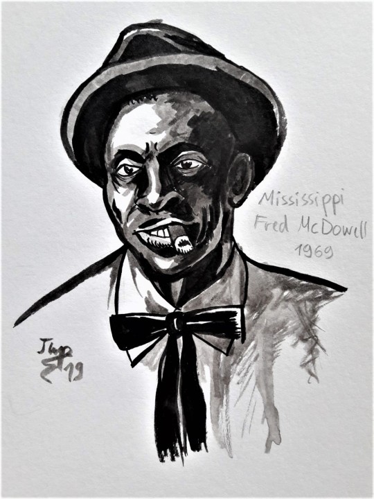
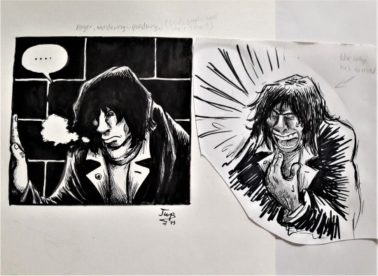
Let’s take a look at this older Floyd drawing of mine:
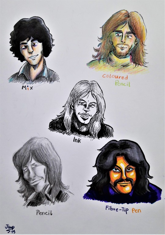
A prime example of my inking methods in one pic (okay Roger’s potrait is a pencil only drawing without real line art so let’s ignore him :D)
All of them are inked using nibs and Indian ink...with one noteable exeption:

Rick’s line art is drawn using ink pens and that’s because the colours are done by pencils rather than copics. The lighter tone of the ink pen harmonizes with the softer pencil colouring (my colouring via pencil differs greatly from my coluring via copic and/or fibre-tip pen)
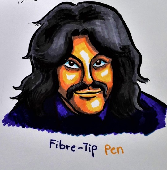
Nick is the polar opposite: Thick ink line art, strong vibrant fibre-tip pen colouring and stark contrasts.
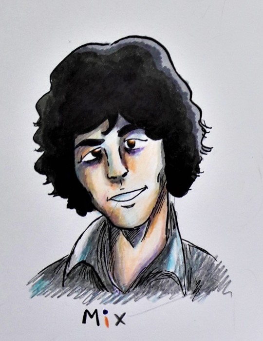
Syd is a mix between every other technique on the paper: Skin and clothing by pencils, shading and hair by ink and copics. And while I wouldn’t recommend coloured pencils on an ink drawing (fragments of the pencil can get stuck on ink and spoil the lining) it works for this one because the lines are really thin and fine.

David’s is an ink only drawing so the lines are medium sized and and a lot more scribbly because every effect has to be accomplished by the ink alone.
So in conclusion: Inking is hard work, especially nibs require a lot of practise, ink pens have their flaws and benefits and colouring is fun :DDD
I don’t know wether any of this is helpful or not XD just practise and explore different techniques and never give up. Let me tell you I started using drawing nibs and ink when I was 14 and I was so bad at it in the beginning that I almost quit art alltogether :’D
Allright then...just draw!
15 notes
·
View notes
Note
I saw your drawing of Patton with wings and PLEASE TELL ME HOW DO YOU DO CLOUDS?!?? TELL ME YOUR SECRET!
HEhehehehehe OK So there’s this tool called Airbrush (I use the free version of Sketchbook btw):

Very useful for fluffy soft things and shading. (I pretty much almost exclusively use Pencil and Airbrush and a select few custom brushes.)
I drew two different types of clouds So, here we go:
Cumulus:
light outline of the general shape (don’t use white. I suggest light grey, grey-blue, light pink/orange/purple, for various times of day/lighting. storm clouds are simular, but use dark grey, dark blue, dark purple, or, maybe, red or yellow all these color variations will change the mood and what time of day it might indicate. For Patton’s I used mostly light pink to indicate early morning/sunrise)

Fill lightly with differing weight throughout, let your intuition guide you honestly.

I then go to the lowest line weight in Sketchbook

and outline again

Using this general stroke pattern:

After that, I kinda just play around, fluff things up and add more definition and define where highlights are

(honestly, you can leave it here, depending on how dense you want your cloud to look.)
After that, I get a darker color (again usually not black or dark grey, a greyish-dark tone of whatever light color you had initially works very nice.) And fill in the areas that will have shading.


Clouds do follow the rules of 3D objects and shading, they’re just….in the sky. Depending on the time of day, the sun can hit them from behind, above or to the side. Know where the sun is and you know where to generally place the shadowing. Add the darkest shadows to the base of the cloud.


After that, I go back to either a very light color, or white, and add more highlights and fluffiness.

Cirrus (honestly these are my favorite kinda clouds?):
With these clouds, you’ll wanna start with a slightly darker color, and make some curvy lines.

bring in the highlight color and go back over a few areas

Then it’s time to break out the pencil tool! get a highlight color, and go over the highlight regions, in a somewhat similar pattern to the cumulus cloud.


Also doing this general pattern & light crosshatching works nicely on these.

That, and:

I have cloud-pen-tools downloaded. :P (although I usually use them as a base to build up on)
336 notes
·
View notes
Text

Instead of a summary of my art from each month of 2019 I’ve compiled a summary of my art from every year of this decade! Finding some of that old art was incredibly difficult.
And making an exact image description of all this would be too long to write or read so I’m going to do my best to describe all this in a concise and interesting way.
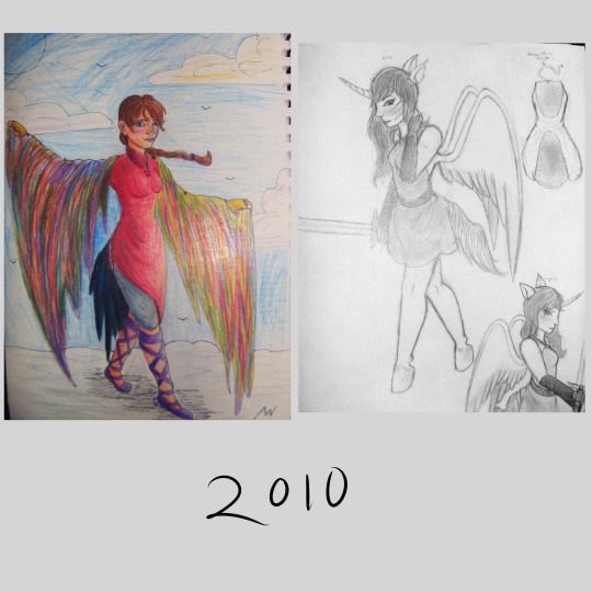
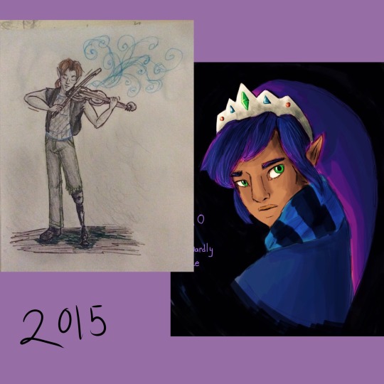
2010: I was a sophomore in high school, so about 15 years old. These two drawings are in pencil and colored pencil, one of some random girl character wearing brightly colored clothes and a rainbow shawl thing (??) walking on clouds it seems. No idea what that was meant to be about. The other is a reference for my old oc, the very first one I ever had, based on myself. She looks human but with unicorn ears and a horn, plus wings and a tail. I hadn’t figured out animal legs yet either so she has perfectly normal human legs that just end in hooves.
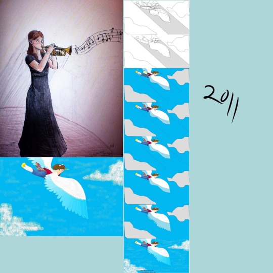
2011: still mostly pencil, colored pencil, I don’t remember if I had a laptop yet. I would have been 16 years old at this time. I picked a self portrait here, a coloreddrawing of myself in black concert dress playing the trumpet because I got to do a solo in jazz band and I was very happy about it. The other art I picked for this year is digital but in the old ms paint program (you know before it tried to be fancy with a few more realistic tools and was only pixel art tools) I do believe I was still using the family computer for this, with a mouse. I was really creative with the tools. It’s my unicorn girl oc again, flying through the sky. I included a progress image, showing how I made it. I’m so glad I saved the steps and posted them it’s really cool to see my old art process for that.
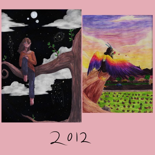
2012: 17 years old, and I think I finally had a laptop with a good art program on it by this time but I still did mostly traditional art, lots of colored pencil work. I found this old experimental art I did that year, a colored pencil drawing of a girl sitting on a tree branch, but the background is all digital, a painting of a fantasy night sky with three moons. It actually looks kinda good, the edges of the colored pencil drawing are crisp and smooth and the digital background doesn’t look out of place. I mean the shading is a bit of a mess and I used white clouds on a black night sky which is a bit funny looking but it isn’t that bad. The other image is a colored pencil drawing that was really ambitious for me at the time. I had this cool idea to draw Death with sunset colored wings, all poetic and stuff. Why did I also draw death with blue skin and horns? I don’t know. Why is death sitting on an ambiguous brown cliff overlooking a cemetery? Well I guess I just was having trouble finding any other way to make a nice background and have death above a cemetery. I should redo this one, it’s a really good concept.
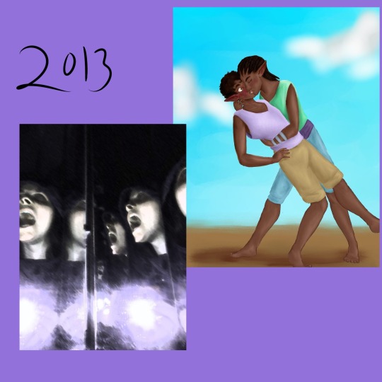
2013: my last year of high school, 18 years old. I was doing digital art a lot more often this year and expanding the diversity of my ocs. One of these images is a digital drawing of two of my first characters of color, two male black elves (black as in African-based) smoochin. My first black oc was also my first queer oc, jayvyn. A gay elf. There are a lot of issues with the way I originally conceptualized his story but even when I was thinking he was the only queer person in his town and there was homophobia towards him (I was only just dipping my toes outside the mindset I grew up in) I gave him a whole massive group of friends (a boys' lacrosse team he was on don’t ask me why lacrosse I have no idea I don’t even know much about lacrosse it was a weird choice) and those friends were extremely loyal and supportive of him, even to the point of going on dates with him just to make him happy. and again, he was the only gay character I had so I was writing a bunch of straight dudes taking their one gay friend on dates in a town full of people who were at least vaguely homophobic, I definitely had a lot of growing to do in my writing and my own mindset but I’m kinda proud of myself for doing that? I could have done so much worse with my first queer oc and my first real step into characters of color, but I made the whole story about this tight knit group of boys who were all such close loving friends. (Gee I wonder if this had anything to do with my being ace and not knowing it yet). Oh yeah, the other image is also there, that one is from a photoshop class I took. We had a three-way folding mirrors the bathroom at the time so I put on a hoodie, turned out the bathroom lights, folded the mirrors in and shoved my face into the gap and then took a photo with the flash while holding my mouth open in a silent scream. The result is this really cool series of screaming faces at different angles, which I then ran through a few filters and major contrast adjustment. Could be an edgy generic horror movie cover lol
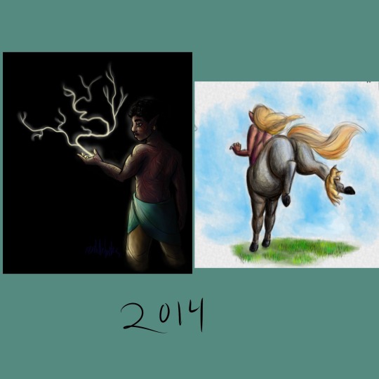
2014: 19 years old, and I just finished a year of community college and then left on a church mission for 18 months. I probably should have used some of my first college art class drawings for this year's summary but I was using my old deviantart gallery to collect these old images so I forgot I had all that college art too. These two digital images are pretty dynamic in different ways. Dynamic lighting and dark skin, an experiment I was doing to figure out lighting better for my characters of color. That’s Jayvyn again I think, with lightning shooting out of his hand because I sure love making characters with lightning powers. The other is dynamic in the posing and I’m still incredibly happy with it, it’s a drawing of a grey centaur from behind, bucking in panic because a kitten pounced on its foot. Definitely still one of the best centaur drawings I have ever made.
2015: 20 years old, I was actually on my church mission for this entire year so finding art from that year was very very tricky. One is just a small pencil drawing on another oc, Ronan with his cool mechanical leg playing fiddle I guess? I was doing a lot of synesthesia doodles that year so there are lots of swirly lines coming off the fiddle. I was also surprised to find this really neat digital art I made of Ravio from link between worlds, I almost forgot I did find a way to make digital art on my mission (no access to my laptop, limited apps we were allowed to use, super limited access to normal computers except for emails and such, always busy doing important stuff) I discovered the drawing function in the iPad notes app and every time I had time I would use it until I figured out how to make it work for me, using only my fingers, the limited color palette options, and this marker tool that had one size and only multiplied (except when using white) this is definitely one of the best ones, but I don’t know where the rest went. I had a lot. I was stunned to find this because it really looks like I could have done it on a laptop, can’t believe I forgot I did that.
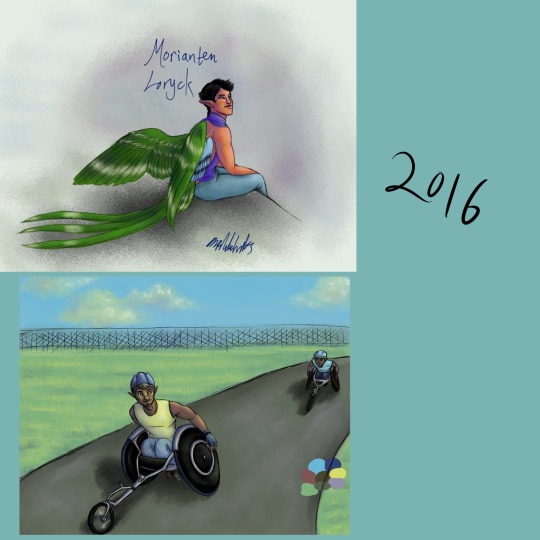
2016: 21 years old. Had to get used to a laptop again. Also I created my current main oc Morianten during my church mission so here I have the very first full body digital art of him! I’ve definitely changed his anatomy a lot since then, made him much more bird like. Kinda funny to look at this old one and see just how differently I draw him now, only three years later. I also have here a digital painting of some other members of morianten's adoptive family, his dad and little brother having a father son race in nice racing wheelchairs. I still struggle with proportions when I draw characters in wheelchairs.
2017: 22 years old, and back in college. I really had a focus on figure drawing that year, I was back in college art classes and I found posespace.com which is just full of professionally shot art model photos. I’ve got one digital figure drawing of my oc Talib, another practice in lighting on dark skin. The other image is a charcoal drawing of my oc Parva, I think I did that one in a 30 minute time frame where I was taking pictures at different points to show my process but I’ve lost the process images.
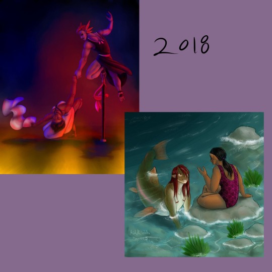
2018: 23 years old, and really getting into color depth with my digital art. I found a really old pencil drawing of a dynamic dancing scene and redid it as a digital painting with extreme colored lighting dynamics and new characters. I also got super into mermay so I’ve included one of my favorites, a rainbow trout gal and her elf girlfriend having a chat after a nice swim. I’m super proud of the colors and proportions here, and the shading is pretty great too.
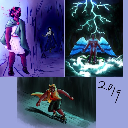
And then it’s 2019! This year! I’m 24! For this one I used three images instead of two, all digital. My ocs Talib and Kouto as persephone and hades in a really quick painting I did but the colors and lighting are intense and fun. No outlines painting of Morianten with some pretty intense lightning lighting. That one took ages and I’m still not entirely pleased with the way I drew his face there but I’m proud of it. And I never actually posted this last one, it’s a new oc created exclusively for the DC superheroes au I dabbled in with @askmissbernadette, a young hero called Lion riding a skateboard in a dark city with a long coat on because that’s a fun way to replace the common superhero cape design.
Overall, it was really fun to go through my art for the entire decade and see how much it’s changed over time. And to see how much my characters have changed. Hope 2020 is a good year, hope the 20s in general are good. Here’s to another 10 years of change and progress!
1 note
·
View note
Note
Hi, I really love your digital art, and I'd love to hear about your set up! Your pen settings honestly give me life, like that Mirage towel piece BOYYYYY <33333333 I was wondering what kind of tablet and software you use, if you didn't mind! (Also your pen settings, please, idk if you could tell, im seriously not over your heckin' pen settings) <3 Thank you for sharing your work!
Aw, thank you! <3 Always happy to answer. I dont wanna get preachy but I do just use pen settings that feel good to me. These tools and brushes behave a little differently on different setups and may not always get the same look. When I draw on my laptop, I use a different tablet and different brushes than when I draw at my desk, and so on.I can make suggestions but please continue your search for brushes that appeal to you just by trying new ones, too! I can only point you in the direction of some.
Tablet
I use a Wacom Intuos 4, XL (And I don't use the whole surface; its too big for my tiny arms so I only use the surface area of a medium Intuos 🤪). I don’t exactly recommend it, but if a secondhand Intuos 4 in medium or larger is cheaper than a new Intuos Pro (the technical equivalent in the current lineup), I would get this older model over the new ones. I’ve heard some mixed but good things about brands other than Wacom honestly, and I’d have to say if this tablet died now I’d probably try changing brands to something else with tilt and at least 2048 pressure sensitivity levels.
Software
Clip Studio Paint with an additional assistant program, Lazy Nezumi. Clip goes on sale a few times a year for like $25~50 and I think its GREAT. It’s designed for comic artists primarily but I personally love its brush engine. It also comes with the free resource Clip Studio Assets, where users can upload their own settings; every brush I’ve used in my last peices of art came from there I think. Theres thousands but I just go through the trending onces periodically for stuff that looks cool. I own Clip Studio EX because I needed some featurs but if you just draw you can get away with the DEBUT/PRO license (unsure what it’s called now). Lazy Nezumi is a stabiliser and helps keep my lines straight and my undos infrequent, it also have a bunch of neat tools like perspective rulers and stuff. Clip has inbuilt stabilisation, I just prefer it paired with lazy nezumi’s.
Brushes and Tools
As I mentioned, I use brushes almost exclusively from CLIP STUDIO ASSETS. On this first page, you can already see a bunch of the brushes and tools I regularly use. I also own the Frenden Big Brush pack.
Brushes used in my art:색연필 (Real Pen Set) - This took some searching because apparently I pulled it out of the set randomly and have been using it on its own for my lines for months. This is what all my apex doodles are drawn with; no clue if i changed any settings. I have one at 33px and one at 14px.Coloured Pencil - size 12, used for 300DPI illustration lines (I believe this is a CLIP default brush in the pencil tab)Admittedly no clue what I use for coloring/painting. I have my own personal textured brush made for laying down color (I’ll upload at some point), but I tend to just pick whatever random brush from my tab that looks right to polish/blend/render. I like the Simple Water brush below, as well as the Gasa rakugaki, but its personal preference.Recommended:Perfect Pencil (With Tilt Support) ガサ伽サ線画ペン Real Pen Set L (l2 is my current fave on my laptop. It just feel right, and im kind of annoyed it doesnt feel the same on my desktop) 먹는빵simple water ふわペンセット がさらくがき
15 notes
·
View notes