#alt text has transcript for people with screen readers
Explore tagged Tumblr posts
Visit Tumblr Blog
Explore Tumblr blogs with no restrictions, modern design and the best experience.
Last Seen Tumblr Blogs


Fun Fact
Premium Tumblr themes are available from anywhere between $9 to $49.
Text
This is my online accessibility (especially image description) masterpost, which I update periodically whenever I find a new resource or guide. I worry this has the side effect of looking overwhelming in scope, so if you're learning about IDs and/or Tumblr-specific accessibility for the first time, I recommend you start with the first six posts, under "The Basics". All post titles are clickable links!
The Basics
[Plain text: "The Basics". End PT]
Why and how to write image descriptions
Accessibility on Tumblr for new users (has templates, also talks about how to tag for flashing lights to accommodate photosensitive folks)
I see an image and want to describe it: a step by step guide
Fanart-specific and Tumblr-specific advice for image descriptions
How to describe screenshots of tags
IDs versus Alt Text, from a visually impaired Tumblr user (spoiler alert: sometimes it makes sense to use both)
Level of Detail
[Plain text: "Level of Detail?" End PT]
Why a short ID is always better than no ID
Blind people discuss the level of detail to include in IDs
The key word for writing IDs: "Relevancy"
Helpful Communities, Tips, and Tools
[Plain text: "Helpful Communities, Tips, and Tools." End PT]
I want to make my posts more accessible, but can’t write IDs myself: a guide
The People's Accessibility Discord sever (also mentioned in the previous link. It's a friendly server for crowdsourcing image descriptions, with description requests and feedback requests both welcomed)
Google Doc full of template descriptions for memes
Online image to text converter
Describing skin tone and describing hair (heads up that the posts themselves are undescribed and were written with fiction writers in mind; potentially still very useful)
How to remember to write descriptions (spoiler: by putting yourself in situations where you see descriptions more often)
Related, a Google doc of described blogs (almost all the blogs linked earlier in this post have tons of described posts and resources too)
(In my opinion, writing IDs is easiest to learn by doing — but especially if combined with watching other people do so. So follow some described blogs!)
Miscellaneous
[Plain text: "Miscellaneous". End PT]
Alt text vs IDs vs Captions with examples
Why not to put image descriptions in small fonts/italics (also, some non-definitive thoughts on IDs vs alt text)
Special characters read by all screen readers
Brief Intro to Transcripts/Video Descriptions
Myths That Harm Blind People
How to make your blog's colors visually accessible - one of the easiest thing on this list!
Other easy things: show love to artists who describe their work, edit descriptions into your original post when someone provides one in the notes, and copy-paste inaccessible (eg, small text or italicized) descriptions as plain text when you reblog!
Lastly, and maybe most importantly, how to continue writing image descriptions while avoiding burnout.
Let me know if any of these links break! I personally don't describe nearly as much audio/video (got those audio processing issues), so this list is sparse on those resources, but if anyone has good guides/blog recommendations for that too, feel free to add on!
755 notes
·
View notes
Note
Hi Sam. A potentially stupid question. Image descriptions for screen readers. Do they work the same way for audio and video? As in are they needed or helpful? I'm finding conflicting answers when I search for this.
Not at all a stupid question! I think sometimes it can vary by community, to be honest.
Screen-reader users, visually impaired folk, and others for whom IDs are particularly relevant, feel free to chime in; I'm going to ramble and you likely have more useful stuff to say. Remember to do it in reblogs or notes, as I don't post asks sent in response to other asks.
I'm not visually impaired, and I don't use a screen reader and thus am not really able to speak with firsthand authority. In the past, when I've asked, I've heard that in-post text is better than alt-text for images; even if that stops being the case, I prefer to use in-post text because there are people who aren't screen-reader users who also like the IDs. I do too, actually. And generally I've heard that video as well as image should be described. I don't do straight audio generally, but when I do, if it's a song I don't bother because the title is there and lyrics are googleable, if it's speech I like to see/give a transcript.
I like when videos have descriptions especially, because I am almost never in a position to play a video I see on my dash. If the video doesn't autoplay I don't want to hit play because then it will load with audio and I'm usually either a) somewhere I can't have audio or b) already listening to something and unwilling to turn it off. If the video autoplays it's muted, but if it's audio-heavy there's the same issue. So if someone posts a video without a description/transcript, unless it has captions, I can't engage.
There are a lot of guides out there for how to write IDs and I kind of think, based on conversations I've had, most of them are bullshit by people who don't use screen readers. In my experience, which is not universal but is relatively comprehensive, people who can't see an image often do not want a precise objective description as we're instructed to provide.
There's a great essay that touches on this, Against Access, where the writer, who is Deafblind, talks about how he doesn't want a diagram, he wants an emotional evocation.
Why are you telling me, telling me, telling me things? Your job isn’t to deliver this whole room to me on a silver platter. I don’t want the silver platter. I want to attack this room. I want to own it, just like how the sighted people here own it. Or, if the room isn’t worth owning, then I want to grab whatever I find worth stealing.
I've had people get shitty with me about putting "feelings" into my IDs, but the majority of people for whom those IDs are necessary have told me they like it because, for example, saying "She looks like she's about to commit violence" is a subjective opinion but conveys something that "A woman is standing with arms upraised and a frown on her face" does not. And if you're describing an image but there's not a ton of meaning to it, describing it in clinical detail is wasting time. A paragraph describing a fortysomething white guy and all the clothing he's wearing and the room he's in is not as helpful, on occasion, as simply saying "This is a photograph of me in my bedroom." It depends on context, which is your call to make, and the only way to get good at that is to do it.
But again: this is my experience with my readers, and even John Lee Clark, quoted above, doesn't speak for his whole community. So I would suggest that the best way to get an answer for this is just to ask your readers what they'd prefer. If you have friends who use screenreaders, ask them. If you don't, or if you don't get a response from your readers, I would do what you feel is best until someone tells you otherwise, and then be gracious and discuss it with them so you can better understand their needs. In my experience, when someone is genuinely trying to make a more welcoming space for disabilities -- as opposed to making virtue-signal attempts to Be The Perfect Ally -- they get a lot of slack when they don't get it exactly right. It is better to make a welcoming space for people to feel safe telling you that you fucked up than it is to pretend you're never going to fuck up.
So yeah, as someone who is more or less fully sighted, that's my two cents, but if you really want to know what your readers want, you know...I'd ask them. :) Good luck, either way.
#disability#image identification#lord knows I'm not perfect with mine#but I like to think generally I'm responsive to need instead#which is more important
63 notes
·
View notes
Text
Hello I have some accessibility and/or quality of life tips for people making isat dialogue gifs with that one maker!
the default text speed is “very slow.” please. please turn up the text speed a little. Maybe this one's just for me but my adhd will kill me if I have to wait too long to read / wait for the gif to reset
I like to put a 1s pause [PS=1000] at the end of each dialogue box to give people time to read as a good compromise.
If you’re doing a really long exchange in a single gif, you can use an online converter to make it a video and that way people can pause or rewind to the start instead of having to rewatch the full gif!
Also, consider including a transcript of the dialogue in either alt text or the body of the post for people using screen-readers!
If anyone else has accessibility / other tips feel free to add on!
30 notes
·
View notes
Note
Re your "speak in fonts" post - just saying that if you're using fonts that are copy pasted from websites (so are a bunch of unicode symbols) they are incredibly inaccessible to screenreaders! Not sure how you're doing it but just wanted to give a heads up because it might mean some of your posts aren't accessible 💛
Let me have fun please, I've never seen people so mad that I had fun without making it accessible.
I did this with FaceMoji.
Somebody using a screen reader probably wouldn't get the joke because the entire joke of the post was that the writing was inconsistent - VERY difficult to pull off as accessible
Nobody gets mad when people don't put alt text on images, so let me do this one thing.
If somebody with a screen reader were to ask, or if anyone who couldn't read it were to ask, I could provide a transcripted version, a normal texted version. Fuck, I could record an audio. At request.
Nobody has asked me to do so, or asked for a transcript. Nobody has done so.
It is a one time for the post, we know that it's not fully accessible, and while it wasn't our intention, I don't see the point of deleting the entire post for it.
They're not copy pasted, it's part of my keyboard, if it helps.
6 notes
·
View notes
Text
[Profile picture transcription: An eye shape with a rainbow flag covering the whites. The iris in the middle is red, with a white d20 for a pupil. End transcription.]
Hello! This is a blog specifically dedicated to image transcriptions. My main blog is @mollymaclachlan.
For those who don't know, I used to be part of r/TranscribersOfReddit, a Reddit community dedicated to transcribing posts to improve accessibility. That project sadly had to shut down, partially as a result of the whole fiasco with Reddit's API changes. But I miss transcribing and I often see posts on Tumblr with no alt text and no transcription.
So! Here I am, making a new blog. I'll be transcribing posts that need it when I see them and I have time; likely mainly ones I see on my dashboard. I also have asks open so anyone can request posts or images.
I have plenty of experience transcribing but that doesn't mean I'm perfect. We can always learn to be better and I'm not visually impaired myself, so if you have any feedback on how I can improve my transcriptions please don't hesitate to tell me. Just be friendly about it.
The rest of this post is an FAQ, adapted from one I posted on Reddit.
1. Why do you do transcriptions?
Transcriptions help improve the accessibility of posts. Tumblr has capabilities for adding alt-text to images, but not everyone uses it, and it has a character limit that can hamper descriptions for complex images. The following is a non-exhaustive list of the ways transcriptions improve accessibility:
They help visually-impaired people. Most visually-impaired people rely on screen readers, technology that reads out what's on the screen, but this technology can't read out images.
They help people who have trouble reading any small, blurry or oddly formatted text.
In some cases they're helpful for people with colour deficiencies, particularly if there is low contrast.
They help people with bad internet connections, who might as a result not be able to load images at high quality or at all.
They can provide context or note small details many people may otherwise miss when first viewing a post.
They are useful for search engine indexing and the preservation of images.
They can provide data for improving OCR (Optical Character Recognition) technology.
2. Why don't you just use OCR or AI?
OCR (Optical Character Recoginition) is technology that detects and transcribes text in an image. However, it is currently insufficient for accessibility purposes for three reasons:
It can and does get a lot wrong. It's most accurate on simple images of plain text (e.g. screenshots of social media posts) but even there produces errors from time to time. Accessibility services have to be as close to 100% accuracy as possible. OCR just isn't reliable enough for that.
Even were OCR able to 100%-accurately describe text, there are many portions of images that don't have text, or relevant context that should be placed in transcriptions to aid understanding. OCR can't do this.
"AI" in terms of what most people mean by it - generative AI - should never be used for anything where accuracy is a requirement. Generative AI doesn't answer questions, it doesn't describe images, and it doesn't read text. It takes a prompt and it generates a statistically-likely response. No matter how well-trained it is, there's always a chance that it makes up nonsense. That simply isn't acceptable for accessibility.
3. Why do you say "image transcription" and not "image ID"?
I'm from r/TranscribersOfReddit and we called them transcriptions there. It's ingrained in my mind.
For the same reason, I follow advice and standards from our old guidelines that might not exactly match how many Tumblr transcribers do things.
3 notes
·
View notes
Text
Why Website Accessibility is Critical for Your Shopify Store’s Growth and Compliance

In today’s interconnected digital world, an online store isn’t just a storefront; it’s a gateway to your brand, products, and services. As a Shopify merchant, you’re constantly looking for ways to expand your reach, attract new customers, and boost sales. While marketing strategies, product quality, and competitive pricing are undoubtedly crucial, there’s a vital element that often gets overlooked, yet holds immense power for your business: website accessibility.
Website accessibility refers to the practice of designing and developing websites so that people with disabilities can perceive, understand, navigate, and interact with them effectively. This isn’t just a moral imperative; it’s a strategic business decision that can significantly impact your Shopify store’s success. Whether you’re starting out or scaling, integrating ADA compliance Shopify solutions into your store is not just a good idea—it’s an absolute necessity.
1. Expanding Your Customer Base: The Power of Inclusivity
Imagine a significant portion of your potential market unable to access your store. That’s exactly what happens when your Shopify website isn’t accessible. Globally, an estimated 1.3 billion people live with some form of disability. In regions like the US, UK, and EU, around a quarter of the population has a disability. By neglecting accessibility, you are effectively shutting out a massive segment of consumers with considerable purchasing power.
An accessible Shopify store welcomes everyone. This means:
Visually Impaired Users: Can navigate your site using screen readers, thanks to proper alt text, heading structures, and keyboard navigation.
Hearing Impaired Users: Can understand video content through captions and transcripts.
Motor Impaired Users: Can shop using keyboard-only navigation or assistive devices.
Cognitive Disabilities: Benefit from predictable layouts and simple, clear content.
By making your store inclusive and leveraging tools like ADA compliance software, you can broaden your audience and increase conversions.
2. Legal Compliance and Risk Mitigation: Staying Ahead of the Curve
In an increasingly litigious digital landscape, website accessibility has become a legal requirement in many jurisdictions. Laws like the Americans with Disabilities Act (ADA) in the US, the European Accessibility Act (EAA), and AODA in Canada mandate that public-facing websites—including e-commerce platforms like Shopify—must be accessible to individuals with disabilities.
Non-compliance can result in:
Expensive Lawsuits and Penalties: ADA-related lawsuits against e-commerce stores are rising and settlements can reach tens of thousands of dollars.
Reputational Damage: Being sued or publicly criticized for inaccessibility can severely harm your brand image.
Using ADA compliance software or implementing ADA compliance Shopify tools can help mitigate legal risk and demonstrate your brand’s commitment to inclusivity and ethical practices.
3. Enhanced SEO: A Win-Win for Visibility
Believe it or not, website accessibility and SEO are deeply interconnected. Many accessibility best practices align with search engine optimization strategies, meaning you can boost organic traffic while making your site more inclusive.
How accessibility improves SEO:
Alt Text: Helps screen readers and boosts image search rankings.
Heading Structures: Improve both readability and crawlability.
Descriptive Links: Make your content easier to navigate and index.
Semantic HTML: Aids both search engines and assistive technologies.
Mobile Friendliness: Accessible websites are typically responsive and mobile-optimized—a big plus for SEO.
By choosing themes and plugins that support ADA compliance Shopify, you enhance both user experience and search visibility.
4. Better User Experience for All: Not Just for People with Disabilities
The beauty of accessible design is that it enhances the shopping experience for everyone—not just users with disabilities.
Examples:
High Contrast & Readable Fonts: Better readability for all users.
Keyboard Navigation: Faster navigation for power users and those using non-traditional input devices.
Plain Language: Easier comprehension for users with limited English or reading skills.
Adjustable Text Sizes: Improves comfort, especially for older audiences.
By embedding ADA compliance software solutions into your Shopify site, you’re not only complying with legal standards—you’re creating a superior experience for all visitors.
5. Brand Reputation and Social Responsibility
Today’s consumers increasingly align themselves with brands that reflect their values. Prioritizing accessibility and ADA compliance positions your Shopify store as inclusive, ethical, and forward-thinking.
Positive Brand Image: Demonstrates you care about all customers.
Competitive Advantage: Few Shopify merchants fully embrace accessibility—this is your opportunity to stand out.
Increased Loyalty: Satisfied, included customers return—and refer others.
By adopting tools and practices rooted in ADA compliance Shopify, you’re showing that your brand is about more than just profits—it’s about people.
How to Make Your Shopify Store Accessible: Actionable Tips
Shopify provides a solid framework for accessibility, but true ADA compliance requires proactive effort:
Pick an Accessible Theme: Choose one built with WCAG principles in mind.
Add Descriptive Alt Text: For all product images and graphics.
Ensure Proper Color Contrast: Use tools to meet WCAG’s minimum contrast ratios.
Support Keyboard Navigation: All elements should be usable with a keyboard.
Use Proper HTML & Heading Structures: Follow logical content hierarchies (H1 → H2 → H3).
Add Captions/Transcripts: For all video and audio content.
Make Forms Accessible: Use clear labels and avoid visual-only CAPTCHAs.
Write Simply and Clearly: Accessible content is easy-to-understand content.
Enable Scalable Text: Use relative font units (em, rem) over pixels.
Avoid Autoplay Media: If used, ensure it’s muted with clear controls.
Test Manually and Automatically: Use screen readers and keyboard navigation regularly.
Install ADA Compliance Apps: Shopify offers several apps to enhance accessibility, including:
UserWay
Accessibly
EqualWeb
Accessibility Spark
These tools function as ADA compliance software to help automate fixes, monitor compliance, and provide users with personalization options (e.g., font size, contrast).
Conclusion: Accessibility is an Investment, Not an Expense
Making your Shopify store accessible isn’t just about legal compliance—it’s about growing your business, improving your customer experience, and building a brand that stands for inclusivity.
Whether you’re a small business owner or a high-growth e-commerce brand, investing in ADA compliance software and adopting ADA compliance Shopify strategies will help you:
Reach a broader customer base
Avoid costly legal consequences
Improve SEO and UX
Enhance your brand image
In today’s digital age, accessibility is a must-have, not a nice-to-have. Begin your journey now—and build a Shopify store that’s open, welcoming, and usable by all.
0 notes
Text
Accessible Website Design: Best Practices for Reaching All Audiences

In the digital age, your website is often the first point of contact between your brand and potential customers. But if your site isn't accessible, you're leaving out millions of users who navigate the web with disabilities. Accessible website design ensures that all users—regardless of physical or cognitive ability—can engage with your content and services. It’s not only a legal requirement in many jurisdictions but also a smart and ethical business strategy.
What Is Accessible Website Design?
Accessible website design refers to creating websites that are usable by people of all abilities and disabilities. This includes individuals who use screen readers, navigate by keyboard, have color blindness, or face cognitive challenges. The goal is to eliminate digital barriers and create an inclusive experience that welcomes everyone.
Why Accessibility Matters
1 in 5 people in Canada has a disability.
Inaccessible websites can lead to legal action and fines under laws like the AODA in Ontario and the Americans with Disabilities Act (ADA) in the U.S.
Accessibility improves SEO, usability, and user retention.
In short, accessibility isn't just about compliance—it's about making the web better for everyone.
Best Practices for Accessible Website Design
1. Use Semantic HTML
Semantic HTML (like <header>, <nav>, <main>, <footer>, and <section>) helps screen readers interpret and navigate your content more easily.
2. Ensure Keyboard Navigation
Some users rely solely on a keyboard to browse the web. Make sure all interactive elements—buttons, links, menus, and forms—are fully operable via keyboard.
3. Provide Text Alternatives for Non-Text Content
Use alt text for images, transcripts for audio, and captions for videos. This enables users with visual or auditory impairments to access your content.
4. Maintain Sufficient Color Contrast
Text should stand out clearly against background colors. Use tools like the WCAG contrast checker to ensure your design meets the recommended 4.5:1 ratio for normal text.
5. Use Descriptive Link Text
Instead of writing “click here,” use descriptive phrases like “Download the annual report” so users know exactly what to expect.
6. Avoid Relying Solely on Color to Convey Information
Color-coded charts or form fields should also include labels, patterns, or icons to ensure the information is accessible to color-blind users.
7. Make Forms Accessible
Label every input field clearly, use fieldsets and legends for grouped options, and include helpful error messages and instructions.
8. Create a Logical Content Structure
Use headings (<h1> to <h6>) in a hierarchical order to organize content. This makes it easier for users—especially those using screen readers—to scan and understand your page.
9. Responsive Design for All Devices
Accessible website design must be mobile-friendly. Ensure that text resizes, navigation adjusts, and content stacks appropriately on all screen sizes.
10. Test with Real Users and Tools
Use tools like WAVE, axe, or Lighthouse to scan for accessibility issues, and consider user testing with individuals who have disabilities to uncover real-world usability problems.
The Benefits of Accessible Website Design
Broader Audience Reach: Inclusive websites welcome all users, expanding your potential customer base.
Improved SEO: Many accessibility practices align with SEO best practices, enhancing search visibility.
Positive Brand Reputation: Accessibility signals social responsibility and builds trust.
Legal Protection: Compliance with AODA, ADA, and WCAG 2.0/2.1 guidelines reduces legal risk.
Final Thoughts
AODA website design is no longer optional—it’s essential. As digital spaces become more central to how we live, work, and connect, designing for accessibility ensures your message reaches everyone. By following best practices and using the right tools, businesses can create more equitable, usable, and effective digital experiences.
0 notes
Text
Hawaii Website Design: Building Accessible, ADA-Compliant Websites for All Users
Creating a beautiful website is important—but creating one that’s accessible to everyone is essential. As more people rely on the internet to access services, make purchases, and engage with businesses, digital accessibility has become a legal, ethical, and strategic priority. That’s why Hawaii website design today must do more than just look good—it must meet accessibility standards that allow all users, including those with disabilities, to navigate and use your website effectively. At NogaTech, we’re committed to inclusive design that reflects Hawaii’s spirit of aloha and respect for all.
Accessibility is about removing barriers. Whether a visitor is using a screen reader, keyboard navigation, or high-contrast settings, your website should provide a smooth, clear experience. And for businesses in Hawaii—especially in education, healthcare, government, and tourism—accessibility isn’t optional. It’s required.
What Is Website Accessibility?
Website accessibility refers to how easily people with disabilities can interact with your site. Disabilities may be visual, auditory, cognitive, or physical—and an accessible site ensures that everyone, regardless of ability, can:
Navigate pages using a keyboard or assistive devices
Read text with appropriate contrast and font sizes
Understand visual content with proper image alt tags
Listen to videos with captions or transcripts
Fill out forms and click buttons without confusion or delay
ADA (Americans with Disabilities Act) compliance is a legal framework that outlines these requirements. Websites that fail to meet these standards risk not only alienating users—but also legal action.
That’s why more businesses are turning to Hawaii website design professionals to bring their digital presence up to modern accessibility standards.
Why Accessibility Matters for Hawaii Businesses
Hawaii is a diverse, inclusive community—and your website should reflect that. Tourists, kūpuna (elders), students, veterans, and residents with disabilities all deserve a website experience that’s easy to access and enjoyable to use.
When you prioritize accessibility, you gain:
Larger audience reach, including seniors and users with assistive devices
Improved SEO (search engines reward clean, accessible code)
Stronger brand reputation for inclusivity and care
Lower bounce rates from frustrated or excluded users
Reduced legal risk from non-compliance with ADA or WCAG standards
At NogaTech, we integrate accessibility directly into every Hawaii website design project. We don’t treat it as an afterthought—we treat it as a standard.
Key Features of an Accessible Website
When redesigning or developing a new site, we implement features and practices that make your website usable for all, including:
Keyboard-navigable menus and interfaces
Screen reader-friendly layouts with proper semantic structure
Alt text for all images to describe visual content
Color contrast adjustments to support visual impairments
Descriptive link text (no more “click here”)
Accessible forms with clear labels, errors, and instructions
Text resizing and zooming support without breaking layout
Closed captions and transcripts for video and audio content
We also run audits using WCAG (Web Content Accessibility Guidelines) and tools like WAVE or Axe to ensure compliance and provide clear recommendations.
Our Process: Accessibility Built from the Ground Up
When we take on a website design or redesign project, accessibility is integrated from day one. Our process includes:
Discovery: Identifying your audience, legal obligations, and accessibility needs
Design: Creating wireframes and layouts with clear structure and universal design principles
Development: Writing clean code, integrating assistive tech compatibility, and optimizing performance
Testing: Manual and automated accessibility audits across devices and screen readers
Training: If you’ll be maintaining your own content, we offer training on how to keep it accessible
Monitoring: We provide optional ongoing support and re-checks to maintain accessibility as content evolves
This ensures your website isn’t just compliant at launch—but stays inclusive over time.
Conclusion
Accessibility is more than a legal checkbox—it’s a reflection of your business values. With expert Hawaii website design from NogaTech, you’ll have a site that welcomes every user, reflects the inclusivity of our island communities, and stands up to modern standards. Let’s design a website that’s open to all—because accessibility is not an extra, it’s essential.
0 notes
Text
You added an "image description" to my post - now what? (FAQ)
While I'm literally always willing to answer (good faith) questions about image descriptions, alt text, and online accessibility writ large, I also know lots of people have social anxiety about sending DMs, doing IDs "wrong," or just not knowing what IDs are for in the first place. Hence, this FAQ.
If I added an ID to your post and/or asked you to do so, and you're confused about any aspect of that, this is where to start. You can absolutely still reach out to me, I just thought I should consolidate as many answers as possible.
"What is an ID and why does it matter?"
IDs, or "image descriptions," are a description of the content of an image, and can range from a transcript of a screenshot of text, to a description of a detailed piece of art. They should be in plain text, and placed on the line immediately following the image (unless it's alt text, more on those pros and cons later).
Before we can answer "why it matters," there are two brief but crucial pieces of prior knowledge we need to establish for this whole post:
Blind people can use computers, and navigate the Internet, with technology like screen readers and Braille displays.
Blindness is a spectrum. Partial vision is common. Some blind and low vision people can't make out all the details of images, but can still read enlarged text.
Now, we're ready to answer why IDs matter. IDs are primarily for blind and low vision people, who need text alternatives to images as they use screen readers, and/or enlarged text on their devices, to navigate the internet.
IDs help others too, including lots of neurodivergent people. Check out this post (link) and the notes for more examples (dyslexics, migraine sufferers, people who can't interpret expressions, people with slow internet...)
IDs are important because without them, the Internet really sucks for people who need them. You probably don't realize how many undescribed images circulate on Tumblr every day, with no way for a lot of disabled people to engage with those posts.
A blind person talks in more detail about all of this here (link).
"I reblogged your ID, is that enough?"
It's not that I don't appreciate it, but editing it into the root post and then reblogging that is much more impactful, for a variety of reasons. It means people who need IDs don't have to dig through the notes for them, it means that Tumblr can't glitch by failing to load the notes and make the ID functionally disappear, and it means all people who find the post in the tags or on your blog will be sharing the accessible version.
To explain visually, the best thing to do is something like this:

[ID: two mock-up Tumblr posts to illustrate adding an ID from the notes to the root post. A blog named "your-blog" posts an image of text reading "something cool you posted" with the caption "check out this cool image I made!" In the notes, the blog "image-describer" reblogs with an ID, which is highlighted. This version of the post is labeled: "original post, reblogged via ID writer."
The second version of the post is from "your-blog" again, where they've added the ID directly under the image, with the same caption below the ID. This version is labeled "updated root post, with ID copy-pasted. End ID.]
"My commentary first, or ID first?"
Include the ID right under the image, followed by your commentary. Unless you're putting your commentary before the image itself, a sighted person will see "image, commentary" in that order, so to ensure the post flows the same way for screen reader users, use the order "image, ID, commentary."
Commentary frequently assumes that the reader has seen the image, after all! A person might not even realize the image is described if the ID is buried too deep, because they might lose patience and skip the post. Or, to explain visually:

[ID: two mock-up example posts with an ID, one formatted well and one poorly. They both start with an image, which is just the text "screenshot of a tweet or something." The first post includes the ID immediately under the image. Below, it continues: "commentary blah blah blah get a load of this guy can you believe it." The post is labeled "Like this!" in green with a check mark.
The second post includes the commentary first, then the ID after the commentary. It's labeled: "Reads awkwardly, deprives screen reader users of immediate context" in red with an X. End ID.]
"I want to make a change to the ID, is that okay?"
Yep! If you want me to change it on my blog too (whether it's characters' pronouns, some typo, etc), just message me.
"What if someone else adds an ID to my post? Would they also be okay with me editing it into the original post like you are?"
Almost certainly! I can't speak for everyone, but I've literally never met an ID writer who wouldn't be okay with it — because we all have the shared goal of maximizing accessibility. If you're unsure or nervous, you can always include credit, but most people are even fine with going uncredited.
"I put your ID in the alt text, is that enough?"
I will never tell you not to use alt text when the alternative is an undescribed post, but I suggest putting it in both the alt text and the post. Some people who use screen readers prefer the flow of alt text, for good reason — but it's also poorly implemented on Tumblr, and it can glitch and disappear on reblogs, in drafts, or just apropos of nothing.
Moreover, when a low-vision person or anyone else wants to read the alt text directly, Tumblr's display options aren't great. (Unless you use XKit Rewritten's AccessKit, which I will always plug, but that's not an option for mobile users.) Hitting the alt text button requires a level of fine motor control that not all people have. And, Tumblr used to use a terrible eye-straining purple background for alt text, and could always do that again with no warning. It's just not ideal.
Here's a visually impaired person talking more about the pros and cons (link).
We're in need of a compromise, so what can you do? One option is to include the same alt text as image description (placing the ID directly under the image as always, because remember, flow is important). I like to lead with "ID from alt," in order to clarify to screen reader users that they can skip the ID, and help differentiate it from the other option I'm about to describe. This should be self-explanatory, but here's an example of a post I did in this style (link).
Option two is to include a short description in the alt text, and then a more detailed explanation in-post. This can let screen reader users instantly know that the post is described, and decide whether they're interested enough in it to stick with it, but it maintains an in-post description for others to benefit from too.
Example of me doing this in a post about IDs (link)
Example of my mutual describing art like this (link)
Also, it's the style I follow throughout this exact post! Take a look!
As usual, the ID is directly below the image in all these cases. This means screen readers move immediately from the alt text to the full description, and the post flows the same way it would for a sighted person.
If you're here because I wrote an ID for you, it might be easier for you to put it in the alt text and the post body identically. That's perfectly fine! But if you're confident writing one short sentence for the alt text, and then including my ID in the body of the post, you can always go for that too.
"Do I need to keep the brackets or the words 'image description/ID' in the alt text?"
Nope, no need. Brackets are purely for the visual distinction, and regarding the "ID" label, most screen readers preface alt text with something like "Image" that fulfills the same purpose. It's not the end of the world if they're there, but it's redundant, so feel free to remove them.
"Can I put the ID under a read more? Or in small text?"
Please don't. Read mores are glitchy, and oftentimes have to be opened in a new tab. Accessibility that requires jumping through extra hoops isn't accessibility. And worse, if you change your URL or get deactivated, that read more link is usually just gone for good, and the post is undescribed again.
A blind person talks about read mores, and why not to put IDs below them, in more detail here (link).
The exception is if the image itself is below the read more, of course. Then putting the ID below the image, also below the read more by extension, is fine.
You should also write your IDs in text without any fancy formatting (by which I mean, you should write them unformatted, just like the text I'm using in this paragraph). Small text, italics, colored text, and so on are bad for low vision people or others who read the IDs directly such as with increased font size. You should not use them for IDs.
The only type of formatting you might want to consider is an indent. As far as I know, indents are a perfectly accessible form of formatting that shouldn't mess up any screen readers, or impair readability — while still helping IDs stand out from the rest of the post. Indents are optional, but can help non-ID readers know what parts of the post they can skip, which can be helpful for anyone who gets overwhelmed by a lot of text. To demonstrate:
[ID: sample indented text. End ID.]
And one more time, just to drive the point home: IDs always go immediately below the image!
I demonstrate the issues with fonts and small text in this post (link).
"Why do you sometimes copy colored text or small text as plain text? Is that a screen reader thing too?"
Same reason IDs shouldn't be in small text, italics, et cetera — because of sight readers with low vision. Small text (and to some extent, italics for some people) is hard to read, so I try to provide an accessible transcript.
Colored text is sometimes even inaccessible to sighted people using certain Tumblr themes! (I'm speaking from experience with regards to the lightest shade of blue text, on the default white background, actually!) If Tumblr gave individual users the option to disable small text and colors on their dash, then I'd tell you to use them to your heart's content, but as it stands, they're not very accessible.
A visually impaired person talks more here, about why plain text is helpful to a lot of people, but a separate issue from screen reader accessibility (link).
"Okay, I want to make my blog more accessible, but I don't feel capable of writing IDs on my own. How can I get help?"
Good news, this is my absolute favorite question! I strongly recommend the People's Accessibility Discord (invite link here, please let me know if it breaks).
It was created for this exact purpose of crowdsourcing IDs (and answering questions about them). I talk about it more in this post (link), but I also describe an alternative if you're like me and have massive social anxiety about Discord servers.
TL;DR: ask in your undescribed post if someone can add an image description, and edit it in once someone does! If you've read this far in the post, you're clearly an expert on how to do that.
In that post, I also recommend text extractors like OnlineOCR (link), OCR Space, and Google Lens to extract text from images, and save you typing if it's just a twitter thread, or something. I would always spot check the text, adjust formatting, and remove superfluous characters, but it usually saves you lots of time when you might not normally have the energy to describe something.
Lastly, a lot of description blogs take requests! I don't unless I specify otherwise, because I easily run out of spoons, but @accessible-art is a great example of a blog that does this for non-fandom art, and there are lots of fandom blogs out there that do similar.
"I want to learn how to write image descriptions for my posts! Do you have any resources?"
This is my image description masterpost (link). I get a little scared about linking it because it's long, and a lot of the linked posts are long too, and I don't want to overwhelm people — so please, start with the first few links to get the broad strokes, and then feel free to treat the rest like a index. That is, peruse it if you're looking for answers or advice on a specific topic!
While learning, keep in mind that different ID users want different things out of IDs, and that's okay. Some people, including many blind people, care quite a bit about color, but others don't, and that doesn't mean either is wrong about the types of IDs they prefer versus ones they find unnecessary.
Additional reading: Blind People Still Like to Know About Color, as a blind person explains (link)
Overall, blind people have a massive range of lived experiences, and all the other people who benefit from IDs broaden that range even more. Generally, no one involved wants huge walls of text, but some people prefer super-minimal IDs, while others prefer a nice handful of (relevant) details. It's stuff like the difference between "Two characters hugging in a cozy-looking house," versus "Two characters hugging with their eyes closed, both smiling. Their house looks cozy and cluttered, with warm lighting."
Neither of those is objectively wrong, and there will be people who prefer either. Nor is it wrong for you, the ID writer, to make a subjective judgement, such as on the "cozy" mood. You don't want to misrepresent things, but subjectivity is usually unavoidable on some level, and therefore fine. Likewise, you don't want to let the ID get so long it's a slog to get through (here's an example of what NOT to do), but if you're describing a complicated image, like some art might be, it's okay to add some details. Just start with the important stuff and general idea first, which helps with clarity.
The purpose of an image also matters. With memes, shorter is almost always better, and excessive detail is annoying (post with examples). You don't need in-depth detail to appreciate most quick jokes. But on the other hand, art is often shared for the purpose of appreciating the details. This post goes into detail about how context matters, and how longer IDs make sense for art sometimes. It puts it better than I could, so I really suggest reading it if this is something you're wondering about! Key word: not length, not brevity, but "relevancy."
In my opinion, IDs are easiest to learn by doing, but also by starting small. If you want to build up your "description muscles" and confidence by just transcribing screenshots of text, that's perfectly fine — and also, the path that myself and a lot of people I know have followed.
Lastly: follow some described blogs! Check out how other people do it! Writing IDs is an art, and though it has a few hard do's and don't's we've gone over, we've also gone over how it's subjective. Everyone brings a slightly different style, with a different level of lengthiness, and it's great to learn from multiple sources. Here's one list of blogs like those (link)!
"Why would this matter if I know I don't have any blind people following me?"
Consider the cycle of inaccessibility (link). If no one ever accommodates blind people, then of course you're not going to see them on Tumblr, in fandom, or in whatever internet circles! There are blind people who might want to use Tumblr, but left because they weren't welcomed and accommodated (link). And blind people aren't the only people who need image descriptions — again, consider this post, especially this addition (link).
Worst case scenario, even if you have no one who can benefit from IDs following you, and no people who need IDs would follow you even if you included them, you're still helping people who do maintain accessible blogs to do so — and moreover, normalizing image descriptions in general.
"I don't think blind people would be in this fandom. I mean, there's a huge visual component!"
Described comics and webcomics exist. Audio descriptions for TV shows and movies exist. Disabled people who find creative ways to play video games exist. People who watched a playthrough of a video game by a let's player, who happened to read out the dialogue, and give descriptive commentary on the action, also exist. People who lose their vision over time, or gain other reasons to rely on IDs over time, also exist.
"Where can I learn more about blindness and related accessibility issues, especially from blind people themselves?"
Wonderful question — check out @askablindperson and @blindbeta for starters! BlindBeta focuses on blind characters in fiction, but discusses accessibility too, and both these users have wonderful and very informative pinned posts! I'll link a few additional posts/tags below, from both these bloggers and others:
BlindBeta on Myths That Harm Blind People
"For a lot of blind and visually impaired people, sight is a conscious effort."
Variation in blind experiences and accessibility needs
Ask A Blind Person's tag on Braille
118 notes
·
View notes
Text
Accessibility in eLearning: Designing for All Learners
In today’s digital learning era, e-learning content development has transformed how people engage with information. But to make learning truly effective and inclusive, accessibility must be at the forefront. The best learning management system (LMS) solutions now prioritize accessible e-learning content development, ensuring that everyone, including learners with disabilities, can benefit from education.
Organizations leveraging custom content development e-learning and custom learning management solutions have a powerful opportunity to expand their reach and improve user experience. By embracing inclusive design principles and implementing effective e-learning module integration, companies can develop courses that resonate with all learners.
Why Accessibility in eLearning Matters
Inclusivity
Accessibility ensures that e-learning content development supports learners with visual, auditory, motor, and cognitive impairments. Whether through screen readers or alternative input methods, a well-designed learning management system can transform access.
Improved User Experience
Designing accessible content doesn’t only help those with disabilities—it enhances engagement for all. Multiple content formats and adaptable interfaces in e-learning module integration deliver a better learning journey.
Broader Reach
Learning management systems that follow accessibility best practices can cater to global audiences, supporting students, employees, and professionals alike. This is crucial for Virtual and Augmented Reality Development Services aiming for mass adoption.
Key Principles of Accessible eLearning Content Development
Perceivable – Making Content Visible and Understandable
Include alt text for images in e-learning content development.
Add captions and transcripts in e-learning module integration.
Ensure high color contrast in learning management systems.
Operable – Ensuring Easy Navigation
Enable keyboard navigation in your custom learning management solutions.
Avoid time-based quizzes unless essential.
Let learners control video/audio in e-learning module integration with LMS.
Understandable – Clear and Predictable Layouts
Use plain language in your e-learning content development.
Keep consistent navigation across modules.
Provide structured feedback and guidance in the learning management system.
Robust – Compatible with Assistive Technologies
Design with screen readers (JAWS, NVDA) in mind.
Use semantic HTML and ARIA tags in custom content development e-learning.
Ensure cross-device compatibility, including Virtual and Augmented Reality Development Services.
Best Practices for Designing Accessible eLearning Content
1. Use Multiple Learning Formats
Support different learning styles in your e-learning content development:
Offer visual, audio, and text formats.
Use interactive transcripts.
Integrate these formats in your learning management system.
2. Design for Keyboard Accessibility
Every button, menu, or quiz in your e-learning module integration should be fully operable by keyboard alone—this is a must in custom content development e-learning.
3. Ensure Text and Visual Readability
Good design is readable:
Use 16px+ fonts.
Avoid color-only indicators.
Optimize spacing and bullet points in e-learning content development.
4. Allow User Customization
A flexible learning management system supports:
Text resizing
Contrast settings
Speed control
Animation toggling for neurodiverse learners
5. Test for Accessibility
Before launch:
Test with screen readers
Perform keyboard-only navigation checks
Validate your e-learning module integration with LMS for accessibility performance
Conclusion
Accessibility in e-learning content development isn’t just a trend—it’s a responsibility. As more organizations adopt custom learning management solutions, building inclusive, user-friendly platforms becomes essential.
By combining custom content development e-learning, advanced authoring tools, and strong learning management system design, companies can craft truly accessible learning environments. Integration with Virtual and Augmented Reality Development Services can further enhance engagement—only if accessibility remains a core focus.
The future of digital education lies in inclusivity. With strategic e-learning module integration with LMS, companies can meet the needs of every learner, everywhere. Let’s make e-learning content development a universally empowering experience.
0 notes
Text
Why Hiring an ADA Web Design Firm Is Essential for Inclusive Digital Presence
In a world where digital experiences often define a brand’s reputation, website accessibility has moved from a “nice-to-have” to a legal and moral necessity. If your website isn’t designed with accessibility in mind, you could be excluding millions of users with disabilities—and risking serious legal consequences. That’s where an ADA web design firm comes in.

Hiring a firm that specializes in ADA-compliant design ensures your website is not only legally protected but also inclusive, user-friendly, and welcoming to all.
What Does ADA Mean in Web Design?
The Americans with Disabilities Act (ADA) is a civil rights law that prohibits discrimination against individuals with disabilities. While originally focused on physical spaces, the ADA now also applies to digital environments, including websites and mobile applications.
An ADA-compliant website meets the Web Content Accessibility Guidelines (WCAG), which outline how to make web content more accessible to people with visual, auditory, motor, or cognitive impairments. These standards are updated regularly and include best practices like:
Providing alt text for images
Ensuring keyboard navigability
Maintaining high color contrast
Offering text transcripts for audio and video content
Avoiding flashing content that could trigger seizures
Why You Need an ADA Web Design Firm
While some business owners try to handle accessibility in-house, the reality is that true ADA compliance is both technical and complex. An experienced ADA web design firm offers:
1. Expertise in Accessibility Standards
ADA compliance requires deep knowledge of WCAG, Section 508 (for federal agencies), and evolving ADA laws. A professional firm stays updated on these regulations to ensure your site remains compliant.
2. Custom Solutions for Your Industry
Whether you're in healthcare, eCommerce, education, or government, each industry has its own digital accessibility challenges. An ADA web design firm tailors your site to meet both general and industry-specific guidelines.
3. Avoidance of Costly Lawsuits
Numerous businesses have faced legal action due to inaccessible websites. Partnering with a compliant firm minimizes your legal exposure while enhancing your site's functionality and user experience.
4. Inclusive Brand Reputation
Today’s consumers are paying attention to brands that value diversity and inclusion. By hiring an ADA-focused firm, you’re sending a powerful message: your business is accessible to all.
Services Offered by an ADA Web Design Firm
An ADA-compliant design firm provides a comprehensive range of services, including:
Accessibility Audits: Evaluating your current site for ADA compliance gaps.
Custom ADA-Compliant Design: Building new sites or redesigning existing ones from the ground up.
Remediation Services: Fixing non-compliant elements like broken forms, poor contrast, or missing alt text.
Ongoing Monitoring: Ensuring your site remains compliant as content or regulations change.
Assistive Technology Testing: Verifying that your website works well with screen readers, keyboard navigation, and other tools.
The Business Benefits of ADA-Compliant Design
Accessibility isn't just about checking a legal box—it’s also good business. Here’s why:
Reach a Wider Audience: Over 61 million adults in the U.S. live with a disability. ADA-compliant design ensures your website is usable for everyone.
Improved SEO: Search engines reward accessible sites with better rankings thanks to alt text, semantic HTML, and clearer structure.
Better UX for All Users: Accessible websites are typically easier to navigate and use, even for those without disabilities.
Enhanced Brand Loyalty: Inclusive businesses earn more trust and loyalty from customers who value diversity and equality.
How to Choose the Right ADA Web Design Firm
When selecting a firm, consider the following:
Experience: Do they have a proven track record in accessibility?
Tools and Testing: Do they use both automated and manual testing methods?
Ongoing Support: Do they offer continuous compliance monitoring?
Customization: Will they tailor the design to your audience and brand?
Ask for case studies, client references, and sample audits to verify their capabilities before making a decision.
Conclusion
ADA compliance is no longer optional—it’s essential. An ADA web design firm doesn’t just help you avoid lawsuits; it positions your brand as forward-thinking, inclusive, and customer-focused. By designing with accessibility in mind, you create a better digital experience for everyone—and demonstrate that your business values equity and inclusivity.
Whether you're launching a new website or improving an existing one, hiring a professional ADA web design firm is one of the smartest investments you can make in 2025.
0 notes
Text
The Importance of Accessibility in Digital Marketing
The internet has become a vital part of everyday life, and businesses must ensure that their digital presence is accessible to everyone. Accessibility in digital marketing is not just about compliance; it is about creating an inclusive experience for all users, including those with disabilities. By making digital content more accessible, businesses can reach a wider audience and improve their brand reputation.
Why Accessibility Matters
Accessibility in digital marketing ensures that individuals with disabilities can easily navigate websites, social media platforms, and online advertisements. It is estimated that over one billion people worldwide experience some form of disability, and failing to accommodate their needs means losing a significant portion of potential customers.
Moreover, search engines prioritize websites that offer a seamless user experience. An accessible website tends to have better engagement metrics, leading to improved rankings on search engines. For a digital marketing agency in India, ensuring accessibility can enhance a client’s reach and improve overall campaign effectiveness.
Key Aspects of Digital Accessibility
Website Design and Navigation A well-structured website with clear headings, easy-to-read fonts, and properly labeled buttons makes it easier for all users to interact with the content. Navigation should be simple, with logical page structures and alternative text for images to assist visually impaired users.
Video and Audio Content Many users rely on captions and transcripts to understand video content. Including subtitles in marketing videos ensures that individuals with hearing impairments can still engage with the message. Audio descriptions also help users who may have difficulty seeing on-screen visuals.
Color Contrast and Readability Text should be easy to read, with a strong contrast between the background and the foreground. Many individuals have color blindness or vision impairments, making it difficult to read content with poor contrast. Using high-contrast color schemes improves readability for all users.
Keyboard and Screen Reader Compatibility Many users rely on screen readers or keyboard navigation instead of a mouse. Ensuring that websites are fully functional using only a keyboard and compatible with screen readers helps individuals with mobility impairments interact with digital content effectively.
How Accessibility Boosts Marketing Efforts
Better User Experience A smooth and inclusive experience improves customer satisfaction and retention. When users find a website easy to use, they are more likely to engage with content and make a purchase.
Expanded Audience Reach By focusing on accessibility, businesses can tap into a larger customer base. This includes individuals with disabilities as well as older users who may face challenges with digital navigation.
SEO Benefits Search engines favor websites that follow accessibility best practices. Features like clear headings, proper alt text for images, and fast-loading pages contribute to higher search rankings.
Legal Compliance Many countries have regulations requiring digital accessibility. Businesses that fail to comply may face legal consequences. Ensuring accessibility from the start helps avoid costly lawsuits and reputation damage.
Implementing Accessibility in Digital Marketing
A digital marketing agency in India can help businesses integrate accessibility into their strategies by:
Conducting accessibility audits to identify areas for improvement.
Implementing alt text for all images and graphics.
Ensuring content is available in multiple formats (e.g., text, audio, and video with captions).
Optimizing website navigation for screen readers and keyboard users.
Using accessible email marketing templates with clear fonts and structure.
Conclusion
Accessibility in digital marketing is not just a trend; it is a necessity. By making online content accessible to all users, businesses can improve customer experience, enhance their brand reputation, and boost their search engine rankings. Companies that prioritize accessibility set themselves apart in a competitive digital space, ensuring long-term success and inclusivity for all.
#website designing company in india#best web development agencies india#website design and development company in india#website development company in india#online reputation management companies in india#digital marketing agency india
0 notes
Text
Digital Accessibility: Making Technology Inclusive for All
In today’s rapidly evolving digital landscape, technology has become integral to our daily lives. From accessing information to online shopping and remote work, the digital world offers limitless possibilities. However, for billions of individuals, including those with disabilities, these possibilities often remain inaccessible. Digital accessibility bridges this gap, ensuring that technology serves everyone, regardless of their abilities.

What is Digital Accessibility?
Digital accessibility refers to the designing and development of digital content, tools, and platforms in such a way that they become usable for people with disabilities, including visual, auditory, motor, and cognitive impairments.
Accessible technology does not merely meet legal requirements but empowers people, which further induces inclusivity and equality in this digital age.
Key Principles of Digital Accessibility
Digital accessibility ensures that technology is available for everyone, including those with impairments. Here are some of its basic guidelines:
1. Perceivable: Content must be presented in ways users can perceive, which encompasses alt text for images, captions for video files, and readable color contrast.
2. Operable: Interfaces must be possible to navigate by all people, including users of keyboards only. Usability improving features include constant navigation and options for pausing or resuming activities.
3. Understandable: Content must be accessible, straightforward with simple language and predictable designs. Processes must have guidance for complicated procedures.
4. Accessible: Platforms need to work with assistive technologies, and the standard conformance will be followed using guidelines such as WCAG for cross-tool and cross-device compatibility.
Technologies Driving Digital Accessibility
1. Screen Readers: Assistive technologies like NVDA or JAWS convert on-screen text into speech, enabling visually impaired users to navigate digital platforms.
2. Text-to-Speech and Speech-to-Text Tools: These tools aid users with visual or motor impairments in consuming and interacting with content.
3. Voice Assistants and AI: Devices like Alexa and Siri are transforming accessibility by allowing hands-free interaction.
4. Keyboard Navigation: Accessible websites ensure functionality without a mouse, critical for individuals with motor disabilities.
5. Captioning and Transcripts: Adding captions and transcripts to multimedia content aids people with hearing impairment.
Challenges in Achieving Digital Accessibility
1. Lack of awareness: Many developers and organizations still do not include accessibility in their projects.
2. Costs of Retrofitting: Updating existing digital platforms to meet accessibility standards can be resource intensive.
3. Rapidly Evolving Tech: Keeping pace with new technologies and ensuring their inclusivity can be challenging.
Success Stories: Brands Leading the Way
1. Microsoft: Microsoft has been at the forefront with such features as Seeing AI and Accessibility Insights, for instance.
2. Apple: Apple has set a benchmark through Voiceover and other in-built access tools, allowing all devices to be usable.
3. Google: Tools such as Live Caption and Accessibility Scanner reveal Google’s commitment to diversity.
Implementing Digital Accessibility
1. Web Accessibility
Ensure websites are inclusive by following these practices:
Semantic HTML: Correct usage of proper tags (e.g., , ) to ensure structure and accessibility.
Alt Text: Make sure that descriptive alt texts are provided for images to make screen reader friendly.
Keyboard Accessibility: Ensure every interactive element can be accessed with a keyboard.
Color Contrast: Text-to-background contrasts should be strong for good readability.
Clear Labels: Preferred labeling as in, “Learn more” instead of vague terms.
ARIA Attributes: Add ARIA roles to dynamic content to provide enabling features for assistive technologies.
Captions/Transcripts: Add captions for video and transcripts of audio content.
2. Mobile Accessibility
Design mobile apps to cater to diverse user needs:
Touch-Friendly Targets: Ensure interactive elements are large and well-spaced for effortless tapping on small screens.
Screen Reader Compatibility: Test apps with screen readers like Voiceover for iOS and TalkBack for Android.
Alternative interaction methods: Provide options such as on-screen controls or voice commands for people with disabilities.
Text Size: Allow text resizing to accommodate people with poor eyesight or who prefer to read large text.
3. Document Accessibility
Make documents easy to navigate and understand for everyone:
Structured Headings: Organize the sensible hierarchies along with appropriate heading levels for better navigation.
Add Alt Text to Images: Describe visuals in your documents to assist users relying on screen readers.
Run Accessibility Checks: Use built-in tools, such as Microsoft Word or Google Docs, to identify accessibility gaps.
Accessible PDFs: PDFs must be properly tagged, structured, and optimized to assist screen reader interpretation.
The Future of Digital Accessibility
As technology advances, AI, machine learning, and augmented reality will feature increasingly in providing access. Innovations such as real-time language translation, AI-powered content adaptation, and smart wearables are already paving the way towards an inclusive future.
Governments and organizations worldwide must collaborate in making accessibility a basic plank of digital transformation.
Conclusion
Creating accessible digital experiences is about more than compliance – it is about the empowerment of everyone to be able to fully participate in our increasingly digital world. By focusing on essential items like clear navigation, alternative text, keyboard accessibility, and proper color contrast, organizations can build truly inclusive technologies that serve all users, regardless of their abilities.
Taking the first step toward digital accessibility may seem challenging, but the rewards far outweigh the effort. Start by assessing your current digital assets, implementing basic accessibility features, and fostering an inclusive mindset across your team. Remember, accessibility isn’t a one-time project – it’s an ongoing commitment to ensuring technology works for everyone.
1 note
·
View note
Text
Why Accessibility Matters for UI/UX Design
User interface (UI) and user experience (UX) design aim to create digital products and services that are intuitive, enjoyable, and accessible to all users. However, accessibility is often treated as an afterthought rather than being built into the design process from the start.
This blog post will explain why prioritizing accessibility in UI/UX design is crucial for both ethical and business reasons.
The Ethical Case for Accessibility
First and foremost, accessibility is about inclusion and upholding the rights of people with disabilities. According to the World Health Organization, over 1 billion people across the globe live with some form of disability.
Some key statistics:
- Visual impairments affect 285 million people worldwide.
- Hearing loss impacts 430 million adults globally.
- Around 15% of the world's population has some form of disability.
People with disabilities have the same rights to access information, engage with digital content, and participate in society as able-bodied users. However, inaccessible design creates barriers that exclude people from using technology successfully.
UI/UX designers have an ethical responsibility to ensure their work can be used by people with diverse abilities. After all, the purpose of design is to solve problems for *all* users, not just some. Failing to consider accessibility harms real people and perpetuates digital inequality.
Type of Disability
Number of People Affected Globally
Visual Impairment
285 million
Hearing Loss
430 million adults
Any Disability
~15% of world population
The Business Case for Accessibility
Beyond ethics, prioritizing accessibility also makes smart business sense for a few key reasons:
#1. Expanded Reach and Revenue
Accessible design allows businesses to reach a larger customer base. According to the Return on Disability Group, the annual disposable income for working-age people with disabilities globally is $8 trillion.
User Group
Estimated Spending Power
People with disabilities
$8 trillion
Friends/family of people with disabilities
$6.9 trillio
Building accessible websites and apps enables companies to tap into this lucrative market. It expands the potential pool of customers and leads. And by being inclusive, brands also build trust and loyalty amongst disability communities.
# 2. Mitigated Legal Risks
In many countries, digital accessibility is required by law. For example, in the United States, ADA Title III prohibits discrimination on the basis of disability in "places of public accommodation" - including websites and apps.
Companies that fail to comply face legal risks such as government audits, lawsuits, fines, and damaged public reputation. Proactively addressing accessibility minimizes these liabilities.
#3. Improved Search Engine Optimization
Accessible design also boosts SEO performance. Sites that conform with web accessibility guidelines tend to be cleaner and more optimized for search engines like Google.
Factors like semantic HTML markup, alt text for images, and closed captioning for videos all help search bots better crawl and index pages. This can lead to improved search rankings and visibility.
Implementing Accessibility in UI/UX
Here are some tips to embed accessibility into the UI/UX design process:
- Conduct user research with people who have visual, hearing, mobility or cognitive impairments to understand needs and pain points.
- Design with accessibility guidelines like WCAG 2.1 and Section 508 in mind from the outset.
- Test prototypes with assistive technologies like screen readers to find gaps.
- Write clean code that uses proper semantics and structure.
- Add appropriate alt text for every visual element.
- Ensure copy is readable by avoiding jargon, writing clearly and using sufficient contrast.
- Make interfaces keyboard and screen reader accessible so they don't require a mouse.
- Provide captions/transcripts for audiovisual content.
- Allow flexibility in navigation and interactions to accommodate diverse needs.
- Include accessibility statements on sites to let users know about available features.
Conclusion
While accessibility in UI/UX design still has room for improvement, the landscape is steadily evolving. Many companies are realizing the benefits of inclusive practices and working hard to implement them.
Looking ahead, we can expect to see continued advances in accessible technology and more stringent web accessibility regulations worldwide. To stay at the forefront, UI/UX agencies must make universal usability a core tenet of their process.
At Consagous Technologies, a leading UI/UX design company, we specialize in building cutting-edge yet accessible mobile apps. Our UI/UX designers conduct in-depth user research, design with diversity in mind, and rigorously test products to ensure seamless experiences for all. To learn more about our human-centered approach, contact us today.
0 notes
Text
Video Accessibility Guidelines
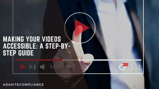
Making Your Videos Accessible: A Step-by-Step Guide
Video content has grown into the most popular form of content available online. It does not matter if you have an educational institution, a banking app, a school, or a blog post. Videos are the most consumed form of content. Unfortunately, 15% of the world’s population finds accessing and consuming the content challenging. And it is because of their disabilities. This is why video creators should create accessible videos to level the playing field and let all their visitors access their online media. Follow Video Accessibility Guidelines for an inclusive online presence.
How can we make videos accessible?
Multiple things can be done, like the right video players, adding captions, and using the right colors and fonts. This needs time and effort; if you need help, we at ADA Site Compliance can help. We are the #1 source for all ADA website compliance issues and can make your video accessible to all users. We have a team of accessibility experts on hand to check the video’s dialogue for accessibility and perform the appropriate measures to ensure compliance.
Web Content Accessibility Guidelines
The Web Content Accessibility Guidelines (WCAG) was first published in 1999 to make web content available to users with disabilities. It was published by the World Web Consortium, and complying with WCAG 2.0 guidelines ensures governmental organization websites and media are accessible and compliant.
Who Benefits from Accessible Videos?
In addition to users with disabilities, other users may prefer watching the video without sound, like while in the library or at night when children are asleep. In this case, accessible videos with captions make a better choice for them.
Checklist to Create Accessible Video Content
Videos everyone can access can go a long way to getting people to view your fantastic content. It expands the reach of your content as the message is conveyed through images, sound, speech, and words on the screen.
The following tips are based on the WCAG and help ensure people with visual, hearing, or cognitive disabilities connect with your content.
1. Media alternative transcript
These are text transcripts describing what is displayed in the video displayed with the speech. Thus, blind users or those with visual loss can easily see alt text and access the video using screen readers.
2. Standard and Extended Audio Descriptions
Standard audio description is an audio description of the visual elements of a video created for the benefit of users with vision loss. Its voice track is written and recorded to fit the gaps between the existing dialogues and audio elements. A voice artist will record, or you can generate a synthetic voice of the final audio description. Extended audio descriptions are used in cases where the video does not have enough natural gaps within the soft track. The video is edited to pause at certain points to accommodate the secondary audio track description and ends up increasing the length of the final video.
3. Use an accessible media player
It is not just the content of video recording that has to be accessible for web accessibility. It also requires that the right accessible video player is used to relay the video content.
4. Adding Captions to Your Social Media Videos
Adding captions to your social media videos increases its web accessibility by:
Communicating your message better as words run with the speaker makes it easier for silent scrollers to enjoy your valuable content.
Making content accessible to everyone, even the hearing-impaired, as they can access the video.
Making content more engaging through moving captions to increase consumer interaction and attention.
5. Remove Autoplay From Videos
Autoplay can be distracting and even an obstacle to people with disabilities. They find it challenging and distracting to read the page with video playing while reading. Besides, the risk of videos hurting people with seizures makes auto video-playing a threat. This can be prevented by ensuring the video is played only when clicked.
6. Make High-Quality Audio
The video and audio must go in sync with your video. Quality voiceovers and a pleasant audio experience are important for accessibility and an overall user experience. Besides, WCAG requires reduced background music to cater to users with hearing or cognitive difficulties.
7. Closed Transcripts and Captions
Your video and audio content should include a caption file relating to every spoken message and non-speech sound. This means the captions should include song descriptions and indicate the tone while speaking, too. It is also always better to provide transcript documents for easy access by users with disabilities.
8. Don’t Forget an Audio Description or Voiceover
Your audio description can be compared to a podcast serving the same purpose. It delivers information without the viewer needing to visualize any information. Audio descriptions are better than transcripts for blind users or the visually impaired. Adding audio or video recording to descriptions may seem uncomfortable to some but becomes second nature once done.
9. Choose and Use the Right Video Colors
With about 7% of Americans having color vision deficiencies, the wrong color choices may lead to them not enjoying your artwork. Users suffering from color blindness find distinguishing between blue and red challenging. It is impossible to rebrand to eliminate colors, but avoid mixing red, blue, and green while creating relevant or meaningful videos. Using contrast-checking tools helps ensure you use the perfect text combinations for those with color vision to access important visual details in your content.
10. Mindfulness in Video Design
The accessibility of your visual content also depends a lot on its design. The wrong choice, like an overly busy video, can make it difficult for users with disabilities to access your video. On the contrary, there are some steps to adopt to ensure your video is design-friendly to cater to your entire audience:
Avoid placing text in places where closed captions will be placed. Too much text clutters the screen, making it challenging for those requiring closed captions. So remember where closed captions will appear before placing that text and place it accordingly.
Avoid having quick transactions or successive bright flashes in videos. It ensures your videos are safe for users with photo sensitivities and prevents possible epileptic seizures. Besides, avoiding flashing also helps users with autism, ADHD, and those recovering from a concussion.
Choose and use the right colors.
Including representations in content like casting or including disabled people or animated characters also helps. While it may not directly increase your video accessibility, disabled users enjoy seeing their representations in the message.
While these are easy and minute changes to implement, they make a lot of difference in your video accessibility.
11. Open, Closed, and Auto Captions and Subtitles
These terms are often used interchangeably and are minimally different. Subtitles display dialogues in a language different from what is spoken in the video. Open captions are found in the video, and are impossible to disable or remove. Closed captions can be activated or switched off if need be.
12. Include Video Descriptions on Social Media
Users with impairments read your content easily through a detailed breakdown of your shared video. The visually impaired people can easily read the video descriptions with the help of screen reading software. Just be very clear and thorough about everything in your content while writing a detailed video description. And remember that video descriptions vary on each social media platform. For example, Facebook includes videos in its description page, while Twitter requires you to enable video descriptions in options.
Conclusion
Many people have inaccessible social media videos mainly because of a lack of awareness. And those who do know about web accessibility do not do it because of the time and effort needed. Put some additional time and effort into creating accessible video content. However, it is well worth it because it avoids an accessibility lawsuit. Besides, if you do not have the time or do not know how to make your videos accessible, we can help. We at ADA Site Compliance are your #1 source for all ADA video compliance issues and can make your videos accessible to all users. Our team of accessibility experts is always at hand to check the accessibility and perform the appropriate remediation of your videos so that you can focus on doing what you do best!
youtube
#https://adasitecompliance.com/videos-accessible-step-by-step-guide/#ada video compliance#video accessibility guidelines#accessible video creation#ada-compliant videos#video accessibility best practices#making videos accessible#video accessibility standards#step-by-step guide for accessible videos#ada compliance for multimedia#video captioning requirements#audio descriptions for videos#accessibility in video production#creating inclusive videos#ada website compliance videos#web content accessibility guidelines (wcag) for videos#ada site compliance#web accessibility#accessibility services#diversity and inclusion#ada guidelines#inclusive design#accessible website development#ada compliance solutions#web accessibility audit#digital accessibility#equitable web design#ada regulations#inclusive user experience#ada consulting
1 note
·
View note
Text
Friendly but firm reminder that neither image descriptions nor audio/video transcripts should be in weird fonts, colors, or small text. With audio transcripts, it's presumably obvious why readability makes or breaks a caption, and with image descriptions, I genuinely understand the source of the misconceptions, but not all people who use IDs use screen readers. Some use large text instead, and weird fonts mess with that.
This is text that I personally have to squint to read more than a few words of, because the font has such a low weight.
["Chat" text reads: "This is text that I personally have to squint to read more than a few words of, because the font has such a low weight."]
Having to read text like this might be difficult for some people, or possible but eyestrain-inducing for others.
[Italicized text reads: "Having to read text like this might be difficult for some people, or possible but eyestrain-inducing for others."]
Here, the font is fine, but the colors are too low-contrast to be read on lots of tumblr themes.
[Green text reads: "Here, the font is fine, but the colors are too low-contrast to be read on lots of tumblr themes."]
And this is just way too small to be a useful accessibility feature for anyone who reads image descriptions directly, as well as anyone who reads transcripts.
[Small text reads: "And this is just way too small to be a useful accessibility feature for anyone who reads image descriptions directly, as well as anyone who read transcripts."]
For people using desktop who can't read some of this text, XKit Rewritten's AccessKit provides options to disable special colors and fonts (not to mention a nice alt text display option). But to my knowledge, there's no workaround for mobile users. That's why it's critical to include captions that are accessible themselves!
If you're on desktop and able to copy-paste, and a post you intend to reblog has an inaccessibly formatted ID or transcript, please consider taking just a second to copy the description in plain text. (Same for IDs under read more tbh, because we all know how glitchy that function can be.)
I do this often, and have never had anyone get mad about it — only the occasional sincere question as to why. Addressing misconceptions from well-intentioned users — and trust me, I used to have misconceptions too — is the best way to make Tumblr (or any other comparable website) more accessible, one or two posts at a time.
(guide to image descriptions) / (second alternate guide)
(guide to describing tags) / (make your blog's colors readable)
#accessibility#image descriptions#like genuinely i totally understand if you didn't know this#i periodically find old posts on my blog where i did IDs in italics and go back to edit it into plaintext#but i feel like i'm seeing it a lot lately so it's important to put this out there
188 notes
·
View notes