#also: even if you want to do the shading directly on a white layer
Explore tagged Tumblr posts
Visit Tumblr Blog
Explore Tumblr blogs with no restrictions, modern design and the best experience.
Last Seen Tumblr Blogs


Fun Fact
Kazakhstan’s Minister of Communications and Informatics has blocked the Tumblr site because it contained 60 sites of terrorism, extremism, and pornography in 2015.
Note
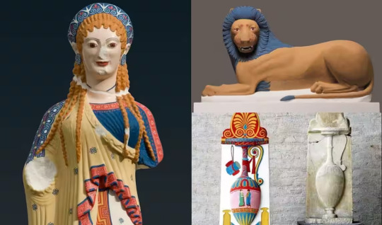
Καλημέρα! I'd like to ask you about the colours of Classical statues and temples. Have you seen any reconstructions you liked? Bless the people investigating them, it seems they didn't wanna assume too hard so they ended up making the statues look somewhat on the very gaudy side. (I sent the same ask to @alatismeni-theitsa just to be sure)
Haha this is a sore spot for me because I really do love the woren all white look!
However, we all have to acknowledge that the preference for the bare white look is largely a bias infliltrating our minds through the presumed superiority of Renaissance Art. The colour of the ancient statues had already faded by that time, making Renaissance artists believe that this was the actual classical prototype that was supposed to be imitated and glorified.
I believe our love for the all-white classical look in sculpture is based on both this bias, but also the aetherealness, distance and solemnity that was believed to be communicated through this lack of colour and the exposition of the work done on the bare luxurious marble. That second reason is what I find beautiful in it too.
Of course, actual Ancient Greek art was coloured. Given that Greek art of antiquity aimed at a naturalistic approach, it is absolutely reasonable that the artists wanted their artwork to have the colours of the real subject / object it was depicting. What you see now are recreations based on whatever colour-tracing methods we have available today, which are not infallible yet. While the general conclusions must be more or less accurate ("this part of the chiton was red and the hair was black" etc), they still remain hypothetical because the methodology cannot perfectly detect hues, paint layers, different pressures on the paint and all those techniques that provide nuance and are integral to art. Having said this, we should also remember that creating paint hues in antiquity was extremely difficult and obviously the paint job done could not be equal to that of the last centuries. Therefore, with our modern criteria, ancient paint job must have often be underwhelming but, again, I believe we also are in a position in which we do not get the precise, fully accurate picture yet.
In a way, this conviction we all have that coloured statues are kitsch is kind of arbitrary, simply because the notion that sculpture reached its peak with the Renaissance is so very deeply engraved to our minds. Think about modern art for a moment: modern paintings, figures and figurines, ceramics with paint... or even sculpture from other cultures of the world outside the Greco-Roman sphere: none of this is considered kitsch, simply because none of this is directly compared to Renaissance scupting. (Although of course other cultures' arts are often viewed derogatorily through this very pervasive presumption that the Renaissance was the peak.)
We also should return back to the considerable probability of poorly made recreations, which lack nuance. Take these examples:
Jesus Christ Superstar
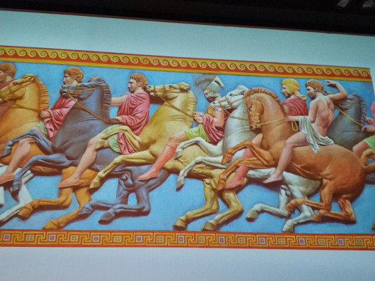
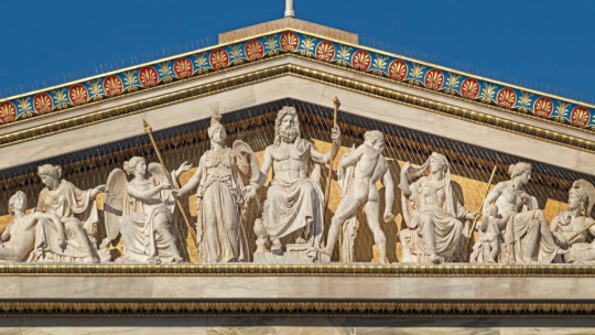
Not the best, right? However, if we see paintings and art from earlier times i.e Mycenaean and Minoan and contemporary ones like rare surviving Classical, Hellenistic and Grecoroman art, we realise that colours were used wisely and there was the concept of layering, shading and creating detail and nuance.
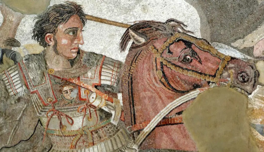
In this art of Alexander (100BC, exhibited in the Museum of Napoli) we can see an extensive use of highlighting, layering and creating shadows, which is very different from the blast of thick paint you will see on these recreations.
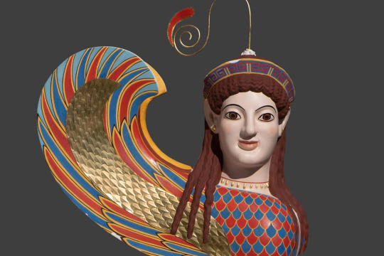
There are also recreations which prove exactly that a lot of the responsibility regarding how we perceive them lies on the very quality of the recreation itself.
Source
Honestly, for me this is totally fine. You can find fine modern art - even modern Greek folk art - of similar styles or colouring. The quality of the recreation here is far superior than the ones above.
This one, I am also totally fine with it, especially the last of the colourised ones. It took exactly the same amount of extraneous work for the artist to sculpt plus the struggle of painting it. And it gives us so much additional information about what fashion looked like.
The recreations made for ancient Greek temples prove more how colour could actually be used in good taste:
If I told you this was some late medieval manuscript art, you'd not think of it as kitsch. The idea immediately kicks in when I say it is a recreation of a Parthenon frieze colourised. (Source)
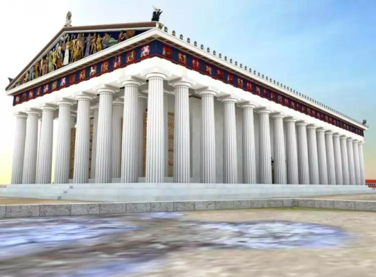
In this recreation IMO the Parthenon looks hella fine!
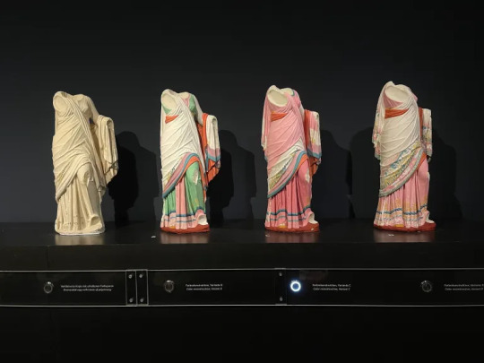
I confess I struggle with the Caryatids of the Erechtheion:
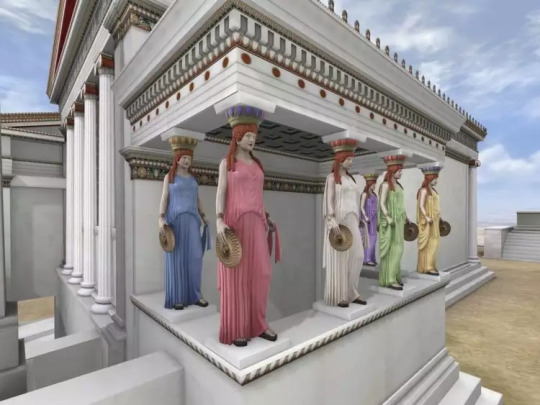
but I suppose it's partly because to us it looks like you took all the redhead Barbies you had and assigned them to carry the building. Without all the preconceptions we have, which are informed by kitsch cheap art of the last decades and the axiom that Renaissance sculpture is the best, Ancient Greeks were probably astonished by the beauty and realism of six different beauties making the temple stand. For me, who I am influenced by all that I have analyzed, my colour tolerance would go as far as having all of them like the Caryatid in the middle, with the white peplos. Apart from that, the paint in the temple is totally beautiful and elegant. (Source)
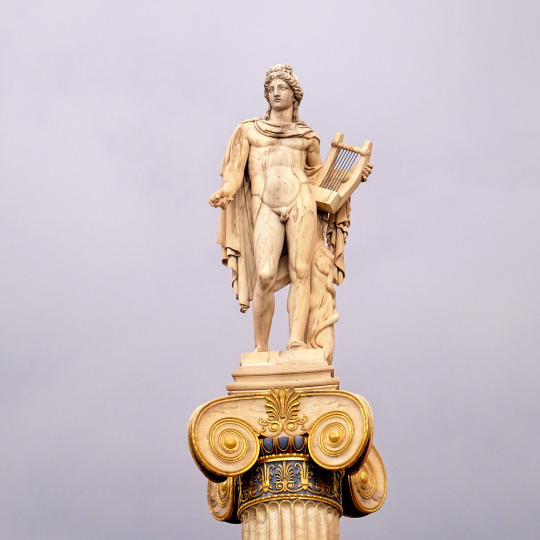
The neoclassical Academy of Athens uses paint like in antiquity except it draws the line in the statues (and perhaps it uses more gold). The Academy of Athens is exemplary.
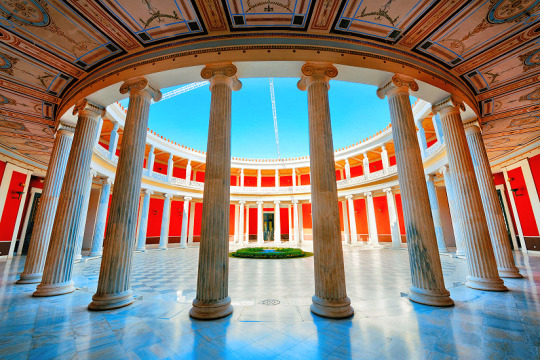
Zappeion also has colour and it's marvelous:
I believe this was the aesthetic ancient artists were going for.
In conclusion, I think ancient artists tried to use paint in the best of their abilities, no differently than how we also almost always add colour to our modern art, except of course there must have been limitations to the qualities and varieties of paint hues that could be produced at the time, which would inescepably sometimes lead to results less than ideal. Regardless of how well or poorly painted any particular ancient artwork was, we are predisposed to view it negatively anyway because we are wired to believe that the Renaissance style set the standards for what is beautiful and what is not and that when it comes to colour in sculpture, less is obligatorily (much) more.
That's all I got to say! From my side, καληνύχτα! (I'm posting this way past midnight lol)
#greece#europe#ancient greek art#ancient greece#ancient greek statues#ancient greek temple#art#renaissance art#greek culture#parthenon#academy of athens#zappeion#athens#attica#sterea hellas#central greece#mainland#anon#ask#tw long post#long post
29 notes
·
View notes
Note
Hi!! I was wondering if its okay to ask what brushes u normally use in krita? I love your art!!
Thank you so much!!! I only use the ones available in Krita by default and I tend to jump around based on what I think will work best for each piece, but I can give a little rundown on which ones I use the most and what I use them for :)
Here's an image guide with each of the brushes I've used and that I recommend checking out:
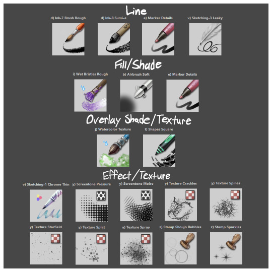
I'll highlight my favorites as well with some examples where they were predominantly used! (though in some cases multiple or even all of these brushes were used)
Marker Details:


Varying opacity and size makes this one my favorites for sketching, especially since it can easily be nearly transparent or fully opaque which helps with value range.
I also like using it for silhouette sketches!
It can also be used for final linework, but it takes more work to get to a full opaque and its lack of texture makes it a little less interesting than Ink-7 Brush Rough imo.
Ink-7 Brush Rough:
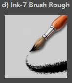
Really good for linework, especially for comic styled drawings with it's slight texture, varying weight, and opaqueness.
Also good for just filling in entire areas with a single color as well as non-smoothed shading!
Wet Bristles Rough:
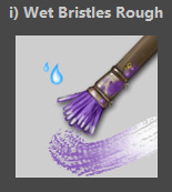
Actually just an amazing brush, its pressure sensitivity is crazy.
Blends strokes like paint and can vary in size and opacity.
Also has a nice subtle texture!
Amazing for smoother coloring and shading, especially if you want a more painterly style.
Watercolor Texture:

(hard to show examples of this, just assume that I've used it in any piece that has smooth shading lol)
Not the best for painting/drawing on its own, however I've found it to be really useful when set to white or black on an overlay layer for adding extra shading and/or highlighting on top of the shading I've already done.
I usually shade individual figures, objects, and parts separately, but using an overlay layer with Watercolor Texture (or even Shapes Square) on top of everything helps make the entire piece feel more cohesive.
Also adds a hint more texture!
Another thing to note is the importance of layer modes!
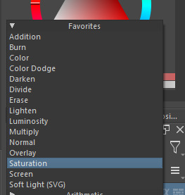
I know that you asked about brushes specifically, but many of these brushes (particularly those to do with effects and textures) work best when experimenting with different layer modes other than Normal. Overlay is generally a safe bet and most of the best for, well, overlaying multiple layers for interesting effects. But please try out all of them at any given opportunity, sometimes things like Burn, Color Dodge, Soft Light, etc can have more interesting effects!
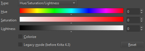
In addition, mess with filter masks! You can even edit where they apply by drawing on the mask directly! HSV/HSL Adjustment (also accessible with ctrl+u) in particular is INSANELY useful for fiddling with the colors and balance of a piece, from individual layers to whole groups and drawings. I also really like blur filters, often times I'll duplicate a layer and make the bottom one blurred to add a glow affect to something without losing its definition.


While this latter stuff isn't about brushes specifically, its generally very important to how I use and experiment with all these different brushes!
Anyways I hope this helps!! I kinda went overboard with this post, but I had a lot of fun writing it! Thank you again for the wonderful ask!! :)
#krita#krita art#warframe fanart#art#artists on tumblr#my art#UpsideDownSmore's art#art tips#art guide#art reference#long post#ask#didn't mean to spend so much time on this but ngl i'm actually so thrilled to talk about my art processes#like man i'm so grateful to be in the position where i can make an art guide like the ones made by people i look up to#sorry if this response is a bit long winded i just had to get a bunch out there lol#love asks like this :)#scheduling this 9 hours from now cause it is currently almost 1am lmao
40 notes
·
View notes
Note
DUUUUUUUUUUDE your alcohol marker works r SO sick i saw that sequence of process pics u had and my mind was just Blown . can you elaborate more on ur process ?!?!? /nf
hello ! thank you for your kind words. i apologize for taking a while to answer this. the process of coloring the drawing i did as an example was rocky, and ive been busy with school.
i'll preface this by saying that i have a few posts with process pictures on twitter (i treat it as a wip dump when i remember to post). heres one of the few where the pics are all together, but my media tab has a fair amount scattered around.
this is going to be long, so i'm putting the 'read more' here.
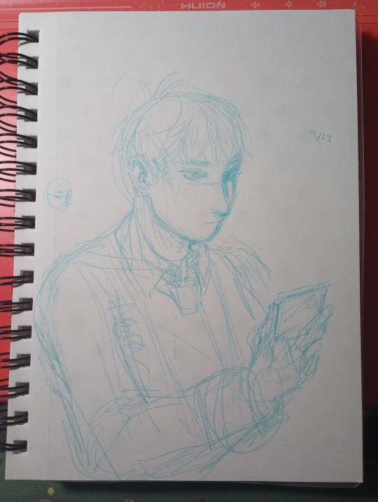
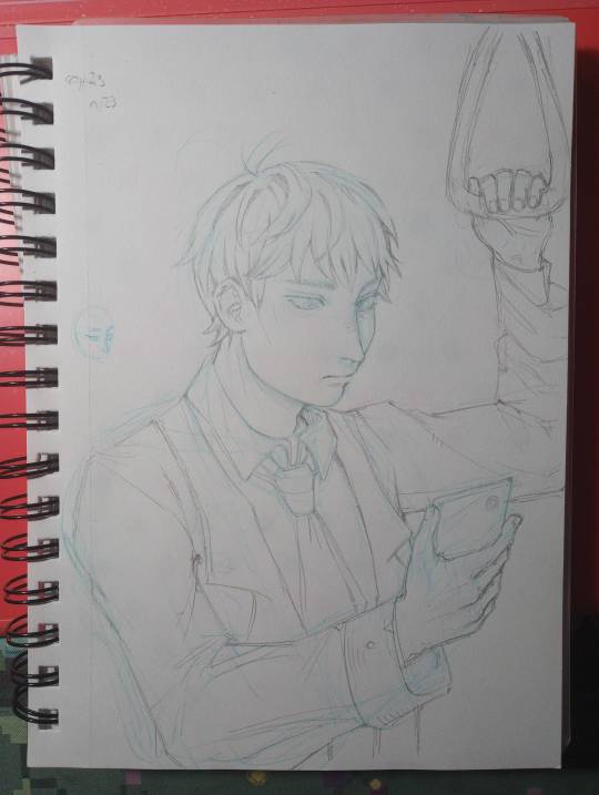
step 0 : sketch. i start with blue erasable pencil, lighten it, and do my lineart with a mechanical pencil.
step 1 : base color. half frivolously chosen as a neutral color to set it off from the white of the paper, half "whats the color of the light / the lightest color being reflected by the material its cast on"

im going to stop numbering the steps. i immediately went too dark with the hair and failed to consider the strength of the light in the setting / how reflective hair is. also i colored the basic color of the eyes and the rough shadow under the jaw. dont get attached to any of this.
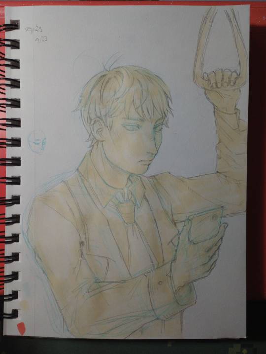
broke out the "ph. martin's bleed proof white paint" my mom gave me a jar of years ago. it does well enough at bringing back light, but the texture youre left with is not ideal. lightly shaded the face skin with a similar color. i also blocked in the rough color for the suit jacket and tie here. the marker doesnt have to be evenly applied because you'll be going back over in enough layers that it'll even out.
i wish i stopped here.
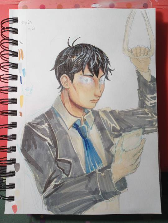
things start to go off the rails. painted over his eyes because "why did i give him double eyelids" tried to paint over just the eyelids. didnt go well. scorched earth. reshaded the hair, deepened shading on the face and neck, started on the shirt, and applied a cursory pass of shadow on the jacket. the light angle does not remain consistent with this.
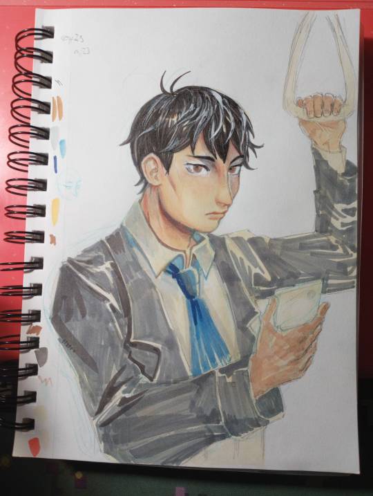
redrew the eyes. the angle feels uncanny. i wish he was still looking at his phone but the paint is not taking ink well and i doubt another layer would make it better. at some point i applied rough shadow to the hands. dont worry about the inconsistent lighting.
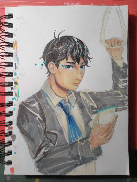
darkened the eyes so they were less creepy. didnt work. i assume the ink bled (alcohol ink soaks into paper, but since this is now on top of white paint, it just sits on top and pools out), so i embellished with posca marker to cover it up.
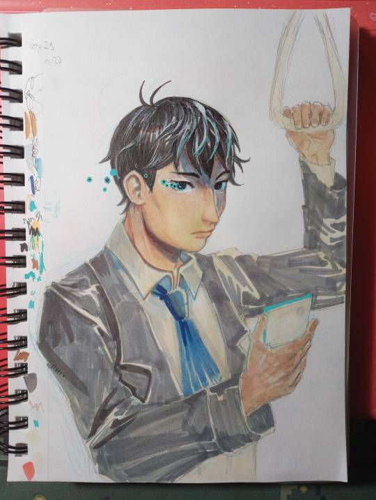
realized that with the length of the shadow the brow ridge was casting, the hair should cast a shadow too. light source starting to be established.

im really sorry. i didnt realize there was such a drastic jump between this one and the prior photo. basically, i started defining edges and areas of deepest shadow. fine edge definition was done with the cheapest ballpoint pen i own. dark marker blends fairly well, but only put it where you WANT it to be that dark, and blend outward from there to darken surrounding areas. many, many layers of grey and light blue, brown and darker brown for the jacket. now that i had a vague idea of the light source, i just had to place the shadows and follow the folds. hitting the points of shadow with brown (base color but darker + warm tinge to suit base color) and blue (reflected light).
this also wouldve been a fine stopping point.
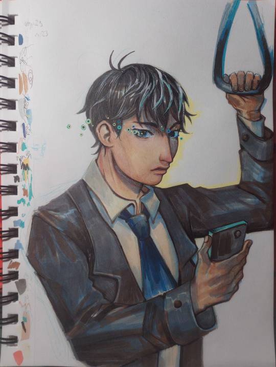
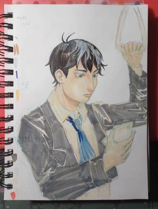
used posca to outline the edge of the face + sharpen edges. added more pupil-spots. messed up the mouth some more. whatever. calling it done here because the jacket looks good and the face is freaking me out.
overall, i treat alcohol marker like watercolor. a big wash of color, rough base colors. roughly block in shadows, gradually add washes of deeper shadow. define edges. etc.
its harder to blend colors directly than with watercolor but thats nothing more layering cant fix. and then white paint if layering doesnt work. and then more layering.
19 notes
·
View notes
Note
Sovonight,
Your art is so beautiful! I was wondering if you have a method for choosing what colors you use in your art. I always struggle with getting my colors to look good together.
I'd really appreciate it if you have any advice (and time to explain ahaha). If not, that's okay!
Have a lovely day!
~Anon
yeah ofc! here are 3 things i do:
on days where i don't want to spend time picking a palette from scratch, i'll just reuse a palette from a past file (like i did here). if i happen to need different lighting from the original palette, i'll achieve that with layer modes. but the more different the goal is from the starting point, the more adjustment layers are required to get there, and at some point it's just easier to get the palette right on the base layers in the first place. so if i have a new specific lighting situation in mind from the start, i'll usually just create a new palette, and i do this with or without a reference photo.
when i use a reference, i almost never use the reference photo's colors exactly. not only are ref photo colors hard to pick accurately from to begin with (since the high level of detail in photos means that even adjacent pixels can vary widely), but matching a ref photo's colors exactly usually ends up looking lackluster and kind of underwhelming. so rather than trying to match the reference colors themselves, i choose colors that invoke my impression of the reference overall. i might choose colors solely by eye, or i might pick colors directly from the reference to start with and then adjust the colors individually from there, or i'll adjust the colors directly on the reference and then pick colors off the adjusted reference (i actually did that here). they're just slightly different ways to get to the same point, but i find that some days i need that slight deviation in the process in order for the colors to click for me.
when i'm colorpicking without a reference, i usually find it helpful to first fill the entire canvas with a color that isn't white/black/grey. i usually have a general idea of what the light situation is (daylight, evening, firelight, etc) and choose one color based off that for the background. from that point it's just a matter of using your color theory intuition / guess-and-check to choose the right colors for the lighting situation. i'll usually make my best guess on the color wheel, put it on the canvas, go "wow that looks really wrong," and then ctrl+u (hue/saturation/luminosity) to adjust the color to fit. a tip for making guesses is to start with the color you want to see when it's in the context of the canvas (say i have a dark nighttime scene that's pretty blue, and i want to color in a yellow flower, i would start with the shade of yellow i want on the color wheel) and then think about how the lighting affects it (i would drag the yellow somewhat towards blue on the color wheel, so that the actual color leans green, and i'd darken and desaturate it quite a bit since it's a dark nighttime scene). sometimes i also apply layer modes to "mix" colors and then just merge those layers onto the base layer to make it the new base color. like if i know i need the color to be darker and more blue, i might add a multiply layer with blue instead of doing the equivalent on the color wheel. if i need to brighten, i might use overlay or glow, and if i need to increase saturation in general i'll use linear light.
#i know it can be unclear without visuals but i knew if i waited to make examples i would never end up answering T_T#but thank you i'm glad you like my art! ^^#sovo answers#art tips
33 notes
·
View notes
Text
A manga caps cleaning tutorial. requested by @noctemys
Program: photoshop cc2019 but could work on any older or newer versions.
i’ve been working on this and a hard time choosing which cap should i work on, i decided to write it using an easy one to work on and writing the tutorial on, but you could work this one even in more challanging caps to clean! i’ll show examples of different difficulty at the end of this tutorial. i’m still a work on a process when it comes to cleaning caps!
*tip: always try to use a high quality files! i personally like to work on the official files if they’re available. they make a huge difference as seen between this old and newcleaned cap!
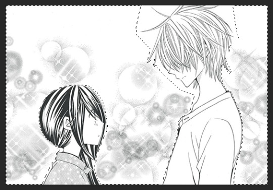
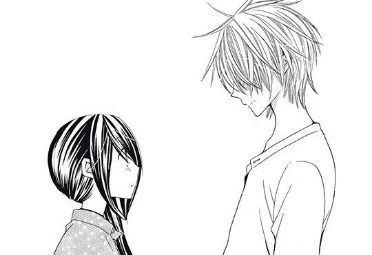
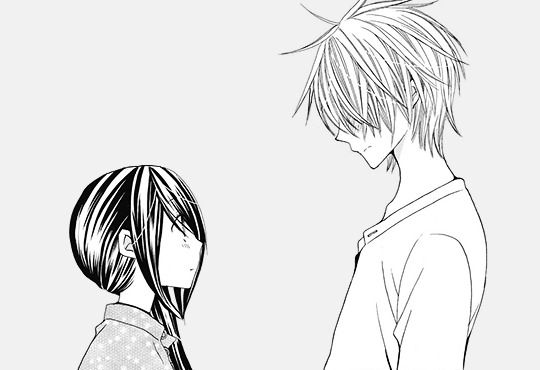
step.1 first step is choosing a cap of your choice and crop the panel that you like. mine is from Special A by minami maki.

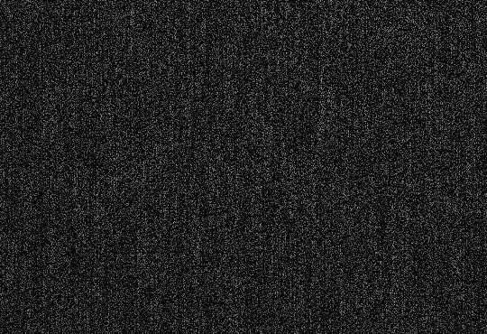
step.2 zoom in the cap, i usually go with x800! then using the lasso tool i select all the area i would like to erase and clean! this step could take a long time with some caps that have overlaying background effect with the characters. you could also use the pen tool or the magnet tool, whichever feel more comfortable using.
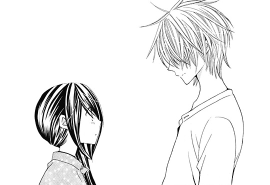
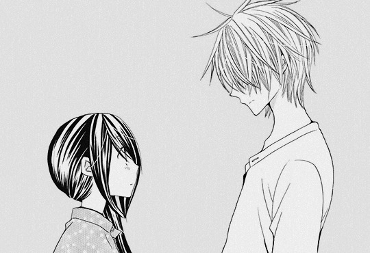
step.3 once you finish selecting the whole area you want to clean, with a white color fill the layer with white color!

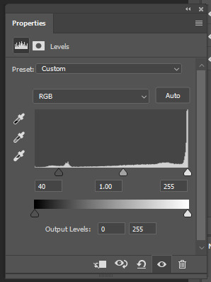
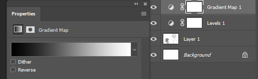
step.4 some caps do need to up the contrast in them just like this one, i usually use the levels to increase the blacks and whites by ticking the black point to the left to increase the blackness and the white to the right until i like the result i get. for this one as it leans more to the grey than black i only needed to increase the blackness.
step.5 some caps aren’t truly in black/white so i just add a gradient black and white!
step.6 add a new colorfill layer and fill it with #f1f1f1 and set it to multiply. and delete the mask!!!

step.7 this step could be the last step or will need an extra step to make. and in this case we’ll need the extra step use magic wand tool select the background that i just cleaned you’ll notice the selection will include parts of both hikari’s hair and kei’s face.
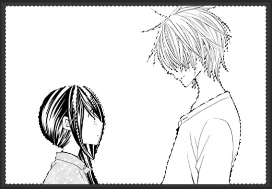
step.8 after deselecting, with a round brush with a grey shade color - my choice is shade is #373737 -, i would zoom in the cap again and notice where the gaps that’s causing the selecting mess is. and while in the cap layers i would redraw those tiny parts… sometimes the gaps are big and there’ll be many gaps.. you could either redraw by the mouse directly if the missing parts are small and tiny or use the pen tool to do that!
step.9 using the magic wand again select the area you want and select the colorfill layer click the mask icon from the layers box and you’re all set!
step.9 - optional- a last step i’ve been adding lately to my manga caps edits is adding this texture at the top of layers and lowering its opacity to 8% for a nice little touch!
the final layer box will look like this.
other cleaned caps before and after: before→ after | before → after | before→ after| before → after
you could add any background you like at the end for a different ending result
#manga#manga cleaning#manga tutorial#ps tutorial#tutorial#photoshop tutorial#photoshop#ps resources#itsmangacap
34 notes
·
View notes
Note
I followed you before because your art was awesome. I follow still because it's still awesome.
Honestly love your use of shadows and sheen.
I'm glad you like my art! :>
I will now take this opportunity to describe why I think my art is good!
I learned most of the techniques from watching tutorial videos.
There's no tutorial that can, like, tell you how to accurately portray form with shading (which is partially why my art is so stylized), you just kind of have to feel out the shape of an object if you're not using references (which is part of why references are SO important)
but there are tutorials that can tell you the basics of shading (digitally, in this case)! this is the process I usually follow, with some variations depending on context- it uses a lot of terminology that I am assuming you know the meaning of, but if you don't, google is your friend
this is NOT a step by step tutorial to shading, I am just explaining the process that I follow in a manner similar to a tutorial
(long post warning)
Things to keep in mind before reading:
I do NOT use airbrush for shading unless explicitly stated. Airbrush makes ONLY soft shadows, where you usually want a mixture of soft AND hard shadows to create an interesting composition. I personally usually cel shade, which is ONLY hard shading.
This assumes you have basic things down like the position of your light source and how to shade, like, where exactly to put your shadows and what shapes to make them. If you're unsure, try to figure out the shape(s) you're trying to create (everything is made of shapes, break an object down into the most basic forms possible and go from there) or just, like, use a reference lol.
This isn't me telling you to always use this method- I vary the method a lot myself while using it, based on context, so please experiment with different layers and techniques to find what works best for you and your style!
If you're not confident in your line art, shading the piece is not going to make it look too much "better" than what you're seeing. Shading uses value to create volume and describe form, but if the form being described isn't quite right, it probably won't come out the way you want it to (I have learned this the hard way).
Seriously, use references. Multiple.
Use the magic wand tool to select the area around your lineart, then invert selected area and grow your selected area by 1 or 2 px. On a separate layer from your lineart, use the fill / paint bucket tool to fill the selected area with exactly 50% value grey.
This creates a base which you place underneath your line art, which is very useful, because you can then clip layers between it and your lineart directly to the base layer, making it impossible to color outside the lines
(but why don't you just use the fill tool to make a color layer?)
This can be a useful shortcut if you're in a rush, but the fill tool can often miss pixels or have unintended side effects if you forget to turn off anti-aliasing or something else. I also don't 100% understand how to properly use the fill tool sometimes, so avoid using it unless the context calls for it
use a multiply layer + greyscale value to convey shades that are darker than your base color
Even if you put a white that is, like, 90% value, a multiply layer will darken any layer underneath it very sharply. You can use this to put various greys and create volume with darker values. While it can be tempting to make an overlay layer or a soft light layer and put all of your shadows and highlights on it (I used to do that) you can get a greater range of value if you use separate layers for your lighter values and your darker values.
create an overlay layer to enhance darker shadows and begin forming lighter values
Overlay, being the cross between multiply and screen, is a perfect way to start exploring lighter colors in your piece without pushing the lever all the way to bright bright highlights while also making some parts of your shadows even darker
put a screen layer on top of the overlay layer to convey shades that are lighter than your base color and create white highlights
Screen can and will lighten your color to a very aggressive degree. I recommend using darker shades of grey in the 10-40% value range to convey "normal" lighting, and going over 50 up to 100 depending on how close you want the visible color to be to white.
create a soft light layer, set your color palette to 10% and 90% value "grey" and break out the airbrush, set the brush size so the cursor circle covers roughly 1/8th - 1/6th of the drawing
Using the airbrush on top of your other layers and also in a soft light layer is like a cheat code for rounding out your shading where your shading may be a little weaker in some places. As long as you don't overdo it, you can create a very convincing composition by combining the airbrush and soft light layer with your harder shading that has more value range.
use a normal layer to add marks of solid color on top of your drawing, like white lines reflecting on glasses or straight up 0% value black in some of the darkest parts of your drawing. this can also be useful for adding additional details and contour / cross contour lines that may be missing from your line art
This step is not always necessary. It is nice to add a little bit of final rendering, but it can be superfluous, especially if you were particularly thorough in your previous steps.
I also use it sometimes to add things like glasses that just appear as the frame without any rendering regarding the lenses.
---
Feel free to repeat any of these layers to get even darker or even lighter values, or add more definition or multiple light sources. Like I have said, the decision to do so is purely contextual, and may vary from piece to piece.
If you have any specific art questions, or any holes I may have left in my process, my ask inbox is always open :>
If you are a digital artist and you see any flaws / room for improvement please feel free to leave criticism on this post or anywhere else like my asks or DMs! I'm always looking to get better.
Thank you for reading my long ass post, or at least scrolling through it all the way.
Either way, have a gold star!
⭐
11 notes
·
View notes
Note
Hi, I’m a real new shiny here (on Tumblr, but also at drawing), and it’s the first time I ask anything, so I hope it’s ok. I must say first that I love the way you draw TCW characters (especially the clones)! 😍 I just came across this sketch you made on canvas (if I remember correctly) https://www.tumblr.com/thepatchycat/729224397978828800 and I was wondering, if you don’t mind sharing, how do you get the perfect white background on non-digital drawings? I currently use a scanner app on my sketches and the results are always inconsistent and far from that white… thanks a lot in advance!! 😊
Welcome to the Tumblr crew, shiny! ;) And thank you kindly!
So my dirty secret for that sketch is... it actually is completely digital! I drew it in a program called Rebelle 5, which is designed to mimic traditional canvas/paper and pencils/paints. I picked it up for super cheap during a huge sale last year, and it's a lot of fun; unfortunately, it's usually pretty expensive, as many art programs are. I highly recommend keeping an eye out for sales though if you ever get into digital drawing--and if you'd like a free program, the one I use most of the time is MediBang. But those programs are really mostly helpful for digital art, not so much for scanning actual pencil sketches.
While I tend to stick to digital drawing nowadays, I definitely feel you on the scan cleanliness issue; phone pictures and even proper printer scans tend to end up either kind of dirty or faded. The short answer is that I don't actually have an easy and effective solution, but there might be some things you can try depending on what you have available. I wouldn't be surprised if you've already explored more methods than I have, and there are definitely people with better ideas and more experience than me, but I'll share what I've tried.
Long(er)-winded rambling under the cut!
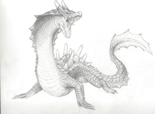
So, I currently have an unfinished piece sitting in my files that began as a traditional drawing, one that I want to keep all the pencil details for. Here's the sketchbook page, scanned using a household printer:
Not terrible, but it'd be nice to have clearer contrast between the lines and the background. In MediBang, I can adjust the contrast by going to Filter>Levels (or Ctrl+L), which gives me a little box that looks like this:
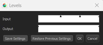
I don't technically know the nitty gritty of how it works, but by my understanding, the outer triangles for the input and output indicate the range boundaries. Adjusting the input--particularly the darker boundary--so that the output boundary exceeds it basically tells the program to make the darker parts even darker, resulting in this:
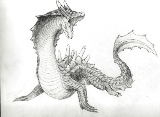
Better! As you can see, though, the darker parts of the background also show up a bit more. Rather than relying only on contrast adjustments, what I actually ended up doing was carefully erasing the background around the drawing after adding a plain white layer underneath, and also going over some of the lines digitally. I did this first in MediBang (the only art program I had when I started working on it), then transferred the file over to Rebelle.

MediBang (left/top) has the pure white background, while the Rebelle (right/bottom) canvas settings I chose are a little off-white and more textured, which I think blends a bit better with the texture and shading of the image. It's possible to add textures and the like in MediBang, too, but Rebelle has it built into its design, so it's a little easier to figure out there; I'll likely finish this piece in Rebelle (whenever I get back to doing so, haha), since the canvas and brush settings will be easier to match to the texture of everything that came directly from the drawing.
Most of this is much easier to do with a drawing tablet/pen, unless you're a wizard with a mouse. As for traditional means... the best suggestion I can come up with is to try inking sketches, or at least darkening them further with a pencil. The more contrast you can get between your lines and the background, the more easily you can digitally tease that contrast out even further. I think most photo editors have at least some contrast, color, and brightness adjusters, and probably more useful functions I don't even know about--it never hurts to mess around with any program's filters and settings to see what happens!
Good luck, and happy drawing! :D
#Patchy Babbles#Asks#I love getting asks so it's more than okay!#Sorry the answer is basically that that sketch is a lie haha#Someone on the internet has probably figured out more effective tricks but that someone is not me#Also your art looks super good!#You have a great eye for detail~
5 notes
·
View notes
Text
absolutely wild seeing like. art process videos from professional artists and they’re doing the most basic shit in such a bizarrely convoluted way. “to do shading duplicate the colour layer and turn alpha lock on then make it white by turning the luminosity all the way up which you need to go through like two menus to do and then—“ just make a new empty multiply layer and put it on a clipping mask i am BEGGING you. if you really need a solid colour background to shade on you can add a white layer on top of the flats (also clipped) then just delete it when you’re done
#.txt#also: even if you want to do the shading directly on a white layer#at the very least both procreate and clip studio have ‘fill entire layer with colour’ options#so just turn alpha lock on switch the colour you’re using to white#and do that#or idk. a rlly big opaque brush#turning the luminosity up just seems like such a strange way to do it to me#doing shading on an empty layer also makes it easier to change the colour/brightness of the shading later if u want#just do the alpha lock fill layer thing again#if u do it on a white layer u can’t rlly make it darker because you’ll probably end up making the white grey
1 note
·
View note