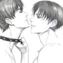
#also trying new rendering and lineart methods
Explore tagged Tumblr posts
Visit Tumblr Blog
Explore Tumblr blogs with no restrictions, modern design and the best experience.
Last Seen Tumblr Blogs


Fun Fact
The KCSC sent more than 20K requests to delete posts related to prostitution and porn to Tumblr from January to June 2017.
Text
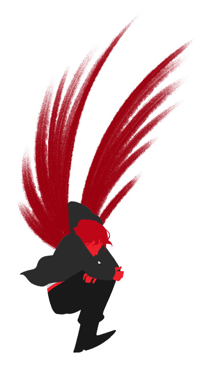
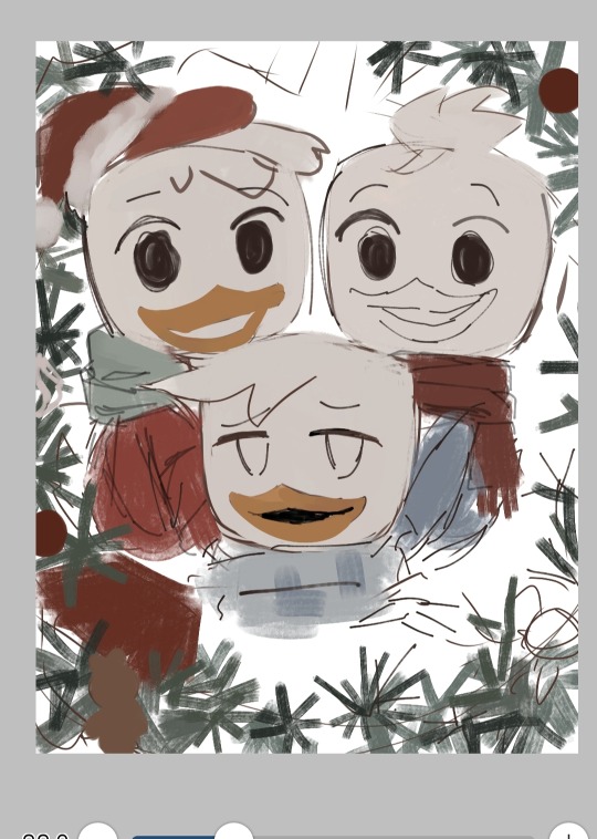
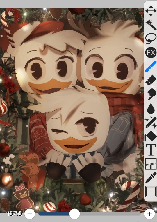
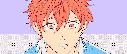
HAPPY BIRTHDAY YUUMA OYAMA - 16th September
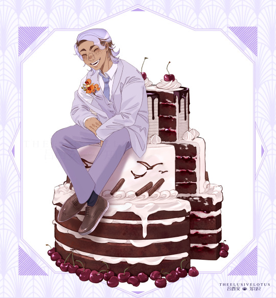
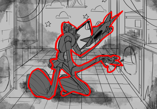
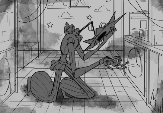
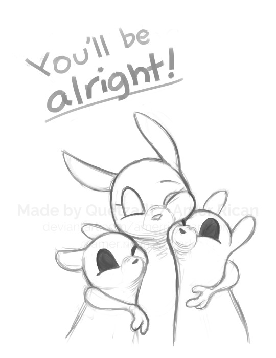
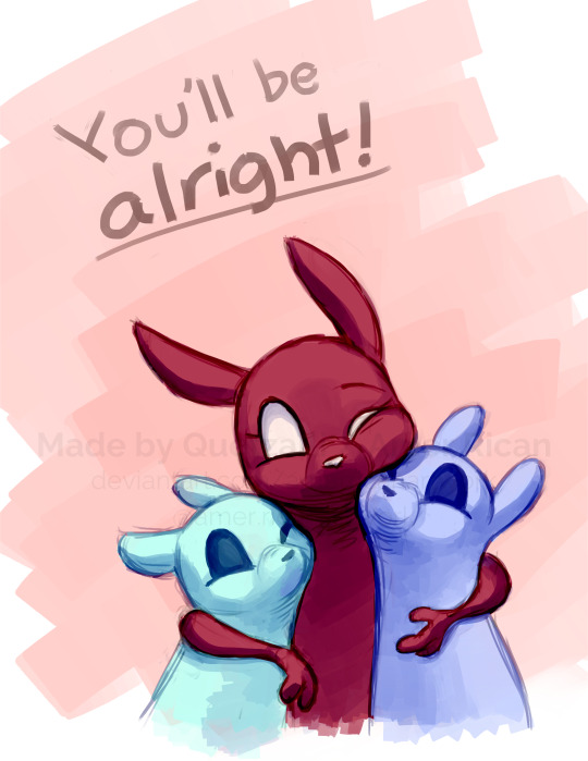
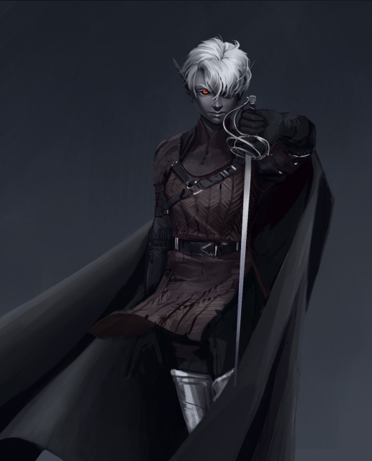
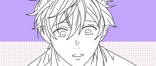
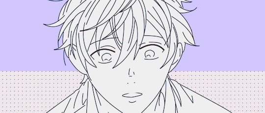
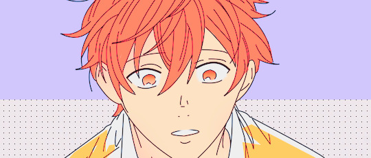
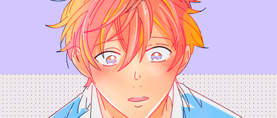
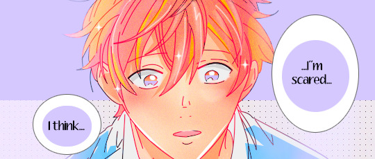
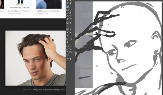
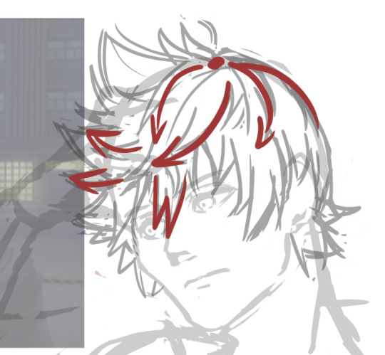
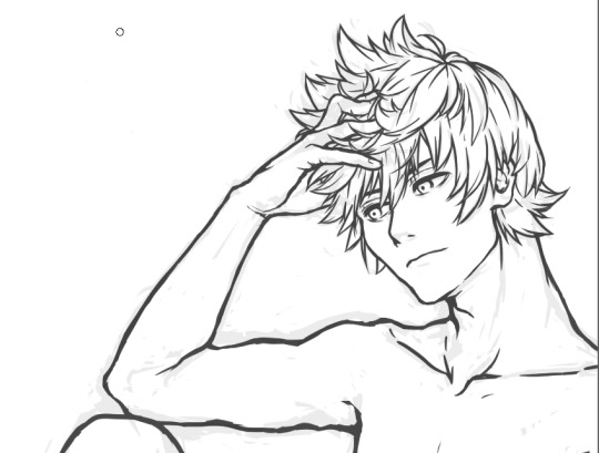
#milgram oc#milgram#clip studio paint#csp#digital art#clip studio#humanoid#illustration#drawing#digital illustration#artists on tumblr#fangram#ocgram#food art#cake#birthday cake#floriography#theelusivelotus art#MY BOYYYY#this is my first time posting about him properly I think#starting to get a hankering for doing food art now#also trying new rendering and lineart methods#but anyway#coming up with the cake design was the toughest part#balancing the important symbolism stuff with making sure it actually looks like a cake still#i'm pretty happy with it tho :]#also dont be fooled#this is probably the most relaxed he'll look for a while#/hj#ill try draw more squishy stuff for him too between mv stuff
16 notes
·
View notes
Note
Oh uh forgot to ask in the previous ask (the one with the digital piece of candy and scurrying and stuff)
How do you draw art so good
Like
Is there a method you use or is that just the style you've gotten over time?
you've activated my trap card
I'm just gonna preface that this tutorial is from someone who was not professionally trained and didn't have a lot of free time for art, so a lot of the tips I have is short cuts I use to get the best results quickly
If you genuinely want to get better at art then please look at references and practice that is always the best
However if you are like me and only really do art for fun but want to go faster then these are for you pfppt
Overall I'd say my style is influenced by speedpaints I would watch when I was younger, I like analyzing how people do things and what makes something look "good" to me
I always recommend watching them because they will often have techniques you've never seen before or do things a certain way that you can try out yourself
I consume good art, it feeds me
but seriously it can be super helpful when developing your own methodology, or just generally trying something new
Usually it starts with me pulling some references from artists I really admire and sort of sketching out how they do the things I like
For example 8um8le has like super good anatomy and poses so I focused on trying to replicate how they do that
venemous-qwille is super good at color and pulling focus so that's what I focused on in my study of them
In general I'd say my process is sketch -> silhouette -> color -> shading -> render
I really don't like doing lineart lol

I'd say for the sketch the most important part is using references and just kind of fudging it until it looks correct anatomically/physically
General rule of thumb is spend time on areas of interest, and keep non important areas light (like the stitching on his pants)
I don't do lineart because I think its unnecessary for most paintings I do
I naturally tend to put more time and focus on areas of interest (like hands and feet) and if you use a brush with opacity for the sketch, those areas are naturally going to be darker in the final sketch
Of course this is gonna be different for everyone but it's what works for me
Sometimes I do a really really sketchy layer underneath my sketch/lineart, just so I know where everything is going
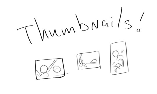
Use thumbnails! They are great to help figure out the general layout of things and what pose I wanna do
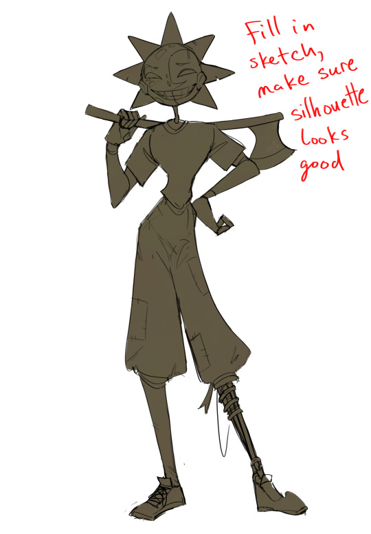
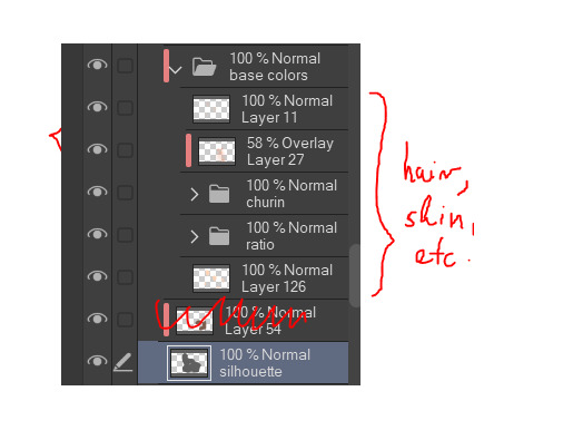
Next is what I call the "silhouette" layer
This is super important for me cause it helps me refine the figure and make sure the pose/anatomy looks correct, also depending on what color I choose for the silhouette helps guide what colors I'm going to use on top
This piece is a good example of how it works. The silhouette shows me how the figure interacts with the background, how the pose looks and if its any good
The silhouette layer doesn't have to be super clean, as long as it follows the sketch decently well and shows where the figure is then its fine
I also sometimes make the silhouette layer multiple colors to help guide shading and vibe
Next is the coloring layer. I usually make this a clipping layer on top of the silhouette layer, or I change the silhouette layer to alpha lock, either way it saves me time on coloring everything in

Sometimes I am super rough with the coloring too, using like an airbrush or my fav watercolor brush just to generically block in color where I want it
Works out cause most objects have like a bounce light to them from surrounding objects, so this is sort of a cheat I use to get that effect without all the work lol
Also don't be afraid to have the lower silhouette layer shining through, having multiple colors sort of subtly shining through the piece helps lots
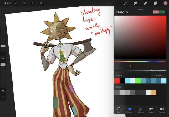
Next is the shading layer, this is usually another clipping layer, usually set to "multiply"
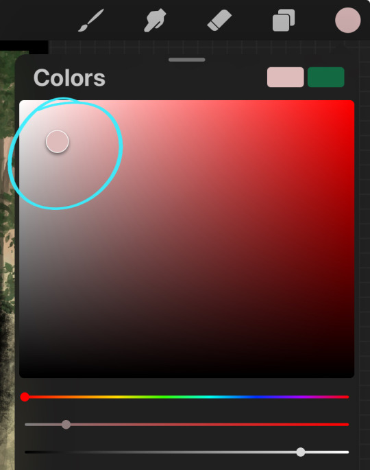
The colors I pick here is usually within this range, any color works, just depends on the piece and vibes.
Since this piece is set in a sunset forest I choose a more desaturated orange for the shading layer
I know there's a whole thing about multiply layer being a crutch (and it kind of it) but it is a useful tool when you just want some darker values across the piece but don't want to go through the process of color picking every single darker shade
Also in my opinion it looks better than picking a darker color and setting it to a lower opacity, idk I just think the color has more "depth"
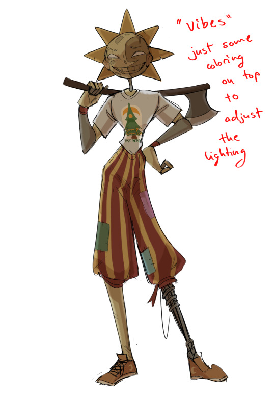
Next is the hardest to explain, sort of the vibes layer
Usually its just a layer of more concentrated color on top of the normal color and I fudge with the settings and values until I get a result I like
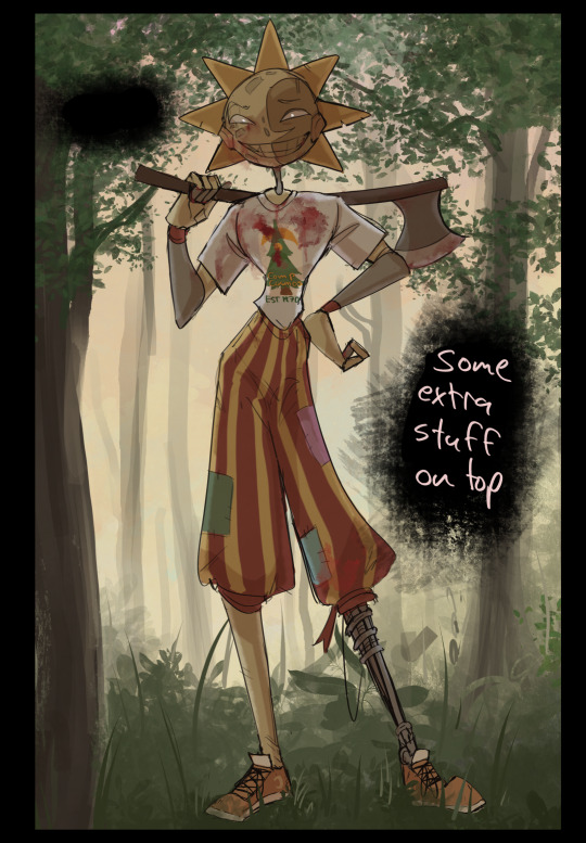
Next is the longest step, is the "extra" or the render stage.
Usually I add a background before this step so that if I need to merge the figure better with the background I can
If I render with a white background but he's supposed to be in a dark forest, its going to mess with the lighting severely
Also this is when I add more "vibe" layers on top to get the figure to match the background better
Backgrounds in general I recommend checking out @/derekdomnicdsouza on instagram he's got lots of great tutorials for breaking down backgrounds simply

I'd say general rule for the rendering layer is to focus on the areas of interest and spend less time on areas you don't care about
I even blur stuff out on the edges I don't want people to see, partially to save time on fixing mistakes in areas I dont care about (oop), but mainly to help draw the eye to the areas I do want people to focus on

Theoretically parts of the background should like mesh with the characters, parrallel lines are a no no unless they are directing a viewer to look somewhere, things that are perpendicular help bring things together
tbh I'm still not the best at layout and probably need more practice, but overall this is what I like doing
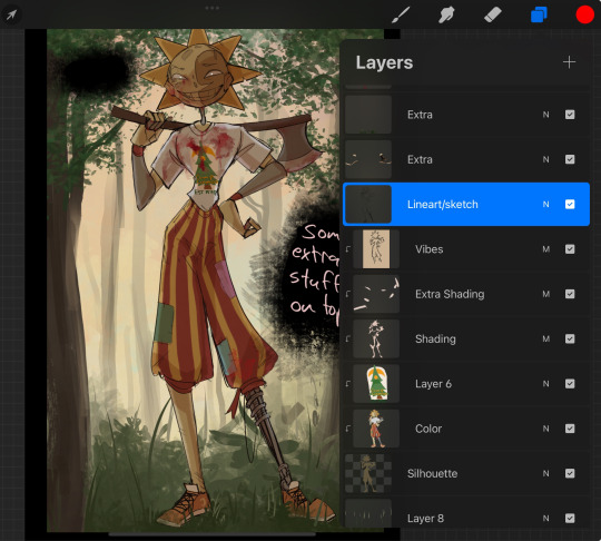
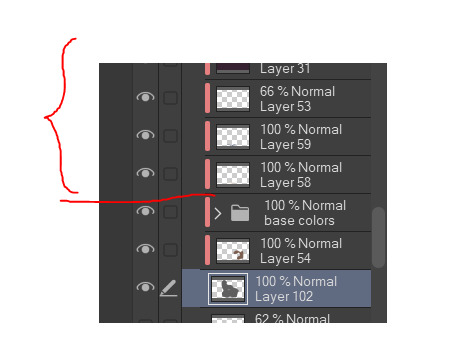
Overall this is what my layer set up ends up being
Sort of a sandwich with the lineart/sketch as the "meat" lol
Color and basic shading below the sketch, clean-up and rendering on top
I like this method cause it's super flexible if I ever want to try something different or try to replicate someone's style
I can make each step less or more messy depending on the end result and can add a lineart layer if need be. Also if there's a part that is straight up not working or needs to be removed its super easy to do cause I can just paint over it on the "extras" layer, color picking from the surrounding area to get the same vibe
Generally rule of thumb for my style is: get the initial layout of colors, form and shading to look good, then the rendering should be smooth sailing
Really the best advice I can give to get better at art is to enjoy what you're doing and become very very obsessed with drawing a silly little guy
You'll eventually get very good at drawing them pfptpf
#sundrop#moondrop#long post#art tutorial#fnaf sun#fnaf moon#I draw them way too much holy guac#ask#this is for you asker#idk if anyone else is interested in this kind of stuff#i apologize for ranting lol#also me struggling to spell silhouette like 15 times
120 notes
·
View notes
Text
"Sometimes, when he finds his way out of one of his many cities and steps into some cowboy boots, he's *almost* tolerable. We might even have one or two things in common.
...But don't go thinking I like him or anything. He's still California, after all."
-Texas
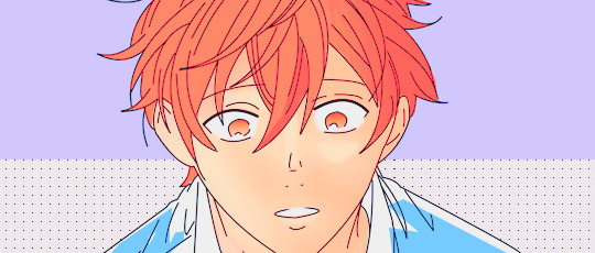
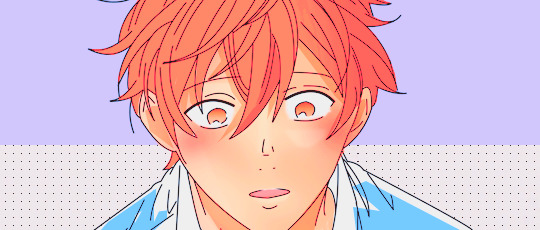
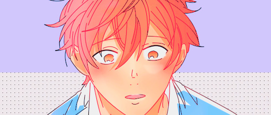
I'm still a sucker for cowboy TexaCali, what else can I say? I found an adorable reference pic (under the cut) and had to make it TexaCali. Could also be AustinCali if that's more your speed.
I tried a new rendering method (for me) and legitimately want to know if y'all like it. More details under the cut.
Reference:
So I legitimately struggle with colors and rendering, it's absolutely my least favorite part of art. (I'm a lineart girlie through and through). So I ended up trying the "5 values" method and starting the rendering in monochrome since I'm relatively comfortable with that. Then I added colors over the top and did some adjustments. I definitely like the workflow of the method but I feel like there's still something missing! It's super dark and idk how it fix it. 🤷🏽any suggestions? I'm open.
#this was supposed to be a quick value study#ten hours later...#wttt california#wttt texas#wttt texacali#welcome to the table#mur art
170 notes
·
View notes
Note
HEY YOU
Um...
Hi hope you're having a a wonderful day
I just wanted to ask since you're a digital artist... how do you color your art?? Because I'm a traditional artist trying to become a digital artist but I have no clue how to color my work (I made the mistake of using 'fill' on ibis paint before realizing oh wait that's not how digital artists color their work dummy) like I know base color and all that but the layers... how... How color? Line art no fun...
*cries*
I have no idea what I'm doing 😭
Don't feel pressured to answer this or anything, just thought to ask you since your art is so CRUNCHY I LOVE IT
Hello there!! I hope you're having a nice day as well
Sure! I'm very happy you like my art and as I also started as a traditional artist, I'm glad to entail some tips! :]
Base colors:
After finishing the lineart (can be sketch too), I use the Magic Wand tool and click it on outside of the lineart. This will give you a silhouette, but in the wrong space. Therefore, we have to go to 'Selection -> Inverse selection', after, you can proceed to use the fill tool on a separate new layer, beneath the lineart.

(Advanced tip: if you use Clip Studio Paint (CSP), there's an asset called 'Erase Along Edge'. Set your lineart layer to a reference layer (light house icon) and you can continue to erase and adjust the silhouette more easily with this eraser!)
Next, make a folder, clip it down to the silhouette, within this folder, add separate layers for each base color. This will help you manage your colors more effectively.
Shading:
This is extremely tricky and I cannot give a standardized process for this, but I'll attempt to do so. There are much better ways to do this I'm sure, the one I entail on forward is a bit time consuming (but it might only be a personal thing as I tend to over-render)
My method:
For a simplified method, skip all the purple colored parts of text.
We are going to continue working here:
I fill a separate layer with all black, and set the layer to color mode. This is to help us see the values better. Should we play around with contrast, brightness, focus points etc.
Then, with a layer, set to multiply mode, I begin shading shadows. Can be grey for now.
After I'm done, I use a layer to block out bright parts, with white. It makes it very dramatic, bless. (You can use different colors for this of course, I just keep this specifically very bright.)
Additionally, make a separate layer, use it for reflection lights with a lightish gray.
Adjust, add, tweak layers to ensure your overall image meets your expectations, including background. Most of the times, I even additionally paint a complete image by blocking out bigger shapes (messy and undefined) to see how the values should match in this stage.
Simplified demonstration:
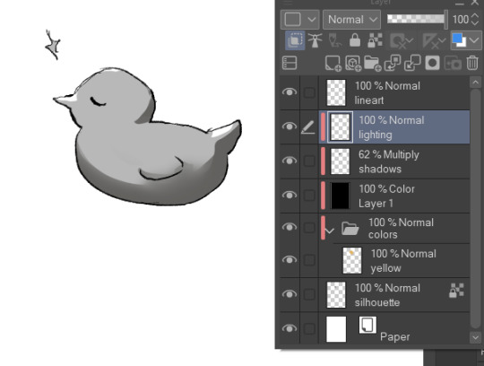
We'll come back to these layers later.
Hide the previous black color layer. We now have colors again, but it's all so muddy.

Therefore, we alpha lock our previous layers of shading, and fill it over with colors. Unsatisfied by any colors? Use the Hue/Saturation/Brightness sliders or add a new correction layer. Important thing to note that you can use other colors than this purple/blue one in the image below for the multiply layer.
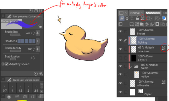
I use correction layers unapologetically. My favourite is Tone Curve + Gradient Map.
Naturally, I have a lot more layers than this in the demonstrated picture, such as Overlay layers to emphasize focus points or further darkening parts with multiply layers, etc. I do most of the hard work during rendering stage! Excuse me for the low effort rubber duck also hahah. Here's a closer example for what I usually do:
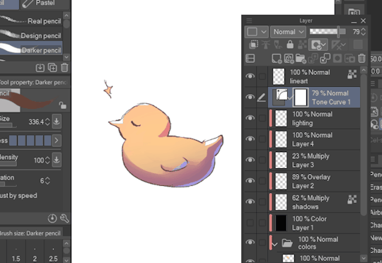
All we got left to do is Rendering (painting over mistakes) and Effects. I cannot give much advice on Rendering, it's pretty much the same as in traditional art.
Effects:
I sometimes leave little speckles/sparkles over my art to make it more detailed.
After, there can be correction layers, simply to adjust the final look.
I usually save the image as png or jpg (or in CSP case, merge all visible layers to a new layer) and add noise.
Sometimes, when I just want to post a sketch I add a 3d effect but in Photoshop. It helps a bit in faking extra details.
That's the end of my process! I hope this proved of help, and I wish you a smooth journey :D In the future, I can post timeline speed paints, if there is interest.
My other related threads are this (on my process) and this (on mindset and learning).
You can see me working in action through gifs here. (The gifs include extra planning stages (mentioned in the previous 'on my process' thread, but they follow the same principles I mentioned.)
----
Another note: it is possible to get a cracked version of CSP, which I won't entail because of account safety reasons, but if you research it, a pointer I can give is that the distributor's name starts with 'o'.
#if there's any related questions feel free to send more#thanks for the ask!#art guide#asks#art tutorial
21 notes
·
View notes
Note
Something about my drawing feels off , i only got into digital drawing few weeks ago and I'm stuck at the same point and lost .. any advice?
mmm okay first of all this is really good- first impressions-wise, the proportions and anatomy look very solid so there are no major glaring issues so to speak
if you were to ask me, what i think this artwork needs is that sort of 'volume' or depth that most beginner digital artoworks lack. You can achieve this sort of volume in two ways depending on the style you are going for: either by improving the lineart, or by treating the lines just as part of the sketch and painting over them for a more.. ''painterly/rendered'' look if you want to keep the lineart in, what i suggest is adding some "line weight" so that the artwork doesn't look so flat. What i mean by this is to thicken the lines where body parts would naturally overlap (like the neck and shoulder, the nostrils area, the corners of the mouth as well as the tip of the lips etc) and where shadows would normally be for the illusion of volume. After that, i'd also add more shadows and color variation in the colouring layer so that the skin looks more lively and again, for that volume. You can do it with some dark blue or orange on a multiply or an overlay layer, just experiment a bit with colors and blending modes. If you want a more messy/painterly look (which is more down my alley or in line with my artstyle), what i'd personally do is i'd create a new layer on top of everything and just paint over the lines with broader strokes and a darker color in an attempt to add some volume to the shapes and to make the artwork look more cohesive and less "digital" because at the moment, i can tell that it is made up of a Lineart layer, then a Colouring Layer below, that very religiously follows the lineart layer and then maybe a layer on top of that for the other colors and the hair. This is a very common digital art process and a good one to keep in mind but a little secret i can give out that i've noticed in 80% of the artists who have this sort of drawing process is that they will always, always merge everything in one layer at the end and adjust things as they go. They will not keep the layers separated and just never revisit them in the process, despite what it may look like. There will always be something that needs fixing and they will fix it as they go so i suggest doing the same and being a bit more "freeform" with your layers
Anywayss, besides that, I'd also introduce some color variation like in the previous method. As a general tip, try to move the color slider around and don't just shade with a darker variation of the base color. I like how the hair is painted and the shine and everything, it looks very good and everything is pretty much set in place, i'd just render it even more, make it More voluminous. It's just missing a little pop a color: i'd add some blueish gray hues in the brown hair and for the purple hair i'd make it more rich by adding some deep dark blue hues and some faint yellow highlights (bc purple and yellow are complementary colors blabla) As for the shape, think of the hair as chunks of volume that reflect light and that are also affected by gravity.. or as spaghetti if u like flat hair like me bsjsjd That's all i could think of; Again, it's very good and promising considering you started just a few weeks ago, so keep going at it! I hope it was at least somewhat helpful and that i wasn't being too technical with the wording (and that it made sense)
#i hope it didn't come across as mean or something#i have a bad habit of being pretty blunt with my words#and upseting people#the artwork is really nice and pretty but i was asked for critique so i pointed out some parts that could be improved#you don't even want to know what my art looked like a few weeks into digital art lmfao#this is 10x better#keep at it op!#and again hopefully i didn't offend with anything don't take it to heart you don't have to listen to me do what u want#ask iztea#if there are any typos no there aren't
52 notes
·
View notes
Text
Current digital art process!
Acting on @shkika 's request because making my redraw for this post actually ended up giving me more confidence in my digital art process! As such, I'm gonna use it as a reference. And if this walkthrough of sorts turns out nice, I might do it again as my process evolves!
I started off with a quick sketch of sorts, trying to focus both on movement and volume, and get the general idea of where each element is located. I edit the image dimensions and placement of things a lot in this phase, as my ideas often tend to change once I actually begin drawing them. In this case, as I got it down, I decided I wanted it to look like some cheesy animal motivational poster, so that influenced where the text was.
From there, I began to clean and sometimes edit the sketch, mainly by thickening the lines to make the shapes more definite, and erasing what wasn't necessary and interfered with other parts. Volume is one of my biggest focuses in my drawings, so I try my best to get the volume of each character at least hinted at with the lines. This is something that will probably remain in my process for a while, as I quite dislike doing separate lineart and like the messy, sketchy feel anyway.

I also wanna mention, in addition to having references and such in other windows, I've recently begun having a second mini window of my current drawing off to the side so I can see what it looks like overall more easily, regardless of how much I zoom in on and flip the main window. It's quite helpful!
For reference, this is what the final sketch looked like:
Then, I went on to add the flat colors. Another tip: I almost always set my sketch layer to "Lumi & Shade" because I think it makes the line colors a lot richer, but since it's based on what colors are underneath, it colors the lines a lot more individually than changing the sketch color as a whole. Here's some comparison to a version without the effect (left):

Then, I add some shading using a (really nice) marker brush. This is honestly one of my favorite parts of the process, just trying to carve out all the volumes, especially since I usually use a pretty blue color for shadows!
Sometimes, I honestly just leave drawings finished at this step, because I adore the sketchy look so much, and because I really don't like the tediousness of more realistic rendering in the painting process; from what I've seen/experienced, it often involves having to basically paint the entire image over again, which I've realized I find REALLY boring (and is also why I clean the sketch instead of making a new lineart layer). As such, one of my hopes is to reach a point where I could almost completely avoid having to clean up the image in a traditional painting method, instead being able to lay down lines and colors so well that they convey nearly all the volume necessary on their own, still have that sketchy appeal, yet also look finished and professional.
Alas, I did do a bit of clean up on this image, but I think it still turned out alright!

Here's the finished drawing! I'll have to practice with this process a bit more to truly solidify it as my digital go-to, but nonetheless, I think this came out adorable! Thanks again shkika for the ask, and thanks to @mintscampi for the sweet prompt! I hope you guys like it!
#art#artwork#artists on tumbr#digital#digital art#digital artwork#painting#digital painting#process#painting process#art process#tutorial#fanart#rain world#slugcat#rw slugcat#slugpup#artificer#rw artificer#quetzalli draws#quetzalli's notes
102 notes
·
View notes
Note
1) I absolutely freaking adore LO rekindled and it’s really inspiring me to finally work on my own damn comic n 2) I heard you mention flats before lineart. How does that work exactly??? I use lineart to let me fill in color quickly but I’m always down for trying new methods to learn!
Aww thank you so much! I've seen lots of comments like this since it started and I think it's great that it's getting more people to dive into making their own <3 <3
Also it's basically exactly what it sounds like, I put the colors down first before the lines! Sometimes I'll do lines first if there's a spot I'm struggling to figure out with just color, but I find most of the time doing color first helps me block out the shapes better than if I had started with lines. Here's an example with panels of Hermes from Ep 30, before he had all of the lines and rendering added !
This is basically what all of our panels look like at the start, just solid blocks of color that we shape out and then finalize with lineart and shading. I've found since using this method, it's helped me a lot because it works better with my brain. It also helps prevent the color from not filling in correctly as the line brushes we use are pretty textured so the fill bucket doesn't detect gaps quite as well as it does with my other pieces and comics that have smoother lineart. That said, if you try it and don't like it, don't sweat it ! Do whatever works for you :)
#ama#ask me anything#anon ama#anon ask me anything#lore rekindled#lore rekindled comic#lore rekindled ama
70 notes
·
View notes
Text
Blogpost #1: Finishing Pre-Production- Background
As I have been working on my final major project, my whole pre-production has gone through multiple changes whether it be characters or backgrounds. In this blog I would like to talk about my backgrounds or rather why I have decided to change them and what my references are for my new backgrounds. While I feel that backgrounds are a strength of mine I have realised that backgrounds don’t need to necessarily be complex to enable compelling visuals.
Firstly, I would like to discuss why I have decided to change my visual style.
While the background style is quite vibrant, I feel keeping this quality of backgrounds would be quite hard consistently throughout the film. This is due to the fact that there are multiple shots with different angles and perspectives throughout and that my film is more than 2 minutes long. I felt I wouldn’t be able to do justice to all the backgrounds and the difference in quality might be visible to the audience. Due to the changes in the story I have also scrapped this particular scene rendering this background discarded. I also have changed the environemtn and how the characters interact with it for example, the shop owner does not have automatically opening glass doors.
For the general feel of my film, I wanted it to feel like ‘If anything happens, I love you’ and for the visual style, I wanted to go for an art style similar to films ‘My Neighbour, The Yamadas’ and ‘The tale of Princess Kaguya’. Specifically I really like the visual style of the Ghibli Film, The Yamadas. While simple they have a whimsical and dreamy feel to them which is brought but the water colour wash like environments and characters. Here is a pin board I made for my references to work on my backgrounds.
I also would like to study and analyze some of the background choices that have been made in these backgrounds and apply them to the backgrounds over the next few posts.-
Scene from ‘The Tale of Princess Kaguya’
I felt like this would be a good image to study. Here the main focal point of the scene is the group of men sitting and eating in a sort of a pavillion. I have not seen the film yet hence I might not exactly understand at what point in the story this scene takes place but my goal is to understand the design decisions here. On first glance I can see that the lineart is mostly limited to the main focal point of the scene i.e. the men sitting down and as we move further away from it, the line art fades into just gestures. The fire here also draws the viewers eye to the focal point due the difference in colour temperatures.
In the background, we also see other men sitting but are crafted beautifully using blotches and shapes of water colour without having line art. While this method eliminates linear, it also requires a good understanding of shape language. Moving on most of the colour palate outside the house has a grey monotonous colour to it. I think this has been done to demarcate class and stature in the story between the group of people sitting outside and the group of people sitting inside. I feel like this is a great reference for my first opening scene as even my story starts off with a dull greying rainy night. Finally, in the texture, there is a clear water colour grain applied to the image or rather the image has been made using a water colour medium.
In my next blog, I will apply this analysis into the background that I make and critique it. I also am planning to try and make backgrounds that have a multimedia aspect to them so I will look for artists that blend 2 or more media and study them.
References- Unknown (n.d.) [Image of people sitting around a fire pit in front of a building with flames coming out of it]. Available at: https://in.pinterest.com/pin/138556126031307248/ (Accessed: 2 June 2025).
0 notes
Text
Hey y’all, here are some process stages for one of the more recent illustrations I did!
My sketches have never been very detailed. I remember being inspired for a pose while scrolling through pintrest and just threw some lines down on a page. I think more about the general pose and feeling I want more than the worry of anatomical correctness because I know I’ll fix it as I go.
In the next stage I establish stronger more contrasting colors and start to define the form of some shapes. The anatomy is still bad so at this point I’ll start to use the warp tool to move things around and adjust proportions. I also end up using the selection tool to cut various parts of the figure apart in order to put them back together in a way I like (I do not recommend doing this lol the sooner you can establish a solid foundation the better because it’ll save you a lot of work as you go. I just have a really hard time seeing my mistakes until I have something visual to work off of.) I alternate using the warp tool and selection tool and painting again and again until I get something relatively presentable like what I have at stage 3!
At this point all I have left are color adjustments and tweaking some small details. I usually don’t make such drastic color changes at the end of my work because I’ll have found my desired pallet through rendering. However with this one I wasn’t yet sure if I wanted a strong blue bg to contrast the orange of Lucéena’s eye or if I wanted the eye itself to be the main point of color. I knew I wanted the eye to stand out so I thought it was worth trying some things. That’s also why I decided to leave some parts messy in the final piece. I wanted the most well-rendered area to be Lucéena’s face to bring attention to that new shines eye she has.
I hope this was interesting and insightful!
With every illustration, I start off with a loose sketch. At this stage I’m not worried about perfection, my lines are more to serves as composition guides so I know where things will roughly go. If there are parts of the illustration that I know I want to put a lot of detail into (such as the face) I will often give that part more time. Then, I jump into colors by laying down flats behind the lineart and then beginning the process of refinement with a new layer on top. At this stage I would have 4 layers, 1 as the bg color (the blue expanse), 2 as the flats of the character, 3 as the line sketch, and 4 as the rough detailing. After this the number of layers I uses depends on how much of the illustration I want to preserve from itself or how many layer filters I end up using (to tweak color and lighting). Still, my illustrations always start with these 4. Once I get to a rendering point similar to stage 2 I start worrying more about the “correctness” of my structure and how I can make the anatomy more realistic. To do this, I like to duplicate then merge all of my layers, excluding the bg layer. Now I have my character one one whole layer and the expanse of blue on another. I have the individual layers still on hand if I want to refer to my og sketch but at this point having them all as one is easier to work with because to tweak the anatomy of a character I usually cut them up into parts and move/warp them to be more precise. Is this the most effective method? Probably not, but I rely a lot on the warp tool to get the exact shapes that I want. And seeing shapes for me is a lot easier when I have some color and value to work with. (I’m not a very “line visual” person if that makes sense XD) The rest of my process is a combination of rendering and adjusting details with the warp tool. At the very end I did some color adjustments (seen between stages 3 and 4) to see if I could get them closer to the initial feel that I wanted. Because I drew this to showcase Luceena’s new magic eye I wanted that to be the focal point of the illustration. So not only is that the place I put the most detail into, it’s also where I wanted the most color to be. I thought that having a blue bg would contrast nicely with the orange of her eye, but I ended up desaturating the whole piece and let that one note of color stand by itself. Lucéena also received her eye in the Shadowfell so the grey, drab vibes ended up fitting perfectly!
#art#digital art#wip#art process#dnd#dungeons and dragons#I was asking some friends for their thoughts on the desaturated version (never be afraid to ask for a second opinion!)#and we joked that this was Lucéena’s villain look because I don’t usually make her quite so angry#she has a resting bitch face tho so I mean this is prob what she loks like all the time lolo#I think her hair is kinda growing out since I first established her design#it didn’t always cover her face so much I think??#what is consistency let me draw my self-indulgent character traits#which means that all of my characters have to have long hair or at least long bangs so that it can be sexily flung over their face#in the heat of battle#and i love givig luceena in particular messy hair because thats a Vibe
69 notes
·
View notes
Text
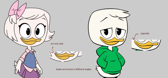
Someone asked me for a tutorial on how to draw louie duck. here you go.
I will generalize it to duck kids, or kids that look like Louie.
I use brushes that blend colors with each other. Switching between color brushes and a normal one is a crucial part in the process. Switch whenever you feel it's the right time.
If the blending is too much and you need to stay to one color, go normal mode. If your brush is fine, keep going.
Since this is a tutorial for my ducktales art, keep a cartoony yet stylized image. I do so by mixing the structuring with the "painting style". Decide on a pallete you want to try. Keep a good balance between those to make your resulting piece look pleasing to the eye.
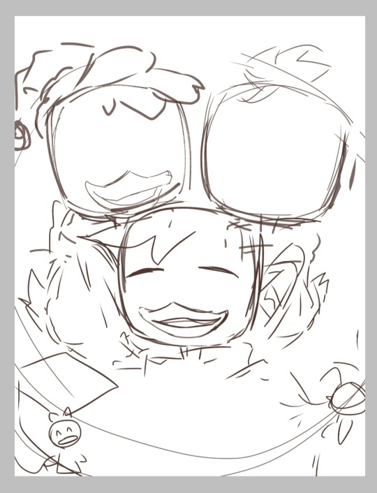
duck children tutorial (dt17):
using my unreleased christmas art that i will post this new year's eve
step 1: make a sketch. try to stay close to the show's art style and get your basic shapes right. I don't want to repeat several other tutorials on how to draw the ducks' structure, but with sheer observation, their shapes are pretty easy to catch. You can put the character layers in a folder for better organization.
fun fact: there is a small difference between male and female beaks. For the adults, there isn't really much of a difference.
I usually start with a very simple idea sketched on my head, but as my process goes on, i think of ways to make the piece look better and more detailed. Think of a cool experience and imagine something you can make with it (my art in general).
sketch:
step 2: put the base colors (bottom layer from the sketch)
[see picture below]
Lineart is a big no for me. It's not like i can't do it, but it takes up most of my time because of my quest to make it look perfect. It is still an option, of course.
step 3: detailing/rendering. I render using the sketch layer itself, by putting color on top of it. You can shade using that method, or add in combinations of multiply + overlay. I use both. the blending modes are on the top layers.
Make sure to figure out what lighting or pallete you'll want to use ^ ^
steps 2 and 3 together: my processes don't go in a certain order after sketching. Base color below, detailing on top. It's very disorganized.
decoration detail:
the progress by this time was weird to look at. It's a part of it.
step 3.5: shadowing. You can clip "multiply layers" to the character folders for this. If you want to go for a softer-looking piece, use a softer brush, and vice versa.
knowing how to manipulate blending modes is good too.
step 4: check the piece. look at every detail to see if something is missing or you want to add something new. This is mostly for detailed pieces or if you want a background.
also the step which i am on currently:
Speaking of which... make backgrounds cohesive but don't go too overboard with the details. I realized when i was making the "Louie Chess drawing". That's what kept its release on hold.
"Hold on, this is a cartoon show about ducks. maybe i shouldn't add too much detail on the background."
Well, That's pretty much it.
idk if that helped, but if it did help you, that's nice.
57 notes
·
View notes
Text
tanchirou’s coloring tutorial
hello!! i was asked to make a tutorial showing how i color a while ago, so here it is! i’m honestly not the best at explaining at all so i’m very sorry if i lose you somewhere along the way ;; you can always come ask me to clarify anything, my dms are open to everyone :)
also a quick disclaimer: this tutorial will only be focused on coloring, so i won’t be showing you how to redraw lineart. however if you are interested in what programs i use, i use clip studio paint to redraw and photoshop to color
besides this tutorial, i also want to link some others that are great for tips & learning!!
katsuke’s coloring tutorial
sugawara’s coloring tutorial
dicennio’s coloring tutorial
and without further ado, let’s go goooo
since coloring given is therapeutic for me, i’ll be using this manga cap for the tutorial:
first step: render, sharpening, psd
take your image, resize and sharpen accordingly to your liking! even though i have a lineart here, it is something that i have gotten into very recently and i have been able to achieve nice results in the past even without it.
some tips:
i find it easiest to use the pen tool to erase any background or redraw any lines. the eraser is also helpful for places that are harder to cut out.
play around with the levels adjustment before coloring. this can make your edit look sharper and cleaner if regular sharpening doesn’t do the trick.
if i ever need to clean something on normal mangacaps, i make a new layer above and then color it with a white brush like so:
i always like to add my psd before i start coloring, and simply make final adjustments with it later on (but this comes down to personal preferences as well). i have a psd that i’ve made for manga colorings, so the first thing i’ll do is just slap it on top of my panel
after adding my psd:
second step: base colors
fill in your base colors! when looking for what colors i want to use, i usually look for the character’s anime pictures as a reference. for mafuyu, i chose this picture

all my layers are set on top of the lineart as multiply. this is how my edit looks after filling in the base colors:
if at any point you don’t like how a certain color comes out, use the hue/saturation tool to adjust it!!
use a new layer for everything (eyes, hair, skin, etc.) so that it’s easy to fix if you ever need to go back
third step: shadows and blush
add your shadings!
i’m pretty amateur with this, but usually i try to imagine where the light source might be coming from and shade in the part where it seems like the light wouldn’t hit. for this picture, i imagined that the light will be coming from the right side of mafuyu’s face, so everything on the left side will be darker. this process definitely comes more intuitively after a while, so practice lots!
i like to set my shading as multiply on top of my base colors on 50% opacity
use the smudge and/or blur tool for a softer effect on the shading and to blend it nicely with the skin
i also pay close attention to the areas under the hair, neck and around the ears. using the same color that i did for the first shading, i will create a new layer, set is as multiply on 50% opacity, and shade in those parts as well. i won’t take the extra step of blurring it with the rest of the skin this time

next, using a pink color, i’ll color in the cheeks and mouth using a softer brush
fourth step: lighting
using a pastel color that matches the background, i’ll shade the right side of mafuyu’s hair to make it brighter (again, that’s where i imagine the light will be hitting him). this layer is set to soft light.

then to change the color of the lineart and make everything bright and pretty in general, i’ll choose a dark red color and set it to screen on top of everything else.
some tips:
you can try to see what colors work for you on your own edit by using the hues/saturation tool again. aside from red, i saw that orange and brown are also nice to color with
you can also try and set it to lighten instead of screen to see what kinds of effects you can get. go with whichever one you like more
fifth step: extra effects
this part is really fun for me and also gives me a chance to explore my creativity a lot! here i’ll add highlight to his hair wherever i want, to his face, eyes, etc. all of these are done with either the pen tool or the brush tool set at size 1.
the modes that i like to play with the most for this is either soft light or overlay
if you’ve ever seen me stream my colorings in the DailyAnime discord, you would see that i always use a looot of layers to experiment with things. so honestly just go wild with your colors!! don’t limit yourself!! :’)
lastly, i’ll be adding any extra things that i want such as speech bubbles and sparkles in his hair. i will also add some noise to the skin and the hair to make it look nicer too. here’s the final product
aaannnddd..... that’s basically it! i use the exact same coloring method for posts like these (x), (x), (x). hopefully this tutorial is able to help at least one of you! ^^
(and a quick thank you to narumii @narumii-chan, zebra @reddriot and jaime @itsyuurikatsuki for helping me look over this tutorial ♡ love you all sm )
554 notes
·
View notes
Note
Do you gave any advice for a still (kinda new) artist?
that is... a loaded question...
work smart not hard is my way to approach art though. and i would have loved if someone would have drilled that into me when i was younger? like... i still strugglewith that. but... it connects to the questions: what do i want to tell? and how can i show it?
defining this is a huge help to me. because some things need a bg to tell the story better. in other moments i don't need it because what i try to say is already told with just a pose or an object.
a bit rough and unperfect lineart is something most people don't look at. a bit a crooked nose or uneaven eyes, in general minor mistakes or crookedness in your art is something people usualy don't tend to see or point out because people look ant the entire picture and composition. (oh... -uncaps red marker- all my mistakes you guys ignore)
so... take shortcuts to achive what you want to tell. if you want to take them of course. don't push yourself because you think you have to. you don't know how something looks you look it up. if there is a free (emphasis on free) pattern use that. or learn how to make brushes for braids and pattern to have an easiertime.
the key for working smart for art are refrences. and to not shy away form them. there are usefull 3D tools in the web for free. you can use fotos to look how angles look like, you can take pictures of yourself.
there is this idea of art having to be hard and difficult in order to be worth something. which is just a stupid point of view. if you use CSP and have these 3D dolls available, use them. there is a reason they are there. use google sketch up as help for environment. if photos don't do it for you. there are many 3D design tools that help visualize what you would like to draw. and there are even artifical drawing rendering tool that can help you with environment.
to struggle through art and forcing yourself through something unpleasant will hurt you mentally on the long run. it kills the joy in the process and at the end can lead to burnouts or just dropping the hobby. (there is a slight difference if it is your job but there are methodes for these scenarios too) so work smart. us the tools that are here to help you visualizing what you want to show us. uhm... finding ref is relative easy but in case you would like to see what i use
adorastock: for posese
for artifical enviorment: this one got really popular a while back. its als just fun to play with :D
animal head references: sould my sould to this for obvious reasons!
manekin for shadows on the face: you can also just use it for head angles :D!
so... i think i talked to much ;;; sorry for the long post!
i couldn't find any art on your blog so i can't give you direct feedback. but you are a talented writer, i like how you portray izumi!
#work smart not hard#no this image needs zebrafinch-mise#and develops an entire frog species just because i can#even though thats not necesarry!#but also most important thing was#chip!ask#yeha.... sorry for the long post#there is also... lots more i could talk about but#yeha this this is kinda my mantra#when i take to long on something i let it stay til i know how to aproach it before i just... scribble around it till next year :')#thank you for the ask!#on the one hand i say but am the first one that is like i had fun!" and yhea... thats the most important!
82 notes
·
View notes
Note
how do you draw faces? mine look okay in sketches but lining them ruins them 😢
I may not be the best person to ask, given that I’m a self taught artist in the same way someone who watches a lot of Synesthesia videos might be a self taught pianist. I can certainly pick up a pen and draw, but I’m not super well versed in terminology or, uh, really anything specific that might be of help to you. I’ve just been doing it for so long that my hands know how to do it. I will respectfully tag @ghosthan here, though, and if she’s willing to give some advice of her own (and possibly correct some advice I’m giving you, if any of it is not up to par), she’s more than welcome to. She is the Art School friend.
But, since you’re here, here’s my basic process:
I’d suggest using a lot of reference images if you’ve got a particular look in mind, especially as someone who’s not super practiced with faces. This is especially helpful for angles that might seem unfamiliar to you. I’ve kind of collected all the knowledge there is to collect from my usual references (Steve, Tony, and Tiberius), so I don’t have to do much searching when I draw them, but when I pick up a new character, I tend to scroll through images of people that match their age, race, etc. to see what vibe I’m going for.
For our purposes, I’ll just pull up the reference I used to solidify my 616 Tony. I don’t think this is a perfect faceclaim by any means, and there are a lot of changes I tend to make with his face shape and facial structure overall (mostly jaw, cheekbone, and nose changes), but. Here’s David Gandy, tumblr’s favorite.
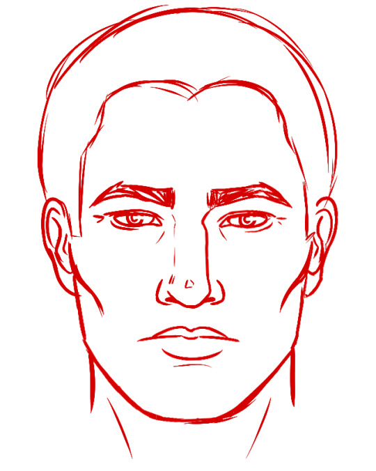
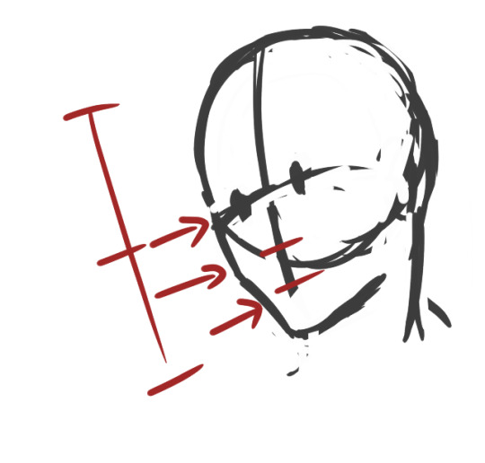
I usually do this part by eye, to the point where I’m not actually sure whether or not this is how you’re supposed to do it anymore, but breaking the face with three lines and comparing the widths of the sections you get as a result is very helpful for proportions.
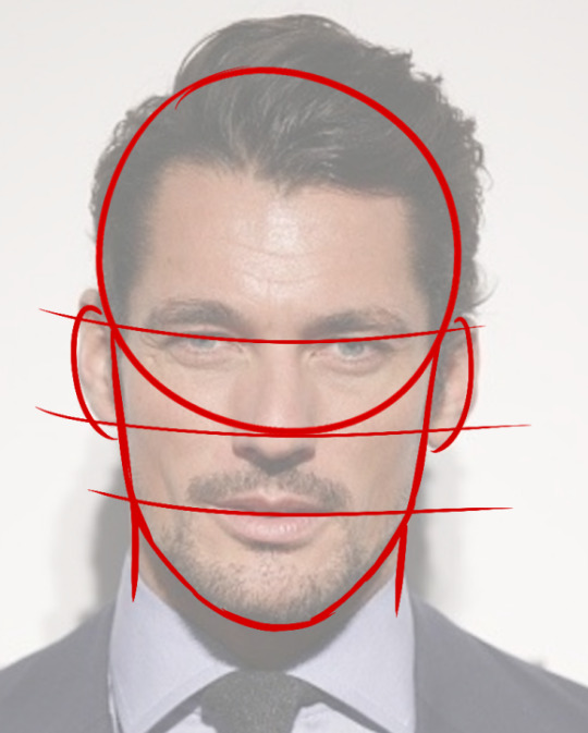
Kiiind of like this? I know some people are very particular about where these lines are supposed to be (like, where they fall on the eyes, nose, and mouth) and what the circle is supposed to be focused on (I’ve heard someone say it should be from the top of the skull to the bottom of the nose?), but as a general guide, my rough sketch when I’m looking at a reference kind of resembles this minus the lines. I just start the circle at the top of the skull and try not to make it much wider than the ears, then adjust later on to accommodate the rest of the skull.
So, this is kind of rough, and I can explain how I do it by eye if it’ll help, but.
As you can see, the middle of the nose here kind of splits the face (from the forehead to the jaw) in half, at least on Gandy. By eye, I’d take more care to notice the bottom of the nose as well as the middle to create kind of a diamond shape in my sketch (we’ll get to that in a minute), as well as the top and bottom lines of the lips, but that’s more intuitive.
So, you can kind of place placeholders for everything here, and I’ll go more into detail about how I do individual facial features, but.
This is basically the most bare bones one of my sketches will get. I put in little lines for the cheekbones, and I start sketching in some basic features. I sharpened the jaw as well, because I like a Tony with a sharp jaw. :)
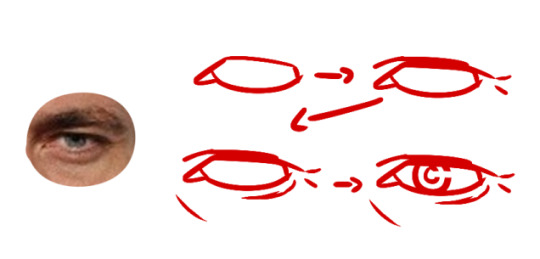
For the eye shape, I basically get down the shape of the eyeball we see+the inner corner of the eye. Then you can focus a little more on studying the eyelids, the wrinkles, etc. And then I added in a little iris+pupil, which is... you know, circles.
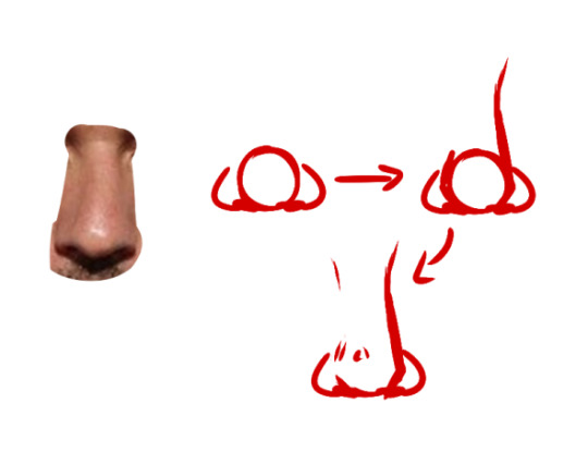
The nose is pretty simple. You get down the ball and the little shapes above the nostrils (nostril houses..?), and then you start to build the bridge off of that. Some people’s noses don’t have very pronounced bridges, so you don’t have to bring it up that high. I’ve drawn some noses that just kind of fizzled out at the top of the ball (and then defined the very slight bridge later on in coloring/shading).
The last bit is just erasing most of that circle and then stylizing the bridge/ball a bit.
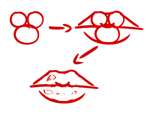
Excuse the rough, rough erasing here, but this is basically the deal for lips. You can squash/stretch/whatever the circles as needed to match the face shape you’re going for, and you can add some fun shines if that pleases you. Lips, I mostly play by ear, but this is the method I used when I was first starting out.
Speaking of ears. I would help you with those if I had any idea how. I feel like I use a reference every single time I draw an ear. Sometimes, I just scribble whatever the fuck into the lines and just let it happen. This was one of those times. My bad.
So, you just take what you’ve done there and plop them onto the sketch (I usually lower the first rough sketch’s opacity and then make the neater sketch over it, as opposed to having a rough sketch that I then try to line-- it’s not that time consuming once rough sketches come more naturally to you), and:
You get something like this! Some details have been changed (bridge of his nose, lip shape), but all of these were small modifications that worked to personalize the reference. I tend to do my face very cleanly the first time to get all the details right, and sometimes this works so well that I can just copy+paste everything inside the face and color it black for the finished lineart. This isn’t a must or anything, but it’s my preference. Even if you’re rougher than this, sticking to lines that you’re pretty confident will be placed similarly in the final lineart can help a lot with finalizing the portrait.
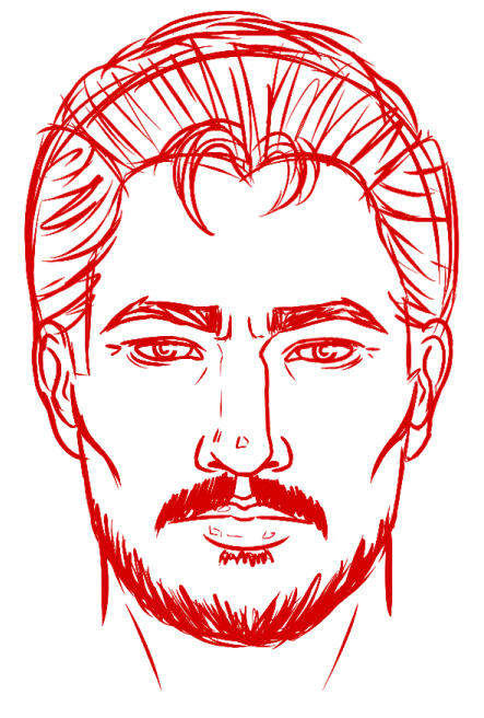
Add some facial hair, some hair, and more details, and... There he is! The reference was used more for a general “feeling” of a face and proper proportioning than anything else, and then you can switch up facial features, push things up or down, and sharpen or round out whatever you’d like to make the character look more identifiable. If you sketch like this, your lineart might be a lot easier to work with. Or you could just use this as your lineart, color it in messily, and pretend the whole thing was intentional from the start.
A few last notes that I’ve learned from actual professional/educated artists, and then you’re in @ghosthan’s ghost hands:
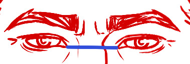
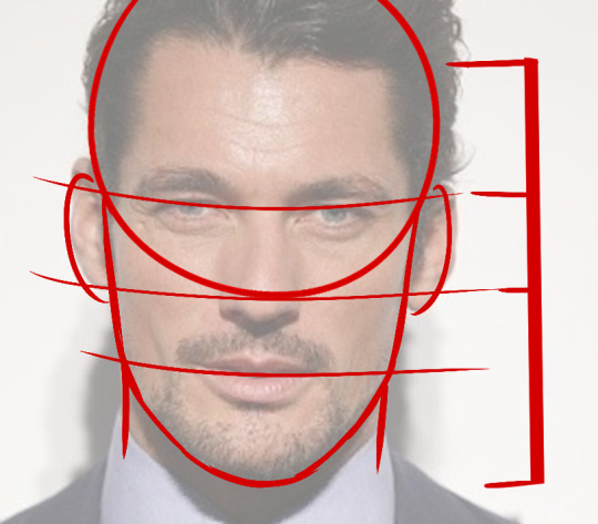
1) You should always be able to draw a straight line across the nose from the corner of one eye to the corner of the other. This doesn’t necessarily mean a horizontal line on your page, it just means that it’s perpendicular to the line you’d draw vertically down the face if you were to half it. To make this clearer, I’ll do the same on some stock photos.
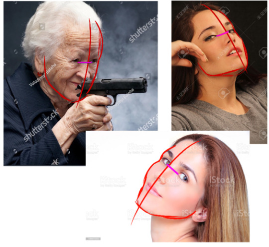
No matter what angle the character’s at or how their head is tilted, if both eyes are showing, I’m pretty sure they follow this rule.
2) The pupil is usually centered in the center of the iris, and it’s also usually showing in full. Yes, that middle circle in there is supposed to be a pupil. I know. I draw them funny. (There are some anatomical mistakes here made in how I moved the iris along the eye, as it’s important to remember that the eye is a sphere and the iris will move around it, as opposed to the iris moving up/down/left/right on a flat plane). The biggest mistake artists make with this is that they’ll move the pupil to the side of the iris that the iris is pointed toward; if the eye is looking left, the iris will be to the left (correct) and the pupil will be to the left of the iris (less correct). A lot of people cut off the top half of the pupil when stylizing eyes as well, which is... I mean, again, it’s just slightly less correct. Honestly, I’ve seen some art styles where these “mistakes” worked fine, and I don’t really think your art style has to be perfectly anatomically correct with every single tiny detail of the pupils and iris and whatnot, if you’re not submitting it to any critics or competitions or w/e. But if you would like this information, here you go. I have it.
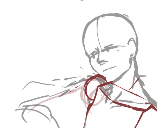
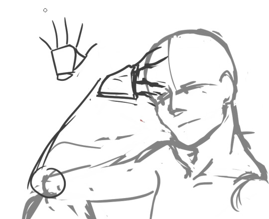
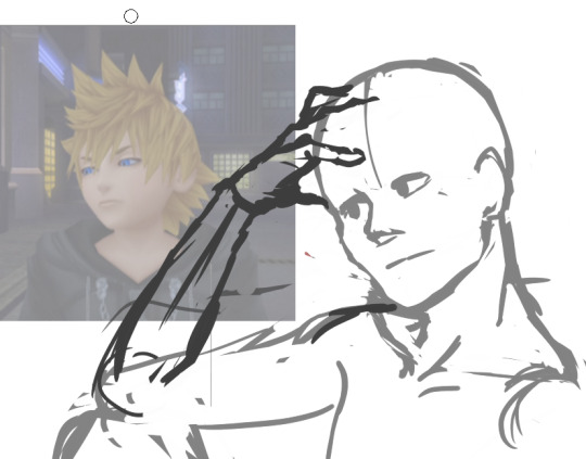
3) Identify the hairline, then draw your hair in sections before adding detail. I didn’t learn this one from an art school source (I picked it up naturally, just from photo/comic panel studies), but this is art school friend approved, so! Apparently, a lot of beginner artists struggle a lot with rendering believable hair. These sketches are by no means flawless, but the gist is there: cut it up into sections, draw those first, then fill in the details afterward. It’ll give you a more cohesive looking style and make it easier for you to fiddle with the hairstyle as you go along.
That’s all I have for now! I know this is nowhere near fully comprehensive (and it doesn’t cover a lot of angles, nor coloring, nor... okay, a lot’s missing), but here’s how I generally go about fully sketching a straight-on face.
If you have any more questions, please let me know! Or you can ask @ghosthan directly and get actual art school advice.
#cassks#i don't know how well this was formatted#my art#uhhh#art tutorial#?#i guess?#hesitant tagging but sure
12 notes
·
View notes
Note
hiiii! i just wanna say, i adore your art. second, im teaching myself to draw and while i can draw simple basics (mouths and sometimes eyes if im lucky), im still a beginner. ive watched many art videos and im still a bit confused on wtf im doing. so i just came here to ask if you had any words of wisdom for beginners? could be anything from what tablets to buy to simple mistakes to avoid. ive read some of the other posts here and have found it all extremely helpful so far! Thx for all you do!!
Hey there! Thank you so much!
I would put a read more but tumblr is broken. I’m trying to cover a lot of varied thoughts in little points, so if there’s anything you would like me to elaborate on or otherwise have questions on, feel free to shoot me an ask or dm me!
General
I think the biggest thing to remember is not to compare yourself extensively to others. A little bit of comparison is healthy... But too much will destroy your confidence, motivation, and take the fun out of art. Particularly if you are comparing yourself to someone older than you (life experience and coordination come into play here) or that has been drawing much longer (practice).
Additionally... If you’re not having fun (and you’re not getting paid to do it), don’t force yourself. If you find yourself being frustrated or bored with art, don’t force yourself to do it. That’s how you burn out and get art block! This applies to parts of a peice, too! If you don’t feel like drawing a face or a hand today? don’t force yourself to finish it. Come back to it later when you aren’t as frustrated or are getting better results. Even if its a week or a month from now. Honestly, at any given time I have probably ten headless bodies in my drafts. That’s okay! I just come back to them when I’m ready to do the face. And don’t be afraid to abandon something if it doesn’t feel right!
Something that also doesn’t get said enough.... take care of your body! I never knew when I started art, but artists are supposed to do warmup sketches and stretches and muscle exercises! I didn’t do any of this, and i went through a period of a few months where I was drawing for 5ish hours every single day. I developed carpal tunnel from it! So remember to take care of yourself. Take breaks, stretch, remember to eat.
Practice
Practice!!!! Even if its just for fifteen minutes every day. Or twice a week. But if art is something you really want to get good at, you have to put in the time and effort!! You can’t expect to draw an hour per month and be on the same level as someone who draws an hour a day!
I know I say this a lot but I think the biggest thing is just reference! If you don’t know what something looks like, look at a picture of it when you draw it! To go hand in hand with that, though, don’t just copy what you see! Learn from it and apply it! So take, for example, a shoe! pay attention to the way the heel is shaped, the location of the eyelets for the laces... how large the toe is, how steep the top! While you’re at it, look at other styles of shoes as well, and compare them! See what makes it look like a boot versus a trainer! And then the next time you draw it, hopefully you’ll remember all the things you learned the first time around!
I do lots of studies that serve no purpose other than to teach me things! I use referencing/studies to learn about color theory, shapes, and anatomy in a real environment. For example, hands or fabric folds! Oftentimes I’ll do them timed (20 or 45 minutes) so that I don’t fixate on perfecting things, just on the process itself and what I can learn from it. This also helps with getting better acclimated to your software and more coordinated with what you’re doing. Repetitive learning, like with playing sports.
I’ve realized a lot of people don’t quite understand what a study is? Basically you just look at a photo and try to replicate it so that you can learn about lighting or color theory or textures or anatomy or whatnot. So here’s an example of a timed study.
Additionally, don’t avoid!! We, as humans, have a tendency to avoid things that make us uncomfortable or are difficult. But it will make you a better artist in then end. When I first started, I absolutely hated doing fabric. I felt like I wasn’t good at it. So instead of avoiding drawing clothing, I sat down and did studies and sketches of different kinds of fabric. By the end of this learning period, I became comfortable with it and grew to enjoy it. These days, I adore sketching clothes, and it’s why my pants and shirts and things tend to be detailed instead of stylized in line art. If you don’t like drawing hands because you feel like you aren’t good at it? Sit down, look at a bunch of pictures of different hands, and practice it. By the end, you’ll be more comfortable, you’ll have learned something. Even if you feel like the drawings you ended up with aren’t good, you’ll still have learned, and that’s what matters!
Style
I worked on basics before I tried to develop a style. I made sure to start with a very realistic method at first, so that I could be sure I understood how fabric folds, anatomy, and realistic expressions worked before I tried to stylize them. I think in the long run this approach really paid off for me. It also allowed me to be conscientious of what elements I was absorbing into my artwork. I hear from so many artists that they started drawing when they were younger and into anime or cartoons or things like that, and tried to emulate it. Because those styles became so ingrained into their artistic skillset, it becomes near impossible to iron out those influences and get rid of them later. So starting with realism is a way to ingrain proper anatomy and other good practice into your artwork.
One way to develop style is to take a look at the artwork of someone you admire, and try to list out the things you like form their style - perhaps the thickness of their lines, or the way they do eyes. Do this with several artists, take all those little details you like and try them out! See if you enjoy using them in your own drawing process! Think of it like a grab bag or a pick-n-mix, sprinkling in the elements you like here and there to create something new and your own - not just copying another artists style word for word.
Don’t worry too much about it though; don’t allow yourself to become anxious or fixated on “achieving a style”. Its a natural ever evolving process that comes with time and practice. I know a lot of people get hung up on style, but just take it one day at a time!
Also try to keep in mind what style you’re going for as you begin drawing. And I don’t mean that like sailor moon vs. ghibli. I mean that as in, is this piece going to be a painting, a lineart, a lined painting, cell shading...? It will help you in the longrun if you narrow down the broad kind of style you use, and refine from there.
Workflow
My workflow for paintings is very different from my workflow for lineart and cell shading. A full tutorial on how I do paintings can be found here! A process video for how I cell shade can be found here!
Everyone is going to have a different method that works for them! You just have to experiment and find out how you like to draw! For me, personally, I use color blocking for painting (see the tutorial above) and a spine method for lineart. How the spine method works is that I will draw lines that represent the legs, arms, back, etc. so that I can determine the placement, length, and composition. From there, I’ll add a dark outline that actually shows the shapes of the body. Then, I’ll use thinner lines to add details. This is the method I’ve found that works for me. Another commonly used method that I’m sure you’ve seen is representing body parts with cylinders and cubes. There are lots of good tutorials out there on breaking down bodies into shapes like this!
Something that I do is if I’m not quite happy with a part of a drawing, I don’t just erase it. I duplicate the layer so that I always have the original copy, and then I make changes from there. Sometimes I can end up with five or six different versions of the same arm or face that i’ve made minor changes to. And then I compare and pick the one I like best, or condense all the parts I like from each version to make a “best” version.
Tools
Currently I use Procreate and the standard Ipad with Apple Pencil. Prior to March I was using a Wacom Bamboo Touch and Photoshop Elements 2008. I find its harder for me to do full paintings in procreate, but its made my life a million times easier for lineart and cell shading. The pen pressure is phenomenal, and I also adore that its wireless / active screen instead of plug in like the wacom. The programme itself is intuitive and easy to get the hang of; it simply lacks a lot of the neat tricks that photoshop has, like rendering (lens flares, for example), gradients, and gradient maps. Try testing out different trials of programmes... firealpaca, photoshop, autodesk, whatever it may be! What works for me may not work for you!
287 notes
·
View notes
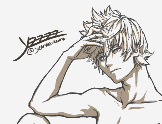
Note
Yo yenrz, I love your work and I was curious if you could show like a step by step process for what you do?
I really need to stop answering asks so quickly I have a LIFe tO LivE
So here’s a step by step blog about how I draw stuffs
Keep in mind that the end piece is still a WIP however. I’ll post it in full later.
Also if you’re asking about how I construct my text blogs I’m sorry I misconstrued the meaning of your message
So let’s start with what kind of brush I use:
I use the default pen brush on a little program called Krita. It’s free if you want to try it out.
Here’s said brush in action:
I always start with a rather huge brush size, since It’s easier to make larger, longer, broader strokes. Also that way I don’t have to constantly change my brush strokes to erase large areas (which happens a lot when you sketch) The main detractor for this method is that you get really messy sketches however >.>
And like most pansies, I don’t go full on black. We artists have too much anxiety to deal with that.

TIME TO DRA-
wait I forgot to put on some music

youtube
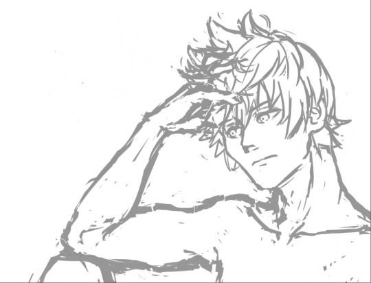
K, so I’m going to be drawing our boy Roxas today because I made a screenshot for the previous text blog I did and I thought he looked really freaking fine in that shot. So I wanted to make a quick body study with facial expressions giving that same kind of edgy mood.
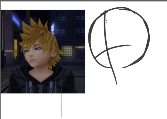
So I first start out with a circle, mapping out the direction that circle is pointing towards.
An important thing to keep in mind when drawing ANYTHING, especially if you’re a beginner, always remember to map out where the parts of your face are going to be. That way you don’t get trapped in a rabbit hole getting sucked into drawing your perfect eyes/nose/whatever facial feature and then realize when you zoom out that it looks like your person underwent a botched plastic surgery.
Rules of thumb to keep in mind about faces:
Eyes are at the midway point of your head
Distance between eyes should be about an eye wide
Ears are around the same level of your eyes
CHEEKBONES EXIST and Jawlines are square
So moving on, I go on and start sketching out the pose. Keep in mind that during the process, I usually don’t really know what I’m going for, so I test out different angles and positions and etc.
So while I settle in, I finish deciding how I want the shoulders to look.
But-

I notice something looks…off.
If you’re a beginner, it can be hard to tell when something is wrong with your drawing. Or even worse, you’re an early intermediate and you know something’s wrong but you have no idea how to fix it. And then you start going down a very, very deep rabbit hole trying to fix it and no matter how you fiddle with it…it never quite looks right. Yes I know the struggle.
So here’s the solution:
Break down the figure into simple forms. The key to making this work is that you must have ample knowledge of proportions of body parts respective to one another.
So here are rules of thumb for drawing most bodies (teenage or older and your figure isn’t larger or shorter than average)
Each half of the arm is about the length of a single head
The arm should reach to the halfway point between the hip bone and the knee
The torso(from the base of the neck to the pubic bone) is about two heads
Each half of the leg is about the length of the torso starting from the hipbone(not the end of the torso)
Boobs don’t jut out the sides unless you’re drawing really big boobs
Also, in this case, i’m utilizing a bit of foreshortening because the shoulders are in perspective, as in they’re facing away from the viewer a little.
So now it’s time to add the arms and hands. And like any other body part, I break it down to basic forms first (when you become an uber drawing deity, something I’m clearly not, you’ll be used to this and can skip over this step )
Hands are one of the things you see beginner (and even advanced) artists cry about for days. For good reason.
So the basic forms are like this:
Draw out your fingers as lines first. Also reminder that fingers are three segments long. Not two, which was evil propaganda that I was fed when I only drew anime.
Also and size should be about the length from the chin to a little above the eyebrows
Also I forgot to mention…
ALWAYS CHECK YOUR PROPORTIONS THROUGHOUT DRAWING. ALWAYS.
And once I decided on the placement, I start mapping out the actual shapes.
Also I wanted Roxas to look more manly and such so I looked a reference image to make his jawline/cheekbones more manly so yeah
So now that I’ve decided on the overall pose, I start on the details.
Also another rule to draw by that I’ll shove down your throat
DETAILS SHOULD BE YOUR LOWEST PRIORITY WHEN STARTING OUT. Start simple and get the whole form first, then start adding details. This ups your productivity and prevents you from getting lost in rabbit holes
It’s called rendering for a reason.
So I start adding the eyes and such and I’m overall satisfied with the face. And now I get started on the hair on a new layer. I don’t want the face lines to interrupt with drawing the hair, so I lower the opacity of the face layer.
I check how it looks by zooming out to see if everything looks alright. Oh noes he looks a bit too manly
Shrink that seme crap
Much better I know I didn’t follow the meme format shoot me
K now time for the fun part: the hair.
….
I just want to give a moment of silence for all of the times people have suffered from drawing Roxas’s hair.
….
because by golly his hair is the one I see beginners dun goof up the most out of all kh characters.
K moving on, the keyword for Rucksack’s hair is WINDSWEPT. And funny enough, there’s actual logic to how his hair works. Everyone’s hair has a center line/point where said hair flows from, whether it be a part in the hair or a eye of a hurricane thing because I don’t know what the name for that is.
Roxas’s is the latter. Demonstrated below:
See what I mean? It’s like an upside down wave going like whooooosh
Come to think of it, all hair should follow this rule. It should either be flowy or whooshy
Unless you’re Tetsuya Nomura, then you get to break all the rules
like seriously what the fu-
So now that’s done, I go and check for the gazillionth time, mirroring the image to see what I screwed up this time.
Oh noes something’s wrong with that shoulde-
Also I forgot here’s how I draw ears
-r it looks off.
That super spidey sense of knowing something’s wrong with your drawing is there for a reason. Heed its call.
Also if you think there’s nothing wrong with that neck, draw naked people for a couple of months and you’ll see why.
So when something’s wrong you do the usual. Break it down to simple fo-
Or just use a reference.
Looks acceptable now. Time to start the lineart.
Out of personal preference, I like to lower the opacity to <20% that way I can focus on the lineart while still being able to see the sketch.
Even as I do the lineart, nothing is set in stone. The sketch, at times, isn’t enough to go off of. So in that case, let’s go back to the reference.
Also I hit a roadblock when drawing the hand so move it out in the open so I can get a clearer look at it.
Also I use my own hand as reference a lot so I accidentally make make my manly men have delicate pansy hands.
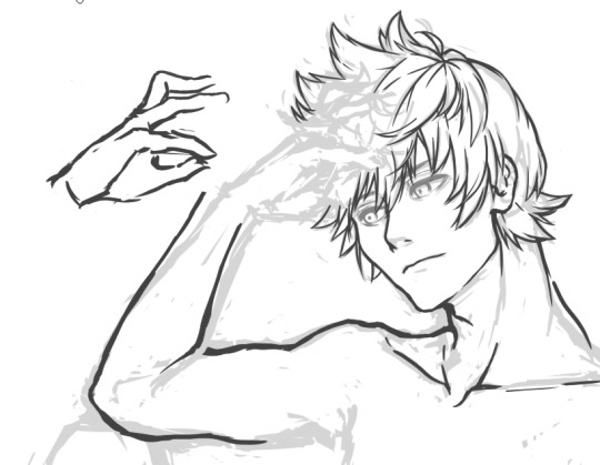
This hand pose isn’t natural at all but I’m okay enough at this that I’m able to make it look okay
Study hands kids. They’ll do you good.
….
I forgot to draw him clothes daMMIT
Whatever i’ll just slap some cel-shade lighting on it and call it a day. This is still a WIP so expect a not-naked-Roxas later this week
Thank you for reading! Here’s a link to my twitter, And if you would be so kind, please consider supporting my patreon.
127 notes
·
View notes
Photo
Finished this weeks ago but been having scanning trouble. Trying out a new and extensive process where I lay down line work, coloring and rendering digitally before I move to real media. It's a long process 😭 but worth it because everything has been worked out before hand. I tried using the grid method to transfer the lineart but I'm going to try other alternatives. My light box just isn't strong enough for watercolor paper. Also, next time, I'm making the watercolor art bigger. Which one do you like better? #watercolour #watercolorart #水彩 #水彩画 https://www.instagram.com/p/B0EPqb4BkUb/?igshid=bk2tyr27xp36
2 notes
·
View notes