#also some fonts just don’t vibe with the media you’re using them for and each other and it’s a big mess
Explore tagged Tumblr posts
Visit Tumblr Blog
Explore Tumblr blogs with no restrictions, modern design and the best experience.
Last Seen Tumblr Blogs


Fun Fact
Post activity is at the highest at 4:00 pm EDT; notes peak at 10:00 pm EDT.
Text
how can gifmakers be so incredibly skilled with color, composition, symbolism, editing and all the technical skills involved and then hide all that stunning work behind a typographic atrocity the likes of which have never before been seen in any other medium. i am begging you learn anything about matching fonts and background contrast because your work is illegible!!
#and just to be very clear i don’t mean that their work is too ‘gaudy’ or too the fonts are too silly#believe me no one is more against the helvetica on white background helscape that design has become i am literally in the process of#starting a whole ass newspaper so i can publish an article complaining about how boring that is#i’m all for silly funny fonts and mixing and matching. BUT. if you have a semitransparent swirly cursive on top of two superimposed moving#images full of chaotic detail then i simply cannot read the fucking letters!!!#also some fonts just don’t vibe with the media you’re using them for and each other and it’s a big mess#that does nothing but hide the breataking gorgeous gif underneath#mine.
3 notes
·
View notes
Text
I'm having bad anxiety so I'm just going to answer these questions rn
Okay so when having anxiety I over think and I barely have any friends so I thought if using these questions to keep my mind off things and it kinda works it's also why some are long because I'm trying my best to think about other things then my stress. Maybe some of yall can try this if you want. Could help idk
Questions belong to @tr33-g1rl
1. coffee mugs, teacups, wine glasses, water bottles, or soda cans?
Soda cans
2. chocolate bars or lollipops?
I LOVE chocolate bro
3. bubblegum or cotton candy?
Cotton candy because let's all be honest bubble gum doesn't even tast good so that just leaves texture and cotton candy dissolves abs you could always have normal gum
4. how did your elementary school teachers describe you?
Some would say nice hard working smart and dyslexic but that's what they say not actually think
5. do you prefer to drink soda from soda cans, soda bottles, plastic cups or glass cups?
I've never really had the soda bottles but for now Ig soda cans because I feel like it keeps it fresher then the plastic and plastic is bad
6. pastel, boho, tomboy, preppy, goth, grunge, formal or sportswear?
Umm out of all these ig tomboy my style that I try to go for more rn is kinda like bille eyelash baddie style
7. earbuds or headphones?
Def earbuds cuz headphones if left on too long start hurting and squeezing my head
8. movies or tv shows?
TV shows 100% I cant consum media for long (my anxiety)so cartoons are the best for me because they're usually 11 minutes and light hearted
9. favorite smell in the summer?
Hmm this is good question in my head summer looks so good ahh but I've never really had a sent for it cuz the past few years I've been in my room but I love the sun oh and you know when your about to go in the pool and you can smell the Clorox mixed with the sun block and that smell just smells like a soft nice energy and there is this one tropical sent havent really smelt it in years I remember the one time I got to smell it was in middle school in the girls locker room so ig it was a perfume idk if it was really associated with summer or it was just tropical perfume my mom could spray on anytime of the year
10. game you were best at in p.e.?
Lol none I hated p.e I was also pretty tall at the time so people expected me to play but I just wanted to hide in the corner
11. what you have for breakfast on an average day?
Well I don't really like breakfast that much I think food in the morning makes me nauseous but I have to eat it cuz I can't eat school lunch food cuz that shit is nasty but breakfast school food is 😉 so I usually get banana bread and good ass duch chocolate milk
12. name of your favorite playlist?
Por Vida is one of my favorite albums if that counts
13. lanyard or key ring?
I hate things being around my neck so key ring
14. favorite non-chocolate candy?
Mexican candy
15. favorite book you read as a school assignment?
The outsiders
16. most comfortable position to sit in?
Your butt relaxing ig and not hunched over idk how some people do their work not hunched over like how do you see what your working on
17. most frequently worn pair of shoes?
These white Adidas with 3 halo strips and tan boots
18. ideal weather?
To wear you can soak in the sun but not have it burn you right when you go outside and kinda breezy not a fan of the cold and whatever weather that isn't effected by global warming is the best
19. sleeping position?
I always try not to sleep on my back cuz then they say that the demons come for you
20. preferred place to write (i.e., in a note book, on your laptop, sketchpad, post-it notes, etc.)?
I have a lot of journals and books to write
21. obsession from childhood?
My little pet shops, barbies, fnaf, teen titans, monster high dolls, beanie babes, never brats or the ever after high dolls cuz I had a fear of big heads as a kid
22. role model?
Em their are not many people to look up to these days but Quenlin Blackwell is even though she struggles with depression and seasonal depression she still is a qween love her
23. strange habits?
24. favorite crystal?
Hmm maybe amethyst one of the only ones I have
25. first song you remember hearing?
No idea
26. favorite activity to do in warm weather?
Be in the sun
27. favorite activity to do in cold weather?
Not have the seasonal depression come for me
38. lemonade or tea?
Lemonade bro tea is kinda weak and for BrItish blocks , but today I did have a bunch of lemons and they got me sick cuz I dont have a healthy balanced diet if anybody knows simple healthy recipes that have little to no cooking pls share
39. lemon cake or lemon meringue pie?
I've never actually have had lemon pie but I have been thinking about making pie. I've had peacon pie and water burger apple pie and McDonald's apple pie and I think another fast food pie but I can't remember the flavor. I know the other flavor exist because my mom order a different pie flavor from me once and she said we can both try each others. Maybe it was lemon. I think lemon tast is quit forgettable thow idk I always put other things on my lemon and lemonade has all that sugar and speaking of Britain I think they carbonate their lemons . But I think I've only had lemon cake 2 times , so if the cake
40. weirdest thing to ever happen at your school?
School is lame and that's on period pooh
41. last person you texted?
Umm this girl I barely know and I'm going to leave it at that cuz this story makes me kinda sad and worried and I'm answering these questions to avoid that
42. jacket pockets or pants pockets?
Hmm good question , I think jacket because they are bigger and girl Jean's have the pockets different to make the booty look better and sometimes that leads to uncomfortable pockets and front pockets barely exit for girls and jackets sometimes have those secret pockets only you have assess too like the ones on the inside and jacket pockets are bigger
43. hoodie, leather jacket, cardigan, jean jacket or bomber jacket?
1. hoodies are good for when you dont have a bra on and they come with one BIG pocket and you dont need to worry about a shirt
2. Leather jackets are for cool kidz and carry a nice vibe and still thick enough to keep you warm , but you can't really get them wet I think so you can't wash em , but they can come with cool designs on the back but their better fitted on perfectly on a person and if you grow they just look odd on you then you have to buy another and that's not fun
3.Bomber jacket , it's a whole style but one I try to pull of but just cant do it well
4.Cardigans kinda umm not a fan but good if your wearing a dress that's shows your shoulders and you are insecure about that being shown. Remember when somewhere in the 2000s they told us that cardigans where so easy to put on and throw more into your outfit so people bought quit a few. I do
5.I feel like jeans jackets aren't warm enough maybe their more for the summer?
44. favorite scent for soap?
Hmm maybe something tropical or just those cool lavender ones that have oats that's cool I like oats in my soap
45. which genre: sci-fi, fantasy or superhero?
I hate sci-fi uhhhg and super hero kinda ties in with that so fantasy and when reading fan fic just sweet simple domestic fluff
46. most comfortable outfit to sleep in?
Hmm not sure but the shirt has to be soft. I only experience soft shirts like that few times in my life
47. favorite type of cheese?
Mexican cheese and blue cheese uhg and mozzarella with that crust, yum🤤
48. if you were a fruit, what kind would you be? Errrum maybe a watermelon cuz they are very hydrated. Oh and watermelon with the big black seeds is better then that soul less watermelon
49. what saying or quote do you live by?
None dawg I really need to find one but I do have a lot written down In a book
50. what made you laugh the hardest you ever have?
Omg my aunt had some funny looking ass dogs I couldn't stop laughing. One of her dogs hate me tho now
51. current stresses? I dont want to talk about it cuz I dont want to worry but I was crying for more then 6 hours probably 8 when I think about it and then today as well and it's so bad I'm not even going to school
52. favorite font? I like the one kali uchis uses in one of her albums I think it's called fairy tell or something
53. what is the current state of your hands?pretty dry cuz I wash them alot and kinda long nails cuz of genetics
54. what did you learn from your first job?
I havent had a first job
55. favorite fairy tale?
Hmmm something with the tooth fairy
56. favorite tradition?
Idk holidays cuz I get school off
57. the three biggest struggles you’ve overcome?
Depression and I would say anxiety but no
58. four talents you’re proud of having?
I dont have any talents
59. if you were a video game character, what would your catchphrase be?
Uuuuyg idk too stressed to really think that I dont even know what type of video game I would be in
60. if you were a character in an anime, what kind of anime would you want it to be?
nothing stressful maybe something calm like a farm anime, some light magic, pokemon things like that
61. favorite line you heard from a book/movie/tv show/etc.?
I was never ment to live life like a sim - megan the stallion
62. seven characters you relate to?
Anybody with anxiety, kinda pearl from Steven universe, the nerdy part of dipper from gravity falls , Roman from sander sides if virgil too sense he has anxiety okay and that's all I can think of I think early I said I dont really watch media or stuff so yeah
63. five songs that would play in your club?
Gosolina kali uchis songs and bank account that's all I can think about rn
64. favorite website from your childhood?64. favorite website from your childhood?
Y8 brooo oh and there was Disney or Nickelodeon websites you know that show with the hands and they had the googly eyes they had a g as new for that loved it and for Disney they had zack and cody games on their website and it's not a website but the one thing on windows that would work without wifi you know and you could make cakes and give them faces and try matching the cards
65. any permanent scars?
One time a cat scratched me more the like 8 years ago and I can still faintly see the mark
66. favorite flower(s)?
The one that grows on the cactus
67. good luck charms?
I know a rabbits foot is one and 4 leaf clovers,and markipliers flannel. I sadly dont have any personal good luck charms
68. worst flavor of any food or drink you’ve ever tried?
I don't want to talk about bad foods rn cut the cameras
69. a fun fact that you don’t know how you learned?
idk I think I can vaguely remember every facts orgin that I know
70. left or right handed?
Basic right handed but my dad used to be left but then the school forced him to be right
71. least favorite pattern?
Anything 80s uhg that shit is disgusting and terrifying
72. worst subject?
Chemistry but I just got out of that so that's fun
73. favorite weird flavor combo?
People day hot cheetos and sour cream is odd but I like it . I would wat some rn but I think I got sick cuz of my poor diet so I'm not. Someone pls suggested simple easy foods for your girl who can cook
74. at what pain level out of ten (1 through 10) do you have to be at before you take an advil or ibuprofen?
1 I am big baby
75. when did you lose your first tooth?
I dont know
76. what’s your favorite potato food (i.e. tater tots, baked potatoes, fries, chips, etc.)?
Tater tots are good and fries
77. best plant to grow on a windowsill?
Idk no green thumb
78. coffee from a gas station or sushi from a grocery store?
Idk ig coffee
80. earth tones or jewel tones?
Jewel tones
81. fireflies or lightning bugs?
Theirs a difference?
82. pc or console?
Console it's just simpler
83. writing or drawing?
Uhhheg ig drawing I'm bad at grammar
84. podcasts or talk radio?
Podcast, podcast are just more plans out then talk radio and talk radio is a morning thing and I'm not the biggest fan of mornings
85. fairy tales or mythology?
Fairy tales mythology kinda ruff ya know
86. cookies or cupcakes?
Cookies their just more sturdy and their is always normal cake
87. your greatest fear?
Tooo many things and I'm having an anxiety attack right now so like no
88. your greatest wish?
Well it's cute and all idk to live peacefully is one part the other parts a secret for now
X.o.x.o gossip girl ya know ya love me
89. who would you put before everyone else?
Umm maybe myself Idk
90. luckiest mistake?
One time my mom ordered a foam sord for my brother and a real one came. It was some anime sword
91. boxes or bags?
Bags cuz they look cute and you can take em every where with you. Disposable I would have to say boxes tho because its less damaging to the environment
92. lamps, overhead lights, sunlight or fairy lights?
Sunlight is so warm and it fills something inside of me makes me feel cozy
Lamps are great for when sleeping and your scared of the dark
Fairy lights are cute but are they neccessary
Overhead lights are good for when you just need light in your life
Am I the only one who gets sad and sometimes cant clean if it's dark in the house?
94. favorite season?
Summer I think. I know it's harder for me to function in the winter cuz depression but then summer is anxiety sometimes ya know
95. favorite app on your phone?
Littetly no idea I don't really love/like the things on my phone if their more distractions or time wasters but I do love how I can search up useful things on YouTube to try to calm down my anxiety and I was definitely not a fan of tumblr at all but I kind have made it my safe place a bit
96. desktop background?
Well the computers my dad's so it has deadpool on i
97. how many phone numbers do you have memorized?
Barely 2 ,I am kinda a dummy sorry unggv
98. favorite historical era?
Well idk heehaww cowboys?
#trifle utters#misspelling because ya girls pretty stressed#im just trying to cope rn so dont cap on me
3 notes
·
View notes
Text
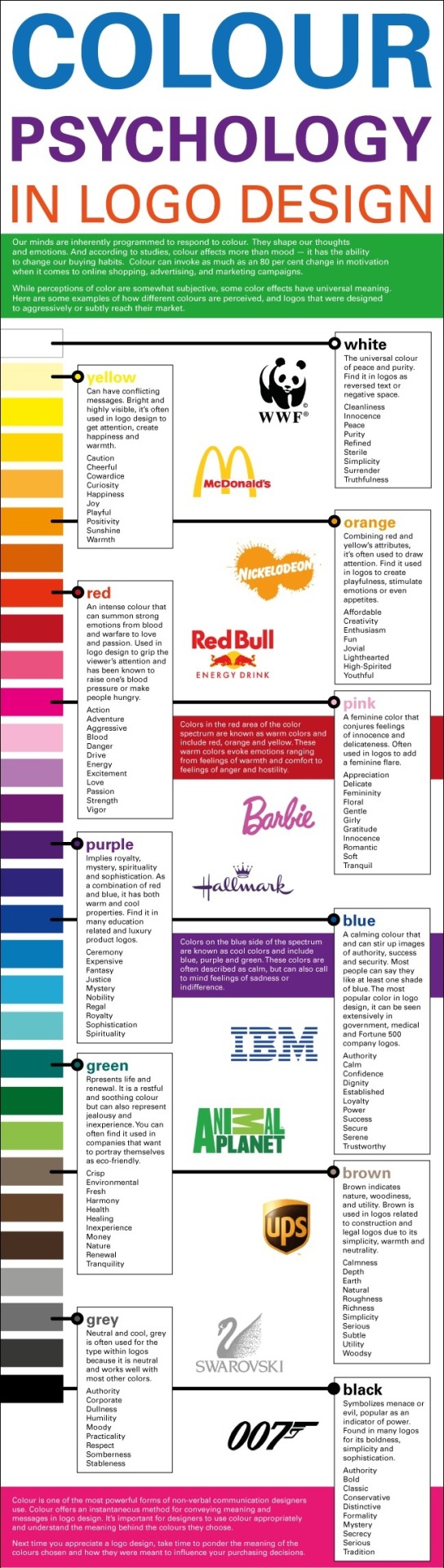
What Does Your Typeface Say About Your Brand?

Fonts perform a great role in your design, so you should know which fonts not to use in your designs. Either in typography or in web page design, the use of proper fonts is a great advantage. Sometimes, designs become disasters just because the font is not used properly or, in some sense, does not fit the occasion.
This calls for the proper selection. For decades, the Internet has constantly provided us with a vast database of fonts, all segregated by variety, style and use.
This lets us choose which to use. Because of this wide variety that we have, it is just fitting to say that nobody can have an excuse why they chose the wrong font. It’s also safe to say that with the liberty each designer has, he should pick the right fonts at the right time.
But some fonts, of course, tend to have become more popular because of their availability. Operating systems like Windows have provided default fonts for the user. It removes the hassle of choosing, downloading and installing them. This convenience has been good because of the easy access of readily available fonts but has become detrimental too because the fonts that were popularly used became cliché. Hence, they are to be avoided.
I tried to make a list of fonts that you should never use again. These were selected because they were too cliché and very hard to put into the design. The essence of this list is not to fully discriminate mainstream and cliché fonts but to properly use them for fitting occasions.
UNLIMITED DOWNLOADS: 400,000+ Fonts & Design Assets
Use of a sans serif signals to customers that your brand appreciates clean lines, has style and is easy to work with. Thinner stroke widths create a trendy vibe, while bolder strokes often feel important. Use a regular weight to take the emphasis off the type altogether, allowing it to fall into the rest of the design.
Sep 20, 2020 Fonts Help Building a Brand Personality. Brand personality refers to the personification of the brand. Adjectives like caring, cool, funny, luxurious, etc. Are associated with the brand because of their brand personality. Fonts have their very own personality and brands can capitalize on it if they use the right type of font for the right content.
Starting at only $16.50 per month!
Your visual brand consists of your colors, fonts, and the style of images you use on your website and in social media. Modernist brands will likely have to re-make their brand image more often than Classic brands to stay ahead of visual trends.
Comic Sans MS
Comic Sans MS is one of the basic Windows fonts installed in your computer as you boot up Windows. Microsoft first introduced this font in 1994. Comic Sans was designed by Vincent Connare as a child-oriented font. Its inspiration was mainly gotten from comic books in Connare’s office (they were Watchmen lettered by Dave Gibbons and The Dark Knight Returns lettered by John Costanza).
According to him, he originally designed the font to be used with speech bubbles and not for general use. But since then a lot of people have fallen in love with this font and it became a cliché.
One main reason why you should stop using this font is it is childish. It lacks formality, though it is used for formal events and announcements (doing facepalm right there). Unless of course you’re running a website for kids, or designing a first-birthday invitation, you could use these kinds of fonts (I said these kinds because you have other choices than Comic Sans).
Never use it for swimming pool rules signboards, grave epitaphs, commemorative plaques, hospitals, government job applications, heart transplant activities, and books.
Never use this font when you are designing for business sites, or warning signs. It might give people an impression that your client is childish and might not take them seriously. Never write DO NOT ENTER in Comic Sans, else, the reader might see it as “Do not enter says stupid childish whoever”.
Use Comic Sans MS only when your audience are below 6 years old (parent-letters not included), when you’re writing speech bubble contents for comics, and when you’re client is dying and his last will and testament said so.
Visit: Comics Sans Criminal
Subtitute Fonts:
Lexia Readable
P22 Kaz Pro
JM Doodle Medium
FF Friday Regular
Sharktooth Regular
Comic Strip
Papyrus
Remember that term paper about Egypt your teacher told you to write? I bet you used Papyrus back then! And I bet too, that you might as well, if you can, forget that shameful design experience.
Papyrus came out in 1983. Chris Costello successfully managed to design it after six months of manual hand-drawing. According to him, it was designed to imitate the pre-modern writing in papyrus leaves.
Be that as it is nobly designed, this font wasn’t really seen in papyrus rolls alone. You can now see it in captchas, advertisements, signboards, banners, books, and even in most typographic designs! It seemed to have been seen everywhere to the point that you might even vomit if you see it again in your page.
This saturation resulted to people hating the font. (For proof, find iheartpapyrus.com.)
Travis Estvold once wrote via blog.echoenduring.com:

“I, myself, hate when people use Papyrus—the font, that is, not the plant or the paper. I’ll be the first to admit it’s a strange thing to detest but whether it’s justified, this loathing is my constant companion. Surely, if someone proclaims the most bothersome part of his day is unearthing new and terrible ways in which locals have used and displayed a particular typeface, he must also be a designer. This is true… I’m not sure when my obsession with the font began, but my poor girlfriend, who has been a party to most of my Papyrus sightings over the past two years, can tell you it’s been building for some time.”
Truly, Papyrus is one of the ‘I-was-used-repeatedly-until-I-became-useless’ type of fonts.
Curlz MT
Okay, I personally loathe this font. Once a classmate of mine used this font in a letter sent to me and I went nuts. My eyes had a hard time reading and I got dizzy and nauseous! To my anger, I wrote him back. Guess what font I used, WINGDINGS! Imagine the hate in his face.
Curlz was originally designed by Carl Corssgrove and Steve Matteson in 1995. They were added into the default Windows fonts and were also originally created for party invitations. This font copied what happened to the Comic Sans Font, it became to mainstream to a point that people got sick and tired of them.
Aside from that, it lacks formality and authority. You can never use it in coat-and-tie events, warning signs and many more because it will just give your readers an impression of a joke. Curlz also has big issues with legibility. Imagine writing a book with Curlz MT font. People who read your book might sing, ‘You spin my head right round right round’. If you want to make your body readable, do not, not even in your drunk days, use this font in the body.
Now this font, too, has become overused. It’s almost everywhere too! Most people think that just because your website caters to women, you have all the right and privilege in the world to use this font.
Actually, the female target market does not oblige you to use Curlz MT. It is very wrong to think that women will fall for cute and curly letters. No, that would never happen. Well you might be able to attract middle-aged ex-cheerleaders who think they are still in middle school. I guess that would make an audience.
Arial
A designer friend of mine once said, if you have Helvetica, use it. Don’t settle for Arial.
According to designworkplan.com, Robin Nicholas and Patricia Saunders originally designed Arial in 1982. It was widely used as the standard typeface for normal computer usage. It became popular after the release of Windows 3.1 where it was installed as free. After that boom, the usage of the Arial font spread like wildfire across the globe.
People may have liked Arial because it is readily available in the operating system. Of course, the mentality is, why buy an expensive font if you could make do with what you have. The result? Arial explosion. Arial on magazines, on street signs, on banners on advertisements and even in TV! Of course this made most designers sick of it. Also, Arial has no proper and true Italics, which made it difficult for body texts to italicize with style.
Good thing, we can have substitutes for Arial nowadays. We can easily swap this ubiquitous font to make your body texts look new.
First is Verdana. Released in 1996, Verdana is one of the more popular substitutes to Arial because aside from its ready availability, Verdana is easier to read. Second is Tahoma. The Tahoma font was released with Win95 as part of the MS Office. It’s also readily available as Verdana is. Third is Trebuchet MS. Trebuchet MS was released with Windows 2000 and looks more like Verdana.
Courier New
Ever remembered the typewriter? Do you notice the resemblance of the typeface your typewriter produces and the font Courier New? Well, it’s supposed to look like it because it was how Howard “Bud” Kettler thought it to be in 1955. Courier is a slab serif type of font that was originally sold to IBM. It was made to look like a typewriter print because IBM originally made typewriters.
Kettler says that the font was called courier because instead of being a messenger, “a letter can can be the courier, which radiates dignity, prestige, and stability.”
Had it radiated dignity and prestige? I don’t think so. Courier’s stability as a font has been questioned a lot of times. All we know about the courier font is that it is a serif font. But aside from that, nothing. Courier had been suffixed with ‘New’ but I still see nothing new in it.
Courier are used for certain occasions like film scripts, codes and plain text documents. Web designers avoid courier because its lettering is not properly measured and it suggests a more ancient design. Also, because it was originally designed for typewriters, courier font letters have low-resolution and cannot be placed in the body artistically but it does look good with a green background.
What Does Your Typeface Say About Your Brand Name
The Courier font is used on movie scripts, novel manuscripts and other forms of literary art. But in web design it has no place, unless you want your website to look like it’s fresh out of the typewriter.
For font alternatives, try Cousine.
Cousine was designed by Steve Matteson as an innovative, refreshing sans serif design that is metrically compatible with Courier New™. Cousine offers improved on-screen readability characteristics and the pan-European WGL character set and solves the needs of developers looking for width-compatible fonts to address document portability across platforms.
Times New Roman
One of the best updates Microsoft Word had in the past years is its use of a new default font. In previous version, I recall that Times New Roman was the default font used. I personally didn’t like Times New Roman because it’s very hard to read and suggests a mood of laziness in it.
For a fact, Times New Roman was named after the Times of London, a British newspaper. They needed a new body text font for their paper in 1929. They hired a guy named Stanley Morison of Monotyope, a British company. Morison did the job with Victor Lardent as supervisor and eventually named it Times New Roman.
Then on, the font was used in most body texts and has been popularized as it became Microsoft Office’s default font. This led to its status of being cliché. It became so overly used to a point when people found it disgusting and insulting to use.
Most designers see the Times New Roman font as narrow-spaced because they are originally designed for newspapers and though it is formal in nature, Times New Roman’s bold typeface makes it hard to read and thus loses its formality. Spacing has also been a problem for Times.
If you can avoid it, please do. You can substitute with fonts like Concourse, which is a sans serif font which can be used for more formal situations and legalities. Equity is also a good font as it is a combination of classic and convenient designs. Book Antiqua is also a good candidate and has better spacing flexibility than Times.
Bradel Hand ITC
It might come to his senses that Richard Bradley might soon be sick and tired of seeing his handwriting. I mean, it’s literally everywhere. It might even cause him a very serious headache to even see his penmanship!
Richard Bradley is the designer of the seemingly abused Bradley Hand ITC font. According to Microsoft, this font is an informal script- based font. It is characterized as warm and familiar in nature and has a relaxed rhythm typical to the real handwriting.
Being a readily available font, this font has been used to convey a personal touch in the sans-serif font because fonts like Arial and Helvetica cannot do this. Producing a handwritten-like design will make it look like the designer himself bothered to personally write. That is why it was used in a lot of occasions like posters, school announcements, bulletin boards, cards, invitations and even in story books.
But this, sadly, all resulted into chaos as it was turned into a cliché. Aside from this, the Bradley Hand ITC font is ineligible. If you’ll use it for headings and announcements, which should be seen from afar, it will not become visible as it is thin, even if emphasized. Meanwhile, if you’ll use it in the body, your reader will probably go mad because he would not understand the text properly because Bradley Hand’s readability goes lower as it size decreases.
Personally, I wound not suggest any alternative for handwritten fonts because I totally don’t want to use them as they are difficult to place together with other elements in the design. So might as well stick to your Helvetica.
Vivaldi
A guy named Freidrich Peter designed this intricate script typeface. It is very calligraphic and copperplate-ish. Because it is a script font, Vivaldi is commonly used in wedding invitations and other formal events.
Vivaldi is pretty formal and good except that it has problems in spacing. Vivaldi characters tend to get crowded because they are not full scripts, meaning their characters are not woven into one stroke only. For a semi-script, it is very much condensed.
This results to difficulty in reading. Yes, you may adjust the spacing between letters, but I won’t even think of that in semi-scripts. Expanding the spaces will result to inconsistency in the font design.
One more problem I see with Vivaldi is its caps. When you capitalize a whole word in the Vivaldi font, it would be pretty difficult to read and discern the difference between letters. I tell you. Try it if you don’t believe me.
Kristen ITC
Kristen ITC is one of the cutie-patootie fonts. It was designed by George Ryan for the International Typeface Corporation. It consist of two weights and was inspired by a handwritten menu at a Cambridge restaurant. This font is asymmetric and resembles the handwriting of a toddler. Like Comic Sans, this font is targeted to the child target market and was impliedly drawn to attract little children.
Kristen font users are usually grade schoolers, gradeschool teachers, child psychologists, and other people who work for kids. The font is playful in nature. You can almost see it in your children’s classrooms all saying how life should be good and that they eat a lot of vegetables.
What Does Your Typeface Say About Your Brand Say
But Kristen should be pretty much avoided. A designer should always think of the issues this font poses. First is that it is has no formality. Using this font in a legal document could make you lose a case. Second thing, is that Kristen’s non-caps are placed in the middle part of the caps. Unlike other fonts that place the non-cap characters as where the cap character baseline are.
Manual spacing could also be a problem as the spacing of the capitals of the font are difficult to measure since the characters are a little bit curved.
Viner Hand
Viner hand is an informal script font developed from the handwriting of John Viner. I’m pretty sure this font sucks because it has been overused, like the others in this list. Commonly, this font has been abused by angsty teenagers and goth wannabes.
Other Fonts to Avoid Using
Mistral
Impact
Symbol
Stencil
What Does Your Typeface Say About Your Brand Say
Wide Latin
Conclusion
For a designer, originality is everything. Fresh designs should always be produced by his rather queer mind. He should always be innovative with the design trends that happen around him. He should also be experimental in the trends he use for designing.
That is why one must not be satisfied by the fonts present in his computer. He should look and look and look until he finds that font that suits him.
Remember, a good designer has no go-to fonts.
This post may contain affiliate links. See our disclosure about affiliate links here.
0 notes
Text
Branding 101: Creating the Visual Identity for Your Business
There are so many things to think about when first starting a business. What will your business offer? How will this differ from existing solutions? Who will benefit most from your offering? And why are you so passionate about this?
If you haven’t done so yet, work through this exercise to come up with your brand identity and business name.
Once you’ve figured out your brand identity, you have to create a visual identity — also referred to as brand imagery — to go along with it.
While you could easily throw together visual elements that speak to you, your goal should be to choose visuals that resonate with your audience. So, building your visual identity is going to require some work.
In the following post, we’re going to look at how your brand’s visual style can give off certain signals to those who encounter it (and how to use those to your advantage). We’ll also break down what you need, to piece together your visual identity.
The Power of Visual Identity
Each of the design choices you make that website visitors, social media followers, and customers can see will impact how they approach your brand. Are you a fun-loving company that caters to a younger crowd? Do you create high-tech products that solve serious global problems? Are you a successful entrepreneur who’s reshaping the way we talk to one another?
When done right, our brand visuals convey our brand’s personality, values, and mission without having to use any words.
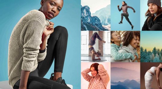
Think about your favorite clothing brand. What do you picture? Let’s use Athleta as an example.
The logo is probably the first visual element that comes to my mind:

The grey radial shape is one I’m very familiar with. It’s on their website, their social media, and it’s usually imprinted somewhere on their clothing.
The second thing I think about when I think of Athleta is its physical imagery:

Rather than include images of the clothing on its own, there’s often someone wearing Athleta clothes while hiking along a trail, walking on a beach, or working out in a studio.
There’s so much that just these two visual elements tell us about this brand:
Athleta targets active female consumers; we see this in its images and CTAs. The fine touches and shape of the logo may suggest this as well.
Athleta creates understated but highly functional clothing; we see this in the product photos as well as in the brand’s use of neutral colors and fonts across its designs.
Athleta’s mission is to help customers have a healthier and more balanced life; we see this in its product photos, but we also get a sense of this from the simple symmetric structure of the logo.
There are overt ways to use visuals in your branding (usually through your choice of photos or illustrations). But there are also ways to subtly convey more about your company, what it does, and for whom you work through your choice of colors, fonts, structure, and more.
How to Create a Visual Identity for Your Brand
Let’s walk through each of the elements you need to pull together to create your visual identity:
The Color Palette
Like with everything else in business, you’re here to give your audience something they need, so they have to be at the forefront of your decisions — including which colors you put into your brand’s palette.
So, where do you start in choosing a color palette for your site and other marketing channels?
Let’s take a systematic approach.
1. Choose a Primary Color
Go to the Canva color meanings and symbolism tool.

Have a look through the colors and find one that feels good to you. Open up the page and read more about what the color means:

You’ll find the following on each page:
A brief history on the color;
How it’s been used by people over the years;
What it’s symbolized over the years and around the world;
How to use the psychology of the color to affect people (i.e. your audience);
Alternate shades and colors if this particular one doesn’t send the right signals;
Colors that pair nicely with this one.
While it’s important to consider how colors evoke different emotions, it shouldn’t be the only driving force. Your primary focus should be to choose colors that positively affect the user experience. In other words, you don’t want them to get in the way or distract prospects from getting to know your brand and eventually converting.
2. Create a Full Color Palette
Once you’ve picked a primary color, you need to come up with a color palette. You’ll want one or two colors to use in your logo and a full color palette for your website and other branded channels.
You can use Canva’s palette suggestions (in the top-right corner of the color page) to create a basic color palette.
For something a little more robust, use Material Design Palette:

Color options are a bit limited, but it does a good job of spelling out where you should use each color. You can then adjust the color palette as you see fit.
Typography
The design and pairing of your fonts can greatly impact the way people respond to your brand and the words you’ve written about it.
So, the goal with typography is to make your words easy to read while also giving hints about your company’s personality and style.
1. Understand Font Styles
Figure out what style of font goes best with your brand identity.
This is the simplest way to categorize fonts:
Sans serif: These are simple fonts without any “feet” (lines at the ends of letters).
Serif: These are more traditional-looking fonts (the kinds you see in literature and newspapers) with feet.
Script: These are cursive and curly fonts that mimic handwriting.
Display: These are fonts designed specifically to appear in logos, hero images, and advertising because of their large, bold styling.
Monospaced: These are fonts with characters that comprise the same amount of horizontal space, often resembling typewritten text.
You can break these down even further and really get to the root of the style. Fonts.com has a great explainer page on each of these classifications:

Here are some sources to help you find fonts for your brand:
Google Fonts
Open source fonts
JavaScript library plugins
Independent font foundries
2. Settle on Two or Three Fonts
Choose two or three fonts for your brand. Max. Anything more than that will create a distracting and overwhelming interface for your audience.
You’ll need:
A font for your header text. It needs to look good in big sizes, be easy to read, and easy to identify from other text when scanning through a page or document.
A font for your body text. It needs to look good in small sizes (16 pixels and up) and be highly legible.
Optional: A font for your logo and hero images. It wouldn’t stray too far from the style of your headers, but if you need something a bit more decorative or unique, you can use a different font family for this.
If you find that you need more variety in your fonts to create a clearer hierarchy on the page or to call out certain elements, use superfamilies with dozens or even over a hundred different styles. That way, your users’ eyes won’t get fatigued from having to switch between too many font types.
3. Learn Font Pairing Rules
To pair fonts, use styles that contrast yet complement one another. Ultimately, you want the pairing of your fonts to send a cohesive message to your audience.
For example, a sans serif header and serif body are a common way to combine fonts. Like this pairing of Fira Sans and Merriweather from the FontPair website:

This modern-looking duo sends the message that: “Your comfort is priority #1 for us. Take your time reading and enjoy.”
There are tons of ways to make varying styles play off one another while sending the right signals to your audience: A safe serif with a retro cursive header font to come off as a playful, yet professional brand; a futuristic header and a neutral sans serif body font to give your product pages a very techy feel; and so on…
Once you have one or two fonts you like the vibe of, use FontPair to track down a good complement to the one you want to use.
Imagery
We can use this as a blanket category for any visual content you might use in your branding:
Photos
Videos
Illustrations
Icons
Backgrounds
Textures
Animations or GIFs
But just because there’s all this content to use, that doesn’t mean it should all appear on the same site to represent the same brand. You’ll want to narrow it down based on your company’s personality and how the style of imagery fits with it.
1. Photos vs. Illustrations
You can alter your brand’s voice and style based on the kind of imagery you use.
For instance, tech companies like Stripe often use illustration in their brand designs:

Even though SaaS companies sell one type of product, their audiences are usually quite vast, so it would be hard to find photos that represent everyone. And it’s not like users are focused on their relationships with the people behind the scenes. These companies put technology into the hands of their users, so it’s best to let the product shine and not the people. This opens up the door for some fun and creative possibilities with illustrations.
That said, choosing photos over illustrations doesn’t completely bar you from using vector graphics and icons. You can mix-and-match those visuals so long as they blend well with one another. What you don’t want to do is to mix two very different styles that say different things about your brand at once.
To decide what’s best for your brand, approach this from your users’ point-of-view. What kind of visuals will help them connect to your brand and what you sell?
2. Style
It’s not just the type of image you use that impacts your brand identity. It’s the style you apply to those visuals that can transform your visuals, putting visitors in a different time, place, or headspace.
Will you apply a filter to give your photos a similar look and feel?
Will you place each of your product photos against the same backdrop for a uniform look?
Will you use a completely new style of imagery for one of your product lines the way Apple has done for the iPhone 12?

There’s nothing wrong with using out-of-the-box imagery. However, if they don’t give off quite the right tone, don’t be afraid to use your design skills to make adjustments and cater them to your own style.
Logo
Your logo is the last of the visual elements you’ll need to invest some time in. The good news is that you’ve already done most of the legwork:
You’ve defined your brand’s identity.
You’ve given your business a name.
You’ve selected the main visual components that will represent your brand: colors, fonts, and images.
That’s really all you need to create a logo that is relevant, unique, attractive, potent, and memorable.
That and a way to bring it all together. You have a few options.
Option #1: If you’re a graphic designer, you can create your own from-scratch.
Option #2: If you want help getting started, you can use a tool like Wix Logo Maker:

You’ll fill out a short questionnaire and then receive dozens of pre-made logos to start with. You’ll later have the chance to customize the design to your liking.
Option #3: You can hire someone to design a totally custom logo.
Wrapping Up
In the next post in this three-part series, we’re going to look at the next step:
Getting your business online.
We’ll take everything you’ve done so far in coming up with a business name, brand identity, and now visual identity, and put it towards your website and the marketing channels that are best for your business.
Source from Webdesigner Depot https://ift.tt/367CU2q from Blogger https://ift.tt/3k4sWnK
0 notes
Photo
50+ Best Google Fonts: How to Choose Fonts for Your Business https://ift.tt/2Yoeyvp
Google Fonts are one of the most popular typeface fonts you’ll find online. If you’re currently running an online Shopify store you’ll know that you’re using Google Fonts on your website. Google web fonts are often the standard fonts examples used by popular brands like Canva. Whether you’re looking for the best Google font combinations or need help finding handwriting Google Fonts, this article breaks down the best web fonts you can use for your website or design work.
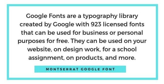
What are Google Fonts?
Google Fonts are a typography library created by Google with 923 licensed fonts that can be used for business or personal purposes for free. They can be used on your website, on design work, for a school assignment, on products, and more.
These fonts are already installed on popular platforms like Shopify and Canva, simplifying design for business owners. However, you can also download the web fonts on your computer for personal use as well.
How to Choose Google Fonts
Several factors can help you decide on which Google Font to choose. When it comes to choosing a web font to use, you should consider readability, purpose, Google font combinations, popularity, and intuition. Here are a few ideas to help you better understand which fonts you should use in different situations:
1. Readability
If you’re composing a book, blog content, or anything text-heavy you should consider choosing a serif font. A serif font is one where it appears like the letters have “feet.” These feet connect the letters closer together which helps make them easier to read. If you look at sans serif fonts, they don’t have these feet-like extensions, which makes it slightly more difficult to read longer passages.
2. Purpose
When it comes to choosing a font, it can boil down to the purpose it’s being used for. For example, you might use Google Fonts handwriting font when it comes to wedding invitations as it’s customary to use cursive fonts in that setting. You might choose a more formal font like Helveticish for your resume since it’ll create a cleaner look. If you’re using a funkier font like ABYS, it’ll be to highlight a word or two in a design rather than for something more text-heavy. You want to choose a Google font that’s appropriate for the design, context, and industry you’re using the font for.
3. Best Google Font Combinations
We’ll share some Google Font combinations later on in this article. However, when choosing a pair of fonts, you should consider how complementary they are to one another. You might pair a modern sans serif title with a serif body text.
Fine stroke fonts work well as titles and pair well with readable serif body fonts to create a clean and easy to read look.
A bolded serif Google font can pair with a popular sans serif font for text light copy.
4. Use Popular Fonts
With over 900 fonts, you might think that any of them could work on any occasion. However, most designers will often resort to the same few number of fonts that work well for most designs. For example, when creating pins on Pinterest, I noticed that the Google font Playfair Display works well at compelling clicks when it’s italicized. I’ve tried several other fonts on the platform but my best-performing pins always come from that same Google font. With experience, you’ll start to select your top few fonts too. It’s okay to use the same Google Fonts frequently. If it works, don’t be afraid to keep using it.
5. Go With Your Gut
Sometimes a font seems right and other times it seems off. While some of the rules above can help you determine the right font, there are just too many Google Fonts to create perfect rules for. At times, you’ll need to experiment and play around with the font selections to see what looks best. If you understand the standard graphic design principles and elements, you’ll have a better idea of which font works best when working on a whole design.
Why Google Fonts Are Important
Google Fonts are important because they allow you to communicate different tones and brand personalities using typography. The fact that there are over 900 free Google web fonts allows businesses on a budget to use different typography without needing to pay for licenses for new fonts.
50+ Google Fonts to Use in 2019
Best Google Fonts
Roboto
Open Sans
Lato
Oswald
Slabo 27 px
Roboto Condensed
Montserrat
Source Sans Pro
Raleway
PT Sans
Google Fonts List
There are currently 923 Google Fonts. Here are a few on the Google Fonts list:
Playfair Display
Bitter
Libre Baskerville
Archivo Narrow
Alegreya Sans
Ubuntu
Crimson Text
Heebo
Cabin
Lobster
Free Google Fonts
Pacifico
Abril Fatface
Barlow
Bree Serif
Bonbon
Ropa Sans
Amiri
Orbitron
Zilla Slab
Great Vibes
Best Font for Website
Playfair Display
Cantata One
Roboto Slab
Cardo
Montserrat
Poppins
Merriweather
Lora
Domine
Karla
Best Serif Google Fonts
Roboto Slab
Crimson Text
Slabo 27px
EB Garamond
Amiri
Neuton
Zilla Slab
Josefin Slab
Unna
Abhaya Libre
Best Sans Serif Google Fonts
Roboto
Ubuntu
Rubik
Cabin
Heebo
Notable
Barlow
Archivo Narrow
Asap
Ropa Sans
Best Google Fonts Handwriting
Indie Flower
Pacifico
Shadows Into Light
Bonbon
Amatic SC
Great Vibes
Architects Daughter
Nothing You Could Do
Reenie Beanie
Sue Ellen Francisco
Best Google Fonts Display
Squada One
Bahianiata
Barriecito
Mountains of Christmas
Lobster
Abril Fatface
Righteous
Comfortaa
Geostar
Patua One
Best Google Fonts Monospace
Roboto Mono
Inconsolata
Source Code Pro
Cousine
PT Mono
Nanum Gothic Coding
Space Mono
Anonymous Pro
Cutive Mono
Oxygen Mono
Google Fonts for Android
Literata
Lato
Montserrat
Open Sans
Raleway
Oswald
Merriweather
Poppins
Roboto Slab
Playfair Display
Best Google Fonts for Logos
Karla
Work Sans
Oswald
Roboto
Rubik
Poppins
Cabin
Montserrat
Chivo
Lato
Best Google Web Fonts
Cutive Mono
Cabin
Bitter
Arvo
Anton
Notable
Fjalla One
Mukta
Varela Round
Darker Grotesque
Best Font Family For Website
Montserrat
Raleway
Roboto
Poppins
Libre Franklin
Source Sans Pro
Muli
Barlow
Exo
Overpass
Google Fonts Shopify
Abril Fatface
Pacifico
Rancho
Sansita One
Inconsolata
Anonymous Pro
Fira Sans
Lato
Istok Web
Bitter
Google Fonts WordPress
Prompt
Rokkitt
Courgette
Alegreya
Old Standard TT
Cardo
Zilla Slab
Pathway Gothic One
Cantarell
Nanum Myeongjo
Best Google Font Combinations
Vast Shadow – Playfair Display
Montserrat – Droid Serif
Oswald – Roboto
Lato – Merriweather
Raleway – Roboto Mono
Abel – Ubuntu
Proza Libre – Open Sans
Rubik – Karla
Bree Serif – Lora
Poppins – Anonymous Pro
How to Download Google Fonts
1. On the Google Fonts website, select all the fonts you want to download by clicking the plus sign in each font’s section.
2. Next, open the pop-up on the bottom of the screen
3. Select the down arrow (download icon)
4. Press “Download”
5. A zip file will download
6. Open the file and click on the first font
7. Manually install each font in the folder
How to Install a Google Font on Your Website
You can install any Google Font that isn’t currently installed on your website. One of the easiest ways to do this is to install a paid Shopify app on your store. For example, Fontify by Nitro App allows you to install any font you want on your website without needing to know how to code.
Otherwise, you’ll need to edit your theme settings. Be sure to duplicate your theme so you don’t lose any of your work in case something goes wrong. If you’d rather not do it yourself and don’t want to pay for an app, you can hire a Shopify expert. Shopify experts have experience modifying themes and can add any Google font you’d like to your website for a one-time fee. If you’re not sure on which font you want, download several web fonts at once to avoid paying more than you need to.
You can also embed Google Fonts on your website. For example, head to the official website. Then, click the plus sign on the font you want. A pop-up will appear. Then, under “Embed,” copy and paste the code at the top of the HTML section of your website. This will result in your text showing up in that font. This process can be a bit manual, but it’s a quick fix for those who aren’t tech-savvy and on a tight budget.
Google Font Generators
1. Canva
Canva’s font generator allows you to find the best Google Font combinations. Whether you’re creating an advertisement or a social media post, you may decide to use two fonts. One of those fonts can be used as a header and the other for the subtext. You can then use those fonts to design and create content on Canva’s platform which also uses various Google Fonts. All you need to do is type in or select the font you want to find a combination for. Then, Canva will present its best match to you. Not all fonts are available on this tool but you’ll find some of the best Google Fonts.
2. Font Pair
Font Pair’s Google font generator helps you find font pairs for your website or other forms of content. The comprehensive website is centered around fonts based on different font families. For example, you can find san serif and serif font combinations or display and serif font combinations. So if you’re looking to match two specific font families, this Google font generator will do the trick.
3. Fontjoy
Fontjoy’s Google font generator showcases three fonts in use. The top font is the best font for the headline, the second font and the subheading, and the third font is the body. You don’t need to use all three fonts. For example, if you’re looking for a title and body font for your website, you can choose the first and third font only. The great thing about this tool is that you see the font in action to help you understand whether this font combination is the right fit for your needs.
4. Analytics
Analytics might not be a Google font generator in the traditional sense. However, it educates you on what the most popular Google Fonts are. If you’re looking to stick to the most popular web fonts, you’ll quickly learn that Roboto is at the top of the list. In psychology, there’s something called mere exposure effect which means that people like things that are most familiar to them. By sticking with best Google web fonts, people “in theory” will prefer the font they see.
Conclusion
Google Fonts can be used for social media graphics, t-shirt designs, websites, and other marketing elements for your online business. When choosing a font remember to consider the tone, readability, and appropriateness of the font for the given situation. It’s okay if you find yourself using the same style of fonts for your work, designers do that all the time. Focus on choosing the Google web fonts that work best for your goal and it’ll help complete the look of your design.
Which Google Fonts do you use on your online store? Comment below!
Want to Learn More?
How to Use Google Trends: 10 Mind-Blowing Tricks for Entrepreneurs
20 Ways to Use Google Calendar to Maximize Your Day in 2019
How to Use Google Analytics for Your Ecommerce Business
23 Amazing Google Chrome Extensions That You Need to Use in 2019
The post 50+ Best Google Fonts: How to Choose Fonts for Your Business appeared first on Oberlo.
from Oberlo
Google Fonts are one of the most popular typeface fonts you’ll find online. If you’re currently running an online Shopify store you’ll know that you’re using Google Fonts on your website. Google web fonts are often the standard fonts examples used by popular brands like Canva. Whether you’re looking for the best Google font combinations or need help finding handwriting Google Fonts, this article breaks down the best web fonts you can use for your website or design work.
What are Google Fonts?
Google Fonts are a typography library created by Google with 923 licensed fonts that can be used for business or personal purposes for free. They can be used on your website, on design work, for a school assignment, on products, and more.
These fonts are already installed on popular platforms like Shopify and Canva, simplifying design for business owners. However, you can also download the web fonts on your computer for personal use as well.
How to Choose Google Fonts
Several factors can help you decide on which Google Font to choose. When it comes to choosing a web font to use, you should consider readability, purpose, Google font combinations, popularity, and intuition. Here are a few ideas to help you better understand which fonts you should use in different situations:
1. Readability
If you’re composing a book, blog content, or anything text-heavy you should consider choosing a serif font. A serif font is one where it appears like the letters have “feet.” These feet connect the letters closer together which helps make them easier to read. If you look at sans serif fonts, they don’t have these feet-like extensions, which makes it slightly more difficult to read longer passages.
2. Purpose
When it comes to choosing a font, it can boil down to the purpose it’s being used for. For example, you might use Google Fonts handwriting font when it comes to wedding invitations as it’s customary to use cursive fonts in that setting. You might choose a more formal font like Helveticish for your resume since it’ll create a cleaner look. If you’re using a funkier font like ABYS, it’ll be to highlight a word or two in a design rather than for something more text-heavy. You want to choose a Google font that’s appropriate for the design, context, and industry you’re using the font for.
3. Best Google Font Combinations
We’ll share some Google Font combinations later on in this article. However, when choosing a pair of fonts, you should consider how complementary they are to one another. You might pair a modern sans serif title with a serif body text.
Fine stroke fonts work well as titles and pair well with readable serif body fonts to create a clean and easy to read look.
A bolded serif Google font can pair with a popular sans serif font for text light copy.
4. Use Popular Fonts
With over 900 fonts, you might think that any of them could work on any occasion. However, most designers will often resort to the same few number of fonts that work well for most designs. For example, when creating pins on Pinterest, I noticed that the Google font Playfair Display works well at compelling clicks when it’s italicized. I’ve tried several other fonts on the platform but my best-performing pins always come from that same Google font. With experience, you’ll start to select your top few fonts too. It’s okay to use the same Google Fonts frequently. If it works, don’t be afraid to keep using it.
5. Go With Your Gut
Sometimes a font seems right and other times it seems off. While some of the rules above can help you determine the right font, there are just too many Google Fonts to create perfect rules for. At times, you’ll need to experiment and play around with the font selections to see what looks best. If you understand the standard graphic design principles and elements, you’ll have a better idea of which font works best when working on a whole design.
Why Google Fonts Are Important
Google Fonts are important because they allow you to communicate different tones and brand personalities using typography. The fact that there are over 900 free Google web fonts allows businesses on a budget to use different typography without needing to pay for licenses for new fonts.
50+ Google Fonts to Use in 2019
Best Google Fonts
Roboto
Open Sans
Lato
Oswald
Slabo 27 px
Roboto Condensed
Montserrat
Source Sans Pro
Raleway
PT Sans
Google Fonts List
There are currently 923 Google Fonts. Here are a few on the Google Fonts list:
Playfair Display
Bitter
Libre Baskerville
Archivo Narrow
Alegreya Sans
Ubuntu
Crimson Text
Heebo
Cabin
Lobster
Free Google Fonts
Pacifico
Abril Fatface
Barlow
Bree Serif
Bonbon
Ropa Sans
Amiri
Orbitron
Zilla Slab
Great Vibes
Best Font for Website
Playfair Display
Cantata One
Roboto Slab
Cardo
Montserrat
Poppins
Merriweather
Lora
Domine
Karla
Best Serif Google Fonts
Roboto Slab
Crimson Text
Slabo 27px
EB Garamond
Amiri
Neuton
Zilla Slab
Josefin Slab
Unna
Abhaya Libre
Best Sans Serif Google Fonts
Roboto
Ubuntu
Rubik
Cabin
Heebo
Notable
Barlow
Archivo Narrow
Asap
Ropa Sans
Best Google Fonts Handwriting
Indie Flower
Pacifico
Shadows Into Light
Bonbon
Amatic SC
Great Vibes
Architects Daughter
Nothing You Could Do
Reenie Beanie
Sue Ellen Francisco
Best Google Fonts Display
Squada One
Bahianiata
Barriecito
Mountains of Christmas
Lobster
Abril Fatface
Righteous
Comfortaa
Geostar
Patua One
Best Google Fonts Monospace
Roboto Mono
Inconsolata
Source Code Pro
Cousine
PT Mono
Nanum Gothic Coding
Space Mono
Anonymous Pro
Cutive Mono
Oxygen Mono
Google Fonts for Android
Literata
Lato
Montserrat
Open Sans
Raleway
Oswald
Merriweather
Poppins
Roboto Slab
Playfair Display
Best Google Fonts for Logos
Karla
Work Sans
Oswald
Roboto
Rubik
Poppins
Cabin
Montserrat
Chivo
Lato
Best Google Web Fonts
Cutive Mono
Cabin
Bitter
Arvo
Anton
Notable
Fjalla One
Mukta
Varela Round
Darker Grotesque
Best Font Family For Website
Montserrat
Raleway
Roboto
Poppins
Libre Franklin
Source Sans Pro
Muli
Barlow
Exo
Overpass
Google Fonts Shopify
Abril Fatface
Pacifico
Rancho
Sansita One
Inconsolata
Anonymous Pro
Fira Sans
Lato
Istok Web
Bitter
Google Fonts WordPress
Prompt
Rokkitt
Courgette
Alegreya
Old Standard TT
Cardo
Zilla Slab
Pathway Gothic One
Cantarell
Nanum Myeongjo
Best Google Font Combinations
Vast Shadow – Playfair Display
Montserrat – Droid Serif
Oswald – Roboto
Lato – Merriweather
Raleway – Roboto Mono
Abel – Ubuntu
Proza Libre – Open Sans
Rubik – Karla
Bree Serif – Lora
Poppins – Anonymous Pro
How to Download Google Fonts
1. On the Google Fonts website, select all the fonts you want to download by clicking the plus sign in each font’s section.
2. Next, open the pop-up on the bottom of the screen
3. Select the down arrow (download icon)
4. Press “Download”
5. A zip file will download
6. Open the file and click on the first font
7. Manually install each font in the folder
How to Install a Google Font on Your Website
You can install any Google Font that isn’t currently installed on your website. One of the easiest ways to do this is to install a paid Shopify app on your store. For example, Fontify by Nitro App allows you to install any font you want on your website without needing to know how to code.
Otherwise, you’ll need to edit your theme settings. Be sure to duplicate your theme so you don’t lose any of your work in case something goes wrong. If you’d rather not do it yourself and don’t want to pay for an app, you can hire a Shopify expert. Shopify experts have experience modifying themes and can add any Google font you’d like to your website for a one-time fee. If you’re not sure on which font you want, download several web fonts at once to avoid paying more than you need to.
You can also embed Google Fonts on your website. For example, head to the official website. Then, click the plus sign on the font you want. A pop-up will appear. Then, under “Embed,” copy and paste the code at the top of the HTML section of your website. This will result in your text showing up in that font. This process can be a bit manual, but it’s a quick fix for those who aren’t tech-savvy and on a tight budget.
Google Font Generators
1. Canva
Canva’s font generator allows you to find the best Google Font combinations. Whether you’re creating an advertisement or a social media post, you may decide to use two fonts. One of those fonts can be used as a header and the other for the subtext. You can then use those fonts to design and create content on Canva’s platform which also uses various Google Fonts. All you need to do is type in or select the font you want to find a combination for. Then, Canva will present its best match to you. Not all fonts are available on this tool but you’ll find some of the best Google Fonts.
2. Font Pair
Font Pair’s Google font generator helps you find font pairs for your website or other forms of content. The comprehensive website is centered around fonts based on different font families. For example, you can find san serif and serif font combinations or display and serif font combinations. So if you’re looking to match two specific font families, this Google font generator will do the trick.
3. Fontjoy
Fontjoy’s Google font generator showcases three fonts in use. The top font is the best font for the headline, the second font and the subheading, and the third font is the body. You don’t need to use all three fonts. For example, if you’re looking for a title and body font for your website, you can choose the first and third font only. The great thing about this tool is that you see the font in action to help you understand whether this font combination is the right fit for your needs.
4. Analytics
Analytics might not be a Google font generator in the traditional sense. However, it educates you on what the most popular Google Fonts are. If you’re looking to stick to the most popular web fonts, you’ll quickly learn that Roboto is at the top of the list. In psychology, there’s something called mere exposure effect which means that people like things that are most familiar to them. By sticking with best Google web fonts, people “in theory” will prefer the font they see.
Conclusion
Google Fonts can be used for social media graphics, t-shirt designs, websites, and other marketing elements for your online business. When choosing a font remember to consider the tone, readability, and appropriateness of the font for the given situation. It’s okay if you find yourself using the same style of fonts for your work, designers do that all the time. Focus on choosing the Google web fonts that work best for your goal and it’ll help complete the look of your design.
Which Google Fonts do you use on your online store? Comment below!
Want to Learn More?
How to Use Google Trends: 10 Mind-Blowing Tricks for Entrepreneurs
20 Ways to Use Google Calendar to Maximize Your Day in 2019
How to Use Google Analytics for Your Ecommerce Business
23 Amazing Google Chrome Extensions That You Need to Use in 2019
The post 50+ Best Google Fonts: How to Choose Fonts for Your Business appeared first on Oberlo.
https://ift.tt/2YuS3ZV July 29, 2019 at 04:00AM https://ift.tt/2YsnuQq
0 notes
Text
HOW TO BUILD A BRAND?
How to build a brand is a difficult task with many complicated work that you may not know where to start. These are many questions that inevitably come up when you start trying to connect the bridge between what you’re selling and who you’re trying to reach.
So what exactly is a “brand”?
A brand isn’t just a recognizable name and logo that distinguishes you in a crowded market. In other words, your brand is how people perceive you wherever they interact with your business—both the impressions you can control and the ones you can’t. Actually, each person has a brand too. We each have a name, a face, a style, a way of communicating, different impressions we make on different people, and what they say about us when we’re not in the room. Likewise, businesses have names, products, logos, colors, fonts, voices, and reputations to manage that make up who they are and affect how they’re perceived.
Building a brand needs consistent and maintaining that consistency as you extend your brand to every part of your business. But it all starts with establishing what that consistency is going to look like and the feeling you want it to evoke.
Here are 7 steps to build a brand from the scratch:
Find out your place in the market
Before starting to make any decisions about your business brand, you need to have knowledge about current market: potential customers and current competitors. Here are some ways to do that:
Google your product or service category and analyze direct and indirect competitors that come up.
Check subreddits that relate to your customers and eavesdrop on their conversations and product recommendations.
Talk to people who are part of your target market and ask them what brands they buy from in your space.
Look at the relevant social media accounts or pages your target audience follows and are receptive to.
Go shopping online or offline and get a feel for how your customers would browse and buy products.
Besides, make a note when you are doing things above:
Who your “lowest hanging fruit” customers are—the ones you could most easily sell to.
Who your top of mind competitors are—the brands that are established and known in the market.
How your customers speak and what they talk about—the interests they have and the language they express them in.
Define your brand’s focus and personality
In the beginning, your brand has no value to other people. It’s important to find your focus and let that inform all the other parts of your brand as you build it. Here are some questions and branding exercises to get you thinking about the focus and tone of your brand.
What’s your positioning statement? A positioning statement is one or two lines that stake your claim in the market. Your unique value proposition is the one thing you’re competing on. Find it, go in on it, and make it a part of your brand’s messaging.
In detail, your positioning statement should go something like…
We offer [PRODUCT/SERVICE] for [TARGET MARKET] to [VALUE PROPOSITION].
Unlike [THE ALTERNATIVE], we [KEY DIFFERENTIATOR].
Your unique value proposition is the one thing you’re competing on. Find it, go in on it, and make it a part of your brand’s messaging.
What words would you associate with your brand?
One way to look at your brand is as if it was a person. What would he or she be like? What kind of personality would your customers be attracted to? You need to focus on how to build a brand personality.
What metaphors or concepts describe your brand?
Thinking about your brand as a metaphor or personifying it can help you identify the individual qualities you want it to have. This can be a vehicle, an animal, a celebrity, a sports team, anything—as long as it has a prominent reputation in your mind that summons the sort of vibe you want your brand to give off.
Choose a business name
Depending on the kind of business you want to start, you can make the case that your name matters very little or it matters a lot.
As we’ve said before, a brand is so more than a name. The personality, actions, and reputation of your brand are really what give the name meaning in the market. But as a business owner, your company’s name is probably one of the first big commitments you have to make. It’ll impact your logo, your domain, your marketing, and trademark registration if you decide to go that route (it’s harder to trademark generic brand names that literally describe what you sell).
You can use our Business Name Generator to brainstorm some names, or try one (or a combination) of the following approaches:
Make up a word like Pepsi.
Reframe an unrelated word like Apple for computers.
Use a suggestive word or metaphor like Buffer.
Describe it literally (caution: easy to imitate) like The Shoe Company
Alter a word by removing letters, adding letters, or using Latin endings like Tumblr (Tumbler) or Activia.
Use the initials of a longer name like HBO (Home Box Office)
Combine two words: Pinterest (pin interest) or Facebook (Face + Book)
Turn a string of words into an acronym: BMW (Bayerische Motoren Werke)
It’s also a good idea to run your name by a focus group of close people, if for no other reason than to make sure it doesn’t have an unintended meaning or is too similar to something else that you might’ve missed.
Pick your brand’s colors and fonts
When you’ve got a name down, you’ll need to think about how you’ll visually represent your brand, namely your colors and typography.
Choosing your colors
Colors don’t just define the look of your brand; they also convey the feeling you want to communicate and help you make it consistent across your entire brand. Also help you distinguish with your competitor.
Choosing your fonts
After choosing color, pick two fonts at most to avoid unnecessarily confusing visitors: one for headings and one for body text (this doesn’t include the font you might use in your logo).
Furthermore, you can use Font Pair to browse from a wide selection of fonts that go well together and download them if necessary.
Write a slogan
A catchy slogan is a nice-to-have asset—something brief and descriptive that you can put in your Twitter bio, website headline, business card, and anywhere else where you’ve got very few words to make a big impact. Always remember that you can always change your slogan as you find new angles for marketing—Pepsi has gone through over 30 slogans in the past few decades.
Specifically, a good slogan is short, catchy, and makes a strong impression. For example:
Stake your claim: Death Wish Coffee—”The World’s Strongest Coffee”
Make it a Metaphor: Redbull—”Redbull gives you wings.”
Adopt your customers’ attitude: Nike—”Just do it.”
Leverage labels: Cards Against Humanity—”A party game for horrible people”.
Write a rhyme: Folgers Coffee: “The best part of wakin’ up is Folgers in your cup.”
Describe it literally: Aritzia—”Women’s fashion boutique”
Design your logo
A company logo is probably one of the first things that come to mind when you think about building a brand. And for good reason. It’s the face of your company after all, and could potentially be everywhere that your brand exists.
Ideally, you’ll want a logo that’s unique, identifiable, and that’s scalable to work at all sizes (which is often overlooked). Consider all the places where your brand’s logo needs to exist. To make your life easier, get a square version of your logo that has an icon element that remains recognizable even at smaller sizes.
The following are some of the different logo types you can take as references. Keep the colors and fonts you chose in mind to make sure they work together with your logo to convey your brand.
Abstract: Google Chrome logo
An abstract logo has no explicit meaning. It’s just a shape and colors that you can’t easily tie back to anything in the real world.
Mascot: Wendy’s logo
These logos are often represented by the face of a character. They may humanize your brand, but be aware that they are an antiquated style now and only recommended in certain contexts (e.g. you’re deliberately going for a retro look).
Emblem: Starbucks logo
Emblem logos are often circular and combine text with an emblem for a bold and regal look. If the design is too complicated, however, they can lose their impact when you shrink them down. But done right, they can make for a memorable style of logo.
Lettermark: IBM logo
Lettermark logos turn the initials of your full business name into a logo. If you chose a business name with 3 or more words, this might be a style you’d want to consider, especially if the initialism is catchy.
Icon: Twitter logo
An icon logo is your brand represented as a visual metaphor. Unlike an abstract logo, an icon logo suggests something about the product (Twitter’s bird is suggestive of the frequent short “tweets” on the platform).
Wordmark: Facebook logo
Wordmark logos turn your brand name, colors, and font into a visual identity. The problem with wordmarks is that they’re often hard to create in a scalable square design and easily lose their legibility when shrunk.
However, you can fix this problem by simply getting an accompanying icon logo or turning the first letter of the wordmark into a separate-but-connected logo, like what Facebook does with the F.
Combination: McDonald’s logo
Because of the limitations that exist for each logo type, many logos are a combination of styles.
Apply, extend, and evolve your brand as you grow
Your brand needs to exist and remain consistent wherever your customers interact with you. From the theme you choose to the marketing you do to customer service and to the way you package, ship your products. In other words, you’ll continue to shape and evolve your brand as you expose more customers to it and learn more about who they are and how to speak to them.
After that, you can tug customers in the right direction, make a great first impression, and manage your reputation. But you can’t control the individual perceptions that exists in each person’s mind
All you can do is move your best forward and try to resonate with your core audience. But hopefully, at this point, you have the tools, knowledge, and resources to start. So that how you can build a brand.
Bài viết HOW TO BUILD A BRAND? đã xuất hiện đầu tiên vào ngày Cowell Asia.
source https://co-well.vn/en/tech-blog/how-to-build-a-brand-13506/
0 notes
Text
Online Event Registration: Tips for 2019
How do you optimize for online event registration? What are some tips you can use to improve your event registration numbers this year? Find out how to supercharge all areas of your online marketing plan and boost registrations in this practical event registration guide.
According to these 2019 event marketing statistics, 36% of marketers said their biggest challenge is increasing event ticket sales and registration. From event websites to advertising, there are lots of new tactics available for you to try out this year. Here are 18 marketing tips for you to experiment with in 2019.
Event Website Tips
1. Have a standalone brand.
Your event should have its own identity separate from your overall brand. Visitors who visit your event registration page online should leave with a strong impression of what they can expect, the overall vibe of the experience, and a sense of excitement for the upcoming event. Making your event registration page memorable is a great way to do that.
Use colors, fonts, and a great CTA form that is both unique and cohesive with your existing marketing. Make important information like locations and event dates easy to see and remember. Tailor your page content to the interests of your target audience and use videos or images that they will like.
Source: Insurection
2. Prioritize user experience.
A fancy event registration page means nothing if your users can’t figure out how to navigate it. Streamline your copy and design so that important information is made immediately available. Have a banner with your event name, dates, location, and other important information clearly visible. Use bold colors for buttons so guests know where to click when they’re ready to check out.
If you plan to showcase last year’s event videos or share your latest social media posts, separate your content into sections. Use a drop down menu or navigation bar that's easy to read. No matter what design elements you choose, your event registration page should align with your overall vision for the event.
Source: Converge Southeast
3. Show off your personality.
What makes your event brand stand out? Your event registration page is the place to flaunt it! Whether it’s bright and fun colors or minimalist and specific copy, making your brand stand out is as simple as showing people what you’re made of.
That doesn’t mean you need to come up with an entirely new concept from scratch. Think of your event personality as if it exists under the umbrella of your company brand. What aspects of its image would work well on your event registration website? Use those ideas in fresh ways to boost interest and increase ticket sales or registrations.
Source: Image Festival
Organic Social Media Tips
4. Tap your super fans.
Word of mouth is a great way to increase event registrations. To do this, you’ll need to create social media posts on platforms that align with your event’s mission. Then, make and share the content that most excites your audience.
Finally, reach out to your top subscribers and followers. They already love your brand so sharing your event promotion with their network is a no-brainer. Just make sure you streamline the process for them. Use tools like social tiles and pre-written Tweets so it’s super easy for your biggest supporters to spread the word.
Source: Twitter
5. Make a digital promotion plan.
Social media can get very complicated very quickly. There are a lot of moving parts to manage when posting and engaging across multiple platforms. Have a plan in place for before, during, and after your event. Even if prospects don’t see your content before this year’s iteration they might find and bookmark it for next year.
As you can see, the marketing tactics you use for this event can affect a possible registrant’s decision to attend future events as well. Create a strong digital promotion plan that uses email, media sponsorships, and cross-promotions with partners. Include details like goals and how you plan to measure them so you can keep track of progress and look for future areas of improvement.
Source: Bizzabo
6. Use more than one RSVP tool.
You should definitely try and create a great website with the perfect event registration landing page for your next event. But marketers should also find other ways for prospects to register. Why? Well for starters, they’re probably already spending more time on any given social media platform than they are on your event page.
Plus, posting to a site like Facebook gives audiences a familiar place to find your event details. They can view a list of other people attending which gives the event more social proof. Attendees can also share the event themselves and get even more eyeballs on it than before.
Source: Mysteryland Facebook
Paid Advertising Tips
7. Don’t forget about retargeting ads.
Advertising your event to anyone and everyone is a sure fire way to blow your marketing budget and get zero results. To make the most of your paid advertising, you’ll need to decide both who you’re targeting and where they are in the buyer’s journey.
Prospecting ads for first-time event registration website visitors are a must. But aren’t you also looking to lock down those who seem interested in the event but haven’t yet committed? Try out some retargeting ads. Only a few people will purchase a ticket or register for an event the first time they visit your website, which means retargeting ads are a worthwhile investment.
8. Choose your platforms wisely.
You have a lot of options when it comes to choosing paid advertising. Narrow down your choices to the platforms and packages that best align with your event and brand. Because there are many pluses and minuses to each possibility, getting to know your paid social stacks is a must.
If you have a lot of B2B clients, LinkedIn might be your best resource. If your audience responds to carousel ads, Facebook could be a great place to invest. Even if you can afford to use paid advertising across all social platforms, be specific in your choices to make the investment worthwhile.
9. Measure goals.
It doesn’t matter what your goal is. It could be increasing ticket sales, event registrations, or boosting revenue by a certain percentage. The important thing is to optimize your spending across multiple ad networks with a well thought out plan.
Most paid advertising packages offer a CPC (cost-per-click) model. While prices vary, you can expect to spend anywhere from a few cents to more than a couple dollars per ad click. Keep track of your goals and review which paid advertisements are the most helpful over time. Update your paid social plans and limit your spending to the ones that actively get you closer to the finish line.
Email Marketing Tips
10. Personalize your message.
Whenever you email your audience about registering for your event online, remember to address them as individuals. You can do this by showing you have a clear understanding of who you’re talking to. Inside jokes, industry terminology, and a brand voice they can relate to are all attractive qualities in an event email marketing campaign.
The more you tailor your emails to their specific perspectives, the more personal it will feel. You don’t need flashy graphics or complicated designs to grab your audience’s attention. Just make them feel heard and understood.
Source: Apple
11. Use event registration email best practices.
Your email marketing messages should have no more than three separate sections. This helps ensure your emails are concise, simple, and (most importantly) easy to remember. Clearly divide the message visually with color blocks, lines, or graphics. Then use rich text to make each header and main idea skimmable.
You should also limit the number of sentences you use in every email to get the point across faster. Despite these limitations, there are still plenty of ways to take calculated risks and make your email stand out from the rest.
Source: Unbounce
12. Consistently engage your audience.
Useful extras like videos and templates make for great email marketing engagement. If you’re going to use video, make sure your thumbnail image is interesting and piques the viewer’s curiosity. Getting your audience to spend more time on your emails through content they actually enjoy builds their trust in your brand.
You can even engage your audience with email marketing during and after the event. Things like venue updates, behind-the-scenes, and daily recaps are all great for keeping their enthusiasm and interest. You can keep the momentum going by encouraging them to register early for next year’s event while this one is fresh in their minds.
Source: Pulse
Partner Marketing Tips
13. Make sure you’re both on the same page.
You’ve already made your partner wish list and screened candidates to find your perfect match. Now it’s time to communicate the ins and outs of how you’ll handle online event registration together. Start things off with a classic kickoff meeting to discuss big picture ideas.
Then, dive a little deeper and answer the following questions. Which partner will be responsible for creating, organizing, and tracking event registration online? Which partner is better equipped to handle event promotion? How will event registration be measured and how will both parties use this information throughout the event lifespan? These questions are a great starting point, but feel free to add in your own as they come up.
14. Coordinate social media campaigns.
Play to your and your partners’ strengths. Does one brand have a significantly larger social media following? Let them spearhead the campaigns. Does another brand excel at using content marketing to gain event exposure? Give them the blog and podcasting duties but let the social media gurus find new ways to share it.
Assigning tasks like this requires very honest conversation around who is best at what. Again, communication is key. The most challenging part of working with partners to market an event is making sure you all share the same brand voice. Consistent messaging across all social media platforms is crucial.
15. Decide how you’ll handle leads.
Have a meeting to decide where you’ll focus your lead-capturing efforts online, who is responsible for promoting those campaigns, and who is in charge of following up. There’s no one right way to do this. All that matters is that you can agree on who is responsible for what.
If lead capture is a shared goal in your partnership, you’ll want to determine what numbers you’re aiming for as a team. You can have check-in meetings leading up to the event or keep each other up to date with a shared spreadsheet. As long as communication continues to flow, you’re sure to pull off a successful partnership.
Tools for Driving Online Event Registration
16. Bizzabo
Online event registration systems like Bizzabo will help ensure your branding is consistent across all channels, offer integrations with your favorite tools, and give you access to optimized website templates. It’s kind of the like the swiss army knife of marketing. Bizzabo users build registration pages that convert, streamline the planning process, and dig deep into their event insights every step of the way.
This event registration software also comes with dashboards that allow you to visualize the event registration process, mobile applications that engage attendees, and even more tools to help you successfully run your next shindig.
Source: Bizzabo
17. HotJar
Optimize your landing page with this online event registration tool. HotJar gives organizers a sneak peek at analytics, feedback, and user behavior for registration landing pages. You can actually view where users are clicking using Hotjar's heat map technology!
If you’re interested in finding out why visitors aren’t converting, HotJar offers Feedback surveys that directly ask users via your website’s sidebar.
Pro Tip: You can combine HotJar and Optimizely to further test new event registration websites.
Source: HotJar
18. Moz
Moz is all about search engine visibility. Using a tool like this one can help your online event registration form get closer and closer to the top of Google’s search results. Discover and track SEO keywords, choose the best keywords for your traffic goals, and increase overall traffic with Moz.
They even offer some useful extras like SEO training and in-depth video presentations to help you make the most of their program. Compare your Moz findings to your HotJar results and gain greater insight into your audience.
Source: Moz
Wrapping Up: Online Event Registration Tips for 2019
When selling registrations online, there are a few key ideas to keep in mind and apply to every area of your marketing.
Get specific. Then get even more specific. Track user behavior with software tools. Get personal in your email campaigns. Do whatever it takes to cross the digital divide and get attendees emotionally invested in your event messaging.
Find ways to communicate better. With your partners, your team, and your prospects.
Discover methods for standing out in the crowd. Have your biggest fans do some leg work. Create a totally fresh event brand. Do something that’s exciting for you and the feeling will be contagious for your viewers.
At the end of the day, helping attendees discover, learn about, and ultimately register for your event online is all about creating a human connection. Keep this in mind and you’ll see some positive results this year and beyond.
from Cameron Jones Updates https://blog.bizzabo.com/online-event-registration
0 notes
Text
7 Techniques for Creating Bold & Colorful Websites with Divi
Using a bold and colorful design style for your website is a great way to make your website pop. It will help you bring a positive vibe to your website and although it doesn’t fit any kind of website, it definitely fits many of them.
In this post, we’ll show you 7 different Divi techniques on how to get to create bold and colorful web design using Divi’s built-in options only. First, we’ll go through the different techniques and afterwards we’ll recreate an example that matches the description.
This is the last post in the post series where we’ve handled 4 different website styles and how to achieve them using Divi:
Clean & Abstract
Minimal
Flat
Bold & Colorful
Let’s get to it!
youtube
1. ‘Turn’ Rows into Sections With Columns
The first technique you can use to create bold and colorful web design is turning rows into sections. By removing all default padding between a section and row, you’ll leave no apparent difference between the two. This, in combination with removing the gutter width, allows you to have two columns that are pressed together.
2. Gradients + Background Textures
Using gradient backgrounds on your website can deliver stunning results. But what helps you empower these colors, even more, is combining them with a textured background. To keep the balance, use this combination for one column only. Keep the second column clean and light for a modern touch.
3. Semitransparent Gradient Colors + Underneath Section Dividers
After you’ve turned a row into a section, you can add section dividers to your column background as well. To make sure the dividers show through, without overlapping the content, use slightly transparent gradient colors for your column.
4. Horizontal Column Overlap of Modules
You often see websites use vertical overlapping. Horizontal overlapping, on the other hand, is less frequently used although it can bring absolutely stunning results. To achieve this kind of result, it’s important to know that elements in the right column have a hierarchical advantage to elements in the left column. You can’t achieve the same result if you place your elements in the left column.
5. Split up Copy for Perfect Alignment
There’s nothing more satisfying than having perfect alignment. It’s one of the primary design principles that distinguished good design from bad design. To make sure this alignment is perfect when overlapping two columns, try splitting up your copy into different Text Modules. This will allow you to create a perfect alignment by making the negative left margin match that word or sentence in particular.
6. Combine Black and Semitransparent Text Colors
To add the bold aspect to your website, use a big font size for the copy you’re sharing along with an ultra bold Text Font Weight. And to balance the boldness, you can switch between using a black text color and a semitransparent one. This will help you create enough depth and variation on your website.
7. Avoid Box Shadow at Top or Bottom to Unite Sections
You can easily unite two sections on your page by playing around with the box shadow options. First things first, use a very subtle box shadow. That means using sufficient blur strength, negative spread strength and a very light box shadow color. Once you create your subtle box shadow, play around with the vertical position. For the first section on your page, make sure you move the vertical position until the box shadow doesn’t appear at the bottom of your section. Same applies to the last section, but instead, make sure it doesn’t appear at the top.
Preview
Now that we’ve gone through all the different techniques, it’s time to put things into practice. We’re going to recreate the following design:
Let’s Start Creating: Add Standard Section #1
Section Settings
Top Divider
Add a new page with a standard section and open the section settings right away. The first thing we’ll need is a top divider:
Divider Style: Find in List
Divider Color: rgba(0,0,0,0.13)
Divider Height: 900px
Divider Flip: Vertical
Divider Arrangement: Underneath Section Content
Bottom Divider
Continue by adding a similar bottom divider as well.
Divider Style: Find in List
Divider Color: rgba(0,0,0,0.13)
Divider Height: 900px
Divider Arrangement: Underneath Section Content
Spacing
Next, give the section some margin and remove the default padding.
Top & Bottom Margin: 50px
Left & Right Margin: 50px
Top & Bottom Padding: 0px
Left & Right Padding: 0px
Rounded Corners
Then, open the Border settings and add some rounded corners.
Top Left: 20px
Top Right: 20px
Box Shadow
We’re using a subtle box shadow at the top of our section by making the following adjustments:
Box Shadow Vertical Position: -23px
Box Shadow Blur Strength: 37px
Box Shadow Spread Strength: -29px
Shadow Color: rgba(0,0,0,0.22)
Box Shadow Position: Outer Shadow
Add New Row
Column Structure
Not that we’re done modifying the section settings, we can continue by adding a row with two columns.
Column 1 Gradient Background
Without adding any modules yet, we’re going to open the row settings. The first thing we’ll need to do there is adding a gradient background to our first column.
Color 1: rgba(255,191,0,0.76)
Color 2: rgba(153,0,255,0.87)
Column 1 Texture Background Image
We’ll combine this gradient background with a textured background. The image I’m using is part of Divi’s Meetup Layout Pack. Save the following image to your desktop by right clicking and saving it (it’s a png file with white textures, you won’t be able to see the what it looks like until you open it on your computer and/or use it on your website):
After you upload the image to your Media Library, make sure you select ‘fit’ as the Column 1 Background Image Size as well.
Column 2 Background Color
Next, give your second column the ‘#F7F7F7’ background color.
Sizing
We’re going to ‘turn’ our row into a section by making it take up the entire width of the section.
Make This Row Fullwidth: Yes
Use Custom Gutter Width: Yes
Gutter Width: 1
Equalize Column Heights: Yes
Spacing
Along with making the row take up the entire width of the section, we’ll also need to remove the top and bottom padding of our section.
Top & Bottom Padding: 0px
Add Divider Module to Column 1
Hide Divider
Let’s start adding the modules! The first thing we’ll need is a Divider Module in the first column. We’re only using this module to create the space we need in the first column. We don’t actually want it to show up. Once you add the module, make sure you disable the ‘Show Divider’ option.
Spacing
Go to the Spacing settings next and add the following custom padding to the divider:
Top Padding: 200px (Desktop & Tablet), 150px (Phone)
Bottom Padding: 200px (Desktop & Tablet), 150px (Phone)
Add Text Module #1 to Column 2
Add Copy
We can now move on to the second column. Here, we’re going to drop our three different Text Modules and make them overlap both columns. If you want to make a module overlap two or more columns, you’ll always need to place it in the column that’s on the right. That’s just how the hierarchical structure works. Add your first Text Module and add some copy.
Text Settings
Open the text settings next and apply the following changes:
Text Font Weight: Ultra Bold
Text Font Style: Uppercase
Text Color: #000000
Text Size: 250px (Desktop), 200px (Tablet), 100px (Phone)
Text Line Height: 0.75em
Spacing
We’ll also need some margin. The negative left margin we’re using matches the copy we’ve chosen. If you want to make this work with other text as well, you’ll need to play around with this value. Change it until you see the beginning of a character align with the transition of the columns.
Top Margin: 200px (Desktop), -250px (Tablet), -120px (Phone)
Left Margin: -279px (Desktop), 5% (Tablet & Phone)
Clone Text Module Twice
Clone #1
Change Text
We’ve created our first Text Module and to save ourselves some time, we’ll clone it twice and make some changes. The first thing you’ll need to change about the second Text Module is the copy.
Change Spacing
The copy we’re using here is different, so that means we’ll need to change the left margin. Notice how we’re also using decimal numbers to make the Text Module align perfectly. Get rid of the top margin as well.
Left Margin: -360.7px (Desktop), 5% (Tablet & Phone)
Clone #2
Change Text
Change the copy of your third Text Module as well.
Change Text Color
And to make the design stand out even more, we’re going to change the text color of this module into ‘rgba(0,0,0,0.19)’.
Change Spacing
We’re removing the top margin for this module and adding some bottom margin instead. The negative left margin is different as well.
Bottom Margin: 200px
Left Margin: -410px (Desktop), 5% (Tablet & Phone)
Add Standard Section #2
Section Settings
Spacing
We’re done with the first section, time to move on to the next! Once you add a new standard section, open the Spacing settings and make the following changes:
Top & Bottom Margin: 50px
Left & Right Margin: 50px
Top & Bottom Padding: 0px
Left & Right Padding: 0px
Rounded Corners
Continue by adding some bottom rounded corners:
Bottom Left: 20px
Bottom Right: 20px
Box Shadow
Add a Box Shadow to the bottom of the section as well.
Box Shadow Vertical Position: 47px
Box Shadow Blur Strength: 37px
Box Shadow Spread Strength: -29px
Shadow Color: rgba(0,0,0,0.22)
Box Shadow Position: Outer Shadow
Add New Row
Column Structure
Next, add a row with three columns to your new section.
Sizing
We’re ‘turning’ this row into a section as well:
Make This Row Fullwidth: Yes
Use Custom Gutter Width: Yes
Gutter Width: 1
Equalize Column Heights: Yes
Spacing
And we’ll remove the default top and bottom padding.
Top & Bottom Padding: 0px
Add Blurb Module #1 to Column 1
Choose Icon
In total, we’re going to need three Blurb Modules. One for each column. We’ll start off by adding one in the first column and after we’re done, we’ll clone it and place it in the remaining columns. This will help us save time. After you’ve added the content to your Blurb Module, select an icon of choice in the Image & Icon settings.
Gradient Background
We’re going to make it seem like the icon is overlapping the top of the Blurb Module by using a gradient background for it:
Color 1: rgba(255,255,255,0)
Color 2: #A21DF9
Start Position: 20%
End Position: 20%
Texture Background Image
We’re combining the gradient background with the same textured background we’ve used in the previous section.
Icon Settings
Change the icon settings next:
Icon Color: #000000
Use Icon Font Size: Yes
Icon Font Size: 85px
Text Settings
Continue by modifying the text setting.
Text Orientation: Center
Text Color: Light
Title Text Settings
Then, we’ll use the following settings to style our blurb title:
Title Font Weight: Ultra Bold
Text Font Style: Uppercase
Title Text Size: 46px
Body Text Settings
And the following settings for the body text:
Body Font Weight: Light
Body Text Size: 18px
Spacing
Last but not least, we’re going to give our Blurb Module some space to breathe by adding custom padding:
Top Padding: 50px
Bottom Padding: 100px
Left & Right Padding: 50px
Clone Blurb Module Twice & Place in Remaining Columns
Clone #1
Change Icon
When you’re done modifying the Blurb Module, clone it twice. After you do so, place the duplicates in the remaining columns. Then, open the Blurb Module in your second column and change the icon that is being used.
Change Gradient Background
Continue by changing the second gradient background color into ‘#D47A9A’.
Clone #2
Change Icon
Do the same thing for the Blurb Module in the last column.
Change Gradient Background
For this module, we’re using ‘#F3BF3E’ as the second gradient background color instead.
Preview
If you’ve followed each one of the steps above, you should have achieved the following result on different screen sizes:
Final Thoughts
In this post, we’ve shown you how to create bold and colorful websites using Divi’s built-in options only. First, we’ve gone through some Divi techniques you can tackle and afterwards, we’ve recreated a matching example from scratch. If you have any questions or suggestions, make sure you leave a comment in the comment section below!
The post 7 Techniques for Creating Bold & Colorful Websites with Divi appeared first on Elegant Themes Blog.
from Elegant Themes Blog https://ift.tt/2w7kuhc via SiliconWebDesign
0 notes
Text
How to build brand consistency into your website design
So, it’s official. You launched that brilliant startup idea you were dreaming about on lunch breaks. You bought the company domain, wrote a clever slogan and even built a solid business model. Now it’s time to focus on gaining traction with your target audience and creating your online presence. That means designing a website with brand consistency.
Your brand is the story that connects people to the products and services you offer. If the look of your website matches this narrative, your business will feel even more engaging and authentic. And that’s why fusing brand consistency into your web design is so important. You’ll gain recognition with your consumers.
Everything from colors and fonts to the words and layout represents your brand. But those design elements don’t need to be noisy, cluttered or overdone to still draw attention and make a lasting impact.
How consistently the brand is translated onto your website determines how successfully the audience perceives, recognizes and connects with your business. Via Claudiu Fagadar.
Just follow these six steps to build brand consistency into your website. The finished product will communicate a bold, memorable statement that customers are sure to notice.
Roll with your color wheel —
Every color you use on the website affects how people experience your company because each one evokes its own emotional response. This is known as color theory and picking the right combination gives your audience more insight on what the brand is all about. For instance, black and red feels edgy. Brown and green feels earthy.
Once you’ve determined the primary and secondary colors of your brand, integrate them into your website. Start with a dominant base color, like one used in your logo. Apply it to headlines, subheadings, background images and illustrations—any place that people will naturally gravitate toward on your site.
Use the subtler accent shades for the more functional aspects like navigation tabs, links, sidebar icons and menus. Color coding your website keeps it looking sharp and clean instead of distracting and unfocused.
Harness the power of whitespace —
Although it’s tempting to cram every square-inch of your website with content, the need for whitespace can’t be overlooked. Fusing this design technique into your site actually boosts attention spans and comprehension rates by 20%.
The prominent degree of whitespace used on this website makes the black and gray features stand out almost three-dimensionally. Via PRANETOR.
Your eyes are prone to overstimulation, but whitespace is a blank canvas that allows them to breathe. Customers will be much more able to retain your brand identity than if you saturate the site with words and graphics. Instead of filling in all the available gaps and margins, surround images and text with whitespace to increase the legibility and communicate your ideas more effectively.
This website’s subtle but effective motif of a grayscale image fading into whitespace underscores the company slogan, “the art of space.” Via Piparus.
A website design that balances visual content with strategic whitespace is organized, polished and accessible—three attributes that you obviously want to be associated with your brand.
Keep your fonts simple —
Just like your brand colors, the typefaces on your website should be uniform across-the-board. There are multiple styles of fonts, but too much variety will detract from your message. Instead of going into font overload, choose two that complement each other and support the tone of your brand. You’ll have design consistency without reining in brand personality.
Whether your preference is old-school serif, modern sans serif or freeform script, make sure the typeface is legible first. This might sound like a no-brainer, but regardless of how trendy the font looks, if you can’t read it, your audience can’t either. Some fonts are just too quirky to be practical.
You can also customize your own typeface, but when going this route, verify it’s compatible with all internet browsers—otherwise, the text won’t load correctly when people view your website. In order to sidestep this issue and still achieve that unique feel, choose a webfont that’s hosted through a server like Google, embedded into the browser and then coded directly onto the website. Although this sounds complicated, the actual process is straightforward, and it ensures that your custom font will be formatted on the website like you intended.
Add personal details —
People want to know there’s a real name, face, and story behind your business, so infuse genuine human touches into your website.
The about page establishes this personal trainer as competent, dedicated and authentic with the use of engaging text, progress photos and client testimonials. Via TheLionKing.
Think of your online presence casting a vision that tells to your audience, “We care about you and want to serve you.” When people are invested, they’re willing to support your endeavors. So rather than turning the website into a marketing hub, focus on personal details to craft a personalized experience that others can connect with.
A great starting point is a mission statement that tells customers what you’re about and how you can enrich their lives. Keep it concise, but specific. And make the core theme socially minded. An effective mission statement also has the freedom and fluidity to evolve as your brand changes based on customer needs.
For instance, we all know Chipotle as the undisputed authority on guacamole (who cares if it costs extra!). But their mission isn’t just about their product—it’s about the people:
“Over 23 years later, our devotion to seeking out the best ingredients we can—raised with respect for animals, farmers, and the environment—remains at the core of our commitment to ‘Food with Integrity.’ And as we’ve grown, our mission has expanded to ensuring that better food is accessible to everyone.”
Once you’ve defined your mission statement, find creative ways to incorporate those values into your web design. Here’s an idea: post candid, behind-the-scenes team photos that support your mission to give your brand an authentic, community-oriented vibe. This unfiltered glimpse into your company’s culture will energize the website with vibrancy and life. Plus, your audience will feel more closely connected to you.
Another element that adds credibility to your brand is the testimonial. Secure the clients’ permission, of course, then designate space on the homepage for real stories and quotes from people who have been impacted through your business. Peer endorsement tells a potential customer that you can be trusted to deliver on your mission.
Accent your content with images —
The graphics on your website shouldn’t be flashier than the message your brand is communicating. But subtle image accents or underlays can add creative and aesthetic depth when used sparingly. Place high-quality photographs intentionally to show your audience what you represent even before they read any words.
Always make sure images are compatible with the content on your website. They should both clarify and amplify the brand’s voice, so people can visualize what it means to be part of your clientele.
For instance, think about the Nike customer—this brand has targeted a successful campaign around inspiring their audience to be fierce and gritty rule-breakers. And the sleek vibe of their graphics suggests owning Nike gear can develop this persona. In other words, strategically curated images send powerful non-verbal cues.
You can also experiment with background or banner images on your website’s homepage to create even more dimension and refine the brand identity.
For example, if your business has an artistic feel—a gallery, fashion brand or design firm—add vivid and textured images to illustrate this concept. The graphic design studio Pentagram does that by interspersing a geometric collage of small photos with a rotating slideshow of large photos. The result is movement, colors, shapes and mixed-media to support the company’s emphasis on imagination and innovation.
Place your logo strategically —
A company’s logo is like its handshake. It’s the first impression that would-be customers receive when they come across your brand. The strongest logos are a fusion of both professionalism and personality, but just as crucial as your logo design itself is where it’s displayed on your website.
Be deliberate and purposeful about where the logo is placed. Visitors are more likely to remember a logo situated near the top left corner as opposed to the right because the majority of languages are read from left-to-right. Position the logo there and it’ll be the first image that readers subconsciously associate with your website.
Granted, it might seem cutting-edge to disregard the conventional top left model and choose a more unique layout—especially if the brand is known for challenging norms and setting new trends. Originality matters, but visibility is more important. It’s also a smart idea to group the logo and navigation tabs near each other for a convenient, effortless and optimized user experience.
Consistency is the key —
From the major elements to minute details, every aspect of the website tells your target audience what to expect from your brand. If your web design is polished, cohesive and organized, people will trust your business to offer that same consistency in service and quality.
In other words, being consistent in how you present the brand online communicates how you operate your business offline. Do you want to be known as reliable and state-of-the-art? Or disjointed and unfocused? Yeah, exactly!
Want to build some brand consistency into your new website?
Our designers can create the perfect site that matches your brand to a T.
Let’s do this!
Mary-Elizabeth Schurrer is a freelance writer and blogger who is passionate about helping creative spirits like herself feel equipped to pursue their ambitions. She lives in Southwest Florida and believes that everything is better beachside. When she’s not writing, Mary-Elizabeth can usually be found running, listening to podcasts or updating her personal blog, Health Be A Hippie.
The post How to build brand consistency into your website design appeared first on 99designs Blog.
via https://99designs.co.uk/blog/
0 notes
Text
How to build brand consistency into your website design
So, it’s official. You launched that brilliant startup idea you were dreaming about on lunch breaks. You bought the company domain, wrote a clever slogan and even built a solid business model. Now it’s time to focus on gaining traction with your target audience and creating your online presence. That means designing a website with brand consistency.
Your brand is the story that connects people to the products and services you offer. If the look of your website matches this narrative, your business will feel even more engaging and authentic. And that’s why fusing brand consistency into your web design is so important. You’ll gain recognition with your consumers.
Everything from colors and fonts to the words and layout represents your brand. But those design elements don’t need to be noisy, cluttered or overdone to still draw attention and make a lasting impact.
How consistently the brand is translated onto your website determines how successfully the audience perceives, recognizes and connects with your business. Via Claudiu Fagadar.
Just follow these six steps to build brand consistency into your website. The finished product will communicate a bold, memorable statement that customers are sure to notice.
Roll with your color wheel —
Every color you use on the website affects how people experience your company because each one evokes its own emotional response. This is known as color theory and picking the right combination gives your audience more insight on what the brand is all about. For instance, black and red feels edgy. Brown and green feels earthy.
Once you’ve determined the primary and secondary colors of your brand, integrate them into your website. Start with a dominant base color, like one used in your logo. Apply it to headlines, subheadings, background images and illustrations—any place that people will naturally gravitate toward on your site.
Use the subtler accent shades for the more functional aspects like navigation tabs, links, sidebar icons and menus. Color coding your website keeps it looking sharp and clean instead of distracting and unfocused.
Harness the power of whitespace —
Although it’s tempting to cram every square-inch of your website with content, the need for whitespace can’t be overlooked. Fusing this design technique into your site actually boosts attention spans and comprehension rates by 20%.
The prominent degree of whitespace used on this website makes the black and gray features stand out almost three-dimensionally. Via PRANETOR.
Your eyes are prone to overstimulation, but whitespace is a blank canvas that allows them to breathe. Customers will be much more able to retain your brand identity than if you saturate the site with words and graphics. Instead of filling in all the available gaps and margins, surround images and text with whitespace to increase the legibility and communicate your ideas more effectively.
This website’s subtle but effective motif of a grayscale image fading into whitespace underscores the company slogan, “the art of space.” Via Piparus.
A website design that balances visual content with strategic whitespace is organized, polished and accessible—three attributes that you obviously want to be associated with your brand.
Keep your fonts simple —
Just like your brand colors, the typefaces on your website should be uniform across-the-board. There are multiple styles of fonts, but too much variety will detract from your message. Instead of going into font overload, choose two that complement each other and support the tone of your brand. You’ll have design consistency without reining in brand personality.
Whether your preference is old-school serif, modern sans serif or freeform script, make sure the typeface is legible first. This might sound like a no-brainer, but regardless of how trendy the font looks, if you can’t read it, your audience can’t either. Some fonts are just too quirky to be practical.
You can also customize your own typeface, but when going this route, verify it’s compatible with all internet browsers—otherwise, the text won’t load correctly when people view your website. In order to sidestep this issue and still achieve that unique feel, choose a webfont that’s hosted through a server like Google, embedded into the browser and then coded directly onto the website. Although this sounds complicated, the actual process is straightforward, and it ensures that your custom font will be formatted on the website like you intended.
Add personal details —
People want to know there’s a real name, face, and story behind your business, so infuse genuine human touches into your website.
The about page establishes this personal trainer as competent, dedicated and authentic with the use of engaging text, progress photos and client testimonials. Via TheLionKing.
Think of your online presence casting a vision that tells to your audience, “We care about you and want to serve you.” When people are invested, they’re willing to support your endeavors. So rather than turning the website into a marketing hub, focus on personal details to craft a personalized experience that others can connect with.
A great starting point is a mission statement that tells customers what you’re about and how you can enrich their lives. Keep it concise, but specific. And make the core theme socially minded. An effective mission statement also has the freedom and fluidity to evolve as your brand changes based on customer needs.
For instance, we all know Chipotle as the undisputed authority on guacamole (who cares if it costs extra!). But their mission isn’t just about their product—it’s about the people:
“Over 23 years later, our devotion to seeking out the best ingredients we can—raised with respect for animals, farmers, and the environment—remains at the core of our commitment to ‘Food with Integrity.’ And as we’ve grown, our mission has expanded to ensuring that better food is accessible to everyone.”
Once you’ve defined your mission statement, find creative ways to incorporate those values into your web design. Here’s an idea: post candid, behind-the-scenes team photos that support your mission to give your brand an authentic, community-oriented vibe. This unfiltered glimpse into your company’s culture will energize the website with vibrancy and life. Plus, your audience will feel more closely connected to you.
Another element that adds credibility to your brand is the testimonial. Secure the clients’ permission, of course, then designate space on the homepage for real stories and quotes from people who have been impacted through your business. Peer endorsement tells a potential customer that you can be trusted to deliver on your mission.
Accent your content with images —
The graphics on your website shouldn’t be flashier than the message your brand is communicating. But subtle image accents or underlays can add creative and aesthetic depth when used sparingly. Place high-quality photographs intentionally to show your audience what you represent even before they read any words.
Always make sure images are compatible with the content on your website. They should both clarify and amplify the brand’s voice, so people can visualize what it means to be part of your clientele.
For instance, think about the Nike customer—this brand has targeted a successful campaign around inspiring their audience to be fierce and gritty rule-breakers. And the sleek vibe of their graphics suggests owning Nike gear can develop this persona. In other words, strategically curated images send powerful non-verbal cues.
You can also experiment with background or banner images on your website’s homepage to create even more dimension and refine the brand identity.
For example, if your business has an artistic feel—a gallery, fashion brand or design firm—add vivid and textured images to illustrate this concept. The graphic design studio Pentagram does that by interspersing a geometric collage of small photos with a rotating slideshow of large photos. The result is movement, colors, shapes and mixed-media to support the company’s emphasis on imagination and innovation.
Place your logo strategically —
A company’s logo is like its handshake. It’s the first impression that would-be customers receive when they come across your brand. The strongest logos are a fusion of both professionalism and personality, but just as crucial as your logo design itself is where it’s displayed on your website.
Be deliberate and purposeful about where the logo is placed. Visitors are more likely to remember a logo situated near the top left corner as opposed to the right because the majority of languages are read from left-to-right. Position the logo there and it’ll be the first image that readers subconsciously associate with your website.
Granted, it might seem cutting-edge to disregard the conventional top left model and choose a more unique layout—especially if the brand is known for challenging norms and setting new trends. Originality matters, but visibility is more important. It’s also a smart idea to group the logo and navigation tabs near each other for a convenient, effortless and optimized user experience.
Consistency is the key —
From the major elements to minute details, every aspect of the website tells your target audience what to expect from your brand. If your web design is polished, cohesive and organized, people will trust your business to offer that same consistency in service and quality.
In other words, being consistent in how you present the brand online communicates how you operate your business offline. Do you want to be known as reliable and state-of-the-art? Or disjointed and unfocused? Yeah, exactly!
Want to build some brand consistency into your new website?
Our designers can create the perfect site that matches your brand to a T.
Let’s do this!
Mary-Elizabeth Schurrer is a freelance writer and blogger who is passionate about helping creative spirits like herself feel equipped to pursue their ambitions. She lives in Southwest Florida and believes that everything is better beachside. When she’s not writing, Mary-Elizabeth can usually be found running, listening to podcasts or updating her personal blog, Health Be A Hippie.
The post How to build brand consistency into your website design appeared first on 99designs Blog.
How to build brand consistency into your website design published first on https://www.lilpackaging.com/
0 notes
Text
How to build brand consistency into your website design
So, it’s official. You launched that brilliant startup idea you were dreaming about on lunch breaks. You bought the company domain, wrote a clever slogan and even built a solid business model. Now it’s time to focus on gaining traction with your target audience and creating your online presence. That means designing a website with brand consistency.
Your brand is the story that connects people to the products and services you offer. If the look of your website matches this narrative, your business will feel even more engaging and authentic. And that’s why fusing brand consistency into your web design is so important. You’ll gain recognition with your consumers.
Everything from colors and fonts to the words and layout represents your brand. But those design elements don’t need to be noisy, cluttered or overdone to still draw attention and make a lasting impact.
How consistently the brand is translated onto your website determines how successfully the audience perceives, recognizes and connects with your business. Via Claudiu Fagadar.
Just follow these six steps to build brand consistency into your website. The finished product will communicate a bold, memorable statement that customers are sure to notice.
Roll with your color wheel —
Every color you use on the website affects how people experience your company because each one evokes its own emotional response. This is known as color theory and picking the right combination gives your audience more insight on what the brand is all about. For instance, black and red feels edgy. Brown and green feels earthy.
Once you’ve determined the primary and secondary colors of your brand, integrate them into your website. Start with a dominant base color, like one used in your logo. Apply it to headlines, subheadings, background images and illustrations—any place that people will naturally gravitate toward on your site.
Use the subtler accent shades for the more functional aspects like navigation tabs, links, sidebar icons and menus. Color coding your website keeps it looking sharp and clean instead of distracting and unfocused.
Harness the power of whitespace —
Although it’s tempting to cram every square-inch of your website with content, the need for whitespace can’t be overlooked. Fusing this design technique into your site actually boosts attention spans and comprehension rates by 20%.
The prominent degree of whitespace used on this website makes the black and gray features stand out almost three-dimensionally. Via PRANETOR.
Your eyes are prone to overstimulation, but whitespace is a blank canvas that allows them to breathe. Customers will be much more able to retain your brand identity than if you saturate the site with words and graphics. Instead of filling in all the available gaps and margins, surround images and text with whitespace to increase the legibility and communicate your ideas more effectively.
This website’s subtle but effective motif of a grayscale image fading into whitespace underscores the company slogan, “the art of space.” Via Piparus.
A website design that balances visual content with strategic whitespace is organized, polished and accessible—three attributes that you obviously want to be associated with your brand.
Keep your fonts simple —
Just like your brand colors, the typefaces on your website should be uniform across-the-board. There are multiple styles of fonts, but too much variety will detract from your message. Instead of going into font overload, choose two that complement each other and support the tone of your brand. You’ll have design consistency without reining in brand personality.
Whether your preference is old-school serif, modern sans serif or freeform script, make sure the typeface is legible first. This might sound like a no-brainer, but regardless of how trendy the font looks, if you can’t read it, your audience can’t either. Some fonts are just too quirky to be practical.
You can also customize your own typeface, but when going this route, verify it’s compatible with all internet browsers—otherwise, the text won’t load correctly when people view your website. In order to sidestep this issue and still achieve that unique feel, choose a webfont that’s hosted through a server like Google, embedded into the browser and then coded directly onto the website. Although this sounds complicated, the actual process is straightforward, and it ensures that your custom font will be formatted on the website like you intended.
Add personal details —
People want to know there’s a real name, face, and story behind your business, so infuse genuine human touches into your website.
The about page establishes this personal trainer as competent, dedicated and authentic with the use of engaging text, progress photos and client testimonials. Via TheLionKing.
Think of your online presence casting a vision that tells to your audience, “We care about you and want to serve you.” When people are invested, they’re willing to support your endeavors. So rather than turning the website into a marketing hub, focus on personal details to craft a personalized experience that others can connect with.
A great starting point is a mission statement that tells customers what you’re about and how you can enrich their lives. Keep it concise, but specific. And make the core theme socially minded. An effective mission statement also has the freedom and fluidity to evolve as your brand changes based on customer needs.
For instance, we all know Chipotle as the undisputed authority on guacamole (who cares if it costs extra!). But their mission isn’t just about their product—it’s about the people:
“Over 23 years later, our devotion to seeking out the best ingredients we can—raised with respect for animals, farmers, and the environment—remains at the core of our commitment to ‘Food with Integrity.’ And as we’ve grown, our mission has expanded to ensuring that better food is accessible to everyone.”
Once you’ve defined your mission statement, find creative ways to incorporate those values into your web design. Here’s an idea: post candid, behind-the-scenes team photos that support your mission to give your brand an authentic, community-oriented vibe. This unfiltered glimpse into your company’s culture will energize the website with vibrancy and life. Plus, your audience will feel more closely connected to you.
Another element that adds credibility to your brand is the testimonial. Secure the clients’ permission, of course, then designate space on the homepage for real stories and quotes from people who have been impacted through your business. Peer endorsement tells a potential customer that you can be trusted to deliver on your mission.
Accent your content with images —
The graphics on your website shouldn’t be flashier than the message your brand is communicating. But subtle image accents or underlays can add creative and aesthetic depth when used sparingly. Place high-quality photographs intentionally to show your audience what you represent even before they read any words.
Always make sure images are compatible with the content on your website. They should both clarify and amplify the brand’s voice, so people can visualize what it means to be part of your clientele.
For instance, think about the Nike customer—this brand has targeted a successful campaign around inspiring their audience to be fierce and gritty rule-breakers. And the sleek vibe of their graphics suggests owning Nike gear can develop this persona. In other words, strategically curated images send powerful non-verbal cues.
You can also experiment with background or banner images on your website’s homepage to create even more dimension and refine the brand identity.
For example, if your business has an artistic feel—a gallery, fashion brand or design firm—add vivid and textured images to illustrate this concept. The graphic design studio Pentagram does that by interspersing a geometric collage of small photos with a rotating slideshow of large photos. The result is movement, colors, shapes and mixed-media to support the company’s emphasis on imagination and innovation.
Place your logo strategically —
A company’s logo is like its handshake. It’s the first impression that would-be customers receive when they come across your brand. The strongest logos are a fusion of both professionalism and personality, but just as crucial as your logo design itself is where it’s displayed on your website.
Be deliberate and purposeful about where the logo is placed. Visitors are more likely to remember a logo situated near the top left corner as opposed to the right because the majority of languages are read from left-to-right. Position the logo there and it’ll be the first image that readers subconsciously associate with your website.
Granted, it might seem cutting-edge to disregard the conventional top left model and choose a more unique layout—especially if the brand is known for challenging norms and setting new trends. Originality matters, but visibility is more important. It’s also a smart idea to group the logo and navigation tabs near each other for a convenient, effortless and optimized user experience.
Consistency is the key —
From the major elements to minute details, every aspect of the website tells your target audience what to expect from your brand. If your web design is polished, cohesive and organized, people will trust your business to offer that same consistency in service and quality.
In other words, being consistent in how you present the brand online communicates how you operate your business offline. Do you want to be known as reliable and state-of-the-art? Or disjointed and unfocused? Yeah, exactly!
Want to build some brand consistency into your new website?
Our designers can create the perfect site that matches your brand to a T.
Let's do this!
Mary-Elizabeth Schurrer is a freelance writer and blogger who is passionate about helping creative spirits like herself feel equipped to pursue their ambitions. She lives in Southwest Florida and believes that everything is better beachside. When she’s not writing, Mary-Elizabeth can usually be found running, listening to podcasts or updating her personal blog, Health Be A Hippie.
The post How to build brand consistency into your website design appeared first on 99designs Blog.
via 99designs Blog https://99designs.co.uk/blog/web-digital-en-gb/build-brand-consistency/
0 notes
Text
Music Logo Designs: Gallery, Tips, and Best Practices
Have you ever created a music logo design? Even if you see cool music logos every now and then, it doesn’t mean it is easy to create one.
Marketing and branding are constantly changing, especially in the musical industry.
Digital music has changed the way the industry connects with listeners, and you will find that social media is actually the new game changer.
You can remember, for example, Justin Bieber getting his big break from his YouTube videos.
Video marketing, specifically, has somehow served as a replacement to MTV music videos. The videos were actually our first music ads, but today new artists are commonly found on videos that are shared on social media. To make a mark here, you need a call signal, which is better known as a music logo.
Any artist knows that music logos are the most important visual aspect, and the power of a good music logo should never be underestimated. If you have a good music logo design, it’ll last you a lifetime, and it may also make a good profit through merchandise.
The benefits of music company logos
If your goal is to create a connection on social media, you should have unique music logo ideas. This should be an image that will reflect your company across the board, and you will need it for anything from your YouTube thumbnail, to your other social media profile images.
These logos are the key to online branding, and it should give your users, or listeners, an overall feel for the company. From the graphics and color, to the vibe, it should represent your business well. This applies for music apps logos, music store logos, music label logos, and any other cool music logos you may think of, so be careful.
Using logos for a music business
How you use your music logo is a pretty big deal when discussing thumbnails and social media profiles. It basically introduces your business before a consumer actually listens to it, or takes any further steps in connecting.
Regardless of whether you want musicians to buy instruments, or trying to attract new talent, or anything else, the first symbol they’ll see is your logo. To put it shortly, you have to do your best with your logo.
The logo is a pretty big selling point, as it gives your fans a graphic representation. You’ll be putting it on your merch, albums, website, everywhere. You do know this already, so let’s see how you can create a memorable logo.
A style guide
From freelance illustrators, to designers, photographers and small businesses, as well as multi-national corporations, they would all benefit from a style guide. That is a document that puts down some rules for applying their brand assets, such as the logos, colors and fonts.
The primary purpose of this document is to give others a guidance as to how the company’s branding is to be used when they want to create anything from a business card to a website, basically anything that will visually represent the business.
Even if your company only has one employee (yes, you), a style guide will help you regarding how you can tie together all the ways you present yourself visually, and help you create your brand identity in the process. Regardless of the scale of the business, a style guide will have a pretty practical purpose, and is also very fun to do as well.
Why do you need one?
You may be wondering why you’ll need something that will put restraints on how creative you can get. Well, designers usually fall into two camps.
If you work for an agency, or as a freelancer, you’ll be used to working within the restraints of the guidelines of your clients, but you may feel like you have a bit more freedom for your everyday work.
The client may outsource to get a different perspective, which may result in them lifting the restraints a little, to reap the benefits of the creative insight they just got.
After all, big clients tend to have an in-house design team, people whose jobs revolve around sticking to that style guide, and creating company materials that live up to a certain standard.
There’s where the second camp comes in – designers that work in-house, for one business or organization exclusively.
The first camp may feel sorry for the second camp, because they may feel like they don’t get enough creative work.
While this may be true for some in-house design teams, for others, this isn’t really the case. The deciding factor here is the brand guidelines of the employer.
If you have a successful style guide, it will channel creativity, instead of restraining it. Which leads us to a single statement, which you should stick to if you want a good style guide. A style guide should merely guide creativity, and never restrain it. There are a few situations that adhere to this motto, and you can use them as guidelines on building your style guide.
The building blocks
Rome wasn’t built in a day, and brand guidelines aren’t that different from that perspective. It all takes a bit of work, and how much it takes is up to you. Below you’ll find guidelines for the essentials, but how much you want to follow and stick to them is completely up to you.
Keep it simple when designing a music logo
Minimalism isn’t just a method of design, it something that ensures longevity throughout your career. For example, the Beatles logo is just black text, but the font is instantly recognizable, and has worked throughout their entire careers. A lot of artists are tempted at throwing designs, colors, shapes etc., but you should be careful, and keeping things simple is pretty effective.
Choose color carefully for a music logo
Colors can evoke emotion, so you should be careful. If you don’t want to stick with neutrals, make sure it isn’t something too loud, or a hue that doesn’t really work with your brand’s voice. Fewer colors will also save on printing costs as well. And, be subtle with the color. Even if you use it in just a few places, such as a letter or a symbol, that can make a huge impact.
Versatility is very important
Great logos tend to come with two pieces. One is the logo, the complete one, and the other is an icon that you can use by itself. For example, the Nike logo is the check, and “Nike” below it, but you will also recognize the “swoosh” by itself.
When you’re creating a logo, make an image that you can either use as a complete symbol, and you can break down without it losing the meaning.
Typography matters in music logo designs
Your logo will most likely consist of text and subtle images. Therefore, you should indeed be picky about the typeface. If you want a classic feel, go with serif fonts. If you want a clean look, go for sans serif fonts. For example, Pixar and Apple’s serif fonts give a regal, classic vibe.
A bold band image for a music logo
What does your band stand for, and what do you want to send to your band as a message? The logo should communicate both of these things. For example, we can take a look at The Rolling Stones’ logo.
Millions of fans will recognize the shiny red mouth and the red tongue sticking out. It is known as “Hot Lips”, and was drawn in 1969 by a 24-year-old student. How much he charged for it? 50 pounds.
He was a student at London’s Royal College of Art, and was inspired by Mick Jagger’s mouth, and the Hindu goddess, Kali. The logo first appeared on the Sticky Fingers LP in 1971, and it was instantly a fan favorite, being used decades later.
An iconic, professional image
You may be coming up with a whole range of services and products that are music related. Your brand is more business, and less performer. In this situation, you’re best off with one iconic logo image, which you can just tweak for each branch.
Universal Music Group and Universal Studios are good examples, as they deal with different sectors, but you’ll see that they are actually visually linked with their logos.
Both of them share the image of a globe which has North and South America. The Universal Studios logo is usually seen in full color on a black background, but the Universal Music Group logo is usually a sketched version, in black and white instead.
Simple, yet spot on
If you want to make a music service or app, take a look at the logos of some popular ones, such as Pandora or Slacker Radio.
They usually keep things simple, and play around with fonts and colors. Pandora is a great example, and the particular shade of blue reminds of their brand immediately.
Napster, for example, has a logo of a catlike face, and the outline of headphones on its head. The logo is also sometimes found in thick, blue lines, and the cat’s eyes are in green. Spotify is another alternative, with the green circle and three curved lines. The lines represent wireless streaming or sound waves.
You can get inspiration everywhere
Thinking outside the box is actually accepted and appreciated. Music logo design inspirations can be found from a person, place, song or an object. Just grab an idea, and play around with it, you’ll be surprised.
You can experiment with images, colors, shapes and fonts, until you get the look you want, and the look that will convey your message. Once you have it, you’ll see your brand taking off with the audience.
Get inspiration from the lyrics
Feeling stuck? Look to your lyrics for the answer. Is there a particular line in your biggest hit, one that fans scream out along with you at concerts? Use it to improve your design.
Get your own font
The font plays a huge role. Even if you decide you want to change up the colors or design later on, if you have a font that is your own, can help you a lot in keeping things consistent.
Most bands will want a custom font, especially with the growth of their fan base. However, if you can’t afford it, just make a few letters stand out. Make them a different shade, or make a design out of them, the possibilities are endless.
Carefully choose colors
The colors tend to say a lot about the type of music people can listen to from your band. Heavy metal goes well with blacks, silvers and reds, and if the music is easy and relaxing, greens and blues are the way to go. However, make sure you have at least two colors, especially If you’ll be wearing your own merch onstage.
Your genre can be your guide
If you’re a classical music band, having a logo with neon hues or raining glitter isn’t that much of a good idea. But, if you make electronic music, such as techno, that’s amazing. Make sure that your design correlates with the type of music you play. And, if you’ve changed your sound recently, your logo might be in for a redesign as well.
Your fans can help
Want to show your fans you appreciate their opinion? Let them influence the music logo design. You can do this with anything from them voting on the final options, to them helping you create images, or you can get feedback from dropping subtle hints about the upcoming logo reveal on social media.
You should remember that these are the people that will wear your logo, and you have to make them happy.
Ending thoughts on music logo design
The aforementioned logos and ideas are very successful at presenting what they stand for, and spending some time to study what makes them so good, is actually well worth it.
The logo is actually the visual identity that makes your audience aware of your services. Give the above a good read!
If you liked this article about music logo designs, you should check out these as well:
Tips On How To Design A Great Logo
Vintage Logo Design
Restaurant Logo Designs: Tips, Best Practices, and Inspiration
Cool Logos: Design, Ideas, Inspiration, and Examples
Logos on Pinterest
The post Music Logo Designs: Gallery, Tips, and Best Practices appeared first on Design your way.
from Web Development & Designing http://www.designyourway.net/blog/inspiration/music-logo-designs/
0 notes
Text
Receding Shores by OrcaWolfy
Story link.
Title (3.5/5)
I really, really like this title. The moment I saw your title on the form, I was so excited to read the story. It sounds sophisticated and elegant, yet mystifying and captivating. I have a thing for titles that have an allure of sophistication without revealing anything and I find that your title is exactly that. I think it has potential for a lot of different plots. I would definitely give the story a try if I were to browse around and find it by accident. However, even though it’s a good title to me, as of now, I feel like it has yet to relate to the plot of your story (other than the fact that the setting is mainly at a beach hence the word “shores”). I’m sure if the story was completed and if I knew exactly what the plot was going to be about, I could go more in depth about it. Since there are only five chapters published, I can’t say much about the relevance of the title to the story. A thought that the story will be giving some slices of angst in between romance came to my mind when I first looked at your title, although I’m still uncertain whether or not I was completely right since your story is still on-going and the tags only hint it to be a romance and friendship story that is fluffy and smutty. I believe that you have everything planned and organized, therefore I hope to see how you will develop the plot and relate it to the title.
Anyway, I also would like to mention that I LOVE your chapter titles. They are simple yet lovely and invoking to me. The titles are perfectly tied and connected to your chapters so I just had to give an extra point for that even though they aren’t really a ‘title’.
Description & Foreword (7/15)
First and foremost, this section will mainly be focused on the description as there isn’t much more than pictures of your characters and credits in the foreword. To be quite honest, the description is not something that would grip my interest. The reason for that is because, to me, the description is too plain and it didn’t spark my curiosity like how a description should when I first read it. I have to be honest that the one thing I like from your description is the simplicity of it. You phrased the whole sentence with the proper length and wording. Its short and blunt content reveals the main idea of the story without spoiling anything; that’s what I think you did a good job of. However, like I said earlier, the description is not entirely captivating. The impression that it first gave me failed to grip my interest or spark my curiosity to read your story. First impressions are really important. Your title gave me a good first impression but your description didn’t. Also, the description says, “Together, no competitions, just friends. Maybe lovers even.” From here we can assume that the story is going to be about the friendship and eventual romance between the members of BLACKPINK and 2NE1. I can see the relation between the description and your tags. However, even when the story seems to be about friendship and romance, I feel like the latter is more emphasized. There are already five chapters published but I barely see that friendship you meant in both your tags and description. I wish we could see more of the friendship stuff before jumping into the romance part. This might also have to do with the fact that your story is still in its early stages, so I hope there’s an improvement as the story progresses.
Then there’s the foreword where there isn’t anything else but pictures and some credits. I don’t mind them but I don’t think it is sufficient to not include something else in the foreword, like maybe, an excerpt from your story that can lure the readers in more. A description is supposed to attract readers, and the foreword is supposed to support the description. Both descriptions and forewords are there to capture people’s interest to read the story. When your foreword only consists of what you have right now, it doesn’t really reach its purpose of supporting your description. Please use the advantage of forewords to support your descriptions. Either an excerpt or a short preview. Even a simple quote that is relevant to the plot would be great.
Overall appearance (3/5)
I think the overall appearance of your story is nice. The font and size are just right, and the poster and background are really pretty. However, I have to admit that the poster and background lack some spark to them. They don’t really set off the mood and tone of the story well. From what I’ve gathered, the story is quite light and romantic with some depiction of drama in the plot. Unfortunately the poster and background do not portray that dramatic and liveliness ambience of your story. The colors are too gloomy for a story like yours. I did say that your title gave me an angsty vibe but after reading your story I don't think angst is part of your genre, yet both the poster and background appear angsty, which is why I find that they don’t fit your story at all. You did mention in the form that your story is slight angst but the colors of the poster are still a bit too dark even for a slight angst fic. Besides that, I’m also annoyed that the poster fails to portray your character personalities. Maybe because it’s hard to make a poster of eight characters and it’s easier to use pictures from official pictorials for a poster like this. However, I feel like it’d be a lot nicer if the character personalities are properly conveyed in the poster. In your story, the BLACKPINK members are mostly cheery and childlike while the 2NE1 members are mostly mature and sophisticated. I wish these traits could be seen in the poster because that’s what posters are for. In fact, the character layout portrays your characters and story better than the poster does (kudos to the designer). I know that you didn’t make your own poster so it’s really not your fault. If you’re willing to request for a new graphic, I suggest one that is mixed with a whole lot more light romance/drama qualities. The poster and background are nice to look at and very aesthetically pleasing but they don’t do your story justice so I’m really sorry if I’m being too critical right now.
I would also like to talk about the way you organized your foreword. I’m sorry but the way you put the pictures and credits look a bit chaotic. It’s not a problem if you view the story on computer but it looks crowded when you view the story via phone. I can see your effort in making your foreword look pretty, and it is, but try to make it look neat. Also, try to separate the character layout from the credits, maybe make a bigger spacing in between or just insert a horizontal line. Whatever that can make your foreword look cleaner and more legible.
Plot / Flow (10/20)
I think because the story only has five chapters right now, so obviously there isn’t much development to the plot yet. It’s nice that each of the chapter has something going on so that readers can actually have something to look forward to when they read your story. However, despite that factor, I have to say that from the beginning until the latest chapter, the plot idea has been extremely simple and isn’t quite engaging. I said this before but the story is quite light, and I meant that in a way that there isn’t anything exciting about the whole plot so far but at the same time nothing boring about it either. Maybe the reason why I find the story quite on the plain side is because the story itself is not the most realistic. I have a hard time understanding the characters and plotline. The situation in the story is very odd. Realistically, popular idols who are nationally known like BLACKPINK and 2NE1 have packed schedules and rarely have time to do other things regardless of whether they are promoting or not. If as described in the story, all the characters should be way too busy to have so much free time to go vacationing in Busan, and it also won’t be easy for them to go somewhere without the media not knowing about it. I’m not saying it’s entirely impossible for idols to go on a vacation freely but it’s highly unlikely. Plus, where are the managers? It doesn’t make sense that their managers are not with them even if they are on a break. It also makes no sense when none of the managers contacted the girls. This is one of the reasons why I prefer AUs because when it is the opposite, it’s hard to write realistic and believable situations unless you have worked in the industry or have done a lot of research to actually have knowledge about it.
Besides that, the flow of the story is pretty choppy. It's good that your story is starting to have a conflict because all stories require some kind of conflict, no matter whether it is a major conflict or a minor one. Conflict is arguably the most important element in making a story because without it your story will have no movement and no narrative drive. I can see that you know the importance of a conflict so you managed to create one that I believe happened in chapter 4. The conflict is fine but the problem I have with it is how unnatural and awkward it is included in the story. The conflict seems to be randomly thrown just for the sake of having one rather than part of an ulterior plan. It’s hard to grasp how quickly it went from Dara and CL to Dara and Jennie. The transition is just not natural. It is too abrupt and quite hard for me to digest what’s really going on. My main problem with it all is how it doesn’t flow well together. It lacks coherence. In my opinion, the plot is already enjoyable and satisfactory, but the structure and organization need some improvement. What you can do is elaborate and develop your plot in a cleaner and more orderly way before starting the conflict so that everything can actually flow well together. Consequently the overall flow and plot of your story will be better.
Writing style (11/15)
Your writing style is not complicated. It’s easy enough for readers to understand what is happening in your story. You keep your diction and syntax pretty simple and straight to the point. I love the simplicity and delicate tone of your writing because it suits well with the story. However, I just wish that you could be more descriptive in your writing. Different authors have different kinds of writing styles and I’m not asking you to change yours because it’s already fine and it has its good points, but I do hope that you can try to describe more about the things in your story. More often, your descriptions seem more factual and clear-cut, focusing more on the actions rather than the characters’ thoughts, settings, etc which sometimes can be hard for readers to connect to the story. I just think that it would be much more interesting if there were more details about the plot, settings and characters.
Anyway, I wouldn’t say I struggled reading your story but I certainly had a few difficulties. The reason for that is because I really hate the inclusion of romanized Korean words. I know that the story is revolving around Korean idols and of course we picture them to be speaking in Korean, but I find that if the story is written in English, it is best to keep all phrases and expressions in English (this does not include honorifics so -hyung, -unnie, -sunbaenim, etc are fine). Maybe it’s a pet peeve of mine but it makes the story feel awkward to read because you’re just randomly interjecting a Korean word into an English sentence and it just doesn’t fit there. Try saying something in English out loud and then add an “aigoo!” or "nae~" to the end or beginning of it; it seems so...weird. I also think that these romanized Korean words in an English story make everything look childish.
Other than that, this only happened in one chapter which is the first one but I still need point it out anyway because it’s a flaw that every author should avoid doing. Please do not change POVs like the way you did in chapter 1. When you want to write a story, one of the most important things to consider is the type of POV you’re going to use. I think you know that there are three types of POVs; first person, second person, and third person (omniscient & limited). These POVs are what going to narrate your story. Covering different POVs in a single story is always a poor decision. You must always stick to one POV. In chapter 1, you switched from third person (Jennie) to first person (Minzy), and I’m sorry but that’s just wrong. That’s not how narration works in a story. If you have so many characters that need to be covered, then it’s best to just stay in 3rd person like you have mostly done in the other chapters. This change of POV only happened in the first chapter so I hope you can quickly fix it and not repeat it in your future chapters.
Character development (8/20)
Before I go more in depth on this section I would like to applaud you for having the ability to write a story with eight characters. Characters play very important and essential roles in a story. When the story develops, the characters need to develop and grow as well. It’s really hard to develop so many characters at the same time especially when all your characters seem to be the major and central characters in your story. It takes a lot of work and effort to establish a good character development with more than one important characters, and in your case you’re working to establish character development with eight important characters. That’s really amazing. Not a lot of people can do that, even I do not dare to try it because it’s a big challenge in writing. I really admire your skill and courage to do so because it shows that you like writing and want to grow as a writer.
Alright. Now let’s talk about the characters. I have to be honest that the characterization is pretty weak. Your characters are not well-developed and that’s probably because you have only written five chapters, so the development of both BLACKPINK and 2NE1 are not yet well-constructed. Personally, I really have no emotional connection to any of the characters whatsoever. I cannot relate, connect to, or understand them. What you lack in your characterization is depth. There are obvious traits of your characters that I can spot like how I said earlier that BLACKPINK are mostly cheery and childlike while 2NE1 are mostly mature and sophisticated. Unfortunately, that’s just it. There aren’t any sides or layers to the characters besides what I just mentioned. These girls are all very important characters to your story since the plot itself revolves around them, but there isn’t much to the them as characters which makes them all two-dimensional. You don’t delve enough into their characteristics. They are also not all that realistic, like their reactions to things in their lives and their thought processes are not reasonable. Here is one example:
- Jennie and Dara. I can’t for the life of me understand how could they possibly sleep with each other. It’s true that Jennie’s relationship with Jisoo is still vague (although they do like each other), but Dara is obviously in an established relationship with CL. Also, despite the fact that Jennie and Jisoo’s relationship is still vague, they seem to share the understanding that if they are ever going to start a relationship, it’s definitely going to be with each other. Infidelity can happen but here’s the thing: before the smut happened, there was no indication that there was an attraction between Jennie and Dara. There was also no solid interaction between the two but suddenly they were both in their own private lodge having sex. It’s not realistic and it’s really an odd and abrupt characterization. I know that there’s an implication that Jennie and Dara were under the influence of alcohol but they didn’t seem to be intoxicated when they were doing it, thus it’s hard to think of what happened and their respective responses to it as believable.
There are other instances where your characters need more depth. This mostly has to do with the fact they are not fully developed yet so everything feels awkward to read, but it also has to do with how choppy your flow is. I’d suggest slowing the pace down a bit so you have time to develop your characters.
Language / Grammar (11/15)
Honestly I’m not going to dwell on grammar. I am no grammar Nazi. I wish I was at least an active reader for tenses and spelling but I’m not. I write instinctively, more so in reading, so truthfully I can’t really be as much as a grammar critic as I would like to be. I’m not sure if English is your first language, but you mentioned in the form that you’re fluent in English. I don’t see a problem with your grammar. Your tenses are consistent and there aren’t really any major grammatical errors that are worth mentioning.
The only thing I’d love to see more in this section is the use of imagery. I mentioned before that your diction and syntax are simple and straight to the point. Nothing wrong with that. Your vocabulary is also easy to understand. The language that you used suits your overall story really well. I do appreciate the simplicity of it. However, I also mentioned that it’d be great if you could write more details in your story, and the use of imagery can be really helpful in adding depth to your plot, settings and characters.
Personal enjoyment (3/5)
As a reader, I kind of enjoyed this story. I don’t know how many times I’ve said it but I loved the simplicity of the story. I thought it was nice and satisfying which makes it pleasant to read. I thought it was a decent read. Your plot and character development need a lot more work, but then again, the story is still on-going and there are so many possibilities that could happen in the future chapters. I’m pretty sure you have everything planned. I tried my best to focus on the things that you wanted me to. If you take into consideration of the things that I pointed out and suggested, your story could seriously be good. Judging by the comments, I can see that a lot of people love reading your story and honestly, that’s what really matters. This is quite a long review and I apologize. I tend to ramble sometimes and it’s something that I can’t help but doing when I’m reviewing or commenting. If you got any questions, feel free to ask. Thank you so much for requesting from me and sorry again for being so terribly slow.
Total score (56.5/100)
reviewed on 8/8/2017
0 notes
Text
HOW TO DOUBLE YOUR BRAND REACH IMMEDIATELY WITH PARTNERSHIPS
Okay, I’m going to let the cat out of the bag early. Because this secret is not so secret. The power behind this bold headline lies in brand partnerships.
There, I said it. You could be done with this post right here but I’d highly recommend that you stick around. In the rest of this post we’re going to talk about why your brand needs partners and more importantly, how to get them. But let’s not get ahead of ourselves. The first question to answer is..
What the heck is a brand partnership anyway?
Simply put, a brand partnership is anytime you join forces with another brand to support and promote one another. You see it happening all of the time but maybe haven’t stopped to notice. But think about these examples:
In each of these you see an example of how brands have partnered up to benefit one another. Take the Soulcycle x Target partnership for example. It doesn’t seem obvious at first but according to Soulcycle founders Julie Rice and Elizabeth Cutler,
“SoulCycle embodies the inspirational and active lifestyle that Target is celebrating as part of its focus on wellness. We’re thrilled to be working with [them] to bring SoulCycle to more people and help them find joy in movement.”
The partnership stems from a shared set of values and a belief that their two audiences will be interested in the others brand.
So why partner? There are so many reasons. Let’s start with the big one…
Brand Partnerships will grow your brand’s reach As the headline suggests, creating brand partnerships is a powerful way to increase your brand reach. Consider this, when it’s just you promoting your brand you’re only able to reach your community- that is your social media followers, email subscribers, and customers. When you partner with another brand, voila, you instantly double your reach – even more so if the brand is bigger than you.
But wait, there’s more! Brand partnerships can also:
Boost credibility: Buddying up with another brand can positively impact how people perceive your brand. That brand has already done the work to build trust with their community. Those positive feel good vibes rub off on you by association.
Create new business: When you partner with another brand you not only gain access to their community but also their team and talent. This opens up opportunities for you to create a new product, service, or event that can only be achieved by working together.
Generate press: In some instances, brand partnerships can even lead to your brand gaining attention from bloggers, influencers, and journalist. An unexpected partnership, one with a bigger brand, or the creation of something new and interesting can all create opportune conditions to capture media attention.
Sounds amazing right??
So how do we do it? And really, how do we do it when we feel like we’re just a little brand that no one would want to partner with?
It starts with trust.
When you haven’t worked with partners before it’s true that they may approach you with a healthy bit of skepticism. Your job is to alleviate their concerns, show them you can really add value to their business, and reciprocate all of things you hope to gain. Here’s how we’re going to do it:
5 steps for nailing awesome brand partnerships
1. Make sure your branding looks awesome Let’s say that you find a brand that you admire and would love to work with. You check out their website, look for an email address, and shoot them over your proposal. The person on the other ends receives your email but isn’t familiar with your brand. She’s curious to learn more about you so she heads to Google to see what she can find. Sound like a reasonable assumption?
Now what happens when they type your brand into the search bar? Hopefully your website and your social media channels pop up as the top results. This is your big moment! This is your chance to make a first impression and to show them you’re meant to be taken seriously.
We make a subconscious judgement about something within 90 seconds of seeing it.
That means your branding needs to dazzle – strong logo, consistent use colors and fonts, and visuals that bring out your brand personality. Strut your stuff and put your best foot forward. For more on that, check out this post.
2. Start small and build credibility The bigger the brands we can partner with the better. Larger brands can give you access to larger audiences and resources. They also carry more press potential. All of those great benefits we talked about earlier. But getting their attention can be hard. Bigger brands are also much more likely to be flooded by partnership requests than smaller ones. They can only afford to spend their time and put their brand on the line for the brands that are the best fit.
Does that mean as smaller brands we don’t stand a chance? Absolutely not. It means that we have to be more strategic in our approach.
Before gunning for the big guys, start small. Reach out to brands that are local or that you have a personal connection to. See what you can do to help them. When you’re pitching any kind of partnership it’s smart to always lead with what you can do for the other person. Make it about boosting their brand, not yours.
The goal here is to score some quick wins that build your portfolio and credibility. You want to be able to show other bigger partners that you want to work with, how you’ve successfully partnered with others in the past. Each time you land a brand partnership, you can use it as an opportunity to level up for the next round.
3. Keep track of your analytics One of the most important things potential partners will want to see are your results. It’s one thing to say you’re a good partner. It’s another to actually be able to show them with hard facts and figures that you’re a good partner. This becomes more and more true as you start to approach larger brands.
With this in mind, it’s important that every time you work with a partner, you establish goals for the partnership from the start. You want to know what you’re going to track, measure and report on in order to show your success. For example, this could be the number of attendees at an event you host, engagement with a social post, or product sales attributable to a blog you published. The goals and success metrics will vary depending on the nature of your partnership.
When you start to work with bigger brands they will want to know why investing you is a smart choice. Being able to share numbers like these from your previous partnerships will help you win them over.
4. Amass fan love Quant-y figures of course only share half the story. On the other hand, you want to be able to show off what people are saying about you. Remember how we talked about credibility as one of the benefits of a partnership? Well your partner is going to want to be sure that working with you will be positive for them. Being able to show that you’ve built a strong, loyal community of customers who support your brand can go a long way.
There are several ways to obtain this soft data. For starters ask for feedback when you’ve completed a campaign with a partner. Testimonials can be an amazing proofpoint. From there is a good idea to screen shot fan tweets, Instagrams, or other social media love that you get. If you receive any supportive emails keep those as well.
One thing I like to do is create a folder for “fan love”. This can be a tag in your inbox, a notebook in Evernote, or a simple folder on your Google Drive or computer. The idea is to have a place to keep all of your data and clippings so that you have examples on hand to show the kinds of relationships and results you’re able to deliver.
5. Show off your success Last but certainly not least, when you start to gather feedback on your partnership campaigns show it off. It will help to increase your credibility and give potential partners even more reason to want to work with you.
Start with your website. Wherever it makes sense add testimonials. These can be from partners or customers but should give clear examples of what you were able to do for them. The more specific and positive the better. Next, add a “Press” page to your site. Add in any media mentions you’ve earned and if possible, link out to the original source.
Besides your website, your social media can also be a great place to show off your best work. Awards and accolades are both great examples of quick, credibility driving mentions you can include in a short bio.
Finally, no matter what size your brand is, its advisable to have a media kit. This is a place where you’re able to tell potential partners all about your brand- your mission, who your customers are, and why you’re a great partner.
To wrap it up I’ve worked across many brands in my career and I can tell you from my experience that brand partnerships are a big deal. They’re like a shortcut to getting where you’re aiming to go. You want to reach twice as many people? Do twice as many things? Find yourself a partner.
Ready to get to it? Download this cheatsheet with my 21 ideas for your next brand partnership.
#brandingexpert#brandmarketing#womenentrepreneurs#howtobuildabrand#brandstrategy#branding#brandbuilding#digitalmarketingcourse
0 notes
Text
My clean-cut plan to raise visitor stats from last week’s blog post seemed to work. All facts at hand are providing a strong suspicion that at least one of my two additional visitors was redirected here through those cleverly placed hashtags. To calm the crowd I immediately follow up this week with a not-so-popular soundtrack. In fact, I’m pretty sure that the bulk of film music fans couldn’t care less about an electronic score like Ex Machina. But I do. In my book it’s an absolute benchmark when it comes to audio post-production.
Alex Garland’s directorial debut is an amazing, downright incredible visual experience, but combined with the musical score from Ben Salisbury and Geoff Barrow it builds up a tension one can hardly escape. It sucks you right in and is full of subliminal layers of pulsating, brooding and unnerving sounds to create a real Freudian nightmare of a film.
But it wasn’t solely the soundtrack that finally convinced me to turn Ex Machina into a full-blown custom covers series. I had already made one custom cover about a year ago, yet with a wrong typeface. When I recently got hold of the original fonts that were used on the official promo material (“Foundry Gridnik” and “Lab Sans Pro”), I used this opportunity to update my cover (#6) and come up with several others as well.
ORIGINAL LOGO DESIGN
The first leg of this post starts with a handful of covers using the original logo badge from the official posters.
#1: Ex Machina (Custom)
#2: Ex Machina (Custom)
#3: Ex Machina (Custom)
#4: Ex Machina (Custom)
Nothing spectacular here, although I spent a fair amount of time recreating the background grid on cover #3. Oh and I might add, if you’re a tech-savvy person and like machines and stuff, make sure to have an extended look on that beautifully crafted bum on cover #1. The level of workmanship is one of a kind.
ALTERNATE LOGO DESIGN
The official soundtrack artwork (#5) – and also some early posters – featured a different logo treatment using the more angular font “Foundry Gridnik”. This monospace typeface is a bit stronger and slightly more technological in its approach, thus making the crimson badge beneath the movie logo unnecessary (#3 is claiming the opposite… I know).
#5: Ex Machina (Original)
#6: Ex Machina (Custom)
#7: Ex Machina (Custom)
TITLE LOGO DESIGN
A third typeface has been utilized within the film. And this time, in a very special and creative way.
#8: Ex Machina (Custom)
#9: Ex Machina (Custom)
Let me reference Fonts In Use once again:
The main titles during both the opening and closing of the movie Ex Machina are an unorthodox use of the layered typeface “Idler“, which is a typeface that consists of layered styles. Instead of using the typeface in the conventional way (stacking layers of the different styles to achieve a 3D, multi-colored beveled look), designer Matt Curtis instead just used the weight Idler Inner. This “Inner” style is actually just the isolated inline of the beveled letters, but when used on its own it has a sort of mechanical, rigid futuristic look.
For this pair of covers I’ve used two contrasting source images. First a brightened variation (#8) of the Mondo x SteelBook #010, with original art created by Jock. This British artist was also directly involved in the making of the film, designing a great deal of concept art for it (see covers #16 and #17).
The dark counterpart on the right (#9) has been accomplished by taking a bunch of screenshot from the mesmerizing end credits, which then were rotated and superimposed over each other to get a square image. I also painted in quite a lot of lines myself, mainly in the corners to cover up some dirty transitions. Unfortunately I haven’t been able to find any additional info on this title design, it would have been really interesting to hear some thoughts behind it. I assume Fugitive Studios UK must be responsible for it, since they were also the ones to come up with that title font. But there’s no mention on their website, so this is not verified.
STUDIO ALBUM DESIGN
#10: Ex Machina (Custom)
#11: Ex Machina (Custom)
This digipack artwork is probably my favourite from this whole collection. I really like Geoff Barrow’s band Portishead, so giving this score a studio album treatment was the obvious thing for me to do. The artwork features very moody, low-light shots of the three main characters, contrasted by eccentric custom logo in white and red, using “Againts” – one of my personal favourite brush fonts.
The gatefold is entirely dedicated to Ex Machina‘s truly one-of-a-kind shooting location, the Juvet Landscape Hotel in Norway.
The Academy of Motion Picture Arts and Sciences awarded the visual effects team an Oscar, rightly so, but the equally amazing production design would have earned at least another nomination. I mean does it get any better than this?
MODERN VINYL DESIGN
#12: Ex Machina (Original)
#13: Ex Machina (Custom)
#14: Ex Machina (Custom)
#15: Ex Machina (Custom)
The official vinyl retail version was produced and published by Invada Records, which is no surprise since Invada has been founded in 2003 by none other than Geoff Barrow. Invada’s very own art director Marc Bessant was responsible for the official artwork (#12). He relied entirely on film stills, which is fine I guess for a visually compelling film like Ex Machina. But it’s also a little lazy from the perspective of a graphic designer.
I rather tend to stay away from still as much as possible on my custom covers, because they usually don’t achieve the level of clarity and sharpness of a publicity shot or an original artwork from any talented creative out there. Also, utilizing original art is a neat way to promote up-and-coming or already established artists.
Brian Taylor AKA Candykiller is one from the latter category. This Scottish artist has already done work for various media like film, comics or books. My first custom vinyl cover (#13) was based on his alternate Ex Machina poster. Interestingly enough it took me several hours to extend his beautiful drawing in width and add small details like texture, frames and shades.
Cover #14 is a square version of Filmarena’s super extensive SteelBook Edition.
And finally a mockup (#15) based on the most unusual approach with this red tinted fan poster by Alex Seder. His unique work evokes a sense of dystopian future from the likes of THX 1138 or the all time classic Metropolis. A stark and minimalistic image together with absolute striking font design creates one of the most original Ex Machina fan artworks I’ve seen so far.
VINTAGE VINYL DESIGN
Making retro vinyl covers has sort of become a tent pole of this blog. So for Ex Machina, I’ve forced myself to come up with something just like that. A design that would let pass the film as an utopian seventies flick. The following two custom covers were the very last I’ve finished for this series and I was a little out of steam to create yet another one or two self-made front covers. So I went with the most prestigious creative discipline of all, the art of imitation ;-)
#16: Ex Machina (Custom)
#17: Ex Machina (Custom)
Using two concept artworks by Jock as a basis, I’ve started looking for reference designs, especially front sleeves featuring portrait oriented images. I ultimately settled for Moonraker (#16) and Def-Con 4 (#17) as my springboard and slowly, bit by bit, turned them into an Ex Machina soundtrack cover. For the custom logos I applied two different fonts. For once “Idler Solid” (#16), a super bold variant of the title logo design I’ve introduced earlier (#8, #9). And “Vermin Vibes 2 Black” (#17), an awesome techno-font of retro-futuristic schick. Just what I was looking for. The perfect opportunity to get some skills in logo design.
Redesigning covers like this is a wonderful way to cool yourself down after a big bunch of work and also a soothing and relaxing way to close the book on yet another custom covers collection.
This slideshow requires JavaScript.
To promote this entry on my social media channels, I’ve created a banner based on BlueBook, the fictional tech giant/super search engine/human a.i. research company from within the film.
The concept behind it was created by UK-based interface designers Territory Studios. They’ve contrived an entire operating system and the technological ecosystem around it. I have remade one of their search engine mockups, mimicking an HQCovers image search results page.
“Ex Machina” by Ben Salisbury, Geoff Barrow My clean-cut plan to raise visitor stats from last week's blog post seemed to work. All facts at hand are providing a strong suspicion that at least one of my two additional visitors was redirected here through those cleverly placed hashtags.
0 notes