#also i used the AM album font on these!!! to stay with the theme
Explore tagged Tumblr posts
Text
Week 5: Holiday Travel Part 1 at Qingdao
On the Friday night before an early flight to Qingdao, I stayed up filled with excitement for the many things we can do there, worried about what to wear for the crazy 90 degrees Fahrenheit at Yantai, anxious for the upcoming EECS216 midterm, and busied myself in an ongoing battle with an unyielding mosquito. There is no way I'm letting the mosquito get to me when my left eye is still swelling from its previous bite. Being so occupied, I didn't sleep all the way to 3AM, when the alarm finally sounded and signaled me to get ready. Half an hour later, I was waiting at the east gate outside of the dorm with Ramona and my cousin Christine. We were waiting for one last person in our traveling group— my uncle Kelvin, who I need to emphasize is very young and having just graduated, this summer in China is his last vacation before he begins working. Imagine setting up countless 5 minute interval alarms on 3 different devices and oversleeping all of them. Thankfully, he did not mute WeChat text notifications. Cutting close, Kelvin arrived at the same time as the car did and the four of us took off.
The weekend's theme places are two coastal cities in the Shandong province north of Shanghai. The plan was to spend Saturday at Qingdao and save Yantai on Sunday and come back on Monday, which we have off because of the Dragon Boat Festival. I will cover the full day at Qingdao in this blog and save Yantai for next week as there's a lot of content.
After flying for one and a half hour, we arrived at Qingdao's airport at 8:30 AM and spent another hour on the metro, where I got really excited to finally see the city. Qingdao is a super popular tourist vacation city, and there have been many shows filmed there, including a Chinese pop idol show that got me into c-pop back then. Following Plan A of Ramona's detailed itinerary, (she was up at 1AM crafting three potential itineraries, respect), we dropped off our stuff at an airbnb conveniently located at the city center and headed out for lunch.
Qingdao looks like an anime world— there's the uniformly painted peach and orange colored apartments on the main road, cute street decorations and cartoon graphics along clean alleys, and big comic fonts on the restaurants' signs. Our hotel is a walkable distance to the anime street so after lunch, we trudged uphill and I found myself marveling again at the cute aesthetics. The anime street is a popular place to take pictures and with each block of stores we passed, I would see people claiming a spot at both sides of the streets giving their best poses. We had to line up a bit for the popular Totoro wall and there's us roasting under Qingdao's welcoming sun.


And of course, nothing's more exciting than trying out new food. For lunch, we had dumplings color coded with different fillings inside and underneath the dumpling picture is a simple dessert made out of yam coated with blueberry sauce (tasted minimal in sugar like most sweets in China) . The restaurant also kindly served us free Zongzi, which is the holiday food for the Dragon Boat Festival. Zongzi is glutinous rice that can have sweet or salty fillings tightly wrapped in leaves. They are in the picture at the top right of this mini food album. After lunch, we visited a coffee shop at the anime street where I got a rose flavored latte, and it was good good.


Next up on our itinerary is the beer museum, where we were about to have a sip of the local Tsingtao Beer. I should mention that the legal drinking age in China is 18. Although I'm not an alcoholic, I'm willing to give Qingdao's local specialty a try. We bought the tickets in advance in the museum's official mini program available on WeChat and off we went.


Taking shelter at the museum during the hottest time in the afternoon, we scanned over the beer's history, watched the assembly line factory where bottles and caps move around at fast speed and came out as packaged products on the conveyor belt, and experienced the loss of balance inside a drunk house designed for recreating the feel of getting drunk. When I finally get to try the beer, I have to say it did not taste very appealing. I'm better off drinking my mixed drink that is half fruit mix, half sprite, and a few droplets of alcohol. None of us had the courage to finish the drink, so we all dumped it and returned our glasses.
After we got done with the museum, we lost some time taking the metro to Laoshan, only to be dropped off at some ticket gate far away from the mountain trails and eventually decided we're not up for hiking so we took an hour subway to May Fourth Square instead.


Quoted from wikipedia, May Fourth Square is a public square in Qingdao's central business district that borders the Yellow Sea. The red spiral sculpture is called May Wind. Its color being Chinese red, the sculpture commemorates the patriotic spirit of the May Fourth Movement during World War One. One of the proposals in the Treaty of Versailles had involved transferring German concessions of the Shandong province including Qingdao to Japan. In response, mass student organizations gathered in Beijing on May 4th, 1919 and protested against the treaty. Their determination influenced the Chinese delegation to refuse to sign. Hence, a separate treaty was signed to return Shandong back to China. That's the history of the May Fourth Square. The May Wind stood as proof of the people's collaborative effort in a patriotic movement to get back the coastal province.


Credits to Ramona for taking the beautiful picture of the tall straight rose at the right.
After May Fourth Square, we headed back to our hotel and I fell asleep soon after settling into the comfy bed. The mattress was softer than my dorm's bed and the pillow was plumper. Most of all, I need to make up for the lack of sleep last night and replenish my energy for Yantai the next day. I needed rest so much I managed to block off the sound of the speaker down the street that repeatedly called out soufflé for sale. Goodnight to Qingdao.
That's it for Qingdao.
See you all next week for the upcoming Yantai, which embraced us with 90 degrees Fahrenheit but the fun of pedaling across the beach, the view of the glowing sun settling in the beautiful dusk, and the food patrol is so worth it.
Vivien Lin
Computer Engineering
UM - Shanghai Jiaotong University Joint Institute
0 notes
Text
Watching A Broken Frame music videos for the first time!
Carrying on with my Depeche Mode video rewatch project with the vids for A Broken Frame (first post is found here https://eternaleve.tumblr.com/post/624649762286780416/ive-spent-the-course-of-covid-lockdown-cycling)
I looked through my vinyl and found I did not steal my mother’s Depeche Mode singles from this album (I only stole all her Elvis Costello and Joy Division and a bunch of Japan singles which I suspect she snuck to me in hopes of making me like them) but they are all mysteriously gone. My abusive stepdad recently moved out and I have thoughts about what property he took, but this just seems petty.
Anyway, let’s talk about A Broken Frame! Vince Clarke left the band to go and be the Paul McCartney of 80s electronic music, forming Yazoo and Erasure. Apparently he did not like success and touring and stuff, which is far because it’s a lot of pressure, so he’s out and Alan Wilder is in after responding to an ad in Melody Maker. Remember music journalism? He joined as a tour keyboardist and appears in the videos for the album, but didn’t contribute to the album.
A Broken Frame was released eleven months after Speak & Spell, which doesn’t seem to be enough time to me for a band to create another whole album's worth of material. It just seems that a band spends a few years perfecting their sound and a selection of songs, and then a record label says, ‘Great! Now do the same thing, but in a much shorter timeframe, under much more stress, and in snatched moments between being shuttled from gig venue to gig venue!’. I understand there’s a ~hype train~ that music acts have to follow, because bands can slip out of notice so fricking quickly, but the pressure does not seem set up to maintain the mental and emotional well-being of people. I’m sure nothing like that will happen in the history of this bad though!
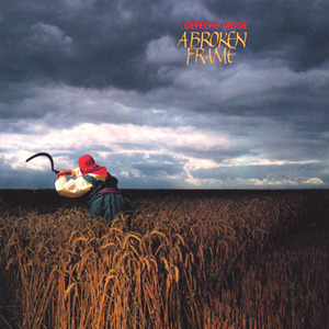
This album cover is considered one of the world’s greatest photographs for a reason. It’s stark and beautiful and has echoes of socialist realism and is just a really striking image. I don’t know who has final say over art direction in the band but whoever does has a great eye for images. The picture is taken over by Duxford and as I’m from the Midlands I have been to Duxford on a hundred school trips (it has a big air centre with WW2 planes and things and bits of the Berlin Wall), so I’ve probably been past this field an uncountable number of times without even realising it.
See You (Jan 1982, No 6 UK charts)
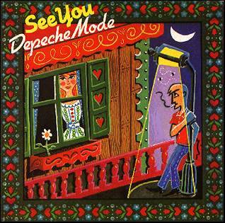
I like how it looks like fuzzy felt. It feels very, very different from the singles art from the last album, I guess to indicate a clear difference in direction? Maybe? This is the first single for the band written by Martin Gore and starting his reign as songwriter.
All the music videos for this album were directed by Julien Temple and are Not Liked by the band. I generally quite like Julien Temple’s work and watched a lot of it as a teen (stepdad being hugely into the Pistols), so I am intrigued to say the least how these will turn out to be.

This does give me a bit of a nostalgia kick for an old-fashioned style train station. It’s pretty much what my home station used to look like before everything was privatised, bought out by Virgin, turned bright red and full of commuters. I like how the station sparks to the beat of the music and that someone okayed an actual spending budget for this time around.
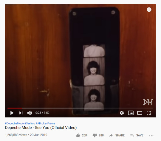
YOU HAVE TO LEAVE THE STATION THE PHOTOBOOTH IS HAUNTED
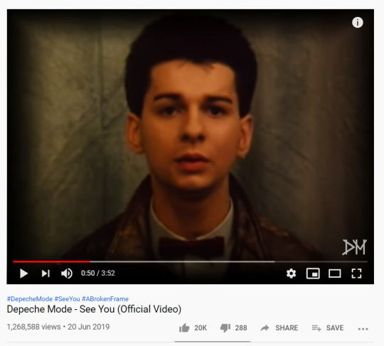
Not going to lie, this looks 100% like my Dad’s first ever passport photo. I like the addition of the bowtie. It adds a real ‘First Communion’ vibe to the whole look. The nose stud… well, I had a nose stud at the exact same period of my life. Same age too, I think, only mine stayed around a lot longer when it definitely should not have done.
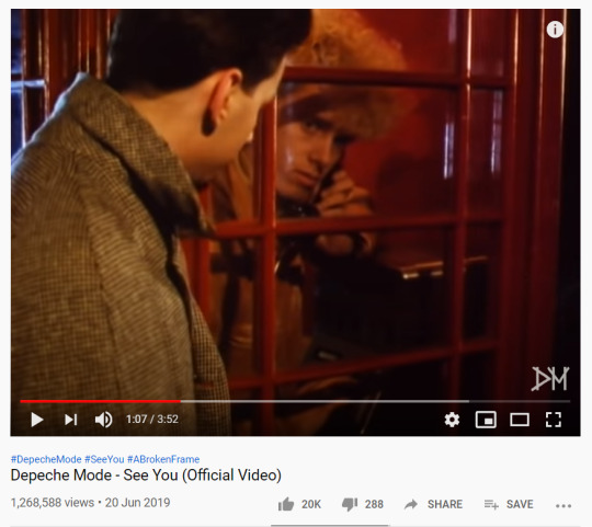
It was at that moment he knew he had made a grave mistake in confronting the ‘Telephone Box Killer’ on his own.
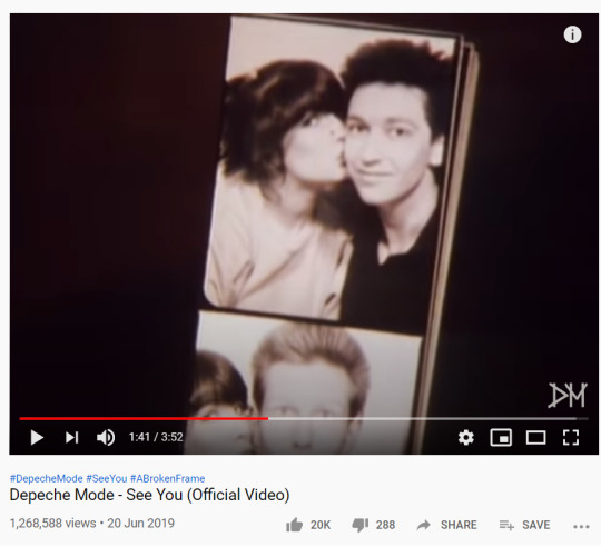
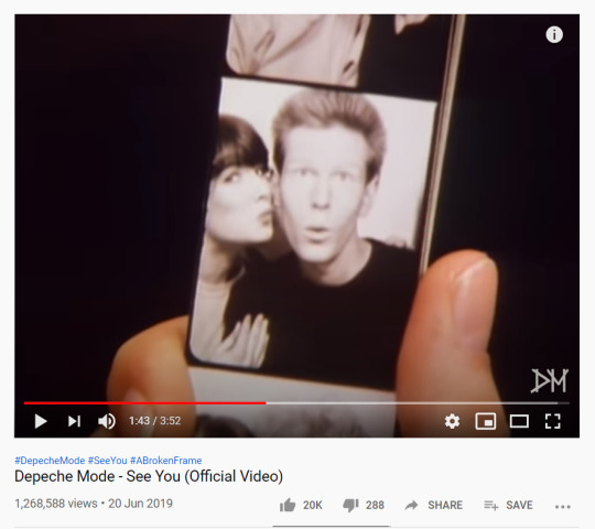
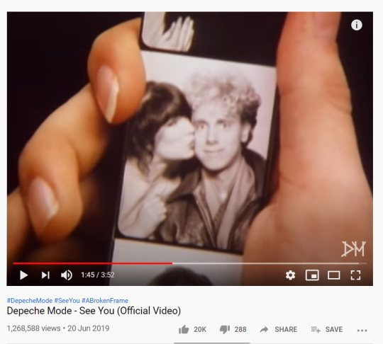
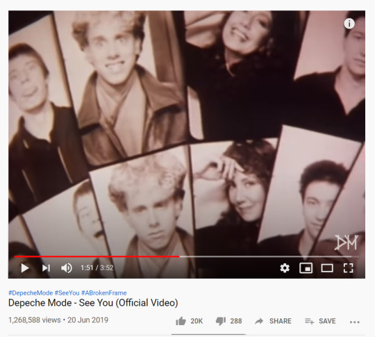
Insert a standard ‘Original Selfie’ joke here. The use of the photobooth gives a cute little through line in the video, as well as giving other band members a chance to be present. I remember using photobooths to take fun photos, before they started costing so much goddamned money and put them only in the most inconvenient places. I still have a bunch that I keep in my purse.
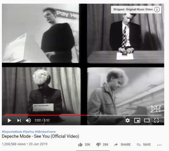
… And now everyone’s working an office job? To show the passage of time? Or because it’s now a bit with music, so we’re showing the use of keyboards through office equipment that sort of requires you to make similar hand movements?
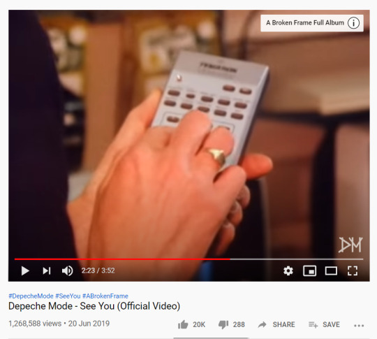
Something, something, statement about technology? The photobooth theme was fine! It was cute! It said something about the regret and passage of time from teen to young adult romance! Why are there now a lot of calculators?
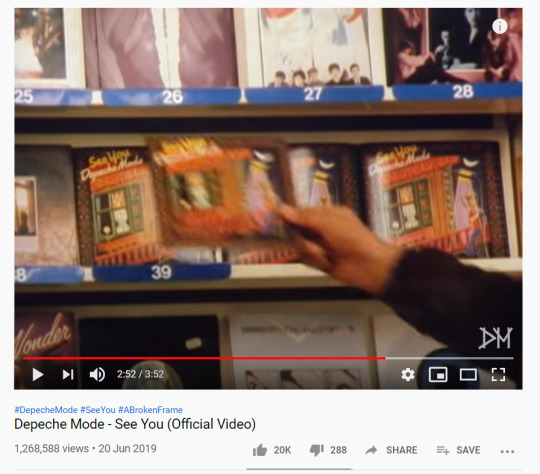
Just in case you forgot - the single’s out now. Wink, wink.
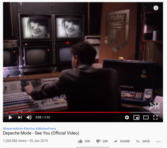
But let’s go back and check in with our corporate overlords. Bob, how are you doing on the spyware floor?
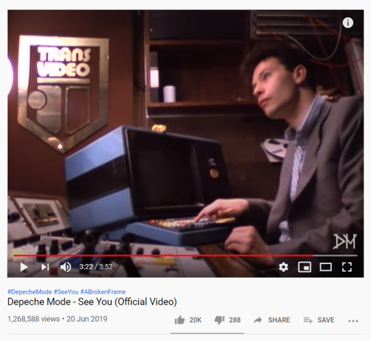
… is this Julien Temple? Is it a music video within a music video? Did he put himself in the video? Could this part not have been done by a member of the band? Like, y’know, that new one who was clearly added in partly through this video?
I like the main core storyline of the video - thinking about a past relationship and then happening to run into them again unexpectedly - but I can see why this is perhaps not well thought of. Next one!
The Meaning of Love (April 82, No 12 UK charts)
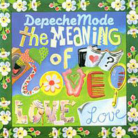
This reminds me a lot of the cover for the first Adrian Mole book which was published the same year. It does not match the first single at all or the album, but I guess the album art was yet to be done? Or maybe two different departments handled them, because I would have gone with a different single cover if I knew that one of the greatest photographs of all time was in the wings for the album.
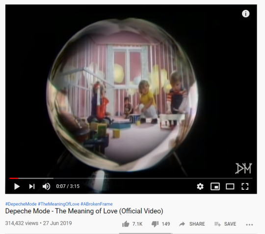
Reader, my heart dropped. I knew we were in for some deeply 80s bullshit. And, like, not good 80s bullshit.
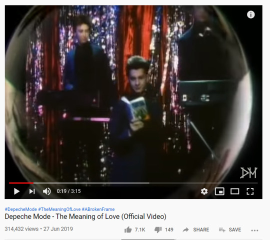
This is the lounge act in the cruiseship of my nightmares
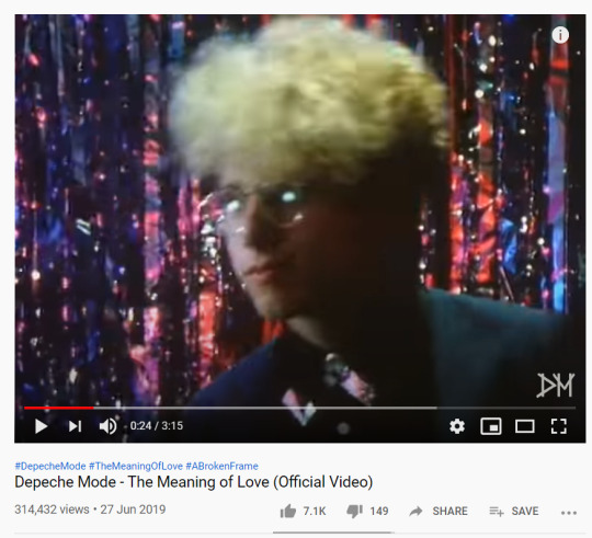
Martin Gore there looking like 99% of the lesbians on the DIY punk scene.
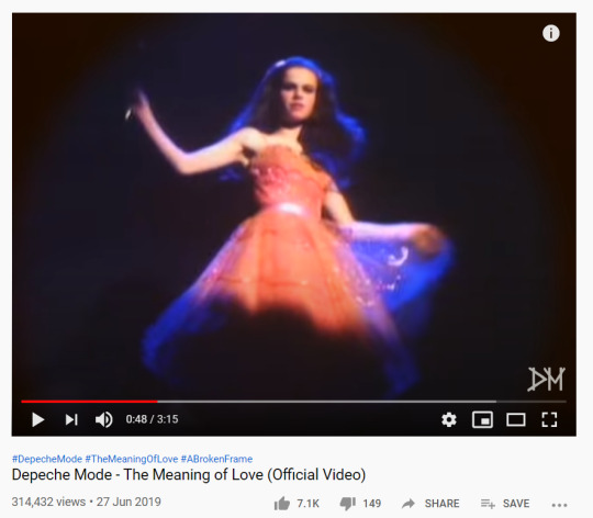
What the fuck is going on?

What, and I must reiterate, the fuck is going on? Are those pies? Pie eyes? Pie eye glasses? What does it mean?
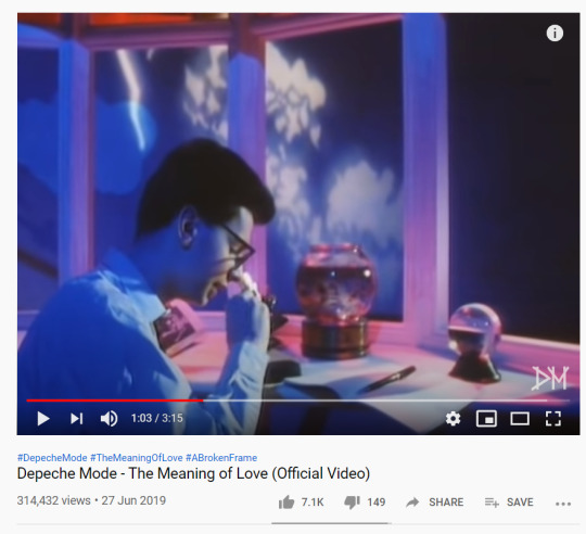
Now’s not the time for your science homework, it’s time to film a music video.
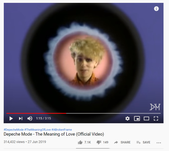
Great, I know what image will be repeating in my night terrors tonight. Martin Gore’s face earnestly singing at me from the depths of a paramecium.

THIS JUST GETS WORSE AND WORSE. THERE IS NO SITUATION ON THE FACE OF THE PLANET MADE BETTER WITH PUPPETS.
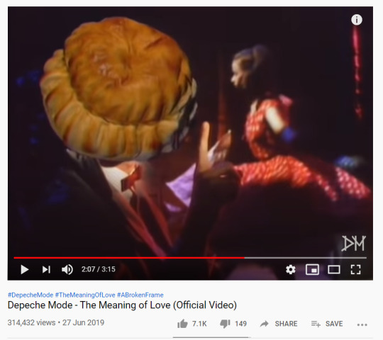
No, my night paralysis nightmare will be Dave Gahan’s face turning into a fucking pie over and over and over again.

Oh, I see, the Meaning of Love is that your wife will turn into a bitter harpy that won’t let you live your dream and also your life is ruined because she keeps letting the puppets sleep in the bed.
I guess the video has a sort of XTC vibe? It does remind me of the video of ‘Making Plans for Nigel’, which I do like, but also this video is fucking awful should be seen to be believed. I liked the band’s awkward choreography which was four men showing how much they did not want to be doing any of this.
Leave In Silence (August 82, No 18)
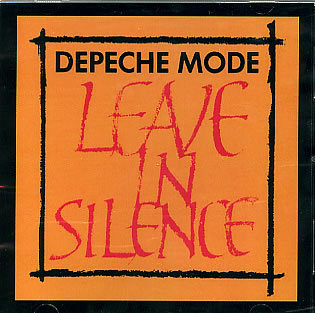
The font is nice. That’s about all there is to say for this. It doesn’t match the other two singles. I’m not saying everything has to be matchy-matchy, but it is nice to have visual similarity and consistency. This looks like the record label gave up on trying.
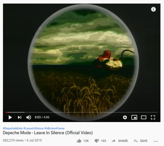
Okay, so we’ve got the album art sorted and starting out with a - I guess you could call it ‘low rural farming vocalisation’, and neither of these two things match the other singles or music videos, which have had a very poppy, teen girl, Smash Hits vibe.
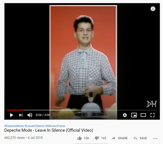
This week on The Generation Game, you could win a stainless steel bowl, a cuddly toy, and the lead singer of Depeche Mode!

This video started with a group of people vocalising while pouring out grain and looking very plaguecore, now we’re all playing around on a conveyor belt because I think Julien Temple has run out of ideas and is being artsy and surreal and weird to cover that up.

Ladies and gentleman, I’m sad to say that ‘The Fanciest Little Cowboy’ competition will not be running this year due to a lack of other contestants. This is a very fancy Little Cowboy though.
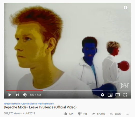
…. I…. what?
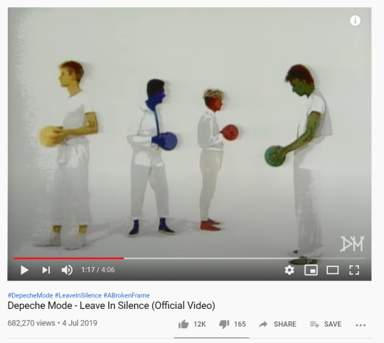
I have seen many bad, bad, bad cursed images in my time, but this is going straight up to the top. What the fuck does this say about the song? The band? The image the record label is trying to project? This pointless weird imagery for the sake of being pointless and weird.
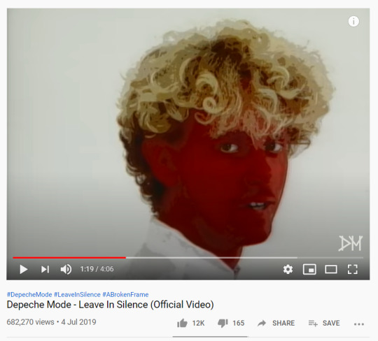
It’s okay, Jess. Bright Red Martin Gore can’t really hurt you. Only haunt you.
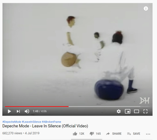
And now spacehoppers. Because of course spacehoppers!

The players from Pathologic show up to make a cameo appearance, matching nothing in the video, and seeming wildly out of place with everything else. Pick a theme or story, Julien! It is EITHER the Generation Game OR a terrifying children’s show OR guttural Soviet inspired plaguecore. You can pick one! Not all of them!
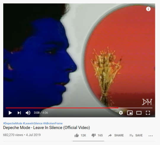
The Blue Man Group really had a rough start. The wheat is… just there. Because I guess Julien Temple couldn’t think of how to organically weave it an advertisement for the album. So there’s just a bundle of wheat for no good reason.
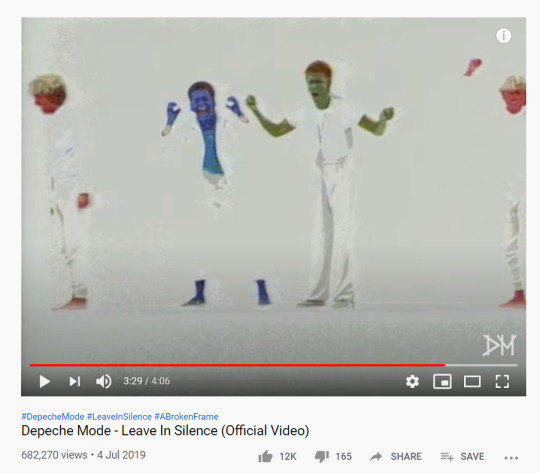
By this point, same, mate. That is the only reaction I am having.
These videos were… not great. I think ‘See You’ is the best and most cohesive - it tells a cute little story that ties in with the themes of the song and provides an emotional resonance. And then things just go off the bloody chain a bit. They get weird and experimental in a way that does not work in selling the band or the song. They seem pretty disconnected from what a music video should be and Julien Temple seemed to just run out of ideas by ‘Leave In Silence’. C- Mr Temple, must try harder.
And then onto Construction Time Again! ... well, when I get round to it. In a few days maybe.
#depeche mode#a broken frame#i'm making myself laugh at least#see you#leave in silence#the meaning of love
2 notes
·
View notes
Photo
Forewarning: an exceedingly long list of bullet journal page ideas below :)
Hi everyone, it’s been a while! So, long story short, I’ve made a very long list of bujo page ideas that I think are useful, interesting + fun! Fyi, I’ve arranged the ideas (i.e. the bullet points) under each categories according to my own priority + interests. Also, I’ll be updating this list from time to time, so feel free to suggest new ideas simply by replying this post! ;)
planning
index (table of contents)
key, legend, specifier
goals (daily, weekly, monthly, yearly, future)
goals (short-term, long-term)
new year resolutions / goals
daily spread / log (routines: morning, evening, night)
weekly spread / log / schedule
monthly spread / log / review
future log / yearly calendar
x-year plan (where x = number of years)
to-dos / tasks (daily, weekly)
10 minute tasks
reminders (daily, weekly, monthly, yearly)
important dates
deadlines
birthdays
anniversaries
holidays / special days
appointments / events
diary / journal
trip / travel / holiday / vacation planning
wedding planning
progress tracker (events, goals, etc)
vehicle maintenance (timeline, checklist)
home maintenance (timeline, checklist)
bullet journal (aka bujo)
bujo routine
bujo hacks / tips
bujo themes
header / banner ideas
doodle / drawing ideas
doodle page (doodle a day challenge)
sketchbook (doodling / drawing pages)
title + sub-title ideas
date ideas
divider ideas
layout / spread ideas for bujo
handwriting page
font page
hand lettering / brush lettering / calligraphy
washi tape collection / swatches
pen colours swatches
highlighter colours swatches
brush colours swatches
water colour samples
stationeries / art supplies wishlist
stationeries / art supplies inventor
practice page (hand / brush lettering, doodle, drawing, colour combination, etc)
page to try out new stationeries (pens, markers, highlighters, brushes, etc)
full-page journal entries
bullet journal page ideas
bujo goals
what is bujo + how to bujo? (bujo introduction + guide)
journaling techniques
lifestyle
habits to break
new habits to adopt
chores list / tracker
shopping list
cleaning routine / schedule / tracker
tidying days tracker
laundry tracker
productivity tracker
outfit planning / inspiration / ideas
time management tracker
work / job / career history + timeline
financial
no buy list
no spend days tracker
money-saving tips
savings goals
savings tracker
spending / expenses tracker
monthly budget tracker / planning
debt payoff tracker
income tracker
income growth tracker
bills tracker
gas mileage tracker
self-care / self-improvement
self-care activities / tips
about me (self-introduction)
bucket list
wishlist / wish board
vision board
abstract feelings (drawing therapy: express my feelings, draw my emotions out)
things that make me happy
hobbies tracker
new hobbies to try
hug / cuddle tracker
what do I enjoy + love? / things I enjoy + love
things I got into recently
dream journal / log / tracker
highlights this past year
experiences this year
“fuck it” page (vents / rants; let all those swearings out)
memories of the month
memories / special moments you don’t want to forget
in-do list (things I’ll quit doing)
my horoscope / zodiac sign info
my personality test result / mbti type info / my personality traits
small things that matter
everyday “nothings” I’m grateful for
timeline of my life
map of my life
happy thoughts
notes to self
positive affirmations
sentence-a-day log
one-liner journal
letter to past / future self
personal stories / thoughts (like diary)
random thoughts
skills to learn
things I want to learn
reward tracker
gratitude tracker (things, people)
20 goals before 20
30 goals before 30
things that are stressing me out
how to reduce the things that are stressing me out?
learned lessons / things to reflect on
things to improve
things I love about myself / what I love about myself?
how to stop self-hate / self-loathing?
my values
how to live out my values?
things I’m proud of
things I didn’t do as much as I liked
“flaws” I am grateful for + why
comments
advices
level 10 life
life goals list / tracker
resolutions page
achievements / accomplishments in life
what am I working / fighting for?
how to succeed?
“one smile a day” challenge
my observations about people
where do I want to be in x years? (where x = number of years)
read at least one chapter log
health
hydration tracker (water intake log)
menstruation tracker
mood tracker
relaxation tracker
methods of relaxation
sleep tracker
healthy meals / snacks ideas / options
healthy meal planning / tracker
snacking tendencies tracker
food to eat / avoid list
no x days (where x = food to eat less; e.g. snack, junk food, alcohol, sugar, carbs, etc)
how to cope with mental illness? / mental health management (depression, stress, anxiety, etc)
step count tracker
daily step count goals
energy tracker
migraine tracker
meditation tracker
mental health tracker
meal / food tracker
meal / menu planning
recipes to try / things I want to cook
ratings on things I cooked
favourite recipes
medicine tracker
skin care routine
calorie tracker
exercise / workout tracker
fitness tips / guide
fitness goals
fitness routines / sets
measurements tracker
weight loss / gain tracker
bmi tracker
yoga tracker
yoga poses to try
study (school, university, college)
printables / print outs
things to do before a new semester starts
academic / semester calendar
classes / lectures schedule (timetable)
assessments tracker (assignments, lab reports, projects, homeworks, etc)
project / assignment planning / breakdown (brainstorming new ideas)
important dates (upcoming tests, finals, group discussions, etc)
deadlines tracker (assessment due dates)
study plan for a subject / course / class
studying schedule / timetable/ routine
studying / revision tracker (study hours log)
revision checklist (topics, chapters, subjects, courses, etc)
scholarship activities / events
definitions list
formulas list (maths, chemistry, etc)
vocabulary to learn list
semester goals
grades / exam results tracker
study / school / university supplies list
study / learning websites
reference books / textbooks to buy
study space layout (actual / dream study space)
dream study space ideas
organization tips / ideas for university
productivity tips / ideas for university
before-class routine / checklist
hours spent in library
study tips / hacks
improvement tracker
note-taking method / system
color-code system
studying techniques / methods
how to study smart / efficiently?
how to stay motivated?
how to focus in class?
how to get good grades? / how to improve grades?
how to stop procrastinating?
tips for time management
syllabus / modules list
lecturer / professor / teacher info
past papers tracker
how to overcome failure?
“funny / weird things that happened in university” list
best campus food
favourites
stationeries (pens, markers, highlighters, brushes, etc)
food / meals (desserts, snacks, beverages, drinks, etc)
swatches (stationeries: pens, markers, highlighters, brushes, washi tapes, etc)
colours / colour schemes / colour palettes / colour combinations
hobbies / pastimes
movies / tv series / documentaries / anime
books / manga / manhwa / manhua
genre categories (movies, tv shows, anime, books, manga, music, etc)
songs / playlists / albums / podcasts
lyrics
song artists / bands
apps
ice cream flavours
things / items / products I own (skincare, makeup, etc)
seasons
font types
words
quotes
podcasts
brands (notebooks, clothings, skincare, makeup, etc)
cafes / restaurants
animals / pets
holidays
plants (flowers, leaves, etc)
stores (online / physical stores)
indoor + outdoor activists
poetry
recipes
presents / gifts
feelings
people
aesthetics
celebrities / influencers
characters
blogs / tumblr blogs / websites / youtube channels / instagram accounts
six word stories
scent / smell
fruits + vegetables
sports
checklists
organization ideas / tips
tea / coffee consumed tracker
to watch (movies, tv series, documentaries, anime, etc)
to read (books, articles, manga, manhwa, manhua, etc)
to listen to (songs, playlists, albums, podcasts, etc)
to buy (groceries, shopping, etc)
to try (food, beverages, activities, etc)
to visit (cafes, restaurants, etc)
to travel (places: countries, states, cities, etc)
things to try / attempt
craft / diy project ideas to try
zero waste tips / habits
green living tips / habits
packing checklist (travel, trip, vacation, moving, etc)
adulting list (things I need to learn to become an adult)
maps (colour the place you’ve visited)
before-bed checklist
road trips
random acts of kindness
destinations / places to travel with friends
progress tracker (e.g. book series: pages, chapters, volumes; tv shows: episodes, seasons; podcasts progress, etc)
boredom buster list (fun things to do)
lists
usernames + passwords
playlists for certain moods / occasions
new music discovered
new songs added to playlist
gift / present ideas
things I googled
foreign language vocabulary to learn
new vocabulary
inspirational / motivational quotes
questions I want answers to
story / plot ideas
character ideas
beautiful words to use more often
untranslatable words
365 words to learn (learn a new word per day challenge)
addresses
convenient / useful knowledge
useful unknown facts
interesting / random facts
important contacts / emergency contact info
upcoming releases of things that I like / love (release dates)
pros + cons list
outfits / clothings I own
fashion / outfit inspiration (print outs, magazine cut outs, etc)
how to make someone happy
authors to know
the most important people in my life
collections
flowers / leaves (dried / pressed)
polaroid pictures / photos
swatches (pens, markers, highlighters, brushes, washi tapes, etc)
fortune-telling paper strips / fortune cookie fortunes / amulets
ticket stubs / tickets (movie, train, amusement park, concert tickets, etc)
receipts
stamps (ink)
postage stamps
clothing tags
bookmarks
maps + brochures from travel
greeting cards / postcards
food wrappers / packagings
wrapping papers from gifts you’ve received
cute paper / gift bags
stickers
magazine / book cut outs
business cards
books purchased (titles, date + place of purchase, etc)
social media (blog, tumblr, instagram, pinterest, youtube, etc)
content / post ideas (planning)
social media planning (timeline, content, event, etc)
followers / subscribers count
blog goals
blog information
blog statistics
content updates
social media tracker (time spent on social media)
blogs, tumblr blogs, instagram accounts, youtube channels, pinterest boards, websites, etc to follow
fun
room layout / dream room ideas / room decoration ideas
dream home ideas
aesthetic page (mood board, style board, inspirational photo board, etc)
morse codes
brain dump
brainstorming
pretty + cute things (literally anything pretty + cute)
song of the day
art journal
collage art
colouring page
pen tests page (scribbling page)
random notes
things to look forward to
countdown to a special day / event
“don’t break the chain” challenge
100 days of productivity
moon phases tracker
musical pieces you’d like to play
journal writing prompts
cryptography
invention ideas
best purchases made
“if I had a million dollars”
pet care log
plant care guide + log (plant watering, etc)
family tree
food / snacks / beverages reviews
restaurant / cafe reviews
places travelled review
movies / tv series / anime reviews
book reviews
constellation chart
30 day challenges
hogwarts houses
zentangles
knitting patterns
things that my friends like
friends page (where my friends write stuffs in)
tattoo ideas
philosophical stuffs
#bulletjournals#bulletjournal#bujo#bujowithme#bujotime#bujo tips#bujoy#bujoideas#bujoinspire#bujo pages#bujo planner#bujoph#bujo aesthetic#bujoaddict#bujospiration#bujogram#bujogirl#bujo goals#bujohack#bujojunkies#bujojunkie#bujolove#bujolife#bujochallenge#bujocommunity#bujo spread#bujoblr#bujobeauty#bujonerd#bujo motivation
5K notes
·
View notes
Text
FLASHBack: Week 45 - Spooky Scary Skeletons / Oh Oh Oh Sexy Vampire
#radwolf76FLASHBack#Adobe Flash#Flash Animation#late 2000s#early web#newgrounds#newgrounds halloween 2007#Spooky Scary Skeletons#zekeyspaceylizard#redmongoose#redmanghost#Andrew Gold#Oh Oh Oh Sexy Vampire#GoshaDole#james franzen#RadioGosha#Diskowarp#JUSTINB#Justin Blenkle#Fright Ranger#Golden Girls#Disney#Toby Fox#Sans#papyrus#Undertale#The Living Tombstone#Nyanners#@minecrafter2011#TikTok
4 notes
·
View notes
Photo




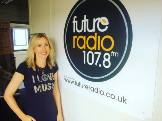
Consumer Guide / No.81 / singer-songwriter Lisa Redford with Mark Watkins.
MW : What can we expect from your new EP - Edge Of Love?
LR : Edge of Love has five self-written songs that are a blend of styles that I’m inspired by: Americana, country, folk, soul and classic pop. The songs are really heartfelt and I’m so proud of them; they really represent me as an artist.
It was produced by José McGill - who produced my last EP Another Place and Time - and there is a mix of band tracks and acoustic songs with really creative arrangements and instrumentation including dobro, pedal steel, acoustic and electric guitars, cello and piano.
There’s a real warmth to it with José adding some really lovely subtle sonic layers and textures. Lyrically, it’s romantic and bittersweet, exploring aspects of love and relationships with a theme of letting go. This includes realising how hard it is, and also letting yourself go; whether you know you need to, or letting yourself go emotionally – letting down your guard, even if that means the risk of getting hurt.
MW : When and where can we get hold of it?
LR : Edge of Love will be released worldwide on 10th May (2019). As well as being on all the digital platforms, it will be for sale at my website and Bandcamp store.
I’m really excited about the EP and can’t wait for people to hear it. So far, there has been an amazing response with lots of radio airplay, and lovely reviews.
MW : Will there be a video?
LR : There was an official music video for the first single Anything But Easy which was released on 22nd February (2019). It was filmed on a beautiful day in Walberswick and Dunwich in Suffolk by a really talented videographer called David McKenna.
We were fortunate that it was a glorious day and he captured such a wonderful light. The natural landscape where we filmed really compliments the song and was exactly what I wanted for this particular track.
Here is a link to the video:
https://youtu.be/8cT1opG9HiU
MW : Any plans to tour?
LR : I will definitely be doing shows to promote Edge of Love and I am also playing some lovely festivals in the summer.
I’ll be launching the EP at a special concert in my home city of Norwich on 9th May (2019) - the night before the release date - which will also feature some of the amazing musicians who played on the release.
I would really love to tour more of the UK, and Europe. The best way to see where I’m playing is to keep an eye on my social media and website.
MW : Looking back, what were some of your music highlights of 2018?
LR : Album highlights of last year include You Are Someone Else by Fickle Friends - and - I saw them play a brilliant set at Latitude festival last year, Love Is Dead from Chvrches, Ruins by First Aid Kit, and May Your Kindness Remain by Courtney Marie Andrews - who I also saw play an incredible gig in the summer at Norwich Arts Centre.
I have recently started hosting a music show on Future Radio in Norwich, and the playlist is an eclectic mix of indie, folk, Americana and electronic : so I listen to a lot of bands, and artists, old and new, and still love discovering new music.
MW : How's your music column going?
LR : It is going well. Currently I’m really busy promoting the EP but I love to write about music, and in particular songwriting, when I can. Last year, I did some interviews for Songwriting Magazine which included Courtney Marie Andrews and Ethan Johns. They both provided fascinating insights into their writing and recording processes. I’ve also previously interviewed Sarah Darling and Bob Harris. As well as Songwriting Magazine, I write an arts and music column for website All Things Norfolk where I also share my music adventures and do reviews.
My most recent article for Songwriting Magazine is all about the inspiration behind my latest single, Anything But Easy, in a feature called Song Deconstructed:
https://www.songwritingmagazine.co.uk/interviews/song-deconstructed-anything-but-easy-by-lisa-redford/44573
MW : How's Bob (Harris) keeping? Is he still a source of support and encouragement?
LR : Yes, I saw Bob recently at the AmericanaFest conference earlier this year when he hosted a lovely In Conversation with John Oates. It’s always lovely to catch up.
It’s definitely been a real source of encouragement having had Bob’s support. I have been invited to record two Under The Apple Tree sessions on separate occasions, and he has featured all of my releases, first playing Be Around (a ballad from my first album Slipstream).
He also played my song, Dragonfly, on a “Best of British Special” amongst major artists such as Coldplay, The Rolling Stones and The Kinks. I’ve also recorded two live sessions when he hosted a BBC Radio 2 show on Saturday nights. “Whispering” Bob’s also introduced me on stage twice: once at The Borderline in London, and again at C2C Country to Country Festival at the O2. It means such a lot to me having someone as respected as him be a supporter.
MW : What’s your view on the public outcry over dumping plastic?
LR : It saddens me that there is such a huge threat to the oceans. Plastic doesn’t go away. Only a small percentage of plastic is recycled worldwide.
I try to be conscious of my own plastic use, and reduce, and reuse as much as I can. For example, I always bring my own reusable shopping bags to shops, and completely avoid single-use plastic bags. I never use straws, and carry around my own water bottle rather then buying bottles. Naturally when I do use single-use plastics that can be recycled, I always ensure I recycle them.
It is important to stay informed on issues related to plastic pollution, and to try to raise awareness of the problem.
MW : Describe your music room and/or record collection and how you may be adding to it or re-organising it, and formats...
LR : I have lots of treasured music memorabilia that I try to keep organised and in good order. It is an extensive collection of vinyl, music books, CD’s and more unique items - mostly by The Smiths and Britpop artists. I have previously talked about the memorabilia for a BBC People’s History of Pop documentary and love how they bring special memories of going to gigs and festivals.
MW : What is your favourite plant, tree, garden?
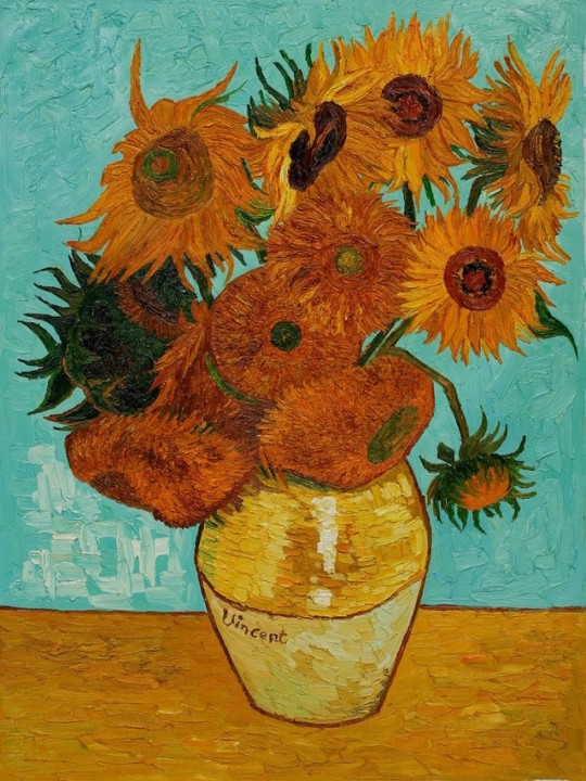
LR : Sunflowers. I’m drawn to the sun and love how they’re vibrant, big, daisy-like and evoke feelings of happiness. They were also famously the subject of Van Gogh’s series of stunning paintings, definitely my favourite still-life.
Tree? It would have to be the mighty oak tree - chosen as the national tree of many countries and a beloved symbol of strength. It evokes feelings of nostalgia and memories of many dreamy summers.
Garden? The Plantation Garden in Norwich, which I often love to visit. It’s a stunning restored Victorian town garden, and its features include a gothic fountain, flower beds, lawns, woodland walkways, rustic bridge, Medieval wall and lots of architectural details. It’s beautiful and dreamy - a tranquil space in the city - and I have filmed some live acoustic videos there, and had photos taken. In the summer there are also outdoor Picturehouse cinema film screenings, which is a lovely way to spend a summer evening.
MW : Do you keep a ‘To Do’ list?
LR : I do have a to do list. I always have my notebook and diary with me. It’s a busy time at the moment with the new release, so I’m making a daily ‘To Do’ list and updating it helps me keep up with what I need to accomplish each day.
MW : If you could have six guests over to dinner, who would you invite & why, and what would you all eat & drink?
LR : Richard Curtis and Emma Freud - such a lovely, warm and benevolent couple. Emma recently made a lovely comment about my latest music video on Twitter, and I also make a very brief appearance in Richard’s new film, Yesterday, as a festival goer.
Stephen Fry - he would be full of fascinating conversation, is such a font of knowledge and we have a Norfolk connection.
Tom McRae - he’s such a brilliant songwriter. I love his witty and dry sense of humour. He asked me to support him at a recent concert. He is a inspiration.
Bob Harris - always love to spend time with him and talk music. He would of course be a lovely addition.
Adil Ray - we’ve chatted on social media. He’s really funny and intelligent. It would certainly be a special evening of laughter and stimulating, fun conversation.
We would have scallops to start, and then for mains we would enjoy pan-fried salmon with creamy garlic sauce and vegetables. Dessert would be a choice of mocha chocolate fondant, or tiramisu and, as I’m a real savoury fan, there would also be a selection of cheeses with crackers, red onion jam and ruby grapes.
Drinks would be a choice of red and white wine with some Dom Pérignon Vintage flowing throughout the evening too! Cheers!!
LINKS : -
https://twitter.com/lisaredford
https://www.facebook.com/lisaredfordmusic
https://www.youtube.com/user/lisaredfordmusic
https://www.instagram.com/lisaredfordmusic/
https://lisaredford.bandcamp.com/
https://soundcloud.com/lisaredford
http://lisaredford.com/
© Mark Watkins / April 2019
3 notes
·
View notes
Text
Whenever I travel, I like to find the local record store and see what’s what. You never know what you’ll find. On a recent trip to San Francisco, not only did I want to check out a local record store- I wanted to find records by San Francisco’s native jazz sons. I succeeded, in more ways than one.
The Music
https://raggywaltz.files.wordpress.com/2018/06/222-groove.wav
The Tune: “222 Time”
Recorded: 20 January, 1962 at the Blackhawk, San Francisco, CA
Personnel:
Cal Tjader- Vibes
Lonnie Hewitt- Piano
Fred Schreiber- Bass
Johnny Rae- Drums
https://raggywaltz.files.wordpress.com/2018/06/stablemates.wav
The Tune: “Stablemates”
Recorded: 21 January, 1962 at the Blackhawk, San Francisco, CA
Personnel:
Same as above
They say that imitation is the sincerest form of flattery, which in this case means that Verve Records paid Columbia Records a huge compliment by naming their album similarly to Miles Davis’ 1961 album ‘In Person Friday And Saturday Nights At The Blackhawk’. Like Miles, Tjader was recorded over two nights, the best of which was pressed onto a single record. Saturday night went on side 1 while Sunday night on side 2. According to the liner notes, Sunday night’s music was taken from the final two sets after most of the people in the club had left for the night, making things particularly relaxed. Cal Tjader’s quartet, sticking strictly to straight-ahead jazz, is at home (literally and figuratively) and stays right in the pocket on each number.
“222 Time” is an original by Cal himself, written in honor of the bar next door to the Blackhawk. Apparently, the cozy Blackhawk couldn’t house both Tjader’s both, the audience, and the recording equipment, forcing famed engineer Wally Heider to set up shop in the back room of the 222 Bar. The 222 must have been a groovy little spot, because Tjader’s tune is a groovy little thing. It sounds like a late-nite radio show theme. Tjader’s crystal-clear vibes shimmer and simmer right along, with strong support from newly minted bassist Fred Schrieber. Having worked with such West Coast jazz luminaries such as Barney Kessel, Pete Jolly and another vibist by the name of Terry Gibbs, this album was Schrieber’s national debut on the jazz scene. For a newbie, his sound and technique is rather distinguished.
Another new face in the group was drummer Johnny Rae, who was also a vibes player like Tjader. Pianist Lonnie Hewitt was the only hold-over from years past. His bluesy, laid-back playing perfectly matches Tjader’s own cool-styled style of playing. Cal Tjader has long been my favorite vibraphone player mostly because of his paired-down, “less is more” mode of playing. His economical style coupled with his unique clear-toned sound is downright delicious. Like cold water on a hot day. Cal Tjader, the middle-weight champion of the vibraphone.
The second side opens with Benny Golson’s original tune “Stablemates”, which finds the Tjader 4 firmly in the pocket. There’s no “look at me!”, bang bang bang playing here; it’s late-nite jazz as can only be played in an empty, dark and smokey club. Hewitt briefly throws a bit of Wardell Gray’s classic solo from “Twisted” into his solo before going about his business.
The rest of the music on the album is much in the same vein, with Tjader’s cool vibes juxtaposed with Hewitt’s earthy but still relaxed piano. Schrieber gets some time in the spotlight on his original tune “Fred’s Ahead” in addition to numerous solo spots on other tunes on the album. Altogether, this album is a great document of a cohesive small jazz group playing in the intimate setting of a hole-in-the-wall jazz club in the middle of the city. It’s a great album to put on and just relax.
The critics differ, as is often the case. Russ Wilson liked it, calling it “A good, unpretentious, highly listenable album.” Another Wilson begged to differ. Writing in the jazz almanac ‘Down Beat’ in 1962, John Wilson wrote that “Schreiber comes in for an occasional solo”, but this doesn’t save the album from being monotonous and bleh. He finishes with this chestnut: “None of the soloists is sufficiently distinctive to raise the set out of an anonymous although generally pleasant rut.” A generally pleasant rut? Yikes. Fred Schreiber decided to take the high road by writing this letter to ‘Down Beat’ the next month: “Mr. Wilson was very fair in putting down Cal and the other guys in the group, but I really think he should have listened to me more carefully. Evidently he did not listen closely to my angular, probing lines, and I am sure that not once did he take note of my relentless throbbing beat.” Touche.
The Cover

Raggy Waltz Rating: B
Out of Tjader’s many albums recorded live in the environs of the Blackhawk (he made like seven), this album has arguably the best cover art. Photographer Pete Turner captured Tjader in a pensive moment onstage, surrounded by the recording microphones. It’s a great shot, in warm color. The late-nite vibe of the music is perfectly captured by this photo and promises the buyer that some good jazz is on the grooves of the enclosed record.
So why a ‘B’ rating and not higher? The font, typeset, and title ruins the whole thing. The font is rather unattractive and blocky, the type is awkwardly sized. It’s not big, it’s not small; it’s just… there. The green color isn’t terrible, but it’s just… there. And what a mouthful of a title. I’m all for the recognition of San Francisco, but was it really necessary to throw it in the title? The placement of the title artistically and aesthetically all wrong, too. One of the main rules of art is to never put your subject smack in the middle of the picture. That makes for a boring, unimpressive artistic statement. The photographer knew better than to place Tjader square in the middle of the picture, so why the art director at Verve thought it was cool to put the type in the middle is baffling. Even without changing the font or the colors, the cover could have been saved by placing the type lower and to the left. Something. Anything! Maybe I should lower the grade even more…
The Inside


It’s a gatefold album, so the liner notes are on the inside, with pictures. Well, picture. Fancy, right? With Tjader having made the move from Fantasy Records to Verve in 1961, we’re finally treated to an album that has recording information! Yahoo! Well, almost yahoo. The album liners state that the music was recorded on 27-28 January of 1962. Cal Tjader’s biographer, S. Duncan Reid, records the date as a week earlier. I’m inclined to believe the hard work and research of Mr. Reid.
The picture that immediately greets the reader is another cool shot of Tjader in action, perhaps at the Blackhawk during the making of this album (although I’d hope that Tjader was hip enough to not wear a white suit jacket three weeks after Christmas. Californian or not, there’s no excuse for this sartorial no-no). And look! The type was set in an attractive font and in an aesthetically pleasing position! More evidence that they dropped the ball when it came to the cover.
The liner notes are mostly solid and filled interesting behind-the-scenes details about the musicians (see Schrieber’s bass) and the music (see after-hours fun). However, Mr. Hadlock unfortunately falls into the linguistic trap of calling the Blackhawk the Black Hawk. It’s an honest mistake and one that persists (with fervor in some circles) to this day. Is it or isn’t it two words? This issue was explored in depth and answered definitively here on another post about another album recorded by Cal Tjader at the Blackhawk. To make matters more confusing, both spellings of ‘Blackhawk’ appear on this album. At the end of the day, both Dave Brubeck and the original owners of the club say it’s one word; Blackhawk. So there you are.
The Back

For the sake of completeness.
The Vinyl
Gone are the translucent reds and blues (and greens and purples) of Fantasy’s record albums. With Verve, it’s strictly business with jet black. Because black is beautiful, too! By 1962, deep-groove vinyl was out and no-groove vinyl was the new norm. This record is in stereo, recorded to perfection by famed West Coast recording engineer Wally Heider. The sound is dynamic and crisp, aided by the Blackhawk’s superior acoustics. Interestingly, the stereo stage on the first side slightly differs from the stereo stage on the second side; Tjader is off to the middle-left on the first side, while he firmly treads the middle ground on the second side. I’m thinking that the microphones were moved after listening to the first night’s performances. The vinyl itself plays mostly quiet, the occasion crackle here and there reminding me I am in fact listening to a record.
The Place of Acquisition
As I mentioned at the beginning, I’ve recently returned from my annual journey back to the West Coast, this trip having spent a few days in San Francisco. While there, I determined to cross a few things off of my jazz bucket list. Concerning vinyl, I needed to 1.) visit a local record store, 2.) find an album or two by such native San Franciscans as Cal Tjader, Vince Guaraldi, etc., and 3.) find albums by those Bay Area natives on San Francisco’s native record label, Fantasy. At a Berkeley record store named Groove Yard (named after the album by Wes Montgomery and his brothers), I was able to meet all three of those goals. Aside from this album, I found another Tjader album (this time on Fantasy), a Guaraldi album (also on Fantasy), and a Wes Montgomery album (not on Fantasy, but on Riverside. Amen), among other albums. Score.
Another thing I had to cross off my jazz bucket list while in San Francisco was to visit the place where the Blackhawk used to be. I HAD to. After all, it’s my favorite jazz club, and despite having closed its doors in 1963, a pilgrimage was necessary. And so, with my friends in tow, we made our way to Turk and Hyde in the Tenderloin District of San Francisco. Pulling up to a parking meter and stepping out the car, the sight I saw was bittersweet. The Blackhawk was torn down in the mid-1960’s and the space was paved over and made into a parking lot. The only thing that indicates that the area once was the site of greatness is a plaque in the sidewalk. Walking up and down the sidewalks was a surreal experience just the same. Knowing that Miles Davis, Paul Desmond, Dave Brubeck, and of course Cal Tjader walked and stood in the same places I was walking and standing made everything worth it. Before we left, I had my friends take some pictures for me from different vantage points. They didn’t understand my reasoning, but bless their hearts they humored me anyhow.

On Hyde Street, looking at the Blackhawk, circa 1957. The 222 Club of Tjader’s “222 Time” is clearly visible.

The same view in 2018. By chance, a dark car (a Toyota Corolla) happened to be parked in the same spot as the dark car in the picture above. How about that? Another interesting thing: the building behind where the Blackhawk used to be is still a storage building with a similarly humorous advertising line.

The corner of Turk and Hyde at night, 1961. Some cool dudes are out enjoying the night, and perhaps are about to enjoy some jazz.

The corner of Turk and Hyde at day, 2018. The dude in the yellow shirt saw me posing and jumped in the pictures with me. I don’t think he knew what was going on, bless his heart. That circular neon sign is remarkably still here fifty-plus years later.
This is what makes record collecting such a fun and beguiling hobby. Through records, I was able to take a front-row seat at the Blackhawk for numerous sets by numerous musicians. In doing so, I made a connection to a space that despite never having physically been there, I feel like I know it. It’s kind of like hearing about a family member that died years before you were born, yet you feel like you personally know them anyhow. I might have missed the Blackhawk by 55 years, but I’ve been a regular patron since 1952.
A post about an album recorded 50 years ago in San Francisco that I found... San Francisco! Whenever I travel, I like to find the local record store and see what's what. You never know what you'll find.
1 note
·
View note
Text
Business Card Project - Part 1
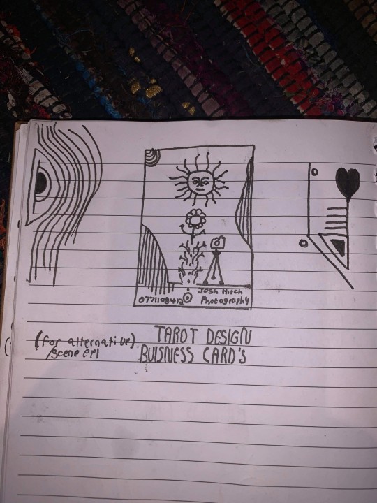
Around the time this module started, I got back into contact with someone by the name of Josh Hitchcock who I met and worked with back in college. We met when we were 16 and worked on several projects with each other during our year studying photography together, I learned a lot from Josh and we’ve stayed loosely in contact ever since leaving school but haven’t collaborated on anything for around 5 years despite having always had similar interests, styles and aesthetics. Josh is also still pursuing his passions and talents in visual communication and is beginning to build a portfolio with the aim of applying for a BA, just like I was doing this time last year. Alongside getting himself prepared to do a degree, he has been expanding his online presence and slowly establishing a business and brand identity for himself. He reached out to me originally to ask if I could potentially create him a logo that he could use across all of his platforms which he needed fairly quickly as he was building a website, unfortunately I couldn’t meet the turnaround deadline and so he commissioned someone else to do a logo, later reaching out to me again to ask if I might be able to create business cards instead.
Josh had already started sketching out ideas and so he sent me his drawings as a starting point for the design
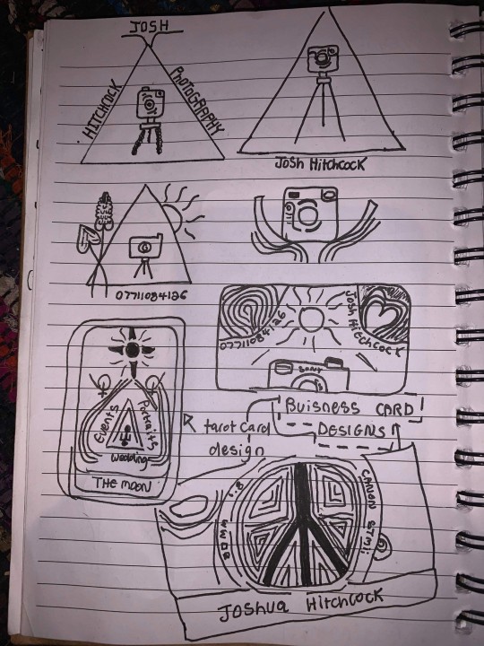
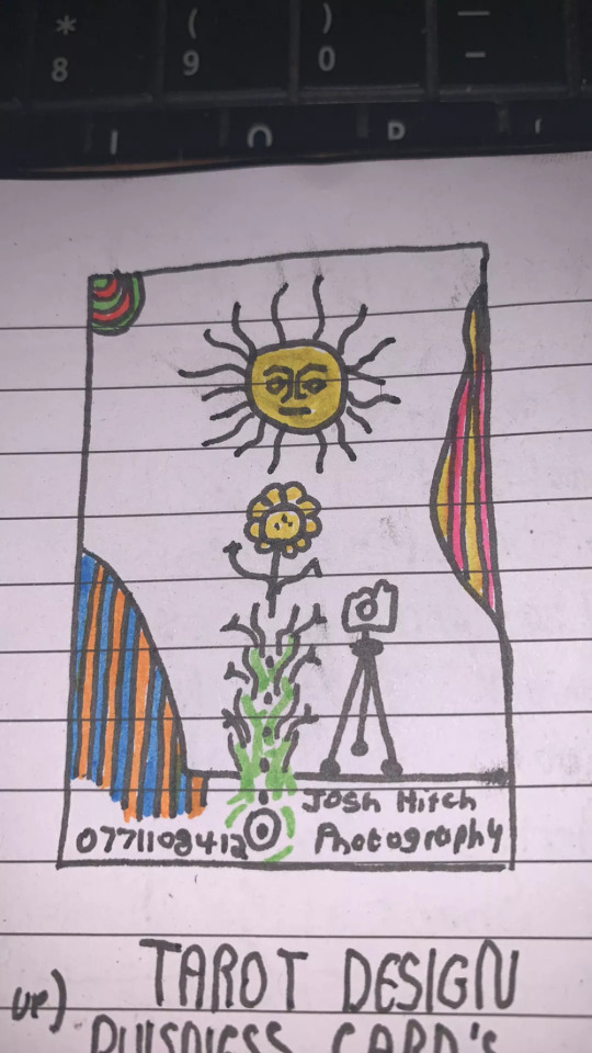
After some discussion and a little bit of time, Josh came to the decision that this was his favorite prospective card design and even began experimenting with it's colors.
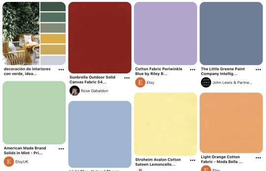
It was at this point that I asked him to create a Pinterest board to help gather all of the ideas together which he promptly delivered on. Pinterest’s description of the board “Clean, simple doodles. Photography orientated based on nature and ancient art. A perfect combination of tech, nature and aesthetic.” sums it up perfectly. This was a really strong starting point for the overall design as it includes everything from small decorative graphic details such as flowers, vines and suns; to a concise range of colors for the palette of the art itself. The board isn’t overcrowded, it's clearly well thought through and does good job of clearly communicating the kind of style that I was expected to reflect in my design.
Coincidentally around the same time I started this project, I decided to treat myself to an iPad Pro and Apple Pencil to support my University work, these have become increasing popular in the art world because they are incredibly powerful creative tools, I chose to invest in it mainly for it’s capabilities in creating digital art using the Adobe suite and Procreate using the pencil which is exclusive to iOS and has is slowly becoming the standard for digital drawings.
Having recently attended the Illustrator workshop, I thought that I would experiment with using this software both on my iPad and computer as I figured if I could learn to use them in conjunction with one another from the get go, I would be in a better position overall later on; but in doing so, I threw myself two learning curves at once as I was not only dabbling in software I wasn’t comfortable with but also using that software on a device that I am a complete beginner to which was a definite challenge for myself.
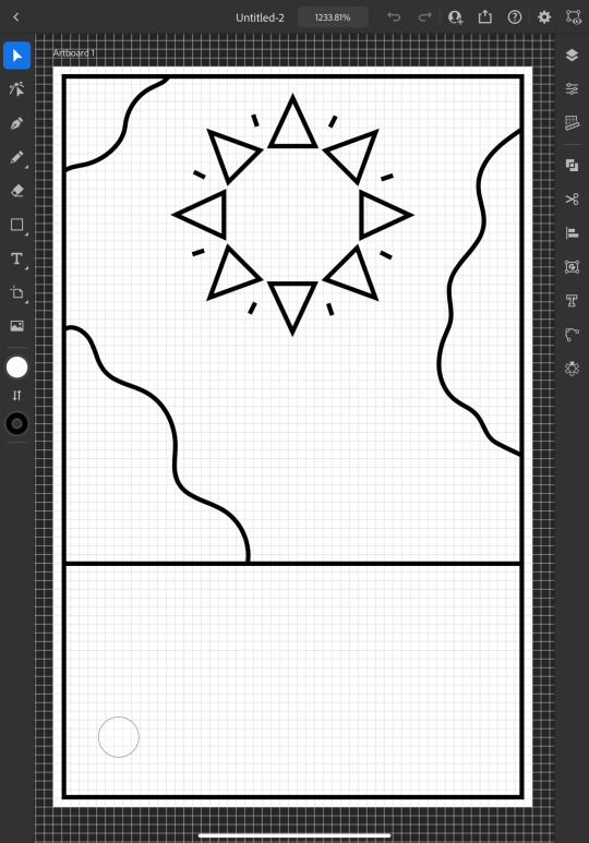
I started out by doing a Google search to find out what the standard size is for business cards and found out that is generally 3.5 x 2 inches (1050 x 600 pixels at 300 DPI, which is the standard DPI for printing). This is how I decided to set my document up which is what gives me the white rectangular shape that you see me working on to start off with.
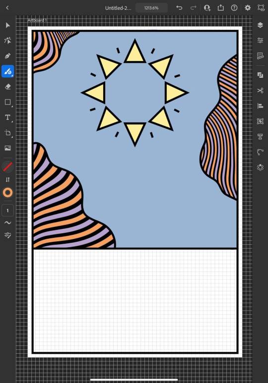
To begin the design, I picked out my favorite things from Josh's sketch which were the wavy line details and the bohemian style sun. I created some simple outlines using the line tools on iPad Illustrator starting with the border and dividing horizontal line where I intended the design to end, from this I was able rough out where patches of lines would go and add the sun. For the sun, I originally tried to draw one with wavy points but I was struggling to get it proportionate, even when I'd figured out how to use the reflect tool to make my drawing symmetrical, it seemed to be throwing the design off and so I threw this idea out and went for a pointed sun design instead. I chose triangles for the points as a subtle reference to the exposure triangle which is a rule that dictates camera settings when it comes to photography so it ties in with the business well and was also a concept that Josh was trying to reflect in his logo. I achieved the geometrically accurate shape of the points around the sun by creating the very top triangle and then using the Radial Reflect tool whilst using my iPad which automatically created the rest of the points for me with even spacing and perfect symmetry; all I had to do then was resize the points as I pleased. Once I had done this, I decided to repeat the process but with a small line between each point to give it an extra beaming sunshine look, this also fits in with how some of the sun's and graphics are drawn on the Pinterest board that I'm referring to as I design this.
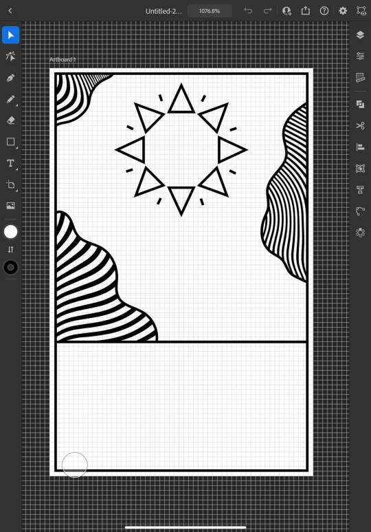
Once the outlines were complete, I started experimenting with filling in the patches with lines, this is an effect that is featured on the album art of one of my favorite albums of all time, Currents by Tame Impala which I previously learned how to do using a vector pack from Spoon Graphics as I did work inspired by it for my University portfolio. Although I have used these particularly line textures before, I have only used them in Photoshop and not Illustrator so I haven't actually used the vector versions of them up until this point. I inserted these into my work using my computer as that's where they were saved, I was able to use Adobe Cloud to sync my work between my PC and iPad making it easy and convenient to switch between the two whilst working. Adjusting the waves worked similarly to how it does when I use them in Photoshop, I just added them in as a layer and then used direct selection mode to delete the extra lines around the outlines and border that I’d drawn in leaving me with what you see above. At this point, I sent what I’d done so far to Josh so that I could begin to get his feedback and make sure that what I was doing was in line with his vision.
Whilst I was waiting for him to reply, I started experimenting with adding color to the design hoping that it would help us visualize it better; I used colors directly from the Pinterest board for my palette by taking a screenshot of the webpage, opening it up in Illustrator, swatching all of the colors and adding them to my Color Library so that they could be easily accessed whenever I needed them.
At this point, I just filled in the colors according to what made sense to me, blue for the sky, yellow for the sun and something contrasting for the wavy lines, honestly, I chose orange because it’s my favorite color and I really like the way that the purple looks next to it, especially against the blue background where it appears slightly more subtle whilst still being effective at breaking up the image in the way that it needs to.
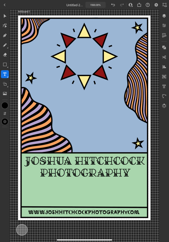
I continued to add colour, changing every other point on the sun to be red to give it more dimension and incorporate more of the colours from the chosen scheme; I then added green to the bottom section which I chose because I thought it would represent grass and fit in with the sun and sky theme that seemed to be emerging. I also added some small stars as I was experimenting with the shape tools dotting them into some small empty spaces on the design so that they line up in a triangular shape which is another subtle reference to the expose triangle.
Then I started experimenting with adding text and social media icons, Josh had told me that he wanted his name, website and social media information on the card, we decided to leave his phone number out as he only has a personal mobile number and didn’t want to risk handing it out to strangers. I chose this Art Deco style font for the name because I liked the lines in it and thought it went well with the lines in the top half of the design which are probably my favourite thing about it at this point. I didn’t use the same font for the website because it doesn’t look as good when it’s small, you can’t really see the lines and it made the website hard to read so instead I chose this glyph font which I thought Josh would like based on some of the imagery from the Pinterest board; I was unsure about this choice at first but it quickly grew on me as it’s subtle and yet it makes the website look bold on the bottom of the image which draws your eye down to it when you’re reading the information. I also added some social shapes to the front keeping Josh updated on my progress as I went along.
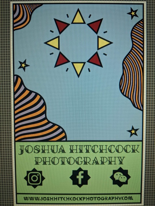
It was at this point that I started to receive some feedback from him, he was really happy with the first impressions of the design but did want to make a few changes. He started out by asking if I could change the green on the bottom to the orange colour in the waves with the hope of giving the card a more uniform look which we both agreed looked much better. He then asked me if I’d started designing the back which I hate to admit that I hadn’t actually thought about at this point and so we started discussing the layout; collectively agreeing to move the social media information to the back of the card and have that there along with some sort of bio which I much preferred the idea of as I wasn’t too keen on how the social shapes looked on the front of the card and I was worried about how I was going to fit all of the contact details on without making it look messy.

Originally we thought it might be nice to add some floral details to the front of the card where the space had now been freed up but we quickly decided that this didn’t look quite right.
0 notes
Text
How to Use Instagram: A Beginner's Guide
New Post has been published on https://tiptopreview.com/how-to-use-instagram-a-beginners-guide/
How to Use Instagram: A Beginner's Guide
Over the past few years, Instagram has seen exponential growth — from one million users in December 2010 to over one billion in 2020.
If you’re interested in getting an Instagram account, or just created one but aren’t sure how to use it, you’re in luck. Here, we’re going to cover all the basics, so you can see why Instagram is the top social media platform for engagement today.
It’s hard to remember a time before Instagram. “Do it for the ‘gram” has become a common saying, which means, essentially, “Do something so we can take a picture and post it to Instagram.”
If you’re not part of the one billion on Instagram, you might want to reconsider. The app is a great chance to stay apart of friends’ lives — when I want to see how my college friends are doing, I don’t check Facebook, I check Instagram. Plus, you can follow your favorite celebrities or political figures to see candid photos of their everyday lives.
Additionally, it’s a phenomenal platform for investigating what other brands are doing — for instance, Nike uses the Instagram Stories’ feature to promote inspirational athlete stories you won’t find anywhere else.
How to Sign Up for Instagram
Go to the Instagram site on your desktop, or download the Instagram app from the App Store (iPhone) or Google Play Store (Android).
If you’re on desktop, click “Log in with Facebook”, or fill in the form with mobile number or email, name, username, and password. Then click “Sign up”.
On Android, click “Sign Up With Email or Phone Number”.
On iPhone, select “Create New Account”.
Enter your email address and phone number, then click “Next”. Alternatively, you can also sign up with your Facebook account on the app.
Once you’ve filled out your username and password, you will be instructed to fill out your profile info. Then, tap “Done”.
If you register with Facebook, you’ll need to log into your Facebook account if you’re currently logged out.
How Do Instagram Notifications Work?
When your account is created, you’ll want to adjust your notifications so you only receive the information you want. For instance, you can choose to receive notifications when you get likes from everyone — but, alternatively, you might decide to only receive notifications when you get a like from someone you follow. Or, you might turn off notifications for likes altogether.
You can adjust notifications to “Off”, “From People I Follow”, or “From Everyone”, for the following categories — Comments, Comment Likes, Likes and Comments on Photos of You, Follower Requests, Accepted Follow Requests, Friends on Instagram, Instagram Direct, Photos of You, Reminders, First Posts and Stories, Product Announcements, View Counts, Support Requests, Live Videos, Mentions in Bio, IGTV Video Updates, and Video Chats.
If you’re overwhelmed by that list, I get it — I am, too. If you’re unsure what notifications you want to receive, you might start with your notifications on “From Everyone”, and if certain notifications begin to annoy you, you can turn them off later.
To customize which notifications you receive, follow these steps:
1. Go to your personal account (which you’ll find by pressing the person icon at the bottom right of your screen). Then, click the “Settings” icon (the circle icon beside “Edit Profile”).
2. Scroll down to “Push Notification Settings”.
3. Check off the notifications you want to receive.
And that’s it! Next, let’s explore how to connect your other social media accounts to your Instagram, so when you post an image to Instagram, you can share it with your other online audiences, as well.
Connect to Other Social Accounts
When you post an image to Instagram, you have the option to share it on other social media accounts, like your Facebook or Twitter.
To link your other social media accounts to your Instagram, follow these steps:
1. Go to “Settings” and click “Linked Accounts”.
2. Select whichever social media channels you’d like to link to, and input the necessary information to incorporate the channel with your Instagram.
In the next section, “Upload, Edit, and Post an Image”, I’ll show you when a linked account comes in handy.
Upload, Edit, and Post an Image
Now, for the most important part of Instagram — how to upload and post an image.
Instagram is an entirely visual platform. Unlike Facebook, which relies on both text and pictures, or Twitter, which relies on text alone, Instagram’s sole purpose is to enable users to share images or videos with their audience.
On Facebook, you might choose to post 100 photos in an album. On Instagram, you need to be choosier about which photos you post. There are a few reasons for this — first, you don’t want to post more than once a day (typically). For the purpose of scarcity alone, you don’t want to post too many similar photos. For instance, it would be odd for you to post ten photos from the same beach vacation on your Instagram. Instead, you might choose one or two.
Additionally, you want your overall profile aesthetic to look diverse.
To learn more about Instagram account themes and get inspiration, take a look at “12 Stunning Instagram Themes (& How to Borrow Them for Your Own Feed)”.
Now that we’ve covered that, let’s explore how to upload, edit, and post an image.
1. Click the “+” icon in the bottom center of your screen.
2. Here, you have three options. You can look through your Photos library on your phone, you can take a new picture from right within Instagram, or you can take a new video. For our purposes, I looked through my Photos library and found a picture of Boston I wanted to use. Then, I clicked “Next” in the top right.
3. There are two categories you can use to edit your image — “Filter” and “Edit”. Instagram automatically shows you filters first. You can scroll through the carousel and click any of the filters to apply it to your image. Additionally, if you want to use a filter but you want to tone it down, double tap the filter and move the cursor to the left to lessen the intensity of the filter.
4. Next, click “Edit”. Here, you can adjust contrast, brightness, structure, warmth, and more. When you’re happy with your edited image, or if you don’t want to edit it at all, click “Next” in the top right.
5. Now, you can add a caption, tag people (you can only tag someone if they also have an Instagram account), and add a location. Additionally, click the button beside Facebook or another linked social media account to share your image on that platform, as well. When you’re ready to publish, click “Share” in the top right.
Upload a Image or Video to Your Stories
In 2016, Instagram launched “Stories”, a feature that allows you to post videos or images that disappear after 24-hours. Instagram’s Stories feature is similar to Snapchat in terms of content — users often post more casual and candid videos and images, offering glimpses into their every day lives.
For instance, you might post a heavily-edited picture of yourself and friends at a baseball game. But you might post a more candid video to your Story of the stadium singing “Sweet Caroline”.
To learn how to upload an image or video to your Stories, follow these steps:
1. Click the camera icon in the top left.
2. Once your within the Stories feature, you can take a picture or video right from within the app. Alternatively, if you have an image saved to your phone that you’d like to use, click the small square in the bottom left corner.
3. Click on a photo you’d like to use in your Stories.
4. In the top right, you have a few different editing features. The smiley face lets you add a location, hashtag, time, date, and other fun images or emojis to your picture. The pencil lets you handwrite or draw on your image. And the “Aa” icon is your text button. Once you click “Aa”, you have the option to change your font by clicking “Classic” at the top.
5. If you click the smiley face icon, you’ll see the following screen. Simply click on one of the icons to add them to your image. If you don’t like it, drag it to the bottom, and a trash can will appear so you can delete it.
6. For instance, I clicked the smiley face icon to add a location and hashtag to my image. You can also swipe to the left or right to add filters to your photo or video. Once you’re happy with your content, you can either click the “+ Your Story” icon in the bottom left, which allows you to share your Story with everyone who follows you, or select “Send To” to send the post to someone specific.
Follow Users
It’s incredibly easy to find and follow users. Using Instagram’s search feature, you can find celebrities, brands, and friends. Additionally, you can search “Tags” or “Places”. “Tags” is particularly useful if you know what type of content you want to find, but you’re not sure who posts about it.
For instance, you might search “#familyrecipes” under tags — your results will include any images with that hashtag. As you peruse, you might find someone who posts content you really like, and you can choose to follow them so their content appears on your feed.
To follow someone, follow these three easy steps.
1. Click on the search icon on the bottom of your screen (it looks like a magnifying glass).
2. Next, type in a person or brand. For this example, I began searching “mandym” (Mandy Moore) and found her as #1 in the search results. Alternatively, I could’ve clicked “Tags” or “Places” to search those categories.
3. Once you’re on someone else’s account, you’ll see a blue “Follow” button at the top. For public profiles, you can click and immediately begin following that account. However, if the profile is private, you may need to wait for them to accept you first.
And that’s it! You’re on your way to becoming a pro. To take your account to the next level, plan out your next posts using an array of content ideas and templates.
Editor’s note: This post was originally published in November 2018 and has been updated for comprehensiveness.
Source link
0 notes
Text
How to Use Instagram: A Beginner's Guide
Over the past few years, Instagram has seen exponential growth -- from one million users in December 2010, to over one billion in 2018.
It's hard to remember a time before Instagram. "Do it for the 'gram" has become a common saying, which means, essentially, "Do something so we can take a picture and post it to Instagram."
If you're not part of the one billion on Instagram, you might want to reconsider. The app is a great chance to stay apart of friends' lives -- when I want to see how my college friends are doing, I don't check Facebook, I check Instagram. Plus, you can follow your favorite celebrities or political figures to see candid photos of their everyday lives.
Additionally, it's a phenomenal platform for investigating what other brands are doing -- for instance, Nike uses the Instagram Stories' feature to promote inspirational athlete stories you won't find anywhere else.
If you're interested in getting an Instagram account, or just created one but aren't sure how to use it, you're in luck. Here, we're going to cover all the basics, so you can see why Instagram is the top social media platform for engagement today.
Sign up for Instagram
Go to https://www.instagram.com/accounts/emailsignup on your desktop, or download the Instagram app from the App Store (iPhone) or Google Play Store (Android).
If you're on desktop, click "Log in with Facebook", or fill in the form with mobile number or email, name, username, and password. Then click "Sign up".
On Android, click "Sign Up With Email or Phone Number".
On iPhone, select "Create New Account".
Enter your email address and phone number, then click "Next". Alternatively, you can also sign up with your Facebook account on the app.
Once you've filled out your username and password, you will be instructed to fill out your profile info. Then, tap "Done".
If you register with Facebook, you'll need to log into your Facebook account if you're currently logged out.
Notifications
When your account is created, you'll want to adjust your notifications so you only receive the information you want. For instance, you can choose to receive notifications when you get likes from everyone -- but, alternatively, you might decide to only receive notifications when you get a like from someone you follow. Or, you might turn off notifications for likes altogether.
You can adjust notifications to "Off", "From People I Follow", or "From Everyone", for the following categories -- Comments, Comment Likes, Likes and Comments on Photos of You, Follower Requests, Accepted Follow Requests, Friends on Instagram, Instagram Direct, Photos of You, Reminders, First Posts and Stories, Product Announcements, View Counts, Support Requests, Live Videos, Mentions in Bio, IGTV Video Updates, and Video Chats.
If you're overwhelmed by that list, I get it -- I am, too. If you're unsure what notifications you want to receive, you might start with your notifications on "From Everyone", and if certain notifications begin to annoy you, you can turn them off later.
To customize which notifications you receive, follow these steps:
1. Go to your personal account (which you'll find by pressing the person icon at the bottom right of your screen). Then, click the "Settings" icon (the circle icon beside "Edit Profile").
2. Scroll down to "Push Notification Settings".
3. Check off the notifications you want to receive.
And that's it! Next, let's explore how to connect your other social media accounts to your Instagram, so when you post an image to Instagram, you can share it with your other online audiences, as well.
Connect to Other Social Accounts
When you post an image to Instagram, you have the option to share it on other social media accounts, like your Facebook or Twitter.
To link your other social media accounts to your Instagram, follow these steps:
1. Go to "Settings" and click "Linked Accounts".
2. Select whichever social media channels you'd like to link to, and input the necessary information to incorporate the channel with your Instagram.
In the next section, "Upload, Edit, and Post an Image", I'll show you when a linked account comes in handy.
Upload, Edit, and Post an Image
Now, for the most important part of Instagram -- how to upload and post an image.
Instagram is an entirely visual platform. Unlike Facebook, which relies on both text and pictures, or Twitter, which relies on text alone, Instagram's sole purpose is to enable users to share images or videos with their audience.
On Facebook, you might choose to post 100 photos in an album. On Instagram, you need to be choosier about which photos you post. There are a few reasons for this -- first, you don't want to post more than once a day (typically). For the purpose of scarcity alone, you don't want to post too many similar photos. For instance, it would be odd for you to post ten photos from the same beach vacation on your Instagram. Instead, you might choose one or two.
Additionally, you want your overall profile aesthetic to look diverse.
To learn more about Instagram account themes and get inspiration, take a look at "12 Stunning Instagram Themes (& How to Borrow Them for Your Own Feed)".
Now that we've covered that, let's explore how to upload, edit, and post an image.
1. Click the "+" icon in the bottom center of your screen.
2. Here, you have three options. You can look through your Photos library on your phone, you can take a new picture from right within Instagram, or you can take a new video. For our purposes, I looked through my Photos library and found a picture of Boston I wanted to use. Then, I clicked "Next" in the top right.
3. There are two categories you can use to edit your image -- "Filter" and "Edit". Instagram automatically shows you filters first. You can scroll through the carousel and click any of the filters to apply it to your image. Additionally, if you want to use a filter but you want to tone it down, double tap the filter and move the cursor to the left to lessen the intensity of the filter.
4. Next, click "Edit". Here, you can adjust contrast, brightness, structure, warmth, and more. When you're happy with your edited image, or if you don't want to edit it at all, click "Next" in the top right.
5. Now, you can add a caption, tag people (you can only tag someone if they also have an Instagram account), and add a location. Additionally, click the button beside Facebook or another linked social media account to share your image on that platform, as well. When you're ready to publish, click "Share" in the top right.
Upload a Image or Video to Your Stories
In 2016, Instagram launched "Stories", a feature that allows you to post videos or images that disappear after 24-hours. Instagram's Stories feature is similar to Snapchat in terms of content -- users often post more casual and candid videos and images, offering glimpses into their every day lives.
For instance, you might post a heavily-edited picture of yourself and friends at a baseball game. But you might post a more candid video to your Story of the stadium singing "Sweet Caroline".
To learn how to upload an image or video to your Stories, follow these steps:
1. Click the camera icon in the top left.
2. Once your within the Stories feature, you can take a picture or video right from within the app. Alternatively, if you have an image saved to your phone that you'd like to use, click the small square in the bottom left corner.
3. Click on a photo you'd like to use in your Stories.
4. In the top right, you have a few different editing features. The smiley face lets you add a location, hashtag, time, date, and other fun images or emojis to your picture. The pencil lets you handwrite or draw on your image. And the "Aa" icon is your text button. Once you click "Aa", you have the option to change your font by clicking "Classic" at the top.
5. If you click the smiley face icon, you'll see the following screen. Simply click on one of the icons to add them to your image. If you don't like it, drag it to the bottom, and a trash can will appear so you can delete it.
6. For instance, I clicked the smiley face icon to add a location and hashtag to my image. You can also swipe to the left or right to add filters to your photo or video. Once you're happy with your content, you can either click the "+ Your Story" icon in the bottom left, which allows you to share your Story with everyone who follows you, or select "Send To" to send the post to someone specific.
Follow Users
It's incredibly easy to find and follow users. Using Instagram's search feature, you can find celebrities, brands, and friends. Additionally, you can search "Tags" or "Places". "Tags" is particularly useful if you know what type of content you want to find, but you're not sure who posts about it.
For instance, you might search "#familyrecipes" under tags -- your results will include any images with that hashtag. As you peruse, you might find someone who posts content you really like, and you can choose to follow them so their content appears on your feed.
To follow someone, follow these three easy steps.
1. Click on the search icon on the bottom of your screen (it looks like a magnifying glass).
2. Next, type in a person or brand. For this example, I began searching "mandym" (Mandy Moore) and found her as #1 in the search results. Alternatively, I could've clicked "Tags" or "Places" to search those categories.
3. Once you're on someone else's account, you'll see a blue "Follow" button at the top. For public profiles, you can click and immediately begin following that account. However, if the profile is private, you may need to wait for them to accept you first.
And that's it! You're on your way to becoming a pro. Once you get the hang of the basics, take a look at our Ultimate Guide to Instagram Marketing to take your account to the next level.
0 notes
Text
Starter's Guide to DIY Musicianship
Are you in a band with recorded music and unsure what to do next? Remember to treat your band as a business – make a plan, be professional and stay focused. Here’s a guide to help you get started!
Copyright and release your material:
I have personally used and back CDBaby. It’s a one-stop shop where you can have your material copyrighted and distributed to all major music purchasing and streaming sites. Click here for more information on what they do and how it will benefit you. Listen to their DIY Musician podcast to become a diy musician pro (I’m really just a podcast nerd and this is one of my favorites)!
Create social media sites:
Make Instagram, Twitter, Facebook and YouTube pages. Create a handle that is or encompasses your band name. Make sure you provide links that direct your fans to an iTunes, Spotify or Bandcamp page where they can purchase or stream your music.
Get a logo made:
It’s 2017. There’s no excuse for having an unprofessional looking social media page. Be sure to get a logo made. Check out Fiverr to get one made on the low. For this website and for my band’s logo, I went through user ajenxris. I’d suggest opting to pay the extra to get the source files, so you can altar the color schemes/sizes to better fit the designs you come up with for your digital content.
Create digital content:
Check out your favorite band’s Instagram, Twitter and Facebook profiles. Take note of what their posts looked like during their last single/album release. I don’t know who’s behind A Story Told’s instagram page, but they’re good at content creation and digital marketing. The posts pertaining to their album release consist of uniform color and font schemes, which correlate with the album cover. Keep in mind that you’ll want your imagery to reflect the sound of your music.
Canva is super easy to use to create profile pictures, headers and image posts. You can use their preselected dimensions for the graphic you’re making or input your own (see below). Upload a version of your logo that has a transparent background to add to your posts. Either create your content on a solid color/textured background that they provide you with or use royalty-free stock photos (pexels, unsplash, pixabay).
Twitter Banner – 1500px by 500px
Facebook Cover Photo – 828px by 315px
YouTube Channel Cover Photo – 2560px by 1440px
click this link for an in-depth guide to dimensions for all major social media platforms.
Create lyric videos with iMovie or Windows Movie Maker. This is something that you can search Fiverr for, but lyric videos aren’t hard to make, and it’s a good skill to have. Download some stock videos (pexels video) of landscapes, moving textures, bokeh, moving lights, whatever. If you use Final Cut Pro X, check out Ryan Nangle’s YouTube channel for inspiration, how-tos and some cool effects you can download for cheap or free. I’d suggest YouTube searching whichever program you’re using, followed by “diy lyric video tutorial,” or something along those lines. Create teasers or short versions of your lyric videos to post.
Get professional promo and live pictures taken:
Talk to your friends who are in bands and see what photographers they use, and hit one up. Whatever you do, don’t approach the situation as if you’re doing them a favor by “building their portfolio.“ Even if someone offers to take your pictures for free, throw them $20 or something. It takes hours between driving to locations, taking the pictures and editing them. Keep any watermarks on the photos and link your photographer’s instagram/facebook/twitter page (respectively) to show credit. Make sure your photographer is alright with you cropping and adding logos to any photos to use for promotional reasons (facebook/twitter banners, etc).
Create an EPK:
Keeping with the theme of being professional, take an hour or so to create an electronic press kit, or EPK. An EPK is a document that best showcases your band that you can send to promoters.
Create a file or webpage specifically for your EPK. Include a short biography, high-res pictures, links to your website/streamable music/social media accounts. Get some EPK inspo and in-depth explanations of what to include here and here.
Book a show:
Check out some local venues you’d like to play at and find their contact info for the promoter on their website, Facebook page or indieonthemove. Send them your EPK, and if you have any specific dates you’d like to play. Once you have a show booked, create some good lookin’ content on Canva to promote your show on your social media sites. Hustle and sell as many tickets as you’re able to – but be genuine and be careful not to come off like a used car salesman (no offense, used car salesmen).
Showtime:
Practice more than you think you need to, get to the venue at load-in time, thank the promoter, respect the sound guy/girl and high-five the other bands that are playing.
some tips:
Draw lines between songs on your set list where the vocalist is going to speak to the audience so the entire band is on the same page
Use earplugs so you can hear yourself and band a little better. I like to use Earasers.
Stay for all the bands to finish out their sets! It’s a respect thing. If you do it for them, they’ll do it for you. Sneak a granola bar in one of your cases if there’s over 4 bands playing, it’s easy to forget to eat and get hangry in the midst of packing a car, getting to the venue, playing and staying for a bunch of bands.
Look into getting some merch to sell at your shows. If I am digging an opener on a show, chances are I’ll buy a physical copy of their CD. Download cards for singles or albums are popular, which you can also get through CDBaby here.
After the show:
Sweet, you made it! Discuss high and low points of your set with your band and keep looking for ways to make your show better and more engaging for the audience. Keep on implementing the marketing strategies that worked for you and think of ways you can improve your posts to create more drive to your page and click-throughs to iTunes so you can generate some sales!
Starter’s Guide to DIY Musicianship was originally published on
0 notes
Text
Let’s Talk About Taylor Swift
It’s about time we talked about the fake, money-grubbing, white supremacist, anti-feminist, Katy-Kim-Kanye-Clavin-John-Jake-Nicki-Spotify-Apple fighting, man-eating, snake, sheep, selfish bitch, (did I miss any descriptors?) that is more commonly known as Taylor Swift. What’s that, you say? You’re sick of hearing about her? You’re tired of seeing her fake face all over social media? Oh, honey. I’m sorry, but she is just getting started and I am so here for it. Allow me tell you exactly why.
Personally, I was never a huge Swiftie or “stan” (I literally just Googled what “stan” meant. It means overly obsessive fan if you wanted to know), but I always listened to her music. In eighth grade, when the Fearless album came out, of course I listened! “You Belong With Me”, “Love Story”, “Fifteen”--those songs spoke to me as a fresh adolescent, ready to embrace the world of social mayhem one mismatched converse shoe at a time. The boy you liked but never liked you back, the boy you loved and knew you were going to marry, the blind hope that your freshmen year of high school would be charming and romantic and pure and lovely and not just awkward and disappointing (SURPRISE!! No one escapes the fresh hell that is the first year of high school).
But I digress.
The Old Taylor Swift, I guess that’s what people are calling her now, could tap into your soul. She somehow knew what you were suffering through and could sense your deepest dreams and desires. Even those of us who weren’t “stans” could be caught singing along to “Mine” during the car ride to the movie theater with the girls and Kayla’s mom in the big, black suburban. We all knew every word. I had friends who went to her performance in Maine at a church after finishing her filming of a music video. It started raining and she kept singing. It was a whole thing with the rain and such. I had other friends who went to each one of her tours from the flagship Taylor Swift Tour to the new and improved 1989 Tour. I personally attended the 1989 Tour in Massachusetts. Gillette Stadium was filled to capacity with tens of thousands of screaming and crying men, women, and children. Even I shed a tear during her throwback to “Fifteen”, standing with my best friend since sixth grade who had seen me through the good, the bad, and the ugly (not necessarily in that order). Taylor would stop and look around the stadium in awe. Her face, projected on the massive LED screen, would make direct eye contact with every one of us and then she’d transition into her next banger. She made you feel like she knew you. She’s talented, I’ll giver her that. It was certainly an experience.
Along the way, I feel like I always noticed people clapping back at her but it never really registered. I always brushed it off as another celebrity feud, another meaningless piece of exploitation or mindless positioning by the media. When the whole thing about Taylor and Kanye’s “Famous-gate” happened, I remember thinking it was funny. I, too, called her a snake. Better her than me #taylorswiftexposedparty (hiss, hiss). I thought Kanye and Kim were being kind of mean, but I didn’t care. Not that much.
Not until now.
After the drama with Kanye, she disappeared. Radio silence followed for approx. three whole years until the $1 Lawsuit. Maybe some people kept track of her movements or her rare appearances in public places, but I didn’t. I listened to 1989 just like a lot of people, a slightly bigger fan than I once was, thinking it was her best work to date and wondering what kind of music she would do next, IF she would do anything else. I also wondered what kind of scandal she would be apart of this time, what version of Ms. Swift would be revealed in the chaos. Then, just a few weeks ago, she deleted EVERYTHING. Website? Gone. Instagram? Gone. Twitter? Tumblr? Gone, all gone. “IT’S ALIVE!!!” The world screamed. The words of Lord Baelish from GoT echoed in my ears, “Chaos is a ladder” and Taylor Swift is scrambling up that shit. She stirred from her hibernation. What was she going to do now? Was she hacked? And she’s back on Spotify?!
Then came the snake. An actual, bonafide snake video that Taylor posted on Instagram. People were taken aback to say the least. General excitement, theories, awkward laughs, shrugs, silence, and comments about how the snake-dragon was kind of scary, followed her posts. I, on the other hand, was jacked. I sent updates to like all my friends and would sit and refresh Taylor’s Instagram for a few minutes at a time just to make sure I wasn’t missing anything. After all, time makes the heart grow fonder. Or is it distance? Idk same thing. The album art popped up with Taylor looking edgy in black and white. The classic New York Times-I Feel Like Pablo-esc font and color scheme graced the cover’s presence. “Wow,” I thought.“ Reputation. She’s going after Kanye with this one.” The too-tight choker, the ripped sweater, the dark makeup, slicked-back hair, this Taylor looks different. Unprecedented. Badass.
Taylor Swift released her newest single, “Look What You Made Me Do”, last Friday. A few friends and I stayed up until late Thursday night to get a first listen. We drank wine and streamed Ye Olde Taylor Swift while we waited for the single. When it dropped, the universe lost its collective shit, Spotify kept cutting out, and we listened to the song four times in a row. Two of my buddies didn’t like it. They said that the New Taylor was bad, that they missed the Old Taylor Swift. Her music was better. I disagreed. This is Taylor Swift. What’s to differentiate Old from New? She just is who she is.
After listening to the song about five-thousand, three-hundred, and twenty-six more times and then watching the following music video nine-hundred times more, I realized this: a lot of people were super upset about this “New Taylor Swift”. I know. Groundbreaking. But then I thought about why, just like my liberal arts education wants me to, and I came to a conclusion. People dislike change. Especially those who feel as though they have a personal stake in whatever or whoever is changing. People loved the Taylor that tapped into their souls and understood their plight of loving people who love them or don’t love them or kind of love them. In “Look What You Made Me Do”, Taylor Swift focuses on other people in a completely different way and she mostly does it for herself, to build herself up. That selfish bitch! But wait. Doesn’t Nicki Minaj do the same thing in Monster? What about Katy Perry in Swish Swish? How about all the countless male artists like Justin Bieber, Kanye West, Drake, etc. who do the same thing? All of them are different stylistically but they all tend to put across the same message, don’t they? That message being: Fuck. You. Taylor would hide little tidbits like that in the past, but her current one has neon arrow signs, black leather, chainsaws, whips, and Grammy’s that get that message across like a flaming garbage fire. She is finished with everyone’s bullshit and she will do whatever the hell she wants.
I also have my own theories. I don’t believe in a “New” or “Old” Taylor Swift. I believe in Taylor Swift. Each one of us changes and develops in different ways as we get older. Our viewpoints can/should change, our personalities shift, we move places, we meet people and lose old friends, and, hell, we can develop allergies to gluten and lactose. So what if I said one day, “No, sorry. The old me is dead. She wasn’t allergic to anything before but now she can’t eat ice cream without getting the shits, so new, shit-stained me is here to stay.” Charming, I know, but ultimately untrue. I’m still who I was in literally every aspect. I’ve grown. I look older. I have different opinions and thoughts. But I’m still me. My image is simply what I choose to put forward to other people. I exist on a continuum. I didn’t just stop one day and become a whole different version of myself.
Going along with the whole image theme, let me enlighten your asses about a little thing called business acumen. Taylor Swift is a BRILLIANT businesswoman. She times her music and tour releases for optimal moneymaking and can extend her reign for up to three years worth of Taylor tomfoolery. There is also something to be said about musicians and their use of imagery to create hype and gain followers (much like a cult leader tbh). But this is why I’m so into her right now at this moment like never before. The whole premise of “Look What You Made Me Do” is how imagery and bad press (although Taylor Swift takes bad press and turns it into record breaking hit singles) has driven her to her peak of success. “Oh look what you made me do! I’ve won Grammy’s and lawsuits. I have millions of dollars, loyal fans, a squad of friends, and two lovely cats.”
Since she was a mere fifteen year old girl, singin’ in Nashville, people have been all over her for one thing or another saying she can’t be that nice, or look that surprised all the time, or date that many people, etc. “Look What You Made Me Do” is her way of saying “you know what? I’m never going to be perfect in your eyes so why should I try? I’m a product of what you all think of me and that will never change so I will become the stereotype and throw you all for a loop.” In “Look What You Made Me Do”, she quite literally just BECAME the headlines. I know this is a very different artist who operated with a totally different message but I’m going to do it anyway. An 80’s pop star/model/actress/general badass and current goddess named Grace Jones had/has a similar plan of attack. If you don’t know who she is, you should Google her ass immediately. She pushed the boundaries of stereotypes and what people thought of her to the point where she became the stereotype and that was her whole thing as an artist. Sounds familiar right? (*cough* Madonna *cough* Lady Gaga *cough* Nicki Minaj and so many others *cough*).
We saw the start of this “Become the Stereotype: Grace Jone’s Method for Financial Success” in 1989. “Blank Space” portrayed Taylor as a man-hungry, black-widow queen who lured unsuspecting males to her massive mansion only to chew them up and spit them out like a piece of Juicy Fruit Gum after five minutes. And again, we saw it in “Shake It Off”: the girl can’t dance for shit (although it seems like she been taking lessons because she busts a fuckin’ MOVE in the LWYMMD music video) but she can sure mom-shimmy with the best of em and she does what she wants.
I’ve taken up too much space, but the moral of the story is this: don’t judge someone by what they did when they were younger or what you think they should be. If I were judged that way, people would forever see a pockmarked sack of hormones with little talent but above average hand-eye coordination. Let Taylor be. She said that the Old Taylor couldn’t come to the phone right now because she’s dead, but she is certainly, very much alive. We criticized her for not being “country” enough. Then we judged her for not being “pop” enough. Now we’re judging her for being a “snake” and presenting a different set of thoughts and sounds. Just because she was young once doesn’t erase everything she’s said, or done, or sung, but she’s evolving. We’ve been telling her to change her whole life. Let her do it now.
It’s what we all wanted her to do anyway.
Wasn’t it?
-A
#taylor swift#reputation#look what you made me do#lwymmd#lwymmdvid#snake#queen#taylor#swift#ts6#ts6 is coming#ts6 is here#ts6 is upon us
0 notes
Text
Free Font Friday: West Side
Welcome to Free Font Friday, where we showcase our favorite free font finds! We are constantly browsing the web to bring you the best content. We try our best to promote independent designers and their free fonts by browsing sites like Behance and Dribble. If you have a recommendation or would like to see your typeface featured, email us.
Designers: Artimasa Studio & Pixelo
Location: Banda Aceh, Indonesia
Website: http://artimasa.com/; https://www.pixelo.net/
Download: Pixelo
About the face: I apologize in advance for the small rant I’m about to go on.
A few months ago we were celebrating ’80s culture with a free font called Lazer 84 by Juan Hodgson. In that piece, I referenced the return of Star Wars movies to theaters, Instagram’s logo update and the design world’s apparent rediscovery of neon gradients. Nearly half a year later, the ’80s trend is still going strong.
So, when I saw this week’s free font, two things came to mind: Saul Bass and English punk rock group The Clash. Bass is known for his amazing movie poster and title sequence designs, and I think it’s safe to say West Side took a little inspiration from his work. Simultaneously, I was reminded of this poster for The Clash album Black Market Clash. Which then had me listening to some of my favorite albums of their’s, including Combat Rock. And we all know Combat Rock features “Should I Stay or Should I Go,” the secondary theme song for ’80s nostalgia trip and ultra popular Netflix original Stranger Things. And if you haven’t watched trailer that was released at Comic Con, stop what you’re doing and go watch it.
If you’re loving the return of the ’80s as much as I am, you need West Side in your design toolbox. This block-styled typeface creates a retro feeling without turning your designs into a laser show. Channel a little Saul Bass into your next poster.
West Side is free for both personal and commercial use. Enjoy!
What do you think about this typeface? Comment below, or find us on twitter @howbrand or @callie_budrick!
Developing your design portfolio can be challenging at best. It should be able to stand on it’s own, but also should be enhanced by your ability to present it well. Roberto Blake wants to help you reach your portfolio #goals, show off your communication skills and highlight the skills you have to offer a potential client or employer.
The post Free Font Friday: West Side appeared first on HOW Design.
Free Font Friday: West Side syndicated post
0 notes
Text
My Top 10 Albums of 2016
I've been wanting to post this since January 1st lol, but I never got around to it haha. I need to be better about blogging. Well, I figured that since we are halfway through 2017 it would be good to share, once again, my top 10 albums of the year (last year). I've been doing this annually for a while now and it's been fun for me. Take a read if you'd like!
Top 10 + Honorable Mentions
Honorable Mentions
-Signs of Light (Head and the Heart)
-24K Magic (Bruno Mars)
-A Seat at the Table (Solange Knowles)
-WALLS (Kings of Leon)
-The Hamilton Mixtape (Various Artists)
-The Life of Pablo (Kanye West)
-Coming Home (Leon Bridges)
-Views (Drake)
-This is Acting (Sia)
-There’s A Lot Going On (Vic Mensa)
-22, A Million (Bon Iver)
-Telluric (Matt Corby)
-Wild World (Bastille)
-Bobby Tarantino (Logic)
-Oh My My (OneRepublic)
-Stranger Things, Vol. 1 (Kyle Dixon and Michael Stein)
Passion, Pain, and Demon Slayin’ (Kid Cudi)
A Moonshaped Pool (Radiohead)
Farewell, Starlite (Francis and the Lights)
Starboy (The Weeknd)
Sunlit Youth (The Local Natives)
indicates nearly making my list haha
Top 10
10. Home of the Strange
Young the Giant
The third studio album for Young the Giant, Home of the Strange, to me has pushed the band to become one that I will continue to listen to for the rest of my life. They are able to create a good range of styles. I think HOTS is able to listened to in so many different settings.
This California band has focused on the phenomenon of the diversity in ethnicity that the band possesses. The lead singer being, Indian-American, and other members being from across the globe plays a part in the album’s theme and dynamic.
I was super happy with songs like “Something to Believe In” (which sounds so perfect for a live performance) and “Titus Was Born”. If you are about to take a listen to Young the Giant for your first times, start from their first pieces of art and move towards their latest piece of art and you will see a fitting a beautiful revolution.
Also, go ahead and head to their Youtube channel where they post the “In the Open” videos that are stripped versions of their music and it’s record so raw and simple. Those videos have inspired me to do video work for music as well!
9. The Colour in Anything
James Blake
The music in James Blake’s album, just like before, is the some of the most unique current music. I have not found other songs out there that sound anything like his other than Bon Iver and Radiohead’s music this year.
So, so, so weird. if you’re gonna go listen this, because I said I like it, please be warned, it doesn’t mean you will, like you might hate it actually, and that’s okay. We tend to adhere to sounds that’s familiar and that coincides with our minds. This album, if you haven’t been a listener of James Blake’s previous works, will not do that for you. There are some odd sounds, weird time signatures changes, and he sings once again with beast vocoder vocals! Sometimes there are some horror silences behind nasally high frequency vocals.
It sounds like I am somewhat shoving you away from listening to this. However, do not get me wrong, I love The Colour in Anything!
Favorite Songs:
Meet You In the Maze
Points.
The random interruptions of repeated lyrics into silence are interesting and I think they reflect perhaps the character of Blake or the anybody out there who shares the stories and feelings written in his lyrics. They’re brash and the noises are loud. & I DIG it.
8. Georgica Pond
Johnnyswim
Johnnyswim. The (Latin) American folk soul pop-duo have returned this year with a banger of an album. I think personally that this is the best work that they have done. This couple are two incredibly talented musicians and they’re chemistry in and out of the booth is something like the dynamic of a Shaq and Kobe.
“The longer you’re out on the road, it gets nicer to have [Abner Ramirez] there. Because he’s the closest thing to home I have,” Johnnyswim’s Amanda Sudano says. “Home is where he is.”
I watched the videos that they shared on Youtube giving commentary on a couple of the songs that were a part of the album. They talked about the process in the studio and the inspirations behind songs like “Drunks” and “Touching Heaven”. One thing I picked up from what they attempt to maintain is the loyalty to the authenticity of the craft.
This was an album that I listened continuously for maybe three straight weeks. I went through phases were song after song became my new favorite. That happens a lot of times when the record is good from start to finish.
I want to be friends with them, simple as that.
#goals
7. THREE
Phantogram
I was introduced to them years ago by my brother, who I could honestly give credit to for a lot of the music I listen to now. This album, THREE, yes, in all caps, was music that I had no clue they had in them.
I definitely used a few tracks on this album for workouts. This is the album that this year I felt comfortable bumpin with both my more conserved buddies and also with some of my hood friends. After Phantogram released some music with as Big Grams in the past, you can surely feel the influence of Big Boi, a former member of the hip hop legendary group, OutKast. The 808s on songs like “You’re Mine” and “Cruel World” are so fulfilling.
One song from this album you’ve probably heard if you haven’t heard of any of the songs on the list is the song “You Don’t Get Me High Anymore” They collaborated with other people to produce such a fire beat. The lyrics are weird and polarizing but that’s what’s great about it
On release day, I went through the entire record as I usually do with music and immediately sent Phantogram a fan girl tweet. I just had to tell them that they nailed this one and it is probably their best work yet.
6. Birds in the Trap Sing McKnight
Travis Scott
S’il vous plais. Those in favor of auto-tune, or at least okay with listening to it and not being baffled by the off-the-(traditional hip-hop)-wall that it is, take your time to listen to a few tracks of this album by the G.O.O.D. Music prodigy, Travis Scott.
I just know in 2017, this man Travis is going to blow UP! I do not know in what way, whether it’s with his music, or with his involvement with big name fashion clothing lines, he will find his way into having you know his name. It’s just the loud and abrasive nature that he possesses.
Birds in the Trap Sing McKnight to me was like a real intro to the world, though it isn’t his first album. When Ye signed him, he was doing a bunch of writing and waiting his turn to get on the map. Kanye finally did what he does best and gave him more pushes and connections. I’ve never seen someone with so much energy. Hip hop gone be alright.
Usually, I listen to albums from front to back, but I know that’s not how everyone does it. So, if you do not have much time and want to take a peek of the record, check out these three, “goosebumps, through the late night, and way back”.
5. The Human Condition
Jon Bellion
Mr. Jon Bellion, out of New York, is the next Chad Hugo, No I.D., and Timberland, all put together, who also sings and raps on the music he produces. Riding that “come up wave”, he will be a name that pretty soon will have a bigger font size on next summer’s festival lineups, guaranteed.
This early 20s MC, is just a pure talent to say the least, and outside his talent, is seemingly a phenomenal character. He has worked so hard to make it to where he is in his music career, but has managed to stay as humble as he was when he was making beats in his college dorm room. The Human Condition was crafted and along with Bellion is the band, A Beautiful Mind, who were all buddies who have all committed to sticking together if one of them made it big in the industry which is such a noble thing to see. They have a natural chemistry.
Bellion says a lot of the people who inspired his sounds were the Neptunes, Kanye, and derivation.
So I can’t write this without giving one person credit for introducing me to him. My roommate Jeff did everything he could that season to make sure the whole world new about Jon Bellion. He played songs from previous EPs to prepare for the album release over and over. While he showered, I could here the songs including the pre-release singles. We ended up seeing Bellion live…twice actually.
I’m excited for his future, collaborations, and ideas he execute to change the way people see music. He’s got that much potential in my opinion. The dude is straight out of New York. If you haven’t heard the album yet, let me just tell you it is very evident. Jon Bellion is a multitalented artist. He’s got his hands on everything, being well-versed with the keys, vocals, and he’s got some bars too. He’ll break it down with the MPC pad too like his idol Kanye. Even on stage during his tour, homie would bring the pad to center stage and loop up the layers of his songs and the sing over the top of it brilliantly.
Bellion’s, like many of us, is also a closet nerd and loves cartoons and animation. One of his big dreams, which he might as well soon see come into fruition is to work with Pixar on scoring a film. I hope this happens! He’s a dreamer, he’s got a newfound faith, and has got a colossal muse. This artist is someone who is just peeking his head out of his egg and we have no idea what he will do once he starts flying.
4. 4 Your Eyez Only
J. Cole
This album is the cure.
Mr. Jermaine Cole. He is such an people’s person. I liked the fact that after he finished touring for 2014 Forest Hills Drive, he said “I’m out.” He had a withdrawal from the public eye. Just wanting to have a normal human experience here in America, he laid low, didn’t really share much on social media and rode his bike around the city. It gave him a fresh mind to intake life and be creative, especially in a tough all-around year like 2016. Seeing artists do that is a breath of fresh air to me. Fame is just something he doesn’t care about.
In the album, there’s a few times Cole rhymes from different perspectives apart from himself. What we have here is a real lyricist, and wordsmith. He chops up words perfectly to make them fit meter after meter. I honestly think he’s getting better and apart from Kendrick, no one out there is stopping him from being the most influential lyricist in urban culture. His mass appeal comes naturally, though he does not care about it or give into it.
Ed Sheeran said in an interview recently on the Breakfast Club that in the likes of the hip hop genre, right now he is really liking this J.Cole album. Reason why I say this is cause, Ed, too took a page from this book and, took a year off from music and celebrity living and just vacationed and traveled.
You can feel it in these songs. The calmness in the beats. There is something retro about the drums, the flows are mellow, and the vibes make me want to go for a soothing walk with headphones, or take a subway into a city like NY. I don’t know if any of that makes sense, but once you listen to a song like “Ville Mentality”, you’ll know.
3. We Got it From Here…Thank You 4 your service
A Tribe Called Quest
They’re Back! Mr. Abstract, Phife the Five Footer, Ali! The return of the historic and legendary hip hop group, the pioneers for all current rappers today, the one, the only, TRIBE CALLED QUEST.
Here is Phife Dawg. The Five Foot Assassin is what he used to go by. He founded this group back with Q-Tip I believe when they were in high school. Hip Hop was already on the rise and established, but it had no real characters that were unique and funky. Them comes along these gentlemen along with other members of the Native Tongues who brought a energy to the hip hop scene that was crazy and untouched. They weren’t talking about money and drinking. It was all conscious writing and fun creativity. This band is why I am a hip hop fan today.
Tribe to me is like the mantle of the earth if Hip Hop was looked at as the planet. And the core would be jazz. We hear it in all of their records, and after the band split in 1998 and after 18 years…it took the death of co-Founder Phife, for the men to get into a studio and make some powerful music for the people, for themselves, and for their lost brother, Phife.
I think it takes bravery to return. They’re a bunch of old men. They know there’s a new audience of hip hop lovers out there who don’t even know them. They know that a lot of people aren’t really gonna feel their music and rhythm. So, I commend their boldness in return and with their humility in asking a great conglomerate of artists from Jack White to Talib Kweli to help join them create their final album to send strong messages on things as simple as how it is to be a black man in America.
This band has left an impeccable legacy and imprint on hip hop music forever.
2. i like it when you sleep for you are so beautiful, yet so unaware
The 1975
You’re probably like.
Wait, what…huh?!?
And I’m sorry to put them so high, but I am not at the same time. I keep finding myself DRAWN to each and every track on this record. For a sophomore album, they definitely found the best way to expand but at the same time stay inside the realm that they created for the fans that is kind of the this imaginary “1975” world.
Kickstarting with a perfect “first single” in Love Me, to being the iliwysfyasbysu era was a pretty cool statement made because we just knew that they were bursting forth with a different brand. You’ll know what I mean if you go ahead and watch the music video. Musically, they’re was some experiments and that is always fun for me to hear. I wish I could know the terminology for what is being used to make that sort of grungy, wavy, synthy guitar sound to start and end the song, but it’s sexy and reminds me for some reason of Halloween?
Matty said that their London shows this year in the O2 were the biggest shows they did and since Vevo put on a sweet video production for it up on Youtube, I had to lay down and watch the hour-long concert. shows.
I found myself listening to the record over and over. Music doesn’t just make it into my top three just that. I really have got to like it. And I enjoy the music, simple as that. All visuals for the album certain vibe. They made a change to their brand and new look to their socials, beginning with a complete 180 of all their black and white monochrome look. It was hit with a hard flavor of flamboyant, loud, pink. That’s right, pink.
(Which, quick input, 2016 was the year of pink. Big year for pink)
Previously, on their first studio album, though they’ve been doing music for over a decade, the artwork of the album, singles, and live show light show were all bright whites and black contrasts.
Then at the end of May, we were introduced to the regeneration of the young (not-so-young) band, the 1975.
The lyrics, on almost every song, so vulnerable and loud, are what mostly impresses me about the record. Matty writes about a lot of things he deals and is trying to make sense of in morality, psychology, drugs, religion and love. Though the song titles are not as obviously direct with the messages like the first album, this album hit at so many questions that we as humans ask, or should ask.
Matty Healy’s intellect kills me. I would definitely put him in my top ten with musicians I would desire to have one or two tea time conversations with. I feel like there would be things we could teach each other. Just listening to what he has to say in interviews became quite a hobby of mine, especially the interviews where he was sober. He has interesting things to input about, love, politics, Jesus, and whatever makes the world go round. I found every lyric and every emotion put into the musically was very intentional.
They have definitely built an experience surrounding what is deemed, the 1975. It’s their own world. Everything about it. The social mediums. The twisted yet attractive persona of the lead. The sounds of the guitar that you hear in “She’s American”. It’s not much different than what you hear in “Settle Down” or even “Chocolate”. My point is, you know you’re entering the 1975, when you enter the 1975; it’s distinct.
There’s something special about that.
These are my lads.
my pics from the show*
Processed with VSCO with a6 preset
Processed with VSCO
1. Coloring Book
Chance the Rapper
Mixtape? Album? Whatever you call it, this body of work takes the crown for me of this year’s best musical work. Gospel and hip hop are the largest influences in my musical upbringing so, for others, this was just a good album. For me, however, this hit me in my heart strings, where my hair rises, and the bumps on my skin appear. The horns and the choir vocals are what told me that I was home.
The evolution of this young Chicago artist is major as I’ve been following Chancellor since 2013 to who he’s become today as a Grammy-nominated star. When he jump started his musical career with his 10 Day mixtape, he was just a shorty making beats in his city, snatching stages at the open mics. He released his first song on Soundcloud in 2011. The 2013 XXL freshmen article is where I realized this man was gonna blow up one day. He and his overalls, nose piercing, and whippersnapper attitude is what drew me. He was put on by Gambino, when he asked Chance to go on tour with him when Gambino had nothing but Royalty and was working on Because of the Internet.
Back then, lil Chano was a little more immature, a high school dreamer who opted out on college and grew on his experimentation of drugs. So many things has changed in a matter of three years lemme tell you.
He and his girl now have a DAUGHTER. Which he just recently is letting the world get to know through his social media platforms. “My daughter look just like Sia, yah can’t see her.” He and his friends who have been working on music producing and writing for other artist called “The Social Experiment” compiled an album for free called SURF, which ended up being a top three album for me last year if you read blog post last year. Finally, he’s cut down on the trippy drugs; he used to think that they would be his thing and something to be known for, but realized it was not something of value to him anymore. The growth mostly is shown in the music by far.
After the mixtape dropped and while Chano and his gang went of tour, they announced the Magnificent Coloring Day Festival, a festival in Chicago to end the tour. It was a day where he invited many of his musical friends, including Francis and the Lights, Alicia Keys, John Legend, Skrillex, Chicago’s own Common, Lil Uzi Vert, and his mentor Kanye West. He had the city of Chicago ‘doing front-flips’!
Undoubtedly, it can be said at least in hip hop, that the is his year. It’s definitely Chance the Rapper’s season in hip hop as much as it can be denied. Last year was Drake season, this year is Chance’s season, maybe next year is someone else’s. Chano had one of the HOTTEST VERSES ON arguably biggest song in hip hop in 2016, Ultralight Beam. He helped heavily on Hamilton mixtape. He has sold out stadiums, became the first independent artist to do Saturday Night Live, performed at ESPYS for the late Muhammad Ali, and got the Grammys to open up categories for non-selling, stream only artists. 2016, as you can see below, was his year.
I’ll get to the main reason why Chance is my guy later, for right now let’s quickly talk about the music. Diversity in his features is what I thought was cool with him at first. In ’13, he spit a verse on James Blake’s, “Life ‘Round Here” and I was like, shoot this new cat messes with people like James Blake AND Action Bronson?!? I need hop on this train before it’s too crowded. Chancellor, along with his brother and other Chicago rappers, has a way with the way he says his words. Poetically he makes them fit into patterns of time rhythms that sets a unique flow almost every time. But there’s also a slight Chicago twang to his voice, especially when he was younger.
One thing I respect is that, this man was blowing up while still being flat out broke in relation to how big of a name he was becoming. He was only making his cash off of merchandise and touring, and doing features I guess. I mean maybe not anymore, I’m sure he’s well off, but it was just cool to see that someone could continue independence and be like, nah it’s really not about the money, Imma give this here music for free.
The Social Experiment.
These guys right here are the Social Experiment. #SoX
They stuck it out with along with Chance, not as a surrounding band, but as a group with equal say into decisions. Head by Nico Segal on the left aka Donnie Trumpet, they made music for the people and were a collection of songwriters for man artists out there and did it for fun. They are now the band of friends that Chance plays, and probably will always play with on tour.
Aint that something! :’)
He’s Happier. It’s evident. If you listened the drug-influenced, young whippersnapper Chance the Rapper was during 10 Day, and his Acid Rap era, and dug deep into the reasonings for his anxiety and hurt in his young life, you’d see a difference in who we’re being blessed with today. He, growing up in Chicago, has seen lots of violence including the murder of one of his friends. Chance has rededicated his life to the Lord and has changed abundantly. It’s so obvious in his tone and poise nowadays. He’s still fun and buck, but man Chano is a transformed person.
So one of the real reasons I love this dude is his social involvement. Time and time again you’ll read that he has had a upbringing with educators and strong women in his life. His father worked in politics and was part of being running the campaign for Barak Obama to get into the presidential office. So, Chance learned a thing or too about how to meet peoples’ needs. He has donated and promoted giving warm, thick coats to the homeless during the winter through an organization in Detroit. These coats turn into a sleeping bag so it is designed especially for those who have no homes. He speaks up against violence like we all do, however, I love seeing someone with a platform like his, give a nonviolent voice of reason. In his community, the city of Chicago, Chance also hosts an open mic night every month called, Open Mike, which is near and dear to him because that’s how he began and how he realized he wanted to pursue music. He wants to give other young kids to opportunity to dream as well.
Anyways, that’s all.
I realized I’ve talked about him for a while now…I’ve tried to be very unpretentious over the year with Coloring Book…but personal blog so.
Anticipating Albums
Colony House
John Mayer
Lorde
Drake
Ed Sheeran
Lupe Fiasco
Paramore
Snubs (the eh’s)
Joanne (Gaga)
Lemonade (Beyonce)
ANTI (Riri)
Awaken, My Love (Bino)
JEFFREY (Thug)
matty and chancellor.
bye.
0 notes
Text
Making a Creative Brief for a New Album
One of the challenges that comes with every new album is wrapping a complete creative package around the music. You need photos, you need album art, you need posters and shirts and little promo graphics for emails and websites and GODDAMMIT CAN’T I JUST MAKE MUSIC?!?
Making a creative brief isn’t my strong suit. Some artists, like Amanda Palmer, clearly think in visual terms… I do not. I think in words and literals, not pictures and figuratives. It’s difficult enough making the music when you’re left-brained, but visualizing the necessary art package is torture.
Fortunately, my good friends Jess and Brad are very visual people. Professionally so. They were kind enough to take a couple hours squeezing the reluctant visuals out of my head, leaving me with enough clarity to begin a true and honest Creative Brief.
What IS a creative brief?
As Karen DeFelice said, the creative brief is “a definite blueprint for the project, with a clear set of expectations and goals.” The kind of thing that gives an illustrator or photographer a much easier time making you happy. Perfect! That’s the kind of unambiguous direction I need in my life… and exactly the kind of thing I’m not good at. Karen’s article, however, walks a noob like myself through the process. (Thanks, Jess, for pointing this one out!)
For Cognitive Dissonance, all I knew at the beginning was that I wanted something mostly monochromatic and more abstract than literal. Not a lot to go on. So grabbing the steps from Karen’s article, let’s work through this process together.
1: Who am I, and what is the album about?
This is akin to writing my own bio, which no artist I know enjoys doing. With respect to the album itself, though, I can at least describe the mood and dynamic of the music itself. Themes like broken dreams, perseverance, disenfranchisement, uncertainty, and hope permeate the lyrics. Even the album title suggests a theme of conflict and duality.
The production is harder-edged than most of my previous works, but isn’t what new listeners would call “hardcore.” Brad described it as somewhere between Elton John and the Foo Fighters, a space I’m very comfortable with.
As I suggested in my first album announcement, you could say Cognitive Dissonance is about learning to live with the conflicts within us all.
2: What do I need made, and when do I need it?
An “art package” is a nebulous term. What specifically do I need art and photos for?
CD and LP Album cover/inserts
Promotional head shots for reviewers/press
Graphics for shirts
Graphics for posters
Graphics for other merch (could be anything from wristbands to pint glasses… I’ll need to get more specific)
Web-ready graphics for each of the album’s singles
The list may grow or shrink depending on fundraising, but at least it’s a start. My artist and/or photographer will know what the end products will be.
The schedule is a little easier: I need at least the cover art before fundraising in February, the promotional head shots before starting the PR blitz in March, and the rest by April so we can have all the merch ready to ship with the album in May. Why is the schedule important? For the artist it signals whether or not they’ll have time to complete the task. For my sanity, it tells me that I don’t have to hire a photographer until after we’ve done the fundraising.
Remember: Structure and deadlines are your friend when you’re working with other people.
3: Who’s my target audience?
Ah, marketing. The bane of my existence.
From the album title alone, you can tell I’m not shooting for the Andrew W. K. or Blink 182 crowds. I’m going for mid-20’s to mid-40’s intellectuals, presumably liberal, politically active (or at least aware), all genders. They eat locally-sourced sustainable food whenever possible, verify their news, and question their own biases. The kinds of people who probably have kids by now, but bring them to Comic Cons in costumes that match their own. The album’s not for the kids, though, it’s for the grown-ups who have had time to develop insecurities and addenda to their lifelong dreams.
4: Competition
I believe that, in music, you don’t have competition. Nobody listens exclusively to one artist. So where a business would describe their competitors and how they need to differentiate themselves, I need to describe the opposite: Whom do I sound like? Whose images and videos would I most like to emulate?
I’ll get back to you on that one. This question has always stymied me. For now, at least I know I’ve got elements of Elton John and Foo Fighters.
5: The Mood Board
Thanks to Pinterest, it’s easy to create a Mood Board and share it with the artists you hire. It’s simply a collection of things that represent what you’ve got in mind:
Color palette
Fonts
Artistic styles
Costumes
Textures
Locations
This is the easiest part for my non-visual brain to grasp— I don’t have to know WHY something works with the album, I just have to say “yes, that’s what I want” and pin it. Pin enough items and you’ll start to see patterns emerge. Beware, though: your artist/photographer may ask you why you added something, and you’ll probably have to give them a good reason.
It’s okay. That’s a healthy part of expanding your right brain. It’ll make this process easier next time.
6: Money
The budget is an obvious necessity, but how and when it will be paid must be addressed up front. Are you offering a deposit? Multiple payments upon delivery of multiple items? Make sure your artist knows you’ll be using their work in a commercial venture (I am hoping to actually make money from this album, after all). Do they want a check? Paypal? What about transaction fees?
Another thing to consider is the approval process. Are you the only one giving the green light, or do you have to decide as a band? What about your manager? Are approvals only valid in writing/email, or do you need a Skype call? Telegram chat? Unless you’re hiring a professional design firm, chances are good even your artist won’t have a clearly defined preference for all this, so work it out in writing before you’re neck-deep in Kickstarter mayhem.
7: Pre-existing art and formatting
I’m lucky in that I’ve had the same logo and type treatment for years. Take a look at my website’s masthead and you’ll see it: The circular logo with the big block font in all caps. If I’m asking the artist for a complete album cover design, they’re going to need those elements. To make things easiest, I keep them in a Google Drive folder as JPEG, EPS, and PNG, along with the actual font files.
I also need to spell out what formats I’ll need from the artist. Bitmaps like JPEG or PNG are fine for web graphics, but silk-screened goods like shirts and coffee mugs usually require vector images like EPS or AI. I’d also like the layered files, if the artist works in layers, so I can use various elements with adjustments. Like taking that fireball in my hand and replacing it with a “20% off” sticker for a Christmas special (or some other corny alteration). Getting the layered files gives me flexibility for the life of the album.
The more specific, the better
I don’t like telling my drummer exactly how to play his instrument, nor do I like telling an artist how to draw. Self-expression is why most of us became artists in the first place. But every project needs specific direction to stay coherent. If someone asked me to just write them a song, I’d be lost. If they asked me for an up-tempo ska piece about spring break, that would make my job a LOT easier.
The more details I can articulate, the more likely my art package will compliment the music I’ve written. Time to start writing that creative brief so Cognitive Dissonance can come to life.
Originally posted at http://bit.ly/2hO2wek
0 notes
Text
Resources
Are you in a band with recorded music and unsure what to do next? Remember to treat your band as a business – make a plan, be professional and stay focused. Here’s a guide to help you get started!
Copyright and release your material:
I have personally used and back CDBaby. It’s a one-stop shop where you can have your material copyrighted and distributed to all major music purchasing and streaming sites. Click here for more information on what they do and how it will benefit you. Listen to their DIY Musician podcast to become a diy musician pro (I’m really just a podcast nerd and this is one of my favorites)!
Create social media sites:
Make Instagram, Twitter, Facebook and YouTube pages. Create a handle that is or encompasses your band name. Make sure you provide links that direct your fans to an iTunes, Spotify or Bandcamp page where they can purchase or stream your music.
Get a logo made:
It’s 2017. There’s no excuse for having an unprofessional looking social media page. Be sure to get a logo made. Check out Fiverr to get one made on the low. For this website and for my band’s logo, I went through user ajenxris. I’d suggest opting to pay the extra to get the source files, so you can altar the color schemes/sizes to better fit the designs you come up with for your digital content.
Create digital content:
Check out your favorite band’s Instagram, Twitter and Facebook profiles. Take note of what their posts looked like during their last single/album release. I don’t know who’s behind A Story Told’s instagram page, but they’re good at content creation and digital marketing. The posts pertaining to their album release consist of uniform color and font schemes, which correlate with the album cover. Keep in mind that you’ll want your imagery to reflect the sound of your music.
Canva is super easy to use to create profile pictures, headers and image posts. You can use their preselected dimensions for the graphic you’re making or input your own (see below). Upload a version of your logo that has a transparent background to add to your posts. Either create your content on a solid color/textured background that they provide you with or use royalty-free stock photos (pexels, unsplash, pixabay).
Twitter Banner – 1500px by 500px
Facebook Cover Photo – 828px by 315px
YouTube Channel Cover Photo – 2560px by 1440px
click this link for an in-depth guide to dimensions for all major social media platforms.
Create lyric videos with iMovie or Windows Movie Maker. This is something that you can search Fiverr for, but lyric videos aren’t hard to make, and it’s a good skill to have. Download some stock videos (pexels video) of landscapes, moving textures, bokeh, moving lights, whatever. If you use Final Cut Pro X, check out Ryan Nangle’s YouTube channel for inspiration, how-tos and some cool effects you can download for cheap or free. I’d suggest YouTube searching whichever program you’re using, followed by “diy lyric video tutorial,” or something along those lines. Create teasers or short versions of your lyric videos to post.
Get professional promo and live pictures taken:
Talk to your friends who are in bands and see what photographers they use, and hit one up. Whatever you do, don’t approach the situation as if you’re doing them a favor by “building their portfolio.“ Even if someone offers to take your pictures for free, throw them $20 or something. It takes hours between driving to locations, taking the pictures and editing them. Keep any watermarks on the photos and link your photographer’s instagram/facebook/twitter page (respectively) to show credit. Make sure your photographer is alright with you cropping and adding logos to any photos to use for promotional reasons (facebook/twitter banners, etc).
Create an EPK:
Keeping with the theme of being professional, take an hour or so to create an electronic press kit, or EPK. An EPK is a document that best showcases your band that you can send to promoters.
Create a file or webpage specifically for your EPK. Include a short biography, high-res pictures, links to your website/streamable music/social media accounts. Get some EPK inspo and in-depth explanations of what to include here and here.
Book a show:
Check out some local venues you’d like to play at and find their contact info for the promoter on their website, Facebook page or indieonthemove. Send them your EPK, and if you have any specific dates you’d like to play. Once you have a show booked, create some good lookin’ content on Canva to promote your show on your social media sites. Hustle and sell as many tickets as you’re able to – but be genuine and be careful not to come off like a used car salesman (no offense, used car salesmen).
Showtime:
Practice more than you think you need to, get to the venue at load-in time, thank the promoter, respect the sound guy/girl and high-five the other bands that are playing.
some tips:
Draw lines between songs on your set list where the vocalist is going to speak to the audience so the entire band is on the same page
Use earplugs so you can hear yourself and band a little better. I like to use Earasers.
Stay for all the bands to finish out their sets! It’s a respect thing. If you do it for them, they’ll do it for you. Sneak a granola bar in one of your cases if there’s over 4 bands playing, it’s easy to forget to eat and get hangry in the midst of packing a car, getting to the venue, playing and staying for a bunch of bands.
Look into getting some merch to sell at your shows. If I am digging an opener on a show, chances are I’ll buy a physical copy of their CD. Download cards for singles or albums are popular, which you can also get through CDBaby here.
After the show:
Sweet, you made it! Discuss high and low points of your set with your band and keep looking for ways to make your show better and more engaging for the audience. Keep on implementing the marketing strategies that worked for you and think of ways you can improve your posts to create more drive to your page and click-throughs to iTunes so you can generate some sales!
Resources was originally published on
0 notes
Text
Free Font Friday: West Side
Welcome to Free Font Friday, where we showcase our favorite free font finds! We are constantly browsing the web to bring you the best content. We try our best to promote independent designers and their free fonts by browsing sites like Behance and Dribble. If you have a recommendation or would like to see your typeface featured, email us.
Designers: Artimasa Studio & Pixelo
Location: Banda Aceh, Indonesia
Website: http://artimasa.com/; https://www.pixelo.net/
Download: Pixelo
About the face: I apologize in advance for the small rant I’m about to go on.
A few months ago we were celebrating ’80s culture with a free font called Lazer 84 by Juan Hodgson. In that piece, I referenced the return of Star Wars movies to theaters, Instagram’s logo update and the design world’s apparent rediscovery of neon gradients. Nearly half a year later, the ’80s trend is still going strong.
So, when I saw this week’s free font, two things came to mind: Saul Bass and English punk rock group The Clash. Bass is known for his amazing movie poster and title sequence designs, and I think it’s safe to say West Side took a little inspiration from his work. Simultaneously, I was reminded of this poster for The Clash album Black Market Clash. Which then had me listening to some of my favorite albums of their’s, including Combat Rock. And we all know Combat Rock features “Should I Stay or Should I Go,” the secondary theme song for ’80s nostalgia trip and ultra popular Netflix original Stranger Things. And if you haven’t watched trailer that was released at Comic Con, stop what you’re doing and go watch it.
If you’re loving the return of the ’80s as much as I am, you need West Side in your design toolbox. This block-styled typeface creates a retro feeling without turning your designs into a laser show. Channel a little Saul Bass into your next poster.
West Side is free for both personal and commercial use. Enjoy!
What do you think about this typeface? Comment below, or find us on twitter @howbrand or @callie_budrick!
Developing your design portfolio can be challenging at best. It should be able to stand on it’s own, but also should be enhanced by your ability to present it well. Roberto Blake wants to help you reach your portfolio #goals, show off your communication skills and highlight the skills you have to offer a potential client or employer.
The post Free Font Friday: West Side appeared first on HOW Design.
Free Font Friday: West Side syndicated post
0 notes