#also i redrew him in the outfit i designed because i like it a lot
Explore tagged Tumblr posts
Photo

#tokyo mew mew#h i m#my art#someone called him baby girl and they are so right#also i redrew him in the outfit i designed because i like it a lot#its official now i said so#also shout out to my one high school art teacher she fucking sucked but i can draw bomb ass chairs now
73 notes
·
View notes
Photo
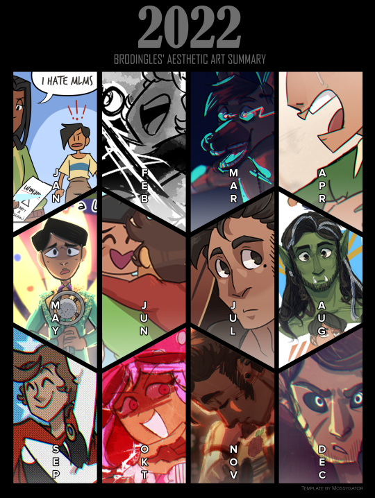
Year in Review, 2022
I actually made a couple of these, because it was hard deciding what really encompassed my year. The version above is the one with my Aesthetic version, which has the pieces I think were the prettiest or most aesthetically pleasing ones I did for that month.
This post has my thoughts on the pieces and some overall thoughts on my progression through the year! I’ll post one with just the image afterwards.
January
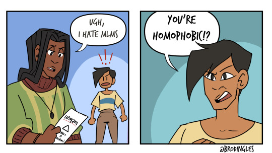
I spent most of January coming off the end of IR and DMP, and as such I had a lot of. Juniper, Dorkus, and Angie on the brain. I actually made a few of these little comics. >:0 Dorkus is one of my favourite expressions I’ve done in a long time, and it lives in my army of Discord emotes haha.
This kind of WAS my meme for the month, my favourite thing overall.
February
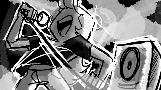
This piece is actually part of a set that I did on stream! It’s part of a set. Keep this artstyle in mind, it will come back later!

Was still drawing Triad Shenanigans this month. I just wanted to share Discount Chocolate Dorkus.

Despite what it may seem like, I actually spent this month planning Tiny Gents! I made headshots for every important NPC for the first oneshot I ran ever in my life. Very shaky knees, but everything went well!!
March

I have no idea what came over me for this one I just went as feral as Barbeau haha. This HAD to be when we were talking about doing a certain DnD game, but the DM and players have been so busy all year we never played. Maybe 2023 is the year Barbeau comes into fruition??
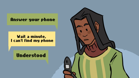
Not the full comic and no Dorkus because I’ve already shared plenty of Dorkus and Juniper needs to be in here SOMEWHERE, but apparently I was still going strong with these in March?? Wild!
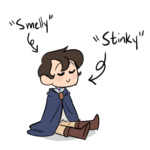
We ran the second(?) Tiny Gents session this month. I am including Tiny Gents because it was such a big part of the year in total haha. April
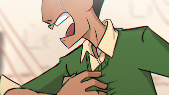
I actually don’t like this piece very much, if I’m honest, but I made it and that should be worth something!! I had the song Eyes Don’t Lie going on loop for this, and I put it on my Rememdium playlist, which is probably my most played playlist of the year (If not, it’s TG). This song is going to come up again, but it definitely put me in A Rememdium brainspace.

I actually spent the month drawing more Tiny Gents stuff. Pictured above is one of the “Feral Group” PCs (featuring Charming reading a book). I did some more character design stuff this month, mostly sketching traditionally.
May
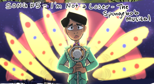
This piece is actually from a LIST of pieces that I did in a row for the Song Meme. This one just looks the nicest when cropped to me haha.
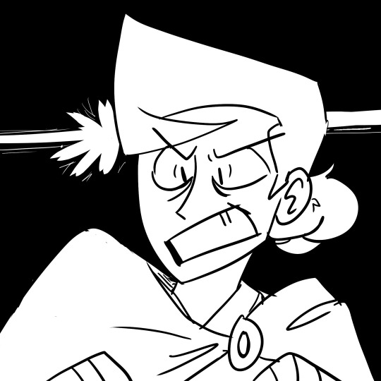
I also redrew a classic comic with the newer designs for the TG RA’s. I...got so much done this month haha.
June

Pride! Emilio and (then) Geon! This was actually NOT the highlight of the month, because this month I created Aine!!

She just POPPED into existence while I was listening to Eyes Don’t Lie and then she took over my brain for a while.

I also did more Tiny Gents art because I had brainrot all year.
July
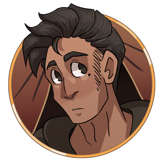
ANTHONY TOKEN
So Anthony, my boy, came into existence a little before this month, but I didn’t draw him much or think about him much until AFTER I drew his token. Now I’m obsessed with the goober. I plan on redrawing this, I’m not as happy with it now.

I actually posted this one here recently, but I did this as a send off with the Feral Group for TG. They haven’t played since and I miss them ;v;
August

I did a lot of doodles? This month? It was a little slow. I created Hisscisca (the half orc) and Jamie (the pink goth). I actually did frames for an animatic done by @anatthema-art
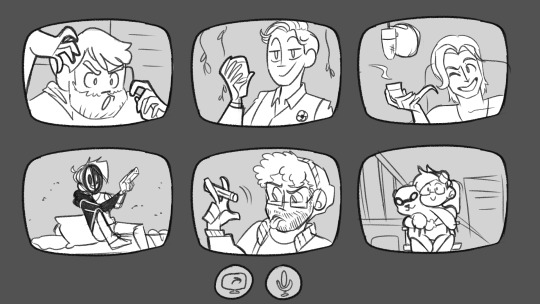
Also created another character with the help of @churrobird
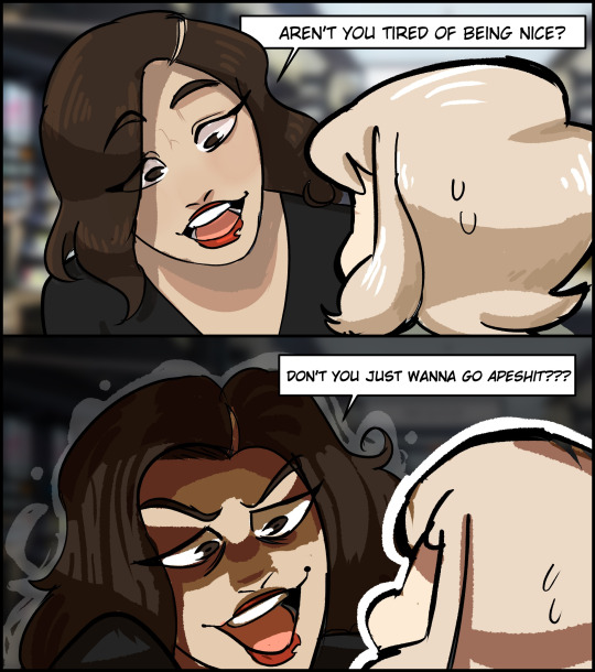
Got back into Triad shenanigans and made Dorkus a gf. I also did a set of outfits for Juniper! I’ll try to post these separately, this post is getting long.
BUSY MONTH.
September
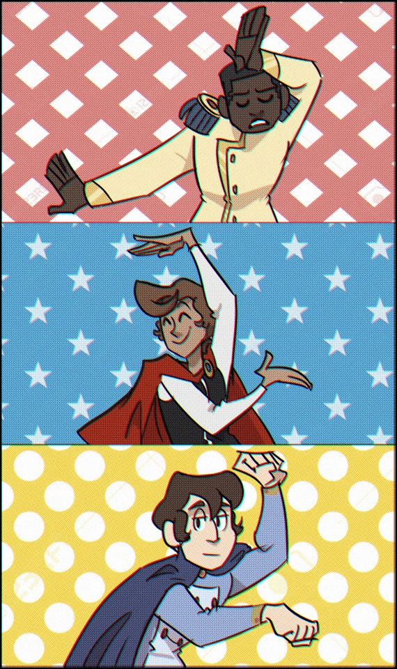
More Tiny Gents. I did so much Tiny Gents. Not so much art but just doing Tiny Gents.
BUT I ALSO WENT INTO ANTHONY BRAINROT

I HAVE SO MUCH ANTHONY. I DID AN ANIMATIC FOR ANTHONY I WEEP. I SOB. I CRY.
October
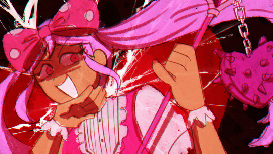
I drew this one in a haste and for love of the game to do MOTI’s Songtober! It was a really fun piece to do, and I’m surprised I have not done more fanart for this game ohoho. Omori made a big impact on my art.
I also tried really hard to do a TG comic this month, and I did 3 pages. Hooray! I can’t find it in my files, but it sure is a thing I did.
I also did like...3 birthday pieces because I have so many OCs with October birthdays.
I actually also spent this month working on an even bigger project...

So Monkey’s Paw is not mentioned ANYWHERE in this summary, and that’s because I forgot I had to do a ton of art for it despite it consuming my being for several months. It is a surprise I got anything else done, really. I don’t even remember when I drew these-- technically they should be earlier. I’m glad the song and video are out haha. Also yes I put an Omori reference in the video.
November
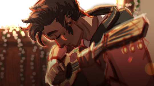
This piece kind of changed how I approach my pieces in general? There was a lot of reference gathering and editing that went into it, even though it didn’t take long to actually draw. I just wanted to try something cool, and it seems to have succeeded. Really this month I did a bunch of cool art with Anthony, I’m also quite fond of the sword piece.
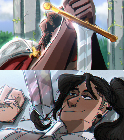
I have so many feelings about this image you don’t understand.
December

I actually don’t know if the person I did this for has a Tumblr, but it was a Secret Santa gift! I did other smaller pieces this month, a lot of them, actually, but I mostly just chilled out. December was very reflective for me personally, and I became so grateful for things that happened this year. This summary is very visual heavy and I apologize for that, but there’s so much art to share this time around and I wanted to do that! Conclusion
I spent this year working mostly on my own projects, which was very surreal. I’m very grateful for being able to do that, and would like to continue working on projects throughout 2023 as well!
25 notes
·
View notes
Text

HERE THEY ARE all of Stampy's (currently alive) wolf pack. Please note that tumblr murders my quality so clicking the image to get more than three pixels is recommended.
I ran out of space for images, so please reblog the reblogged version with all the dogs! It'll be in the notes when I finish typing it all out.
Some dogs (like Flippy sorry Flippy 💔) got kinda covered up, so for clear pictures check under the readmore!
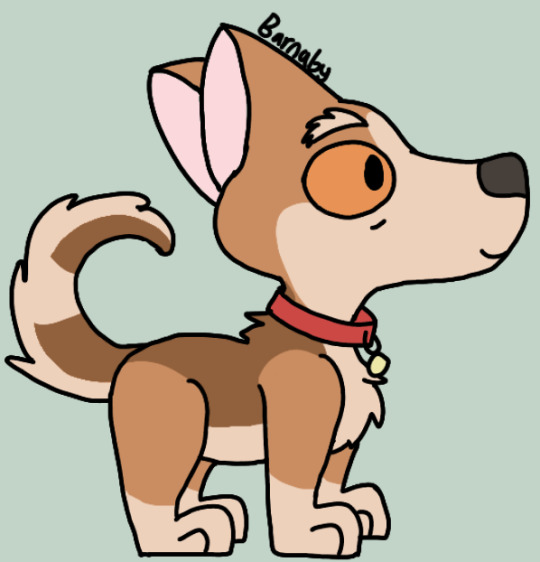
Barnaby is a corgi! I took some inspiration from Alyx, Stampy's real life dog. He's got bushy eyebrows and eyebags because he's old.

Sherbet is a chocolate lab/german sherpard mix! He gets chocolate lab from Aqua (chocolate labs LOVE to swim) and german sherpard from Spring (apparently they're known for jumping, also Spring was the Playful Popo dog.) Him being known for his shiny fur made me give him eyelashes.


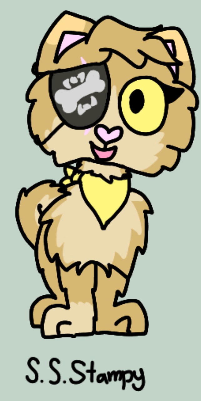

Fluffy is a pomeranian! She has a lot of alt outfits because she has just. A whole bunch of backstory but she's blind in one eye, wore an eyepatch during her trips on the SS Stampy, and after Tragic Day she has a new collar and a neck scar. In my headcanon, Stampy was so sure Fluffy was dead because he found her collar, while in reality, it was just ripped off and she ran away to avoid getting any more hurt. Also, her eyepatch has the symbol of a dog biting a bone!
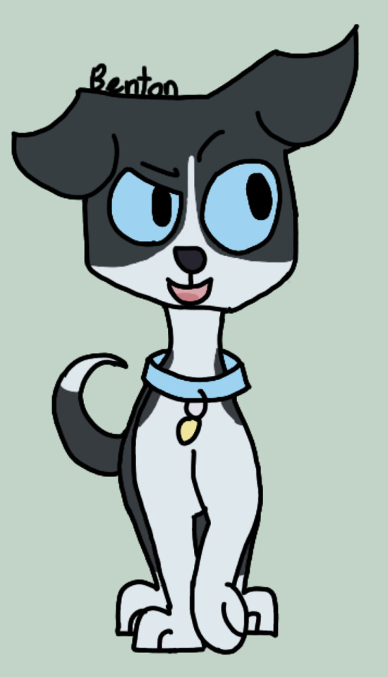

Bengy is a pitbull! He's mostly a pitbull because I wanted Duncan to be a pitbull and Bengy is his brother, but I think it fits him pretty well. The spot in the side profile is only on one side.

Flippy is a golden retriever! She's old, hence the eyebags and grey muzzle. I had actually made a design for her a while ago, but redrew it here and edited a few things.
The other dogs are in the next reblog! Check the notes of this post.
#stampy's lovely world#stampylonghead#stampylongnose#stampy#mcyt#god I'm not tagging every dog#Stampy's wolf pack
39 notes
·
View notes
Text
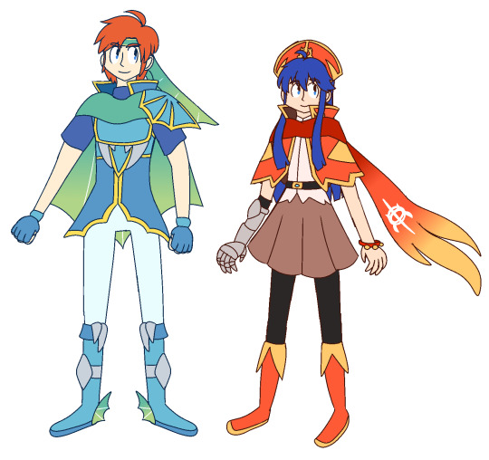
Fire Emblem: The Binding Blade Postgame / The Dragon's Gate Aka Roy and Lilina gets isekai'd
Hooh.
I've never shared anything about this fun idea that I brainstormed nearly a year ago, so guess it's time to talk about it. Idk if I should call this an au or not.
So, this is supposed to take place 2 years after the events of FE6, where both Roy and Lilina (now 17) travelled to Valor bc something happened over there, so when they go investigate what was causing it, they found Nils (idk if he's supposed to be grown up now or is like Sophia and hasn't even aged a bit), so they went after him until they reached to the Dragon's Gate. Once they entered through it, they end up in the Dragon Realm, and then a whole bunch of shit happens. This was supposed to make FE6's connection with FE7 somewhat closer, but I never expanded on it. Also, since it was made for fun, the chances of making FE6 Postgame a reality is very slim atm. Btw I'm pretending that the multiverse bs isn't real in the FE franchise.
Anyways, I'll just explain a bit about the Dragon Realm designs that I made for Roy and Lilina:
Roy: His outfit is heavily inspired by Elibean Ice Dragons, and a reference to Ninian being one of his possible mothers in FE7. A lot of fan depictions of Ninian!Roy either give him Manakete ears or just Ice Dragon traits, but I feel like depictions like that have been overdone, so I'm not a huge fan of those depictions in particular (Not that they're bad tho). Instead, his outfit has features that resemble traits of the Elibean Ice Dragons, notably the fins and sharp fangs.
Lilina: I think her outfit was designed first, but idk. So anyways, it's a very loose inspo of Elibean Fire Dragons, but aside from the flame-shaped scarf, it has almost no resemblance to those dragons, though this is because I didn't have that Dragon Realm idea in mind yet. Also, I gave her that gauntlet that covers her entire lower right arm bc I thought it looked cool. Her hair used to be cropped at the tips (Her fringe remained the same), but ever since I drew DG!Lilina today, I just draw her with her usual hair.
I do have more ideas set in stone, such as including Wolt in this whole thing and also give him an Elibean Dragon-inspired outfit like both Roy and Lilina, and add characters original to it. I don't have anything else to add, so I'll just show off stuff I've made related to it (and it's not even all of it.)
Please don't kill me IntSys


Here are some portrait edits I made from Aesprite (Yes, I just used their FE6 portraits as base bc if I redrew them, it would be hell on earth). And no, there won't be a ROMhack for this, because I have absolutely no experience in ROMhack stuff whatsoever.


Some art I drew when this idea was freshly baked.
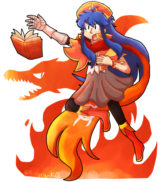
Lastly, I just drew this very recently, because this idea came to my mind again.In addition to Art Fight coming up next. This is a style test.
#fire emblem#fe6#elibe#lilina#roy fire emblem#fire and ice#fanart#gbafe#portrait edit#possible au#my fanwork#fire emblem the binding blade#fire emblem binding blade
15 notes
·
View notes
Note
1, 23, 27 for the oc questions?
This contains super old drawings so I’m putting it under a cut, beware my middle school art. Thanks for asking these were fun to answer :)
1. Your first OC ever?
I’ve answered a similar question to this a couple of times before, and I mentioned like the ocs I made when I was like 8 years old. This time, I wanted to use like my first legit developed OC who I put effort into building as a character (this was when I was 13-14), but I wanted to put a specific drawing of her that I was really proud of at the time and I couldn’t find the notebook it was from, so maybe another time. Instead, here’s my wings of fire OC I made when I was 11. Her name is Bobcat and I did not put any effort into building her personality at all unfortunately.
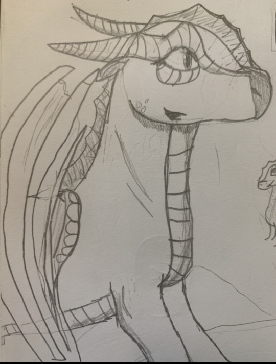
From this image I assume she was nice, but who is to say. I like talking about really early ocs though bc sometimes there’s not even a concept I just drew a person with random shapes on their face or outfit and then like an out of context line of dialogue and that was it. It’s also like fun to see the ideas I came up with that I have NO memory of whatsoever. I made a couple of sparkledog type characters and drew them each once and never again. I had no idea I ever did that it was news to me
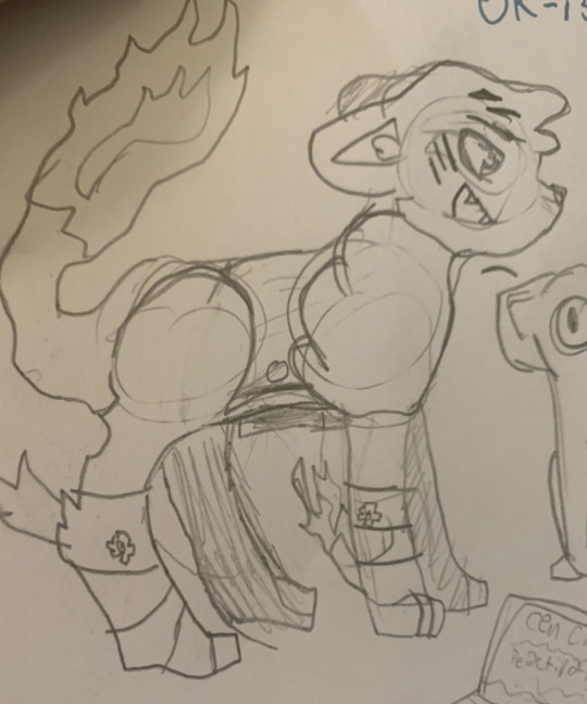
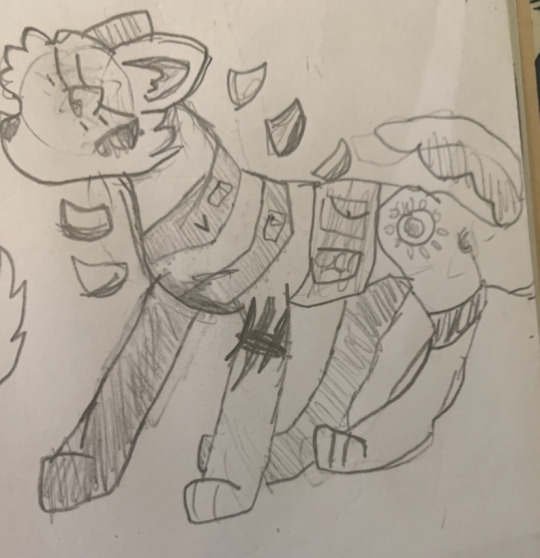
As you can see the one on the left is fire themed (he was a supervillain) and the one on the right is technology themed (superhero). I found this context from the writing on the page which I cropped out bc it is dialogue I wrote at age 12
23. Introduce OC that has changed from your first idea concerning what the character would be like?
Ok let’s see I’ve talked abt Angel and Gloria before so who’s left… I don’t think I’ve talked abt Daisy before. The like cyberpunk style characters originated as an idea for a DND campaign I had, and then decided to write out instead. However, I only came up with like one character, so I abandoned the idea. Coming back to it like 8 months later, I made it sci-fi themed instead. The first character I had like solidified was Remy, who was a pop star basically. For some reason, I later on came up with an incredibly similar idea of a like super rich diva girl type. Not only was this almost exactly the same as him, the design was also very very difficult to draw. So I was like ok this isn’t working so I redrew the character a couple of different ways, and one of them was like a repairman type character with super curly hair, who I thought looked cool, so I basically replaced everything abt the character (personality name gender backstory) except narrative role + role in the heist itself (<it was a heist at the time it’s not anymore).
Also Anjara was originally an ace attorney oc (<from when I knew absolutely nothing abt ace attorney but I had seen objection funk) with like a smug personality but then became like a samurai type personality instead.
27. Any OCs that were inspired by a certain song?
Yes. Many. An embarrassing amount. My creative process is essentially listening to a song I like that doesn’t have anything to do with any of my ocs, so I come up with a new oc to channel the emotion through. To better enjoy the song. I don’t do this as much now though because 1) I already have a lot of different ocs to cover various song types 2) I’m better at developing characters from nothing I would say. But enough abt that let’s get into specific songs.
every like sci fi oc I have: daft punk around the world/harder better faster stronger from alive 2007
Laura: Dynasty by rina sawayama
Saida: Grace Kelly by Mika. She’s totally different from her original characterization. It used to be like she had no sense of identity and now she’s like, the complete opposite of that LOL
Melanie: baby one more time by Britney Spears, not because her character had anything to do with the song whatsoever, but because at the time I had a bunch of ocs that were just like visual designs made for fight scenes I would choreograph in my mind. To songs. So her design, but not personality, was one of the ones I made for this. Later on it was Honey I’m Home by Destroy Boys
Tane: The Pop Team Epic OP and also Ironina by nilfruits
Aurelia: Wonder What She Thinks of Me by Chloe x Halle, which is interesting in that that song has a very specific and obvious story which the character here has pretty much nothing to do with. Vibes I guess and massive recontextualization
Henry: Friends in Low Places by Worthikids even more egregious than the above since that’s literally a character song abt an ocs backstory. It was also very recontextualized
Luke: Electric Feel Justice Remix
^This is all a little embarrassing to admit, but I’m not going to lie on ocs ask memes I take ocs very seriously. Also I like how it said “an OC” and I just completely ignored that
#an interesting fact abt my ocs is that I came up with several of them while I was in therapy#and I would drew them while talking to the therapist#and sometimes I’d talk about oc lore to her#I was too embarrassed to talk abt what are now my main ocs#but she did know the lore for Anjara Aya and Remy#I lied abt Remy’s gender for no reason he was too gnc for therapy I guess#my ocs#Also since the drawings I put here are all animal characters I feel like saying I was actually more into making human ocs even then#it’s just that I’m too embarrassed to post the drawings I made of them 🥲
2 notes
·
View notes
Text
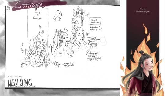
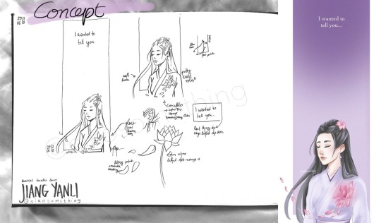
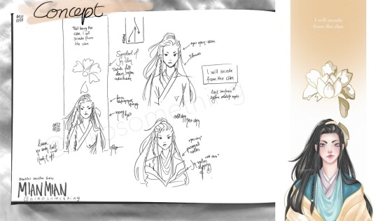
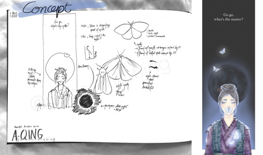
Thought it might be fun to share my concepts for my Beautiful Sacrifice Series
My Concepts
The women of The Untamed are so amazing ughhh
This whole series happened thanks to @mdzswomen s event to honour the women of MDZS. When I read about it I noticed I had never tried to draw any of these amazing women and I knew I needed to change something about that.
My idea was to create a tribute to these strong women and their decision to sacrifice everything. My choice of characters was based on the week one prompts: Jiang Yanli, Wen Qing, Mian Mian and A-Qing. There were more prompts and women, but at that time I didn’t even think I’d manage to draw more than two of them let alone a conceptual series.
It all started with Wen Qing, actually, even though she was the prompt for day two. I knew I wanted a really tall format like a banner hanging from a ceiling (as they are often used in an honorary context) and parts of the character to stick out of its boundaries.
As you can see at first I experimented with Wen Qing fiercely staring into the distance. I tried another sketch with her eyes closed and that’s what inspired all other elements, really.
I decided that I wanted to depict one of the saddest, but also most beautiful and strongest aspects of their journey: the end. I’d call it their final moment, but that doesn’t quite cut it. Jiang Yanli saving Wei Wuxian might have been instinctive, but it wasn’t done to her, she chose to push him away, whatever it may cost her. Which is why I want to go for the phrasing of it having been their final decision. It was an action. And a strong one at that. MianMian chose to end her career, unwilling to tolerate those close-minded people. Wen Qing chose to face the Lanling Jin clan, knowing death was a very likely result. A-Qing chose to signal Xue Yang’s position knowing how dangerous he was.
I didn’t want to portray the scene too realistically, but rather in a symbolic way. For the Beautiful Sacrifice Series I wanted to focus on ease/liberation, sadness and beauty. I chose to portray the deceased with closed eyes and a peaceful expression (as they don’t regret their final act), which is why Mian Mian’s eyes are wide open with her determinedly looking ahead. I also included the last sentence we hear each of these women speak in the show before their (old) life ends.
WEN QING
The first character I had a concept for was Wen Qing. I knew immediately that I wanted to include fire as the cause of her death, but I also wanted to simplify it, to turn it more into a symbol than the actual scene of her being burnt alive.
(At least I imagine that that’s what happened, I may be wrong, though. We know they got her ashes. However, she may have been killed first and burnt later. Or they made it a spectacle to watch one of the last Wen die in flames. Very cruel, but perhaps some found it satisfying).
Wen Qing’s hair is floating in the upwind of the fire’s heat. The flames point to the last thing we hear her say. The background is red for the Wen and fades to black to make the fire shine bright.
The colouring process was quite challenging. I spent days on it, it was really giving me a headache hahaha, I just wasn’t satisfied with anything, the colour palette, the shading, the lighting (it’s the first time I tried a more fancy lighting situation). In the end I put some layers on multiply, which actually helped as I now know her robes were coloured too light, which meant there wasn’t enough contrast to the bright flames in the background.
I was really insecure about the whole piece. I am still stunned that Wen Qing is the drawing with the most notes of this entire series. Thank you so much, it gave me a lot of confidence and motivation to keep trying out new stuff!
JIANG YANLI
Immediately after I had scribbled my Wen Qing concept I knew what I wanted Jiang Yanli’s tribute to look like. Soft and tender, like she is. With Wen Qing it’s the powerful flames that make her hair puff up, resembling Wen Qing’s fierce personality. For Jiang Yanli it’s a gentle breeze that lifts a strand of her hair and carries the lotus leaves with it.
Her eyes are closed as she is deceased. A lotus flower is located where she received the lethal wound in her brother's stead. The flower symbolises her sect, family and fond memories (be it playing by the water with her brothers or making lotus root soup).
Jiang Yanli is wearing my favourite outfit of hers and not her mourning robes which she died in, because I think it captures the gentleness of her personality perfectly with the pastel Jiang colour palette (and it’s actually a layer of see-through fabric in the show).
I really enjoyed colouring this piece and while it was the second design it was the first one I did the lineart and colour for.
MIAN MIAN
I wanted to include an element of disillusion since she experiences that moment of humiliation which is followed by the realisation that the Jin clan doesn’t have her back and goes against her morals.
In the caption I wrote: She spoke up, she stood her ground and then she left all these narrow-minded people behind, choosing to walk alone rather than be silenced. She was the true spark amidst plain snow and she had to realise that the white peony she served was rotten. That day she escaped these golden robes, shedding this old skin which had gotten too tight, and stepped into the future that was hers and hers alone.
The white peony is the symbol of the Lanling Jin sect and while it shines brightly on the outside Mian Mian learned to see through the façade, recognising all the rotten parts she didn’t want to tolerate any longer. With her leaving the peony sheds its petals until it vanished from her life.
In my initial sketch Mian Mian is portrayed with the simple robes she wears underneath her Lanling Jin attire. Since I didn’t give Jiang Yanli her mourning robes and didn’t plan on drawing A-Qing in her white robes either it didn’t feel quite right, though.
The phrase “shedding old skin” and the image of a snake came to my mind. First I thought about experimenting with an actual snake or the pattern of its scales. In the end I settled on the Jin robes being that old skin and showed Mian Mian’s personal robes as the shiny new skin underneath. I wanted to show that she may be stepping out of the Jin sect, but that she is starting on a new, meaningful path.
(Drawing the Jin robes was quite bothersome hahaha. I took tons of pictures of me wearing a robe, but it was so slippery that I almost pulled a muscle while trying to make it look right in the photo. I spent an hour or so on it without any satisfying result and ended up drawing it from imagination after all.)
While I loved my sketch the execution was a p-a-i-n. Colouring her personal robes almost drove me mad and the face, the face was such a struggle. I think I redrew it four to five times. I still think I could have done better, but after days of trying to fix it I decided that perhaps I need some more months of practice to get her expression right (so I might re-draw her in the future).
A-QING
I didn’t think I’d enjoy the A-Qing piece as much as I did!! After having drawn three artworks I was worried that I may have exhausted all possibilities / ideas and that it would end up being a repetition of what I had already done.
I rewatched her episodes for inspiration. I watched all significant episodes of all the women I drew for that matter haha. The last thing we hear her say is directed at Song Lan, actually, which in retrospect surprised me. I could have sworn she talked to Xiao Xingchen last. Or Xue Yang (like in the novel). But nope, it’s our poor poor Song Lan.
Given that A-Qing died the youngest (I think?) I wanted to make her look younger than the other women, so I kept her head round and used pastel colours on her face.
I like moths (unless they eat my clothes or settle down in my food). Moths seek the light and in some way Xiao Xingchen was that light in A-Qing’s life. With the glow they symbolise A-Qing’s soul leaving her body through the lethal wound Xue Yang inflicted on her.
I placed one moth on her mouth as she has been muted by Xue Yang. The new moon in the background stands for the eternal darkness Xue Yang cast on her as moonless nights are the darkest.
For A-Qing I wrote in the caption: She couldn’t protect the man who had taken her in and cared for her. But she stayed. She became a lonely guardian, watching out for the remains of her lost brother in the silence and darkness which were forced upon her. Until that fated day when she gave her life so that the culprit who had shattered this tender soul would be brought to justice.
I finished A-Qing’s artwork way quicker than expected. The robes were tricky with all the torn spots and loose thread, but the rest came easy. I had lots of fun with the moths and the moon. And the glow. I love that cool light blue glow.
THANK YOU
All in all I really loved drawing this series and I thank you for your support, for your wonderful tags which make me smile and giggle and for every reblog and like! Whenever I have a hard time I revisit your tags and find strength within them.
195 notes
·
View notes
Photo

Now with 5000px in width, I am still going to be running out of space for my D&D idiots since theyre all ground-bound except Ursinia.
I’ve added a lot of new characters, and fixed some errors on others as well as completely redrew some of them as well!! I’ll put all the “bug fixes” under the cut, lmao. Also all the names of the new additions!
--
This is about to be one of my longest posts because I am using images to show what I fixed and added instead of just text. God help us all.
==BUG FIXES==
-Completely redrew Kress in his disguised form (Linos) to be in the same pose as Kress with his wings out. Also adjusted a few things about Linos to better match Kress.

-Completely redrew Axel from scratch. Now his hair, scar, sash, leather armour, and boots are correctly drawn, and his shirt and eyes are the correct shades. Also removed his bag strap and a random additional belt with a sword on it because they really don’t need to be there. The pose now also better matches Axel’s personality.

-Fixed a slight hood problem on Carrion so that if both Blaze and Carrion were visible, part of Blaze’s head clipped through the hood, because it bothered me to no end that there was a dent in Carrion’s hood.

-Changed Cecillia’s horns to the correct shape. Why they were rotated 90 degrees in opposing directions is still beyond me, but they were also far too short. They’re fixed now so no worries!

==NEW ADDITIONS==

Rashakeiasychis, or Rasha for short, has been posted here before. He’s a Khenra or Jackalfolk of Amonkhet-style, and goes be he/they. They’re honestly one of my favourite designs I’ve come up with, so I hope he’ll get a game that he can be in sometime soon!!

Azure Sosira is a Dragonborn Sorcerer or Wizard (I haven’t decided yet) who goes by they/them and prefers to talk instead of fight. But don’t get me wrong, they’re a real force to be reckoned with.

Ildan Kilarn is a Drow Paladin who’s a nervous wreck who goes by he/him. He really needs to learn how to better protect those around him, but for now he’ll just keep jumping in the way of attacks and hope for the best.

Inspector is a Warforged Artificer with a few screws loose and goes by he/him or it/its depending on who he’s conversing with. Originally Inspector was built to assist a city guard with investigating crimes, he got knocked about a few too many times by said city guard and decided to change careers and go adventuring. Why he picked a wild west style is beyond him, but hey, it’s a cool style!

Zekiel, or Zeke if you want to get a glare of a lifetime, is an Aasimar cleric who goes by he/him. Zekiel is a calm presence who wants to make sure all those in his flock are looked after. He calls his group his flock, yeah. “Like geese”, he says. Geese. Geese.

Verda Dei-Ilya is a Rabbitfolk Barbarian and goes by she/her. She’s almost hilariously short in comparison to her main weapon, her Greataxe, but as she used to work in a nightclub-tavern, she knows how to deal with big things trying to break the tavern rules. Also yes, she fights in that outfit. Don’t question her style, mmkay? That’s just asking for a broken nose.
#the disappointment speaks#drawings by me#OCs#D&D#honestly next time I update the crew it'll probably be well into the future because hot DAMN am I fresh out of ideas lmao#yes I've been laughing at Verda for the past several hours and no you cannot question as to why#also axel now looks even hotter than ever lmao help meeeeee
3 notes
·
View notes
Text
My characters throughout the story: arc by arc
I realize there’s not much of a point in showcasing my art as is when most of it relies on context, so I’d rather upload my art and give the story behind it.
But okay big reveal ! I redrew my character lineup ! My original was in 2018, and I sorta gave away a lot of character details without any explanation, so I’m sure I left a lot of people like ??? Why is that character dressed like that ?
This time around I’m tired of keeping secrets, time for explanation ! Despite the differences in outfits I made, there aren’t any story changes since then.
I’m gonna give context behind what’s going on in the story in each story arc. The outfit I gave the characters don’t always dictate the point they are in regarding development, so I don’t dive in all the looks.
Arc One:

Their staple outfits ! At least their staple styles. Sure they go through character development within this arc, but not enough to change what they wear. Avery likes neutral colors and dresses, Katsumi with quirky cuts and bright colors, Audrey likes black and edgier jewelry, Advik loves baggy clothes and layers, Zack likes black and gray with minimal detail. Of course they can each break away from their comfort zones, but this is what showcases their characters best.
Arc Two:

The summarizations of these styles is basically arc one: part two ! Confusing, I’m sorry, but there’s no real evolution in their styles. And that’s okay ! They’re in the same predicaments as the first chapter (with the exception of Advik, who’s taken on a new internship in the lab, but that’s not gonna reflect on what he wears.) The biggest change, of course, is the introduction of two new characters !
That’s right, Morgan and Sean are finally in the story. Sean’s style changes a lot, he’s still trying to find what he likes most. After all, he spent the years before wear laboratory jumpers and never really had an independent style until he’s been introduced to the rest of the world. He just copies what he sees everyone else wearing.
Morgan’s sense of style isn’t as thoughtful, she just wears what’s comfortable and makes her look good. She nails it.
Arc Three:

Arc three is where ~*things happen*~. Sean’s had enough time in the real world to get a sense of what he wants to wear. I put Avery into pants because I think she should go around wearing something comfortable given she and Zack spend a portion of this chapter outside Evelow and in some dangerous situations in Recom.
Another notable change is Audrey is wearing more colors ! She’s getting a taste of the elite life of Evelow, given she’s friends with Aurora and her brother Nathan is given respect amongst the lawmakers. So she’s shedding her “mystery alchemist”-persona for a moment.
Arc Four:

Advik takes his first drastic change in style. He’s being taken seriously as a possible contender of a leadership position, and he doesn’t want to give this up. He wants to keep his prime class identity to look out for his friends Avery and Zack who aren’t doing so after after the previous chapter’s events. Speaking of them, they look a bit more formal due to being welcomed into their family’s lives, who are also prime class.
Advik has also regained his memory of who he was before his defunding (aka being stripped of his assets and relocating to the outskirts of town, where he was at the start of the story) so redeeming himself is a priority.
Audrey is dressed down, she left to her old hometown of Dile and spends a great amount of arc four on the desolate island. She left on her own terms so she purposely dressed comfortably. Drab colors to contrast her bright colors from the previous chapter.
Katsumi’s alter ego “GLOSS” makes her debut in arc four ! No one knows of her identity except for Morgan (eventually she tells the rest, but it’s kept a secret for the most part) but GLOSS is a player in the Hadler Arena, meaning she battles other players (not to the death don’t worry lol) and even sometimes genetically engineered monsters.
Arc Five:

And so the corruption begins ! Sean’s god complex is getting to him as he realizes he can essentially get away with anything, and so he does. With the help of his new right hand man Zack, the two of them look for ways to take down Evelow from the inside out. That’s why they’re dressed a little rough (Well Sean still manages to make it work lol)
And perfect timing since Advik has officially gained a position amongst the council ! He now has to pit himself against them. Doesn't help that he already has to deal with Avery’s newfound organization the natural mass. And she absolutely has to dress in her best for this, it’s what she’s always wanted.
I may have changed the design of Audrey’s “corrupted patient” look, but it’s the same concept. Being in Dile back in arc four sure did some strange things to her.
Arc Six:

This is essentially the aftermath of the previous chapter’s events. Aurora managed to win the fight, at least so long as it's over. With corrupted packets within the city and imprisoned characters, it’s reflected in their outfits.
Sean, due to Aurora’s love for him, has been let free, but must stay in hiding or else she won’t hesitate to hurt him. So in solitude Sean stays, in a fancy complex, mourning the loss of his friends. He blames himself for the downfall.
Avery and Zack were captured. Avery was imprisoned in Aurora’s own palace, and Zack at the medical center (the end of arc five left him in a rough condition), hence the difference in their outfits.
Advik was banished in a toxic district, and Kat is in hiding, so they battle the wastelandic environment to reunite. Advik ends up getting infected by a mutated fly trap, so he needs to do something about that hand of his.
Morgan struck a deal with Evelow’s elite: They cured her mutation, so long as she hunts down the rest of the projects for them. They’re not too pleased that Aurora let Sean escape but can’t really reprehend her for it.
Aaaaaand Audrey’s final form ! She’s embraced becoming a host (and bright colors again) and I think she’d resort to her natural hair color. She’s ready to take on the final boss and help her friends restore Evelow.
#art#advik#audrey#avery#katsumi#morgan#sean#zack#ummm let me know if I missed anything !!#or if you have any questions !!!
7 notes
·
View notes
Text
Mastermind!Danganronpa edits 2 explained!
This is the explanation for design choices in my 2nd batch of mastermind edits you can find right over here so I hope you all enjoy
7. Kokichi Ouma
Fun fact I actually started on this edit in the middle of Father’s Day which is kokichis birthday and I finished it early morning the next day, also I did the sketch in a car because I was coming home from a family members house right after I started it. Of course I like red buttons hehe so I have them to him, his outfit is mostly white so I changed his sleeves to be black and I made his pants to be red with those weird straps black. I love that I gave him face paint but it’s kinda hard to see the white part, I was going to color half his face black instead of white but I realized it could be taken as racist which I am not (ok when I say it like that I sound like I’m in denial but I swear I’m not) but of course red monokuma eye around the characters left eye hehe
8. Tenko Chabashira
Hers was actually the first edit that I actually redrew the whole sprite rather than putting stuff over it so you can tell my skill gets better after this one! I actually had originally thought up the headband first and I wanted to make the base red so I made the monokuma eye be pink which honestly is cuter and I made her hair ties be pink to match! I made her weird green hair thingys be black and white because monokuma also they are fun to color then I made her choker black. I decided to replace her cropped uniform shirt with a sports bra which is something women usually wear when they workout at the gym also hehe hoohoo it’s red with a nice black and white trim! I think adding a third layer to her skirt makes it looks puffier and cuter so I’m glad I did that hehe!
9. Kazuichi Soda
There is actually a cancelled draft of Kazuichi! The way I do these edits is by asking my buds over on Crackganronpa (a Dr discord server) who they want to see as a mastermind next, the owner requested Kazuichi but I didn’t want to do the method I did with Tenko because I felt it took way too long so I tried to do my color over method but it was too complicated due to his hair and I had spent around 2 hours just trying to color his hair white so I cancelled him and told them “I’m willing to continue on Kazuichi but if I do then I’m starting over” and they really wanted to see him so I redrew his sprite also so now you all have this Kazuichi! I liked the idea of him dying his hair again if he was a mastermind (because he canonically dyes his hair pink) and I liked coloring his hat black because it matched the white. I decided to color his jumpsuit red and give it pink accents but I colored his shirt last minute and if I was thinking I would have made it black, I had fun replacing the logo on his jumpsuit and making those buttons! I have 2 fun facts about that hammer he has there, it’s actually a large recolored version of the hammer I gave to Mastermind!Angie, the second fun fact is that I actually was listening to Sonias voice lines while doing the hammer. Adding onto that last fun fact when doing the lines for the face I was listening to Ibuki’s voice lines and was listening to Celeste’s voice lines while coloring the suit.
10. Chihiro Fujisaki
This one is truly where I have peaked in design (well for now, don’t know when I’ll strike genius again) so I’m very proud of this Chihiro and my Angie! I’ll start with saying that CHIHIRO IS NOT A TRANS GIRL THAT IS A FACT THEY LITTERALLY WERE BULLIED INTO BEING A GIRL so I gave him some super cool pants and it was fun drawing that belt! I took away his overcoat so you can see his dress shirt and I replaced the coat with a super cool cape!!!! It was fun to come up how the cape is layered the left side going over the right side with a part on top. This was a idea I loved so much and wanted to put on a edit (right under using that cape idea) which is the big Ol fairy flower hat! His design was lowkey based off fantasy things! I felt the design needed one more thing so I lightly airbrushed his face to give him a sickly and sort of pale look. This was also the edit that I started adding the fabric overlay on
11. Korekiyo Shinguji
Now this one! This is a doozy! Lots of little details here and there but first things first, if Korekiyo was a mastermind he would definitely have trinkets here and there from the dead students (also in these mastermind universes the person who is the mastermind in the game they are from dies instead of them) so feel free to guess what thing belongs to who! I believe Korekiyo would want to dress liek the original mastermind and it was fun to give him big pigtails like her, he is wearing a ripped sleeve from one of the dead students (won’t specify but it was hard to get it from under where it was from) and the tie is from another student instead like the one the original dr1 mastermind wore and the little buttons are from other students, the gloved hand is ripped as a little detail and I think that Korekiyo could definitely rocks a skirt! This is truly my husband heehee
12. Yasuhiro Hagakure
This edit came into my home and pissed on my clothes then shit in my sink I am not proud of this one at all just like Kaito (if the 18th mastermind sucks I think that makes it a pattern) so here’s why. I was going to do this like the others but I didn’t want to spend hours tracing the lines for his hair so I just added some bear ears and a monokuma eye over his left one. I changed the yellow from his shirt and pants string to be a nice red and I made the inside of his jacket use the pattern I originally made for Kaito! Yay recycling. Fun fact I was listening to a He///va B//s BLM charity stream (I censored I don’t want fans of the series to come across this in the tag due to how tumblr works and they might get spoiled) also the sprite I used actually was sweaty faced so I removed it to make him look smug. I also removed his stubble because if he was betraying his friends he definitely would wanna look nice for it. The pattern used for Kaito and Yasuhiro is downloadable in the previous explanation post for use!
#danganronpa#drthh#sdr2#drv3#kokichi ouma#tenko chabashira#kazuichi soda#chihiro fujisaki#korekiyo shinuji#yasuhiro hagakura
4 notes
·
View notes
Note
Hey! Love your edits. I was wondering if you could take us through how you make your edits? And any tips on how to start with editing?
I COULD try and livestream the whole process because one single edit I post is quite literally, a combination of different edits, some parts are even completely redrawn based of canon material and references.
I think the best thing to do is to just show you in rough lines how I created my last edit:
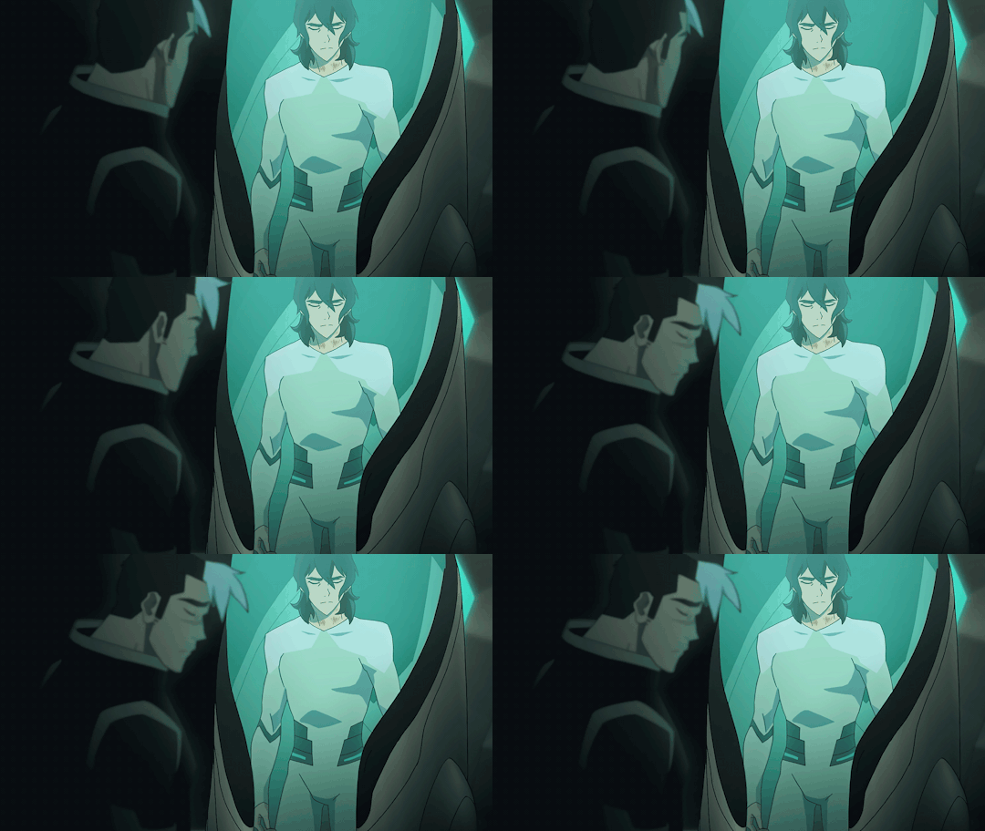
Also seems like the perfect time to post all my wips and bonuses! which isn’t much but… yeah
1. BACKGROUND
So first I searched for a healing pod for Keith to sit in.
So I headed to an episode of Voltron which featured a lot of empty healing pods :S1 EP9: Crystal Venom. Eventually I found this screencap:
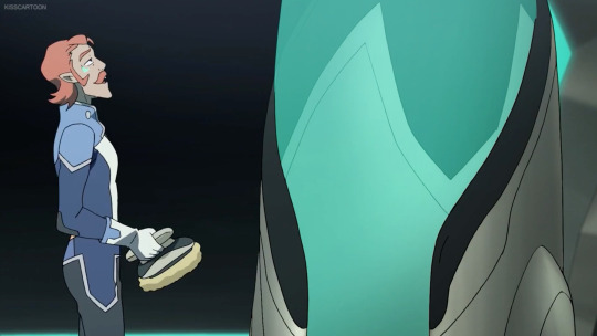
So I edited Coran (+ the annoying watermark) out and voila:

I’ve made a canvas where I could drop the rest of my photoshop shenanigans in later on!
2. KEITH IN THE POD OUTFIT
Okay, this one is a lot trickier. To recreate Keith wearing the outfit I used the following images:
Keith’s body came from this screencap:

Keith’s head came from this screencap:
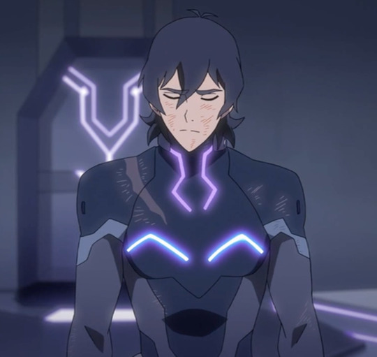
I redrew Keith’s entire pod outfit onto Keith’s body more or less?
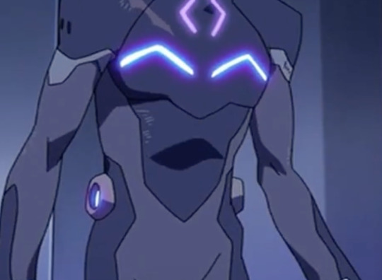
I used a couple of screencaps of Lance wearing the outfit for design + color reference, pretty much how actual artists do it when they have to draw things from the show!
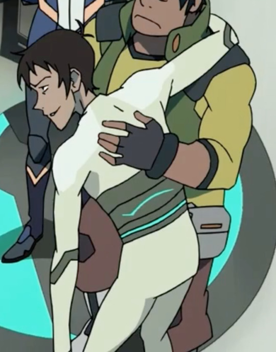
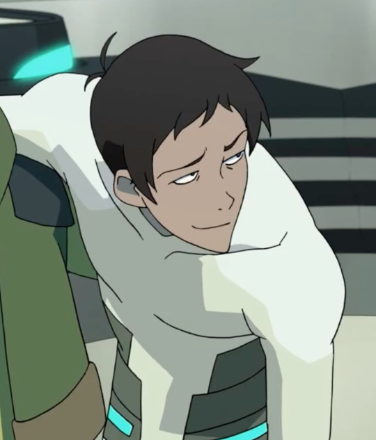
This image came in really handy because there I could also color pick the shadows on Lance’s chest & shoulders.
Now, to actually start DRAWING, the following tools will be your life savior:
1.

The brush tool to create lineart, which you’re going to draw right on top of Keith’s body. Since the pod outfit is really basic and the animation of the show is literally just black lines, you can make a really basic outfit from just…well.. lines.
Also to make sure your lines are anti-aliased, exactly like in the animation, use these settings:
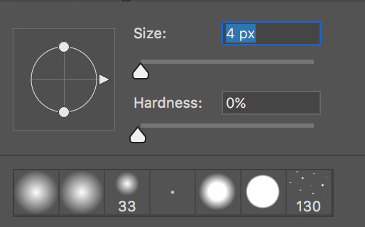
Since your brush is really small (from 3 to 4 px in diameter), your hardness has to be at 0% (that’s what she never said). It’s the softest (and most anti-aliased) you can get.
2.

The color picker to take samples of the colors of the pod outfit (including shadows!). You’re going to use this A LOT to take samples from the outfit on Lance himself.
3.

The polygonal lasso tool to select areas on Keith’s body to so you can fill in entire areas. With this tool you’re going to color your lineart (on top of Keith’s actual BOM suit, lmao)
For the shadows, I’ve used the shadows that were already on Keith’s body.
It should give you this result:
(also yeah I flipped the canvas because my POD is headed in a different direction)
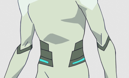
If you still notice some imperfections, you can always fill them in again with the brush tool, or if you’re unsatisfied with how the shadow looks you can always fix it up with the polygonal lasso tool as well!
For the next step I’ve selected out Keith’s head from the first screencap, pasted it onto Keith’s body, messed around with the colors a bit, to make it match the color scheme (I always use Color Balance & Selective Color for this)
Since Keith was still hunched forwards to much IMO, I’ve used Liquify (Filter > Liquify) to straighten him up and I’ve copy pasted Keith’s left arm onto his next one so that his joint is pointing inwards, so his arm isn’t sticking out as well.
which gave me this result:
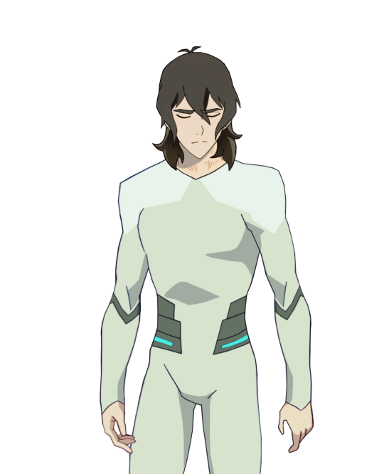
As you can see I’ve also kinda remastered his hands, and I’ve also removed the knife from his fingers. And I���ve also made Keith’s hair longer (because I wanted to, for the angst), all redrawn the same way as the pod outfit.
(I’m so sorry this is so hard to explain but my editing process is literally just and endless repeat of drawing, coloring and shifting until everything is exactly how I wanted to be ;; the more time you spend on photoshop the better you get at seeing details that are easy to patch up. It really comes with practice. ORZ)
3. SHIRO
For the upset Shiro, I’ve made a transparent gif. The Shiro I’ve used comes from this scene from S1EP9: Crystal Venom

But since it’s OLD SHIRO, not Kuron, I had to edit his entire outfit + hair so that it looks a bit more like Kuron in s3. And yes, this also means, redrawing every frame, because in this particular scene, Shiro is turning his head. Luckily his outfit isn’t that much different. He just has an… obnoxious white collar.
For his bare arm and Shiro’s hair I used the same coloring technique for Keith’s pod outfit, although the lineart won’t be really necessary here (since Shiro’s already kinda blurry looking anyway)
This is the raw transparent version
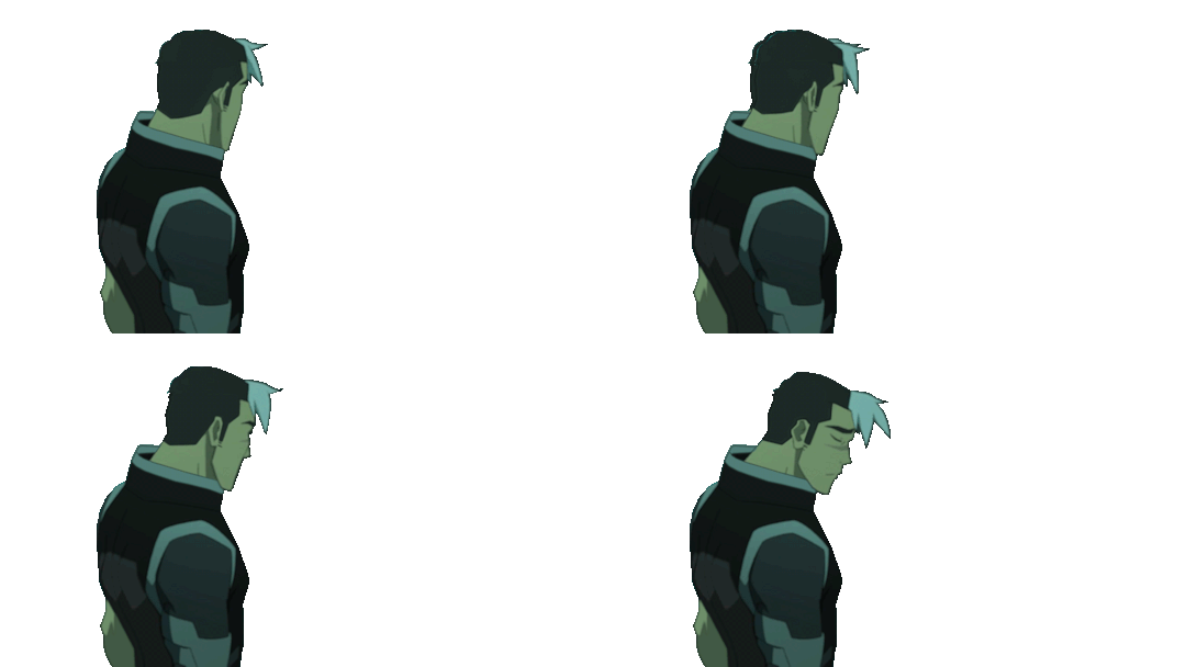
(I know his white tuft is normally cut shorter but… just a dumb detail jhegz, nobody noticed anyway)
I extended the time of the first and last frame to 1 second, the 2 in between are 0,1 seconds.
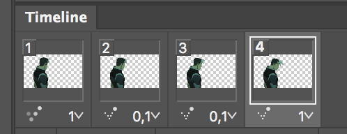
the frames have also been reversed. Since in the episode, Shiro sighs at Keith & Lance first and then looked over to Pidge and Coran in that moment.
But in my edit, we want Shiro to look at Keith first, so yeah, I manipulated that a little by reversing it.
3. ASSIMILATION
So now that I’ve both got my Shiro/Kuron and my Keith I’m gonna slap them onto “the scene” aka that screencap I’ve edited.
Here’s a quick GIF of all the actions I’ve underwent to finish the scene up. Since it’s the just the finished psd of my edit I’m just making a recording of me selecting all my layers again :’D I didn’t… actually record myself making it because that’s would have taken me a WHOLE DAY.
Before this I’ve also cut out some parts of keith’s body because he’s IN the healing pod, he’s not chilling out on top of it.
To give Shiro that blue-ish glow I’ve used blending mode -> outer glow with opacity 14%
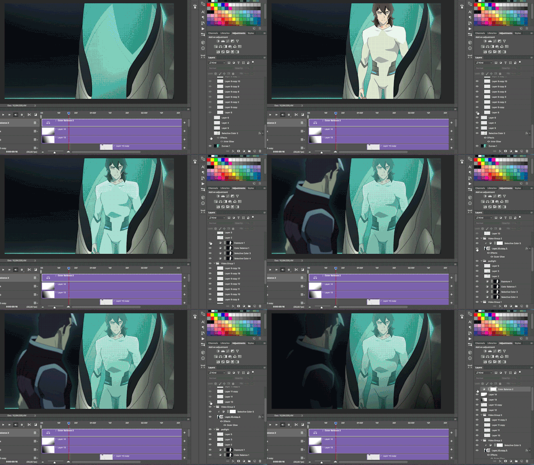
Also, GOLDEN TIP:
Adding shadow really make a scene 500% more dramatic
To add shadow I’ve made a new layer, and used a black & white gradient with the gradient tool.

For this edit I’ve added 2 shadow-layers.
I’ve done plently more animations on this edit after I was done with actual editing. But for now I’m gonna skip this part because it’s just all very basic GIF making. Also my ADHD is kicking in ^^’
I hope this explained it a little? I apologize that I didn’t go into detail, but it would’ve taken SO MUCH time otherwise. Again, making such an edit takes me a full day to make because 70% of the time I spend my time drawing or cleaning up details.
If you’re interested in a doing livestream of some kind, LMK!
698 notes
·
View notes
Text
Why I Hate Powerpuff Girls- The Power of Four
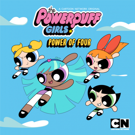
1. Bliss’ design. I know this isn't anything new. We’ve all heard “she looks like a Deviantart OC” but it’s true. Tumblr likes to defend the concept of OCs but there’s still such a thing as bad character design especially when it’s in an actual cartoon. Her unnatural bright blue hair stands out a lot, I would’ve preferred if they made her hair brown or black rather than a colour you’d find straight from an anime.
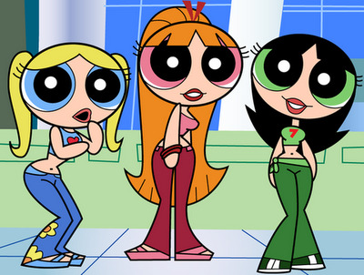
There’s also the issue with her lower half. People were upset about the hips, assuming Cartoon Network let Bliss have such curves because she’s black but after seeing her freakishly long legs, viewers realized the hips were there to add to her age. The rest of her body is proportionate for a PPG so when her legs are twice her size it looks incredibly jarring and disproportionate. I get she’s supposed to look older but it looks like the only thing that grew was her lower half. Look at the episode “The City of Clipsville” from the original PPG when the girls transform themselves into teenagers, you’ll see that their whole body looks more evened out.
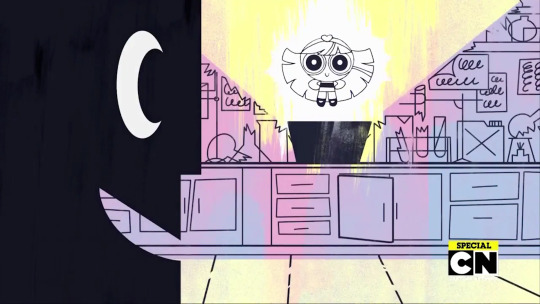
2. Bliss’ Origin Story. Bliss was Professor Utonium’s first Powerpuff girl before Blossom, Bubbles, and Buttercup. Her name is actually Blisstina (which sounds ridiculous, just call her Bliss). She was made with “sugar, spice, and Chemical W”. Bliss couldn't control her powers and destroyed everything around her unable to maintain it. When she accidentally blew up the Professor’s house she ran away and shut herself out in a deserted island where she grew up.
I find her story lazy. Chemical W is an obvious knock off to Chemical X, just slapping another letter on it seemed indolent. The fact that sugar and spice was apart of the formula is confusing since those ingredients created Bubbled and Buttercup separately but in Bliss’ case it created one person instead of two. The fact that Professor Utonium even had another girl before the three is already unsettling for those who enjoyed the original series such as myself. It means that Professor Utonium messed up creating “perfect little girls” by accidentally adding in a chemical concoction twice. Then after losing a child Professor kept quiet about it and didn’t tell the girls about their long lost sister until Bliss revealed herself after returning from the island.
Bliss living majority of her life on an uncharted island is the most laziest thing about this back story. The writers didn’t know how to explain Bliss’ long absence from the show and the best thing they could think of was Bliss isolating herself from the entire world completely. Not only that but she didn’t even train to control her powers while living in the island. She returned back to Townsville after leaving because she couldn't control her powers, so why did she come back after still having the same problem?
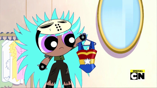
3. They slut-shame Wonder Woman. In the episode the four girls go shopping for new superhero costumes even though there’s nothing wrong with the ones they have now and they don't find anything at the end making the entire scene pointless. While shopping, Bliss pulls out a super suit that resembles the one the Wonder Woman wears. Buttercup actually says “Where’s the rest of it?” and Blossom gives it a hard “pass”. They actually called Wonder Woman, the iconic superhero, a slut for her outfit. But then again the reboot also removed Ms. Bellum after deeming her too inappropriate for kids, and even redrew Ms. Keen, getting rid of her small boobs.
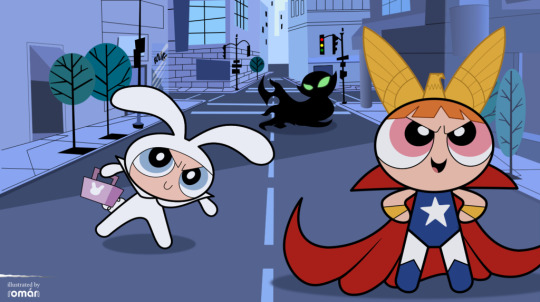
It especially bothers me that we hear Blossom rejecting the Wonder Woman super suit. In the original PPG you would know that Blossom actually likes Wonder Woman. In the episode “Super Zeroes” Blossom is inspired by Freedom Gal, who resembles Wonder Woman, when the three girls try to move independently. In the episode “Equal Fight” when Femme Fatale asks the girls to name female super heroes, Blossom names Wonder Woman.
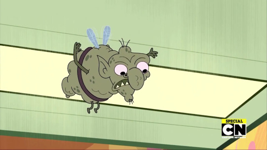
4. The show fails at continuity from the previous series. The last two arguments already prove the shows failure to recognize what has already been done in the original PPG but here’s yet another example. The girls’ shopping trip is interrupted when Gnat tries to destroy the Powerpuff Girls. When the girls fail to recognize him, Gnat tells them he is their “oldest enemy”. If you’ve seen the episode “Mr. Mojo’s Rising” or The Powerpuff Girls Movie you would know their oldest enemy is actually Mojo Jojo.
And as everyone has been saying since the announcement of this episode: Bunny was the first fourth Powerpuff Girl, she even had purple to but I’ve let it go.

5. Him. After removing villains such as the Ameoba Boys, Gang Green Gang, Fuzzy Lumpkin, Sedusa and so on you sure as hell bet the reboot keeps the literal cross-dressing demon himself. When Bliss was on the island she made a friend with a baby elephant named Mi. Because elephants live in tropical islands I guess. It felt like an unnecessary companion, like a familiar in an anime, but it’s later revealed that elephant is actually Him.
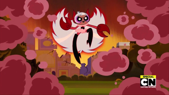
The problem I have with that is why did Him wait so long? Him befriended Bliss before Blossom, Bubbles, and Buttercup were even born so no one was stopping him if he wanted to do something evil, but he waited for Bliss to return to Townsville. And the three girls met Him before so when did he have time to switch back and forth fighting the girls and being an elephant?
Why did Him even need Bliss’ powers? When Him possesses Bliss he uses his power to spin the rings of Saturn so fast it’s like a buzz saw before pulling the planet towards Earth so it can saw it in half. Is that something only Bliss can do?

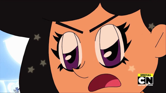
6. Mojo Jojo saves Bliss. So Bliss is under the control of Him and the girls are having trouble defeating him. It would have been nice if it was the Professor who would make a move as a good parental figure by trying to stop Him, proving how sorry he is and showing his lover as a father, but he continues to be a shitty dad and do nothing. When the Powerpuff girls are in a bind, it’s one of their arch enemies Mojo Jojo who saves the day. It’s another example of lazy writing. The writers had no idea how to actually defeat Him/Bliss so they have Mojo Jojo wanting to save Bliss for no reason. He conveniently invents a bomb which can separate the two. To make it look like it’s the girls who’s fighting, it’s Bubbles who uses her Green Lantern powers to whack the bomb and hit Him/Bliss reversing Him’s deal.
7. It makes a reference to anime. Him continues his rampage by becoming a giant monster destroying the city. The girls, including Bliss, team up to defeat Him and have a literal transformation scene where the girls circle around Bliss, all their eyes closed and become shining silhouettes, all with the typical anime background behind them as an actual Japanese song plays during all of it.

The four girls combine their Green Lantern powers to make a Dynamo knock off. Dynamo was also a reference to anime, specifically the mecha genre, but it wasn't so cringy as to have Japanese music playing. To make it worse a bystander in sunglasses says in an Asian accent “Huh!? Look! The Powerpuff girls have bond into one giant Powerpuff girl! Let the fight begin!” Swiping off her sunglasses revealing a pair of sparkly anime eyes.
They proceed to fight Him swinging katanas swords before the girls destroy Him with some super beam.
8. The ending. The episode ends with Saturn creating an “interstellar imbalance” so Bliss has to use her powers to take Saturn back to where it belongs and will probably never come back because the writers know that in the end the PPG are Blossom, Bubbles, and Buttercup. So after being isolated from the world her whole life in an island she ends up having to go into space and fly all by herself for who knows how long.
I know a lot of people were psyched to have a black Powerpuff Girl, and that is really cool, but it’s a shame that the representation was included in such poor writing. It’s so hard to look at what Powerpuff Girls has become as someone who was a huge fan of it during my childhood.
#PowerPuff Girls#powerpuff reboot#the powerpuff girls#my thoughts#long post#rant#personal rant#personal#cartoon#cartoons#Cartoon network
162 notes
·
View notes
Note
Hello, love! What and who inspired you to draw? I love your art! It really inspired me, but how can you draw the whole body? It's hard drawing the body. (Short story: I showed my single parent, my dad, the future! YOI. He was shocked, surprised, and he thought it was funny. He said, "Damn, must be hard having four husbands.". Omg. I'm dead.) Oh, and he asked me to ask you, "How many hours does it take you to draw and color them?". (Sorry that this is really long, I've been dying to ask you!)
A lot of things and people have inspired me to draw, it’s very hard to pinpoint any single thing ^ ^; A full body is difficult for me to draw too (which is why I rarely do it and when I do it tends to take me at least 3x longer than any torso-only shot lol). I just…keep practicing? I’ve been drawing since before I could talk ^ ^; I use references sometimes but I’m bad at it and just tend to go with gut instinct, and just keep on drawing. Improvement is a slow journey but it’s there ^ ^;
And LOL! I’m glad your dad found my art amusing, thank you for sharing with him! It really depends, but in general I am a very, VERY slow artist, and anything that I feel is worth sharing has had tons of time go into it. (One of the reasons why I haven’t opened commissions: I’d like to think my skills are specialized and trained enough to deserve above minimum wage, but I don’t think anyone would pay me that much ^ ^;) Something like one of the several decades later illustrations (like Victor here) which is just a torso shot in a non-difficult pose and simple/zero design outfit in my standard pseudo-paint coloring style will take me anywhere from 5 hours (if I’m super lucky and things go ridiculously smoothly) to 20 hours (Yuuri took around this much, because I redrew his face and hair a dozen times each). Anything with more people like this (kids group shot) will take anywhere from 20-40 hours. This is the total amount of time I spend actively drawing, taking out breaks/snack time/bathroom/procrastinating on social media time etc.
Things like my 4komas, depending on complexity and how my drawings turn out that day (it varies), I can churn out a page in 4-20 hours. My longer regular comics usually require a full week of me working on nothing else. Something like Inferno ch. 1 (Here) took me around 3 months, because each individual frame (that’s each image on a page, so like 3-4 of them per page) is more detailed than my average single color illustration. I also needed to spend a ton of time developing costume and scenery along with story, so hopefully that time will shrink over future chapters ^ ^; I need to figure out a way to simplify or else it’s never going to get anywhere; luckily not every chapter will require so much action or such a large cast ^ ^;
Hope this answered your and your dad’s questions! ^ ^ Thanks for liking and being interested in my art! I never mind long questions haha
18 notes
·
View notes