#also i decided to add some colors
Explore tagged Tumblr posts
Text
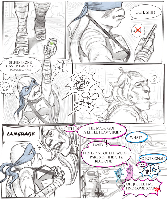
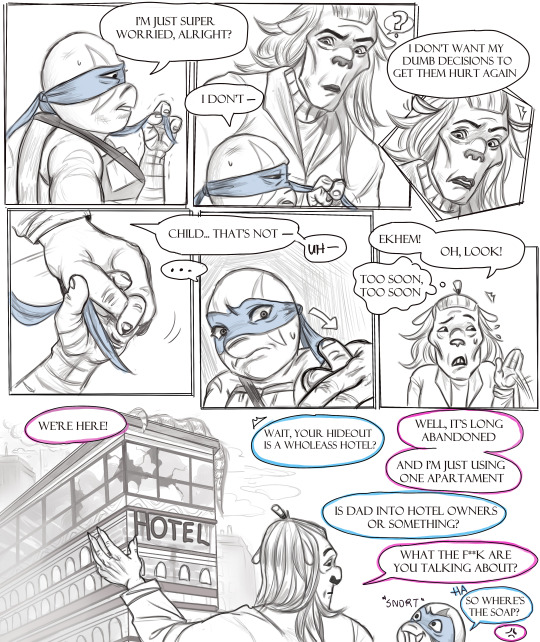
Baby Blue (8/25)
first/previous/next
IMPORTANT: Okay, so I'm unable to make 4 pages a week now, unfortunately. Hence a poll on twitter, asking if y’all want 2 pages every week or 4 every two weeks and 2 pages a week won. So here we go.
#rottmnt#comic#digital#baby blue au#hamato family#hamato leonardo#baron draxum#barry's trying#leo's untrusting#and angry#it's rough lol#also i decided to add some colors#hope it's cool#love ya'll
407 notes
·
View notes
Text

Dead Tired Honey Swamp
Shout out to @deuces-stone-cold-style for the nightgown inspo!
#monster high#monster high fanart#monster high g1#honey swamp#dead tired#finished this a couple days ago but couldnt post it#cuz my laptop battery decided it had had enough and finally went caput on me#i have a replacement coming within a i cant really draw until then and im super bummed about it#anyway this drawing was funny#i kinda hated it but thought if i could just add some color that it would help#and it did i love her#shes one of my most detailed mh designs so drawing her is always a doozy#i wanna design a dt wydowna to match because they are ghoulfriends#also sorry the nightgown isnt that accurate to the actual reference#i dont think honey is particularly a lace ghoulie which is why i went with the wispy plant fringe#and i really dont like drawing floral patterns i just used the csp presets 🥲#i know the dt dolls come with little accessories but she gets a blankie#and i couldnt fit the sleep mask because i refused to get rid of the bow on her bonnet#id in alt#my art#sabz art
509 notes
·
View notes
Text

Powerpuff Girls
#gbunny draws#nsr#no straight roads#neon j#djss#dj subatomic supernova#eve#they're my other ot3 so i need to make sure they look good together too#also implemented some of the changes I asked about#NJ is keeping the pac-man radar#but i did decide to add a gradient to make it more accurate#smiling eve is also winning the survey#i personally think it's a little ooc#she smiles so rarely#but y'all wanted it so i made it happen#added a little more lip detail to make it look better though#djss is apparently perfect and has not had any changes made besides the gradient#reminder: the gradient layer is gonna be semi-transparent#to give the illusion of colored acrylic#to make 'em look more like candy~
56 notes
·
View notes
Note
for the art ask game: charlie with palette 14? :0
All hail the queen!
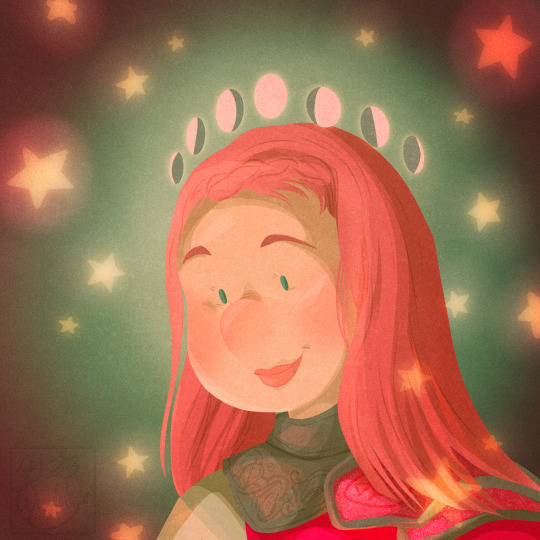
Help me beat my art block!
#spnfanart#charlie bradbury#supernatural#spn art#wiggleart#trying to do these fast so I stop worrying about the little things haha#also I’ve decided that I can use blend modes and opacity which does give me a wider range of colors#and it’s not just the standard five of the palett3#but I still use those palette colors in these blending modes so imo it’s fair game#otherwise it’d be super hard to do lol let’s add some contrast and highlight#! anyway pls send me requests I’m in an art funk atm#not helped by the fact my medication is wishy washy on being refilled right now#so my brain is all over the place
110 notes
·
View notes
Text
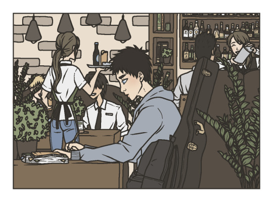

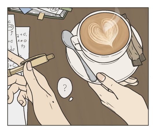
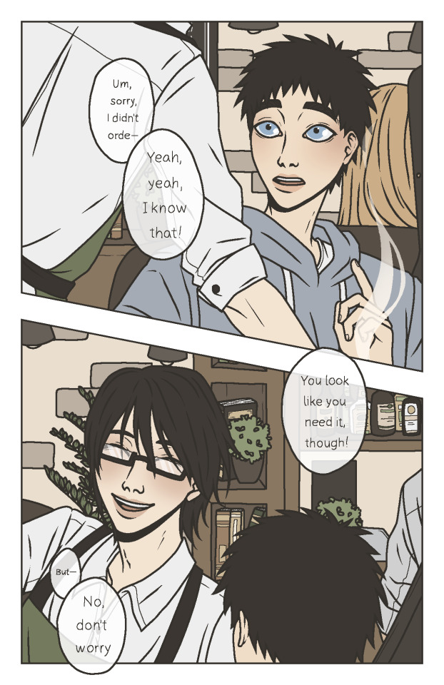
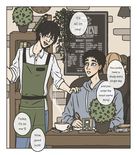
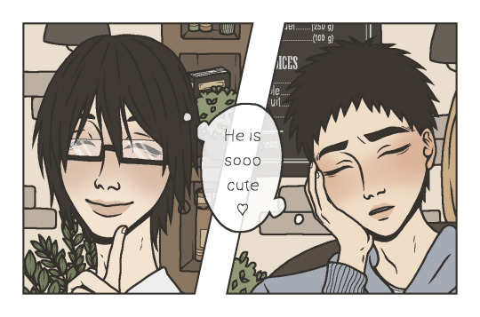
It's finally here, my gift for @alwaysdrowninginfeels for the @knbexchange event 🤍
I decided to go with ImaKasa and Coffee Shop AU (well, it's not really a coffee shop, more like a café/bar)! This was my first time drawing Imayoshi as well as my first time actually thinking about this ship. I got really into it sooo I decided to make a little comic! ☕️ I also decided to try something different from my usual art style, something a little simpler and with less bold colors... Had a lot of fun working on this and I am pretty happy with how it turned out! I hope you will like it, too! 🤍
#knb#kuroko no basuke#kuroko no basket#the basketball which kuroko plays#kasamatsu yukio#imayoshi shoichi#imayoshi shouchi#imakasa#imayoshi x kasamatsu#kasamatsu x imayoshi#fanart#my art#i got so into this i made an entire au in my head#might actually post something related to theese idiots again soon#i got really into them and honestly that's a gift#so yeah... i think we both got gifts in a way!#when it's about the art style - i had so much fun picking colors and stylising everything and making the lines sharp#really tried to set a cozy coffee shop mood with using the earthly colors so muchh#ALSO I SHOULD HAVE PLANNED WHERE THE SPEECH BUBBLES SHOULD GO... i literally finished everything and then added them at the end...#that was NOT a good idea - barely squeezed them in#alsooo the mole on yukio's hand is a little special - i have a mole on the same place#wanted to add something 'me' in the gift#decided to make it a mole...#hope you don't mind it#ALSO i had a lot of fun adding some details#like the board in the background or the guitar and backpack and textbooks and all the people in the background#i loved drawing this AHHH#hope you will like it as much as i do ♡♡♡
123 notes
·
View notes
Text

first page 🧎🏻♂️ of many 🧎🏻♂️🧎🏻♂️🧎🏻♂️
#also will probably add some color i’m still deciding. i think i want to finish alllll the outlining first thought#though*#because i actually rly like how this looks#but i’m worried he looks too gansey like lmao which is why i want to color it a bit….#also love giving blue her gold jewelry and colorful clips <333#my wip#trc
26 notes
·
View notes
Text

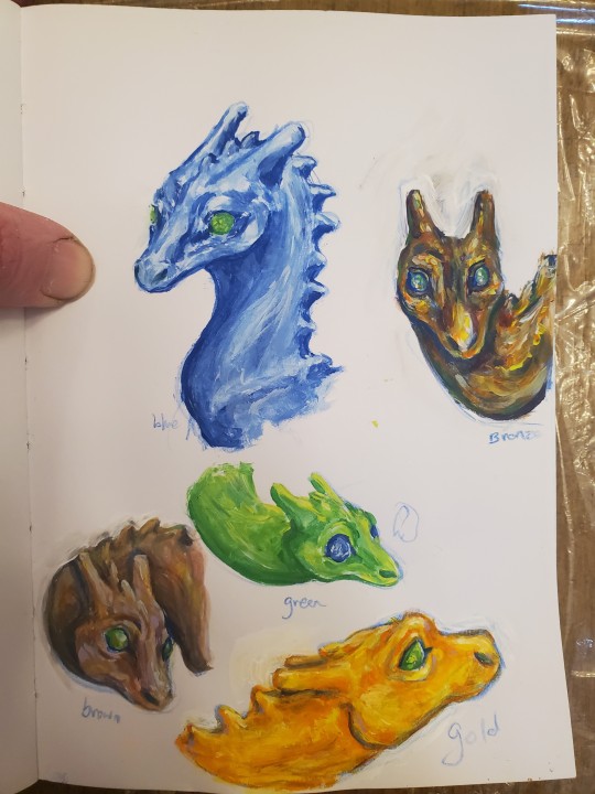
Painted some Pernese dragons with my new gouache paints 😊
#pernese dragons#dragonriders of pern#dragons#dragon#paintings#doodles#not a doodle#pern#dragon art#dragonriders#pernese#dksartz#all 4 original colors ye#i suppose i could add Ruth#yes the blue looks larger and also has a slightly diff face shape/design. i drew it first and then decided on some changes for the rest#but also of course dragons would have differences between individuals ^^
49 notes
·
View notes
Text
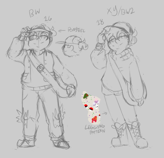

Sometimes I play a Pokemon Game and don't want to make a new S/I for it but do want to interact with it's story and characters.
So here are some Wandering Protagonists I aged up and moved across Regions for funsies.
#Emile's Arts#Pokemon Self Insert#I still haven't fully decided what I'm doing for BW2#Honestly the protags for BW2 are great on their own so I'm almost okay just leaving it to Rosa maybe#Maybe make her a biiit more of an OC and give my draft S/I story to her#That'd probably work better#I did have fun aging up my Sun/Moon Protag he's one of my favorites design wise#Silly little guy <3#More Pokemon S/Is to come I'm working on some things#I wanna redraw my Masters Rocketsona and Sword/Shield S/Is of course#And I'm also designing my Monster Mind S/I for the first time#Having fun arting#EVENTUALLY I'd like to color these and add info#Like what F/Os they correlate to and what not#But that's an after I'm done character designing the rest kind of thing#God I love sketching and designing <3#Anyway ask about them if you want#I'd appreciate it!
8 notes
·
View notes
Text

okay we’re leaning into it; i added wings :3
#N posts stuff#i am still trying to decide if i want the meeting eyes to be like.#one eye socket or if i want to leave it as two displaced sockets#but i did decide the mouths should be hinged together#i might actually tilt the muzzles in towards each other a little more so that they’re further combined#but i am already pretty pleased with it!! so we’ll see :3c#think i’m also going to flip some of the tail colors but i need to design the back in general so. we’ll figure that out then#for the life of me i still can’t figure out how to add a hair floof that looks good 😔#fursona
3 notes
·
View notes
Text
nuggeto
+ original sprite for comparison
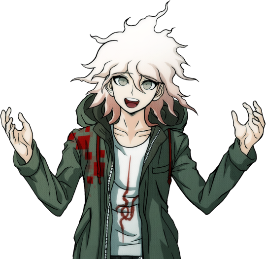
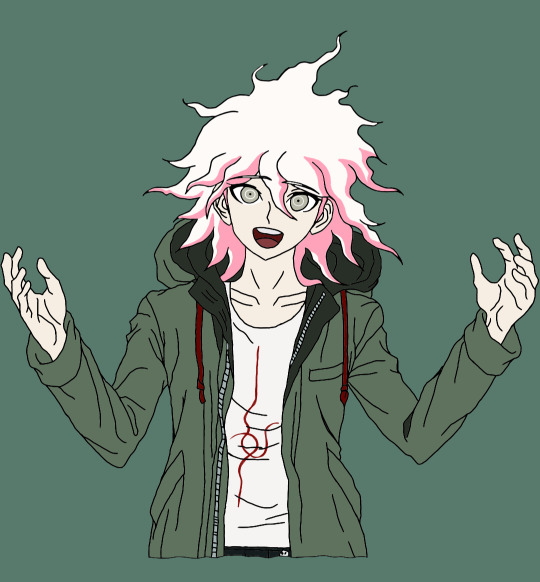
#wondering how &/or why i made this? well because i needed to keep myself awake today and also wanted to practice using the sketchbook app on#my phone. as for how: i actually traced the original sprite#then colored in the hair by hand. in the middle of that though the quality suddenly got annihilated and i hadn't saved in a while#so i just decided screw it. i finished the pink highlights by hand then used the color picker/paint bucket tools to fill in the rest of the#coloring (which i was originally planning to do also by hand). then i opened a new sketch & drew the symbol on his shirt and layered that#on top (idk why but i thought that would be easier than trying to trace it and i...think i was right? either way i like how it turned out!)#then i just cleaned it up a bit- retraced some of the lines and such. and *then* right before i went to finally post it i realized i forgot#the red squares on the right side of his jacket. so i just spent the last hour or so adding those#i was also gonna add a bit of shading too but i'm fucking burnt out at this point so screw that lmao#honestly it doesn't really matter i'm very VERY happy with how this turned out :)#nagito komaeda#danganronpa#sdr2#🖌 tag#🍄 tag#send tweet
7 notes
·
View notes
Text
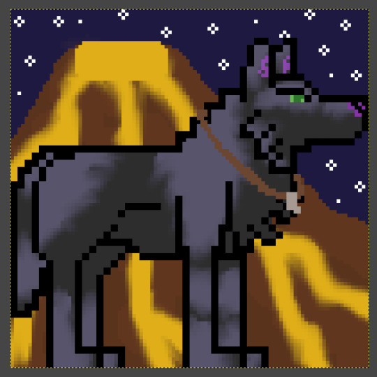
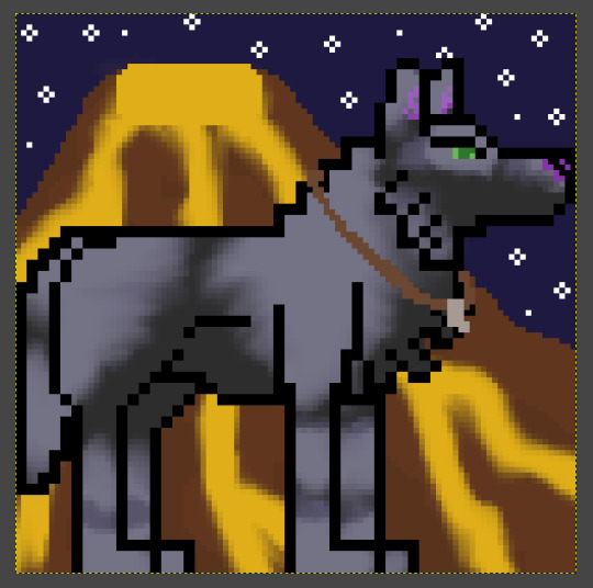
WIP pixel art of my OC
#wotb#wolves of the beyond#my art#coloring is a bit off in gimp rn btw#gotta update it anyway#but yeah. that lava should be orange#as for my oc i decided to update him#i usually make rly realistic looking characters in general but decided eh fuck it let's have some fun#add some funky stuff#so i gave him some light grey patches/splotches and some pink marbling on his nose and ears (pawpads too but not visible in this drawing)#i think i like version 2 better?#anyway if the color remains fucked up#ig if i print this i can put gold glitter on the lava to make it look neat instead of weird lol#rn it looks kinda like a macaroni volcano lol. appropriate bc i love macaroni and cheese#and a macaroni volcano would be amazing tbh#but yeah idk why it's doing that#also i may or may not keep his design like this but tbh i rly like it#he used to have black fur with some subtle brown undertones. i may add those back in some places too#but i do like the light grey patches. kind of a unique look
6 notes
·
View notes
Text
Finally did that third Signpost Uncommon cycle


#custom cards#custom cards 2#not sure Plunder is the best name for that keyword#but it's fitting enough that it makes for a good placeholder#No One Left Behind would probably be better design wise if it had chainweaving instead of that 2 or more Rebels thing#but it's much more flavorful this way#I also had to Google if Swordwise is even a word#and the only result was the Magic card “Swordwise Centaur”#which is good enough for me#I even remember owning that card#I considered making Swordwise Apostate a 2 mana 3/2 as a reference to that#would've taken away vigilance if I'd done that#but I think I like it better this way#also unsure about Church District Guard because Deathtouch and Vigilance is a rather good combo on such a cheap card#but I think it's fine when the deathtouch costs 3 life#Makeshift Pillory originally had a different flavor text that I deemed unfitting but still wanna use for a future card 'cause I like it#also I considered changing up the set themes altogether and add Energy Counters#but decided against it#it would've been nice for Black/Red both mechanically and flavor wise#but that's about the only good use it would've had#overall the flavor of that is taken care off by Blue/Green's charge counter theme#sadly those two archetypes don't have any color overlaps or I could've done some charge counter stuff in BR#I mean I still could#guess we'll see when I get there
4 notes
·
View notes
Text
my toxic trait is I keep spending money even tho i JUST lost my full time job bc I just think "whatever I'll get another"
#tbh my main concern is actually ny insurance right now. my rent is shockingly cheap and ive been saving for a long time#specifically in case of an incident like this so i know i will be ok its just probably gonna be tight and is definitely a setback#but im really concerned about getting medicaid bc missouri is like very famously bad about#like. we were one of the only states that refused expansion under the ACA until a few years ago when we passed a referendum on it#like with flying fucking colors. not a close vote at all we decided to expand medicaid. and josh hawley threw a fit about it#and they refused to add any money to the health care budget until they were forced to comply basically#and a bit ago there was a whole big thing where they fucked some shit uo and purged thousands of people over night from the system#so these people just suddenly had no insurance. anyway wish me luck lmfao! with that or getting a job in Colorado which would also be cool
7 notes
·
View notes
Text
Animatic update ✨
Because I thought Iwas almost finished with the Crowleys but I am not... This is the amount of frames for each character I have left:
Crowley - 25 frames (not counting a couple of snake Crowley frames)
Aziraphale - 89 frames
Metatron - 15 frames
Michael, Uriel & Saraquel - 6 frames
Demons + Gabriel - 3 frames
Seems like a lot (and it is) but a lot of these can be duplicated and just modified a little so it's a little bit less work. Still... quite a lot to go, specially since I gotta go back in and shade everything, or at least make Crowley's clothes and the Bently black for contrast 👌🏻
Thank god I did the backgrounds as I was thumbnailing, otherwise I would have killed myself already lol
#i have yet to decide how i want to shade this... might just do it b&w or perhaps i'll add a color gradient...#i don't know but i do need crowley's clothes and the car to be black because some transitions depend on it#also i gotta do the glasses not transparent in one frame which might look ridiculous because for the entire animatic they are#like still sunglasses but with transparency because i like drawing eyes and i want them to be visible lol#angel's animatic journey#angel talks#personal
4 notes
·
View notes
Text

this is the fit and color combo rosie ended up with for now btw :3
#i think it looks cute on them and works with the dark/purple colors i wanted#but also adds some fun variety to the outfit since it is a bard and that feels colorful to me#even if rosie itself is like. goth bard.#ghost.txt#still not as decided on what i wanna do with them as id like to be tbh.. originally i was leaning towards Evil Dark Urge#but i kinda like them trying to resist it.. i dunno we shall see#i also wanted it to romance someone other than astarion since i went for him my first playthrough but im kinda liking the vibe with the two#supportive of his murderer partner
4 notes
·
View notes
Text

Me and the silly man
#you probably have some funny getting together stories.#THIS MAN ASKED ME OUT ON ROBLOX SQUID GAMES OVER PHONE CALL. ROBLOX. SQUID GAME.#anyways decided to draw the sillyness#also I used to have a scar right under that eye which I’m just tossing into the design#also his barber did him BAD#I didn’t make it look too bad#it’s so sad#also I didn’t add it but GOD DAMN I have so much brown#like my natural color is coming back#anyhow#fursona (ig)#also depression is a banger I have like 15 images of me having a mental breakdown then some horrifying chicken
0 notes