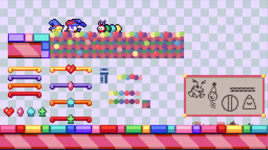
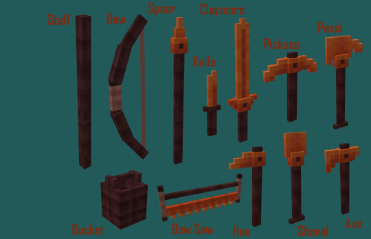
#also i changed up my UI elements for editing!
Explore tagged Tumblr posts
Visit Tumblr Blog
Explore Tumblr blogs with no restrictions, modern design and the best experience.
Last Seen Tumblr Blogs


Fun Fact
Forty percent of Tumblr users are between the ages of 18 to 25.
Text


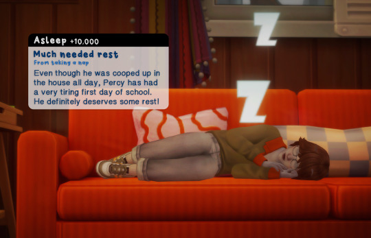
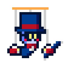
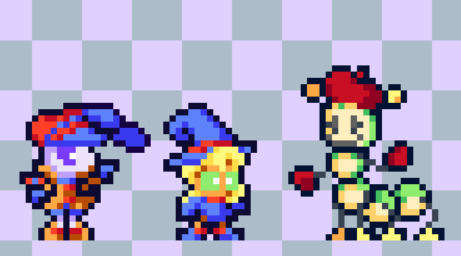
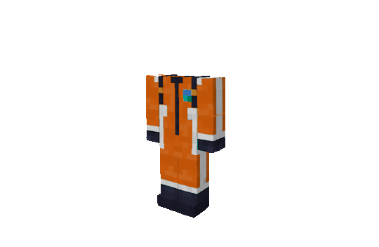
📚 now that he's a child, percy has started school! every day, he logs into his virtual classroom for a variety of assignments and classes. it's a bit unconventional, but probably for the best.
(online school enrolment is from adeepindigo's education overhaul mod. such a cool mod, i definitely recommend checking it out!)
some yapping about my gameplay mechanics down here :P
for this save, i've decided to approach things from a more realistic lens regarding occults, and i'm testing the waters starting with percy. i'm not gonna be going too deep into worldbuilding surrounding human perspectives on the supernatural because that's a bit too much depth for casual gameplay, but i want to try and impose some semi-realistic restrictions because it personally keeps me more immersed lmao
strangerville is a really interesting place for the legacy to start because it's kind of like... anti-alien? or at least alien-hostile. my thought process is that with percy being an alien, his safety could be at risk if he was open about it, especially in strangerville where everyone is either a conspiracy theorist or military personnel. also with the description for generation 2 referencing the alien heir growing up feeling out of place, and the founder having the paranoid trait, i thought it might make sense for percy to have some disconnect from people around him because josie is sheltering him from the outside world. hence online school!
for future generations, if the heir in question is living in a more accepting society around them (ie, forgotten hollow for the vampire generation, or moonwood mill for the werewolf generation) they will naturally have an easier time. but for the more grounded in reality, human towns, i'll be making sure to implement realistic restrictions. i'll also probably make use of the education overhaul mod's occult school option if it feels like it makes sense (which didn't feel like the right choice for percy).
also, regarding the in-game alien disguise feature, i thought it might be a bit too easy to be able to use the disguise without any setbacks like in the vanilla game. i've implemented a personal restriction to keep things interesting where i can only have percy use his alien disguise once a week, almost like it's a special ability on a one week long cooldown. basically if he uses his powers to disguise himself too frequently, it could cause him to burn out. i think it makes sense!
i wasn't sure how to explain this storyline and these mechanics with my usual post formatting so i thought i'd just explain it lmao. if you guys have any questions about it feel free to ask!
#ts4#the sims 4#simblr#gameplay#occult legacy challenge#dean legacy#dean legacy: gen 1#percy dean#also i changed up my UI elements for editing!#wanted to keep them consistent with fonts + colors
80 notes
·
View notes
Text
A longish list of Fo4 mods that hopefully won't break your game if you're playing on Next Gen (This list is very much catered to my specific play style and my love of the Minutemen and the Railroad, BOS look elsewhere)
I'll add more or edit this list when I find other mods that I like which play nice or if one's on here are incompatible
The Technical Ones:
Extended Dialogue Interface You'll need F4SE For this one though I'm pretty sure you need it for quite a few. The extended dialogue interface does what it says on the tin and removes the short four options you have for responses and gives you exactly what your sole survivor is going to be saying so you don't end up being incredibly racist towards Nick when the option says 'sarcastic'.
HUDFramework is a UI framework that makes it possible for mods to add new UI elements to the HUD (I say don't worry about this one until it's in a requirement for mods you're getting)
Cheat Terminal Yes, yes I know how some people feel about this kind of mod. I've been playing fallout 4 for like 10 years, I don't have fun scouring every corner of Boston's armpit looking for clipboards. This is a holotape cheat menu that lets you add anything in the game to your inventory, SPECIAL points and other bits. It also lets you teleport companions to your location if they get stuck in an elevator, fix some faction quest if they get broken. This one is great for me because in my little make believe world I have my soul survivor is either a Courser or the Kellogg guinea pig and there's options to make you a little more deadly
Workshop Framework For Players: New controls and faster, more stable workshop scripts. For Modders: Add new resource types, override settings, and generally change the way settlements work dynamically. You'll need this bad boy for a few of the mods on this list They'll be in the requirements for them on nexus
Fallout Priority Next-Gen - CPU Performance FPS Optimizer Does what it says on the tin and stops me from ripping my hair out. Improves performance by elevating the CPU Priority of the game process and minimizes input lags and prevents stutters caused by other processes.
Workshop Menu Missing Tabs Fix Sometimes your workshop tabs will just disappear which is really really annoying. This fixes that with a holotape
The Immersion/Gameplay Ones:
Realistic Death Physics - No Animations decreases the amount of force of both melee and ranged attacks (especially crits) to more realistic levels
Lowered Weapons I hate how your character is always pointing their gun foward 100% of the time in first person, this has your character relax their hold on their gun when not firing it
Improved Maps and Visible Roads A much better high contrast world map with roads, topography, and waterline all clearly visible. Optional number grid and regions
Reverb and Ambiance Overhaul Increases the diversity and dynamics of in-game sound, Great on the ears if you're playing with headphones. My one problem with it though is that it's a little too loud for me and the settings keep resetting every time I boot up the game, but that can be fixed by going into your sound settings, and it takes less than 5 seconds
Enhanced Blood Textures Mixed blood look a little more like well... blood
Vivid Fallout all-in-one In many cases they sharpened the games original textures somewhat, made new normal maps and enhanced shadowing.It looks really good and the textures are less V-Ram heavy than the original ones
Skip Kellogg's Memories I hate that Bethesda felt the need to try to make me sympathetic towards that man, and so I skip his memories all together. Wouldn't recommend for a first play through
Raiders Nonaggressive Raiders are now name "Wastelander" and they are no longer immediately hostile. If the player gets to close the Wastlander will warn you, if you continue to get close the Wastelander will draw a weapon, if you continue to move forward from there they will then attack
Gunners Overhaul makes the Gunners friendly to the player at the start of the game. It also makes all containers and useful items in Gunner areas belong to the Gunner faction, which means you have to steal it from them. It basically makes them the mercenary/militia faction they're implied to be
Extremely Long Lasting Stealth Boy There is different scales for the length but I do the one that extends it to 1 minute
Pip-Boy Flashlight This one is one of my personal favorites, it overhauls the flashlight on your pip-boy as well as on power armour making it look more like an actual flashlight and like the light is coming from your pip-boy. You can customise what kind of light it is too and some of the options are really cool
Settler and Companion Dialogue Overhaul reduces or eliminates repetitive companion dialogue and adds new situation-appropriate dialogue for companions. They'll have more to say and seem more aware of their surroundings. Settlers are aware of your quest progression, and while they still occasionally complain about "my back hurts, my feet hurt…", they display increased awareness of the dangers lurking in the Commonwealth, expressing gratitude for the protection you've provided them
Better Third Rail this one makes the 3rd rail a little more lively in a lore friendly way
Combat zone restored-restored brings back the cut content that made the combat zone more than just another dungeon
Friendly East City Downs restores the content where this isn't just another dungeon
Fiddler's deliver animation retexture ooooh my god I'm obsessed with this one it makes the loading animations for unarguably the best gun in the game beautiful. And if you're wearing your wedding rings still you can see it in the animation and it makes my heart hurt each time
Natural expression fix helps make the expressions the player and emphasis have a little more...normal
Project reality footsteps changes almost all footstep sounds into more realistic ones. Including subtle gear and backpack rattle
Commonwealth encounter adds almost 300 new encounters to the game
The Faction/Companion Ones:
Afiinity Gains This changes the rate of how you gain affinity with companions. I choose the one that halves it because of the way I play, I get deacon's conversations a lot sooner than I feel is in character for him
Companions Infinite Ammo Gives the vanilla companions infinite ammo for all weapons, just like settlers. As long as they have 1 round in inventory they can fire indefinitely
Companions Stealth Distance Companions can sneak is the one I got before this but it's no longer compatible. It prevents your companion from charging up your booty at full speed whenever you enter stealth. Also slightly increases their follow distance. Now also prevents Dogmeat from entering player crosshairs every damn time you stop
Immersive Dogmeat Makes him a little more sneaky and a little more deadly. He'll wait for you to attack before doing anything for the most part. It also removes his level cap
Everyone's Best Friend Speaking of dog meat, this mod let's you take him with you and a companion at your choice like how it was originally intended before the game was launched
Preston Garvey No Radiant Settlement Quests Until you take the Castle, Preston will give you the quests as normal. After you have control of the castle and the radio powered up again, he'll stop giving you new quests every time you speak with him. Now to receive further quests you simply tune into the Minutemen radio station and will receive the alerts from there.
Deacon outfit change change stop deacon from changing clothes every three seconds. This one's for my own little game play reasons where he gets to a point where he feels like he no longer needs to change his clothes every 5 seconds when he's with Wanderer
Improved Railroad Overhauls the Railroad faction (in a lore friendly way) to more closely resemble the Underground Railroad and put them on the same level relative to the other major factions
Cleaner Railroad HQ Environment This is when I instal a little bit after joining the railroad, it gets rid of all of the trash and random bricks scattered throughout HQ
Railroad redone is an overhaul of HQ Even though the Railroad is a struggling faction in the commonwealth at the start of the game, I still feel that their base of operations in vanilla fallout 4 is extremely underwhelming. This mod fixes that by changing the physical environment. There's now personalized spaces for iconic characters like Desdemona, tinker-tom, deacon and others. The Player character also has their own quarters with a private terminal, bed, and power-armor station. It cleans up all trash -and some bricks and re-navmeshed the cell. And there's a pathway across the waters in the escape tunnel
More railroad exits adds a small little dungeon and two more exits into the inner city through the escape tunnel
Diverse railroad adds new faces to the unnamed NPC associated with the railroad
Railroad redemption This adds more bits to for the railroad associated with settlements, and allure friendly way it makes the railroad feel bigger and outside the scope of just the player
Railroad perks All of the quest reward perks for Railroad quests were cut before the game was released. This mod enables them at the appropriate times in doing Railroad Quests through a scavenger hunt style "quest"
You and what army Have you ever felt like the minutemen were a bit lacking? Perhaps the settlement system feels tedious, extra, or simply lacks real progression for you. Maybe even wondered why the minutemen seem less relevant the more you play? This mod aims to fix that, using your settlements as a base to expand the Minutemen and improve their ability to help the commonwealth. No longer will everything be entirely on the shoulders of one general. I love this one because in my head Preston and I are co-generals
We are the Minutemen The Minutemen are supposed to be the best alternative for rebuilding the Commonwealth because : More settlements = More resources = Better materials = Better fire power and a larger presence in all the Commonwealth. But currently this is not the case, this mod attempts to fix that
We are the men an alias framework gives the Minutemen ranks and lets you find out their names using the Alias Framework.
The Pretty Ones:
Forest Transforms the Commonwealth into a dense and overgrown forest landscape without disabling precombines. It's my favorite nature overhaul. Tree Trim is a 2024 patch for it that improves tree placement and compatibility (but you can open console commands and type 'disable' after selecting one if there's a tree in a place where a tree shouldn't be)
Animated Traffic Lights This makes the traffic lights thought the Commonwealth work again which I think is fun and goes nicely visually wise with the next one on my list
Lighting Series - All In One lights up red rockets, Starlight and other diners neon, bus stops adds, and illuminates billboards in the Commonwealth
Lightweight Lighting The lighting overhaul lighting mod I use, there are others out there higher on the endorsement list, but this is the best I've found for not tanking my fps while still looking fantastic
Interiors Enhanced - Darker Ambient Light and Fog Ambient light power and fog brightness inside all interiors reduced by 60%, without touching any directional light sources whatsoever, keeping lighting 100% true to vanilla except for those dark corners and unlit areas. Subways are actually dark and scary! Not just a filter, actual light data has been altered. 10/10 my fav lighting mod
Enhanced Lights and FX creates more atmospheric and realistic lighting. It overhauls the lights, effects, ambient light and creates a new mood for interiors. If you get a weird teal light at some locations it might be because of this mod
Darker Nights The lighting ones above look really cool with this. I have the lower setting that doesn't make the nights longer but adds just a little more night
The Flora and Fauna Ones:
Glowing Animals Emit Light Makes glowing animal variants emit light, scaled to their size
Fireflies This adds fireflies at night. It gets a little heavy at the start for my taste but there's a holotape that can tweak the settings
Wildlife overhaul less aggressive creatures and companions This mod makes prey cautious but still scared - also stops companions from hunting them down without cause. Additionally randomizes the animals height slightly, and adjusts some stats. Adds aggression radius to most creatures and robots
Squirrels of the Commonwealth there's squirrels now :)
Mutant Menagerie is a real fun one with all new creatures gathered from a wealth of public access sources. These new, lore-friendly creatures come with unique drops and hand-placed spawns. This mod also adds in dozens of dynamic spawns for new, vanilla, and DLC creatures alike! I'm not going to tell you what it's using as a shell but there's a giant hermit crap and the first time I saw one I was genuinely afraid
More Radstags adds more radstags
Commonwealth Chickens and Rabbits adds, you guessed it! Chickens and rabbits
Commonwealth wilderness overhaul adds a ton of hand placed scenes, objects and creatures across the entire commonwealth wilderness
DECAY makes feral ghouls terrifying
The Player and NPC Ones:
Rusty face fix so there's this bug right? Bug changes the colour of your characters and NPC faces and it's really annoying. This mod fixes that
Classic Ghouls Redux Every Ghoul in the vanilla game gets a Fallout 3/NV ghoul look. It gives them that gruesome falling apart look like the older games
FCO - HD Eyes My fav eye mod that just enhances the vanilla eyes. There's the eyes of beauty but I feel like that mod is too over the top and the eyes, while beautiful, don't fit the game
Ponytail Hairstyles This is the hair mod I think fits best with the vanilla textures, also 13 is my favorite
Lore-Friendly Maxson I don't even see his stupid face in my games, I just need to know that he actually looks like a 23 year old before I blow up his stupid blimp. But seriously, there's something more heavy about knowing that you're destroying a ship whose captain is someone who is so so young
Magnolia is not a cartoon makes Magnolia look a little bit more like the fantastic Linda Carter who is her voice actor. Hi Linda!
Shawn goes to bed this one's a spoiler so don't click on it unless you know what happens at the end of the main quest but now your son goes to bed at night
Eli's Armor Compendium Adds a bunch of new lore friendly armors and outfits to the game
Wasteland fashion also adds a bunch of more friendly outfits and armors
Black Metal pip-boy Makes the pip-boys in game black
Player comments and head tracking makes your character speak other then just in dialog scenes. Includes combat taunts, player hello's, responses to NPC's and much, much more including player head tracking
The Settlement Ones:
Transfer Settlement Blueprints This mod is currently not working if you're playing with the next gen. The author's most recent update on the 5th of June says that their hard work's paying off, and they're getting to a point where they're testing the mechanics of it. Basically this mod lets you download other people's settlements that they've made and posted on Nexus to have them be in your game and vice versa. Since this mod is currently out of commission, I won't include any transfer settlement mods in this list but Fiddleflaps has the best one's in my opinion
IDEK's Logistics Station 2 Adds a system to automatically manage supply lines, improve the efficiency of inter-settlement resource sharing, and adds a handful of minor convenience features.
Place Everywhere My beloved, makes building where you want them a lot easier
Scrap Everything And in game version of a console command disable that lets you delete things while you're in build mode. Be very careful with this 'cause if you delete a part of Sanctuary's road I'm not responsible for the 30 minutes you had to reload to
Icebreaker Settlements 400+ new carefully selected lines of settler dialogue to reduce the repetitive sound of the 168 original. All lines in the original actors' voices. Intended to blend in very naturally with the default lines. Settler dialogue lines that insulted the player character were also tweaked
Graygarden Planters Unlocks the ability to craft the planters at Graygarden after you clear the water purifying plant and talk to Supervisor White. Each planter yields the same amount of plants that are visible in the planter
Proper trading stores and animation Changes how trading stand look and settler animations to be the same as the crafting workbenches So now, an armor-smith who sells your armor would be seen like he actually made the armor
Settlers Go Shopping Your stores in your settlement are no longer empty and silent. Settlers occasionally go shopping and start different randomized conversations with the vendors. Or maybe just the vendors asks them about buying something. Invisible Shopping Marker version is available too
Dino's Decorations Gives you the option to craft static clutter, makes settlements feel more lived in
Sanctuary Hills Overhaul is my favorite Sanctuary mod and the one I used for like 7 years straight . It makes it so there were a few plane crashes near sanctuary and previous settlers used the bits of those planes to build walls and homes
Rickety restored Sanctuary bridge fixes the bridge in Sanctuary but in a lore friendly way
Anom's Sanctuary Hills Overhaul makes the houses there somewhere to the ones and the rest of the commonwealth instead of 'houses of the future' It also adds a community centre and a hotel in a lore friendly way
Starlight bus barricade is an overhaul of Starlight Drive, it's very fun but very big
CVC Dead Wasteland Workshop adds 1000s of unique, lore friendly items to build in your settlements and I love it, The candles and other lighting they have or an excellent touch for low/no power settlements
Settlement supplies expanded is another workshop expansion , this one adds about 400 things
#I'm not apologising for how long this is#fallout 4#fo4 mods#nexus mods#fallout railroad#fallout minutemen
73 notes
·
View notes
Text
Rant/Review: Wuthering waves, its Writing...
((An Essay about what I think about the game so far. Note, I have not played into the story of the Blackshore))

Edited
Tags: Feel free not to read, rant, review, essay, long read, opinions, spoilers
*Do note that everything I say are my opinion*
So, I started playing this game since it's launch. Agree to disagree how I feel about this game and it's current trajectory, because my take on it won't be an overall positive one.
I will mostly talk about the story writing in this essay since it is the most glaring issue for me. This topic, I know, would set off some really heated debate, mainly, as I have observed within my scope.
In regards to Wuthering Waves, I'll start with the positives, the combat. I think this is an area that actually outshines Genshin. The bosses in Wuwa are harder, but fun to play. The stakes are higher, and the flexibility of player attack combos feels nice to play.
Unlike Genshin, the boss does not hover, go under, or flash around the area for the majority of the time. I can count how many times I have to wait in the area for a few seconds just for the boss to reappear, hit them within a few nano seconds before having to wait again.
The bosses have their own movesets, attack, counterattack, parries, and combos that keeps you at your toes. They don't shy away from giving you a hard time, and Kuro allows the bosses to have their abilities to be on par with the playable characters.
What I also like are the bosses, or anything really, does not caters to certain limited characters' playstyle or element. This, however, might be too early to say.
The graphics looks quite nice, the NPCs have personality, and I enjoy the many expressions they give. More generous cutscenes, and Rover being allowed to speak. Exploration modes like the grappling hook and parkor are nice touches as well.
With many good stuff happening in Wuthering Waves, it is easy to see how this game can compete with Genshin Impact in the market. Yet, despite so, it did not stop me from uninstalling the game from my Ipad.

It has been said before by many since the launch. Voiceover, music, dialogues, Ui, and other details in general are making and breaking the game.
I have heard a lot of theories and things as to why the launch is what it is. Back then I was told to wait due to their history with PGR. As a fan I was willing to wait, and endure the state of its launch and mediocrity as long as the experience of the whole package is good.
Which brings me to the glaring issues:
1. The Writing and the Execution.
Needless to say, people flocked to Wuthering Waves is because the game feels like it could offer something different in the genre of open world RPG. Not only is the combat a factor, but also the type of themes and the stories it can tell.
Genshin's story is not bad, but some players deemed the themes of the plot are a little too fantastical and childish. Wuthering waves, given how serious its lore is, and the devastation theme in their concept of a sci-fi world seems like a nice change from a pg friendly game.
I would like to point out, Lore ≠ Story, and Plot ≠ Storytelling.
I think the marketing team stating Wuwa as a story rich game might be a mistake, because the game certainly did not live up to the hype; it did not execute that hype it display in the launch trailer. I won't go into a detail analysis of the storytelling. But, I know this topic has sparked heated debates.
We can all agree to disagree, but this still does not take away the disappointment, and the issues that I have for the game.
The reason for my source of unsatisfaction are due to the quality of the writing, the writing direction, and the medicore execution of plot points. This extends to character story as well.
I want to experience what the lore and open world has to offer, as it was marketed. The story is essentially the overarching experience of the game; a window to the world of Solaris-3
This is where I am coming from when I am getting into the game.
Yet, as the patches progress, the glaring issue of actually writing a story, instead of a fanfic fantasy tested my patience. To me, the main story didn't feel like a progression of the protagonist's journey of their own agency or their accord.

Which brings in my next point:
2. Characters and Fanservice
I hated the fanservice in Wuthering Waves. I know, quite a big statement.
I believe a good story and fanservice can co-exist, as long as there is a good ratio to it, and is tastefully done.
The fanservice is overly glaring in the story and character quest. Mostly, it was unwarranted. This is what I hate, not the nature of the fanservice itself, but the unwarrent fanservice that is shoved down our thoarts.
Given the vibe and type of game Wuthering Waves convey through the main story, the fanservice really feels jarring. Pairing it with bad writing, it feels like a amateur fanfic writer wrote this, and somehow the Creative Director green lit this as good.
Yinlin's character quest is an example, the one I have gripes with the most. The writing of her story, by how I experienced it, did not make me like her at all, and to force a fanservice scene really takes the cake. It doesn't make sense to me, and it made me begin to question am I playing an Sci-fi open world apocalyptic RPG, or actually an anime isekai dating fantasy game.
The latter is not what I signed up for.
So, it is no surprise I never rolled on the character banner after the beginner's banner. I was pretty much rolling for weapons for my existing characters instead. (Hence, I wish I can convert my green and gold convene to weapon convenes.)
In theory, I should have rolled for Jiyan, but I didn't, because there isn't much interested shown by his character other than the beef with Geshu Lin. ((Edit: The craziest thing is, I legit have no idea what that beef is even about?)) His character quest did nothing to convince me to roll for him.
I shed a few tears during Xiangli Yao's story quest...but it's for an NPC and his monoluge. Not sure what Pascar has to do with Xiangli Yao's, at least how I understood it, urge for solitude to ponder and search for answers to his intellectual curiousity(?).
The characters in Wuthering Waves, to me, feels like a 3D manifestation of tropes rather than characters. There is no depth, and has shown no depth, in their own personalities, and how their dynamic with other characters, NPCs, and Rover develops. It's (the developed relationship) there because the story said so.
My favourite characters so far in the story are actually, Aalto and Encore. These two have more personality to show, and when they are together, they actually create character dynamic. They are also introduced with something to contribute to the progression of the story; providing an insight to the lore of the First Civilisation and the Black Shore.
Scar is also a character that seems to be interesting, but I won't say that for sure until we see him more in action. In all honesty, I think he is interesting because he is the "antagonist" in the story who provides tension and conflict, something like building up to a climax or a twist.

With an antagonist, there is a protagonist:
3. Rover as a protagonist
Now, I know that the silent protagonist is seen to be a self insert. But, I tend to believe even if the protagonist is silent, there should be at least some consistancy to the characterisation. Because, the switch between the UwU rover, to the Serious/Hardcore Rover feels jarringly inconsistent.
Another point to make is Rover and their, still, lack of agency. From my own understanding of what was presented to me, we should be viewing the story through Rover's lens. Yet, there are times where I felt their response and reactions are passive to naught, and it does not make sense to me, as there is no reasoning on Rover's behalf.
For example, should the seed of doubt linger in Rover's mind after a confrontation with Scar? Since Rover has no memory, what makes them fully trust Yang Yang to the tee? When Rover learns about their significance to the world through Jue, during the confrontation scene with Jinhsi, should the first thing Rover did was to demand for more answers? Ask more questions on the spot, instead being like, "Oh... Okay...". Should the first thing Rover did, after Yinlin zapped them unconscious, is to deem her as a potential enemy for self preservation purposes?
Instead almost all of the agency are given to other characters. In the arc at the Northfall Barrens, most of the agency were given to the resonator cast when they were defending Jinzhou; having their Avengers moment. Rover was just there. Then they were told to find Jiyan. And the rest of time was Jiyan speaking, taking initiative even towards the end.
Like, what was the purpose of Rover being there? Was it because Yang Yang said so? What would Rover achieve by fighting with the Midnight rangers other than earning a hero status? Who knows.
Because of having little to no agency for the Rover, the story feels lost. There is no definate overarching goal.
Sure, they might be searching for their lost memories, but there is no definate goal post for the story to reach it's conclusion for Rover's journey. There is no intrigue to keep the story moving forward.
Genshin's story, as an example, has always been about the MC finding their lost twin, with the conclusion that they will, hopefully, reunite and continue on their mysterious journey. Along the way of finding their sibling, things happened. The regions and their crisis as subplots, that reveals the lore and the trajectory of the world MC is travelling in to reach that goal.

I am not saying Genshin has the best writing. It has it's flaws. But, regardless of the sometimes, messy and muddled execution of plot points, having a good story can really make an impact to the gaming experience with games like these.
Gameplay alone can only take a game so far. In the Jinzhou region of Huang Loong, the exploration of the world map needs more work, and even then there needs to be stories that makes the world an interesting place to explore.

Due to the three points mentioned, I was heasitant to begin the new chapter to the Blackshore. With how the story's bad ratio of Character/story development to Fanservice, and the execution of the storytelling, I have been, instead, grinding the domains, bosses, and Tacet fields.
The voice about whether or not I have been phished to play an Anime Waifu fantasy game grew louder at each patch. The fact that I, as a player, have no choice but to endure the jarring superficial segments of dates and fanfiction-quese sequence (I mean the cliche and chessy ones) is enough to turn me off from the game.
It might have not been it's intent, but with how intergrated the fanservice is, it's really hard to take this game seriously anymore. To me, I feel like I was in a lost.
The gameplay alone was not holding the game up for me, as there's only so much you could do in the open world. Either it's boss, puzzles, or combat. The events are always in relation to combat alone, and they are recycled at each patch.
My patience for the, "Just wait, it will get better just like PGR" is wanning. I don't think being a fan of PGR can be used to excuse the apparent state of the experience of Wuthering waves.
Which is a shame, because I really tried to be patient, and I tried so hard to like it. I have been waiting for this game since its first announcement. I remember looking at Rover's very first design and the promo art, being all excited, wanting to play it so badly.
Needless to say, Wuthering Wave, unfortunately is not living up to what it says it's going to be. I think there is potential for the game to be great, but, as of now, and the direction things are going, it feels like they have decided to go a certain way.
Though, I wish they didn't have to phish me into adding numbers to their download count on lauch day. (They didn't actually phish me, but given how everything turned out felt like it.)
I hope, things will get better in the game, and that the experience can be more enjoyable for players alike. Yet, as of now, I won't been having it in my gaming roaster.

16 notes
·
View notes
Text
Best Sims 4 Script Mods✨
wanted a masterlist on this site of my "cannot live without" mods, so buckle up and get ready for your game to finally become even better!
Note: Playing on basic hardware and think your game can't run this high of scripts? My specs are a laptop with barely 4 GB of usable RAM and the most basic cpu+gpu out there. Go ham.
⭐List is under the cut and includes scripts like "All Worlds/Secret Worlds Residential", "Travel to Hidden World Easily", top notch map/loading screen replacements, ongoing projects like "sims 4 multiplayer" and more⭐
Gameplay Tweaks:
✨Darkmode ★ By: Dskecht
As of making this, both Arnie's Darkmode/Plumfruit are broken and will probably stay that way due to their retirement. Dskecht is currently hard at work with updating theirs though, which you can find at the link above, and their main updates about patch fixes here.
••••⋆••••⋆••••⋆••••⋆••••⋆
✨All Worlds Are Residential ★ By: Zerbu
With this, destination type worlds (granite falls, selvadorada/ect) and hidden worlds (sylvan glade/forgotten grotto/ect) become residential or whatever lot type you want them to be. You'll need the creator's Venue Changes mod along with it. Cannot explain how important this mod is.
••••⋆••••⋆••••⋆••••⋆••••⋆
✨Travel To Venue/Hidden World ★ By: TwelfthDoctor
Quickly travel to places like Forgotten Grotto and more- all from your cell phone!
••••⋆••••⋆••••⋆••••⋆••••⋆
✨OMSP Shelf ★ By: AmoeBae
This "shelf" is basically a placeholder and has many slots, which doesn't conflict on placement and you can then turn invisible. If that sounds confusing, basically: wow shelf/table full of decorations instead of like two weirdly placed objects.
••••⋆••••⋆••••⋆••••⋆••••⋆
✨More Traits ★ By: MapleBell
A lot of good traits, that I feel go well with a "maxis match" or "basegame" playthrough.
••••⋆••••⋆••••⋆••••⋆••••⋆
✨Photographic Memory ★ By: RSVN
Take better photos with a custom camera and frame them in different frames, polaroids, canvases, calendars, ect. Beautiful work.
••••⋆••••⋆••••⋆••••⋆••••⋆
✨Sacrificial's Mods
The creator of "Extreme Violence" brings you a ton of other elements. Armageddon, Zombies, Life tragedies, possessed or murderous children & so much more. Go wild.
••••⋆••••⋆••••⋆••••⋆••••⋆
✨TurboDriver's Mods
Wouldn't be a complete list without the creator of "whickedwhims". Kudos, TurboDriver.
••••⋆••••⋆••••⋆••••⋆••••⋆
✨Basemental's Mods
Mods which are full o' vices, if you catch my drift. All of their work is amazing and goes super well with sacrificial & turbodriver's work.
••••⋆••••⋆••••⋆••••⋆••••⋆••••⋆••••⋆••••⋆••••⋆••••⋆
More Scripts:
✨Dershayan & 20thCenturyPlumbob Maps/Loading Screen Replacements
I can't choose a favorite set- both creators have made beautiful work, though Dershayan only offers map replacements.
••••⋆••••⋆••••⋆••••⋆••••⋆
✨More Columns in CAS ★ By: weerbesu
CAS UI is incredibly irritating and this helps by giving more columns. You have different choices for how many you want.
••••⋆••••⋆••••⋆••••⋆••••⋆
✨Better BuildBuy ★ By: TwistedMexi
Will change your life and TwistedMexi will become like family. Oh, and did I mention it has live camera (tab key) in build mode?
••••⋆••••⋆••••⋆••••⋆••••⋆
✨ColorPicker ★ By: Carl's Guides
Hate the game's colors with objects? Carl is here to help.
••••⋆••••⋆••••⋆••••⋆••••⋆
✨T.O.O.L ★ By: TwistedMexi
Total manipulation over otherwise locked assets in game (ex. non-editable player items/buildings/terrain like those freaking apartment windows you can't delete or change). This creator is currently working on a huge project for this entire community, and is also another concrete presence.
••••⋆••••⋆••••⋆••••⋆••••⋆••••⋆••••⋆••••⋆••••⋆••••⋆
✨Big Ongoing Projects✨
🏆Sims 4 Multiplayer
Creator Simsmultiplayer brings you something we've all talked over for years. It's released, but I haven't tested it myself.
🏆Sims 4 Create-A-World
TwistedMexi comes through once again, but this time with the most complex sims mod were seeing being developed. It has years of work already and is currently still in development. Updates at link above.
----------
Kudos to all mod + creators- big and small💞 This game has been tweaked, redesigned and literally fixed by modders time and time again and our community gets even more vibrant each day with their talents. After almost ten years in this community, I have seen such amazing work and tireless effort to creations of assets & mechanics, fixes to game bugs of all types and providing of technical support. We love you guys💖
#ts4#ts4cc#ts4 cc#ts4mm#the sims 4#sims 4 mod#sims 4 hair#sims 4 cc#sims 4 poses#sims 4#sims 4 gameplay#sims 4 legacy#ts4 simblr#simblr#s4 custom content#ts4 mods#maxis match#alpha cc#ts4 maxis match#sims 4 mods
139 notes
·
View notes
Text

Beta 6 of Cornbread's Texture Fixer is now available on Planet Minecraft! We are getting bizarrely close to the full release, but unfortunately, almost everything visual there is left is gonna be really annoying to fix, so development is probably gonna slow down a bit. Besides, some of my other packs also need updates.
Download Link
Change Log:
Bug Fixes
The way Mojang flattened Cobblestone Walls conflicted with the way this pack defined the textures for Sandstone Walls, causing Sandstone Walls to revert to vanilla and Cobblestone Walls to take on the appearance of other wall types depending on the exact shape of the wall. These have both been fixed. (Removed, added blocks JSON) ৹ The flattening of walls technically makes it possible to intentionally change the texture of a wall based on its shape (useful for sandstone and polished walls), but this behavior is ridiculously broken to an unimaginable degree (seriously. try imagining it. you'll be wrong.) and so will have to come later, if at all.
The Bundle Storage Bar no longer moves up slightly when scrolling through said Bundle. (Added UI JSON)
A closed version of the Bundle is no longer visible behind the open version when scrolling through one in a crafting grid. (Added UI JSON)
The Mob Effects Screen should no longer appear brighter than in vanilla during its opening and closing animations when in a dark space. (Edited UI JSON)
This pack's fixes to the Player List on the Pause Screen now apply when a scoreboard is displayed there. (Added UI JSON)
The label on the Chat Settings font type dropdown is now scaled correctly when using Noto Sans. (Added UI JSON)
General Changes
Updated grass sides fix to include the Pale Garden. (Edited terrain JSON)
Removed the textures for all types of Nether Bricks since vanilla fixed their issue in game version 1.21.50. (This also fixes an issue that I had previously not noticed.)
Shifted the texture for Mud Bricks a pixel to the left for consistency with other types of bricks. (Added texture)
Turns out that Bedrock Edition's intended green item slot highlight is very difficult to work with from a creative perspective. As such, the changes made in Beta 5 have been reverted, giving the slot highlight (mostly) the same appearance as on Java Edition. (Re-added UI JSON, removed textures) ৹ The issues the pack had with the opacity of the slot highlight in Bundles in Beta 4 (as well as vanilla's issues in 1.21.50) have been fixed. (Added UI JSON, textures) ৹ Uses custom textures at "textures/cb_custom_ui/container/slot_highlight", "[...]/bundle/slot_highlight_front", and "[...]/bundle/slot_highlight_back".
Relatedly, the hover appearance of the buttons on the Beacon Screen has been reverted to vanilla, regardless of the subpack chosen. (Removed texture)
The Recipe Book and Creative Inventory no longer scroll two pixels lower down than they should. (Added UI JSON)
The various elements of the Bundle UI are now properly aligned with each other. (Added UI JSON)
Mojang added an option to the GUI Log Level dropdown in the Settings Screen, making the dropdown scroll in vanilla. It now scrolls with the pack enabled as well. (Added, removed UI JSON)
Bundles should no longer flicker a little when opening them for the first time in a session. (Added UI JSON) ৹ Bundles may still flicker occasionally when the first item highlighted inside is also a Bundle. I have no clue why this is.
Wolves should no longer be off center. (Added model JSON)
The Mob Effects Screen is now the same size as in vanilla. (Edited UI JSON)
The Player List on the Pause Screen should no longer overlap the outline for its background. (Added UI JSON)
The Scroll Bar for the Player List should now be vertically aligned with the scrolling content. (Added UI JSON)
Fixed nineslice information for the Player List's background's outline.
Players' names and scores no longer have a nearly invisible drop shadow when a scoreboard is displayed on the Player List, for consistency. (Added UI JSON)
Pale Oak Hanging Signs now use the stripped log texture for their particles. (Added blocks JSON)
The Pale Oak Sign texture now matches Java Edition and just generally looks less garbage. (Added texture)
The rarities of Books and Enchanted Books are no longer swapped. (Added items JSON)
The Button for expanding and contracting the sidebar in the Dressing Room and Marketplace is now aligned correctly. (Added UI JSON)
Technical Changes
Re-added global UI variable "$cb_ignore_disabled_slot_highlight" since it is now used again.
Removed work on my hypothetical fix for mouse controls on the Crafter Screen. Experimentation will have to resume some other time.
Removed JSON responsible for left hand mode in the Mob Effects Screen since it didn't seem to be working anyway.
4 notes
·
View notes
Note
hi sel! i was wondering if you had any tips or tricks or advice for making fic banners and dividers? yours are always so cohesive! ❤️🧡💛💚💙💜
hi nonie! omg i'm so flattered you asked me this 🥺 i’m happy you like them!! admittedly, i am a bit particular about the aesthetics of my fics, but don't really expect anyone to notice 😭
i am by no means a designer! but i'll share a few of the things that have worked for me 🥺 under the cut will be what i do for sizing, editing, and inspo!
SIZING (w x h dimensions, 300 dpi)
› banners: 1280 x 320 for my thicker banners. 1280 x 249 for my thinner ones. i've been preferring the thicker ones lately just because i prefer how it looks on the post compared to my thinner ones (more balanced and stuff!)
› dividers: 1280 x any size you want or 500 x 5. i have both jpg (thinner) and png (thicker) versions for my dividers, mainly because my jpg ones stopped working after a while* 😭 i use the png ones more now because the actual image itself is also bigger in height; there are transparent spaces above the bar itself that allow more control over the space your divider will have between text (please let me know if this is confusing! i'm not sure if i'm explaining it well).
*tumblr can be really selective with the media it allows on the feed and tags, and for some reason, some dividers have been causing that problem 😭 i still haven't figured out what characteristics/factors exactly cause it, but i suspect it might be a combination of size + colours. i usually have to do test posts to make sure it appears!
i'm attaching some screenshots below for reference!


EDITING
› software: photoshop, figma. though i know there are others you can use (e.g., photopea, canva, picsart, etc.)! i just use these because i'm more accustomed to them 🥹
› process:
find a manga panel i like and clean it up (background removers can usually do the trick)
find colours i like and use it as the base for the background
*if using photoshop/figma/photopea: set the manga panel layer as 'multiply'
add the text
*for dividers: i usually just grab from the background of the banner (either i crop a portion of it or colour a long, thin rectangle the same colour)
attaching what my editing board looks like on figma! (i could be more organised but i usually do these things in such a rush i could never be bothered 😭)


› things i consider
for general fic banners: i like to keep a consistent format, which is: character panel + name + identifiable colour because they're the details that i'd like to inform people of first when they stumble upon my post! (some people will put fic titles too, which i don't do bc i can't be bothered to mess with the spacing 😭)
*keeping a consistent format also makes it easier to duplicate elements of your banners into other banners you'll be making! ex. if i'm writing 2 different gojo fics and decide to change what manga panel to use, at least i can always duplicate certain elements (i.e., name text) and find colours along a similar saturation/hue! it makes things a lot quicker and easier.
for event fic banners: i usually pattern it after the event banner itself! so for example, the fics under my 'how to be your loverboy' collab share similar elements (i.e., the wavy edge) to the main event banner. sometimes i use the same colours too (i.e., in's and out's event).
*on dividers not showing up on the dash: i notice it a lot more with light-coloured banners (some neutrals) and super thin ones. to find a way around this, i either change the colour and/or the size OR i'll find a photo that shares the colours i want and crop it to the size that i want (for some reason, it works this way 😭)
INSPO
i usually browse through pinterest for inspo on digital design stuff! i learned a bit of UX/UI so there's also a part of me that's influenced by its trends.
lately, i've been really into gradients! because it's a fun and easy way to make things look clean but not boring, and i think it can evoke the ~vibe of the fic based off the colours you end up choosing!
when i can't think of anything and want to come up with the banner quickly, i'll usually choose a photo/aesthetic i associate with the fic and blur the image until all you see are kind of blobs of colours. they're similar to gradients but have more shapes and require less of your brain power 😭 (i.e., by your passenger seat, and there's something...)
... and that's it!
sorry for this really lengthy post, i hope it's helpful nonie 🥹 let me know if you have any other questions/if anything is unclear!
#sorry it took me a while to answer!! i was gathering what to say 🥹#i hope this was helpful!#ask#rep#anon#reference
8 notes
·
View notes
Text
I FINALLY, FINALLY, FINALLY HAVE SUBSTANTIAL PROGRESS TO SHOW FOR MY GHOST TRICK ROMHACK. [04/18/2024]
THERE IS LITERALLY ONE SINGLE THING LEFT TO IMPLEMENT BEFORE I CAN CALL IT DONE.
As it is a massively spoilery ROMhack, details below the cut, do not open unless you have beaten the game.
You have no idea how long I've been trying to make this happen.
The point of the hack is to replace every single instance of Sissel in the game with the cat (so you can play as a cat WOOO!!!) and leave Yomiel as-is (since he uses almost all of the same assets, which made this go from a "could do it in a weekend" hack to "has taken me about 4 years" hack).
For the longest time I had successfully replaced all of Sissel's sprites in each scene using a script I wrote after a ton of digging, because for almost all of the game the sprites are associated with each line of localized text (defined per-localization). So I just ran the file for each scene through a script that find+replaces all of the codes for Sissel's Yomiel sprites, point them to the cat, and then revert some scenes that have false positives (late game scenes with Yomiel). This didn't take too long to figure out and I documented the journey on Romhacking.net.
What this did not do was address the Yomiel!Sissel sprite in 3 places:
The "phone line is down" scene
The people directory
The "I fucked up let's rewind time" scene
The phone line was the easiest fix, I realized after much headache that using save states actually caches the system_0000 file [so changing that file and then loading the save state does NOT reflect the change], and *that* is where the phone line sprite is defined. Once I realized that, the script I used for everything else found another sprite code and fixed it. That last fix was... a while ago.
I tried to update the directory the same way, but the directory file did not have the sprite codes in it anywhere. It had the upper screen animations, so I was able to edit the animation of Yomiel's dead body and replace it with a kitty, but the sprite could not be changed from there.
Today, I have finally figured out why. I spent over 10 hours yesterday following the dead end of trying to figure out progression stuff via meticulous edits to the chapter.xml file, and after learning a lot about how the game works that does not help this hack whatsoever, it occurred to me that these sprites seem to be treated by the game as UI elements. So... I had to start looking at how the game handles UI stuff.
Many frustrating hours later, I finally found what I was looking for (at least for the phone book), and it was found in overlay9_0006.bin. I narrowed this down by noticing that if I replaced this overlay file with junk the game would play normally until I tried to load the directory and then it would crash. Then I eventually was able to replace Sissel's sprite with the cat, and it was very annoying but I'm so glad it's done. I was also able to replace the sprite on the bottom screen, but unfortunately there is no definition for the cat there that I could replace it with (and since the cat is black it might not even show up anyway...), so I settled on the ghost as it's neutral enough.
The unfortunate news is that this still leaves the "rewind time" scene, and that is the most important of the 3 because it comes up so often in gameplay. If I had found that one first I might have shipped the hack as-is. But I do not feel it is complete until I can find that last fucking bit of code.
I have a bit of an idea of where it might be. I think it is also in the overlay files. I KNOW it's NOT in 0002, 0004, or 0006, because replacing those with junk I was able to load the rewind time scene just fine. It is in one of:
overlay0000 - editing this one caused the game itself to fail to load even before the title screen, so I am assuming this is a very low-level overlay and am leaving it alone for now.
overlay0001 - same.
overlay0003 - this is the likeliest culprit. If modified, the game can load but as soon as you try to press either "select chapter" or "continue" it crashes. I imagine most of the UI stuff for regular gameplay is in here then which shoooould have the "Rewind Time" scene?
overlay0005 - second likeliest culprit. If modified the game can load the Capcom/etc logos but crashes trying to load the title screen itself. This implies to me it has info on the main title screen menus which I suppose could theoretically be the same level as the rewind time scenes, though I kind of doubt that and 0003 still seems likeliest to me.
I don't know when I will have time to work on this again. Technically I didn't have time to work on it this week, I just kind of did anyway. But next time I pick it back up, if I can find what part of (probably) overlay9_0003 (maybe) includes the code for that rewind time scene, I can finish this project that I started so long ago they went and made a whole ass Switch release in the interim.
11 notes
·
View notes
Note
hi!!! i love for custom blog theme,, do you have a link to the code or creator 0:?
ya!
so my theme is actually a heavily modified version of redux edit #1 by lopezhummel (current url: holyaura). i always remind users that most tumblr themes are old and that you'll need to replace all instances of "http://" in the code with "https://" so tumblr will save the theme. i had to do it with this one
these are the modifications i made to the theme. i edited this theme over the course of at least a year or so and don't quite recall how i did all of these things. but to the best of my ability:
i moved the "left side img" to the right side of the screen. i also made this element "responsive" so the image will never get cropped when you resize your screen. this was a bitch and a half to figure out and i truthfully do not remember how i did it
i deleted the text in the drop-down navigation so it appears as a little line that is otherwise not noticeable. this type of theme, the "redux edit," used to be very popular because having a drop-down menu let you cram a bunch of links that lead to sub-pages on your blog. i've done away with my sub-pages, but i still like the format of the "redux style" tumblr theme, for its minimal UI and for its customization options.
i separated my mobile description from my web description for formatting reasons. basically, most elements in tumblr themes are connected to specific text fields and toggles. i simply went to the section that was connected to my blog description and deleted it. the web description has to be manually typed inside of the CSS/HTML editor when i want to change it. whereas my mobile description is whatever i type in the "description" box of the normal tumblr theme editors.
i added code someone else made ("NoPo" by drannex42 on GitHub) which allows you to hide posts with certain tags on them. i did this to hide my pinned post, as it looks bad on desktop.
i replaced the tiny pagination arrows at the bottom with images that literally say "next" and "back" because the arrows were far too small/illegible. i know they aren't centered in the container i'm not sure how to fix that lol

i added a cursor

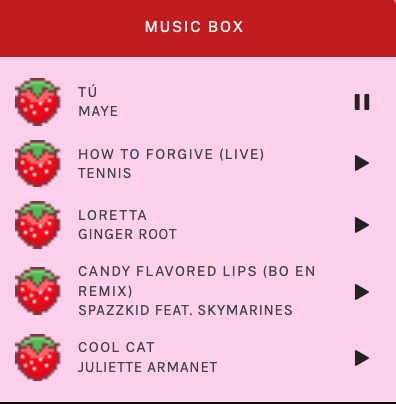
i installed a working music box ("music player #3" by glenthemes), and then added music by uploading MP3 files to discord and then using the links of those files as the audio sources. iirc i also had to make this element responsive and i aligned it so it would sit on the left side of my screen. i made the "album art" for each one the same strawberry pixel art
the moth is just a PNG i added and then moved around so it was behind my sidebar using the options that came pre-packaged with the theme
if you want something like the strawberry shortcake decoration at the top (called "banner" in the theme) your best bet is to google "pixel divider"
theme didn't support favicon so i added that in so i could have a little heart

ALSO:
this theme is. really weird about backgrounds. any background that i have ever set for it, i've had to do weird shit in photoshop. like making the background HUGE, mirroring it, etc. - because it would crop the image weird, or there would be a gap where there was no image. idk man, it's haunted. i'm sure there's a way to fix this but i am NOT tech savvy enough. anyway, patterns are probably your best friend. and if you DO want something that isn't a pattern, it's going to take a lot of trial and error. but i love this theme so i deal with it 😭
the sidebar image and the floating image do not scale. if your image is 1000 pixels, it will display at 1000 pixels. you'll either have to edit the code so that the theme scales the image for you, or resize any images before you add them
my white whale of theme editing (aside from the Weird Background thing) is that i cannot get infinite scrolling to work. i have tried every code out there. all of them break my theme. it makes me sad because like. i have music there for a reason. the idea is that people would listen to it while they scroll. unfortunately, the way it's set up now, the music will stop every time someone clicks "next" or "back" 💀
anyway sorry for rambling but i hope you enjoy the the theme and customizing it in the way that you want to!
22 notes
·
View notes
Text
The return of the update. I’ll need to fix Poppin’s head one day.
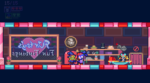
This is the main thing that got me back on Poppin & Jupa. Flirtsy is an ibbix doll living in an underground toy kingdom that’s part of Chapter 5. She’s not an important character, just a shop keeper, but I like her design and this felt like a small enough thing to complete.
I kept up with chapter 5 by doing sprite art for all the planned enemies for that area. Didn’t get a chance to code them yet, but I have the attacks planned out now. There’s like 7 total in this chapter, making it the second most new enemy types for a chapter. But we’ll see if that holds up in the future.
That also included designing a bunch of other ibbix dolls besides Flirtsy. It’s definitely overkill, but I really like these stupid things, so I’ll probably follow through with them.
The work extended to assets for planned obstacles/game elements too. For example, a ball pit that functions similar to snow, reducing your speed/jump height.
And a music box you’d wind with the Drill, that would activate elements in a level temporarily.
Concept sprite for a miniboss, Dueldelle!
But really, most work was extremely boring and monotonous. I decided to bite the bullet and carry over all of the dialogue and cutscene system changes from Escape From Fragaria Park to Poppin & Jupa.
What that means is that how text is loaded is completely different and every line of dialogue had to be copied over and replaced with a script calling it instead. I did this for all of chapter 1 and chapter 2. I did start some pause menu stuff, but that will take a long time to get all the UI elements configured as well.
It also included stuff like how text is colored, which initially led to crap like this gif here. I’ve had to fix that too.
This was all so I can have a consistent process between the two projects, as well as making it easier to view the whole story and make edits without digging into instances, and making it possible for translations... y’know, assuming that I ever finish this in the first place, let alone amass interest in foreign places. Oh well.
Has discussing what I plan to do next month ever worked well? Not really, like this month alone I was planning to code all the enemies and got sidetracked with the dialogue. This month my planning has geared towards Chapter 2 yet again: I really hate tiling, set dressing, and backgrounds, so I should really just commit and start getting more of it out the way. Once I get sick of it, I can always move back to Chapter 5.
- Cleave
33 notes
·
View notes
Text
Weekly check in. Some little stuff, some bigger stuff.

Current word count: 23.323 (Ch.5), >8k (Ch.6)
And we're finally back on track with Harcourt, babyyyy. After a month of eh from both me (with the editing) and MelS (writing the next chapter), we both managed to break through our respective blocks.
As of a few days ago, I sent back the edited Chapter 5 to MelS, so he could answer my comments and check the changes. I finally got to read the missing bits (and they are creepy and yucky)... Can't wait to code all of that when it is ready. We definitely need another round of MelS editing the text and me checking it, before I can add that to the file.
Until I get the file back, I'll focus on other projects.
Like...

Yerup... I ended up finishing it. A little binksi with more vibes than story. Click if you dare :P
Making a binksi (or a bitsy/bipsi) had been something on my bucket list for a while now (almost a year actually), and I finally got to make one for realsies!
Honestly, the hardest part in all of this... was making the tiles/sprites in 8x8 pixels ;-; Anyway, the code is freely available on itch and my GitHub.

Fixed some accessibility issues yesterday:
textbox not getting in focus properly
links/buttons not changing state when in focus but not hovered
added image descriptions to pictures in French/English
Also added the logos of Twine and SugarCube when the game loads. Those are clickable too.

I have worked a tad more on the UI/missing elements. But not as much as I should have.
Next week, the final update should be out.

This is what I'll be fixing this month. Officially reopened the code files, stared at it, and cried. It's so bad. It's such a mess...
Not looking forward to it, but it needs fixing! (I've asked the Forum for help too in the commands...)
ALSO, I've decided there will be a hyperlink version of this game. Instead of the commands, click on words. It will be in the same file, and you get to choose at the start.

I’ve finished reviewing the EctoComp entries (except the Spanish-only ones because I suck at Spanish...) and have started reviewing the Bare-Bones Jam entry. An updated version of the reviews have been queues on the IFDB and @manonamora-if-reviews. I will probably go back to the IFComp entries after that (probably after the voting deadline... I've done 40 already...).
-_-
I've made a completely new intro post with all of the place I'm at (if you'd rather not be on Tumblr). It was a long time coming, and now I have clear channels of where I'm posting about stuff. Just need to be consistent...
I've also started migrating old dev logs and posts to my blog, especially the longer ones where I have a lot to say. Since the search function and archive on Tumblr is eh, I get to keep the important ones (not all of them are) in a more organised place. They are still on Tumblr, btw. It's not gone, just copied. It's been nice to revisit old dev logs, and see how far I've come (it's been a long way). It's pretty humbling (especially the typos, omg... I fixed so many of those).
-_-
The IFComp and EctoComp, are always looking for players/voters. If you want to play a few short-ish games, take advantage of that! There is only a few days left for the IFComp and a few weeks for the EctoComp.
The @seedcomp-if is always looking for inspiration (text, images, code, etc…) in this current first round. If you have half-baked ideas or anything, really, come submit something!
Over @neointeractives, ShuffleComp! is looking for playlists and participats :)
-_-
And that's it I think...
12 notes
·
View notes
Text
Update Log #1

Following up on Log #0, this is our first proper update log showcasing our most recent and current works-in-progress for our indie game, presented by yours' truly, @recusantalchemist and @andeditor7! Starting off with some of our recent technical changes, @andeditor7 has been hard at work getting our water mechanics implemented, arguably the most important aspect a game set in the ocean. Although for the moment on my end of the repo, it's looking like a desert:
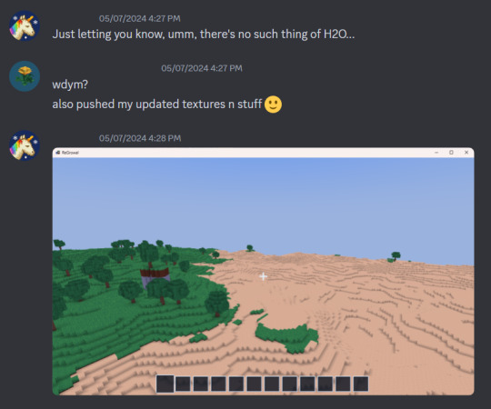
Ah well, soon enough I'll get to go swimming again. Also, we've started working on the weather and seasons system as well as planning out various weather types, ranging everywhere from radioactive rainstorms, snow, and sunny days.
Speaking of sun, AndEditor7 has also improved the lighting system drastically, allowing us to use a much wider variety of colors as well as allowing for proper blending between light sources!
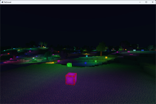
Next up for lighting will be ambient occlusion and shadows.
On my end of things I've been working on updating and polishing textures and block models as well as making more new ones, such as those seen above and below. Along with that I've been adding a variety of new creatures to the game, ranging from darners (aka dragonflies), purple shrimp, crabs, rollerspike crabs, plankton, and giant bloodsucking.... things, to name a few!
Quite a few new tools and weapons have been made as well, although I forgot to update the copper texture before making this display (Sorry, I'll show that and some tweaks to the models in Log #2!). Some ui's have been polished as well, namely the hotbar and the backpack inventories. I'm also working on some new more visually interesting uis for the world generation, namely within the spaceship before the game takes place. Here's two working drafts:

I was working on my garden with my partner L the other day and noticed the dirt in game didn't feel quite right, so after touching plenty of grass irl I decided to recolor the one in ReGrowal a bit:

We've also got a starting space uniform and backpack model now as well, as you might have noticed here and there in the screenshots above. Next up will be implementing them along with the player model. Fun.
And for now, that's everything in Log #1, we look forward to showing you more in Log #2, on 5/24/24. In the meanwhile I've got a mile long to-do list of to complete and about 30+ lore fragments to edit and fix. Until then, everyone! Oh right, P.S. - We'll be setting up a proper website here in the future too. Hopefully some news within the next update log or three. P.P.S. - In Log #2 i'll show ya'll the new skybox elements such as the sun, moons, orbiting spaceship ruins, and the thankfully-not-too-distant black hole. (it's totally fine there just don't think about it too much.)
#pixelart#3d artwork#aseprite#blockbench#game dev blog#pixel art#pixel graphics#game dev stuff#indie dev#indiegamedev#game development#game dev update#indie game#indiedev#game developers#voxelart#voxel game#indie games#regrowal#regrowalthegame#dev update#dev log#dev blog#farming sim#farmcore#farm#farming#farming game#geology#my art
5 notes
·
View notes
Text
Under the Bridge by Sam Khan
============= Links
Play the game See other reviews of the game See other games by Sam
============= Synopsis
Survive as a monster that has taken up residence underneath a bridge, interact with strangers who pass over your bride and see if you can not only survive the encounters, but create a home for yourself.
============= Other Info
Under the Bridge is a Twine (Harlowe) visual novel*, submitted to the 2022 Edition of the IFComp. It ranked 17th overall. *according to the itch page, though I feel it fits more the "rules" of IF than VN
Status: Completed Genre: Horror
CW: Violence, death, gore, and profanity Note: the game contains SFX (with a volume slider) and animated text
============= Playthrough
First Played: 3-Oct-2022* Last Played: 22-May-2023 Playtime: about 1h (found all endings) Rating: 3 /5 Thoughts: The monster under the bridge is not always a frightening one.
*I had reviewed the game during the IFComp in the Author's section (which was hidden to the public). I forgot to keep track of the notes I gave though... You can find the OG review under the cut.
============= Review
Under the Bridge puts the player in the shoes (hooves?) of a monster having taken residence under the bridge. Your survival will depend on the interaction with passersby...
Spoilers ahead. It is recommended to play the game first. The review is based on my understanding/reading of the story.
Under the Bridge is a fairly short and contained game, with 4+ endings, with a heavy themes of otherness, exclusion and survival. Playing as some sort of lonely eldritch abomination, forced to leave the comfort of the forest to end up hiding under a bridge, your main task is to survive. Peering above the bridge might bring sustenance or deadly confrontation.
Through the otherness of the main character, we get to see mundane aspects shown in a different light. The writing brings a strange uneasiness to the setting, from the large eyes of the frog to the stomping of the armed men. With how other characters react to you, you can't help but feel unwanted.
While the writing focuses on the senses and basic description of elements, there is something very unnerving about its simpleness. The use of 1st plural POV brings questions about who the player is supposed to be: are we but a lost monster or a collective? Is our loneliness turning us mad? It makes for a horror moody piece, enhanced by the darkness of the UI and the choice of animation and formatting of the text.
I really enjoy the addition of assets into this game. The different SFX added to the text, bringing the setting into life, with the wind rustling the branches in the forest, the sound of water flowing by the bridge, the threatening footsteps of the guards... Similarly the illustration, especially of the monster, helped to bring forth the horror-y aspect of the game.
Through the binary choices, you get to interact with the different characters approaching the bridge, with interesting variation for each. However, it is after you reach the end, that things got a bit... dull. You are prompted only with a Play Again? link, sending you right back at the start. If you are replaying the game as soon as you reached the end, you have to go through all the non-choice passages, and things get repetitive pretty fast (the variation only happens on the passages right after your choice or just before an ending).
I also had some little issues with the styling of the game:
the page would not size properly to the screen, often cutting the beautiful illustration (even changing the zoom would not help, neither did full screen), for some, scrolling would still not bring the full picture on the screen (which is a shame considering the illustrations).
the volume sidebar clashed with the rest of the formatting, with the light grey background, breaking a bit the immersion (a move to a black background would have fixed it all).
the formatting of the page felt awkward at times, with the choice links being awkwardly placed, or having the basic dark blue/purple colour on the links (i think a shade of grey or a more muted colour would have worked a bit better).
=======================
OG Review during the IFComp
Short and contained game. I think I ended up finding all endings within the 2h limit.
It had a really nice vibe and using the main Styling from Harlowe was a great fit for the story. I enjoyed having some background audio to go along with the story, it made it feel a bit more alive (I could feel my heart go all anxious at some points). The illustrations were also impeccable (and creepy, the good kind)!
A few points:
I think the game would have benefited from getting a bit of touch up in the CSS styling (the grey sidebar felt out of place) or in the formatting (the choice links were a bit awkwardly placed too). While it was a great idea to play with the text animation options, some texts (especially the blurry or flashing ones) were a bit harder to read.
After the second playthrough, the replay-ability gets a bit dull, especially at the beginning and if you are replaying the game as soon as you finished it.
Overall, this was a neat short game that gave me the feels (the anxiety feels).
#Under the Bridge#Sam Khan#review#twine game#interactive fiction#IFComp#2022#complete#visual novel#horror#choice based
8 notes
·
View notes
Text
Decided to check out that Wuthering Waves thing Mihoyo is so angry about. Here's my first impressions, written as I'm playing.
Woke up to two attractive (and possibly crazy) white woman who immediately decided my name was Rover. This is totally someone's kink.
Phones are gourds. I have no explanation for this.
Voice acting is kinda garbage, I actually thought they cheeped out and AI voiced the whole thing at first. (that may have just been an audio issue on my end though)
Relatedly, they didn't bother changing any of the Chinese names and no-one can seem to decide if they're going to pronounce them like a normal English speaker, or over-pronounce it massively complete with the correct tonal inflection. I'm not entirely convinced they didn't sloppily edit in the correct pronunciation into some of these lines.
No controller support, but at least this time it's just the devs messing with me and not Apple. Hopefully that will change soon, but my devices button to screen binding should be enough to muddle me through. It's enough for Genshin at least.
The UI is trying so hard to look exactly like the Genshin UI it almost hurts. Some screens are mostly original, but they tend to be for screens that won't show up in the Store page screenshots, tellingly enough.
To my surprise the combat's actually pretty original. Characters have special attacks they preform after being switched in (after charging a special bar), and it has an actual focus on dodging and parries over elemental whatevers (which seems to be totally absent) and generally favors a skill challenge more inline with a Souls-like in that way while still feeling like over the top action. Honestly I much prefer this to Genshin's combat so far, feels more like I'm engaging with the enemy rather than endlessly repeating the same sequence of elemental attacks on whatever healthbar is in-front of me.
The game thinks my device has a lot less horsepower than it does, took some settings tweaks and like two restarts to get it to not be in potato-vision. I could smell the pixels.
Stamina doesn't get used by the standard sprint, you can run indefinitely! Thank god!
Combat just got cooler, instead of torturing me with random equip drops to boost my stats we have a Castlevania Aria/Dawn of Sorrow style monster soul thing going on complete with monster specific special abilities/attacks. Seems like I can only have one of those special abilities at once while other soul equips are just stat upgrades, but this is so much cooler than what Genshin does.
I take it back about there being no Elemental stuff. Looks like special attacks and enemies have elemental types and damage, but they've yet to indicate there's any kind of mixing system like Genshin, just seems to be standard RPG weakness triangle stuff.
No piles of loot dropping on the ground, any loot you find has the decency to just drop into your inventory rather than make you mash the screen 20 times to pick it up.
Found another Genshin thing. The "following the glowing thing to treasure" is here.
I guess there's also pillars that you can activate to use as teleport waypoints, but I'm not giving Genshin credit for that idea.
There is parkour. It's just a basic "Assassin's Creed-esq" hit button to auto climb thing, so no skill challenge to be found there, but it makes traversal over vertical areas and mild level geometry problems so much more fun and easy.
I take it back, the voice acting isn't that bad, it's just Yangyang. I wouldn't call the rest of it fantastic mind, but Yangyang just isn't good and she's the main person you talk to for most of the intro. I don't think it's entirely the actresses fault, but the fact she seems to sharply drop straight into proper a proper Chinese accent/pronunciation whenever a Chinese name appears in the script isn't helping.
I haven't unlocked the gatcha yet, so I have no idea how bad that is. That also means I don't know what most of the characters look like, but I can't say I'm a huge fan of any of the designs I have seen. A whole lot of fairly generic "faintly realistic anime sci-fi" vibes and no real defining identity of it's own.
I think I've basically finish the tutorial now, the omnipresent grappling hook thing is a nice bonus. All I can hope now is that Yangyang isn't this game's Paimon, because she's only left me (from a story perspective) once so far. That said she's also playable, so maybe I'll be lucky and their isn't any Paimon sub.
1 note
·
View note
Text
Racer Postmortem
Building upon the experience I had gained from developing two games prior to this one, my goal this time around was to challenge myself to experiment with the GDevelop engine and create a game that incorporates everything I had learnt up until now. I spent a lot more time initially brainstorming a concept for my game, helped along by Chapter 6 of Game Design Workshop, and put plenty of thought into the balance and player experience of my game, as discussed in Chapter 10 of the textbook, as well as Chapter 1 and it's outline of the Player Centric Design process. This time, I ensured to add a tutorial to explain the effects of the obstacles as well as outline the controls to the player, implemented a basic UI to display health and added visual effects to denote certain statuses on the player. I strived to implement a system of interplay between certain obstacles and powerups, adding an element of variety and strategy to each playthrough. Each powerup had a downside and each obstacle had an effect that can either benefit or detriment the player, similar to the shadow costs discussed in Lecture 6.
If I were to redevelop the prototype, there are a few things I would like to change. Firstly, I would have liked to add items that the player could pick up that would have varying effects, like being able to defeat enemies on contact, or granting a single time instance of damage immunity. This could have added further strategy to my game and potentially increased the difficulty if each pickup had a negative side effect. I also would like to have added special audio effects or music to my game to really play in to the medieval setting further than I already have.
If I had to change the design of the prototype, I would have liked to implement different character models that have their own strengths and weaknesses, using a Lizard, Frog, Mouse race style of balancing. The Knight has more health, while a Squire may move faster with less health, but has a probability to dodge an attack, or perhaps a Mage type character could have the ability to negate an attack from a Spike Trap a single time per level. I would also like to have added new enemy varieties with their own effects. One idea I had was to add a fallen tree that might block two lanes of the path, or a puddle that would temporarily slow the player down. These could tie in to the interplay I mentioned previously. I would also have liked to implement a timer to the level which could be used to track the speed a player completed the objective. Furthermore, adding a difficulty option could have provided greater challenge, like increasing base spawn rate or changing the spawn rates of various obstacles.
Overall, I was the most satisfied with my racing game compared to the two other games I had previously created. I was pleased with the difficulty level, and my playtester agreed that it was sufficiently challenging. The game was also replayable, and each time featured a completely random sequence of obstacles to avoid or powerups to collect. At the end of my game, I implemented a basic cutscene that the player can interact with, instead of simply marking the level as complete and quitting, something I had wanted to implement since my first game, the platformer. In conclusion, I am very glad to have worked on this game. This style of gameplay is one that I haven't interacted with much in the past, but learning about how such games are designed has been thoroughly enjoyable. Next up, I will be grouping together with several of my classmates to develop a final game for Assignment 3.
Until next time!
Fullerton, T. (2018). Game design workshop : A playcentric approach to creating innovative games, fourth edition. CRC Press LLC.
0 notes
Text
XIM WRLD
The task was to make an interactive 3D environment but I went a little ham on it and made a whole game.
[ itch.io download here ]
I was browsing the asset store to get inspired and saw a city builder asset pack and thought it might be fun to make a little maze... the concept is something something eerie urban sprawl, you're a rat in a maze, get out!
First up, building the city.


I found a maze template and started with the road layout that I filled the buildings around. I actually built a whole city up but then I didn't like it because there was too much differentiation between building assets and I wanted the feeling of being lost to be more apparent, so I cut down the asset pack to fewer buildings and did it all over again. I also put my first person controller in there so I could feel what it was like to move around.
Looks pretty cool. Then, I wanted to make a "reprieve" from the city once you got out, so I set about making a landscape for the player to fall into once they escaped the metropolis.

Terrain tools, trees, water shader, you name it. However I wanted the character to fall into the water, and when they did, for the camera to have a blue tint on it. I found a youtube tutorial that taught me how to do collision triggers; I made a "water" game object that would change the fog settings once the character collider entered it. However, I was having trouble with the collider only triggering once.
Something in my code was wrong and after much fervored googling I figured it out!


I would end up using this little trick again for another game element: my clouds! I was feeling inspired by Super Mario 64 (I had subsequently used one of its skyboxes which created a very surreal vibe to the environment) and so decided to make the city sitting on top of some clouds. First I had to slice up a blender model I found online, and then place the city on top of it. Then I added a few more clouds around for flavor; but also because I wanted the player to be able to jump from cloud to cloud! I had to change up the code a little now, instead of just turning fog on and off, I had to have three different fog states. Not too hard with the power of god & anime on my side ( & google).


Looking pretty cute. I added colliders around the world and under the clouds so the player could land on them. However, just moving around the world wasn't quite enough. What's a playground without some toys?
I wanted to make three kinds of collectibles; a coin system that would eventually trigger a Win state, but also, potions that would boost the player's speed and jumping, so you could eventually feel like you were flying around Xim Wrld...
First, the coins. I created and animated the model myself in blender!
Shiny!!
Using another youtube tutorial and then banging my head against the wall for awhile, I created a new collision trigger script for collecting the coins, making them disappear once the player collects them. I also was able to link that up to changes in the UI, and make sure the scene would change once the player found all 100 coins. By making a coin prefab with the "coin" tag attatched, I was able to place my hundred coins all around the city & clouds of the map.


Why no coins in the landscape below? Something about the bounty of nature being enough... you don't need money when you're among the birds & trees!
...But it is more fun to play around when you can jump super high & run super fast. Next up: boosters!
Using all I had learned about collision triggers, I made a speed booster and a jump booster. Took some fiddling around with the numbers to make it so you don't go too fast, but I think I landed close enough. It might not control as tightly as Mario does in 64, but it's pretty fun to float around! I also made sure to add a UI animation element so the player would know what the potions did.


I finished it all up with some sound effects, some music [a jon brion song recorded & played by me, edited to fit the moods...] and a win scene... which you will have to beat the game to see :)
Thank you & Enjoy!!
0 notes
Text
Phone Animation test
this test occurs in the merging of case study 3 and 6

so the first step was to create the TV, which I created in 3D using maya, I'm also using the colour scheme that the RSA uses on their website when talking about the SDA centenary, the reason I have the screen in green is because I'm going to green the TV screen so I can have different images appear on the screen such as the phone appearing

The next step was to model the phone, which I also made in 3D with a green screened screen so I could change the visuals on there too

Another thing I did was add In a little phone stand to lift the phone up slightly, this made the rotations of the phone feel a lot more natural

Next up I started to make all the UI elements that would go on the screens, first creating the promo art that advertises the return of spitting image, showing that it has moved into a new age

The most complicated part was the way the phone works, so the way I made it was to create different layers of the UI and edit them together so I could animate the movement of the apps changing


This includes the way that apps work on phones, when you open and close them you see an animation of it fading into the centre. When I combined all the layers into adobe premiere, I was able to then animate the different apps such as scrolling features on Instagram
I just made the UI in photoshop trying to match what an iPhone looked like in 2016


and then I did the same thing with the Instagram UI, making sure that it was accurate to Instagram's design in 2016, the Instagram layout was hard to make since I had to make a lot of different layers for the phone itself, the Instagram overlay and then ones for the posts, since I wanted the Instagram posts to scroll


I also created some art, that I used for the Instagram post, using pictures of what they look like


Another important thing I considered was using motion blur, this makes every clip flow smoothly together but it also does a great job at hiding the errors in movement when I do these zooming in shots. Since I've made everything layer by layer it worked great for movement in the apps but when I wanted to zoom in on the screen I noticed that my 3D frames with 2D images didn't line up perfectly when zooming in. So all I did to fix this was go frame by frame to adjust the scale and values to make sure it lined up perfectly


That left me with my finished animation test, I am very happy with how this turned out, my next steps are to finish off the promotional art for the Pluumo brand section
0 notes