#also believe it or not my hair does this on its own. the asymmetry does annoy me thank u very much
Explore tagged Tumblr posts
Text
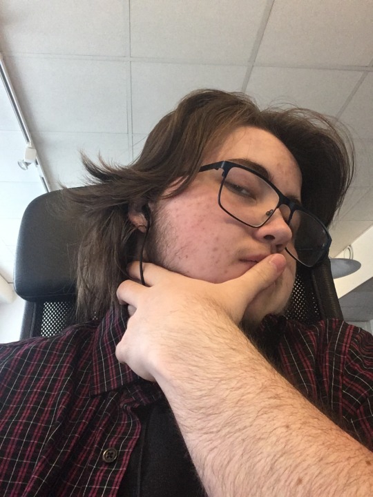
SILLYPOSTING!!!! anyway happy 1 year t anniversary to me ^w^
#face reveal?!?!! in this economy!????#i was not. nearly this hairy a year ago haha#also believe it or not my hair does this on its own. the asymmetry does annoy me thank u very much#to delete later#just in case i wanna remove all source traces of my face hehe ☺️😚🫶#im gonna regret posting this i think but yknow what !!! im celebrating MY anniversary!! i worked hard to look this gross!!!!!!#and i do like how i look :) i find myself staying in the mirrors reflection longer n longer nowadays#this shit has made me a very happy camper <3#marina bestie u reminded me i had a face and then i remembered it’s been a year almost since i met all of y’all :’) very happy
19 notes
·
View notes
Text
Kimetsu no Yaiba Character Designs: of Kny Girls, Thoughts and Breakdown
I’m just a huge nerd when it comes to character designs, and I think Kimetsu no Yaiba has did rlly well on that. I especially like how artistic and varied the designs of the female characters are. So here, I'm going to talk about their visuals, as well as my own thoughts on it as an artist!
So here is my take on the characters designs of kny girls! Given some of my knowledge as a design student who took a short course on character design, I wanna talk abt my thoughts in the design, how it relates to the character of the girls, and what I like and don’t like about it. Keep in mind that this is for fun, and I might also express my personal thoughts on their style and aesthetics, bc I like to think I have some semblance of fashion sense (lol), and also bc I believe style and aesthetics also connect to character design in one way or another.
Sooo let’s start w Nezuko!

-Cute, wild, but also modified to be more practical (given her circumstances), those are the first two things that come to mind.
-I love the whole black and pink and red color scheme
-I like how her outfit is really just a simple kimono, but the slight modifications on her outfit make it visually interesting. It really shows her transition from a regular human to a demon girl. The little details, like how her skirt more open, to free up her legs for battle, considering how a kimono skirt has a restraining vibe to it.
-her hair gradient is symbolic visual of her human and demon side, how she tethers between the two.
-Her hair creates a wavy-ish silhouette, which expresses her dangerous/erratic side as a demon, Silhouettes are very important in character design, and can tell a lot about the personality of the characters. The red gradient shows her hidden fiery side (and her relation to the hinokami kagura), and obviously, the focus on her design, which is the bamboo on her mouth, all of which shows that she’s dangerous
-but despite this, there are cute details on her outfit which creates a contrast, like the ribbons on her hair, and the shape of her footwear, which is round and chunky. I think it provides a nice visual contrast to the fact that she is also dangerous and would kick your ass. The fact that her kimono is baby pink makes me feel that I want to take care of her.
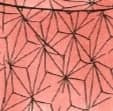
-The leaf pattern on her kimono is a Hemp Leaf (Asanoha). It is frequently associated with growth and child health, this could possibly symbolize her caring and nurturing personality, especially towards her younger siblings. (aw)
-Or, it could be a symbolism of the growth of her own demon abilities
-The only thing that bothers me personally is that she doesn’t look like she has taken a bath, or changed out of those clothes in YEARS.
Kanao
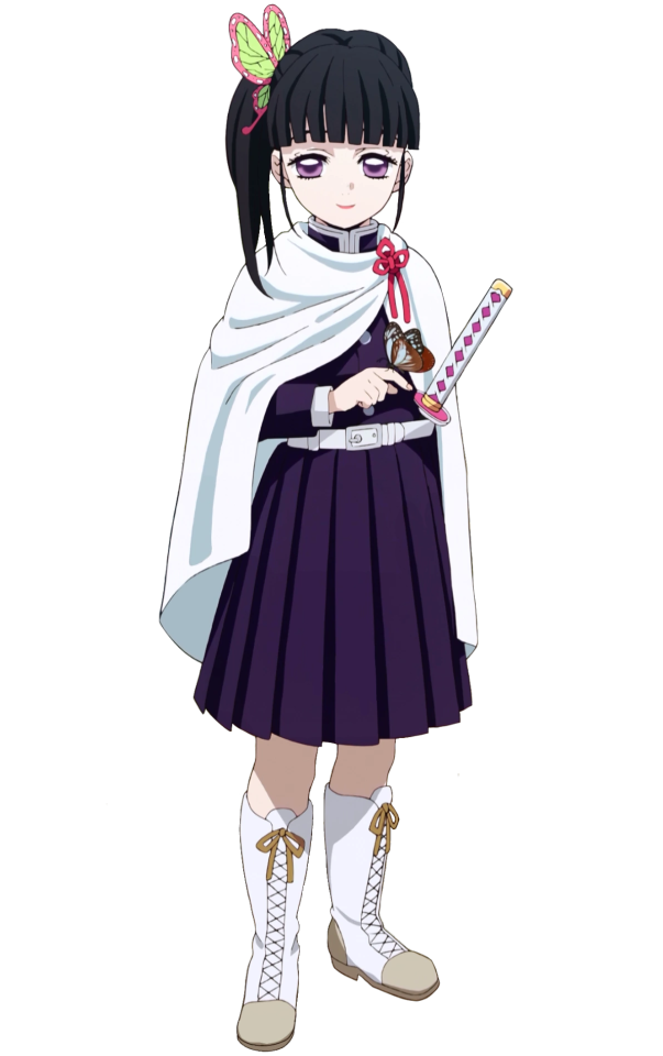
I like the lace boots, and the white and pink color scheme that makes the pink pop more
-A very simple and subtle design, the silhouette is pretty basic, but her side ponytail does make it recognizable
-Personally, it also looks a little plain for my liking, but I think it does make sense for her character. Since Kanao has always had trouble expressing herself, it does make sense how it could reflect on her clothing choices (now I feel sad thinking about this) but still, a few adjustments would surely improve her overall look.
-I do like the subtle bits of asymmetry on her design though, like her side ponytail and the ribbon on her cape and sword. Asymmetry is something that is highly encouraged in character design, and its the most obvious in Kanao’s getup. Generally I do feel that kny could use some more asymmetry for its other characters.
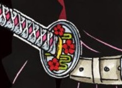
-From her outfit, she seems like the younger sibling that wears hand me downs, because her hair pin once belonged to Kanae, and the design of her sword, which is flower breathing, was the technique Kanae once used.
-I prefer the sword design of the manga version more. The color scheme matches her hairpin, and the color of the flowers matches her eyes, when she uses her scarlet spider eyes technique.
-The cloak is fastened by a flower knot! (cute!) making it ever consistent with her flower breathing theme.
-I do wish there could be a bit more going on with her cloak though. It looks very under designed, maybe there could be a subtle pink gradient, or a more unique "flower-like" cloak, to show her connection to Kanae, just anything to not make her cloak look like a towel because its too flat. It would also be nice if they would continue that same pattern on her lace boots, make her overall look more consistent.
Shinobu

-ara ara
-This is peak design, easily a 12/10. It’s one of my personal favorites alongside Mitsuri. I love her flowy and elegant style, and how she embodies the butterfly aesthetic. What her design really did well is the repetition of patterns, all the little details on her are all related to butterflies. BUTTERFLIES! what more can I say, down to her hair pin, and haori and even her leg wraps, all the patterns, are consistent all throughout. Not many people can pull of her outfit the way she does, sadly, bc of how bulky it can look at times
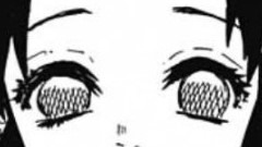
-In the manga, her eyes have crisscross patterns that resemble an insect, befitting on an insect pillar. I’m disappointed that the anime removed that.
-The silhouette of her haori, especially when she’s gliding, feels very agile and delicate, which also reflects on her fighting style, which is less on brute strength, and more on precision, It also reflects on her sword design, which is thin and needle like. The size of the haori emphasizes how petite she is.
-her color scheme is a bit more on the subtle side, You gotta look past the details to appreciate the gradient on her haori, and the like. I also like that her hair is tied neatly, bc it puts more emphasis on her butterfly clip and haori
-The butterfly motif in general, represents, resurrection, endurance, hope and life. This shows through Shinobu’s own perseverance despite her disadvantage in her strength as a swordsman, and also the general fleetingness of her life. (sad in hindsight)
-also on the matter of butterflies, I was told that some butterflies are toxic, which suits her duality with medicine and poisons, reflecting her design motif. It really shows the dual nature of her character.

-Her sword design kind of looks like insect wings too now that I think about it.
-If I do have one critic, it is that her hair gradient looks a bit dull, and her butterfly clips colors also ( idk, blue and purple is kind of a boring scheme) maybe the colors of the hair pin could the same as the haori, so that it would look more consistent. The colors of her sword also doesn’t pop as much I would have liked it to.
Mitsuri
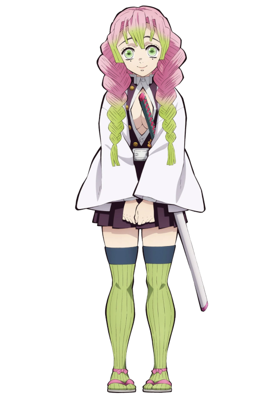
-WATERMELON QUEEN!
-Also one of my personal favorites! I love her style, reminds me of an art student (which she is, in kimegakuen!). Aside from that, she reminds me of a Shoujo heroine, which brings me nostalgia of my pink and magical girl phase, until society told me that being girly girl sucks and I needs to "mature" so I have to hide what I like.
-But hey, Mitsuri’s character is all about going against those expectations imposed upon her, and it shows in her appearance, which is why her design is well thought of, not to mention inspiring too!
-I initially hated that cleavage window but now, I do see how it completes the look. The shape of her braids creates this rounded shape, which expresses her sweet personality. The fact that her braids are so exaggeratedly big is done on purpose, it is to emphasize the silhouette. In character design, some proportions are made bigger and smaller on purpose for this exact reason. The curvy silhouette is further emphasized when her whip-like blade is out. Curves are associated with emotions which indicates, how Mitsuri is someone motivated by her emotions.
-The design really did well in terms of visual continuity, the gradient of her long braids just leads you down to her cleavage (lol) and her sword handle, which has little hearts on it! Did I mention her braids itself looks like hearts too, really befitting of a love pillar, and shows are quirky she is!
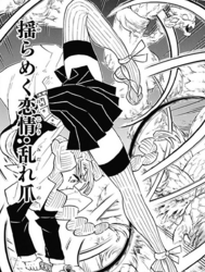
-Extending past her braids are her stockings. The stripes and the continuity of her color scheme, elongates and puts emphasis on her legs, which makes sense cuz her fighting style has lots of legwork!. The little ribbons on her ankles are a cute detail too. It is a simple yet striking design, and sometimes you got to look past her color scheme to really appreciate the details in it.
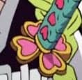
-The design of her sword guard is a four leaf clover (Katabami Leaf), this symbolizes luck, hope, and love, which also relates to Mitsuri’s love for many things. I saw some of MetiNotTheBadGuy 's analysis and It also be a reference to the crest of the Katabami clan, a clan that created its own form of martial arts, similar to how she created the Breath of Love. It represents how Mitsuri turn her feelings of love into a weapon that she can use to help others.
-Gotoge also did well with the pink and green. Complimentary color scheme can be a hit or miss depending on how you apply it, put too much and its going to look painful, but with Mitsuri, Gotoge was aware to make her uniform and haori plain, so as it balance out her colors and make the focus of her design (hair, sword and stockings, pop out more)
-I think the adding white to her color scheme is cute, bc it adds to Mitsuri's food related motifs, not only does her hair represent the sakura mochis that she ate, but she also embodies the colors of hanami dango! One of her fav foods! 🍡
-But still, I wish the Haori could have a bit more design. It was apparently suppose to be Rengoku’s keepsake, but it felt like an afterthought because it lacked interesting visual. Maybe if the haori has a bit more subtle design to it, it would be better, like some texture, or perhaps play around with its shape, just like with rengokus haori (so they can match)
-Also, while I do love her hair, I think it would be better if there's a bit of yellow between her hair gradient for a smoother visual transition!
-Overall still a great design, 9/10, her cute and quirky outfit, shows how unique, sweet, romantic, and artistic she is.
Overall
Though I did have some personal opinions about the styles and aesthetics, the fact that their appearance tells a lot about their character really shows how good the character designs are. I think Gotouge really nailed it, down to the motifs, details, and the silhouette of each of these girls!
#kny#nezuko kamado#Shinobu Kocho#mitsuri kanroji#Meta#analysis#sort of#Kanao tsuyuri#I did this instead of doing my thesis RIP#which is why this whole thing sounds like a damn thesis#demon slayer#i edit this post every once in awhile bc the more i look into their designs#i realize theres more going on to it beneath the surface like woah#tr#my post
97 notes
·
View notes
Text
stolen from: @ducktales-wco-oo
tagging: whoever else has some extra time they’d like to kill

layer one : the outside
Name: Mordecai Heller Eye color: Green Hair fur style/color: Black with white on the tips of his fingers/paws, under his eyes, around his mouth, his eyebrows, and the tip of his tail. His fur is short, and he always keeps it neatly brushed. Height: 5′9-5′10 according to a witness account in a police report about him Clothing style: Formal and business-like. Won’t be caught dead without a perfectly tailored suit. Best physical feature: Probably his eyes, although the combination of them and his scary murder brows tends to put people off...
layer two : the inside
Fears: Germs, rats, his old enemies (of which there are many) catching up to him Guilty pleasure: Cooking (for one) Biggest pet peeve: Asymmetry, untidiness, poor grammar Ambitions for the future: To clean up Marigold’s mess and help them establish themselves as the biggest bootlegging empire in the region. Forcing Lackadaisy out of the business would be a nice bonus, though, he will admit.
layer three : thoughts
First thought upon waking up: “First order of business on today’s agenda is to triple-check today’s agenda.” What you think about most: Work. It’s only ever work. What you think about before bed: “I did lock the windows, didn’t I?” I wonder if: “...Nico and Serafine might have their own agenda towards which they are working. They don’t seem to take their Marigold duties seriously enough.” What your best quality is: Detail-oriented, efficient, neat
layer four : what’s better?
Single or group dates: Single, although he prefers the term “business meeting” to “date.” To be loved or respected: Respected Beauty or brains: Brains Dogs or cats: It would be kind of fucked if Mordecai owned a pet of any sort, considering he himself is a cat, but... Either way, he tends to hate all pets. Cats, I guess, since he has to at least tolerate those for the sake of business.
layer five : do you...
Lie: You don’t get very far in his line of work if you don’t lie. Believe in yourself: Yes, of course. He’s the best in the business, although he’s not one to boast. Believe in love: Love is a neurochemical con job, and he wants no part in it. Want someone: To die? Yes. He wants a good number of people to die.
layer six : ever been...
Been on stage: Of course not! Grand public appearances would be absolutely detrimental. He won’t go anywhere he could easily be seen by the police. Done drugs: Never. Even in the modern verse where Marigold is a drug cartel, he doesn’t really approve of drug use. He’s just here to kill for money. Changed who you were to fit in: Not really, although it might’ve done him some good. If he could make it so that his personality wasn’t so... god-awful, maybe he wouldn’t have such a long list of enemies.
layer seven : favorites
Favorite color: Black, white, beige - the no-nonsense colors. Favorite animal: He dislikes animals. Messy, noisy, putrid little creatures. Favorite movie: He doesn’t watch many movies. Probably something like a documentary. But even then, he would rather just read a textbook or encyclopedia. Favorite game: The one where he asks you questions, and if you don’t give him an answer he likes, you get hurt.
layer eight : age
Day your next birthday will be: March 28th How old will you be: 29 Age you lost your virginity: He hasn’t yet, and he doesn’t plan to anytime soon. He’s also going to shoot you if you stick your nose in his private, personal business like this again. Does age matter: I suppose it depends on circumstance. He joined the criminal underworld at the age of thirteen, although that isn’t what he would recommend for most-- Oh, that’s not what we’re talking about, is it?
layer nine : in a person
Best personality: Someone serious, who knows how and when to focus on the task at hand, like him. Also, someone who is punctual. Best eye color: Green or yellow, perhaps. They are common eye colors for cats and will not be distinctive or terribly noticeable. Best hair (fur) color: Brown or gray, maybe, for the reasons above. Best thing to do with a partner: Their job, of course, what else?
(It becomes increasingly obvious to the reader that Mordecai has elected to fill out this section as if it was about a business partner, not a romantic one.)
layer ten : finish the sentence
“I love: Symmetry. No one else in my line of work seems to understand its importance.” “I feel: perturbed... by many things, including but not limited to: certain people’s flagrant misuse of the English language, my partners’ inability to take our job seriously, and the fact that there still exist those who put mayonnaise of all things on their sandwiches.” “I hide: most things, to be quite frank. My weapons, my intentions... In some cases, even my identity. My accent.” “I miss: my sisters. Annoyances that they were in my youth, that old cliche - ‘you don’t know what you have until it’s gone’ - rings true. I still correspond with them on occasion, of course, but to bring them here for a visit would prove... problematic.” “I wish: this superfluous ‘interview’ would come to an end so that I can get back to my real work. Haven’t you wasted quite enough of my time as it is?”
7 notes
·
View notes
Text
New Post has been published on My Fitness and Nutrition Store
New Post has been published on http://myfitnessnutrition.princefamily33.com/2017/10/27/the-proper-way-to-apply-styling-mousse-for-volume/
The Proper Way To Apply Styling Mousse For Volume
TIP! Consider using baking soda as a means to add some vibrancy to your hair. Add a touch of baking soda and shampoo into your hand just as you are about to use it.
We all know that true beauty is from the inside, however, that does not mean you shouldn’t pamper the outside of your body just a little bit! Lots of people want to enhance the beauty they already have. This post can help you make your natural beauty shine through.
TIP! If you have a squared face, soften its angles by using a coral or creamy rose blush. With your fingers, add a bit of cream blush to each cheek, then blend and smooth gently upward toward you temples.
There is scientific evidence that people tend to prefer symmetry over asymmetry. This means you need to seek symmetry. This can apply to anything from application of makeup to trimming of facial hair. Just try and make both sides of your face look the same.
TIP! If you want healthier looking hair, nails and skin, simply eat better! Beauty will come from the inside and work its way out! Your diet should consist of the nutrients you need to consume every day. To grow strong nails and healthy skin and hair, include whole grains in your diet to provide protein, iron and other minerals.
Use Vaseline for your eyebrows. Apply it just before bedtime. This will enhance the appearance of your eyebrows. Be certain not to get vaseline on any other part of your face, since it might cause your skin to break out.
TIP! Believe it or not, teabags can actually be a great way to fix a torn fingernail. The first thing you should do is empty the teabag.
Apply a light-weight moisturizer before your makeup. Moisturizers are great for your skin but also help spread your makeup evenly. Your makeup will seem less blotchy if you moisturize first. This can be a perfect method of making your cosmetics last much longer.
TIP! The beauty products you own will last longer if kept refrigerated. You should at least do this in the summertime.
You can add life to your foundation by mixing it with moisturizer. This also changes how the makeup looks and increases the foundation’s ability to protect your skin from the sun.
TIP! Fruit juice can actually help your skin. Just like fruits and vegetables are beneficial to your body, juice is beneficial to your skin.
An eyelash curler can help improve the quality of your lashes. Curling your eyelashes can make them look longer and it can also make your eyes look younger too. Just apply the curler to the base of the lashes and squeeze. Repeat this near the lashes ends. This gives your lashes a natural curl instead of a sharp angle.
TIP! In order to keep grey hairs away, eat some curry leaf chutney. The leaf chutney aids in the formation of pigmented cells that color your hair.
Incorporate a daily glass of milk into your beauty routine. There is scientific proof that it helps bones and organs, including your skin. Milk is full of calcium and protein, which are great for your body. It helps control weight, too. Milk is an affordable beauty solution.
TIP! Kitchen sponges are perfectly fine to use in the bathtub. They work as well as ones specifically designed for the bathroom, and you can buy them in large quantities to save some cash.
Make space in your fridge for your cosmetics. This definitely applies during the summer season. Beauty products will last longer when placed in a cool dark location or the refrigerator. Your skin will appreciate the cooling relief you are giving it.
TIP! If you’re dieting to lose weight, try incorporating pineapple into your diet. Pineapple contains bromelain, which is great for digestion.
A beauty tip for you: Make lashes appear more voluminous by applying a lengthening mascara in a waterproof formulation. There are many types of mascara that claim they will give more volume to your lashes. Many of these are too heavy. The end result is lashes that are weighed down. Try a moisturizing formula instead, which will not only make your lashes look fuller while you wear it, but will also help them grow. The waterproof mascara will add volume to your lashes, and help them curl up properly.
TIP! Decrease the puffiness of your eyes by applying a thin potato slice to them. Let it sit for ten minutes or so.
Eyelashes are easy to enhance and they make a dramatic difference in your appearance. Use your eyelash curler to shape your lashes prior to applying mascara. This will make your lashes more visible, help your eyes look larger, and draw a lot of admiring attention.
TIP! Try going for glossy lips to enhance your lips. Dip a concealer brush into a bronzer that is a couple of shades darker than your skin tone, and outline your lips with it.
If you’re wanting to look great on the outside then that is very understandable! The best way to do that is to bring out your good features instead of covering up your flaws. The piece you have just read is great for emphasizing the good and downplaying the bad. You will appear more beautiful and radiant if you use these tips.
0 notes
Text
19 Best New Portfolio Sites, July 2017
Hello WDD Readers. It’s July, and is it hot in here, or is it just these awesome portfolios? This month, it seems that post-minimalism and brutalism are giving way to our love of things that look pretty and designery. That’s a word now.
Oh, you’ll still see a few sites that embrace the “artist” aesthetic pretty hard, but those portfolios mostly belong to artists. But many designers, it seems, have starting mixing the collage-style presentation and asymmetrical layouts with a now-classic aesthetic. Big, thick, sans-serif type. Lots of white space. The whole thing screams “designer’s portfolio”.
I’m enjoying this new mini-tend, but you should take a look on through the list for yourself.
Zurb
Well let’s get the big one out of they way. Zurb — the creators of Foundation — went and redesigned their site again. Yeah, they still do client work.
Their website loosely keeps to the sort of alien astronaut theme that they’ve developed over the years. You’ll still see their mascot hidden here and there. The header of the home page says “Greetings, Earthling.” in a typeface ripped straight from old sci-fi.
Their penchant for illustration, however, has taken a backseat to photography, and subtle animation. The rest of the site is the pure, clean simplicity we’ve come to expect from the creators of Foundation.
As a bonus, there are forty-two illustrated cows hidden throughout their site. If you click on the cow icon on the bottom of any page, you can keep track of the ones you’ve found so far.
Jacob Sutton
Jacob Sutton is a photographer, as as such, he is contractually obligated to use the now-classic post-minimalism for his portfolio. I kid. It’s just regular minimalism with a bit of asymmetry thrown in. It looks elegant and understated at the same time, which is quite a feat of design.
Use All Five
Use All Five’s website has a distinctly modern aesthetic and uses a lot of pastels. Darnit, I think I used a Morticia joke some months ago already. In any case, it’s a pretty good-looking site that definitely stands out with its own distinct personality.
L’Éloi
L’Éloi’s agency site combines the an asymmetrical layout with a kind of minimalism I’m going to start calling “design portfolio chic”. I need to start collecting these terms somewhere. Anyway, you know the drill: thick heading text, classic serif body text, a metric ton of white space.
But instead of a giant hero image and three columns outlining the services, we get the collage-style layout and asymmetrical tendencies of the post-minimalist. I actually think it’s a pretty great combo. And it’s one seen a couple of times in this list.
Oui Will
Oui WIll Has a lot going for it. First, there’s that glorious pun. Second, there’s a beautiful layout with an emphasis on great typography. They didn’t quite commit to a dark or light layout, opting to mix the two and let the contrast do a lot of the talking. They also do that thing with the overlapping elements. Overall, it’s a solid piece of web design that combines a clearly professional feel with a few artistic flourishes.
Pavel Kedzich
Pavel Kedzich has one of those websites that you’d swear is a classic case of post-minimalism… and it is… almost? I mean, yes, the images are laid out collage-style, but that’s it. There’s a floating logotype and nav-bar on the right and the rest of the site is literally single column. If anything, this is just minimalism with style.
Negative Labs
Okay, remember when a ton of minimalist websites used all sans-serif typefaces (usually just one), and used a lot of thick black borders? I don’t have a good term for it yet, but it was a sort of precursor to brutalism.
This is that, but with very minimalist WordArt. You think I’m joking? Go look at their home page. I won’t say I dislike it, but I’m not that sure I love it, either. Nonetheless, it stands out, and it might inspire you to try something new.
All Boats Rise
All Boats Rise has a fairly standard layout with decent typography, and a whole lot of personality. It’s one of the first sites I’ve seen in a while that uses this much blue, but doesn’t feel super corporate. That’s some good work.
Flavien Guilbaud
Flavien Guilbaud’s portfolio is one more that’s mixing collage-style presentation and asymmetry with a distinctly professional aesthetic. This one has an even bigger focus on animation than others on the list, and it looks fantastic.
Standing By
Standing By mostly focuses on typography and imagery, with a somewhat… eclectic grid layout. This is classic minimalism at its finest. Sticking their portfolio navigation into a dropdown in the header is an interesting choice. Not sure every new user will get it at first, but it’s cool.
Amber Eve Anderson
In another example of that minimalism with lots of borders, Amber Eve Anderson spices up a classic aesthetic with larger fonts than we used back in the early ’00s, and some subtle background imagery. I quite like the way her work is organized by year.
The Feebles
The Feebles’s portfolio site is modern, colorful, and stylish as can be. The make excellent use of animation, minimal asymmetry, and element overlap to make as site that feels as playful as their work, while remaining quite classy.
Hype Type Studio
Hype Type Studio embraces the grid, and that classic minimalism in the sense that it’s all black and white except for the images. Nothing exotic here, just good, clean design.
Laura Makabresku
Laura Makabresku’s photography portfolio is yet one more presentation style website. It puts the work front and center, and let’s you, the user, just get to work. Yet for all that, it’s a pleasure to browse through. It’s a textbook example of how to match a website’s aesthetic to the tone of its content.
Any Studio
The single most interesting thing about Any Studio is their Tinder profile. Well, sort of. They show off ten of their projects on their home page in a little game that allows you to swipe left if you don’t like their work, or swipe right if you do. If you like most of their stuff, they suggest contacting them. If you don’t they suggest trying again.
It’s an interesting approach, to be sure, and it might actually help them find the right clients for them. My only issue is that, other than the cursor, there is little indication that anything like this is going on until you start clicking and dragging, or swiping. There is a message while the whole thing loads, but people on fast Internet (or people who open a lot of tabs at once) may never see it.
Type and Pixel
Type and Pixel present us with almost the perfect example of mixing post-minimalism and with a professional aesthetic. The layout is mostly simple, with hints of the collage style, while the graphics and colors lean to the wilder, artistic side of the spectrum. It’s all held together by simple but well-executed typography to create a site that spans the spectrum from chaos to classical minimalism.
Neutron Creative
Neutron Creative brings us a design slightly reminiscent of brutalism. It’s got the monospaced typeface and the shades of grey. But it also with good typography, and the creative use of accent colors. Oh, and white space. If anything, the entire design is meant to present them as a company of nerds, from the logo to the type, and it does that while looking professional.
Tyron Hayman
Tyron Hayman’s portfolio is as simple as they come, but that works for him. It’s spiced up with some very subtle background video, some bright gradients, and decent typography. It;s nothing revolutionary, but it looks darned pretty.
I only have one little issue. On the home page, the first words you see are these: “I am a minimalist. I believe in saying the most with the least.” As I am often one to split hairs, I am compelled to point out that he should have just used the first sentence. The second detracts from the minimalism.
He probably needed to put that in for people who are fuzzy on the concept of minimalism. But, you know, hairs. Splitting. Etc.
Activeoo Banners
Web agency Activeoo is trying something interesting by creating a separate portfolio for just one of their services. The service in question? HTML5 banner ads.
The design is crisp, clean, and professional. It’s good. But… I’m actually not interested in the design so much as the strategy. Activeoo has obviously put a lot of work into developing this sub-site, and written a lot of content about one single service that they offer.
This positions them as not just “an agency that does banner ads among other things”, but as experts in banner ads. Conceivably, you could design a separate portfolio site for each service to paint that same picture to every potential customer, no matter which of your services they need. It’s a lot more effort, but it could work.
Sci-Fi Bundle: Space Fonts, Backgrounds, Logos, UI Kit – only $17!
Source from Webdesigner Depot http://ift.tt/2tHUAjg from Blogger http://ift.tt/2tMBw1O
0 notes
Note
Hey, RoL anon here. I KNOW you're a terrible enabler. I really want to watch Black Sails now, simply because of the gifs you've been reblogging :D I really don't know if i'm going to like it tho, I'm weird about shows. Pro and contra arguments for watching it? Anything I should be aware of? :D
Being a terrible enabler is what I do best, dear anon. :D Black Sails is an amazing show and I can't recommend it enough, but of course I don't know what you like or dislike in shows. I'll list some things that I love about it or that I know other people love about it, and some things that I imagine might be off-putting. Putting this under a cut because it got long:
Pros:
- lots of interesting characters with interesting character dynamics; one thing I especially like is that relationships change over time and characters' actions have consequences - people work together and then betray each other, people fall in and out of love, if one person fucked another one over, the other one will resent them and this will colour their interactions in the future etc.
- morally very grey characters and no protagonist-centric morality: everyone is fucked up, everyone makes mistakes or bad decisions, everyone does awful things for various reasons; nobody is the heroic good guy who's always right; but at the same time all the characters are sympathetic and complex and even when they do horrible things, they have reasons for them
- really great and varied female characters who have their own storylines, their own goals and motivations - a show about pirates could have easily been all men, but instead you have several extremely important, well written female characters who are as central to the story as any of the men
- it's so entertaining: scheming! betrayal! cool fight scenes! pirates! angry arguments! shifting alliances! heartbreak! more scheming!
- the writing is so strong, the story is always engaging and often unpredictable, the dialogues have both humour and incredible badassery
- so many hot people; Flint is obviously the hottest of them all, but the entire cast is smoking hot
- canon m/m and f/f, and not of the token gay character variety: the main character, the badass pirate captain everyone is terrified of, is revealed to be gay well into season two, and several of the main female characters are bi or gay; there are also canon poly relationships; the canon het relationships are well written and believable and not just "this random man and random woman are in love now because we needed an obligatory het romance"
- generally lots of shipping potential, m/m, f/f, m/f, threesomes, cute loving relationships, fucked up violent relationships, sad heartbreaking relationships, complicated relationships with a lot of history - whatever you're into, chances are you'll find a ship that works for you on this show (although, come to think of it, there’s a sad lack of incest potential on this show; the closest you get is a mentor/mentee ship with strong paternal vibes and lots of “he’s like a son to me”)
- it's utterly gorgeous: beautiful sets, costume porn, hair porn, beard porn, and an amazing soundtrack to top it all off
Cons:
- it's very violent, if that's a problem for you
- there's a rape storyline in season 1 that I know some people found hard to watch
- there's a weird asymmetry between the m/m and f/f ships: f/f gets explicit sex scenes, m/m gets a kiss; we get one gay male main character whose romance happens in flashbacks, while three of the four female main characters are bi/gay and their relationships get much more screentime. It's kind of jarring, but at the same time, it's a pirate show that made its badass main character gay and his romance with another man the most life-changing, important event in his life, so it's still more than just about any other show out there has done.
- in the last two seasons, there's one character the show seems a bit too enamoured with for my taste and it hurts the writing, imo, but most of the fandom adores that character, so maybe it's just me
- everyone can die: to me that's a pro because it's one of the only shows out there on which I genuinely never know what's going to happen next, but at times it's really painful to watch when one of your favourite characters murders another character you love ;)
TLDR: it's a great show and definitely worth watching; even its flaws are fairly small compared to most other canons. Unless you have a big problem with violent scenes or don't like canons with morally grey to very dark characters, I'd say give it a try at least. :D
0 notes