#also I’ve been trying to practice working with digital art programs
Explore tagged Tumblr posts
Text
It’s Thursday!! So I’m throwing this here and I’m running away!!!

He can be a lil cutie and wear a crop top, as a treat 💖✨⭐️
#submas#emmet#Thoughtless Emmet Thursday#tw shirtless#tw suggestive#I mean he got a lil tummy showing and he’s not really shirtless#but you get the idea#hehe lil cutie#also I’ve been trying to practice working with digital art programs#and I think it’s going okay!!#well…#as okay as it can be with my fat fricken thumbs lmaoooo#tangential-hooliganart
4 notes
·
View notes
Note
hiiii just wanna start off by saying I love your art style and general vibes ✨️ I'm a stay-at-home partner always in search of fun things to do, and I've recently gotten back into art after not engaging with it since I was a kid (largely because your sun n moon fixation rubbed off on me 😭). I've never tried digital art and it looks cool! Do you have any advice for a beginner like me?
Oh it makes me so happy when people say I inspired them to start creating again 😭 The DCA and the fandom brought me out of my own years-long artistic funk last spring. Clown power, yeehonk 🤠 🤡
I’m planning a significantly longer post in response to an ask I got ages ago all how I learned to draw the way I do, so lookout for that.
But in the meantime, here’s a couple things I can think of off the top of my head:
Specific tools don’t matter much. I currently use Procreate and would recommend it if you have an IPad. It’s an extremely simple but effective program.
On desktop, I use Clip Studio Pro, but Krita is another program I’ve used and liked AND it’s completely free.
I do also have loads of experience with Photoshop and other Adobe products but can’t recommend them at the price, not to mention they’re not super beginner friendly.
Hardware-wise, I almost exclusively use my IPad to draw because it’s so portable. I also have a Huion Kamvas pen tablet monitor that hooks up to my desktop. But I started doing digital art with a dinky lil Wacom tablet that was less than $100. There’s definitely a bit of a disconnect at first, not looking at where you’re drawing but rather on a screen, but you get used to it.
Bottom line is to use whatever tools are convenient and comfortable for you! I even know of a great artist that exclusively draws with their mouse. I realized I hated sitting at a desk and that stopped me from practicing digitally. I got an IPad and now it’s much easier for me to work comfortably on what I love.
Point two I’d like to make is take advantage of the capabilities of working digitally. This means using the godsent undo button to your heart’s content. Download fun brushes to play with and add texture. Use perspective grids. Turn on line stabilization so your strokes are extra smooth. Like what you’ve sketched so far but want to try something different? Duplicate the layer and work from there so you can go back to the old version if you change your mind. Radically change the colors or values with adjustment layers. Use clipping masks. Abuse the liquify tool.
A lot of this might sound like gobbledygook to a digital art beginner but just googling any of this terminology will get you loads of tutorials and information for your specific setup. Also I’m happy to go into details about specific digital art techniques I’ve picked up with over a decade and a half of experience.
Finally, and most importantly—make what you want to see in the world AND what feels good to make. This ofc is not exclusive to digital art, but I always want to stress this to new artists. I realized after I got into the DCA fandom that I had been letting shame, fear, and perfectionism keep me from creating the content I was really interested in making. But then man, idk. Frickin’ robot clowns amirite ¯\_(ツ)_/¯ it’s like there was a secret agent sent into my brain and he uploaded a DCA virus into my mainframe or smth idk hacker style. tktktktkt. they’re in.
Anyway. Hope this helps! Feel free to send another message if u have more questions :3
15 notes
·
View notes
Note
hi tamelee!
I'm here to ask for a little bit of advice if that's okay (: about a month ago I bought a Wacom drawing pad so I could start experimenting with digital art. artists like you here on tumblr have really inspired me to start making art. but I feel kinda.. lost. I've been mostly drawing naruto manga caps and I'm getting better but I guess I don't know where to go from here. coloring and shading scares me lol. I'm using clip studio paint and it's just a little.. intimidating. I feel discouraged, like I won't be able to do it. how did you do it tamelee? did you watch a lot of tutorials, or did you experiment until you figured things out? any advice you'd have for a beginner artist I'd really appreciate.
thank you veryvery much for your time ^^
Hi Nonee! 🧡 Sure!
Oh I think that’s a very good place to start. As well as drawing subjects you like ^^! Hmm, tbh I’ve just experimented a lot, but I don’t think my way of having done things was the most efficient. You might want to follow tutorials step by step? You can try coloring only with flat colors until you feel a bit more confident with that as well as cell-shading (toon-shading/non-realistic, like in anime) instead of rendering further as that can all be confusing at first. I personally never truly understood shading until I studied cell-shading and made my art a lot more readable. A lot of Anime uses this;
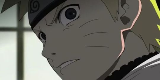
You see how there is a base color, a darker color for shadows and highlights? (Sometimes not even highlights.)
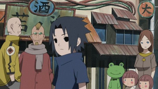
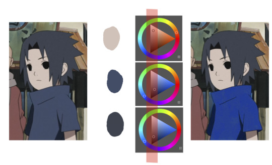
When you start to study it from existing work you’ll start to notice things like color always being in the same area of saturation and when you suddenly have a color that is way more saturated than the other it can look off. (See example.) But this is a guideline, not a rule. In your own art you can especially use saturation and brightness to help aid you to direct a viewer's focus and even tell a story.
I LOVE ‘How to train you dragon’ and ‘Kung Fu Panda’ for this because their coloring is so inspiring and if you truly want to learn from professionals... well those are the type of media to look for of course! I have an entire folder to inspire me just based on those.
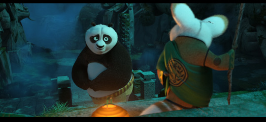

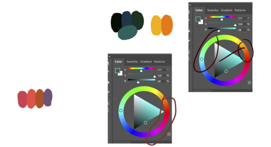
Do you see how calculated those color combo’s are?!?! Here you see both analogous and complementary schemes and it is actually through looking at the things I like that I learned it >< The orangey colors stand out and are bright which helps you to focus on that area whereas the complimentary scheme is used to bring characters together.
If drawing Manga-caps is something you love to do, then maybe for coloring you can study screen-caps from Anime or even other animated films. I’d recommend to take it step by step, though I haven’t really applied it myself, from the video’s I’ve seen and artists I’ve followed it is always advised to have an art-goal that you can work toward. Maybe you first want to focus on lineart and then laying down a base color where the colors are harmonious and next would be cell-shading maybe and then you can start adding another light-source etc- eventually you can decide to create more depth or practice with monochromatic coloring, maybe even greyscale to learn values. But right away that can all sound a bit intimidating doesn't it? Find things that you like and then maybe you can open them in your program and just study. Find a brush you like, put on some music or a show on the background and for a moment play around with it without needing to create a finished piece. This is also how I learned how things like adjustment layers work or what all the different kinds of tools do. I have to agree with you, CSP is intimidating for me as well >< so this is kinda how I approach it as there are so many add-ons and additions within it but I try to only learn what I need for that moment so I don't overwhelm myself. I definitely try to find video’s that can help me with creating Manga though! ^^ There are plenty! It'll get easier eventually, you'll learn the program and you start to recognize placements for shadows and you will get a feel for the coloring- no worries 💪 Learning something new will always stay intimidating, every time I open up a new document I feel it too. It's not easy at all, but you kinda have to allow yourself to experiment and even make mistakes because practice is never perfect. I have some beginner tips written here- I hope any of this is somewhat helpful 🌷🫶
16 notes
·
View notes
Note
Hey there! I love you’re semi realistic, semi cartoonish art style bro! I hope you don’t mind me asking but what software/mediums do you use? I am trying to work on my lighting and shadows and textures but I have no clue how artists like you achieve such detail
First off- thank you so much! I truly appreciate it. And second- oh my goodness I am so sorry for how long this ask has sat in my inbox! I hope some of this can still help you :’D
As far as software goes, I’m almost exclusively working in procreate as of late. There’s plenty of great programs- if you need something free and desktop based, I highly recommend Krita. I have a few brushes from different packs that I often default to. You can see them all and links to said packs through this answer I gave to someone asking about my brushes earlier:
As far as detail in my work goes, that’s just through a loooot of practice and doodles and drawings. I’ve been drawing since I could pick up a pencil, so I’ve had a lot of time to figure out the way I like to do things- but even then I have so much to learn!
I do, however, work in many traditional forms of media as well! I haven’t done so as much lately since digital doesn’t require cleanup, but I honestly believe that working in traditional for my entire life up until 5 or so years ago has a hand in how I approach things digitally as well. I’ve done pen and marker illustration, pencil and colored pencil, acrylic painting, as well as 3D work. I’ve worked in a lot of media and I want to get around to trying as much as I can when I have the energy to! If you have questions specifically about what traditional media I use or work with let me know!
When it comes to improving on rendering, doing small studies of images you really like the lighting in helps a lot for me. Learning how to break light in a photo down to simple, blocky shapes helps to figure out getting an initial layer down to refine later when doing full pieces! When rendering a character, especially if drawing something that isn’t in a scene, I always recommend marking out the direction the light is coming from as well as color of the light before even starting, so that you can determine where highlights and shadows would be placed in an initial blockout. Keep in mind there’s different kinds of light in a piece- I would recommend looking into tutorials about direct light, indirect light, reflected light, etc to get a better feel for how it works- while I do my best, I don’t think I am quite skilled enough to explain those nuances.
When approaching most textures, especially unfamiliar ones, references are my best friend always. It might be a good idea to just do test sheets/practice making the textures that would be useful to you on occasion! And in the end, textures also tie into lighting as well, since a lot of what makes textures super distinct is how light hits them, especially when it comes to things like metal. It may be a bit of a hot take, but in a lot of cases I tend to avoid a lot of digital texture/object brushes, especially those meant to simulate natural textures like leaves, and I do those textures manually instead. I just personally like having more control over those shapes and feel it looks better when each texture is made intentionally by hand! Sometimes I do use texture brushes especially for backgrounds, abstract work or subtle layers, especially if I’m working on something very fast, but it’s not my first choice. However I do know there’s plenty of artists who use texture brushes in ways that look great, so that’s just personal preference. :)
I do apologize it took me so long to respond! But if you have any specific questions, my dms are open and I want to start replying to y’all more!
4 notes
·
View notes
Text
Okay, while I’m waiting five years for this frame to render, here’s some thoughts I’ve been having about the whole practical effects vs digital effects debate.
See, on the one hand, I freaking love practical effects. Poorly done practical effects, well done practical effects, practical effects that haven’t aged well, practical effects that hold up and probably always will. Practical effects my beloved. There’s just something about having a thing actually be there, interacting with the light and the environment, having real weight, that I absolutely love. I absolutely want to see more of them in film.
On the other hand, I kind of bristle a bit when people argue that digital effects are easier, because…they’re really not. They’re cheaper a lot of the time, but that’s because the studios aren’t paying digital effects workers fairly. And they take up less space, of course, or maybe take up space differently. But they’re probably just as much work as the practical effects. You’re still having to come up with solutions to get things to look right, having to hit things with proverbial hammers until they behave, and definitely having to throw a whole bunch of math and art at a problem until it works. If there’s a cg dragon on screen, I promise that someone had to design that dragon, that someone else had to sculpt it (which isn’t less work even if it is happening on a computer), and then there’s the texturing and the rigging and probably coming up with solutions to get the rigging on the wings to work because dear lord is rigging the worst, and that’s besides animating, lighting, and compositing, and trying to get it to look like it belongs in a scene with everything else.
In fact, the reason why so many digital effects look iffy, especially on television, is because they’re a lot of work, but studios often won’t shell out the budget to allow the cg artists the time to do them properly. The cg animals in the cg Lion King look weirdly weightless and expressionless? Its not because cg is inherently bad (even though I think remaking The Lion King was inherently unnecessary, but that’s another story). It’s probably because the animators and riggers were either given the bad direction, or because they weren’t given the time to go back and refine the animation and give it the weight it needed and ended up having to rely on Maya (or whatever program they were using) to do a lot of the tweening, or something similar.
And there are also times when practical effects just will not work, sometimes because of safety or sometimes because cg is actually better suited for the situation. And there are even situations where audiences will assume an affect was digital, and then for it to turn out to be practical. So, for me, it’s not a debate over which kinds of effects are better. Its more about:
1. CG artists needing to be compensated fairly.
2. Studios and directors needing to not automatically default to cg effects.
3. Using the right kind of effect for the situation.
For example: The Dark Crystal: AOR needed to be puppetry and practical effects. A realistically rendered Dark Crystal universe would have been a complete disaster; that’s a fully built up from the ground fantasy universe that feels lived in because, in a way, it kind of is. They used digital effects here and there to touch things up or help with compositing (Lore, for example, is a puppet, but they used digital compositing to erase the puppeteers), and there’s a couple weird moments that are cg, but it’s the puppets and the practical effects that really shine. Alternatively—Prehistoric Planet. I’m sure there were practical effects used in some situations, but the animals in Prehistoric Planet needed to be cg, and realistically rendered cg, because the conceit of that series is that it’s a nature documentary. Now, do I also want to see a version of Prehistoric Planet that’s all puppets? Yep, but it would be a very different thing with a different result and feel.
So anyway, tl:dr: Digital effects and cg aren’t inherently bad; they do still require a lot of work; I think it should be less about getting rid of cg in favor of practical effects and more about knowing when to use cg, when to use practical effects, when to use various kinds and styles of animation, when to use everything together, depending on what kind of story you’re telling and what you’re trying to achieve instead of cg being the default.
And pay cg artists more.
5 notes
·
View notes
Text
Weekly Update September 15, 2023
Life is hitting hard. I had a big interview for a really important internship, and while I think the interview itself went really well, the rest of the week has been pretty rough, with the exception of a nice discord call I had with a friend. I don’t know how much of this is bad luck, physical stress on my body due to nerves, or bad decisions on my part, but most likely a mixture of the three. I have not heard back from the internship yet but I do think it went really well, it’s the second time I’ve interviewed for it, and I was really close to getting it last time, and that was before I had officially completed all the relevant courses I took that semester, and also before the lab job I worked this summer. I think I’m in good standing, but I don’t want to be overconfident either. I was told I’d hear back by the end of this week, but given that they’re changing a lot about how they’re doing things I was expecting to hear back closer to next Wednesday, which looks to be the case. I’m fine with the wait, but given what my nerves have been doing to my body, it does unfortunately mean I won’t be able to make as much progress on art projects as I’d like.
I said earlier this week I’d be done for the rest of the week, but I have gone back on that a little. I sketched out some nice shots of Shaun to use as more blood practice, which I’d like to digitize in the near future, and I have kept work on TRGA going. I finished up the character animation for shot 1-2, and have started keyframing Jon for 1-3. 1-3 should be a lot quicker, as it’s short, it has few keyframes, and Tim does not appear, meaning there’s theoretically 33% less animation to do (although in practice it’s more like 12-25% less since Tim has been less complex so far, although I know it won’t stay like that). I’ve probably got almost as much done as I would’ve if I hadn’t ‘called this week off’, but I’m still not going to hold myself to my schedule on it until I hear back about the interview (and possibly then some). It’s still going good though.
I’ve also been messing with effects and whatnot for drawings in general, I’d like to be able to animate with some as well, but I’m going to stick with current projects for now. I’d like to mess with after effects as well, as I’ve been learning a bit about the features it has, and I think I can probably do more with it than animate. I think Adobe programs are meant to be used in tandem with one another anyway. I don’t think I’ll need it for the current animation, but I’ll keep it in mind for maybe the next TRGA. Or I could do more tests in-between.
I think I should be investing more time into music as well, should I have time this weekend I may take another crack at it. I’ve been writing down bass patterns as I hear them from music I listen to, although I’m not trained enough I can identify notes of their own, just in relation to one another, so I probably mistranscribed, meaning what I wrote down would technically be original. I’ll try to mess with that and drums, until I get something nice enough sounding. I already tested my strategy for finding original Melodies, and it doesn’t work 100% of the time but it does work. I really should make a bigger push for music I think it would be pretty good for my state of mind. I need to commit to a basic project but I’ll keep the larger one in mind.
I’m going to keep taking it easy but I’ll try to get stuff done. I’ll keep trying.
5 notes
·
View notes
Note
do you mind if i ask what tablet do you use? and if you practice drawing digitally more than traditionally? i’m trying to get into the habit of drawing after seeing your art!! you always feel like you’re having fun 💪💪💪
I’ve been meaning to answer a similar question i got ages back so I’m just gonna answer this rn!!!
I use a Wacom Cintiq 16-that’s one of the tablets with a light up screen you can see the movement directly on as you draw, vs a tablet that’s blank where you have to sync up your movement with the computer screen that I used to use (there’s nothing wrong w that and those tend to be a lot cheaper, but I personally find it really hard 😭) there’s a lot of options out there though-you can even get special pens that let you draw using your phone (or draw with your finger on your phone, though mine is a bit too small to really do that well w how clumsy I am tbh…or maybe that’s just quitter talk!)
As for the art program, what I personally use is krita. Before that for this blog I used photopea, which is a free brower based program that’s an almost 1:1 copy of photoshop, but it had a major issue where if the internet went out you couldn’t use it and if your browser crashed there was no way to recover your work. Krita is also completely free, and while I’m by no means an expert at all I’d say it works well for how I use it! (Though I really should be learning more about some of its other functions)
I’d like to get clip studio if only for the brush capabilities but my laptop is slowly dying and I don’t really want to buy new software until I have something new
I also do do traditional! At this point in time it’s nothing more serious than ballpoint sketches with most of my serious work being digital, but at point I took irl traditional art classes so I do have some background in it. It’s good to practice a variety of art styles anyway, but I like to sketch through the day to occupy myself. I have whole sheets of doodles that none of you have ever seen bc they’re traditional and not really worth taking poor ipod photos just to spam here (seriously, I have stacks of the stuff)
#I love to draw despite my recent semi break (I say having just busted out another comic)#I feel like I’m plateauing a bit…maybe I should change some stuff#or actually learn krita. imagine#my asks#side note: I love my tablet but don’t feel like you have to get a fancy schmancy one#I just draw enough that it was worth it compared to my old one#+I have sync issues anyway#diff people have diff abilites in that regard
6 notes
·
View notes
Note
just popping in to say that i absolutely adore your art! you’ve become one of my biggest inspirations and so inspired me to finally make the translation to digital art. do you have any tips for a beginner? thanks so much and I hope you have a great day!!
oh my gosh!! thank you so much!! you really don’t know how much it means to hear that so thank you, you just made my day!!
i’ve been collecting resources for someone i know who used to only do traditional art years ago, and is recently making the switch to digital, so i’ll link my all time favorite spreadsheet which covers a lot art-wise!! and then i’ll give some of my own advice at the bottom :)
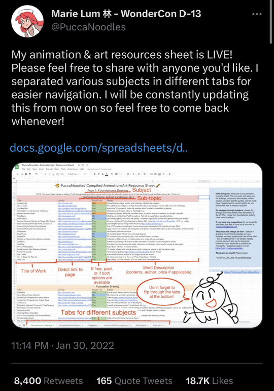
( it’s sorted by the type medium whether it be illustration / animation / storyboarding. they also have a whole section for foundational drawing and links out to websites for poses. it’s also updated every so often! :) it also lists resources and information about programs !! prices are included too! )
—————
now, i’m not too sure how to give advice about art, but i definitely want to try and offer some help! :)
i have been drawing digitally for maybe ~8 years. the switch was really hard, but don’t let it discourage you!! i went on youtube and watched a bunch of speed paints and timelapses of my favorite artists at the time to try and understand how they did certain things. and to be honest, my art was not great! and i’m still improving; things i look at from even 3 months ago i will put my head in my hands at.
anyone would probably tell you to just practice when you say “i want to learn how to draw digitally” but they don’t often tell you what to practice either. i don’t really like that advice (even though it’s mostly true— it just doesn’t feel very beginner-friendly!!). so here are a few things that i wish i was told instead of ���just practice to get good”
1. i really recommend finding an artist you like and looking at how they do certain things. try to figure out what you like about it; is it the texture, the colors, the lines, the compositions, etc. maybe think about incorporating the way someone uses bright colors (for example) in your own art (if you like the way the artist uses bright colors).
2. reference photos!! they are key. especially having multiple references, maybe one for lighting, a pose, background, etc. the more the better! — i recommend maybe maybe a folder on your device for references ^^
3. keep your old drawings! — some people tend to get discouraged (me) when they think they’re not improving. best thing i ever did was keep my sketchbooks and try to keep as much of my earliest digital art as possible.
one of my first digital drawings ever VS my redraw from last year…. which i want to redraw again now!!
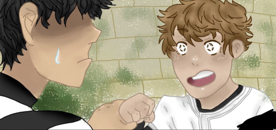
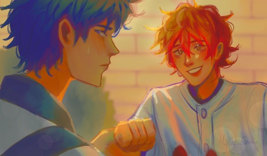
4. this one is going to sound a little funny, but draw your favorite character! - having a character to constantly draw helped me a ton. especially an original character;
5. if you are feeling uninspired, find a screenshot of some media you enjoy and try to redraw it or do a study of it :). i did this often when i didn’t know what to draw but wanted to draw!
6. experimenting with brushes!! — if you are also stuck, maybe try to download or even create some new brushes. …. i have too many brushes
—————
i really wish i could offer all the advice to help you succeed!! i’d love to see your progress as well!! the main thing i can say is that not everything you create will be a masterpiece, but not every work of art is a mistake either. don’t regret spending time drawing if you love it, even if you aren’t in love with what you create. if you can recognize that something may be off, whether it be proportion-wise, color-wise, ANYTHING, you’re still seeing a way for improving your work. which means you are still improving!
i wish you the best anon!! if you ever have any more questions i can try to help, and i am rooting for you!!!!
you can do it!!!!! :) (ft. drawing i did in elementary school)
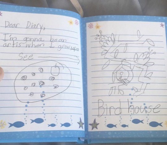
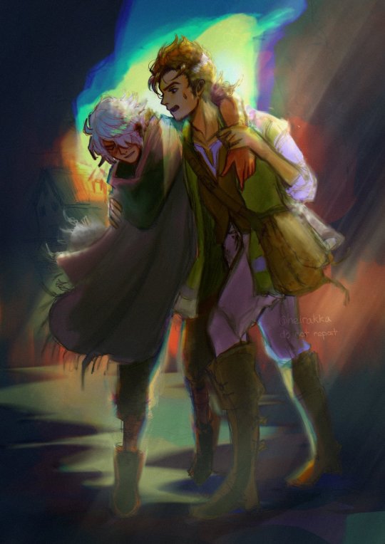
#zack speaks a lot tag#zack replies tag#long post#question mark (?)#i spent so long typing this the images got bugged i hope they work#seriously!! good luck! i hope you get to make the art u want to!!
3 notes
·
View notes
Text
Moontiger Custom Sticker Sheets
What is working?
So far gathering resources and finding quality supplies has been so much easier than I thought it may be. Not only is the paper I found reasonably priced when compared to other top brands, but it is also waterproof giving extra durability and thickness for more sturdy, weather proof stickers. The sheets are also large enough to print two sticker sheets on one paper saving further money on paper and printing fees. Friends, family, and colleagues have shown interest and excitement in ordering their own custom sheets which has me excited to get going on everything!
What is not working?
The elements of formatting and the settings at which to set the sizing and printing of the sticker sheets are a little more complex than I initially thought. I found multiple tutorials to aid me that specifically follow the steps of creating your own sticker sheets from home, but it took a few practice attempts at printing to figure out the settings within the digital art program and to use for the print formatting.
How do you feel the project is coming?
I feel the project is coming along but just a little slower than I expected. I am working on the website and the order form page while also starting to get the word out further using social media and word of mouth while working on the first sheet designs. Resources like youtube tutorials and advice from other artists has been monumentally helpful and has helped push things along as well.
What are you learning about running a business?
I think the biggest thing I’ve learned so far in starting and running a business is how many little steps and sort of hidden things you may not think about or consider at first that come into play. For example, strict copyright laws on games, T.V. shows, movies, etc., and how much it limits what you can include in your art, which is something I glazed over when first starting. There always seems to be more things to consider or that come up when you're not expecting it.
What are you learning about yourself?
I am learning that while I love creating and am excited by starting this small business, there are certain parts of the business process that are harder for me to get used to. I feel I’m not experienced at the sales part of business that goes with marketing and promotion. I always feel like I’m being pushy on people by trying to 'convince' them to buy a product. But, I also love creating for certain mediums that are good for marketing and promoting, such as video making for a commercial or designing art to decorate a website or an ad poster. I hope to gain some more experience in this through my online platform and by using these mediums.
1 note
·
View note
Note
since it’s been about a year and i’ve learned many new things, i wanted to reblog this with some more art tips :D (also more digital art centered ones!)
try to use the erase button over the undo button more. i really do think that it helps to not be constantly undoing every line you make and be able to make more adjustments and not be so perfectionist (been doing this a lot since making going to the eraser one of my actions on my apple pencil)
definitely explore programs/materials your using- i managed to get a graphics tablet for free and i’ve used it to mess around (and struggle) with different programs like krita and csp. and anyways, who knew it was so nice to draw with crayola markers??
learn your layer modes - my person favorites are overlay, add, and multiply, but there’s a lot for a reason! messing around with them can lead to cool things! (this goes for other features you may not use in your program!)
if your coloring - EDIT your colors!! you might not realize how desaturated you’re making things, or maybe how they aren’t totally working together. i recommend duplicating your color layer(s) and messing around with curves, saturation, and gradient maps (these are procreate features i do not know what exists on other programs-)and then using layer modes + opacity to make everything nicer. also - if you want to just tone everything one color (or just make everything warmer or cooler) - fill a new layer thats above either the colors or everything and set it to the layer mode “color” and adjust opacity :)
the liquify tool - im not sure if this is just a procreate thing or not but its so awesome to use when editing proportions. i like to flip my canvas and select all my layers and push things around and make things bigger and smaller. it can be a lot more efficient than redrawing things :)
dont use like a billion brushes - sometimes less is more, i use about 3-4 for every drawing. id recommend using a textured brush among some less textured brushes to so its not overwhelming or underwhelming with so few brushes.
draw traditionally!!! - drawing traditionally will do things like give constraints and force things like line confidence and problem solving (especially if you are using (semi) permanent materials!!!). it doesn’t have to be anything particularly fancy, it can just be little sketches and practice, or just messing around with materials.
and again - have fun!!! art is a fun thing that you should be enjoying. none of these tips matter if they aren’t making you happy/enjoying the process of creating! just make things, cause thats really cool, the technical stuff only matters if you want it to matter :)
btw if you have anything specific you want me to talk about, ask! i love talking about art and giving art tips!
Have any art tips, your art is cool and I've been trying to get into digital art recently.
thanks :)
something ive learned recently: set ur layer to add on digital art for lighting - best things ever
but if you're just starting out with digital art, find a program ur comfortable with (i recommend procreate), and just play around and figure out what brushes and stuff you like, find digital artists on youtube for more specific tips (i recommend LavenderTowne for more cartoon-ish style digital art, but some of her tips can be good for any style)
if you've been doing traditional for a while, it'll just kinda throw you off to start digitally drawing, but eventually you figure it out and get the hang of it and to have pretty much every tool and color at your disposal is cool, just gotta learn how to use them :)
but if you're new to art entirely, just draw and have a good time, like thats my biggest tip, explore your style while also having fun, dont worry if it's not the next mona lisa, that's not important, it's gonna take time, and there will never be a point where you will have the skills to draw every single thing you want exactly how you want it, its just impossible. also you can look at other peoples art also take inspiration to start creating your style, i swear though i feel that step by step tutorials can hurt your art SO BAD, unless they give a thorough explanation into why you are doing what you're doing, you haven't learned anything, and when you try to do it again, but in different contexts, it's gonna look weird, because you don't actually know what you're doing.
ALSO JUST GENERAL TIP JUST WATCHING PEOPLE DRAW, IT DOESNT EVEN HAVE TO BE A TUTORIAL OR ANYTHING, ITS JUST SO HELPFUL TO WATCH SOMEONE'S PROCESS
heh i don't know if this helps, i can totally give more specific tips if anyone asks ^^
4 notes
·
View notes
Note
Hello! I was just wondering if you have any time-lapses of your drawings? I'm trying to learn on my first wacom and I love your style of art so would be super curious to see/hear any tips you might have 🙂 No obligation at all tho!!
I’m super flattered that you like it! I’m probably the worst person to ask for tips cause i feel like my technique changes a lot and I’m kinda barely getting into the groove of a look i really like (coloring wise). But in my case, I’m now happy with a simple look. The program I use is procreate, and i do use the jingsketch brushes. My sketching process is chaotic, but the liquify tool in procreate has become my bff- helps me adjust things so easily and I barely figured out you can color fill with the selection tool 😒.. it cuts coloring time down a lot haha. For recent works, I’ve been using a dark red or orange for lineart (i like it better than solid black) and i just map out my colors with the color fill selection tool and only give a little extra dimension to the face with a blush color and a smudge tool. I’m horrible with shadows, so it takes me way too much time and thought to figure them out (although i do sometimes use clipping mask set to multiply/add and a soft airbrush to give a general shadow/highlight- but i did not show that in the time-lapse.) Also, i do recommend using multiple layers.. i tweak things until the very end and I HATE when I’ve already flattened all the colors with the lineart lol
I did watch videos to familiarize myself with procreate.. learned the shortcuts and different tools on it, and it’s helped me get more comfortable with digital art. My beginning posts definitely dont look like they do now but i practice when i have the time and its really been all trial and error for me. Not sure if any of that is helpful (in general or with Wacom) but hopefully it’s a little insight into my look ?
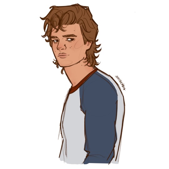
#went with a steve sketch cause i love him right now#I’m a horrible explainer and i’ve never been asked for tips before 😂#if you have specific questions feel free to ask and I’ll try my best to answer#i also do usually have a photo reference on hand for the sketches#i start with a rough outline and build it up and adjust with liquify#and I think drawing the same characters over and over again has also helped me get a better hand on the style and look I like#the whole stick to what works best for you deal lol#I’m always happier with those drawings#the video quality is crap i apologize#long post#my fanart#steve harrington#stranger things art#my timelapse#art tips
45 notes
·
View notes
Text
AI Art
This one has me thinking, and I would love to hear other opinions.
I’ve noticed other artists and friends really oppose it, and understand because it can affect our work, instead of hiring an artists to create a piece of art, someone can easily use the app and that affects the income of an artist that sales custom art.
There is also the fact that AI bases itself on art created by people, years of practice, blood and tears you name it.
All for some program to just copy mix and give a finished product in seconds.
Lets face it, AI bases everything it does on art that has been created by an artist in the world with or without permission. copying art styles and techniques that take time to be able to master as an artist.
At first I was honestly offended, as an artist... how dare you AI, all these years I have been an artist trying to improve, come up with an original style, for this thing to come along and do this...?!
and then I looked up the definition of art...
“The expression or application of human creative skill and imagination, typically in a visual form such as painting or sculpture, producing works to be appreciated primarily for their beauty or emotional power.”
AI can try to do all of this, however it is limited to something already created by a person, or nature, and lets face it, Ive seen some real good AI.
however not good enough to make me feel something, for example looking at Waterhouse’s Lady of Shalott... that painting expresses so much emotion, has so many details you feel something.
AI is not a person, has no emotion, morals, values, it does not suffer, it does not live.... it cannot love or hate it can only copy what was created by those who can feel.
Being human having that passion. That is what creates REAL art.
So, I am still upset about AI art, but understand why it was created, why to a point it is practical for the general public... Not necessarily good for artists who make a living out of digital stuff.... just saying. But I hate it, I get it, but I hate it.
This was a bit of a wake up call for me, as an artist, I have been getting a bit too comfy with my art, not pushing to improve, so for me this helped me get back in the game of passion filled art, I will continue to do comics and commissions, But I will push myself to start making art pieces with meaning and passion again.
From digital, watercolors, paints, wood carving, you name it, a true artist has no limits... and I plan to mess up and learn and improve to show, that no program can beat talent.
anyhow.. what do you all think about AI art?
22 notes
·
View notes
Note
I've been really self conscious about my coloring abilities in digital art, can you maybe give some tips on that because your art looks amazing
of course!
some general tips i can give you with no specific order of method is: *filters, *what are complementary colors, *color picking, *hue direction on lighting and *layer blending modes to summarize what i’m covering here.
tip #1- feel free to mess around with filters. if you have a program with filters like brightness/contrast, hue/saturation, yada yada, value those tools to help you adapt better to understanding flattering coloring. sometimes you may color a piece and it feels super saturated or bright, use the filter tools to adjust it in a way that is less straining for you to look at but also still makes sense.
tip #2- practice identifying complementary colors. what colors work with red? blue, green, etc. what level of contrast/brightness should it be to help the red pop out more? these foundations will help you decide necessary colors for your palette, but try to keep it simple. and dw multiple colors of the same hue (section of the color wheel, like blue) count to, but try to keep it simple.
tip #2.5- you can also just copy off an official color palette if you ever need to, it’s also just helpful for accuracy.
tip #3 for shading, the hue of the lighting will tend to vary both based on position and environment. i wouldn’t worry too much about it but some general tips are, lighting will get gradually cooler the further it is to the darkest area of the shadow.
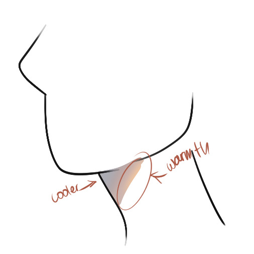
another general trick is if you don’t know what color to use for the shadow, warm tones like crimson or maybe the color of the skin are good for general lighting like day time or such. cooler tones like sky blue are good for stuff like closer to night time or a cool-lit room, etc. but again it also really depends on what looks good and benefits you.
oh yeah, for shading layers, i tend to switch between multiply and linear burn on blend layers. it just depends how intense i want the shading to be without having to directly go to the filter tool. multiply does general shadow building but linear burn helps emphasize shadows in darker colored areas, like a dark navy blue. again it depends on whatever i need. i also tend to use the add or glow dodge or linear light whatever is the brightness and most saturated blend mode on your program for highlighting certain areas. i typically use warmer colors for this unless it’s nighttime to which i’d use like a cyan.
these are really the main basics i’ve had in my coloring routine for a years that always helped me.
i hope these aren’t to confusing or broad, i would have drawn more examples but i’m kinda tired rn ^^. if you’d also like some recommendations i suggest looking into sinix design and his quick tutorial videos. marco bucci is also really good at coloring but there are really a lot of videos so i’d recommend colour harmony - 10 minutes to better painting. you don’t really need to start digitally painting but it’s just good fundamentals to learn about as it impacts cell shading as well.
17 notes
·
View notes
Note
Any tips for new drawers? I'm learning to digital draw but it's just awful. Tutorials or sketch tips?
Idk if I’m the best person to ask but I’ll try and help! Being a new drawer for me was when I was like 3, so everything I’ve grown to be feels like it just happened? Like I can only remember little details I changed or worked on. So I don’t know if I can help with that. But I can give you some digital art advice!
1: sketch it out on paper, finish it digitally. Taking a picture of a sketch and then using that can help you get a feel for the program and which brushes you like without worrying about the sketch. It’s a lot easier to do with tablets/phones and more time consuming for computers/laptops. For a while I used my phone without a stylus, so sketching digitally was extremely difficult. Taking pictures of sketches was my saving grace in those dark times.
2: zoom in/out depending on how big/small you draw. I found that this worked nicely for me. If you find you draw sketches rather small, zoom out of the canvas. That’s the case with me and I found it really does help get my proportions right because I’m so used to drawing smaller things. I’m sure this also works if your sketches are bigger and you zoom in, but idk that’s for you to try. This also would be a lot more difficult on a phone, but shouldn’t be a problem with a tablet.
3: don’t confine your sketch to one layer. Use two or three layers. One to get the feel of the pose, the second to define the pose, and add more depending on the detail you want to add before line art.
4: do color palette challenges to practice! Doing so allowed me to practice color balance, shading, using different brushes, and the sketches don’t have to be the best because it’s the colors that really count here.
5: Just some general stuff to consider if you’re going from traditional to digital:
• flip your canvas. It really does help, I’ve saved a lot of drawings from doing so. It gives your brain a fresh look at things and helps balance things out.
• make a canvas just to sketch on! Just practice with it, no one has to see it, make the most ugly things on there. Not everything you make has to be perfect.
• use a lot of references. I know that’s like basic stuff but really it helps. But not just real images, you can use others art as reference. Especially if you like how someone draws faces, or hands, or bodies. Copying someone’s work is obviously not ok, but studying it is a necessity for growing artists.
EDIT: I totally forgot but please if you haven’t already just search for some tutorials on tumblr. I’ve come across so many from just general tips to how-tos on ethnic features. Tumblr is your friend, remember that.
I hope these help, even just a little bit. If you want me to go into detail about specific things just let me know! I just don’t think I’m the best person for this because my experience has been so.. unconscious? I feel like I hardly think when I’m drawing so it’s hard to pinpoint exactly the things I do. But nonetheless I hope this is what you’re looking for!
85 notes
·
View notes
Note
Really sorry if you have gotten this ask a million times, but i'm a nee follower. Your coloring style is pretty much exactly what i aspire to. Do you happen to have any tutorials or anything that you've posted of yourself or used to learn from?
It’s okay! I haven’t been asked too many times! Even if I had, I’d still answer!
the lame response is, practice and trail and error. I’ve been drawing for many many years, and was in school for also many years, so it’s kind of congealed in my brain into one mass.
This got longer than I expected, so more under the cut
a slightly better response is; I’ve always struggled with unifying my colors. One thing I was taught was using layer effects is bad, and can make the art look bad. I use both photoshop and clip studio paint, though I know a lot of drawing programs have similar functions.
layer effects are a lot like salt. If you do too much, someone might like it! But it can really put a damper on piece, and the reverse is true, only having a little might not make a difference at all.
Because I struggle with unifying colors, a real traditional painting way is to either have a very opaque wash, or even mixing the main color of the piece into some of the other colors.
I’m an OKAY traditional artist. I still struggle with color, which is why all my work is digital. I have better practice, and I’m just better at it.
so with the power of photoshop, I “cheat” a little bit. I could try to hand mix the colors digitally, but photoshop sucks for that and, well, I’m lazy. Work smarter, not harder.
My party trick? I add a light pink layer over a lot of my work, set it to overlay and lower the opacity on that layer so it’s not as strong.
for example, the drawings on the left, the colors are fine, they could just ~pop- a little more. I throw on the overlay layer, move it to 46% and, viola! Colors are more unified and it’s got a distinct look to it.
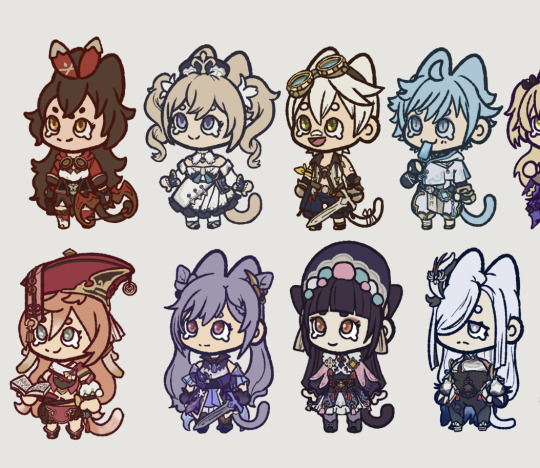
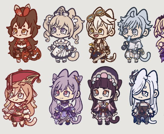
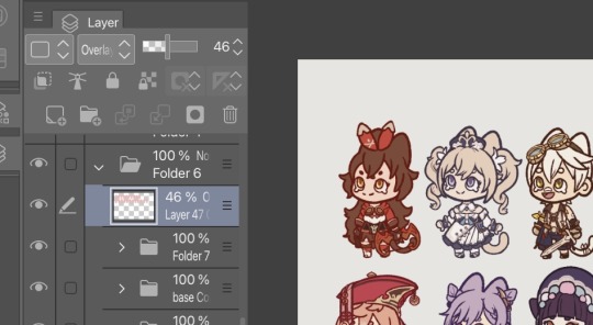
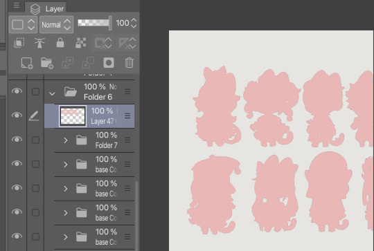
I’ve been doing this for a few years now, and usually what ends up happening is, sometimes I’ll just merge the overlayed layer and just start color picking from those merged colors.
those genshin chibi’s I did are just color picked from their character models, and maybe lightened slightly so it’s not too dark, but really not much changing. So putting the overlay really gets everything together.
Another layer option I tend to use is Exclusion, and usually a lighter brown with the layer opacity set to like, 15 or 20%. It helps a) unify everything, and b) helps tone down some of the brighter colors, to make it a bit more muted so it fits with the art nouveau style I like to draw in.
and again, just lots of color picking from the merged images to help keep everything together.
this turned out longer than expected! TLDR experiment! Try limiting your color pallets! Use layer effects, it’s okay if you don’t know what they do, I honestly don’t quite know myself ( I can give it a good guess, but, eh lol )
also avoid using true black if you can! When doing shades, darks get more rich, while lights get more washed out ( this is how I use colors, the cool thing about art, is you can do whatever! )
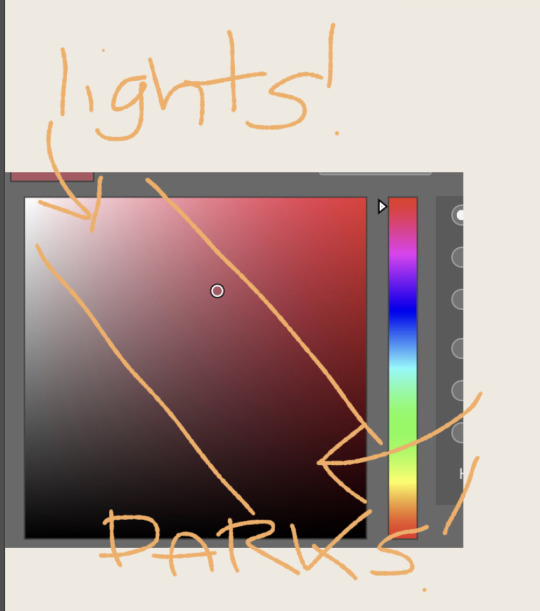
When I’m doing “blacks” in my piece, usually use a blue, or a red or purple, cuz it’s more vibrant and there are lots of tones of black. Ever try wearing a full black outfit with different clothes from different stores? They’re all different. So I always try to mix up the blacks and also try to keep the same color of black separate. That way stuff doesn’t start to blend.
And uhhhhh yeah! That’s more or less how I go about coloring. Sometimes you just gotta color pick from a neat photo and use those colors! See a cool rock? Color pick that bitch. Reference is king!
4 notes
·
View notes
Note
Hi Chekhov! Really enjoying your white diamond au! I had a quick art question: How do you start comissions? I've been improving my drawing skills and thinking about drawing for others after having fun in artfight, but I don't know where to start? How much to charge, how to get paid, etc. Do you have any tips? Hope you're doing well! :)
Alright, since a few people have asked, I’ve decided to put together a few things about how to get started on commissions - what you need, what you should make, and how to keep things organized.
This will get a little long, so I’ll divide it into 4 main sections:
1) Draw Art - Getting started
2) Get Commissioned - Making a commission sheet, Advertising
3) ??? - Communicating, Setting Limits, Running the Business
4) Profit - Pricing Yourself and Getting Paid
* Disclaimer: I’m an artist, so this How-To will be illustration-focused. I’m sure many of these tips can apply to ANY types of commissions, but I will be focusing on the type I know best. If you are proficient in other types of commissions for other types of art - music commissions, photography, etc - feel free to chime in and leave a comment or make your own tutorial!

1) Draw Art
I think this is probably the most obvious part, but it needs to be said:
Before you start making art for other people, you must first be comfortable making art in general.
I’m not saying your art has to be Disney-quality, or industry-level! Not at all.
BUT! You must be comfortable creating what you sell. If you try to sell something you have little confidence in, you will stress yourself out and possibly end up losing time AND money.
Don’t shoot for the moon if you haven’t landed on it even once. Sell what you know you’re good at. Your commissions don’t HAVE to include full-body illustrations if you don’t know how to draw feet/solid stances. Limit yourself to what you can do.
Things you need to should probably have before starting commissions:
1. Access to art materials or a fully downloaded art program
DO NOT - Use a free tutorial version that will expire in a month and leave you without a way to draw! If you are having trouble finding a program, try free ones like MediBang Paint Pro.
2. Free time to complete the amount of commissions you want to take.
DO NOT - Take on or offer commissions if you KNOW you’re going to be overwhelmed with school or personal life for the next 2+ months. Pace yourself, otherwise you’ll burn out, get stressed, and get discouraged.
3. A reliable way to communicate with your customers like a commissions-only email
DO NOT - Use your friend/family/college email. It’s hard to keep track of things as it is, and creating new emails is easy and free. And keep it professional if you can! Not many people will reach out to dong-wiggles20434 to ask for a design. Ideally, your email should be close to your brand - however you want to brand yourself. Usernames are fine!)
DO NOT - Use Instagram/Twitter/Tumblr to collect commission info unless you are ready to do the organizing yourself. Some people make it work, but in my experience, if you use these SNS sites to communicate with friends and network... you’re going to be losing commission inquiries right and left and accidentally ignoring people. Email is much easier to organize and sort into folders.
4. A portfolio or at least 2-3 pieces of each type of art you’re planning to sell.
DO NOT - Advertise commissions without having any examples of the art you plan to sell. People will find it difficult to trust you if you can’t even give them a vague idea of what sort of drawing they’ll be getting.
Disclaimer: These are not hard ‘do not’s. If you have had a different experience, I respect that. I’m simplifying for the sake of streamlining this advice.
.
2) Get Commissioned
So - you have your art, you have your art program, and you’ve got all the time in the world. That means.... that’s right! It’s time to let the world know you’re taking commissions.
One of the most common ways artists signal to their audience that they can do commissions is by creating a commissions sheet. There are MANY ways to make this - and they range from simple and doodly ones to VERY complex designs. For example, here’s mine!
There are many ways to organize a commission sheet. At its core, a commission sheet should display the types of art you WANT to be commissioned to make. Let’s go over a few ways they can be done!
#1.... Body Portion Dividers!

This sheet is most common with those who want to capitalize on drawing people and characters. If you want to draw lots of characters, this is a great way to offer several tiers of pricing based on how much of their character your customers want to see.
#2... Complexity Scale
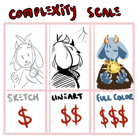
If you’re open to drawing many things but want to base your pricing off of how complex something is, you can split your tiers into done-ness. This type of commission is popular with those that draw characters AND animals, furries, etc.
#3.... Style and Type

If you’re more on the design side of things, or if you have various niche art styles that you can’t quite lump together, display a variety of your skills alongside each other! It helps if all the ones you have can be organized under a common customer - like those looking to advance their own business and get logos, websites, or mascots made for them!
.
3) ???
You got your first commission... what happens now???
Well, ideally you have the time, tools and motivation to make things happen! Now all you have to do is... sit down and... draw.......
I’m going to say something that may be a little controversial:
Commissions aren’t fun.
No, no, hear me out: I have fun doing commissions! I genuinely enjoy drawing characters and coming up with designs. But even with all that said, commissions are, first and foremost: WORK
I’m not saying this to discourage you, I’m saying this to keep things realistic. When I first began commissions, I thought it would be just like any other type of drawing. I would sit down, imagine a thing, draw it... it would be fun!
But then I realized that I couldn’t just draw what I wanted - another person had an idea in mind and had asked me to do it. I stressed over getting the design correct from descriptions. I stressed over not having the right reference for the pose the commissioner wanted. I stressed over not being able to draw the leg right in the way I had promised I would do. I stressed about billing. I stressed about digital money transfers. It was difficult, and time-consuming, and I did not enjoy it. At all.
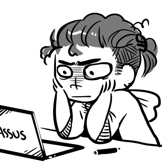
And a part of that is definitely on the commissioner - we, as artists, NEED to demand proper references or descriptions. We, as artists, NEED to limit the amount of changes we’re going to make at the flick of a finger. We NEED to demand clear instructions and set boundaries. That’s also super important.
But also - don’t be discouraged if you find yourself exhausted drawing your first commission. MANY artists go through this. Adjust your rules, fix up your limits, practice putting your foot down on finicky commissioners who expect you to read their mind! It does get easier, but you have to communicate and put in the effort and act as your own manager AND your own customer service AND your own accountant. That’s what you’re looking at.
Good limits and boundaries to set:
Limit the amount of changes a person can ask to make. “I want blue hair.” Next email: “No wait, yeah, make it red.” Next email: “Actually I changed my mind, can I get the blue but like, lighter?” Next email: “No, not that light.” ... At some point, we have to stop. I personally allow 2-3 changes on the final stages of a commission before I start refusing or start asking for extra money.
Demand clear instructions and/or references. If something isn’t described, you have to take artistic liberty and design it, but that’s difficult! And if the customer is not happy with it but can’t tell you more? That’s not your problem - the burden of reference is on THEM. You cannot read their mind, and that’s not your fault.
Get at least half the payment up front! This is a good balance between the ‘pay before art’ and the ‘pay after art’ conundrum that will limit the amount of woes between artist and customer. (I’ll touch upon this a little more in the Profit section.)
Organization:
Where possible, create good habits! Tag your emails and organize your folders. I have a tag on my emails for active and finished commissions. I also keep my emails on Unread until I have time to sit down and properly look at/reply to them.
My Commissions in the folder are also organized chronologically and I mark down which ones are paid and which ones are not.
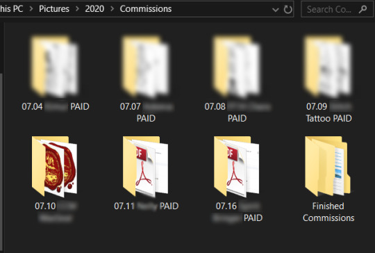
(I understand not everyone can do this, but if you want to give it a try, it does make things easier in the long run. Again, this advice is just what I have found personally helps.)
One last thing - I do not want to shame ANYONE for taking their time with commissions! Commissions are complex, and they take time and work. You can draw in 8 hours, but some things take research, materials, etc. Some illustrations realistically take up to half a year, or, depending on what’s involved, several years!!
THAT BEING SAID - it’s good manners to be upfront with your customers about how long you expect the commission to take. If you think you’re busy, just say that! Explain that you have a lot going on, and you will probably take (insert time period here).
And if your commissioners are worried, work out a system to keep them updated! I send my commissioners updates when I finish the lineart/flat colors/etc and I try to be clear about how long everything will take. I try to estimate with a +3-5 days buffer to give myself extra time... and recently I’ve been using it. Always say a bigger number than you think you’ll need.
If someone wants a rushed commission... make them pay more. If ANYONE wants a commission done ‘by the end of the week’ - that’s an automatic rush-job for me because I’m juggling an irl job and several commissions at once. I WILL charge a rush fee and I won’t feel bad about it.
If someone wants a commission within 24 hours...... Well, they better be paying you 3x your normal amount, or more. And remember - you CAN refuse! It’s perfectly reasonable to say ‘No, sorry, that sort of turnaround time is not realistic for me.’
Food For Thought - Invoicing
Many artists I’ve commissioned in the past have not used Invoicing, but I’ve recently begun to fill out invoices and file them in my Commissions folder just to keep track of things. It’s not necessary until you start getting into the Small Business side of Freelancing, but it’s not a bad idea to get into the habit early in case you might need to do it later for tax purposes.
Here’s what my Invoice looks like, for example.
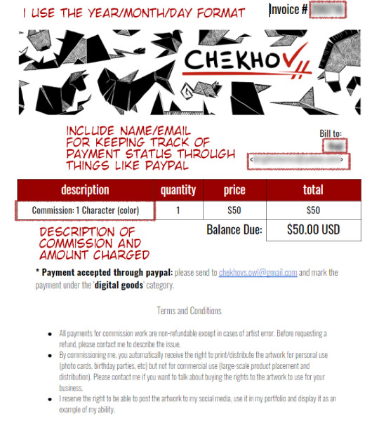
I’ve optimized it to help me remember who, what, and how much is involved! It also contains important info for my customers like where to send the money.
Which brings us to...
.
4) Profit
One of the hardest things for artists is pricing themselves. I’m not going to tell you which way is BEST - there is no BEST way, only the best way for YOU.
One of the options available to you is pricing by the hour. It includes averaging out how long it takes you to draw a specific type of art (whatever you’re offering as a commission) and multiplying that by an hourly wage you’ve decided on.

When you do this, I stress - do NOT price yourself below minimum wage if you can help it. When you first start out, aim for the $15/hour mark and adjust accordingly.
Other ways to price your art:
- Per complexity: Portraits vs full body should be scaled based on how difficult you find one vs. the other. You can also easily decide on a price for a sketch and double it for lineart, triple it for full color, etc.
- Per type: Look up for industry prices for website design and logo design. They may surprise you! You don’t have to charge that much, but it helps to keep things in perspective.
It’s okay to change your prices! Keep your commission sheet image handy so you can update the amounts as you grow. :)
Payment up front or after completion?
Some artist take full payment up front. Some only demand payment after they’ve finished and sent out the piece. I personally think these are both risky for everyone involved.
I recommend doing at least HALF of the payment BEFORE you start the commission. Calculate your full price and ask for half before you start working on it in earnest, to make sure the person can actually pay you. Then, when they receive the full piece and are satisfied, they can complete the payment.
I personally work in this structure:
> Someone emails me with their idea/reference
> I send back a rough draft sketch that shows the idea/pose (only takes me 10-20 minutes so not a huge loss if they ghost) and quote them a price
> They can pay the full thing upfront OR pay half
> I finish the commission and send updates when I do the lineart/colors to double check anything so they have multiple chances to spot any errors
> If the person paid only half on completion, I send them a low-res version of the finished thing, they finish up their payment and THEN I send them the full-res version plus any other filetypes/CYMK proofs, etc.
Many of the people who commission me pay me up front even though I offer they pay half - and I’m really flattered that they trust me that much! Because of that, I feel encouraged to update them frequently and ask for their input as I work, so they have the peace of mind knowing I’m actually doing their commission.
Great, but how do I get PAID????
There are NUMEROUS ways - these days money is relatively easy to transfer over digital means, and you have a few options.

Paypal is perhaps one of the oldest digital wallets and is geared towards businesses. By setting up a PayPal and connecting it to your debit card of bank account, you can tunnel a pathway from your online business directly into your hands in a matter of days.
Paypal also offers Invoicing - you make an invoice, price it and send it to the person’s email and they can pay whatever way they need! (It also allows partial payments.)
Pros: transfers from PayPal to bank account are free, and take a couple of business days. It also has no upper limit to the amount of money you can move in/out each month. It can force refunds due to the nature of its business-oriented payment system.
Cons: Because it’s used by businesses for larger transactions, PayPal may demand a more rigorous proof of your identity. It may also take longer to set up and be harder to get used to. I’ve also heard that they can be a hassle when it comes to closing your account.

Venmo is another type of digital wallet that acts much like paypal, except for a few key differences - it is NOT made for businesses (so depending on whether you’re officially registered as a freelancer, you may not be able to use it). I personally don’t use venmo, so I cannot speak to its usefulness, but I know a few people that use it for casual transactions. It’s easy and quick! :)
Keep in mind that you cannot force a refund over venmo! The transactions are final.
There’s also CashApp, GooglePay (which could load gift cards but also allows peer-to-peer transactions) and I’ve heard good things about Due, though I’ve never personally used it.
Other ways to pay: I’ve had people pay me over Patreon by upping their pledge, and I’ve had people pay me over Ko-Fi by donating a specific amount.
Many people even use Etsy - the website specialized for independent small businesses selling art - by listing their commission sheet and offering up several ‘slots’ of commissions, which allows you to track taxes AND allows your clients to pay using whatever they feel comfortable with.
If you’re in Canada, you can even pay by emailing money directly from bank account to bank account - check whether your country offers this type of service! There’s no shortage of ways to move money in the digital world.
Just like everything else, there’s no singular ‘Best’ way. It just depends on what works for you.
I think that just about wraps it up! I can’t quite think of what else to put here - but I’m sure other artists will chime in with their own advice. :) I’m very sorry this became so long but I hope it was helpful!
Obligatory Disclaimer: I’m not qualified to give legal or accounting counsel. Please double-check the laws in your own country/state in regards to taxation of freelancing work and do your own research. If you are underage, DEFINITELY get an adult’s permission before you start doing commissions, and have the adult help you through the process.
. . . . . . . . . . . .
OTHER POSTS YOU MAY FIND USEFUL:
An Extended Post on Pricing Yourself for Commissions
Dealing with Imposter Syndrome/Feeling ‘Not Good Enough’
Growing Your Audience
Advice for Starting Digital Art
2K notes
·
View notes