#all designs will only have 4 A / 5 B / 5 C / 3 D (or the same for equivalent jogger sizes) available ready-to-ship
Explore tagged Tumblr posts
Text
Btw, if you wanna snag any of these without waiting for a preorder then you GOTTA know the very second the initial tiny ready-to-ship batch drops! They will likely go very fast, so be ready!!!

The Fall Collection Sneak Peek
Guest artist design test prints are here!!!


Left to right, top to bottom: @vetiverfox Blood Sacrament Joggers; @dobie Dark Cathedral Joggers, Dark Cathedral Midi; @loppyrae Little Baphomet Joggers, Little Baphomet Skater; @fleebites Corruption Midi, Morningstar Midi, Demonic Draconic Joggers Placeholder preview listings are up in the shop now, so feel free to start wishlisting & signing up for in stock alerts! The Fall Collection will drop later this month. Keep an eye out for more info soon~ 🖤witchvamp.com🖤
#go to w/e is your fave design and hit that button to get an email the absolute first split second everything is available for purchase!#all designs will only have 4 A / 5 B / 5 C / 3 D (or the same for equivalent jogger sizes) available ready-to-ship#so if you want one get ready#of course i'll also let everyone know the exact day & time of the drop once i know for sure when i can do it#that hinges on shipping and how fast i can take pictures of everything tho so#i can't really decide that until it's pretty close to the day#we shall see..#and then if you miss the first batch don't worry too much#preorders will start just a few days after the drop
92 notes
·
View notes
Text
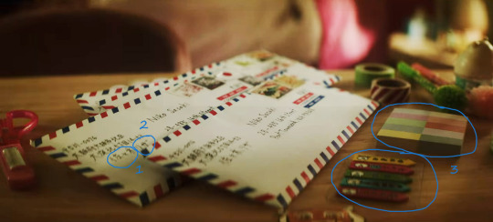
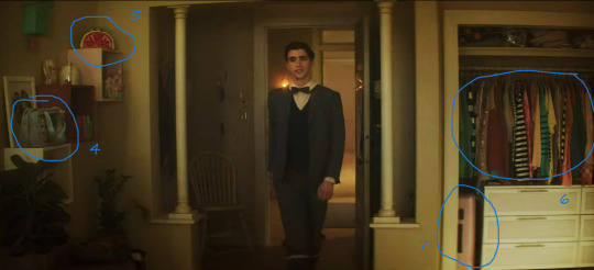
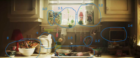
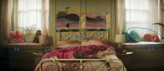

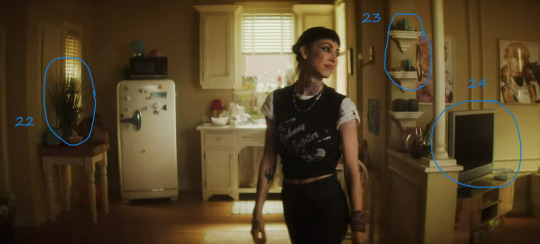
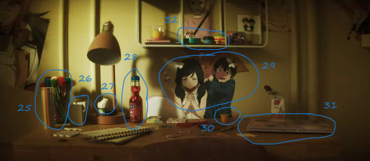
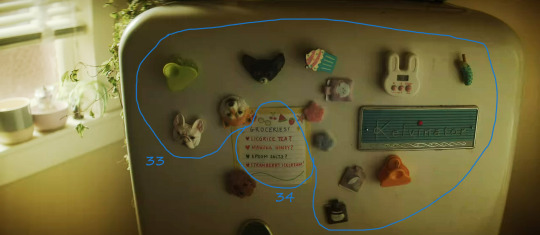
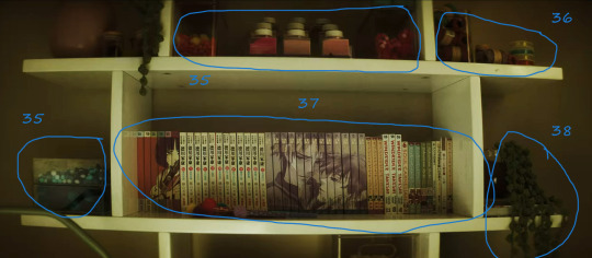
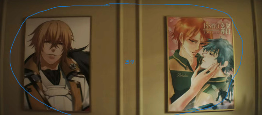
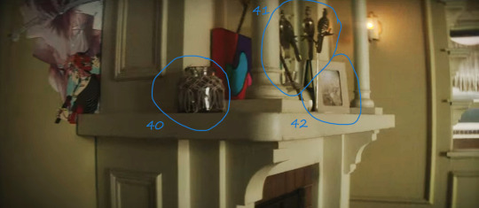
Set breakdown time! Next up: Niko's room.
As before, I've circled the points of interest and numbered them to make them easier to talk about. Cool? Cool. Let's do this!
1: Niko's mom's name! This part is her and Niko's surname. The kanji are 佐々木.
佐 – sa, meaning help or aid
々 – an iteration mark. When you see this, basically it means "exactly what the last one said, one more time." So another sa meaning help or aid
木 – ki, meaning tree
It's really neat that they picked a last name for her that doubles down on her role in the narrative. Just like Niko is there to support and help other characters in whatever way they seem to need, her surname hammers it home by including 佐 not once but twice.
2: Riza (リザ) Niko's mother's given name. Somewhat odd here is that it's written in katakana and not kanji. Without getting sidetracked too much (you can pop over here to read more if you're interested) most Japanese people write their names in kanji.
Katakana seems like a bit of a strange choice here, unless a) Niko for some reason doesn't know the kanji for her own mother's name (weird, given that she's in high school) b) her mother is a foreigner (a possibility; foreigners usually write their names in katakana) c) the set designer/whoever prepped the letters didn't know the appropriate kanji for "Riza" (seems unlikely, given how accurate all the rest of this is) or d) some sort of personal habit. An interesting side note is that her letter to Niko also puts Niko's name in katakana.
3: Cutesy stationery, used for marking your place in a document or book
4: A cute blue purse!
5: Watermelon! Judging by the shiny material and placement near the other bag, I'm going to guess this is another purse
6: Niko's clothes :>
7: Pink luggage
8: Lots of instant noodles
9: A rice cooker
10: Rice vinegar
11: This girl LOVES her some plants
12: Probably food items…? The one on the right looks like it might be a five-pound bag of rice, but I don't recognize the brand
13: Lots of unwashed dishes
14: A toaster oven
15: Chopsticks
16: A cute octopus pillow. I think I saw someone mention that it's from Ikea :>
17: She often leaves dirty dishes sitting on the bedside table
18: A painting of what seems to be a skyscape
19: Brightly colored pillows
20: Metal art in the shape of a moon
21: A decorative window hanging
22: More plants :)
23: Candles
24: Her tv
25: Cute pens with pompoms on the end
26: Regular tape
27: A cute cat statue
28: Marble Pop Ramune, strawberry flavor. Ramune is a type of soda that's a popular festival drink in Japan. It's sealed with a glass marble and you have to pop the marble down into the little catch basin before you can drink it.
29: Anime wall décor
30: Fruit jelly cups. In Japan, small gelatin based snacks like this are popular. They're tiny, about an inch tall, and you eat them in just one or two bites.
31: Niko's laptop. She has stickers on it
32: Washi tape! It's decorative Japanese tape, often with bright colors and patterns, used for crafting.
33: A lot of cute magnets, including the bunny one, which serves double-duty as a kitchen timer
34: Niko's grocery list. The only thing on here that's here because she wants it is strawberry ice cream. The rest of the items, licorice tea, manuka honey, and Epsom salts, are all natural remedies. She's been trouble-shooting how to get rid of the effects of the sprites. She knows she's sick, but not why
35: Cutesy craft supplies! Sequins, glitter, and pompoms
36: More washi tape!
37: Niko's manga collection. She is that particular brand of organizational mess that does not put her numbered volumes in order. She has made an exception for the series that makes a complete picture when you line them up, though
38: More plants :)
39: Manga posters! Issho is one of the series that she has on her shelf
40: A decorative jar
41: Little metal bird sculptures
42: What seems to be the only framed picture in her room. The angle is wrong to see what the photo is, but it's interesting that they added just one in here. Maybe it's her family…?
161 notes
·
View notes
Text
SURROGATE PROCESSING WORKFLOW
DRC, Facility Operations Command, Compound Oversight Unit
Date: [REDACTED]
Subject: Surrogate Management Protocols
Location: Paternity Compound 131, [REDACTED], Oregon
Objective
This document provides a detailed overview of the surrogate processing workflow employed at Paternity Compound 131. It highlights the efficiency-focused methodologies implemented throughout the process, from intake to post-delivery. Personal letters from Surrogate ID S131-279-P are included, documenting his journey from arrival to delivery to help illustrate the overall operations.
I. Arrival & Intake
Transport
"Dear Dad,
I’m not sure where to start. They brought me here in this big, quiet van, and as soon as we got off, they started running all these tests. They gave me a number and tattooed it on my stomach like livestock. They keep saying I’m doing something important for the greater good, but I'm just confused." - S131-279
Candidates are transported to the facility in climate-controlled vehicles, ensuring they arrive in stable physical condition. They are processed in batches of [REDACTED] at a time for efficiency.
Initial Assessment
Upon arrival, surrogates undergo physical and psychological evaluations to assess readiness for the program. This includes fertility screening and compatibility testing for high-multiparity potential.
Registration
Each surrogate is tattooed with a unique ID number for tracking and monitoring throughout their conscription period, imprinted just above their navel.
Compound ID: The facility they will be housed in for gestation.
Arrival ID: The order number in which they arrived at the facility.
Fetal Count: A letter to indicate the number of viable fetuses they carry:
A (1) - B (2) - C (3) - D (4) - E (5) - F (6) - G (7) - H (8) - I (9) - J (10) - K (11) - L (12) - M (13) - N (14) - O (15) - P (16) - Q (17) - R (18) - S (19) - T (20) - U (21) - V (22) - W (23) - X (24) - Y (25) - Z (26) Example: Paternity Compound 127 + 437th Surrogate to Arrive + Carrying Quattuordecuplets (14) = S127-437-N
II. Rest & Preparation
Induction & Crowd Control
"Hey Dad,
Things are getting weirder by the day. Yesterday, they gave me a shot that burned like hell and made me feel woozy. It must have knocked me out cause I woke up, and it was tomorrow morning. I don’t know what happened, but I was so sore. I just want to go home." - S131-279, Arrival Weight 170 lbs
Entry areas are designed to funnel a group of surrogates into a single file line. Short but sweeping corridors are employed so that each candidate is prevented from seeing what lies ahead and concentrates on the individual in front of it.
Hygiene Protocols
Surrogates are directed to communal hygiene zones where they undergo full-body cleansing, enemas, and sterilization procedures.
Hormonal Optimization
Subjects are administered hormonal injections and supplements to ensure optimal uterine receptivity and increase the likelihood of successful embryo implantation.
Tranquilization (Optional)
Depending on the subject’s stress levels, mild to full sedation may be administered to maintain compliance and calm.
Note: [REDACTED]% of surrogates require some form of sedative before insemination.
III. Insemination Process
Surrogates can be assigned one of three insemination methods, depending on operational efficiency, donor availability, and strategic objectives:
"Dad,
I don’t even know who I am anymore. My body feels like it’s not mine. It’s only been a week since I arrived, and my stomach is growing so fast it scares me. I can’t stop eating, and it’s like my hunger gets worse the more I eat, but I can't stop. They keep telling me this is normal, that 16 is a "good number"?! They said it was a badge of honor. Sixteen! I feel like I’m being turned into something I don’t understand, and I can’t stop it." - S131-279-P, Day 6, Weight 192 lbs (+22 lbs)
In Vitro Fertilization (IVF):
Procedure: Embryos fertilized in a laboratory are implanted directly into the surrogate's uterus.
Benefits: High precision, maximum control over embryo count, and genetic compatibility.
Usage: Preferred for surrogates assigned to carry high-volume fetuses or when multiple donors are involved.
Traditional Method (Sexual Intercourse):
Procedure: Selected donors engage in physical intercourse with surrogates under closely monitored conditions.
Benefits: Natural conception methods reduce laboratory overhead and offer efficient insemination for surrogates with high natural fertility markers.
Usage: Typically used donor compatibility is exceptionally high.
Fluids Infusion (Turkey Baster Method):
Procedure: Donor samples are introduced directly into the surrogate's reproductive tract using a sterile infusion device.
Benefits: Combines simplicity with minimal intervention—a cost and time-effective alternative to IVF and traditional methods.
Usage: Often employed in high-volume batches where rapid insemination is required or transportation to the nearest compound is infeasible.
Post-Procedure Monitoring: Surrogates remain in observation units for [REDACTED] hours to confirm successful implantation and address any immediate complications.
IV. Monitoring & Maintenance
Ward Assignment
"Dad,
I don’t think I can do this anymore. My belly is enormous—I can barely move, and I’m out of breath all the time. They keep saying I’m ‘thriving,’ but how can they call this thriving? I heard one of the staff joking about how I’m ‘one of the biggest ones yet.’ They think it’s funny. I don’t. I can feel them—16 of them—moving inside me, taking over everything I used to be. I’m not me anymore." - S131-279-P, Day 13, Weight 254 lbs (+84 lbs)
Surrogates are transferred to gestational wards, where they will reside for their pregnancies. These wards have medical monitoring stations, communal feeding areas, and resting zones.
Nutrition Protocols
Diets are adjusted to high-calorie "one-size-fits-all" solutions, such as nutrient-dense puddings designed to promote fetal growth while maintaining surrogate docility. Hormonal treatments are incorporated into meals to reduce the need for frequent medical interventions.
Weekly Checkups
Surrogates undergo routine ultrasound exams, weight measurements, and health assessments to ensure all embryos develop within target parameters.
Behavioral Observations
Any signs of distress or resistance are addressed promptly through psychological support or, if necessary, isolation protocols.
V. Delivery Process
"This will probably be my last letter. I don’t think I’ll make it much longer. My body’s breaking under the weight—literally. I'm too big, no one was ever meant to be this big. They’re moving me to the birthing wing tomorrow, and I know what that means. I’m terrified, but I don’t have a choice. I just want you to know I didn’t have a choice." - S131-279-P, Day 28, Weight 490 lbs (+320 lbs)
Pre-Labor Preparation
As surrogates approach full term (29-35 days), they are moved to birthing wings equipped with specialized delivery equipment and staff trained for high-multiparity births. Diets are radically adjusted to promote greater weight gain.
Labor Management & Delivery
Surrogates are monitored continuously, and medical staff is on hand to manage complications. Multiple babies are delivered in succession. This process may last several hours or more, depending on the number of fetuses.
Post-Delivery Processing:
Fetuses are immediately evaluated for health and viability.
Surrogates are provided palliative care as necessary.
VI. Post-Delivery Workflow
"Surrogate S131-279-P demonstrated remarkable endurance and successfully delivered 16 fetuses, average weight 14 lbs, in 30-45 minute intervals, after a 34-hour labor. The surrogate's abdomen showed extreme distension, with clear evidence of significant internal [REDACTED]. Full natural delivery was achieved, but the surrogate succumbed to irreversible [REDACTED] failure minutes after the final baby was delivered." - Dr. [REDACTED], Chief OBGYN, Paternity Compound 131
Vital Cessation Verification
Medical staff confirm the cessation of all vital signs immediately following delivery to ensure compliance with humane protocols. Time and cause of expiration are noted for record-keeping and research purposes.
Surrogate Decommissioning & Disposal
[REDACTED]
Note: As standard protocol, all personal items of Surrogate S131-279-P were recycled following his decommissioning, including the destruction of [REDACTED] paper letters addressed to a Mr. [REDACTED] Collazo.
Surrogate Output Metrics
Each surrogate’s performance is evaluated against pre-delivery projections. The Prenatal Division records key performance indicators for review, including total fetal weight, fetal viability, and gestational efficiency. Personal details related to the surrogate are then purged to save computer storage space and maintain confidentiality.
Key Metrics and Efficiency Goals
Average Per Surrogate: 8–14 Embryos
Delivery Survival Rate (Fetuses): [REDACTED]%
Surrogate Survival Rate: 0%
Cost per Surrogate: $[REDACTED]
This structured process ensures that surrogate output meets national population growth goals while maintaining operational efficiency and cost-effectiveness.
----------------
Click Here to return to DRC Report Archives

49 notes
·
View notes
Note
Do you have any screenshots of your favorite details from KHUX?
HAHAHAHAHA, yeah I do
Gonna just drop a read more here 'cause if y'all know me at all you know this post is probably gonna be 10KM long lol
So, I'm gonna try to hold myself back a little because I literally have like 10 pages of notes about specifically stuff in the backgrounds and I doubt the internet will find my bench and lamppost count interesting. (Also image limit lol)
I'll list just 4 things for now (in no particular order) and talk about them a bit underneath.
NUMBER 1 || STREET SIGNS

So there are four street signs that we’ve seen in Daybreak Town. Two are in the Fountain Square (A and B), one is in the Marketplace (C), and one is in the Clocktower Outskirts map (D).
For B and D it’s pretty easy to figure out what the represent. B is a clock, probably representing the Clock Tower… or maybe the best place to see the Clocktower because it’s in Fountain Square. The overall shape of it is different from the rest of the signs so I imagine that means something. D is a gondola or canoe of some sort, which makes sense because it’s next to stairs that seemingly lead to the canal that runs through town. Maybe there’s a ferry system of some sort?

A and C I’m less sure about. The designs don’t really bring anything obvious to mind. Maybe C is Munny because it leads to the Marketplace? I’m not sure.
NUMBER 3 || DOOR UNDER FOUNTAIN SQUARE
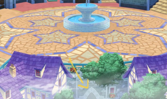
See what makes this interesting to me isn’t just the fact that apparently Fountain Square is hollow underneath (maybe for pipe repairs or something, I don’t know) but just the general fact that a lot of structures in this town, that maybe shouldn’t be, are hollow.
If you look even some archways have windows, so there has to be an open space inside, right? Most of them seem at least connected to houses so I assume they’re basements or something. (The one by murder house gets me tho, like that’s right under the bridge. Who’s living right under the bridge)
And I also feel like this leads into the fact that, similarly but not as extreme as in Scala, Daybreak Town is kinda built on top of itself. Maybe that’s a symptom of being around so many (and possibly on) mountains but I still feel like it should be talked about more.
NUMBER 4 || LIGHTHOUSE INTERIOR MAP
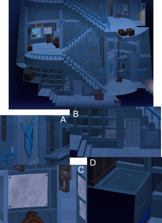
There is so much to unpack here but I’ll try to keep it brief.
So I’m pretty sure this is one of, if not the oldest building in Daybreak Town. Two reasons.
1. Instead of having little wall lamps, like the rest of the town and buildings, all the light seems to come from mounted candles.
2. There are swords (A) on the walls and not Keyblades. Why would the Keyblade town not have Keyblades on its little shield emblem? Is it possibly because it was there before Keyblades?
This staircase here (B) is also the only known (not sewer drain) way into the waterways. It leads into the sewers then out to the little dock below the Lighthouse with the boat, hence the sign.
There’s these maps here (C) that I don’t really know what to say about, but is definitely worth pointing out. They’re all the same and I assume show the layout of the area surrounding the town (the darker parts being water). It could be a world map though (darker part being continents)… I don’t think we’ll ever really learn lol
And also I don’t know what this is (D) but I think it’s interesting that it has writing on it. It kinda gives me the vibe of those flat on the ground gravestones…
NUMBER 5 || BANNER

Daybreak Town actually has a flag it’s all over the place and you’ll start to see it everywhere if you look for it. They also kind of look like the banners in Radiant Garden. The colours and shape/mounting are the same but the designs on the flag itself (and mounting) is different.
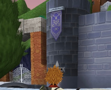
I have no clue what that implies, if anything, but I figure it’s worth pointing out ‘cause it’s interesting.
#This post took a lot longer than I wanted it to lol#but I hope you enjoy my brain rot#there’s so much I could point out but I think if I did any more the post would never would've been finished lol#actually writing thoughts down is a killer lol#(like originally there were going to be 7 but for whatever reason my brain was not letting that happen)#(so I’m just letting there be the 4 lol)#khux#kh#kingdom hearts#sometimes i think about khux
95 notes
·
View notes
Text
Pitch for a “The Dark Pictures Anthology” game:
1) The title
“The Thrill of the Hunt”
2) Prologue
1920, British-controlled India. Jaspreet Singh and Sameer Patel, Indian rebels who fought against the British Empire (the false protagonists of the prologue), have been captured by the British Army. Although they’ve been sentenced to execution, they learn that they are actually being transferred to the Kingsley Gentlemen’s Society. From what we can tell of the Society, it’s run by the rich and powerful of British society.
Jaspreet and Sameer then learn the reason why they’ve been transferred. Today is the day of “The Hunt” where the Society members work together to take down the prey in the designated game preserve. And Jaspreet and Sameer are the game.
Since this is the prologue, Jaspreet and Sameer unfortunately end up being killed by the Society.
3) Main story
Present day, Falkland Islands. Five strangers have been brought to the mansion of the Kingsley Gentlemen’s Society. Four of the strangers are there after being invited by the Society while the fifth is there because they are dating one of the Society members. For the invitees, they all have the same goal; join the Society and cement their status as part of the upper class.
But, just like with Sameer and Jaspreet, that’s not the case at all. Today is, once again, the day of “The Hunt”. Since the 1920s, the Society has gotten bored of hunting down people who have already been sentenced to death. To get an extra thrill, the Society now targets the hopeful and wealthy.
In the main villain’s words, “it is far more satisfying to tear down people who are happy and actually have something to lose since you know that it is you who caused their despair”.
As the players, it is up to you to determine if the five strangers can work together as a team to either escape or destroy the Kingsley Gentlemen’s Society. Or end up becoming just another trophy on their shelves…
4) Playable cast
a. Desmond Johnson (ADVENTUROUS, RATIONAL): A highly successful American lawyer whose dream is to become a Supreme Court Justice one day. Desmond becomes the de facto leader of the group. He is played by the celebrity guest actor, Michael B. Jordan.
b. Faye Simmons (NAIVE, INQUISITIVE): A biologist from London who was dating one of the Society members. Much to her horror, she learns that the reason why the Society member wanted to date her was so that he could lure her in and force her to participate in The Hunt.
c. Hiroki Akashi (STERN, OVERBEARING): A high-ranking shareholder of a Japanese corporation. Despite coming off as a little vain and arrogant, he does show a willingness to work with the group since he wants to make it home to his children.
d. Omar al-Ghazi (PARANOID, AMBITIOUS): A Saudi Arabian oil tycoon who has trouble trusting other people. His behavior is a result of numerous business deals that went wrong due to people betraying him, as well as his family becoming estranged to him. Despite this, Omar does take pride in his ambitious nature, even if he ended up alienating his loved ones.
e. Adrianna Reyes (ABRASIVE, LONELY): A Mexican billionaire businesswoman who is currently dealing with a scandal. She reveals to the group that even though she’s married, she had an affair with an unnamed Senator in the Mexican Senate. The reason for the affair was that her current marriage is loveless, only done for political reasons.
5) Bonus poll
#tumblr polls#polls#supermassive games#man of medan#little hope#house of ashes#the devil in me#directive 8020#michael b jordan#dark pictures anthology#dark pictures house of ashes#dark pictures little hope#dark pictures the devil in me#the dark pictures anthology#the dark pictures the devil in me#the dark pictures little hope#the dark pictures house of ashes#the dark pictures man of Medan#until dawn#the quarry#horror games#horror video games#horror ideas#story ideas#game idea#the curator#the dark pictures#video game#video games#gaming poll
8 notes
·
View notes
Text
I ask Dalle 3 to draw every single Pokémon in the pokedex and I grade it on accuracy to show that us artists still have hope in not getting replaced, but we still need to keep fighting. (pt 1)
1. Bulbasaur
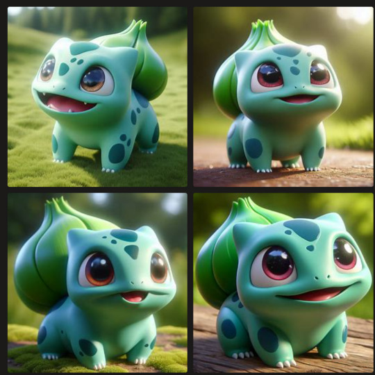
Understood the assignment. Overall basic idea of bulbasaur has been expressed. Spot placement is loose and generalized. 3/4 of them do not have fangs. Some of their eyes are not the right color. All of them have pupils, which is not a trait found in Bulbasaurs but I'll allow it for the style that they are using. As a cute bulbasaur render, it passes.
Grade: B+ (probably nightshade your bulbasaurs)
2. Ivysaur
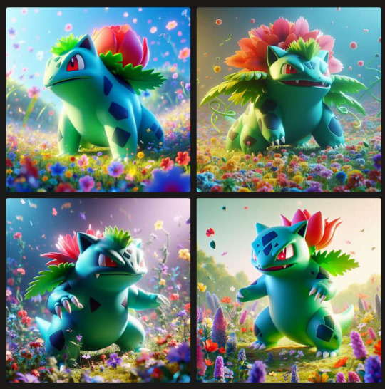
Is slowly starting to lose the plot. Most of the time, the ivysaurs generated by the algorithm are either bulbasaurs with buds, ivysaurs with bloomed flowers, or an in-between of ivysaur and venusaur. Flower isn't even the right kind. And some of them become bipedal with tails?? the fudge? And there are too many flowers in the background. The composition is starting to become cluttered.
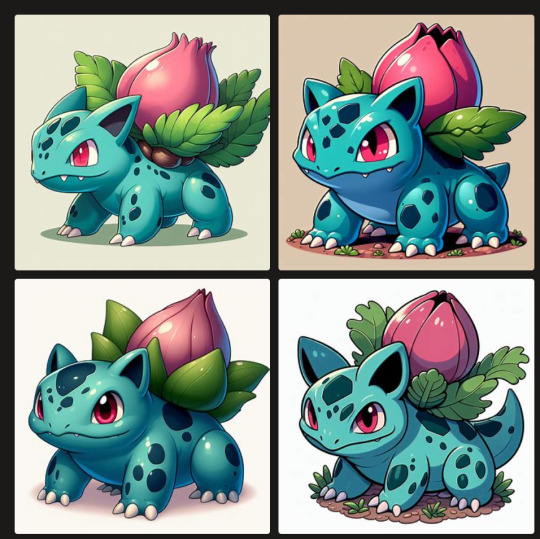
Upon giving it the bulbapedia description of its physical appearance, it was a little more accurate. However, the leaves are all wrong and it still suffers from too many spots syndrome. One even had really thin pupils.
Grade (without full description): D Grade (with full description): C (you probably don't need to nightshade your ivysaurs, but seeing the next pokemon... yeah you should probably do that.)
3. Venusaur

Horrible. Absolute failure. This is just a bigger bulbasaur with ivysaur's colors and venusaur's plant.
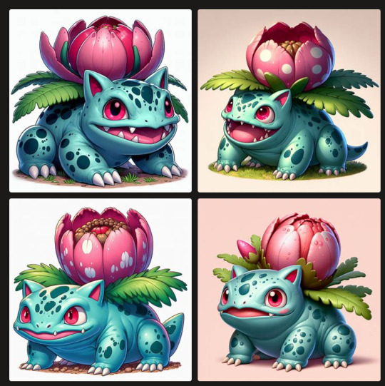
With description is even worse. Nice rendering, but as a representation of Venusaur, it fails spectacularly. Still a bunch of Ivysaurs. With too many spots. And none of those flowers are remotely accurate.
Grade: F (for both of them. Venusaur fans, you are safe. Bulbasaur and Ivysaur fans, though? Nightshade them to hell and back.)
4. Charmander
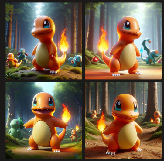
Proportionally it needs to a be a little thinner, but other than that? Very scarily accurate, random Pokémon gobbledygook not withstanding.
Grade: A (nightshade your charmanders)
5. Charmeleon
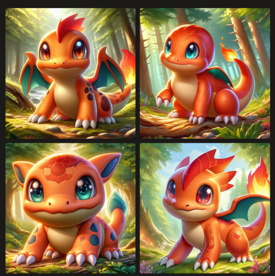
Asked for Charmeleon, ended up with some bulbasaur/charmander/charizard fusions. Which is nice, but its not what I asked for. Failed automatically.
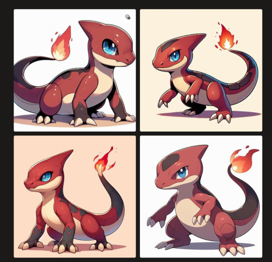
Is better with the physical description, but it still has some issues. It's not the right color of red, some of them are quadrupeds, and there are dark greyish brown spots which the description did not have. The cream scales also extend to its mouth, which is also not what the original charmeleon had. Points for originality (well, as original as an algorithm that scrapes images can get), but this is still not going to get a high grade.
Also nice crab claw flame.

Grade (without description): F
Grade (with description): C-
6. Charizard
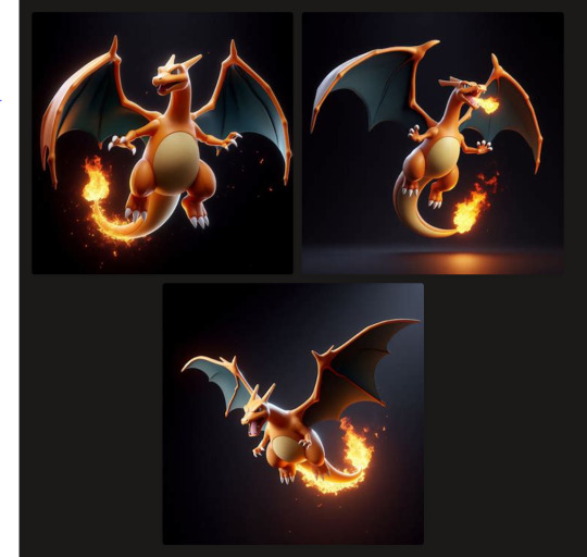
Also understood the assignment. Aside from the flaming tail and some wing bone coloring issues, this is a really accurate representation of a Charizard. It sometimes fails in the proportion department, but 9 times out of 10 it poops out a charizard that doesn't look janky. Though considering that Charizard is one of those really big Pokémons, of course its going to get that right.
Grade: A+ (Nightshade your charizards)
7. Squirtle

If it wasn't for the machine's struggle with the tail, we would have another A+ on our hands. Which is a scary thing to think about.
Grade: A (Nightshade your squirtles)
8. Wartortle
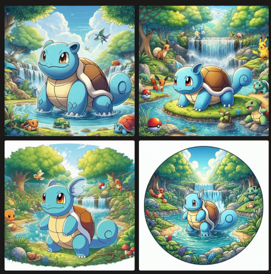
The one time it actually got Squirtle's tail right, and it was in the section where the AI struggles to generate a Wartortle with only its name to go by. Just a bunch of bigger squirtles that sometimes go quadrupedal and have blastoise ears.
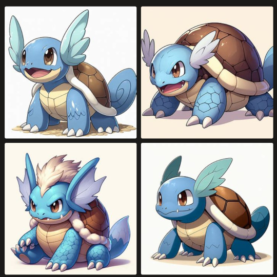
With description is slightly better, but it still fails. All of them are quads, some of them have blastoise mouth, and one even has a mane. The tail isn't accurate either, but then again the cohost designer has a character limit. Even without a character limit, I'm still gonna grade it negatively. Especially since it has ignored the bipedal part of the description.
Grade (without description): F (seriously. nightshade your squirtles.)
Grade (with description): D
9. Blastoise
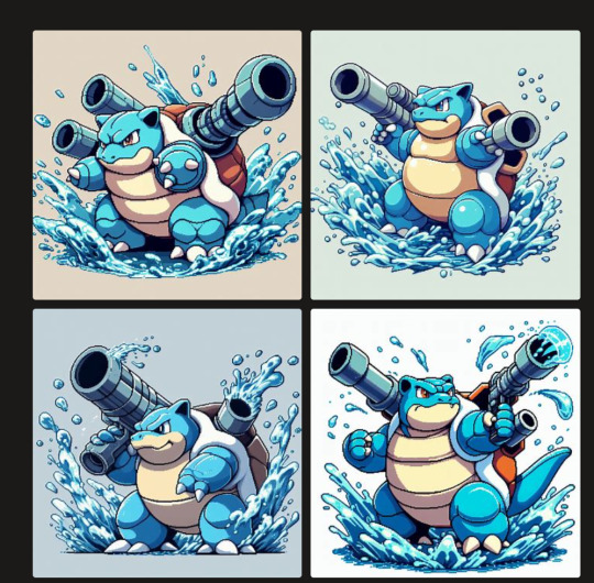
Appears to understand the assignment, but it only understands the overall body plan. We got tangents and multiple guns galore. And Blastoise.... holding guns?? The fu-?
Also, Dalle 3 does not know how to pixel art. Pixel artists, you have been spared.
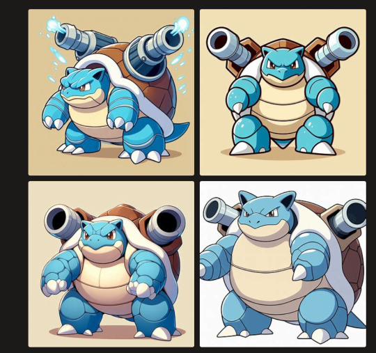
With description, it fairs a little bit better... from a distance. 3/4 of the blastoises have malformed hands, the white shell outlines do not wrap around the arms like a backpack, (which some of the gun toting blastoises actually got right!) and one of the images' ears are too big.
Grade (without description): C-
Grade (with description): B- (Best to nightshade your Squirtles and Blastoises)
19 notes
·
View notes
Text
Yay founders cut time!! To avoid spoilery spam I'm just going to put my thoughts and things I really liked below the cut
Episode 1 spoilers below
1. Giving a whole point over to saying that goddamn I missed this, I missed this so much
2. Ranboo touching the urn at the start and hearing flashback memories to begging to die - it's a loop confirmed?? Holy shit?
3. The sound design in this cut is genuinly excellent loving the sound effects mwah
4. They used the shot where Slime looks directly to camera on entrance this time!
5. The whole cooking segment is really tightly cut and I love the repeated cutaways and the energy of the whole scene, really feel that panicky pace this time
6. Slime backstory cutaway my beloved, I'm so glad they included it after he mentioned it in his bts stream from ages ago
7. The glitch to reveal the fridge contents are indeed gore yes yes
8. COOK? I D K H O W T O C O O K
9. Definitely overthinking this but I love the lighting change when Ranboo plays the first tape, like everything in the cabin goes dark and Hetch is the only light? The symbolism of him being the only light in the dark, and Ranboo being able to see him but not follow him because there is a literal television in the way?? Thematic parallels my ABSOLUTE beloved
10. Ahhhh the echoing please when they look at the model house ahahahha
11. 'Frank and I have been through a lot. There's been a lot of piss.'
12. The glitches and lighting flickers when anything touches Sneegs hat? Ohhhohohho lovely touch
13. Oh this for sure means something, Sneeg only starts getting frustrated with The Hero not knowing ahead of time what they need to bring after the slime touches the hat, and given the control method for Sneeg is in his hat, it definitely looks like the slime fucked with his control enough for him to remember some stuff from the last loop
14. This isn't related but seeing that portrait of Charlie reminded me that he said his mum really wanted that portrait of him and that's very funny to me
15. OK at the start of the fight, the Hero says 'Not if I done you...first...what?' as an opening taunt, and the mask flickers. Idk if that was intentional, but I do enjoy the idea that either a) the hero was programmed to say something else, but his control glitched, and he forgot what that was or b) the hero was programmed to say that line, and it was so weird that he broke himself out of control for a second
16. Oh DAMN it was intentional!! Control was breaking when it wasn't their 'turn'!
17. Okay onto ep2 later, but while I love the live version of ep1 and all the little pauses and extra improv and it's still a source of comfort to watch it, this cut is so clean and precise with the extra editing and effects I love it equally, I can't wait to see the other episodes
10 notes
·
View notes
Text
Fontalicious, but not delicious

A new font rant after so long that's actually fair and not just a bowling ball to the ballsack of the people who created this font? No way! Big shock! Domain expansion! Billions must have their mouths wide open like they're about to suck the best dick they've ever sucked in their life, in shock!
Anyway, let's start.
Swinkydad.
Yes, that's the name.
Did they pull "swinky" out of their ass? I searched up the definition of this obscure ass word and i only got the definition of "swanky" + 6 urban dictionary definitions of swinky that are completely different and have nothing to do with each other. Like, where did they get it from?
Now imagine if you slapped this unknown concoction on your dad. Then what the hell would it be? It would be Swinkydad. That is the most random name they could have picked.
Now i'll get back on the definitions. In Dafont.com (a really nice site), it says "First seen on DaFont: before 2005" The font was made before 2005. So i went back to urban dictionary to see the definitions of "swinky", and the oldest definition.. is it from 2010? 2004? 2007? 1969? Fuckin' 200 B.C.? No.
It's from FUCKING 2016, and has 14 dislikes out of 6 likes.
Ok, let's stop vomiting mom's spaghetti on the font's name and rant on the design.
The design is terrible! All of the glyphs are squashed into a pulp, not to mention how unnecesarily wide it is! I will show you the comparison between "Swinkydad" and another normal Fontalicious font, to prove how c h o n k y it is.
Here's "Swinkydad."

This is in real size too.
Now, here's "Kravitz."

If you somehow can't notice a difference, "Swinkydad" is SO W I D E, that less letters would fit into a single row because the cells are stretched in favor of the wideness of the glyphs, and that's why it has an extra column!
But not "Kravitz" though, which is likeably slim, thus making the cells skinnier and allowing more letters to fit in a single row, and removing the one added column.
Now let me do some maths real quick.
2 + 2 = 69 xD xD xD xD xD xD xD lol lol lol haha my roflcopter go swoosh swoosh swoosh swoosh swoo-
Ok, enough fucking around, now for real.

I counted every "Swinkydad" letter in each row and then put it on an average calculator, and the average was 6.5 letters per row (8, 8, 7, 3)
6.5 is a quarter of all the normal letters in the alphabet, which is not shocking at all.

I counted every "Kravitz" letter in each row and was pleased to see how many letters per row there was.
The average? 8.6666666666667 letters per row!
That's exactly a third of all the normal letters in the alphabet!
It's a surprisingly big number, but it's a bit unsurprising due to the skinniness of the letters.
So i subtracted the letters per row in both fonts by descending order (8.6666666666667 - 6.5), and got a 2.16666666667.
Kravitz has 2.16666666667 more letters per row than the fatass that "Swinkydad" is. That's how wide "Swinkydad" is.
But i'm not here to give a handjob to Lenny Kravitz so i'll get back on track.
I do not like how the letters look at all. It looks like Nikocado Avocado took "Bauhaus 93" and- oh wait, he tricked us all.
Well, it looks like some fatass took "Bauhaus 93" and sat on it, flattening it in the process. The lowercase B is just the uppercase B flipped vertically and horizontally, and if the lowercase D is the same as the uppercase D, then the 6 IS JUST A FUCKING D!!!!! They didn't even know that a 6 isn't flipped horizontally! And it's just a crushed Bauhaus 93 D too!!! It's like some dumbass is counting and then..
"1, 2, 3, 4, 5, uhhh... d, 7, 8, 9, and tin!"
Also, some simbols for some reason are a playing card ace of clubs, and some are uhh...

WHATEVER THE FUCK THIS IS!
Some symbols also for some reason have dots inside them like for example, the uppercase and lowercase O, which instead of a normal glyph, looks like a planet, and the 8 which just looks like a sideways "No words" emoji. almost half of the symbols are blank, and 3 lowercase accentuated letters have NOTHING to do with one another!

The õ is just the 4 with a rounded tail, the ù is probably a scrapped design for the lowercase G, and the ú? It's just a fucking Y! Yeah, Y! Y! Y for why! Why! WHY! WHY? WHY?!
I do not have anything more to say.
Fuck it. 0.25/10.
#bad fonts#fonts#glyphs#fontalicious#dafont#review#swinkydad#frutiger#frutiger aero#metro grunge#grunge#frutiger metro#2004#200s#hey why are you looking at the tags go away shoo its over get out of here
3 notes
·
View notes
Text
Restoring Accountability to Policy-Influencing Positions Within the Federal Workforce
Issued January 20, 2025.
By the authority vested in me as President by the Constitution and the laws of the United States of America, including sections 3301, 3302, and 7511 of title 5, United States Code, it is hereby ordered as follows:
Section 1. Purpose. Article II of the United States Constitution vests the President with the sole and exclusive authority over the executive branch, including the authority to manage the Federal workforce to ensure effective execution of Federal law. A critical aspect of this executive function is the responsibility to maintain professionalism and accountability within the civil service. This accountability is sorely lacking today. Only 41 percent of civil service supervisors are confident that they can remove an employee who engaged in insubordination or serious misconduct. Even fewer supervisors -- 26 percent -- are confident that they can remove an employee for poor performance.
Accountability is essential for all Federal employees, but it is especially important for those who are in policy-influencing positions. These personnel are entrusted to shape and implement actions that have a significant impact on all Americans. Any power they have is delegated by the President, and they must be accountable to the President, who is the only member of the executive branch, other than the Vice President, elected and directly accountable to the American people. In recent years, however, there have been numerous and well-documented cases of career Federal employees resisting and undermining the policies and directives of their executive leadership. Principles of good administration, therefore, necessitate action to restore accountaability to the career civil service, beginning with positions of a confidential, policy-determining, policy-making, or policy-advocating character.
Sec. 2. Reinstatement of Prior Administration Policy. Executive Order 13957 of October 21, 2020 (Creating Schedule F in the Excepted Service), is hereby immediately reinstated with full force and effect, subject to the amendments described in section 3 of this order; provided that the date of this order shall be treated as the date of Executive Order 13957.
Sec. 3. Amendments to Prior Administration Policy. Executive Order 13957 is amended as follows:
(a) replace the letter "F" throughout, when used to designate an excepted service schedule, with the words "Policy/Career";
(b) in section 1:
(i) remove the text between the words "make necessary" in the seventh paragraph and "excepting such positions" in the eigh paragraph; and
(ii) insert the text "competitive service and the" immediately before the words "adverse action procedures" in the eighth paragraph;
(c) in section 4(a)(i), replace the word "Positions" with the words "Career positions" in the final paragraph;
(d) in section 4(b)(i), add the text "providing for the application of Civil Service Rule 6.3(a) to Schedule Policy/Career positions and" after the words "as appropriate";
(e) in section 5:
(i) insert the words "recommend that the President" immediately after the words "petition the Director to" in subsection (a)(i);
(ii) insert the following text at the end of subsection (c):
"(vi) directly or indirectly supervising employees in Schedule Policy/Career positions; or
(vii) duties that the Director otherwise indicates may be appropriate for inclusion in Schedule Policy/Career"; and
(iii) amend subsection (d) to read "The Director shall promply recommend to the President which positions should be placed in Schedule Policy/Career";
(f) in section 6:
(i) designate the existing text as new subsection "(a)";
(ii) insert a new subsection (b) that reads: "(b) Employees in or applicants for Schedule Policy/Career positions are not required to personally or politically support the current President or the policies of the current administration. They are required to faithfully implement administration policies to the best of their ability, consistent with their constitutional oath and the vesting of executive authority solely in the President. Failure to do so is grounds for dismissal."
Sec. 4. Conforming Regulatory Changes. The Director of the Office of Personnel Management (Director) shall promptly amend the Civil Service Regulations to rescind all changes made by the final rule of April 9, 2024, "Upholding Civil Service Protections and Merit System Principles," 89 Fed. Reg. 24982, that impede the purposes of or would otherwise affect the implementation of Executive Order 13957. Until such rescissions are effectuated (including the resolution of any judicial review), 5 CFR part 302, subpart F, 5 CF 210.102(b)(3), and 5 CFR 210.102(b)(4) shall be held inoperative and without effect.
Sec. 5. Additional Positions for Consideration. Within 30 days of the date of this order, the Director shall, after consultation with the Executive Office of the President, issue guidance about additional categories of positions that executive departments and agencies should consider recommending for Schedule Policy/Career.
Sec. 6. Revoation. Executive Order 14003 of January 22, 2021 (Protecting the Federal Workforce), is hereby revoked, and any rules, regulations, guidance, or other agency policies effectuated under Executive Order 14003 shall not be enforced. The heads of each executive department and agency shall review and identify existing agency actions relating to or arising under section 3(e)(v) and 3(f) of Executive Order 14003 (relating to suspending, revising, or rescinding revisions to discipline and unacceptable performance policies) and, as soon as practicable, suspend, revise, or rescind such actions identified in the review.
Sec. 7. General Provisions. (a) Nothing in this order shall be construed to impair or otherwise affect:
(i) the authority granted by law to an executive department or agency, or the head thereof; or
(ii) the functions of the Director of the Office of Management and Budget relating to budgetary, administrative, or legislative proposals.
(b) This order shall be implemented consistent with applicable law and subject to the availability of appropriations.
(c) This order is not intended to, and does not, create any right or benefit, substantive or procedural, enforceable at law or in equity by any party against the United States, its departments, agencies, or entities, its officers, employees, or agents, or any other person.
3 notes
·
View notes
Text
How to Start a Podcast
Part 1
The second article Sydney kindly gave me is How to Start a Podcast by buzzsprout. Buzzsprout is also a hosting site, which you need when you start a podcast, so they have to know their stuff (according to the article, since 2009 they've helped three hundred thousand podcasts launch, which is impressive).
Buzzsprout breaks the process into ten actionable steps.
Develop a concept.
Define goals
Pick a theme/topic (they provide a whopping seventy-five in this article linked)
Find a niche
Name it (they have provided this article for further reading)
2. Choose a format
I didn't think about this before I read this article, but there are different ways to present podcasts- the article mentions interview, cohosted, scripted non-fiction, news, educational, and scripted fiction (and I will provide audio drama help as I conduct my own research and get information from podcasters about it).
The article goes over the 'optimal' podcast episode length, with some statistics, but the only thing that seems to be important they put in the first sentence: "Make your episodes as long as they need to be and no longer."
They also talk about an episode release schedule, with more stats.
3. Set up recording equipment
Of course they talk about microphones, including another article all about that aspect of podcasting, but apparently there are different types of microphones. I never knew that. They go somewhat in-depth about the different kinds, so I'll leave the technical reading to you.
4. Choose software
The article also talks about different software, from recording to editing. They give a few different options in the article, with links to each. I'm not sure if they get commissions based on how many people click through, so I'll leave you to go there to give them some love.
5. Record your first episode.
The article further breaks the process into smaller steps.
A) Write an outline (with further reading that includes templates)
B) Pick your recording room wisely
Before Sydney's post, I didn't know that sound travels different off of hard and soft surfaces, though I guess in retrospect I should have figured (echos in canyons, for example). I didn't realize it would make a big difference, but I guess it does.
C) Connect your equipment and set up your software
This is important- make sure you hit 'record' and everything's plugged in, folks.
D) Microphone technique
If you're going to speak into a microphone, learn to do it right.
E) Test different recording styles
Test for quality.
6. Edit
They provide an article for further reading. In the main article, they break it into broad steps.
A) Make sure the intro and outro are engaging
Hook the listener right away.
B) Edit for content, then everything else.
Start with big cuts, then move smaller.
C) Fade between tracks
Apparently, cutting audio can sometimes make clicks and pops in the recording. Who knew?
D) Create a punch list
I guess this is a to-do list.
Then when all that's done, you export it! They throw a bit of technical jargon at you (what the heck is an ID3 tag?) but thankfully, it seems to be fairly simple with this podcasting host site. I'm not sponsored by them, it just seems easy enough for beginners.
7. Create podcast artwork.
They also include five tips for that.
A) Visually communicate the subject
B) Design for a variety of sizes
C) Don't use too many words or fonts
D) Avoid 'podcast imagery' (microphones, for example)
E) Keep your brand consistent
They provide a few sites for people to create artwork, so that's cool.
8. Set up podcast hosting
To be honest, this confused the Hell out of me. But there are a few videos about it they linked at the end of the step, so feel free to read the full article and watch them.
9. Get listed in podcast directories
More technical stuff, but I guess that you need the last step- hosting- to actually get onto Spotify or Apple podcasts or any other site/app.
10. Launch and grow
The article goes over two ways to launch- grand and soft- and a few other things like imposter syndrome. It talks about seven marketing tips.
A) Tell friends and family
B) Create a buzzsprout ad
C) Post episodes on social media
D) Join groups and forums
E) Cross-promote with other podcasters
F) Overcast ads
G) Create a call to action
The article also recommends celebrating, and I'm always down for a celebration. Don't be embarrassed it's about your own achievements, or feel like it's needlessly self-congratulatory or self-centered. It seems like a ton of work, so give yourself some credit!
8 notes
·
View notes
Text
A-Z Challenge GAME 4
A game is done. B game is short. C is getting voted on now, but I also have far too many options for this one.
(Seriously, this started with 9 options) (...I'm just a very indecisive person okay. ><)
As always, more info about the game options below the cut, including blurbs, tags, and trailers. DOTO I played once and will eventually play again, whether as part of this challenge or not, it's just a matter of getting around to it.
1. Dark Nights With Poe and Munro (2020)
youtube
"Guide local radio hosts Poe and Munro through six TV-like episodes of supernatural strangeness and sizzling on-screen chemistry. From the creators of The Infectious Madness of Doctor Dekker and The Shapeshifting Detective." Steam tags: choose your own adventure, fmv, detective, interactive fiction, multiple endings, point & click, dark comedy, horror, romance
2. Dead Synchronicity: Tomorrow Comes Today (2015)
youtube
"A dying reality, a universe that’s fading away. A merciless world thatgets sick and vanishes. No past, no present, no future; only the impending moment of “dead synchronicity” ahead. Will you be able to stop it?Because, otherwise… what will you do when Time dissolves itself?" Steam tags: adventure, point & click, indie, post-apocalyptic, story rich, atmospheric, mystery, horror
3. Detention (2017)
youtube
"Detention is an atmospheric horror game set in 1960s Taiwan under martial law. Incorporated religious elements based in Taiwanese/Chinese culture and mythology, the game provided players with unique graphics and gaming experience." Steam tags: horror, indie, psychological horror, atmospheric, puzzle, story rich, adventure, drama, dark, point & click
4. DIVINATION (2019)
youtube
""What if you're born into this world without your permission?" DIVINATION is a very short visual novel where you act as a fortune teller in a futuristic world. Talk and listen to people's stories, then foresee their future using the runes they had drawn." Steam tags: visual novel, cyberpunk, short, philosophical, experimental, point & click, noir, text-based, story rich, choices matter, sci-fi
5. Dry Drowning (2019)
youtube
"Dry Drowning is a psychological investigative visual novel set in a futuristic dystopian city. Follow the story of Mordred Foley, unscrupulous private detective haunted by his dark past, and look into a series of macabre serial killings inspired by Greek mythology." Steam tags: futuristic, adventure, visual novel, mystery, sci-fi, noir, horror, investigation, psychological, thriller, puzzle
6. Dishonored: Death of the Outsider (2017) (I have 17/30 achievements after 30hrs of play, hltb estimates an average 17hrs completionist so obviously I play slow lmao)
youtube
"Be a badass supernatural assassin and take on the role of notorious Billie Lurk as she reunites with her mentor Daud in order to pull off the greatest assassination ever conceived. Building upon Dishonored® 2’s signature gameplay and art style, Death of the Outsider features all the series hallmarks, including brutal combat systems, unique level design, and immersive storytelling that responds to your every choice." Steam tags: stealth, action, first-person, female protagonist, assassin, steampunk, atmospheric, story rich
#a z challenge#turner plays things#indie games#indie gamer#poll#dark nights with poe and munro#dead synchronicity#dead synchronicity tomorrow comes today#detention game#divination game#dry drowning#dishonored death of the outsider
17 notes
·
View notes
Text
Arc Plays: Persona 5 Strikers
we're back, baberinos

Hello, my name is Arcturus, you may call me Archie, so begins our fourth liveblog. For the liveblogs of Persona 3 Portable, Persona 4 Golden, and Persona 5 Royal, please see the pinned post.
I'm going into this knowing:
a. I have never played a Musuo game ever so that'll be interesting.
b. This takes place in the Persona 5 Vanilla ending, so no Akechi dodging the bullet of fate and no Maruki to come in and steal my fucking heart. Alas.
c. ALLEGEDLY this game is surprisingly good for being a genre-shifted spin-off done with Koei Tecmo.
d. yo this main title theme is a jam

I'm not buying your JackCoin, Atlus, go away.
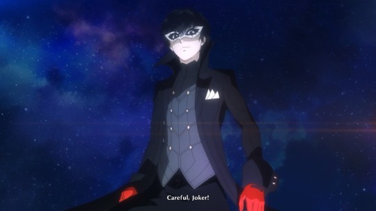


MAN these games LOVE to start in medias res huh? I respect it. Our beloved boy is flipping and jumping along the rooftops of a city and being chased by a helicopter shadow. I ADORE the design of this gunship guy, with just a hand holding the gattling gun.
It feels like a bit of a in-joke between the game and the player to have Joker do a flying leap onto this helishadow to rip its mask off. HE HAS THE ONE MOVE, OKAY, IT'S ALL HE HAS.
Joker on Halloween needs to be tied up like a werewolf at the full moon or else he will just run around town ripping people's masks off.
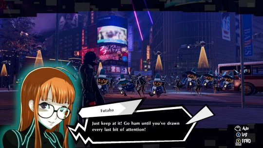
Oooh I'm gonna need to remember to install a better font.
But ONCE AGAIN JOKER IS THE BAIT. He is always the bait. HE ONLY HAS THE ONE ROLE OKAY IT'S ALL HE HAS.
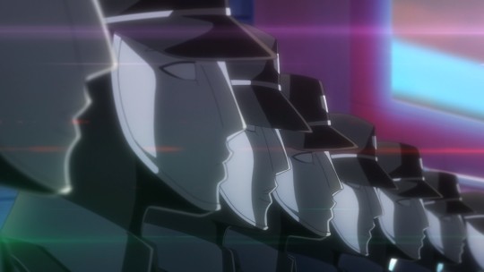
Cops are demons, got it. The only difference between MegaTen and IRL is that in MegaTen you can negotiate with them.

MUSUO SURE IS DIFFERENT FROM TURN BASED BATTLE HUH. Oh my god this is gonna take a grip to get used to, but the ability to summon Arsene on the fly is pretty sweet. So far, Joker is the only Persona MC who seems to have a more than surface-level relationship with his persona, and I really dig that. The others are just a bit of winkyface foreshadowing (Orpheus) or a dude who becomes super important late in the game with no build up (Izanagi). Arsene feels much more personal.

is this a ROAD TRIP GAME? are we going on a ROAD TRIP? also i love you, Yusuke, it's fucking the middle of summer and you STILL are in full pants and a fucking knee-length elegant coat.
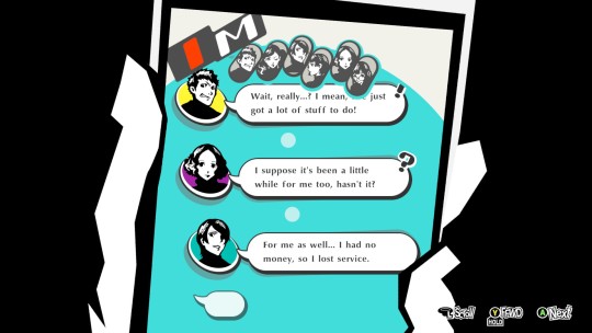
Speaking of Yusuke, I am concerned. Can Sojiro just adopt him already???? Is anyone making sure Yusuke isn't fucking dead while Reverie and Morgana are gone? christ.
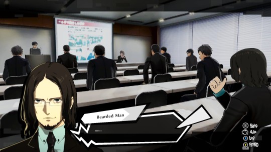
you look so much like a Chaz. you look like you were in an acoustic band from 1992 to 1995. you look like you have five piercings in each ear but use none of them because your stuffy cop job. you look like you do a half windor knot because you don't know how to do a proper one.
ANYWAY PLOT DUMP: It's the summer after the Phantom Thieves' whole big thang, and all of a sudden, people seem to be having changes of heart? Like, a finance minister suddenly confessed to documents tampering, three councilmen confessed to bribery and resigned, etc.

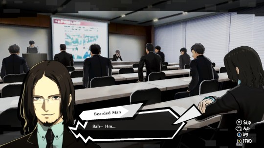
I love how he's "Bearded Man" but that's like barely a beard. Anyway, his name is Inspector Hasegawa.

lmao a full investigation of Reverie's life, please refer them to my liveblog, I got 'em covered. lemme save y'all time and sum up:
REVERIE'S CHILDHOOD: idk he lived in a small town or something and was just a kid
SHIDO THING: fuckhead Shido framed a fucking teenager for assault and subsequently threatened his entire future because y'all's politicians are morally bankrupt fuckwits and the stigma on criminals in japan is outrageous and the whole public record thing is yikes
MOVING TO TOKYO: everyone was awful all the time and treated Reverie like shit and you're all lucky to still have in-tact tires bc I would have been slashing them personally
METAVERSE: Reverie got in touch with his inner scene kid/drama student and turned into a phantom thief and did some shit that was frankly concerning ethically-speaking until the world nearly ended.
PAN-GALACTIC YARGLEBARGLE: big cup. catboy knock cup off table. world saved.
AKECHI: oh my god we don't have the time to summarize this shit
MARUKI: i miss him
A BOY AND HIS CAT: Reverie and Morgana went back to unnamed-small-town to restart their lives.
Boom, you're welcome.
Also wouldn't Sae have all the information these fools need? where is Sae. oh right she's a defense attorney now right. that's neat.
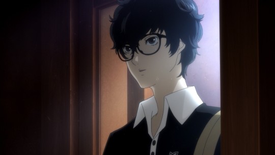
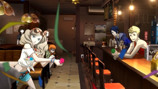
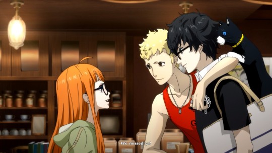

Ann, reknowned hater of Morgana, reaches out and rubs Morgana's head. With malice aforethought, I presume.
Okay okay I'll lay off.
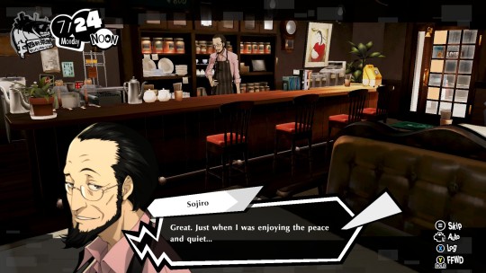
thanks dad bye dad love you dad you're the best dad, dad.
boogie woogie woogie.
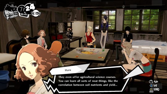

Everyone hangs out in the old attic and catches up. Futaba is doing well adjusting to school, and Haru is in college for business but seems to be trying to take every Ag class they will let her.


so like do you wanna lay you head in Reverie's lap and talk about it, Yusuke?
The crew decides to kick off summer with a barbecue, because nothing is more fun than being in 92F degree weather and then standing around a fucking fire, right?

oh no

OH HELL NO

WELL THREE CHEERS FOR CONSISTENT CHARACTERIZATION, YOU ARE ALL STILL AS DUMB AS A BOX OF PARTICULARLY DIM ROCKS
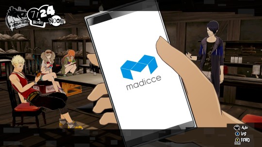
IS THAT FUCKING META
listen, I am a person who refuses to allow any google assistant or siri or what the fuck ever in my home. there are no listening devices allowed. my phone is set up to only listen to me when i physically press a button to allow it to hear me. this is madness.
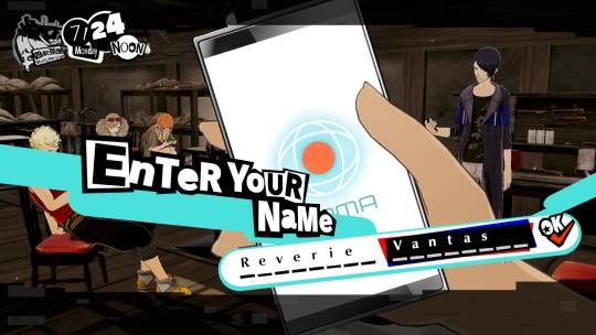
There are no other options. Reverie Vantas the Fifth rides again!
28 notes
·
View notes
Text
Regarding the Plazma Burst 2 Update Team
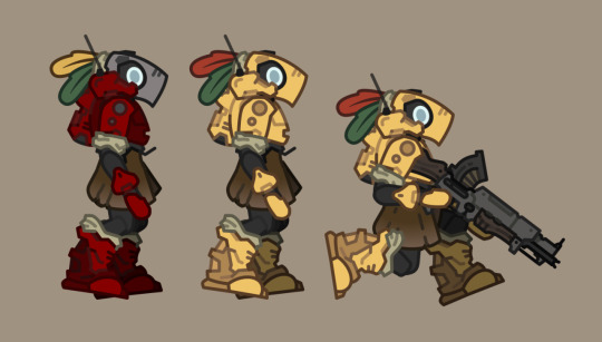
original scavenger falkok design
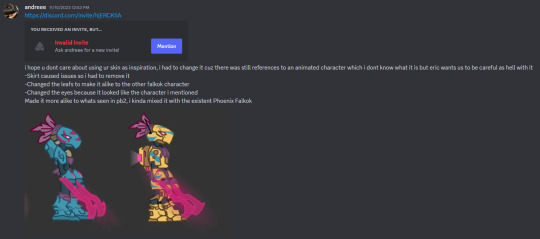
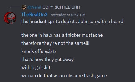
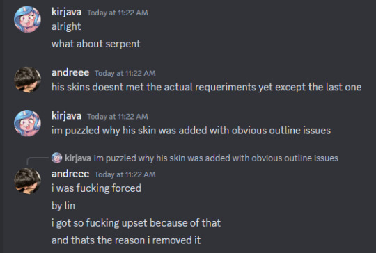
It recently came to my attention that the reasons the "Savage Falkok" skins were edited from my original submission were not because of copyright but because of RealOn3's disdain for MLP[1], which is the source of inspiration for the skin. I was highly upset because not only was MLP invalidated as artistic reference, it highlights a double standard and nepotistic behaviour in the team responsible for PB2 updates and lack of communication within the team. Nehil is able to selectively choose skins to get away with copyright issues, such as RealOn3's upcoming Sgt. Johnson skin, while skins such as mine are wildly changed without notice for supposed "copyright reasons"[2]. In my talks with Nehil he has denied any bias against me or my Scavenger Falkok submission, but continues to demonstrate unfairness by stating that RealOn3's Sgt. Johnson skin would be fit for publication after changing only the sword sprite[3]. This was said while completely disregarding the extreme similarities in armor and facial features. Meanwhile, my skin was radically changed beyond the given copyright issues of its feathers and visor. Furthermore Lin, the current lead developer of PB2 has brought in an inexperienced artist Serpent, whose art was added directly into the game without any revision or communication with the rest of the team[4].
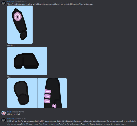
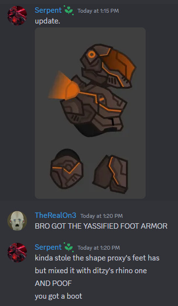
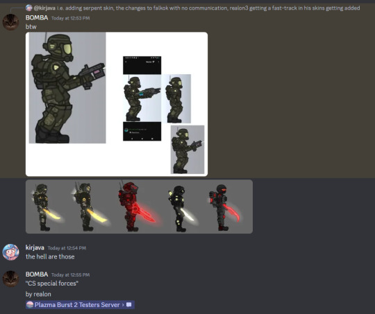
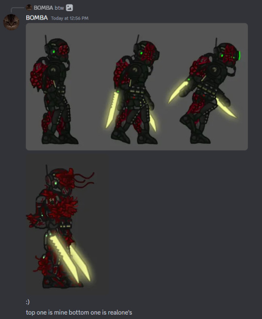
Information is not shared within the team, but rather between the subset of friends running the team as was the case with the lack of communication regarding Serpent's art being added to the game. I was not informed of changes to my skin or its supposed "copyright issues" prior to the fact, and neither were other artists, such as LazyRain with his proxy skin submission[5]. This deficit in communication is also followed by extreme stubbornness, in which the leaders of the team have refused to accommodate artists wishes to fix their own art[6]. My own autonomy as an artist has been brought into question by this stubbornness, as after requesting my submissions be removed from the update queue I was shown hostility towards my wish to remain in control of my own art[7]. This leads me to the conclusion that the art team believes it may use whatever art they find however they wish, which is corroborated by the theft of not only my art[8], but also Kek's Nexxon contractors in the development of human special forces and infected human special forces[9].
Addendum:
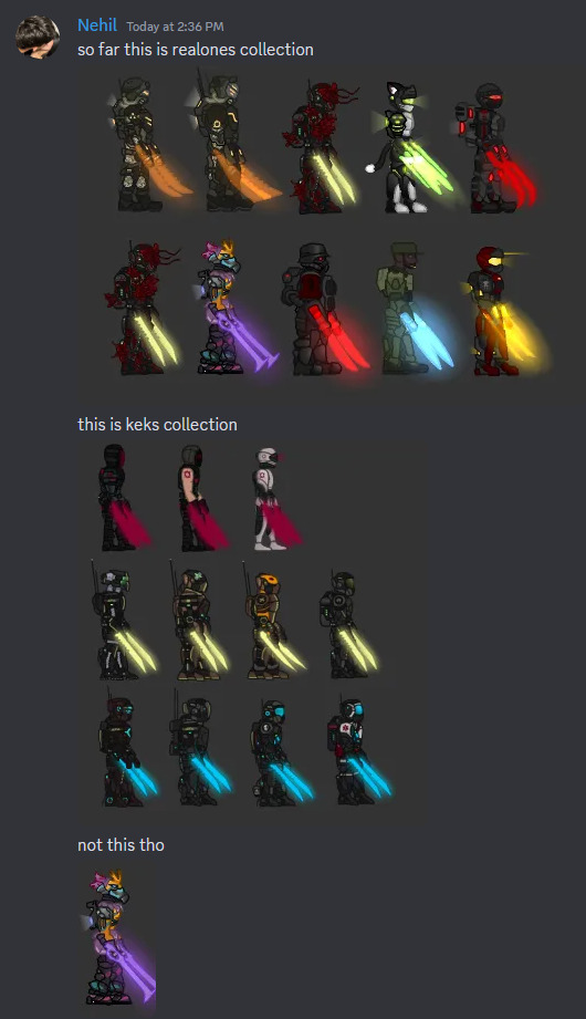
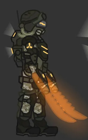
To clarify on the theft of Kek's work: The original design was a security contractor made by Kek[a], which was recreated by Cakespider[b]. Cakespider's recreation was copied and recoloured by RealOn3[c], which then made its way into the game as a CS special forces soldier[d]. Notice how only the head is significantly changed, while the body retains all of its original detail with the addition of a few armor plates and pouches.
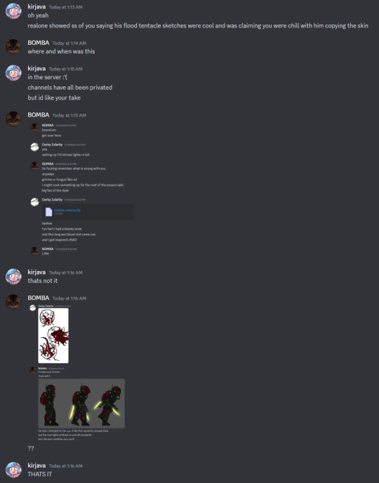
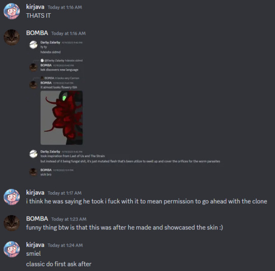
Additionally, Kek was initially approached about using his original infected Nexxon contractors and was told that the original file had been lost. RealOn3 then recreated the skin without obtaining permission to do so[e].
-------------------------------Screenshots-------------------------------
[1] RealOn3 admitting to altering my skin because of its relation to MLP
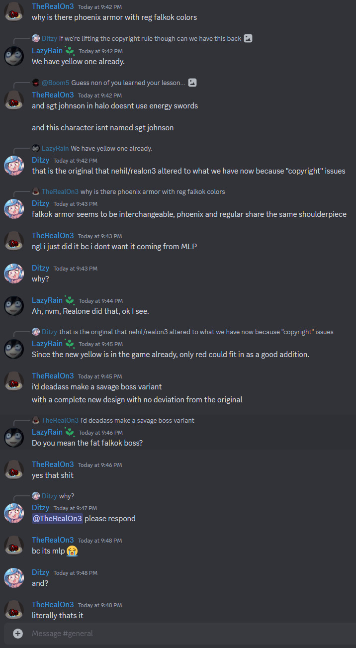

[2] Supposed copyright issues with Scavenger Falkok
[3] Copyright infringement of Sgt. Johnson


[4] Lin forcing Serpent's skin into the game

[5] Nehil changing LazyRain's submission without notice
[6] Refusal to allow artist to modify their own submission
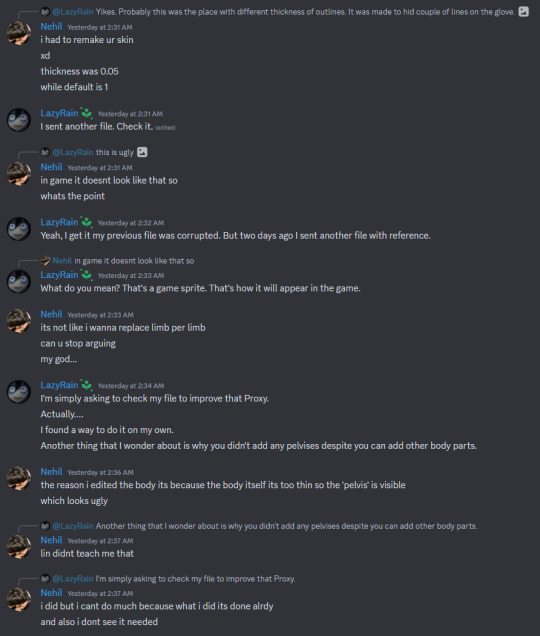
[7] Hostility towards me after requesting my artwork be removed
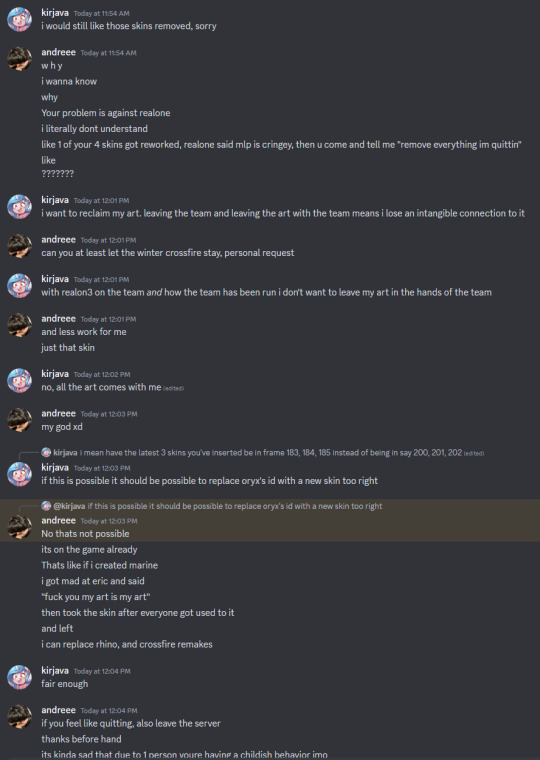
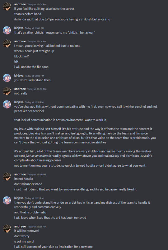
[8] Theft of my work by Serpent


[9] Theft of Kek's works by RealOn3


--------------------------------Addendum--------------------------------
[a] Kek's original design
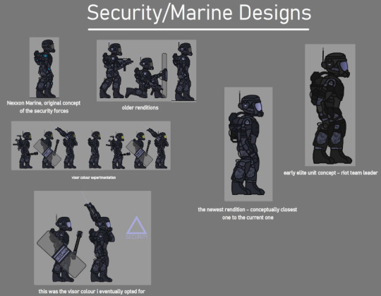
[b] Cakespider's recreation
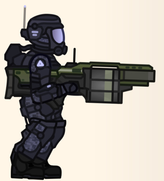
[c] RealOn3's copy

[d] RealOn3's final product
[e] Theft of infected Nexxon contractors

10 notes
·
View notes
Text

Finally got around to make a tier list for the Master Detective Archives: Rain Code characters. Please note that these are just my opinion, and you are free to agree or disagree with me. Just please do not try to persuade my opinions to be in your favor (I hate that).
SPOILERS FOR THE GAME AHEAD!
S-Tier
You’ve seen my posts, I love the entire Nocturnal Detective Family Agency characters and group. I’ve been writing fics about them, and I just want to see more of their group dynamic whether in fics or the DLC or any adaptations (anime or manga) that the team will hopefully do in the future.
And just to clarify, no I do not condone Desuhiko’s perverted nature nor do I even relate. He is high on the list because of my bias with the group and because I love other positive traits he has (his bromance with Yuma and his loyalty nature). If anything, if I write Desuhiko, that perverted nature wouldn’t be focused at all, or the others would be trying to overcome his bad habit
Makoto is my favorite antagonist in the game. Honestly, he is more an anti-villain to me (someone who has good/noble intentions, but commits terrible actions in order to accomplish it), and kind of a protagonist of his own story. Someone I wish for better, and to become better. And I love Yuma’s and Makoto’s relationship in both game and the fics.
A-Tier
Shinigami in the Labyrinth is more memorable to me than when she is in the real world, especially in chapters 3, 4, and 5 when we saw more depth and character growth of her
Kurumi is a great supporting character, and I genuinely like her and Yuma’s relationship. I just wish we got to see more of her, or get a Gumshoe Gab like with the detectives (though it made sense why since Gumshoe Gab are technically flashbacks that happened between chapters)
Pucci is someone I relate and love and even wish she had survived. I love her motif for cute things (the teddy bear, her headphones) and her Forte feels so relatable to me
Yoshiko is like my favorite of the three girls, in terms of designs and personality
B-Tier
Kurane is just relatable is all
Shinigami in the real world is slightly less memorable to me except for her design and some of her commentaries and dynamic with Yuma
Rant time, but I believe some of the Peacekeepers deserved better writing and more screentime. It felt like they were only meant to meet requirements and be obstacles for Yuma and the detectives in both the real world and the Mystery Labyrinth. We don’t see them have more personal relationships with some of the detectives, or see them beyond the chapters they were in or even make a presence like Yomi and Martina even. Seth is the only one I’m fine with his writing because he at least gets some form of ending to his story in the game (I think), but it’s something. Swanks and Guillaume (and Dominic actually), I wish we had gotten more from them beyond their chapters, like what are their special roles in the Peacekeepers? Are they like commanders that follows directly Yomi’s orders? Do they have special jobs they have to do? I just wish we’ve gotten more of that.
Yomi is a great unlikeable villain we have gotten, he is like so twisted and evil and irredeemable and quite a threat towards the detectives. However, I feel like he was also overrated, mainly because I feel like he took up too much of the screentime and be the only main threat towards the detectives. The rest of the Peacekeepers (except Seth and Martina) feel like they were overshadowed completely, or barely threats since they never show up or have a presence like Yomi.
C-Tier
These range of characters are those that I like and served their roles well as support/minor characters in the story and don’t hold no ill will towards (except Fake!Zilch and Dr. Huesca, but that was the writers’ intents)
D-Tier
These characters are those I just don’t care, even the order it went doesn’t matter, I just have no emotions towards them whatsoever. Please don’t take what characters I chose the wrong way, it’s just how I personally feel
#master detective archives: rain code#master detective archives spoilers#master detective archives characters#rain code#rain code spoilers#I’m not going to list all the characters bc there are way too many of them#nocturnal detective agency#tiermaker#tier list#fun fact: I actually made a post beforehand and was done but I accidentally deleted it🤣#definitely demotivated me tho#but I’m finally done#please be respectful of my opinions and feelings on this matter#these are still fictional characters from a video game I just love#rain code characters
11 notes
·
View notes
Text
The Legionary's Charter - 02C (Gales): Standard Conduct Regulations

The Galespun is a very odd faction both to outsiders who know little about the empire and those within it who know it well. There are so many differences between the way the Galespun operates and the way the others operate that some wonder if they should even be classified as a faction.
The truth is that the Galespun have maintained the most similarity to their founders of all of the Greenwood factions - from their dual leaders being adopted from Breeze Mantle and Fading Gale, to their hunting habits leading to two distinct crafts to having no designated denwright’s rank.
The Galespun are very proud of their archaic fashions, proudly proclaiming to be the living remnants of the Old Empire - this pride for their Ancient ways shows itself in their strict adherence to the code; offering only a few modifications where necessary.
1) A legionary shall defend his faction from all that seeks to destroy it
2) A legionary is expected to maintain platonic relations with other factions
a) Non-platonic relations with other factions will be met with demotion
b) Non-platonic relations are permitted among merchants and drifters
3) A legionary is expected to respect and abide by the territory lines drawn in the empire
a) Should borders need to be crossed, the one crossing is expected to don a diplomat’s circuit as a display of peace
b) Starmenders are permitted to cross borders without circuits in times of emergency
c) The only respectable border is one that is clear - a faction who neglects to mark their borders open themselves up to territory challenges
d) A legionary caught poaching repeatedly shall be outskirted and made to repay the faction they’ve stolen from
4) Cubs are the future and elders are the past - they are always to be fed first
a) In times of famine, caesars shall eat last and their lieutenants only before them
5) Prey shall only be killed to be eaten
a) A legionary does not torment their prey
b) A legionary offers thanks to the prey, to Slysoul and to Treesoul for its life
6) Unity Games are held at the Kirkyard from the moment Sunsoul’s Eyes are Widest to when Moonsoul’s Eyes have begun to close - there is to be no spilled blood during these times
a) A legionary who violates the peace during these nights shall be demoted to cadet tasks until the next moon
b) A cadet who violates the peace during these nights will be barred from attending the next Unity Games and held back from promotion if they were close
c) A legionary who violates the peace more than three times will be barred attendance from all future Unity Games
7) Mercy and Honor is what separates the Empire from a cruel band of rogues united under one banner - a faction is expected to help a creature in need
a) No faction may ignore the cries of a cub in need, and to do so to invite stillbirths and misfortune
b) An orphaned cub should be taken in regardless of parentage
8) No legionary should ever enter battle intending to end a life
a) A legionary’s body shall be returned to their faction for burial rites
b) A body that cannot be returned should be substituted with a totem
9) When the Vendus or Zefer passes, only the lieutenant elected for each caesar shall succeed them
a) Should both perish, the Starseer shall rule in their stead until a new leader is chosen
b) Should there be multiple Starseer, the one closest to The Souls takes precedent
4 notes
·
View notes
Text
clothing showcase tutorial
halo, today i will be teaching how to make a showcase! the style will be something like below:
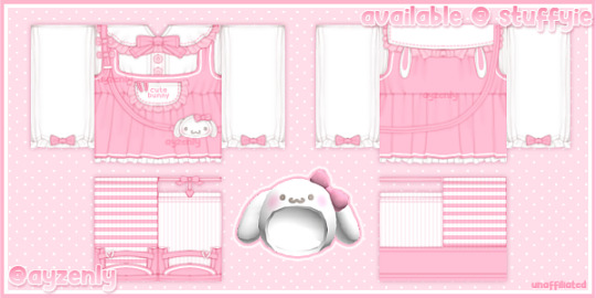

☆
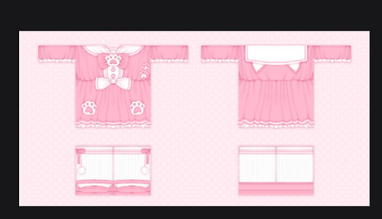
step 1: go to pixlr, and click open image
step 2: open your showcase
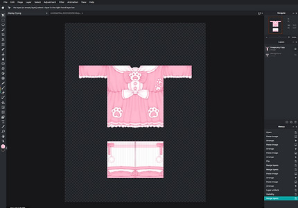
step 3: this is optional but you can also include a backside of your design!

step 4: resize your canvas! go to the top left corner, click page, then click page size, and enter the new dimensions! the ones i use are:
1 showcase : 300 x 300 2 showcases : 600 x 300

step 5: rearrange your showcases.
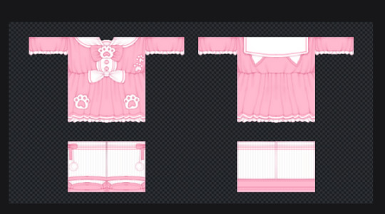
step 6: add a background, i usually go for a polka dot pattern, but you can use whatever u want.
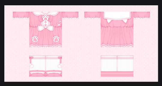
step 7: now i duplicate the showcase layer, and change the whole thing into a shading color (for shadows).

step 8: then drag that layer under the showcase, set the layer to multiply, and blur it!
to blur: filter > details > blur
step 9: this is optional and only applies if you want to add an ugc item to your showcase!
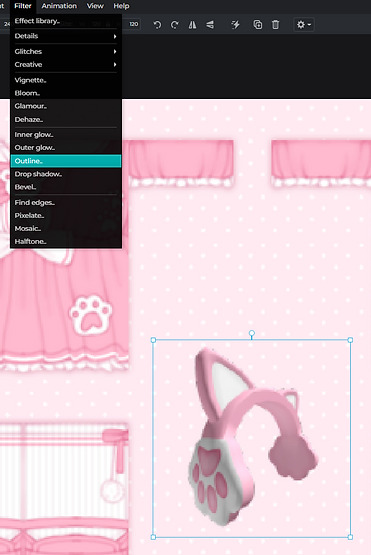
a. load the image of the ugc in, then i add an outline to it, sometimes if i’m feeling quirky i’ll do a double outline
b. to outline: filter > outline
c. the same as before, i duplicate the layer and change the color to make the shadow


step 10: it's time to add text! my favorite fonts can be found below, these are the ones I normally use! click the text to be redirected to the download page (‾◡◝)

a. black bubble
b. candy beans
c. cookies
d. fredoka one
e. hey comic
f. milky nice clean
i usually add my roblox/twitter handle in one corner, then where it's available at in the opposite corner.

step 11: again, i add the shadow so it pops more
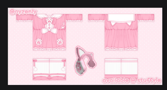
step 12: add ur watermark (i forgor)
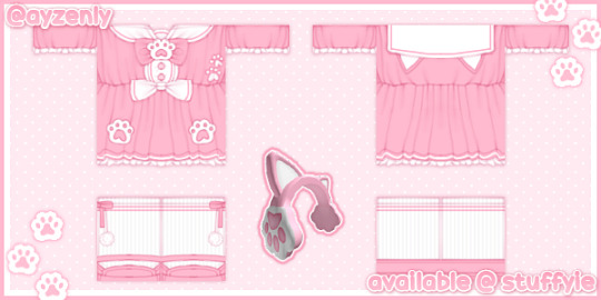
step 13: at this point, you’re basically finished, but i like to add some small fun little pngs to make it look cuter. since this outfit is cat themed, i added some little paws as details.

step 14: i also like to add a double border so it looks more decorative!
to add a border: go to your background layer > filter > inner glow

step 15: if you think everything looks blurry, merge everything into 1 layer.
then go to: filters > details > sharpen
and sharpen your showcase, it makers everything less blurry!
anddd, you're all done, now you can be a certified 'pro showcase maker' like me!!!!
☆
you made it to the end!! lmk if u have any questions, suggestions to making this tutorial better, etc.
credits: ayzen#1111 or @ayzenly on roblox contact me: ayzen#1111
11 notes
·
View notes