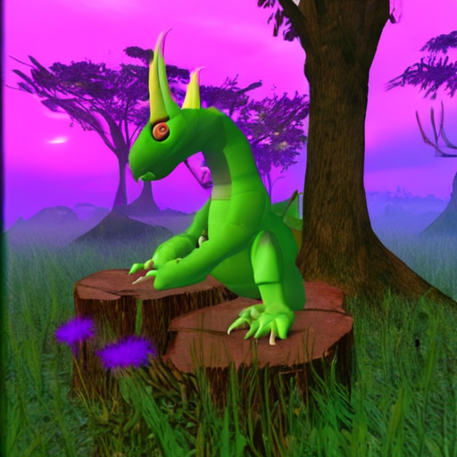
#all I want is to be a render and lighting artist
Note
HFDOSN OMG YOUR ART IS SO LOVELY!!
I was wondering if you have any tips to rendering or the way you pick colours?? It's something I struggle with and yours are so vibrant and full of life!
HII I’m actually so happy to answer ur question! I work at the studio I took art classes at to help highschool kids learn the basics to art, so I love teaching a bit of art!!
Mind you, I’m still a younger artist, and I still have a lot to learn. And this is only talking about my style and my tastes! Make sure to look at how the true masters do it too! (My favorite master artists are Redum4, Octahooves, and Matchach on Twitter)
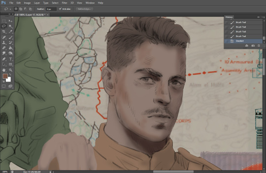
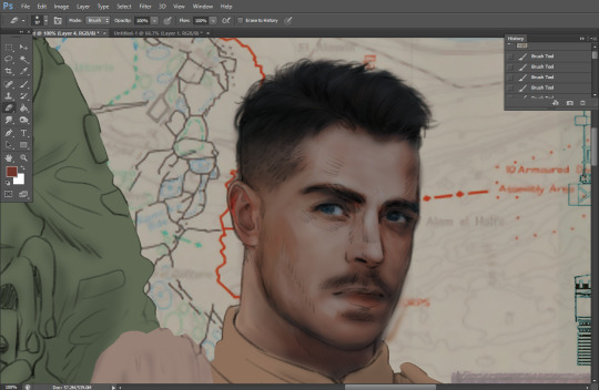
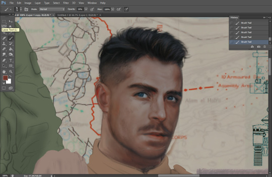
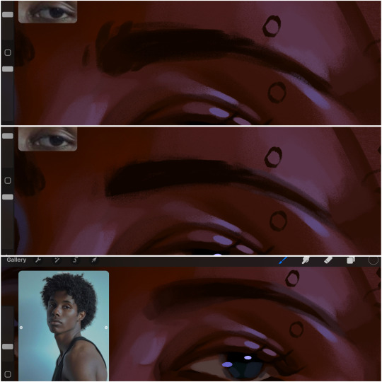
When it comes to rendering, values, and color, it’s all about balance and contrast.
For rending, (at least for my style) it’s all about lost and found edges. Balancing lost edges vs soft edges. Smooth vs textured, harsh vs porcelain.
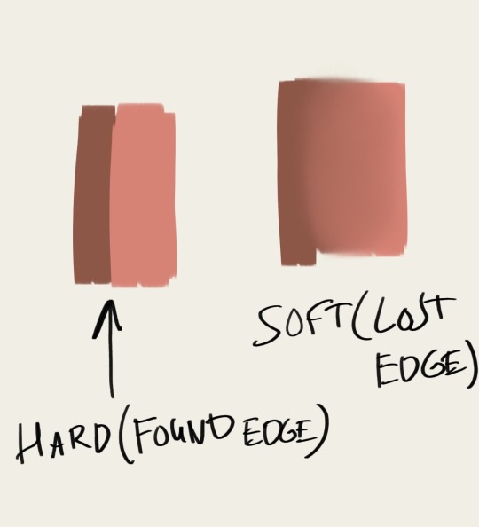
In my style, I see rendering as a way to convey character and mood. Lost edges equals softness and grace. Found edges equals harshness and severity.
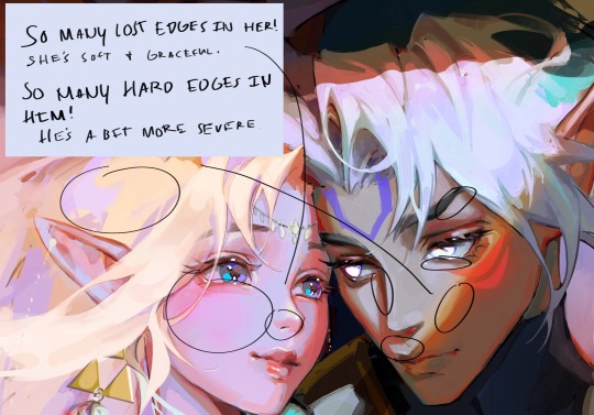
I utilize lost and found edges in this way! In other words, if you ignore balance (such as utilizing many found edges and hardly any lost edges) then give it a narrative/mood reason, I say! :3
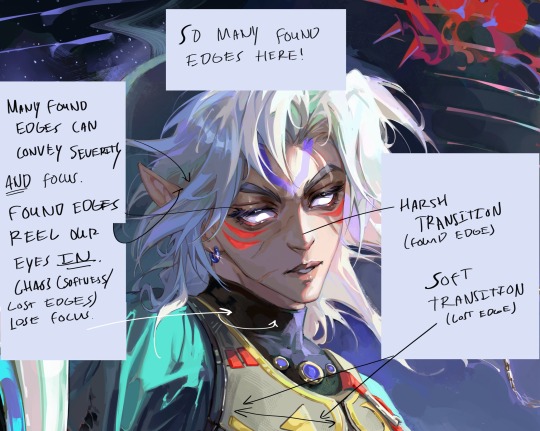
But in terms of the basics, lost edges means a smooth surface, a smooth transition from light to dark (or transition of color). While found edges suggests a harsh transition from light to dark. ALSO and probably most importantly when it comes to edges in rendering: Found edges reels the eye in, creating focus. Lost edges typically lose the eye, creating a rest for our eyes. It’s important to balance them for these reasons too!
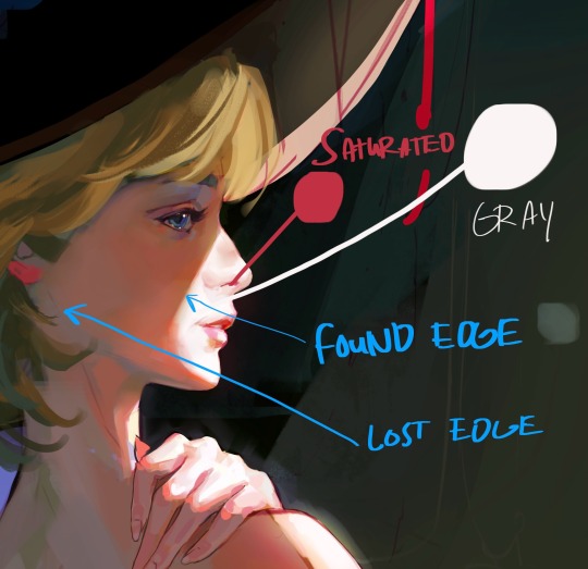
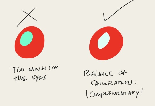
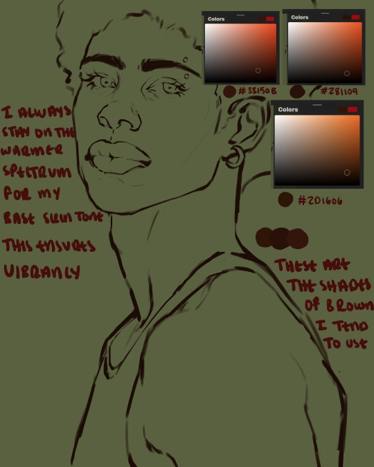
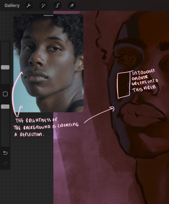
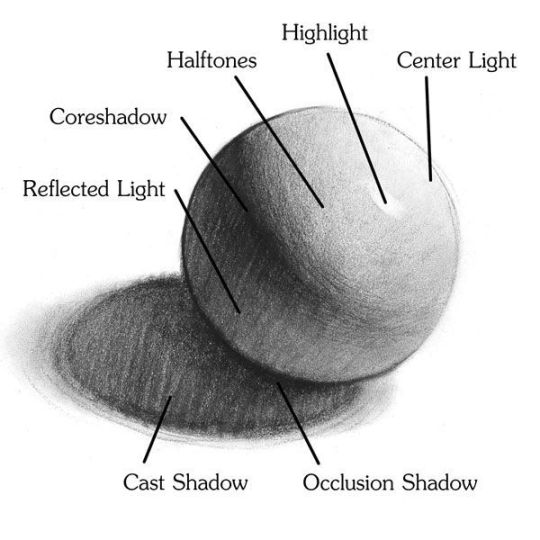
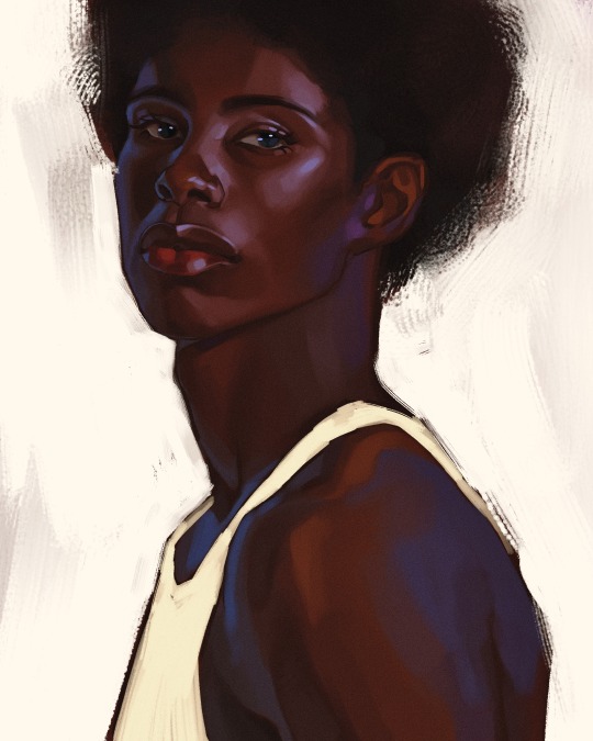
For colors, it’s all about THE GRAYS. (Ironically enough!) The basics of my coloring method can be described via this sphere:
Basically, a highly saturated color can only have its high saturation in the spotlight BECAUSE the gray tones make it pop by giving the eyes a break period saturation wise. All about contrast!
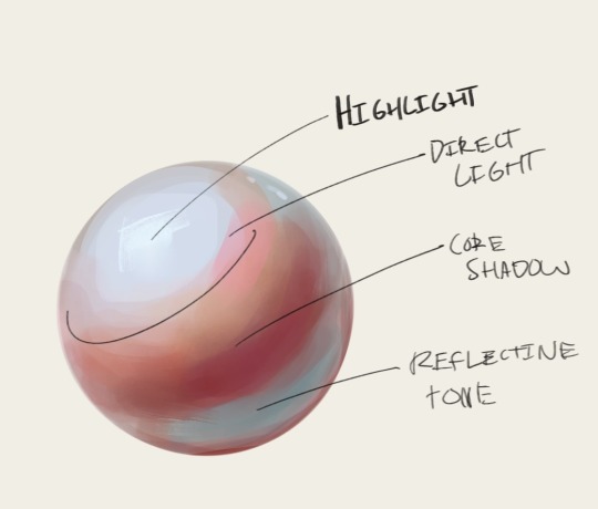
As you can see, I differentiate the colors and saturations by values. My shadows are deeply saturated, typically warm. (It’s more typical to make the lighter area warm and the shadows cool! But I find that vibrancy comes easier if you desaturated the light, make it colder, and really PUMP UP the saturation and heat in the shadows.) And the areas lit up are typically cooler and have hints of gray in them! This is great for conveying strong direct light (which is typical in my style), and it makes it look as if the light is so powerful it seeps through their skin. You can see how I do this in some of my work, I typically exaggerate these qualities in skin!
You can also do this especially well for skin with melanin!
This also works especially well digitally, because saturation and value works in tangent in the color square! Pure white has no saturation, and the more saturation you add to pure white (the further right you go on the color square) the more saturated you get.
The use of grays are the most important thing when it comes to vibrancy, in my opinion! Too much saturation is, well, too much. Again, you can disregard this rule if you have a reason for it. Such as a high energy mood or overstimulation you’re trying to convey! Or desaturated to convey coldness, stillness, etc.
Anyways, I hope this made sense! (And sorry about it being more of an info dump than tip-giving >w<) If anyone wants clarification on anything, feel free to ask me in the comments! 🫶🏼🫶🏼
34 notes
·
View notes
Text
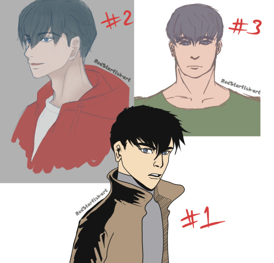
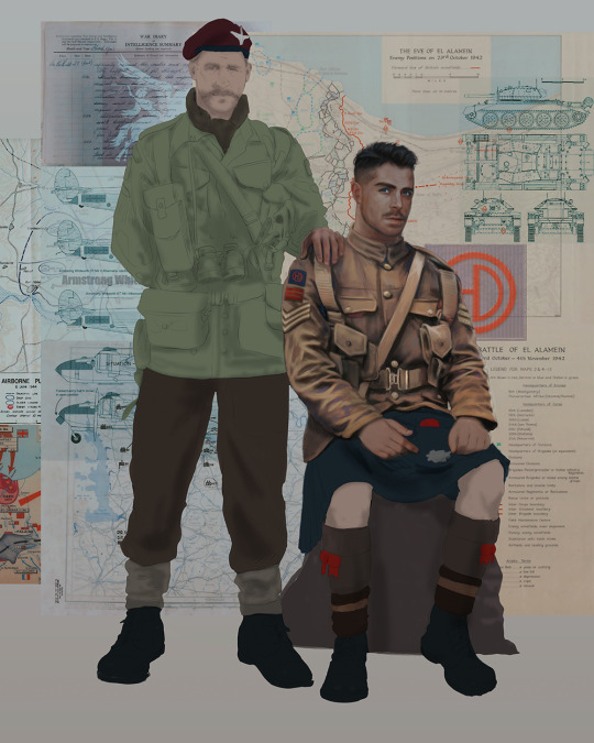
Which Jason is best?
All drawn by me. This is what it looks like when an artist does not have an established art style. XDDD
#I'm a jack of all trades and master of none lol#Jason Todd#Red Hood#Batman#Robin#my art#someone please teach me how to render because I keep getting stuck#I've been studying light and shadows etc for so long and yet I still struggle to apply the knowledge#btw please excuse the blurriness#I don't know how to do the photo-edity-sharpening-y stuff#every day I tell myself I will make a character sheet for how I want to draw Jason and every day it's a difference Jason#forget different face syndrome - I'm drawing a whole different art style every time lol#I do feel kind of proud that I am finally indulging in drawing my favourite character as much as I want :3#no one asked but number 1 was hardest because I'm not very familiar with DC comic art style yet#To be honest I still have some work to do before I can genuinely say I can draw in that style#artist problems
4 notes
·
View notes
Text
So JJK is over and my LMK brainrot is back , added with the fact i am playing a MOBA game and am being blessed with delicious illustrations
it prompted me to make this


Now i am going to ramble about this because this is the first time in forever where i kinda pushed myself to make a FULL art piece-
I will be standing for this-
Let me tell you, i had no confidence in this and the composition was supposed to be way different, but this still happened.
This took two days because i kept procrastinating , walking around my room dreading drawing the background
BIG ADVICE FOR BEGINNER ARTISTS
Watch speedpaints. You will learn so much by watching the process and that was this for me
I have the tendency to kinda burn myself out and finish everything in a day and then never actually finishing. Tried something different for this and made a cheap silhouette of a sketch, then drew over that and used greys and whites fort the shadows. Then i think i colored everything in a base color (and i finally used a palette) and then i tried to find the lighting and shadow colours. It was weird. And what im saying is that i planned most of it instead of diving head in withour a plan.
Crazy i know-
I also just learned about dpi PROPERLY and unfortunately made my piece so big that it kept stalling paint tool sai-
let me just post the progress shots
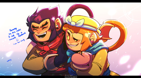


I also fucked up macaques reference and fixed it in a whim somewhere. You can see it here. I honestly wasn't planning to follow the lmk at style but that kinda happens when you're starring too much at the references.
There's still a mess and i wanted to render it a bit better ,the way i normally do but i didn't. Anyways i did enjoy the process and i actually miss them so much and i might watch LMK all over again
Especially Wukong and MK
Btw this was supposed to be a moving illustration and i just didn't
I have Live2D but no
(Btw please check out my profile if you have the chance and thank you for reading this! Love you-)
#lmk art#lmk sun wukong#lmk fanart#lmk macaque#lego monkey kid fanart#lego monkie kid#lmk monkey king#lmk shadowpeach#shadowpeach#six eared macaque#lego monkie king#OK BUT I FOUND OUT HOW TO DO THE EFFECT IN THE FIRST AND I FELT LIKE A KID ON CHRISTMAS#btw im sorry i dont ever post anything for any holidays#it will be the same for the chinese new year and valentines day
2K notes
·
View notes
Text
Let's Talk About Un-ironicizing Art!
In light of a lot of the conversations i've seen surrounding Death Grips and recent events concerning them, I want to take the time to point out that this is a good time to start thinking about how we engage with art on the whole!
For a long time, the irony poisoned method of consumption went unchecked in all facets of internet culture. As an internet musician in current day, I have noticed a sharp disconnect between artists and enthusiasts/casual listeners when it comes to attitudes surrounding music specifically, though I've witnessed it permeate all forms of art in some way.
I see people who have grown scared to engage on deeper levels, intentionally severing any resonant connections or knowledge learned from a piece of media before it has the chance to take root. In short, dare to be vulnerable! Dare to enjoy something on the basis that you yourself resonate with it, and not for any other nebulous reasoning. When masses of people relegate art to a spectacle, not only do artists become more likely to be disenchanted with the passions that fuel their work, but the consumer base ultimately suffers as well. All art at that point becomes less an extension of ourselves, less a vehicle to explore our identities, and is rendered a meaningless hulking sludge, or worse, the opponent to an already shrinking and narrow worldview.
Be not afraid to be unabashedly in love with the work that inspires you. Be not afraid to have the things you love misunderstood by by some. When you engage with work new and old, make sure to do it for yourself. Making and consuming art is inherently selfish, but being selfish is not inherently misguided. Allow yourself to learn, grow, discover, and repeat that cycle until the day you die.
To speak more candidly about my own experience, throughout the course of my life, there has been art that I've held near and dear to my identity, and own journey of self discovery that I seldom find others who hold the same sentiments to. I've always found this exciting. Exciting to hold something close to my chest as something so personal, and even more exciting when I can ease up on that grip when I find someone who I can share that with. However, I've also been through the throws of how the internet tends to chew up and spit out art that generally isn't understood by the many. I've fallen victim myself to the hive mind mentality that circles some artists and the cult of non-identity around them. This off-color ouroboros of knowing all about an artist's work and simultaneously upholding this facade of vapid complacency. I've come to the conclusion that if being openly supportive and connected to an artist's work or a particular piece of work automatically renders a person uninteresting and unambiguous at the very least, then I will live happily as an uninteresting open book. At the worst times, we see this line of thinking contribute to Death Grips being mocked and belittled en masse by people who are unwilling to engage with their art before they even get that far. It's heartbreaking, to me at least to see people put so much effort, emotion, and passion into transforming culture for the better to be rewarded with a crowd that's plugging their ears.
I realize I run the risk of sounding pretentious, self indulgent, or even patronizing to an extent; I apologize because that isn't my intention, I'm hoping to see gears shift at least on a micro level surrounding attitudes towards art appreciation. Remember to dare to be in love holistically with the art you engage with! Speak of the things you love in a way that makes that clear to others, and consider your peers to do the same! You and the people around you can only be better off for it.
#long post#really long post#music#death grips#the internet is full of bright and beautiful art so why not help yourself
2K notes
·
View notes
Text
Ok! I've finally decided to put together a (somewhat) comprehensive tutorial on my latest art~
Please enjoy this little step-by-step 💁♀️
First things first--references!
Now I'm not saying you have to go overboard, but I always find that this is a crucial starting point in any art piece I intend on making. Especially if you're a detail freak like me and want to make it as realistic as possible 🙃
As such, your web browser should look like this at any given point:

Since this is a historical piece, it means hours upon hours of meaningless research just to see what color the socks are, but...again. that isn't, strictly, necessary 😅
Once I've compiled all my lovely ref pics, I usually dump them into a big-ass collage ⬇️
(I will end up not using half of these, alas :'D)
Another reference search for background material, and getting to showcase our models of choice for this occasion~
When picking a reference for an actor or model, the main thing I keep in mind (besides prettiness 🤭) is lighting and orientation. Because I already kinda know what pose I'm gonna go with for this piece, I can look for specific angles that might fit the criteria. I should mention that I am a reference hound, and my current COD actor ref folder looks like this:
Also keep in mind, if you're using a ref that you need to flip, make sure you adjust accordingly. This especially applies to clothing, as certain things like pants zippers and belt buckles can be quite specific ☝️
Now that we've spent countless hours googling, it's time to start with a rough sketch:
It doesn't have to be pretty, folks, just a basic guideline of where you want the figures to be.
The next step is to define it more, and I know this looks like that 'how to draw an owl' meme, but I promise--getting from the loose sketch above to below is not that difficult.
Things to keep in mind are--don't go too in-depth with the details, because things are still subject to change at this point. In terms of making a suitable anatomically-correct sketch, I would suggest lots of studying. This doesn't even have to be things like figure drawing, I genuinely look at people around me for inspiration all the time. Familiarize yourself with the human form, and things like weight, proportions, posing will seem a little more feasible.
It's also important at this stage to consider your composition. Remember to flip the canvas frequently to make sure you're not leaning to one side too often. I'm sure something can be said for the spiral fibonacci stuff, which I don't really try to do on purpose, but I think keeping things like symmetry and balance in mind is a good start ✌️
Next step is just blocking in the figures. Standard. No fuss 👍
Now onto the background!
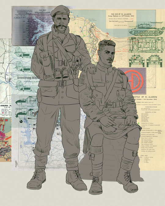
It's frankly hilarious how many people thought I was *hand-drawing* these maps and stuff 😂😂 I cannot even begin to comprehend how insanely difficult that would be. So yeah, we're just taking the lazy copy and paste way out 🤙
I almost always prepare my backgrounds first, and this is mostly to get a general color scheme off the bat. For collage work, it's really just a matter of trial and error, sticking this here, slapping this there, etc. I like to futz around with different overlay options until I've found a nice arrangement. Advice for this is just--go nuts 🤷♀️
Next, I add a few color adjustments. I tend to make at least 2 colors pop in an art piece, and low and behold, they usually tend to be red and blue ❤️💙There's something about warm/cool vibes, idk man..
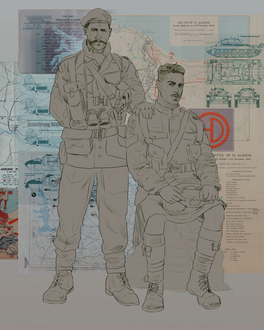
Now we move on to coloring the figures. This is just a basic block and fill, not really defining any of the details yet.
Next, we add some cursory values. Sloppy airbrush works fine, it'll look better soon I promise 🙏
And now--rendering!
I know a lot of beginner artists are intimidated by rendering, and I can totally understand why. It's just one of those things you have to commit to 💪
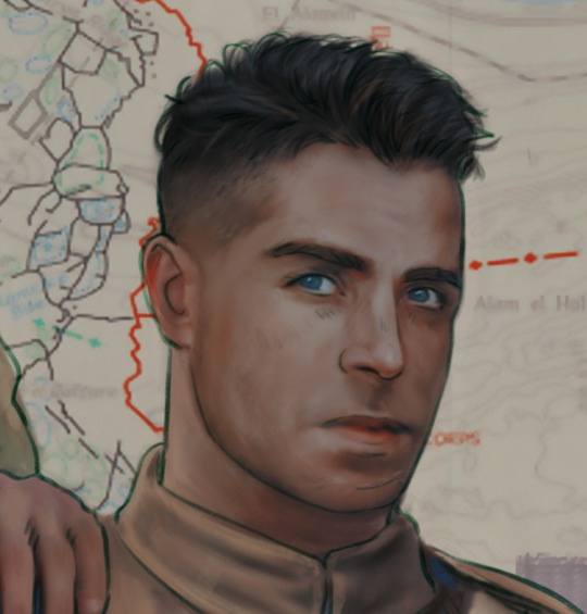
I've decided to show a brief process of rendering our dear Johnny's face here:
Starting off, I usually rely on the trusty airbrush just to get some color values going. Note--I've kept my sketch layer on top, but feel free to turn it on and off as you work, so as to not be too bound to the sketch. For now, it's just a guideline.
This next stage may look like a huge jump, but it's really just adding more to the foundation. I try to think of it like putting on make-up in a way~ Adding contours, accentuating highlights. This is also where I start adding in more saturation, especially around areas such as ears, nose and lips. Still a bit fuzzy at this point, but that's why we keep adding to it 💪
A boy has appeared! See--now I've removed most of the line layer, and it holds up on its own. I'll admit that in order to achieve this realistic style, you'll need lots and lots of practice and skill, which shouldn't be discouraging! Just motivate yourself with the prospect of getting to look at pretty men for countless hours 🙆♀️
I'll probably do a more in-depth explanation about rendering at some point, but let's keep this rolling~
Moving forward is just a process of adding to the figures bit by bit. I do lean towards filling in each section from top to bottom, but you can feel free to pop around to certain parts that appeal to you more. I almost always do the faces first though, because if they end up sucking, I feel less guilty about scrapping it 😂 But no--I think he's pretty enough to proceed 😚
They're coming together now 🙆♀️ Another helpful tip--make sure you reuse color. By that, I mean--try to incorporate various colors throughout your piece, using the eyedropper tool to keep a consistent palette. I try to put in bits of red and blue where I can
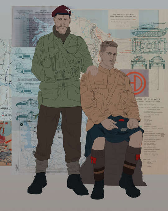
Here they are fully rendered! Notice I've made a few subtle changes from the sketch, like adjusting the belt buckles because I made a mistake 😬 Hence why you shouldn't put too much stock in your initial sketch~
The next step is more of a stylistic choice, but I usually go over everything with an outline, typically in a bright color like green. Occasionally, I can just use my initial line layer, but for this, I've made a brand new, cleaner line 👍
And the final step is adjusting the color and adding some text:
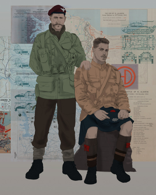
Tada!! It's done!
All in all, this took me the better part of a week, but I have a lot of free time, so yeah ✌️
I hope you appreciated that little walkthrough~ I know people have been asking me how I do my art, but the truth is--I usually have no clue how to explain myself 😅 So have this half-assed tutorial~
As a bonus, here is a cute (cursed) image of Johnny without his mustache:
A baby, a literal infant child !!! who put this wee bairn on the front lines ??! 😭
Anyway! peace out ✌️
#tutorial#my art#art tutorial#since people have been asking#I remembered to save my process from this latest work~#enjoy 🙆♀️
1K notes
·
View notes
Text

the babis again!
very sketchy lines ‘cause i mostly wanted to study the rendering of dramatic light/shadow
twitter was banned in brazil i am starving for haikavehtham content please i need all of you artists to post your fanart on bluesky so i can love all of them again
#haikaveh#brart#digital illustration#light study#kaveh x alhaitham#kaveh#alhaitham#genshin impact#kavehtham
261 notes
·
View notes
Text
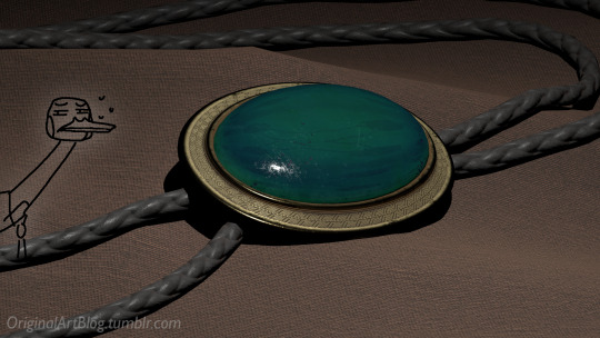
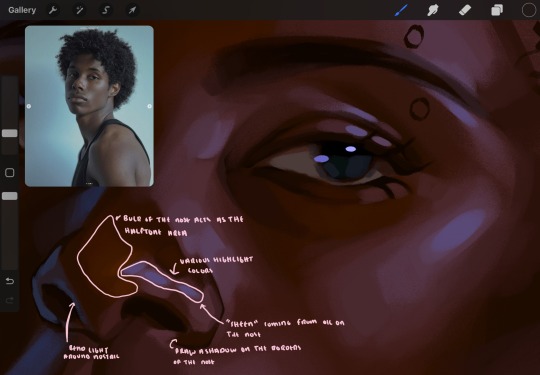
"Nawy what do you MEAN quick-ish 3D render it's got scratches and everything and I thought this was real for a minute!!"
Well, first, thank you very much that was the intention ❤, and second, you see, all speed is relative, and between finding my references, modeling, texturing and lighting, on top of having to learn how to make convincing gems, it still took me quite a few hours. I, however, cut corners everywhere for speed, and I wouldn't put this piece in a portfolio in its current state.
But! for the curious, I thought I could do a simple breakdown of how the witchcraft happens, without using too much specialized language to make it more accessible. In short,

In this case, I’m talking about a 3D model that was textured (colours and stuff) and then lit (lights on!) to make a pretty final picture. The objective is not to make a tutorial, but to put in simple terms what a 3D artist does to make something go from this, to that:

(people curious and/or trying to see if this interests them welcome)
I'm skipping the 3D modeling part altogether, since it isn't where most of the magic happens here. Just know that to be able to add colour and stuff on a 3D object, you have to go through the process or "unwrapping" it, which is like doing those foldable cubes in reverse
and then we can draw on it!!
Now, the good stuff:
Surfaces (metal, plastic, fabric, wood, skin, etc.) have different looks that make you able to differentiate them on sight. To make something look realistic, you have to try to replicate real life into the 3D world (duh.)
The software developers took care of the hard part (math and coding), so as artists we can play with the parameters available to make something pretty. What those parameters are depend on which "recipe" we're using. One of the most common "recipes" for realistic results is called PBR: Physically Based Rendering, named that way because it's trying to replicate real-life light physics. In this case, the 4 basic parameters are called albedo, roughness, metalness, and normal.
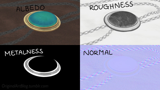
Albedo is the base colour of the surface (easy stuff). Roughness is to determine if a surface is rough or shiny. Metalness is to say if something is made out of metal or not. The normal is there to add all those tiny details you don't want to or can't sculpt on your 3D model (engravings, fabric bumps, etc.)
The roughness and metalness are black and white images because the information you're giving to the software is black = no and white = yes. It's easier to understand in the metalness image, where everything that is NOT a metal is black, and everything that IS a metal is white.
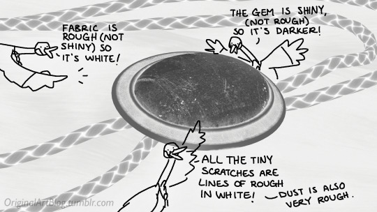
The normal is a bit more complex, but in short, it uses the colours green and red to know what is up/down or left/right, and will help the software fake relief on top of the model. You don't make it by hand; it's computer-generated from other stuff I'm not getting into.

With the technical stuff out of the way, we can actually use these. There are specialized softwares that will let you preview the results of each parameter in real time, so you can see what you're doing easily. This is what I have.
That software comes with some types of surfaces that are already set up, like the fabric in my piece, which was already 85% good for me straight out of the box. Then, it's up to me to use the tools available to decide how shiny a surface is, if there's dust or scratches and where, what colours things are, if there's metal parts, etc. That's where you can see a 3D artist's skills.
And finally, you bring it all together into a specialized software that can render 3D stuff and use those images on the corresponsing parameters, and then light the scene.
Because it all comes down to this: the light! For something realistic, light is vital to get right. You can pour your heart and soul into those tiny scratches, but if you don't light the scene correctly, well...
So we carefully light the scene to get some nice highlights to make the textures look good and highlight our subject (it's basically a photography studio inside a computer)
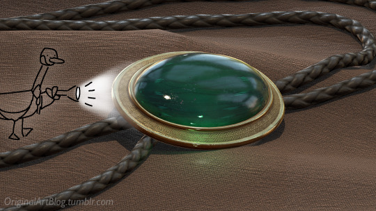
And then we add some camera effects...

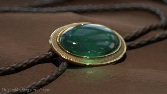
and voilà! pretty picture!!
... and if you somehow did notice something different with the bolo tie from my last post, I did find out while taking all these screenshots that I messed up my initial renders in a way that made everything darker than it was supposed to be and that's why my gold looked so muddy...

I hope this was interesting and that you learned a thing or two!
#welcome to nawy's 3d school for complete beginners#nawy's 3d#technically not art but... you know...
353 notes
·
View notes
Text
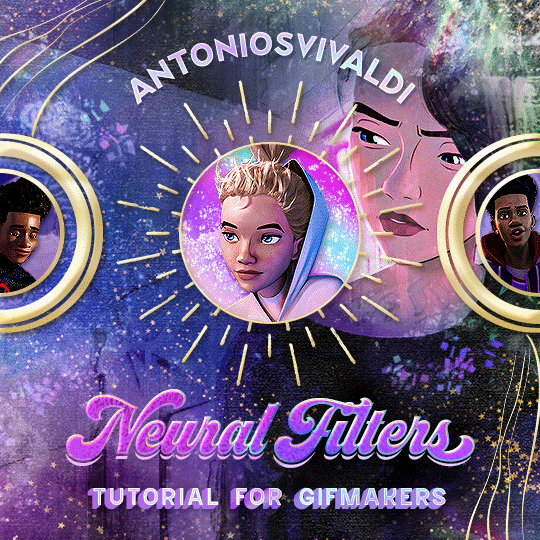


Neural Filters Tutorial for Gifmakers by @antoniosvivaldi
Hi everyone! In light of my blog’s 10th birthday, I’m delighted to reveal my highly anticipated gifmaking tutorial using Neural Filters - a very powerful collection of filters that really broadened my scope in gifmaking over the past 12 months.
Before I get into this tutorial, I want to thank @laurabenanti, @maines , @cobbbvanth, and @cal-kestis for their unconditional support over the course of my journey of investigating the Neural Filters & their valuable inputs on the rendering performance!
In this tutorial, I will outline what the Photoshop Neural Filters do and how I use them in my workflow - multiple examples will be provided for better clarity. Finally, I will talk about some known performance issues with the filters & some feasible workarounds.
Tutorial Structure:
Meet the Neural Filters: What they are and what they do
Why I use Neural Filters? How I use Neural Filters in my giffing workflow
Getting started: The giffing workflow in a nutshell and installing the Neural Filters
Applying Neural Filters onto your gif: Making use of the Neural Filters settings; with multiple examples
Testing your system: recommended if you’re using Neural Filters for the first time
Rendering performance: Common Neural Filters performance issues & workarounds
For quick reference, here are the examples that I will show in this tutorial:
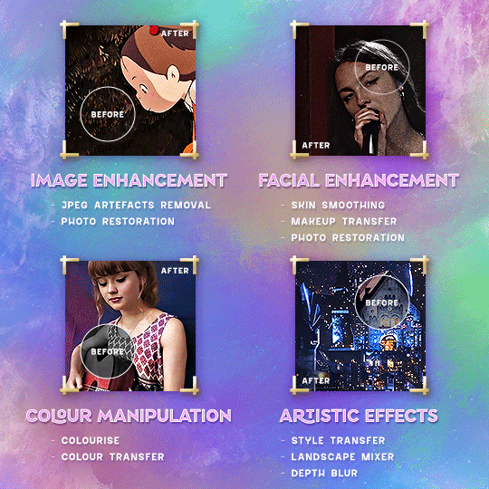
Example 1: Image Enhancement | improving the image quality of gifs prepared from highly compressed video files
Example 2: Facial Enhancement | enhancing an individual's facial features
Example 3: Colour Manipulation | colourising B&W gifs for a colourful gifset
Example 4: Artistic effects | transforming landscapes & adding artistic effects onto your gifs
Example 5: Putting it all together | my usual giffing workflow using Neural Filters
What you need & need to know:
Software: Photoshop 2021 or later (recommended: 2023 or later)*
Hardware: 8GB of RAM; having a supported GPU is highly recommended*
Difficulty: Advanced (requires a lot of patience); knowledge in gifmaking and using video timeline assumed
Key concepts: Smart Layer / Smart Filters
Benchmarking your system: Neural Filters test files**
Supplementary materials: Tutorial Resources / Detailed findings on rendering gifs with Neural Filters + known issues***
*I primarily gif on an M2 Max MacBook Pro that's running Photoshop 2024, but I also have experiences gifmaking on few other Mac models from 2012 ~ 2023.
**Using Neural Filters can be resource intensive, so it’s helpful to run the test files yourself. I’ll outline some known performance issues with Neural Filters and workarounds later in the tutorial.
***This supplementary page contains additional Neural Filters benchmark tests and instructions, as well as more information on the rendering performance (for Apple Silicon-based devices) when subject to heavy Neural Filters gifmaking workflows
Tutorial under the cut. Like / Reblog this post if you find this tutorial helpful. Linking this post as an inspo link will also be greatly appreciated!
1. Meet the Neural Filters!
Neural Filters are powered by Adobe's machine learning engine known as Adobe Sensei. It is a non-destructive method to help streamline workflows that would've been difficult and/or tedious to do manually.
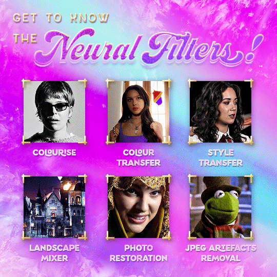
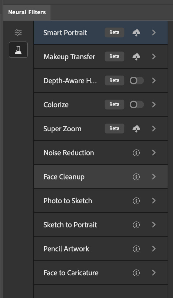
Here are the Neural Filters available in Photoshop 2024:
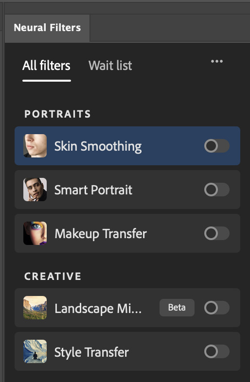

Skin Smoothing: Removes blemishes on the skin
Smart Portrait: This a cloud-based filter that allows you to change the mood, facial age, hair, etc using the sliders+
Makeup Transfer: Applies the makeup (from a reference image) to the eyes & mouth area of your image
Landscape Mixer: Transforms the landscape of your image (e.g. seasons & time of the day, etc), based on the landscape features of a reference image
Style Transfer: Applies artistic styles e.g. texturings (from a reference image) onto your image
Harmonisation: Applies the colour balance of your image based on the lighting of the background image+
Colour Transfer: Applies the colour scheme (of a reference image) onto your image
Colourise: Adds colours onto a B&W image
Super Zoom: Zoom / crop an image without losing resolution+
Depth Blur: Blurs the background of the image
JPEG Artefacts Removal: Removes artefacts caused by JPEG compression
Photo Restoration: Enhances image quality & facial details
+These three filters aren't used in my giffing workflow. The cloud-based nature of Smart Portrait leads to disjointed looking frames. For Harmonisation, applying this on a gif causes Neural Filter timeout error. Finally, Super Zoom does not currently support output as a Smart Filter
If you're running Photoshop 2021 or earlier version of Photoshop 2022, you will see a smaller selection of Neural Filters:

Things to be aware of:
You can apply up to six Neural Filters at the same time
Filters where you can use your own reference images: Makeup Transfer (portraits only), Landscape Mixer, Style Transfer (not available in Photoshop 2021), and Colour Transfer
Later iterations of Photoshop 2023 & newer: The first three default presets for Landscape Mixer and Colour Transfer are currently broken.
2. Why I use Neural Filters?
Here are my four main Neural Filters use cases in my gifmaking process. In each use case I'll list out the filters that I use:
Enhancing Image Quality:
Common wisdom is to find the highest quality video to gif from for a media release & avoid YouTube whenever possible. However for smaller / niche media (e.g. new & upcoming musical artists), prepping gifs from highly compressed YouTube videos is inevitable.
So how do I get around with this? I have found Neural Filters pretty handy when it comes to both correcting issues from video compression & enhancing details in gifs prepared from these highly compressed video files.
Filters used: JPEG Artefacts Removal / Photo Restoration
Facial Enhancement:
When I prepare gifs from highly compressed videos, something I like to do is to enhance the facial features. This is again useful when I make gifsets from compressed videos & want to fill up my final panel with a close-up shot.
Filters used: Skin Smoothing / Makeup Transfer / Photo Restoration (Facial Enhancement slider)
Colour Manipulation:
Neural Filters is a powerful way to do advanced colour manipulation - whether I want to quickly transform the colour scheme of a gif or transform a B&W clip into something colourful.
Filters used: Colourise / Colour Transfer
Artistic Effects:
This is one of my favourite things to do with Neural Filters! I enjoy using the filters to create artistic effects by feeding textures that I've downloaded as reference images. I also enjoy using these filters to transform the overall the atmosphere of my composite gifs. The gifsets where I've leveraged Neural Filters for artistic effects could be found under this tag on usergif.
Filters used: Landscape Mixer / Style Transfer / Depth Blur
How I use Neural Filters over different stages of my gifmaking workflow:
I want to outline how I use different Neural Filters throughout my gifmaking process. This can be roughly divided into two stages:
Stage I: Enhancement and/or Colourising | Takes place early in my gifmaking process. I process a large amount of component gifs by applying Neural Filters for enhancement purposes and adding some base colourings.++
Stage II: Artistic Effects & more Colour Manipulation | Takes place when I'm assembling my component gifs in the big PSD / PSB composition file that will be my final gif panel.
I will walk through this in more detail later in the tutorial.
++I personally like to keep the size of the component gifs in their original resolution (a mixture of 1080p & 4K), to get best possible results from the Neural Filters and have more flexibility later on in my workflow. I resize & sharpen these gifs after they're placed into my final PSD composition files in Tumblr dimensions.
3. Getting started
The essence is to output Neural Filters as a Smart Filter on the smart object when working with the Video Timeline interface. Your workflow will contain the following steps:
Prepare your gif
In the frame animation interface, set the frame delay to 0.03s and convert your gif to the Video Timeline
In the Video Timeline interface, go to Filter > Neural Filters and output to a Smart Filter
Flatten or render your gif (either approach is fine). To flatten your gif, play the "flatten" action from the gif prep action pack. To render your gif as a .mov file, go to File > Export > Render Video & use the following settings.

Setting up:
o.) To get started, prepare your gifs the usual way - whether you screencap or clip videos. You should see your prepared gif in the frame animation interface as follows:

Note: As mentioned earlier, I keep the gifs in their original resolution right now because working with a larger dimension document allows more flexibility later on in my workflow. I have also found that I get higher quality results working with more pixels. I eventually do my final sharpening & resizing when I fit all of my component gifs to a main PSD composition file (that's of Tumblr dimension).
i.) To use Smart Filters, convert your gif to a Smart Video Layer.
As an aside, I like to work with everything in 0.03s until I finish everything (then correct the frame delay to 0.05s when I upload my panels onto Tumblr).
For convenience, I use my own action pack to first set the frame delay to 0.03s (highlighted in yellow) and then convert to timeline (highlighted in red) to access the Video Timeline interface. To play an action, press the play button highlighted in green.

Once you've converted this gif to a Smart Video Layer, you'll see the Video Timeline interface as follows:

ii.) Select your gif (now as a Smart Layer) and go to Filter > Neural Filters
Installing Neural Filters:
Install the individual Neural Filters that you want to use. If the filter isn't installed, it will show a cloud symbol (highlighted in yellow). If the filter is already installed, it will show a toggle button (highlighted in green)
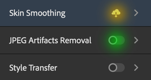
When you toggle this button, the Neural Filters preview window will look like this (where the toggle button next to the filter that you use turns blue)

4. Using Neural Filters
Once you have installed the Neural Filters that you want to use in your gif, you can toggle on a filter and play around with the sliders until you're satisfied. Here I'll walkthrough multiple concrete examples of how I use Neural Filters in my giffing process.
Example 1: Image enhancement | sample gifset
This is my typical Stage I Neural Filters gifmaking workflow. When giffing older or more niche media releases, my main concern is the video compression that leads to a lot of artefacts in the screencapped / video clipped gifs.
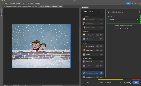
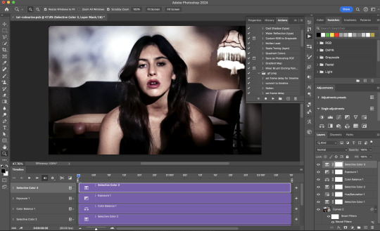
To fix the artefacts from compression, I go to Filter > Neural Filters, and toggle JPEG Artefacts Removal filter. Then I choose the strength of the filter (boxed in green), output this as a Smart Filter (boxed in yellow), and press OK (boxed in red).
Note: The filter has to be fully processed before you could press the OK button!
After applying the Neural Filters, you'll see "Neural Filters" under the Smart Filters property of the smart layer

Flatten / render your gif
Example 2: Facial enhancement | sample gifset
This is my routine use case during my Stage I Neural Filters gifmaking workflow. For musical artists (e.g. Maisie Peters), YouTube is often the only place where I'm able to find some videos to prepare gifs from. However even the highest resolution video available on YouTube is highly compressed.
Go to Filter > Neural Filters and toggle on Photo Restoration. If Photoshop recognises faces in the image, there will be a "Facial Enhancement" slider under the filter settings.

Play around with the Photo Enhancement & Facial Enhancement sliders. You can also expand the "Adjustment" menu make additional adjustments e.g. remove noises and reducing different types of artefacts.

Once you're happy with the results, press OK and then flatten / render your gif.
Example 3: Colour Manipulation | sample gifset
Want to make a colourful gifset but the source video is in B&W? This is where Colourise from Neural Filters comes in handy! This same colourising approach is also very helpful for colouring poor-lit scenes as detailed in this tutorial.
Here's a B&W gif that we want to colourise:

Highly recommended: add some adjustment layers onto the B&W gif to improve the contrast & depth. This will give you higher quality results when you colourise your gif.
Go to Filter > Neural Filters and toggle on Colourise.
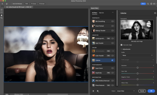
Make sure "Auto colour image" is enabled.
Play around with further adjustments e.g. colour balance, until you're satisfied then press OK.
Important: When you colourise a gif, you need to double check that the resulting skin tone is accurate to real life. I personally go to Google Images and search up photoshoots of the individual / character that I'm giffing for quick reference.
Add additional adjustment layers until you're happy with the colouring of the skin tone.
Once you're happy with the additional adjustments, flatten / render your gif. And voila!

Note: For Colour Manipulation, I use Colourise in my Stage I workflow and Colour Transfer in my Stage II workflow to do other types of colour manipulations (e.g. transforming the colour scheme of the component gifs)
Example 4: Artistic Effects | sample gifset
This is where I use Neural Filters for the bulk of my Stage II workflow: the most enjoyable stage in my editing process!
Normally I would be working with my big composition files with multiple component gifs inside it. To begin the fun, drag a component gif (in PSD file) to the main PSD composition file.
Resize this gif in the composition file until you're happy with the placement

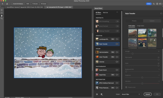
Duplicate this gif. Sharpen the bottom layer (highlighted in yellow), and then select the top layer (highlighted in green) & go to Filter > Neural Filters

I like to use Style Transfer and Landscape Mixer to create artistic effects from Neural Filters. In this particular example, I've chosen Landscape Mixer
Select a preset or feed a custom image to the filter (here I chose a texture that I've on my computer)
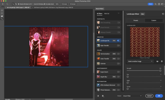
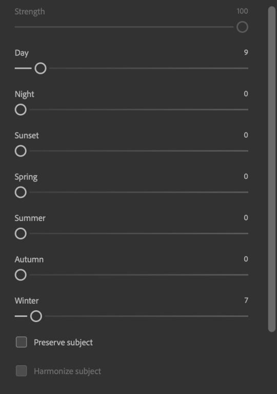
Play around with the different sliders e.g. time of the day / seasons
Important: uncheck "Harmonise Subject" & "Preserve Subject" - these two settings are known to cause performance issues when you render a multiframe smart object (e.g. for a gif)
Once you're happy with the artistic effect, press OK
To ensure you preserve the actual subject you want to gif (bc Preserve Subject is unchecked), add a layer mask onto the top layer (with Neural Filters) and mask out the facial region. You might need to play around with the Layer Mask Position keyframes or Rotoscope your subject in the process.
After you're happy with the masking, flatten / render this composition file and voila!

Example 5: Putting it all together | sample gifset
Let's recap on the Neural Filters gifmaking workflow and where Stage I and Stage II fit in my gifmaking process:
i. Preparing & enhancing the component gifs
Prepare all component gifs and convert them to smart layers
Stage I: Add base colourings & apply Photo Restoration / JPEG Artefacts Removal to enhance the gif's image quality
Flatten all of these component gifs and convert them back to Smart Video Layers (this process can take a lot of time)
Some of these enhanced gifs will be Rotoscoped so this is done before adding the gifs to the big PSD composition file
ii. Setting up the big PSD composition file
Make a separate PSD composition file (Ctrl / Cmmd + N) that's of Tumblr dimension (e.g. 540px in width)
Drag all of the component gifs used into this PSD composition file
Enable Video Timeline and trim the work area
In the composition file, resize / move the component gifs until you're happy with the placement & sharpen these gifs if you haven't already done so
Duplicate the layers that you want to use Neural Filters on
iii. Working with Neural Filters in the PSD composition file
Stage II: Neural Filters to create artistic effects / more colour manipulations!
Mask the smart layers with Neural Filters to both preserve the subject and avoid colouring issues from the filters
Flatten / render the PSD composition file: the more component gifs in your composition file, the longer the exporting will take. (I prefer to render the composition file into a .mov clip to prevent overriding a file that I've spent effort putting together.)
Note: In some of my layout gifsets (where I've heavily used Neural Filters in Stage II), the rendering time for the panel took more than 20 minutes. This is one of the rare instances where I was maxing out my computer's memory.
Useful things to take note of:
Important: If you're using Neural Filters for Colour Manipulation or Artistic Effects, you need to take a lot of care ensuring that the skin tone of nonwhite characters / individuals is accurately coloured
Use the Facial Enhancement slider from Photo Restoration in moderation, if you max out the slider value you risk oversharpening your gif later on in your gifmaking workflow
You will get higher quality results from Neural Filters by working with larger image dimensions: This gives Neural Filters more pixels to work with. You also get better quality results by feeding higher resolution reference images to the Neural Filters.
Makeup Transfer is more stable when the person / character has minimal motion in your gif
You might get unexpected results from Landscape Mixer if you feed a reference image that don't feature a distinctive landscape. This is not always a bad thing: for instance, I have used this texture as a reference image for Landscape Mixer, to create the shimmery effects as seen in this gifset
5. Testing your system
If this is the first time you're applying Neural Filters directly onto a gif, it will be helpful to test out your system yourself. This will help:
Gauge the expected rendering time that you'll need to wait for your gif to export, given specific Neural Filters that you've used
Identify potential performance issues when you render the gif: this is important and will determine whether you will need to fully playback your gif before flattening / rendering the file.
Understand how your system's resources are being utilised: Inputs from Windows PC users & Mac users alike are welcome!
About the Neural Filters test files:
Contains six distinct files, each using different Neural Filters
Two sizes of test files: one copy in full HD (1080p) and another copy downsized to 540px
One folder containing the flattened / rendered test files
How to use the Neural Filters test files:
What you need:
Photoshop 2022 or newer (recommended: 2023 or later)
Install the following Neural Filters: Landscape Mixer / Style Transfer / Colour Transfer / Colourise / Photo Restoration / Depth Blur
Recommended for some Apple Silicon-based MacBook Pro models: Enable High Power Mode
How to use the test files:
For optimal performance, close all background apps
Open a test file
Flatten the test file into frames (load this action pack & play the “flatten” action)
Take note of the time it takes until you’re directed to the frame animation interface
Compare the rendered frames to the expected results in this folder: check that all of the frames look the same. If they don't, you will need to fully playback the test file in full before flattening the file.†
Re-run the test file without the Neural Filters and take note of how long it takes before you're directed to the frame animation interface
Recommended: Take note of how your system is utilised during the rendering process (more info here for MacOS users)
†This is a performance issue known as flickering that I will discuss in the next section. If you come across this, you'll have to playback a gif where you've used Neural Filters (on the video timeline) in full, prior to flattening / rendering it.
Factors that could affect the rendering performance / time (more info):
The number of frames, dimension, and colour bit depth of your gif
If you use Neural Filters with facial recognition features, the rendering time will be affected by the number of characters / individuals in your gif
Most resource intensive filters (powered by largest machine learning models): Landscape Mixer / Photo Restoration (with Facial Enhancement) / and JPEG Artefacts Removal
Least resource intensive filters (smallest machine learning models): Colour Transfer / Colourise
The number of Neural Filters that you apply at once / The number of component gifs with Neural Filters in your PSD file
Your system: system memory, the GPU, and the architecture of the system's CPU+++
+++ Rendering a gif with Neural Filters demands a lot of system memory & GPU horsepower. Rendering will be faster & more reliable on newer computers, as these systems have CPU & GPU with more modern instruction sets that are geared towards machine learning-based tasks.
Additionally, the unified memory architecture of Apple Silicon M-series chips are found to be quite efficient at processing Neural Filters.
6. Performance issues & workarounds
Common Performance issues:
I will discuss several common issues related to rendering or exporting a multi-frame smart object (e.g. your composite gif) that uses Neural Filters below. This is commonly caused by insufficient system memory and/or the GPU.
Flickering frames: in the flattened / rendered file, Neural Filters aren't applied to some of the frames+-+
Scrambled frames: the frames in the flattened / rendered file isn't in order
Neural Filters exceeded the timeout limit error: this is normally a software related issue
Long export / rendering time: long rendering time is expected in heavy workflows
Laggy Photoshop / system interface: having to wait quite a long time to preview the next frame on the timeline
Issues with Landscape Mixer: Using the filter gives ill-defined defined results (Common in older systems)--
Workarounds:
Workarounds that could reduce unreliable rendering performance & long rendering time:
Close other apps running in the background
Work with smaller colour bit depth (i.e. 8-bit rather than 16-bit)
Downsize your gif before converting to the video timeline-+-
Try to keep the number of frames as low as possible
Avoid stacking multiple Neural Filters at once. Try applying & rendering the filters that you want one by one
Specific workarounds for specific issues:
How to resolve flickering frames: If you come across flickering, you will need to playback your gif on the video timeline in full to find the frames where the filter isn't applied. You will need to select all of the frames to allow Photoshop to reprocess these, before you render your gif.+-+
What to do if you come across Neural Filters timeout error? This is caused by several incompatible Neural Filters e.g. Harmonisation (both the filter itself and as a setting in Landscape Mixer), Scratch Reduction in Photo Restoration, and trying to stack multiple Neural Filters with facial recognition features.
If the timeout error is caused by stacking multiple filters, a feasible workaround is to apply the Neural Filters that you want to use one by one over multiple rendering sessions, rather all of them in one go.
+-+This is a very common issue for Apple Silicon-based Macs. Flickering happens when a gif with Neural Filters is rendered without being previously played back in the timeline.
This issue is likely related to the memory bandwidth & the GPU cores of the chips, because not all Apple Silicon-based Macs exhibit this behaviour (i.e. devices equipped with Max / Ultra M-series chips are mostly unaffected).
-- As mentioned in the supplementary page, Landscape Mixer requires a lot of GPU horsepower to be fully rendered. For older systems (pre-2017 builds), there are no workarounds other than to avoid using this filter.
-+- For smaller dimensions, the size of the machine learning models powering the filters play an outsized role in the rendering time (i.e. marginal reduction in rendering time when downsizing 1080p file to Tumblr dimensions). If you use filters powered by larger models e.g. Landscape Mixer and Photo Restoration, you will need to be very patient when exporting your gif.
7. More useful resources on using Neural Filters
Creating animations with Neural Filters effects | Max Novak
Using Neural Filters to colour correct by @edteachs
I hope this is helpful! If you have any questions or need any help related to the tutorial, feel free to send me an ask 💖
#photoshop tutorial#gif tutorial#dearindies#usernik#useryoshi#usershreyu#userisaiah#userroza#userrobin#userraffa#usercats#userriel#useralien#userjoeys#usertj#alielook#swearphil#*#my resources#my tutorials
458 notes
·
View notes
Text
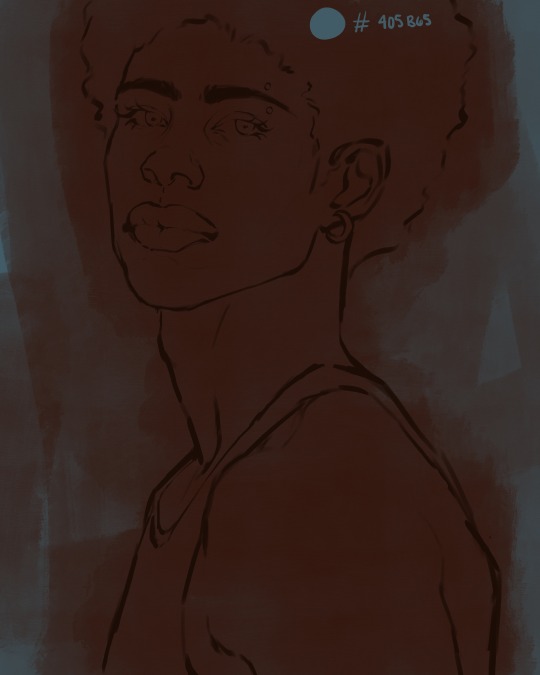
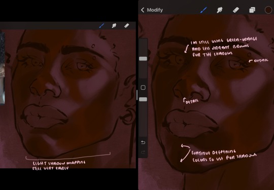
eaudera's detailed tutorial for skin rendering
okay loves i've put together a tutorial in text form detailing my step by step process of shading darker skin + the brushes and techniques I use and why I use them. you will be following along as we shade a piece together, you can find the lineart to the piece here. *turn off your true tone and night shift displays for the most objective viewing.
i wrote a lot on the preview pictures, if you find spelling errors (which you def will) or are unable to read my handwriting, you'll find the typed out version of the writing in the alt text feature.
disclaimer: i'm not an art professor nor am i academically/classically trained in art. a lot of the verbiage and techniques i'm using to teach you all here are from my current self taught and observed understanding of art, light, and anatomy
support me: kofi / ig / twt / commissions
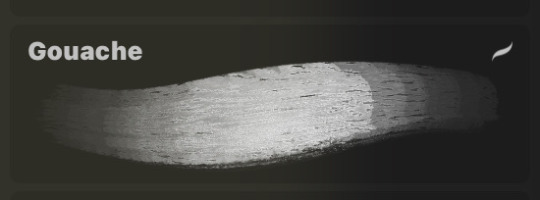
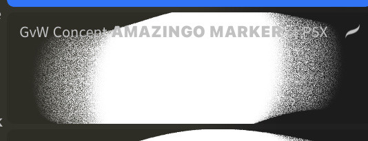
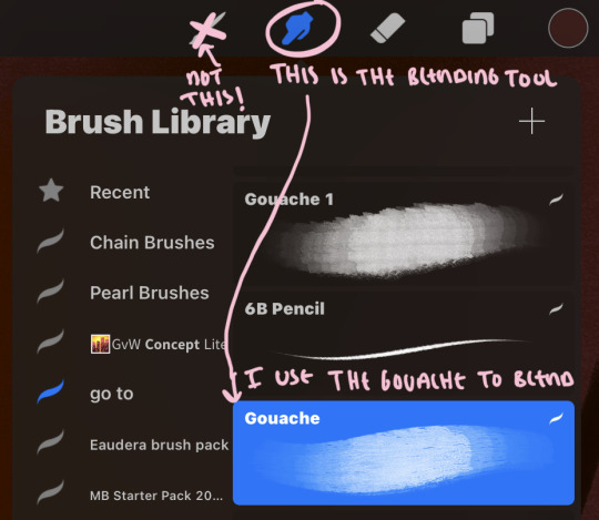
firstly, here are my two staple brushes. you can find the second brush here, i modified it by making it larger.
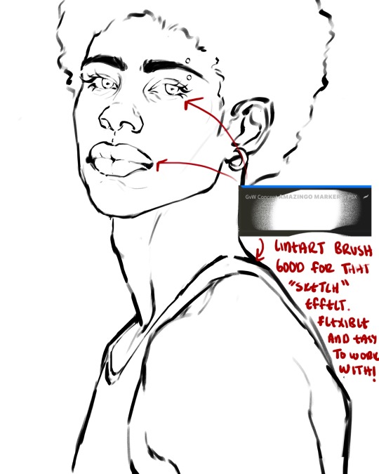
the lineart brush is very good for easy sketching and simultaneously cleaning up that sketch to produce the final lineart you'll be using in your piece. the diffusion from the erased parts/the diffusion created by lowering the pressure of your pen creates a light graphite effect which i enjoy! give it a shot.
you'll notice quickly that there are lighter strokes throughout this lineart, these are simply acting as rendering guides for me in order to remember certain placements. i erase/draw over these lines a lot.
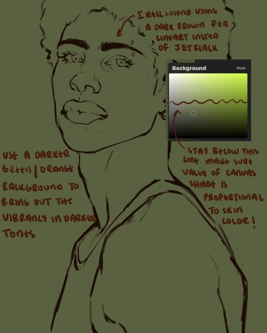
i initially learned to shade skin on a completely grey background with very slight orange undertones, and for a while this was very helpful in providing the most objective view of the base colors you're using (objective as in free of being effected by colors of different values). as you might know, using a white background for dark skin will seemingly darken the value and dim the vibrancy of your base colors, and using a black background will do the opposite. if you're using a darker skin tone, you want your canvas shade to be of a value that is proportional to your skin tone to avoid the same problems created by colors with too light or dark of a value. now if you're using a screened device to draw, you have the extra burden of screen reflections/wavering color output on different screens, so you're never really sure if the exact color you're using will be consistent across the board. priming your canvas with neutral colors will help with that. whereas priming with more vibrant colors will slightly change the undertone of your skintone (especially if you're using a low opacity brush), but it makes for a funner canvas and more creativity with your color palette imo. if you're a beginner i recommend you stay below the wavy line to avoid too light of a canvas shade.
for these same reasons i avoid keeping my lineart jet black. when you lay down the base colors under a black lineart it can look very unfavorable.
here are some skin tone variants that i tend to use the most, peep how i never wander off too far to the left of the spectrum where the reds are. i definitely favor red-oranges as compared to green-oranges for my skin tones, however, because i stay primarily on the left side of the color spectrum for my rendering, red can quickly become too much too fast. so i make sure to use a skin tone that can work very well with green-orange shadows. for this specific piece i will use the third shade (#2d1606).
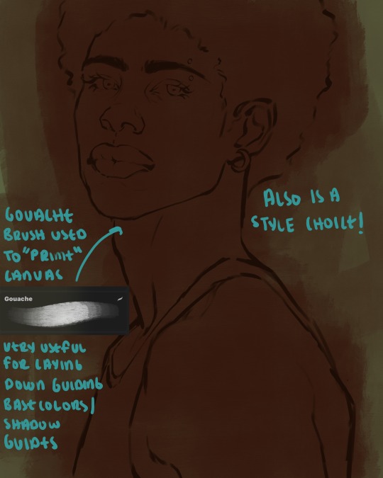
heres where the gouache brush comes in handy. i use it very loosely to "prime" the canvas almost. if you've ever done oil painting you'll realize very few artists draw directly onto a completely white canvas, though i've already primed my canvas essentially by changing the background color, i loosely shade over it with the skin tone color using the gouache brush. i find this gives me a better grasp on the composition of the piece due to increased harmony between the canvas and the skin color. it also looks really cool to me and resembles a real canvas almost.
as stated before, priming your canvas with neutral colors (grey) can help give you a more consistent view of your base colors, when you get the hang of understanding the colors you most often use (i.e, how they interact with other colors), you can start using more vibrant and fun colors to color your canvas with! the gouache brush changes opacity depending on the pressure exerted by the pen, if you zoom in you'll notice patchy areas where the canvas color bleeds through the layer more prominently than it does in other areas. for some people this might throw off the consistency of the shadows, but you should be fine as long as you're using a consistently opaque brush (which we will be doing)
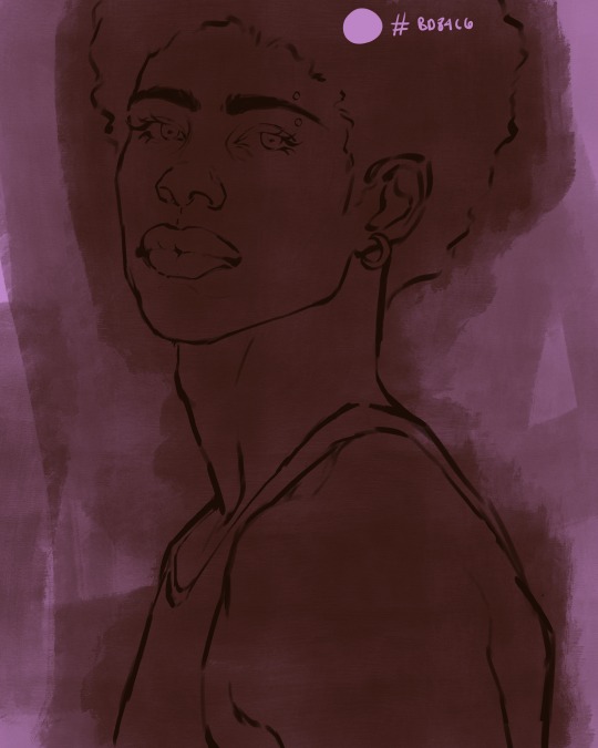
i know i recommended beginners use a grey canvas like i did, but since this tutorial is using my techniques i figured i'd also teach you guys how to use variantly opaque brushes to your advantage. we will be drawing on the pink canvas from here on out.
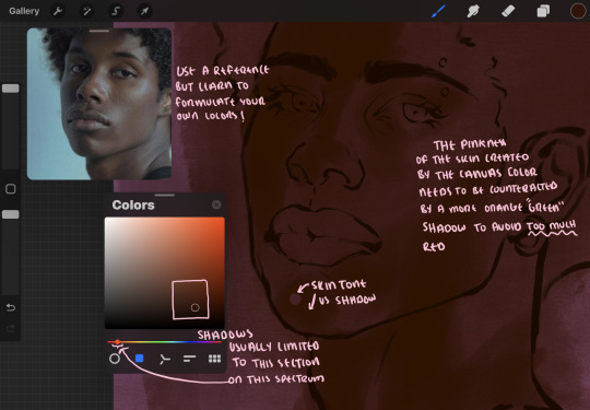
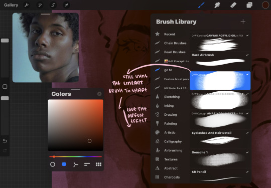
a reference is so helpful, i still rely on references to guide my shadows/lights. i'm past the point of relying on references for exact coordinates for rendering or lineart, but they are still incredibly helpful. in most references of darker skintones you come across, color dropping directly from the picture will give you very grey colors! we want to prioritize vibrancy in this case, so attempt to formulate your own colors or colordrop and increase the vibrancy :)! keep in mind i'm now using the lineart brush to shade. the diffuse/soft corners of this brush allows fewer pixels to be scattered wherever you lessen the pressure, this is perfect for color dropping medium colors to blend two colors together. you'll see how i blend colors later on.
as mentioned previously, red can become too much too fast- so i avoid monochrome rendering as much as possible by using shadows of different undertones. my most frequent combination is using a red-orange skin tone and then using a green-orange shadow.
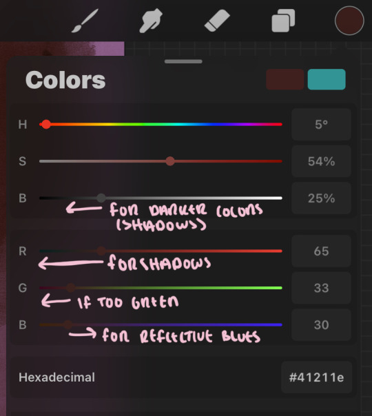
the value spectrum will be your best friend in mixing values and undertones, i use it all the time to formulate the best less saturated darker shadow that is proportional (not too dark, not too grey) to my skintone value. if the shadow is too green simply increase the magenta, if you're looking for a "reflective" shadow, increase the blue.
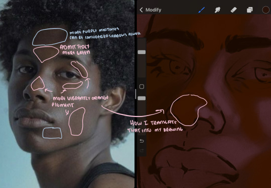
when i begin shading, i always slide the curser to a truer orange color on the spectrum and increase the saturation (slide towards the right) while i decrease the brightness (slide down). heres how it looks when i'm jumping between shadows and highlights while trying to keep my colors proportional (but not identical) to whats happening in the reference ^. i most often times will rely on the value tool, however.
you will notice that a lot of darker skin tones have patches of orange vibrancy, these areas are most common on the nose and cheeks. this is only a detail to pay attention to if you're going for more of a realism rendering style :)
now onto how i prefer to bridge/blend colors together by utilizing the blend tool.
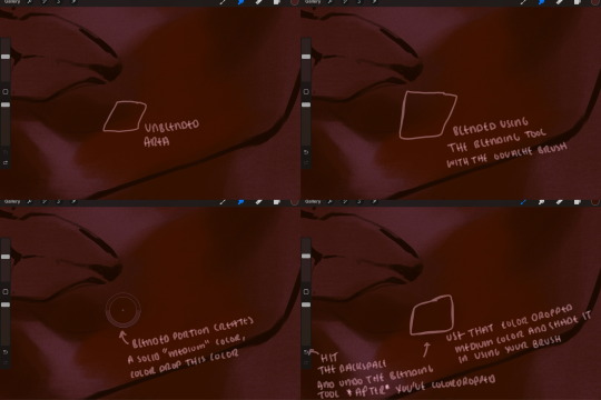
i do not like simply blurring colors in order to blend colors together, it can lead to overblending which can make your portrait look heavily gaussian blurred (think 2010 deviantart art... yea that). the brilliant thing about procreate is you can utilize brushes really efficiently, which include changing the brushes you use for blending. so in reality, artists who use the blending tool on its own can still have portraits that don't look it! there also exists plenty of brushes that have properties allowing it to blend into its surrounding colors are you draw. but in my case, the above photo is 99% of the times how i will bridge two colors together. doing this allows me to keep pretty consistent brushstrokes across the whole portrait, which i enjoy. it also gives me better control of the shapes i use in my rendering, an aspect that is pretty easy to lose when you're using the blending tool directly and solely.
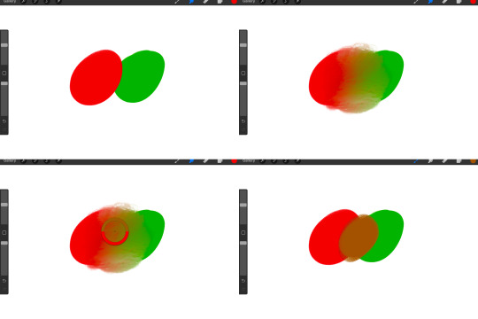
in case the blending process is a bit hard too see, heres that same process recreated with different more visible colors:
now once you've placed your shadows where they generally tend to be (according to the reference photo), let's make those shapes a bit more specific and pick up on smaller details to make your rendering look more complete.
your base colors will never be as dark or as light as you need them to be when you begin rendering, making sure you have a decent contrast between your lightsource highlights and the shadows is key to capturing the essence of a light being cast on your character. it's much easier to keep building upon your shadows before rendering the highlights, i laid down the highlights only to create a guide/help me map my shadows better. do not darken the entirety of the areas affected by shadow, you'll find that shadows are rarely ever the same value, it's a gradual process affected by things like position, height, etc. so make sure the darkest of your shadow colors are preserved only in areas where the shadows are the or should be the darkest.
you'll notice i labeled some areas as "detail", adding very specific shadow placements is a detail. in the reference, the model has a pretty prominent brow bone, creating a shadow over where his eyelid creases just above his lash line, paying attention to feature details like this help enhance the rendering and its realism.
now that i've mapped my shadows i'm going to move onto to rendering my highlights and the region of the face where the lightsource is most prominent.
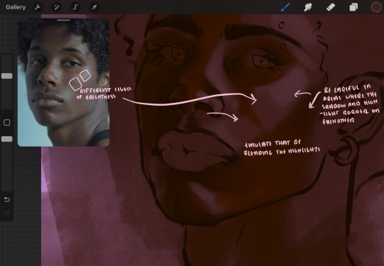
i described shadows as a gradual process earlier, this is because of the lightsource. light tends to spread when its further from the affected surface, creating a larger area affected by the light. of course, this varies depending on how intense and how close/far the light source is. in this case, the light is being casted above him further to the other side of his face, but again, remember that the face is not 2d and more prominent areas are affected more by light. it's due to this that there still exists a, albeit very minimal, shadow beneath his cheekbone. i exaggerate the shadow here for stylistic purposes, but it also helps in keeping me uphold that contrast between the highlight and shadow once again. so i refrain from blending the light into this area like i did in other areas.
midtones are the areas most unaffected by the light source, they're neither shadows nor highlights. and because light spreads, it is brighter in certain areas and darker in others. it is most easiest to blend the darker ends of the highights into the midtones of your portrait. you can emulate this by once again using your blend tool. blend the outer areas of the light and colordrop this color and use it as the darker light more proportional to the midtones. note that before i add even lighter shades to the areas where light is most concentrated, i blend what highlight placements i currently have there.
we're going to switch gears now and focus on the reflective shadow occurring on the darker half of his face.
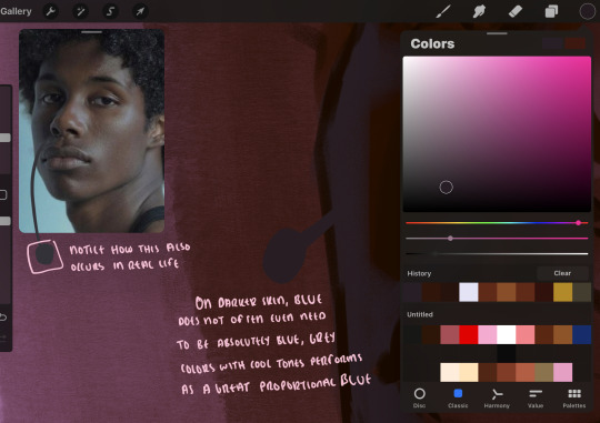
this shadow is a reflection from the lighter background the model is up against, the light being casted above him is allowing for some bounce back from his surroundings, leading to very faint light visible in areas primarily affected by shadows. hence why i'm referring to these colors as "reflective shadows".
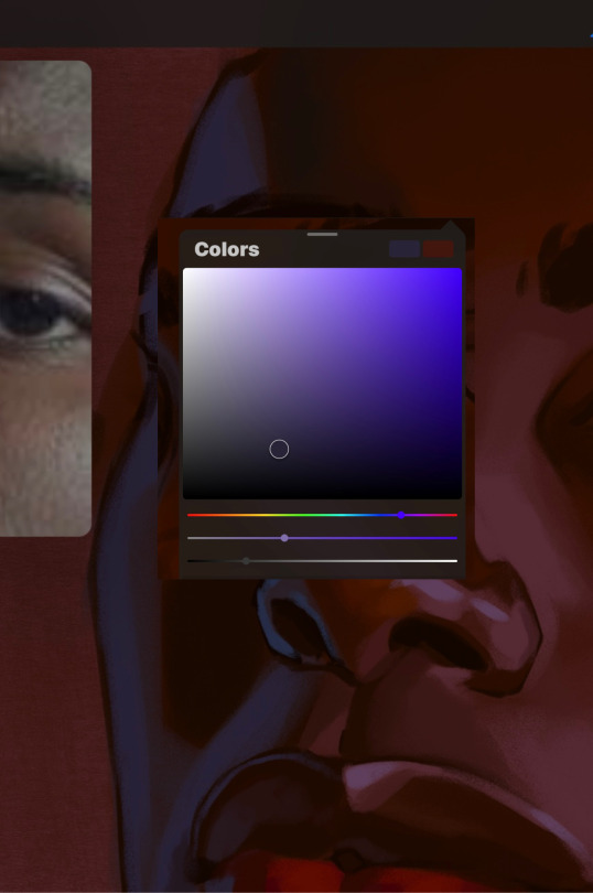
in this case, the reflective shadows are blue, or appear to our eyes as blue. on darker skin, "true" blues (blue-purple) are not often times present. what is present rather, is a very grey tone with cool undertones/a grey tone on the blue side of the spectrum, which creates a blue that is much more proportional to the value of the skintone than a true blue. in this case i used a deeper grey on the pink color spectrum, which is more purple. this was intentional, and was done in order to create some sort of color harmony between the contrasted deep oranges im using for the bordering shadows and the blue-grey i'm attempting to emulate.
while i utilize this blue-grey, out've a purely stylistic choice, i still introduce true blues to my rendering. in fact i love using blue/purple reflective shadows in my art, it creates a stunning and colorful render. in this case, i used the blue-grey as a stepping stool to introduce that trueer blue more naturally. you'll see this happening in the second picture above, where i used a slightly more vibrant and slightly more brighter blue, and used it on areas where this reflection was more prominent (and therefore brighter).
you'll notice how the shadows that border on these reflective colors are less saturated and darker than the shadows on his chin. introduce a darker and less saturated (more green) shadow to that area on his cheek and the darkest shadow of this photo, the sunken area near his nose bridge and inner eye corner. i emphasize this line in the lineart so you can follow this shadow more accurately:
this is also a detail in my opinion and can make your portrait more realistic if you include.
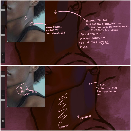
we're going to pivot to his neck area before continuing. you'll find the area of his neck with the most light is also the least vibrant, i laid down a grey base color to emphasize this detail in the portrait. afterwards i added key details. i wanted to stay at least somewhat true to the color dynamics occurring in the reference hence why i used the grey, but i'm not a very big fan of using blatant grey directly on the skin, so i made it more blue.
moving forward, the outer eye and the nose can be some of the most "detail focused" areas of the face when it comes to rendering. due to their more "bulbous" anatomy, light tends to curve around them in more complex ways than the flatter parameters of the face.
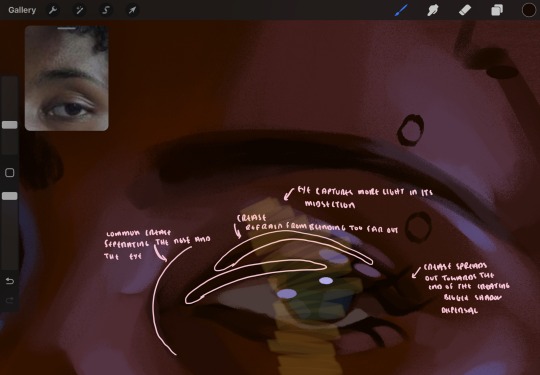
when it comes to the many creases that surround the eye, the skin folding over itself creates a very thin shadow from between the folds. the key to rendering this crease is to concentrate the blending to a very small scale, do not overblend the area because the hill created by the crease very easily captures light, creating an area where the shadow and highlight meet in very close proximity. slight blending is needed for this area, you can deepen the shadows in both horizontal corners of the eye for more accuracy. the midsection of the total eye area (eyeball and socket) tends to capture the most light, remember this is due to how bulbous rounder shapes tend to capture light from whichever direction its coming from.
this is of course the case for the nose as well. highlights are typically placed as a dot on the outermost part of the nose by artists, but highlights also spread on either side of the tip of the nose. the nose tends to collect a lot of oil, creating a sort of sheen on the upper parts of the nostril. when rendering a portrait where the position of the head is more cast to the side, the highlight of the nose changes from the bulb of the nose, to the upper nostril. in this case, the highlight spreads, causing a "half tone", or the remnants of the light on the bulb of the nose. this is the easiest place to blend highlights and shadows together. now for the shadow detailing on the nose, i'm actually drawing on top of the lineart on a separate layer. which i'll go into detail about in the next part. you want to focus the shadow on where your lineart is, the outermost part of the nose.
now were going to really detail your portrait by introducing a new layer, the detail layer! this isn't technically apart of the skin rendering, so i'm gonna keep it very brief. this is the layer you're going to render the lips, eyeballs, and eyebrows. more specifically, the purpose of this layer is to reduce the reliance on lineart. in terms of order, it goes above the lineart layer. we're going to soften and even erase the lineart in certain aspects. i use bolder/thicker lines when creating my lineart, but this can become a nuisance/hinderance when rendering.
starting out with the lips:
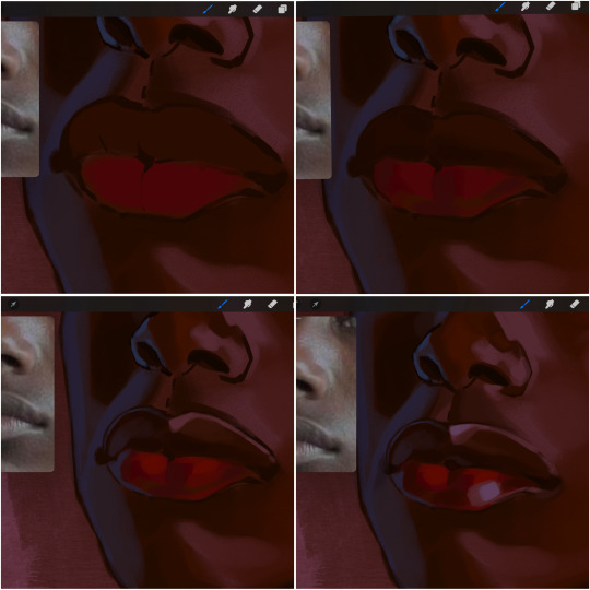
people w brown skin tend to have two toned lips, with the top lip resembling the same skin tone as the face and the bottom lip being redder/pinker and lighter than the upper lip. in my case, i prefer a more vibrant red for the bottom lip. once i lay down these base colors, i begin shading on the second layer.
i personally enjoy the look of a poutier lip shape, this includes emphasizing the middles of the lips as opposed to the ends. i've highlighted the shapes that this lip shape often entails. the small circles on the corner of the lip line are just pockets that occur when the mouth is closed and become emphasized by the fat around the mouth. the parameters of the lip lines do not often meet these round corners, theres often times a "double lip line", that exists around these areas. i love including that in the art, its very easy to emphasize by simply drawing a highlight from the corner of the lips along the curvature of the bottom lip towards the middle.
shadow mapping on the lips tend to go: highlight, shadow, highlight, shadow. the top lip going inward creates a highlight on the most outward part: the top of the lip. and the bottom lip curving outward thus creates a shadow on the bottom of the lip.
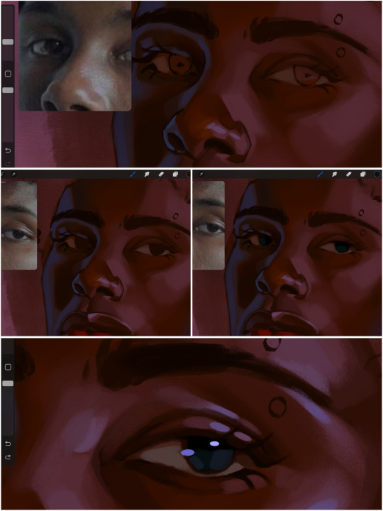
when it comes to the eyeball, i don't draw the white parts as solid white, nor do i make them too bright most of the time. they're most often times an orange grey, i also dont spread this color out if you can notice the uncolored white part of the eye. i do this intentionally to keep some of the shadows that are naturally present on the eye. very specifically right where the upper eyelid sits on the eyeball, it tends to create a small shadow that follows the curvature of the eye. this shadow is crucial, if you can see the first and second picture do not have this shadow, making the iris look more exposed and the eye appears to be held wider.
when it comes to the iris, i do very little. if i'm drawing a dark colored eye i will cover the entire iris brown, before darkening it with an almost black color. i leave the brown sides of the iris exposed to aid in bridging the values between the whiter parts of the eye and the very dark iris. this blended ring also appears on all eyes in real life. lastly, dark eyes tend to show light reflections much easier than lighter eyes. these reflections can be any color in art, in this case i kept it blue-green. i bend these reflections around where the pupil would most likely be depending on the drawing.
next, the eyebrow. i find it tedious to draw individual eyebrow strands when it comes to rendering, i actually prefer to blend the parameters of the eyebrows to create cohesiveness. sparse and fine eyebrow hairs are penetrated by light and shadows more than what you'd find on the scalp. it's harder to see light on someones scalp due to the bulk of hair crowding the scalp, whereas as its easier to see such light on the eyebrow. to introduce this concept to my art, i will initially draw the entire shape of the brow. then when rendering, i erase the parameters, leaving the darkest part of the brow. then i blend. the lower brow bone will be blended the least, whereas the area of the eyebrow connected to the T zone will be the most blended thanks to the shadow following the nose bridge. the far end of the brow by the hairline tends to be the lightest given the light source.
and lastly, i loosely draw a white border around the portrait for stylistic purposes. then i combine the layers (group together your layers, then duplicate and compress the duplicate group so that you still retain your individual layers) to edit. i typically add noise and play with the curve setting. and heres the finished image:
i hope you enjoyed!!
#i didnt proofread this if u find spelling errors pls lmk#black artists on tumblr#digital art#illustration#painting#black art#commissions#tutorial#art tutorial#how to shade#rendering tutorial#brushes
185 notes
·
View notes
Text
oh we’re still so young, desperate for attention
this was super experimental so i will talk about my process (+ clearer version) under the cut

i’ve been looking at a lot of “messier” or more textured painting styles recently and an artist that stuck out to me is clariondeluna ! they posted a self-portrait recently that i really liked and i was super interested in the brushwork seen in their work. i love all the textures and how the shapes feel so loose yet everything is so detailed.
that’s not a method for me at all!!!! i cannot paint like that at all and the stuff i like to paint is very different to theirs. which is okay!!!! i had no intention to copy this artists style so closely like with what i tried to do in my raiden painting, i just wanted to try this style out :^)
it’s been a goal of mine to avoid over-rendering like i tend to do a lot, and i think i’ve been doing good with that recently! the mindset i’ve got going on right now is that if i find myself staring at it too hard for too long, i have to leave it and move on. if there’s still something wrong with it, i can fix it later once ive got a fresh view!
i’ve been trying a lot of things with my art this year. i always try to challenge myself with each piece, and to end the year off i wanted to be as uncomfortable as i possibly could be with this painting. i let myself draw whatever i wanted because i still wanted to enjoy it, but everything i did in this process was new, including parts of the subject matter.
i’ve never drawn a head at an angle like this, and i struggle with drawing mouths open. i don’t do bold lighting like this, and if i do, it’s not fire. i’ve never drawn fire! i also rarely work with warm colours and i hate using green, so i combined those to be my colour palette. i like working cleanly so instead of having a dozen different layers for one section, each section only had 1-2 layers for rendering. instead of clipping masks i would simply paint over things loosely and clean it up later. i never like having limbs cut off in a drawing so i had his other arm go GOD knows where. i don’t like weird patterned backgrounds so i made myself figure out how to like it!
IS THIS MY FAVOURITE PIECE OF ALL TIME. no. absolutely not. but i’m very proud of how this came out with all the challenges i put on myself. i WANTED to get better at these things and be more broad with my art, both in terms of the styles and subjects i portray.
okay let’s talk about wtf this drawing is
for those who don’t know, the design in this painting is my fatui/“Father” lyney fan design (read the design post here). the concept isnt super complicated and i don’t really have much explanation for it, but i wanted to combine the story of how lyney wanted a delusion before getting his vision, fire eating circus acts and how olympic medalists will bite their medal to prove it’s real??? don’t quote me on that i’m like 75% sure that’s a thing that happens. i don’t watch sports though so im just believing someone i heard on the internet ages ago.
anyways. i think fire eating acts are cool. and i think the fact that lyney wanted a delusion is very interesting to me. scratches my brain in the right places. and yk as a magician lyneys character revolves a lot around fooling people and creating illusions so i guess what im saying here is that lyney is trying to prove to himself that this power he’s been bestowed is real. bc his whole life his only constant has been lynette so he is trying to see if he can trust this new power. cause i guess this is an alternate universe where lyney does eventually become “Father” but he never got his vision ??? idk im not making lore for this i just wanted to dress up this funny little guy.
ok i’m done
thanks for reading

here’s my dog
#my art#fanart#genshin impact#genshin fanart#lyney#genshin lyney#lyney fanart#digital art#artists on tumblr#artists of tumblr
540 notes
·
View notes
Text
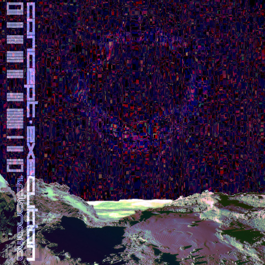
research & development is ongoing
since using jukebox for sampling material on albedo, i've been increasingly interested in ethically using ai as a tool to incorporate more into my own artwork. recently i've been experimenting with "commoncanvas", a stable diffusion model trained entirely on works in the creative commons. though i do not believe legality and ethics are equivalent, this provides me peace of mind that all of the training data was used consensually through the terms of the creative commons license. here's the paper on it for those who are curious! shoutout to @reachartwork for the inspiration & her informative posts about her process!
part 1: overview
i usually post finished works, so today i want to go more in depth & document the process of experimentation with a new medium. this is going to be a long and image-heavy post, most of it will be under the cut & i'll do my best to keep all the image descriptions concise.
for a point of reference, here is a digital collage i made a few weeks ago for the album i just released (shameless self promo), using photos from wikimedia commons and a render of a 3d model i made in blender:
and here are two images i made with the help of common canvas (though i did a lot of editing and post-processing, more on that process in a future post):

more about my process & findings under the cut, so this post doesn't get too long:
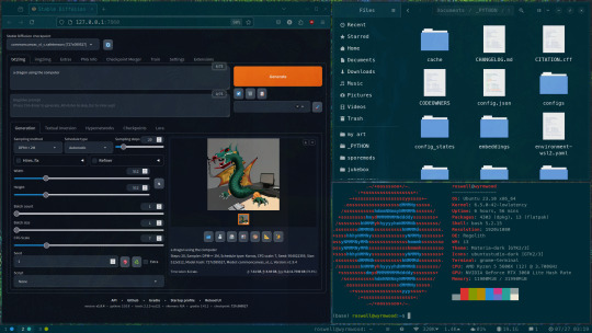
quick note for my setup: i am running this model locally on my own machine (rtx 3060, ubuntu 23.10), using the automatic1111 web ui. if you are on the same version of ubuntu as i am, note that you will probably have to build python 3.10.6 yourself (and be sure to use 'make altinstall' instead of 'make install' and change the line in the webui to use 'python3.10' instead of 'python3'. just mentioning this here because nobody else i could find had this exact problem and i had to figure it out myself)
part 2: initial exploration
all the images i'll be showing here are the raw outputs of the prompts given, with no retouching/regenerating/etc.
so: commoncanvas has 2 different types of models, the "C" and "NC" models, trained on their database of works under the CC Commercial and Non-Commercial licenses, respectively (i think the NC dataset also includes the commercial license works, but i may be wrong). the NC model is larger, but both have their unique strengths:
"a cat on the computer", "C" model
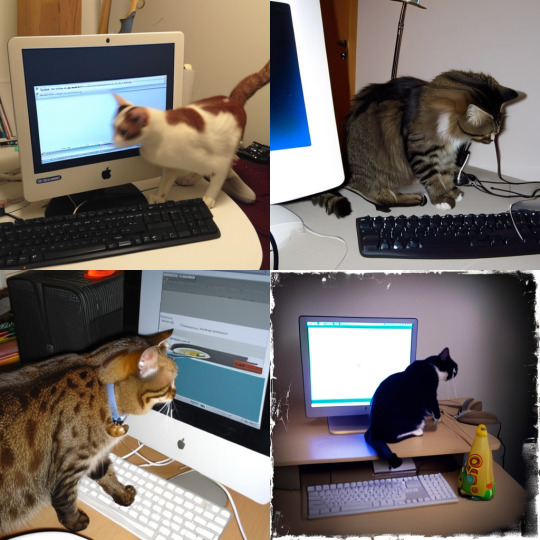
"a cat on the computer", "NC" model
they both take the same amount of time to generate (17 seconds for four 512x512 images on my 3060). if you're really looking for that early ai jank, go for the commercial model. one thing i really like about commoncanvas is that it's really good at reproducing the styles of photography i find most artistically compelling: photos taken by scientists and amateurs. (the following images will be described in the captions to avoid redundancy):
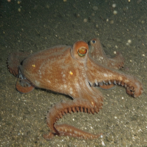
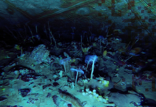
"grainy deep-sea rover photo of an octopus", "NC" model. note the motion blur on the marine snow, greenish lighting and harsh shadows here, like you see in photos taken by those rover submarines that scientists use to take photos of deep sea creatures (and less like ocean photography done for purely artistic reasons, which usually has better lighting and looks cleaner). the anatomy sucks, but the lighting and environment is perfect.
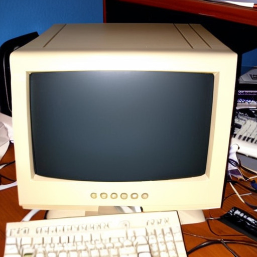
"beige computer on messy desk", "NC" model. the reflection of the flash on the screen, the reddish-brown wood, and the awkward angle and framing are all reminiscent of a photo taken by a forum user with a cheap digital camera in 2007.
so the noncommercial model is great for vernacular and scientific photography. what's the commercial model good for?
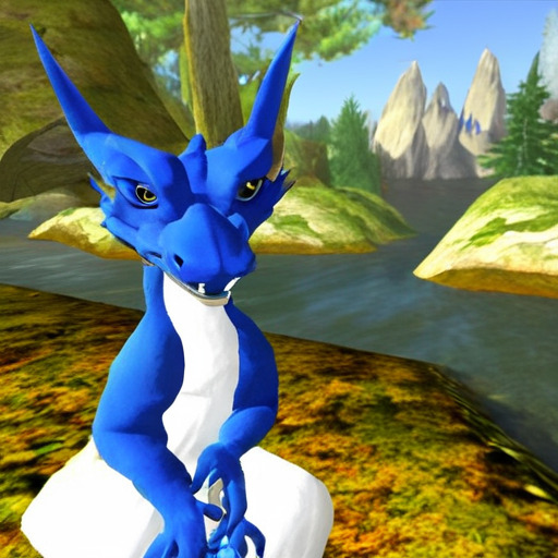
"blue dragon sitting on a stone by a river", "C" model. it's good for bad CGI dragons. whenever i request dragons of the commercial model, i either get things that look like photographs of toys/statues, or i get gamecube type CGI, and i love it.

here are two little green freaks i got while trying to refine a prompt to generate my fursona. (i never succeeded, and i forget the exact prompt i used). these look like spore creations and the background looks like a bryce render. i really don't know why there's so much bad cgi in the datasets and why the model loves going for cgi specifically for dragons, but it got me thinking...
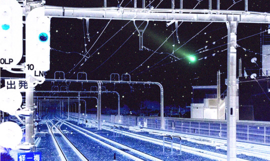
"hollow tree in a magical forest, video game screenshot", "C" model
"knights in a dungeon, video game screenshot", "C" model
i love the dreamlike video game environments and strange CGI characters it produces-- it hits that specific era of video games that i grew up with super well.
part 3: use cases
if you've seen any of the visual art i've done to accompany my music projects, you know that i love making digital collages of surreal landscapes:
(this post is getting image heavy so i'll wrap up soon)
i'm interested in using this technology more, not as a replacement for my digital collage art, but along with it as just another tool in my toolbox. and of course...
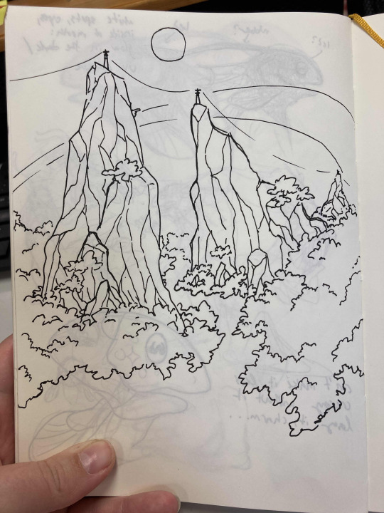
... this isn't out of lack of skill to imagine or draw scifi/fantasy landscapes.
thank you for reading such a long post! i hope you got something out of this post; i think it's a good look into the "experimentation phase" of getting into a new medium. i'm not going into my post-processing / GIMP stuff in this post because it's already so long, but let me know if you want another post going into that!
good-faith discussion and questions are encouraged but i will disable comments if you don't behave yourselves. be kind to each other and keep it P.L.U.R.
193 notes
·
View notes
Note
Thank you for getting me to finally try pixel art! I‘ve always wanted to get into pixel art but I never knew what to start with and always ended up procrastinating. Your blog and the post you made on learning pixel art were what finally pushed me to give it a go. It was really helpful and I managed this little animation in Libresprite.

I definitely want to improve and your art is like the ultimate goal lol. Do you have any tips or instructions for how to get better or on what to focus on in the future? I‘d appreciate any kind of criticism/input you are willing to give! How do you manage to make such gigantic and beautiful landscapes?
thank you!! and i'm so happy you decided to give it a real go, you're doing great already!! the rendering on the body and the pink shading is really nice.
i can help a little with animation stuff but i'm not an expert, ill write something out about backgrounds at the end
i hope you don't mind but i edited the sprite a little, just to illustrate some stuff
🤺Animation stuff

i added an extra frame near the top of the arc so it slows down. this is called ease or slow in/out and usually happens at the beginning and end of movements. u can do even more slow but this is just a quick version
i also removed the middle frame (where the tail is straight down) to make the swing appear a bit more powerful. this could be the principle of timing in the same video. you can exaggerate smears if you do this, its up to you!! lately i tend to exaggerate stuff a lot, things arent super noticable in motion
i also got a good bit of advice from nickwoz that helped me, basically when you begin to animate, it really puts the rest of the sprite being still into focus. try to think of how you could animate other parts of the body, even subtly. and sometimes if individual pixels stay still they can catch the eye in an unintended way as well, just keep it in mind!!
if you want to learn animation more, you could take a look at duelyst sprites, they have incredible idle and ability animations, i study them a lot

heres one i downloaded a long time ago. i recommend just downloading stuff you like and looking at it!! i have a huge collection of pixel inspo. slowing animations down can really help you understand whats going on. its just a bunch of simple elements put together that makes it look so good.
IF U WANT MORE RESOURCES/ARTISTS I REOCMMEND TO GO AND STUDY LMK!!! IM LIKE A WIKIPEDIA, I AM A BIG FAN of pixel art and love to share
🌿 OK lets talk about landscape stuff
it looks like you have art experience already, but im gonna talk as if youre a complete noob cos it might help some other people who read this!! ur doing great 👍
❓ how to learn: study (and practise a lot)
what i mean by study: draw it, copy it, try to understand it. you can try to change characteristics about it. changing the angle or lighting can help u understand how something works in 3 dimensions.
sometimes it takes time, dont worry, you will figure out your own style through doing studies, its all a process
❓ how to draw landscape details?
study pixel artists and how they do it
recommendations: fool, slym, jubilee, deceiver
also please look at real world references!! you got to build that visual library
❓ how to learn composition?
study traditional artists or animation. i did a ton of studies of ghibli backgrounds which i think helped my growth a lot
recommendations: arcane, studio ghibli, traditional painters
im gonna break down a piece as well and maybe that will help. this is one from 2022 but its still one of my most popular and its pretty simple too!!


if we remove all the fancy stuff what we have is actually really simple. just a few large, overlapping shapes that all point towards our focal point. it's the brightest area with the most contrast and many edges point into it.
go to pinterest or google and just search "pretty landscape" or "mountains" or something and you can see what i'm doing is nothing special or unique!! break it down into bigger shapes to begin with, its just different areas of material mostly.

and heres how you can make any landscape from any colours. purple sky or mountain? orange grass? ok !! it all works, it doesnt matter. i just blend the colours.
when parts of the landscape are in the distance they become closer to the sky colour as there is more "sky" in between you and it. its called atmospheric perspective. so if the sky was red, the clouds would fade towards red.
OKKK i dont know what else to say so i hope that helps!! honestly 90% of what i do is intuitive and hard for me to really explain, so you dont have to know The Rules, you just kind of pick up stuff as you go.
GL and thanks so much for showing me your art!! please keep going!! 💕💕💕💕
174 notes
·
View notes
Text
DTIYS Results!
Greetings, circus goers! After so many amazing submissions, it is now time to find out whom I most favoured!
------------------------------------------------------------------------------
First off, Losers!
"What's that?" you say! "Is this not a friendly art competition?"
Well, kids, there are winners and losers in every game. You either die a winner or live long enough to see yourself become a loser. I hope you take that to heart and it affects you deeply for the rest of your adult life.
Anyway! Give a huge round of boos for our loser:
@sm-baby!

Booooooooo, boooooo you suck boooooooo- ahem. Let's not waste too much of our time on this... charlatan, children.
------------------------------------------------------------------------------
RUNNERS UP!
There were so many amazing pieces with their own unique strengths that I wanted to shine some light on!
So, my favourite artists aside from first place were...
(Drumroll)
@grimmtells, who not only made this wonderful putdown of our favourite jester, but also made a toon of their own!


You don't know how grateful I am that people love this au enough to make their own characters! Thank you for your little ego-tripping maniac into this jolly jack-in-the-box!
@mangotangerinepastry, for their lovely rendering and animation!

Trust me when I say it was a very difficult decision between you and our first place winner!
@dreamybasil, who made this adorable comic!

Poor Pomni, suffering from success.
And finally,
@notyesterdays-era with some Pomni-ception!


He's a little confused, but he's got spirit.
------------------------------------------------------------------------------------------------------------------------------------------------------------
Alright, ladies and Gents! the moment you've been waiting for, our first place winner:
(more extravagant drumroll)
@cruising-cats with this amazing animation!

A fully coloured background, the spotlight fading in and out, the floating bubbles and of course, Pomni and our Plucky performer braving the tightrope, this was most certainly my favourite interpretation!
Be sure to message me with an image reference of what you'd like me to sketch!
Thank you all so much for participating! I honestly never expected this au to get as big as it has, so I hope this reboot will be worth the wait! (and hopefully draw in new fans!)
Ta Ta for now!
209 notes
·
View notes
Text
[Click image for better quality]
I FIGURED OUT A WAY TO FUCKING MAKE THE IMAGE SMALLER FOR POSTING ON TUMBLR WITHOUT SACRIFICING THE ACTUAL QUALITY OF THE IMAGE OH MY GOD
Ok so, what I did is go into the clip studio paint file, make a new file, copy and paste the group in the original file, merge everything, get rid of the extra stuff outside of the canvas, and then make the flattened image smaller and crop the canvas. Once you have that, export it and you're done. This helps maintain the actual quality of the image and also helps shrink the file size down to something actually postable (if anyone has a better way of doing this please tell me)
[Edit]: Ok I guess posting something to Tumblr just naturally compresses the image a bit more somehow because I'm looking at it now and zooming in too much makes it a bit blurry so I'm still gonna have to futz around with image quality for future pieces oof
Artist's Note:
I'm so glad I figured out a way to do this because I like working on a big canvas so I can get as much detail in as I possibly can. Only problems are how laggy it gets while drawing lol.
I had an idea for a drawing with Reimu and Zanmu because I really like thinking about their potential dynamic a lot. I also wanted an excuse to draw Zanmu again but in my normal rendering style because last time I drew her she was in my more sketchy style with generally flat colours so I wanted to draw her again. Speaking of, looking at the sketch for this is a jumpscare that I never enjoy seeing, like, man am I glad I didn't use those for my final piece.
Also about her spear. I was originally gonna make it like the ones she had in game, but it kinda threw off the whole piece. It was too big, too blue, and too flat, so I just went "fuck it" and gave her a different one instead. My headcanon justifying this is that the ones she uses in game are for danmaku battles whereas in any other fight she just uses a proper yari, or she still uses the yari and just makes it all glowy to power it up, maybe both lol. I pulled as much inspiration as I could from Sengoku era spears, and even put in some blue into the decorative part of the spear and also added a little skull to pay tribute to the original spear. Also, in my research I saw some art of izanami and izanagi making japan and saw that the yari izanagi has had a little decorative tassley thingy on it so I took some inspo from that and just made it one of Zanmu's tassles (Idk when that art was from or if the spear was still accurate to Sengoku period Japan but hey, probably the same reasons Eirin puts little bow ties on her arrows, it's just for personalization purposes).
I love rendering hair and clothes so much omg, while I like the super curly hair Zanmu, the longer, wavier hair suits her better for this drawing (I imagine it only does that like how Ghibli characters hair moves when they feel angry lol). I love making Zanmu's hair all messy and crazy, as well as giving her grey hairs, this woman has aged like a fine wine. Also, if the hem on the ends of her sleeves, top of her shirt, and her pants look like gold to you, that's because it is! It's fairly light so she's not collapsing under the weight, but it's gold! (I don't care how impractical it is, it's just cool). Not the undershirt though, it's made of a gold fabric. I had a cute idea with Reimu's hair to make it have a red shine to it. I also changed up Reimu's outfit so it isn't just a blob of red. I like it a lot when Reimu's skirt and outfit is segmented into different layers, so I wanted to incorporate that.
I tried to draw their hands differently as well, but IDK how noticeable that is. Also, I am super happy with how the side profiles for the two of them turned out, I used to struggle a lot with how to make the side profile of a character actually look like the character, so I'm really happy that they actually look like themselves.
Also added in the tree and rocks in the background as an homage to Zanmu's character art in Touhou 19, just because I was getting kinda stumped on what to do with the background lol.
In terms of a story idea with Reimu and Zanmu, idk why but the potential plotline of Zanmu wanting to ascend to godhood is so fascinating to me. Like, it is very possible that if she just convinced everyone she was a god (which would be very easy for her to do), she would become one in a heartbeat. Also, if she were to become a god, with her ability to return stuff to nothing, could she hypothetically get similar abilities to (Jojo Part 5 spoiler btw) GER? Like, idk about the death timeloop stuff, but the concept has been haunting me every night as I have been trying to find loopholes in GER's ability for a while now ( for no reason in particular). Back to the main topic, I imagine that she would probably tell Reimu that if she were to become a god she would take over the Hakurei shrine since the god there might as well be dead, and Reimu just says to her, "Over my dead body bitch." Like, I have no idea how to summarize their dynamic but like, it's the type of hero-villain dynamic where the phrase "We're not so different, you and I" would definitely be a phrase said during a fight. I think that if another IN style game were to release, Reimu and Zanmu would be in a team together. They could also have an interesting mentor and pupil kind of dynamic. Can you tell that Zanmu has been charging my mind rent these part few months? Like, instead of living in my head rent free, she kinda just uno reversed the whole situation and now she's the one charging me rent. What happens if I get evicted from my own brain? Actually, scratch that, I don't think I wanna know.
#touhou project#art#fanart#touhou fanart#touhou 19#touhou#東方project#zanmu nippaku#unfinished dream of all living ghost#reimu hakurei#東方
274 notes
·
View notes
Text
-FAQ-
Hello! I've gained a whole bunch of followers lately and I've been getting a lot of questions about commissions, what my setup is, what brushes I use, etc, so I thought I'd make a post about it to answer everyone's questions at once !
Putting them under the cut <3
Commissions:
Commission prices are listed in my pinned post. You can send me a private message about your commission idea and we can get to talking :) It is helpful to have enough references handy (character, outfit, descriptions etc)
I am generally a fast drawer but I also have a job and a physical disability so there might be moments I can't work on your commission. But that is never longer than a few days at most.
Payment is upfront, the full amount and via paypal only. I know this might seem a bit scary but unfortunately there are a lot of people who end up not paying for commissions and I want to avoid that.
During the process I will send you frequent updates and will ask for input, to see if it is going in the direction you want. You can ask for changes during the sketching progress but once I've started on line-art and coloring, no big changes will happen. (You can for example ask for a different color for a shirt etc, but not for a different prop or pose or expression)
When it is completed, I will send the drawing to you via email. The drawing will remain mine and it is not to be sold or profited of by the person who commissioned me. If the commission is for something commercial/for selling, that needs to be discussed. I prefer to do drawings only for personal use!
For more questions, my dms/asks are open :)
How long have I been doing digital art:
I've been drawing digitally for about 5 years now i think? But before that I've been drawing and painting traditionally literally since the moment I could pick up a pencil.
Set-up:
It's just me and my ipad and apple pencil laying on my bed. I wouldn't even know where to begin for those whole multi-monitor/screen setups ;-; I draw only with Procreate
Brushes:
I tend to play with different brushes from time to time to get different textures, but generally i use the same few for most of my drawings/styles. My favorite one is the Peppermint Brush, for sketching. I use it in every drawing i make! I always sketch with it, and often do the line-art with it as well! And it makes for a nice textured brush for rendering as well! (i used it for a lot of rendering of the armor in this drawing)
The (procreate) brushes i use a lot are
for medieval style:
inking - Ink Bleed (for line-art)
artistic - Quoll (for coloring)
for general style:
calligraphy - Chalk (coloring/rendering)
sketching - Peppermint (line-art/sketching)
for realism:
calligraphy - Shale Brush (full rendering) Also using the shale brush for smudging and erasing when drawing realistic
for lineart:
smooth pencil from this pack by Heygiudi
How/why do you choose a base color:
I tend to look at a few different things when deciding on a base color/color palette.
the overall color of the reference pic
the color i associate with who or what i am drawing
the feeling/vibe i want to give off with that drawing
color has a BIG impact on the vibe of a drawing, so it is something i keep in mind when im drawing.
Using a color as a base to start, helps a lot with my drawing process. It helps me pick out other colors so they match better. It helps me get light/dark values right. And the chalk brush i use, has gaps between the strokes, so the base color will always come through a little. Having the same color come through in the entire drawing, helps pull all the colors together if that makes sense? I always start with a solid base color when i am painting traditionally as well!
Advice:
PRACTICE!!! just keep drawing and practice. I know this is such generic advice but truly practice is The Way. Learn from other artists but don't compare yourself to them. Everyone's artistic journey is different and there's no "good" or "bad". And most importantly make sure that you have fun when you're making stuff :3
I also learn a lot by studying art I admire and love. Figuring out what it is I like about it. (for example, the line thickness or the shapes or texture etc), and try to incorporate that in my own style in a way that is not directly copying or stealing.
#my art#FAQ#frequently asked questions#art process#art tips#drawing process#procreate#brushes#commission info
767 notes
·
View notes
Text
Rough Day Comic 0-1 "Other Talents"
💗PLEASE REBLOG TO SUPPORT!💗
SERIES MASTERLIST
Based on Rough Day by @no-droids
SERIES GEN WARNINGS: non-canon typical gore/blood, violence, light language, implied nudity, implied trauma (Blood, depression, anxiety, bullying, sexual), typos and general lore errors possible (plz lmk if you find any I enjoy accuracy)
See end for bonus content and credits.
LISTEN TO THE ACCOMPANYING MUSIC FOR A CINEMATIC EXPERIENCE! (LINKED AS YOU GO)
TRACK 1: REPROGRAM (only track til end credits)

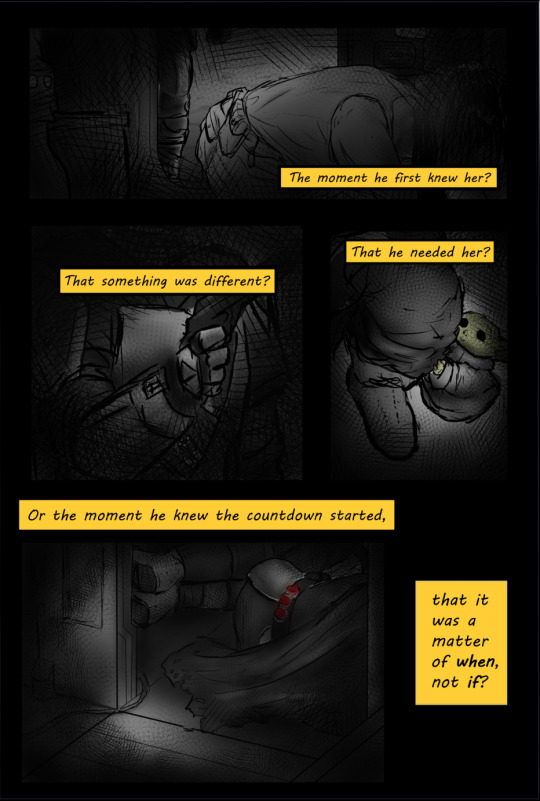
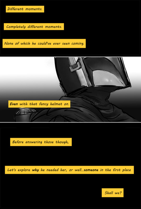
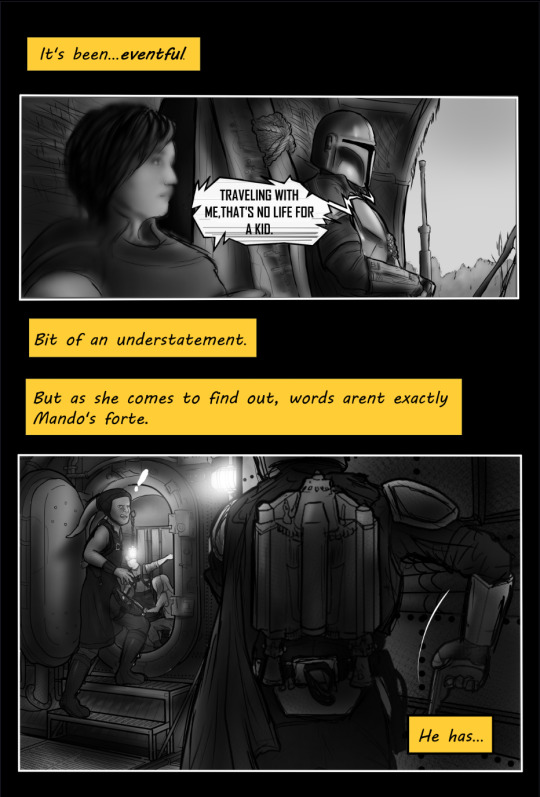
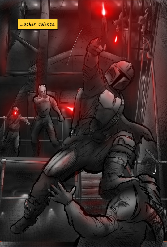
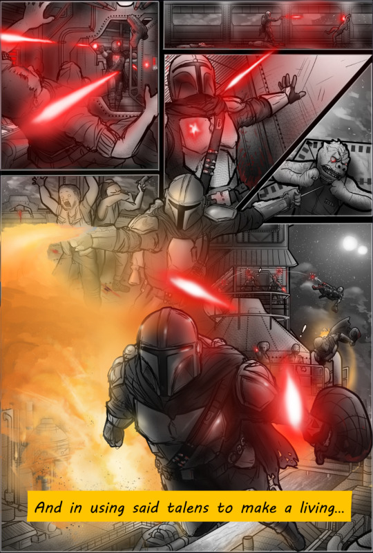
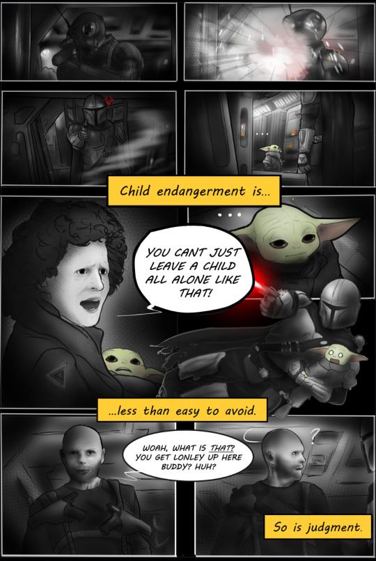
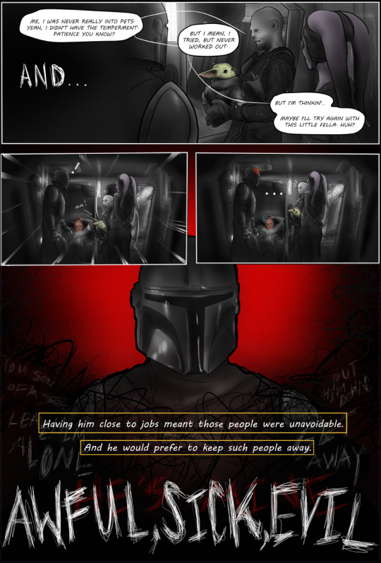
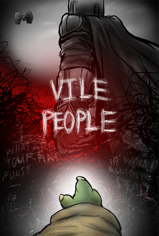
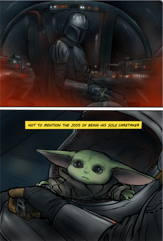
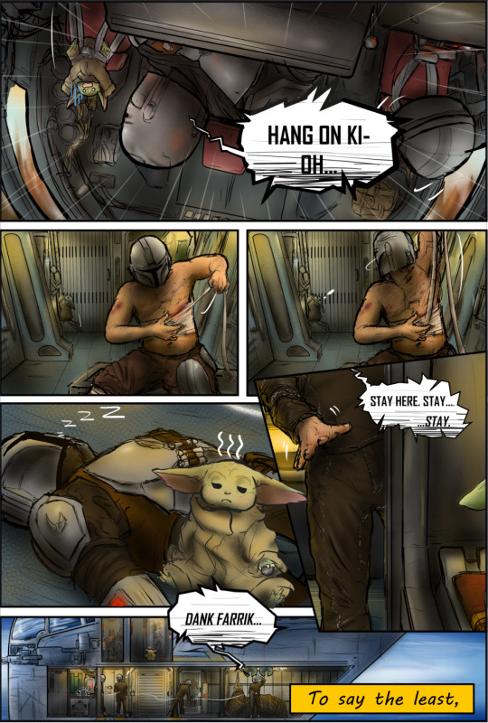
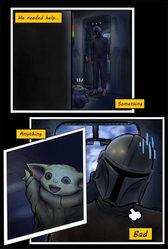
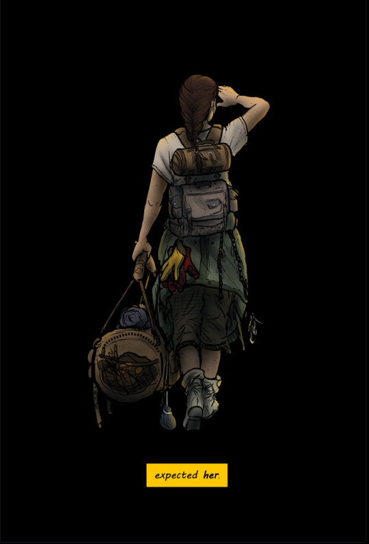

END CREDITS TRACK: A FRIEND -GUITAR COVER
Up Next: CH 0-2: "Rules and Habits"
"And yet, only when she was absolutely certain he wouldn't see ...shed let that nagging curiosity get the better of her, make an exception...and-"

AUTHORS NOTE:
Well, this is the moment we've all been waiting for, sickos! I'm so proud of what Ive learned and been to accomplish these past few weeks (digital-art and writing in general), and have so much gratitude for all of the wonderful people who have followed along and encouraged me thus far. Most of all, thank you to the wonderful @no-droids for creating the fic in the first place. I cant wait to continue posting what's in store these next few (probably) years.
Thanks so much for reading! I hope you'll consider checking out my homepage for updates, sneek peeks, more depravity, the star wars mega-pinterest boards, and the unofficial soundtrack! 💗
Next chapter coming.....whenever its ready...in-person school is aboutta start and im going to pace myself and figure out how to balance going in person for the first time in a year...workin' and well...life, which includes this depravity and you all 💗!!!
Cheers, Sweet Girls. 💗
-M (@roughdaysandart)

CREATOR CREDITS
Credit to @saradika-graphics for the amazing dividers!
Credit to all of the talented artists making covers of the songs I link!
Credit to Brittany Broski for introducing me to RD/Ao3 this late in my life
Credit to...anyone else my mushy brain forgot (lmk ya'll)
credit to my drug-induced psychosis?
ERRORS/DISCREPENCIES/INNACURACIES (feel free to add)
Sweet Girl was drawn on the cover before her design was finalized, and so her clothing as well as her body are not exactly the same as how she appears in the series.
On page 5, Din is supposed to be laying in the cockpit's main compartment listening to the closed door, not in the mini hall where the ladder resides.
on page 9, there is a spelling error (talens--> talents)
On page 12, the rendering of the Crest's hull is a bit too wide (most dramatically apparent by the fresher door's length), the hull should be a tad more narrow. In addition, the flooring coloring is somewhat inaccurate, needing to appear more metallic instead of similar to the roofing textures and colorings
On page 12, the handle of the fresher door is supposed to be on the left side, not the right.
Speaking of the handle: I understand that manual doors are somewhat uncommon in the SWU, and it would be inconsistent for the Crest to have one when the cockpit and cot doors are auto, but I wanted to stay consistent with the descriptions in the original fic. In chapter 2, SG is described to slide open the door with her hand as she sees Mando standing outside. But I didint want to just purley stick to the fic's details and ignore in-universe discrepancies, so i thought of how this somewhat odd/niche detail could still make sense in this setting. I figured that with the inclusion of a control panel within the fresher (seen in later chapters) in addition to the one bewteen it and the cot, the option of an automatic function would presumably still be available aside from the manual one (which could be there for the purpose of giving the user a speed or distance preference or to avoid pinching etc.)
on the page beginning with "to say the least", the mini-halls' roof is suppposed to have a window. Therefore, the lighting of the space is somewhat innacurate.
#rough day comic#rough day fanfic#mando#the mandolorian#mando fanfiction#the mandolarian#mando x reader#mandotsecurities#din djarin#din dijarin x reader#din dijarin fanfiction#din darjin#din djaren#the mandalorian#ao3 fanfic#fanfic#rough day#pedro pascal characters#pedro pascal#pedrohub#pedrito#star wars fanfiction#star wars fanart#star wars#sw fanart#sw art#sw fic#sweet girl#disney#din and grogu
182 notes
·
View notes
Last Seen Blogs

thengb
NGB

siam-computing-blog
Untitled

twinkpeaks
twinkpeaks
aizawabuttdandruff
Aziwabuttdadruff

halfdaymoon
Art Journal