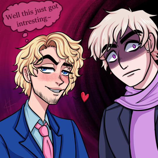
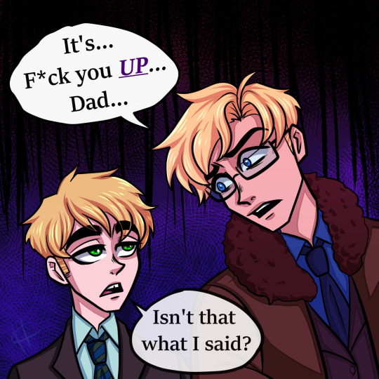
#alfred vargas
Explore tagged Tumblr posts
bubblyernie · 7 months ago
Text
Tumblr media
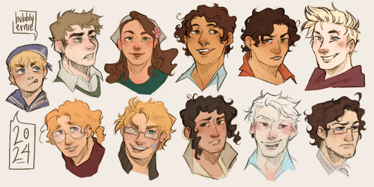
Bro was rent asunder. Thanks for all the requests guys!! We're SOOOO BACK
art tag // commission info
1K notes · View notes
hetalia-club · 5 months ago
Text
Tumblr media
It's them
755 notes · View notes
nordic-italian-german · 3 days ago
Text
Tumblr media Tumblr media Tumblr media Tumblr media Tumblr media Tumblr media Tumblr media Tumblr media
'Not-so-scary monster encyclopedia' 👻
Halloween doodles by Himaruya Hidekaz
293 notes · View notes
vamprwave · 8 months ago
Text
Tumblr media
Sigh...
472 notes · View notes
snoozerin · 8 months ago
Text
Tumblr media
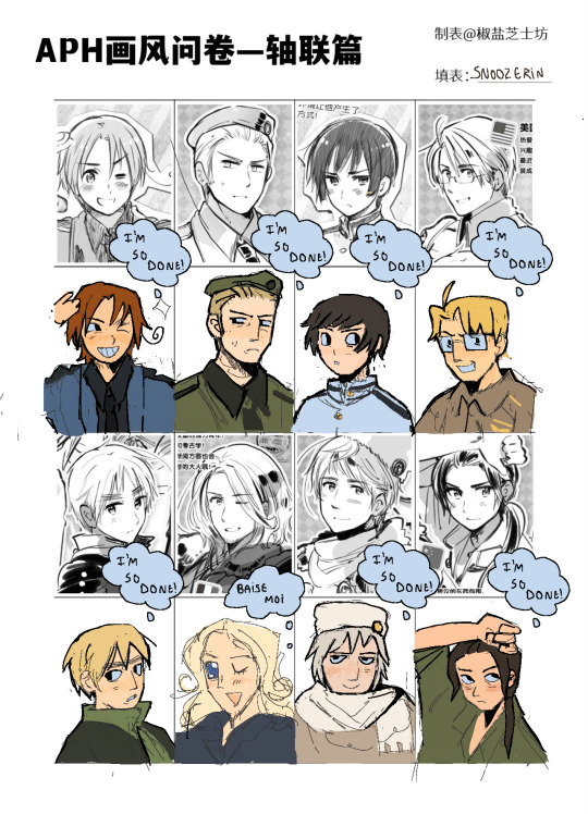
How ants look at you when you lift up a rock
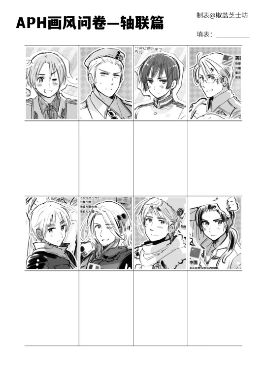
Tumblr media
590 notes · View notes
amarshelli · 2 months ago
Text
Tumblr media
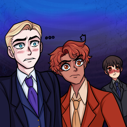
Roaring 20s trio :3
222 notes · View notes
nadohunter · 10 months ago
Text
Tumblr media Tumblr media Tumblr media Tumblr media
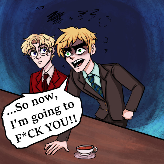
Uh.... Maybe it was a Freudian slip... (Based on that moment from the last episode of Hazbin Hotel bc I had to...)
463 notes · View notes
alloydia · 1 year ago
Text
Tumblr media
2K notes · View notes
itstokkii · 2 months ago
Text
rating the new flower pop up outfits as a fashion major
what the title says
Tumblr media
Spain
Tumblr media
im ngl spains one is actually my favorite, and I think is the best out of all of these. this is because:
he has an established style/fashion sense throughout these pop-up events
the flared train at the back is a unique twist that's nice to look at
the color theme is consistent throughout, shades of similar dark red, and pink and white as accent colors
my only complaint is that the flowers aren't central to his outfit, but this is a complaint I have with all the outfits. if this is about the countries' national flowers, it should go with the design and not as an afterthought.
FINAL POINT: 9/10
China
Tumblr media
I love the flower patterns on the inside of his cape! his design is rather nice
this is where the compliments end because now I have issues:
what is up with this color scheme? the white boots throw everything off, both design wise and color. the peach pink could be a little darker as well, like how spain has visibly different shades of red but they work well together because they look similar to each other.
balance in a design is incredibly important. the pieces need to look unified and not like a bunch of different pieces forced on as a single outfit. the color and pattern on the inside of the cape could be used on the blazer replacing the peach pink, whereas the notch collar and lapel could remain as peach pink. this way, the outfit is unified while the peach pink adds a pop of color as contrast. the cuffs could potentially be a different piece cut of the peach pink fabric and sewed onto the end of the sleeve.
his pants are very high waisted, it looks odd. either keep his pants high waisted and make the blazer longer, or lower the pants a little. short blazers can work in certain situations, but it's not doing anything here.
honestly I just wanna know what was the designing process behind this
FINAL POINT: 6/10
France
Tumblr media
I love the light blue, white, and cream color scheme here! this is maybe, next to spain's, the best color scheme. the flower placement works and is still a noticeable detail in his design.
additionally, the colors are applied in a way that keeps the design balanced and unified. the bottom is cream, and the top has a cravat of the same color. the dress shoes is a good contrast that still works due to how light the brown is. the cape is blue, which is reflected in his cravat brooch. a small detail, but it works so well. we also have his belt/girdle that's a baby blue and it also works to unify the design, even though it's slightly lighter than the cape and brooch. the cape and pants are light and easy on the eyes, and help keep the design grounded and not washed out. the gold accents are subtle and are placed at the top and the belt.
design wise, I do wonder if there's something more that could have been done to his bottoms...the top gives the perfectly princely feel, the bottom feels so plain in comparison..
FINAL POINT: 9/10
America
Tumblr media
since there's nothing good about his design, let's skip to the bullet points already:
the color scheme is atrocious. purple and green...works if you try hard enough. but the blue?? on his shoes?? what?? I assume it was an attempt at unification with the blue pinstripes...an attempt. I would change the color of his waistcoat to match his shoes, since it's much easier to work with purple and blue than purple and green
the pinstripes were certainly a choice. I would've gotten rid of them completely and replaced it with maybe some white or gold trim at the hem and sleeves.
the flowers are placed in such a lackluster way, when it could have maybe been a design detail of flowers spaced out at the top and then collecting at the bottom of his jacket, with a few flowers spaced out at the top of his pants to balance the outfit.
once again, there is no focus or an established sense/style for him. from what I'm seeing across many pop-up events, the idea or "vibe" is a childish, sleazy(??) vibe. but that's very vague, and they would need to further outline common elements/looks they could refer back to when designing anything for him.
FINAL POINT: 2/10 my goodness
Germany
Tumblr media
I like his design a lot, it fits his personality well! the gold trim and buttons is a nice touch that helps balance the top and bottom. the color scheme is an unexpected surprise, since in my mind he's wearing green always..? but I guess in the hws anime, he wears a blue suit.
I do wish the suit was a different shade of blue, like a slightly lighter shade, since the stark blue and yellow feel very in-your-face like Ikea, and since the flowers feel like a blue plum, this really deep, dark shade of blue just feels like a bit too much.
my other only issue with this is honestly the flower placement. I see that they were trying to balance the placement on the left and right, but it covers up important design details like the gold trim on the shoulder and the viennese seam.
FINAL POINT: 7/10
Italy
Tumblr media
it honestly feels so similar to the sweets parade pop up, so i really don't know how to feel. especially the train/cape detail that was in both. that doesn't immediately mean this is bad, though
I do like the train here because it's such a reflection of his personality!
it's nice how they try to balance the top and bottom through the same patterns on the waistcoat and train. the pants however...
the pants throw it off. they could have gotten rid of the stripe pattern and it would have been fine.
the jacket being white isn't necessarily a bad thing, but I have issues with the lapel and collar having a green stripe. it's very stark and isn't enough to balance the jacket with the pants and blouse. the white and green needs to be swapped, i can't see it working any other way. a white blouse would still work with a yellow waistcoat and orange bow, and the green unifies the top and bottom. the only problem with this is figuring out how well this works with the orange on the inside of the jacket train...
the flower is very tiny despite being in the middle, and would need to be placed in a way that is noticeable. my initial thought was one or two daisies as lapel pins(bigger than the daisy on the bow) connected by a gold chain...perhaps the bow-daisy design detail could be added at the top of his boots?
FINAL POINT: 6/10
Japan
Tumblr media
*grits teeth in korean* he's pretty charming here i gotta give him that
the pink-green is ATROCIOUS. different shades of pink and green would have worked. they chose a colder pink with a colder green and it just clashes so hard. this cold pink also clashes with the warm magenta. the pink and green are extremely light, and would benefit from being more prominent and warmer shades.
there is no balance because below that is just white with gold details. the white just eats everything up, especially because the pink and green are extremely light shades. the cuffed hem at the bottom of the pants are fine, but the rest of the pants would work better in pink or green. or fine, keep the pants. but the shoes better be in green or pink.
the inside of the cape is way too light, and alongside the pants and shoes, eats the other colors up. I would make the pattern on the inside a gold trim, and the background a more prominent pink.
again, the flower here is really tiny. cherry blossoms aren't known for their size, but if the whole point of this is highlighting the nations' flowers, the flowers should be a bigger deal that the design works around, not an afterthought. I'd add cherry blossom petals onto the pants, spaced out so it looks like they're falling to the bottom.
FINAL POINT: 5/10 good lord the white
England
Tumblr media
THIS DESIGN. i have the BIGGEST BEEF with it its a designers NIGHTMARE
where is the balance? i'm supposed to expect these dark plaid pants to work with the light red roses? why is this plaid? where is plaid anywhere else in this design? if the top is white what is unifying this design?
to fix this problem i'd burn the plaid pants. but if that's not an option, i'd give him a plaid waistcoat. but honestly, burn the plaid pants. NOW.
there has to be a better way to incorporate the roses into this design. i'm thinking a dark red coat with gold rose trim, and removing the lone rose at the bottom of his top. also the roses gotta be the same dark red as his pants.
the frills are also excessive. cmon man.
FINAL POINT: 2/10 something something like father like son
Russia
Tumblr media
*grits teeth in uzbek* he really is a dapper lil man...
so first off this color scheme is wonderful. for a guy associated with winter constantly, the sunny yellow and green matches his sort of...enthusiastic attitude?? however there is one(1) issue I have with it. the yellow would look better as a warmer, slightly golden yellow. because right now it looks more like paint yellow than sunny yellow. some of the light green could benefit from being a similar shade as the forest green at the hem of his pants.
the balance is there in the brown and green pants and the brown waistcoat. the green details are well placed throughout the jacket and looks great. the hat is a nice accessory that ties everything together. I don't know if the yellow jacket is overwhelming the brown bottoms, or if it's just me having issues with the shade of yellow... because if the yellow was warmer, it could work with the warm brown pants?
Instead of the gems on the chain of his pants, it could be sunflowers? there's so many opportunities to incorporate the sunflowers, but it was missed...
FINAL POINT: 8/10
Prussia
Tumblr media
i'm sorry to say but oh...oh my goodness this is actually terrible i actually don't know where to start
it's blue everywhere. the shoes are the only breath of fresh air. but then you look at the overall design and wonder why these colors were chosen.
these shades of blue don't unify this outfit. the waistcoat is a colder blue compared to the pants. also, the random flower pattern on the shoulders? nobody asked prussia pack up and go home. there's silver stripes on the side of his pants. that could have been the color of the flower chain instead of?? brown??
I love the flower chain though im ngl
there has to be some sort of secondary color that's prominent enough to balance the outfit properly. there is none here so I'm just very lost like i don't know how to save this outfit.
i'm wondering if a dark blue and red would work(thinking about his military fit from world twinkle).
FINAL POINT: 0/10 (why are you even here? you're just a province now)
Common issues
Color schemes
Balancing outfit
Minimal flower placement(I would personally design their outfits to resemble the silhouette of their national flower in some way, and perhaps use ouji fashion as a base for inspiration)
In fashion school you're taught that customer profiles are important when designing for someone, and to think of key elements in each design to keep it consistent to the profile. they need to start doing that
anyway that's it follow my soundcloud etc
137 notes · View notes
kumamooko · 4 months ago
Text
there's this old romerica art i sent to the shadow realm because i have no motivation to finish, enjoy!
Tumblr media
168 notes · View notes
achieve-the-sun · 1 year ago
Text
Tumblr media
I haven’t drawn the whole gang in a while!! This was a fun exercise✨
Template by @oplusplus , blank one under the cut!
Tumblr media
657 notes · View notes
keiksy-cake · 9 days ago
Text
Lunatic Blue Ch 9 (Gore TW || Hetalia Doujinshi)
Tumblr media
YEAHHHHH AFTER 4 YEARS. 4 YEARS. 4 YEARS.
木綿ドゥフ does it again with another very incredible chapter~ I missed this series so much! The wait was definitely worth it, this chapters as great as the others! I wish I could've finished it faster, I even put My Arika on hold lol, but I had assignments and such D;
There's no gore in this chapter but it's still full of horror and suspense!
If you haven't read this series yet, I HIGHLY recommend it, definitely one of my top top favorites, idk if I like any other more than it. Altho, I started doing a lot to "clean" the pages, which I didn't in the beginning. How much I've grown in both cleaning and translating within this 3 year gap is greatly exemplified in this series... Which is great, but in other words, that also means the first chapters are very drastically... I've been saying for a long time I want to re-do them, I started re-doing the first chapter a couple years back but never finished lol but finally the other day I decided to update it, posting what I have at least. Lets hope my renewed motivation is enough to actually finished...
Since it's been so long, I recommend even those who have read this series to re-read it before reading this one. Anyway, sorry for the long intro! Please enjoy! Here's a list of the prev chapters too:
Lunatic Blue 1
Lunatic Blue 2
Lunatic Blue 3
Lunatic Blue 4
Lunatic Blue 5
Lunatic Blue 6
Lunatic Blue 7
Lunatic Blue 8
Tumblr media Tumblr media Tumblr media Tumblr media Tumblr media Tumblr media Tumblr media Tumblr media Tumblr media Tumblr media Tumblr media Tumblr media Tumblr media Tumblr media Tumblr media Tumblr media Tumblr media Tumblr media Tumblr media Tumblr media Tumblr media
I was too lazy to actually redraw this last page, sorry >.> Look at him mad broody tho lol
Also, I accidentally made this and thought it looked cool so I thought I'd add it in lol:
Tumblr media
Notes:
Rather than "sir", child Alfred calls Arthur "nii-san" which means "older brother", but it's also largely used to refer to any older young man.
Rather than "the excitement" (of space), America says "romance", but I was afraid any young and/or American readers wouldn't get that it's meant in an excitement sense, not like love kind of romance.
I'm still not that great at translating, I had to guess for a lot of the sound effects bc English onomatopoeia sucks D;
The expression I tled to "prideful" literally is "hates to lose"
If anyone wants to make a clean version
I did not make this series, I'm just your friendly neighborhood translator~
89 notes · View notes
hetalia-club · 5 months ago
Text
Tumblr media
yeah...
1K notes · View notes
nordic-italian-german · 7 months ago
Text
Tumblr media Tumblr media Tumblr media Tumblr media Tumblr media Tumblr media Tumblr media Tumblr media Tumblr media Tumblr media Tumblr media
Which dish would you choose? here
423 notes · View notes
butt-wizard · 2 months ago
Text
Tumblr media Tumblr media Tumblr media Tumblr media Tumblr media
Y'know what? Fuck you bro. *homestucks your hetalia*
89 notes · View notes
snoozerin · 8 months ago
Text
Tumblr media
mentally ill people who think they r countries or whatever
497 notes · View notes