#absencepresence
Explore tagged Tumblr posts
Photo
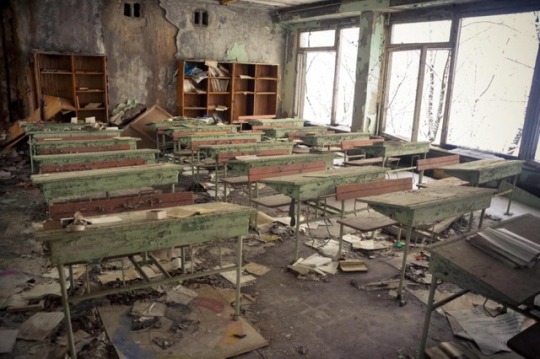
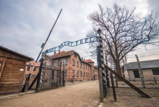
Chernobyl and Auschwitz.
4 notes
·
View notes
Text
Eugene Atget - project
Eugene Atget, French photographer. First time I saw his work on my degree course. When I had a look at his images I found them a bit boring and not really talking to me, however on one of the Photographic Eye lectures I heard the story behind the images. I read about Atget more and he intrueged me. He photographed Paris between 1897-1927, leaving thousands of negatives. Images of traders, stairs, markets, streets, prostitutes, windows, buildings he was kind of photographing everything! One of the first documentary photographers! Over 100 years ago. Imagine, he didn’t have an iPhone or dslr. So he couldn’t just do snap snap. I wonder sometimes how many kilos of equipment he had to carry or if he had an assistant?
As I was going to Paris and my second project started (35mm black and white film - AbsencePresence) I decided to visit some of the places captured by Eugene over a hundred years ago. I went to the exactly same location where Atget was taking his images and I took photograph on my camera of the same place which he took it. Thinking that Eugene Atget was standing here got me a bit excited and more kind of knowledgeable to the space where I was. Very interesting experience which I’m going definitely repeat it at some point. I already print the contact sheet and I’m kind of happy with the results from technical side but not very satisfied about the whole project in general. Not sure if my chosen images should be more categorised into a Past-Presence instead Absence-Presence. There is some of Atget’s photographs:


#westminsteruniversity#photographiceye#eugene atget#documentary#black and white#baphotography#4imag001w#project#absencepresence#presence#absence#streetphotography
3 notes
·
View notes
Photo


The photographer that has inspired me with his work for my next project is Robert Polidori. His exhibition Versailles made me see a different perspective to photography. All the details in his images and the vibrant colors makes them stand out even more. As I am photographing Greek Orthodox churches my aim is to work in a similar way to Robert Polidori, and capture every detail that will make my pictures more interesting. There’s only one difference; I’m shooting with B&W film instead of color.
2 notes
·
View notes
Text
Tom Wood & Nan Goldin notes and cell phone snippets from photobooks
Asa have recommended to check out some photographer’s work before I’m heading to the club scene. It’s almost 8:30pm and my mate haven’t replied, if he managed to organise guest list or bouncer-back up in Heaven, after this post I’m heading home and see what’s going to happen…
I really liked both artist’s work although their work is different from my project brief, all done with flash and colour.

Wood’s project is more an observer’s view on the crowd in the club “Chelsea Reach” - he was shooting there for over 3 years, documenting the stereotypical girls nd boys group, how the two genders are finding, getting close to each other during the nights, the almost tactile tension between them, how the middle class youngsters are pretending to be adults, a showcase on the 80′s fashion, emphasised body language, intimate - like portraits etc.


The ‘sexual’ hunger on the men’s face & glances ( like predators!) are so obvious I had to laugh out loud sometimes. The project is about how Us, human beings are following our basic instincts, of course after some boozing, and how we try to do the best to get the attention of others to get some sort of love night after night…there are some short stories about the club and the people at the end of the book, and a clubber said at the end “is addictive”… A fun photo essay which is always and will be valid forever!


Nan Goldin’s work is a lot more intimate, more sensual, more profound, as her entire oeuvre is like a photo diary.
(I’ve looked at the ‘Ballad of Sexual Dependency’, ‘The Other Side’ & ‘ Nan Goldin by Guido Costa)
Literal glimpses from her life, the motion blur created by the flashlight gives a real authenticity for her subject.Her friend’s, families portraits made me think, if she had her camera with her 24/7…? maybe my people, closest to my heart are coming from a different background but they’d kick me in the face, if I’d take half naked photos of them…but I guess all of the above - her camera was / is? / with her all the time as well as her group of people just got used to the site of a camera - I mean her! although my Mum would never allow me to take ( not to publish! ) a photo like that of her…

I love the energy of this photo, that smile! works with the the muted flash & colours.
She have been a selfie queen as well! Documenting the self’s changes, the environmental / suburban changes is not new ( Friedlander, hellloo) but as camera is directly pointed at the photographer is.

This one was taking just after her ex have beaten her up and almost lost her eye-sight…is it also another way of dealing with her own tragedy, to realise what is happening with her… She has also kept a written diary only not to forget anything on her night outs while taking drugs and drinking with her friends. I don’t even take out my camera after I had a few because I’d just break my camera, I know myself…

Having photographed her gay and transsexual friends during the early 80′s I can relate to the scene quite close…not the same quality but I’ve took this photo of my friends not that long ago :D

It was there first night out as ‘girls’ and they’ve loved it :D


I particularly like this photo - I cannot really explain it why, maybe the inkling shadows on the sheet and the blueish hue on the overall photo brings me back some sort of memories…


I’ve never really like the use of flash on my photos - mostly because of the unflattering sharp tones the flash gives but I’ll definitely push myself to try it again once I’m back on working with DSLR.


and now it’s time to shoot!
I’m back again with the Canon EOS500 camera from the school store - I need autofocus for the low light environment and I cannot use flash either. let’s see what’s going to happen!
#absencepresence#thephotographiceye#visualinspiration#research#colour#flashphotography#documentaryphotography#nangoldin#tomwood
2 notes
·
View notes
Photo
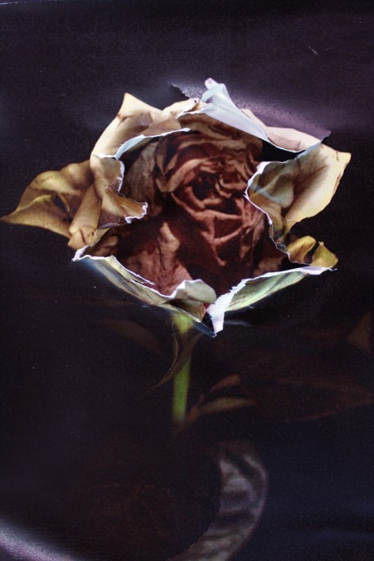
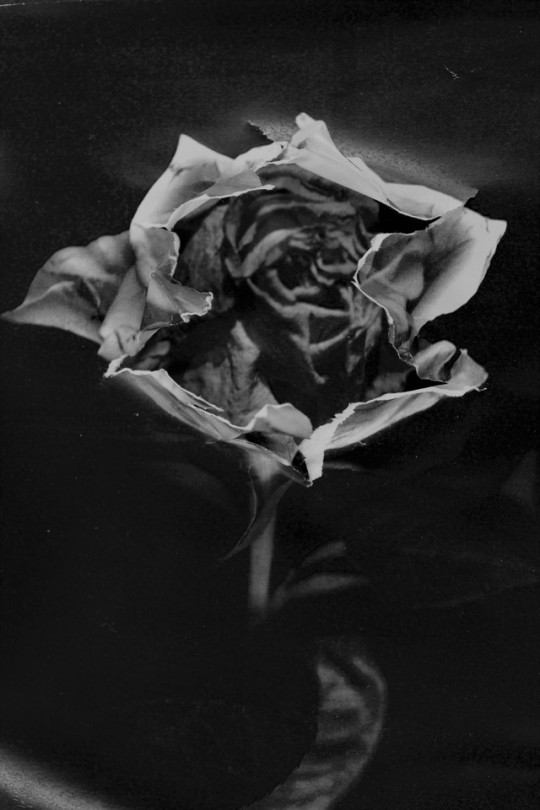
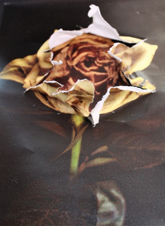
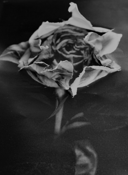
An Absence of Beauty.
Inspired by Mark Jacob Bulford, I attempt to emulate his layering technique in multiple photographs seen here. I came across his work of mind bending distortions and his unique style during A Levels which instantly intrigued me to create my own using this technique as my muse. While creating these reformed images, I focused on manipulating my subject to uncover just how ugly some subjects can be. While analysing my images and assessing every detail, using the same analytical skill we can see that it can portray the superficial and absence of beauty within our society.
1 note
·
View note
Photo

My development of Kingston Market. This image was taken on a film SLR camera before being processed and then developed on a “Pearl” style piece of photographic paper. The image is demonstrating “Absence” and “Presence” because there are displays of this image of areas that are clearly busy during the day but are deserted after shutdown.
0 notes
Photo

another dnd commission, this time for @absencepresent
67 notes
·
View notes
Photo

final images
these are my final 6 images on the studio wall
0 notes
Text
Self Evaluation
Now I have finished printing my final images I can self reflect on how I think I have done.
Overall I don’t think this has been my strongest project, from concept to final outcome. I struggled to come up with something under the umbrella of ‘absence and presence’ and landed on the idea of Absense in people, trying to photograph scenery where it is evident someone has been there and effected that area, or that someone has been there and left something of theirs. In a way, their presence is still there, but themselves are absent.
I thought this idea was alright, and I had a few images I thought well represented this.
Unfortunately, due to fault of my own, never owning or using a film camera, I don’t think I operated it well. I found a lot of my photos were overexposed or out of focus, so I definitely need some time to learn the camera properly. However with the development process, I think I am able to work efficiently. From developing film, enlarging and making the final prints I am very confident.
I think I well pronounced my idea of absence and presence in my photos, and it was more of a technical flaw I suppose on my own part that let this project down.
I believe I should’ve practiced more with my camera, bought more rolls of film, until I was comfortable using the camera before I started thinking about what to do for the project.
The way I “researched” maybe wasn’t the best either (mentioned in a previous blog post) instead of just going out there and shooting, I could have looked at more reference images and inspiration, but I think my concept works regardless. Research into use of a film camera would’ve been very beneficial for this project, if I am required to use film on another project I will no doubt do this before thinking about the concept.
0 notes
Text
BA (Hons) Photography Years 1
Module: 4IMAG001W The Photographic Eye
PROJECT SELF-EVALUATION FORM
Yassen Grigorov
Project Title
Binary // In a way my title didn’t change - throughout the project I was thinking about absence and presence in a very literal way. I focused on trying to represent that through a series of diptychs where a key factor has changed. I immediately thought of computing and the way that relies on clear cut opposites, being zeroes and ones. The title of the project is directly inspired by that.
Subject
For my subjects I chose both people and inanimate objects, and tried to represent them in a purely one dimensional capacity. As an example, a mug does not serve one singular purpose - it can be full, it can be empty; it can be whole, it can be broken; it can be white or black or green or any other colour for that matter, which is to say - there are many variables in play in everything in life. What I’ve tried to do (and I believe photography is a perfect medium for this as it’s a flat, momentary representation of a moment) is to “flatten” my subjects down to a single parameter, and change it.
Aims, Objectives, Concept
I kind of outlined my goal in my last point, so I won’t bore you with repetition. As for how well I’ve done in achieving it, I feel like I could have come up with more as well as more refined interpretations of my concept. I wish I could have expanded more on it, and ended up with more than just these three diptychs, and plan to carry on with it to that end. I’m still struggling with being a slow shooter and I’m getting to grips with going out and shooting as much as I can, paying less mind to how many of the shots I’ll end up actually using in the end. Another blunder of mine was just not coming up with and pursuing this concept early enough in the lifespan of the project, and ending up in a lot of unused material.
Another objective of the project, this one of a purely technical nature, was getting to grips with developing and printing film, which is something that was completely new to me. I feel like I have succeeded in that regard, having learned to cherish and appreciate my time in the darkrooms, as well as having learned some invaluable new skills. My already intense interest in analogue has grown even stronger as a result.
Form, medium, presentation
I’ve chosen diptychs as my form of presentation, which seemed like the only logical choice when thinking about my concept. Originally I was throwing around the idea of triptychs, but I realised that my project relies very heavily on ones and zeroes - I’m trying to represent polar, “OR” states, with no transitional state. I found that a photograph depicting that grey area couldn’t work with the project and would only end up weakening it.
Research Methods
Conceptually the project was mostly a result of my own brainstorming and contemplation, combined with running ideas by fellow artists. I feel like the tipping point for my inspiration was the concept behind Virgil Abloh’s clothing brand “OFF-WHITE”, to quote “Define the grey area between black and white as the color Off-White”. I thought a lot about grey - in morality, in color, in every perceivable situation in life, and decided to flip it all on its head and be one-dimensional and shallow for once, just as an experiment.
In a technical aspect, I learned how to develop and print from my tutors and my peers, also making use of videos online.
References
I didn’t really look to photography as inspiration or as references for this project. Again, it was mostly the result of quiet contemplation and brainstorming. That being said, I probably could have gotten to work under this concept or perhaps a different one, had I explored more work and thought about it within the context of the brief to come up with my own interpretation.
0 notes
Link
Self evaluation
0 notes
Photo
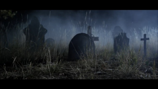
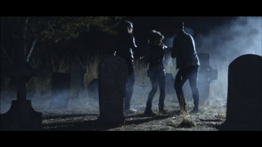
Some inspirational shots from Lindsey Stirlings Music video to Moon Trance.
1 note
·
View note
Photo

There was somewhere a time and the hidden space where reality wasn’t real and the perfect lines got woobly. Movement is been recorded, catched into a one frame, can’t escape now.... There is no time, there is no space .... Were you really there?
#westminsteruniversity#photographiceye#4imag001w#streetphotography#presence#absence#absencepresence#bwphotography#baphotography#black and white#reflection#poem#abstract
1 note
·
View note
Photo

1 note
·
View note
Text
Test prints, awkward scan borders, final prints
I have scanned all my failed and final prints here at the library...the borders have been cut during scanning ( by oddly position them to the edges of the scanner, silly me!), I have tried to recreate them proportionally in Photoshop according to their original size ( I hope it will be visible here uploaded too) but the main thing that I have decided about the final selection.The quality is quite bad as well ( any alteration like restoring the print’s contrast would pixelate the image really badly!) but hey, at least they are not from my phone’s gallery!
I have been playing around with 11 images, 2 of them are out of focus, 3 of them just create a separate series itself and I have left with 6 still life / street photography images.
The out of focus photos
The subject is too far away from the camera so it wouldn’t work with the final theme...

This one would have worked with the final still life theme though

I have been using some ‘post productional’ alterations during printing the images - dodging and burning - here are a couple of examples of some over-dodging technique - on the second one even the border is not straight - the easel might have been loose? anyway, having the borders dead straight was like hoping to win the win the Euro Million lottery - I was adjusting the easel as straight I’d have but a lot of times the light was bleeding underneath the easel’s edges...like on the second image attached below!


Maybe-baby
Here I have the 3 images I quite liked but after overall discussion in the classroom I have decided not to include in the final selection as the human presence on the photos would have alter the still life theme I was aiming for.


I have worked a lot on the last image, having several prints with different crops and burning the shadows was a good lesson too so I feel disappointed having this one out of the final selection!
FINAL PRINTS
I’ve been left with 6 images to present on tomorrow’s showcase.
I am overall happy with the result, I have learnt a lot in the darkroom using 3 x 25 sheets on the project - I will definitely go back to continue to experiment in the darkroom as soon as I’ll have time and the money to practice on printing other projects!
I just wish I would have choose the SATIN resin coated paper as I feel like the PEARL / matt paper I have worked with as having no gloss or reflection on my prints I feel like I have missed out on something...Only I have realised this when I have started the 2nd pack of paper batch and by that time I had some prints ready so I thought it would do for now...


I am not sure how I’d present them on the wall...I need to lay them out play around with layout.
and now I’ll carry on uploading the project proposal and the self-evaluation.
#blackandwhite#darkroom#darkroomfails#contrast#brightness#absencepresence#thephotographiceye#streetphotography#stilllife#firstyear#firstproject
1 note
·
View note
Text
Second Shoot: Printing
this photoshoot was more influenced by the style of André Kertész. Here, I paid more attention to detail, but I still wanted to experiment with composition to make my project look more personal and original. Here are some images that stood out.

although blurred and slightly underexposed, I like this image as it appears that the store is empty, even through the CCTV monitor. I won’t be adding this to my final images however, as I feel as though the shot looks rough and unprofessional.

this is a personal image because this is exactly the kind of details that I leave behind. I feel this is a very strong image, high in contrast.


both images here could do with an increase in contrast but overall, I am happy with the composition and detail.

a stack of magazines left behind in the library

an empty shelf someone neglected to refill. I particularly like how there is an empty space in this image.
I will continue on to do another final shoot.
0 notes