#a kinda shitty redraw from 2021
Explore tagged Tumblr posts
Text

borderline personality disorder
#a kinda shitty redraw from 2021#i drew a whole background and spent ages on it and it SUCKED so bad that i redid the background into the ocean in like 30 minutes#arhghg#art#digital art#digital drawing#artists on tumblr#illustration#omatoxin#digital aritst#artist#artwork#my art#drawings#digital painting#bpd#borderline personality disorder#ocean#surreal#surrealism#surreal art#surrealist art#contemporary art
116 notes
·
View notes
Text
Okay uhm. Warning some REALLY FUCKING OLD art under the cut. Like, from middle school old. So like,,,, uhhhh 2019/2020 is like the oldest idk
this is just kinda showing my progression as an artist :}
STARTING OFF STRONG SHITTY


IM SOBBING
okay the Cells At Work and that first Oikawa aren’t bad but HAHSHDHDGSGSHDHDJD OKAY IG that was all from 7th-8th grade so like around 2020


Why did I give the Mahito a 0/10 :( he’s just a silly little guy. I was WAY too self critical also I fucking love that last one, the battery shit. I might try and do a redraw of that at some point bc some parts could use some reworking
that was all like 2021 I think


Sophomore year 2022 I’m okay with all of these
I LOVE THE TV GUY HOLY FUCK DO YOU SEE THOSE COLORS HHGAGSHGGHDHD
anyways


Junior year, so last year. I was just starting to get a grasp on anatomy, I love all these


More recent art from this year :}
19 notes
·
View notes
Note
For the artist asks, 2, 11 & 18 :3
2. 5 favourites of your own work?
in no particular order:
pokesona, the stars are falling (not posted, will be posted with this years redraw), jewel's house, sleeping jewel, jewel's bedroom (also an extra bcuz i really like it but couldn't find the compressed file to put here: be back soon screen)
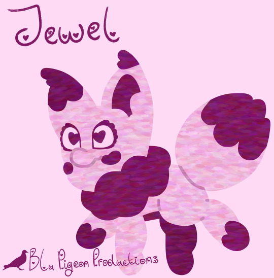
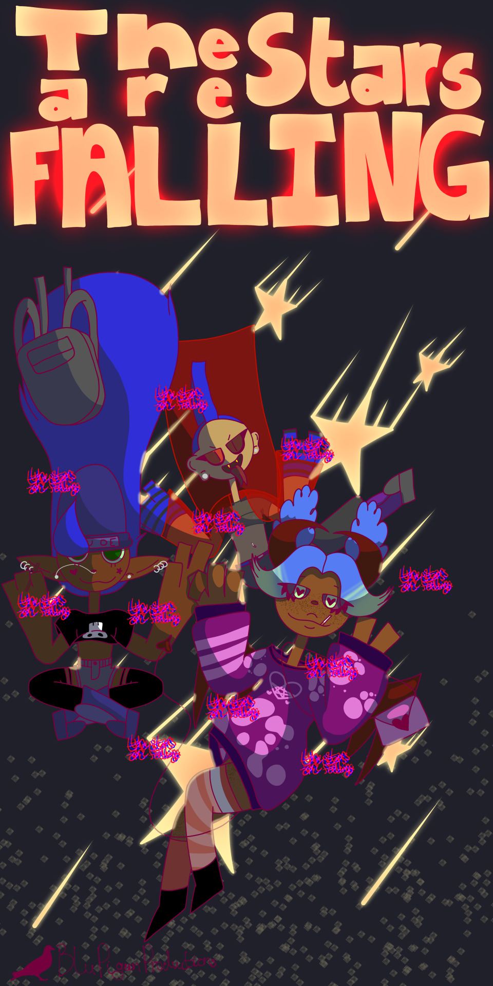
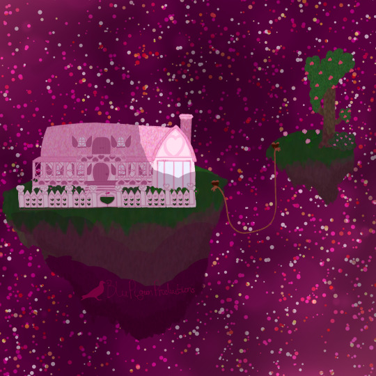
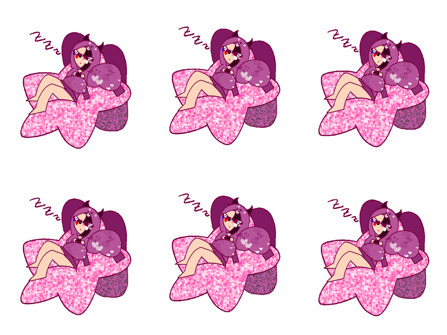

i have a lot of fun drawing my pokesona, it was drawn completely using vector lines which was unbelievably enlightening
the stars are falling was first drawn back in 2020 and has become a way for me to compare how my art has developed over the years. 2020 only featured Jason (he/him), 2021 only had Zero (ey/em), and 2022 includes the former two plus Cleo (she/her, but shes bigender and also goes by Liam he/him), 2023 will include Jason and Ambe (she/her). its a way for me to basically do a benchmark test on my composition and anatomy and colours and shading. i always have a lot of fun drawing it and sometimes making whole new brushes. important note: this one was actually submitted to an art contest, sadly i lost but it was actually my first time since elementary putting my art out with the intent to be judged.
jewel's house was my first time drawing and designing a house and finding different places to incorporate hearts was literally so much fun.
sleeping jewel is just super cute and jewel's bunny hoodie is my favourite thing ever. i have it on my phone and could stare at it for hours.
jewel's bedroom is ALSO a redraw. i enjoyed trying to fit so many things in it, i enjoyed sketching, i enjoyed lining, i enjoyed colouring. though this is actually my least fav of the 5 bcuz i fully believe the idea that your art is only as good as its weakest point. that's not to say its bad or that everyone will approach it as critically as possible. not even to say that everything needs to be perfect. but when i was rendering it, i didn't want to shade. so i took a funky brush and just rushed thru shading. in fact you can see that when watching the speedpaint, i just kinda scribbled the shading. HOWEVER that doesnt take away from the fact i think the rest of it is really well done. i think i did well on the bed in particular and the fact that i stylized a real bed that we own and my actual childhood bed that i would die to get back (we owned two, mine was lost when mum and dad had to abandon my childhood home bcuz of shitty roommates and a shitty landlord) i enjoyed drawing my actual stuffed animals and my actual lolita dress. it like actually has sentimental value bcuz of all of that i just wish i did it better.
11. favourite comment you've ever received on your work?
uhhhh so like i dont usually recieve comments on my work aside from my family's "wow i could never do that" soooo well go with the comment you left on my bunny hoodie design bcuz as far as i can remember iirc it was the first time id gotten a nice comment about my fashion designs and i was really happy someone liked it bcuz im like super nervous about my silly fashion doodles :)
18. do you have any larger projects you'd like to pursue? like comics, shortfilm, a series, etc?
yes! id like House Of Misfits to be a cartoon, tho the show would probably be lighter than the short stories bcuz i don't imagine i could explore Amber's backstory on screen. im making a proof-of-concept website which is technically online and more than 70% unfinished.
i also have a coming-of-age novel i need to do research for called Saftey Blanket about a hijabi girl named Aminah in her senior year of highschool (if i made it a series wed get to see her twin siblings realize they're trans which would be fun but rn they are but lil babbies), id like to make a children's cartoon and a visual novel but i don't currently have any ideas for either.
btw despite the fact that i am an animator, i don't want to animate a show. i want to run a show. i don't actually enjoy animations longer than maybe 10 seconds.
i have a side project based around the album A Constant State Of Ohio by Lincoln that would be a very personal project around self image while having multiple personality disorders (and other problems), but i cannot for the life of me make an animatic. there's lots of ideas like this jostling in my brain, like a stop-motion animation of Through The Roof n Underground by Gogol Bordello, where i just simply cannot which i am fine with.
then theres the fact i do actually want to sew my fashion designs, at least that bunny hoodie if nothing else, and i cannot get my hands on any fabric despite owning a sewing machine
0 notes
Text
So. the butch hartman rant. i wanted to kinda just... talk about some of the weirdness of the dsmp artworks from an art perspective, cause we all know he does literally no research and its a shitty way to promote his stupid commissions. thats not what im talking about here. i want to talk about how the way he draws the characters either tells us nothing about their personality or actively hinders the audience from understanding who they are.
so, let’s start off with the first character he drew, Dream.
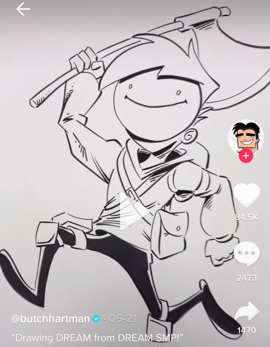
so without knowing anything about the character, what can we learn from this image butch has drawn? well, he’s got a really cartoony, almost silly gait to his run, and he seems like hes almost jumping excitedly, so at least what i am picking up from his pose alone is that he’s a fun, silly character, who is a bit of a fighter with his axe he uses. his mask looks cheerful, as if he’s just a normal looking young person- he looks 14 in this idfk why- who’s maybe a superhero? maybe he fights the bullies off at school or something.
and, as we all know, that is just the complete opposite of who dream is as a character. and that’s the start of how it can just completely shift who these characters are. how do we fix his posing to better reflect his personality? i feel like a slightly top-down angle, walking forward, holding the axe down towards the ground pose could show what an intimidating character he is. just an example though.
and i want to stay on dream for a moment longer to touch on the biggest problem butch has- because it doesn’t show up in dream’s art at all. it’s that his compositions cut off the characters at the weirdest spots and makes the drawing feel even more awkward than it already is.
we see this in technoblade’s fanart with one of his hooves getting cut off right at the tip, making you think he could have just sketched the character a little higher.
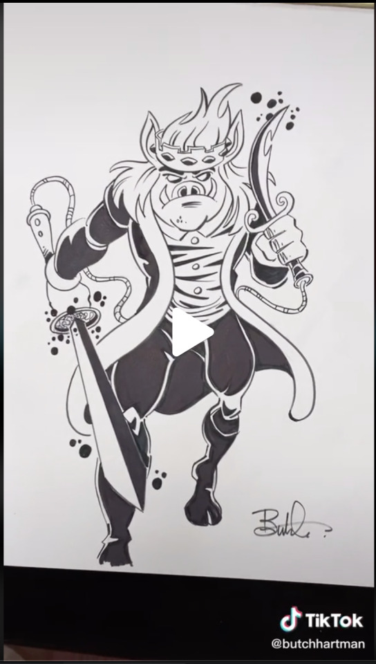
and we can see this in quackity’s artwork (im going to be pasting in the rant from earlier here so if youve read this already you can skip it)
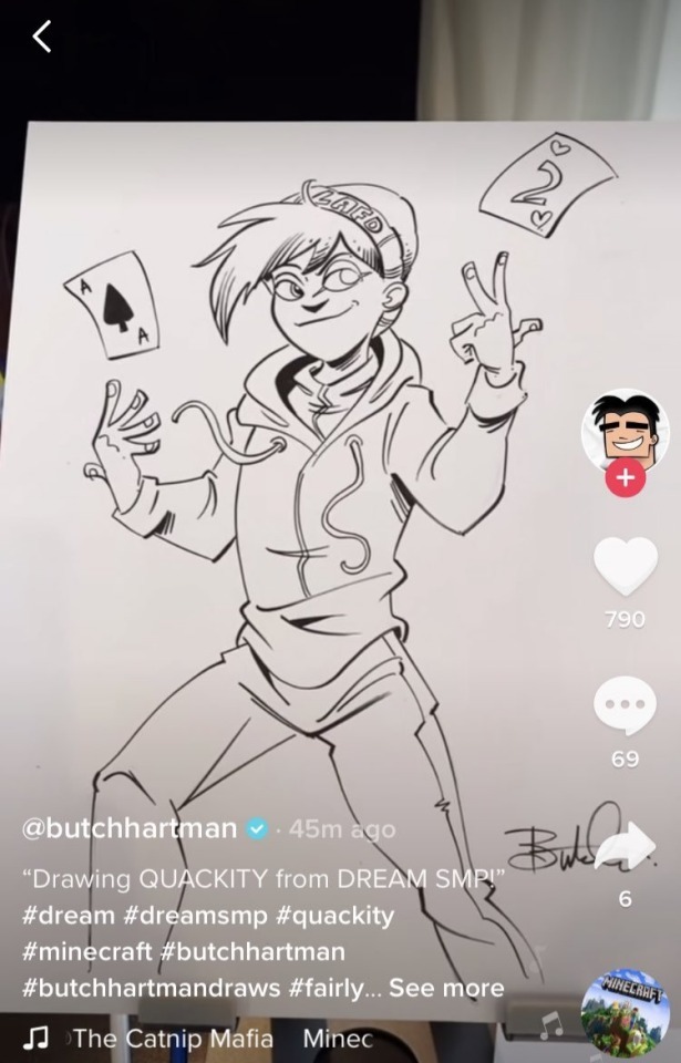
in the video, he started from the head, and went down, so the waist up looks good, but he for some reason feels the need to try and fit a full body, even though the page doesn’t have room for it.
here’s a screenshot of it happening:
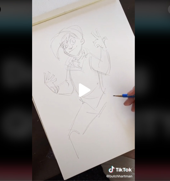
most people would just redraw the image to better fit the space of the page, but he doesn’t, and for an experienced person like him (i mean….. debatable but u know-), it shows just how fucking lazy he is and how much he just doesn’t give a shit about these characters.
and now im going to touch on tommy because i want to culminate all of this with his latest (as of july 16th 2021) character.
so.... tommy.
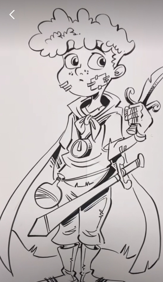
tommy is the worst offender when it comes to his shitty designs (yes over wilbur) because sadly this one references a lot of things in canon but he fucks them up so that’s why his is the worst.
this design not only is just a terrible exercise in character design imo, but also just completely butchers everything about c!tommy all at once.
let’s do the same thing we did with dream’s art. i see a very young, probably around 9-12 year old boy, posed very quietly and nervously, holding a sword he looks like he doesnt know how to use. he is dressed like a child playing pretend pirates in the backyard with his friends, and he has some bandaids on his face, probably from where he and his friends got into a tussle.
and again, obviously this is just not tommy like. at fucking all. to accurately pose a character like this- when drawing them for the first time so we can get a read on their personality, WHO THEY ARE- i think he needs a pose more like dream’s or wilbur’s.
he’s energetic and loud and bombastic (yes i know hes also a sweetheart and hes gentle and stuff but im talking about first and foremost what we see of tommy). give him a big shit-eating grin, have him hold a weapon like he knows how to use it, and make his stance something confident. because without the personality of the characters shining through- something butch hartman clearly knows nothing about- these are lifeless, shitty character designs.
and this has all culminated (thus far at least) with ranboo. my poor fucking boy. oh my sweet jesus [garfield speak to me meme goes here].
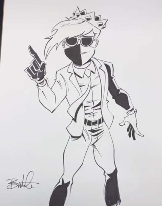
because god either hates me specifically or doesn’t exist at all, this happened. and we can use the things talked about above and see them here in this drawing. we have the complete misunderstanding of the character, to the point of him clearly just googling ‘ranboo’ and seeing the cc.
we have the total lack of understanding how posing can show us things about a character- and i think ranboo’s is the worst because he’s not getting any information about who he is, BECAUSE he isnt seeing fanart. at least with characters like quackity he could pull at the very least a fucking expression from the fanart on google, but because he has nothing to go off of, the pose feels stiff and lifeless.
we have the awkward cutoff of the drawing at the knees- which also have this weird shading applied to them that makes no sense unless we can see his feet? very odd choice. he does it on his back arm too, and it makes the arm look detached, almost prosthetic, because it’s one of the only parts of the drawing with that harsh shading- aside from the legs, which we can hardly see because theyre cut off.
we have the fact that this is the sloppiest drawing of them all so far, with the glasses not even being set right on his face, the line on the black side of his mask not connecting at the cheek, and i am not even going to touch on how weird it is that he drew his thighs and crotch like that. not even touching on that.
and finally, we have the fact that ranboo and tommy are nearly the same age, and tommy looks 9 while ranboo looks 27.
i have no fucking clue if this was at all like. good. i just have a lot of fucking hatred for bitch fartman and i cannot believe- and it is a pure coincidence probably- that the first canonically not-cis character he picks to draw, he draws the fucking CONTENT CREATOR AND NOT THE CHARACTER BUTCH I HA-
#mcyt#text#long post#readmore#tw butch hartman#hi this is one massive bitchpost on bitch fartman bc i despise him
598 notes
·
View notes