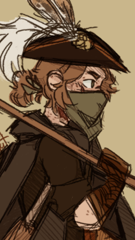
#YET the lineart is good which im happy about
Explore tagged Tumblr posts
Text
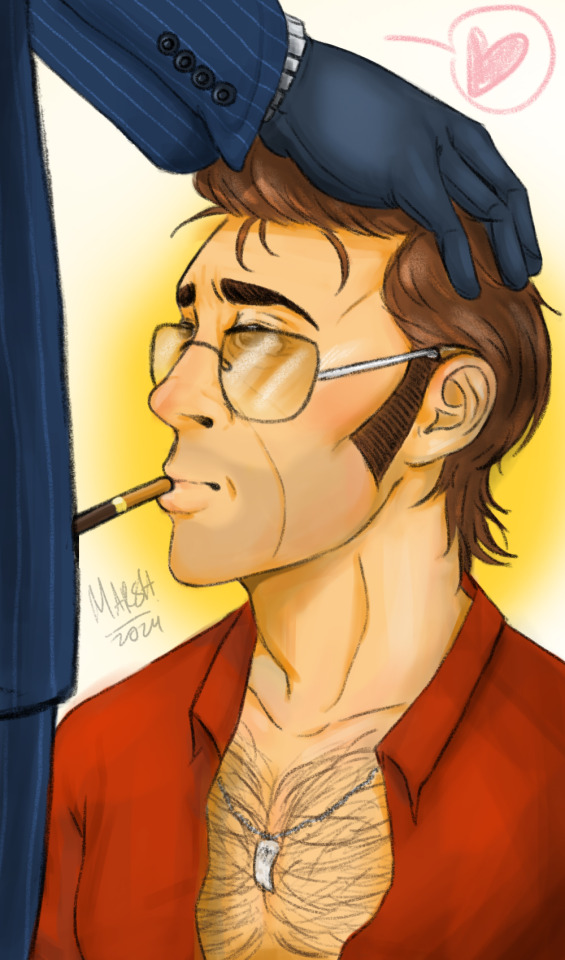
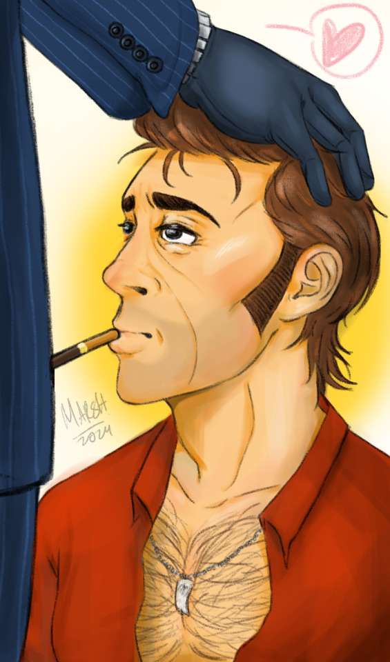
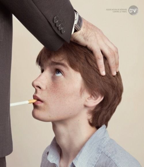
I saw this picture on twitter and i was like hell yeah *w*
#marsh stuff#tf2#team fortress 2#tf2 fanart#tf2 sniper#tf2 spy#sniperspy#knife party#bloody suit#old man yaoi#GOOD LORD#Its been a steaming minute since i drew sniperspy wew#IM QUITE SATISFIED WITH HOW THIS TURNED OUT#i need to get more creative with back grounds#and be less shy with shading#YET the lineart is good which im happy about#same with the coloring#starting to get used to digital
113 notes
·
View notes
Text
˖⋆࿐໋ friday 13th of december
⋆˙⟡


i woke up on time i can recall i even woke up early enough to have time to do a full face of makeup and well, be there on time

this mornings weigh in made me feel disgusting… but.. it’s ok, i told myself. i got ready and left my house with a pretty outfit that would be more beautiful on somebody skinnier than me ;; i truely disgust myself hahaha


college went fine, i actually got some good good work done in my first class, i made the entire thing in ice cream colors.. brown pink and soft pastel yellow.

4 zero sugar energy drinks
my second class also went ok. during my first class i put all 4 of my energy drinks on the table and that made everyone laugh so they put their drinks too which resulted in this photo being taken. peep my mutual putting his thumbs up lol. during my second class i finished a concept of my assignment and i got to starting the lineart of the final project but im still far from done.

after college i went with my best friend to the store and he got me these hairclips, im very happy with them. he probably knew i was hella triggered watching him spending a lot of money on someone that is not me but i hope that person is happy with what she’s getting.
i went to the store and i bought an onigiri cause i was craving it. when going home i debated if i should walk home after i get out of the train or if i should take the bus since i already had 10 k steps.. but i saw a triggering tiktok so i decided to walk. while walking i felt sickly and tired, i barely felt present all day and this walk more than ever was me just skipping through time in 0 degree weather… but anything for some extra steps.


dinner / omad : a bowl of pasulj (bean soup), 1 piece of schnitzel, some mayo, burek mom made with idk some vegetable filling. a rice cake with jam. an onigiri
cals : 752
if you care about the soup or schnitzel read yesterdays post. the burek was good, my mom always makes good tasting variations of it. the mayo was to dip my schnitzel in idk. i finally learned how to properly use our new microwave so for the first time in a while all of my food was actually warm. like fr fr.
i let myself have that onigiri cause i walked home. i know i shouldn’t be rewarding myself with food i know it’s gross but give me a break. i wanted to have a kinder bueno but i told myself i could have it the next day if i just fasted for the rest of this one. i finished a litre of pepsi zero to cope lol, it helped.
before bed i read my old story chats about my favourite characters, it gave me comfort when i needed it the most, as i was really hurt by something at the time (still am) and i needed something comforting. i shared some of the dialogue with eli who was keeping me company at the time.
total cals : 752
total steps : 15.2 k
song for today, recently i’ve been feeling more and more shameful about how i look and how i feel, it feels so good to be sick yet i don’t feel sick enough, i feel painfully average even knowing im now the smallest person in my class… i still feel like i could get thinner, dangerously so.. and im nowhere near there. i have a thighgap my ribs show my collarbones show but i just look thin, not sick. it’s driving me up a wall. atleast i’ve been binge free for a while now and i’ve been ignoring my random cravings more and more…
⋆˙⟡
#spotify#3d di3t#3d diary#4anorexi4#edbr#eedee tumblr#fat loss#pretty girls dont eat#thiinsp0#3d but not sheeren#tw 4n4rexia#tw b1nge#tw edtwt#tw an0rexia#tw ed ana#ana twt#tw ed implied#ed twt#tw skipping meals#tw disordered thoughts#tw 3d diet#tw 3d in the tags#tw 3d vent#tw a4a#tw ana bløg#tw ana rant#tw calories#tw ed not ed sheeren#disordered eating in tags#tw mia
21 notes
·
View notes
Note
Hellooo! I just wanna say that your art makes me smile so much!! And i love your content with venti x oc TvT. If its too much trouble would you be willing to give some tips on drawing and how you do color for an aspiring artist. I cant wait to see more of your works!!
thank you so much, im glad my works that i do for fun make you smile! especially my venlune works, which i didnt expect would get attention ;w;
i dont consider myself a very skilled artist yet, and im also not an art student, but im willing to give some (personal) tips i learned along the journey i went through in making art!
(assuming anon means art in general not comics)
1. (this is obvious but some actually dont do this, ok tbh even i dont because im lazy lol) watch tutorials from the internet, like youtube. there are a lot of videos available there from pro artists!
2. practice anatomy first, or linearting. you can start learning more about rendering later. if you want to focus more on making pretty but simple art, then you should study how to draw anatomy decently first, then you can just use some flat colors if youre not confident yet or still practicing your rendering! because from what i observed from my past artworks, detailed rendering doesnt do much if the anatomy and lineart aren't done well TT (anatomy doesnt have to be accurate by the way, as long as it looks aesthetically pleasing to the eyes youre good! imo at least)
3. steal some processes from other artists, then mix it with your own. it helps in experimenting and building your own style that you find comfortable to do! but you dont really have to find a specific style, you can draw inconsistently, if that's what makes you enjoy art! dont pressure yourself in finding a style, take your time! it even took me almost a decade to find mine (yes i just found a style im satisfied with recently that i can actually make consistently TT)
4. for rendering, im not confident in giving tips regarding it yet, because im still struggling with lighting and such. but im willing to share my process next time with images! just ask again if youre interested ^^
5. the most important part, have fun with the process! this sounds cliche, but to me this is what my goal is currently. i used to enjoy making them so much when i started, so im doing my best to feel happy with the process again, not only focusing on the result! also i believe in [happy process = good result] hehe
my bad im not good with words and im currently sick so i hope what i said is still understandable >w<;;
goodluck with your art journey, anon! <3
#asks#art tips#feel free to send me anonymous messages anytime!#especially venti or lyney headcanons or abt my oc... heheheheh
6 notes
·
View notes
Text
10 Anti LO Asks
1. ok but thats also i think i dont get? because without the series or character names, what of any of the promo images or banner or anything else give away it's supposed to be a greek mythology story? they just look like people with weird anatomy who are colored like highlighters. at the very least some iconography should be on them, but there's not? like even percy jackson stuff makes sure to give him a trident and have water flowing around him.
2. rachel made three times where persephone could have made the choice to be with hades willingly and didnt do it each time. first time she was drugged and put into his car, where he phsyically handles her unconscious body and puts her in his bed (ew). second is her working for him, which was hera forcing it. third was her going to the underworld not because she wanted to, but because she was hiding from the law/apollo and he found her. where exactly is her agency in all of this?
3. LO seems like the fast food of webtoons. because there's no room to speculate or theorize, you just read an episode and move on, the bright colors distract that it's a rushed and lazy product over something with high quality and effort, the characters are flat and boring, and the plot has no substance. it's meant to be consumed in a rapid binge, because if not you realize what low-effort and what little you're actually getting from it when you slow down and actually think about it.
4. i mean rachel does have some logic to her fancasting, the problem is it seems the only people of color are either demonized for being hypersexual (aphrodite, eros until he's with psyche) or are literally r//pists who are out to harm her white-fa casted persephone (apollo), so yeah, there is logic there, it's just pointing to rachel being (hopefully unintentionally) racist
5. It pisses me so much that I work over time (using references and looking at paintings and reading history for ideas for interesting character motifs) so that any of the ancient greek characters I draw look cool and authentically greek, and yet fucking Rachel Smythe, who can't even be bothered to do more than 5 seconds of research to learn that not all ancient greek outfits were shitty, minimalist off white and eggshell, gets to be revered as an artistic revolutionary. It pisses me off so. Fucking. Much. Not just for me, but for everyone else like me who absolutely ADORES greek mythology and wants to draw accurate portrayals of these characters! To whoever is reading this, stop. Stop rn and go read Sleep and His Brother Death (a comic on webtoons), go play Hades (the video game), go read The Song of Achilles (a book by Madeline Miller). Those are beautiful pieces of fiction about Greek mythology that deserve your attention more then Rachel and her shitty pink highlighter self inserts.
And a sidenote, I know that this is kinda like a modern AU for the gods. I am aware. Does not change that fact that anytime any character is drawn in ancient greek fashion it's always the SAME. SHITTY. CHITON. Maybe with a.cape or a scarf, but for the most part? It's just the same stupid, off white chiton.
6. oh, i thought you guys were joking persephone is now stuck with red eyes. is that seriously what look we're stuck with now? does rachel know it looks really ugly?
7. i feel like the lineart less style actually hurts LO in a way. way too often you can look at a panel and it becomes really murky where something starts and ends, and it looks even worse on a phone screen, because on an even smaller screen the images look even more compressed, making it even harder to tell stuff apart. this wouldnt be as bad if the comic took back up its more high contrast look from the begging, but now it's all one flat shade and im not sure why.
8. im really confused over the marketing of LO, tbh. like the ads are all hxp focused, but the series name implies its not about them, but focusing on the 12 olympians, but then the synopsis is general mythology and at the very end randomly mentions its about persephone? but then you read it and nots sure whether its a teen romance, a comedy, a serious drama, and can't stay straight with its messaging and timeline? and persephone is not there for a chunk of time. like whats actually going on?? 😭
9. Chapter 173 is like 50% filler. It gives more questions that answers, and not just from the reporters. Like the reporter stuff was mostly filler, and the Persphone and Hades stuff was like yeah we know dont need to drag this on.
My questions are WHAT ARE THE RED EYES? Is it when she’s mad? Horny? Sad? Happy? I feel like the red eyes just show up whenever RS wants to draw them
Flying? I feel like Persphone has always been flying like it wasn’t a bug moment at all. She flew home when Minthe and Hades kissed. But apperently Demeter didn’t know? I guess I don’t remember her flying in the mortal realm but her flying didn’t seem like a big moment, none of the other characters seemed surprised by it.
“Answer mine first!” When i got to that line I reread some of it just to find where the question was. That line normally matters when you’ve already asked the question not if you haven’t gotten there yet. Like of course Demeter is gonna be worried and ask a million questions.
I know the pomegranate pin is gonna be important but I felt the focus on it was a little too much, like an excuse not to cover more this chapter. Because honestly it felt like 5 minutes of the plot was covered in this chapter.
10. So uh, whats up with Hades weird ass comments... Like "Persephone you look beautiful and if someone says otherwise they can go play on the highway" ???
Because Persephone looking good during a murder trial is clearly the most important thing here.
Also, Perse's response to the reporter who asked her about her friendship with Hades. I mean, on one hand Persephone is right, her "friendship" (or whatever it is they have going on) is nobodies business but her own - but at the same time, its kinda also the underworld denizens right to know in the sense that their future leadership could be affected so they might want to know whats going on if their getting a new co-ruler / Queen that they will be subjects of. They probably will want to know who Persephone is, should she and Hades get married because it's very likely that when (cause lets be real its a 'when' not 'if' they get married) they do get married that Persephone will inherit half the title.
So, eh?
43 notes
·
View notes
Note
What art are you most proud of? And please show us a pic if you can! <3
Not gonna lie, this was actually p hard to answer. I’m honestly proud of any piece I get done, especially any full body, full color, full background pieces, and I refuse to let myself out-right hate anything that I draw in general now-a-days, unfinished or no. I draw for fun, always have, so I try not to put too much worry on how good something looks so long as it gets my idea across in a way that I like, or that I tried?? (And ik being proud of a piece doesnt have to tie into what the end result looks like, im just covering that base) I looked through all of my recent digital art on my ipad(that i’ve had what, 3-4 years at this point?) and found myself about just as happy with each finished piece-
-Except one. There is one piece that I forget about constantly but I’m honestly super proud of the amount of effort it had put in to reach the end result. It probably sees a number of glances infrequently(due to my sporatic activity on said blog) but isnt posted to this blog’s art tag.
It’s the blog banner I drew for my @thelostguardianau fic, of the(at the time) whole cast in the au. You can find the post to reblog it from here but i’m also adding it below for reference. (* and honestly I’ll mention every other art piece in this au posted to it’s blog stands at having this same proudness, as each individual characters complicated design fed into this big banner, each one having a giant set of uniquely drawn wings, complex body markings, and unique clothing and features. And I would not have been able to complete this banner without having those singular character chart pieces finished first, except for Thomas’s design, who has yet to be posted for ✨reasons✨)
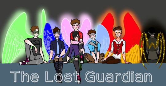
This fricking Banner was and still is(for now, *wink*) the most ambitious piece I’ve managed to finish. It took me so long, my wrist hated me, my ipad hated me, my ipencil hated me, medibang hated me, this piece pushed the limits of the poor app. Every time I try and open this piece up on the app it takes a solid couple seconds to open, save, and close.
From sketching to lining every single character, to having to uniquely match up Their Wing Sizes and Heights, because Guardians are fucking Tall, so Wing size and Height size was hell to calculate and portray. Why, you might ask?
Because I was limited to the proportions that would actually fit into a tumblr mobile banner. Which, funfact, is much smaller than you’d think!
I had to make sure they’d all fit, wings and all. And they didnt fcking want to. But I made it fit, because I wanted a full body + wings cast banner and goddamn it that was going to happen. And I did. And I lost a fuck-off amount of detail-space for it.
Coloring it wasn’t exactly difficult, but I will once again point back to this app hating this piece and it draining my battery because of it. I work in layers. My lineart will have 5-6 different layers in color before I combine them and set the hue to black, but I still keep my lineart seperate in that each character has their own lineart, and the background lineart is seperate.
I had their lineart, and probably still do, seperated into Seven different layers, one per character, each one w/ an extra masking layer for their wing glow. Each character got their own folder for colors, and had multiple layers for each colored section: clothing, skin, skin blush + eye whites, hair, wings, body markings, marking glow. And then there was the background layers, and the glowing affects, ect. The whole piece stands at having about 80 total layers having been used over the course of making it.
So yeah, Medibang does not like this piece when I try to open it. xD
But really, setting aside fighting and babying technology thats being pushed close to its limit, the real pride comes from the fact that this piece has Seven fully colored, near-full body characters drawn, all touching and interacting and accurate to the scale that I made. It is the most amount of characters in one piece that I’ve ever drawn, colored, and finished, and I’m pretty fricken proud of it.
Which makes it all the more daunting that said banner is going to get an upgrade, because it’s a Character Cast Banner after all, and its going to have four more fully designed and full winged characters added into it.
And by upgrade, I mean I get to redraw the whole dang thing. Because I gotta rearrange ✨everyone’s✨ positions. And at this point, the only way thats possible is by starting over.
wish me luck on that. o_o;
128 notes
·
View notes
Note
12, 17, 24!
12 - Fandom you’ve drawn the most for?
god it’s gotta be rain world huh? i mean it’s still mostly oc stuff that i draw and i’ve only doodled the canon characters like once (i do love them very very much tho 💖 it’s just hard to generate ideas about characters i don’t know). Runner up is probably hollow knight? again, also mostly ocs, and like half of it was your ocs sggsgdhhdhhd <3
17 - Favourite oc/sona drawing?
this is probably also that group pic with rw ocs or Lun’s duel (both cool lineless scenes that i think turned out rlly well with some fave ocs) but to pick something different, i really really like Raster’s ghost design :]
I used one flat colour and used opacity to create the illusion of tones, and then did some funky layer mode stuff on top and im so pleased with the result !!!

24 - What do you like most about your art style?
Ohhh this is a hard question? I mean i like my art style i have a lot of fun with it but i’m trying to find a thing that, when i look back on art i drew, makes me go “that. that thing i do really good. proud of that one thing”
y’know what actually, it’s probably my character designs! I have been told time and time again that i make really fuckin complex designs and it’s true sgbshbdbdhd but i love them <3 ! Especially happy with the human chars i’ve been designing recently, i think i’ve done pretty good at avoiding sameface issues! People were a struggle for a long time because i was an animal artist first but i’m now at the point where i can really have fun drawing them!
most of the human characters i’ve designed this year (+ adam, the dude with porcelain skin, who i didn’t design but really enjoy the art i did; & cori who had a mostly complete design already when i was asked to draw them. and also i designed cress prior to 2021 i think but didnt like the art enough and redid it), from approximately newest to oldest:


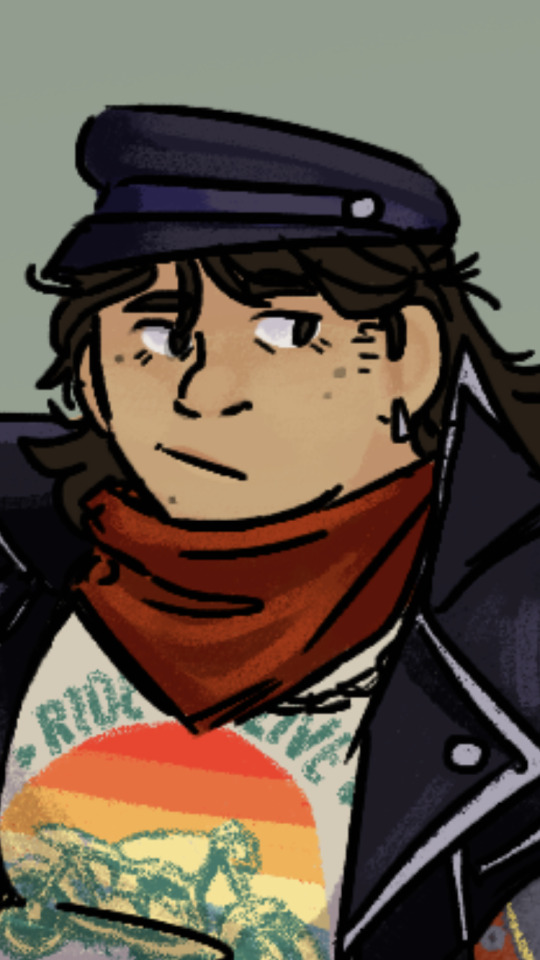
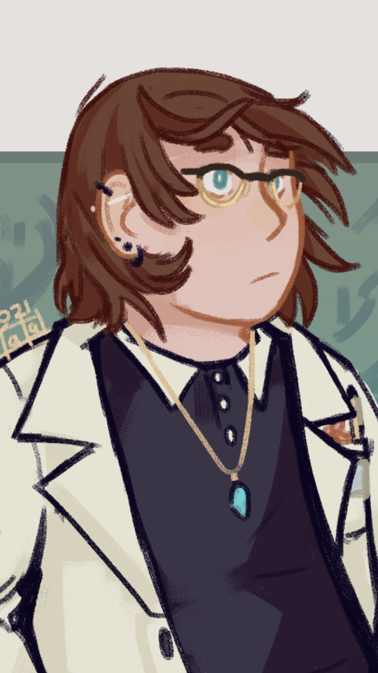


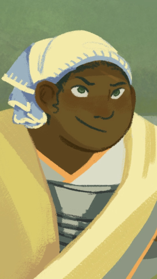
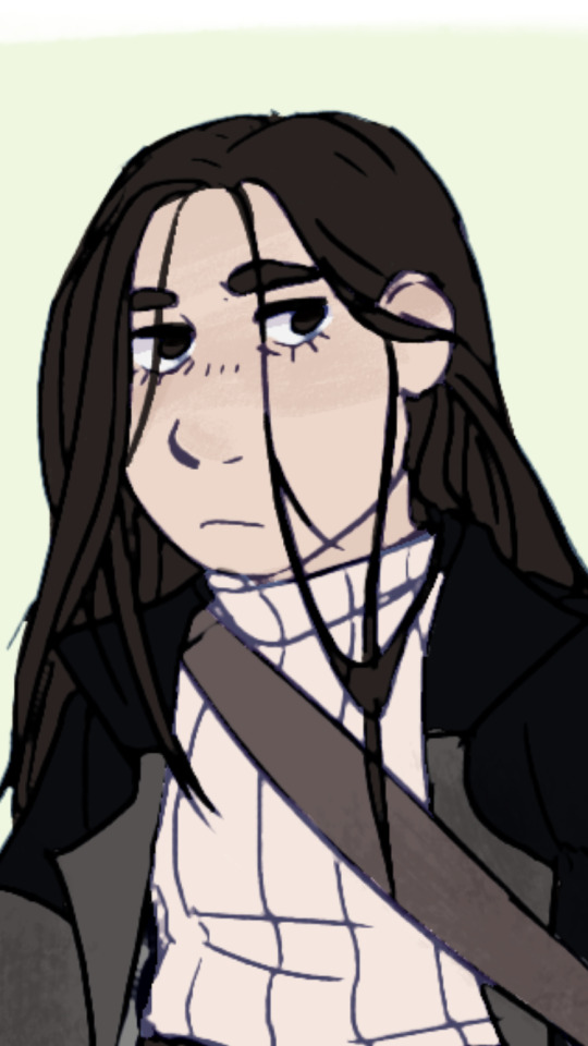
Also my most recent lineart style im very happy with, which you can see in two or three of these pictures with the chalky lines? Same brush i use for lineless and usually for colouring. I have newer examples but can’t post them yet, they are secret santa gifts that are still secret
4 notes
·
View notes
Text
week 4! officially got thru a month without giving up! ngl i dont even know if i drew anything good this— or, technically, last— week bc i’ve been very low on inspo but i guess i’ll see lmao (1/24/21–1/30/21)

1/24/21 — tbh i dont like this all that much, the arms and ass look kinda off and we dont talk about the hair, but i do kinda like the clothes and legs

1/25/21 — i actually do like this, im pretty happy with the pose and how i drew the right shoe, but hands and heads are still problems

1/26/21 — i started (and lowkey gave up on) writing an original thing which involved an oc being held prisoner by being tied to a pipe (dont ask im low on creativity rn) so i drew this as a general idea of what that looks like bc i have no idea what my oc looks like lmao. the body is too boxy and the thighs look too big compared to the calf and foot and you can tell i gave up on the foot but i was surprised with how the hand came out. it still looks kinda unnatural but hey it looks like a hand lmao. i also like how the rope came out but rope is like super easy to draw so that doesnt really count
im drawing less and less every week and it’s a bit of a problem lmao but that concludes week 4 of my attempt to learn to draw! i have yet to do any Actual Finished Pieces tho bc im too scared of messing things up to do lineart and im afraid if i try digitally i’ll get too used to it and not be able to draw traditionally lmao so things arent going the best but i just need some inspo to sketch stuff and i should be good
ive been drawing every day but im self conscious bc i still suck but there are some things ive drawn that im pretty happy with and i have like 4 followers so posting them here doesnt seem like the worst idea lmao
for reference on my art experience: i spent about a month trying to learn realism last feb but i dropped that before i could even draw more than individual eyes/noses/lips, went 6 months without drawing, then made an artist friend who motivated me to draw again, then i lost motivation again for 4 months, and now i’ve been drawing every day since jan 4 + i did a bit of sketching on jan 2. im not an artist whatsoever but i mean im trying lmao

1/5/21 — this was originally supposed to be a leg but i made the calf too low so it looks more like an arm but its actually a decent arm imo!! it was very exciting to draw my first Good Thing even if it didnt turn out the way i wanted it


1/6/21 — a pair of arms i tried to show emotion thru, lowkey inspired by zuko lmao. obviously the hands arent great but i dont hate the arms!

1/7/21 — first full bodies ive ever drawn decently!! i made the first dude muscly and buff unintentionally so i purposely made the second dude skinny and lanky to practice different body types yknow. also tried to practice poses by having the second dude gesture to,,,,,, something and having the third dude kneel on the ground and im pretty happy with how they came out
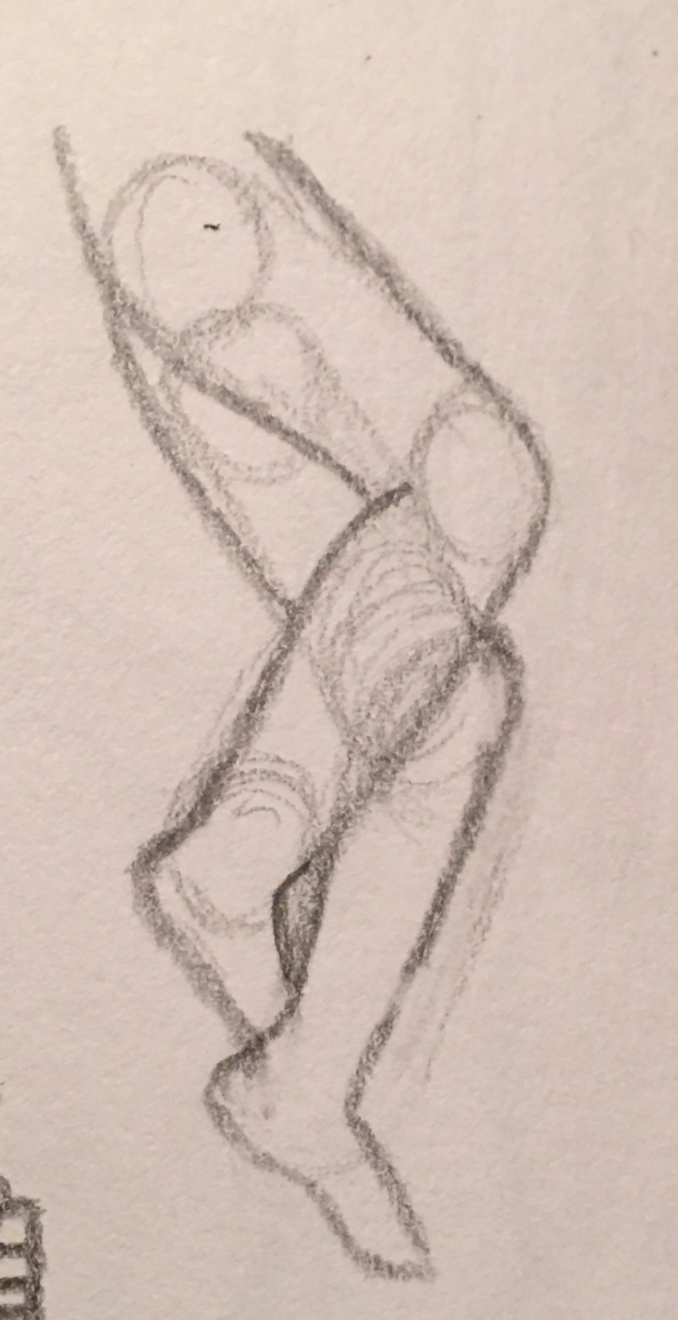
1/8/21 — legs i drew yesterday that im pretty proud of!

1/9/21 — hand i actually drew today! it’s a lil long and stiff and the index finger’s too thick but its the only good thing that came out of today’s study of hands lmao
i might update this with more good things i draw to keep up motivation and morale but yeah! i drew good things :))
15 notes
·
View notes
Text
May 13th-May 19th, 2020 Reader Favorites Archive
The archive for the Reader Favorites chat that occurred from May 13th, 2020 to May 19th, 2020. The chat focused on the following question:
Which comic has your all-time favorite artwork, and why do you like it?
carcarchu
Oh yes i can say this with certainty but the webcomic with my all-time favourite artwork by far is 榴花不及春 https://www.manmanapp.com/comic-1404769.html. it's not just that the art is beautiful but the way the artists create mood and tone is just jaw-dropping. I actually got chills a few times while reading it from the art alone and that's not something that i can recall happening when reading a lot of webcomics, or actually any fiction in general. there's such a elegance to the line weight and movement of the art that brings life to the characters. the artists' use of lighting adds such depth to the scenes, sometimes creating a warm and inviting atmosphere and other times a haunting and foreboding chill. the time i've spent with this comic is not something i'll soon forget(edited)
Cronaj (Whispers of the Past)
This is such a difficult question for me. Gahhh, so many pretty comics out there.... I guess, in regards to artwork alone, my favorite is the 2015 version of Countdown to Countdown by Vel. (https://tapas.io/series/Countdown) Just... such beautiful work. I'm a sucker for detailed painterly styles I will admit, but also the color and lighting is phenomenal. The way Vel sets up the mood with color and movement is amazing. The textures and brush strokes are simply gorgeous! Unfortunately, Vel rebooted the comic to a new style last year, and while it is still really gorgeous, I must admit, I don't like it nearly as much as the original. (What can I say? I have a bias for painterly styles.) Still highly recommend it! (https://tapas.io/series/CTC) I do want to point out some honorable mentions for me: * Ghostblade by WLOP (https://tapas.io/series/GhostBlade) - another painterly comic * The Sixth Dalai Lama by Ze Zhao (https://tapas.io/series/thesixthdalailama) - discontinued as far as I'm aware, but painted traditionally with watercolor! * Wind Rose by Sfera (https://www.webtoons.com/en/challenge/wind-rose/list?title_no=54306) - Painterly again (later on as the artist improved) but also great expressions I will say, I also love deliciously detailed lineart, but I don't see it a lot (especially in webcomics), and I cannot think of one right now :/(edited)
carcarchu
ahh ghost blade is a great choice @Cronaj (Whispers of the Past) and while i agree that countdown to countdown's new art isn't as sumptuous as it used to be for a comic it works better and the simpler art style allows vel to release at a more consistent rate without injuring herself so i really respect the change(edited)
Cronaj (Whispers of the Past)
Yeah, definitely understand why they changed styles, because oml can a painterly style be taxing
DanitheCarutor
I can't pick just one! But to start off I love the art of Lost Honey (https://www.losthoney.com/), everything about it is so soft, the linework, the colors the character designs, the panelling, it all has such a nice feel to it. The creator's use of color is sooo easy on the eyes, it fits so well with the comic. The linework has such a nice flow and movement, there is never a feeling of stiffness, it almost reminds me of water. Also I'm a complete sucker for traditionally drawn comics. Even though it's discontinued as far as I know, Thicker Than Blood also has really nice aesthetics! (https://tapas.io/series/Thicker-Than-Blood-), it has such a unique style almost like classical art mixed with glass. The designs are detailed yet highly stylized. The quality varied from time to time, given the amount of work that goes into them, but overall I really liked the look of this comic. Carciphona is another one I like aesthetically. (https://tapas.io/series/carciphona) The art of this one has improved immensely since it started, and while I'm not a fan of the look of the earlier pages, I'm loving how their work has evolved. The style is very Japanese inspired, there is a lot going on sometimes, but has its own unique look and is very well crafted. Also I love the action scenes, how they're handled makes the scenes look intense, sometimes grandiose.(edited)
shadowhood (SunnyxRain)
Oh my god I love carciphona’s art! I always get shilin’s art whenever she sells at Anime North I’ve been meaning to read carciphona for a while so thanks for reminding me!
FeatherNotes(Krispy)
Hands down it is Black Out Cityhttp://blackoutcity.ca/lvl10.php Jay does these amazing illustrative panels when they introduce a new chapter and it has me hooked on each update! The way that the title is incorporated within the panel is beautifully done, and their attention to detail and effective use of contrast is breath taking. Definitely a huge inspiration of mine! I also want to shout out to O'Sarilho by @Capitania do Azar . The palettes she uses are unique and dynamic, and the layouts read like the comic is animated (there's even animated parts in it!) the way she draws action and portrays horrific parts is phenomenal!https://sarilho.net/en/
(also i love this prompt but i could def go on forever with it hehe)
Deo101 [Millennium]
I wholeheartedly second O'sarilho ^^ it's a comic I regularly reccomend and I probably won't ever get over how lovely it looks! (I'll have to look for more comics who's art I love later)(edited)
LadyLazuli (Phantomarine)
I'll throw in Heart of Gold https://heartofgoldcomic.com/. The ethereal palette, the clean and crisp architecture, the panels that work perfectly with the church imagery, and the energy of the lines and brush strokes. SO GOOD.
Tuyetnhi (Only In Your Dreams!)
I agreEE
shadowhood (SunnyxRain)
Okay for me it's two webcomics One of them is Tracy JB's Lackadaisy https://www.webtoons.com/en/challenge/lackadaisy/list?title_no=39790&page=1 https://www.lackadaisycats.com/ Everything she does is wonderful; colour, expression, character, plot.....her art inspired me to embark on expression work. I remember being younger and being so inspired by her webcomic. Hands down can't find a flaw. The other one is Muted by anidoodles https://www.webtoons.com/en/supernatural/muted/list?title_no=1566 I was introduced to her from her Heather animatics on youtube. I love how her inking and cell shading is simple but VERY effective; the use of bold bright colours and watercolours was amazing. My art style is heavily inspired by hers and overall, I love how she captures people's attention with it.(edited)
Miranda
Oh I love Muted!
shadowhood (SunnyxRain)
looks at your profile pic heheh
Miranda
I mean, I'd have to say I love "Nothing Special" by Katie Cook. Her art style and color scheme is just easy on the eyes and I love her intricate filled backgrounds. https://www.webtoons.com/en/fantasy/nothing-special/list?title_no=1188&page=1 Phantomarine is another favorite. I absolutely love the painted look and it's been inspiring my newer pages. Every page is just a work of art and I love the color choices and just everything about it. http://www.phantomarine.com/
shadowhood (SunnyxRain)
PHANTOMARIIIIIIIIIIIIIIIIIIIIIIIIIIIIIIINE
sssfrs (JOE IS DEAD)
I’m also going to say Phantomarine
Theres also one I found recently called Bybloemen that has a really cool art style
FeatherNotes(Krispy)
ohhh Bybloemen is gorgeous and is so up your alley Sssfrs!
sssfrs (JOE IS DEAD)
Its so good
LadyLazuli (Phantomarine)
Woah, it's like woodcuts!! I like it!
Joichi [Hybrid Dolls]
Ooh this is a hard choice since I see beautiful webcomic art alot. Recently my favorite art and coloring style I've been inspired by are: - The Glass Scientists https://www.theglassscientists.com/ Some of the pages are well executed, I like the character designs, fantasy with alchemists, werewolves and more. Ghost Teller https://www.webtoons.com/en/horror/ghost-teller/list?title_no=1307 I enjoy QTT use of gradient coloring and spooky atmosphere, it looks like alot of time were used to make each strip. I like how the characters are linked to each story, it's not as spooky as more dramatic. They are all short stories Gourmet Hound: https://www.webtoons.com/en/drama/gourmet-hound/list?title_no=1245 When I think of slice of life with a soft pleasant color palette, this story comes in mind. I like to refer to her work as well as other SoL comics for inspiration on coloring.(edited)
Joichi [Hybrid Dolls]
@carcarchu ooh I love the different comics you recommend. It's always unique and pretty. I hope there's a tranlation strip for '榴花不及春'(edited)
shadowhood (SunnyxRain)
GOURMET HOUND
IM SO HAPPY ITS HERE
chalcara [Nyx+Nyssa]
Funnily, the webcomic with my all-time favourite art is Order of the Stick. Love how much expression and narrative work this simple style does.
RebelVampire
Definitely Rising Sand https://risingsand.glass/. The art is immensely detailed in ways that are relevant to the world and story, has beautiful color choices, beautiful compositions, amazing light effects, great backgrounds, and so on. And just overall the skill level is so high I'd need another 20 years experience with art to even be able to begin to point out a single flaw.
LadyLazuli (Phantomarine)
^Ooh yes! I don’t know how Rising Sand keeps that quality so high. From their posts, it seems like a bit of a nightmare sometimes But the end product is like its own animated film!
Joichi [Hybrid Dolls]
Omg I'm often in awe with those artists making high quality art that looks like it belongs in graphic novels or film. I can imagine those big details will take alot of time to put together. (edited)
I once happen to meet the creators for Rising Sand. Very passionate writer and artist team who have quite some experiences and strong teamwork. (Life goals!)
Eightfish (Puppeteer)
so many comics to check out :0
Deo101 [Millennium]
wow rising sand is really gorgeous
shadowhood (SunnyxRain)
Whoa rising sand is really good
actually reminds me of Tigress Queen by Allidraws https://www.tigressqueen.com/comic/page-0001(edited)
especially the parts where she draws glass and architecture it's very vibrant and full of life
Joichi [Hybrid Dolls]
Gosh I realized I have a trend of loving slice of life stories, so I might end up recommending that genre afew times!
keii’ii (Heart of Keol)
(don't forget webcomic_recs for recommending good comics in general outside of the weekly topic!)
Unfortunately Korean-only at this time, but I am in awe of the art in this comic. It's not very polished, but you can tell the artist really knows what he's doing in terms of anatomy, perspective and composition. https://comic.naver.com/webtoon/list.nhn?titleId=701535&weekday=wed
Joichi [Hybrid Dolls]
oops I remembered that, I'll go repost there instead. Thanks Keii. Wow that comic(edited)
Joichi [Hybrid Dolls]
I really want to read more Korean and Chinese webcomics, they have a different vibe and story atmosphere. I enjoy looking into them as inspiration on how to stage my webtoon scenes.(edited)
keii’ii (Heart of Keol)
Hmmmm, I wouldn't recommend the one above for how to make vertical scroll comics. That one was originally made for print and then adapted afterward, and it shows.
Still absolutely amazing action art, though!
Holmeaa - working on WAYFINDERS
@LadyLazuli (Phantomarine) Heart of Gold is SO beautiful! I agree with you 100 procent!
I will add The Ocean Soul. Holey damn this comic is SO gorgeous!!!! https://tapas.io/series/The-Ocean-Soul
Javi
Gonna add this before this prompt changes. I think Oren's Forge has the best artwork I've ever seen done in a webcomic. Every panel has a setting that's so bold and pristine in color, layout, and background that it begs to be animated. Every color used paints a different mood to show character development and the style of the characters is so stylized and interesting to look at. Even the story is interesting enough that it gets you hooked and wondering what will happen next. Also talking animals, what more can I say? :) There's more discussion in FurAffinity than there is on Tapas so I'm putting two links https://m.tapas.io/series/OrensForge https://www.furaffinity.net/full/18260576/
#ctparchive#comic#webcomics#indie comics#comic chat#comic discussion#comic tea party#comics#ctp#reader favorites
0 notes