#Work at Height(Level 1 to 2)
Explore tagged Tumblr posts
Visit Tumblr Blog
Explore Tumblr blogs with no restrictions, modern design and the best experience.
Last Seen Tumblr Blogs


Fun Fact
Tumblr posted its first advertisements in May 2012 and subsequently earned $13M in revenue.
Text
have i ever mentioned claire’s measuring tape. the measuring tape she carries in her purse and when a man is annoying her she takes it out. which is a threat.
#okay so claire is really good at guessing people’s heights#this is something she learnt as a kid and it just kinda stuck with her#she can look at you and easily guess your height based on 1. stuff you’re standing close to and 2. her own height 3. your eye level#so like men lying about their height to her never works. because she will look at you and go well actually you’re 5’8.#which is fine. but stop lying.#i don’t even think she did it maliciously. at first. she just thinks measuring things is cool and she has the autistic need to tell you#about it + correct you if you’re wrong about something she knows you’re wrong about.#and she’s very accurate too. to a scary degree! chris tried to claim he’s 6’1 and she was like actually you’re more like 5'10.#he wasn’t even hurt. he was just confused because his entire life he thought he was 6’1. and then claire used the measuring tape to Prove#him wrong. and he was 5’10. and he’s like okay how does this work. and claire tells him well i just liked to measure butterflies wingspans#he doesn’t understand how it translates to measuring people’s heights but he accepts the explanation#<- the real explanation is that claire is good at mathematics and geometry. that’s all. like that’s it#but if she says that it's 1. boring and 2. people don't believe her. because it's claire. so she came up with something funnyyy
2 notes
·
View notes
Text

#𝗖𝗼𝘀𝗺𝗼𝘀 𝗧𝗿𝗮𝗶𝗻𝗶𝗻𝗴 𝗜𝗻𝘀𝘁𝗶𝘁𝘂𝘁𝗲#𝗛𝗶𝗴𝗵𝗳𝗶𝗲𝗹𝗱 - 𝗨𝗞 𝗔𝗽𝗽𝗿𝗼𝘃𝗲𝗱 𝗖𝗼𝘂𝗿𝘀𝗲𝘀#Principles of Health and Safety (Level 1)#Health and Safety in the Workplace (Level 2 to 4)#Health and Safety for Accommodation Supervisors (Level 3)#Health and Safety for Construction Labourers and Site Visitors (Level 1)#Health and Safety for Construction Supervisors (Level 3)#First Aid at Work (Level 3)#Emergency First Aid at Work (Level 3)#Fire Safety (Level 1 to 2)#Work at Height(Level 1 to 2)#Confined Spaces (Level 1)#Risk Assessment (Level 2)#Safe Moving and Handling (Level 1)#Accident and incident Investigation (Level 3)#Teaching & Training (Level 3)#Auditing and Inspection (Level 3)#COSHH (Level 2)#𝐂𝐨𝐧𝐭𝐚𝐜𝐭 𝐔𝐬:#Mob:#+917530075440#+919655111155#+919787637876#Email:#[email protected]#Web:#www.cosmostrg.com#teaching#teachingtraining#TeachingJobs
0 notes
Text
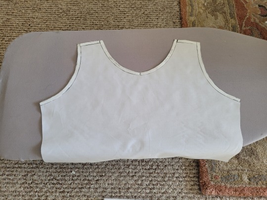
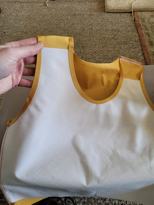
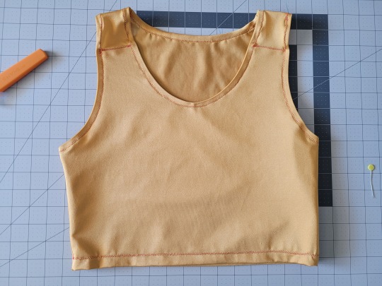
How to Make Your Own Binder that Fits Well and Looks Good
A while back I was in need of some new binders and thought hey, I bet I can make one way cheaper than buying it from somewhere (especially cus some of the ones I’ve bought in the past didn’t really fit right). Except when I started looking for a binder patterns online, I was very surprised that I really… couldn’t find many that looked very nice lol. Most of them had really wrinkled necklines, or didn't bind well, or just overall looked weird. A lot of the patterns also required a serger, which I don't have.
So I just said fuck it and made my own pattern! And it ended up being relatively easy! And the binders fit REALLY WELL and are comfortable to wear, even for long periods. The neckline doesn't show under shirts with loose collars, and the bottom hem doesn't gap or stick out. Here's me wearing one:
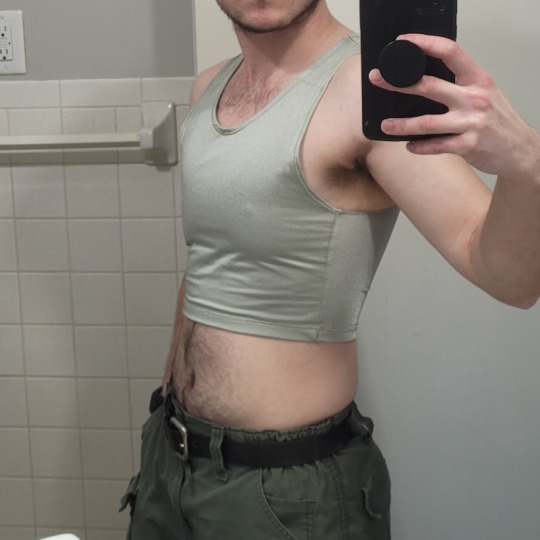
(plus I was able to make myself 5 of them for a total of like ~$50.)
So I figured I could throw together a guide to help out anyone else who wanted to make their own binder but was dissatisfied with the patterns available!
Disclaimer: This tutorial is going to assume a baseline level of sewing experience, and also will require access to a sewing machine. It is not a complicated pattern, but it will most likely require some tweaking and adjustments after you make the first one. Don’t be afraid to make alterations to make it fit better!
This tutorial is for a gc2b-style half-tank binder. It could be altered to be a full-tank binder, but all instructions will be for the half-tank design.
Materials needed:
Stretchy fabric, probably listed as 'athletic fabric' (I use this kind from Joann’s. Most athletic stretch fabrics should work, look for around 80% nylon/20% spandex blends)
Stiff fabric (I use this shirting cotton because I like how lightweight it is. If you want something a little stiffer with more structure, you can use a cotton or cotton/poly blend twill like this. gc2b binders use twill for theirs.)
Lightweight fusible interfacing (I use this kind) (get FUSIBLE not sew-in)
Fusible webbing like Pellon Wonder-Web (this is technically optional but it WILL make your life easier when you’re sewing - just make sure to get the kind with the paper backing!!!)
“But kiwisoap thats 4 whole kinds of materials, surely I don’t need that many!” Ok sure, you can probably get by without the fusible web and interfacing, but consider: they are both dirt cheap (im talking like $1-2/yard), they will make it much easier to sew the final product, and will give you an overall better-looking result. This tutorial is written with the assumption that you’ll use them.
"How much fabric will I need?" Measure the circumference of your chest below your armpits. Add 6 inches just to be safe. This is the yardage of stretch fabric you’ll need, and should give you enough material to make at least 3 binders without much excess left over. You will need around half as much stiff fabric.
Other supplies:
Big Paper (for drawing the pattern)
Flexible measuring tape
Sewing machine
Iron
Pins
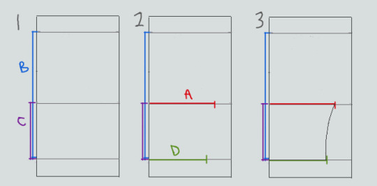
Step 1: Measuring
You will need 4 main measurements for this pattern.

A) Measure the circumference of your chest just below your armpits, then divide the number in half. This will be the widest part of the pattern.
B) Measure from the top of your shoulder down to where you want the binder to end. For most folks, this will usually be around the natural waist (narrowest part of the torso), about 3-6 inches above the belly button. This will be the overall height of the pattern.
C) Measure the distance from below your armpit to where you want the binder to end. This will determine where the arm hole starts.
D) Measure the circumference of your waist where you want the binder to end, then divide the number in half.
So for example, after dividing A and D in half, my measurements are 17", 15", 7", and 14.5".
Next:
Subtract one inch from measurement A - This will help provide some compression. You might need to take it in even further depending on how it fits, but one inch is a safe starting point. I take mine in around 1.5 inches.
Subtract half an inch from measurement D. This will help prevent the bottom edge of the binder from gapping. Again, you may need to take it in more or less, depending on your own body.
Add 1.5 inches to measurement B and one inch to measurement C. This is to account for the hems and armhole placement.
This makes my final measurements
A = 16"
B = 16.5"
C = 8"
D = 13.5"
From here on out, we are only going to be working with the measurements that we have added/subtracted to, NOT the ones we initially took.
Step 2: Drawing the Pattern
You will need a piece of paper large enough to accommodate the entire pattern. This may involve taping multiple pieces together, or using a piece of newsprint, etc.
I recommend folding the paper in half to ensure that you get a symmetrical pattern. However, this means you will need to divide measurements A and D in half again, or else you’ll end up with a pattern that’s twice as wide as it should be!
Also note: the pattern is drawn with the seam allowance built in! You don’t need to add any seam allowance.
To draw the pattern:
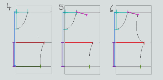
Begin with your folded paper. Measure and mark B and C on the paper, and draw a line extending across the paper. These will be your guidelines.
Measure and mark A and D along the middle and bottom guidelines, respectively. Remember, the paper is folded, so you only use half of the measurement for A and D.
Draw a loose curve connecting the endpoints of A and D. If needed, you can also just draw a straight line between the two.
Mark the opening for the neck hole. Depending on your size, it will measure around 6-8 inches across at the top (remember to divide this in half for the folded paper) and about 5-6.5 inches deep. (mine is 6.5" across and 5.5" deep) Draw a curve to connect the two points. This part will take some tweaking and adjusting to get it to look right lol.
Measure the width of the strap - this should be somewhere between 2.5 - 4 inches wide. They will end up about 1/2” to 3/4” narrower once you sew them. Draw the line at a slight angle, as shown.
Connect the endpoint of the strap to the endpoint of line A with a curve like in the diagram.
This will be the pattern for the front piece.
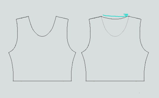
To make the back piece, trace the front pattern, but make a very shallow curve for the neckline instead of a steep one, as shown:
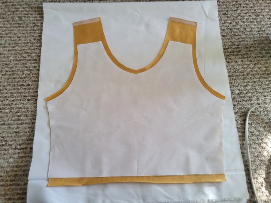
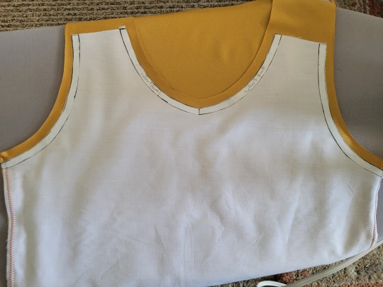
The last piece is the stiff front panel. This is what provides the flattening effect of the binder. To make the pattern, trace the front pattern again. Trim 3/8” in on the sleeves and neckline, and 3/4” to 1” along the bottom. This gives a flatter hem. Then trim the straps shorter by a few inches. This helps the binder lay flatter along the shoulders.
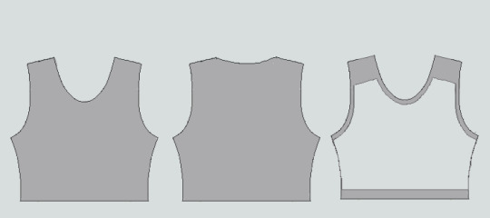
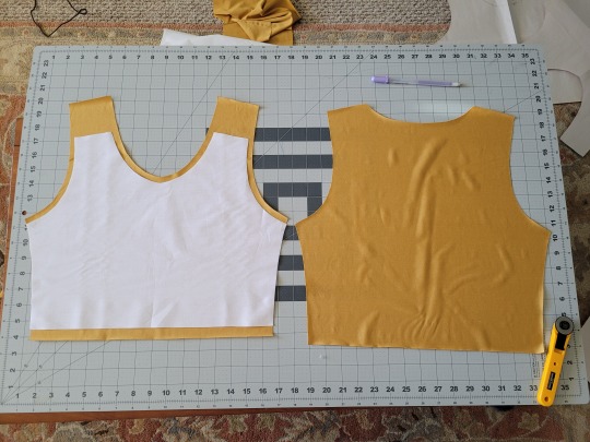
When you're done, you should have 3 pattern pieces that look approximately like this (stiff panel shown overlaid on the stretch fabric to show how it fits together).
NOTE: If you want more compression or just want to make it a bit sturdier, you can add a second panel of stretch fabric to the back piece. Just use the bottom half of the back pattern (from the widest part down to the bottom hem) to cut out another piece of stretch fabric. Attach it to the back piece with a strip of fusible webbing and a zig-zag stitch along the top.
Step 3: Putting It All Together
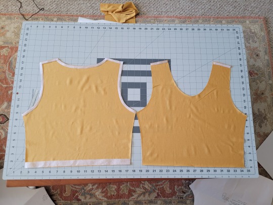
Once you’ve made the patterns and cut out the pieces of fabric, you should have something that looks like this:
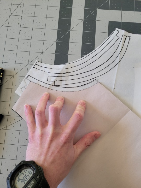
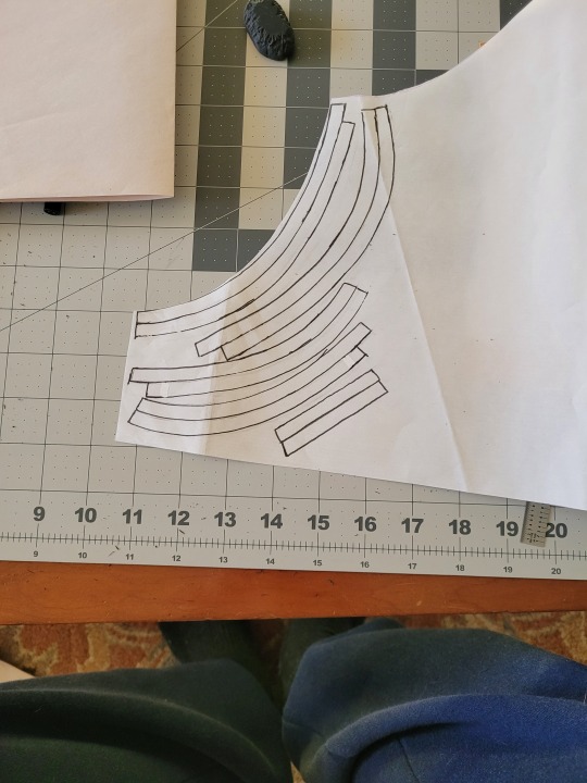
The next step is adding interfacing and fusible webbing. Use your pattern to cut out 3/8" strips to fit on the top of the straps for both pieces, and to the neckline, sleeves, and bottom hem of the back piece, as shown:
If you want to add it to the bottom hem of the front piece, it will help keep that hem flat when sewing it down later, but it's not essential.
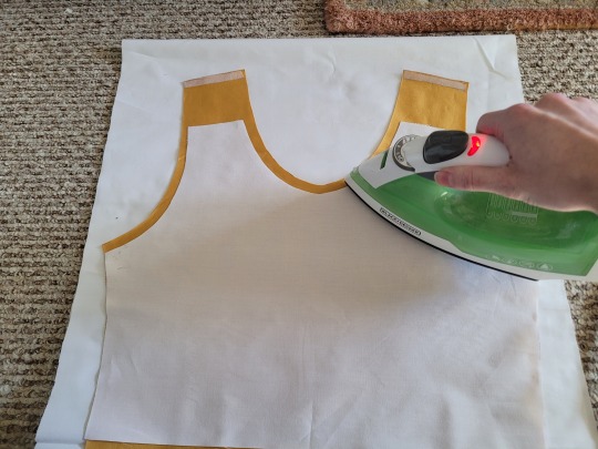
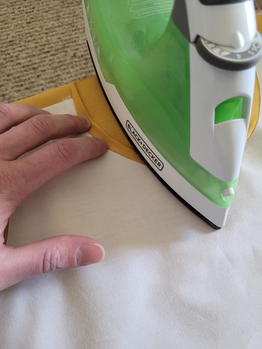
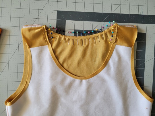
If you choose to also use fusible webbing (WHICH I RECOMMEND), you will apply it to the stiff front panel similarly to how the interfacing was applied, ~3/8” strips along the neckline, sleeves, and top of the straps. Cut out two strips for the neckline and sleeves, because we'll use those later too.
Iron the strips onto the front panel as shown:
Once it's on, just peel off the paper, position it webbing-side down on the stretch fabric, and iron it to fuse the two pieces together so everything stays in place while you sew. THIS MAKES IT WAY EASIER TO SEW.
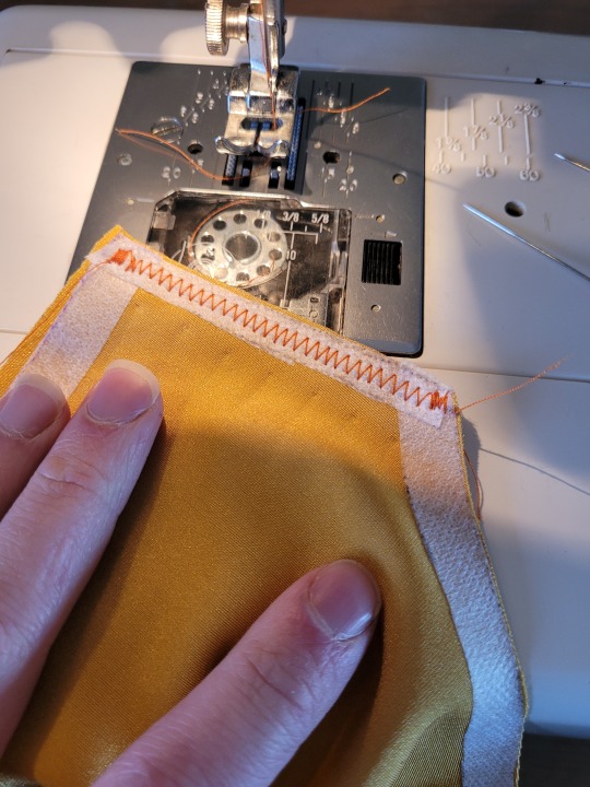
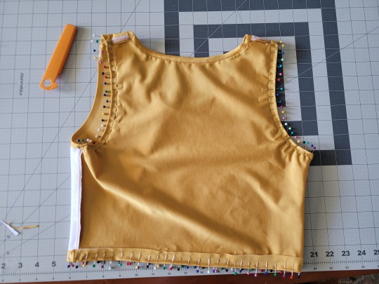
After the stiff front panel is fused to the stretch fabric, you’ll sew the straps of the front and back pieces together, then join the pieces along the sides. Pin the hell out of it to keep everything in place -this type of material is VERY prone to puckering.
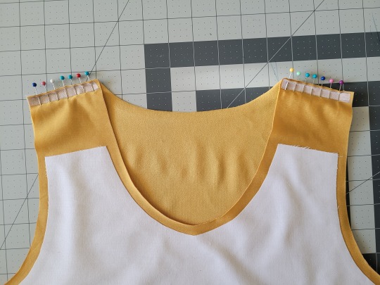
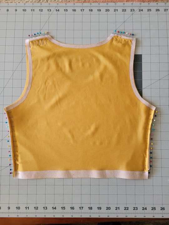
When sewing, USE A ZIGZAG STITCH. A straight stitch will NOT WORK for stretch fabric. I adjust mine to 1.3mm long and 3.5mm wide which has worked well. If your machine doesn’t let you adjust stitch length or width, well. That sucks, I don’t really have any advice.
After you sew the front and back pieces together, you can add more fusible webbing to the front panel to help hold the hem down flat and prevent it from puckering while you sew it. Just add the strip, peel the paper off, then fold the hem over and iron it down. This part isn’t really necessary, but it does make the hems look nicer. If nothing else, I would recommend adding it to the neckline.
After that, you just fold & pin all the hems and sew them up with a zigzag stitch, then go over the raw edge at the top of the stiff panel (where we cut the straps shorter).
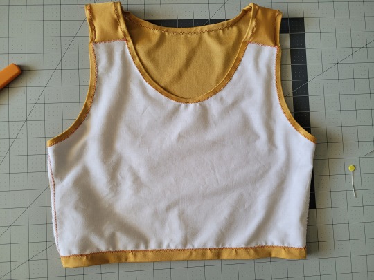
And that’s it! You’re done! And now you can make your own binders whenever you want!
And hey! If you used this tutorial and wanna throw me a dollar or two on ko-fi, I wouldn't complain.
1K notes
·
View notes
Text
0 notes
Text

#𝗖𝗼𝘀𝗺𝗼𝘀 𝗧𝗿𝗮𝗶𝗻𝗶𝗻𝗴 𝗜𝗻𝘀𝘁𝗶𝘁𝘂𝘁𝗲#𝗛𝗶𝗴𝗵𝗳𝗶𝗲𝗹𝗱 - 𝗨𝗞 𝗔𝗽𝗽𝗿𝗼𝘃𝗲𝗱 𝗖𝗼𝘂𝗿𝘀𝗲𝘀#Principles of Health and Safety (Level 1)#Health and Safety in the Workplace (Level 2 to 4)#Health and Safety for Accommodation Supervisors (Level 3)#Health and Safety for Construction Labourers and Site Visitors (Level 1)#Health and Safety for Construction Supervisors (Level 3)#First Aid at Work (Level 3)#Emergency First Aid at Work (Level 3)#Fire Safety (Level 1 to 2)#Work at Height(Level 1 to 2)#Confined Spaces (Level 1)#Risk Assessment (Level 2)#Safe Moving and Handling (Level 1)#Accident and incident Investigation (Level 3)#Teaching & Training (Level 3)#Auditing and Inspection (Level 3)#COSHH (Level 2)#𝐂𝐨𝐧𝐭𝐚𝐜𝐭 𝐔𝐬:#Mob:#+917530075440#+919655111155#+919361165584#Email:#[email protected]#Web:#www.cosmostrg.com
0 notes
Text
who will you end up with?
→ liked the reading? support me on ko-fi!
ᯓ𖤐.ᐟ introduction: this reading will cover who you'll end up with, and who your end game is. This is a follower request yippie!!
ᯓ𖤐.ᐟ reminder: this is a general reading made for entertainment purposes, so please take what resonates and leave what doesn't ^_^
ᯓ𖤐.ᐟ how to pick a pile: close your eyes, take a deep breath, and choose the picture to which your eyes are drawn to.
from left to right: pile 1 | pile 2 | pile 3 | pile 4 | pile 5
PILE 1:
their physical appearance - page of swords
The physical appearance of the person you’ll end up with is someone who looks youthful for their age like they’re eternally 20 years old. They have brown wavy hair and eyes with warm medium tan skin, (I don’t know if you guys are familiar with this brand but I keep seeing the shade “Lazi” from Colourette’s first base skin tint.) They are also tall with a lean or naturally slim build. I’m getting very “boyish” vibes from this card.
their aura - the star
With the star card, their aura is very dream-like, like a breath of fresh air of hope. Their favorite color could be blue as well, with the water and the background on the star card as well as on the page of swords. They could enjoy wearing the color blue or incorporate it often in their daily lives. Anyway, I see they could be a spiritual person as well, with a strong connection to water. Their favorite hobbies may include stargazing, swimming, and walking.
their main traits - saturn in scorpio and mercury in virgo
What I'm getting at with the saturn in scorpio is that they are a very intense person, especially when it comes to work. This includes being a perfectionist and a hard worker as well. The meaning of this card is inheritance, so this could hint that they deal with family matters often, such as managing an inheritance. I'm getting hints that the person you end up with could be a businessman or someone whose career requires maximum effort and an excellent, analytical mind. Your person does not rush into things or do things impulsively, rather, they take the time to think clearly about their options with a level-headed mind.
━━・❪ ❁ ❫ ・━━ ❜❛ ━━・❪ ❁ ❫ ・━━ ❜❛ ━━・❪ ❁ ❫ ・━━ ❜❛ ━━
PILE 2:
their physical appearance - temperance
Your person is someone who is very angelic in their appearance. They have this white aura-like glow about them, and they’re conventionally attractive as well. I see that they have the perfect balance of feminine and masculine features, so they are androgynous in appearance. To be more specific, they may have light brown to blonde hair, have dewy, healthy skin, and are average to tall in height.
their aura - the tower
This is someone who has very intense energy. They could have experienced great losses in their life that makes them closed off to people. I’m getting that they’re the type of person to leave a long-lasting impression on people due to how intense and powerful their aura is.
their main traits - saturn in capricorn and saturn in scorpio
A lot of saturn energy here! Aligned with the tower card, your person is someone who experienced great lessons in life, thus transforming them into someone who practices self-discipline and structure in their lives. While they’re young, they’re a very “all work no play” type of person, but once they get older and cement themselves in life as a successful person, they start to let loose. I see that for now, they could be very stuck-up and stick to the rules a lot, but that is for their own benefit in life. They feel as though they have to leave their mark in the world.
━━・❪ ❁ ❫ ・━━ ❜❛ ━━・❪ ❁ ❫ ・━━ ❜❛ ━━・❪ ❁ ❫ ・━━ ❜❛ ━━
PILE 3:
their physical appearance - nine of cups
For this pile, your person is someone who you’ll take note of first and who dresses with comfort in mind over everything else. They could have round faces and body shapes, as well as wavy dark-colored hair. They are of medium to short height (shorter than you or around your height).
their aura eight of pentacles
This is someone who at first glance, you know is passionate and creative about their craft. This craft could be anything, like hobbies such as woodworking, or even writing. They have a very grounded, they know themselves, hardworking energy about them. This is someone who is a very dependable person due to their consistency.
their main traits - jupiter in libra and mars in leo
I see that they have a talent for making people love them, it's their comforting, reliable energy. They have the respect and admiration of others in their life, and this is for good reason. Although with this respect comes egotism, they could also be someone with a high ego because they know that they are great at what they do. I see that they enjoy playing games as well, it could be one of their hobbies!
━━・❪ ❁ ❫ ・━━ ❜❛ ━━・❪ ❁ ❫ ・━━ ❜❛ ━━・❪ ❁ ❫ ・━━ ❜❛ ━━
PILE 4:
their physical appearance - the empress
First of all, I have to say that this entire pile is giving me feminine energy. So this person who you'll end up with is definitely someone who embodies the feminine energy and the divine feminine. This is someone who is undeniably beautiful, and they know it. They take care of themselves well and carry themselves with elegance and grace.
their aura - queen of wands
For their aura, they are intensely confident, independent, and vivacious. They know what they want and they know how to get it. They are also incredibly independent - like pure "girl boss" energy is just screaming from this pile. For the people they're close with, they see this person as a mother figure at best, someone who is dependable and exudes warmth.
their main traits - venus in aries and moon in aquarius
Your person has a lust for life, they're wild, eccentric, and affectionate. You could enter this relationship with them impulsively or it's a relationship that moves fast. Whoever they choose to be their partner, they get them. This is someone who does not hide behind any facades, they show their true selves to others and they have to decide whether to appreciate them or move on.
━━・❪ ❁ ❫ ・━━ ❜❛ ━━・❪ ❁ ❫ ・━━ ❜❛ ━━・❪ ❁ ❫ ・━━ ❜❛ ━━
PILE 5:
their physical appearance - knight of pentacles
I see that with the knight of pentacles, your person has an earthy look about them, like dark hair and olive-to-dark skin. They are muscular and strong, very sturdy. This build makes them someone who at first glance, you already know is a great shoulder to lean on. I see that they could have thoughtful and expressive eyes as well, like they can't hide how they feel no matter what once you look into their eyes.
their aura - knight of cups
This is a very romantic person, lucky you! They care about you a lot and chivalry is not dead when you're with them. I see that they're very sweet and charming, but not to the point where it's flashy. This charm and sweetness come straight from their heart. They love connecting with you and knowing every thought that comes from your mind, they find those thoughts beautiful.
their main traits - mercury in aquarius and sun in leo
This is someone who is revolutionary, they're immensely intelligent, an innovative thinker, and cares about humanity in general. They could take a social science or a humanities course in college. This is someone who has a grand vision for people and wants to execute it. They could be a CEO later in their life, such as owning a start-up company. This is someone who is a hard worker and reaps what they sow. I see that they often take leadership roles, not because they want the recognition of being a leader, but because it is in their soul to lead.
#tarot#tarot pac#pick a pile#pick a picture#tarotblr#pick a card#pac#pac reading#tarot reader#intuitive reading#tarot reading#divination#intuitive readings#intuitive tarot reader
636 notes
·
View notes
Text
"A reward for someone so good." Hashira Series!
Part 1, 2, 3, 4, 5
Gyomei Himejima x Male! Reader
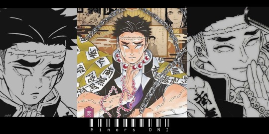
Warnings: Minors DNI, NSFW, read as afab reader, size kink, "calm" sex, faint, belly bulge, Himejima has feelings for the reader.
Summary: Pillar training has begun, much to your delight. Of course, as a hard-working and strong person, you can handle any challenge. Even if it's fighting a hashira. And in a way, they all see some value in you, and want to reward you for it.
You decided you would trust Sanemi (in which case, you were too tired to try and cut the ropes). You slept on the floor of that room and were woken up by someone mumbling while untying you.
"Ah, you finally decided to wake up? Lazy bastard." And you just shrug. If Sanemi wasn't going to untie you, you'd probably stay there until you gathered the strength to do it yourself.
Shinazugawa finally lets you go, but you can't walk at the moment. "..." He stares at you, hoping you'll get up soon. "You haven't realized my situation yet, have you?"
"I won't carry you in my arms, don't you dare ask."
....
You didn't even have to ask. He picked you up willingly and covered you with his haori (which only covered the bottom part due to your height). Fortunately, no one saw you in this situation.
Sanemi carries you to the room and offers you new clothes, next to a hot bath since you were covered in blood. He seems to want to apologize for being too rough last night, but he's too proud for that.
This is how he shows that in a way, he cares for you. Genya came to see you after your shower, and he seemed very curious to know why you disappeared last night and are now in Sanemi's room. You just laugh softly.
After some small talk and some things about the upcoming training and about Gyomei, Genya and Sanemi accompany you to the gate. You were already more recovered, and could probably get to Gyomei's training area with ease.
Genya says goodbye to you with a handshake and quickly leaves. Sanemi would finally apologize to you. "... Sorry for yesterday." "It's okay. Just make sure you don't leave me tied up next time." And so, you walked away while following your crow.
"Wait... WILL THERE BE A NEXT TIME?!" The older Shinazugawa screams and tries to reach you, but trips on a rock and ends up falling.
......
You finally arrived at Gyomei's training area. The few people who made it past Sanemi's training looked washed up. Himejima's training was very heavy, just like Genya said.
A hand subtly touches your shoulder, and you immediately recognize who the person is. "Himejima-san!" You smile, and the man almost twice your height smiles back. You weren't exactly short, but Gyomei was almost a tree, he was so tall.
"[Name], long time I haven't seen you. Namu." He says, voice deep as he rubs his hands together. The bulging veins on his arms made you blush softly. Maybe you have a thing for muscular men. And speaking of which, you've done a lot of missions together. It was almost a trio. Genya, Gyomei and you (since Tomioka stayed away from you in the past).
For a few seconds you wondered how Himejima knew it was you. But he's like a bear, his senses are extremely keen. "So, what's the training like?" Even though you already had an idea, you still wanted to be sure of what you were going to face.
"Your training is unique, please follow me. Namu."
.....
You obey the Hashira, and soon, you arrive at his mansion. It was very similar to all the others, except it felt more warm and comfortable. "Please sit."
Gyomei takes you to the farthest corner of the house, and sits in front of you. The difference in size was brutal even when he was sitting down.
He holds your hand gently and sighs, preparing to say something unusual. "Sr. [Name], I would like you to have sex with me. Not only that, but I propose that this be your test of strength." He was so straight to the point that it scared you.
Okay, you knew that was his personality. But it was on a much higher level. Seeing that you didn't answer him, but didn't move away either, he continues what he was saying. "On every mission we've done, I've felt something for you that I never thought I'd feel for a man. You are kind and pure, despite your personality being somewhat eccentric."
You had no words for it. You were normally the one praising people, and now you were being praised in such a kind way. You just squeeze Himejima's hand, as your body moves closer to him.
"...I accept this training, Himejima-san."
.....
He takes off all of his necklaces, and starts to unbuckle his belt. Before he even took off his pants, you noticed that his cock was already hard as a rock.
And when he took off his pants, you almost fainted. Seriously, your blood pressure has really dropped. That thing was huge, probably 44 centimeters. That wasn't even humanly possible! Now you're not sure if you agree with this training.
Himejima senses your concern, and quickly reassures you. "If you can't take it, I won't force you." And you just make a mumble of "ok"
He takes off his pants, and pats his hand gently on his thigh, to signal that he was ready. You quickly take off your pants too, and crawl until you are face to face with that monstrosity. It was quite heavy, and his balls felt swollen, as if it were waiting to release their load.
You try to sit on Gyomei's lap, placing the man's cock in your pussy. But it was almost an impossible task, it was too big. Only the head had entered and you already felt full. He throws his head back and lets out some low, hoarse moans, already feeling pleasure just from having contact with your body.
Little by little, you get used to the new sensation, and Gyomei's cock starts to slide inside you. Soon, (almost) everything was inside you, and you were already sitting on Gyomei's lap. He let out much louder, but still discreet, moans as he hugged your body. Your belly was swollen, and you could be sure that that bulge was the perfect shape of Gyomei's cock.
You massage that bulge and squeeze gently, making you and the other man moan again. He didn't seem to care if you weren't moving, he just wanted contact with you.
But you wanted to move, you wanted to go after your own pleasure. And so, you began to lightly move back and forth, riding the taller man. He starts to sigh deeply and moan some meaningless words, while you bite your mouth to keep from screaming. Every slightest movement you make makes his member hit your sweet spot.
Until he decides to help you with your movements. His hands held your ass, and without any difficulty, he made you move up and down gently on his slippery cock. That was as far as you could go without moaning loudly.
You just put your hand over your mouth to keep from screaming while he fucks you. "H-Himejima...Ah!~" It's all you can say, because you were almost screaming.
And this goes on for a few minutes. He makes calm movements with his body as he reaches the deepest point he could reach. You were already close to passing out, it was too much to handle and every time he hit your sweet spot, you could feel your blood pressure dropping.
"... [Name]-san... I feel like I'm about to..." You widen your eyes, already understanding what he meant. And it only took a few seconds for him to release his load inside you. As soon as his cum hit your deepest point in a warm jet, you passed out.
There was a lot of cum, it was even leaking and causing a bigger swelling in your belly. He notices your body going limp, and pulls you off his dick. He wasn't that experienced in having sex, but he felt like he shouldn't have such extreme concern, just take care of you and your body while you were passed out.
And so he does, giving you a bath, putting on clean clothes and lying next to you in bed, hugging you in a bear hug.
He was really happy with everything that happened. He really likes you, and sex only confirmed his feelings.

Bonus lines!
"I really love you, [Name]-san. We should get married, I want you to be my husband."
"... I see..."
#male reader#smut#kimetsu no yaiba#demon slayer#kny#kny x reader#ftm reader#gyomei himejima#kny gyomei#gyomei x reader#tengen uzui#giyuu tomioka#mitsuri kanroji#obanai iguro#sanemi shinazugawa
602 notes
·
View notes
Text
AI’s productivity theater
Support me this summer on the Clarion Write-A-Thon and help raise money for the Clarion Science Fiction and Fantasy Writers' Workshop!

When I took my kid to New Zealand with me on a book-tour, I was delighted to learn that grocery stores had special aisles where all the kids'-eye-level candy had been removed, to minimize nagging. What a great idea!
Related: countries around the world limit advertising to children, for two reasons:
1) Kids may not be stupid, but they are inexperienced, and that makes them gullible; and
2) Kids don't have money of their own, so their path to getting the stuff they see in ads is nagging their parents, which creates a natural constituency to support limits on kids' advertising (nagged parents).
There's something especially annoying about ads targeted at getting credulous people to coerce or torment other people on behalf of the advertiser. For example, AI companies spent millions targeting your boss in an effort to convince them that you can be replaced with a chatbot that absolutely, positively cannot do your job.
Your boss has no idea what your job entails, and is (not so) secretly convinced that you're a featherbedding parasite who only shows up for work because you fear the breadline, and not because your job is a) challenging, or b) rewarding:
https://pluralistic.net/2024/04/19/make-them-afraid/#fear-is-their-mind-killer
That makes them prime marks for chatbot-peddling AI pitchmen. Your boss would love to fire you and replace you with a chatbot. Chatbots don't unionize, they don't backtalk about stupid orders, and they don't experience any inconvenient moral injury when ordered to enshittify the product:
https://pluralistic.net/2023/11/25/moral-injury/#enshittification
Bosses are Bizarro-world Marxists. Like Marxists, your boss's worldview is organized around the principle that every dollar you take home in wages is a dollar that isn't available for executive bonuses, stock buybacks or dividends. That's why you boss is insatiably horny for firing you and replacing you with software. Software is cheaper, and it doesn't advocate for higher wages.
That makes your boss such an easy mark for AI pitchmen, which explains the vast gap between the valuation of AI companies and the utility of AI to the customers that buy those companies' products. As an investor, buying shares in AI might represent a bet the usefulness of AI – but for many of those investors, backing an AI company is actually a bet on your boss's credulity and contempt for you and your job.
But bosses' resemblance to toddlers doesn't end with their credulity. A toddler's path to getting that eye-height candy-bar goes through their exhausted parents. Your boss's path to realizing the productivity gains promised by an AI salesman runs through you.
A new research report from the Upwork Research Institute offers a look into the bizarre situation unfolding in workplaces where bosses have been conned into buying AI and now face the challenge of getting it to work as advertised:
https://www.upwork.com/research/ai-enhanced-work-models
The headline findings tell the whole story:
96% of bosses expect that AI will make their workers more productive;
85% of companies are either requiring or strongly encouraging workers to use AI;
49% of workers have no idea how AI is supposed to increase their productivity;
77% of workers say using AI decreases their productivity.
Working at an AI-equipped workplaces is like being the parent of a furious toddler who has bought a million Sea Monkey farms off the back page of a comic book, and is now destroying your life with demands that you figure out how to get the brine shrimp he ordered from a notorious Holocaust denier to wear little crowns like they do in the ad:
https://www.splcenter.org/fighting-hate/intelligence-report/2004/hitler-and-sea-monkeys
Bosses spend a lot of time thinking about your productivity. The "productivity paradox" shows a rapid, persistent decline in American worker productivity, starting in the 1970s and continuing to this day:
https://en.wikipedia.org/wiki/Productivity_paradox
The "paradox" refers to the growth of IT, which is sold as a productivity-increasing miracle. There are many theories to explain this paradox. One especially good theory came from the late David Graeber (rest in power), in his 2012 essay, "Of Flying Cars and the Declining Rate of Profit":
https://thebaffler.com/salvos/of-flying-cars-and-the-declining-rate-of-profit
Graeber proposes that the growth of IT was part of a wider shift in research approaches. Research was once dominated by weirdos (e.g. Jack Parsons, Oppenheimer, etc) who operated with relatively little red tape. The rise of IT coincides with the rise of "managerialism," the McKinseyoid drive to monitor, quantify and – above all – discipline the workforce. IT made it easier to generate these records, which also made it normal to expect these records.
Before long, every employee – including the "creatives" whose ideas were credited with the productivity gains of the American century until the 70s – was spending a huge amount of time (sometimes the majority of their working days) filling in forms, documenting their work, and generally producing a legible account of their day's work. All this data gave rise to a ballooning class of managers, who colonized every kind of institution – not just corporations, but also universities and government agencies, which were structured to resemble corporations (down to referring to voters or students as "customers").
Even if you think all that record-keeping might be useful, there's no denying that the more time you spend documenting your work, the less time you have to do your work. The solution to this was inevitably more IT, sold as a way to make the record-keeping easier. But adding IT to a bureaucracy is like adding lanes to a highway: the easier it is to demand fine-grained record-keeping, the more record-keeping will be demanded of you.
But that's not all that IT did for the workplace. There are a couple areas in which IT absolutely increased the profitability of the companies that invested in it.
First, IT allowed corporations to outsource production to low-waged countries in the global south, usually places with worse labor protection, weaker environmental laws, and easily bribed regulators. It's really hard to produce things in factories thousands of miles away, or to oversee remote workers in another country. But IT makes it possible to annihilate distance, time zone gaps, and language barriers. Corporations that figured out how to use IT to fire workers at home and exploit workers and despoil the environment in distant lands thrived. Executives who oversaw these projects rose through the ranks. For example, Tim Cook became the CEO of Apple thanks to his successes in moving production out of the USA and into China.
https://archive.is/M17qq
Outsourcing provided a sugar high that compensated for declining productivity…for a while. But eventually, all the gains to be had from outsourcing were realized, and companies needed a new source of cheap gains. That's where "bossware" came in: the automation of workforce monitoring and discipline. Bossware made it possible to monitor workers at the finest-grained levels, measuring everything from keystrokes to eyeball movements.
What's more, the declining power of the American worker – a nice bonus of the project to fire huge numbers of workers and ship their jobs overseas, which made the remainder terrified of losing their jobs and thus willing to eat a rasher of shit and ask for seconds – meant that bossware could be used to tie wages to metrics. It's not just gig workers who don't score consistent five star ratings from app users whose pay gets docked – it's also creative workers whose Youtube and Tiktok wages are cut for violating rules that they aren't allowed to know, because that might help them break the rules without being detected and punished:
https://pluralistic.net/2024/01/13/solidarity-forever/#tech-unions
Bossware dominates workplaces from public schools to hospitals, restaurants to call centers, and extends to your home and car, if you're working from home (AKA "living at work") or driving for Uber or Amazon:
https://pluralistic.net/2020/10/02/chickenized-by-arise/#arise
In providing a pretense for stealing wages, IT can increase profits, even as it reduces productivity:
https://pluralistic.net/2024/01/11/robots-stole-my-jerb/#computer-says-no
One way to think about how this works is through the automation-theory metaphor of a "centaur" and a "reverse centaur." In automation circles, a "centaur" is someone who is assisted by an automation tool – for example, when your boss uses AI to monitor your eyeballs in order to find excuses to steal your wages, they are a centaur, a human head atop a machine body that does all the hard work, far in excess of any human's capacity.
A "reverse centaur" is a worker who acts as an assistant to an automation system. The worker who is ridden by an AI that monitors their eyeballs, bathroom breaks, and keystrokes is a reverse centaur, being used (and eventually, used up) by a machine to perform the tasks that the machine can't perform unassisted:
https://pluralistic.net/2023/04/12/algorithmic-wage-discrimination/#fishers-of-men
But there's only so much work you can squeeze out of a human in this fashion before they are ruined for the job. Amazon's internal research reveals that the company has calculated that it ruins workers so quickly that it is in danger of using up every able-bodied worker in America:
https://www.vox.com/recode/23170900/leaked-amazon-memo-warehouses-hiring-shortage
Which explains the other major findings from the Upwork study:
81% of bosses have increased the demands they make on their workers over the past year; and
71% of workers are "burned out."
Bosses' answer to "AI making workers feel burned out" is the same as "IT-driven form-filling makes workers unproductive" – do more of the same, but go harder. Cisco has a new product that tries to detect when workers are about to snap after absorbing abuse from furious customers and then gives them a "Zen" moment in which they are showed a "soothing" photo of their family:
https://finance.yahoo.com/news/ai-bringing-zen-first-horizons-192010166.html
This is just the latest in a series of increasingly sweaty and cruel "workplace wellness" technologies that spy on workers and try to help them "manage their stress," all of which have the (totally predictable) effect of increasing workplace stress:
https://pluralistic.net/2024/03/15/wellness-taylorism/#sick-of-spying
The only person who wouldn't predict that being closely monitored by an AI that snitches on you to your boss would increase your stress levels is your boss. Unfortunately for you, AI pitchmen know this, too, and they're more than happy to sell your boss the reverse-centaur automation tool that makes you want to die, and then sell your boss another automation tool that is supposed to restore your will to live.
The "productivity paradox" is being resolved before our eyes. American per-worker productivity fell because it was more profitable to ship American jobs to regulatory free-fire zones and exploit the resulting precarity to abuse the workers left onshore. Workers who resented this arrangement were condemned for having a shitty "work ethic" – even as the number of hours worked by the average US worker rose by 13% between 1976 and 2016:
https://pluralistic.net/2024/01/11/robots-stole-my-jerb/#computer-says-no
AI is just a successor gimmick at the terminal end of 40 years of increasing profits by taking them out of workers' hides rather than improving efficiency. That arrangement didn't come out of nowhere: it was a direct result of a Reagan-era theory of corporate power called "consumer welfare." Under the "consumer welfare" approach to antitrust, monopolies were encouraged, provided that they used their market power to lower wages and screw suppliers, while lowering costs to consumers.
"Consumer welfare" supposed that we could somehow separate our identities as "workers" from our identities as "shoppers" – that our stagnating wages and worsening conditions ceased mattering to us when we clocked out at 5PM (or, you know, 9PM) and bought a $0.99 Meal Deal at McDonald's whose low, low price was only possible because it was cooked by someone sleeping in their car and collecting food-stamps.
https://www.theguardian.com/us-news/article/2024/jul/20/disneyland-workers-anaheim-california-authorize-strike
But we're reaching the end of the road for consumer welfare. Sure, your toddler-boss can be tricked into buying AI and firing half of your co-workers and demanding that the remainder use AI to do their jobs. But if AI can't do their jobs (it can't), no amount of demanding that you figure out how to make the Sea Monkeys act like they did in the comic-book ad is doing to make that work.
As screwing workers and suppliers produces fewer and fewer gains, companies are increasingly turning on their customers. It's not just that you're getting worse service from chatbots or the humans who are reverse-centaured into their workflow. You're also paying more for that, as algorithmic surveillance pricing uses automation to gouge you on prices in realtime:
https://pluralistic.net/2024/07/24/gouging-the-all-seeing-eye/#i-spy
This is – in the memorable phrase of David Dayen and Lindsay Owens, the "age of recoupment," in which companies end their practice of splitting the gains from suppressing labor with their customers:
https://prospect.org/economy/2024-06-03-age-of-recoupment/
It's a bet that the tolerance for monopolies made these companies too big to fail, and that means they're too big to jail, so they can cheat their customers as well as their workers.
AI may be a bet that your boss can be suckered into buying a chatbot that can't do your job, but investors are souring on that bet. Goldman Sachs, who once trumpeted AI as a multi-trillion dollar sector with unlimited growth, is now publishing reports describing how companies who buy AI can't figure out what to do with it:
https://www.goldmansachs.com/intelligence/pages/gs-research/gen-ai-too-much-spend-too-little-benefit/report.pdf
Fine, investment banks are supposed to be a little conservative. But VCs? They're the ones with all the appetite for risk, right? Well, maybe so, but Sequoia Capital, a top-tier Silicon Valley VC, is also publicly questioning whether anyone will make AI investments pay off:
https://www.sequoiacap.com/article/ais-600b-question/
I can't tell you how great it was to take my kid down a grocery checkout aisle from which all the eye-level candy had been removed. Alas, I can't figure out how we keep the nation's executive toddlers from being dazzled by shiny AI pitches that leave us stuck with the consequences of their impulse purchases.
If you'd like an essay-formatted version of this post to read or share, here's a link to it on pluralistic.net, my surveillance-free, ad-free, tracker-free blog:
https://pluralistic.net/2024/07/25/accountability-sinks/#work-harder-not-smarter
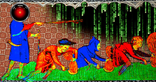
Image: Cryteria (modified) https://commons.wikimedia.org/wiki/File:HAL9000.svg
CC BY 3.0 https://creativecommons.org/licenses/by/3.0/deed.en
#pluralistic#productivity theater#upwork#ai#labor#automation#productivity#potemkin productivity#work harder not smarter#scholarship#bossware#reverse centaurs#accountability sinks#bullshit jobs#age of recoupment
462 notes
·
View notes
Text

"April to lab 3... April to lab 3 for a systems check." The pa blurted out into her office. April rolled her eyes as she grabbed her clipboard and started meandering through the halls. Her heels clacking against the hard cold floors. Her footsteps echoing as she passed the labs. As she peered In through the windows checking on the various projects her company was working on.
Lab 1 was busy burning one of their plants that had been exposed to plant fertilizer. grapes the size of a fist popping and exploding as they outgrew their environment. The vines crept out into the hallways as the team tried to contain its growth to one room.
Lab 2 was much less destructive. Their love potion seemed to be working wonders as two of her co-workers were currently sprawled against the floor. Hungarily tearing their clothing off. She smirked as she called it into the radio that lab 2 had had a chemical leak... Again.
Finally she pulled up to lab 3. Punching in the code as she readjusted her button up. She priced open the door as she slinked into abrupt chaos. Technicians and scientists running to and thro. In the center of the room a sparking growth ray haphazardly swinging in a circle. A tech furiously typing into the computer as the machine started to shirt to life. A bright bean forming at the tip of the nozzle "it's gonna fire FIND COVER." April shoved the tech down as she tried to take control of the situation. Clearing the error codes as she punched in the manual override.
The growth ray swung around and violently spasmed as the room started to shake. A large hum filling the room deafening any sound. Stephen the senior tech screamed at her but she heard none of it as she punched in the final commands. She turned to look at the machine as her eyes opened up wide. Too late. She realized as a bright green beam shot out at hef. She barely had time to think before it splashed into her. She gasped and shrieked as it shoved her to the floor. Her skin glowed and throbbed as she felt the heat course through her. Her body hit the wall behind her with a smack as she thudded to the floor. The machine powering down as everyone gathered around April.
Meanwhile in a haze April was cautiously trying to stand back up. Not having fully realized what had happened. She opened her eyes as everyone surrounded her. "What.. happened." Before any could respond April felt her body shudder and rapidly heat up.
April snapped back as she felt her body get hot with wave after wave of energy. In tandem her body responded by growing larger with each rush of heat. The first to respond was her chest which made its entrance as it billowed forward. Her blouse stood no chance as her measly cups expanded into a letter April didn't even know was possible for her frame. Her buttons snap off in quick succession. Her bra lifted off of her as her boobs bulged over and under the fabric. The straps loosened and dug into her shoulders before they snapped off entirely. April quickly raised her hands to cover as she sat up. April tried to turn as a couple scientists caught an eyeful. "Stop looking you perverts".
She felt herself cool down as April raised herself up. She peered down into her cleavage as she slinked her blouse off. Her shirt no longer capable of covering her. She stood awkwardly as she saw a couple people bust out measuring tapes and cameras. "For research purposes" she muttered as she let them approach.
She stared coldly as they wrapped around her. Noting measurements and radiation levels. she felt her skin grow warmer but she attributed it to nerves. Everything seemed normal except of course her new bust size. Meanwhile April felt a nagging pressure inside of her. She tried holding it back but it seemed to grow and grow and "FUCK"
April screamed as her skin glowed and expanded. Her body filled the room as she doubled her height. Her butt ruptured her skirt in half as her leggings and shoes exploded off of her. Her panties popped off into a technician as he fell to the floor. Aprili raced to cover herself with a hand now at 10 ft tall but felt the feeling grow again. "I'm not stopping" she screamed before she doubled again.
Her head smashed into the roof as she recoiled off of it. Groaning and yelping In pain as her head met the 20 ft ceiling. A tech slammed the panic button as the sirens and red lights flooded the room. April turned to and thro as she tried to figure out how to leave. The techs rushed out the emergency exit as she felt her body pressurize.
"wait don't leave me somebody..." She doubled again. She tried to brace for impact but her head easily smashed the floor as she raced in. Her cleavage similarly busting the floor open as it punched through. Her head hit the second ceiling as she peered over her cleavage to the screaming attendants in lab 8 who were currently watching a woman fill half the room. Her waist at eye level.
"HELP MEEE" she screamed before she filled the entire room. Her body smashed them as she doubled again. Her feet below her filled the entire room as she bursted through the facilities roof. Her waist stuck in the framework as she tried to get away from the carnage and panic she was causing. Her body pressurized and glowed again. "nooooo"
She grimaced before filling out again. Over a hundred feet tall. Her head rushed with vertigo as her cleavage dragged her down. The survivors watch as a hundred foot...AAAAHHHHH...THREE hundred foot April crushed the lab in one fall. What they weren't expecting was her to suddenly swell closer. April raised to her hands and knees as she spurted again. Her feet dug into the soil as they raced across the road and hills each one falling to either side of the surviving scientists as her butt encroached in front of them. Her boobs dragged into the building as her head raced forward a couple hundred feet. Before anyone could react it was too late. A butt the size of a col de sac crushed the group in seconds. She spurted again and again her body filling the country side as April gave up. Groaning and crying as her body finally sizzled out after filling half the state.
257 notes
·
View notes
Text
Ik noone asked for a part 3, but this is so fun to write

ORION PAX x D16 x GN!READER
[ orion pax x d16 x gn!racer!reader ] [ Part 3 ]
PART 1 PART 2
“Wait! Before you go, (Y/N)! Is there any way you could.. I don’t know.. Keep us somewhere secret? They wouldn’t care about a few miners disappearing.”
”But Pax, you think they will let us off the hook? Just like tha-“
”Don’t you wanna hang out with your crush more?”
”… Wh- DON’T SAY THAT OUTLOUD! Let (Y/N) make their decision before you jump to conclusions.”
They then look up at you, waiting for you to make your decision. You weren’t sure if you wanted to hold them in your quarters. You didn’t want to isolate them from society just so they wouldn’t get in trouble…
POLL RESULTS
Give in and bring them into your quarters - 95.6%
Decline and force them back into the mines - 4.4%
START OF PART 3
“… Look, if I bring you guys to my quarters temporarily, then will you guys be happy?”
The two looked at each other, shook that you even accepted Orion’s request. Orion then looks at you, nodding eagerly. D16 looks at you with a shy smile, still willing to come with you. The two don’t have the best life so anything could seem fun to them.
”Are you serious? I- I mean yeah, sure, of course! It would be an honour!”
You chuckled at D16’s confused but hyped tone and crouched to them once more, going down to eye-level.
”Alright, but I’ll have to carry you guys on my shoulders again. You guys can’t catch up with me and my speed.”
Both of them understood so you grabbed them and instead of harshly throwing them onto your back, you held them with one in each arm. You were holding them so they were facing you as they sat in your arms. You then start rushing to your quarters as you feel their hands grip onto you for stability.
Bypassers saw you run by, waving and screaming your name as you were famous for all of your wins in the Iacon races. The Cybertronians around you made it clear that you were absolutely famous and you loved to bask in the glory, but currently you're holding two miners who could probably be fugitives so you couldn’t stop for autographs nor meet and greets.
You get to the building and push everybot aside and unlock the metal passageway, throwing the two into your quarters, running in after and letting the passage shut and lock. Looking at the miners then at your room, reality struck you again. These are fugitives and you took them in, you could get in trouble for having them here… Whatever, things happen and it is too late now, you thought.
You were training as a scientist despite being more of the speeds than anything else. You were made to be a bot all about speed and maybe even brawn, but you aspired to be a scientist. Because of this, there were lots of advanced technology, messy chemical works, shelves filled to the brim with inventions and generally it was a mess. Then at the back was where your stasis pod was, directly in the middle. Beside the stasis pod were a massive shelf on each side, both of them filled with trophies and badges you have received overtime in iacon. It was contrasting on how dirty it is on the front of your quarters compared to the cleanliness in the back.
Orion Pax and D16’s jaws were dropped so quickly at the sight of your quarters. It was so messy and clean at the same time, the surprise of you wanting to be a scientist was definitely something else and their height makes them look like little sparklings. Orion immediately runs off and starts looking around, his face in awe. D16 grabs his arm and yells at him.
”Pax! This isn’t a museum, we can’t just look around without permission!”
“Oh come on, I’m sure (Y/N) wouldn’t mind! Right?”
Orion smirked and looked up at you for their approval. You just chuckled and nodded.
”Sure, just be careful. There are many failed inventions and deadly chemicals that are placed around here… I should really clean it up.”
Orion launched off mid-speech, you and D16 weren’t too surprised. D16 gently tapped your elbow, looking up at you with a tinge of curiosity, it was pretty wholesome. You look at him with your head tilted slightly.
”(Y/N), are you studying science?”
”Yes, why do you ask?”
”I just wanted to know… Why? You are the fastest bot in all of Iacon! You are swift and sly, unlike any other bot. What’s the poi-“
D16 was cut off with Orion yelling out your name, trying to get you to go over to him. He was yelling for you to come and explain something to him, seemingly it was something pretty personal to you. D16 just scoffed and crossed his arms, he was jealous?
TO BE CONTINUED
with another poll!!
#transformers#transformers one#tfone#d16#orion pax#optimus prime#megatron#transformers x reader#megop#d16 x reader#orion pax x reader#optimus x reader#megatron x reader#optimus prime x reader
159 notes
·
View notes
Text
A 3-Part Character Profile Template

PART 1: The Present
THE BASICS
Name:
Age:
Place of birth:
Current location:
Nationality:
Education:
Occupation:
Income:
PHYSICAL APPEARANCE
Height:
Eye color:
Hair color:
Build:
Distinguishing features (tattoos, scars, birthmarks, etc.):
Preferred outfit?
Glasses?
Accessories (cane, pipe, necklace, etc.):
Grooming: Disheveled; Smart, very put together; Untidy but clean; Other
Distinguishing “tics” and mannerisms:
Health? Do they suffer from chronic illnesses?
Handwriting (sloppy, neat, careful, unintelligible, etc.):
Gait: Confident, powerful strides; Lazy stroll; Fast, walks at a clip; Distracted, eyes on the ground; Other
SPEECH & COMMUNICATION
Style of speech (elevated, educated, peppered with slang, etc.):
Tempo of speech (rapid, slow, measured, drawl, etc.):
Health? Do they suffer from chronic illnesses?
Distinguishing “tics” and mannerisms:
Do they have an accent?
Pitch (melodic, gravelly, deep, etc.):
Posture: Stiff, military; Slouching; Casual and relaxed; ‘Turtle’, tired; Other
Gesturing: Only when agitated or eager; Doesn’t gesture; Compulsive “hand-talker”; Controlled, only to make a point; Other?
Level of eye contact (direct, shifty, etc.):
Speech impediments:
Distinguishing speech “tics”:
Preferred curse word:
Catchphrases:
Laughter? What do they tend to find funny?
Describe their smile:
Emotive? Do they wear their emotions on their sleeve? How easily can others read them?
They have a resting ____ face. Angel; Side-eye; Neutral; Confused; Other
PART 2: The Past
This shows how your character is a product of their environment.
BACKSTORY
Hometown:
Type of childhood (sheltered, neglected, etc.):
Education:
Were they involved in organizations and clubs at school: Sports; Debate; Gay/Straight Alliance; Model UN; Drama; Other
At graduation, they were named Most Likely to __ in the yearbook.
Jobs (if applicable)? What would their résumé look like?
Dream job as a child? Why?
Who were their role models growing up? Describe them:
Greatest regret:
Hobbies growing up:
Favourite place to be as a child?
If they could change one thing from their past, what would it be? Why?
Major turning points or “life beats” in childhood:
Earliest memory:
Saddest memory:
Happiest memory:
Clearest memory:
What are their skeletons in the closet?
Three adjectives to describe them as a child?
What advice would they give to their younger self?
Criminal record:
FAMILY
Father
Age (if living):
Occupation:
Briefly describe their relationship with your character:
Mother
Age (if living):
Occupation:
Briefly describe their relationship with your character:
Siblings (if applicable)
How many?
What are their names? Ages?
Briefly describe their relationship(s) with your character:
Children (if applicable)
How many?
What are their names? Ages?
Briefly describe their relationship(s) with your character:
Extended family
Grandparents:
Uncles and aunts:
Cousins:
Other:
Family’s economic status:
How often do they see their family in a year?
RELATIONSHIPS
Closest friends? Describe them:
Other significant friends:
Enemies? Describe them:
How are they perceived by…
Strangers in the street?
Acquaintances at a work function?
Colleagues in the office?
Authority figures?
Friends in their friend circles?
Children?
The opposite sex?
Extended family?
What social media platforms are they on?
How would they use their social media platforms?
How would they fill out an online dating profile for themselves?
What’s their role in a group dynamic? Leader; Joker; Parent; Hype man; Mooch; Other
Who do they depend on for…
Practical advice?
Mentoring?
A wingman?
Emotional support?
Moral support?
What do they want from a relationship?
Who would be their ideal partner?
Do they have a significant other? Describe them:
How many people would attend their funeral?
PART 3: The Core
This shows how your character is deep down.
PSYCHOLOGY
What do they do on rainy days?
Are they: Street-smart; Book-smart; Optimist; Pessimist; Introvert; Extrovert
What is their favorite sound?
Favorite place in the world?
What secrets do they keep? What are they most afraid of people finding out?
What do they want the most?
Biggest flaw:
Biggest strength:
Biggest fear:
What is their biggest accomplishment?
What is their idea of perfect happiness?
Do they want to be remembered? What for?
Favorite quote:
How do they approach…
Power?
Ambition?
Love?
Change?
What is the one object or possession that they would rescue from their burning home?
What (or who) bores them?
What makes them angry?
What do they look for in a person?
How strong is their moral compass? When, specifically, are they willing to compromise their morals?
List the last 10 books that they read:
Which fictional world would they most wish to visit?
If they didn’t have to sleep, what would they do with extra time?
What are their pet peeves?
If they won the lottery, what would they do?
Describe the character’s bucket list at the ages of: 15; 20; 30; 40
List the 10 songs that would occupy their All-Time Most Played playlist on Spotify:
What is the best compliment that someone ever paid them?
In an elevator, do they push the elevator button more than once?
What would they want their tombstone to say?
PRESENT & FUTURE
Story goal:
Story motivation:
Source ⚜ More: Worksheets & Templates ⚜ Notes & References Plot ⚜ Character ⚜ Worldbuilding ⚜ Tips & Advice
#character development#writing reference#writeblr#character building#writing inspiration#writers on tumblr#spilled ink#dark academia#literature#writing prompt#poetry#poets on tumblr#light academia#fiction#creative writing#writing inspo#writing ideas#on writing#writing tips#writing advice#novel#story#hans andersen brendekilde#writing resources
187 notes
·
View notes
Text

#𝗖𝗼𝘀𝗺𝗼𝘀 𝗧𝗿𝗮𝗶𝗻𝗶𝗻𝗴 𝗜𝗻𝘀𝘁𝗶𝘁𝘂𝘁𝗲#𝗛𝗶𝗴𝗵𝗳𝗶𝗲𝗹𝗱 - 𝗨𝗞 𝗔𝗽𝗽𝗿𝗼𝘃𝗲𝗱 𝗖𝗼𝘂𝗿𝘀𝗲𝘀#Principles of Health and Safety (Level 1)#Health and Safety in the Workplace (Level 2 to 4)#Health and Safety for Accommodation Supervisors (Level 3)#Health and Safety for Construction Labourers and Site Visitors (Level 1)#Health and Safety for Construction Supervisors (Level 3)#First Aid at Work (Level 3)#Emergency First Aid at Work (Level 3)#Fire Safety (Level 1 to 2)#Work at Height(Level 1 to 2)#Confined Spaces (Level 1)#Risk Assessment (Level 2)#Safe Moving and Handling (Level 1)#Accident and incident Investigation (Level 3)#Teaching & Training (Level 3)#Auditing and Inspection (Level 3)#COSHH (Level 2)#𝐂𝐨𝐧𝐭𝐚𝐜𝐭 𝐔𝐬:#Mob:#+917530075440#+919655111155#+919787637876#Email:#[email protected]#Web:#www.cosmostrg.com#teaching#teachingtraining#TeachingJobs
0 notes
Text
Capricorn Rising
Accuracy influenced by ENTIRE chart.
Appearance:
Generally, cap risings can appear:
🧩 Stoic. Sharp and bold features - a few possible examples: high cheekbones or tall in height or jawline or eyebrow shape & placement. Their gaze as well. It's sharp and alert. They aren't likely to shy away from eye contact.
🧩 However, the above can change. EX: If aspecting planets like Neptune, they can appear in their own world. They may have traits that make them appear fragile or dainty - ex: short, big eyes, etc.
🧩 Intimidating/unfriendly looking. This can be due to various reasons - maybe due to resting bitch face or due to their status (EX: a person with authority).
🧩 In my experience, these people can be very self critical of their appearance. They may often look for ways to change or enhance their appearance. EX: Cosmetic surgery, fillers, don’t feel good or want to be seen in public without makeup. They are generally well groomed and styled.
Personality:
RARELY can people realize when a cap rising is making a joke. People take everything they say so literal. It's so easy for a cap rising to offend people. Maybe it's their sarcasm or dry delivery.
Feeling they don't deserve good things because they haven't done enough to earn it. They are very critical of themselves. The positive of this is they tend to be very hardworking. They create and find opportunities for advancement/improvement. Due to this it is likely they will find materialistic success.
However, not all cap risings are career orientated. For example, a cap rising with saturn in pisces or moon in pisces isn't likely to care about materialistic matters. Of course, just like everyone they would love to have a lot of money but they aren't in love with the hustle of making money. They're more likely to be/become artistic and/or spiritually inclined.
There can be a disconnect between how people see them and how they seem themselves. 10th H Libra indicates people see them as someone who is balanced, they have it all together. However, this creates a lot pressure from a young age to have it all together.
People assume they are capable and independent. Due to this, they get handed a lot of responsibility throughout life. 6th House of duties/responsibilities in gemini indicates being very busy and all over the place. Cap risings often have too much on their plate. They dislike asking for help and others are unlikely to offer help. People will assume they're fine and capable of doing everything on their own.
Cap risings will generally encounter 2 types of people in relationships (platonic or romantic):
🧩 TYPE 1: Moody people. People who are attracted to the Cap risings strong presence or status. They like that the cap rising appears stable and in control. They can want the cap rising to be like a parent or protector to them. These people may be sensitive, shy, insecure, withdrawn, clingy & demanding as well.
The person's neediness may make the cap rising feel secure in the relationship. The partner has an obvious dependance on them - making it unlikely the partner leaves them.
🧩 TYPE 2: These people are providers/nurturing. They may express this through domestic work like cooking or cleaning. These people are protective of the cap rising. They can have a hard exterior but are very sweet and soft on the inside. These people can be very sentimental and touchy/affectionate/like to cuddle with the cap rising.
The spouse of the cap rising can have a mix of type 1 & type 2 traits. The cap rising can behave like a mix of type 1 & type 2 in relationships.
This is all general info. This does not take into consideration apsects or placement ruling the houses. When looking at only one placement we can only get general/surface level insight.
#astrology observations#astrology#capricorn rising#capricorn first house#moon in pisces#saturn in pisces#10th house libra#6th house gemini#cancer 7th house
194 notes
·
View notes
Text
Dragon Age: The Veilguard - known Character Creation info Part 1
[LINK TO PART 2]
This post is just a dump collection of info and snippets that came out about CC (& some related topics). if you've been following the news or reading posts here, it's not new info or anything, I just put it together in one place here for convenience. ( ˶´ ᵕ `˶ )
if you notice anything missing, pls lmk. there's a bit of repetition of info in places as prev posts on the topic overlapped.
---
CC is vast [source] and immensely detailed [source]
We will enter CC straight after Varric’s opening narration [source]
You are given 5 categories to work your way through in CC: Lineage, Appearance, Class, Faction, Playstyle. Each of these has a range of subcategories within them. There are 8 subcategories within the “head” subcategory" in “Appearance” alone [source]
Lineage dictates things like race (i.e. human, elf, dwarf, qunari) and backstory [source]
Backstories include things like factions. Factions offer 3 distinct buffs each [source]
There are dozens and dozens of hairstyles [source]
There are separate options for binary and non-binary pronouns and gender [source]
“BioWare’s work behind the scenes, meanwhile, goes as deep as not only skin tones but skin undertones, melanin levels, and the way skin reacts differently to light” [source]
CC has a range of lighting options within it so that you can check how the character looks in them [source]
There are a range of full-body customization options such as a triangular slider between body types and individual settings down to everything from shoulder width to glute volume [source]. There are “all the sliders [we] could possibly want”. The body morpher option allows us to choose different body sizes [source]
All body options are non-gendered [source]
They/them pronouns are an option [source]
Rook can be played as non-binary [source]
Individual strands of hair were rendered separately and react remarkably to in-game physics [source]
Special, focused attention was paid to ensuring that hairstyles “come across as well-representative, that everyone can see hairstyles that feel authentic to them, even the way they render” [source]
The game uses strand hair technology borrowed in part from the EA Sports games. The hair is “fully-controlled by physics,” so it “looks even better in motion than it does here in a standstill” [source]
The ability to import our choices from previous games is fully integrated into CC. This will take the form of tarot cards - “you can go into your past adventures” and this mechanic tells you what the context was and what decision you want to make [source]
In CC we will also be able to customize/remake our Inquisitor [source]
A core tenet of the game is “be who you want to be” [source]
There are presets for all 4 of the game’s races (human, elf, dwarf, qunari), in case detailed CCs overwhelm you [source]
It is the best CC BioWare has ever made in a game [source]
The faction we choose will determine who we as protagonist Rook were before they were recruited to put a stop to Solas [source]
Certain conversation options are only available to Rooks of certain factions. For example, Grey Wardens get conversation options that are focused on the Blight, as they know more about it from other people. It also impacts how people talk to Rook (reactivity from characters and then faction reactivity from plots relating to that faction) [source]
Faction choice affects a lot of things [source]
There aren’t unique missions (I think this means like the playable Origins in DA:O), but faction choice does set the course for Rook for the rest of the game [source]
“body customization and morphing. From more muscular characters, to curvier builds, and just about any shape you want to give your character, there are all sorts of toggles to adjust so you can give them any figure you want”. “There’s even features that let you choose proportions, so you can alter their height, give them wider shoulders, and much more” [source]
There are makeup options [source]
There are tattoo options [source]
The hair uses a “Strand system” to “make them behave and move in a believable way for the different races” [source].
There are 4 voices to choose from for Rook: two feminine and tow masculine (one American, one British for each) [source]
In CC, 'Lineage’ is the game’s parlance for race i.e. human, elf, dwarf, qunari [source]
We can pick Rook’s name, but the dialogue calls them 'Rook’ [source]
In CC we can “make a few key decisions that will impact how The Veilguard begins” [source]
“I really do think its our most feature-ful character creator ever.” [source]
All armor and clothing options will scale and mesh to any body type [source]
The character creator has lots of sliders for body parts and overall shape, none of which are tied to the voice or pronouns (she/her, he/him, or they/them) that you choose [source]
“Epler took special care to show off the extensive curly and textured hair options in the game, including several versions of braids and locs, noting that increasing these options in particular was very important to the team” [source]
You can change your character’s physical appearance at any time during the game, but not their class or backstory [source]
“Each individual class has some variability, too; even the mage class has some up-close-and-personal attacks, since a mage player character could still conceivably have an assassin backstory and would therefore need to have some attacks to accommodate that sort of career path” [source]
“ "We’ve spent a lot of time thinking about skin tone,” Corinne said. The character we made, a Black elf, seemed to glow in the bluish light of a nighttime scene, and under bright sunlight, I could see the richness of his color. Corinne: "We want to make sure that skin tone is reflected authentically” “ [source]
” “We have dozens and dozens of hair types,” she said. “And they’re fully affected by physics.” The quality and variety of choices I saw delighted me. The rows of bouncy, luxurious-looking hair of all curl types and textures (and yes, the annoyingly ubiquitous “Killmonger cut” was among the options, what can you do?) brought the biggest smile to my face in the hour I spent with Busche and The Veilguard.“ [source]
BioWare confirmed that even if you make your Rook a short king, the team has done work to ensure animations fit any character build [source]
“Dragon Age’s character creator has seen a massive glow-up” [source]. “The volume of choices you get here are frankly insane. As Epler noted, “you could spend forever here,” and he’s not kidding.” [source] The art and graphics teams spent a lot of time trying to make hair look amazing [source: the Discord]
In CC we can customise our “bulge size” [source]
Some more detail on the new lighting options to see how Rook looks like in CC when you make them: you can view them in “blazing forest sunshine versus the glare of an underground temple” [source]
“newly mobile, extra-hairy hair” [source]
Faction choice has statistical boons. For example, Shadow Dragon Rook deals extra damage to Venatori blood cultists [source]
Faction choice basically determines why Rook has been called to help in the fight against Solas [source]
All pre-determined character models in CC can be adjusted [source]
You can make a really tall dwarf if you want [source]
“Setting your previous world state is fully integrated into the character creator for Veilguard” [source: the Discord]
Inquisitor appearance will be re-created, there is no way to carry their appearance from DA:I into the game [source: the Discord]
Classes for Rook are not restricted in the sense that you can play any almost class, lineage and faction combination that you want. For example, a mage Rook can be a Crow [source: the Discord] (Fel note: it sounded like Rook cannot be a magic-wielding dwarf, even though the exception of Harding now exists) (Fel note: there is a mage Crow in one of the books)
“The diverse body and gender options make it an industry leader by a signifcant margin” [source]
“BioWare was keen to highlight the hair strand technology that looked very similar to that seen in FIFA and EA FC, also made under EA’s roof” [source]
“Fine tuning sliders that allowed for microscopic adjustments of nose angles, it was clear that a lot of options exist to get the smallest possible body parts exactly right” [source]
“There’s no specific genital customisation to be oversold as CDPR did but, much like Saints Row, there is an option for bulge customisation” [source]
Pronoun choice, gender identity, body type, and voice choice are 4 separate options, not tied together [source]
Height is customised on a slider [source]
Size is customized on a triangle like in Saints Row: the 'points’ are fat, slim and muscular [source]
The different lighting options are 4 different settings: clean, bright, dim, sunset [source]
In CC you can also try out what Rook looks like in their starting rags, in typical mid-game armor, and some level 50 gear (class appropriate for each one) [source]
There’s a way for you to modify your character’s look once the game has started if you want to make some tweaks [source: the official Discord]
You can be any class and choose any backstory/faction, any race, any gender [source]
The opening cinematic Varric narrates at the start of the game plays before CC. “Following character creation, Varric’s narration continues, revealing that he’s put together a group to stop Solas, having recruited our character and a handful of others so far.” [source]
Faction choice affects in-game moments between other factions and locations, as well as characters [source]
Re: using body sliders in CC - “It looked incredibly easy to maneuver around and create a body that is either close to that player’s real personage or their ideal fantasy self” [source]
“Our presenter said that each specialization was pretty much as deep as a job” [source]
“Many fans were subject to the horror of DA Inquition’s special green light, so BioWare made it where players could shuffle through a handful of backgrounds to see how their character looks in different lights. Body sliders for fully customizable bodies, other appearance changes like tattoos, and everything fans would expect from a modern Dragon Age character creator seemed to be there.” [source]
Rook always shares a background with 1 of the companions. Makes sense, the backgrounds are Wardens, Crows, Shadow Dragons, Mourn Watch, Veil Jumpers, Lords of Fortune, and that’s Davrin, Lucanis, Neve, Emmrich, Bellara, Taash respectively [source]
The CC team and character art team spent a lot of time working on making sure that hairstyles behaved appropriately, in a realistic way, and on representing a lot of different hairstyles [source]
“We were told that one of the three key pillars of the game was ‘Be Who You Want To Be.’” [source]
“Numerous selections for a wide variety of body types & skin tones” [source]
There is faction-themed gear to wear, like if you chose Grey Warden as a background, there is GW gear. [source: The Discord]
“As a faction, the Inquisition doesn’t really feature prominently in the story - your appearance options are more reflective of the factions and styles you’ll encounter in The Veilguard.” [source: The Discord]
body sliders + “a triangle for gradients of body types” [source]
“The team heard us loud and clear on hair styles”. Frostbite engine updates served them well. Hair moves with your body and reacts to the wind [source]
For pronouns and gender selections, everything you select is used in the game and in cutscenes [source]
They were asked about the customizability of Rook’s backstory. Rook has 6 different backgrounds that you can choose from. Each of them is tied to one of the major factions in DA:TV. “Each one sets up who Rook was before they were recruited by Varric. Well that sets out the broad events. As you go through the game, as you have conversations, either with members of your faction, other characters, you can define not just what those events were but what they meant to you. What was your motivation, what was the kind of person you are as you build up Rook. Because again, we wanna make sure that roleplaying is at the heart of this experience, and taking Rook, giving them background to ground them in the world and then letting you decide what that means, what that says about you, is also a big part of it.” “A lot of opportunities to really define who your Rook was and who they are now, so.” [source: June 14th Discord Q&A with devs]
They have taken a different approach on how we import our decisions into the game this time around. This is now fully integrated into the character creator. The devs believe that this serves a dual purpose. Corinne said that she playfully thinks of it as ‘last time on Dragon Age’, though it isn’t actually called this in the game. She noted that it has been ten years since the last Dragon Age game was released, so this aspect serves as a refresher on critical events as well as allowing us to remake those decisions that are critical to us. The system for doing this is very highly visual and uses the familiar tarot card aesthetic. “It’s a very visual and playful experience as you go through it.” It was very important to them that this system was built into the client, so that you can play this game entirely offline. No online connection is required, no linking to EA accounts is required – this was a big fan request.
Corinne added, “I don’t want to spoil anything by revealing what decisions you can import, but I will say that this [thinking about the decision import system and what decisions to include] has been a really interesting creative intersection for us, because on the one hand, this is a whole new adventure”. In this game we are in northern Thedas, in locations we have not been to before. This naturally affects “some of what will matter and what decisions they’re not using this time around, as far as decisions. But obviously there are some very, very clear connections to existing characters.” “It’s no secret that the Inquisitor is going to show up, so that’s a factor”. [source: June 14th Discord Q&A with devs]
In CC, Rook’s pronouns can be chosen. You can select both pronouns AND gender, as as Corinne noted, these are related concepts, but actually not exactly the same thing. Rook can be non-binary. The pronouns available are she/her, they/them, and he/him. [source: June 14th Discord Q&A with devs]
The Character Creator is very detailed and very deep. The team focused a lot on doing good hair and doing hair and skin tones respectfully. There is full body customization. They are going to show us a lot more on CC in the future, but at a time when they have the time and space to do so. [source: June 14th Discord Q&A with devs]
Q. How extensive are Rook’s decision trees for companions and NPCs throughout the game going to be?
A. “Huge. It’s a Dragon Age game. We wanna make sure you have choices, we wanna make sure you can choose your roleplaying but also choose outcomes of conversations, choose how events unfold. We wanna make sure that we also react to decisions you’ve made. So, for example, you may be talking to a follower who is an elf, and if you yourself are an elf, obviously you’re gonna have a different perspective on events than someone who is not an elf. Sometimes that means different conversation options. Sometimes that’s going to mean entirely deep dialogue trees. As well as based off decisions you’ve made throughout the game, so. Again, making sure that the game feels like the it’s noticing what you’re doing is a huge part of how we’ve written out the dialogue trees in this game.” [source: June 14th Discord Q&A with devs]
“There are quite a few, easily more than we’ve done before I think, tattoos from various cultures. We’re bringing the vallaslin back of course. There are a ton of different options, especially when we’re going into all of these new regions. Each region has its own kinda visual language for that. But yeah, we are bringing the vallaslin back, and then a couple of the characters have them, but we’ve kinda customized them a little bit, they’re a bit more specific to their personality.” [source: June 14th Discord Q&A with devs]
Corinne’s favorite thing other than the companions is the CC. “That CC, the makeup options, the range of sliders… I’m a qunari fan, so even just the way you customize the horns and combine that with the really great looking hair”. [source: June 14th Discord Q&A with devs]
The Inquisitor can be customized, “include some of our new customization options”. “Yeah, they’re gonna show up and they’re gonna be your Inquisitor.” [source: June 14th Discord Q&A with devs]
We will get to see the Character Creator before launch. “They are laying out a roadmap for what we are going to show and when we are gonna talk about it. So, yes, you will see it, as we get a little bit closer to launch.” [source: June 14th Discord Q&A with devs]
In CC, the body customization can be done for humans, elves, dwarves and qunari. Qunari hair options and horn options are rad. They acknowledged that it was hard to have nice-looking hair for qunari in DA:I. [source: June 14th Discord Q&A with devs]
“Related to this, your Lineage (human/elf/dwarf/qunari) gives you a lot of really unique dialogue options, so that’s a really lovely aspect of choosing your lineage as well.” “Each lineage, depending on the lineage you choose and the background you choose, there are some specific call outs to. For example, if it’s the Mourn Watch, them being a faction from Nevarra of mages, obviously your experience as a dwarf there is going to be different than say a human or an elf, so, there are also specific callouts tailored to those combinations with again, the intention of giving each lineage their own little flavor as to how they fit into that faction as a whole.” [source: June 14th Discord Q&A with devs]
“Rook’s last name is defined based on their faction, again, we wanted to tie that into your backstory, but also, there’s a name generator that can give you a selection of first names. Obviously if you want to make your own first name, that’s definitely something we support as well.” But if you always struggle during CC and name all your characters like 'Bob’ or something, you’re gonna be okay thanks to the name generator. [source: June 14th Discord Q&A with devs]
"some of what I saw behind closed doors, as well as the way the devs spoke openly about the passion for diversity, gave me a lot of hope for this installment." [source]
"A New Peak For Progressive Character Creators. My first thought as I watched the dev take us through Dragon Age: The Veilguard's character creator at Summer Game Fest was 'okay, everyone can shut up about Cyberpunk 2077 now'." "Dragon Age, as I've written about in more depth in my full breakdown, cares. It takes elements of Cyberpunk 2077 and Saints Row, plus its own creator from 2014's Inquisition which was then best-in-show and remains a contender even today. It acknowledges the trans experience in a multitude of ways, likely owing heavily to game director Corinne Busche being a trans woman and therefore able to inject a personal perspective that most other games lack." "The dev also made a Black woman during our gameplay demo" [source]
The world reacts to Rook’s lineage and backstory. There are unique dialogues or conversation options based on backstory and lineage. [source: June 14th Discord Q&A with devs]
There are glorious, fantastic dwarf beards. "I don’t know what magic the character art team did with the beards”, but they feel/look like how beards should. [source: June 14th Discord Q&A with devs]
On the slider for body type selection: “It looked incredibly easy to maneuver around and create a body that is either close to that player’s real personage or their ideal fantasy self” [source]
“Our presenter said that each specialization was pretty much as deep as a job” ((job - class)) [source]
“sliding a cursor across a triangle that can make your character stocky and chubby or tall and muscular or anything in between” [source]
#dragon age: the veilguard#dragon age: dreadwolf#dragon age 4#the dread wolf rises#da4#dragon age#bioware#video games#long post#longpost#solas#lgbtq#this is a topic ppl care a lot about so here's the info (that I know of anyway#there could be more) in one place rather than spread across 90000 posts haha..
233 notes
·
View notes
Text

I couldn't fit the tutorial on a reply lmao, here's a full post explaining my process :]]
STAMP TUTORIAL (TF2 edition, but works for everything)
99% of the process is done on the website ezgif. Ezgif carries the stamp-making process lmao
1. Get your GIF
Tenor: Ok place to grab your GIFs. Average quality of the GIFs is good enough, and looks ok when resized to the size of the stamp. You'll find like 1 normal GIF every 4 buff characters GIF tho.
GIPHY: Average quality of the GIF is better (I don't think the web compresses the GIFs that are uploaded)… If you find what you're looking for. You'll have to SCROLL before finding what you're looking for because there are always non-related GIFs on the top of your searches or the same GIF multiple times, it's crazy.
makeagif: You will find cool GIFs, but the quality is pretty low (I think the web itself compresses the GIFs a lot). It looks bad even when resized down. And it has a watermark, which I recommend cropping because it's not even visible when resized, it just looks like a gray blob on the corner.
Google: Best option by far, quality is pretty good and the ratio of “things I was looking for/things I actually find” is SLIGHTLY in favor of “things I was looking for” (and most of “things I actually find” are just the characters rotating, not NSFW, so that's only a nice change from Tenor). You won't have to scroll much to see different and interesting GIFs. JUST REMEMBER TO FILTER BY GIFS.

You search whatever > Images > Tools > Type > GIF
Make it on your own: Aka, you download your video, go to ezgif's “Video to GIF” (then you can crop it, CUT IT. THIS IS IMPORTANT, YOU DON'T NEED TO GO ANYWHERE ELSE TO CUT YOUR CLIP, YOU CAN DO IT ON EZGIF ITSELF). Ok, I lied, it wasn't Google, this is the best oftion by far. You get exactly what you want, the best quality if you don't compress it much until after the GIF has been resized into the size of a stamp… It's just super time-consuming, and you'll have to spend like an entire hour just watching a video to find the clips.
OK, I HAVE MY GIF NOW
Hehe, his legs go pipupipu
2. Resize
Go to ezgif, this is where the fun begins (if you weren't on ezgif already). You download your GIF, or copy the link and insert it, or you'll have it there if you made it yourself.
A STAMP MAKES 99px × 56px
THE INNER PART OF THE STAMP MAKES 91px × 47px
I RECOMMEND MAKING YOUR GIF 92px × 48px
BTW, THESE MEASURES ARE FOR THE TEMPLATE I'LL GIVE YOU LATER. If you use another template, just go to an image editor and see what the inner size of the stamp is.
So, you set your GIF's width to 92px.

Then crop it, so your height is 48px.

Or you can resize it so it's directly 92px × 48px, but the crop will be in the center, and SOMETIMES YOU DON'T WANT THAT.
For example:

It's a vertical GIF whose area of interest is not in the center, so if we resize it directly-

oops-
ANYWAY
Once you have your GIF resized:
IMPORTANT: BEFORE THE NEXT STEP, REMEMBER TO CONVERT TO GIF IF THE FILE YOU'RE WORKING ON ISN'T A GIF ALREADY
Sometimes you'll be working with a webp without even noticing (EW, I hate webp) and transparencies don't work particularly well with that extension.
3. Overlay

Click on this icon.
Ok, now that that's fixed:

Extend the size of the canvas.

Select your template and Upload image!

This is the template, btw.

Then move the overlay around until it contains the GIF nicely, or just set Left to 43, Top to 20 and Generate image! (I have these numbers memorized, it saves you like 20 seconds lmao)
Also, again, these numbers work on MY template, if you use another one, you'll have to figure it out yourself.
4. Crop

THIS OPTION IS A TIME-SAVER FR
5. Optimize (optional, highly recommend)

I always set my optimization method to Lossy GIF and level 10 because I find that there is no quality loss, and the file size might drop by 30%-70% (actually crazy). These percentages don't change much in higher compressions, even though you'll start seeing a drop in quality around level 35 of compression (the default).
6. Save

YIPPE!!! Your stamp is done :D
You can save it and look at it and place it on your profile or website.


Here it is btw, in case someone wanted it :]] The Sniper GIF but correctly cropped and made into a stamp as well.
Now do that another… eleven times, and you'll have a stamp pack to make into a Tumblr post... Oof TT
There's no website that lets you make stamps faster lmao (I wish)
@sir-broken-bones (I'm @ them so they actually see it, I made this tutorial for them after all lol)
#team fortress 2#tf2#tf2 scout#tf2 sniper#stamps#da stamps#tutorial#graphics#old graphics#neocities#old web graphics#old web
162 notes
·
View notes
Note
hello! I love your edits and I wanted to know, for the "Steve Robin and Nancy" Gif you posted.. How would I go about doing something like that? More specificly, the bottom two where it says "Height Difference" and where it labels them as "Princess, Jock and Loser"
Thank you! Sorry this took a while to answer. I finally had time to sit down and write this. Link to original post.
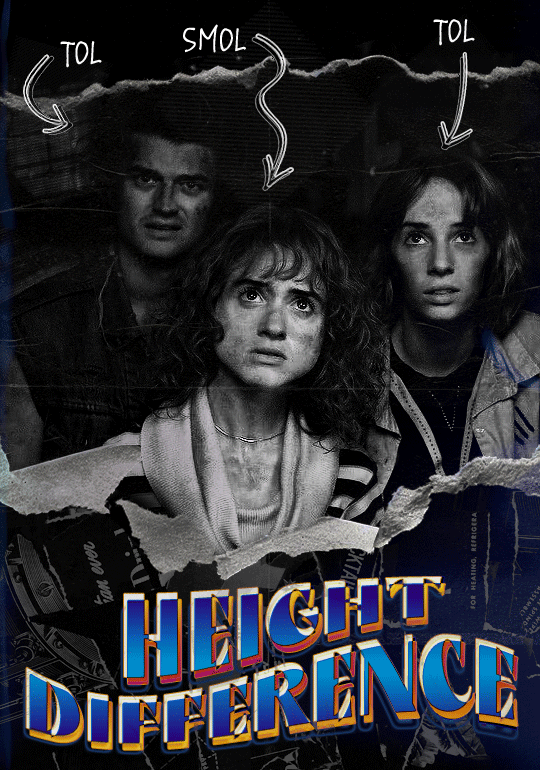

Quick notes: I'm using Photoshop 2021 on Mac and working in video timeline. Must have basic gifmaking skills and know how to use layer masks. This is primarily a gif layout and text tutorial.
Fonts used in first gif:
Pea Wolfe Tracks — link here
King & Queen — link here
Fonts used in second gif:
Kiera — link here
Post — link here
Ellianarelle's Path — link here
Heina's hurry — link here
I used a light leaks/film texture, ripped paper textures, folded paper textures, and transparent pngs (arrows + post-it notes + smiley face).
We'll start with this gif.
Make your gif! The gif here is 540x600px. I color and sharpen it to my liking. Go to image > canvas size > change height from 600 to 770px. I left the anchor in the middle, though it doesn't really matter.
I drag and drop my folded paper texture and change the layer order so it's under my gif. Then I change the blending mode on my gif to Screen so the texture shows through the gif, but I keep the texture at 100% Opacity and Fill.
Now I move my gif around and add my ripped paper textures. I wanted to give it a sort of poster-like feel to it, so I made more room on the bottom for my main text and ended up with something like this. Blending mode is set to Lighten for the ripped paper textures.
I then use layer masks to hide what I don't want shown and add my light leaks/film texture. Blending mode on light leaks/film texture set to Pin Light, Opacity: 50%, Fill: 70%.
I use Levels and Brightness/Contrast adjustment layers to darken the gif up a bit more, then I add a patterned paper texture. Blending mode for patterned paper texture set to Lighten, Opacity: 100%, Fill: 75%. Result:
Now on to the text!
I'm going to be honest here, a lot of this was clicking around until I settled on something I liked. There's three layers to create this text effect. The font used here is King & Queen.
For the first text layer, the font color is set to black (#000000), font size: 87 pt, leading: 80 pt, tracking: 25.
Layer styles used here are stroke and drop shadow.
Text Layer 1
Stroke settings:
Size: 1px
Position: Outside
Blend Mode: Hard Light
Opacity: 40%
Overprint: unchecked
Fill Type: Color
Color: #5911ed
Drop Shadow settings:
Blend Mode: Difference
Color: #2d5ba8
Opacity: 85%
Angle: 70°
Use Global Light: checked
Distance: 7px
Spread: 0%
Size: 6px
Contour: Cone - Inverted
Anti-aliased: unchecked
Noise: 0%
Layer Knocks Out Drop Shadow: checked
Blending mode for text layer set to Overlay, Opacity: 100%, Fill: 85%.
Warp text settings:
Style: Wave
Horizontal: checked
Bend: +60%
Horizontal Distortion: +10%
Vertical Distortion: 0%
With all those settings applied, the first text layer looks like this:
Duplicate the layer, clear all layer styles, and change the color for the second text layer to white (#ffffff). All other text settings (including warp settings) should stay the same. The only layer style then applied to this text layer is stroke.
Text Layer 2
Stroke settings:
Size: 1px
Position: Outside
Blend Mode: Difference
Opacity: 100%
Overprint: unchecked
Fill Type: Color
Color: #d48f16

Blending mode for the second text layer is set to Difference, Opacity: 90%, Fill: 100%. Nudge the second text layer a bit so the first text layer is a little more visible or move to your liking.
With both those layers active, it looks like this:
Duplicate the second text layer, clear layer styles, and change the color of this third text layer to a dark grey (#1a1919). Again, all other text (and warp) settings should stay the same.
Layer styles applied to this layer are stroke and gradient overlay.
Text Layer 3
Stroke settings:
Size: 1px
Position: Outside
Blend Mode: Difference
Opacity: 100%
Overprint: unchecked
Fill Type: Color
Color: #d48f16
Gradient Overlay settings:
Blend Mode: Difference
Dither: unchecked
Opacity: 100%
Gradient: #cd3f00 > #ffdb5d
Reverse: unchecked
Style: Reflected
Align with Layer: checked
Angle: 90°
Scale: 100%

Blending mode for the third text layer set to Exclusion, Opacity: 100%, Fill: 100%. I also moved the third text layer around, down and to the right a few pixels to give it that 3-D Word Art effect.
With all three text layers active:
Next are the arrows.
Take your transparent pngs and place them to your liking. Blending mode for these is set to Difference, Opacity: 100%, Fill: 100%.
Command + click on an arrow thumbnail to select all the pixels in that layer. This is why the image must be transparent!
With that selection made and on a new blank layer, right click the selection and click on stroke. Settings for that are width: 2px, color: white, location: center. Move that a couple of pixels over.
Do this for all arrows for a total of 6 layers for arrows. I group them together to keep my workspace clean, then I duplicate my arrows group with no further changes made to the second group to get what you see in the final gif.
Next is the smaller text. It's three separate text layers for each word, so I can move each of them around to my liking.
Font used is Pea Wolfe Tracks, font color: white (#ffffff), font size: 24 pt, leading: 6 pt, tracking: 25. Bold and italic options checked. I set the blending mode to Difference, Opacity: 100%, Fill: 100%.
And that's it! That concludes the tutorial for this gif!
Now on to this gif.
We'll start with the background gif. There are three separate gifs. You could make them one gif, but I wanted the option to order them differently if I needed to.
All gifs in the background are the size of the canvas: 540x770px. Color and sharpen to your liking, but keep them all black and white. To get the blurry effect go to filter > blur > guassian blur. Set radius to 7.0 pixels. Add this to all three gifs.
Then I add two folded paper textures. Blending mode for one set to Lighten, Opacity: 60%, Fill: 100%. The other set to Screen, Opacity: 70%, Fill: 90%.
I found this tutorial a while back for a halftone effect. They include links to the halftone pattern used here as well as textures and gradient maps not used here.
I'm only using the halftone pattern here.
Pattern fill settings:
Angle: 66°
Scale: 8%
Link with Layer: checked
I also added a gradient overlay layer style to the halftone pattern which gives the gifs the color you see above.
Gradient Overlay settings:
Blend Mode: Overlay
Dither: unchecked
Opacity: 100%
Gradient: #0059ac > #a33600 > #e6b801
Reverse: unchecked
Style: Linear
Align with Layer: checked
Angle: -100°
Scale: 100%
Now on to the square shapes with rounded corners. In the interest of keeping this tutorial short(er), I found this tutorial on youtube that explains how to make squares with rounded corners.
I set my stroke size to 6px, stroke color to white (#ffffff), and fill to no color. I don't use the stroke layer style to make the borders of the shape like in the video! I'm only linking the video to show how to curve corners with square shapes.
Note: Be sure you know how big or small you want these to be and how they're going to fit on your canvas in order to make all the shapes and edit them. It can be tedious to change the settings.
Duplicate and resize to your liking.
In this instance, I wanted to make three squares total, so I had to duplicate twice and resize until I had something I liked.
Settings for the shapes used here are:
Innermost shape: W: 200px, H: 280px, corners: 50px
Middle shape: W: 220px, H: 300px, corners: 60px
Outer shape: W: 240px, H: 320px, corners: 70px
Once I have the size I want for all three shapes, I group them together to make a set and duplicate that group twice, then adjust each set on the canvas for my layout.
What the sets look like all together:
Colors used: orange #e47100, blue #0062d1, yellow #ecac00
To add color to the shapes, either change the color of the shape itself or use layer styles. I used layer styles.
Note: I didn't add the colors until the end after I knew what gifs went where and what color scheme I wanted, but I don't want to add more images than I need to here.
To keep this short, I found this tutorial on youtube that explains how to wrap text around a shape. However, I wanted the text to align on the outside where the white line is and not the green line (left image):
So I created another shape just inside the innermost square and used that as a path for my text (right image). Adjust the text to your liking until you have your text where you want it. Refer to the video tutorial if you need help moving the text along the path!
You don't need the shape path once you have your text where you want it, so use the layer visibility tool to hide it. You can hide your other shapes too so you can work with your text.
Do not delete your shape path!
I duplicate it once I start working with my "jock" text since all the sets are the same size. The "loser" text has to be worked a little differently, but we'll get to that later.
For the princess, jock, and loser text, there are two text layers to create the overall effect. For both layers, font used is Kiera, font color set to white (#ffffff), font size: 60 pt, blending mode set to Normal.
I added a gradient overlay layer style to the first text layer which I'll call the base layer. Opacity for this layer is 100%, Fill: 100%.
Base Layer
Gradient Overlay settings:
Blend Mode: Normal
Dither: unchecked
Opacity: 100%
Gradient: #f0b002 > #e7f0fd
Reverse: checked
Style: Diamond
Align with Layer: checked
Angle: 90°
Scale: 100%
The second text layer is your stroke and drop shadow layer. For this layer, opacity is set to 100%, Fill: 0%.
Stroke and Drop Shadow Layer
Stroke settings:
Size: 2px
Position: Outside
Blend Mode: Linear Light
Opacity: 100%
Overprint: unchecked
Fill Type: Color
Color: #0064cb
Drop Shadow settings:
Blend Mode: Difference
Color: #fb7c00
Opacity: 100%
Angle: 30°
Use Global Light: checked
Distance: 5px
Spread: 0%
Size: 0px
Contour: Linear
Anti-aliased: unchecked
Noise: 0%
Layer Knocks Out Drop Shadow: checked
End result looks like this:

When I make my shapes visible again (minus the one I used as a path), I get this:
The shapes are clearly in the way of the text, whether they're above my shapes layer or under it. I use layer masks to hide what I want, so the text is legible. It looks cleaner this way and I wanted the text to be a part of the shape itself. I do that for each rounded square.
Now on to my smaller gifs. I like to crop, resize, sharpen, and color separately because my laptop and Photoshop would kill me if I tried to do it all on one canvas. I use the size of the middle shape for my gifs (220x300px), so I can have a little wiggle room when adjusting. I then use a layer mask to hide the parts of the gif that are outside of the shape.
A quick way to do this is to command + click on the thumbnail of the innermost square. With that selection made, I got to my gif layer and add a layer mask. Sometimes you need to invert it. Use command + i with the layer mask selected (not the gif) to invert the layer mask.
I repeat this process with my Steve and Robin gifs. I have to go back and forth with all the layer masks to hide parts of the gif/shapes I don't want for each set. It's kind of a long process, but not all that difficult. I label and group my layers together as I work to keep things clean and it helps me keep track of what I edited and what needs to be edited when it comes to things like this.
The picture below shows where I hid the bottom right corner of Nancy as well as the shapes that make up her set using layer masks. I also did this with the Steve and Robin sets, hiding the bottom left corner of Steve.

Similar text settings used for jock. The gradient overlay layer style for this base layer is different than that of princess because of the positioning of the text. Again, same as princess, two text layers are used here. Blending mode, opacity, and fill for both are the same as the princess text layers as mentioned before.
Base Layer
Gradient Overlay settings:
Blend Mode: Normal
Dither: unchecked
Opacity: 100%
Gradient: #007aec > move bottom middle dot to 80% > #e7f0fd
Reverse: checked
Style: Diamond
Align with Layer: checked
Angle: -140°
Scale: 100%
Stroke and Drop Shadow Layer
Stroke settings:
Size: 2px
Position: Outside
Blend Mode: Linear Light
Opacity: 100%
Overprint: unchecked
Fill Type: Color
Color: #a05700
Drop Shadow settings:
Blend Mode: Difference
Color: #ffba00
Opacity: 100%
Angle: 30°
Use Global Light: checked
Distance: 5px
Spread: 0%
Size: 0px
Contour: Linear
Anti-aliased: unchecked
Noise: 0%
Layer Knocks Out Drop Shadow: checked
Image 1: We start with Robin.
Image 2: To make the loser text, I had to create a new path.
Image 3: I make it so the text is on the inside of the path instead of the outside. (Hint: Refer to video tutorial if you don't know how to do that.) I then adjusted the tracking between the letters in the word "loser" so they didn't look so squished together.
Image 4: Then I use layer masks to hide the parts of the shape I don't want shown.
You can then hide the path or delete it. You only need it if you want to adjust the placement of the text. I keep it (hidden) just in case.
Text settings for loser are just like those for princess. Blending mode, opacity, and fill are also the same.
Base Layer
Gradient Overlay settings:
Blend Mode: Normal
Dither: unchecked
Opacity: 100%
Gradient: #eb6400 > #e7f0fd
Reverse: checked
Style: Diamond
Align with Layer: checked
Angle: 90°
Scale: 100%
Stroke and Drop Shadow Layer
Stroke settings:
Size: 2px
Position: Outside
Blend Mode: Linear Light
Opacity: 100%
Overprint: unchecked
Fill Type: Color
Color: #e1a900
Drop Shadow settings:
Blend Mode: Difference
Color: #0068de
Opacity: 100%
Angle: 30°
Use Global Light: checked
Distance: 5px
Spread: 0%
Size: 0px
Contour: Linear
Anti-aliased: unchecked
Noise: 0%
Layer Knocks Out Drop Shadow: checked
Next are the post-it notes! This is probably the easiest part of making this gif. You just have to repeat this process for however many post-it notes you're making.
Image 1: To start, place your transparent post-it note where you want it. You can also rotate it if you'd like.
Image 2: Then create a text layer and write what you want. Font used here is Post. I wanted this text underlined to give emphasis, so I click on the underline option. I also adjusted the leading because I wanted more space between the word and the line. Rotate the text so it looks like it's written on the post-it note. Note: It looks better if you choose a font that looks handwritten.
Image 3: I wanted another line to give emphasis to the "Dingus!!" text and make it seem more handwritten. I use the line tool to create another line.
Image 4: Then I adjust that line to my liking.

Fonts used for notes: Post, Ellianarelle's Path, and Heina's hurry
Repeat this process for all post-it notes!
That finishes the tutorial! (And I hit the 30 image limit lol.) I hope this helps. If you have any further questions, feel free to send an ask or IM and I'll try to answer to the best of my ability.
Happy photoshopping!
#ask#pcocana#photoshop#photoshop tutorial#tutorials#*tutorials#userchibi#userbunneis#uservivaldi#userriel#userabs#usertiny#useralien#useraljoscha#userfanni#userraffa#tusermona#userbess#userrobin#userroza#quicklings#janielook#usernaureen#userrlorelei#tsusermels#tusermimi#userelio#usertj#userbarrow#usernolan
268 notes
·
View notes