#Website Design Long Island
Explore tagged Tumblr posts
Note
oh could you write something cute about the reader and Lando please, maybe something funny where the reader says "oh yeah I'll do this but for that you'll buy me a Porsche" and Lando actually buys her a car 💜
BRAND AMBASSADOR | LN4

wc : 3k
an : slowly working through my requests yippie! im not too sure about this but i hope its alr :'>
It was meant to be a joke. Really.
But Lando didn’t know how to take a joke.
For weeks, he’d been pestering you to do a photoshoot with him for Quadrant.
“Brand image, baby!” he insisted, arms flailing as if that explained everything. “Power couple vibes! You and me, absolutely dominating the internet. Imagine the engagement!”
“My manager would actually drop dead if I did a hoodie campaign.”
“Oh come on, baby, just one photoshoot,” he pleaded, leaning so far over the kitchen island that he looked like he might slide right off. “Just a few pics in Quadrant stuff! Hoodie, joggers, maybe the bucket hat if you're feeling spicy-"
You didn’t even look up from your phone. “Lando. I’m booked for the next eight months. Vogue is flying me to Paris next week, and Dior wants me in Milan by the weekend. I don’t have time to play influencer in your gamer merch.”
“It's not gamer merch!” Lando gasped, clutching his chest like you’d stabbed him. “It’s- it's… lifestyle! Culture! Gaming and racing fusion!”
“That’s cute,” you said flatly, scrolling.
Lando narrowed his eyes. “You didn’t even look at the new designs I sent you.”
“Because it’s just another hoodie, baby.”
He gasped again, louder this time. “Just another hoodie?”
“Oh, I’m sorry- hoodie, but make it Formula 1.”
“Wow.” He pointed at you. “I cannot believe this slander. From my own girlfriend.”
“Your supermodel girlfriend,” you corrected without missing a beat.
“And yet, I’m still here, humbly begging for crumbs of attention.”
You didn’t even blink.
And that’s when you heard it. The soft shuffle of socks against hardwood floors.
You looked up just in time to see Lando drop dramatically to his knees in front of you, arms sprawled over your thighs like some lovesick Victorian maiden.
His chin rested on your knee, staring up at you with those big, stupidly pretty eyes.
“Please.” His voice dropped to a pitiful whisper, like he was auditioning for a charity ad. “Do a Quadrant shoot with me.”
“Oh my God, Lando- get off the floor!”
“No. I live here now.” He clung tighter. “Photoshoot. Please, baby. You could be the face of the brand! Imagine it: you in my merch, absolutely carrying. We could finally replace Max’s ugly mug on the website-”
“Lando!” You laughed, swatting at him.
“It’s true! The customers deserve better!”
“You own the brand. You’re supposed to be the face.”
"But you’d look so good in my hoodies," he said, practically drooling at the thought. "God, you in joggers? Maybe one of those cropped sweaters? The internet would lose its mind.”
You stared at him. Long. Hard.
“…Fine.”
His eyes lit up, stars in aquamarine. “Wait, really?”
“But it’s gonna cost you.”
Lando blinked. Sat up straighter. “How much?”
You smirked, dragging your perfectly manicured nails through his curls, watching him melt like butter.
“A car.”
His entire posture changed. He sat up straighter, interest piqued. Now you were speaking his language. “Which one?”
You almost choked. “Excuse me?”
Lando leaned in, eyes sharp now. “Which. One.”
Oh, he was serious.
You blinked, regrouped, and leaned back like you were simply ordering off a menu.
“LaFerrari.”
Silence.
“The red one. Wine red. Matches my nails.” You admired the burgundy polish glinting under the light. “I’d look good in it.”
Lando didn’t even blink.
“Deal.”
Your head snapped toward him. “What?”
“Done.” He stood up, dusting off his sweatpants like you hadn’t just asked for a multi-million-dollar hypercar. “I’ll have the keys for you next week. Photoshoot’s on Friday.”
“Lando, that’s a LaFerrari-”
“And?”
“It’s like… a $3 million car!”
He tilted his head. “Do you want it in the garage or delivered to your place?”
You opened your mouth. Closed it. Opened it again.
“…You’re insane.”
Lando leaned down, smirking, and kissed your forehead. “And now you’re stuck with me.”
“…I want full creative control over the shoot.”
“Baby, you can set the studio on fire if it makes you happy.”
“And you’re paying for my glam team.”
“Obviously.”
You stared at him, still trying to process how you had accidentally hustled a hypercar off your billionaire boyfriend in under five minutes.
“And I want full rights to veto any photo where I look bad.”
“Oh, baby, you never look bad.”
You squinted. “If I show up and it’s just me in some hoodie in front of a brick wall-”
Lando’s hands cupped your cheeks, deadly serious. “You will be in a hoodie… in front of a gaming PC.”
You slapped his hands away.
—
You were never supposed to take it this far.
The photoshoot was meant to be a joke.
A little bargaining chip to shut Lando up for five minutes. You didn’t think he’d actually pull it off.
Yet here you were.
In a studio. In a Quadrant hoodie. In sweatpants.
And to make it worse, Lando was treating this like he was shooting for Vogue.
“Okay, okay- pause! Can we fix the lighting on her left side? I need more contrast, more mood. She’s selling the hoodie but not the vibe.”
You slowly turned to glare at him. “Lando. I am wearing a hoodie. There is no ‘vibe.’”
“There’s always a vibe!” Lando spun around to the photographer. “Tell her there’s a vibe.”
The photographer, who was clearly riding the paycheck wave, gave you an awkward smile and a less than enthusiastic thumbs up. “Yeah. Big vibe.”
You groaned and adjusted the hoodie, tugging the hood up over your head. “Lando, I walked for Dior last month. Dior. And now I’m here, dressed like a Twitch streamer in front of a gaming PC.”
Lando gasped. “First of all, streamers WISH they looked this good. Second of all, don’t disrespect the setup. That’s a triple-monitor, RGB-lit, water-cooled rig worth more than my life.”
“Yeah, well, it better be. Because I’m dying inside.”
“Okay, can we get a shot of her sitting on the desk? Like, casual, but make it fashion. Maybe holding a controller? No- headset! Baby, put on the headset.”
You stared at him. “You want me to wear a gaming headset in a fashion shoot?”
“Yes. Gamer girlfriend aesthetic. Internet eats that up.”
“I haven’t touched a console since the Wii came out.”
“And that’s the fantasy!”
—
Lando couldn’t stop staring.
The moment you put on the damn headset, he knew he was in trouble.
He’d been so smug, so proud of himself for getting you to agree to this ridiculous photoshoot.
But now? Now he was fighting for his life.
Because there you were, sitting on the desk in a Quadrant hoodie, wearing his brand, looking so effortlessly good that it was like the universe was punishing him for ever thinking this was a good idea.
It wasn’t just the way the hoodie hung on you, oversized and perfect, or the way you pushed the headset into place like you were made to wear it.
It was the thought behind it.
You were wearing his stuff.
And that did things to him.
Very Dangerous things.
Lando dragged a hand over his face, trying to snap himself out of it, but it was no use.
His gaze betrayed him, sliding back to you as you leaned back on the desk, legs crossed, your smirk telling him you knew exactly what you were doing to him.
“Lando,” you said, your voice teasing and smooth, “you okay over there, baby?”
He tried to play it cool. “Yeah. All good.” His voice cracked halfway through, and he coughed to cover it up.
But he wasn’t fine.
Not even close.
His hands were clammy, his heart was pounding, and he was hyperaware of the fact that he was growing harder by the second.
Oh, this was bad.
You shifted on the desk, leaning forward slightly, the motion drawing his eyes to your legs before snapping them back to your face.
That cocky little smirk was still there, your stupidly pretty eyes glinting with amusement.
You were enjoying this. Brat.
“You sure?” you pressed, tilting your head.
His voice was higher this time, strained and barely holding it together. “Yep. Fine. Totally fine.”
You didn’t buy it for a second. “Lando…”
“That’s it,” Lando muttered, voice tight, cracking slightly with frustration. “Break! We’re taking a break.”
His words were sharp, a contrast to the usual smooth confidence he exuded.
Without waiting for any response, he grabbed your wrist, dragging you away from the set with a sense of urgency that didn’t match the cool composure he usually carried.
“Lando, what the-”
“Not now,” he interrupted, low and tense, as he pulled you into a nearby storage room.
The door clicked shut with an almost deliberate force, the sound of the lock turning echoing in the small space.
You barely had time to gather your thoughts before he was in your space, his breath coming fast, his chest rising and falling against yours.
“Do you have any idea what you’re doing to me?” His voice was low, strained, his hands finding your waist, gripping tight, enough to bruise.
A slow smile spread across your lips. “I think I’ve got a pretty good idea, yeah.”
Lando’s forehead pressed against yours, eyes squeezed shut for a moment as if trying to center himself.
His breath fanned across your lips, shaky and uneven, and you couldn’t help but notice the way his chest seemed to rise and fall faster with every breath.
“You’re a brat,” he muttered under his breath, voice raw, yet edged with something almost desperate.
“You’re the one who wanted me in your merch,” you teased, your fingers curling into his hair as you leaned into him, feeling the heat of his body.
“Yeah, well…” His hands slid lower, pulling you closer, his fingertips burning against your skin. “Now I’ve got more than I bargained for.”
The words barely left his lips before his mouth found yours.
The kiss was messy, urgent, his lips urgent against yours, like he couldn’t get enough.
You didn’t need to think. Your body responded immediately, hands moving to pull him closer, the heat building.
The press of his body against yours was relentless, hard and desperate, as he deepened the kiss.
His hand slid down your thigh, pulling it up to hook around his waist, while the other traced a slow, deliberate path along your jaw.
His breath fanned across your skin, shallow and uneven, each exhale carrying a heat that set your nerves ablaze.
“You don’t fight fair,” he murmured against your lips, his voice rough, edged with a hunger that made your stomach flip. His mouth moved to your neck, leaving a trail of fire in its wake as his teeth grazed your throat.
Your lips curled into a smirk, your nails raking across his back just enough to make him shudder. The sound of his sharp inhale sent a rush of power through you.
“Neither do you,” you whispered, leaning closer, your breath mingling with his as your fingers found the hem of his hoodie, tugging it higher, your touch skimming over his skin.
“God, you…” His voice broke, his words catching in his throat as he crashed his mouth back to yours.
The kiss was harder this time, almost frantic, as though he couldn’t get enough of you.
His hands moved with purpose now.
Demanding, claiming, leaving no part of you untouched.
Your nails scraped against his back again, dragging another groan from deep in his chest, a sound so raw and desperate it made your knees weak.
His hips rocked against you, slow and deliberate, each movement sending shockwaves through your body.
“Careful, Norris,” you teased, your voice breathless but still carrying a hint of mischief as you pulled back just enough to meet his gaze.
His eyes were dark, pupils blown wide. A quiet intensity that you'd seen more than once.
“You’re starting to look a little… well, territorial.”
For a moment, he froze. His chest heaved with every ragged breath as if he was trying to regain control.
Then his lips twitched into a sly, almost dangerous smile, one that sent a thrill through you.
“Maybe I am,” he murmured, his voice low and rough, each word carrying weight. His hand slid to your waist, pulling you even closer, making any distance between you disappear.
The words sent a shiver through your spine. But it wasn’t fear. It was something else, something exciting, something that only made you want more.
His lips found your neck again, pressing soft, burning kisses against your skin.
His teeth grazed over your pulse, just enough to send a jolt through you, sharp and unexpected, making your breath catch in your throat.
You tilted your head to the side, giving him more access, fingers threading through his hair, pulling him closer as you whispered, “Everyone’s going to notice, you know. You weren’t exactly subtle when you dragged me off like that.”
The corner of his mouth curled into a grin, but it was dark now, and there was a sudden pressure in his hands as he adjusted his position against you. “Let them notice,” he said, his voice thick with something unspoken.
He kissed down your neck, his lips trailing lower, his breath hot against your skin. “I don’t care. They can see whatever they want.”
The words sent a wave of heat rushing through your body, and you couldn’t help but arch into him, your nails scraping lightly over his back.
—-
When it was over, you leaned back against the wall, your chest rising and falling as you tried to steady your breath.
Lando, however, was already standing in front of you, his hair tousled, his hoodie still hanging off his frame in a way that somehow made it look even better on him than it ever had before.
He bent down casually to scoop your underwear from the floor, dangling them in front of you with a shit-eating grin plastered on his face.
“Come on, love,” he said, his voice rough and teasing, still thick with exertion. “Don’t leave me hanging. Put these back on before we go out there.”
You shot him a glare, snatching the fabric from his hand and hurriedly slipping it on, feeling the heat rush to your face.
Lando leaned back against the wall, watching you with a cocky, self-satisfied grin. “Still dripping with me,” he murmured, but the rasp in his voice made your stomach flip. You felt your cheeks flush even more.
You rolled your eyes, tugging the hoodie down to hide your body and fix your composure. “You’re disgusting.”
“And yet, you love me,” he replied with a wink. “Guess that says something about you too.”
The studio lights were still dimmed as you walked back in, legs slightly unsteady. You caught yourself on the doorframe, trying to keep your cool, but the feeling between your legs was still fresh, raw.
Lando followed you, smirking like a cat that had just caught its prey. He leaned against the wall, eyes on you as his grin grew wider. “Fix your hair,” he said, voice dripping with amusement. “You look like you just got fucked.”
You barely suppressed a laugh, brushing your fingers through your hair and pulling it back into something that at least resembled “done.” “Gee, I wonder why,” you muttered under your breath.
Lando raised an eyebrow, clearly enjoying the way you were still trying to play it cool. “Hey, I didn’t hear you complaining.”
You narrowed your eyes, about to retort when Lando took a step forward, his smirk never fading, and pulled you close. He kissed you softly, lingering, the kind of kiss that made it hard to remember where you ended and he began.
“Come on,” he murmured against your lips as he pulled away, the mischief still dancing in his eyes. “We’ve got a photoshoot to finish.”
—-
Months passed.
The LaFerrari didn’t show up.
Not that you cared. Really.
Sure, it had been a fun little joke—“Pay me in a LaFerrari or I’m not doing this shoot”—but you never expected Lando to actually follow through.
He said he would but Lando also forgot to stock up on groceries some days so you didn’t take it to heart.
Besides, it wasn’t like you had time to think about it.
Your schedule was relentless: fashion weeks in Paris, Vogue shoots in Milan, fittings for Dior in New York.
You were barely home long enough to unpack, let alone pine after a car.
It wasn’t a big deal.
Until one night, after a particularly grueling flight back from London, you pulled into your driveway and-
You slammed the brakes.
Because there it was.
A LaFerrari.
Burgundy red. Like aged wine. Like sin and velvet had a baby and parked it outside your house.
It gleamed under the porch light, shameless and expensive.
For a full minute, you did nothing but stare, slack-jawed.
Then you slowly got out of the car, leaving your bags in the trunk.
“Lando,” you muttered, pulling out your phone.
You called.
He picked up on the second ring.
“Hey, baby- what’s up?”
“You left a LaFerrari on my driveway.”
“Oh! You got home?” He sounded way too casual.
“Lando. There is a multi-million-dollar car parked outside my house.”
“Yeah, about that. It’s yours. Obviously.”
“…You’re joking.”
“Would I joke about something this expensive?”
“Yes.”
“Fair. But not this time.”
You stared at the car again.
“Are you serious? After months?”
“It takes time to deliver a LaFerrari!” Lando said, his voice way too serious for a man who had just been exposed.
“I had to get it customized, too. Your name is literally engraved on the side. And then there was the whole issue with cargo. Did you know they’re super strict about how cars are transported? I had to make sure it wasn’t gonna get dented, and the shipping company I trust didn’t have any available slots until-”
“I thought you were joking, Lando!”
“Well, I wasn’t,” he replied confidently. “You said you wanted a LaFerrari. You said ‘make it red wine,’ so I made it red wine. I also got the seats customized with carbon fiber inserts and-”
You groaned in disbelief, interrupting him. “You literally bought the car, customized it, and shipped it to my house."
Lando blinked, unfazed. “Well, yeah. Obviously. Did you think I was kidding about that part?”
“Yes! It’s a LaFerrari! Who even does that?! It’s absurd!”
"Clearly me.” He paused. “Check the glove compartment.”
“What?”
“Just do it.”
Suspicious, you approached the car, heels clicking on the pavement. You opened the door.
God, even the door sounded expensive- and popped the glove compartment.
Inside was a tiny Hot Wheels car. A red LaFerrari.
Taped to it was a sticky note.
“Just in case this one wasn’t enough. - Lando”
You stared at it.
You looked back at the LaFerrari, glinting under the sun like some ridiculous, over-the-top love letter.
“…I’m taking it to the Dior fitting tomorrow.”
“You better.”
“…Is this why you were ignoring my texts last week?”
“I wasn’t ignoring you! I was busy coordinating with Italy!”
“Oh my God.”
#x reader#formula one x reader#formula one#formula 1#formula 1 x female reader#formula 1 x reader#lando imagine#lando x y/n#lando x you#lando x reader#lando norris#ln4 fluff#ln4 imagine#ln4 fic#ln4#ln4 x reader#ln4 x y/n#ln4 x you#ln4 fanfiction
2K notes
·
View notes
Text

Everything You Ever Wanted To Know About Website Design
Web design creates websites and design pages with all the company's information while providing a user-friendly experience. Layout is the most important factor when it comes to website design. Website Design Long Island NY is one of the best website designers.
0 notes
Text
I was on glitterberri's website reading about Wind Waker's development (it's relaxing) and was taken by this developer's description of Ganondorf:
Ganondorf, to me, is the embodiment of villainy. I really enjoy the idea of the villain being the antithesis of the protagonist. While the baddie is a persona whose brutality must be overcome by the player, he also has an admirable sort of charm. That’s what I was aiming to capture as I designed him.
The Wind Waker takes place in an era far removed from Ocarina of Time, so the character has lost the air of youthfulness he had in those days. At the same time, and in contrast to his ambition then, he’s also imbued with a certain sense of resignation… He’s known for a long time that he can’t escape from his destiny of pursuing the Triforce, but even so, he hasn’t given up on his pursuit of the Hyrule of old.
The world of the Wind Waker consists of a lot of small islands floating atop the Great Sea, but Ganondorf has no desire for them. That’s why I gave Ganondorf a strong figure, with no room for whimsy or excess.
(emphasis mine) These are four simple attributes of the ideal monster husband
#or any ganondorf characterisation. if your game has that.#monster husbands#beauty and the beast#those are the tags he goes under... it's just how it is
131 notes
·
View notes
Text
The Legend of Outer Wilds: CHERT

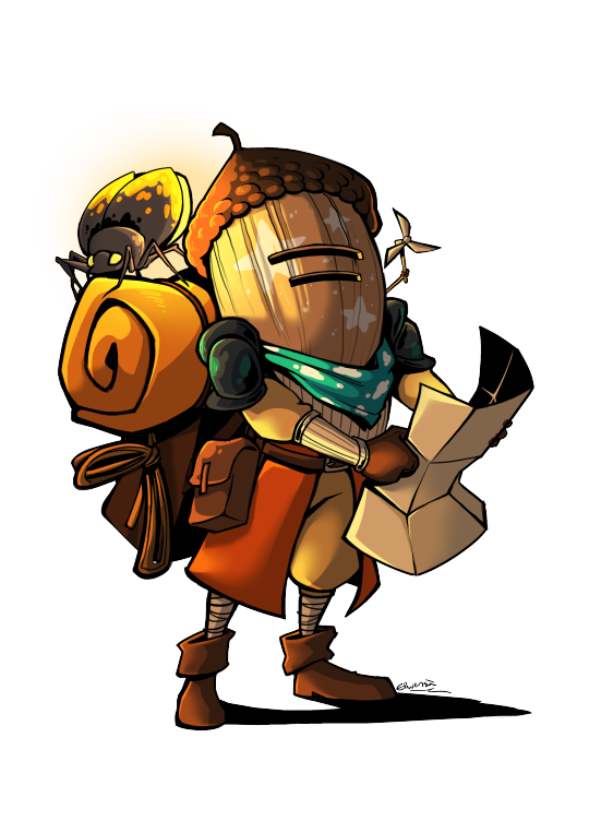
Here is the fourth reference sheets of all the TLOOW main characters, the one who's aware of the trouble: Chert!
Additional informations about Chert:
- Chert doesn’t like the idea of having to fight and kill creatures to explore their system. For that, they refuse to carry a weapon. Because of that, they use their scout bug, Pathfinder, a lot. You can push them to be a little bolder, but it might get them in danger. But it also makes them less aware of the decline of the Crystal.
- Chert plays a different kind of drum called a Tabor.
- Chert’s flying bug looks like a dragonfly. They can stay in stationary flight for a very long time, so Chert can map the islands from above. Their name is Sun’s Eye.
- I hesitated to give Chert a bow or a slingshot that they would only use in extreme cases. Your choice if you prefer them with or without.
- Their design is not inspired by the Zelda franchise, but by Cha-Cha from Monster Hunter Tri
If you want to know more about this universe, please check out the website
57 notes
·
View notes
Note
Do you have fic recommendations 👉👈
Of course!
I would recommend my own fic, but... it's still in the works, unfortunately. No mal du pays content for the weak and elderly.
did you really think i wouldn't recommend ghostlight, of all things? especially with my current drawing series, obviously it's good!
It's a postgame fic centered on loop's and siffrin's (mostly loop's) healing processes post-game, where loop has to learn how to be human again. It's 24 chapters long, about 84k words, has an ongoing sequel (though it's on hiatus), and has a tumblr account you can interact with! @ghostlightfic
here are some other postgame fic recommendations:
Bloom And if I were not myself, would this be easier?
@livesworthlivingau Is a postgame au where Siffrin lives on for 30 years after the loops only to loop back when Odile dies in the future. This fic has a dual chapter system, one set of chapters that focuses on Loop and one set of chapters that focuses on Siffrin. This distinction becomes crucial later on. It also, like ghostlight, has a discord to join :3
I haven't read chokehold of a broken family bond myself, but I've heard wonderful things about it from everyone around me!!!! It's a LONG, ongoing AU fic that I'm sure someone else can provide a synopsis for ;)
Follow the Stars Back Home is another fic I have yet to read, but got recommended and decided to check out. It's postgame and focuses more on Siffrin's Island trauma than their Looping trauma, a nicher aspect people don't explore often.
speaking of aus:
Try It Again, Cheater by @moonstandardtime sends Loop back to their original timeline after breaking free from Siffrin's loops. They and their family have to adjust to this drastic Change and suffer the consequences of a timeline they could never remember.
To Extend our Reach to the Stars Above is a Villain Siffrin au where they meet the King before the party! It's one of only a few fics that explore this concept, all of which are so so interesting to me. Check it out!
Timeloop Support Group by @pixxyofice is a fic about therapy done from the pov of Siffrin and focuses on timeloop trauma. The twist? The people they're stuck with are au versions of their friends who got trapped in time loops themselves!
featured aus:
In Tales and Time (Odile) by @/tealgoat In Cycles and Cessation (Mira) by @/the-bitter-ocean Of Stitches in Sequence by @/basilpaste (which also has two fics on ao3, but i recommend viewing the au on everyone's profiles instead)
-- Oh, hey, Basilpaste!!! They have more bangers up their sleeve!!!! Slay the Savior is a Slay The Princess fusion au with ISAT that features Isabeau as the protagonist and Siffrin as the princess. Not only is the writing excellent but he thought up new designs for each siffrin on each path!!! Not to mention thinking up new paths, too! It's on hiatus, though.
The Dormont Archives are another Basil product, infusing ISAT into The Magnus Archives universe!! Like STS it's done in the style of the media and all of the statements are absurdly creative. It's ongoing with (currently only) 14 chapters, god knows how many planned for the future. (ALSO IT APPARENTLY HAS A DISCORD. I DIDN'T KNOW AABOUT THAT WHILE WRITING IT. go check out basil they put so much effort into this stuff dude 😭)
I've read SO MANY isat fanfics but the majority of them never got bookmarked. Practically all of the ones on ao3 are a good read!!! It's hard to keep track!!! If i missed any of your favorites fanfics on any website, please tell me please. if I've read it it'll get added to the list.
114 notes
·
View notes
Note
I sometimes question Pixie Hollow’s geography when it comes to the book continuity… Like where exactly is the Home Tree located on Neverland? Or how much of Neverland do the fairies occupy?
The Pixie Hollow in the movies feels more like a dimension separate from Neverland, that I sometimes forget that Tink and her friends live in Neverland.
I've thought about this too! Pixie Hollow's geography and where exactly it is located in Neverland is a very messy part of the lore throughout most of the continuities. So this is gonna be a long answer
In the books the Pixie Hollow with the home tree, it's supposedly in what I think is "a clearing", like behind some foliage. In the third guide book "The Hidden World of Fairies" which is made up of book and movie canon (a lot of elements from the books and movies together) we see that Pixie Hollow is located behind a leafy clearing somewhere in Neverland.


According to this map, Pixie Hollow is located towards the right of Neverland next to Skull Rock and Mermaid Lagoon
However, it's still sort of complicated!
In In the Realm of Never Fairies, we have some illustrations of areas that seem to be around Pixie Hollow- that seem to be quite vast and empty, including concept art.

Here, we have a lovely concept drawing of Tinker Bell near a waterfall- note the waterfall, it will become important later
This is the original illustration of that image:

Here's an interesting illustration with Havendish Stream, the dust mill, and several mountains:

We also have a detailed explanation of Prilla's arrival in Quest for the Egg and world building in the trilogy which suggests it is located in the island somewhere near the mountains, but also somewhat close to the Lagoon (after all Soop could flood Fairy Haven/Pixie Hollow) with the cove seeming close- but also still a several days journey for fairies, with it taking at least couple hours to get to both locations. It can be assumed Torth Mountain where Kyto resides is close to the fairies, as well as the Tiffens which are creatures that trade with the fairies unique to the Levine books. A fire almost destroyed Neverland (Kyto I believe) and Mother Dove survived and made the island magical. So I have an idea that it's close to the mountains, but still on a flat terrain. In the forests of Neverland, in like the center leaning a bit to the right. Likely the "heart of Neverland"
In the books, I think it is also heavily implied that the Dust Mill is further away from the Home Tree than it is in the movies.
It's very interesting you say that "The Pixie Hollow in the movies feels more like a dimension separate from Neverland, that I sometimes forget that Tink and her friends live in Neverland." Because, in the original version of Pixie Hollow it was a distinct place behind a secret portal in Neverland, and had a unique apperance different from Neverland! They try to connect it to the book lore, and the story was even on the website at one point. In this version, Pixie Hollow is located in the waterfall in the middle of Pixie Hollow, and the waterfall is a magical portal. However, the idea of Pixie Hollow being located behind the waterfall- even if it is not magical, is scarcely used in the final canon. I mean in the Pixie Hollow game, there is the speedchat phrase "See you around the waterfall!" for a goodbye phrase and maybe the waterfall is mentioned one or two times in Never Girls. Personally, I'm very biased to this design of Pixie Hollow because I really like the style and how it feels both separate and unique to Neverland. It shares the design of Neverland but is still it's own unique and original place.

youtube


Compare to the final version, which takes a lot of cues from the books, down to the Pixie Dust Tree being modeled from the home tree. Design wise I don't hate it, but it always felt a bit "off" to me and rushed. (very likely wise, considering the timeline of the movie's development)
Ironically, it's said by the director they used a lot of shots of the mountains (Discovering Pixie Hollow DVD documentary) to give some sense of Neverland in Tinker Bell. But Tinker Bell, imo- also has felt too different from the world of Neverland and also not similar enough. And a lot of that art was not from the final version of the film!
youtube
But when it comes to the movies, we can get an idea where Pixie Hollow is located based on certain scenes in the films- which I believe is more similar to the books, a forest area- but still close to the falls and closer to the coast of Neverland. It is very hard to see where, but I have an idea.


Very close to the center and the falls, but also an elevated forest area as we can see from Tinker Bell's arrival. So the waterfalls were relevant in some ways.

When they leave Pixie Hollow to go to the Mainland, this is the direction they are coming from.
In Tinker Bell and the Lost Treasure, she goes north and this is what she sees behind her when she says "Goodbye Pixie Hollow, I'll miss you."


This shot to me, shows the strong differences of Pixie Hollow and Neverland. How in some cases, they went too realistic imo...
TLDR- So, Pixie Hollow's location in both the films and the books (as well as everywhere else) is quite messy to me! I get there's some mystery in not knowing where it is, but there isn't really any indication besides "in the forest clearings of Neverland". Very odd to me that they never directly say where Pixie Hollow is located- anywhere besides a few random places. Also there's the implication that the seasonal meadows of Pixie Hollow are a speck compared to the full world of Neverland in the films, which is surprising to me. It's magical and yet sort of surreal in some ways too I guess hehe
But I overall, prefer the concept movie designs for Pixie Hollow compared to the movie designs, as the design feels very intentionally crafted. The idea of Pixie Hollow being hard to find makes sense, so I wish the movies had it be behind a clearing of some sort as well and not in the middle of the mountains/forest
#disney fairies#discussions: books vs movies#discussions: concept art/development#movies#books#in the realm of never fairies#fairy dust trilogy#fairy dust and the quest for the egg#fairy haven and the quest for the wand#discussions: neverland vs pixie hollow#early version#early stuff#queensharotto
35 notes
·
View notes
Text
Optimization Preview | Version 1.5
From the Official Nikki Website.
Breaking News: Version 1.5 Drops MASSIVE Optimizations + FREE 10 Pulls!

Keep Reading for more in depth coverage of what's in store.
[Camera] Optimization: Enhanced Photography Experience!
Momo's Camera is getting a major update in Version 1.5!
Version 1.5 will introduce vertical photo mode for PS5 and PC platforms. For mobile devices, due to the wide range of models and screen specifications requiring extensive optimization, this feature is still under active adjustment and will be released once fully polished. We sincerely appreciate the patience and understanding of our mobile players!
The new update will also allow you to save and share up to 20 custom photo settings. Preserve your favorite configurations, then effortlessly share them with friends.
On top of that, we've addressed feedback about limited composition options due to Nikki's fixed poses. After the 1.5 update, Momo's Camera will debut a free movement mode, enabling Nikki to move freely during photoshoots. This "small step" for Nikki could lead to a giant leap in capturing stunning shots—get ready to immortalize even more dazzling moments with her!

*This is an in-development version of the game. Please refer to the actual in-game content.
Leila has arrived! The previously teased camera merchant Leila arrives in Version 1.5! you can use camera modification tools to unlock 8 new photo poses, including "Drowsy Yawning," "Play the Pipa," and "Graceful Floating." In the future, Leila will also offer additional poses, filters, and other photography goodies for purchase or exchange—so stay tuned!
After snapping your shots, you'll now be able to rotate photos and edit them with stickers and text! Experiment with a variety of stickers to personalize your memories and craft dazzling keepsakes!

*This is an in-development version of the game. Please refer to the actual in-game content.
Embark on an Adventure with Nikki: New Storyline Unlocked!
Version 1.5 Bubble Season brings a thrilling new chapter.
What begins as a lighthearted graduation trip soon spirals into an epic journey. Guided by a mysterious stranger, Nikki witnesses a world in crisis and steps into a rift in time and space, venturing toward the primordial Sea of Stars. There, she'll uncover secrets about her past, present, and future—and encounter countless versions of herself from parallel worlds.
A brand-new multiplayer map will open, featuring unique gameplay mechanics and co-op challenges. Co-op is entirely optional—solo players can enjoy the map at their own pace, with a focus on relaxed, stress-free exploration. Dive in and savor the adventure!
Alongside the update, Nikki's MV "Echoes of the Stars" will debut, where Nikki will tell the story of her celestial journey. Follow /@InfinityNikkiEN for updates—prepare to be swept away by the harmonies of the Sea of Stars!
But the adventure doesn't end there! Nikki will visit the secluded Serenity Island, where she'll meet new Piecey companions and unravel long-forgotten tales. Immerse yourself in the island's rich bathing culture and leisurely charm—a perfect respite before your next cosmic quest!
Unleash Boundless Creativity With Custom Ability Styling!
As Nikki's journey across Miraland unfolds, she gets better at harnessing her Whim. After collecting a set number of Ability Outfits and completing their story quests, Nikki will be able to use abilities freely, unbound by specific outfits.
Once an Ability Outfit is fully collected and its power unlocked, head to the Ability Setup interface to customize its appearance. Mix and match your favorite aesthetics to create unique looks for each ability.
Some abilities require specific items to function (e.g., handheld items). For these, you can swap the design of the required item (e.g., choosing a different style of cleaning brush for the Default: Animal-Grooming ability) but cannot replace it with an item from unrelated abilities (e.g., scissors from Tailor: Animal-Grooming, fishing rods, or bug-catching nets).
Some outfits, like "Daughter of the Lake" and "Spectral Mist," feature special effects. These are tied to their full sets and can only be activated by wearing the complete outfit.

*This is an in-development version of the game. Please refer to the actual in-game content.
Visual Upgrades & Ability Enhancements!
With the launch of customizable ability styling, we've upgraded the visual effects of select Ability Outfits to make their powers stand out even more! The following outfits have received art upgrades and ability refinements: "Crystal Poems," "Froggy Fashion," "Breezy Tea Time," "Shark Mirage," and "Forest's Fluttering." The "Crystal Poems" outfit now features a special purification animation: Nikki will wield her wand to cast Purifying Orbs, accompanied by a shimmering snowfall effect around the wand. While many stylists requested customizable orb colors, these hues are tied to future story developments—stay tuned for Nikki's evolving abilities on her adventure! The "Froggy Fashion" outfit has been upgraded to the new [Croaker Chorus: Whimsicality] ability, allowing Nikki to summon four Croakers for a lively choir session. This ability upgrade will debut alongside the [Croaker's Whisper] rerun event during Version 1.5's 4-Star Resonance period. Outfits available in the permanent Resonance event like "Breezy Tea Time," "Shark Mirage," and "Forest's Fluttering" also receive polished ability animations. Upon acquisition, their ability items—a bug-catching net, fishing rod, and cleaning brush—can now be swapped for exclusive new designs during use!
Glow Up & Recolor! Enhanced Benefits Await!
An upgrade will elevate the Glow Up experience: 5-star/4-star outfits and pieces unlock new color variants after being fully glowed up. For 3-star outfits and pieces, glowing up won't unlock new colors directly, but you can now use materials in the dyeing feature to unlock additional unique hues.
Starting in Version 1.5, fully glowed up outfits will grant color variant pieces directly via the Glow Up interface. More outfits will gain this feature in future versions.

*This is an in-development version of the game. Please refer to the actual in-game content.
Interaction & Gameplay Improvements
We have been continuously enhancing visual performance across mobile and PC platforms. Detailed improvements will be announced separately via our official channels.
In addition to visual optimizations, we have also optimized button interactions during gameplay. We've added X/Y-axis inversion for keyboard/mouse and controller, and the custom keybinding system will now support combo key customization (e.g., assigning keys for the Timeless Melody's exclusive skill).
Additionally, we have reduced grind for the two PS trophies "I Swear, This is the Last Time" (using Surprise-O-Matic 1,000 times) and "Heart Full of Wonders" (100 Iridescent Eurekas), allowing everyone to obtain Platinum trophies within a more reasonable timeframe.
Other Ongoing Optimizations
Album Sorting Fix
The display order problem in Momo's Album will be resolved in Version 1.5. Thank you for your patience!
Streamlined Main Interface + Immersive Mode
In Version 1.5 Bubble Season, a function hub button will be added to declutter the main interface, grouping and organizing secondary features into a tidy menu.
Additionally, a new immersive mode hides all UI elements (except an exit button) and interaction prompts while retaining shortcut functionality. Perfect for distraction-free exploration and photography!
Whim Calendar
Track event progress and manage Vital Energy efficiently with the new Whim Calendar on the main interface. Plan your adventures smarter!

The path of optimization never ends—future updates will bring even more refinements to your adventure. To all our beloved stylists, thank you for your unwavering support of Infinity Nikki. Your feedback and passion have been the guiding stars lighting our way forward. As a token of gratitude, 10 Revelation Crystals will be gifted to all players upon the launch of Version 1.5 Bubble Season. Let's set sail toward new horizons together!
The celebration of creativity goes on, and our pursuit of excellence never rests. Ahead lies the boundless Sea of Stars, where every twinkling star holds a story waiting to be heard. Together, we shall march onward, embracing a future sparkling with endless possibilities. Here's to brighter days ahead!
#infinity nikki#nikkiverse#infinikki#nikki#nikki games#nikki series#dress up game#infinity nikki optimization#infinity nikki version 1.5#infinity nikki bubble season#infinity nikki news
17 notes
·
View notes
Text
Bionicle Inspired Project
I miss Bionicle greatly. I dream of it coming back still, but it really feels like it's a long long way off if it'd ever happen. I saw some indie toymaker having their own Lego inspired building block sets and it had me thinking; what if they made something inspired by Bionicle? Then my next thought, what if I made something inspired by Bionicle?
What if I made a spiritual successor to Bionicle that carried on its legacy. Robotic beings exploring and doing battle in beautiful, exotic, natural settings. Mysteries upon mysteries in insanely deep lore. Characters that stick with you. Cool toys that you can even just stare at pictures of. Games that pull you into another world. A website with a growing story that rewards you for checking in with it.
A few immediate issues: I'm a writer with no ideas how to design toys, how I would possibly go about making them, how I'd make a website, games, all of it. I have a picture in my head of what I'd want this to be - in my most pie in the sky dreams, somehow being like Bionicle, with toys, an ongoing story, games…
Realistically, with the budget (or lack thereof) that I have, I don't see how I could do most of it. I think if I had a collaboration of many people, a website with a story and graphics of cool custom designed robotic beings is possible. I would probably start there, having a team of more design minded types and more storytelling types. That's where you could potentially come in!
If you'd be interested, fill out this form!
Here's a post where I expand on this a bit:
https://www.tumblr.com/risingshards/787379860165279744?source=share
And some early brainstorming by me past the read more.
Ideally what I could contribute:
-I could help manage big picture ideas of what this project could be (some experience managing creative projects)
-I could write (english major, have one published nonfiction book and lots of web novels with one of them being premium/published by the site)
What I'd want to write:
-I'd love to contribute to a ground level aspect of the story focusing on the villagers, I think that would be the space I'd be best suited for, a MNOG type story of the little fellas on an adventure while the big movers and shakers do big world altering stuff
-I'd love to help make absolutely insane worldbuilding
-I could help with the overall broad strokes of the story like what the big movers and shakers are up to
What I'm less good at:
-Have no idea about how to design robots outside of building MOCs or drawing
-The pie in the sky "actually make toys and games and website" part I have literally no idea
-Writing wise I'm more of a character writer, when I draft up an outline of a big serious epic, I tend to stall out on the actual writing. I think my writing strengths are character, dialogue, romance, and fluff which don't necessarily translate to a Bionicle type story ofc...
Self indulgent Potential Starting Point:
I'd love for this to have at least some connection to the bionicle-y corner of my own connected web of stories. I write web novels primarily, and all of them so far have been in the same broad universe. One section that was briefly touched upon is an island called Vita Coa.
I think this could be a fun starting point! A mostly blank slate that we could fill in with whatever we wanted.
If that's a total no go and we want to do a complete blank slate I totally get it, but at the very least I hope there could be some connective gateway between this new world and that corner of the RS world.
Info on Vita Coa:
The main Bionicle-y corner of the Rising Shards universe is an island called Vita Coa, inhabited by robotic/organic hybrid beings called Exumi.
The humanoid presence on Vita Coa was brief, a blip in the time of the Exumi but one that had a great effect on the land. The humans arrived, settling in the disk cities (a multi level group of cities built on giant disks) across the sea. Two factions of the same group, the Order of Terina and the Sharai, went to war with each other and destroyed their home. The battle reached Vita Coa, but a group of humans saved them and sent the Order and Sharai away. The enemies all follow a mysterious presence called Endora. The heroes came from another world called "Atria," so they were called Atrians. A tragic event happened at Desola that left the region a wasteland and junkyard of parts, and the heroes disbanded. On the edge of the horizon from the beach, the remains of the disk cities can be seen.
Now, the island's villagers, without any heroes left, fight back against the remnants of the Sharai and Terina armies. In some locations, waves of dark energy erupt. Whispers that the never seen Endora still lurks somewhere below.
Locations on Vita Coa:
Asha Coa - A waterside village
Desola Coa - A wasteland, a tragic place where only piles and piles of metal parts remain.
Micra Coa - Miniature world, I'm picturing a cave that feels like wandering through a Legoland exhibit, with tons of different themes at play. Like walking past a small world and seeing equivalent of Rock Raiders, City, Life on Mars, a bunch of themes going on at once.
Auris Coa - Not figured out yet, just have the name.
Crimda Coa - Not figured out yet, just have the name. Maybe the fire/volcano tribe?
Rosea Coa - Not figured out yet, just have the name.
Aranae Coa - Not figured out yet, just have the name. Likely the desert?
Pura Coa - Not figured out yet, just have the name.
Atria - Somewhere beyond (the stable dimension). In this universe, there is a stable dimension called Atria that is relatively peaceful, and…
Other Void Dimensions - …a place called the void which is an amalgamate of near infinite other dimensions where pretty much anything can happen.
How would this work as a starting point?
If we went with this, the story could go pretty much anywhere from here! Fleshing out Vita Coa could just be the start, the rest of that slate could be filled in with the craziest robotic-organic lore imaginable.
Possibly a similar start to Bionicle itself, where a group of heroes arrive on the island to fight evil, and also a Takua-like traveler is exploring.
Maybe the island itself was originally from a different place, and it goes back there to start, rejoining a world of biomechanical beings like Voya Nui rejoining the GSR.
If you read this far, thank you for checking this idea out! I have no idea if anything will come of it, but at the very least it can hopefully inspire some fun, creative brainstorming.
—Chiral
#bionicle#chiral writes#collab project#mocs#lego#ive been thinking about this nonstop singe last night so might as well post it#bionicle inspired project
13 notes
·
View notes
Text
i was asked about this at some point but you can actually make a pretty solid timeline of claire and owen's relationship post-park via the DPG website. the key piece of information is the eruption of mt. sibo and when the DPG began. because definitively we DO know that the underlying subtext of the break-up was based on different trauma reactions on how to deal with the existential threat to the island. it cannot happen before that.
mount sibo was first declared active in september 2017 after some minor activity in febuary 2017. the park fell in late december 2015, so this places us nearly two years post-park. while we don't have an OFFICIAL starting date for the dpg, the earliest blog on febuary 4th, 2018, mentions that the san francisco base of operations was established two weeks before placing it in mid-january 2018. the twitter account actually places this office move on december 22nd but that is not how math works. websites are given greater creative direction by colin trevorrow, the writer, than social media so we'll take this into our hierarchy of canon. however, there isn't an contradiction to december 22nd as a possible establishment date as suggested here.
based on this, we can establish the Van Separation Agreement anywhere from september 2017-feb/march 2018. though, for logistical purposes i'd personally place it about december 2017-january 2018. from everything we know about this argument, it was not sudden and was likely a boiling point of issues. you could argue the tension could've started in febuary, but minor seismic activity is not something that gets more traction than research paper. much more likely is that the tension starts in september and begins to boil throughout the end of 2017.
the second major factor is the status of owen's cabin. frankly, there's not very much progress done. that's maybe a month at most assuming he spends half his day playing pool. he has been there long enough to buy property, get some wood, design, and start construction. he's probably been there for two/three months if you really stretch how long all of that takes. maybe longer if he delayed starting to spend a month only drinking beer and playing pool. but being in the sierra nevada, this is established as only a day trip from san fran. this indicates that the Van Separation Agreement likely happened while they were both in the cali area and one of them branched off. with the DPG and cabin both being extremely new projects by every indication, december 2017 is really the earliest point that makes sense.
where does that leave us? fallen kingdom canonically happens june 23rd based on the last blog post (claire receives eli's call on the 22nd and the flight happens the next morning). approximately 2 and a half years pass within the canon of the universe between movies. the most likely scenario is that they spent borderline 2 years together and have been separated for 7/6ish months. at bare minimum, 1 year 9 months.
#claire dearing#jurassic world#owen grady#clawen#claire x owen#guy who does read the websites#not even for lore but for fun
14 notes
·
View notes
Text
We're gearing up for summer--literally--with an episode on aloha shirts and Bermuda shorts! Aloha wear was invented in Hawaii in the 1920s and 30s, but it really took off during WWII, when millions of military personnel passed through the island--and picked up souvenirs to send home. We share the history of aloha shirts from their birth in Hawaii to their boom on the mainland, and trace the evolution of two well-known aloha wear designers, Malihini Sportswear and Alfred Shaheen. We talk about the difficulties and opportunities given to different groups in Hawaii and share how Japanese American business owners found ways around discrimination to thrive in the Hawaiian economy. We also share inspiring and unique examples of modern aloha shirts in the New Zealand Museum's collection.
Then, we talk about Bermuda shorts. These long, formal shorts were invented--probably--on the island of Bermuda, which has an interesting history (did you know it was uninhabited until 1609?). We talk about Bermudas vs. Ghurka shorts, the official Boy Scout uniform, and how Bermuda shorts became "badges of independence" on Barnard College's campus in 1960.
Plus, we recap our most popular and favorite episodes of our first season--see you in September for more Handmade History!
Listen on Spotify: https://open.spotify.com/episode/1D81sCYX9ToQBWDavNLSBA?si=81955fb600a94ab7
Listen on Apple Podcasts: https://podcasts.apple.com/us/podcast/episode-18-aloha-shirts-bermuda-shorts/id1768302024?i=1000709855038
Listen in your browser: https://handmadehistorypodcast.com/#listen
Show notes & sources here: https://tinyurl.com/4bh8w3bd
Do you own or make aloha wear? Do you have a favorite Bermuda shorts pattern? We'd love to see your creations! Or have a question, comment, or idea for a future episode? Email us at [email protected], or visit our website at handmadehistory.com.
Happy listening!
#handmade history#aloha shirts#history of alohawear#malahinisportswear#history of bermuda shorts#bermuda shorts#Spotify
5 notes
·
View notes
Text
How I Make Gifs!
I've gotten multiple asks in my inbox about the method I use to make these animal crossing gifs:
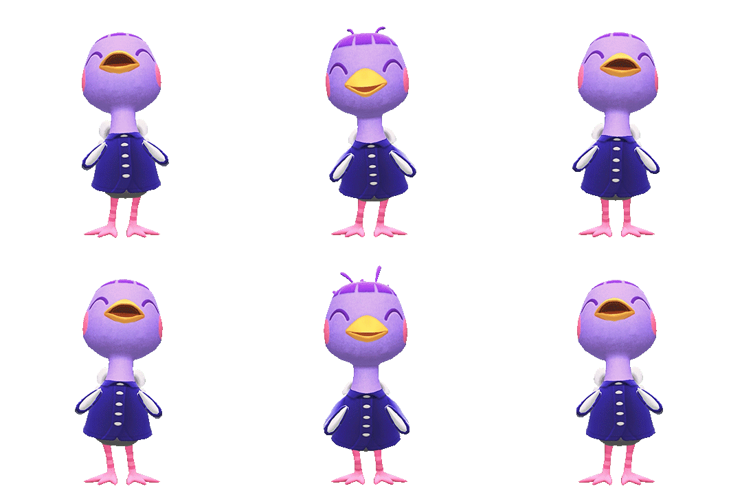
So I figured it was about I time I answer these asks in the form of a separate post using gifs and screenshots to help explain things! I will warn that this will be an EXTREMELY LONG explanation, but I want to give as much details as I can under the cut. I'm going to use Queenie as my example!
The first thing I do is go to Photopia on Harv's island, a place where you can take photos using any of the villagers in the game and all the items you've collected. I use the Custom Designs app on the nook phone to download different colored wallpapers and floors. The colors that I use depends heavily on the villagers. I've used different backgrounds to make these gifs: green, blue, magenta, and (very rarely) black. For Queenie's colors, it was best to use green! I usually place the villagers towards the back of the wall while I stand in the center of the room. From there, I take out the phone's camera and start recording different reactions.


To record these I use my capture card, the Elgato HD60 S, and the capture software that you can download from Elgato's website. Any capture card and recording application will work.
I use three adobe apps to make these gifs: Premiere Pro, After Effects, and Photoshop. I know not everyone has access to these, but I was able to obtain these with the help of some friends. I won't go into details, but I will leave you with this image as a friendly reminder:
Premiere Pro - Here is where I drag all of my videos down onto the timeline and begin the editing process!
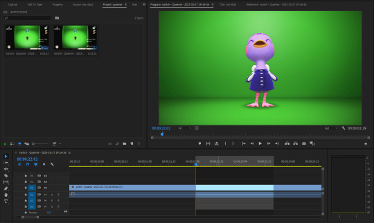
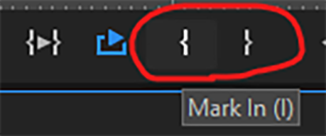
I try to find the best looping points for each reaction. I mark those points using the "Mark In" and "Mark Out" buttons located at the bottom of the preview window. The "Mark In" sets the starting position for the villager reaction and the "Mark Out" sets the ending point, creating a bracket for that specific reaction.
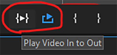
After marking these points, I use the "Play Video In and Out" button and then I make sure to click on the "Loop Playback."
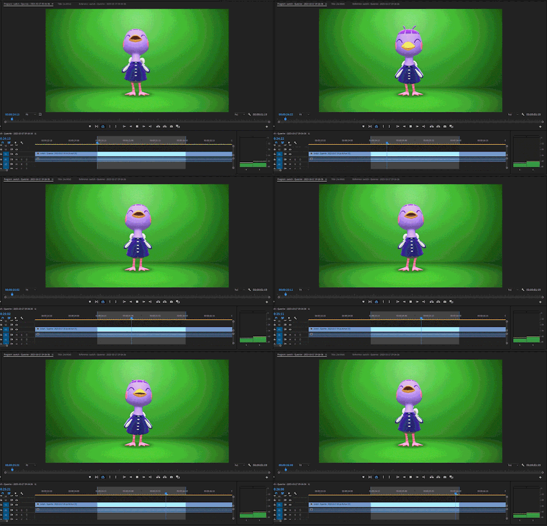
This will not only play the parts of the timeline that I've marked, but it'll loop that exact bracket.
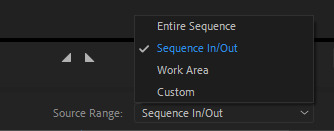
From there, I go to File > Export > Media (or ctrl+m on keyboard). This will bring up the export settings window. I turn the "Source Range" tab to "Sequence In/Out," so it only exports the spots I've marked with the "Mark In" and "Mark Out" buttons.
I then go to the source tab at the top and select the cropping tool.
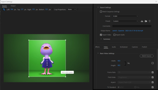
I make sure to click the box under the "Match Source" button to remove the check mark, and then click the chain icon next to height and width settings to put a slash through the symbol. This allows me to freely crop the video and adjust the height and width of the output, so I can make a perfect green screen box around the villager


I then export this video and move on to the next reaction. I have folders for each gif set that I make. They usually look like this for all the villagers I've completed sets for:
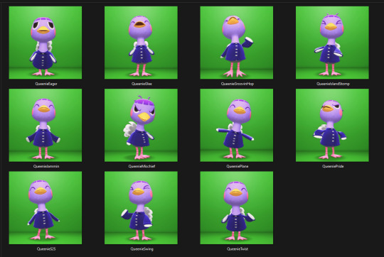
After Effects - Here's where I open all of the reaction files. I go to the effects panel and open the keying tab.
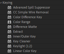
This is where the magic happens! There are three keying effects that I use: Color Range, Key Cleaner, and Inner/Outer Key.
First Effect : Color Range - Starting the keying process, I use dropper tool on any part of the green that's behind the villager. This will only remove some of the background elements because how unevenly colored the green is, due to the lighting of the game.
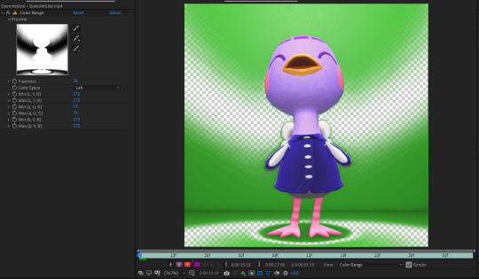
I then use the dropper with a "+" icon on the rest of the background. What helps me is clicking the "Show Channel and Color Management Settings" button at the bottom of the preview window and switching to the "Alpha" view. The alpha channel deals with the transparency of an object and switching to this view allows me to see every bit of the wallpaper and floor that remains. This is where I can apply that dropper+ tool to get rid of them. It doesn't have to be perfect, because the other keying effects that'll be used will help get rid of the loose pixels of green that may still be present.
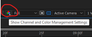

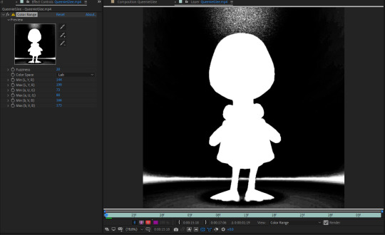
From here, the only adjustment that I sometimes use under this effect is the "Fuzziness" tool. Some villagers will have various color patterns that'll get keyed along with the background. Bringing down the fuzziness helps bring some of those colors back. This does run the risk of bringing some the background pixels back into the video, but that can easily be erased. I usually don't need to adjust the fuzziness. Again, it all largely depends on the colors of the villagers. After all of this is done, I now have a transparent background, but now there's a green outline around the villager:
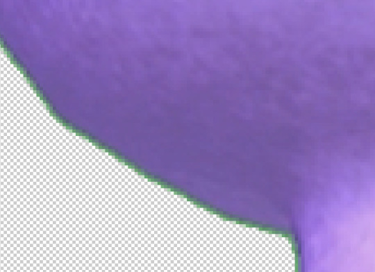
Luckily, the next effect will help with that!
Second Effect: Key Cleaner - This plugin helps clean up the alpha channel around the edges of the villager. The only thing I do here is select the box labeled "Reduce Chatter" and turn the "Alpha Contrast" all the way to 100%.
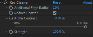
This helps erase most of the outline and makes the edges a little sharper, but there's still a tiny bit of green that surrounds the villager.

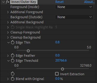
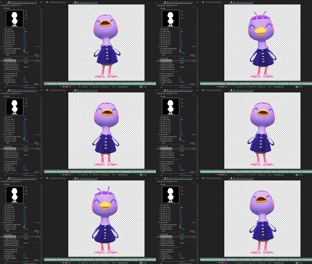
Third Plugin: Inner/Outer Key - I will admit that I don't utilize the entirety of this effect's capabilities. I only adjust the "Edge Thin" and "Edge Threshold" sliders, which should shave off the rest of the green outline.
Using these tools, I've now completed the keying process and I have a nice, crisp villager reaction with a completely transparent background!
Next I go to File > Export > Add to Render Queue (or ctrl+m on keyboard). I bring up the output settings by clicking on the "Output Module." I then change the format to QuickTime, which will render the reaction as a ".mov" file. I then change the channel to "RGB + Alpha" to render the object (which is the villager) and the transparent background.


Once this is done, I hit the render button and the reaction has been exported! After doing all of this with the first video file, I highlight all of the effects that I've applied from the effects panel by clicking on the names:
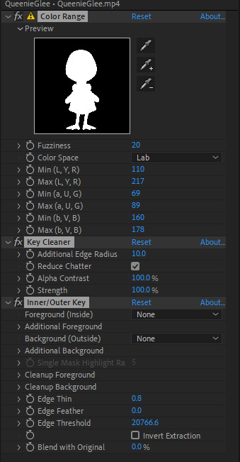
I then hit ctrl+c on my keyboard, open the next reaction into the timeline, and then hit ctrl+v. This copies all the effects applied to the first reaction and pastes them to the next video. I repeat this process for each file so I don't have to redo the entire keying process for all of the reactions. After they're all rendered, I can move onto the final adobe step.
Photoshop - This is where I open all of the QuickTime files that I've exported from After Effects.
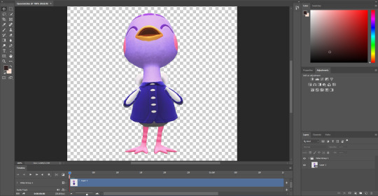
From here, I can apply any adjustments to the villager, whether it be adjusting the brightness, messing around with the hues and saturation, increasing the speed, etc. The main thing I do here is decrease the size. These files are usually huge so I have to adjust the size so I don't risk putting groups of extremely large gifs on peoples' dash. I go to Image > Image Size (or Alt+Ctrl+I on keyboard) and change the width and height to five inches. Of course, any size you choose will work. Five is just perfect for me because it's not too small to ruin the quality of the gif.

After this is done, I got to File > Export > Save for Web (or Alt+Shift+Ctrl+S on keyboard). This is where I can preview the gif.

I go to looping options on the bottom right and change it to "Forever," otherwise the gif won't loop. I then turn the matte to "None" so the gif doesn't export with an outline around it. I also make sure that the transparency box is checked. This is what my window looks like before I hit the save button:
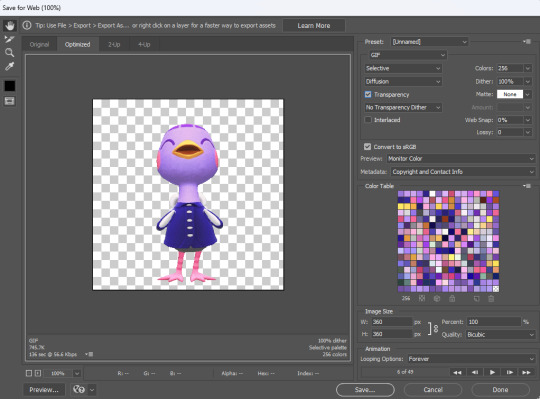
Once I hit save, that's it! Queenie has been exported as a gif. You can see that gif at the top of this post.
If you've made it this far, thank you for reading all of that! I know some parts of this could've been just a simple summary, but I really wanted to show all the details of how I use every application in this gif making process. I will say that I'm no expert at adobe. This is just a method that I pieced together after experimenting with different combinations of keying effects and I managed to make it all work. I apologize if this process seems messy to advanced users out there and I welcome any tips if they help make things easier!
108 notes
·
View notes
Text
Big Update Post
Hiya, shapeshifters!
We have some announcements to make this evening.
Here’s the short of it:
The Shapeshifters website will be temporarily down this Sunday evening, March 3, 2024 at Midnight EST.
When it comes back up, you’ll find a shiny new website that is organized the same way with a couple of exceptions.
The Off-the-Rack Sale and Holographic listings will be temporarily delisted.
The Goth listings will be renamed. You will find Rainbow Constellations, Monster Mouths, and a couple of new options listed under Cosmic Horror.
The Skin Tone listings will have brand new additional color skin tone options!
The Island Time listings will also have a new option available.
The Binding 101 FAQ will be rolled into its own section in the FAQ.
There will be a brand new Events Page!
The blog will be temporarily disabled.
If you’re curious about the long of it, keep reading.
For everyone else, we appreciate your patience during this transition! Like so many other transitions, we’re delighted about where it’s going.
Website Downtime
Shapeshifters is finally moving to Shopify! We’ve done a lot of work over the past few months building a more organized, streamlined website that will be easier to access for you and update for us. On Sunday night, we’ll shut down the current website to pause orders so that we can migrate everything cleanly.
Off-the-Rack and Holographic Listings
The Off-the-Rack listings will be delisted to give us a chance to reorganize the remaining stock so we don’t accidentally double-sell anything.
The Holographic listings will be delisted while we assess our fabric options. Long-time customers might notice that we’ve removed Liquid Metal and Oil Slick from the Holo listings; we’re sourcing replacements and new options throughout spring. Once we know our options, we’ll either re-launch the Holo listings, or move the currently available fabric Prism to another home so it won’t be all alone anymore.
If you’ve been eyeing either Prism or an Off-the-Rack, buy it before Sunday if you can!
Expanded Skin Tone Range
We’re very excited to announce three new skin tone options will be available after the website migration: Pine, Chestnut, and Laurel! Pine is a pale shade, while Chestnut and Laurel are both on the darker end of the spectrum.
And, the new and improved Skin Tone listings will be the perfect place to see the results of our latest photoshoot! We’re excited for y’all to get to see these photos around the site and on the listings. We sought out models of color with darker skintones both to fill a gap in the modeled photos in our listings, and to show off our darker skin tones. All of our models were amazing, our photographer was great, and the photos are fantastic! We really leaned into the cozy Vermont vibes for this one.
Events Page
We’re going to events again! Hooray!
And we’re not just going to conventions and conferences and Pride festivals. We’re also talking queer markets, fashion shows, and binder sewing workshops!
That’s right, some lucky folks in the New England area will have the opportunity to take an in-person class with Eli, our head tailor and the developer of our DIY Binder Sewing Kits. They will walk you, step-by-step, through sewing your own custom-sized binder and help you troubleshoot along the way. These workshops are designed for sewists of any level and do not require you to own a sewing machine.
If you’d like to host a sewing workshop or would like to have us at any other event, educational, celebratory, fashionable or otherwise, please contact us!
Thanks once again for bearing with us during this transition and we can’t wait for you all to see the new site!
#chest binders#shapeshifters#events#pride#skin tone chest binders#sewing workshops#how to sew binders
47 notes
·
View notes
Text
by Sabrina Iglesias
How many people can say they’re in a 13-person worldwide collective of people doing their specific job? Or that folks travel from all over to work with them? Most of us certainly can’t, but Mona Maruyama, a tattoo artist at Floating World Tattoos in Center City, can.
Maruyama does Hajichi, a traditional style of permanent body markings reserved for Okinawan women. It is said that Hajichi offers protection and spiritual connection to their ancestors. “[It] is a constant reminder of the land we wish to defend,” Maruyama said.
The community of Hajichi artists, or Hajichaa, keeps in touch via group chat, holds meetups, and has a website dedicated to providing information and resources surrounding Hajichi. They are members of the Ryukyuan diaspora and aim to encourage the revival of the Hajichi ritual and tradition.
How did you get started in Hajichi style tattooing?
I got into giving Hajichi to members of the diaspora after hearing members of the community encouraging Ryukyuan artists to begin practicing and looking into supporting the cultural revival effort.
What is Hajichi? Tell me all about it.
Hajichi is a closed tattoo practice reserved for Okinawan people that was banned by the Japanese government in 1899. Hajichi is one of many words we have to describe tattoos traditionally worn on the hands of women and the term differs from island to island. It’s a tattoo practice that provides protection and connects us to our ancestors and is a constant reminder of the land we wish to defend.
The reasons have changed over time and some of the meaning behind the symbolism has been erased and the information we do have is unfortunately a mere snapshot of the tail end of the thousands of years long tradition, typically recorded by outsiders.
Based on what we know, many of our symbols are based on our land and culture, mostly nature like flowers, stars, inside of turtle shells. But as a collective, we’ve also discussed the similarities in some of the designs and shapes with sound waves of certain frequencies.
Read more...
36 notes
·
View notes
Text
THIS DAY IN GAY HISTORY
based on: The White Crane Institute's 'Gay Wisdom', Gay Birthdays, Gay For Today, Famous GLBT, glbt-Gay Encylopedia, Today in Gay History, Wikipedia, and more … November 13


354 AD – Early Christian writer St. Augustine was born on this date (d.430) Following the example of St. Paul, Augustine set the standard for confessional literature that was to flourish in the centuries that followed. The pattern, of course, is a detailed listing of one's sins, followed by a narration of some event or events that made one long for salvation, and then an enunciation of the pains and joys of penance with the hope of future redemption.
Augustine confessed not only to having fathered a son, but to friendship that was classically homoerotic. When he was a young man, his closest friend died and Augustine contemplated joining him in death. "I felt that his soul and mine were `one soul in two bodies'; and therefore life was to me horrible because I hated to live as half of a life; and therefore perhaps I feared to die, lest he should wholly die whom I loved so greatly. My longing eyes sought him everywhere." Augustine, of course, cast off all sins of the flesh and becoming one of the great founders of Christian doctrine, admonished us all to do the same.


1759 – In the Netherlands, minister Andreas Klink is banished for life for having committed sodomy. He defends his attractions as natural.


1879 – Marcus Behmer (d.1958) was a German writer and book illustrator, graphic designer and painter.
Marcus Behmer was a son of the painter Hermann Behmer. His uncle Rudolf Behmer, known as a breeder of Merino sheep - was the twin brother of his father. His brother Joachim Behmer was also active as an artist.
His artistic beginnings came with his first major success with the illustrations for Wilde's Salome in 1903. The early works show the influence of the illustrations of Aubrey Beardsley.
On 1 October 1903 Behmer entered military service, was appointed a corporal in 1904 and promoted in 1907 to sergeant. From 1914 he participated in the First World War (in Flanders and in Poland). In the summer of 1917 he fell ill "after an operation in the field" and was six weeks in the military hospital of Jarny . During his time in the army, many so-called "comrades' portraits" emerged, usually reduced, although finely crafted profile views of young soldiers
From 1902 Behmer produced illustrations for books, designed initials and writings, and was responsible for carefully planned publishing facilities. He worked for the Cranach Press of Count Harry Kessler and illustrated numerous articles for the monthly magazine "The Island."
Behmer had been since 1903 a member of the first homosexual organization in the world in Berlin. Because of his homosexuality, Behmer was sentenced in April 1937 by a court in Konstanz to imprisonment of two years. At times he was given the opportunity to work as an artist in prison. The works produced in this period are mostly calligraphic tablets with Greek text (prayers and Bible quotes), and drawings full of bitterness and irony.


1950 – Charles Kaiser is an American author, journalist and academic administrator. In 2018 he was named Acting Director of the LGBTQ Public Policy Center at Hunter College. He is also a nonfiction book critic for The Guardian (US).
His book about one family in the French Resistance, The Cost of Courage (2015) received enthusiastic reviews from The Washington Post, The Wall Street Journal, and The Christian Science Monitor, among many other publications. It also won the grand prize at the Paris Book Festival (2015). In 2016 it was published in France by Seuil as Le Prix du Courage.
His blog about the media, Full Court Press, originated on the website of Radar Magazine in the fall of 2007. He continued it at the Columbia Journalism Review and the Sidney Hillman Foundation until the spring of 2011.
The son of a diplomat, Philip Mayer Kaiser, he grew up in Washington, D.C., Albany, New York, Dakar, Senegal, London, England and Windsor, Connecticut. He has lived on the Upper West Side of Manhattan for many years.
He is the author of The Cost of Courage, 1968 In America, and The Gay Metropolis. The Gay Metropolis was a Lambda Literary Award winner, as well as a New York Times Notable Book of the Year. He was a guest on the Colbert Report, where he discussed a new edition of The Gay Metropolis. He wrote the afterword for a 2012 edition of Merle Miller's landmark work, On Being Different: What it Means to Be a Homosexual. That afterword was excerpted on the website of the New York Review of Books. In 2015 he was inducted into the LGBT Journalists Hall of Fame.


1955 – Caryn Elaine Johnson, best known as Whoopi Goldberg is an American comedian, actress, singer-songwriter, political activist, author and talk show host. She is a strong supporter of the LGBT community.
On April 1, 2010, Goldberg joined Cyndi Lauper in the launch of her Give a Damn campaign to bring a wider awareness of discrimination of the LGBT community. The campaign is to bring straight people to ally with the gay, lesbian, bisexual, transgender community. Other names included in the campaign include Jason Mraz, Elton John, Judith Light, Cynthia Nixon, Kim Kardashian, Clay Aiken, Sharon Osbourne and Kelly Osbourne.
Goldberg's high-profile support for LGBT rights and AIDS activism dates back to the 1987 March on Washington, where she was one of few celebrities participating.


1969 – Today is the birthday of bi-sexual Scottish actor Gerard Butler. He is best known for his portrayal of King Leonidas in the intensely homoerotic film about the Spartans, 300. He also portrayed the Phantom in the 2004 film version of The Phantom of the Opera. He is slated to portray the iconic Scottish poet Robert Burns in an upcoming biopic.
In the gossip mags, there have been numerous stories of his romantic involvements - including several of romantic and/or sexual involvements with other male stars.
In a 2004 Movieline interview he said:
"I talk about my sexuality, but it's always glossed over. People seem to shy away from the issue. Whenever it is discussed, it's distended and exaggerated. Gerard Butler is Gay. No I'm not. I don't know myself what I am so it can be bewildering to see that being plugged. I have been in relationships with women. And men. That doesn't make me Gay. That doesn't make me straight. It's hard enough to go through these things in my mind without being scrutinised about it so there are times when you want to close the door and say my sexuality is my own personal business."


1999 – Josh Cavallo is an Australian professional association footballer who plays as a left back and central midfielder for Adelaide United. Cavallo has represented the Australian under-20 national team.
Cavallo was born in Bentleigh East, Victoria.
Cavallo represented both Melbourne Victory FC Youth and Melbourne City FC Youth. Western United. On 15 April 2019, Melbourne City announced that Cavallo would leave the club at the expiration of his contract at the end of the 2018–19 season.
On 24 June 2019, new A-League side Western United announced that Cavallo would join the club ahead of its inaugural season. He made his debut on 3 January 2020 in a 3–2 loss at his previous club. On as a 71st-minute substitute for Apostolos Stamatelopoulos, he earned a penalty when fouled by goalkeeper Dean Bouzanis, which was converted by Besart Berisha. Western United announced that Cavallo was leaving the club on 10 February 2021.
On 18 February 2021, Cavallo signed a short-term contract to play for Adelaide United. After a successful stint in the 2020–21 A-League, he signed a two-year contract extension on 11 May. He was rewarded with Adelaide United's A-League Rising Star award after a successful 2020–21 campaign, in which he started 15 games and made 18 appearances.
Cavallo came out as gay in October 2021. At the time, there were no other openly-gay male footballers playing professional top-flight football, in the world. In becoming the first to do so, he said in a statement, "I hope that in sharing who I am, I can show others who identify as LGBTQ+ that they are welcome in the football community."


8 notes
·
View notes
Text
American nuclear is in 25-year-old Isaiah Taylor’s blood: his great-grandfather worked on the Manhattan Project. In 2023, Taylor, who dropped out of high school to work in tech, started his own nuclear company, Valar Atomics. It’s currently developing a small test reactor, named after Taylor’s great-grandfather. But the company says that overly onerous regulations imposed by the US Nuclear Regulatory Commission (NRC), the country’s main regulatory body for nuclear reactors, has forced Valar Atomics to develop its test reactor overseas.
In early April, Valar Atomics, in addition to another nuclear startup, Deep Fission, as well as the states of Florida, Louisiana, and Arizona’s state legislature, signed onto a lawsuit against the NRC. The lawsuit, originally filed in December by Texas, Utah, and nuclear company Last Energy, blames the NRC for “so restrictively regulat[ing] new nuclear reactor construction that it rarely happens at all.”
The US has historically been the global powerhouse of nuclear energy, yet only three reactors have come online over the past 25 years, all behind schedule and with ballooning budgets. Meanwhile, other countries, like China and South Korea, have raced ahead with construction of reactors of all sizes. Some nuclear advocates say that the US’s regulation system, which imposes cumbersome requirements and ultra-long timelines on projects, is largely to blame for this delay—especially when it comes to developing new designs for smaller reactors—and that some reactors should be taken from the NRC’s purview altogether. But others have concerns about potential attempts to bypass the country’s nuclear regulations for specific designs.
The NRC has long been criticized for its ultra-slow permitting times, inefficient processes, and contentious back-and-forth with nuclear companies. “The regulatory relationship in the US has been described as legalistic and adversarial for nuclear,” says Nick Touran, a licensed nuclear engineer who runs the website What Is Nuclear. “That is kind of uniquely American. In other countries, like France and China, the regulators are more cooperative.”
The lawsuit takes these criticisms one step further, claiming that by regulating smaller reactors, the NRC is misreading a crucial piece of nuclear legislation. In 1954, Congress passed the Atomic Energy Act, which created modern nuclear regulation in the US. That law mandated regulations for nuclear facilities that used nuclear material “in such quantity as to be of significance to the common defense and security” or that use it “in such manner as to affect the health and safety of the public.”
“We would love the NRC to respect the law that was written,” says Taylor, who believes the reactor his company is working on sits outside of that mandate. “What it would do for us is to allow innovation to happen again. Innovation is what drives the American economy.”
“The NRC will address the litigation, as necessary, in its court filings,” agency spokesperson Scott Burnell told WIRED in an email.
While we generally think of nuclear reactors as huge power plants, reactors can be made much smaller: Models known as small modular reactors, or SMRs, usually produce a third of the energy of a larger reactor, while even smaller reactors known as microreactors are designed small enough to be hauled by semitruck. Because of their size, these reactors are inherently less dangerous than their large counterparts. There’s simply not enough power in an SMR for a Three Mile Island–style meltdown.
The lawsuit argues that by mandating a cumbersome licensing process for all types of reactors—including those that are safer because of their size—the NRC is both violating the Atomic Energy Act and stifling progress. A company called NuScale, the only SMR company to get NRC approval for its model, spent $500 million and 2 million hours of labor over several years just to get its design approved. In late 2023 it pulled the plug on a planned power plant in Idaho after customers balked at the projected high price tag for power, which soared from an estimated $58 per megawatt-hour in 2021 to $89 per megawatt-hour in 2023.
The lawsuit comes at a unique time for nuclear power. Public sentiment around nuclear energy is the highest it’s been in 15 years. Dozens of new nuclear startups have cropped up in recent years, each promising to revolutionize the American nuclear industry—and serve power-hungry industries like data centers and oil and gas. Private equity and venture capital invested more than $783 million in nuclear startups in 2024, doing twice the number of deals in the sector as they did in 2023.
The lawsuit “is about getting steel in the ground. This is about getting nuclear on the grid,” says Chris Koopman, the CEO of the Abundance Institute, a nonprofit focused on encouraging the development and deployment of new technology. The Institute, which was founded last year, has no standing in the lawsuit and does not represent any plaintiffs but has served as a “thought partner,” per Koopman, who coauthored an op-ed in The Wall Street Journal in January announcing the lawsuit.
Deep Fission, one of the plaintiffs in the lawsuit, seeks to generate electricity using small modular reactors placed a mile underground—a model its CEO, Liz Muller, says is both safer and cheaper than traditional construction. Even though Deep Fission is a party in the lawsuit, the company has also begun pre-licensing its design with the NRC. Muller sees the lawsuit as bringing a new approach to the agency regarding SMRs: helping it to develop “a regulatory sandbox, where we’re allowed to explore approaches to regulations while we’re moving forward at the same time.”
The lawsuit posits that individual states “are more than capable of regulating” smaller reactors. Thirty-nine states are already licensed by the NRC to handle and inspect nuclear material, while Koopman points out that the states involved in the lawsuit have recently passed legislation to speed the construction of nuclear projects in-state. “All of the states involved in the case have already entered into agreement with the NRC, in which the NRC has recognized that they know their stuff,” he says.
Taylor believes allowing states to compete on regulation would help boost safety within the field of small modular reactors. “Innovation is what drives the safety ball down the field, and the only way to do that is to have different regulators with different ideas,” he says. “That’s federalism 101.”
Adam Stein, the director of the Nuclear Energy Innovation program at the Breakthrough Institute, an eco-modernist policy center, sees some serious flaws with this approach. He says that while some states, like Texas, may have the resources and the knowledge to create their own effective regulatory body, other states may struggle. Stein likens a patchwork of different regulations as being akin to car seat laws, where the age of the child required to be in a car seat varies across states, making it tough for a parent to plan a road trip.
“Some states are less consistent in applying safety standards than others,” he says. “Some states would prefer their standards to be stricter than national standards. Some states have reduced safety standards from nationally recommended standards.”
Muller says she understands these concerns. “There is a risk if we get wildly different regulatory processes, that would not be a great result,” she says. “But I think there’s also an opportunity for states to move forward and then for other states to piggyback on what has been developed by the earlier adopter.”
Stein also foresees a possibility for continued red tape, as even with state-level regulation, the NRC would still be forced to review individual reactor designs to see if they were safe enough to pass off for state review. “A developer couldn’t just assert that their design is so safe, that it’s below the line,” he says. “It’s still going to have to go through a review to determine whether the NRC should review it.”
Just because a nuclear reactor can’t cause massive damage to big populations doesn’t necessarily mean it’s fail-safe. The only deadly nuclear accident on US soil occurred at a tiny reactor in Idaho, which killed its three operators in the early 1960s. Designs for small reactors have made leaps and bounds in safety since then—a development Touran says is thanks in part to regulations from the federal government.
“I believe a well-designed small reactor, subject to reasonable nuclear design standards based on years of lessons learned, would be very safe,” says Touran. “I do not believe that this means anyone should be able to go out and build a small reactor with minimal oversight.”
There have been efforts in recent years to speed up the NRC’s permitting process. In 2019, during his first term, President Donald Trump signed the Nuclear Energy Innovation and Modernization Act; among its many reforms, it mandated that the NRC shift around key licensing processes and create a new process for licensing smaller, more technologically varied reactors. Last year, President Joe Biden signed the ADVANCE Act, which made even more changes to the NRC process; both of these pieces of legislation passed with overwhelming bipartisan support.
“At this point, the NRC says pretty willingly that they’re working hard to be more efficient, that they understand they need to be more efficient, that they have been more efficient with recent licensing applications,” says Klein.
For developers like Taylor, this progress is too little, too late. “Do we really want China and Russia to be the global nuclear developers for the world?” he says. “I don’t. I would like the United States to be the nuclear developer of the world.”
Permitting reform alone, especially in the SMR space, may not solve the issue of competing with other world powers. Nuclear energy might be overregulated, but it is also expensive to build, even for smaller reactors, requiring big up-front investments and a large amount of labor. NuScale did lose valuable time and money on a cumbersome regulatory process—but its energy was also competing in price against gas and renewables, which are, on average, cheaper than nuclear power from plants that have been running for decades.
After decades of battling public fear of nuclear plants, nuclear acceptance has reached a pivotal moment. When compared to the massive health toll from fossil fuels, which research shows are responsible for 1 in 5 deaths around the world, nuclear power is exorbitantly safe. But there’s a sense from some advocates that some of the hard-won trust nuclear energy now has from the public—supported by decades of careful regulation—is in danger if the movement becomes too cavalier about safety.
When Valar announced it would join the lawsuit, Taylor published a blog post on the company’s website that claimed that the company’s reactor was so safe that someone could hold the spent fuel in their hands for five minutes and get as much radiation exposure as a CAT scan. Touran questioned this claim, leading Taylor to post the numbers behind the company’s analysis on X. Another nuclear engineer ran his own calculation using these inputs, finding that holding fuel under the conditions provided by Valar would give a “lethal dose” of radiation in 85 milliseconds. (Taylor told WIRED that Valar is working on a “thorough analysis” in response that will be public in a few weeks and that the initial claims around the spent fuel were simply “a thought experiment we did for our own internal illustration purposes” and not part of the lawsuit materials.)
“We’ve operated reactors so well for so long that a whole new breed of advocates and even founders mistakenly believe that they’re fail-safe by default,” says Touran. “The reality is they’re made fail-safe by very careful and well-regulated engineering and quality assurance.”
4 notes
·
View notes
Text
Spilling the Tea | Issue 1
From the Official Nikki Website.

Keep Reading for the tea from the Infinity Nikki dev team.
★ Spilling the Tea | 2025 First Issue ★
Good afternoon, stylists. Our brand new segment—Spilling the Tea—is here!
To kick off our inaugural session, we've decided to address some of the most frequently asked questions from our stylists, and we've even got a few exclusive spoilers about the upcoming version.
So, grab yourself a nice cup of tea, sit back, relax, and let's get started.
Remember, your feedback and suggestions are important to us, so keep them coming, and we'll keep working to improve the game. A vibrant and exciting Miraland awaits us—let's go!
1. This version update feels too empty! Once it's live, there's nothing to do, and the wait between updates is too long. Please give us more content!
Alright, alright, alright! We heard you loud and clear! Let me update all our stylists on what we've been up to!! Right now, we're putting all our efforts into preparing Version 1.5. This update will go live at the end of April and bring a ton of new features, including the long-awaited dyeing feature, multiplayer co-op gameplay, and a brand-new location.
We know many of you are eagerly waiting for the "Home" feature we teased earlier, but it's a huge project and still needs some fine-tuning. We truly appreciate your patience, but I promise, when it's ready this summer, you won't be disappointed!
The dyeing feature lets stylists customize different parts of an outfit. And the fun doesn't stop there—stylists can share and swap dyeing schemes, so we can all join forces to create something truly beautiful.
The update also introduces a multiplayer map and a brand-new event location, Serenity Island.
This magical place is home to our favorite Pieceys. On Serenity Island, stylists watch bubbles float lazily through the air, and dive into a quirky bathing culture. Plus, it's the perfect place to explore the history of the Abandoned District and learn more about the Pieceys (It's finally our turn to shine, Pieceys! IP: Abandoned District).
For more information about the multiplayer map, please stay tuned to our official account @InfinityNikkiEN.
And if that wasn't enough to keep you busy, Version 1.5 will feature tons of new outfits for stylists to craft and collect. We're talking about a large outfit lineup, including a wide range of gorgeous pieces from storylines, gameplay, and special events. Let the fashion frenzy begin!
2. Abilities should no longer be bound to a specific outfit. They should be unbound by collecting the full set or by obtaining a certain number of specific accessories.
As Nikki gets better at harnessing her Whim, after collecting a certain number of Ability Outfits and completing certain story quests, stylists will have the option to use abilities without needing to wear a specific outfit.
3. We hope to get a preview of the rerun schedule for the Flutter Storm and Blooming Dreams outfits.
Both outfits will be making a comeback soon!
The Flutter Storm and Blooming Dreams outfits are set to return during the limited-time 4-star Resonance periods in Version 1.6 and Version 1.7, respectively. During the rerun, once your total Resonance count reaches 160 (including past Resonance) you'll unlock the exclusive dance move for Flutter Storm and the exclusive decoration "Floral Rain" for Blooming Dreams.
4. Recently, the five-star outfits have started to feel a little repetitive. It'd be great to see a wider mix of styles, not just exclusive to one country.
In the future, we'll be mixing things up with more diverse designs for our in-game clothing. Get ready to see all kinds of new looks, like elegant and cozy robes, dashing prince-inspired outfits, beautiful ink-wash Linlang designs, and futuristic, fashion-forward pieces.
5. When will we get the Home feature? I'd love to feed little animals, grow some crops, and decorate a space of my own. It'd be awesome to build a home from scratch, or pick one from a template and be able to personalize it.
We hear you, stylists!
Yep, this summer, the home feature is coming your way. Soon, you'll get to claim your very own little corner of Miraland. Here, you can build your dream home and grow crops, among many other gameplay possibilities awaiting your exploration.
In designing the Home feature, we want it to seamlessly integrate into the open-world experience. Expect fresh surprises and creative twists as you build and customize your home!
And if you need inspiration, we'll offer basic house templates that you can tweak or totally redesign, giving you plenty of room to create your perfect space. We hope that this summer, the Home feature will offer you a cozy escape from your main adventures—a place to relax and enjoy the comforts of home.
6. Collaborations! Collaborations! Bring them on, we can't wait!
We're working on some exciting partnerships, including charity and cultural heritage collaborations. On top of that, we're exploring opportunities to team up with other well-known IPs. Stylists, get ready—if all goes smoothly, these awesome collaborations will be here before you know it!
7. Could you make all those outfit handhelds into separate items, especially the shepherdess staff!
It's in the works! We've heard your thoughts and ideas about handheld items! Our team is diligently working on thoughtful updates—please bear with us a little longer.
8. We're curious about what's next for Infinity Nikki! Any hints about what's in store for the game? What can we look forward to in future updates?
During the early stages of Infinity Nikki's development, when everything was still up in the air, we asked ourselves: "What could the future of Miraland look like?" "What new adventures would Nikki embark on in Miraland?" Those questions became the foundation for the game you see today, shaped by our team's imagination and your creativity. Looking ahead, we'll continue embracing this spirit of unbridled possibilities. We'll never confine Infinity Nikki or Miraland to a single definition—because Nikki's journey is meant to be one of endless wonder. She'll chase breezes and the scent of flowers, build her own home, uncover untold stories across Miraland through Whim, and embark on limitless adventures. Our goal is to channel all our creativity into empowering Nikki to explore, dream, and live a life beyond amazing—crafting an Infinity Nikki experience that redefines what's possible.
#infinity nikki#nikkiverse#infinikki#nikki#nikki games#nikki series#dress up game#spilling the tea issue 1#infinity nikki updates#infinity nikki news
6 notes
·
View notes