#discussions: concept art/development
Explore tagged Tumblr posts
Note
I sometimes question Pixie Hollow’s geography when it comes to the book continuity… Like where exactly is the Home Tree located on Neverland? Or how much of Neverland do the fairies occupy?
The Pixie Hollow in the movies feels more like a dimension separate from Neverland, that I sometimes forget that Tink and her friends live in Neverland.
I've thought about this too! Pixie Hollow's geography and where exactly it is located in Neverland is a very messy part of the lore throughout most of the continuities. So this is gonna be a long answer
In the books the Pixie Hollow with the home tree, it's supposedly in what I think is "a clearing", like behind some foliage. In the third guide book "The Hidden World of Fairies" which is made up of book and movie canon (a lot of elements from the books and movies together) we see that Pixie Hollow is located behind a leafy clearing somewhere in Neverland.


According to this map, Pixie Hollow is located towards the right of Neverland next to Skull Rock and Mermaid Lagoon
However, it's still sort of complicated!
In In the Realm of Never Fairies, we have some illustrations of areas that seem to be around Pixie Hollow- that seem to be quite vast and empty, including concept art.

Here, we have a lovely concept drawing of Tinker Bell near a waterfall- note the waterfall, it will become important later
This is the original illustration of that image:

Here's an interesting illustration with Havendish Stream, the dust mill, and several mountains:

We also have a detailed explanation of Prilla's arrival in Quest for the Egg and world building in the trilogy which suggests it is located in the island somewhere near the mountains, but also somewhat close to the Lagoon (after all Soop could flood Fairy Haven/Pixie Hollow) with the cove seeming close- but also still a several days journey for fairies, with it taking at least couple hours to get to both locations. It can be assumed Torth Mountain where Kyto resides is close to the fairies, as well as the Tiffens which are creatures that trade with the fairies unique to the Levine books. A fire almost destroyed Neverland (Kyto I believe) and Mother Dove survived and made the island magical. So I have an idea that it's close to the mountains, but still on a flat terrain. In the forests of Neverland, in like the center leaning a bit to the right. Likely the "heart of Neverland"
In the books, I think it is also heavily implied that the Dust Mill is further away from the Home Tree than it is in the movies.
It's very interesting you say that "The Pixie Hollow in the movies feels more like a dimension separate from Neverland, that I sometimes forget that Tink and her friends live in Neverland." Because, in the original version of Pixie Hollow it was a distinct place behind a secret portal in Neverland, and had a unique apperance different from Neverland! They try to connect it to the book lore, and the story was even on the website at one point. In this version, Pixie Hollow is located in the waterfall in the middle of Pixie Hollow, and the waterfall is a magical portal. However, the idea of Pixie Hollow being located behind the waterfall- even if it is not magical, is scarcely used in the final canon. I mean in the Pixie Hollow game, there is the speedchat phrase "See you around the waterfall!" for a goodbye phrase and maybe the waterfall is mentioned one or two times in Never Girls. Personally, I'm very biased to this design of Pixie Hollow because I really like the style and how it feels both separate and unique to Neverland. It shares the design of Neverland but is still it's own unique and original place.

youtube
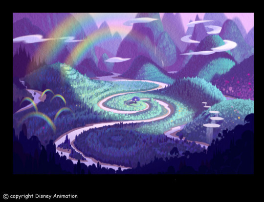
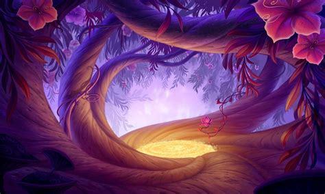
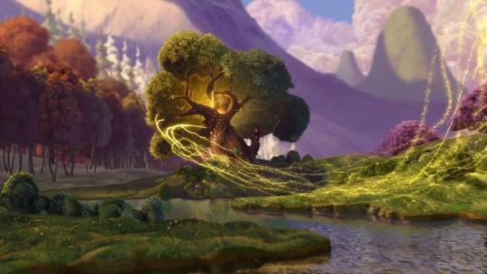
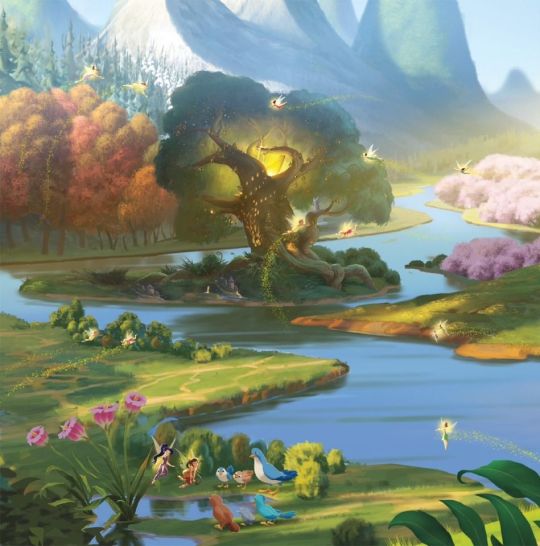

Compare to the final version, which takes a lot of cues from the books, down to the Pixie Dust Tree being modeled from the home tree. Design wise I don't hate it, but it always felt a bit "off" to me and rushed. (very likely wise, considering the timeline of the movie's development)
Ironically, it's said by the director they used a lot of shots of the mountains (Discovering Pixie Hollow DVD documentary) to give some sense of Neverland in Tinker Bell. But Tinker Bell, imo- also has felt too different from the world of Neverland and also not similar enough. And a lot of that art was not from the final version of the film!
youtube
But when it comes to the movies, we can get an idea where Pixie Hollow is located based on certain scenes in the films- which I believe is more similar to the books, a forest area- but still close to the falls and closer to the coast of Neverland. It is very hard to see where, but I have an idea.


Very close to the center and the falls, but also an elevated forest area as we can see from Tinker Bell's arrival. So the waterfalls were relevant in some ways.

When they leave Pixie Hollow to go to the Mainland, this is the direction they are coming from.
In Tinker Bell and the Lost Treasure, she goes north and this is what she sees behind her when she says "Goodbye Pixie Hollow, I'll miss you."


This shot to me, shows the strong differences of Pixie Hollow and Neverland. How in some cases, they went too realistic imo...
TLDR- So, Pixie Hollow's location in both the films and the books (as well as everywhere else) is quite messy to me! I get there's some mystery in not knowing where it is, but there isn't really any indication besides "in the forest clearings of Neverland". Very odd to me that they never directly say where Pixie Hollow is located- anywhere besides a few random places. Also there's the implication that the seasonal meadows of Pixie Hollow are a speck compared to the full world of Neverland in the films, which is surprising to me. It's magical and yet sort of surreal in some ways too I guess hehe
But I overall, prefer the concept movie designs for Pixie Hollow compared to the movie designs, as the design feels very intentionally crafted. The idea of Pixie Hollow being hard to find makes sense, so I wish the movies had it be behind a clearing of some sort as well and not in the middle of the mountains/forest
#disney fairies#discussions: books vs movies#discussions: concept art/development#movies#books#in the realm of never fairies#fairy dust trilogy#fairy dust and the quest for the egg#fairy haven and the quest for the wand#discussions: neverland vs pixie hollow#early version#early stuff#queensharotto
35 notes
·
View notes
Photo
More crown anaylsis:
My working theory is that the second crown is actually the crown for autumn like Sarena suggested. But was never supposed to be the "normal one" she wears
We see from many concept arts and even a deleted scene that the fall scepter was originally going to be a crown
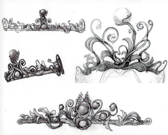
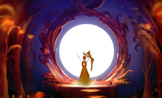
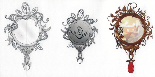
Not only that, this is a piece the original concept art of the mirror of encanta. One of the plot points of the movie was that pieces of the mirror would be used to rebuild the scepter, same would go for the crown right? LT and TB were also being worked on the same time, explaining on how the crown could end up in Tinker Bell, which I'm thinking it did during the Vidia confrontation scene
This is from a scene where Blaze returns home instead of going to Pixie Hollow
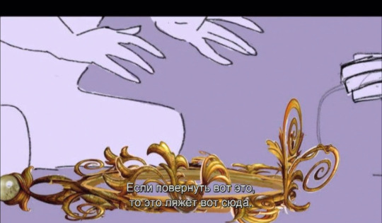
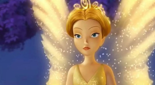
Now the PHG crown looks very detailed right?
Well, the crown is so detailed and ornate- I can't believe I missed it because I was so used to the so called "default". Well there is plenty of reason that this crown can look like this. The original working title for the movie was "Race through The Seasons" and it was originally a full length film, the 5th and final one before it was condensed for TV. I believe every movie prior, which should have included SoTW, would have had a different design. However, the directors lost interest, and there was general confusion regarding the crowns. Only PHG got a crown design for the special.
I believe it was supposed to be a more "seasonal" design, it could also be a a design reject from Lost Treasure.
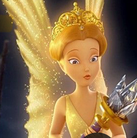
Another interesting thing is this magazine or some source I read mentioned Clarion's first crown is the "Arrival Day" crown and the flower crown is the "Spring Celebration" crown. However, I am inclined to believe that her first crown was always supposed to be her normal crown design was always supposed to be the Arrival Crown. This crown features a white floral motif, her favorite flower is white cala lily and symbol of her regal status. I believe this crown, was always meant by other artists to be a regular everyday crown, though somehow the autumn crown/swirly design ended up being the regular day crown.
A weird thing about Clarion's ROB/pre final design was that it had no crown but a necklace instead, making her seem like she's more humble. It would make sense for the notes to say, make it more regal, using the books lily thing as inspiration. Many of her merch at the time seems to have the pointy crown or the Ring of Belief style, meaning the Arrival crown could have always been the normal one. Maybe that's too much thought into a small difference but still. Last one is the edited website image
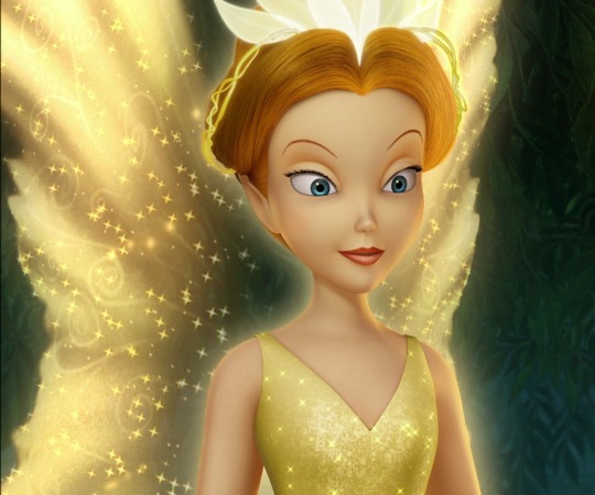
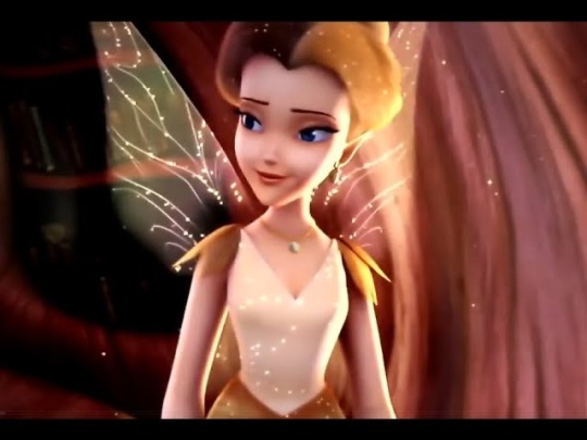
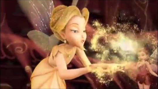
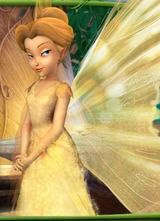
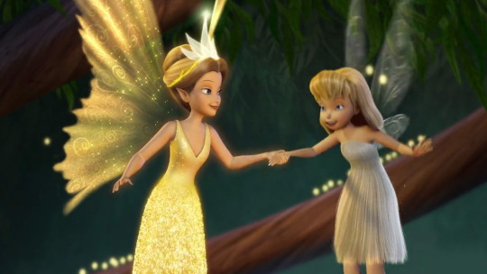
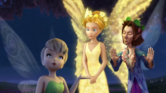
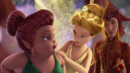
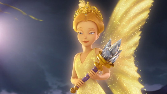
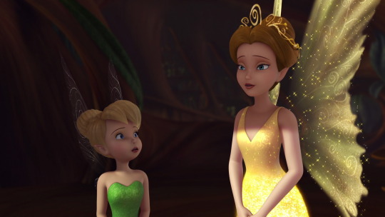
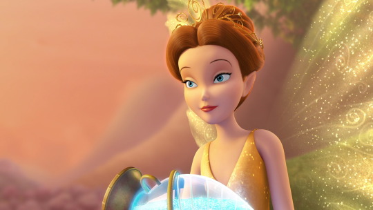
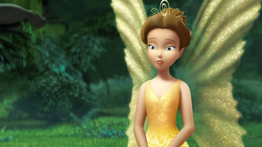
On Queen Clarion’s crowns. After Mary and anon had mentioned it, I had to look for all the crowns she’s worn in the movies and do some quick analysis!
The first scene, Tinker Bell’s arrival, takes place in Winter, and Queen Clarion is wearing a glowing white crown. Later, when she attends a review of Spring preparations, she changes into a flower crown which she keeps for the rest of the film (and presumably the season.) In the next movie, the fairies are preparing for Autumn, and Clarion again has a new tiara. Finally, the Pixie Hollow Games special introduces one more crown, and this just so happens to take place in Summer.
Was this coincidental, that we only see Clarion wear certain crowns in certain seasons? Or was it an intentional design choice? I don’t know, but I don’t care. My headcanon is that she has a tiara for each season.
This would solidify the timeline of when the rest of the movies occur, which is something obvious for the first few films…TB = winter-spring, LT = autumn, GFR/PHG = summer…But not so much for the others. The next three films take place only in Never Land and we aren’t told what season the fairies are bringing to the mainland.
But the answer is hidden in Clarion’s crown! She wears her Autumn crown for the rest of the movies.
We can even prove this at least as far as SotW, judging simply by what’s going on in that movie. The winter fairies are all in Pixie Hollow, practicing their frost and packing snowflakes into baskets to take to the mainland. They’re in Autumn, preparing for their upcoming season.
#disney fairies#disney#race through the seasons#pixie hollow games#clarion#idk what sarena or mary would say regarding this now but these are my thoughts#lost treasure#discussions: df franchise#discussions: concept art/development#movies#discussions: clarion's crown
105 notes
·
View notes
Text

2024 reads / storygraph
Outdrawn
f/f contemporary romance
two cartoonist who’ve been rivals since uni, and now have competing webcomics online, have to work together on the relaunch of a cult classic at the comic press they both work at
they both struggle with art-related physical and mental health issues, and complicated families
#outdrawn#aroaessidhe 2024 reads#sapphic books#I thought this was decent! I liked the concept (even if I got distracted by some art related things…)#and the dynamic between the characters was good. I enjoyed their relationship development broadly speaking#and the emphasis on communication; though it was a quick flip into being together all of a sudden.#The sketchbook doodle flirting was cute. Some interesting exploration of their complicated family situations too.#There’s a lot of exploration of burnout and carpal tunnel and the dangers of artists overworking which I think are important conversations#and are done with some nuance. But it’s pretty much all discussed in the context of the personal pressure they put on themselves#rather than the industry corporate greed and artificial competition created by the comic platform - which are significant in this story!#It felt odd that that connection wasn’t really ever made?#I know that this is a romance and nitpicking the background plot is beside the point and also that I am not a big romance reader#but the premise that the comic hosting site archives everything; wipes the leaderboard; and out of nowhere has a comic competition for#new weekly chapters…I’m sorry but the art world would riot. Even if people enter because they’re desperate for the cash they’d be pissed#People live off the income from their webcomics! if they were erased (temporarily) with no notice…..there would be crimes committed istg#I simply don’t believe that it would be doable to create a new weekly webcomic with no notice while you also have a full-time comic job#(especially as the only stylistic choices mentioned are full-colour) - not to mention what happened to their 8-years-running webcomics#that were archived? they don’t think about them at all after the beginning? surely they’d care about that?#And then with their new comics they make for this competition (after work I guess) we get vague snippets about them but barely anything#- if they’re consuming that much of your time I would expect to feel like they’re thinking about them all the time#rather than the vaguest discussion about genre and cast numbers only.#I guess I just think the whole comic site stunt felt unnecessary for the plot anyway -#it would have worked exactly the same if they were just competing on the normal leaderboard with their normal comics???#anyway - I’m not judging TOO hard about all that because again I know it’s not the point and maybe the industry is like that in some place#Unfortunately it was distracting enough to affect my feelings on the book tho lol.#Lastly: the audiobook………oof. The narrators talk at different speeds; for one.#And Sage’s VA does this deeply weird raspy-anime-teen-boy voice for Noah which is such an odd choice#and doesn’t match her character at all.#unforch my library only had the audiobook (what I usually prefer) so I just had to sort of….translate the narration into a normal voice lol#anyway the romance is good tho
41 notes
·
View notes
Text

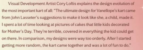
Short excerpt from the art book about Vanellope's kart🥺
#vanellope#I finished reading it tonight :)#I am sad to say king candy only has 1 page of discussion and turbo isnt mentioned at all#only concept sketches of him#but this was mostly about visual development#And a few things could be implied about him from what they said in other sections#I'LL TAKE IT#vanellope von schweetz#wreck it ralph#book#art book#wir art book
55 notes
·
View notes
Text
#tb skyen#palworld#palworld game#pokemon#palworld art#palworld controversy#creature design#creature concept#gaming videos#gaming thoughts#video game posting#gaming post#video games#video game#video game development#video game design#video game discussion#game development#game design#youtube#youtube content#youtube recommendations#youtube video#video recommendation#youtube shorts#shortvideo#short video#shorts#youtube link#video link
3 notes
·
View notes
Text
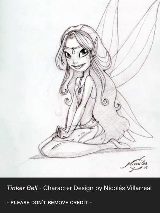
I'm still thinking about her...who were you... Rani???
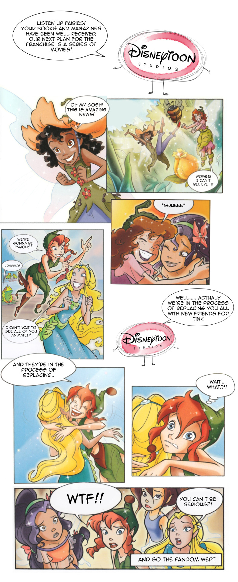
We're all still bitter 😭
#lmao#lily#prilla#fira#beck#rani#books#comics#would have loved them even as bg characters would have ate that up#the congrats frog ily#discussions: concept art/development#discussions: books vs movies
349 notes
·
View notes
Text
this is the biggest pokemon leak weve ever seen. holy fuck.
a gamefreak employee got phished in a dev portal. i feel really really bad for them. but at the same time so much of this is amazing. i love cut content. i love seeing the process of making stuff. so i have mixed feelings, but i’m going to set that aside.
ive been here for multiple beta leaks since the spaceworld gold demo in 2018 and the diamond and pearl beta leak somewhere after that. this is by far the most intensive leak of beta pokemon stuff ive seen.
source code and beta builds for gens 3, 4, 5, and later 6 and 7. it is MASSIVE.
there is so fucking much and you can see coverage here
edit: if you dont have twitter (elon is a shitbag i dont blame you) you can go on r/PokeLeaks
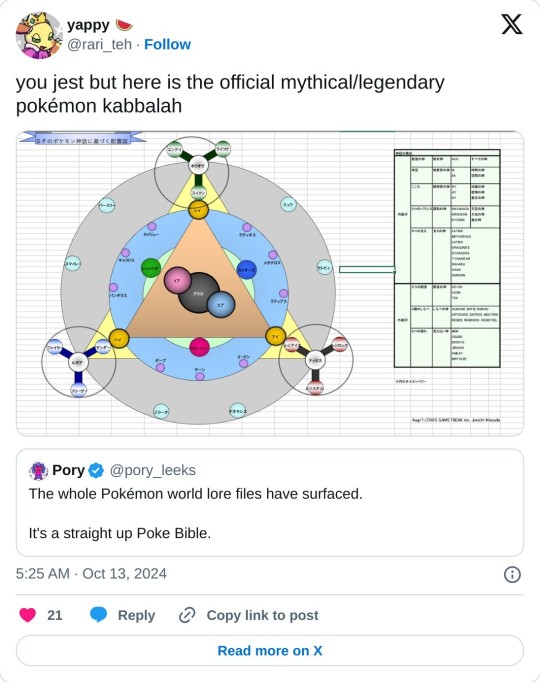
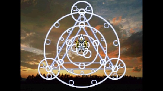
this document from junichi masuda made in 2005 is the highlight for me, the symbol used in the hgss arceus event. it seems the legendaries are like a greek pantheon of deities
but we got more
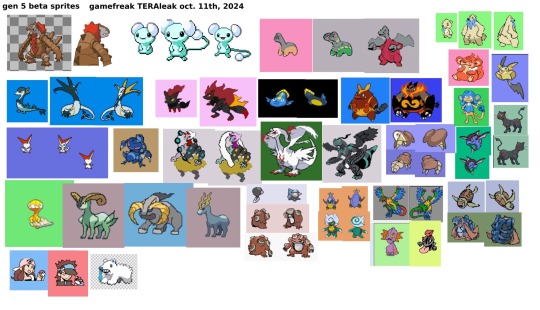
internal development and discussion. universe creation lore, character profiles (e.g. skyla is a sexy latina pilot inspired by jennifer lopez and isabella fontana), never before seen designs, seen-before designs (latiken had a fucking sprite!), concept art, gen 3 had some darker looking discarded dev art. WHAT IS THIS IT RULES

here are compiled beta sprites from gens 3, 4, 5
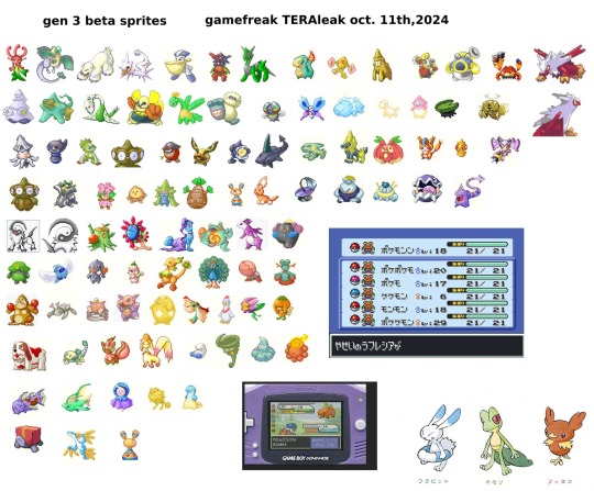
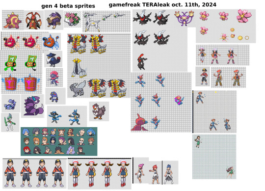
27K notes
·
View notes
Text
Since everyone is talking about that concept art of Jayce and Viktor fighting, it's useful to know that the concept artist, Suheb Zako, also posted it on their twitter with some context.
It is early concept art for a final fight between Jayce and Viktor in the hexzone sorry I'm not calling it that astral plane. There's a link in the twitter thread to an anime clip that gives you a sense of what the vibe would've been.
It's not totally clear when in the development/production process this art is from, but I wouldn't be surprised if Jayce and Viktor originally had a dynamic that was more like their game counterparts. In that case a knock-down-drag-out fight in the astral plane might've fit better. But in the final version of the show it wouldn't have worked anywhere near as well as what we got, and not just because it would have seemed out of character for what the characters and their relationship arc became in the finished show.
First of all, we already did have a knock-down-drag-out fight between them. That's the Council chamber fight scene. It would've felt like a repeated beat and that's the last thing you want in your big finale. When you have characters who fight each other multiple times, you want each fight to reflect a progression of their relationship.
Secondly, by the end of the show, Viktor is absurdly overpowered compared to any other character. Once he goes full Machine Herald he is basically a god. A conventional fight scene is just not gonna do it here. You need a twist, some way to win that doesn't involve being stronger than him. And the trump card being The Power of Unconditional Love (And Also This Time Machine Getting Chucked at Your Head) fits perfectly with the show's themes.
Thirdly, the final episode is ALL action. In an episode that's one massive battle, it takes a lot of work to make individual pieces of action stand out. (And generally, you do it not by making the fighting look Super Duper Extra Cool, but with character work.) But any scenes between the characters that are not action are automatically gonna pop because they're so different in pacing and energy from everything around them.
I haven't seen as many people discussing this set of keyframes, but the changes here are also fascinating:
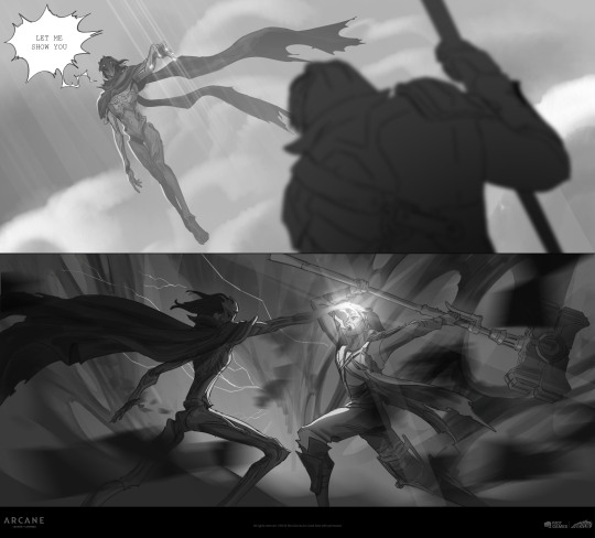
Because Viktor assimilating Jayce as a battle move is almost the complete opposite of what we got in the finished show, and what we got in the finished show is so fucking good. It's one of my favorite moments in the whole damn series.
I've already written about it here, but playing it so that Jayce doesn't get surprised or overpowered but chooses to allow Viktor to bring him into the astral plane as a last-ditch effort to reach whatever is left of Viktor's humanity is sooooooo narratively sexy. (And also just. Sexy. Big stronk dude with his fuckass hammer and his stupid shoulder armor waiting on his knees for his eldritch god bf to materialize behind him and oh so tenderly penetrate his brain with his magic fingers, listen I am not making this up this is just what happens, no homoerotic fight scene could ever top this.)
It also fits with the motif of a number of characters winning their individual battles in the finale by surrender/submission/potential self-sacrifice. It fits with Caitlyn realizing that to cut the string of protective runes off Ambessa's arm she has to allow Ambessa to get within stabbing distance of her face. And of course, Jinx forcing Vi to let her go by popping the gemstone out of her gauntlet and letting herself fall with Warwick.
Arcane has fantastic action storytelling and part of good action storytelling is knowing when to have the character stop fighting each other. Seeing the early concept art is cool to see how much things evolved, but I'm glad they moved away from just trying to do an epic boss fight because what we ended up with is so much more interesting.
#maybe the real boss fight was the cosmic soulmates we made along the way#or something#arcane#viktor arcane#jayce talis#jayvik#concept art#action#story structure#fight choreography
236 notes
·
View notes
Text
Hi Mary! I think that youre right basically! But I also think based on some things that Gail had said on her blog, the timeline isn't clear with the books and movies 🤔 and where the "early version" comes in- so I thought I'd share some things I've hypothesized about the timeline
around -2001-2003 Early concepts were made by the Disney Consumer Products/publishing art group for Disney Mermaids/Ariel's world it was reworked into Disney Fairies- it started out as Tinkerland in concept art by Ron Dias. Early character concepts that stayed were Bess, who was Lavender, as well as Rosetta and Silvermist
Art by Judith Holmes Clarke from her book (found on Whitney Pollette's instagram)

2003-2004
Disney Consumer Products contacted the publishing department for the book, and were able to get a hold of Gail Carson Levine because of the work with Ella Enchanted. Early concepts/names of the characters were made before Levine's book, because she was suggested the name Invidia for Vidia. Gail thought it was too on the nose, so she shortened it. She did not know of what the illustrator, David Christiana had drawn- but is said to be that she hadnt seen but had approved of. I assumed he worked with some early concept art
Rani is an original name, and Beck is assumed to be as well
Around 2004, the "video department" (Disneytoon Studios) had interest into developing this into a film. The original script for the movie involved characters going on around individual quests to have children believe in fairies again, but in Pixie Hollow. Judith, one of the original artists- also made concept pieces and the cast was made of Pixie Hollow quickly. Silvermist and Rosetta were preexisting by this point, going off of Lisa Temming's portfolio. There was also a character named Lumen in the lineup (top left), and Iridessa's name was Candessa. Fawn also wore purple at first. Drafts of the chapter books were likely produced as well, as I've seen some art pre chapter book on the Japan promotional site I visited
Art of Judith Holmes Clarke

An early character drawing that looks like Rani:


There were four quests we know of from storyboards that helped a fairy overcome their fear. There were also more songs planned.
Eventually, the movie was switched in to 3d and the plot became grander and took place in the mainland, another 3d production was the Snow White dwarves movie. The artists pull from art noveau. It can be assumed that there are many scenes at fairy school as well at this point, because of the abundance of storyboards of that
2005- Fairy Dust and the Quest for the Egg was published and Disney Fairies brand launched globally
The Disney website renovation was being established which would allow create a fairy and Pixie Hollow to exist, but also... the Disney and Pixar merger would happen-
2006- Pixar buys Disney and John Lasseter gets involved with Disneytoon/tinkerbell, Sharon Morill is in charge and wants a full Disney Fairies launch by 2006. In the end two pitches are had, one is a modified treatment by Bradley Raymond (director) that used more naturalism and real life insporation, the other suggested to expand the franchise but did not provide script edits, but plot synopsis for new sequels. John Lasseter prefers the edit and they begin rewriting Tinker Bell

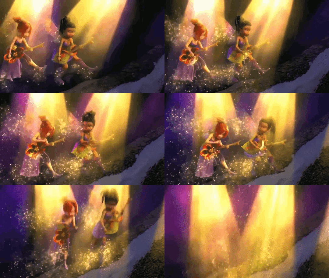

Raymond also used inspo from the books, and directly borrows from "In the Realm of Never Fairies" I think
Late 2006/2007- The movie is rewritten, the pixie previews are produced. 3 get bundled with the movie Peter Pan Return to Neverland, Pixie Powered Edition- the others go on Disney Channel eventually. Brittany Murphy leaves and Mae lands the role.
Also, both movie trailers and the website have the older promotional materials
Fall 2008- Movie releases, and they planned four movies for each season originally. Production of Lost Treasure starts around this point and released in 2009. (evidence from the Tinker Bell DS game) Also I think they used models of the London mainland to save money in TB and GFR, as well as model the orphan Victoria from the trailer into Wendy. I swear I noticed a background character from a deleted scene in GFR during the London car chase. As well as there being bg fairies with the earlier artstyle in the opening of Tinker Bell
So thats how the entire brand changed every year 🤔 ... I think. Weird butterfly effect!
little timeline of marketing for Tinker Bell
-> 2002. Disney is adapting Gail Carson Levine’s “Ella Enchanted”
-> 2003. four people from Disney Press take Levine to lunch and ask her to invent the Disney Fairies books
-> 2004. Ella Enchanted comes out
-> 2005. Levine’s Fairy Dust and the Quest for the Eggs comes out
-> 2008. Tinker Bell film comes out
just thinking about the levels of simultaneous marketing and media that were produced through this. By having the fresh familiarity with Levine through the Ella Enchanted movie, it marketed the Fairy Dust books, then (as mentioned before on this blog) the fairy books themselves were inspiration and marketing for the Tinker Bell film
#disney fairies#discussions: concept art/development#discussions: books vs movies#books#movies#early version#also they used the book of in the realm to market the movie#it had some facts that werent in the other version
71 notes
·
View notes
Text
✦ LOST IN LIMBO DEVLOG #18 | 05.02.2025
Phew. Brace yourselves—this one is packed, so let's have a bullet list for those who don't want to read me yapping for another month!

Extended Demo: Prologue backgrounds done! ✨
All the new sprites for the LIs and their expressions are done and coded! ✨
The Prologue script is done and ready to be proofreaded, with more than 36k extra words! ✨
Extended Demo: Prologue tracks are done! ✨
New QOL features added!
Achievements coded!
Concept art phase started on Evie!

First of all, let's talk Extended Demo! We can confirm our first update with the new sprites and some new features will come not in June, but in May! :^) We'll set a date pretty soon; even if it's not the juicy major update you're waiting for, we hope you are looking forward to it!
As for the CHUNK of it all, the new prologue, that'll have to wait a bit more. We want to wait until we can give y'all a precise date before saying anything, but know work is going well. Sadly, we have decided not to join Steam's Next Fest this time around as the big update won't be coming until a bit more later. Let's see it!
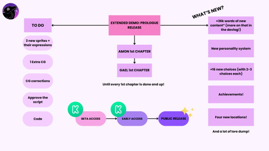
A very professional graphic, you see! Our...roadmapish graphic with no dates because we'd rather not make promises we can't keep!
So, first of all, our first big big update, version 2.0, will come this year. Version 2.0 will include the new prologue, which features you can see listed on the right. There's more, but we have listed only the juiciest stuff. Our Kickstarter Beta Access Backers will receive the first build of the update (without any major bugs), and once they deem it ready, it'll be sent to our Kickstarter Early Access backers. Then, boom! To the world!
This update will pave the path for the first chapter of every route, something we want to offer for free, as you may remember. First will be Amon (v2.1), then Gael(v2.2), Raeya, Envy, Ara, Xal, and Pride. Then, we'll work on two routes simultaneously (script wise) but prioritize one. That means we'll work on Gael's route while working on Amon's, but Amon's will have priority. After every chapter of every route is out, no more free / public updates will be done until final release. We'll enter public early access for those who want to pay for it. Of course, our Kickstarter Beta and Early Access will have all the content before it goes public.
After our first big update, we'll open a Patreon as some of you have suggested to keep investing in the game and maybe, if things go well, to start supporting ourselves :^) You'll be able to enjoy special content, updates, and get Early Access to the game's progress (at a price we'll discuss with our backers first to make it fair for them. Please keep in mind our Kickstarter Backers will have priority on everything!).
Now, changes in the workload / responsibilities have been made after analyzing Raquel's new situation and it becoming a (for now) permanent part in her life.
To compensate for the amount of work Raquel won't realistically be able to pull of, we've decided to officially have Airyn work on our concept and character art as well. If we want the development of the game to keep going steadily, we have to put our (and your) money to good use. Don't worry, we've mathed hard and we've got the funds for it! Our composer has already been paid for our original soundtrack (our first and only stretch goal!), so that and other stuff are secured :^).

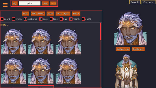
As of today, the new sprites and the new expressions of all our LI's are done and coded! Also, Raquel has implemented the fixes you all suggested for our dear dad. Tree Pride is no more, the golden accents are yellower, and the original tone of the gauntlets is back! Also his head tilt and his smile have made a comeback, as y'all wanted!
Thanks to Raquel for her hard work, all the sprites are ready for our first update!
Also, work on Evie's concept art has started! Our Kickstarter folks will get a sneak peek of some sketches, so you folks will have to wait a bit to see her! In addition, Astro has begun working on more voidbound, so you can encounter more versions of them instead of just voidbound-chan! :^)


All the backgrounds for the Prologue of the Extended Demo are done!! ✨And animated, by the way!
Now, as Airyn will be helping us with the characters, we will have to halt work on the backgrounds for a little while. After the Prologue come Amon and Gael's first chapter, and those will include a lot of new locations, and we'll have to dedicate some time to properly flesh out the aesthetics for both routes. During this small break, I'll properly design the moodboards to give to Astro and Airyn as soon as the new characters are done :^)!

The writing for the Extended Demo: Prologue is done. DONE. I'M DONE.
Originally the new prologue was going to be 20k extra words, buuuut we are sitting at 36k extra. Our editor Allie side-eyed me a bit (with love), and we both know some chopping may be done because I tend to write above my possibilities. So, now we are entering the "this could've been an email" phase. I hope the wait for the first update of the Extended Demo is worth it—I think it'll be, but you'll be the ones to judge!

I've, obviously, been programming the new sprites, as well as the bones of what will be our Achievements section, again thanks to beloved Feniks who has a tool for this in Ren'Py. Achievements won't be coming until our big update, but I want to get the jist of it with enough time!
I also have been battling the code to make it so those of you who turn off the Timed choices know easily when there's a timed choice and when a choice is...well, not timed. Timed choices will have a cute little hourglass on each side! Also, a lot of miscellania like adding Tomás in our credits, revisiting the game to make sure the sprites work accordingly, changing the gallery graphics so they match the new sprites, and so on!

New art has been added to the artbook, and our manufacturer has finally given us a date in which our pins will be done! That's more relevant to our Kickstarter backers, so more about that in there. Kayden is still working on a bunch of mini CG's, as per usual!
Soundtrack wise, Tomás has delivered even more than we needed for our first big update—instead of only two tracks, we now have four original tracks that will be added to our big update! They are finished, cleaned, and ready to go. And let me tell you, they're absolutely breathtaking :`)
April has also been the month to fight taxes, the government, and our own counselor. We even had a big scare with a bunch of oopsies that surprisingly weren't our fault, but that's solved now!
As for our personal lives, I've been fighting the demons of my PhD courses and trying not to cry when faced with math (I failed). Astro has made some big decisions about the course of his life that we see as something positive, Raquel is feeling the pressure of her irl work and wanting to give more to LiL, and Kayden is existing peacefully. Damn I hate that guy /j.
Oh, also, Airyn is very happy to be able to help us a bit more. She's also been working a lot on different stuff (not only for us!), so send good vibes her way!

Somehow this devlog doesn't feel like a lot????? And we did a lot of stuff! Progress is going great!
I guess we are feeling a bit down because the first big update won't make it to this June. We were giving it our all, but even with Airyn's official help, we don't dare to say it'll be ready for June. You always feel like a...not pressure, but duty? To give a date (even if it's just an approximate one) but we'd rather not this time around. Let's just see how everything flows while giving it our all.
That being said, I'm headed to get some rest! I hope you all are doing alright, and as always, thank you so much for the support, the kindness, and everything else 💜
184 notes
·
View notes
Text
"Public domain Sunder" outside of Tumblr (How my project art runs away)


This is NOT a general Sunder! As cool as he looks, he belongs to me and Mynametia/ Inishira (Instagram)!
I want to talk about how reposted art causes harm. It has been stressful to see and I hope fellow artists can sympathize or empathize. And please, if you base art off this Sunder, credit the project Transformers: Mercy!
Firstly, I've heard both "you're niche and unknown" or "you have a big following so watch your mouth"
It feels mean either way... :( Like the jab takes whatever stance is most convenient.
Bottom line: I don't consider myself special. I am just a very hard worker. The only reason I have gotten as far as I have was my hours of daily work for years on my project and YouTube channel.
I am awed when I reflect on how far I have come. Growing my social media platforms, working with 100 different artists from all over the world, commissioning comic artists like Alex Milne and Livio Ramondelli for posters, getting interviewed, collabing, or having shoutouts on other YouTube channels, sitting on panels at TFcon in front of hundreds (although it was t e r r i f y i n g) and getting to talk to them about Transformers: Mercy! And this year, I will be selling Mercy merch at a table at TFcon in the art gallery!
So I don't think I am niche anymore... I don't think my project Transformers: Mercy is. Over the years it has become very widespread with art posted on blogs across social media platforms. As I will discuss, maybe too widespread in one wrong way.
But... there is a long way to go to completing the project. I have about 1000 images now. That's insane! This is no tiny lil project. And I am gunning for 1000s more to make this TFP fan-made sequel. But, I have to pay so so much out of pocket despite making less than minimum wage most months. I need a lot of support to make this big dream possible. Thank you to all who have already helped me thus far.
I think I am just writing this post to clear the air. I am honoured deeply by fanart or fanfictions or fan animations people have created for Transformers: Mercy. It is very motivating and heartwarming and helps me keep up the pace of working hours every day on this project.
I don't mind inspiration being taken from my work. It is an honour. My project draws inspiration from James Roberts' MTMTE and would be nothing without his appealing takes on characters. We may critique MTMTE but where would we be without his Whirl, Rodimus, Drift, Ratchet, Pharma, Cyclonus, Tailgate, Chromedome, Rewind, Swerve, Overlord, DJD, etc.? I carried on from him, others may carry on from me.
A while back, I never meant offence when pointing out one animation of Sunder had features that looked eerily similar (to me) to the Sunder of my game. The reason I got a jolt of horror stems from the fact that this project has fallen victim to reposts on places like Instagram, Pinterest, Reddit, the fan wiki, and other TF forums with zero credit to me or the artists. The growing popularity of Mercy art has also caused it to appear in general searches for IDW or TFP characters. This is why if you search "Transformers Sunder concept art" you are likely to see Mercy Sunder right there but uncredited. So you would see our art but not know what it was for. And Mynametia/Inishira (the artist) did such a good job that it even looks like IDW concept art. It can be mistaken for official content.
But it's not. It was created for my project with very specific features to match my story. A project which costs so much of my time and money and it needs all the donations it can get. It is loses support when its art becomes popular with no tie back to this project. It is still a project in development and is therefore vulnerable.
Transformers: Mercy, after all the years, has become a famous project. But it is a struggling project due to the high financial cost. It is made with ok not blood, but real sweat and tears as I have pushed so hard to make it this far. It has been emotional. It even brought me the love of my life, my spouse.
I want to continue to work on it, the largest Transformers fan project that I believe has ever been attempted. But I need that support, that credit. It hurts when I use google/another search engine and search "Transformers Sunder concept art" and see our work totally visible to the public and not at all attached to Mercy. It then jumpscares me to see other people creating something that looks just like my creations. I see fanart that uses the face of my ghoul Sunder, the one-eyed purple-eyed version with a gaping black pit where the other eye should have been with a small white light within (or the other specific features I requested for Mercy Sunder).
It feels like my ideas are running away from me.
I do not believe anything was done with intent to harm or any malice or spite. I did not believe my project art had been knowingly stolen by any animator or fan artist of Sunder. But when I wrote my post in response to one animation, I did believe that Mercy Sunder had been seen and used as an inspiration because he does appear in general Sunder searches on the Internet. So this is where I came from and why I felt compelled to step in at the time.
I hope I have expressed myself better than last time and I just would like to voice that not this artist/ animator I first reblogged, but other people have reposted Mercy Sunder and caused him to become like.... public domain? Please, I just want it to be known that what you see on search engines, forums, wikis.... was taken from my project. Please do not base your Sunders on that art without crediting Transformers: Mercy and Inishira (Instagram or X).
I hope all the artists here can imagine the feeling of distress I feel seeing credit and support fly away from me and that talented artist, Inishira (who designed Mercy Overlord, Sunder, Crankcase, Fulcrum, Misfire, Krok, Spinister, Waspinator (bug form), and angel Starscream).
I don't want drama or a public back and forth. I seek amicable relationships going forth. Please be very mindful and go back to add in credits if you realize you used this Sunder design as a reference!
131 notes
·
View notes
Photo

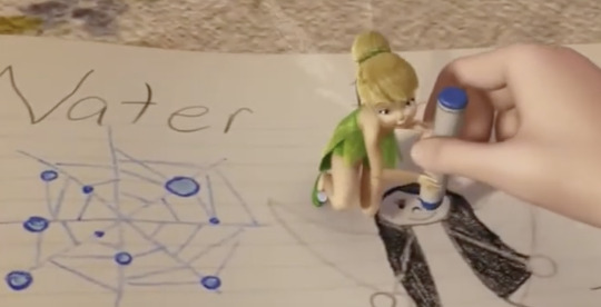

I've been thinking if "she's a water fairy you can tell because her skin is blue" was a reference/inside joke to this character... could it be a early Silvermist?
Same posing
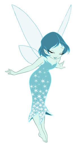
Tinker Bell - Concept Art by Mark Cote
- ᴘʟᴇᴀsᴇ ᴅᴏɴ'ᴛ ʀᴇᴍᴏᴠᴇ ᴄʀᴇᴅɪᴛ -
#ring of belief#early stuff#early version#unknown character#mark cote#My working theory is either that this is early silvermist#Or this is part of Silvermist's quest to find the water of life and its sort of a reflection of her inner desire#art#concept art#blue skinned fairy#By shadow/mirror character I think like a water that can take many forms and mirrors silvermist so she can learn to love others and herself#And silvermists quest is to not be cold hearted and a warm heart can melt whatever something something#And people who worked on ROB could still slip in a joke like that#discussions: concept art/development
53 notes
·
View notes
Text
Wasn't quite in the headspace today to be postin', but the New York Times had to drag me to my keyboard by publishing an article about "The rise of otaku". An article on otaku! In the Year of Our Lord 2025!!
It isn't that you can't do that, of course - the thesis about how Japan's otaku approaches to fandom grew to dominate the wider world is a perfectly valid one to discuss. But if you do, you need to grapple with the cultural detritus the West has accumulated about "otaku culture" over the years, and it does not reach that bar. It isn't "cringe", it isn't obviously wrong, but it is stuck in the past. Take the headshot you can see above of a 単眼面/Tanganmen, or "one-eyed mask". The author is using it to showcase the ~crazy things~ people in Japan who are into anime-adjacent stuff do. In other words, the Weird Japan trope, where for complex reasons niche one-off things done by influencer-types or media companies in Japan get transported to the West to be used as symbols of Japan's "alt" culture. So while in English searching "tanganmen" throws up Vice articles, in Japan the creator of these masks Ozawa Dango has 6000 followers on Twitter:
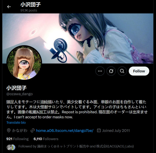
She first made them in 2012, and while like props to her for keeping an art project alive, the source the NYT uses is an article from 2019, 7 years later - which is itself from 6 years ago! This isn't a "thing" in Japan, it is not a relevant part of otaku culture, and I think having it be front billing here is deceptive. I have a similar-if-less-intense reaction to the usages of the classic "otaku room photos" in the article:


This does reflect a real phenomenon, for sure, but for one the first photo is from 2014, and the second from 2019. In fact, none of the photos in the article are from the 2020's at all - a serious problem for a discussion of a youth pop-culture-focused movement. But let's take that first photo - it is from Shiori Kawamoto's 2014 “Daraku Room” book. Did you notice, like I did, that our girl is, well, really hot? Like way too hot to be that devoted to moe yuri series YuruYuri? For context, let's look at some other photos from that book!


Thanks, JapanTease.net! I can't tell you where this book ranks on the gravure-scale, I don't own it, but I can promise you is not zero. That girl might actually be a massive yuri manga fan, I won't judge, but the point is that pulling photos from a softcore porn glam book to stand-in for otaku is not what we in the statistics business call a representative sample. Like the one-eyed mask, this isn't real otaku at all.
Okay, enough photo dunks, let's get into the text. Those dunks are relevant, of course; they play on older tropes about Japan, "Weird Japan" and the "Otaku Room", and that problem continues throughout the article. First up, we have foundational quotes from Susan Napier, who is something of a trope herself as the first American academic to publish serious-yet-accessible works about anime starting in the 1990's. I am not a fan of her work, as she constantly tries to draw overly ambitions and serious social and historical connections between anime and the world, and we see that on display here:
[She] traces the origins of the otaku to the Edo period. Beginning in the early 17th century, sanctioned red-light districts known as pleasure centers were built in Tokyo, Kyoto and Osaka as sites for courtesans to entertain men; other areas were designated for enjoying Kabuki theater. “You had the development of a fan culture with people who loved a particular courtesan or actor.”
Strictly wrong? No - but Edo's red-light districts did not invent the idea of a celebrity, let's be real. That is a socially-universal concept that existed for centuries before then across the globe, and it didn't really lead to otaku (a very modern phenomenon) in any causal way. But it makes it sound more distinguished, more artistic, the way 2000's fans of anime in the west wanted their hobby to look.
That temptation to universalize cuts a different way too - lumping too much under the "otaku" umbrella. Since it has that "otaku led the future of fandom" thesis, it wants to label everything from themed Shinjuku bars to Lolita as "obsessive otaku fandom" to sell you on that idea. However, while those concepts are linked, sure, are they the same phenomenon? When, as the article quotes, Marie Kondo calls herself an "organizing otaku", is she actually saying anything about creative fandom? Or is she making a joke, and she is just an interior designer/lifestyle guru like every country everywhere has had for decades? These comparisons obscure more than elucidate, because "otaku" culture was historically, by a large majority, composed of media otaku. Japan did not invent or export a model of people being devoted craftsmen or opening themed restaurants. What it did "export" was the idea of fandom-as-identity and fandom-as-creativity, which media fans in the relevant eras dominated.
A topic around which, admittedly, the article has a bit of a knot it can't untie; because it is an article about otaku that doesn't want to mention sex. Beyond Edo-era red-light districts, the only mention is from a gender lens:
Wong and others make a point to address what he calls “the elephant in the room”: an undercurrent of female sexualization that began with manga and which, in what’s still a rather male-dominated society, extends to the broader world of otaku
"Elephant in the room" guys it is the whole room. It is a whole city block! You mention Comiket - oh sorry, "Comic Market" - but delicately dance around how those "750,000 attendees" bought at least as many porn doujins. And unlike Marie Kondo this is foundational to how otaku cultural dynamics were formed, and how they spread - the erotic content was a core part of why everyone "showed up" in the early days. And it is how the media mix and fandom-creator model spread to other countries, building on extant communities writing fanfiction and making fanart zines. You could not mention this topic at all if you didn't want to, but if you are going to touch on "sexualization" you need to own its importance. I almost see this as a sort of memetic response; in the anime early days everyone bashed otaku as perverts. In the new, tolerant era of today the author doesn't want to engage with that, but they overcorrect by essentially ignoring it. You have to find the middle here if you want to understand the history.
Okay, okay, that is enough - I know this is a very "death of a thousand cuts" essay, there isn't like a core failed thesis. As the New York Times, articles like these both set the standard for narratives around a topic and reflect the standard ideas already out there, so it is frustrating for it to be so... ungainly, and I wanted to note that. Set the record straight, as it were. But I will admit it is better than it probably would have been a decade ago, it does reflect growth in the discourse. And it isn't like it has some straight up nonsen—
After the original series [Neon Genesis Evangelion] aired, his most passionate followers, disappointed with the final two episodes, pressured Anno to redo the ending in a subsequent film trilogy.
Are you FUCKING KIDDING ME there are practically storyboards for End of Evangelion in the show broadcast next episode previews oh sure fans had to pressure Anno to fulfill the dream of every anime creative to get a big movie budget and make millions of dollars doing what he wanted to do for the TV show anyway before they collectively shot the production schedule in the head what kind of ADV Films 90's mistranslated rag interview garbled by a 2000's Reddit post bullshit is this the NEW YORK TIMES is LYING ABOUT THE PRODUCTION HISTORY OF EVANGELION I will BREAK INTO YOUR GOD DAMN HOUS—
130 notes
·
View notes
Text


HAPPY 10TH ANNIVERSARY TO ME! 🥳
What a crazy decade it’s been, too! I’ve met a lot of good friends, people I still talk with daily and hang out with in person to this day! Despite things not being perfect in the Nintendask community (as I learned much later, haha, I kept in my lane), I still personally cherish the years I spent making art for this blog. It was my passion project for a while, but unfortunately it slowly drifted away from my grasp.
I can’t say if I’ll ever update with the tenacity that I once did. In fact, I can almost guarantee I won’t, but I like being able to come back here every once in a while to drop some new art sometimes. :]
I had a lot of big swings that I wanted to do in regards to the koopz’s arcs, some MUCH more fleshed out than others (namely Lemmy, Wendy, and Morton’s were lacking), and I’m almost positive I won’t be able to get to them in full.
So how about a big spoiler dump, huh? Every plot point, every plan, every character concept that was going to occur will be beneath the cut! If you wanna wait on me to maybe get to them over the course of another decade, please, by all means don’t read beyond!
If you’re hungry for what was cooking upstairs, then scroll on! And thank you guys for the outpouring of support I’ve constantly gotten with this blog! 💖 (Also for real, this read-more is mega long, so seriously prep yourself. Here’s the google docs version that might make it easier to read! If you have any questions about the plot stuff, uh. Maybe I'll answer them OOC?)
Also bonus comparison images! EW!!


TL;DR: The prophecy was a sort-of fake created by Kamek! It started out real, but after it officially stopped existing, it was perpetuated on accident/for emotionally selfish reasons! It didn’t start out that way when I planned the blog, but it eventually became that over the course of development discussion with BoomPom mun! Eventually the koopz were gonna give up their star child prophecy magic nonsent and live their lives how they wanted to. The end!
THE LONG VERSION
Version 1.0 of AskTehKoopz (then AskIggyAndTehKoopz):
The star children prophecy was loosely based on the Yoshi’s Island DS concept of “star children”. Each koopaling (and Bowser Junior) were imbued with an inherent, powerful magic when they were born to help them take over other kingdoms (as mentioned in their various bios). This changed both their ability to inherently harness magic as well as changing their species, explaining their strange features, specifically their pointed ears and wildly colored hair (the pointed ears admittedly did come later during the wedding arc).
The koopalings had always been planned to be unnatural magikoopas, but at the beginning of the blog’s inception, it was not concrete what exactly they each were. This will be covered below.
Version 2.0 of AskTehKoopz:
If you look in their bios, you will see that they are each noted as “Magikoopa(?) + (Where they were born)”. This, along with their last names, were a hint as to their original species. This was added circa 2017 when their bios/references were finally updated.
Originally they were the following:
Roy - Bullet Bill
Iggy - Toad
Morton - Hammer Bro
Larry - Yoshi
Ludwig - Koopa Troopa
Wendy - Bombshell Koopa
Lemmy - I don’t knoooowwww
An additional twist had been introduced during this stage as well:
This set of koopalings (and Junior) were not the first set of prophesied star children.
Affectionately named “The Alpha Koopz”, these are what you might know as the DiC cartoon koopalings: Bully, Cheatsy, Kooky, Kootie Pie, Big Mouth, Hip, and Hop. These seven, along with a young!Bowz were the first set of star children. Back then, Bowz did not see them so much as kids he needed to take care of. Moreso they were “guys who he’s forced to do magic alongside”, despite Kamek’s pressure to be more attentive to them as the eldest. He was considerably more reckless back then with his power as well.
As aggressive and mean and selfish as the blog koopz are, they don’t surpass the sheer annoyance and danger the alpha koopz put themselves in, mainly due to Bowz’s negligence.
And because of this unfettered, reckless behavior, they managed to doom themselves to a “Game Over”, shattering the prophecy and allowing their set of star child powers (along with Bowz’s) to shoot off and embed itself into the next set of vessels. This is also why the blog koopz are “in the wrong order” with regards to their age.
In addition to gaining these star child powers, echoes of their memories and actions and dynamics exist in some of the koopz tendencies:
This is why Lemmy gravitates towards Iggy (Hip and Hop’s closeness). Cheatsy is why Larry is a kleptomaniac. Kooky is where Ludwig’s “crazy laugh” comes from. Kootie Pie is where Wendy pulled “Daddykins” from.
How did they game over? As of right now, it was a mundane and tragically, incredibly avoidable fate, one that echoes Bowser’s many in-game endings: Bully simply fell off the roof of the castle, plunging into the lava moat below. The alpha koopz had little restraint and they encouraged one another to constantly do dangerous things. Walking along the giant chains of the castle without his wand was one of these dangerous things.
If Kamek had had the power to*, if Bowz had desired to see them as more than nuisances and instead helped them learn restraint, if they had realized that despite their immense power, they weren’t invincible, they most likely would have been the koopz that were blogging.
Whomp whomp!
(*I don’t have a good place to stick this, but to put it shortly, the reason Kamek had to be hands off with the alpha koopz is because he used to have a place in what was basically a high magikoopa council. He was assigned to train Bowz to fulfill the prophecy when he was first born with his star child powers. Bowz was NOT a very good student and put himself and many others in danger as they searched for the other 7 star children. When the council hit their last straw, they nearly elected to execute Bowz, who was a child at the time, and start the process over. Kamek traded his spot in the council to spare him, as he had grown attached to Bowz. Bowz overheard this discussion and shaped up quickly. Kamek has never found out Bowz knew of this deal.)
Version 3.0 of AskTehKoopz:
All of the above in 2.0 still happened, however there is now an additional twist.
The prophecy’s a lie! Sort of!
This one was on BoomPom mun. I joked about an article referring to Kamek as a koopaling and unfortunately we came up with something tragic:
Kamek was ALSO part of a set of koopz BEFORE the alpha koopz! Whoa!
Back nearly 100 years ago, there was supposed to be a prophecy. It wasn’t Koopa Kingdom specific, just a general “Well whoever can harness these powers will be able to take over”, it just happened to be the Koopa Kingdom that found out about it first (they were a group of some mix of archeologists and scientists, I don’t remember fully*). It was a once-in-a-lifetime chance. These powers would awaken and they HAD to find someone to use them. Kamek, along with these 7 other kids/teens, were given the opportunity of a lifetime to essentially be vessels for this crazy power to help bring this prophecy to life (literally signing their souls away. The powers NEEDED a soul to latch onto and a body to stabilize itself with).
(*I think that BoomPom mun and I vaguely discussed they might have been the same people who ALSO were the ones who created the cores for the splorches that eventually became Sol, Simon, and Scotty. Yet another experiment that went terribly wrong. These guys are on FIRE. 0-2!)
So Kamek and these 7 formed a really tight sibling bond pre- and post-power. But uhhhh you really shouldn’t be giving crazy raw magical prophecy power to children. Absolute bonkers idea.
Despite their extensive training, it didn’t end well. They genuinely worked so hard to try to be the ones to help bring empires to their knees, but they were only children. I didn’t have a specific incident, all I recall was that the power was WAY beyond their control, and all 8 of them died.
Except.
Through some fail-safe Kamek set up prior to their last hurrah to revive all 8 of them (he felt something might go wrong when they did what they did), Kamek was revived. Alone.
Left in the ruins of what their own powers did to them, Kamek had to live with the guilt that he lost the prophecy, but more importantly, he lost his family, too. Unless he did something about it.
So, despite what a terrible idea it was and how dangerous it might have been, knowing these powers were linked to his sibling’s souls, he decided “I know the prophecy was a once-in-a-lifetime opportunity. But I’m gonna make it happen again somehow. I do not care.” And with the star child powers he still had, he tried to revive them again. Despite the blood, sweat, and tears poured into the ritual, it didn’t work.
Years passed, he’s on the magikoopa council and eventually, after finding kid!Bowz, he’s like “...Hey wait a minute, I weirdly recognize you.” (Magic vibes, general demeanor, etc.) He discovers wow! The prophecy is back on! I did it?! I DID IT?! Soon he recognizes slowly that each of the powers/souls got transferred to a random kid they need to find.
So they find the alpha koopz (i.e. cartoon koopalings) and uh. Yeah they’re all bratty asshole versions of his found family, but well. It does bring him a strange comfort knowing they’re slightly living on regardless. However Hip and Hop are weird. Like. Finishing each other’s sentences, acting in tandem, etc. It’s extremely bizarre. And he’s not really sure WHICH of his siblings Hop is?
Unsure how, but he finds out oops, after restarting the prophecy for a second time, his star child powers got sort of weird because KAMEK WAS SUPPOSED TO BE DEAD. The other 7 star child powers traveled with the souls that stabilized them, however Kamek’s star power DIDN’T HAVE A SOUL TO TRAVEL WITH CAUSE… KAMEK IS ALIVE? So that raw star power was like “Ummm… Uhhhh…… Where do I go? I need a soul to latch onto, I am an insane amount of power…” Luckily Hip and Hop are twins, so naturally, it latched onto Hip’s soul and shares a soul between the two of them while also trying to make its own soul, but it can’t do it right. Super fine and no issues happen because of that at all. They aren’t offputting and weird, I promise.
So Hop was essentially SUPPOSED to have Kamek’s soul pre-packaged with the power, but Kamek is still very much alive, so it’s sort of. Trying to make due. It’s both halfway between Kamek and Hop while ALSO soulless but ALSO trying to use Hip’s soul to ground itself while ALSO trying to artificially make a soul for itself. It’s a mess. Just understand Hop’s star child powers are a mess because Kamek is still alive.
Of course, like in 2.0, the alpha koopz’s Game Over happens, and the prophecy is broken again. Kamek assumes “Well. That’s the end of that. I don’t have enough magic power to try and restart it again, because half of it was in that freak child, so I definitely can’t do a second round of that.”
Everyone in the Koopa Kingdom, including Bowz, are like “Don’t worry, there’ll be another way we can fulfill this prophecy! They came back the first time! People were wrong that it was a once-in-a-lifetime chance!”
Kamek plays along with it, being like “Yep, that definitely happens naturally. Obviously we’re going to have another set of star children. There were no outside forces that made it happen a second time.” You know. Like a liar.
However, SURPRISE! ROY AND IGGY SHOW UP! AND ROY’S ACTING LIKE ONE OF HIS SIBS! OH GOD, I DON’T THINK THIS HOW ANY OF THIS IS SUPPOSED TO WORK. I LITERALLY DO NOT THINK THIS IS A PROPHECY THING ANYMORE. DID I ACCIDENTALLY TRAP MY SIBLING’S SOULS IN A NEVERENDING EXISTENCE LOOP CURSED TO LIVE VICARIOUSLY THROUGH OTHERS FOR ETERNITY? ALSO WHO THE HELL IS IN THAT ONE? (LOOKS AT IGGY)
(This is actually what this sketch on turtle-pen was about, with Kamek’s concern over them not being messed up, like how Hip and Hop were, haha)
So uh. Yeah, Kamek isn’t sure WHY the cycle is continuing, and he’s almost positive the prophecy’s not even really a thing anymore, but the star children stuff sure is! And the powers/souls are already super unstable by the time they get to blog koopz, and it only gets worse as time passes! (One of the earliest examples of that magical decay was Roy suddenly getting an impulse to shave his head to match Bully/pre-koopz “Roy”. Eventually this kind of thing would start happening later on down the line in higher frequency with the other koopz as well. This is actually what the third sketch on this post was alluding to. In fact, Iggy’s is actually the most unstable magic of them all, because ever since the fake-out death with Kamek, whoever got HIS star child powers was always going to be the weakest/most unstable magically. More about this will be covered in Roy’s section below)
The Koopz
What order did they all end up at Bowz’s?
I talked about how each of them got to the castle in their bios, however if you can’t piece it together, the order is Roy/Iggy -> Ludwig -> Morton -> Wendy -> Larry -> Lemmy. Junior, I think, showed up between Wendy and Larry. Bowser just walked in with him one day. None of them know where he came from.
Why is Iggy a vegetarian? Also why are his eyes like that?
I’m gonna keep it buck: Iggy is a vegetarian purely because I wanted an excuse to make him monster-y sometimes. In 2.0 Koopz, I justified it by the star child power (being inherently a magikoopa power) not meshing well to him being a Toad, playing off the idea of Toads and Koopas being diametrically opposed.
There was a sliding scale of “how lizard” someone was based on how well their species reacted with magikoopa magic (I only remember Iggy being the most “lizard-y” and Larry being the 2nd most “lizard-y”, This is also why his eyes are like that and why he and Larry have split tongues) Eating meat weirdly triggered some primal urge in him due to the magikoopa thing, I guess?
In 3.0 Koopz, I genuinely have no reason why he can’t eat meat or has weird eyes since I got rid of the lizard-y scale, I was gonna figure it out later, haha. The 2nd pic is actually him after accidentally eating Pom’s burger when his veggie burger got swapped at a restaurant.
Who was that kid in the flashforward meme?
That’s Ozzy, Iggy and Pom’s kid! He melts! :) (cw for body horror and blood in that link) But it’s okay, he gets better!
To put it plainly, in 2.0, Pom accidentally gets some of her DNA in Iggy’s clone nonsense, and oops they have a kid now. He is NOT genetically stable. Drama ensues, and they have to figure out how to get him to not completely unravel.
At first, we thought that maybe Iggy should have him melt and clone him again without the memories of melting and present it as something he worked tirelessly on (and BoomPom mun drew an excellent comic about Pom’s reaction to it), but we couldn’t justify any way for her to forgive Iggy for basically replacing Ozzy, and Poggy was just too important to us to break up. We were stumped.
And long story short, the book Ludwig was reading when he was in se7en-sib’s world was one about DNA cloning. (But that’s spoiler stuff for se7en sib’s blog that I won’t get into, heh heh) And Ludwig, despite it being the perfect opportunity to have Iggy traumatize and disappoint Pom, tells them about it and that they should visit se7en-sib’s Kamek somehow to fix it. (He does fix it! By melting Ozzy and recreating him again. HOWEVER Ludwig and Iggy have to swear to secrecy about it. They take that shit to their graves.)
So he’s better now!
ROY:
Roy had started on the path of his biggest plot points being covered (him finally ending up with Boom and slowly showcasing his natural inclination to being a leader, despite NOT wanting to be), but I didn’t get his biggest two out of the way (one of which I’m glad I didn’t get to yet): Roy cheating and Roy almost dying.
Koopz 1.0 - Roy was going to be transphobic (specifically enbyphobic. This is actually one of the reasons he doesn’t like Larry all that much), but over time he’d learn that that’s a personal problem. He specifically had a lot to unlearn of his biases of what inherently makes someone a man/woman. Ludwig’s transition was fine with him, but Larry “switching” didn’t make sense to him. (His definition of a “man” was severely warped by his abusive father) This is actually still canon, but he learns better, of course.
Roy was also going to cheat on Boom via a night of drunken infidelity. The big twist was going to be that it was with a woman, and along with him, we find out that he’s bisexual. After some thinking it over, I ultimately decided, despite the drama that would ensue, I didn’t feel particularly comfortable perpetuating what I didn’t realize was a “cheating bisexual” stereotype. Morton’s bi as well, so maybe it would have been fine? But I was like “Uhhhh noooo I shouldn’t do that.” (I wish I could find the pic BoomPom mun drew in reference to when they got locked in a room together by Pom and Iggy to “talk it out”. Boom was punching the wall next to Roy and it was real dramatic. Oh well!) There was also a discussion about a compromise of him sleeping with other people, but letting Boom know about it beforehand? It was gonna be MESSY, haha!
Koopz 2.0/3.0 - Him coming out as bisexual changed to what was going to be a comic with Roy confronting the fact his hypermasculinity was exacerbated because he felt that not being solely attracted to men was a win for his shitty dad. (It makes sense in HIS head: being gay but also being hyper-masculine and liking pink was to piss off his dad. But if he’s actually also attracted to women, then his dad gets what he wants, right? For him to like women?) It was going to end in a sweet moment where Boom reassured him being bi didn’t mean his dad was right about him.
Now to Roy almost dying. Hoo boy. So as mentioned, the star child powers they all got were already quite unstable. As time went on, things started unraveling at a quicker pace. Roy started having weird flashbacks/visions in his dreams (only telling Iggy), which are of course visions of the alpha koopz. Soon enough all the present-day koopz would start to have moments where they physically re-enact something the previous star children did. This was especially prevalent when certain koopz interacted with one another (like if Lemmy and Iggy brushed by each other, suddenly they’re acting exactly like Hip and Hop again for a short while). These moments not only got more frequent, but longer as well.
And we’d build up to Roy, like Bully, on the roof, the rest of the koopz in their hazy, lucid states, encouraging him, like the alpha koopz did so long ago. None of them would be really in their right minds, it was all going to be very dramatic. There was gonna be rain and everything, building up to the inevitable of the cycle being broken again.
What’s the difference this time around? Roy’s dating Boom. And Boom solves this the only way he knows how: by clocking Roy in the face before he almost slips and falls. So Roy gets knocked out, which manages to knock ALL the other koopz out of their weird stupor.
This plotline gets resolved by the koopz having a heart-to-heart with each other, with Bowz, and with Kamek, who comes clean about the whole prophecy thing, which isn’t quite real anymore (due to the 3.0 change). Professing how he just missed his family and didn’t want any of this to happen nor did he know any of this was going to happen.
Ultimately they’d come to the conclusion that they need to let these weird soul/magic things go, to stop anchoring their souls and not allowing them to move on, and to let the koopz live how they were supposed to. Kamek can’t guarantee they’ll be able to even harness magic anymore, or honestly if this would even work, but they end up performing a VERY extensive, painful, and tiring ritual that allows Kamek closure, allows the blog koopz to meet the alpha koopz for a moment, and allows them to live their normal lives. (As koopa royalty, but you know.)
There was also a planned Nintendask event where Roy was going to raise his father from the dead to confront him about his shitty behavior. Chaos was going to ensue and there was going to be a small “Zombie apocalypse” event similar to the revolution arc that occurred.
IGGY:
The main things with Iggy had already pretty much occurred: Hooking up with Pom -> Love poisoning himself -> Confrontation with Ludwig about it -> ??? -> Profit. Honestly there truly only one plot point that didn’t get to be touched on, and that’s Marilyn! (Those who follow turtle-pen probably know Marilyn)
Koopz 1.0: Like I said, at first the star child powers were going to be specifically magikoopa and make Iggy super weirdly unstable magically. He at first would dye his hair blue/yellow/pink (Hop’s colors. This is pre-alpha koopz) to not stick out in Toad society. His parents were a LITTLE worried about his nonconformity. He was going to run away from home, because oops he ate meat and hurt his parents pretty bad. I THINK at one point this switched to him accidentally killing them, but we don’t talk about the Edgy Koopz Era. This was switched back to harming them pretty soon after.
Koopz 2.0: After the introduction of the Hop thing, it now became less “He dyed his hair to fit in” and “He dyed his hair because he Mysteriously Doesn’t Know Why.”
Truly the biggest change/introduction was the inception of Marilyn. HE IS… Once again a thinly-veiled excuse to shove some favorite tropes onto Iggy. BoomPom mun and I got super into the Jekyll and Hyde musical (specifically with Anthony Warlow), and we went “Iggy should get a Hyde thing going on”. So in combination with the weird “can’t eat meat lest you go sicko mode” thing, we decided to justify it by making it be Iggy try to get rid of his “lizardness”. (This was when the lizard scale still existed) It manifested as Marilyn, who REALLY hated Iggy and REALLY liked Pom. Shenanigans ensued.
Koopz 3.0: Once the lizard scale was taken out, we were like “Uhhhh Marilyn shouldn’t exist anymore”, however unfortunately I love him. So YOU REMEMBER THAT LOVE POTION ANTIDOTE THAT POM GAVE IGGY THAT MADE HIM SICK? Yeah Marilyn came from that now. That weird star child magic latched onto this manifestation of emotions that became his own being (you can see it in the last two pics here). Sue me, man.
You can read more about him on turtle-pen, but the end-game was that Marilyn was sent to Sol’s lab to work for him so he could be humbled and he fell for Bob. A huge nerd. He also became besties with Scotty. The end.
Outside of this, I really had no other big sweeping plot points for Iggy to cover, other than him and Boom learning to get along, potentially meeting Boom and Pom’s actually alive parents (This was only briefly discussed with BoomPom mun, and we didn’t plan much further than that other than AU discussions), and the introduction of Ozzy.
Oh and Iggy was also going to come to terms with IDing as agender during 1.0, but I ultimately never got around to confirming it.
MORTON:
I believe really the only big plot situation that was going to happen for Morton was developing further about his crush on Birdetta only for him to get turned down. I was juggling seven kids, man.
Other than this, I don’t think I ever fully explained how he lost his leg? It was implied in his flashback, but his father (a hardass) was the type to be like “Speak when spoken to” to a degree that was unhealthy. At the military base he was raised on, he managed to get a pretty bad cut on his leg, but, in fear of his father, he never spoke up about it. It developed sepsis and well you know how that goes.
LARRY:
Koopz 1.0: The biggest change was Larry getting hit with the Edgy Koopz Beam as well, similarly to Iggy. He was normal, then shifted to being more violent, back to being normal again.
Koopz 2.0: Even in 1.0, Larry was always planned to have been dealing with depression and anxiety via… self-medicating. However 2.0 is really what changed the cause from intrinsic to extrinsic. The main thing that exacerbated his smoking habit, depression, and anxiety was that he found out they weren’t the only set of kids Bowz had dealt with. I don’t know how, but he somehow managed to find out about the alpha koopz. He kept that secret to himself, but it not only made him feel replaceable/used, but it soured his opinion on Bowz as a whole.
Ultimately Larry was going to get therapy, discuss with the other koopz what he knew about the previous star children, and eventually ween away from his drug habit. I can’t find the post, but I did mention it when doing some ask meme about rating ships and someone sent in a Larry/Weed one and I went “0/5”, haha.
LUDWIG:
There’s honestly not much to say here. Truly most of Ludwig’s arcs have been concluded: his crush on Pom has been wrapped up, him coming out to the koopz as trans (officially) has happened, and he’s on track with his HRT.
The only current plan that had been in motion was to more properly have him and Iggy talk it out and Pom be a wingman for him in his further romantic endeavors.
I suppose that there were also potential plans for him and Scotty to end up together because. Um. They’re cute. (There was also a mild discussion of him and Trudy as well, but there was a lot more discussion between BoomPom mun and I about him and Scotty!)
WENDY:
Similarly to Morton, Wendy didn’t have much going on on her end in regards to big arching plot points either, other than ending up with Chuck eventually and also confronting her insecurities with feeling like she’s not very special!
LEMMY:
And like Morton and Wendy before him, uh. Lemmy didn’t have much! The only planned thing was the drama of his type 1 diabetes diagnosis and that’s IT. Maybe bring back his mom since that was touched on?
Endgame for the Koopz:
They were going to give up their star child powers and return to normalcy, as mentioned in Roy’s section. However they’re still royals so of course it’s still a weird and exciting life for them. I believe they all still end up with the ability to use magic, but it’s much more elbow grease then they’re used to working with.
Roy was going to have a kid with Boom! Unsure if biologically/magically or adopted. Somehow they get their little girl, Stevie, though! I think Roy would also get in touch with his estranged sister that I only just realized I haven’t brought up (4th pic here!).
Roy and Larry were going to end up as co-DJs together working at a nightclub.
Iggy and Pom were gonna have Ozzy, and honestly? Kinda just continue to get into crazy shenanigans. Iggy wanted to rule the Koopa Kingdom but somehow he manages to get convinced not to. (He would NOT be good at it) Iggy would also get in touch with his parents again. They really did miss him after all of these years.
Ludwig and Wendy are going to be the ACTUAL co-rulers of the Koopa Kingdom. They were both so hard-headed and stubborn about it, fighting tooth and nail to make it to the top, Bowz just crowned them both. I think Ludwig also would get in touch with his bio-family as well.
I don’t remember in full what was going to happen with Morton and Lemmy as their end game? Lemmy might have become a circus performer and Morton the military general of the Koopa Army? I really don’t recall to be honest!
And that’s it! That’s all the plot I remember! If you made it this far, thank you for reading!
#nintendask#asktehkoopz#koopalings#super mario#10 year tumblrversary#I HAVE. 20 MINUTES TO SPARE BEFORE IT WAS NO LONGER THE 26TH. Also just so it's clear YES the last pic's colors are a reference to SMB3!#also yes I did blatantly steal your redraw idea BoomPom but I THINK I told you this hIOLKJFD#ALSO ALSO SHOUT OUT TO THAT PERSON IN FEBRUARY WHO SENT AN ASK SAYING THAT LUDWIG'S ARC WAS A PERFECT PLACE TO CAP OFF KOOPZ#genuinely helped me come to terms with potentially not updating anymore ;v;)b!! because. You're right!! character growth!!#iggy koopa#roy koopa#larry koopa#ludwig von koopa#wendy o koopa#morton koopa#lemmy koopa#iggy draws
190 notes
·
View notes
Text
youtube
[Most of the relevant sections regarding concept art are in the first 1/2 of the video FYI]
This is a useful video by the "Souls Series" YouTuber Illusory Wall. The video is a breakdown on false claims that Elden Ring had "Ai" concept art (It did not in case that wasn't obvious) and how false accusations of real artists using Ai is offensive and harmful to them and their industry
Most of the "fraudulent" art practices Illusory Wall rebukes are long-standing artistic practices in concept art and game dev. Eg. Photobashing, asset reuse, mixing 3D layers into art, etc.
He also shares and discusses details of the "how and the why" of concept art and its function in game development. If you're not familiar with the practical function of concept art, the info here is basic, but *super* informative and useful.
Many of these are techniques we also see in ESO and Oblivion Remastered concept art, as well as later Fallout series art. Hell, even Skyrim used some of the techniques and methods discussed in the video.
Even if you're not an Elden Ring fan, much of the information discussed in the video relates to the look and the function of concept art you may see on this blog. The second half is more of a "general" or point specific discussion about AI and art. However, the overall information is quite useful to broaden the (false) perception that artists are just making everything with a pen and paper and not using rendering software and other programs.
(The most relevant sections to this blog are discussed in the first 1/2 of the video)
61 notes
·
View notes
Text
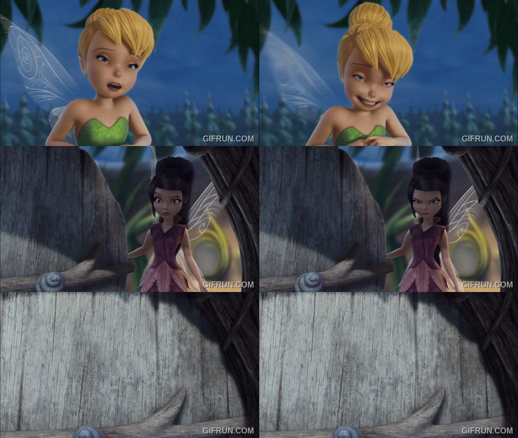
Me walking up to the witches grotto make a soul bargain in desperation for the movie that almost killed the Disney Fairies franchise but the witch sold their soul to the Disney company
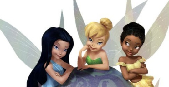
Me and the crew if we ever get our hands on some new material
Me trying to guess plotpoints based on random concept art/prototype thing
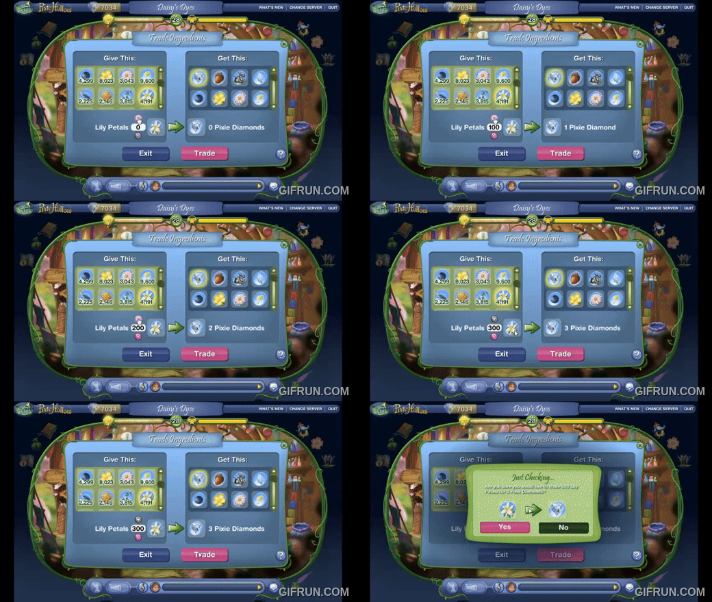
Me if some one had it on their hard drive under ransom
Disneys security is slaking rn please
94 notes
·
View notes