#WCAG Version 3.0
Text
ADA Standards For Accessible Design
ADA Site Compliance specializes in implementing ADA standards for accessible design on your digital platforms!
#Websites and mobile app accessibility#web and mobile app accessibility#Americans with Disabilities Act (ADA)#ADA standards#Title II of the ADA#online services and mobile applications#state and local governments#accessibility standards#ADA standards for accessible design#ADA-compliant websites#WCAG 2.1 Level AA#WCAG 2.1 AA standards#WCAG standards#WCAG 2.1 Level AA accessibility standards#WCAG Version 3.0#digital content#digital resources#free accessibility scan#ada compliance tools#ada compliance analysis#website accessibility solutions#ADA site compliance#ADASiteCompliance#adasitecompliance.com
0 notes
Text
Sichere Zusammenarbeit mit der Content-Collaboration-Plattform

Moderne Teamarbeit mit Echtzeit-Content-Collaboration bietet mehr Sicherheit, ist barrierefrei und macht die Verwaltung einfacher denn je. Ein neuer Antivirus Service schützt vor Trojanern, Viren und anderer Malware.
Die neue, dritte Version von ownCloud Infinite Scale ist jetzt barrierefrei gemäß WCAG 2.1, verbessert die DSGVO-Compliance und baut das Spaces Feature weiter aus. Zudem bringt sie ein schnelleres und flexibleres WebUI mit, vereinfacht die Verwaltung und bietet zahlreiche neue Funktionen unter anderem für noch mehr Sicherheit.
Neuer Antivirus Service und File Firewall
Ein neuer Antivirus Service schützt vor Trojanern, Viren und anderer Malware und sorgt damit für sicheres File Sharing. Er scannt Dateien vor ihrer Speicherung mit einer externen Engine und verhindert die Ausbreitung infizierter Daten. Die Integration von Antiviren-Scannern via ICAP (Internet Content Adaptation Protocol) ermöglicht es, den Scanvorgang auf einen dedizierten Service auszulagern, wodurch sich Performance und Skalierbarkeit verbessern.
Eine neue File Firewall fügt eine zusätzliche Sicherheitsschicht auf Datei-Ebene hinzu. Administratoren können mit definierbaren Regeln und Kriterien, etwa auf Basis von Dateierweiterungen, Mime-Typen und sogar Inhalten, den Upload von Files einschränken. Mit dem Open Policy Agent (OPA) können sie Regelsätze definieren und der Policy Service von Infinite Scale prüft dann, ob eine angeforderte Operation zulässig ist oder nicht. Diese granulare Kontrolle hilft dabei, unerwünschte und nicht autorisierte Uploads zu verhindern.
Volltextsuche mit Apache Tika
Mit der neuen Volltextsuche im Search Service von Infinite Scale finden Endnutzer benötigte Informationen schneller und effizienter als je zuvor. Sie können Files jetzt zusätzlich zu Titeln und Metadaten auch anhand ihres Inhalts suchen. Manuelles Durchsuchen unzähliger Ordner und Dateien nach benötigen Tabellenkalkulationen, Präsentationen und anderen Dokumenten ist dadurch hinfällig. Für die fortschrittliche Extraktion von Inhalten nutzt die Volltextsuche das Apache Content Analysis Toolkit Tika.
Compliance durch Policy Service, WCAG 2.1 und DSGVO-Export
Die Policy- und die Antivirus-Services von Infinite Scale 3.0 können Virenscans oder Signaturprüfungen durchführen und wenn die Inhalte der Files bestimmte Bedingungen erfüllen, nötige Aktionen durchsetzen. Als erste Open-Source-Content-Collaboration-Software überhaupt ist Infinite Scale 3.0 zudem barrierefrei und entspricht dem WCAG-Standard 2.1 (Web Content Accessibility Guidelines). Außerdem können Endnutzer jetzt mit einem einzigen Klick alle DSGVO-relevanten Daten exportieren, die von einer ownCloud-Instanz verwendet werden – Eingriffe von Administratoren sind dazu nicht erforderlich. Die Daten werden in eine JSON-Datei exportiert und lassen sich dadurch unkompliziert automatisch weiterverarbeiten.
Einfachere Administration durch benutzerdefinierte Rollen
Administratoren profitieren von benutzerdefinierten Rollen wie "admin", "space admin" und "user". Sie lassen sich mit unterschiedlichen Berechtigungen ausstatten und machen es einfach, Rollen zu konfigurieren, die den individuellen Anforderungen einer Organisation entsprechen. Durch fortschrittliche Filter und Rollen können ownCloud-Administratoren bei der Filterung von Content jetzt Tags oder beschreibende Wörter verwenden. Sie können Benutzer bequem nach Gruppen und Rollen filtern und dadurch spezifische User-Segmente schneller lokalisieren und effizienter verwalten. Stapel- und Filter-Aktionen, erweiterte Gruppen und das neue Management von Spaces machen ihnen den Arbeitsalltag ebenfalls leichter.
Verbessertes WebUI und Datenklassifizierung mit Tags
Die zahlreichen Clients von Infinite Scale (Windows, Linux, macOS, Android, iOS) wurden mit umfangreichen Verbesserungen ausgestattet. Dazu zählt eine Auto-Konfiguration mit einem Connection Wizard, der WebFinger nutzt sowie ein deutlich optimiertes WebUI, mit dem sich nun ebenfalls Links teilen lassen. Zudem bietet Infinite Scale jetzt die Möglichkeit, Dateien mit Tags flexibel und intuitiv zu kategorisieren. Durch die Zuweisung relevanter Tags zu Dateien können Endnutzer gesuchte Dokumente leichter finden. Sie müssen sich keine Dateinamen merken und auch nicht mühsam durch komplexe Ordnerstrukturen navigieren. Nutzer können einer einzigen Datei mehrere Tags zuweisen und so Dokumente nach verschiedenen Kriterien klassifizieren. Das ermöglicht ihnen eine personalisierte Organisation, die sich an ihren individuellen Vorlieben und Arbeitsweisen orientiert.
Optimierte Teamwork Experience von Spaces
Mit der Version 1.0 führte Infinite Scale das Feature Spaces ein – eine revolutionäre neue Art für die Zusammenarbeit in modernen Organisationen. Spaces bieten Personen-unabhängige Datenräume, die verschiedene Manager und zahlreiche Mitglieder mit unterschiedlichen Berechtigungen haben können. Mit Infinite Scale 3.0 wurde das Spaces Feature umfassend aktualisiert, um Zusammenarbeit und Produktivität weiter zu optimieren. Zudem stellt es jetzt sicher, dass Rollen, Zugriffe und Berechtigungen durchgesetzt werden. Außerdem lassen sich nun Space Templates hinzufügen. Sie machen die manuelle Erstellung von Ordnern und Unterordnern bei neuen Projekten oder beim Onboarding eines neuen Teams überflüssig.
Leichtere Nachverfolgung von Dateiversionen und anonyme File-Ablage
Das Konzept der Dateiversionen wurde für Infinite Scale 3.0 komplett überarbeitet. Endnutzer können jetzt einfacher denn je frühere Versionen nachverfolgen und zu ihnen zurückkehren. Jedes Mal, wenn jemand eine Datei ändert oder aktualisiert, wird eine neue Version erstellt und gespeichert, so dass eine vollständige Zeitleiste der Änderungen erhalten bleibt. Die neue Funktion „Secret File Drop“ ersetzt den früheren „Uploader“ und ermöglicht es Nutzern, eindeutige Links zu generieren, die mit externen Parteien geteilt werden. Die Empfänger können über diese Links anonym Dateien ablegen, ohne ein registriertes Konto zu benötigen und ohne Einblick in andere Übermittlungen zu erhalten.
Passende Artikel zum Thema
Lesen Sie den ganzen Artikel
0 notes
Text
Webstandard für Barrierefreiheit WCAG 3.0: Erster Entwurf liegt vor
13 Jahre nach Version 2 hat die Arbeitsgruppe AG WG einen ersten Entwurf für ein Update der Richtlinien für Zugänglichkeit von Websites vorgelegt. Read more www.heise.de/news/…-... www.digital-dynasty.net/de/teamblogs/…

http://www.digital-dynasty.net/de/teamblogs/webstandard-fur-barrierefreiheit-wcag-3-0-erster-entwurf-liegt-vor
0 notes
Text
Programming Sass to Create Accessible Color Combinations
We’re all looking for low-hanging fruit to make our sites and apps more accessible. One of the easier things we can do is make sure the colors we use are easy on the eyes. High color contrast is something that benefits everyone. It not only reduces eye strain in general, but is crucial for folks who deal with reduced vision.
So let’s not only use better color combinations in our designs but find a way to make it easier for us to implement high contrasts. There’s one specific strategy we use over at Oomph that lets a Sass function do all the heavy lifting for us. I’ll walk you through how we put that together.
Want to jump right to the code because you already understand everything there is to know about color accessibility? Here you go.
What we mean by “accessible color combinations”
Color contrast is also one of those things we may think we have handled. But there’s more to high color contrasts than eyeballing a design. There are different levels of acceptable criteria that the WCAG has defined as being accessible. It’s actually humbling to crack open the WebAIM Contrast Checker and run a site’s color combinations through it.
My team adheres to WCAG’s Level AA guidelines by default. This means that:
Text that is 24px and larger, or 19px and larger if bold, should have a Color Contrast Ratio (CCR) of 3.0:1.
Text that is smaller than 24px should have a CCR of 4.5:1.
If a site needs to adhere to the enhanced guidelines for Level AAA, the requirements are a little higher:
Text that is 24px and larger, or 19px and larger if bold, should have a CCR of 4.5:1.
Text that is smaller than 24px should have a CCR of 7:1.
Ratios? Huh? Yeah, there’s some math involved here. But the good news is that we don’t need to do it ourselves or even have the same thorough understanding about how they’re calculated the way Stacie Arellano recently shared (which is a must read if you’re into the science of color accessibility).
That’s where Sass comes in. We can leverage it to run difficult mathematical computations that would otherwise fly over many of our heads. But first, I think it’s worth dealing with accessible colors at the design level.
Accessible color palettes start with the designs
That’s correct. The core of the work of creating an accessible color palette starts with the designs. Ideally, any web design ought to consult a tool to verify that any color combinations in use pass the established guidelines — and then tweak the colors that don’t. When our design team does this, they use a tool that we developed internally. It works on a list of colors, testing them over a dark and a light color, as well as providing a way to test other combinations.

ColorCube provides an overview of an entire color palette, showing how each color performs when paired with white, black, and even each other. It even displays results for WCAG Levels AA and AAA next to each result. The tool was designed to throw a lot of information at the user all at once when evaluating a list of colors.
This is the first thing our team does. I’d venture to guess that many brand colors aren’t chosen with accessibility at the forefront. I often find that those colors need to change when they get translated to a web design. Through education, conversation, and visual samples, we get the client to sign off on the new color palette. I’ll admit: that part can be harder than the actual work of implementing accessible colors combinations.
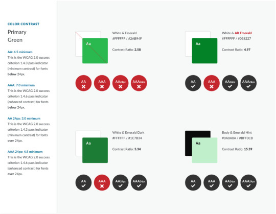
The Color Contrast Audit: A typical design delivery when working with an existing brand’s color palette. Here, we suggest to stop using the brand color Emerald with white, but use an “Alt” version that is slightly darker instead.
The problem that I wanted to solve with automation are the edge cases. You can’t fault a designer for missing some instance where two colors combine in an unintended way — it just happens. And those edge cases will come up, whether it is during the build or even a year later when new colors are added to the system.
Developing for accessibility while keeping true to the intent of a color system
The trick when changing colors to meet accessibility requirements is not changing them so much that they don’t look like the same color anymore. A brand that loves its emerald green color is going to want to maintain the intent of that color — it’s “emerald-ness.” To make it pass for accessibility when it is used as text over a white background, we might have to darken the green and increase its saturation. But we still want the color to “read” the same as the original color.
To achieve this, we use the Hue Saturation Lightness (HSL) color model. HSL gives us the ability to keep the hue as it is but adjust the saturation (i.e. increase or decrease color) and lightness (i.e. add more black or more white). The hue is what makes a green that green, or a blue that blue. It is the “soul” of the color, to get a little mystical about it.
Hue is represented as a color wheel with a value between 0° and 360° — yellow at 60°, green at 120°, cyan at 180°, etc. Saturation is a percentage ranging from 0% (no saturation) to 100% (full saturation). Lightness is also a value that goes from 0% to 100%, where no lightness is at 0%, no black and no white is at 50%, and 100% is all lightness, or very light.
A quick visual of what tweaking a color looks like in our tool:

With HSL, changing the low-contrast green to a higher contrast meant changing the saturation from 63 to 95 and the lightness from 45 to 26 on the left. That's when the color gets a green check mark in the middle when used with white. The new green still feels like it is in the same family, though, because the Hue remained at 136, which is like the color’s “soul.”
To learn more, play around with the fun HSL visualizer mothereffinghsl.com. But for a more in-depth description of color blindness, WCAG color contrast levels, and the HSL color space, we wrote an in-depth blog post about it.
The use case I want to solve
Designers can adjust colors with the tools that we just reviewed, but so far, no Sass that I have found could do it with mathematical magic. There had to be a way.
These are some similar approaches I have seen in the wild:
An idea by Josh Bader uses CSS variables and colors split into their RGB values to calculate whether white or black is the best accessible color to use in a given situation.
Another idea by Facundo Corradini does something similar with HSL values and a very cool “switch function” in CSS.
I didn't like these approaches. I didn’t want to fallback to white or black. I wanted colors to be maintained but adjusted to be accessible. Additionally, changing colors to their RGB or HSL components and storing them with CSS variables seemed messy and unsustainable for a large codebase.
I wanted to use a preprocessor like Sass to do this: given two colors, automagically adjust one of them so the pair receives a passing WCAG grade. The rules state a few other things to consider as well — size of the text and whether or not the font is bold. The solution had to take this into account.
In code terms, I wanted to do this:
// Transform this non-passing color pair: .example { background-color: #444; color: #0094c2; // a 2.79 contrast ratio when AA requires 4.5 font-size: 1.25rem; font-weight: normal; }
// To this passing color pair: .example { background-color: #444; color: #00c0fc; // a 4.61 contrast ratio font-size: 1.25rem; font-weight: normal; }
A solution that does this would be able to catch and handle those edge cases we mentioned earlier. Maybe the designer accounted for a brand blue to be used over a light blue, but not a light gray. Maybe the red used in error messages needs to be tweaked for this one form that has a one-off background color. Maybe we want to implement a dark mode feature to the UI without having to retest all the colors again. These are the use cases I had in mind going into this.
With formulas can come automation
The W3C has provided the community with formulas that help analyze two colors used together. The formula multiplies the RGB channels of both colors by magic numbers (a visual weight based on how humans perceive these color channels) and then divides them to come up with a ratio from 0.0 (no contrast) to 21.0 (all the contrast, only possible with white and black). While imperfect, this is the formula we use right now:
If L1 is the relative luminance of a first color And L2 is the relative luminance of a second color, then - Color Contrast Ratio = (L1 + 0.05) / (L2 + 0.05) Where - L = 0.2126 * R + 0.7152 * G + 0.0722 * B And - if R sRGB <= 0.03928 then R = R sRGB /12.92 else R = ((R sRGB +0.055)/1.055) ^ 2.4 - if G sRGB <= 0.03928 then G = G sRGB /12.92 else G = ((G sRGB +0.055)/1.055) ^ 2.4 - if B sRGB <= 0.03928 then B = B sRGB /12.92 else B = ((B sRGB +0.055)/1.055) ^ 2.4 And - R sRGB = R 8bit /255 - G sRGB = G 8bit /255 - B sRGB = B 8bit /255
While the formula looks complex, it’s just math right? Well, not so fast. There is a part at the end of a few lines where the value is multiplied by a decimal power — raised to the power of 2.4. Notice that? Turns out that it’s complex math which most programming languages can accomplish — think Javascript’s math.pow() function — but Sass is not powerful enough to do it.
There’s got to be another way…
Of course there is. It just took some time to find it. 🙂
My first version used a complex series of math calculations that did the work of decimal powers within the limited confines of what Sass can accomplish. Lots of Googling found folks much smarter than me supplying the functions. Unfortunately, calculating only a handful of color contrast combinations increased Sass build times exponentially. So, that means Sass can do it, but that does not mean it should. In production, build times for a large codebase could increase to several minutes. That’s not acceptable.
After more Googling, I came across a post from someone who was trying to do a similar thing. They also ran into the lack of exponent support in Sass. They wanted to explore “the possibility of using Newtonian approximation for the fractional parts of the exponent.” I totally understand the impulse (not). Instead, they decided to use a “lookup table.” It’s a genius solution. Rather than doing the math from scratch every time, a lookup table provides all the possible answers pre-calculated. The Sass function retrieves the answer from the list and it’s done.
In their words:
The only part [of the Sass that] involves exponentiation is the per-channel color space conversions done as part of the luminance calculation. [T]here are only 256 possible values for each channel. This means that we can easily create a lookup table.
Now we’re cooking. I had found a more performant direction.
Usage example
Using the function should be easy and flexible. Given a set of two colors, adjust the first color so it passes the correct contrast value for the given WCAG level when used with the second color. Optional parameters will also take the font size or boldness into account.
// @function a11y-color( // $color-to-adjust, // $color-that-will-stay-the-same, // $wcag-level: 'AA', // $font-size: 16, // $bold: false // );
// Sass sample usage declaring only what is required .example { background-color: #444; color: a11y-color(#0094c2, #444); // a 2.79 contrast ratio when AA requires 4.5 for small text that is not bold }
// Compiled CSS results: .example { background-color: #444; color: #00c0fc; // which is a 4.61 contrast ratio }
I used a function instead of a mixin because I preferred the output of a single value independent from a CSS rule. With a function, the author can determine which color should change.
An example with more parameters in place looks like this:
// Sass .example-2 { background-color: a11y-color(#0094c2, #f0f0f0, 'AAA', 1.25rem, true); // a 3.06 contrast ratio when AAA requires 4.5 for text 19px or larger that is also bold color: #f0f0f0; font-size: 1.25rem; font-weight: bold; }
// Compiled CSS results: .example-2 { background-color: #087597; // a 4.6 contrast ratio color: #f0f0f0; font-size: 1.25rem; font-weight: bold; }
A deeper dive into the heart of the Sass function
To explain the approach, let’s walk through what the final function is doing, line by line. There are lots of helper functions along the way, but the comments and logic in the core function explain the approach:
// Expected: // $fg as a color that will change // $bg as a color that will be static and not change // Optional: // $level, default 'AA'. 'AAA' also accepted // $size, default 16. PX expected, EM and REM allowed // $bold, boolean, default false. Whether or not the font is currently bold // @function a11y-color($fg, $bg, $level: 'AA', $size: 16, $bold: false) { // Helper: make sure the font size value is acceptable $font-size: validate-font-size($size); // Helper: With the level, font size, and bold boolean, return the proper target ratio. 3.0, 4.5, or 7.0 results expected $ratio: get-ratio($level, $font-size, $bold); // Calculate the first contrast ratio of the given pair $original-contrast: color-contrast($fg, $bg); @if $original-contrast >= $ratio { // If we pass the ratio already, return the original color @return $fg; } @else { // Doesn't pass. Time to get to work // Should the color be lightened or darkened? // Helper: Single color input, 'light' or 'dark' as output $fg-lod: light-or-dark($fg); $bg-lod: light-or-dark($bg);
// Set a "step" value to lighten or darken a color // Note: Higher percentage steps means faster compile time, but we might overstep the required threshold too far with something higher than 5% $step: 2%; // Run through some cases where we want to darken, or use a negative step value @if $fg-lod == 'light' and $bg-lod == 'light' { // Both are light colors, darken the fg (make the step value negative) $step: - $step; } @else if $fg-lod == 'dark' and $bg-lod == 'light' { // bg is light, fg is dark but does not pass, darken more $step: - $step; } // Keeping the rest of the logic here, but our default values do not change, so this logic is not needed //@else if $fg-lod == 'light' and $bg-lod == 'dark' { // // bg is dark, fg is light but does not pass, lighten further // $step: $step; //} @else if $fg-lod == 'dark' and $bg-lod == 'dark' { // // Both are dark, so lighten the fg // $step: $step; //} // The magic happens here // Loop through with a @while statement until the color combination passes our required ratio. Scale the color by our step value until the expression is false // This might loop 100 times or more depending on the colors @while color-contrast($fg, $bg) < $ratio { // Moving the lightness is most effective, but also moving the saturation by a little bit is nice and helps maintain the "power" of the color $fg: scale-color($fg, $lightness: $step, $saturation: $step/2); } @return $fg; } }
The final Sass file
Here’s the entire set of functions! Open this in CodePen to edit the color variables at the top of the file and see the adjustments that the Sass makes:
CodePen Embed Fallback
All helper functions are there as well as the 256-line lookup table. Lots of comments should help folks understand what is going on.
When an edge case has been encountered, a version in SassMeister with debug output was helpful while I was developing it to see what might be happening. (I changed the main function to a mixin so I can debug the output.) Feel free to poke around at this as well.
Play with this gist on SassMeister.
And finally, the functions have been stripped out of CodePen and put into a GitHub repo. Drop issues into the queue if you run into problems.
Cool code! But can I use this in production?
Maybe.
I’d like to say yes, but I’ve been iterating on this thorny problem for a while now. I feel confident in this code but would love more input. Use it on a small project and kick the tires. Let me know how the build time performs. Let me know if you come across edge cases where passing color values are not being supplied. Submit issues to the GutHub repo. Suggest improvements based on other code you’ve seen in the wild.
I’d love to say that I have Automated All the A11y Things, but I also know it needs to be road-tested before it can be called Production Ready™. I’m excited to introduce it to the world. Thanks for reading and I hope to hear how you are using it real soon.
The post Programming Sass to Create Accessible Color Combinations appeared first on CSS-Tricks.
Programming Sass to Create Accessible Color Combinations published first on https://deskbysnafu.tumblr.com/
0 notes
Text
Americans With Disabilities Act (ADA)

Latest Regulation And Finale Rule On Web Content And Mobile App Accessibility For State And Local Governments
In a significant advancement for digital inclusivity, Attorney General Merrick B. Garland has enacted a critical update under Title II of the Americans with Disabilities Act (ADA). This new regulation compels state and local governments to ensure their websites and mobile app accessibility for individuals with disabilities.
Considering the integral role of digital platforms in providing access to services such as emergency responses, healthcare, voting, and public transit, the lack of accessibility could significantly prevent disabled individuals from accessing necessary services.
This rule clarifies governmental bodies’ responsibilities and highlights the imperative for businesses to adjust, even amidst evolving compliance landscapes.
ADA Site Compliance works to help companies comply with regulatory mandates. With a dedicated team that monitors regulation updates, we ensure businesses confidently maintain websites that meet current accessibility standards.
Statements from Justice Department Officials
Attorney General Merrick B. Garland: Emphasized the rule’s role in fulfilling ADA’s promise for equal participation. He stated that by establishing definitive digital accessibility standards for state and local governments, they support the ADA’s mission of ensuring full and equal participation for people with disabilities. He also commended the diligent efforts of the Civil Rights Division in implementing this rule.
Acting Associate Attorney General Benjamin C. Mizer highlighted the commitment to making digital platforms usable for everyone to participate fully in society.
Assistant Attorney General Kristen Clarke described the rule as groundbreaking, noting that it removes barriers that have historically excluded Americans with disabilities, and ensures equal access to essential online government services like voting and public benefits.
Importance of Web and Mobile App Accessibility
As state and local governments increasingly digitize their services, the accessibility of their web and mobile platforms becomes crucial. Inaccessible websites and applications can exclude individuals with disabilities from accessing vital services.
For example, visually impaired individuals often need screen readers to navigate websites and applications. Governmental sites posting crucial public information in images without alternative text (“alt text”), is inaccessible to blind users.
Such digital barriers can prevent disabled persons from performing essential activities such as securing mail-in ballots, obtaining tax information, or engaging in community events.
The latest regulation aims to guarantee individuals with disabilities have full access to state and local government online services, programs, and activities. This rule also clarifies steps governments take to adhere to ADA standards, ensuring inclusivity and equal access for every community member.
Title II of the Americans with Disabilities Act (ADA)
Title II of the ADA mandates that all services, programs, and activities provided by state and local governments are accessible to individuals with disabilities.
This extensive requirement encompasses everything from adoption services to zoning regulations and includes both online services and mobile applications managed by state and local authorities.
The rule ensures that individuals with disabilities can fully access and benefit from public services, promoting a more inclusive society with an improved quality of life for disabled individuals nationwide.
This includes:
Making public transportation details accessible to visually impaired users, Enabling the deaf or hard of hearing to participate in online educational courses,
Aiding those with manual dexterity issues in navigating web-based services.
Overview of State and Local Government Functions:
State and local governments are essential providers of numerous public services, including:
Offices administering social benefits like food assistance
Educational facilities
Law enforcement agencies at state and municipal levels.
Judicial systems of local and state courts.
Offices overseeing state and local electoral processes.
Public medical facilities
Community resources like parks, recreational facilities, and public transportation systems.
Accessibility standards under Title II apply to all entities within state and local governments, including their various departments, agencies, special purpose districts, Amtrak, and commuter authorities.
Furthermore, state and local governments contracting with third-party organizations, like non-profits managing drug treatment programs, must ensure these entities adhere to Title II’s accessibility standards.
What Constitutes a Rule or Regulation?
Rules or regulations are formal directives issued by a government agency, from laws enacted by Congress. Following the enactment of the ADA, the Department was authorized to develop regulations to articulate the responsibilities outlined in Title II and Title III of the ADA. Typically, these regulations consist of the regulatory text and an appendix.
The Process of Developing a Rule
The Department formulated this rule through a method known as “notice and comment rulemaking.” The process starts with declaring a Notice of Proposed Rulemaking (NPRM), serving the regulation’s initial draft and proposed requirements, and inviting public feedback.
The Department modified the proposed rule based on the NPRM feedback. Detailed descriptions of the public feedback and rule adjustments are in the rule’s appendix.
What are technical standards?
Technical standards are detailed criteria defining accessibility requirements. For instance, the ADA Standards for Accessible Design include specifications like minimum width for doorways to ensure physical accessibility in buildings and ADA-compliant websites.
Requirement for State and local government websites
This regulation covers all web content handled by state or local governments and must conform to WCAG 2.1, Level AA, including content administered by external contractors.
Example: If a county’s website displays a list of local parks and operating hours, it must adhere to WCAG 2.1, Level AA for accessibility, even if a third-party service provider developed and updated the site.
Web content includes text, images, audio, videos, and documents on the internet.
Requirement for State and Local Government Mobile Apps:
Mobile apps used by state and local governments must conform to WCAG 2.1, Level AA standards. It includes all mobile apps provided or accessible by state or local governments, and external parties.
Mobile apps are software applications specifically designed for use on smartphones and tablets. Developed by the World Wide Web Consortium, WCAG standards make web content universally accessible.
Example: Consider a mobile app developed by a city facilitating public parking payments. The app must comply with the WCAG 2.1, Level AA accessibility standards, no matter if the city or a private company manages it.
Going Beyond Standard Compliance with WCAG 2.1, Level AA
State and local governments have the leeway to adopt web content and mobile apps extending beyond the minimum requirements of WCAG 2.1, Level AA.
This provision for “equivalent facilitation” allows using alternative designs, methods, or technologies, if they offer accessibility and usability equal to or greater than mentioned by the standard.
This flexibility is intended to accommodate the adoption of future, potentially more stringent standards while ensuring continued accessibility for individuals with disabilities.
Example: For instance, a state parks department might implement WCAG Version 3.0 for its new mobile app for booking campsite reservations, if it offers better or equivalent accessibility compared to WCAG 2.1, Level AA.
Specific Exceptions to the Rule Explained
There are various situations where there are exceptions to digital content conforming with the rule. They include:
Archived Web Content:
This applies to outdated or unused content stored in archives, such as old reports or documents, that remain unchanged since archiving. However city council minutes and documents created after the compliance deadline must adhere to accessibility standards.
Even PDFs with up-to-date data on county park maps must conform, regardless of archival status.
Pre-existing Conventional Electronic Documents:
This applies to documents like PDFs or Word files on government digital platforms created before the compliance date and not updated or essential for current use.
However, documents posted or updated after the established compliance deadline do not qualify for exemptions. Active-use documents for accessing government services, irrespective of publication date do not qualify either.
Third-Party Content:
Content posted by third parties without a contractual or official arrangement with the government, which the government cannot modify is exempt. However, content directly posted or managed by the government like calendars developed by external companies, updates made by a government vendor, and message boards must meet WCAG 2.1, Level AA standards.
Individualized Documents:
Applies to personal documents like water bills and documents about specific individuals or accounts available in a secure, password-protected format. They can be challenging for immediate accessibility, especially for recipients without specific disability requirements.
Preexisting Social Media Posts:
This includes all social media posts made before the compliance date. However, if a visually impaired person requests information about a social media image from 2023, the government must provide an accessible description for effective communication.
Conclusion
The new regulation marks a significant step forward in ensuring that all individuals, regardless of disability, have equal access to digital resources provided by state and local governments.
This move aligns with the ADA’s long-standing commitment to inclusivity and modernizes public services to be more accessible, enhancing civic engagement and participation across the community.
ADA Site Compliance works to help companies comply with regulatory mandates. With a dedicated team that monitors regulation updates, we ensure businesses confidently maintain websites that meet current accessibility standards. Get your FREE ACCESSIBILITY SCAN here!
#Websites and mobile app accessibility#web and mobile app accessibility#Americans with Disabilities Act (ADA)#ADA standards#Title II of the ADA#online services and mobile applications#state and local governments#accessibility standards#ADA standards for accessible design#ADA-compliant websites#WCAG 2.1 Level AA#WCAG 2.1 AA standards#WCAG standards#WCAG 2.1 Level AA accessibility standards#WCAG Version 3.0#digital content#digital resources#free accessibility scan#ada compliance tools#ada compliance analysis#website accessibility solutions#ADA site compliance#ADASiteCompliance#adasitecompliance.com
0 notes
Last Seen Blogs