#UR ART IS ALWAYS SO GOOD AND STYLIZES!!
Explore tagged Tumblr posts
Note
Hi Andy! out of curiosity would you be able to give any tips on, and this is the best way I can think to describe this 💀, rendering the elf glow ears? Like the glow of a light source where skin is thin i guess?
It's something that I've been trying to figure out how to do for ages in procreate, and is something I've always really liked in yours as well as others work when it comes to elves! If not thank you anyway, take it easy
hi!! i'm so sorry this took a while to get to.... I drew up a little step by step including what layer modes i usually use, but it's not foolproof and will need some colour tweaks on a per-drawing basis until u find your stride with it.
the term for this is subsurface scattering!!! its how light penetrates translucent surfaces and bounces around inside/diffuses back out into a 'glow'.... that orange radiance is Blood and Cartilage.
some videos i've enjoyed on the topic (1) (2) (and there r many more to do with 3D rendering, if you're interested in going down the rabbit hole... i think i took off running with glowy ears after learning abt subsurface scattering in my 3D animation course back in 2018. ITS SO FUN)
i'm using my own shorthand for. everything i drew here. but i hope it makes sense for visualizing a quick workflow in procreate!!!!
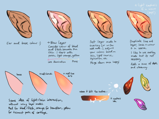
i personally use a mix of layer modes, depending on the piece, usually overlay, screen, or colour dodge... It is honestly something i should devote some proper study time to (paint from observation without layer modes - its Good to be able to better understand colour interaction this way) - but this is how I've been doing it for the last few years!
transcript under the cut:
from left to right:
Ear and base colour :)
+ New layer Consider colour of blood and flesh beneath the skin. I start with pinks, light orange, yellow Less illumination <--> More
Set layer mode to overlay (or ur fav add mode...), adjust your colours based on skin, light source, stylization, etc. Merge down once happy!
Duplicate line art layer, lock + colour it in warm. + Light emphasis if u want (pop!) I like to use overlay mode but its not necessary. Adds a sense of depth and vibrancy.
base + soft brush + red line art Same idea of light/skin interaction, without using layer modes. Red for blood/flesh, orange for transition, yellow for thinnest part of cartilage.
When it (light) hits the surface... it scatters idk
160 notes
·
View notes
Note
Hi you’re very kind in always answering people with their art questions i appreciate you so much!! I wanted to ask if u have any books/videos that helped you on your art journey? Love your art so much ur an inspiration 😘😘
hi!! this is so nice of you to say and you’re very welcome 🥰 - books and videos under the cut!
videos
what helped me a lot when i started with art is to watch time lapses or draw-with-me sessions so i can kind of copy how artists draw or paint. however it’s "Level Up your Portrait Drawings" by Chris Hong (ETA: sorry the link doesn't seem to be working, so i've included the title of the class) that was like a turning point in how i drew faces. it’s available via membership on skillshare but i think you can sign up for a month free. i can’t recommend it enough! the quality of my portraits changed after this especially with regards to anchor points—i learned how to tweak my art with this video and i do feel it carried over and improved the way i drew very visibly <3
another video i feel created a huge improvement in my drawing is this class by Lexin Yuan (qrbits). this is a lot more rigorous and thorough than the previous one and also included feedback from the artist (!!) and it’s available via subscription to Class101 but lexin has since made a free version on their youtube which i HIGHLY recommend as well (actually i would recommend their entire channel) - from here i learned how to make characters stand and pose properly, i learned to draw from dance videos, i learned about boxes and anatomy in a very approachable way.
another artist i’m subscribed to and whom i enjoy watching draw is likelihoodart. i love looking at their art bc i feel like they have the perfect blend of semi-realism and stylization - plus their OCs are amazing (the general art rule for teeth is don’t fill them out, but i’ve never seen anyone draw teeth a good as them! i mean look at this work in particular). i picked up some rendering styles and tips from watching their draw-with-me videos.
i’m also currently subscribed to Loish’s patreon where she has very useful and in-depth tutorials and guides. she explains it so well and i also see a lot of the artists in their patreon community sharing their improvements and it's SO cool and encouraging. she has accessible tutorials here you can check out :)
books
comic books/graphic novels - i think i mentioned before but when i first started drawing (again, after living artless as a corporate cog), i was in my marvel (mcu//stucky) phase and one of my fav comics back then was matt fraction’s hawkeye. i liked david aja’s style and i would copy entire panels from the comic in ink into my sketchbook. so i would recommend copying whatever art style comic or manga or graphic novel you like into your sketchbook as personal practice (not for public sharing). re-draw your favorite panels! copying directly from the source also helps you figure out how the artist might have drawn their works.
figure drawing by michael hampton - if i were to recommend just one figure drawing/anatomy book to you, it would be this one - this is also a direct recommendation by lexin yuan and i found this book to be easy to follow and the concepts are understandable. i am at heart more of a gesture drawing artist so his emphasis on line of action and dynamism is something i really appreciated.
ART BOOKS! in particular: spider-verse 1 and 2 art books - everyone knows these and for good reason; ami thompson's character expression sheets alone are worth the price. seeing concept art is always very special--you get to read how a team of creatives come up with ideas and you can learn how to incorporate them into your own art. these two are currently my favorite art books, but i also like the art of tangled (glen keane's sketches are in the inside of the covers and that alone made me want to weep they're so beautiful). and sometimes i go into the japanese section of my local bookstore and see what art books they have - i got this one last year which i really enjoyed, and i got a copy of ryoko kui's doodle book for dungeon meshi and i just love it SO much. their character designs are varied and top-notch and it's just so FUN to go through (if you're interested in this, they'll be releasing an english version soon!)
i also draw a lot of inspiration from artists who make and sell zines of their own art or sketches or sketchbooks - some of them even offer it for free! it seems to be a lost art nowadays because people think zines have to be like big collaborative productions, but it can just be a pdf of your sketches. i literally have a page from one of my fav artist's digital zines printed and taped in front of my desk for constant inspiration, and it's just a sketch of theirs. there's nothing quite like seeing an artist's work in zine format <3
my gawd sorry that was so long BUT i hope these are helpful to you in any way!! <3
25 notes
·
View notes
Note
hi!! can you, if it's not difficult, please show how you draw your hands and/or body?? I fell in love with your drawings from the very first sight and now I just can't help but start learning to draw with double effort :D
i am deeply unqualified to advise anyone about anatomy lol if you want to learn more about drawing hands and bodies, i think miyuli's art tips (miyuliart on twt and tumblr) are really good...!!
that said, i don't mind sharing my personal habits, but these are more oriented towards how i draw bodies with regard to composition, rather than How To Draw A Body specifically... and keep in mind, it's very much stylized:
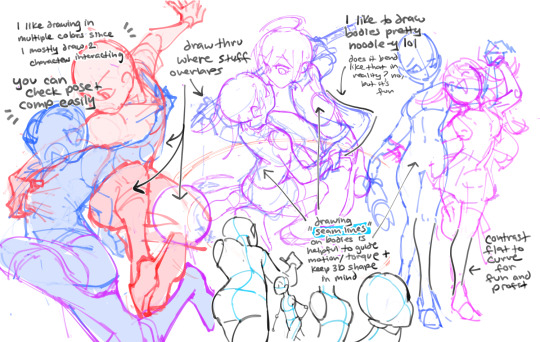
and for hands. best tip is use references a lot...!! hands are the easiest thing to get reference for. just use ur own!
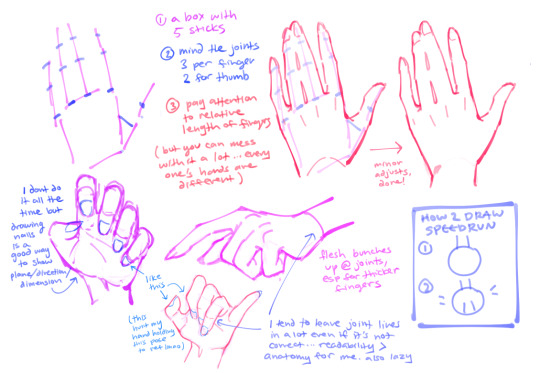
to me, i think readability in a picture is more important than 100% anatomical correctness. so it's important to have a good idea of fundamentals, but after you get comfortable it's fine to just yolo the rules and draw whatever. and as always, the best tool for drawing is observation with intention...!
apologies i can't provide a full fledged tutorial, but hope that helps!
#ASK EVER#for example. the 2nd of the wlw saiou i posted is suuuuper off in a lot of places (e.g. oumas proportions esp legs)#but i didnt bother fixing it bc (1) rkgk (2) i wanted to emphasize her body lines + where shes tangled up with saihara#so it's pretty exaggerated in that respect!#ever art questions
574 notes
·
View notes
Note
Hi! I was wondering how you draw people’s faces & bodies (specifically babe but thats just cuz I like him :3), I kinda struggle with the proportions of stuff relative to each other, and your art always looks so good! Both like, the style, but also getting them to look consistent. (Also it is in fact me who asked about copying your art again, hi :D) Love your stuff man 🫶
hi anon!!! my art is pretty stylized, and im not the best at explaining but ill briefly explain my process to u!!
this is a p long one so
okay! so!
here are the babes i quickly scribbled up

usually the very first thing i establish is the face shape! i usually do a very vague oval that extends from a circle (generally the eyes are around/ slightly above where the circle crosses the overall oval shape.) depending on who u wanna draw, the oval can be long or roughly square,,, treat it like a playdoh in which u can mold it
* generally i keep the eyes where the ears are, and realistically the tip of the ears is where the eyebrows end but i always break this rule LOLOLOL
THEN i try to figure out the key features of the face: the eyebrows, the nose shape, the eye shape and if there are any other visible feature like deep smile lines or moles
* i draw the mouth around where the bend of the jaw is, and eyebrows are around the same length of the eye (sometimes slightly longer and it ends bending w/ the eye shape). make space for the gap between the nose and the mouth, and the chin
try not to line out every detail cuz it'll look. off??? treat ur lines like shapes and shadows. the eyes are semi circles and the lines of the nose are shadows and stuff like that,, its really about simplifying what u see
style is also what u wanna emphasize. i emphasize their eyes and ears (?) to be bigger and to stick out more. i also shrink necks to emphasize their heads. i also make hair messier and in a sense,, bigger,, than they usually would be.
its all about playing with proportion until whatever looks right to u 🤑
i added a speedpaint below,,
ON TO THE BODY PART!
firstly when it comes to proportion i really recommend practicing figure sketching 🧘🧘 it was super helpful for me when i was still figuring out how to draw anatomy and stuff
i was also gifted this book called bridgman's life drawing WHICH IS SOOO helpful and interesting! not saying u have to buy it, cuz there's plenty free resources to help u like youtube tutorials
i took pics some of the pages
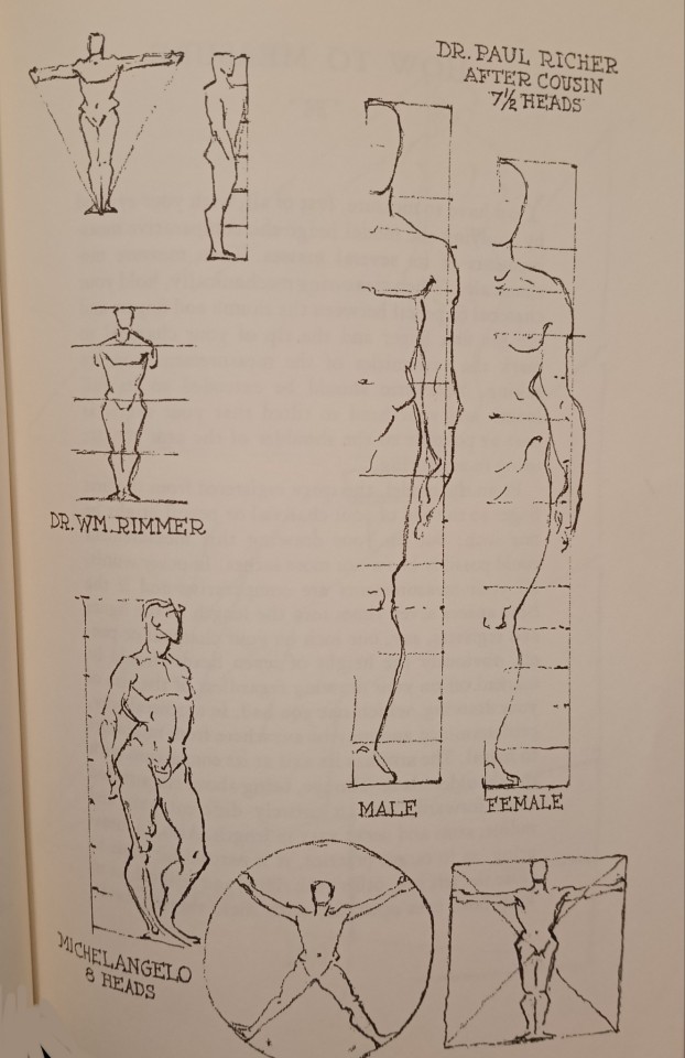
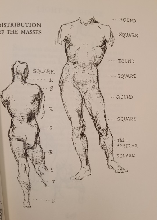
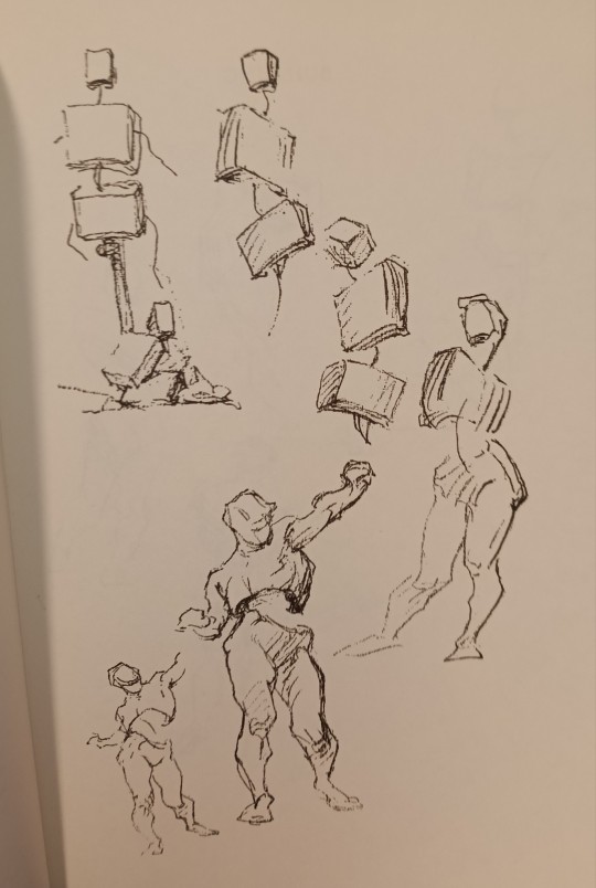
again its all about breaking the body down into bendable shapes and depending on ur style how long these shapes are
and then getting familiar with how it bends and where each part ends in comparison to the rest of the body.
i always start from the head, then the upper torso to get a grasp of how i want to draw a figure's body!
i tend to draw really long limbs, but to keep it looking anatomically accurate enough that it doesnt rlly look "off" i generally keep to these rules
>split the arm into two equal parts at the elbow
>split the legs at the knee, where the thigh + knee is equal with the foreleg (??? the yellow part in the image below) (but i break this rule alot LOLOLOL so. as long as it looks okay)
>the torso length generally varies but imagine it as 3 shapes strung on a string. the middle shape is the smallest and acts as the "knee" of the torso,,
once u get a sense of how the body works shape-wise, u can go silly with the poses (first with reference, then when ur confident enough try without, just to build confidence)

i connect the shapes that dont bend and where many lines connect with a strong line
its important to not treat every line or shape u lay down as the final line. ITS SO EASY TO FORGET THIS!!! u can always erase or redraw or repaint until u get the character right
and then draw everything over and over and over again
thats how u build consistency HAHA
OF COURSE every body is different so mold the shapes to whatever ud like.
++ the key to the confidence in ur figures and posing (dynamic or not) is all about control
and u can really only get that thru experience and practicing and experimenting 🤑🤑
im not a pro (yet) so this is all just from someone who draws too much for my own good.
hope this wasn't too confusing!!!! thank u for the ask anon!
15 notes
·
View notes
Note
Hello! I just did yet another reread of your comic, so here's a list of random things I love about it!! Sorry if this is a bit uuuhhhh MUCH but I just love your comic a lot, and want to share some of that love, and this seemed like the best way to go about that. So:
-The way Azazel's wings are so fluffy and Jophiel's are so sleek! Your stylization of them is so pretty.
-How you draw Azazel's hands always folded as if in prayer, or fiddling...even though the rest of him is often so still. Very true to Aziraphale, of course, but also fitting of an owl - still and always observing. But still, something that betrays that vigilance.
-Jophiel's honest-to-someone mullet in Mesopotamia. I love him so much. His little curls give me life.
-How Jophiel is always moving, angling his head in funny ways, pulling absurd expressions! He's so fun and mobile, which is just perfect to contrast our very sad and stationary owl.
-just a second being overwhelmed again at the fact that Azazel risked and gave up everything for Jophiel and continues to do so after Falling for him I'm fine I'm fine I'm fine this is fine.
-The way they are so in character in this!! I love reverse AUs but it's very hard to keep them in character in them. You do so flawlessly, to the point that as I find myself trying to imagine future story beats, I struggle to because I just see them acting the way they do in the canon. Stellar writing.
-Jophiel's wink in Mesopotamia. This deserves its own point in this list. As does Azazel finally getting to look happy in the frame after, even if it doesn't last...oh sweet owl...
-Azazel tugging on Jophiel's abaya in Golgatha...completely unnecessary to get his attention, didn't need to pull him closer or anything, but it's like the fiddling of his hands wasn't soothing enough and he needed to reach out in this moment of fear for Jophiel, always asking questions.
-The return of Jophiel's mullet in Heaven! Hell yeah
-help you draw Muriel SO cute.
-Azazel's "I've personally witnessed an Angel become an owl" PLEASE it's so devastating yet so funny
-Every time we get a little frame of just Jophiel's eyes reacting with sorrow and anger at moments when it's so, so clear Azazel was never meant to Fall. His eyes are SO expressive. I don't think your future sunglasses are gonna hide the fact that you're constantly glaring at god my guy.
-I really love the way you draw Jophiel's nose, it's gorgeous!
-Jophiel. Calls. Him. Angel. Need to lie down
-Seriously, I should've anticipated it, and I didn't, that's on me, but my HEART was not READY and I'm obsessed with this scene and its implications. The way Jophiel, deep down, doesn't even see Azazel as a demon ("you were an angel once" "that was a long time ago"). How pleased and adorable Azazel is at being referred to thusly (the little hair poofs!!!). The care they have long held for each other, in its unique and strange manifestations, revealing itself as a tangible burgeoning affection.
-Jophiel's declaration on the most recent page to protect Azazel, having no freaking clue that he's frankly 4500 years late to the game. Glad to have you here, your demon friend has been protecting YOU since before time was invented! Woo...but seriously, such a powerful and touching moment all around.
Anyway, I know this is ridiculously long, but goodness knows long comments on my GO fics always make ME very happy, so I figured you wouldn't mind. ;) I eagerly anticipate every update and bit of art, and when you make this comic into physical form, I will be camping out front of the pre-orders like it's a Black Friday sale. Tent and all. And snacks.
Take care!
🥹🥹😭😭 THANK YOU!!! This is super super sweet thank you for taking ur time to do this!!! I think I’d create the first physical copy when we finish season one of the show in the story, and then if interest is still high, a second physical copy for when we tackle season 2!
85 notes
·
View notes
Text
random blogging abt my thoughts reflecting on my art style over the years and animation school LOL
when I was still in college, i used to be such a stickler on myself for trying to make "animation appropriate" art/designs bc i felt like EVERY aspect of my art had to reflect "I'M ANIMATION STUDIO HIRE READY!!!" ALL the time. even my personal art 🙃
but once i graduated, I realized I was kind of unnecessarily holding myself back from exploring other avenues of my own art. (And learned it kind of doesn't matter what style you draw in your own time lol. As long as you do good work and you're capable of adapting to the studio anyway.) If you've been following me for long enough, you could probably tell my art has pendulum swung around from anime to more cartoony... then back to anime again LMFAO.
I always told myself I wouldn't give in to the whole when art professors nail into ur head "don't draw anime" but i think halfway in my attempt of exploring other styles, it got to me LOL 😭. So once I graduated and was released from the confines of animation school hell, I started to have fun with my art again... i just drew and embraced however appealed to me!! And it feels GOOD!!!
and it's not that I DON'T like cartoony/highly stylized art or my art from that phase of my life either. if anything, i think i learned a lot of things from experimenting other avenues of art! (u could say I now have the power of cartoons AND anime on my side LMAO) Plus, I love the challenge of style matching and adapting.
i think, what's at the very least important for me, is knowing that i am capable of compartmentalizing the art I CAN make that's appropriate for work/animation and art that I know is JUST for myself, no arbitrary restraints applied.
#tbd later maybe#THO as much i draw more anime-esque now i still think my specialty lies w/in cartoon designs.#i am a big fan of simplicity and easy 2 draw LOL
47 notes
·
View notes
Note
*breaks into ur askbox through a plaster wall* hi i am genuinely fascinated by how you do patterns/ornaments in your art. I don't have like, the slightest bit of patience to do those, but I'm still hella interested to know how ppl do them. Do you plan them out or is it 'fuck it we ball' type of process? Do you usually go into more symbolic meanings (like with the floral ornaments) or add whatever fits aesthetically? Also are there any particular artists that inspire you when drawing them?
("good luck getting to me i'm behind 7 firewalls" meme voice) good lucky getting to [my blog] i'm behind 7 [layers of bricks]
hiii ok let's get serious now
while it'd be easier to tell me about my #process on a case by case basis (so if you have an image/images in particular you'd like to know how i did the patterns of i could likely be more precise in my response) the Vast Majority of the time truly i am ballin. at most I might sketch out where i want Big Pieces, and where i'll fill out with smaller things However Comma there are motifs that keep coming back. and i'm sorry to tell you this. one of them is The Patience To Do So. in no order whatsoever:
floral motifs. i never go for something that Actively Looks Like A Real Flower on purpose: the language of flowers is very dependant of era and place, and a flower that means [x] in 1910s Russia might not mean the same in 1870s England.
vegetal motifs in general, so leaves, vagyuely ivy-looking stuff, stuff inspired by mushrooms & fungi, etc
animal motifs, typically associated with the characters i'm drawing. i might draw stylized birds, wings, horns, serpents/snakes, scales, etc.
eyes, mouths, wounds, or anything that looks kinda ()-like. it can also. look quite yonic depending on the context so. yeah you could say i draw those motifs.
anatomical motifs, inspired by scientific diagrams of the epidermis, of cells, of different organs and body parts, etc. i rely a lot on [this] (Henry Gray’s Anatomy of the Human Body) because you have a lot of engravings for every body part you could think of.
random motifs: spikes, spirals, dots, waves, curls, blobs, "ladders",...
i do equal parts symbol & vibes. as mentioned above i'll often fit in animals that i associate with the characters i have drawn, add more anatomical stuff depending on the characters,... but a lot of the "filler" squiggles are pure vibes. i use them to connect symbols together. also most of the characters i draw with these types of patterns are in equal parts anatomy of the body and anatomy of the vegetal so truly i'm tailoring it here.
as for artists i'm inspired by those are the two i always mention:
Ernst Haeckel especially his Kunstformen der Natur (<- link to the Gallica digitalization, but if you google search that you'll also see plenty of good images). He was mostly a biologist & his KdN is drawings he did within his research, a bunch and i mean a buuunnnnccchhh of very beautiful drawings of so many lifeforms on earth. i often reuse his drawings of hexacorallia in peterstakh artworks. those types of artworks if you see what i'm seeing.
i'm also incredibly inspired by Solange Knopf's artworks, and routinely joke that i keep being inspired by her art. i loooove how she does it very freeflowing, packed with so much details
again, i'd probably have more to say if you pointed to an image in particular, but for the most part this is it chrewly!
you must learn patience... you must learn to enjoy doing the squiggles... this is the only way... THANK YOU FOR QUASTION
26 notes
·
View notes
Note
Gimme ur ability to draw prowl good 🔫
(sjjdjkdh why is his face shaped so hard for me to grasp 😭)

I UNDERSTAND THE STRUGGLE EEYAAAAGHHH 😭😭😭 he’s so fun to draw but like the more I try to stylize him or draw him facing a slightly different angle it’s like eight billion times as hard to get his weird chiseled face right. He’s such a strange thang I want to shake him around really hard sometimes
Thank you so much for thinking I draw him good tho!!! :D it definitely takes a few to figure out what exactly is up with his face, and how exactly you wanna draw him, but i believes in yewwwww !!!!!!! Keep on drawing, I always love seeing your art so so much you have a really lovely dynamic way of drawing mwa mwa mwa !! :DD keep up the good work and I hope you get better wit da powlllll!!! 🫶🫶🫶💖💖💖💖
35 notes
·
View notes
Note
Oh heck, my apologies (for not proofreading and/or being specific)
I was thinking more about like how do you figure out lighting, colour picking and the methods you use to finish up a piece. I was also really curious about your favourite anatomy tips and how you do so many dynamic poses.
Uhh tl;dr
I am fuckin stupid and I'm sorry
Lighting, colour picking, methods for putting the colours down, anatomy tips, and how do you do dynamic posing so well??
I only draw busts and it's making me mad :D
HMM lets see: I don't color pick unfortunately, it's not a method I use so I can't help u there sadly. As for lighting and shading, I don't really use any tutorials but I just apply the same types of questions to it that I would to any other part of my work while drawing, which are broad question types like : - where is my light source - is this piece calling for any unique light source? (universal/generic lighting is just fine to keep using!) - how MANY light sources do i have, and what are their distances to my figure - what's the MOOD of the piece, is dramatic lighting necessary - if im just here to have a bop and do an art what light source do I want to play with for practice If it was something like a more polished and finished piece I'd definitely be thinking on these questions harder, or multiple revisions and potential references would be pulled up. But normally for references I just refer to my memory of shows that I've seen, since it's a LOT of visual library, and animated or live action, light source is heavily calculated. So you'll get a good display of these ranges you can apply. Lately I've been watching The Bad Batch and I'll always recommend that and clone wars as good examples of environmental lighting, especially given the style of animation they do with how shapely their figures are. It's a good simplified breakdown of the planes of a figure, so paired with their hard lighting choices u get an even exaggerated easier format to look at for guessing light source. (very reminiscent of comics like the more stylized/cartoon you get in art the more u can push and pull these dynamics. or like easier to spot then live action)
SO UHH, im disclaimer: not in any industry and im sure gonna be missing some terminology, but I just nabbed some random images off the google of bad batch to show case a few broad categories of lighting:
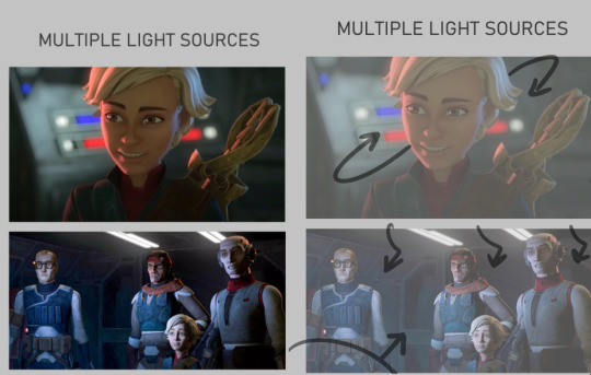
Multiple light sources are ur most common type, and to me the most fun especially when it's like Two light sources. U can often play with the fun lighting types like rim lighting, u often have a warm side and a cold side for contrast/directions sake. The distance of the light determines how sharp or broadly lit something will be, and the size of the light can determine how much of that light hits the figures. So Omega here is surrounded by the lights on their ship, there's likely a very broad top light that's gently lighting the entire area, but the reds and blues of the buttons and screens around her are what's shaping the figure more dramatically. You can see the blue is coming from the top/behind her, where the red is more in front/bottom side to her, since it's the way she's facing and looking at you/the viewer. The second one, still on their ship, features the more broad top down lighting, but the screens in front of them are more important as they're all facing it. both lights in this image are broad wide lighting, so there isn't much of a sharp focus.
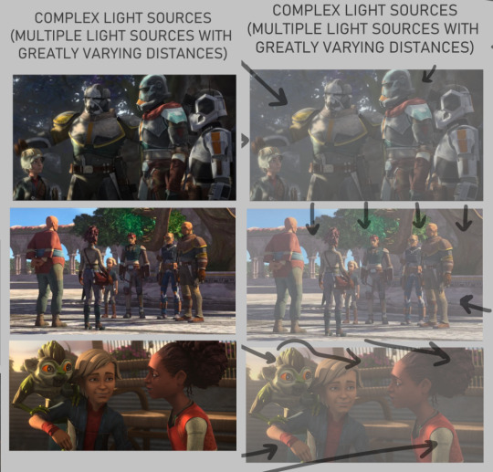
COMPLEX LIGHTING to me usually just means 'there are many light sources of greatly varying distances and brightness' or that there's a lot of figures in the image so it's got a lot more to organize so that the whole image may look readable at the end. You get a lot of environmental lighting for these types, meaning like hey the SUN is one of ur major light sources. it is super fucking bright but it is also FAR away, it's lighting EVERYTHING. and closer to sunset/sunrise u get more direct, highly saturated light from it because of the angle it's often shining- there's a lot to play with for just an outdoor lighting! The three images I picked here are a more morning shot, a mid day shot, and an evening shot. Talking about the angle of the sun especially at the last image with the grookey on Omega's shoulder, which casts a shadow over her and her friend. But her friend is positioned in a way so that she's not entirely over shadowed, because we're here to look at all three figures, and their faces matter in this shot. VS the middle images which is more about the scene/setting as a whole, and the figures are all more or less equally lit/shaded according to just standing in bright daylight.

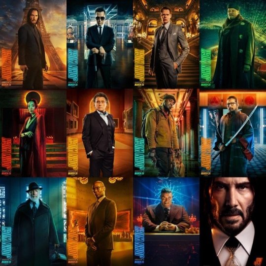
there's also this fun lighting type, singular light sources can usually add a WIDE RANGE of emotion to the piece, depending where you flash the light. You've probably seen tons of light study gifs or shots where a face is shown with one light passing around their entire face and it highlighting the different planes that illuminate based on where the light is. So the first image, the classic Morticia Addams eye drama light, is focused hard on the figures, and what they're looking at. The second image of crosshair is another type of foreboding emotion, but instead with the eyes in the dark. Singular light sources aren't always for drama or asking you to focus on one specific thing but I feel like end of the day, the sharper and closer the one light source is, the more the artist is usually asking you to focus on the scene for. There's also some examples here of multiple light sources being used for the same storytelling dramatic effect. There's crosshair's entire front lit up to focus on not just him but by extension the rifle he's holding, with a backlight to catch the edge of his helmet and the barrel, because those are where we want you to look. They're the most important parts of the image, and they wanted to make lighting appropriate for reading that. With the last image there's what's his face (bro i forget my b) looming over him in a common type of dominant lighting. With how the lighting is assigned to this scene his face is shadowed, vs crosshair's who is partially under that shadow. IDK IM RAMBLING NOW i doubt this is the concise easy to read tips anyone's asking for sorrY I am not a teacher. IN SHORT FOR LIGHTING I JUST think about shows I've watched. I won't go into anymore but I think a GREAT example of super well done lighting in all categories of art are the John Wick films. They're both lively, highly direct, and superficially colored to fit the mood of each character and scene. I'll suck these movies dicks i'm obsessed:
Anatomy I always generically recommend people continue loose study/education from skeletal and muscular anatomy cause if you can build a figure from the inside out, the surface is going to be loads easier. And then when I'm too lazy to look up any muscular break down cause I sure don't remember every part at every angle I kind of just fudge it which is super common, like how many of us draw an ear correctly to it's bends and shapes. I sure as hell don't I just like to draw them the way I'm familiar with lining it (unless it's some really polished piece) cause end of the day my ear is still getting interpreted as an ear. So If I can't recall which muscle overlaps the other given a certain angle I just take a guess and usually it's not something blaring if I threw it down confidently enough. Studying not just muscle though, but how all body types sit and tense and move is crucial. Like fat is obviously going to have a much different type of hang and sit on the body, and then there's deciding how much fat to muscle you want on a figure. There's also skin to consider- older skin is looser, scarred skin has a tighter more custom pull to the areas, skin otherwise is just a big elastic band around ur body. So when that becomes overstretched or cut in any irregular way it's going to have a much different look to the muscles and bones it wraps around. Muscle reference I don't have anything specfic to refer other then using actual anatomy charts. Some 3d modelers have made great reference to body parts with full turn arounds i'd suggest. Since big fantasy muscles can be exaggerated so much (and they should!) it's the only reason why id only Lightly suggest for observing other artists individual drawings of buff characters. cause lotta us are fudging parts and u will end up picking up an incorrect anatomical trait (we literally all do it, just a silly unlearning process once ur hand is so familiar and used to drawing something a certain way) I think something specifically that's really helped me slowly gain a very diverse understanding of the fat to muscle ratio is getting into sumo wrestling. (NOT TO PUSH MY FAVORITE SPORT BUT I HAVE SOURCES IF U WANNA HEAR ABOUT IT/FIND A SPOT TO WATCH) In sumo there's no weight division like other forms of wrestling, and because of that you can have a very diverse set of ways to go about your own style of fighting. Entirely setting aside the fighting STYLES, there's broadly the categories of how much fat do you want to put on and the advantages that has against your opponents, vs how much muscle, or where that muscle needs to build on your figure, height and the like also play into it but basically 'what is my body shape, how can i build/ play it to the advantages of how i fight my opponents'
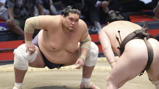
so like terunofuji is a fucking MOUNTAIN of a man, he's the current yokozuna (top banana rank) and his sheer height and weight plays greatly into his fight style. All of them are fucking jacked and watching Sumo has been a great general visual library builder because: - its a huge sport so it has a lot of coverage and footage on high def cameras - they're mostly nude and you're getting incredible displays of muscles in slow mo as they collide, fight, and throw each other. s2g you'll have an entirely new appreciation for the human body and just how many ways it can shape itself from watching this sport.
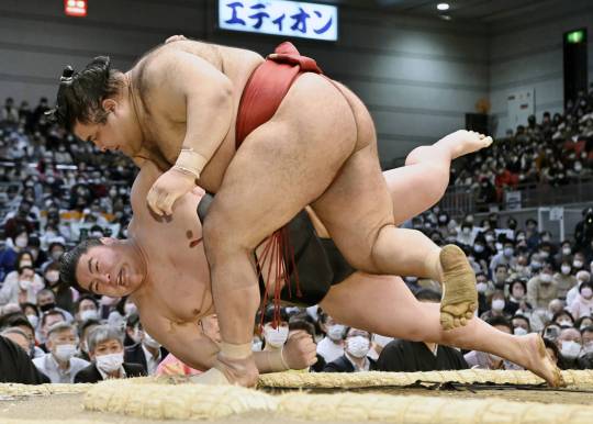
Always a ton of fucking leg muscle but Takayasu is one of my faves i gotta show him.
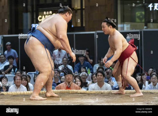
with no weight limitations not only are you seeing all the different levels of weight to fat, but you're getting an excellent display of how fat builds and forms on different people. there is no one way to gain fat, its pretty cool how diverse it can form, where it prefers to store fat, how quickly someone might gain weight vs overtime, genetics, what types of fats you're storing, lots of shit to look up on! this last image is ichinojo vs enho who are like usually one of the biggest and the smallest wrestlers, and both play to their size and shape and have become very high ranked. ANYWAY THIS POST REALLY WENT PLACES HUH idek if i answered the questions right i think i gave more questions back but i tried to touch a little on my thought process and where ive specifically gone in the art study journey. For poses I really don't look up anything I just try to think of the figure and do a lot of preliminary sketches. No i don't have the 'picture a perfect apple in my head' noggin i too suffer from looking at a blurry void when i try to think of shit so yes im hitting a brick wall by not utilizing all the model posing references that are probably out there hsuogjdhk
97 notes
·
View notes
Note
I love ur art soooo much and I admire it. So I have a question: Do you have any tips on drawing poses and anatomy? I struggle a lot with it
Oh gosh, I'm pretty terrible at both of those things... I don't think I have any tips you can't find on any old basic anatomy tutorial tbh. There's a reason a good chunk of my art is either incredibly random poses and/or floaty.
Uuum... Study actual anatomy or dolls or skeletons? Elbows are usually around belly button height and wrists at about crotch height? Palms up thumbs out? Corner of the eye is usually aligned around the top of where your ear attaches to your head? The collar bone is almost always higher than you think it is? Know where the hair is rooted and parts even if you're drawing hair as a mass? Foreshortening is a thing, apparently? (Haven't really learned that one yet) Double check your limbs are the same length? (I also haven't learned that one) Take not of if you are actually drawing straight or at an angle? (I really haven't learned that one) Remember that organisms are at least a bit squishy?
Absolutely do not let yourself get away with only drawing one eye constantly learn how to draw both eyes even if you gotta flip the canvas to do it? If you're going for more stylized then there are very few angles where the eye should both be actually part of the outer line of the face and also look good, and flow and comprehension takes priority over correct anatomy? Off-model can be a tool not a flaw? (But also learn how to draw on model before you try to utilize it as one) Consider how your character would move?
Use layers when unsure how overlapping things will work? I dunno man, that's all I got I think...
64 notes
·
View notes
Note
im not the anon who asked for that art tut but i was wondering if you could explain how you stylize ur anatomy , its one of my absolute favorite things about ur art !!
Oh, that's a very good question! First and foremost, understanding anatomy in the real world is an important step to being able to accurately stylize it! You're not required to do so, but doing life studies of models can help train yourself to understand proportion and perspective.
My anatomy stylization actually comes from a few artists, the main one being Matt Rhodes. Rhodes has a few wonderful compilations of how he breaks down and studies anatomy which is super fun to observe, alongside that he has an amazing understanding of composition and perspective.
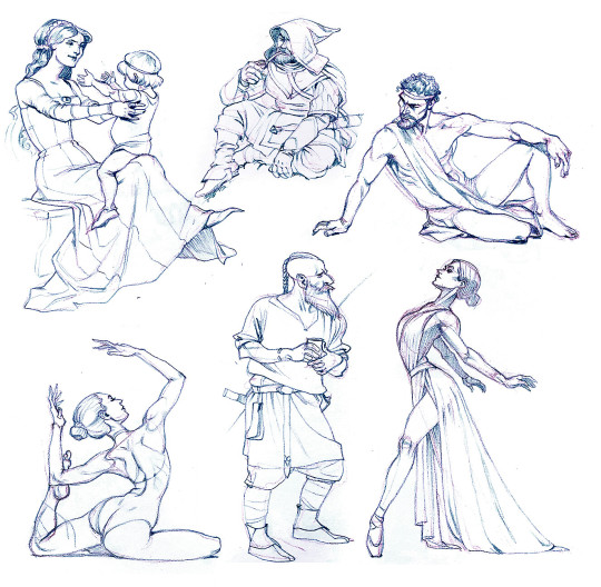
(Matt Rhodes - Axe Sharpening II: The Ensharpening)
Another artist I learned from is TB Choi. Choi actually has a great art book detailing how they stylize and draw anatomy/art in general. Def recommend checking it out.
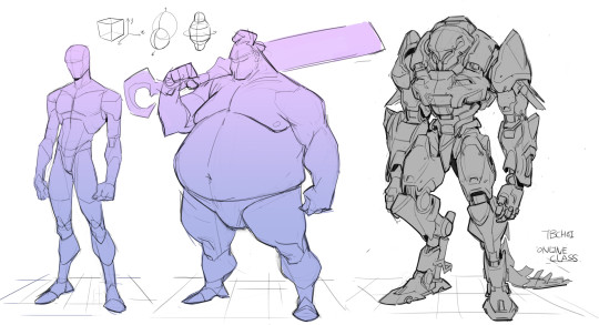
(TB Choi - Online Class Demo)
With these in mind, I use an underlying basic skeleton/shapes such as the ribcage, pelvis, head, and any joints to start chipping away at it!


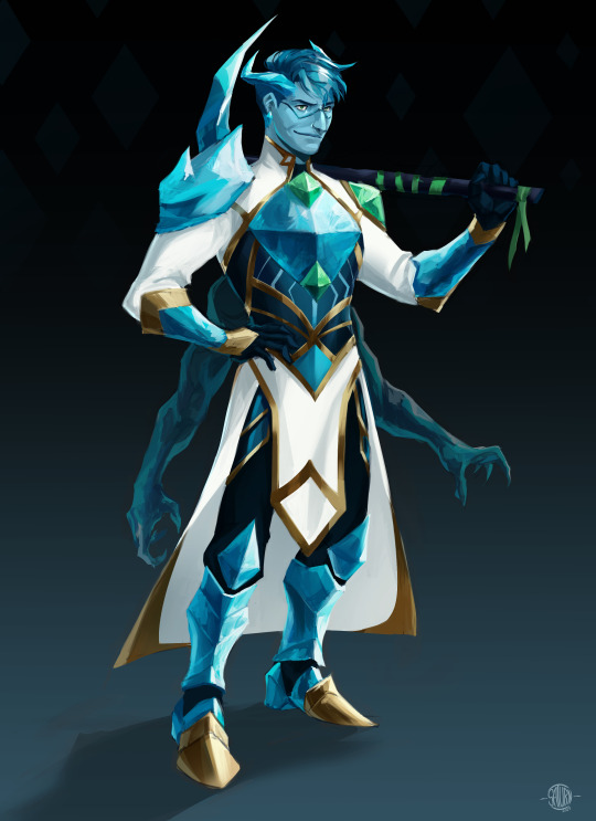
I am no expert compared to the artists I am inspired by, but going out and studying guides from them and doing constant anatomy studies has helped me improve in the past 2 years. Don't be afraid to go slow with your anatomy and use real-life references! If you get stuck, you can always take a break to let your brain process.
If you want some books to learn more about this subject here are a few I recommend:
Classical Anatomy - Valerie L. Winslow
Constructive Anatomy - George B. Bridgman
Morpho: Simplified Forms - Michel Lauricella (any Morpho books are great tbh this is just a good starter)
63 notes
·
View notes
Note
different anon but also on a quest to improve my art and ive always wondered... Do u do anatomy studies (figure/gesture drawing, copy down poses just to study how the body works) or do u just . Raw dog it. Because ur anatomy always looks so good despite the stylization of ur art... Like.... How..... /pos ((i love ur art so much u r like. On my top3 fav artists of ALL TIME ily)
i've never gone out of my way to do anatomy studies, but i use references when i need to and save pics of cool poses for inspiration. does that make it mostly raw doggin + some observation...?? i guess you can consider constant blorbo drawings as studies, if very slow and over invested as far as a method of practice goes. but motivation to keep drawing's important too, and i just like looking at my favorite creatures lol
tbh i'm sure your eye for anatomy will develop much more quickly if you DO do figure studies though. this is kind of a 'do as everyone else says and not as i do' situation, i think...
#ASK EVER#You know how they say work smart or work hard...#i think the balance of that varies from person to person#good luck on ur art journeys
47 notes
·
View notes
Text
long journal like ramble? where i think out loud about art.
the thing about my art is that i dont really know what i want to do with it -_- i really admire people with highly stylized artstyles and i think that it would be very on brand for me to take my art in that direction. but i also like the idea of people able to draw stuff that looks more. realistic i guess.
hyper realism is boring imo anyone can learn how to draw in hyper realism but developing an artstyle that entirely unique to yourself is a difficult and long process and idk.
i have not gone to Art School i dont know anything about art except that i like to draw sometimes and would like to get better at it. i kinda feel like im Missing Something like theres some "obvious" thing i should be doing to practice that i just. dont know about. i try to "practice" by drawing a lot and trying out new things. i feel like the biggest thing i need is just Time bc although ive drawn for years i have not done it a Lot. and so this is basically the first time ive ever drawn consistently
its also difficult bc i feel like. my art isnt "good enough" to be passionate about yet. which. i dont think art needs to be """""good""""" to be important and more than that i dont think art can really be classified as "good" and "not good" and that all art conveys emotion and thoughts and is important.
but i also feel the need to like. justify or defend myself. "i know my art isnt good but-" type stuff. which is probably part of where typing all this out comes from as well this idea that i need to state that i know my art isnt at the level it """"should"""" be at or whatever.
i want my art to be for Me and that doesnt mean it has to be palatable or conventionally "good" or Realistic. its just for me. i feel embarrassed to be excited about and proud of my art bc im "too old" to be developing these skills as though 24 is old at all, which its not. and bc its "not good enough" to be excited and proud over. which is subjective.
am i afraid of being judged? probably. i worry about the way i appear to people a lot even tho i try not to let it affect the way i behave or the way i think about myself. but i do always have this worry that im doing something "wrong" or "weird" and that its only a matter of time before i become ostracized for it. which has happened before. so i understand the fear.
as always my logical beliefs vs my feelings about my own actions. as though i am somehow outside of my own universal beliefs.
i guess this is kind of culminating in that sharing art is always a vulnerable thing for me no matter how silly the art is. and ive been feeling a lot of. i guess. shame? about it? like im embarrassing myself by sharing it.
but im gonna keep making art bc its fun and thats the most important part. to anyone who actually read all this ur insane and i love you.
#this didnt really need to be a post on tumblr this could have been written in a journal somewhere but whatever#i process and think best through talking so. i talked
5 notes
·
View notes
Note
Gahhh i love how you draw, do you have any tips for drawing people?
WAH IM FLATTERED ANON!!!!!
i’m not the greatest at art advice because a lot of my artistic process has been me just kinda winging it until something sticks in a way i like, the main reason i’ve gravitated towards a more painterly style rather than hard lineart is that i enjoy the process of refining details out of vague shapes….. the thing that’s helped me the most has been seeking out references. trace over screenshots to get a feel for a characters face shape, use stock photos to block out poses, atuff like that… and don’t be afraid to let ur art be messy. something i feel gives pretty good insight to how i approach art is when i compare a rough sketch/colorblocking to the finished product (like so!)
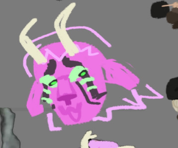
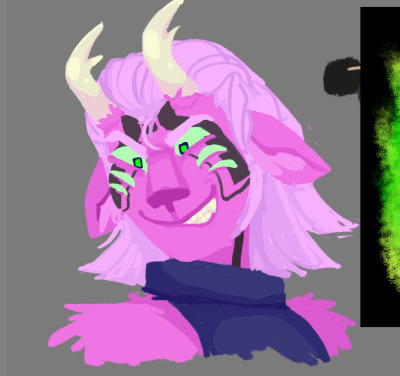
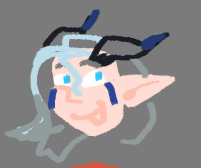
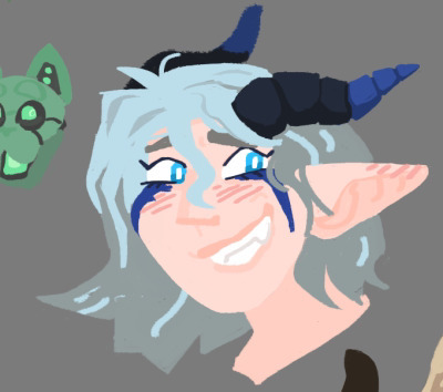
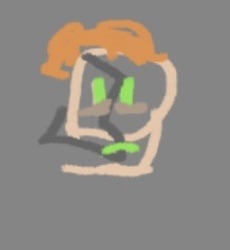
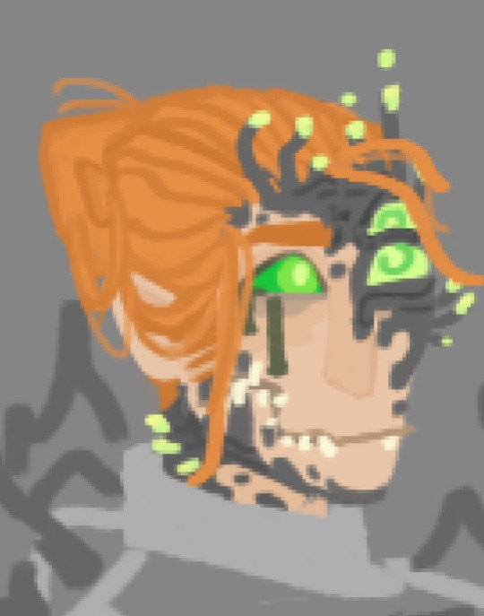
color swatching too is something i’ve found pretty invaluable when it comes to portrait style painting like i’ve been doing recently, building up a palette to work with can be super helpful, especially when you’re trying to simplify or stylize those features
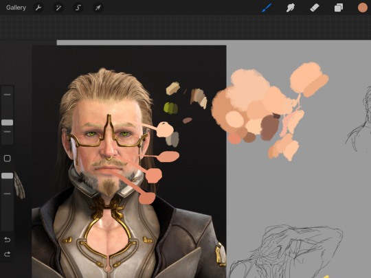
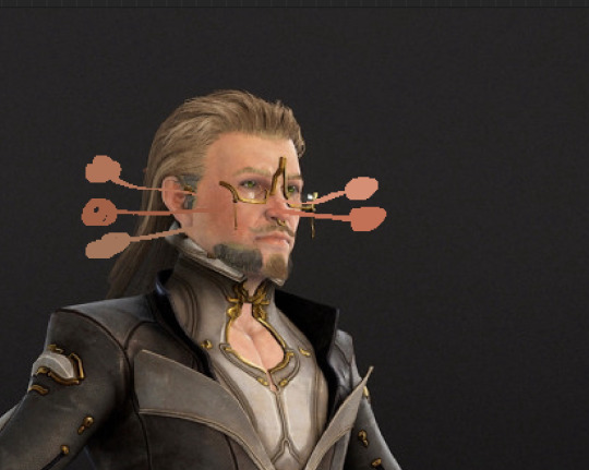
working out an even middle tone and a few darker accent/outline colors can even make unshaded/blocked out art like this feel a lot more rounded out than black lineart over flats most of the time…
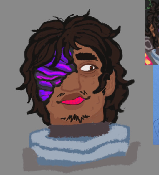
i have no idea if any of this makes sense LMAO i have a really hard time putting anything relating to my artistic process into words … my number one tip will always be to collect references and do lots of studies and warmups until you feel confident freehanding a character w/o double checking 👍 i tend to obsessively draw one guy over and over for days at a time anyway due to my mental illness so that’s worked out for me anyway LMAO. hope this helps mwah mwah
7 notes
·
View notes
Note
hii how did u start drawing, how old were u, do u have any tips for beginners, etc
helloo. tbh I’ve been into drawing for as long as I could remember, I used to always draw in any notebook or piece of paper lying around really, which ik sounds cliche lol but making things with my hands has always been so satisfying to me. I had a few different points where I was like “oh I like drawing more than others” once was when I was probably like 7 or 8 and then in middle school I was like I guess I should call myself an artist @ this point ! lmao. as for tips (it got long so I’m putting under a read more)
what’s been most effective and efficient for me is using real life references alwaysss. I steer clear from tutorials that break down let’s say anatomy into line and shapes tbh though or those sheets that show a body part at all angles, bc I feel like they keep you stuck only knowing how to draw smth in very specific positions yk. I like to understand more how what im drawing works and thinking about it in a 3D sense if I can’t get it right looking @ my ref just flat if that makes sense. drawing frequently is best and drawing things you like will help keep you drawing a lot, so do ur fanarts, get into a subject for a lil while, have no shame!! draw from real life, draw from photos, either you find or take yourself. A lot of the skill comes from observation imo or at least for me, thinking about how lighting works, how my subject is structured etc. when you start to understand the Nature of things/your subject then you can really get into bending and stylizing. Though I will say I don’t think you need to master realism perfectly before you get into stylizing your art, but it is very helpful to get good a good grip on proportions and lighting/shading before fully jumping into a style you’re leaning toward
#ask#lmk if u want me to clarify anything or get into anything more specific#I’ve drawn for a very long time and went through so many styles and phases and mediums so i have a lot I can share !
2 notes
·
View notes
Note
Do you ever feel bad about your art? I've tried drawing before, but it never looked good so I just quit
OUGH SOMETIMES TBH....... though id kinda say thats part of the drawing process 💔💔
for me theres two types of "feeling bad" abt my art; the first being more imposter syndrome-y where i just kinda feel guilty over the amount of recognition i get when theres so many artists that i think are better and deserve it more than i do and other things along that line
the second one (and probably more universal) is, ofc, the feeling that ur art kinda sucks sometimes. honestly its very rare for a drawing to turn out the way i had originally envisioned because i simply do not have the skills to pull it off, which sucks!! and honestly, alot of the time i just try pushing through despite me hating the way the drawing looks. usually ill still post it even if i hate it, because in a way i think its kinda important to let myself be bad at art, and my blog was never meant to be used as a portfolio anyway, so why not post the things im less proud of aswell? especially since the communities im part of are rather niche, and i feel as though even if the quality is bad, someone might still be happy to see it!
so i let myself not be perfect with my art, as i feel being stuck on the same piece is only going to stagnate my growth and make me frustrated. not to mention the drawing usually only ends up looking Worse the more i try to fix it, and me posting a drawing is basically me putting a full stop to working on the drawing, forcing me to move on to something else and try again
art doesnt always look good!! and it most DEFINITELY is never perfect, but i also kinda find beauty in that yknow?? especially when uve been drawing for a while, its always fun to look back and see ur progress! its fun to see ur missteps and how u managed to improve! ive mentioned it before, but the sole reason i even created this account was so that i Would improve my art. i didnt really have much going on so i thought id genuinely try my hands at art again, which i had grown less passionate about the years prior. this blog is me sharing what ive created, no matter how amateurish it is, no matter my ups and downs, because i believe that will help me grow in the end! ive posted numerous attempts at various styles (moreso rendering styles) to see what i think suits me and what i find most pleasure in, aswell as my art style in general being rather stylized (the simplistic faces for example), figuring out what ways of drawing made me happy and what didnt through trial and error!
the first step is always the hardest, but its better than no step at all! so if you wanna draw, just go for it! its ok for it to look bad! keep trying various styles and methods until you find one that makes you happy!! its ok to be inconsistent!!
#having ur art journey documented online is all fun and games until u remember ur old ugly as fuck art is still available for everyone to see#But u dont have the heart to delete them because that would ruin the purpose of why i started doing this to begin with#so i just gotta SUCK IT UP.#ITS OK TO BE BAD!!!!! WE ALL SUCK SOMETIMES!!!!!!!!! ITS OK!!!!!!!!!!#ask#no matter the quality all art is valuable............. this is what i believe
12 notes
·
View notes