#This was meant to be just a flat colour sketch;
Explore tagged Tumblr posts
Text

Sparring
Loved this stream, it had such a nice vibe :))
#I love drawing bird guys sooo much#Qsmp#my art#mcyt#baghera jones#qsmp baghera#philza#qsmp philza#fanart#This was meant to be just a flat colour sketch;#it ran away from me but I really like it!#The pose turned out great :))#qsmp team bolas#qsmp purgatory#qsmp team red
91 notes
·
View notes
Text
I haven't really done much art for tumblr (at all) lately, cus life, but! Here's a lil something I've been working on (it's a Xmas gift) 💙
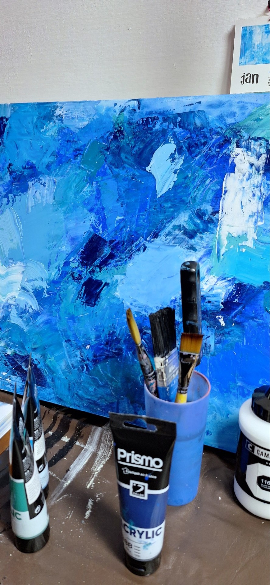
(also peep that lil January calendar painting 👀 i did mini squares for each month for myself, because I need to have a physical one always, and they each have their own colour 🥺)
#sometimes i forget i'm a painter lol#this is just the base so i'll still add some cool stuff (colours and some gold leaf details hehe)#usually my thing is more flat/less busy painting (with more mixed media) but i've been digging this vibe lately#my art account is completely wiped cus i private everything earlier this year (same with personal)#but i wanna start posting again. not just old stuff but actually *make* something new everyday#like a little challenge i suppose#since i'm not currently working in my field and have being going through a bit of a rough adjustment period about ✨things✨#(plus the whole depresh spiraling)#i barely have been making any art at all that isn't just sketches/silly stuff#i miss painting. i miss making murals and working on an actual project etc#now that *some * things have been settled AND i finally have my own space i feel a lot more keen on working on it#i know i hardly ever talk about that part of my private life cus i do wanna keep it somewhat separate from here#but i guess i'm in a good mood and kinda ready to admit some stuff#??? that didn't make sense#i'm feeling hopeful for next year and have a semblance of a plan. That's what I meant there you go#i can already feel myself cringe cus everytime i share these type of things something ALWAYS bites my ankles#and that's why i hardly ever share anything at all with anyone ever until it actually is done or underway#which is! not good! i'm aware! but. ya know#ANYWAYS. rant over. look at the pretty colours and ignore my rambles#hmmmm my band crush guy (platonic) (guess who) (🕊️🥁) said my name and loved my super insightful question and i'll probably dream about it#(and the other really liked it too. MY BABE. it was kinda silly so very unexpected)#(okay i think this is buried deep enough to not make myself look like a 12 with a stupid crush) (hehehehehe)#darya does art#<- sure in the art tag it goes#blue#(it was a coincidence! i've never done anything exclusively blue before actually!) (in this capacity i mean)#traditional art#abstract painting
17 notes
·
View notes
Text
.:Soul Search in Seoul:. .:part 2:.


summary: after helping him choose his outfit, (y/n) goes on a "date" with Seung-hyun
pairing: Choi Seung-hyun x Fem!Reader
a/n: how do you like the page breaks? obviously i chose moon and stars
contains: fluff, romance, slight angst, some suggestive content, cameo by GD
w/c: 3.2k
⋆⁺₊⋆ ☾⋆⁺₊⋆ ☾⋆⁺₊⋆ ☾⋆⁺₊⋆ ☾⋆⁺₊⋆ ☾⋆⁺₊⋆
The next day, thanks to Jun-hee meddling and telling Seung-hyun you have no friends in Seoul, he started chatting with you online. He started off with some random reels and memes he found funny and you responded in kind. You were sketching on a pad, when he dropped a bombshell on you.
Video call?
Your eyes nearly popped out of their socket and your heart was racing. He was still typing - perhaps he would apologize and let you know his message was meant for someone else. Just your luck, he meant you specifically.
Jun-hee told me you’re really into fashion and I want your input on something
You thought for a moment - combed your hair and checked if you looked presentable; you didn’t want to scare him off with a casual zombie look - and wrote him back.
OK
He called immediately.
“Hey!” -you greeted.
“Hi!” -he waved at you with a shy smile. “Thanks for this.”
“No worries, what’s up?”
“I need to take you to my bedroom.” -he swapped the camera around. “Little house tour.”
“Are we ready for the bedroom, stud?” -you teased. This was your first time teasing him like this and you already regretted it, when you heard him laugh in the background. You might just be addicted to his laugh, too. As he walked through the hall, you noticed something. “Wait! What’s that?” -you noticed a piece of art on the wall on the edge of the screen. “Did you paint that?”
“This?” -he brought the camera to the piece. “No, I bought it. I really like art and I collect it.”
“That looks amazing, I love the brush strokes. Zoom in!”
“You like art, too?”
“Yeah, I did art history in high school… No, let me look at it!” -you protested when he moved along.
“You can come over and look at it one day, okay?” -he said.
“Fine.” -you rolled your eyes, a little too theatrical, that earned a soft laugh out of him. “What do you need help with?”
“This.” -he stepped in his bedroom. You couldn’t take in much of his room as he aimed his phone on his bed with a few suits lined up in different colours. “I need your opinion on picking an outfit.” -you gave him a nod as an agreement. “It’s for my first interview in 11 years.”
“Oh… are you sure I’m the right person for this huge task?”
“I don’t want you to flat out tell me what to do. Just an opinion.”
“Okay. Bring me closer!”
He had a back-red striped two piece with a matching red tie. You had to remind yourself you were on camera and he could see you, if you were to bite your lower lip, but inside you were screaming. He would look like a heartthrob in that! Tell him to wear it! Tell him! Tell him! -your mind was blaring like a foghorn into a foggy night. You took a deep breath and instead, looked at the other options. He had a formal black two-piece with black and white ties for options.
“I’m thinking of wearing the black one.” -he said, pointing at his choice with his long index.
“It is a big day, you better bring your A-game!” -you winked at him in a reassuring manner. “But definitely wear that striped one at some stage.” -you added.
“Yeah? Wanna see oppa in that?” -he teased. Okay, he definitley gets me! You burst out in a laugh, all flustered and nodded. “Hm, if there’s another interview, I will wear that. I promise!”
“Your portrayal of Thanos was amazing, I’m sure you’ll be busy.”
“You watched me?” -he swapped the camera again, so you could see his face. His handsome face with a soft smile plastered on it. He was happy you saw his performance.
“Of course!” -you said it in English and threw your fingers, spread-out like his character did in the show. He laughed, his face falling forward.
“That asshole will haunt me for the rest of my days!”
“Come on, you made him so iconic!” -you giggled. “Senorita, excuse me?” -you lowered your voice for maximum effect.
“Okay, well thanks for your help, I appreciate it!” -he nodded. -”But I’m gonna hang up now.”
“No, no, no, no…”
“(Y/n)! You! Out!” -he gave you his signature finger heart and hung up.
You couldn’t stop laughing. What a cutie…
Soon after, you’ve got a link from him - it was for the artist who painted the picture in his house. You sent him a video of the Impressionists.
This is what I’m into - you wrote.
I’m taking note of this ;) -he replied immediately.
From then on, you were messaging with each other at the randomest times. Message by message, you felt closer to him. You both became more confident. You would tease and he would tease back - and vice versa.
⋆⁺₊⋆ ☾⋆⁺₊⋆ ☾⋆⁺₊⋆ ☾⋆⁺₊⋆ ☾⋆⁺₊⋆ ☾⋆⁺₊⋆
A few days later, Seung-hyun dropped by Ji-yong’s home studio with some lunch and news about you.
“...She was so understanding and we’ve been talking ever since.”
“Hm.” -Ji-yong only half listened to his friend. He had a headset held close to his ear, just one, while mixing some background music for his new album releasing next month. Seung-hyun was tossing a stress ball, designed to look like the moon, high in the air and catching it every time.
“I’m telling you, she’s incredible.”
Pressing some buttons on the mixing console, Ji-yong looked up.
“Wanna give it a listen?”
The taller man sighed, knowing his story was not welcome at the moment. But he understood, this was crunch time and there was no place for distractions. If anyone, he understood being a perfectionist.
“Hit it!”
Ji-yong pressed play on a computer and the speakers started to play Take Me - a new track.
Seung-hyun was gently bobbing his head in his seat, tapping the ball between his fingers to the rhythm. He only spoke when the track ended.
“What will you do with my back-up vocals?”
“I’m not scraping that!”
“Come on… I’m not ready to come back!”
“I know! Listen!” -Ji-yong rolled closer with his swivel chair. “I’m gonna mix it so much that no one will even notice it’s your voice. It’s gonna sound like some shitty AI.”
There was no point arguing. What could he even say?
A part of him appreciated the effort and the warm welcome, yet his other part was terrified what could happen - not to him, but to his friend. The sole reason he left BIGBANG was to save his friends from repercussions. Even if it’s been a decade, some people really don’t want to let go, forgive and forget.
“Now, tell me about your girlfriend.” -Ji-yong asked with a wide grin on his face, changing the subject.
“She’s not my girlfriend.”
“Yet. I know you, hyung.”
⋆⁺₊⋆ ☾⋆⁺₊⋆ ☾⋆⁺₊⋆ ☾⋆⁺₊⋆ ☾⋆⁺₊⋆ ☾⋆⁺₊⋆
You were munching on some cereal, with a cup of coffee, and playing with your phone - of course, Instagram and TikTok suggested nothing but Squid Game 2 and Thanos edits.
The doorbell rang into your slow, quiet morning, startling you in your seat. Since it was only yourself and expected no company, you were in your nightgown - basically an oversized T-shirt, no bottoms. You opened the door.
“Seung-hyun? Hi!” -your jaw nearly hit the floor. What is he doing here? He looked more casual than last time - runners, jeans, hoodie, puffy jacket, a different pair of glasses and a baseball cap with the writing ‘a hug from the art world’. You hid behind the door.
“Lazy morning?” -he asked, a smile tugging on his lips. He didn’t think he would see so much of you so soon. “I know I showed you my bedroom, but..”
“Hehe… very funny!” -you chuckled nervously and added. “There’s no one home.”
“I know. I came to take you to an exhibition. As a thanks for helping me with my outfit.”
“An exhibition? But I’ve barely done anyt-...”
“It meant a lot to me.”
“Come in!” -you finally said and let him in. “I need time to get dressed but make yourself at home.”
“Sure.”
About half an hour later you were at a gallery in Hannam-dong.
The exhibition was incredible. It was a Renaissance period pop-up gallery, with some of your favourite Impressionists, including Monet and Renoir.
“Is it your first time seeing a Monet?” -he asked.
“No, I’ve been to Paris before.” -you responded, still looking at the painting, The Water Lily Pond, mesmerized by it. “Absolutely stunning.”
“Is this your favourite piece?”
“Oh, you want me to pick a favourite piece?” -you turned to him in disbelief.
“Okay, how about… “ -he was rephrasing his question. “What do you like about Renaissance so much?” -he asked, as you moved onto another piece, The Beach at Sainte-Adresse.
He didn't pay attention to what your response was though. But rather how you responded.
The sparkles in your eyes, the way your hands were in the air, all animated and excited, the way you were hyper-focused on the painting in front of you. You tucked a stray strand of hair behind your ear and caught him staring at you in awe.
You were familiar with this sort of male gaze. The glassy eyes and half open, watering mouths. It was always an appreciation - sexualisation - of your body, your curves. The boys from your hometown were all the same. But not Seung-hyun. You picked a beige, oversized hoodie that covered you from neck to your upper thigh, jeans and boots. There were no curves to be seen!
"Tsk, Earth to Seung-hyun!" -you waved your hand in front of his eyes.
"Sorry, just, uh... got caught up in the moment." - he smiled.
"You didn't hear a word I said!"
"No, but I loved the way you spoke."
His response made you blush, a cheeky comeback dying on your lips. Your brain short circuited. He was appreciating you and your enthusiasm. Not many people did. You muttered a small ‘thank you’ as you continued on.
You loved every minute of it. Seung-hyun was also the ideal museum partner. He didn’t speak much. He would ask a few insightful questions, either about the painting or the artist, and would listen to your elaborate answer. He adored how you were geeking out over art.
He invited you over to his place for lunch.
“You really want to get me in your bedroom?” -you winked at him.
“Maybe.” -he played along and leaned closer. Your breath caught on your throat, as he whispered in your ear. “I just don’t want to be caught at a restaurant.”
While what he meant was no joking matter, he did not want any paparazzi to take pictures of you two, you felt a little tingle of excitement in your body. You covered your mouth not to giggle at his breath tickling your ear. You agreed and followed him.
Turns out the exhibition wasn’t too far from his place.
“Want a little tour?” -he asked, as he let you step in first.
“Yeah!” -his place felt like a museum. As if you had a private, mini exhibition at his. All the artworks, all the unique chairs. “Okay, this is so cool!” -you ran up to the chair made up of Mickey and Minnie Mouse plushies. “Can I sit in it?”
“Go ahead.” -he agreed and disappeared in the kitchen. “White or red?” -he asked.
“Huh?”
“Do you want white… ” -he came back in your view, lifting a bottle of white wine in his right hand and red in his left. “...or red?”
“Is it such a good idea after New Year’s?”
“Anything to get you in my bedroom.” -he taunted.
“Okay, you’re getting too comfortable with that joke, oppa!” -you giggled, the hint of flush creeping to your cheeks and added. “Red, please.”
“Tsk, you’re the one who started it, princess!”
Technically, he wasn’t wrong. But calling you princess so casually, like you’ve known each other for years? You rolled your eyes, trying to settle the butterflies in your stomach. It’s been a great day and you didn’t want to ruin it with catching feelings, which was becoming harder and harder by the minute! Neither of you wanted to be romantically involved; you said it yourselves! On the contrary, he took you out to see your favourite artists under the false pretense of a ‘thank you’ - even though he could have chosen the outfit himself! - and now he’s brought you back to his place for food and wine. Such a classic date!
While you chewed the inside of your cheek, deep in thought, Seung-hyun got back with a glass of red wine. One for you and one for him.
“To what?” -he asked.
“Hmm… To friends.” -you said, raising your glass. You could catch the slightest hint of disappointment in his brown eyes. Would he not want to be friends?
“Yeah.” -he mustered a weak smile. “To friends.” -he clinked his glass with yours.
Seung-hyun made food for you; stir-fried Korean beef. It was an easy but safe dish. You wanted to help, but he told you, you are his guest. So you sat down and observed him. You got fully captivated by him. You always liked when a man knew his way in the kitchen - even in anime, you adored guys like Loid Forger, Kagami Taiga or Kazuki Kurusu. In your rosy-cheeked awe, as you watched Seung-hyun prepare food for you, you forgot about your wine glass on the table and accidentally knocked it over and spilled its contents on your jeans.
“Shit!” -you jumped up.
“What?” -he turned around to see the damage. “Oh… “
“Do you have salt, vinegar and baking soda?”
“Sure.” -he got the requested ingredients. “Take it off!”
The next minute you were standing next to Seung-hyun in your sexy underwear, which was tastefully covered by your hoodie, as he dabbed the mixture on your jeans.
“I’ll throw it in the wash, just in case.”
“Thanks.”
“And I’ll get you a blanket.”
“Right…” -you muttered, biting your lower lip as he walked away. He came back with a fluffy blue blanket, littered with bigger and smaller white stars. Your heart skipped a beat when his fingers brushed yours as he wrapped you in the blanket. You locked eyes for a second too long and you felt the butterflies set off in your stomach. The air felt slightly heavier, but Seung-hyun broke contact. He put the portions on plates and moved to the living room.
You got comfortable on his couch in front of the TV and picked a movie together.
He picked the row and you picked the column. It was a cheesy romance movie. Certainly not what you needed when you yourself felt rather overwhelmed from the events of the day.
⋆⁺₊⋆ ☾⋆⁺₊⋆ ☾⋆⁺₊⋆ ☾⋆⁺₊⋆ ☾⋆⁺₊⋆ ☾⋆⁺₊⋆
"I would never just up and leave a potential love interest like that.” -you spoke, when the movie got to the typical, cliche-like climax, the misunderstanding. You drank some more wine, only your second glass because you did not plan to get buzzed and stupid, and continued. “Imagine you wake up dead one day thinking 'oh shit, the one that got away'... why are you laughing?"
Seung-hyun was bent over next to you in laughter.
"Wake up dead?" -he echoed, his rich laugh not faltering. "That's no longer romance! That's horror! You're a zombie."
"Shut up, you totally know what I meant." -you hit his leg.
"No, not only they died, they're still thinking? And people say I'm an overthinker."
"You dumbass!" -you got out from under the blanket, straddled him and grabbed him by the collar. He played along, giving you the most animated shock he could muster. "That's not what I meant!"
Laughter filled the apartment. Your stomach hurt from laughing so much, but so did his. How long has it been that he's had such an infectious and uncontrollable laugh with someone?
For many years - too many years - his only companions were his inner demons, feeding nothing else but his self-loathing. But then came you. Your carefree attitude punched his demons in order. The chains and shackles he kept himself in were easing around him. Because of you, he was ready to enjoy life - maybe even love. He didn’t even dare to think about it before, let alone long for it.
He's thrown his head back, his chest still rumbled with the last of his chuckles. And in that moment, you closed your eyes and laid your forehead on his chest. His cologne lingered in your nose. The all too familiar leather, amber and tangerine mix. All you wanted to do was to kiss him. Your mind was playing tricks on you, reminding you of your first kiss together. The kiss you longed for more than anything. The kiss that would set your lips on fire and your heart ablaze. You may not have remembered much of that cold, New Year’s Eve night, but you remembered your first kiss with him. His soft lips, his confident tongue; hell, even the taste of his vape: blueberry ice.
The laughter fades completely, leaving your feelings, just like your legs, exposed. Genuine. Authentic. His thumbs are gently caressing your thighs. You lift your head, opening your eyes. He presses his forehead against yours. Your breath hitches as he does. Your hands are no longer grabbing his collar, but rather find their way to the back of his neck - a silent invitation. You meet his dark eyes, kind and sweet, quitely asking - begging - for a kiss. He is hesitant to initiate the kiss at first, but once you close your eyes again, he makes his move. The vivid memory of your kiss at the rooftop is reignited. He sets fireworks off inside you. Your fingers find their way into his hair, deepening your hungry kiss, while his hands grab your hips - grinding you into his crotch. You let out a breathless mewl as you feel him getting hard against you.
“I think we should finish the movie.” -you pull away in a whisper, caressing the back of his neck.
“Sounds good.” -he presses his lips on your forehead and lets you get off him. You do but keep your legs across his lap and snuggle to his chest. He cuddles you. One hand holding you by the arm, the other resting on your outer thigh.
The movie is nothing more but a mere background noise you’re both ignoring. You think quietly what would be the best course of action, while you enjoy the lingering sweetness this day has brought upon you.
As the final credits start to roll, Seung-hyun turns to you. You weren’t the only one thinking.
“Should we talk?” -he asks.
“Yeah.” -you nod. “Were you bullshitting me the other day when you said you want no relationship?” -you smile.
“I really shouldn’t.” -he sighs. “I just got my second chance, I can’t let another scandal ruin it.”
“Understandable.” -you take no offence. “Hm, how about…” -and suddenly, you find the solution. “friends with benefits?”
“What?” -he raises an eyebrow.
“Y’know… best of both worlds! We hang out, we have sex, but we’re not exclusi-...”
“I am familiar with the concept.” -he cuts you off. “Aren’t we too old for that?”
“Speak for yourself!” -you feign shock and nudge him.
“Just never thought a girl would offer.”
“Well, it’s been a while and I could use the benefits.”
Seung-hyun suddenly kisses you, pinning you on the couch. He caught you off guard, but you quickly kiss back, wrapping your legs around him. He’s still hard.
“Wanna start now?” -he breaks away, asking breathlessly, his hand pushing your hoodie higher and higher.
“Oh, yeah, let's!” -you urgently pull him back into your kiss.
⋆⁺₊⋆ ☾⋆⁺₊⋆ ☾⋆⁺₊⋆ ☾⋆⁺₊⋆ ☾⋆⁺₊⋆ ☾⋆⁺₊⋆
part 1 .:. part 2 .:. part 3 .:. part 4 .:. part 5 .:. part 6
Taglist: @bettelaboure @flymetothexmoon @nerdydoll-com @ldydeath @infinetlyforgotten @cybertempo @breakmeoff @wcnderlnds @emmiesoverthemoon @berfgrimm
feel free to request to be tagged in future fics!
99 notes
·
View notes
Note
Can you share what your art-making process is? What software and tools do you use?? I'm falling in love with your work!!
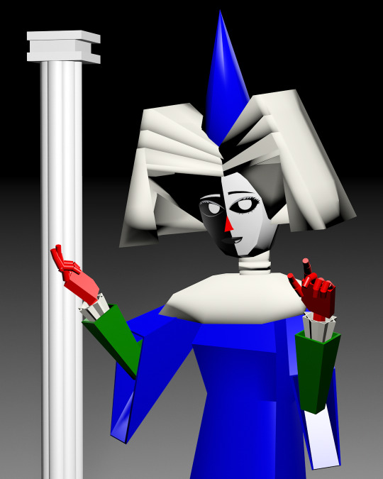
Thank you, I'm so happy you like my work and are interested in the process. The short answer is I mostly use Adobe Animate.
I hate how I'm using an Adobe product (although I still regard it as a MacroMedia Flash product), but there's just no other software that compares to its jankiness. Perhaps it's just my long familiarity with the program, but nothing I've experienced matches how it simultaneously feels like drawing in MS Paint and using Microsoft PowerPoint vector shapes. The result is something that feels in-between the two; handmade yet computer-generated.
Typically, I'll start with a hand-drawn sketch, often beginning as a thumbnail done with pencil and paper.
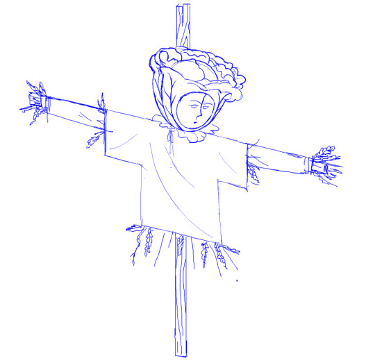
I'll then do a mix of hand drawing and vector shape tool rendering. I use the Paint Brush tool to hand draw strokes, and the line and shape tools mixed with transform to make more geometrically accurate shapes. The design is rendered into divided closed loop shapes, ready to be filled with a solid. The strokes are kept or removed depending on the design.
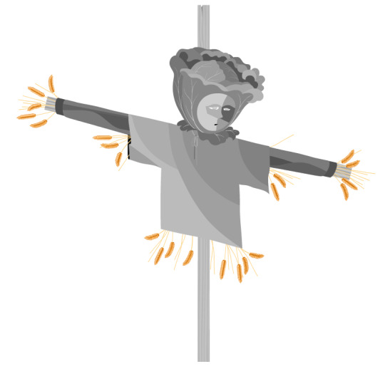
These fill shapes are then either coloured and rendered in Adobe Animate, using fills, gradients, or a more complex process of masks and effects.
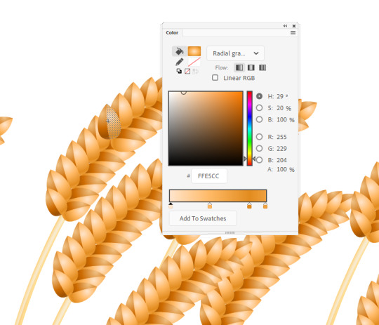
Alternatively, I'll bring all these vector shapes into Photoshop and use them as clipping masks. The vector shapes act like masking taped areas or shields to maintain sharp edges, while the brush is like an atomized airbrush used to build soft volumed forms.
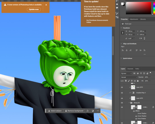
Please excuse all that horrible Adobe Cloud and AI bloatware...
And there we go!
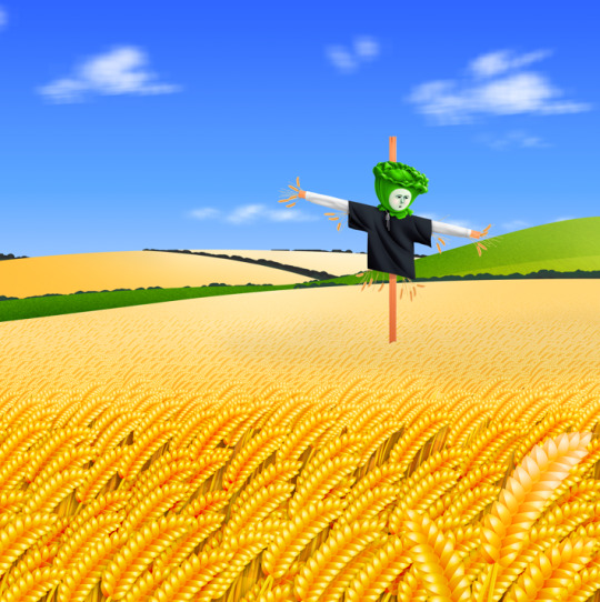
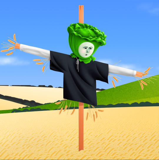
Variations in the process include just using MS Paint, index color in Photoshop, or 3D programs.
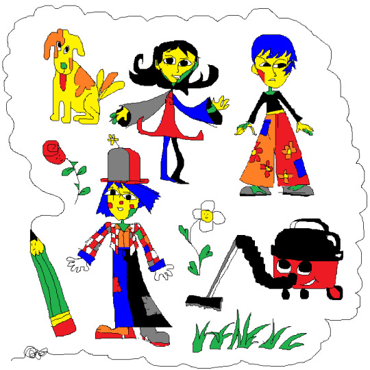
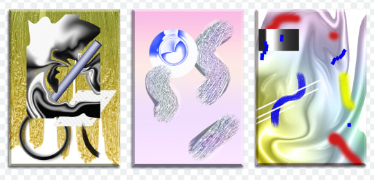
Very old works of mine were almost abstract, just exploring digital mark-making, which was a trend I was following in the mid 2010s that I loved. This kind of stuff.
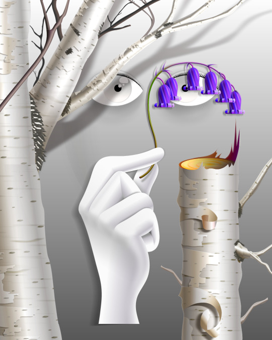
While my current work uses its digital material specificity as an intermediary to the subject in the illustration.
For example, #ersatz.world parodies clip-art and flash edutainment styles but imagines the characters living within that kind of world. The designs are meant to be cute, easy to read, light in computer processing, but also irreverent, janky, and generic too.
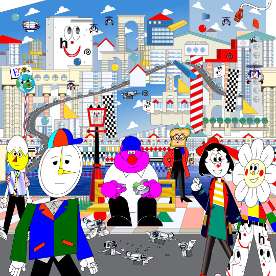
People typically regard this sort of clip art style as ephemeral trash, but I always found them charming. I use Ersatz World primarily as a satire vehicle, parodying educational formats to spoof corporate explainer content and digital media.
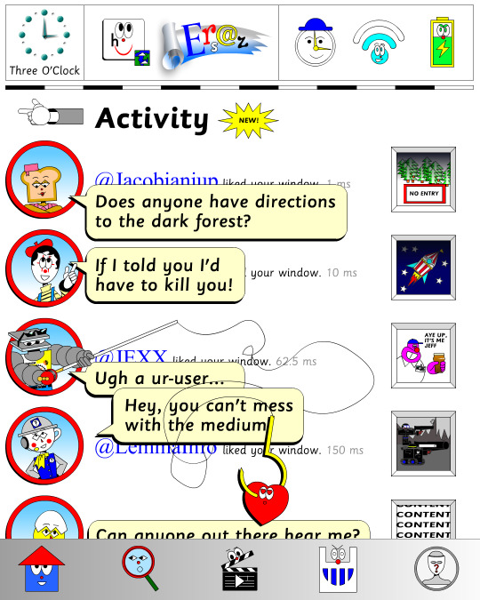
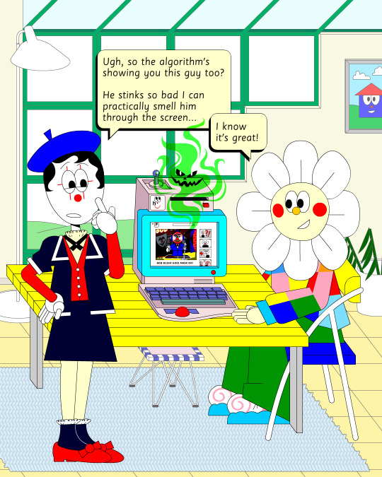
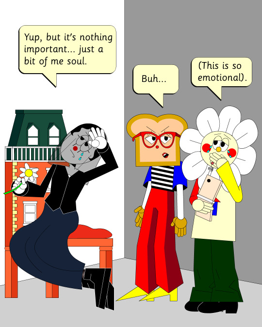
However, part of the problem with Ersatz is I've made it look too polished, complex, and I've grown too attached to the characters, which I imagine is a typical issue with overbuilding a world. So recently, I've made an even jankier Ersatz-like set of characters to play about with, using an even simpler style with less cohesion. I like to try and use slightly different styles and digital material styles to relate to the property at hand.
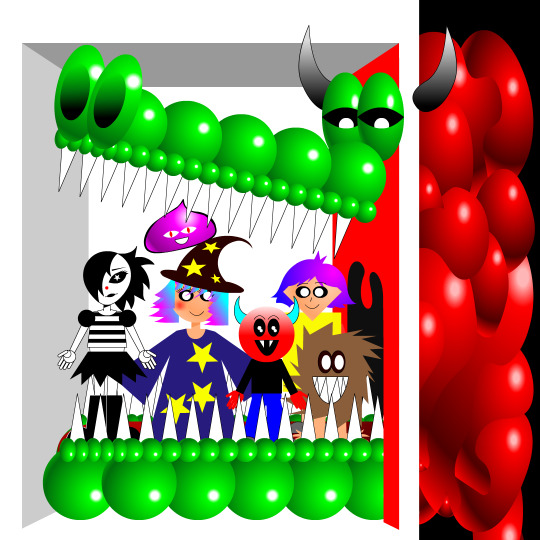
That’s why #autonymus has a bitmap digital material and a denser feel to it. Unlike Ersatz, Autonymus is not meant to be an overt semi-meta fiction. It’s not exactly pixel art, but the pixels are just about visible, as the intention is to create a digital expressionist depth to the setting. Although it’s still stylized and not realistic to our world, I definitely still want to evoke semblances of our world. That’s why there’s attention to landscape, plant life, and implied life beyond what you see in the frame with the characters, etc. But I'm still making a cartoon, and I still want it to feel at ease with itself being a digital material work. Characters are therefore flat, simple, stiff, and the speech style is like a bad Shakespeare parody. I like to balance between ugly and appealing, simple and complex, familiar and unfamiliar.
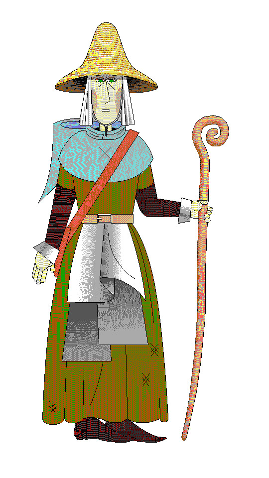
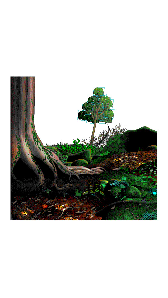
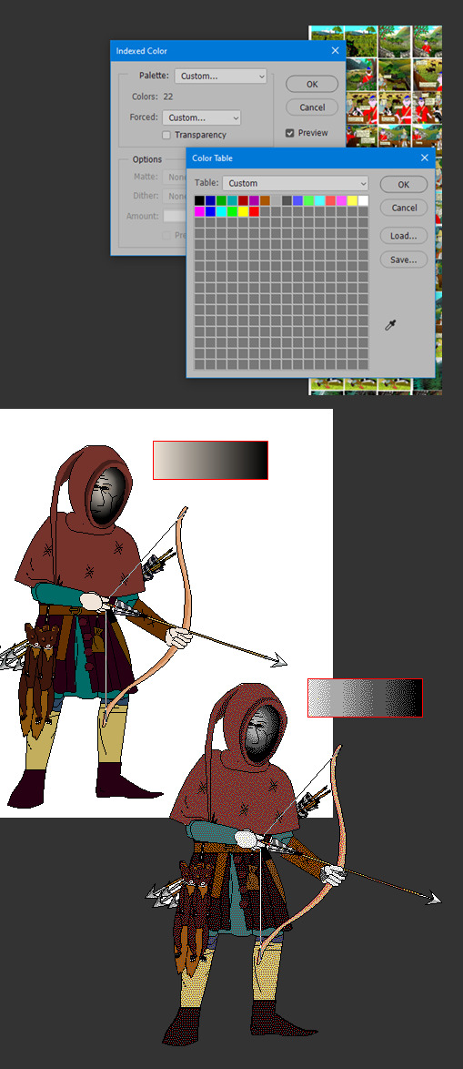
In regard to things like inspiration, references, and my relationship to aesthetic genres; these things certainly factor into my work, perhaps I'm even overtly dependent on them. My work can definitely be post-modernist in method; creating new, ironic, or fragmented interpretations through deconstructing a mix of various styles or methods. But at the same time, I'm still trying to make a digital gestural representation where the aesthetic is driven by my relationship to the software and techniques directly—not simply in an attempt to reference a style. For example, I like drawing lines in sweeping strokes, not to a point of geometric perfection, but just in a way where the curves are smooth and simple. But if I want perfectly curved or straight lines, I'll use the vector tools.
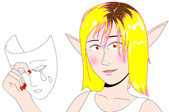
Working this way, you can sort of learn why certain styles and design choices in past vector aesthetics were made, as they would have also needed to make similar choices. That’s why I’m more mindful of using digital material specificity as a foundation to build narrative and subjects upon these days.
For example, genre references like cyberpunk clichés for #cyberhell or late medieval design for #autonymus or 2005 to 2015 era subculture fashion for #gradientgoblinz.
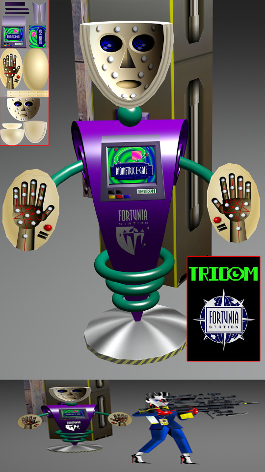
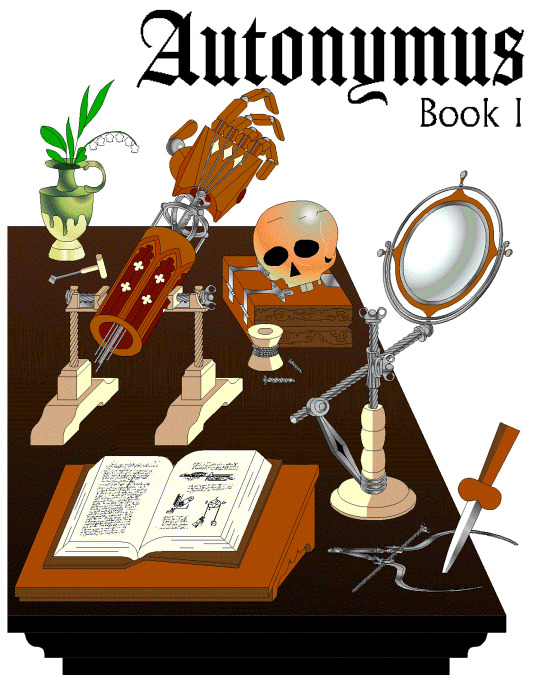
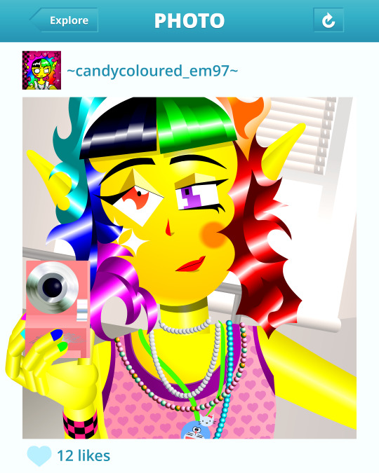
I think it’s important to take inspiration and reference from a wide variety of sources, but I think they’d mean nothing without having something to say or express. Autonymus, although it is a collection of tropes and clichés, isn’t just about that. It’s a story about the tensions of socially constructed systems and how that shapes faith, technology, and the natural world, or at least that's what I'm aiming for anyway.
But despite all that, I think there’s a danger of locking myself into the past by using these methods. For example, using nostalgia and references to past aesthetics can result in just recreating the past in a form of role-play. To avoid that, I try and evoke the past through a messy, inaccurate pastiche rather than caring to accurately re-enact anything. I’m probably not always successful at communicating the deliberateness of this, and it can certainly get very frustrating and pedantic. To be honest, I do kind of hate aesthetic labels (terms like Y2K, global coffee house, utopian scholastic designs from a pre-9/11 world).
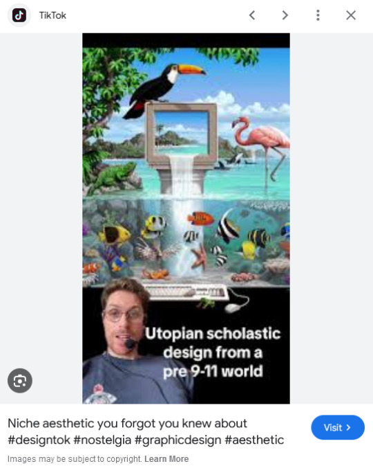
I do not believe that a project aimed solely at mapping history through aesthetic styles is worthwhile. Sure, they can be handy for organizing style trends, but they can also be reductive and ahistoric. Who are these people to define the history of these design eras? The result is a kind of suffocating simulation of design history but removed from context, perfect for moodboardism. I wish it felt more tongue-in-cheek, less absolute of itself in its own practice. Instead, it acts to legitimize and engender those making these labels, almost giving them ownership of the design styles. It’s similar to the logic and process of generative AI and its databases in a way, just done manually.
I’m very inspired by artists like Oneohtrix Point Never in this regard, as I think he’s able to create an aesthetic portal to all kinds of memories, feelings, and worlds reminiscent of the past, while still being in the present. It’s more a reflection of how timelines are messy now, like a memory or dream, rather than an audacity to say the past was actually like that, or to try to actually map some kind of timeline.
I think the benefit of this process is how it avoids the other side of the spectrum—being locked into chasing the cutting edge of digital processes. I don't necessarily think using an old digital process means your work inherits the semiotics of old aesthetics. Non-digital mediums don’t have this issue to this degree, as you can still paint in oils and be considered contemporary, or at least it's not frowned upon to such a degree. And I also don't think anyone in the heyday of Flash ever made work the same as I do, especially as computers are more powerful now so can handle more. I probably shouldn't boast too much about that though, as artists at the time probably just had more sense than to use Flash like a painting program! So then, why is my use of Adobe Animate critiqued as obsolete and an aesthetic dead-end? Because to whose standards is this process obsolete? If you value digital aesthetics as an apparatus in industry practice, then sure, my work is redundant.
But as wonderful as the latest tech can be in creating new aesthetics, I do feel it can be overtly dependent on the trends and directions of tech corporations, and therefore act as an indirect propaganda tool to their hegemony over digital aesthetics, such as the ever-demanding processing power needed for simulated realism. If anything, work that does follow in the direction of the latest tech trends is ironically the quickest to date once the trends move on.
I've noticed I've not really described what my work is about, just the process, in this text. But I don't know, maybe I like Flash because it is regarded as redundant. No one really cares about it, so I feel free to make whatever I want, and can decide on form myself, to my own standards, the quality of my work. As fun as making images is, I find it difficult to put into words what it is exactly I'm expressing in my work, and perhaps that would spoil it anyway.
221 notes
·
View notes
Text
So,,,,,, I'm working on some Hazbin redesign stuff......
Got most of it started; redesigned the characters, but they're still just flat-coloured rough sketches, and I'm planning on doing clean in-style versions with a speed draw and possibly a narration....
Anyway, here's a lil free sample of my Adam and Lute redesign! They're meant to resemble their original Viv-given designs (because I love and respect her and her work), but I tried give them more symbolism and a more diverse colour palette (I understand Viv made the colour palettes of winners and sinners respectively to be analogous, but they can be difficult to read at times).
My versions here are meant to resemble gargoyles whose fearsome appearances are supposed to ward off demons (the purpose of exterminator angels) but which are also supposedly evil (ironic). Afterall, how best to strike fear into a demon's heart than to look even more terrifying lol.

#hazbin#hazbin hotel#hazbin hotel fanart#hazbin redesign#hazbin hotel redesign#hazbin adam#hazbin hotel adam#hazbin lute#hazbin hotel lute#character design#character redesign#original art
51 notes
·
View notes
Text

(Click the image for better quality)
Yipeeee that Keiki and Mayumi fanart I posted the WIP of is finally done woooo- This piece was a very experimental one that I'm kind of OK on. Maybe because I've just gone insane looking at it for so long and I'm my own worst critic lol.
Artist's Notes;
So I've once again been playing around with my rendering style, mainly because I have been wanting to improve my lighting for a while now and as I was just scrolling through Tumblr, I saw some of the official art for that one webcomic-turned-animated-TV-Show Lackadaisy and was immediately inspired. I also have seen a technique a few times in the past where the lineart and shading are merged together, so I've been meaning to try that for a little while.

I did some experimentation on this one sketch of Keiki I posted in my sketch dump and I really liked the results of it, so I carried those over to this piece.
I ended up scaling up Keiki and Mayumi from the original WIP because I felt like they were both getting lost in the composition, and I'm glad for that because I think it works a lot better. I'm not a fan of how Mayumi's sword turned out at all, but it's not really meant to be the focus of the piece so eh. Overall, I think I could do better with my colours, probably because with Keiki and Mayumi's colours, I did them flat in greyscale and then used a brush on the overlay blend mode to colour all of them over, after which I changed the base layer for their colours from white to yellow and then lowered the opacity so it all went together better. I also decided to use gradient maps for a lot of the background elements, mainly to experiment with getting in my values first to make them pop out more. I ended up finding a really nice sky gradient on Clip Studio Paint that I really liked, and that kinda helped to establish the colour scheme of the background a lot. I think the whole "start in greyscale then colour" thing really works better with painterly styles rather than more illustrative ones, and while it is good at making sure your values are more readable, I honestly don't think I have the skill level to pull that off yet. Honestly, I think I've been looking at this drawing too long or maybe I added too much to it, but I wish I could've made the colours less monochromatic, but I'll just save that for the next piece I do.
I do love how the flame (...well it's more of a weird space rift than anything in this piece) and the lighting turned out, those were fun to do. I was initially struggling with the flame and how Mayumi is positioned in front of it before realizing "Oh wait! This is a weird abstraction of a weird creature! I don't have to follow the laws of anatomy!" and just dislocated it's flamey bottom jaw from the main body. I also changed the colours of it since I was really not liking how incredibly bright it was when it had lighter colours. Again, the gradient maps served the more painterly style of the flames well.
I also love how Mayumi turned out. I could do her sleeves better but that's more of just me needing to study how those types of sleeves fold in that position more. I'm also very happy with the posing, the technique I used for that was taking photos of myself in the positions I wanted, blocking in the silhouette and then modifying that by adjusting it to my lines of action that I drew on top of the original photos, and then sketching over the silhouettes and drawing in the shapes of the hands overtop of the photo if I needed to get the fine details right. As for what I do to take the pictures myself, I use a tall chair I have, prop up my phone with a phone stand, put on a ten second timer and scramble to get in position. Yes, I did have to use a bunch of thin markers I had to try and get the hand positioning on Keiki's pose right, yes I do have a fake sword that I used to get the positioning of Mayumi's arms and hand right, the sword was for an old Halloween costume from several years ago. I really like how both Keiki and Mayumi turned out in this drawing, I'll have to play around with these designs for them more in future drawings.
Also, if you wanna know why I draw buildings like that, when I watched Fantasia 2000 as a kid (One of the Disney movies where they make really beautiful animations to classical music) the way they drew the buildings in the first few sections Rhapsody in Blue segment (the jazz one with the cities) changed my brain chemistry and now whenever I need to draw buildings really quickly, I refer back to that. Since the buildings aren't really the main subject, I didn't put much thought into them.
As you can tell I am very tired of this piece, mainly because I made things harder for myself by overcomplicating the process compared to what I usually do, mainly with the whole "starting in grayscale then adding colour." I'd honestly just prefer having a black layer set to colour that I can just toggle on and off when I need to see the values, but it was good to experiment. And that was mainly the point of this whole drawing, to experiment. I'm definitely going to have to play around with this new style I'm going for, mainly because I liked how it turned out a lot in the augmented Keiki sketch, and also because I want to find ways of making it suit my style more. I also really want to keep experimenting with my lighting like this, it's very fun. Last but not least I am never starting in greyscale again because dear god I do not like the workflow it forced me into. I don't have a problem with the method itself it's mainly just a skill issue lol.
If you wanna read my headcanons for these two, I put them in my WIP post, so you can read them there if you want to. The more I look at this the more I prefer the simplicity of my WIP. I might go back to this and just take away the fancy colours and effects to see what it looks like without all of that stuff and reblog this post with that drawing, but for now, I don't think I can look at this drawing again for a while.
#touhou project#art#fanart#touhou fanart#touhou 17#wily beast and weakest creature#keiki haniyasushin#mayumi joutougu#haniyasushin keiki
117 notes
·
View notes
Note
How do you draw the metal shine on your animatronics?
Oh geez
Honestly?
I have no frigging idea! Couldn't start to explain what I'm doing, as I just draw and add shine and shading as I work. At least if yer talking about my robot shine in my sketches.
But alright, let's see if I can try and make examples for this..
Fig. 1

As said above, I usually shade and shine as I go, so leaving this one mostly blank was bit of a toll on me.
But yeh, just a flat sketch of our favourite Sun guy just happy to be here
Fig. 2

Alright, this is a very simple example for how I do most shine on areas meant to be a light colour. Can't be too drastic and risk making it look like the casing is supposed to be darker.
Best way I can explain the "shine lines", hmmm.. I'm not smart enough to have the words, I guess. I just learn from observing art and things around me to try get an idea what gives the right effect with the tools given..
Fig. 3

Let's try with more detailing by adding soft shading.
I really do just add these things based on feel and vibe, as I go.
Do pay attention that whether it's metal shine or shading on non-metal parts, it rarely goes all the way to the art lines. Gotta preserve white space for effect, it helps giving the needed illusion of light when ye only got pencil to work with. Is the best way I can put any instructions on this.
Fig. 4

Of course matters on the shape and desired effect on what you are drawing. There are many ways to draw shading and shine on different materials, for the right feel. This is just some basic and simple examples I can think of to try and illustrate.
I'm sure you can find plenty of better tutorials out there to explain this concept in deeper detail than I'm able to.
I never really looked it up myself, I just experimented with my techniques as I went. Even trying to set it up in separate parts have me unsure if this gonna help ya understand how I do my work.
Best I can tell ya, is I mostly tribute the backgrounds of Hollow Knight some credit for my shading techniques today. Some arts done attempting to copy the style of the game's backgrounds and detailing gave me some pointers to work from.
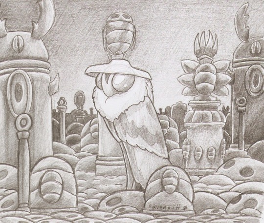
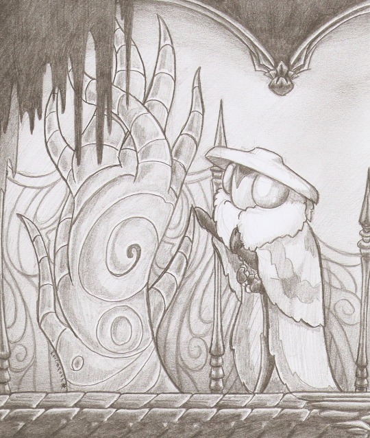
(Moth character my old OC Grave Keeper)
So, yeah, that's the best I can give ya on the subject of how I do metal shine in pencil. Best I can offer is ya look up examples that work for you, to try draw from as you figure out your own technique and vibes for it.
I do hope that was any help!
Enjoy!
The Roan RPG Project ScreeCon Server on Discord Leave a Tip on Ko-Fi
#PuffBlog#MyArt#AChickenNamedCheese#Art Tips#Metal Shine#I have no clue what I'm doing#FNAF#DCA#Daycare Attendant#Sun#Hollow Knight#Grave Keeper#Old Art#Sketch#Traditional Art#Tutorial
55 notes
·
View notes
Text
just for a season (09Ghoap, YoOTP25)
Hanahaki Disease (non-fatal), Historical AU, Mer AU. 09Ghoap, minor John Price x John Soap MacTavish
MacTavish didn’t think he would stay for long at the lighthouse when he’d first arrived on the island. The village itself on the shore just beyond had been more familiar, a low-slung huddle of thatched cottages on the outskirts that congealed into brick and mortar, some storefronts and the bones of a marketplace, a few pubs and he could be content there for a time. The lighthouse had been a scar on the horizon, some artistic rendition of a wizard’s tower thrown on a drunkard’s pottery wheel, and MacTavish had staggered from the small boat sent to ferry him across to it wearing the remnants of his final pint splattered across his boots into the arms of one John Price.
“Only need you to stay for a season, lad,” Price had said, one hand pressed to MacTavish’s forehead to keep him upright, the other resting above the keys at his waist. “Just a season and we’ll send you off to your nice soft bed with some coins in your pocket and a few hairs on your chest.”
MacTavish couldn’t say what colour Price’s eyes had been, but he sketches them in charcoal on the corner of tattered sailcloth strung up along the side of his bunk that first night, the roar of lighthouse horn enough to pluck him from fitful sleep minutes before it sounds. He spends that first breakfast tipping forwards into his plate, a fry-up for the first day after a resupply, strips of bacon fried in their own fat and bread neatly hacked from the loaf and toasted in front of the fire, while Price chuckled, wreathed in smoke and salt like some deity of old. His fingers were crooked, weathered and pale as driftwood, but he’s fast with them, smacking across MacTavish’s knuckles with the flat of his knife to keep him awake, to keep him alert, and just because he could.
He’d hated the man and adored him in equal desperate measure.
One season bled into two, to three, to one bitch of a winter when MacTavish curled up in Price’s bed to steal any memory of warmth from his sheets, and then another.
Then, there was war.
Two men left the lighthouse.
One man returned.
“They’ve asked me,” MacTavish begins, tapping the ash from his cigarette into his mug. It’s mostly paper and char by this stage of the month but he returns it to his mouth all the same, tastes the stale tang of damp tobacco. “If I want to stay on the rock for another season.”
He plucks two cards from his hand, their edges soft with age and warped by the salt in the air, holds them aloft before he adds another, laying them all down on the stool that sits between the two men. It’s a strange configuration; MacTavish slung in the low-backed armchair, the frame moulded to fit a different man’s shoulders, the angle of his hips. He sits forwards, legs spread wide and laces trailing from his boots, half-loosened as the evening stumbled onwards, and sinks back against protesting springs. Riley presses himself upright, the cloying scent of brackish water clouding the air like a lover’s perfume, and the water sloshes against the side of the copper bathtub he’s folded into. If Riley had been any other man, it would be a private affair, MacTavish busying himself with his sketchbook or the snarl of his thoughts.
Riley blinks at him, first one set of lids — milky white like death’s first kiss — then the other, dark lashes spilling shadows across his cheeks. “What did you say to them?”
There’s dark indentations splashed across his forearms from the edge of the tub, harsh lines woven over the paler sheen of scale and skin. Riley leans closer with a slosh of water, three cards held between thumb and forefinger before he drops them on the stool. He has a way of looking up at MacTavish — a necessity given their seating arrangements but it runs deeper than that — like he’s studying him in the same way a religious man bleeds over his bible.
“They’re not wrong for asking, there’s meant to be some new blood on the rock for years now.” MacTavish drags blunted fingers over his jaw, scratches at the line of his neck. “Could be a younger man for you to bite at over cards, with a pretty wife and a baby. More interesting company for you than an old man.”
Riley hums, his jaw tight. It doesn’t sit even, the scars at the corner of his mouth drawing his grin jagged, the curve of his teeth constantly on display. “No, you’re fine.”
“It’s like you’re trying t’make me blush.” MacTavish shifts his cards between his fingers, places them all flat on the stool, only to pick them back up again. The evening air is cool, a distant prickle against the nape of his neck, the edge of his wrists, and he considers rising from his seat and crossing the expanse of four steps to the huddle of the stove and throwing another piece of driftwood in. It would burn beautifully, a riot of purple flames devouring the pale sculpture, but that would be a step away from Riley, from the deliberate weight of his gaze.
MacTavish stays where he is.
“What would you do in town?” Riley asks, his teeth exposed in something more than common flesh healed jagged. There’s seaweed tangled in his hair, dark against the sodden curls, never able to fully dry but golden all the same. “Your own pretty wife, a baby?”
MacTavish laughs then, really laughs with his head thrown back and chest aching from the effort. His ribs had never healed right from his first tumble into a foxhole, fresh blood on his palms (his, Price’s, the laughing lad next to them) and every breath sends a pang echoing through the memory, crashing into the swell of the present. Price had pulled him from the stinking mud, slapped him on the back before his hand rested on MacTavish’s shoulder, keeping him upright, keeping him steady.
“No, lad.” MacTavish chucks down his cards, clearing his throat before he swallows down the mud of a foreign field he hopes to never see again. He draws another pull of his smoke, the dull glow burning steadily to his fingers, and breathes out through his nose. “No wife, though it wasn’t for a lack of them trying when I was younger. Must’ve told you this before—” He looks to Riley, tipping his head to one side in question. They’d spent countless nights together living in the same cramped quarters, the aging lighthouse keeper and the mermaid in his bathtub, and the details blur together in MacTavish’s memory, faded like an old photograph that’s been exposed too many times and the image beneath bleeds through. Riley shrugs, layering his arms over the edge of the bathtub and resting his chin upon them. Could be an oil painting of a cherub torn straight from the church walls and MacTavish abandons his cards on the stool without a second thought, reaching for the bloated curve of his sketchbook, pencil jammed between the pages.
“Anyway,” he says, scratching out the blunt beginnings across an empty corner of a page. “When I was younger, back when I kept saying I was only staying on the rock for a season, I had a handful of girls trying to court me.” It had been a heady, if uncomfortable, sensation as a young man, giddy excitement of being craved warring with the bitter panic that something isn’t right, something with no shape or name but it existed all the same. His older sister had brought home an unbroken colt once and he’d felt the same as that beast; trying to flee a world that did nothing but exist. “Few of them were Heartsick over me, wore their flowers in their hair so I’d notice.”
He couldn’t remember their names, but he remembered their flowers, the same ones that would likely litter their pillows in the morning or be chewed and swallowed along with their food, a bouquet of red roses, some pink, daisies, primroses. Their scent hung heavy on the morning air, mixing with the smoke of the incense in church as MacTavish took one hand between his own, lowering his face to whisper a blessing that would be devoured in one starving blink. The affliction wasn’t fatal, a byproduct of God’s love for his creations or some quirk of human biology if the doctors were to be believed, but it could be inconvenient for the sufferers. The radio plays and serials would use it to raise the stakes in their romantic subplots, sending out the fresh-faced female leads with a wreath of roses woven into her hair or the plotting step-sisters with fresh blooms cut from the garden.
“Although,” MacTavish tears himself free of the memory, the remnants of it clinging to his arms, his hands like dust. “If you’re asking because you’re a siren, Riley, then you’ll have a poor last meal from me.”
Riley chuckles, the sound closer to the scratch of a match than anything a human could produce. His tail shifts, the dark fins stretching above the water to counter his movement, a ripple of muscle down its surface as Riley lifts himself upright, seawater sloughing off his skin. He’s human from the waist up, the sharp concave line of his belly warring against the onslaught of pale scales, his navel blank except for the scars that stretched across it; one set over his hip, another straight up the centre of him, a handful more curving over shoulder and forearms, before the deliberate devastation of his throat and jaw. There’s a few tattoos visible on his upper arms, the edges of one on his collarbone, and another on his ribs, and MacTavish marks them quickly on his sketch, smudges his thumb over the hurried outlines. Riley doesn’t move when MacTavish isn’t watching him, dark eyes catching the embers, the faint glow of MacTavish’s smoke. He holds out one webbed hand expectantly, and MacTavish hands the cigarette over with a rueful sigh. He doesn’t mind, not truly. The end glows a pittance in Riley’s hold, the smoke barely more than a wisp as he breathes it in, the memory of it rolling from the gills in his neck like morning mist inland, pale and barely there.
“I don’t think I’d see much of you if I left the rock,” MacTavish says, returning his gaze to the cards spread out in front of them, his sketchbook balanced on his lap, his pencil tucked behind his ear. There’d be grey lines over his temple later, dark against the silver shot through his hair.
Riley drops his set of cards down, nudging them into place before he returns the cigarette to his mouth. It’s down to the paper now, grey ash falling free over Riley’s fingers, floating on the surface of the water like soap scum. “I could go with you.”
MacTavish first met Riley the night after a storm. It had been his second or third season at the lighthouse, his legs growing steady with every step over the slick rocks, the salt crystallising down to his bones. Price had dropped a basket onto his chest, mercifully empty, and sent him out with a smack to the back of his head, Price’s jumper sitting wide on his shoulders and long on his hips. Seagulls wheeled high overhead, shrieking to each other and dropping out of the slate-grey sky to pick at something on the ground, barely visible at first as MacTavish made his way over. He’d expected some fish, their eyes already glassy or missing, just empty husks staring up at a sky they were never meant to see; but what he found was a man, his skin scraped raw and bright over his hip, his elbows, blood and feathers clinging to his palms, his mouth.
“Fuck off,” Riley had snarled, his voice barely louder than a rasp behind the display of his teeth, and MacTavish only laughed, a mixture of disbelief and wonder rattling through the empty spaces between his bones, the universe reshaping itself because of one chance encounter.
“You’d go with me?” MacTavish asks, leaning back in his chair and letting his legs slide wider. He’s got a small cottage back on the mainland, it had been Price’s like so many things that MacTavish owns now, just another thing folded into his hands alongside a black-edged telegram that was too small to contain the full breadth of the man it trapped in dark typeface, the man who would be forgotten as just another name amongst the war dead.
It’s big enough for two.
MacTavish hums quietly, reaching for a smoke he no longer holds. He pushes himself up from the chair, the creaking of the springs only masked by the cracking of his knees, a line of pressure caught tight in his back. He staggers his first step towards the low slung cabinet, but catches himself on the second, the third. Another wail of the horn high overhead, the carrion call of some enormous bird, and MacTavish pulls fresh rolling papers, a folded paper package of tobacco. “Another?” he asks over his shoulder, drinking down the shadowed lines of Riley’s features as he slouches against the line of the bathtub, his fingers twisted in the seaweed caught in his hair.
“No,” Riley murmurs, far gentler than he has any right to be. Drawing him wouldn’t be enough, MacTavish could fill every inch of the lighthouse with his visage, carve the smooth curve of his form into the rock itself so someone, somewhere can dig it out of the ruins and marvel, and it still wouldn’t be enough. MacTavish is stubborn and sullen, a ruined husk of a ship from a bygone age left to rot in the sun, with salt on his hands and an anchor looped around his neck, never more than a handspan away from the terrified lad who breathed in the thick scent of blooming roses and wondered why he didn’t feel anything.
MacTavish dampens one edge of the paper, tapping out a thin line of tobacco, rolls, and lights it. Riley wins the game, his grin sharp behind his facade of indifference, blood scented in the water and leapt upon, and MacTavish blackens his lungs with every inhale, the taste sharp across his tongue.
“Going to be a storm tonight,” Riley murmurs. The fire has long since burnt to embers, the room cast in pale shadows, and his eyes gleam strangely in the low light, dual eyelids shimmering with every blink. “You should sleep.”
“Aye.” MacTavish stands, presses his hands into the small of his back as he leans against it. Riley lifts himself partially from the tub to sit on the edge of it, the sharp bite of the sea ever present.
He’s solid in MacTavish’s arms as he lifts him, Riley’s arms locked around his neck and the curving tattoo on one bicep the point of MacTavish’s focus as they breathe in tandem, for a moment, a single entity. The lighthouse howls above them, around them, and Riley twitches, his tail fin flaring wide in a ripple of muscle down the length of it, his jaw clenched tight as he turns his face into MacTavish’s neck, his breath damp against his skin, the fall of his crucifix.
“You alright, Riley?” MacTavish murmurs as he makes his halting way down the stairs, his shoulders turned to keep Riley’s tail clear of the narrow stone walls.
“Yes,” Riley answers, his voice thick. His hands twine in the loose strands at the nape of MacTavish’s neck, the sharp edge of his claws scratching delicately at his scalp.
Their parting is inevitable, the roar of the sea against the edge of the broken sluice gate louder than the lighthouse overhead, the marrying of their two worlds. MacTavish kneels, the stone damp and soaking into the light fabric of his trousers, matching the ocean already emblazoned across his chest and belly, the rivulets slipping over the edges of his spine, and he hasn’t been inside a church in years but here is sacred enough for him to worship. Riley slides from his hold, catching himself on the edge. “Sleep well,” he murmurs, his words almost lost beneath the roar of the water, and then he is gone.
MacTavish returns to the huddle of his rooms, a thin trail of smoke fluttering behind his every step like a bridal veil. His thoughts are muffled, echoing through shattered bone and tangling around the snarl of his ribs, the stagnant cling of his heart, and he thinks of Riley, Riley in the old-wheeled chair gathering dust in the corner of Price’s, of his front room; the double bed that always felt too big for him so he spent his nights stretched out in front of the fireplace, seeking salvation from cool stone and the distant hiss of the ocean. He sleeps but he doesn’t dream, and wakes with a rose petal between his teeth.
It tastes like his ma’s perfume, a deliberate steeping of the fresh spring cuttings, and he spits it out into the trembling cup of his palm. Dark enough that he can barely make out of the shape of it in the gloom, the air trembling with the aftermath of the lighthouse’s call, but he knows it by the musky tang coating his tongue, the scent heavy in the air and the space behind his teeth. MacTavish brushes his fingertips over the gentle crush of it and tucks the petal behind his ear, blinking out into the darkness.
In the distance, inside the emptiness of his thoughts, he hears the roar of the ocean.
#09 ghoap#ghoap#ghostsoap#soapghost#price x soap#captain john soap mactavish#lieutenant simon riley#john soap mactavish#simon ghost riley#john price#my writing#cod mw2#fanfic
14 notes
·
View notes
Note
Hi, i hope this question doesn't bothers you, do you have any videos of your process?, im currently starting to learn how to do digital art and have trouble knowing where to start and what to do (im always like, should i start drawing this part first?, is it better to do clean lineart or just paint over the sketch?, do i work on the lights first or the shadows?, etc)
I can probs make you a video on this at some point based on something I'm currently working on, although I have a few on my tiktok already (@ xephia) if that helps!
My process is a bit messier than many other artists - I alternate between stages of sketch and colour before I even think about ‘final colour’. I’ll start with a sketch like the ones below, then slap some rough colour on. This is because IMO colour is an important part of the composition so I want to see what works before I line. They’re not meant to be pretty or social media ready. This stage can look super messy or tidy depending on how I feel or how complicated it is. And they can look wildly different; here’s some examples:
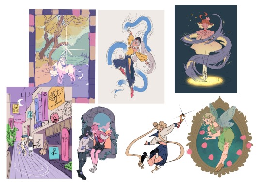
That stage also helps me decide if I want to finish the piece or if I should abandon it (I abandon a lot). Sometimes this stage takes 15min, sometimes 2 hours, it really depends on the piece. But for me personally, it’s crucial because otherwise I find it very hard to envision how it will look later, or forget what I was planning.
Then, I do at least one more layer of ‘sketch line art’, which is basically a first layer of line art to see what works and what needs changing. I colour the important bits relatively cleanly (usually character/s) and add might some subtle shadows/gradients and/or lighting to get a feel of what it will look like finished. Sometimes I repeat this process a couple of times if I’m not happy with how the first iteration looked. This stage usually looks a little like this character sheet I’m working on, and this slice from a Kiki delivery service sketch:


It’s usually not until I’ve done all that, that I go over and do the final lineart, making it thicker, colouring the lines, redoing the flat colours, tidying it up, and adjusting where needed. Essentially I don’t start ‘finishing’ a piece until I’m happy with where everything sits and what colours I’ve picked. It’s only at this point I feel like the sketch is ready to line, and lining and final colouring can actually take less time for me than all those layers of planning somehow haha.
At this point I keep tidying, cleaning, lining, colouring, until the piece feels complete. Sometimes complete for one piece is tidier than complete for another, it really depends.

I’ll also use Procreate’s push tool to adjust things as I go in all steps - it saves a lot of time and isn’t cheating.
Although as you can probably tell from my examples, I do change this procress up a lot depending on the piece! Sometimes I’ll even paint over parts of my final piece like I did in this magical girl street. I think find whatever works for you, everyone will work differently and things like mood, energy levels, how patient you feel, how stressed you are, if you have any hand pain or shaking, and how much free time you have that day to draw can all affect your process day to day, week to week.
Some days it will be easier and more comfortable to sketch messily, other days tidier. Some days you will draw well, other days not well at all. At least for me, I find consistency almost impossible.
So I think there's no right or wrong order to do things and it's great to switch it up and keep things interesting for yourself, and different processes work for different people. Hope this helps!
#faq#art process#art advice#art tips#drawing guide#sketch progress#digital art#procreate#human artist
33 notes
·
View notes
Text
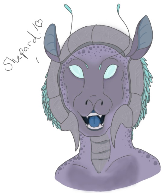
(This is an old idea I had for Quarians here, I just think Tali looks adorable in this old pic, lol).
Today's inktober word is 'Nomadic' and this made me think about Quarians in the game Mass Effect. And to my self-imposed horror, I realized I never bothered uploading my ideas for what they looked like back in the day. I went through a phase like that. I did lots of stuff back in 2010 and never really uploaded it...Possibly for the best, as it looks pretty rough in places now, but I did want to share some of my ideas before I upload my more current version from today.
I did at least upload my concepts for the Volus and the Raloi though (two other unseen races in game, one is coved up, and the latter just mentioned in other media). You can see them here:
Quarians are masked aliens in game and back in the day, I had to have my graphic settings turned WAY down in order to play mass effect. Have my low graphic crunchy Shepard
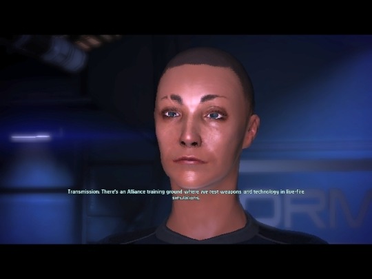
Because of that, I never saw the two glowing eyes or slightly human nose bridge reflection you can see in a normal setting. So I had in mind an alien species that somewhat resembled the Geth - a race of AI the Quarians themselves made:

So I was picturing something with one eye, armour and maybe even mandibles? So here is my first go:
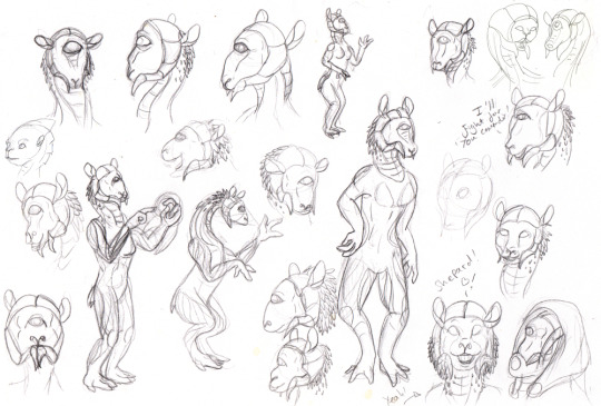
BUT later on, when I played Mass Effect 2 on a better pc, I was disappointed that you could see a bit of a human face. No matter- I could still work with this.
MORE BELOW so I don't clog up your feed with ancient quarian debates I should have posted a decade ago, lol.
So I got to playing around with ideas, using my old ones. I mean- Quarians are mentioned to be attractive to Turians and later Javik mentions that ancient Quarins looked attractive. And they look like this:
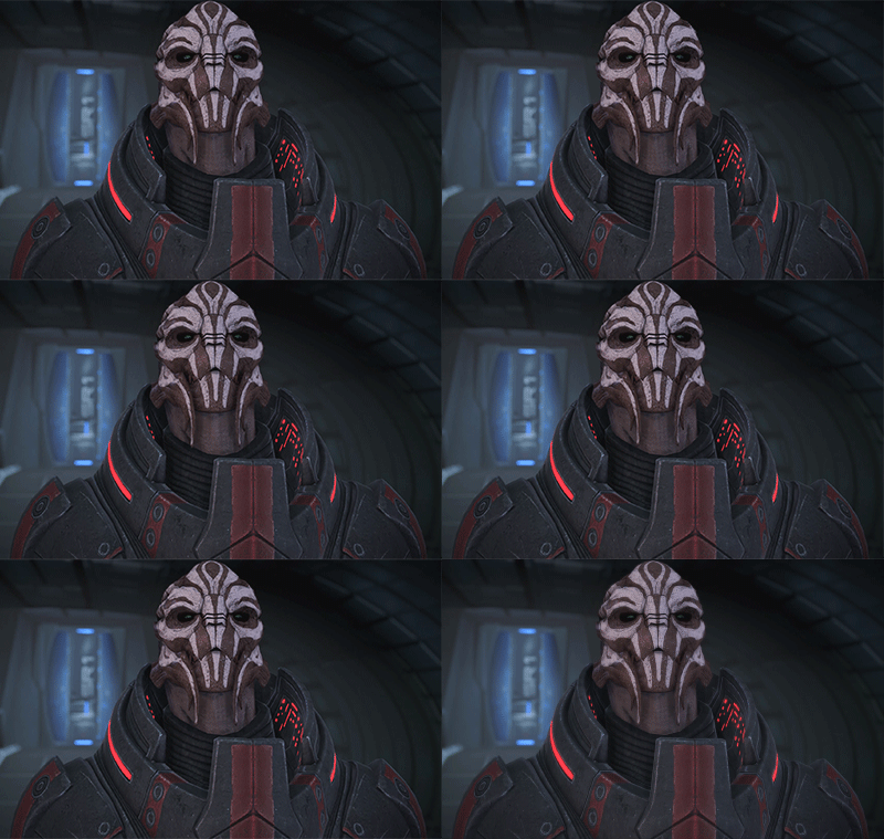

So definitely not very human....right?
One thing I also noticed was that male Quarians have a flat nose compared to females, almost like a muzzle. (screenshots are mine, the model I downloaded back in the day and can no longer find a source sadly)

And that made me think about the sci-fi trope of cat people.

Seriously, these are just some of the books on my bookshelf that contain sci-fi cat people, and that's the ones I could find off the top of my head:
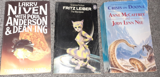
It makes sense; Mass Effect is a bit of an amalgamation of sci-fi tropes into new ideas. You have the insect race (Turains), Warring tank race (Krogun), the classic 'Grays' (Salarians), Animal-like with tentacles (Hanar), The 'sexy human female but a colour' (Asari). etc. etc. yadda yadda.
So I sat down and tried to design something that sort of encompassed all these ideas, Geth-like, attractive to Turians, Javik and maybe even humans...and a little bit of space cat thrown in.
So this was my first idea that I meant to upload back in 2012.
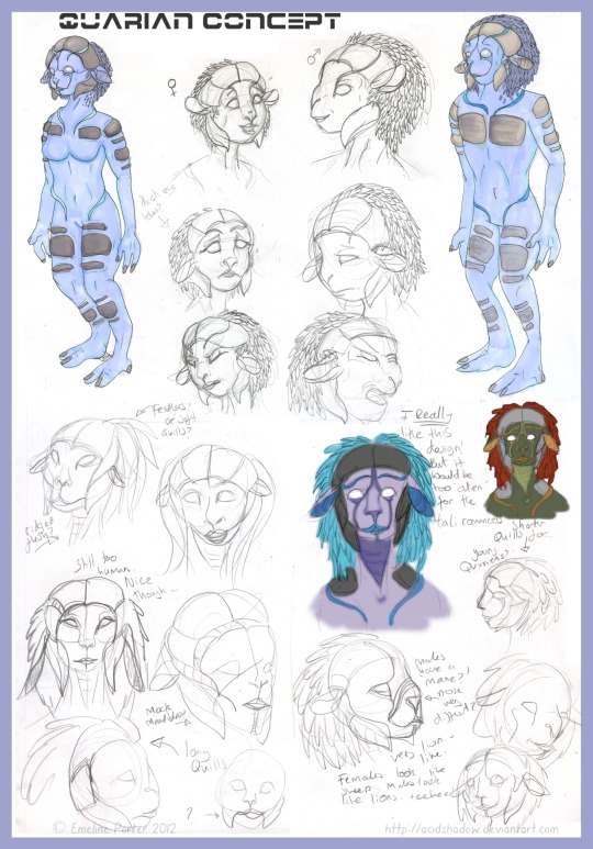
I think I wasn't happy with the body and I had meant to come back to it. I had over the next few years dabble din other sketches, even going back to the drawing board on the face.
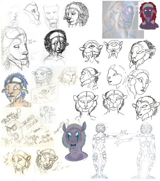
I think what stopped me was the things we learned from Mass Effect 3. If you romance the Quarian Tali, you can see a photo of her face!...
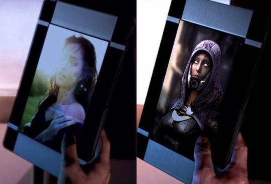
...they were purple humans.
LAME.
But recently, The legendary edition took the critique on board and revamped the picture to the one on the right. Now they look ...even MORE human.
EVEN MORE LAAAAME.
Utter disappointment. Now I always knew that if Bioware revealed the Quarian face they would disappoint some people, but this was such a missed opportunity to design something unique. Bioware did they that they were worried if it was too alien, it would be hard for cosplayers to dress up? But come on, cosplayers love a challenge and will overcome anything. We knew they had two eyes and a nose bridge, it didn't have to be too alien, just alien enough.
TALI RAGE.
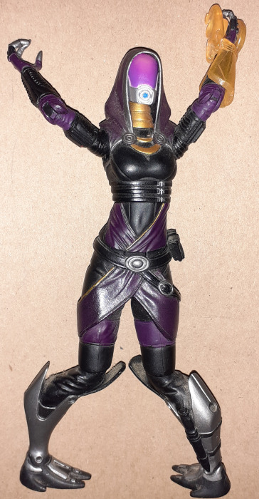
BUT the best answer is to REJECT CANNON.
And in a moment I'll upload my more updated Quarian idea.
#inktober#alien#mass effect#quarian#quarian concept#tali'zorah#quarian face#aliens#cat aliens#cat people#sci fi tropes#Tali#mass effect quarian
11 notes
·
View notes
Text

THE SHIRTS I DESIGNED FOR MY FRIEND'S WEDDING DINNER ARRIVED
aaaaaaaaaaaa 💕


She wanted One Piece characters for her fiance's "Mr" shirt, and Dragon Ball for her "Mrs" shirt. It's their favourite anime for their respective shirts. I can't afford to give her a nice wedding gift at the moment, so I offered to do these as the wedding gift!
The brief she requested: for the MR shirt to have Luffy, Sanji and Zorro. For MRS to have Goku, Gohan and the 4th dragon ball. A preference for the "MR" and "MRS" to be prominent
I am barely familiar with either of these shows. So some research was needed lol. Because both of these anime are long running shows, the characters she gave me names for that she requested on each shirt have multiple appearances. For the Mr shirt, I went with season 1 appearances for the gang. The Dragon Ball characters was a bit harder to find the right appearances for. I initially accidentally pulled references from different seasons, which meant conflicting timelines lol. Also, the size of the dragon ball seems to change of the course of the show?? She requested not to see the design until it was finished - to have it be a surprise. Which is fine! I can accomodate that, though it meant muscling through my self doubt. I couldn't ask her for verification on a sketch out of concern it would spoil the surprise.
Striking a balance between the words and the graphic was tricky, and I ended up only having the text be 1/3 of the shirt... but before I had these shirts printed I showed her the final design and she said she was really happy with it. It was a huge relief after essentially working in the dark with my fingers crossed.
I'm new to this process. This took weeks of work (admittedly not consistently, but chipping away a bit at a time) between work and just needing mental breaks. Mental health being up and down. Hormones. Great stuff. But these are the iterations of the sketches - some of them I went back and forth with the text vs graphic ratio, wondering about fonts, wondering whether to incorporate floral motifs I used for their wedding dinner invites, etc.


One important aspect I want to document - first time using free form vectors with the pen tool!

Because I wanted the option to scale this for printing I figured I'd test my hand at this? And fuck, am I glad I have this new PC to accomodate for the extra loading power to allow for it. I grabbed a screen print for Zorro's mouth here - that's one pen stroke of the 5 I did to shape his mouth. In other parts of the shirt, I couldn't achieve a shape I wanted so I carved the lines with an erased line. This results in... many, many.... vector lines.
I compiled my wips into gifs - in my version of CSP I can only animate up to 24 frame though, so its super speedy.


and then the final results...


I wanted a transparent window to the background so that the text could pop forward (hopefully to make it more prominent!) - so again, using a vector pen with an eraser/transparent colour I did some devil fruit and shenron shapes to be less graphical. With that see-through window I hoped it would invite the shirt fabric colour into the design to mix with the colours I chose. It all looks a bit flat, but from what I understand from researching a bit, this is prefereable from having soft colour blending which doesn't print as well. So anime style shading worked out pretty well in that respect?
I went with a Melb based printing company called PrintLocker (and they chucked in some free gummy bears!). With this company I could do a front, back and sleeve prints. It cost extra to have each of these zones with a graphic, but I think it was worth it. Plus, shorter shipping time! It was express posted too, which I didn't think was included in my overall shipping/delivery time.
When I saw the option for sleeve prints I definitely wanted to utilise it. So I had the idea that when standing side-by-side with their shirts on that it might be cute if their sleeves said Mr and Mrs that faced each other.

So there it is. Weeks of work with a result I'm a bit chuffed by. Again, this was my first time printing my work to shirts by myself. I don't know if I'll do this again for myself, but at least I know how to do it now! Wahoooo~
4 notes
·
View notes
Text
Things That Have Significantly Improved My Art in 2024
1. Drawing EVERY SINGLE DAY.
No joke, it's all I do in my free time (or when I should be working, lol). On days when I don’t know what to draw, I’ll scroll through Pinterest for inspiration. It doesn’t have to be anything significant. Sometimes I’ll just focus on sketching hands, eyes, or an interesting pose. The key is to stay consistent, even with small studies.
2. Simplifying my sketching.
I used to get caught up in small details, which distracted me from focusing on the bigger picture. Now, I try to use fewer lines and rely more on S-curves and C-curves and using my whole arm to sketch, rather than my wrist, to create flow in my sketches. Surprisingly, you can break down a person’s face into simple letters and shapes, which makes it easier to understand 3D planes. This approach has really improved how I draw faces and bodies.
3. Stepping out of my comfort zone.
This one was hard. Trying new things meant my art looked like crap for a while, but it paid off. I started as a traditional artist using just pens and paper, no colour, and mostly drew static poses and skulls. When I switched to digital art in 2018, it was a steep learning curve, but the ability to erase and experiment was a game changer. Since then, I’ve pushed myself to draw dynamic poses, incorporate storytelling, and experiment with color and digital painting. Lately, I’ve been teaching myself cel shading, which is a work in progress.
4. Mastering LINE WEIGHT.
This might be the most underrated skill in art. Learning to vary line weight transformed my work from flat and lifeless to dynamic and eye-catching. It helps emphasise 3D planes and naturally guides the viewer’s eyes to the focal points of a drawing.
5. Watching YouTube artists.
This, along with daily drawing, has been a huge part of my improvement. I love David Finch’s videos, particularly. He’s a comic book artist for Batman, and his live drawing sessions and tutorials are incredible. Proko is another favourite. I even paid for some of their classes, and I cannot overstate how much they’ve helped me with fundamentals and beyond.
6. Having fun!
This might sound obvious, but it’s so important to enjoy what you’re creating. For me, drawing fan art is my favourite thing to do. Especially romantic or spicy scenes with Kerry and V. I also love making comics, even though they’re time-consuming. Drawing things I enjoy keeps me motivated and gives me a constant source of practice. Whether I’m doodling while half-watching TV or sketching at my desk during downtime at work, I try to make sure I keep it fun.
4 notes
·
View notes
Note
For the fic asks: maybe 4, 13, 29?
Hello :) Thank you for these <3
4. How many WIPs do you have right now?
Harder question that it looks ahah I have one WIP for F1 (Lifeguard AU). I suppose everything else I've started to write counts more as abandoned than a work in progress. I think I need new ideas 😅
13. How much planning do you do before writing?
The amount of planning of a fic is directly proportional to the probability I will abandon it, so ideally I don't plan much. Maybe I'll do a rough sketch for more complicated things (like non-linear narratives), but most often I start writing something and it goes on an unexpected path so I just let it happen. Then the nightmare of editing everything into a coherent story begins.
29. Share a bit from a fic you’ll never post OR from a scene that was cut from an already posted fic.
Here's an entire scene from 'got milk?' that didn't survive the editing cut (because it was really pointless 😂 also I reused parts of it in other scenes):
Fifteen minutes is a deceptively short amount of time. Jonas wastes no time in slipping into the first pair of jeans he can find, but it all derails after that.
He spends a good five minutes in front of the bathroom mirror, trying to flatten his bed-mussed hair with his hands, then fluffing it up again when it becomes too flat, then frantically dragging his fingers over the uncooperative blonde strands before giving up altogether and leaving it as it is, flopping uselessly over his forehead.
His face looks too pale even for Jonas, doing nothing to hide the blooming dark circles under his eyes. It irks him—even if Jonas has never cared much for the way he looks, it’s still an expression of weakness. And Tadej—he never looks weak. The last time Jonas saw him, he’d looked—
‘It’s Armani, eh’ Tadej had told Jonas, holding the right side of his jacket open to show him something—the brand tag, maybe, Jonas couldn’t tell you because his eyes immediately strayed to the fabric of the shirt clung to Tadej’s chest. Delicate, white linen, almost see-through, the hint of a pebbled nipple underneath—god. He’d seen Tadej shirtless countless times before, of course. Again, it’s the sort of thing that comes with the job. This shouldn’t have been news to Jonas. There was no logical reason for him to get flustered over the mere suggestion of a perfectly normal anatomical feature. Except—
‘Looks good,’ Jonas had mumbled, averting his eyes. A waiter passed by, offering him a timely distraction in the form of free champagne. (In hindsight, that was the first poor decision of the night.) At least Tadej had seemed pleased about his answer.
Except.
Except, maybe Jonas should have seen this coming. He’s worked through this in therapy too—how he shouldn’t let his feelings bottle up inside him until they blow up. How he should cut them into small, manageable pieces. Work through them, one at a time, so he can remain calm and focused.
Of course, in therapy they meant to address things like anxiety, anger, the fear of failure. Not-- Not whatever it is that grips inside Jonas’ chest whenever Tadej smiles at him. So, of course, he’d let that bottle up inside, and, of course, it has now blown up in the most spectacular, ill-advised, world-rocking fashion.
And so all there’s left for Jonas is to scour through the depths of his suitcase, trying to find a shirt that is not team-branded, or contains the words colouring history, or is an actual yellow jersey—what the fuck, he needs to start packing properly—so he can meet Tadej and figure out where do they go from here.
His fifteen minutes are up and his phone rings once more just as he manages to find a plain white t-shirt with a wash-resistant ketchup stain near the collar that will just have to do.
“Your Uber ride has arrived, sir,” Tadej announces in a mock-solemn voice. It takes the edge off Jonas’ shoulders, even if only momentarily. Maybe things can be as easy as before. Maybe nothing has to change.
“Yeah, I’m coming.”
3 notes
·
View notes
Text
Trivia: Drawing Akah-El
🍂 All pictures have images descriptions. Click alt.
Oak's (Akah-El, never mind the misspelled name on the sheet) design was the one I struggled the most with. Drawing birds is much easier, who would've thought.
First, here are the earliest design I made for Oak. Dates back to 2020, during lockdown.
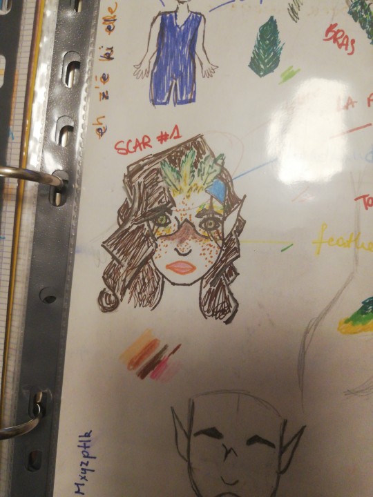
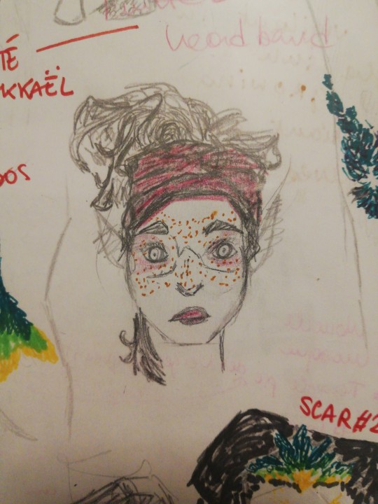
Hair down then up. First drawing I ever made of Oak. They were a much different character back then and I wasn't really happy with how they turned out, but looking back now, I think these drawings are pretty good for a first try. It set most of the features they still have now. As you can see on the research sheet below, I played around with their hair a lot and it took a while for me to ditch the strand of hair on the right side of their face - I think, for the best.
Oak's scar was established pretty early. I wasn't sure about the feathers at the time but ended keeping them. Got rid of the big ones on the forehead though. Idk. Might bring them back.
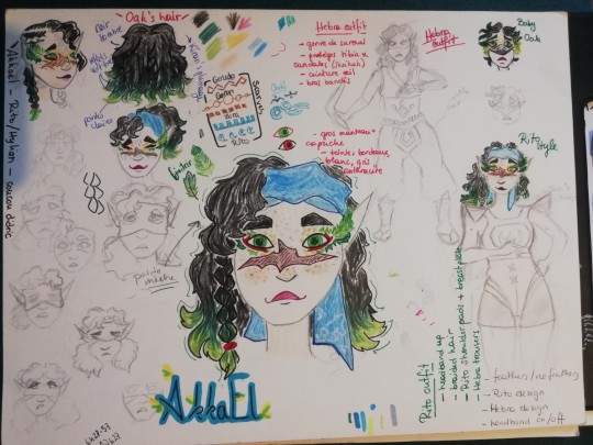
Giving a character recognisable features is just something I usually struggle with and Oak was no exception. The Hebra being people of the mountain and cold weather, I knew quite early on I wanted to base their design off the Inuits. That ended up evolving into something quite different that's really just my own style but the inspiration is still there. None of the sketches on this page really fitted what was on my mind. The big one at the centre helped me define the nature of their hair, its colour, and how the feathers would look like. The green ends on the hair and red outline on the eyes were ideas that came with the new design and were based off Kíran's. Hesitated on making their eyes red. The sketch labelled 'Rito style' still looked too Caucasian for my liking.
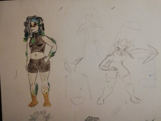
Same thing with this sketch on the the left. The face was not what I wanted, but it's still a good sketch to show their body features: Oak has wide hips and strong limbs from climbing. Their feet are sort of scaled and look like not fully-formed talons. They have feathers growing along their arms and calves and their body hair is dark green.
The one on the right at least set me on the path of what I wanted for the face and hairstyle.
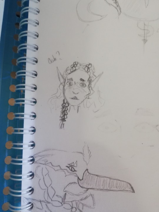
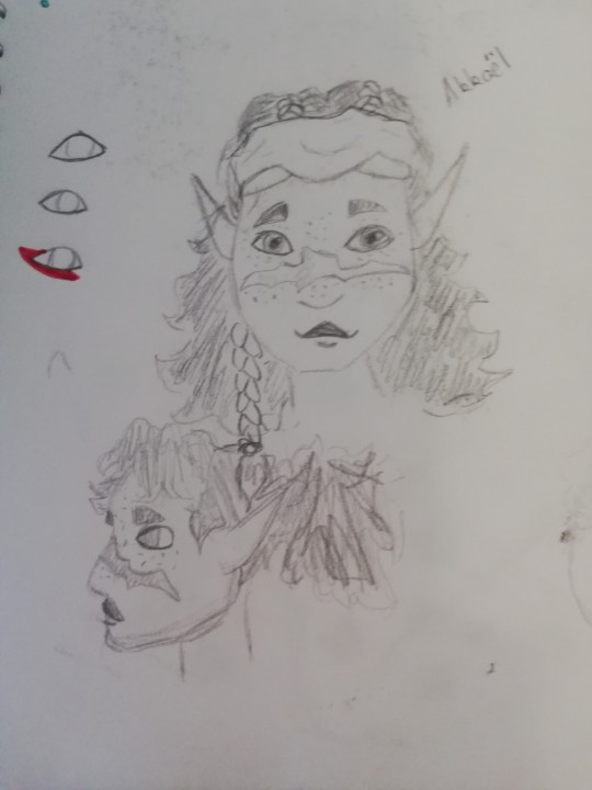
Tried a different face and eyes shape and this happened. Something clicked. I think it was the eyes. I tried drawing them higher up on the cheeks. The left one was still too Caucasian.
So then I drew this and it was super satisfying. Like when you can put a name on a face you'd thought you'd forgotten,
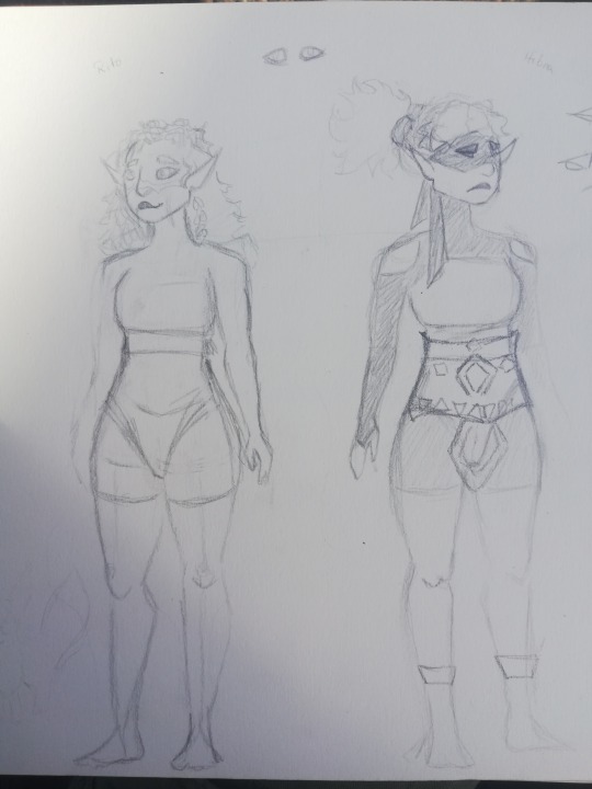
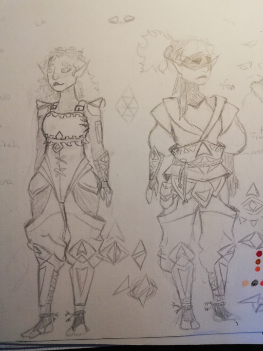
I love Oak´s nose and scar. They have a flat, rounded nose due to their former beak growing on top of it.
The Hebra and Rito outfits were a nasty piece of work and even now I'm not satisfied with how they turned out. For now, Oak´s Rito outfit consists merely of their Hebra trousers and the Rito breastplate they sell for Hylians. The fabric they wear is obviously Kíran's. Their hair is also loose as opposed to the ponytail they wear in their Hebra outfit. There´s a small mistake: they shouldn't be wearing the shoulder pads because they are an indication of a Rito's skills, according to whether they're still an apprentice or an accomplished warrior.
I went for that overlayered look with the Hebra outfit, hoping to recreate something in the style of the Inuits, again, although trying to keep it Zelda-like. I went back to the artbook and clothes references a lot while drawing this. There is much inspiration from the Sheikah, including their prior iterations. The Hebra outfit is meant to keep them warm but its moveable layers are meant to be adaptable. Given Hebra do a lot of climbing and goign in and out of caves, where the temperature is milder, I wanted to create an outfit that would easily adapt to all these apsects of their daily lives. Oak wears a face mask to hide their bird-like features but I don´t know yet if that´s just a common piece of the Hebra outfit.
I like the triangular motive. It gives off a nice touch to the outfit and is meant to be reminescent of the mountains. I figured Hebra probably use polar bear furr to make their clothes, hence the beige/white/grey colour scheme. But I also wanted the Hebra outfit to be easily recognisable as that of an enemy, hence the touch of red.
I kind ruined Oak´s face with the colouring but I'm thinking on touching the illustration up later, digitally.
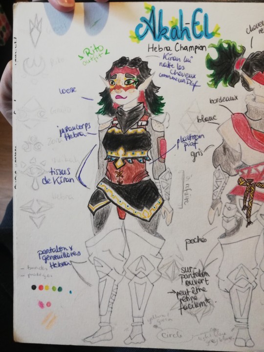
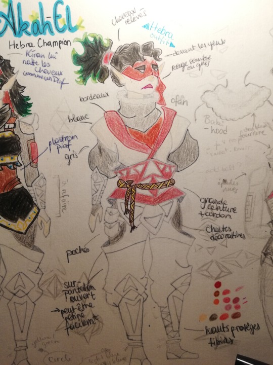
Overall, I think I succeeded in showing Oak´s duality in their features. They're probably still going to evolve as I grow more confident with my drawing skills, but for now I´m proud of the result.
Bonus sketches in terrible quality.
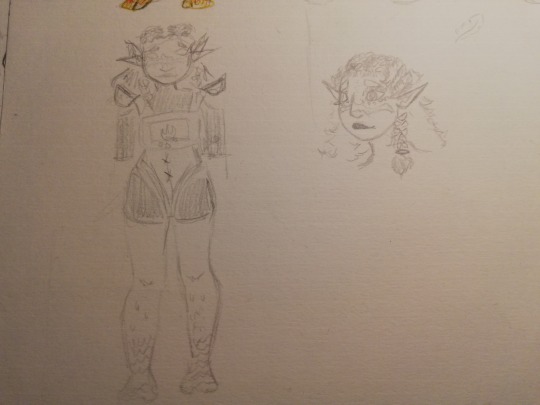
I know I said I´d post this back in early November but I love lying, now who knows when the next chapter might be dropping.
3 notes
·
View notes
Text

1 of 4 guest adoptables for Starsnares! (The sale is hosted on their IG post here)
Below is just a few notes on my thoughts working on this set.
Guesting for closed species!!! It's fun to shop around their trait lists and design without committing to owning the design haha. The mods are lovely and the critters are adorable, it was a great experience and I'm grateful for the opportunity 💕
The shading is experimental, I wanted to see if I could make it work (shaded final artwork while being able to turn off the shading entirely for flat colours) and I think it did pretty well across the entire set of 4, although...it certainly took longer than I'm probably going to earn from these...might have to workshop that a bit.
After going to Design Festa this year I'd been itching to play around with graphic design more so here's an attempt. I had fun with this - all four are composed differently on their graphics with a similar visual theme, split into 2 pairs of 2 adoptable design themes. Stars goes with sky/rainbows (I guess this is a day/night pair), sun goes with moon.
Also yeah I couldn't make this one a square. Or the next one, so I have to deal with awkward thumbnails. Instagram sux
A friend once said that if you don't have enough visual "noise" for a generic floating character kind of drawing and want to add more complexity without adding anything extra, turn on the sketch layer. I'm not sure if this is what they meant (probably not, they use it differently) but it was a lifesaver for filling in the empty spaces in the background.
I think it's really weird thinking that my primary platform for posting art is not dA now. RIP dA
#my art#adoptables#yeah I did have a particular naming scheme for these but the designs are not actually related to the reference
3 notes
·
View notes
Note
I adore your artstyle. I feel like I'm never happy with my own cause it looks so boring and unstylized. Got any good tips?
AHHH THANK YOU ANON!! <<333
And believe me, I’ve been in your shoes. Seriously. Even now, I still have 26474885 new things I want to try with my art and things I want to change. But I DO have some tips for you- hopefully theyre good tips!
So, I think one of the key things is looking at other artists and pulling their art apart.
Practice and spending the time actually creating art is important, but I’d argue that spending time analyzing art is equally important. I spend a lot of time looking at art, and then instead of just staring at it, I try and figure out what EXACT elements of it that I want to incorporate into my own work. For example, if I like the way somebody does lineart, and the way another person does their rendering, I’ll try and figure out how they did it & why I like it & try to combine it with the way another artist does rendering or lines/the way I want to do them. I spend a LOT of time pulling at apart, seriously. I send various pieces to my own private discord server channel & literally talk to myself about them and what exactly I like about them and how EXACTLY I want to change my own work. I do probably as much typing as I do drawing when it comes to art.
Also, a good question to ask yourself when you see a piece of art you like is “I like this art, BUT- do I want my art to look like this?”. There’s artists whose styles I ADORE, but I don’t want my art to look like theirs- for example, I love looking at people with super heavily stylized art with only flat colouring & no rendering, but it’s not how I want my art to look & isn’t the type of art that I enjoy creating.
So, being able to pull apart various pieces and go “okay, WHY do I like this piece and DO i want MY art to look like this?” is something that’s definitely helped me.
I also think it’s super important to set actual, solid goals and figure out what you want your art to do.
What I mean when I say “figure out what you want your art to do,” is in terms of “okay, well, do you want everything more flat and visible with less rendering and less volume? or more rendering and more volume? Do you want to focus on design/concept work? Do you want to be able to do complex poses or complex lighting or both? What matters more to you- having a painting with dramatic, heavily contrasting lighting, or having a style where everything is easily visible & not obscured by shadow, or some combination of the two? Do you want to be good at drawing couples? Complex backgrounds? Both? HOW do you want to draw those couples and complex backgrounds? Lots of volume? Minimal volume? Focus on lighting? Focus on lines? Somewhere in between? tc"
Personally, I try and visualize it as a give and take situation/a sliding scale with tradeoffs when it comes to stylization. On one side of my scale, I’ve got super linework-focused, flat colours art that’s more focused on shape and less focused on volume and minimal lighting. On the opposite side, I’ve got super rendered, painterly art with complex lighting. And I’ve been trying to find an ideal combination of the two, and that’s where the tradeoffs I mentioned come in.
My work used to be even MORE linework heavy than it is now/flatter (which is great, just not the direction I wanted to personally keep going), and I had SO much trouble doing painting/rendering and it frustrated me and I couldnt figure out why. But then, I realized I had to make a tradeoff- my complex linework didn’t work well for heavily rendered styles, because the sketches/drawings/lines for paintings on that “super rendered basically no visible linework” side of the art scale are generally meant to be more for function rather than form.
My lines weren’t serving the function they needed to, they weren’t doing the heavy lifting that they needed to, so the rest of the painting would collapse & wouldn’t work and I would get frustrated as all hell when trying to paint.
What I mean when I talk about the lines doing heavy lifting is what I said earlier with the sketches in painterly styles generally being more function over form. I needed to think of my lines as supporting the painting and acting more as a *map* for things like the lighting (see: shadow mapping) & as using fewer lines to make room for more volume (the tradeoff). My lines weren't doing that, I wasn't really thinking about where I was putting them/how I was using them/how they interacted with other elements of the piece (such as the lighting & how that affects the way I do lines).
I also highly highly highly recommend the book/resource "anatomy for sculptors"- you can find a bunch of excerpts from it on pinterest/all over the internet, but it really is a phenomenal resource and a unique resource IMO because it does a really great job of demonstrating the link between the anatomy vs the planes of the face/shapes that make up that anatomy, and bridging the gap between 2D shapes and 3D forms.
Also, just some basic tips that help me in general: -Your areas of detail should also be your areas of high contrast. This sounds more complicated than it actually is, but basically, it doesn't matter how much detail you put in a low-contrast area of a painting, because it won't show up (because it's low contrast). So, keeping your high contrast areas as your detail areas is a good thing to keep in mind, esp when working on more complex paintings. -General proportion "rules". I try and keep in mind some general rough tips like "the eyes should have the width of one eye between them," and "the face should be roughly the sized of a splayed out hand".
-Straights vs curves. I think about the straight lines vs the curved lines a LOT in my art.
-What works for me may not work for you. Different people think differently. What works for other artists may not work for either or us. What works for other artists may work great for you but not for me.
Also, experiment with different brushes. They DO make a difference. No brush will fix a lack of understanding of the fundamentals, but a brush that works for you will make those fundamentals easier to learn/apply. Personally, I draw with a combination of the default photoshop pressure opacity tapered airbrush and one of Ruan Jia's free textured square brushes.
And also, experiment with overlay layers/all those different types of layer. Seriously, that was a gamechanger for me, especially in terms of stylization and giving more of my art that warm feeling/look that it has. My art actually usually starts out very cool toned and I slowly warm it up via colour changes and various yellow (or other colours) overlay/soft light etc layers.
And I don’t say any of this to box you in/overwhelm you, just to give you a list of things I wish I knew sooner.
Also, I think people focus too much on having one consistent style. I 10000% understand needing to have a consistent style for commission purposes, but as far as just developing your art goes. just experiment and figure out what you like and what works best and the style WILL come.
ANYWAY! Hope this helped, I'm like half awake rn so it's not as coherent as I'd like it to be.
2 notes
·
View notes