#The color schemes and the outfits designed for each of them are really pretty
Explore tagged Tumblr posts


Text
Recently read @queenofthequillandink ’s DPxDC crossover fic Unearthed, Reborn
I got inspired to draw character sheets for Danny, Sam, Jason, and Jazz’s vigilante personas. Here’s a link to the author’s drawings of their outfits (these were a vital reference for me when doing this so thank you so much for sharing them Quill) More commentary (like 7+ paragraphs plus 2 images) about this project and the designs below the “keep reading” line.
None of these thoughts I have for each character are in order, but I have a lot of commentary for these since this project was a lot more conceptual than my normal work. I also just like talking about my art/design process. If you ever find yourself wondering at some point why an element from the original design wasn’t included, the answer is that the removal was completely intentional and part of my grandmaster vision for this work and wasn’t because I just forgot about it entirely during the design process.
————————————————————————
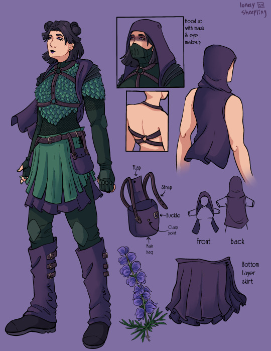
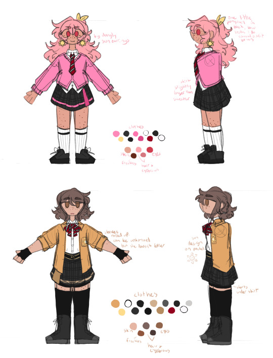
Aconite (Sam)
This was the first one I sketched out, I wasn’t even sure at the time if I was going to fully commit to drawing all of them. I thought that Sam was gonna be the hardest since her description was way longer than the others, but then bird boy beat her out. I took a lot of creative liberties with her design, the bag was added bc I couldn’t figure out how to add pockets to the skirt. I was trying to avoid a joker color scheme so I had a lot of ref images that I got by searching like “purple green aesthetic” on Pinterest. The dark purple and dark forest/blueish green won out in the end. I desaturated a lot of my colors for her just to get as far away from the neon Gotham rogue aesthetic. I also added the bdsm harness over the armor to add more punk elements to her design, I know that in real life that would be very uncomfortable to wear over scalemail armor but sometimes we take creative liberties when they look sick as fuck. Also, I didn’t realize until I went to look for a reference for aconite flowers that aconite is wolfsbane! That was neat to learn! Also, the font I used for Aconite is called “zai Art School Calendar 1931”, I’ve used this a few times for other projects, it’s one of my favorite fonts. The ‘zai’ fonts the creator has are all very good.
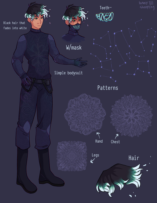
Shade (Danny)
There wasn't much to add to this page. His outfit is pretty simple (besides the patterning). I wasn’t sure how to pull of an optical illusion pattern but I was reminded how I sometimes get an eyestrain induced headache when looking at someone wearing a patterned shirt with really thin stripes so I just leaned into the idea of a small/detailed hard lined pattern. I originally made 5 separate patterns for him and then turned them into stamp brushes in procreate. I only ended up using three of them, the one on the chest, the one on the legs, and the one on his hand. But, I imagine the patterns fade and shift when he moves, sort of like a lenticular print. I gave him constellation freckles and stylized the hair’s fade into white. The hair was inspired by how time-woods draws Martin Blackwood’s hair (linked: time-woods’s fanart of Martin Blackwood). Also put way too much effort into the teeth on the mask. I just like the chunky teeth design. Oh yeah and the font I used for him is called “Typewriter_Condensed_Demi”
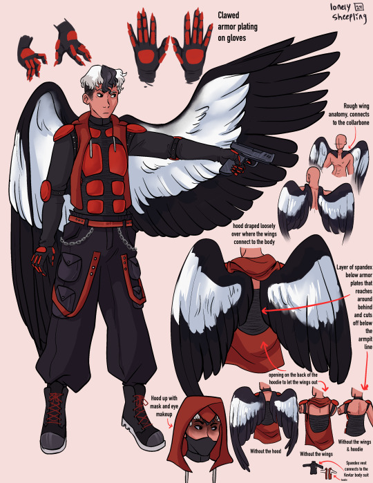
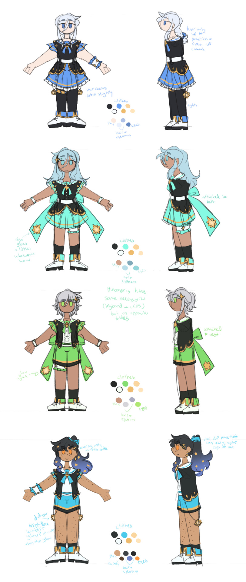
Erinys (Jason)
Repeatedly ran into the issue of not having enough canvas space bc of my fervent need to thoroughly document and plan out how the wings worked. I also reversed the colors for the bodysuit & armor so the under layer was black while the armor plates were red. I only realized afterwards that I may have been inspired by the red centipedes in Rain World (linked: gif of the red centipede, don’t click the link if you’re unsettled/afraid of bugs/insects), artists subconsciously draw inspiration from other artists all the time though so I’m not like upset about it. I stand by it because it looks sick as hell. Also leaned into the magpie theming for the wings. I think the vigilante form was supposed to be reverse magpie coloring? I can’t remember, but I stuck with normal magpie coloring. The anatomy of how the wings connected to the collarbone was inspired by JayEaton’s Magpie Bridge Project. Reference image link. Link to the article the image is from. I didn’t draw the wing armor because I couldn’t figure out how to would work with the wing anatomy and I ran out of canvas space. Finally, the font used for him is “DIN Condensed” this is a default font, I would’ve used something more punk but I needed the text to be legible.
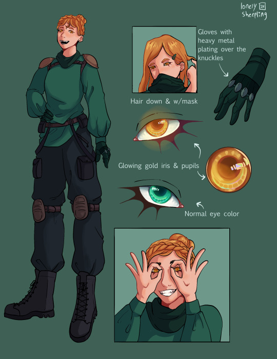
Insight (Jazz)
I did Jazz after I’d already finished the initial trio, so I had to switch to a new canvas for her bc I’d hit the layer limit multiple times on the previous one. I really do love doing that spiked under-eyelash thing with characters. Don’t know when that started. Anyway, I added the shoulder pads to her outfit to help break up the empty space. The golden eyes were a nice accent color since her design is very overwhelmingly green. Honestly the braid hairstyle and gold eyes really do obscure her identity, multiple times when drawing her I was worried that she didn’t really resemble Jazz enough. There wasn’t a drawing from the author for her so I only had the text description to go off of. I just realized that she sort of reminds me of a forest ranger and I don’t know what to do with that realization. I copy/pasted my drawing of her eyes when gold and recolored them to match her normal eye color. There were two layers for that, a hue shift and a hard light layer to emphasize the shadows.
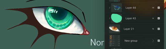
Here’s what it looks like without the hue shift:
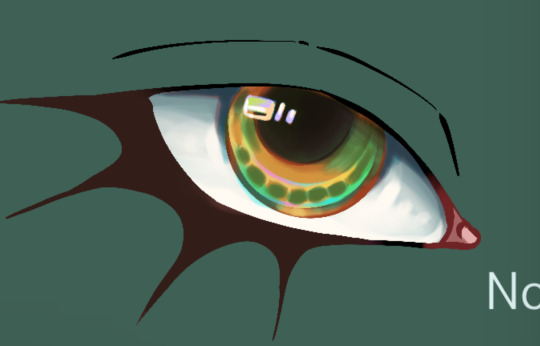
It looks really cool and I’m 100% that color combo in another drawing down the line. Oh yeah and the font used for this sheet was “Euphemia UCAS”. It comes with Apple’s operating system, I use it as a neutral default text most of the time bc it’s nicer than helvetica but not overly fancy like Times New Roman—and why am I talking about fonts. ——————————————————————— Anyway, this project was very fun to work on. The alt text for this was its own endeavor, hope the folks using screen-readers don’t mind 4-5 paragraphs of description text. Also, I cannot remember for the life of me if Dani got a costume description, but if she does I’ll make sure to update this image set with a sheet for her. And to the author, QueenOfTheQuill, if you’re reading this message that I’ve left at the very bottom of this post below a read more line, thank you for the fic. It’s very good and I’m glad I caught it during my slow decent into DPxDC brainrot. I love the interactions between Jason and Tim, it’s nice seeing a revived Jason that’s not bogged down by pit rage. They definitely seem like they could’ve been good friends if not for the unfortunate circumstances that led them to meet in canon. Also, I’m sure Jazz will love interacting with Batman and Nightwing. So much psychological & childhood trauma to unpack with them. Feel free to use/share these images if you so desire and thanks again for your work.
#art#art tag#digital art#my art#procreate#illustration#character design#fanart#dc#dc comics#jason todd#danny phantom#sam manson#jazz fenton#danny fenton#dpxdc#dp x dc crossover#alt text#id in alt text#alt text included#writing out the alt text for these was long and hard#but now that I’m finally back on my adhd medication I have the motivation to do it again#as always message me or comment if you have critiques regarding the alt text#character concepts#concept art#conceptual art#danny phantom fanart#danny phantom crossover#batman crossover#crossover fanart
498 notes
·
View notes
Text
matchy-matchy with seventeen
a/n: me in my single era pt 2093520395 and here’s me projecting just a little bit yk. also i tried really hard to make these creative i hope it went well

seungcheol: jackets
✧ specifically varsity jackets or those racing jackets
✧ maybe not exactly the same, maybe it’s the same style of jacket but in different, but complementary colors
✧ absolutely loves knowing that it’s so easy to tell that the two of you are a couple when you walk together
✧ his lock screen is a mirror picture of the two of you :’)
jeonghan: hair accessories
✧ matching hair accessories oh myyy
✧ it could be in simple barrettes or clips with little cutesy designs
✧ or ribbons !!
✧ one day he sees you tie back half of your hair (like a semi-updo) and he just asks you, “can you do that to me too?”
✧ you two can be dainty together 🫶🏽
joshua: rings
✧ perhaps he’s a simple romantic
✧ rings can go with any outfit and he wants a reminder with you everywhere he goes
✧ loves seeing his ring on his finger in all of his daily activities
✧ also loves to hold your hand to look at the ring on your finger only to follow with a soft kiss to the back of your hand too
jun: earrings
✧ maybe he’s a little more subtle with it
✧ but he finds earrings as an easy way to be connected with you, knowing you have the same pair
✧ all that matters to him is that it’s something that the two of you know about - and maybe others if they’re paying attention
hoshi: tiger phone cases
✧ ofc you support his tiger agenda and one day he just surprises you with matching tiger print phone cases
✧ falls a little more in love with you when you don’t hesitate to swap your current case with it LOL
✧ loves taking mirror selfies where you can see your cases and as the two of you make the tiger claw hand gesture
✧ if you’re with literally anyone else together, he’ll just grab both of your phones to go “look!”
wonwoo: headphones
✧ thought of this because he games but headphones are also pretty necessary in general
✧ you each pick sticker packs and you place some stickers on your own pair
✧ then you swap headphones and fill up the rest of the negative space of each other’s :’)
woozi: pajamas
✧ he’s someone who’s also very lowkey methinks
✧ he doesn’t feel the need to flaunt his relationship too much, or go out on his rest days either
✧ he likes the moments you have just between the two of you and pajamas are a cute way to still have that
✧ whether you’re cuddling on the couch or just walking around the house, his heart is content seeing your matching home outfits
seokmin: shoes
✧ just felt like this would be soooo cute with him
✧ it gives you both freedom with your outfits and individual styles but anyone looking at you two together would know that you’re dating
✧ he love love loves taking those pictures of your matching shoes
✧ maybe he even takes a short video for his story and you can tell he’s happy in it because he can’t stop his feet from doing a little dancey dance
mingyu: hoodies
✧ adores seeing the two of you matching so obviously in the reflection of windows, mirrors, etc. when the two of you are out
✧ takes so so many pictures of you two
✧ you definitely have more than one matching hoodie
✧ will fall in love with you more if matching couple clothes was your idea first LOL
minghao: nails
✧ i had to, i HAD TO, just imagine the two of you with the prettiest hands ever
✧ maybe he lets you pick a color first and then he’ll pick a second to complement it aaa
✧ and even if you aren’t too much of a nail person, maybe you just get one nail painted with a little image or design to match the color scheme of his
✧ also imagine the intimacy of painting each other’s nails and he’s holding your hand close to his face and blowing on your nails to dry them
seungkwan: bracelets
✧ the two of you make your matching bracelets at one of those shops meant for dates
✧ i just know he would try so hard !! to make yours so pretty
✧ his heart ACHES when you find these 2 bear charms to represent the two of you (so you can have a little bear of each other)
✧ “this one’s me and this one’s you, don’t you think?”
vernon: beanies
✧ he’s always giving you his beanies when it’s cold out anyway
✧ then on this day he’s shopping and he can’t pick between 2 options (they’re both the same 2 colors but in different combinations)
✧ vernon just gets both and lets you pick the one you like more
✧ he knows you’ll look good in either one :)
chan: crewneck/hoodie-sweatpants-set
✧ this is various things but here me out, he’s a dancer and he probably has a good amount of athleisure
✧ sometimes you visit him during his solo dance practices and he likes to try to convince you to dance with him
✧ one day you stopped by without the intention to dance and he just casually pulls out the set for you that coincidentally matched with his
✧ he’s so giddy when you change. so so many recordings of you dancing together (regardless of how coordinated the two of you actually are) and mirror selfies to capture your outfits
#seventeen#svt#seventeen headcanons#svt hcs#scoups x reader#jeonghan x reader#joshua x reader#jun x reader#hoshi x reader#wonwoo x reader#woozi x reader#mingyu x reader#dokyeom x reader#minghao x reader#seungkwan x reader#vernon x reader#dino x reader#scoups x you#jeonghan x you#joshua x you#jun x you#hoshi x you#wonwoo x you#woozi x you#mingyu x you#dokyeom x you#minghao x you#seungkwan x you#vernon x you#dino x you
2K notes
·
View notes
Text


I'm so excited to finally post this.
My full Murder Drones reference! so hopefully I can keep up consistency
Obviously, this is full of my own head canons so close ups and explanations under the cut (it's a LOT) >;]
To be totally honest my focus was on the main characters, and I think that shows in the designs of the Manor Drones and Cabin Fever Squad. BUT I'll still do my best to explain my process here.
For the Disassemblers I decided to do very different builds for each but the same color pallet.
My idea here was that since each have a different designation letter, that was akin to their model type. That's also why "the company" was able to clone J so easily, they just had her model on file. (also like to imagine there are 26 different forms of the Disassemblers Imao).
I had all the colors remain the same to show their unity and of course the Absolute Solver-ification of the basic Worker Drone color scheme. Essentially, I just took the monochromatic WD colors and put the highlighter yellow over it that Cyn loves so much.


For J I did a more lean and strong build. I wanted her to exude that leader energy. I also made her Core a star shape for similar reasons and then I also noticed that N and V had caution stripes at the top of their legs but as far as I could see J didn't, so I decided to add those to the very top of her legs to finish the garter belt look she's got going on. For her hair, I actually really like the pigtails I just flattened them out a bit because the big cutesy poof they had didn't fit her style in my opinion. I brought it back for her worker form though.
With V I gave her a round yet sharp look. (My favorite added detail is the sharp shoulders) I did make her the shortest of the DD because everyone loves the small but vicious archetype. For her core I made it a sword or spear shape, because she's extra violent. And finally, I made her legs a little more pointed than J's to finish off the sharp look.
Last but CERTAINLY not least, N's design is meant to be soft and plushy but still has a little edge to it. His hair is fluffy but the tufts curl to be sharp, His core is meant to look like a heart but it's upside down so the point is still facing the top (which makes it look more like a club but whatever) I gave him a rounder torso than the other two and his elbow and kneecaps are softer too. His general construction is still menacing, though, so don't get too comfortable with all the fluff. I also spent a LONG time contemplating if I should make his thighs black to look like little biker shorts to contrast with J and V's sock looks but went against it because I love how the hazard stripes stand out against the white.
For N and V's worker forms I basically took out all the sharp edges and rounded them out. J's still a little sharp though not as much.


With the Workers I did the opposite of the DD. They have the EXACT same body types (minus Uzi because she's little) and instead I changed their color schemes to all be unique to their eye lights
Since Worker Drones were made to... well... WORK I think their initial manufacturing would be pretty uniform. A copy and paste if you will. It was only when they were left to their own devices that the WD started to customize themselves. Thus came the wigs and clothes.
I like to think the color started with those infected with the Solver, so Yeva and Nori gained color and then passed that on to their kids. Thats also why Alice has color, but Khan, The Manor Squad, and some other drones in the colony don't. Does not explain Lizzy and Thad though (maybe they have a distant relative that had the solver idk)
It was a lot harder to infer about what a base WD body would look like Maybe I was just looking in the wrong places, but I had to infer with things like the worker helmets, we see every WD except Uzi wear one but they seem more coordinated with their outfits so I decided to just continue my color head-canon that its naturally monochrome and you can customize it if you want to!
I added a light to the feet of the worker drones to match the hand lights. I don't think there's a canon reason for the lights but, on the workers at least. I think they're there to help them do grunt work in the dark! to light their ways in caves or tight spaces so they could do their job better. Now they're just another robot cosmetic

For the Parents, I gave them wrinkles because I thought it was unfair that Khan was the only one who got them. So, Nori gets crow's feet hurray! No but I probably had the most difficult time with these drones. It was hard to separate the canon from fanon since we know so little about them, but I fought off all the demons to keep their designs relatively grounded. Minus Khan's scar. And Alice's more natural horns. and-
I also gave some drones eyelashes. just cause. if I thought it fit, I added it and if it didn't, I didn't add it.
Now you may be wondering "Lexo what's up with all the cracks!?" the idea here is that it's the solver taking over. We see in Cabin Fever and Home that the solver virus fundamentally changes the body of a drone. The crack in the casing is basically this process. Depending on the stage of which your drone is at it changes the intensity. We see Cyn being the main host and essentially patient 0, so she has the most cracks. It starts at the core then spreads until it reshapes you entirely and you become a Disassembly Drone. Unless you stop it in time. Thats why J, V, and N have the pale lines on the bottom of their torso, they're more pretty and cleaner since they achieved the solvers "final form" so to speak. Nori and Yeva on the other hand, have repaired cracks but they're still messy since they were stopped mid-way. Alice, however, did not stop the spread with the solver cure since she was "abandoned" so instead she just cut out her core entirely. Yup. Shes functioning on pure insanity and spite at this point. And then of course with the new hosts, there is light spreading. TL: DR the cracks are a zombie bite.

But that's it for my Murder Drones head canons and designs! If you read all the way to the end, you're a champ and I love you. Have a cookie superstar <3🍪
#my art#I contemplated not posting this because I thought people might be weird but I spent so long on it I couldnt not post it#so don't be weird please#nonsexual nudity#murder drones anatomy#murder drones#murder drones fandom#murder drones art#murder drones fanart#serial designation j#serial designation v#serial designation n#uzi doorman#thad murder drones#lizzy murder drones#doll murder drones#maid v#maid j#butler n#crowzi#cyn murder drones#tessa james elliot#khan doorman#nori doorman#yeva murder drones#yeva's husband#LIAM GIVE OUR BOY A NAME!!#alice murder drones#beau murder drones#welp gangs all here folks. thanks for readin 👋
181 notes
·
View notes
Text
Color Theory in Cinderella Boy
There’s some silly stuff happening with colors, and in this probably brainrot post, I will be using my art brain to over analyze the heck outta this (for those who are interested, though I find it fascinating!)
**This post includes a scene from todays new ep (53), so make sure you read that first!**
So, I first stumbled upon this discovery sorta by accident. I use Clip Studio Paint for my artwork, and I often end up with an average to 30-50 layers per drawing, and thankfully Clip Studio has an option to color-code your layers to make things more manageable.
For my CB drawings, I defaulted to using green for Chase, purple for Buddy, and blue for Deacon. It made sense to me, because of the casts ‘default’ outfits feature these colors:
We can also see these colors in some book outfits:
Chase’s green outfit in We Need to Talk About Buddy, Deacons shirt in Beach Boys, and the blue accents in All That Glitters
What I noticed though, was that these aren’t the only colors they are seen in, and in fact, out of all the other colors, two in particular stand out

Specifically, pink for Chase, and orange for Deacon
Something to note is that these colors are nearly perfect complementary colors to each other. Even Prunella seems to have this theme, with her red hair and green shirt.
Now, it is generally good for character design for outfits to have good complementary colors to make them stand out, but me thinks that Punko went even further with this.
The thing is, Buddy really only has purple in his color scheme (unless out count every shade of gray and black).
We see him in some other colors, but mainly it’s purple:
Like, a lot of purple.
(Other examples include Toffee Break, Beach boys, Sick Day, etc)
Pretty much all but two of Buddy’s ten outfits have included some element of purple.
But then again, up until recently, he’s only been a villain. A foil to Chase. The black and purple suited him, for a while, because he was only ‘evil’. (This also leads me to believe that future Ex Libris members will also wear black in their outfits to fit on theme. In Dreams by Day, a presumably Ex Libris worker is wearing a black shirt).
But now? It’s Buddy’s story too. He is becoming a protagonist. And that means getting a new color, possibly one that compliments purple.
And what color flowers bloomed when Chase saved him?
Yellow.
This is leading me to believe that Buddy will have a major character shift at the end of season 1 / beginning of season 2, where yellow is included in his outfit colors. And maybe, S2 will feature Buddy’s story more as he becomes a protagonist ‘,:3
TL;DR: Colors are important to CB characters, and Buddy is gonna be a protagonist soon.
I’ve actually been forming this theory of mine since like, the beginning of October, and the amount of serotonin that filled my brain when I saw those flowers, and seeing that my theories may be true could literally flood a city.
Thank u for reading :D
140 notes
·
View notes
Text
Hey all! Sorry for the long absence here, life has been kicking my ass 😅
But I did finally pick up the tablet again, and I've been working on some things. I've been interested in character redesigns so thought I'd try it with some of my favorites (and some old OCs no one's seen yet or in a while). So if you're interested in seeing them sooner, please do drop by my patreon!
Notes:
Anti Comso and his family were my favorite villains in Fairly Oddparents (even when they kinda just...vanished along with every other previous villain that wasn't "relevant") Always thought it was a missed opportunity that we never got them acting ad a villainous family unit. Evil vacations, family bonding thru world conquest scheming, board game nights! C'mon it coulda been great!
Anti Cosmo-- some outfit changes, wanted to break away from the all navy blue color scheme a bit to make him really stand out more among the masses. Also wanted him to have a legitimate crown since...dude is the ruler of the race he deserves a cool ass crown. Made it reminiscent of a salt shaker, put a little upside horseshoe, and the number 13 for bad luck vibes. Alsoooo put some runes in there to symbolize "great protector", because even tho he's a menace....his plans are all focused on freeing his kind so they can do their thing. Just saying, if I had control of these characters, I'd probably be delving more into their place in the world.
Anti Poof (because I'm not calling him Foop)-- gave him a real body, and wanted to try and style his hair after both parents? Make him look a bit more like their kid ya know. Pretty simple design, cute lil onesie. Gave him a rattle instead to mirror Poof more, but cube instead of rounded. Styled it after a dice, and each side has an ailment he can inflict on people. Pink eye, stubbed toe, etc. In my version he's around his folks a lot more, but tries to keep himself presented as an independent person; he's a big boy he don't need no parents (the self proclaimed big boy says as he's burped like the 1 year old he is)
Anti Wanda-- the biggest changes, obviously. The show had some faults...like the constant fat jokes (cough fuck you Bitch Fartman). So out of spite, she's a chubby queen and her twink of a husband adores her every time she nearly snaps his spine. She's not the smartest, but she brings the muscle to Anti Cosmo's brains.
And of course, gave em all tails. Because they're cute, sue me.
#digital illustration#artists on tumblr#character redesign#anti cosmo#anti wanda#foop#fairly oddparents#anti fairies#anti poof
205 notes
·
View notes
Text


4 dreamtale redesigns done!
A bunch of words explaining designs and everything below the cut.
Also plz forgive me for misconceptions, I'm writing this at almost 4:am and I'm not well versed in dreamtale lore.
I see nothing wrong with the original designs, they just don't fit with my style. Dream's colors didn't really sit with my art well, and I always felt unsatisfied with the results, so I changed it a bit. Plus, the little... Glove/shoe cuff things???? Took too many layers and were a bit hard to add, so I wanted a design without cuffs... At the expense of overcomplicating Nightmare because I had my mind deadset on giving him cool whispy cape things. There were also the crowns... Circlets... Whatever.
I personally didn't like Nightmare's crown designs, but I dislike even more that it doesn't parallel Dream's crown. One's a moon, and the other... Isn't. Even though they have a sun and moon motif. So, I just made them a bit different, to both make them parallel visually, and fit with the rest of the redesign.
I also just really wanted to draw shawls and ponchos.
Ok, separate explanations.
Dream's palette was designed to be a bit softer, less of a stand out yellow. Like a warm sunny day. Still a happy, light color scheme, but more subdued and mature than his more playful younger self, which, while it has similar colors, was meant to portray much more of a stand out color scheme. At the same time, I did want the older and younger outfits to pay homage to each other. There's the crown, sure, but there's also the shoes, similar stripes on the shirt, and the poncho » shawl change is meant to look somewhat similar.
Nightmare time!
His Corrupted form is meant to mimic his younger self much less. I feel as though Nightmare would try to disconnect himself from his younger counterpart. No crown. No shoe apples. No matching colors.
His passive colors are meant to portray a much more quiet and subdued feel to him. Someone who doesn't want to stand out. It was also meant to be what I perceive as sleepy colors (I feel sleepy writing this, I'm going to pass out so hard as soon as I hit post).
HOWEVER, you may notice that Nightmare's shawl is pretty close, save for the colors. That's the only connection I wanted there to be, just a general shape that's consistent over both designs, connecting them without being super obvious.
Edit: sorry for the cut off, I fell asleep while writing this. Editing in the morning.
In conclusion, the hardest part of drawing these, was trying not to post them one by one.
#art#artists on tumblr#artwork#digital art#digital drawing#goopyart#undertale au#dreamtale nightmare#dream sans#dreamtale#dreamtale dream#passive nightmare sans#passive nightmare#nightmare#dream#reference sheet#ref sheet#character reference sheet#fan redesign#long post.#i almost fell asleep writing this#rambles#nightmare sans#sans au#au sans
55 notes
·
View notes
Text
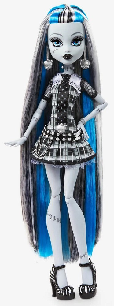
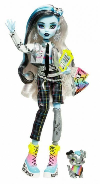
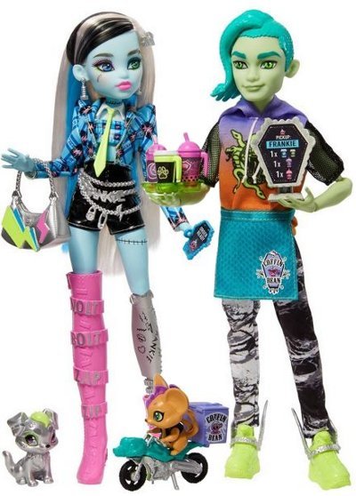
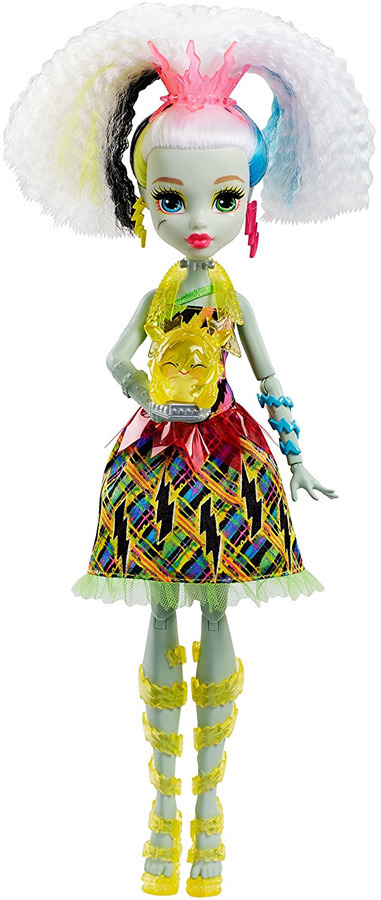
Mewmew and I have been bonding over our inexplicable love of Monster High... so I went through a list of MH dolls to pick my favorites. I started off trying to limit the number of dolls of each character I would save but I went a lil wild... lol
PART 1!
FRANKIE (The black/white/red one is kinda weird cuz those arent their colors.... but it still is cute.)-


THE WORST ONE-
Look how they massacred my them
Abby-
I think shes a victim of me trying to keep it reasonable cuz Im sure I liked a couple others. but I like her.

Operetta- You might think the bright red with the pink might bother me... and youre right but sometimes the bitch just SERVES. I cant help it.


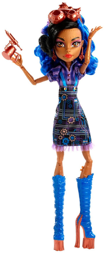
Robecca- ...NGL... I love this bitch. I like the more dusty bronze over the brighter bronze... but it could just be picture lighting??? IDK but I love this bitch.

Kjersti- I LOVE THIS LITTLE TROLL BITCH. Shes so cute... Does she have no other dolls? When I looked her up there was a Reddit post that said 'Why all the Kjersti hate' They could never make me hate you Kjersti.

River- I dont necessarily like the fashion but her base design is SO COOL. I also like the colors.
Jinafire- This bitch is so cool. I do think the designers bit off more than they can chew with her color scheme tho...It seems hard for them to balance. LMAO. Shes so cunty tho.


Wydowna- Cunty. I want a million more dolls of this wacky broad.

Ghoulia- Im gonna be honest... this bitch is my mortal enemy... but she does have 1 (one) doll that I liked. LMAO I also like her name LOL.

Casta- Goofy as her name is... shes kinda serving.

Avea- SO FUCKIN COOL. I wish the color on her wings was blue or red or just solid black instead of green.... but w/e tho.

Luna- IDKY this bitch is yellow but she is cute. At least this doll is cute anyways.

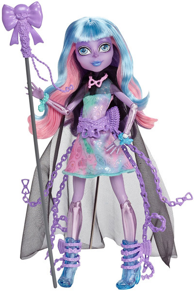
Viperine- Love her base design and her outfit here is pretty cute.

These fusions- Of course I like the Cleo and Drac ones... but I also really love Tora and Rob... so... I feel like I SHOULDNT like the Tora/Cleo one but for some reason the colors tickle my brain. She looks like shes being lit up by blacklight.


The worst- Look how they massacred my girls....

Twyla- SUCH a cute doll. Drac could never(apparently)
Toralei- My GAL!! Shes so cute. I dont like when they give her long hair. I like her straight bob.

27 notes
·
View notes
Text
Feast of the Exceptional Rose - 2025 1899


This year's feast has many handsome strangers with intriguing tales to share. Perhaps one would enjoy your company?
Approach a Devilish Claywoman The quartz in her skin glitters beautifully against her gilded dress, but those cracks and the horns remind you of the danger she presents.
Join a Well-Intentioned Thief That scandalous outfit just barely distracts from their hands sneaking into your pockets. They could certainly make use of a partner in crime.
Escort an Insatiable Ingenue She looks a bit young for this crowd, and her mind doesn't seem entirely clear. Someone would probably be in your debt if you kept her out of trouble.
------------------------------------------------------
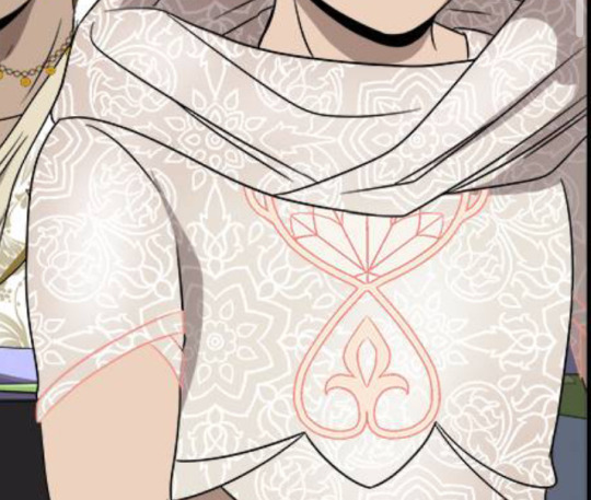
Another event, another excuse to draw my PCs in pretty outfits! And the masked ball gives me a chance to go all out.
I started by searching through mochipan's catalogue of designs for inspiration. Sibyl's dress is even a direct rip of their vampire overcoat design. But I didn't want to make them ALL red or rose themed, so I was left with the question of where to start. Then it hit me.
The cameo frames.
So yeah I designed their outfits after each of their respective cameo frames, which was a really fun exercise in putting them in colors I would usually avoid. Most notably bright gold isn't usually what I'd go for with Fae; I tend to default to monochromes and blue to stay neutral with her skin and hair's color scheme. However I found the gold actually complimented her quite beautifully. She sort of reminds me of lapis lazuli with that combination.
I do kinda wish I had a fourth character only to complete the set with that spider/candle themed one, but meh. I have some non-pc characters but nobody I felt like drawing and I don't want to make a fourth account for the foreseeable future.
This is my first Feast, so I'm excited to learn more about it! Hope you're all having fun this year too.
Used photos for reference, also- Going to hesitantly tag @neathyfashioncoalition in case Feast of the Rose outfits are covered by the current winter prompt. If not though, no worries.
#these outfits are not historically accurate at all lmao#but the neath is a weird place and I like drawing lolita-esque fashion#also I considered putting links to their profiles but I don't really want that getting out of control#but within reason I'm open to people here friending me in the game so lemme know if you want a link or try to find them manually yourself#only thing I'd say is unless you're like a really close friend of mine I'm probably going to put a limit like only one of my PCs per person#as in you wouldn't be able to friend all three of them on one account so choose wisely#and at the moment I'm mainly focusing on Emery overall#Fallen London#Feast of the Exceptional Rose#Feast of the Rose#Fallen London OC#Fae Ghuleh#Emery Ender#Sibyl Bierce#my art#my post
22 notes
·
View notes
Text
Earth and Sky: Rosalace Symbolism

So as anyone who's been following me for a while knows, I associate roses/apples with Rosalyn and stars with Ace. Here's a bit of a breakdown of their symbolism and what it says about their relationship
Rosalyn and the Earth
Roses
So I associate Rosalyn with Roses because of her name and color scheme. But there's actually a little more to it. Roses are associated with beauty and more importantly love. But it is also important to note that roses have thorns, which in my opinion represents Rosalyn's loving side that she's kept guarded up due to being hurt before (i.e. Jocelyn bullying her, Ace betraying her). She's lovely and welcoming from a distance but has to protect herself.
Apples
After changing Rosalyn's design I noticed a lot of people point out that her color scheme reminded them of an apple, so I decided to make that part of her symbolism as well. Commonly associated with school/education, the apple represents Rosalyn's knowledge and connection with the educational system. This in turn makes sense given Rosalyn's dedication to her school. Additionally, let's think about the taste of apples. Some are sweet, others are sour. I like to think this variety of tastes in apples is a nod to Rosalyn's mixed feelings towards Ace post betrayal. She's "sweet" in the sense that she still carries romantic feelings for him and wants to be around him, but feels "sour" in the sense that Ace's betrayal continues to leave a weird taste in her mouth and she's reluctant to go back for more.
The earth
All in all, both the rose and the apple are parts of nature that grow from the soil beneath them. I believe this represents Rosalyn's connection to her world, namely her community in the town. She's grounded, knowledgeable, and loving, but also tough, defensive, and complex.
Ace and the Sky
The stars
So I chose stars to represent Ace because of the badge on his outfit. I think there's a double meaning behind Ace being represented by the stars. The stars are associated with Ace's ambitious goals and his desire to shine among his peers. He feels the need to be great, greater than others to stand out and be recognized. However, stars are also really far away from the earth, which may indicate Ace's initial distance from friendship and love in the quest to achieve his goals. While he's trying to be the best and be noticed, he's all on his own without anyone else in his corner because what he's reaching for has caused him to lose sight of what is important to him.
The Sky
The stars exist in the vast, expansive sky, filled with potential for dreams, ideas, and possibilities. Ace has high aspirations for himself. While the sky holds all this potential, again it can be pretty lonely and isolating. Ace isolates himself in the hopes that he will be able to reach his goals. Even if he succeeded in his betrayal, he'd end up all alone.
The Earth and Sky
Together, Rosalyn and Ace represent the balance between aspiration and practicality. Sometimes, this creates friction between the two of them. Rosalyn's attachment to her school, her community, can come off as stifling to Ace who wants to go beyond high school politics and aims to push Rosalyn beyond that as well. On the other hand, Ace's lofty dreams put distance between him and Rosalyn and make him unreachable to him.
But there are positive aspects to this dynamic. Rosalyn is Ace's emotional grounding and helps him to see what he tends to overlook, and Ace encourages Rosalyn to want to be more than what she sees in front of her. The earth and the sky need each other, together they keep the harmony. The Earth without the sky remains stagnant and unchanging, and the sky without the Earth is aimless and lonely.
Not only do the earth and the sky need each other, WE the people need the earth and the sky. Ace and Rosalyn bring a lot of good to their community with their different strengths. They help to maintain, cultivate, and develop their community.
#hss prime#otp: rosalace#oc: rosalyn brinkwater#everything's coming up rosie#ace de la cruz#addae art#ecur
12 notes
·
View notes
Note
Is it me or are the new outfits simpler? Like old ones had a lot of tiny useless details all around, the new ones look "cleaner" in comparison. It's not bad I kinda like it but it definitely feels weird
Before we start I just wanna say that I kinda critically analysed the costume designs instead of you know. just talking about the details. cool here we go
Yeah aside from VBS they all feel so. Plain, I guess? MMJ’s outfits probably the worst instance, imo they felt more same-y than before and I get they’re an idol unit so they were gonna be uniform but there’s something off. It’s the blue, I get that it’s probably a nod to the blue penlights, but using green or their respective image colors would’ve been better I think. You can barely even see Haruka or Shizuku's image colors on the skirts. Honestly I don’t think the accessories are that bad, they’re pretty cute and fit the group, though the costume being so plain outside of them just makes it look like there should be more. the thing is the outfits aren't the same, they have different skirts and shirts like the original it's just the fact that they all have the same color scheme and similar-enough accessories that it makes the differences less noticable. their image colors should've been the primary or secondary color not the tertiary color.
Leo/need I can get being more uniform, it goes with their whole thing, and I liked how there’s still a lot of details to differentiate them and give them personality. Honestly their original color scheme was pretty basic but making their image colors the secondary colors instead of of the primary colors of their outfit? it just wasn't it. honestly it wouldn't be too bad if the grey wasn't such an ugly color it looks really bad. if they'd gone with black or a much darker grey for the blazers it would've looked so much better and made the accents stand out more. also, the lack of accessories... i get they're more "professional and mature" but their outfits are quite boring, especially next to Miku's. If all of them had a big star armband like Honami or even had a bigger star buckle anywhere (like on a belt) it would look a bit nicer.
WxS was an improvement from Leo/need maybe? The outfits are definitely the most detailed so far, and they had a lot of personality. I like that they kept the original theme of character types (Rui being a villain, Nene being a fairy, etc), and it's not hard to tell what role each of them are meant to be (except emu but it wasn't obvious what hers was in the first place). I think Tsukasa's fits his personality quite well; he plays hero roles so he has a prince sort of outfit, he's the leader so he's got the sash, and he usually dresses very smart. it's very plain though, definitely could've done with brighter colors on the accessories, and maybe keeping the belt charm. also the jacket and trousers being the same color without much to separate them and balance it out doesn't look great. emu and nene's are both better, the color palettes are really nice and their outfits aren't plain holy shit. Emu's fits her personality really well - just by looking you can tell she's a fun and positive person. Rui's is probably the one i'd say is best out of the bunch. I know we can't see the front but the asymmetry and use of black in the color palette makes it stand out a lot and really adds something that the others were lacking. it's a very good villain outfit as well.
N25's were simple, but managed to actually pull it off. they didn't feel really plain compared to some of the other units despite actually being pretty plain. their outfits were always dark, and that hasn't changed, but making the colors more murky adds an extra layer to it. the addition of the flower patterns really adds something to take away the plainess of the original outfits, as well as adding relevant symbolism. Mafuyu's especially stands out being the lightest color and being the most ragged. It tells you she's different, she appears bright and perfect at first, but when you look further down, she's damaged. The image colors could've done with being a bit brighter maybe but other than that these are pretty good.
VBS outfits are actually really good. There I said it. They're able to feel cohesive as a group while still managing to reflect the individuality of each members and not be plain. The outfits fit their personal styles really well, Kohane's more girly, An's more cool and mature, Akito's sporty and active and Toya's more smart but still has the street look. Despite their outfits looking totally different, you can tell they're a unit because of the reddish-pink accents on all their outfits and also using white as a unifying color. i know i complained about the white making the other outfits plain but it's far more balanced out here and isn't as in-your-face. it isn't like MMJ and WxS that have white as their main outfit color. With VBS it's just one white item of clothing: Kohane's sweater, An's cargos, Akito's hoodie and Toya's tshirt. it's incorporated in a very natural way and isn't overly prominent. their image colors and other colors are used just as much in the outfits to balance it out. they have the best balance undoubtedly. even the accessories, they aren't big and there's not a whole lot of them, but the outfits already have a lot going on so they don't need to be complex, they're just there to add something extra.
There’s too much white.
115 notes
·
View notes
Text


so i like the april fools shuffle units a normal amount. i have done redesigns for almost all of them and i draw them A Lot.
rambling additional notes on all of the redesigns below
a couple notes if you ever want to draw any of these redesigns for yourself at any point: i'd appreciate being credited for these redesigns (obviously anyone not redesigned i don't need credit for lol) and you don't need to follow my specific skin tone + hair/eye color schemes i have laid out. those are how i personally like to draw the characters and i've included them for anyone who might want to stay completely accurate to my redesigns, but you're welcome to use your own preferred color schemes for the cast when drawing them with these outfits!
now onto the fun(?) stuff
aoharu is pretty straightforward with redesigns, its basically just leoni but with a sun theme instead of stars. adding the image for the color palettes for the unchanged designs just because it has the notes for ichisaki too (their changes were too minor to completely redraw them, in my opinion).
ichika remains entirely unchanged design-wise other than adding a sun pin to her suspenders. saki stays mostly the same too, other than changing the design on her armband and switching her pigtails for a ponytail (in an attempt to seem a little more mature/imitate airi's hairstyle/move on from her childhood self since she's started to believe that honami and shiho want nothing to do with her and ichika anymore).
not too much to say about airi and ena's outfits either, i wanted to go a little more cute with airi and cool with ena, but there's minor changes with both of their hairstyles, with airi switching her pigtails for a ponytail as well (moving on from her idol days but still maintaining her usual sort of style) and ena's hair being a bit longer/messier.

yyj is definitely the most drastic, they're the only unit where i changed every single character... i have a lot of trouble drawing the mmj outfits, but also the lighter color scheme and clover theme just didn't really make sense for yyj to me? so instead i went with a mainly black and character color combo for their color schemes, alongside gold and white to accent it and a more spacey/dreamlike theme. everyone's black and white are slightly tinted with their character colors too!
they're split into pairs for matching accessories, but it doesn't mean much otherwise. kanade and an both have the dangling star charms and a single larger wristband (with those being on opposite sides from each other) as well as no buttons on the front of their outfits, while both hinomoris have the large bows on the backs of their outfits, smaller wristbands on both arms, a legband, and star shaped clips (like the other pair, the clips and legbands are on opposite sides from each other) and they do have buttons. they're split differently for the same style outfits though, with kanade/shizuku and shiho/an being the matching pairs this way.
kanade has the most obvious design changes. i swapped her character color to a medium-light blue rather than red, because tbh she kind of stood out too much if she was still red. she's not meant to be the leader of the unit, she doesn't want to stand out. her hair is a lot shorter than canon and she usually keeps it braided for practice and performances (and leaves it loose otherwise) (both the haircut and style were initially suggestions from shizuku). shes the only member of the unit to wear tights and to lack any star shaped hair accessories.
shizuku i don't have that much to say about, i had designed kanade first and then shizuku to match. its pretty straight forward i think? she's got the tallest socks not counting kanade's tights though.
for both an and shiho i wanted to go a slightly cooler/less feminine direction, while still sticking to the general theme i had going. which lead to the shorts and vest combo! otherwise the only notable change with either of them is that an's changed her clips to two regular gold ones and she's got a ponytail now when they practice/perform, much like kanade's braid.
fts was both very fun and an absolute pain to redesign because on one hand, i can do whatever i want, on the other hand, it's like vbs there's really no consistent theme to carry through everything. except a lot of layers i guess. so my goal was to kind of merge their casual aesthetics with something more vbs-like.
tsukasa wearing his jacket incorrectly was inspired by my own tendency to do so whenever i get too warm. i think he just does it because he thinks it looks cool though (its a little silly and a pain to keep it on but he's committed to the look). also leaving his middle layer as his fish jacket from his casual sprite was a funny little thing i thought worked for him.
with rui my goal was just pockets. lots of pockets. they're probably hiding little robots and tools in those pockets. i should have put more pockets on their pants too but oh well. combine that with wanting some obnoxious bright greens and blues and at least one item that kind of clashed color-wise with the rest (their pants in this case) and this is the result. the sketch doesn't convey it well but their black jacket and pants are both kind of loose, while the green hoodie and tshirt underneath fit okay. also their hair is kind of long if they ever untied it, but no one ever sees that.
hapisen for the most part sticks to their canon sprites, just simplified slightly for my sanity. mafuyu's costume still drives me insane to draw though, that's so many layers to think about.
other than questioning my sanity every time i draw mafuyu, there's only one change from her sprite, which is making her hairtie one decorated with pompoms much like a lot of other parts of her costume. i just thought it tied things together a little more.
the upper half of haruka's outfit is more or less completely unchanged (other than making it fit in a way that looks slightly more masculine), but then i replaced his skirt with pants and gave him boots (wxs meiko, who is the sprite haruka's outfit is originally just a recolor of, wears heels). i figured if i was going for a more princely sort of design for haruka then changing those felt fitting. beyond that he's obviously got shorter hair (a choice he makes after seeing kohane decide to change herself, wanting to embrace the genuine person he wants to be beyond the idol people knew him as) and that's about it. hits this guy with the transgender beam.
kohane's outfit is really just a bit simplified from the original with sizing/proportions of elements adjusted to (in my opinion) suit her better. the ribbons in her hair felt like a cute addition (and i like to give kohane ribbons in general), while her hair length is an in between of her two standard canon ones, longer than the usual one we see but shorter than pre-canon/early mainstory. her glasses are optional, she changes between them and contacts with how she's feeling for the day and what kind of shows hapisen is planning. the more intense the show, the less likely she is to wear her glasses.
kyushumi was kind of intended as niigo but without one member in a mostly white outfit since they don't have someone like kanade who is intentionally trying to save people. although they're also a little happier off anyway, so they don't need someone like that. they're my most drawn shuffle unit, so also probably my most thought-through redesigns.
each design takes slight inspiration from a member of niigo (nene/kanade, minori/ena, honami/mafuyu), but that was just kind of as a personal guide for what kind of vibes to go with for the outfits. they've all got personal touches to them.
nene's hoodie is very loose on her body and arms, but a normal fit in the length, and her shorts are actually long enough to be seen. she just wants to be comfy, she's tired a lot, very low energy girl. glasses because i think nene should wear glasses anyway, so as opposed to canon nene who i like to believe just favors contacts, this nene does not.
minori is pretty obviously similar to ena's outfit, but there's a few nods to mmj in here. she's got clover shaped earrings, the pattern along the bottom of her dress is meant to resemble the tips of the clover leaves from mmj's symbol, and her shoes are just the mmj unit outfit shoes in different colors.
the goal with honami's outfit was simply "how little skin can she have exposed" because i imagine her being more worried about that than usual here. so long sleeves, long skirt, high collar, etc. her hair is longer (for no particular reason tbh, i simply liked how it looks) but still styled the same, and she's got a solid red scrunchie now. the four buttons on her outfit are all meant to look like the moon, two full moons and two opposite facing crescents. also i will never stop joking about the fact that she's naturally the second tallest girl in the cast (not counting vs, then she's third tallest) and i gave her tall heels on top of that. she is towering over all of her unitmates here.

while you're welcome to use these designs for any (non-incest) ships you'd like, i do have a personal list of ships that are canon to my own au with the shuffle units, which is what i originally designed these for. the "canon" ships are
ichika/saki
ena/airi
honami/kanade
akito/touya
mafuyu/rui (qpr)
haruka/kohane
mizuki/nene
however you are not by any means required to follow these specific ships! i have no desire to enforce the ships that go with these, so draw whatever ships you might prefer with these designs. i'm happy to see anything!
anyway if you made it this far congrats on surviving i know this is a lot of text o7 i hope you've enjoy my silly little character design insanities ^^;
#you guys have no idea how much these live rent free in my head#the chibis were a fun little project#and then it turned into the full sketch references for everyone once i realized i needed a better way to share my designs#project sekai#prsk art#project sekai fanart#prsk fa#w1f1 draws#saki tenma#ichika hoshino#airi momoi#ena shinonome#kanade yoisaki#shizuku hinomori#shiho hinomori#an shiraishi#akito shinonome#touya aoyagi#tsukasa tenma#rui kamishiro#emu ootori#mafuyu asahina#haruka kiritani#kohane azusawa#mizuki akiyama#nene kusanagi#minori hanasato#honami mochizuki#april fools shuffle units
171 notes
·
View notes
Note
All your ocs (trolls, gems, ect) have such cool designs! I especially love what you do with colors and shapes :D Do you have any specific process when you make them or is it like an elaborate vibe-check
aww, ty :) for every oc no matter what i always try to make sure something about their character is communicated in their design, whether its something like "they are a doctor so they wear a doctors coat" or more like "they are lazy so their outfit looks very low effort"
but for TROLLS specifically, i almost always try to make sure theres some sort of theme or motif going on that i keep in mind throughout the whole design process. keep in mind what you want/need (eg, for slush puppy he needed to look like his parents, while for rosé i established from the beginning "pink glitter troll" and that smth i needed to stick to) and plan around that. heres an attempt at explaining my thought process after the fact

sometimes a theme isnt as obvious, for example brad and angelina were designed to resemble raggedy ann and andy toys but that isnt really obvious when theyre any older than children. i think this is okay since their older designs still show their personalities and are still pretty cohesive while complimenting each other

often youll have a theme or look youre going for but still struggle landing on perfection, and thats fine! a couple of my favourites, cupcake and glitz, took agesssss to nail down

(not including my reference photos for obvious reasons, but there is NO shame in assembling a moodboard for a character design! i highly encourage it in fact!)
for cupcake i knew i wanted her to be sweet lolita from the beginning (since. her name is Cupcake.) but settling on something concrete was trickyyyyyyy. everything from "her outfit should seem cutesy enough to fit her vibe without being so complicated that it looks muddy on such a small chibi body (and would be really hard to draw...)" to "i need to give her a hairstyle that looks trolly enough, oh no this doesnt look trolly enough but the hime cut really fits her personality, does the massive hat help her silhouette?" to "i want her colour scheme to look like youre walking into a candy store, is this incohesive? what if i try going for a chocolate and raspberry vibe? doesnt have what im going for... how do i salvage this?" it was a lot of facing a problem, trying to fix it, and then facing a NEW problem. and thats okay! rome wasnt built in a day yknow. sometimes youll need a loooooot of drafts to get a character design youre happy with. in fact its actually way better to have several drafts, especially if its a character youll actually use a lot! believe me, ive made the mistake before of "i designed what i thought looked good but i actually hated drawing it over and over again". if you love the way it looks and you think its effective, but you hate actually using it, its still a bad design! its half the reason i redesigned penny 😭 to be fair to me though im not sure i really expected to love penny as much as i do now...

with glitz i have less notes since i had an actual person (his co-creator) to give me real time feedback rather than reasoning to myself </3 but the same sort of thing happened. he actually took me more than a month to finalise! part of that was we only had one parent for him decided at first (and it was actually through the design process we figured out the other one! if you know who glitz is you can probably see the exact moment we figured it out 😭). but from the beginning i still knew i wanted him to look flashy with glittery accents (but NOT a glitter troll!) you can see i originally wanted him to have glitter freckles but i swapped that out for a glittery star shaped... okay i never actually decided whether that was makeup or a birth mark. audience interpretation! but i ended up giving him a much more recurring star motif since he wants to be a star and sometimes you gotta beat the audience over the head with symbolism
im not sure if any of that actually helped or if it was just rambling, but the tldr is: make sure you have an end goal in mind! whether its communicating something specific about their personality (eg glitz's flashiness representing his ego and lust for fame) or you have a theme you want to stick to (eg pitaya is obviously styled after actual pitayas), having a goal makes everything so much easier since you know what youre actually working towards! if youre just throwing shit at a wall, you probably wont end up anywhere youre fully satisfied with
10 notes
·
View notes
Text
I got inspired from other ppl doing redesigns of Hazbin characters and wanted to give a go at it. I don't watch the show but I know info about it from the internet because it's kinda hard to avoid it with it being everywhere. Like most ppl I like the fun idea of their designs but there is much left desired when taking account animation and how they stand out from one another in the background. I focused on character design in college so I'm looking at it through a designer's pov. I feel I know enough about the show to give design feedback. Even so you can still disagree with me/challenge me and be valid. Critique is how we grow as artists! We need to know how to give good criticism and how to take it ourselves :) I'll say the strengths and weaknesses of each original design and go over the changes/why
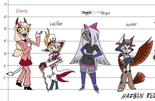
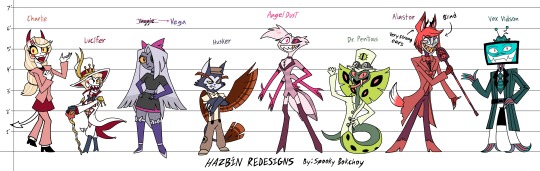
Charlie- Her original design in the show's cute but I thought she was a clown, not a demon at first. Already has a "demon form" with horns+ tail so I added those built in already. Wanted her to feel optimistic but unsure of herself. Lucifer- Original suit tells he's an over the top king, added gold shoulder pads matching the crown piece and exaggerated his shortness so now he has a Napoleon complex and takes pride from being short. Him and Charlie keep the mostly red yellow white color scheme to signify their royalty. Vaggie Vega- Unique hair shape, good for recognition. Changed name to Vega/Vegatha, sounds strong willed, better fitting for her. "X" over hair distracts from her face, put it underneath. I also made her a bit darker in value to subtly show she's a fallen angel Husker- Eyebrow game is strong, got a unique face from your typical toothy big-eyed citizens. Too many symbols that look pretty but don't make sense in his character. He's a sulky hard ass who doesn't want attention but he's got a design that's very eye-catching. I made him look lower class since he used to be an overlord and is fighting a gambling addiction. 180 color change too so you know he's a cat with owl features.
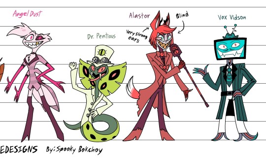
Angel Dust- Iconic floofy hair swoop. Darker suit to bring out face with a heart choker bc he's a feminine fellow after all. On that note, more pink leaning color scheme. Added abdomen for more spider theming. Dr. Pentious- His Victorian steam punk theme is fun & quirky though you can't quite see it in his design. You can't really see it in my design either cuz I was more focused on filtering out all the eyes and extra details. I would want to take this back to the board and do it over. His original top hat face distracts from his actual one so that had to go. 2 front fangs to appear more snakey. Alastor- His design works for the 1930s the decade he passed. I don't get the correlation to radio and voodoo though. The whole discourse with him being creole is messy so I scrapped it and made him a white American broadcaster to not deal with that. I made him blind with supernatural hearing abilities leaning into the sound aspect. It feels chilling knowing he hears your every move, emotion and heartbeat like the warden from Minecraft. Deer and orange fox themed for a dual nature. Vox- This idea of a tech savvy con man is super fun. Made his persona charming and eccentric, being able to appear friendly while being sketchy as f. His body is made of wires too with his teeth resembling the shock waves on his hat. Kept the pinstripes for a wirey feel.
I also did some Helluva Boss redesigns too! I think Helluva designs deliver pretty well (besides Queen Bee) so I more or so redesigned them based off my own head cannons. I used to watch the show but fell off around halfway of S2 bc I wasn't vibing with the direction of the story. Octavia- Young entrepreneur, takes after her father and mother being snobby and looks down at lower classes who she sees as less intelligent than high class. Very creative in problem solving. Millie- I like her og clothes alot. Those overalls are chic. This outfit is what she'd wear out in the field when she's working for IMP or at the farm. She and Loona fight alot about who works harder and Loona having an attitude problem towards everyone. Sallie Mae- Not much change other than white hair and removed eyelashes. I might want to make her shirt dark muted blue instead. I gave her a backstory how she ran away from toxic masculinity parents and eventually gets hired at IMP as a spy.
Loona- Emo to the extremo. She's originally goth but I got emo from her I'm sorry she just doesn't look goth. She's very lax when it comes to her job and slacks off constantly. She still does it well despite not working as hard as Millie, Moxxie or Blitz. She's strict but means well and cares for ppl around her. She also gets adopted at age 14 in my head cannon.
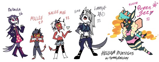
Bee- 180 change completely. She's a thick queen! Made her black coded with more stripes cuz she's a BEE. I don't get why Vivienne didn't give her stripes bc that's a design thing she uses so much and she doesn't use it in a character whose name is BEE? What??? anyway her design is still complex but simplified and uncluttered for animation so the animators can have pleasant dreams. She's the child of Beelzebub and a hell hound. So that's my take on Hazbin/Helluva character design! This was fun re imagining not only the characters but the story itself. I may write a fan fiction but i dunno right now. I respect the original source material which is something I feel everyone needs to acknowledge when they do a redesign of anything. There are things I don't like about the original and that's ok! That's part of why I did the redesigns. That being said I don’t support Vivziepop :)
#character design#digital artist#hazbin hotel#helluva boss#hazbin redesign#charlie morningstar#lucifer morningstar#angel dust#alastor#sir pentious#loona#hazbin hotel husk#helluva fanart#design ideas#helluva millie
21 notes
·
View notes
Text
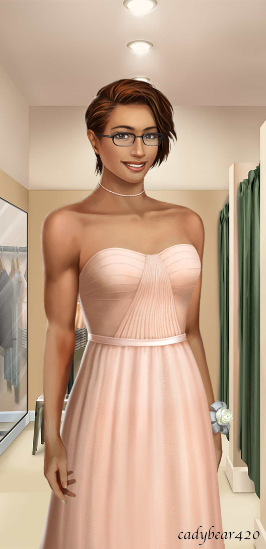
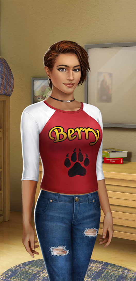
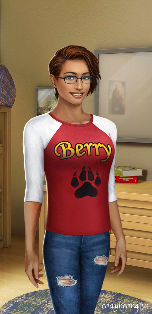
Cadybear's MC Wardrobes: Evie Ayana, OG HSS Book 3. Featuring some edits by me!
How this series goes: With each book, for a MC I'm invested in, I'll assess each of their in-game outfits. How much do I like or dislike the outfit? Is this something that suits my MC's style, or does it make me go "My MC would NOT wear/own this"? And for the outfits that my MC would not wear or own, how would I alter or replace them? I'm not going to use screenshots from the actual game because I can't be arsed. Also I want to use the different sprite expressions to express how my MC would feel about each outfit.
I like to think this is a good opportunity to elaborate on my MCs' dress styles, and show off some edits :D
Now, let's assess the outfits of OG HSS Book 3 and finish off the wardrobe for Evie Ayana! Well, not quite finish off, as I might make some posts for her in-game outfits in HSS:CA, as well as some bonus miscellaneous outfits I came up with myself for other events in the timeline.
Directory for the other parts will be included in the reblogs after I've completed the posts for all books!
Ch 1: "Not-So-Cold Shoulder" Premium Starter Outfit

Evie would actually really love this top. Although she is pretty lukewarm/indifferent on bare-shoulder tops, she would totally wear this one, mainly for the fabric texture. However, I don't think she'd be too keen on the necklace or the skirt, though, as cute as the flower embroidery is.
Verdict: Only partly in Evie's wardrobe. Alter by replacing the skirt and removing the necklace.
Here's what it'd look like more in her style. I might headcanon this as her casual fit for HSS:CA 3.
Ch 1: "Spring Fling" Premium Starter Outfit

And here we have a reverse situation of the previous outfit. Evie would dig the pants, but not so much the top.
Verdict: Only partly in Evie's wardrobe. Alter by replacing the top.

So how about a combination of the two? :3 (Unfortunately the embroidery looked a bit awkward on these pink jeans, so I left it off).
As it is though, I think I'm perfectly happy with using the "Cardi Cute" outfit for her HSS 3 spring casual outfit (or the altered version of the "Bombshell" outfit, but that would mean paying for the original one which I don't quite think is worth the diamonds). Like I said, I might use these altered spring premium outfits for her spring casual outfit in HSS:CA.
Ch 1/2: "World-Class Tour" Premium Outfit
It's not bad, I kind of like the trim design on the skirt. I can definitely see Evie dressing up so as to at least make the Hearst kids' tour fun. Plus, it sort of matches with Aiden's spring casual outfit, being that it's also a light blue button-up and dark blue bottom piece.
Buuuuuut I don't think the skirt is quite her style. It's just a little bit too short, and doesn't really seem "loose and flowy". Plus, she would prefer an outfit with pants for this type of event.
Verdict: Only partly in Evie's wardrobe. Alter by replacing (or lengthening) the skirt.


Here's how it would be if it were closer to Evie's style. Plus, a version where the skirt is closer to Evie's style. I tried to make the pants blue-ish to keep that color scheme match.
Ch 3: Baseball Uniform


Jock girls stay winning <3
Verdict: Technically not in Evie's wardrobe because you have to return uniforms at the end of the season, but the point is, Evie would love wearing it. Keep it as is.
Ch 4: "Light it Up" Premium Outfit for the Mitchell's Beach Party
This is gonna sound crazy, but... aside from maybe the arm bands, Evie actually wouldn't mind wearing this. The romper is really nice-looking color and aesthetic wise and it looks fairly comfy.
While it is arguably a bit revealing– namely, it does violate Evie's "no skirts that go above mid-thigh" rule, she probably would be a little more comfortable breaking that rule with a romper dress rather than a regular dress or skirt. Granted though, she wouldn't really wear rompers very often, so yeah.
Also, the necklaces are adorable. I love moon/star shapes and so does Evie.
However it might be a little bit too extravagant for her tastes for what I feel is a more casual house-based beach party.
Verdict: Actually would be a part of Evie's wardrobe. Move the arm bracelets, but otherwise keep it as is (but save for a different event and possibly go with a different outfit to wear to the party).

Evie in the altered outfit, plus the m!MC's version of the romper outfit. She'd also love to wear the replacement outfit for the pool party outfit from Book 1 (it would also match Aiden's outfit, then again I might give him a new beach party outfit too as well as all the other LIs). She'd also be perfectly happy wearing her regular casual outfit to the pool party like everyone else did.
Ch 7: "Key to my Heart" Premium Outfit for Open Mic Night at the restaurant

It's decent on its own, but I don't think it's really Evie's style. I don't think she'd really vibe with keyhole dresses.
Verdict: Evie would not own this. Keep the bracelets, but replace the rest with either her usual casual outfit or her usual semiformal outfit.
For this sort of event, she'd far prefer to wear the "Make a Statement" semiformal blazer outfit, or just her regular casual outfit like everyone else.
BONUS ROUND: Ch 11: Band Concert Outfit
Looks fly as hell. She'd dig it. But she would also think it's kinda dumb that the guys (and Cameron) all wear long sleeves while the girls all wear short sleeves lol.
Verdict: Part of Evie's wardrobe. Keep it as is (for band!Evie AU) (but also give her a long sleeved version, and save both for other events).
Long sleeved version! Though honestly, I'm not sure Evie would have really had much of a preference. She likes both styles.
Ch 12: "Silver Goddess" Premium Prom Outfit
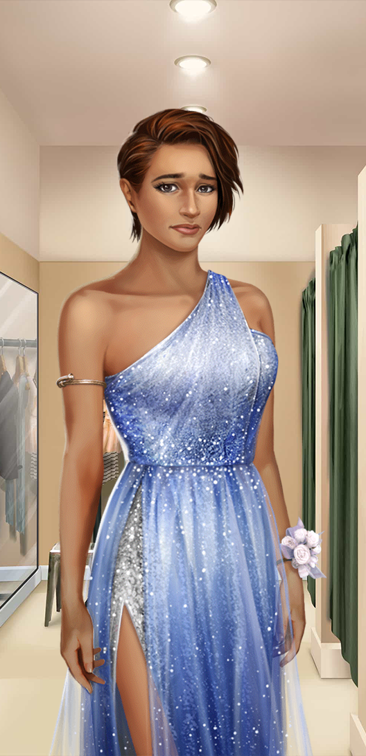
God damn it. The cloth and color of this dress is so damn pretty! But there's no way in hell Evie would EVER wear a dress with a leg slit. She'd feel like... like the exact opposite of a goddess.
Also, why is it called "Silver" when the game file describes it as lavender? Not that it's even lavender anyways, that's clearly periwinkle.
Verdict: Evie would NOT buy this. Perhaps alter later by closing the leg slit and removing the arm band. But even then, it would not have become a part of her wardrobe due to a certain other premium prom outfit option...

For now, here's that one edit I made previously of Aiden wearing the outfit because I like it better on him <3
Ch 12: "Black Tie" Premium Prom Outfit
*inhales*
YAAAAAAAAAAAAAAAAASSSSSSSSSSSSSSSSSSSSSSSSSS!!!!!!!!
Verdict: Becomes part of Evie's wardrobe and is her official prom outfit for the book. Keep it as is.
Ch 12: "Just Peachy" Free Prom Outfit
It looks pretty nice, I like it much better than the premium prom dress. It's neat and simple, which is something Evie would enjoy wearing. She'd also like the peach color too. Especially considering she likes Aiden's "peach".
Of course, there's no way Evie is giving up that tux. So yeah.
Verdict: Evie would wear this, and it maybe would've become a part of her wardrobe if she didn't already buy the tux for her prom outfit.
Ch 16: "Once a Tiger" Premium Finale Outfit (and carries over to HSS:CA as MC's default outfit for that trilogy if purchased)
Not bad, but why does PB hate putting this MC in tops that are cut below the pants? Also, no thanks to the choker-style necklace.
Verdict: Somewhat part of Evie's wardrobe. Alter by lengthening the top and the necklace.

Here's the outfit more in Evie's style, plus her in the m!MC one because I do think it suits her better either way.
Though in either case, I don't consider it Evie's default outfit for HSS:CA. I'm going to be making a different new set of outfits for that instead, and that will be its own series. Stay tuned.
#choices stories you play#choices#choices game#choices stories we play fandom#choices stories we play#high school story#hss#choices hss#choices high school story#evie ayana (og hss mc)#my edits#my edit#cadybear's edits#hss edits#choices edits#choices edit#cadybear's mc wardrobes#og hss mc#hss mc#og hss f!mc#hss f!mc
20 notes
·
View notes
Note
Coordinating hero outfits, sorry I didn’t make it clear
Oh no, that's fine--and it's interesting, actually!
I think that's actually a situation where I would be more amenable to a more feathery Raven, but not *as* feathery as some of her recent designs. I kind of like the idea of their outfits having kind of a unifying theme of scrappy DIY-ish punkiness--they're both more comfortable around each other, they've both gotten more patient with their own and each others imperfections and issues, and they're both kind of rubbing off on each other in terms of general practicality. With Raven you kind of see some hardier, sportier details--more durable treaded boots, some color-paneling on her bodysuit that's reminiscent of the Doom Patrol but still in her palette, maybe a small cute feather accessory in her hair that's only visible when she pulls the hood down. She's gotten a bit more physical, a bit more tangible, more grounded, and on the other side Gar has kind of embraced his own fluidity and inhumanness a bit more--he has a sleeker silhouette and seems a bit more 'feline.' I do also think he'd be less self-conscious and not devote as much effort to looking really human, so you see more prominent lower canines, his fingernails aren't exactly claws but they're definitely noticeably more almond-shaped and pointed than your average human's, the eyes are definitely more feline, and the hair's definitely scruffier. Hell, he might even have a wolf cut. He'd also ease away from the Doom Patrol uniform stuff, play a bit more with silhouette. I really like onebadnoodle's cropped hoodie for him, though I wouldn't go for the short pants. I do actually like him taking on a beastier look as a sign of maturity, as a sign of overcoming not just his self-consciousness, but also as kind of a play on that whole, "knowing when to let beast out is what makes you a man" line.
As far as color schemes go, I still see raven sticking mostly with her classic indigos, navies, and purples.
You all know my feelings on Gar's bright red and white outfit, but I wouldn't want to go full 03 on color scheme for him, either. I like the idea of burgundy/maroon and off-black for him, while keeping the silver metallic accents. I think that would still be a nice contrast to his green skin without making him too... garish (haha). But it's like... he's already green--you can darken and desaturate his outfit and it's still going to be pretty memorable.
But yeah anyway I don't see them having a full outfit overhaul because their skillsets are that unique from each other and those outfits reflect that. But I do like it when you can see how couples have influenced each other in the little details.
8 notes
·
View notes
Text
My favorite LoL skin (with photos) for each Heartsteel member (excluding their Heartsteel/Prestige Heartsteel and Base skins)
So I absolutely adore the Heartsteel skin line, and for Aphelios, Kayn, and Yone, their Heartsteel skins are arguably my favorite skins of theirs (especially Yone’s Prestige Heartsteel skin). HOWEVER. I want to talk about some other amazing skins too. Three of the ones I’ll mention come from the same skin line, but listen, it’s a beautiful line. Also note: These are based on the splash art. I know some of the aesthetics change when translated to a player model. Ok let’s GOOOOO!

Aphelios: Spirit Blossom Aphelios

I love the COLORS of this skin. I love Spirit Blossom Aphelios’ hair design (like damn Phel go off with the man bun/small pony I see you), outfit/accessories, the markings on his face, and how his horns are opposite to Alune’s. (Also can we discuss how Alune also looks so pretty here like omg. I’m so glad they made sure she fit into this as well.) But Aphelios just looks softer than some of his other skins and it’s an interesting vibe from him. I dig it!
Ezreal: Faerie Court Ezreal & Prestige Heavenscale Ezreal.
(Listen I genuinely can’t fucking pick between them so he gets two.)

THE OUTFIT (with all its wing motifs). THE WINGS. THE PINK HAIR. HIS expression!! I love the redesign of his gauntlet as well. Another thing that I really enjoy is how they managed to keep his face markings and make them unique. His face markings are a trademark element of Ezreal’s base skin so I’m glad they kept those here. AHHHHH HE JUST LOOKS SO GOOD. This is just such a fun reimagine for his character.

This might be one of his two newest skins but holy fuck it’s already one of my favs. His HAIR. MY GOD IT’S SO GOOD?? His pose and expression exude so much power and confidence. His gauntlet with the draconic claw and his horns is just so fun. Also that OUTFIT? His outfit genuinely looks amazing. The color combo of light blue, maroon, and gold is just EXCELLENT. Again, they also kept face markings of some kind, even if they moved from his cheeks to his forehead.
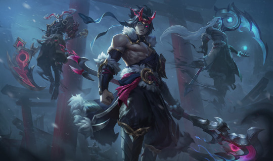
Kayn: Snow Moon Kayn
Kayn’s skins are always fun because you really get 3-in-1 with Kayn, his shadow assassin form, and Rhaast. I love a good black and red (with gold accents) theme and the Loki-esque horns, as well as the addition of the furs on his basic Kayn form are really cool. And the shaddow assassin’s hair. My goodness I do love a man with long white hair 😂 (this will appear again later). I love the color contrast between the shadow assassin and Rhaast designs as well. Also Rhaast looks badass. Terrifying, but still badass.
K’Sante: Prestige Empyrean K’Sante

This skin is so fucking cool. We get to see his face here unlike the original Empyrean K’Sante skin. I love the color scheme with the purple, gold, white, and pink as well as the designs on the clothes/his weapons. The little pink on his face also adds a really small but eye-catching detail that I very much enjoy. Also Lil Nas X helped design this skin and I think that’s so fucking cool.
Sett: Spirit Blossom Sett
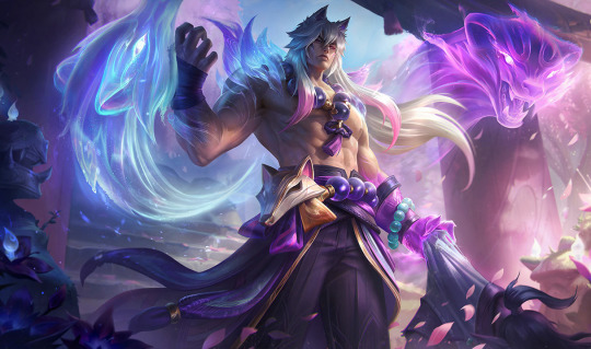
Ok listen yes a bit of the reasoning for all these is that the characters themselves look fine as fuck. But holy shit look at Sett here. LOVE his long white hair (hehe what did I say it’s a pattern) with his ears here. That outfit and the accessories are stunning. And again the color palette for the spirit blossom line is just so pretty. Sett just looks so in charge and powerful here. He really is the boss. (Also shoutout to the [I believe] first instance of canon SettPhel which happened in the lore/voice interactions for this line.)
Yone: Spirit Blossom Yone
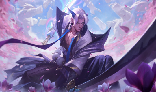
Look at him. LOOK AT YONE. There is something about Yone with longer white hair that is just so…right, even if it’s tied back or braided. All the beautiful shades of purple in his outfit too! I love. I also like how, besides the horns and his hands/arms, he seems almost human and he’s not stuck to his mask like in his base skin (though I do love his base skin). He also just gives off really pleasant vibes in this. I cannot explain it lmao.
These are my thoughts! These are just my opinions, and frankly so many of these champions have so many amazing skins. I’d love to hear your favorites if you have opinions!
#writerblue275 gremlin hours#aphelios#aphelios and alune#ezreal#kayn#shieda kayn#k’sante#sett#settrigh#yone#league of legends#league of legends opinions
30 notes
·
View notes