#The General ; Shade
Text
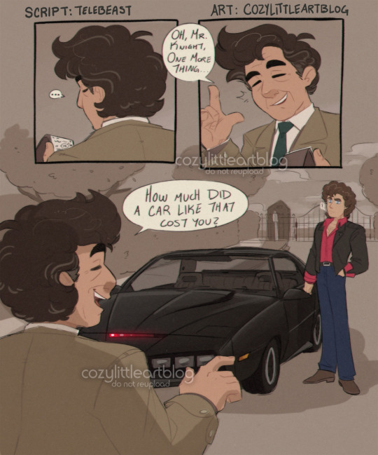
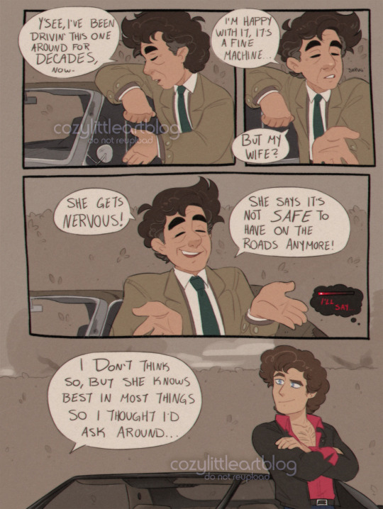
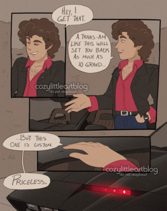
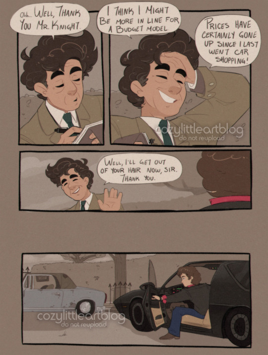
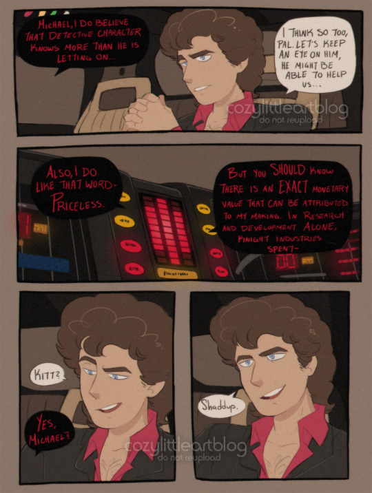
Columbo and the Knight (1984)
put me in the universe where Columbo ran through the 1980s and had a crossover episode with Knight Rider. I think they deserved it, and I am not just saying that because they're my two favorite Old Shows. @telebeast wrote a little fanfic blurb about it and I HAD to visualize it into a comic (which is also the longest comic I have finished thus far at five pages...), so writing credit goes to them.
Autism W!
#columbo#knight rider#art#michael knight#kitt#comic#highlight reel#crossover#telebeast#there are two small easter eggs here. can you find them. they were somehow not Entirely lost when i resized these for the public#this is what i mean when i say I Draw And It's Everyone Else's Problem. look at my INCREDIBLY niche crossover comic boy#if the knight rider fandom has like 12 people in it. how many of y'all have seen columbo#this comic is for like 4 people and me and phoenix are already two of them#niche is my specialty lets be real. weird niche obscure shit and ships nobody's paid attention to yet#not to suggest this is ship art. columbo has his wife and michael has his car lmfao#stylizing real people is EXTREMELY hard btw sorry for when they get off model. its partly a 'better imperfect than never finished' situatio#cant tell you how much i redrew some of these panels. weeps#this took me 2 weeks but i think i thumbnailed it all in may and the ideas been rollin around in my head since march#is anybody good at editing. please edit michael and columbo into an image together like its a screenshot. NOT generated. edited.#it would be so cool#ive drawn columbo a lot but i haven't drawn a lot of michaels. i was learning things about his outfit AS I WAS DOING THE DAMN#COLORS ON THIS. all the lines done. it was too late to change anything. i did all the lines and colored page by page#i realized my mistakes on like page 3. 1 and 2 were already done. it was Too Late.#imagine it though. them working a case together. switching between the more serious tone of columbo vs the goofier#action antics of michael and kitt. columbo being so impressed by Modern Technology. there's more i could say but phoenix may write#more of this crossover and i don't want to spoil it :'3#there's opportunity here though i swear. there's gold to be dug.#i like how kitt gets shading but columbo's junker peugeot doesn't. kitt looked wrong without any. columbo's car is matte and dirty#i also applied effects to this to make it look a little film-grainy and VHS like. some CRT TV vibes#the only question left is. did they put knight rider into columbo; or columbo into knight rider 🤔
3K notes
·
View notes
Text

my piece for the girl psycho 100 zine, which you can download for free on gumroad!
#mob psycho 100#mp100#mp100 fanart#kurata tome#tome kurata#mp100 dimple#this was such a fun opportunity to experiment with how to do dramatic lighting in a style where i don't generally shade
1K notes
·
View notes
Text
I think 90% of my gripes with how modern anime looks comes down to flat color design/palettes.
Non-cohesive, washed-out color palettes can destroy lineart quality. I see this all the time when comparing an anime's lineart/layout to its colored/post-processed final product and it's heartbreaking. Compare this pre-color vs. final frame from Dungeon Meshi's OP.


So much sharpness and detail and weight gets washed out and flattened by 'meh' color design. I LOVE the flow and thickness and shadows in the fabrics on the left. The white against pastel really brings it out. Check out all the detail in their hair, the highlights in Rin's, the different hues to denote hair color, the blue tint in the clothes' shadows, and how all of that just gets... lost. It works, but it's not particularly good and does a disservice to the line-artist.
I'm using Dungeon Meshi as an example not because it's bad, I'm just especially disappointed because this is Studio Trigger we're talking about. The character animation is fantastic, but the color design is usually much more exciting. We're not seeing Trigger at their full potential, so I'm focusing on them.
Here's a very quick and messy color correct. Not meant to be taken seriously, just to provide comparison to see why colors can feel "washed out." Top is edit, bottom is original.
You can really see how desaturated and "white fluorescent lighting" the original color palettes are.
[Remember: the easiest way to make your colors more lively is to choose a warm or cool tint. From there, you can play around with bringing out complementary colors for a cohesive palette (I warmed Marcille's skintone and hair but made sure to bring out her deep blue clothes). Avoid using too many blend mode layers; hand-picking colors will really help you build your innate color sense and find a color style. Try using saturated colors in unexpected places! If you're coloring a night scene, try using deep blues or greens or magentas. You see these deep colors used all the time in older anime because they couldn't rely on a lightness scale to make colors darker, they had to use darker paints with specific hues. Don't overthink it, simpler is better!]
#not art#dungeon meshi#rant#i'm someone who can get obsessive over colors in my own art#will stare at the screen adjusting hues/saturation for hours#luckily i've gotten faster at color picking#but yeah modern anime's color design is saddening to me. the general trend leans towards white/grey desaturated palettes#simply because they're easier to pick digitally#this is not the colorists fault mind you. the anime industry's problems are also labor problems. artists are severely underpaid#and overworked. colorists literally aren't paid enough to do their best#there isn't a “creative drought” in the anime industry. this trend is widespread across studios purely BECAUSE it's not up to individuals#until work conditions improve anime will unfortunately continue to miss its fullest potential visually#don't even GET ME STARTED ON THE USE OF POST-PROCESSING FILTERS AND LIGHTING IN ANIME THOUGH#SOMEONE HOLD ME BACK. I HATE LENS FLARES I HATE GRADIENT SHADING I HATE CHROMATIC ABBERATION AND BLUR
2K notes
·
View notes
Text
"those great android reflexes of yours" geordi. geordi PLEASE.
#they fit so much flirting and worrying about each other into the 5 minutes of screen time they got in this episode#star trek clips#star trek: tng#tng 2x22#shades of gray#daforge#data soong#geordi la forge#the next generation#star trek#ty to aquamonstra for reminding me I had this one in the vault <3
718 notes
·
View notes
Text

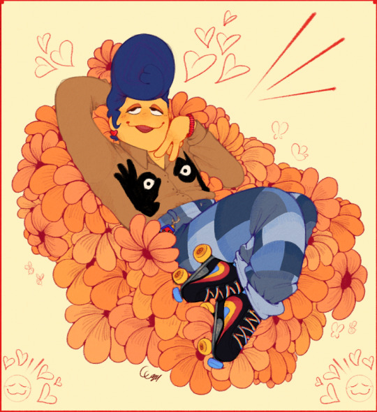
saw some choice clothes on pinterest and Had to indulge <3 ngl i had the song Golden Dandelions playing in my head when i sketched this
#both light and dark versions cause i couldnt decide!#man... i wish I could lay on a bed of plush flowers. that'd be heavenly#also: lmao eye nips#& unshaded bc really? you expect me to shade all those petals? not a chance babey!#plus i think it would've started to look cluttered#scribble garnish#welcome home#welcome home puppet show#wally darling#this was a fun pose! and just a fun scribble in general
1K notes
·
View notes
Text

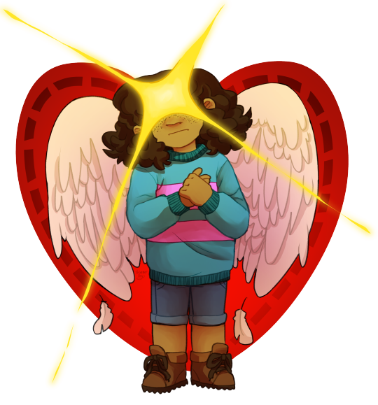
Legend has it, an 'angel' who has seen the surface will descend from above and bring us freedom....
#undertale#my art#safeutdr#chara dreemurr#frisk#frisk dreemurr#frisk undertale#chara#chara undertale#I've had these sitting in my wip folder (colored but not shaded yet) for almost exactly a yearrrrr. I'm glad I finally finished them#I thought it would be cool to draw something where Frisk and Chara had parallel angel imagery#in reference to the whole legend of the 'angel from the surface' thing#and also representing the fact that they both had a lot of pressure and expectation put on them to save the monsters because of the legend#so like. parallels. symbolism. yippee!#I'm really happy with the way they turned out AND the composition and idea in general I think it's cool 👉👈
2K notes
·
View notes
Text

Happy 2k followers @rorydrawsandwrites !!
I meant to draw this way sooner, but admittedly I only had motivation to start properly drawing this 2 days ago. I've had this idea for what to do for this picture for around a week now so I'm glad I finally sat down and drew it!!
Rory, you are such a creative person and very sweet the few times we've talked! I can't wait to see what you do in the future! Just do not feel obligated to post about Puppeteer if you have no motivation even if it did gain you some popularity. :]
#art#tadc#the amazing digital circus#digital circus#digital circus fanart#tadc fanart#digital circus au#tadc au#puppeteer au#jax#tadc jax#jax fanart#puppet jax#gangle#tadc gangle#gangle fanart#puppeteer gangle#anyway im very proud of this#the background is#basic#and the shadings/lightings not great#but im just generally proud of how gangle and jax look#i think i did good on their posing and such#also i sketched this first on paper a week ago#and when asking rory about isles pomnis design#i sent a picture of her with gangle barely seen in the corner from this#so yeah#rory if you read this far that was infact gangle#very silly indeed#happy 2k followers tho
279 notes
·
View notes
Text
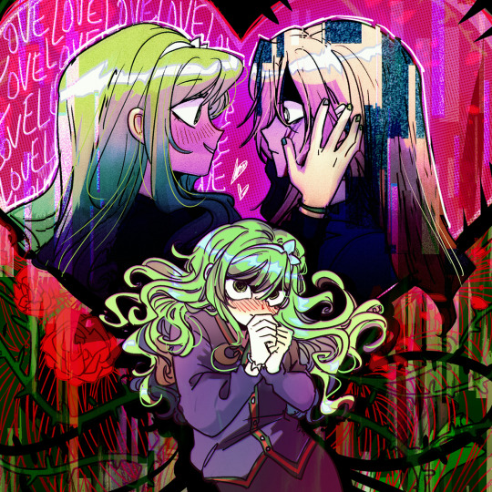
day 4: doomed by the narrative ♡
(femslashfeb prompt list)
#minifemslashfeb2024#surviving romance#seyeong jin#chaerin eun#THE GIRLS ARE NOT OKAY!#READ SURVIVING ROMANCE IF YOU'RE A HORROR YURI LIKER#OR A TOXIC YURI LIKER IN GENERAL#ok I promise it's not all toxic but man is there SO many layers#and barely anyone out here is talking about it#PLEASE. PLEASE JOIN ME#I NEED TO TALK ABOUT SURVIVING ROMANCE#god the colour palette on this kicked my ass#I'm bad at using green. but seyeong's hair is such a pretty shade#I couldn't get away with NOT using it#seyeong is sooo. god forbid women do anything
851 notes
·
View notes
Text
straight trans guys & aro trans guys solidarity. weird that my whole life I've been expected to be into dudes and now that I'm a guy the lgbts also want me to be into dudes or else they don't really think of me as one of them
and while I'm not attracted to anybody and straight trans dudes are attracted to women, i feel like we're in the same boat here. too queer for the straights and too straight for the queers
#not that i *need* to be a part of the lgbt community like that yk but still#its a little isolating to not fit in with any of the other trans people you find irl#(aside from my trans friends i knew pre-transition obv ily)#(and no shade to the gay & bi people im friends with irl either. this is more abt Generalizing Groups not the individual lgbt people i know#(Generalized*)#(i fear i may be rambling lol)#transhet#ftm#trans man#aromantic#trans#aro#o.
443 notes
·
View notes
Text
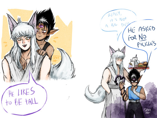
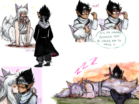
I am so normal about them
#listen i had a couple of horrendus weeks and whats better than super self indulgent art to light up thw mood#these are actually based on a looooong convo i had with the friend who got me into watching yyh#something about post canon future youko#when shiori dies at the ripe age of 120 yo or smth#and youko acting like a domestic animal makes me feral#they be the happiest murder couple look at them eeping covered in blood at the bottom#missing some other things like big dog youko zoomies but i lost the interest in drawing at some point because i really wanted color em#this wasnt supposed to see the light of the day like mostly of my self indulgent stuff bc they re for myself but i feel generous (?)#they have 292 different skin shades because using a semi transparent brush and constantly neglet colorpicking first makes the job tricky#digital art#csp#clip studio paint#yyh#yyh fanart#yyh hiei#yyh kurama#youko kurama#shuichi minamino#hiei x kurama#hiei jaganshi#hiei#kurama#kurahi#yu yu hakusho#yuyu hakusho#the og convo was actually more bittersweet and i could i have material to draw angst but this is supposed to be comfort art so#ending the yap#i should stop yap under my posts#pick your fave mine is hiei poisoning himself with the seed
244 notes
·
View notes
Text

COME AND GET ME OUT OF HERE‼️
#jjba#diamond is unbreakable#yoshikage kira#kosaku kawajiri#I love him and his unhealthy nail biting habits#jojos bizarre adventure#jojo no kimyou na bouken#jojo’s bizarre adventure#jojo fanart#jojos bizzare adventure fanart#jjba part 4#jojo part 4#I don’t like this#spent too long to not post it tho#oh well#pls DONT throw tomato’s#I love oingo boingo so much I have an oingo boingo song assigned to almost every jjba character#it just fits jjba#I love oingo boingo#did I mention#i love#oingo boingo#help#uh#idk what else to put#I’m so bad at tags#this is specifically like the BUT THEY CANT SEE ME THROUGH MY WINDOW SHADES JUST LIKE IM NOT EVEN THEREEE part#I know private life is kind of generic but it is SO KIRA ITS NOT FUNNY#!!
234 notes
·
View notes
Text
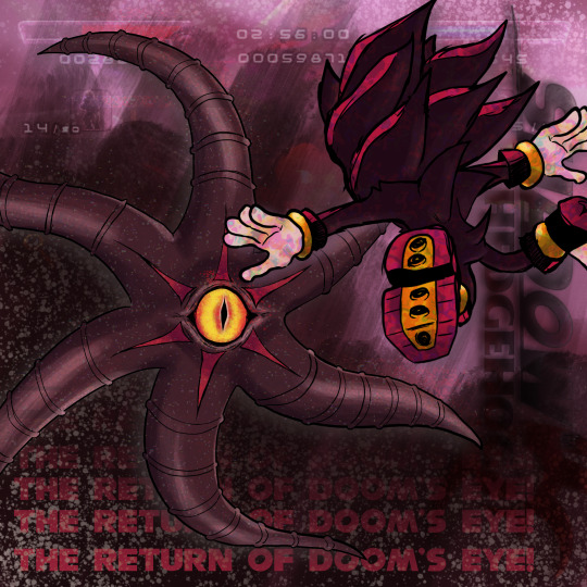
THE RETURN OF DOOM'S EYE
#you know the hyperfixation is really taking over when i start making shaded art#sonic the hedgehog#sth#sonic#shadow the hedgehog#shadow the ultimate lifeform#shth 2005#sonic x shadow generations#shadow the hedgehog fanart#black doom#doom's eye#my art
451 notes
·
View notes
Text
i think a big reason why i enjoy the zukka fanbase significantly more than any other atla shipping-specific fanbase is because nobody in there is wasting time trying to convince anyone why it was secretly canon. like, this is a ship that is pretty much exclusively limited to unpacking these two characters, exploring how their personalities complement one another, and talking about what the post-war universe would look like. nobody is sitting here trying to tell you why, like, suki was secretly toxic and sokka was in love with zuko the whole time. idk. y'all are vibing and chilling and that's why it works
#idk this is rambly#not specific shade at any specific fanbase#just a critique of fandom shipping culture in general#zukka#atla#zuko#sokka
863 notes
·
View notes
Text

THE PIT (Part 3 FINAL)
#i had to do this quick sorry the shading is a bit wonky#warrior cats clangen#clangen#clan generator#warrior cats#warriors oc#gtc comics
652 notes
·
View notes
Text

Gathering Storm
Made another animation this one starring Olivier! I’ve been wanting to illustrate Olivier’s weather abilities for a while now since they’ve always looked so darn cool in my head whenever he used them.
Anyway this was a lot of fun to do and provided the opportunity for me to experiment with different rendering techniques for animation. Gradients and blended stuff overall takes some practice to learn how to move without looking choppy.
The effects also took a long time, I did a lot of experimenting with those to figure out what looked the best. The version up above is certainly the most dramatic looking but I also ended up with some calmer ones.


#started this all the way back in May but didn’t get any significant work done till recently#was also working on this simultaneously with the last one#I colored- shaded and added all the environmental effects within the last few days#I think I deserve a nap after all that#also the name is generic I could not come up with a better one to save my life#hfth#hello from the hallowoods#hfth olivier#Olivier hfth#olivier song#art stuff#larolds moving pictures
152 notes
·
View notes
Text
data worrying about him...
#i know what you are /ref#star trek clips#daforge#geordi la forge#data soong#star trek: tng#the next generation#star trek#tng 2x22#shades of gray
258 notes
·
View notes
Last Seen Blogs

mysecretfriendjapan
My Secret Friend Japan

nubianinjaress
Untitled


zahi-fujoshi-blog
zahiFujoshi7u7

mr-z3r00
Untitled