#THIS WAS NOT THE ORIGINAL PLAN FOR THE DRAWING AT ALL BUT THIS IS BETTER I THINK
Explore tagged Tumblr posts
Text
Answering some AU related asks in this post so I don't flood your feed ! I wanna draw some of these so those will be included in a separate post later on !

Jetfire, Ratchet, Wheeljack and Perceptor are on an Optimus assigned mission so that's why/how they're working together !
Prowl and Brainstorm join them later ! Prowl broke Brainstorm out of prison as a really terrible backup plan after the Jetfire's team gets compromised (full context for the AU's locations can be read here) but in summary, Luna 2, where the team was originally working, was raided by Decepticons. This forced Jetfire's team to jump through the Spacebridge to an unknown location.
Brainstorm and Prowl with the help of others storm Luna 2 and hijacks the Spacebridge so Brainstorm and Prowl can get to Jetfire's team. They only buy enough time for a one way trip so now Brainstorm and Prowl are stuck with the Science Team.

As a pitbull owner, this made me chuckle, I imagine he kinda acts like one too. His whale eye of judgement and him having absolutely no sense of personal space and getting into everyone's business. Sometimes he can look incredibly sad and pathetic. Who want him?

Honestly, he's probably considered it and then went "no, no bad Skyfire ! that's an awful thought !"

HONESTLY REAL, Jetfire would be the designated chef, I imagine he cooks in big ass portions because he eats a lot. Ratchet is the second designated chef of the science team, Perceptor mixed up the salt and sugar and fucked up the soup. Prowl only cooked enough food for himself.
First Aid is like ratatouille while Red Alert would overcook all his food out of fear.
Wheeljack and Brainstorm cook the worst meal ever, forced to be removed from the kitchen. Brainstorm probably steals a bite from everyone's food though just because "it tastes better when it's from your plate"

Thank you ! Brainstorm's wings get in the way of Everyone and Everything and he's probably ruined countless of Percy's (and everyone else's) carefully put together experiments. I think he has similar energy to when someone with a long ponytail turns around and accidentally whacks you in the face but on a much more painful scale.

In no particular order and mostly with the Science Team;
Staying up the longest without recharge
One sided racing with Jetfire, whether it be to the other side of the room, lounging area, kitchen, outside, doesn't matter he just needs to get there first (Jetfire chooses not to acknowledge this)
Engex drinking (He's actually an incredibly lightweight drinker, and the quickest to knock out out of the scientists but that won't stop him from trying)
Getting his lab reports done fastest
He keeps trying to challenge Perceptor in a game of scrabble and keeps losing
anything, and I mean ANYTHING in regards to Brainstorm, he will try his hardest to one up that guy
Wheeljack does not fuck around during group game night
Secretly playing a game of "lets see how many times I can lap everyone around the Science Base"
Glaring contest with Ratchet, whoever looks away first loses (also one sided, Ratchet's lost in thought)
"Do you dare me to do this thing?" "no" "ok im doing it"

Ratchet likes to nap, he's a big fan of getting rest and he definitely needs it, he probably snores like crazy tho. Wheeljack likes to drive long distances, doesn't need a location or anything he just likes driving around. Jetfire likes to read and journal his thoughts, his only way to cope and vent around here </3. Perceptor likes word puzzles, crosswords, word search, etc, he would be a HUGE wordle fan.
They have game nights together, mostly board games.
Brainstorm has never heard of the term “relax” in his life but he does like to push other bot’s buttons for fun. He wants to know what makes them tick. Prowl has never heard of the term “fun” in his life but he does like to sit in solitude and darkness in the quiet away from everyone.

The adding height to his wings bit is really funny omg
But nah, Wheeljack’s not really self conscious about his height. He prefers it over being Jetfire’s height. At least Wheeljack can fit through most doorways.

BAHAHA, where there's Prowl there’s Brainstorm and vice versa. Honestly I’m not sure which guy the Science Team fears more.
I'm sure that when they see Prowl around, they just look around the room for Brainstorm like they've just lost sight of a spider they've been keeping an eye on.
105 notes
·
View notes
Text
Both Heaven and Hell use human souls as currency and power. Heaven traps human souls in little personal dream-prisons so they remain content and complacent (like Michael did to Dean in his mind) so Heaven can then harness their soul power to "keep the lights on" in Heaven's offices and for angels to derive their power from.
Angel grace production is dependent on an angel's connection to the Heavenly Host. When they are cut off their grace becomes less potent and reproduction diminishes. When they are within the fold of Heaven, they are at full power. Hence why Cas's powers continue to diminish over time, even after his grace is "restored."
Later seasons muddles this lore when Naomi suggests that the diminished number of angels is the reason Heaven is barely keeping the lights on. A possible theory to bridge the gap between these varying lores, is that angels are a necessary conduit to "process" the raw soul energy into energy that can be used for maintaining Heaven. So, the more angels there are in Heaven, the more soul-energy that can be processed and converted into "grace" and other Heaven-supporting power. Now that there are few angels left, they can't keep up with the energy demands of Heaven. They have all those souls in cages, ready for processing, but not enough angels to do the processing.
Hell, on the other hand, uses human souls to create workers to continue to fuel Hell and propagate Hell's missions on Earth. Souls go to Hell to be tortured and transformed into demons. Hell doesn't have to worry about diminishing numbers because they can always make more demons. Making more demons is easy! It's a renewable resource. Unlike angels, which seems to be largely finite. (More angels could be theoretically created, as we see Jack attempt to do under Duma's guidance, but its methods are dubious and results unstable).
But Hell? Hell uses demons to make more demons. Both through the torture of souls and through the use of deals. Deals are how they draw in new meat. It's kind of MLM vibes. Demon mentors other demons. Those demons go out and make "sales" and draw in new souls to become demons. There are quotas. Analytics. Reports and performance reviews.
And Hell originated with Lucifer -- angel. Humans (souls) have always been a commodity to angels. The whole reason for the apocalypse WAS to cause death and destruction. The so-called "paradise" would be for the angels. Think of all the souls they could reap in the fallout of Lucifer and Michael's battle? All that power ripe for the taking?
It's also why Cas goes for the Purgatory souls when he needs power to defeat Raphael (many monsters were once human, so their souls function similarly). And it's why a soul-bomb could potentially kill a cosmic being like Amara (concentrated energy like that would be nuke-levels). It's why both Heaven and Hell hate hunters like the Winchesters for meddling and messing with their plans and not following so-called "fate", for choosing free will, thwarting apocalypses, saving those human souls from deaths where they could have become commodities for Heaven and Hell.
Heaven and Hell, while seemingly opposites, work in-tandem to keep humans on Earth subjugated. Heaven just has better "PR" as they say. But angels are not "the Good Guys" to Hell's "Bad Guys." And they both function similarly when it comes to their use of human souls.
50 notes
·
View notes
Text
a/n: omg ANOTHER senku fic?? Sedate me. I went off topic in this fic and didn’t even try to redeem myself so 🙏 writing Stanley next, wish me luck
senku ishigami x gn!reader | no warnings, set at the end of the village origins arc. 970 wc. Lot of dialogue cause that’s just how I roll (`_´)ゞ

Senku was tired.
Thoughts raced in his mind at a mile a minute, never-ending and constantly sprouting. On paper, he was sure it’d mimic the nervous system. Each thought that crossed his mind bothered him to no bounds, leading him to sleepless nights where he would devise plans for any situation that could happen.
Like how to handle animal attacks like the one with Taiju in the beginning. What to do if there were (somehow) a fish shortage. What the plan was if an unknown settlement comes suddenly to raid the village. What to do if the Tsukasa empire decides to take action first…
For once (more than he’d admit), thinking made his head hurt. A groan leaves his lips as he holds his head in his hands, rubbing his temples in an attempt to soothe himself.
“Another late night?”
He turns around slowly, watching with parted lips as you approach him, a tray with two steaming cups in your hands. “Yeah.” Is all that he can come up with, mouth running dry. He can’t remember the last time he stopped to have a drink.
“You know, for someone as knowledgeable as you, I’d hoped you know that sleeping can be very beneficial to your health.” Senku chuckles at your words, gratefully taking the cup of tea from your hands. “What’s got you so worked up?”
He takes a moment to gather his thoughts, taking a long sip to mask his uncertainty. “I'm just thinking about how this whole thing will play out.” It’s not a lie; he is worried about how everything will go, but it isn’t what he hoped to say. Though, he isn’t too sure what he wanted to say in the first place.
You hum, leaning against the edge of his workbench. Your eyes trail over the mess of scribbles on the papers in front of him to the notable bags under his eyes. “Have faith,” Senku nearly rolls his eyes. “Believe in your comrades, and everything will fall into place.”
He nearly jumps out of his skin at the feeling of your hand holding onto his chin, blinking up at you with wide eyes as you tilt his chin. “You should rest, Senku. A general can’t lead an army with only a wink of sleep.”
He laughs to himself, shutting his eyes as he pulls away from your warm touch. “I know.” Is all he responds with. He knows you're right, but he goes back to the drawing board anyway, ignoring the irregular beating in his chest. “You can go.”
His tone held no malice or annoyance at the blatant dismissal, his words gentle as he cast a glance your way. You’d walked away from the table, standing behind him now, likely to aid him in his next endeavor.
Once again, Senku jolts at the feeling of your touch. Your arms wrap around his waist from behind, your head pressed in the space between his shoulder blades, and your fingers clutch the fabric of his tunic.
“What’s gotten into you?” He asks. Voice strained to keep himself from shouting or worse– trembling.
“Come to bed, Senku.” You’d whispered, pulling on his tunic gently. He sighs, running a hand through his hair as the slightest bit of annoyance builds up.
Not with you, with himself for ignoring his health to the point you were concerned.
“Alright.” He sighs, turning around in your hold. You weaken your grip the slightest. Senku wonders if you thought he’d run away if otherwise. “Don’t worry, I won’t run.”
“You’d better not, " you mumble, releasing him fully. Your hand slips into his, fingers intertwining in place. He felt like they were meant to fit together. Senku quirks a brow. “Just in case. Though I’m sure you wouldn’t be able to get very far with your… stamina.”
He rolls his eyes, allowing you to lead him out of the lab. Twigs and dirt crunch under your steps as you approach his hut. His eyes trailed around the village, and a part of him was praying that no one was awake to see you and him together.
Not that anything was wrong with that– it’d just be another annoyance he’d have to deal with.
Senku blinks down at your intertwined hands. When was the last time he held hands with someone? Did he ever? A flash of Byakuya crosses his mind, and a smidge of sadness crosses his face at the thought–right, when they went to see fireworks.
He figures the look was still etched on his face when you entered his hut. Your hand comes to his face, thumb brushing over his knitted brows. He ignores the touch, his eyes lifting to meet yours.
Instead of asking him what was wrong, as he thought you would, you wordlessly pulled him into you, fingers carding into his hair and ruffling it around. He groans out a noise of protest, frowning at the wide smile on your face.
“There’s something wrong with you,” he says, rolling his eyes when you pinch his cheeks. “Ten billion percent.” You don’t say a word in response, only messing his hair up even more until it falls in front of his eyes. “You’re weird.”
You scoff at the insult, pinching his chin. “Yeah? And what are you, normal?” He nods, crossing his arms over his chest. “You’re the craziest guy in this village, Senku. I assure you.” He chuckles at your words, and only then does he realize what you’ve done for him.
Tore him away from his work, successfully relieving him of his stress and calming his mind.
Except his mind wasn’t calm, and a million thoughts swarmed his head the second he locked eyes with you again. Did you always make his heart race when you looked at him?
And when did you get so… pretty?
98 notes
·
View notes
Text
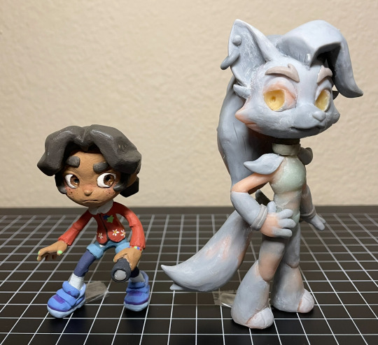
Abandoned wip Cassie & Roxy figures. From ~2023
They’re about to go into storage, so I took some photos. And I figured I might as well post them since they’re never getting finished. So yeah
More photos & notes below the cut :)
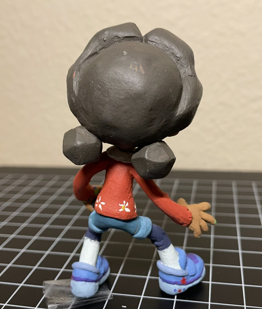
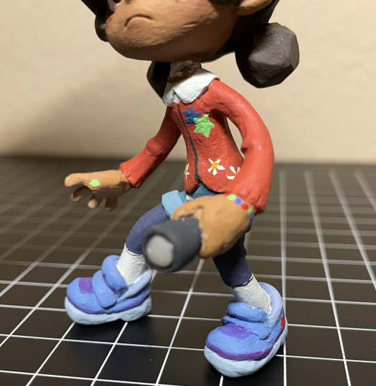
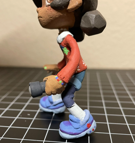
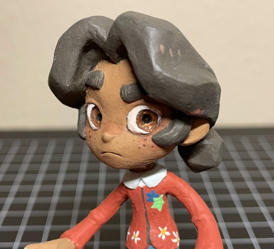
Cassie! Her design is sooo cute. I enjoyed translating her into my style + into 3d. I was (& still am) really happy with how I sculpted her face and hair. Up until this point I rarely sculpted human faces, so I was surprised how well it turned out (then again it’s very stylized so. Whatever). And her hair came out almost exactly like my reference drawing! Which doesn’t happen as often as I would like it to. The paint job came out nicely as well, I’m especially proud of the sneakers and the tiny stars & flowers on her cardigan. Anyway, She was looking really good overall! That is until she fell off my shelf and broke her neck. Unfortunately, that was the breaking point (lol) for me, as I was already having problems with Roxy, and I didn’t want to go through the trouble of repairing her tiny little neck after she was almost fully painted, so I scrapped the project entirely.
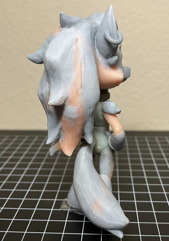
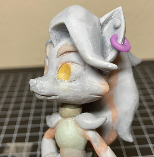
Only a few Roxy photos since she wasn’t painted. I had made her before cassie, (I was originally going to only make Roxy) but never managed to get to the painting step for mainly one reason: Her neck kept breaking. (I have bad luck when it comes to necks, it seems. Probably because I like chibi proportions.) I had to repair her neck, like, 5 times, before finally deciding to use apoxie sculpt instead of my regular polymer clays. (Which I probably should’ve done sooner) But then the apoxie dried in the wrong position, so she couldn’t stand on her own anymore (she needed to be in a very specific pose to stand. her hair is heavy!!). Thinking back on it, I’m really sad I never got to paint her, because I think her form ended up looking really nice. If you’re wondering why neither Cassie nor Roxy have eyelashes, that’s because I was planning on doming both of their eyes with resin, then sculpting eyelashes on top. But I never got to that step. Fun Fact!: Roxy’s eyes are glow in the dark :) so is Cassie’s flashlight
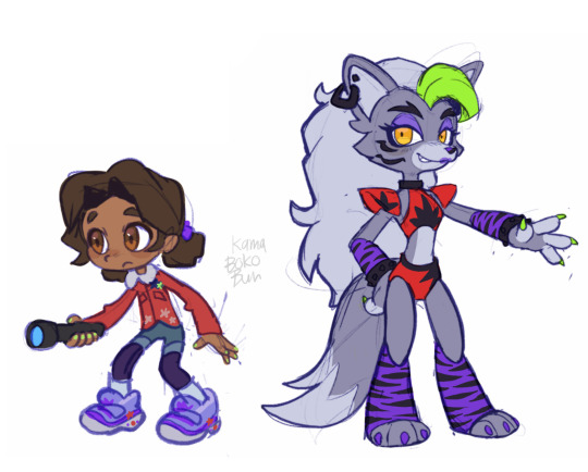
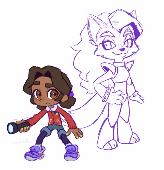
And lastly, here is the art I made for me to reference. Left is the original sketches, and right is the revised poses/designs + traced off of the figures I had already started making. Fun fact: halfway through sculpting (after baking in the pose) I realized that, in-game, cassie holds her flashlight in her left hand and not her right, so I had to completely remove & remake her hands.
I really want to try remaking these two someday, not only because I think I can make them better than I did before, but because Cassie & Roxy are probably my favorite SB characters and I still want to have cute figures of them to display on my desk lol.
Alright that’s all bye bye
60 notes
·
View notes
Text
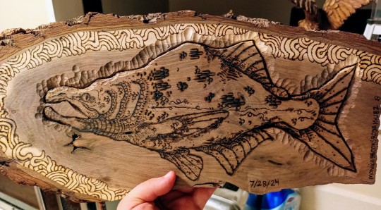
worm and salmon woodburning :))) 🪱
eerrrm .. finally woodburning this piece... that i had sitting in my closet for 2 years... also uhhhmmm *dies* i almost died when i didnt take my meds for the last 3 days never fucking do that it was HORRIBLE but im glad to be back on them things feel better
#eerrmm well tbh i do feel like my depression has been getting worse :(#i honestly didnt take them on purpose so i could spiral and hopefully go through with some plans#but i ended up just feeling really really physically sick this morning#so i gave up#i have not told anyone this but i will be telling my doctor and therapist bc i really do feel worse#doing all my coping skills tho! and handling ppl interactions alot better#artists on tumblr#art#my art#oc#oc art#artist on tumblr#salmon#salmon art#salmons#sockeye#fish#fish art#mixed media#traditional art#traditional drawing#furry#furry artist#furry art#monster oc#original character#artist#my oc#animal#animal art
627 notes
·
View notes
Text
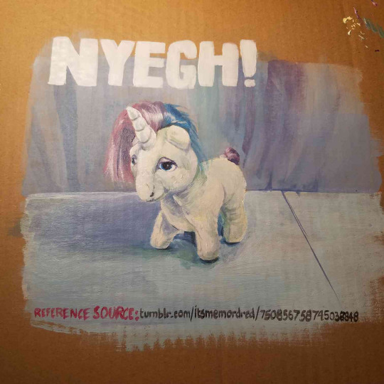
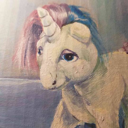
good news : i might try to draw some more again this month bad news? : its mostly from trying to 10+ years later join the Equestria Daily NATG so its really just gonna be horses. might not share it all
also as mentioned this is drawn after the very very good picture from this post
#shevr#my lines#dont get too attached to it my plan for all this is to do cardboard paintings and to every paint over the previous day's one#and in that also i hope this quality of picture is satisfying to y'all bc im not sure i can do better#and the original will be gone so ! eh well#on a diff note the Nyegh! is a very specific reference to the most recent stream from australian comedian tom walker.#it is funny to mostly me and some other idiots#ahahahahah anyway yeayyyyy yayyye i hope i'll also manage to kickstart some more general drawing energy over that month !#if i manage it yanno !!#we'll see !!! hope you can enjoys horses in the meantime ! nyegh !
546 notes
·
View notes
Text
That one creator meets oc thing
Shhhh ik there's giant watermarks and it's super bad quality sHHHHHhhhsh
Mandatory @dingodoodles
Credit to this guy I guess ┐( ∵ )┌

#Tbh I kinda got lazy drawing Rooster#Original plan was to have him either turned around or spinning the teacup#But i spent all of my motivation on drawing dingo and sips so ┐( ∵ )┌#fools gold dnd#fools gold#fools gold sands#Rooster#Sips#Dingo doodles#Idk I just feel like this could've turned out better#oh well c'est la vie
373 notes
·
View notes
Text
that one "do you think we're friends in every universe" Dan and Tray post I made AGES ago but space dogified.. rubs my hands together like a cartoon villain
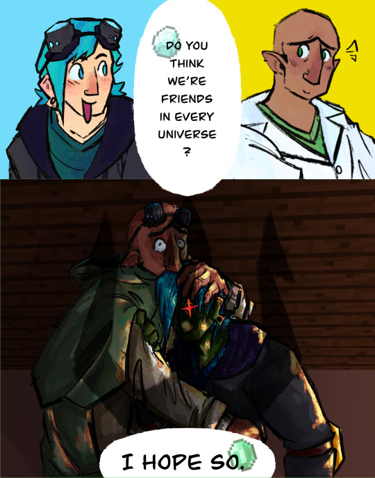
The drawing 👇👇 based on this one painting my friend sent me AGES ago to draw for a different au (mermal 🎉🐟) but uh. IT GOT TURNED INTO A TDM THING-
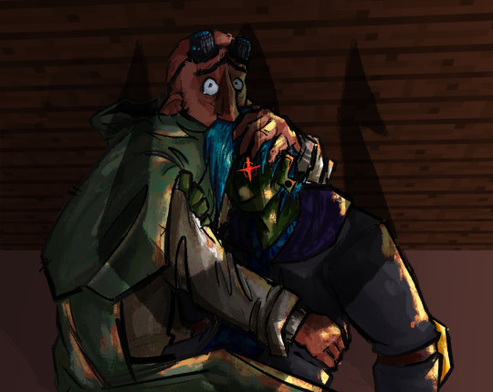
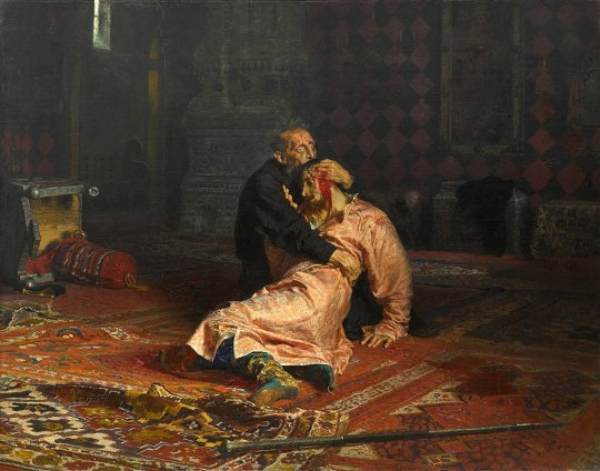
also the original post I made
#DanTDM#DanTDM au#dr trayaurus#minecraft story mode#mcsm#Mcsm au#Mcsm: space dog#Unsure if I should tag jack since he's not like technically here but like that's his trident above them 😝#TH. THE ORIGINAL POST IS A YEAR OLD..#NO FUCKING WAY????#NAW..#I need to remake it I could do it so much better omg#With more fandoms too#I wanted to do tomodatchi life in it too but my wrists were killing me 😭😭#ANYWAY. au ramble time 😝#So. Drawing context! ☝️ Uhhhh SO BASICALLY#Trayaurus is very deep in denial about Dan#Sure. He found the goggles. He hasn't found Dan in six years of searching. Sure all signs point to him being dead#HOWEVER he's been searching for so long HES GOTTA FIND HIM SOON. RIGHT???? (no-)#So when he DOES get solid evidence that Dan was murdered he uh. Loses the plot a little#After having a massive argument with jack and Nurm over it he flees town and heads straight for the manor#And attempts to make the machine he used to revive grim again. But things don't go to plan#Because he's so frazzled and rushed it comes out quite sloppy. Plus he needs bones. And while Dan's bones ARE in the manor#So are a lot of zombie bones. He accidentally creates some freakish mindless bloodthirsty zombie that looks an awful lot like Dan...#Ofc it tried to kill him. But Tray is just so desperate to see Dan again that he ignores this and welcomes the creature with open arms#Before it could hurt him jack finds him and kills it though so he's good!! Tray is furious about this until Jack talks some sense into him#So yah 😝
37 notes
·
View notes
Text

sunrise ☀️
#YAYYYYY YIPPEE MY TREAT FOR DOING TASKS TODAY. FINALLY LETTING MYSELF DRAW SOMETHING#THIS WAS NOT THE ORIGINAL PLAN FOR THE DRAWING AT ALL BUT THIS IS BETTER I THINK#it's not perfect but That's Okay i'm allowed to post art that isn't my best (<- affirmations)#it's been a while since i used that brush :D i couldnt see myself making a background without it so i just. didnt even try JHDJGH#dante was described on priv as chewy btw i just need to let that be known. im glad bc i was going for squishy slime creature#sb#my art#rising sun#technoblade#(that is techno btw! just in the rising sun gear so 99% of him is covered jhdjgh)#i was gonna include energy being sent to him to from the players scattered around. ya know like how the dialogue goes#but then i finished part of it and decided to leave it alone bc i liked that way more#just pretend that all the mana has already been sent his way. pictures taken moments before disaster (for dante)
102 notes
·
View notes
Text
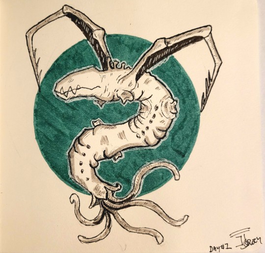
I haven't drawn since the start of the pandemic in 2020 everybody fucking clap its my Screaming Worm Boy (tm) from my fanfic Duality
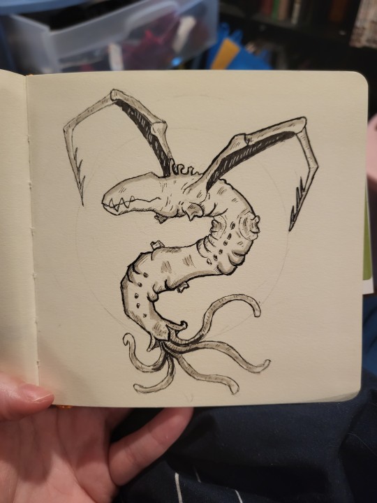
#im not expecting people to clap im clapping for me cause holy shit i can still draw#also i lied i did 1 drawing last year in april for ardyn and that was it#had no plans to draw anything but the noodle wouldn't leave#Two Legs (plaga)#his variant is based off the spider plaga arana and the cephalo#threw in some snek#his body was longer had a standard stinger tip like the regular plaga but he got half his body crushed from a giant rock#and lost all but two of his legs#his body was originally more spider like then he mutated to have more worm like traits to compensate for the lost limbs#so the spaghetti at the end of him is his tendrils that connect to the central nervous system#he redirected it from the mouth and back area where it used to be#tendrils also come out from the little holes down his belly#so he sucker fishes himself to the spine like a pleco#anyway this is the fella piloting Luis's body in Duality post Krauser stab#i just realized im literally writing a fic with the same energy as “would you love me if I was a worm?”#fuck#resident evil#las plagas#plaga parasite#two legs oc#plaga!Luis#sawyer kiddo oc#re oc#duality fanfic#duality resident evil#wish my lighting for photos was better
14 notes
·
View notes
Text

trying to psych myself up to finally do oc refs by doing fandom-related refs instead: volume 1
wanted to update my yuma from whatever tf this au is so he was a bit more unique... takes inspo from a lot of different things while also trying to be its own sorta thing? which is fitting given the au ;)
bonus chibi now that i'm also figuring out how tf to do chibis lol:

#my art lol#synth v yuma#yuma synthv#synth v#synthv fanart#synthesizer v#vocaloid#vocaloid fanart#YES I KNOW ITS DIFFERENT but at this rate its the umbrella tag. all vsynth shit goes under there just like on main 😔#sorry for the annoyign watermarks i just dont want this to get stolennn/traced it'll b my joker arc. is2g#like thats never happened to me before as far as i know but now that my art is getting 'better' i begin to get scared that it will happen#if my fanart got stolen i'd def sting a little yeah but not hurt AS bad as if someone stole my original shit. THAT would hurt#one of many reasons why i post less personal oc stuffs. although as mentioned above i AM in an oc mood so i wanna draw em maybe...#and stuff like this is a step to develop a PROPER FUCKING REF STYLE bc i SUCKKKK AT MAKING REFS LOL 😭 BUT I SHOULD GIT GUD#i have a few other refs planned for vocaloid au (i guess???) related shit but they're not done yet. this one was also a wip that i just??#impulsively decided to redo & finish bc i wanted to draw but nothing else i was trying to draw came out right. advantages of many wips#i have SOOO many things i could say abt some of the things that went into this redesign but i dont wanna come off as pretentious 😔💔#obviously it was primarily inspired by the vimalion yuma design but. there's moreeee that i can't explain here bc tag limits and im shy#i do think i want to try and be more intentional with my character designs now so i'm seeing how that goes as i redesign some old ocs#man though this kind of stuff makes me remember i used to LOVEE doing this stuff. and now its even crazierr given art improvement#uaurhghh my head is buzzing w/. so many thoughts. THIS ALWAYS FUCKING HAPPENS I GET SO MANY IDEAS WHEN IM BUSY GFD#this is actually from today though unlike some other things i might eventually post. that'll make more sense soon#and fuckkk i forgot the chain necklace thing on the chibi yeah but i couldnt get it to look good. whatever
16 notes
·
View notes
Text
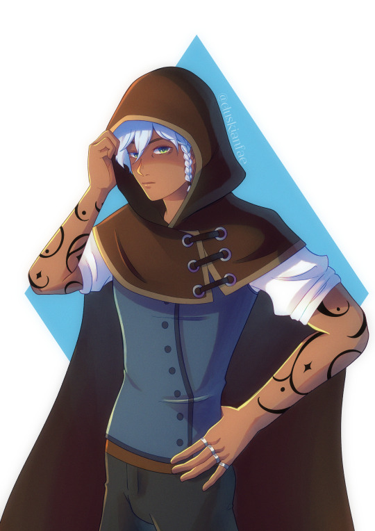
Nothing to see here
#digital art#artists on tumblr#original character#oc#nova draws#songs of stars and dreams#brart#hans falkhart#hansel falkhart#my most handsomest man#I finally can say I love drawing him#now to get used with drawing aLL THE OTHER CHARACTERS#too bad i'm in a voltron brainrot so everything I have planned now is fanart oops#i would draw for Arcane too but Arcane is so pretty and my art is so shite#i wouldn't be able to do it justice#voltron is pretty too but it's closer to my style so I have a better time drawing them#anyway that's it for today's ramble how are you guys doing?
7 notes
·
View notes
Text
"I'm gonna draw today!"
New season of Queer Eye drops.
"Fuccccckkkkk!"
My priorities are a bit skewed.

#in my defense im still recovering from a sinus infection#queer eye#i could draw traditionally but originally was planning on drawing digitally#lazy day#all things just keep getting better
4 notes
·
View notes
Text
dawg so many people in the side of the podcast community im currently observing have their own projects and podcasts i feel like such a doofus for my only creative output being fanart
#the way that my only plans for this year is to get better at drawing comics....#like i do take the process of drawing quite seriously and im planning and keep a regular schedule and stuff#but WOW do i feel silly for being like. yeah all i do is draw niche podcast fanart. its the only thing im good at#but JUST YOU WAIT until i get better at music and also speaking i WILL make an audio drama it is NOT in my area of expertise at ALL b#ut WHATEVR#gonna draw a six page comic to feel better#i gotta start doing original comics too LOL
11 notes
·
View notes
Note
I'm so excited/terrified to see what happens after crocodile betrays Robin cause like. She's Luffys best friend and he's so not gonna take that well. Part of me thinks that Luffys gonna runaway(with Robin?) because of it and that's how we're gonna start meeting other people
:^^^^^^^^^^^^^)
#crocau ask#arc 1 is like. so close yet so far. like. i have the mini arc within the prologue thats about 4 comics long (could become 5) and then the#last thing i need to do is show robin's relationship between luffy and croc more clearly. which is at least 2 comics but might need more.#so including the comic im working on theres at least 7 comics left before were done with prologue!! but!! theres also the keeping up with#the strawhats interlude before we can start arc1 and mannn. im all hyped in my corner and i cant draw that fast (and shouldnt)#the prologue has already turned much longer than i had originally planned (and is much better for it for sure) but ough. hype
35 notes
·
View notes
Text
Becky Botsford jr high version is such a coin toss because I could totally see her leaning HEARD into academics and wanting to be taken seriously.........but you also cannot tell me she isn't wearing an alicorn onesie to sleep each night.
#She would havesuch a fun free cringeful jr high phase but also I think she represses her interests too much to indulge.#Violet? She's not repressing shit. Becky? Her whole existence is repression.#I think I'm gonna go with my original Becky idea and then do a little Wordgirl costume redesign.#To add some like Pegasus wings. And Bob manages to convince her NOT to add a unicorn horn to her costume.#You get what I mean Wordgirl fandom?#I have a few bonus drawings planned for when I post the 8th grade Becky drawings.#Because I have so many thoughts.#And I think they'll be actual drawings and not the edit drawings I've been doing.#The main one will be to fit with the others.#I think Huggy would bemoan the wings addition of the costume at first but then realize it gives him more room to sit while flying.#I mean. A secret identity is such a perfect thing for Becky wihle she's growing up.#She is such a high strung girl and I think that'll get worse before it gets better. Wordgirl could be her outlet for being cringe.#And no one but her closest friends and family know it's her. And her friends and family all know she's got a loving for ponies & princesses#OKAY!#Wordgirl#Becky Botsford#Sentiments of a vampire.
13 notes
·
View notes