#THE COLORS COMBINE TOO WELL. THE DESIGN OF THE CHARACTERS. THE DETAILS. EVERYTHING
Explore tagged Tumblr posts
Text
DAAAAAMNNNN I AM STILL IMPRESSED WITH THE QUALITY OF YOUR ART 😻😻😻😻😻😻😻😻😻😻😻😻 IT'S SO FUCKING GOOD UGHSGEIEJ KISSING YOUR HANDS IN THIS MOMENT ❤️❤️🔥🔥🔥❤️🔥🔥🔥 YOU ATE BECAUSE OF THIS DUDE🍴❤️🍴🍴❤️🍴❤️🍴❤️

omg happy new year ^^ haha *disappears for an entire month without a word*
i'm sorryy i know i should've said something but i really needed a social media break... like if you look at my previous posts you can see me slowly get more depressed ☠️ but i'm getting therapy! and i caught the flu! that's pretty much all that's new sooo STRANGETOWN
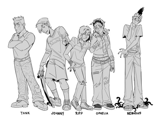
it's not asher f1shart without a bonus... just some guys i drew while i was out NOT tagging everyone i'll die fr
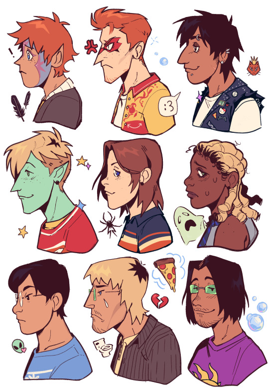
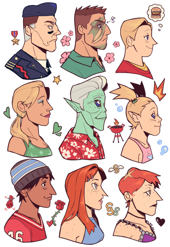
#GUYS WE HAVE BREAKFAST LUNCH AND DINNER FOR THE WHOLE MONTH. THANK YOU F. ART ❤️❤️❤️❤️❤️❤️❤️❤️❤️❤️❤️❤️❤️#F.ART YOUR ART IS MAJESTIC 🌹🌹🌹🌹🌹🌹🌹🌹🌹🌹#MEOWWWW#MEOW MEOWOWOWOW#THE COLORS COMBINE TOO WELL. THE DESIGN OF THE CHARACTERS. THE DETAILS. EVERYTHING#POL IS SO KAWAII STOPP 😿❤️#ugh buzz is handsome.... sigh....#DAMNNNN YOU KNOW HOW TO WRITE IN SIMLISH. YOU ARE GOD#HEHEHEHEHHRHEHE JROO AND TANK HELLO TANKIE HELLOOOOOO MISSED YOU SO MUCHHH DHEHRHJEEBEE#THE CURIPUSSS BROTHERS OMFGFGGGGGGG 😻😻😻❤️😻❤️😻❤️😻❤️😻❤️😻😻❤️😻❤️😻❤️😻❤️😻❤️#THEY ARE CURIOUS HUH#BELLA GOTH#fuck nervous you're so pathetic that's why you're my blorbo ❤️ THE BLACK PARTICLES. SON OF DEATH YEAAAAHH 🔥🔥🔥🔥🔥🔥🔥🔥🔥🔥🔥#D D D D D D. DEPUTA DUNCAN.......#i want to print this so bad.... can i.... pleaseplease please........#PROFILE DRAWINGS. BRO YOU ARE THE DEFINITION OF PERFECTION WHAT#PASCALLLL CPLASCK APPAASSVALL CURIOYS WOMMGGGGGGGGG OMFFGFGGGGG YEYSYEYSYDYYSYWYYSS!!!!1!1!1!1!1!1#LOVE YOU ASHER F. ART ❤️❤️❤️❤️😻😻❤️❤️❤️#ts2#reblog#not my art
2K notes
·
View notes
Text
Making day 4 a bit later than normal. Sorry guys, I’m a bit sick.
So wrapping up origins today because I’ve run out of characters that I think are necessary to include
So hypno steve


I originally planned on fully overhauling the design, but found it to be really difficult with how complex the skin is, so I opted to give him faint steve detailing on the body, some hair, and brighter colors.
In terms of story, nothing really changes. He’s still an experiment created by dark with the ability to manipulate a person’s mind. Really all I want to do with him is expand slightly on how he was made.
So basically, Dark butchered several steves and stitched bits and pieces of them together to make hypno. He then infused a bit of shadow stone alongside several more steves to give his creation life. Unfortunately for dark, Hypno was fully aware of what he was, and more importantly, who each part of himself was before the experiment.
In the end, dark couldn’t control hypno because every part of Hypno wanted vengeance on him. This ended in dark having to lock him inside a machine for his own safety.
Months after the experiment went wrong, Sabre and blue steve stumble upon the island that dark did everything on, eventually finding a lever that they flip to see what happens, inadvertently turning off the machine and freeing Hypno from his stasis.
Hypno quickly finds the two and starts messing with them, starting out small by making them hear each other in different directions, separating the two. Hypno proceeds to focus on rainbow, having a fascination with him since he too is a combination of steves. He starts probing Rainbow’s mind, searching his memories and dreams. He then projects a twisted image of what rainbow wants to the hero, showing him a world ruled and corrupted by him. A world of nothing but rainbow color. Hypno joins him under the guise of blue Steve, explaining what this world is.
Rainbow is obviously horrified by it, which convinces hypno of his intentions. However, rainbow freaks out and starts trying to attack hypno out of fear, which ends up with him actually attacking blue Steve in reality. Hypno, now sure of Rainbow, leaves for the time being.
Hypno’s story ends when Rainbow is at his lowest. His best friend is dead, nightmare is stronger than ever, and he still doesn’t know how to use his powers. Hypno makes him the offer to put him into a deep, trance-like sleep for generations to allow him to build up power. Rainbow accepts, giving hypno the remaining artifacts. After putting rainbow to sleep, hypno destroys the artifacts, feeling that they had no more use.
From then on, he’d act as a sort of guardian from the shadows; forcing himself to stay alive until Rainbow safely reawoke, at which point he finally let go and allowed himself to move on.
Yes I’m taking hypno out of the actual steve saga. He made a single appearance and honestly it kind of ruined the moment for me when he did.
So finally starting the actual steve saga with the main character himself, Sabre

Now, I actually have 2 redesigns for him


The left one is obviously a proper redesign, keeping the chicken body while making it look a bit more detailed. Fun fact about the chicken skin, Sabre has said before that it isn’t actually a onesie. It’s in fact, his face on a humanoid chicken’s body. I just think that’s funny.
So design 2 on the right is based on his modern skin. I felt like the chicken skin was a bit goofy so I put together a fully human one that I think looks pretty nice.
Shared design traits between the two are reshaded/recolored hair and a blue blindfold
So starter lore. Sabre enters the steve world, discovers the steves, and out of curiosity starts making machines to see how they work. He eventually meets and captures the awakened rainbow, and accidentally breaks him during his experimentation. This makes rainbow more hostile towards him as well as begins a slow decay from the damage, corrupting him more and more over time
That’s all I have for today. Lmk if it’s any good
Have a good day/night guys
20 notes
·
View notes
Note
What did you think of annihilation? Any details you noticed?
REALLY loved the cancer symbolism there. and the way it ties in with the main character's affair. in the initial conversation with her husband when they talk about god, she says god makes mistakes because if it weren't for a certain "biological error", the cell's reproductive cycle would make us immortal. this is, of course, bullshit, as the psychologist makes evident in their discussion about suicide vs self destruction. "not many people commit suicide. a lot of people self destruct". lena looks up when dr ventress lists off ruining a happy relationship as one of the examples, closely tying her to the cell lifespan symbolism when ventress mentions that cells die because it's already programmed into their dna (something lena knows well, being a biologist). death NOT as a mistake by god, as a programmed stage of our life cycle. and what does lena say after her last time sleeping with her colleague?
"This was a mistake."
and the issue is: as harrowing, as unfair as preprogrammed, by-design mortality is, a cell that doesn't die and keeps reproducing forever is, well... a cancer. which is exactly what the shimmer is. it refracts everything, it combines dna regardless of species, it creates doubles, it absorbs and transforms, not so much killing, as annihilating what it touches as a consequence of complete genetic reshuffling, engulfing it into itself.
it's god's so-called "mistake" in cell dna (and thus, as an established parallel, human nature)'s tendency to self destruct that finally stops the shimmer's expansion. when lena gives her clone the grenade and takes its hand to set it off, she essentially teaches it to self destruct, like any (ironically) healthy cell would. no more immortality. no more cancer.
the final scene between lena and kane was also very... interesting. i think if i were to interpret it in any way, i'd say it's a kind of reflection on a biological ship of theseus. in the same way one would ask "if most (if not every) cell in your body dies and is substituted every so and so years, is it even still you"? kane committed suicide. he killed himself and let his clone take his place by lena's side, because his answer to that question was... no. and he couldn't deal with it. lena, as previously mentioned, self destructed and "won" against the shimmer as a consequence. unlike her husband, she remained "her original, non-alien self". kane doesn't think he is the same, and we can't blame him for it. but still, he turns the question over: are you? because she may not be an alien clone, but the shimmer changed her too. cells don't destroy themselves as a mistake or for fate, they do it to prevent cancer, save energy, and maintain the health of the organism. dying, changing, replacement, self destruction: they're all a part of our lives.
she doesn't answer. in the final shot, her eyes change color like his. alien. different. changed.
is she still the real lena?
does it matter?
#GOOD MOVIE#MMMMMM#you know those stories where the symbolism is so juicy you can sink your teeth in#answered asks#annihilation
62 notes
·
View notes
Note
okay so feel free to delete this message for asking you about TP crimes. but I'm curious if you have any purely aesthetic thoughts about the Link + Zelda designs, as well as the Zora designs, in TP? like how do you feel about the designs on their own, even apart from your distaste for the general atmosphere + story. again feel free to ignore this for TP crimes and no harm done!
yeah ok. disclaimer for those who don't know. i don't like twilight princess and i think the art direction was almost as bad as the story. do not argue with me about this. let's get into it. link first
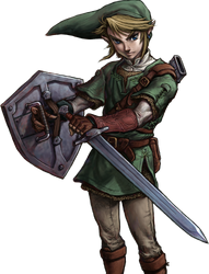
from a purely character-design standpoint I don't think this design is bad, but I don't think it's all that special either. it's very evocative of oot link, which I'm SURE was intentional based off everything else in the game. it does a decent job of complicating the outfit to the standards of tp's setting without going too overboard in terms of little details. the long hat looks stupid but i understand what they were going for. my biggest critique of the design itself is the desaturated color scheme, which I understand was present in the game at large but. I don't like it. I honestly do think that taking away the vibrance and colorfulness of loz takes a lot of the fun out of it. these games were originally for the NES. we're working off of 8-color pixel graphics. link's tunic should be eye-searingly green no matter how dark and brooding you want his story to be, because without that brightness and vibrance the games cease to feel like loz imo.
anyway. the real PROBLEM with this design, and with most of the art direction in tp, lies in how it was actually handled in-game. twilight princess was a game for the wii & gamecube, released in 2006. while advancements in graphics were GETTING THERE, the models were still relatively low-poly. The franchise had already seen a lot of success working with low-poly models in oot and ww, specifically because they leaned into the limitations of low-poly graphics and went for a more cartoonish, unrendered art style which made the blocky models seem purposefully stylized instead of limiting. twilight princess, however, did a complete 180 with the art direction and decided to attempt to HIDE the low-poly graphics behind over-rendered textures. this combined with the desaturated color palette of the character designs makes everything look very flat and lifeless.


in every close shot of link throughout this game i was constantly distracted by how awful the textures made the model look. the rendered folds of his tunic being slapped onto a flat surface, the rendering in his hair being an obvious coverup for the fact that it's one mass on the model with no physics, etc etc. the textures seldom rendered perfectly smoothly on the wii either, so the painted rendering would be strangely pixelated or blurry compared to the model's sharp edges. the game's lighting also seems to operate entirely in harsh black gradients, making the color and rendering choices on the model all the more obvious. Again, I understand that these are limitations of the medium the devs were working with, but i think that art direction that takes the medium into account and works WITH it instead of AGAINST it is almost always more successful than attempts to cover your ass after the fact, and i think that twilight princess could have been a more visually pleasing game if the art direction hadn't been so focused on covering the flatness of the models with hyper realistic textures.
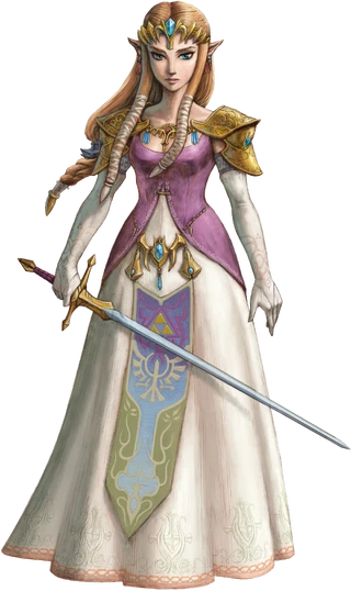
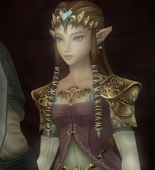
onto zelda. again, we have a theme here of taking the oot design and overcomplicating it. i think the color choices are better here than they are with link, but i would have liked a brighter pink on her bodice. I also think that the dress's neckline was... pretty obviously a sexualization attempt. there's a reason men love this zelda. imo if they were going to keep oot zelda's shoulder armor they should also have kept the breastplate-ish piece in the middle and the high neckline from that dress. you cant say ooh look shes a swordfighter see she has armor!! and then leave her fucking jugular exposed. no wonder she got possessed by ganon immediately. other than my general complaints with the over-rendering i don't have much else to say about her tho. shes fine

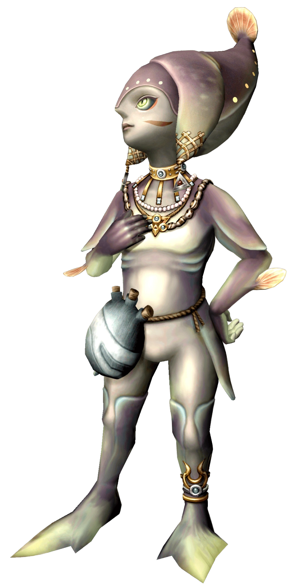

the zora tho... this is where i start to get pissed off. HOW ARE YOU GONNA DESIGN A SPECIES OF FISH PEOPLE BASED ON TROPICAL FUCKING FISH AND THEN REFUSE TO PUT A SINGLE SATURATED COLOR INTO ANY OF THEIR DESIGNS. the way these designs could all be improved by about a hundred percent if you just TURNED UP THE GODDAMN SATURATION. GIVE ME A REAL RED. IM BEGGING. UGGHHHHHHHHHH. i also think the ugly rendering REALLY shows through on these guys because they don't have a lot of detail on them to cover it all up. someone needs to explain to these designers that you don't shade with black. like. god. the designs truly are not bad in terms of like creature design i dont think but they are so DESPERATELY in need of color that it's fucking distracting. color is not your enemy guys please
#tp critical#twilight princess art direction my detested. bane of my fucking existence#COLOR IS NOT EVILLLL YOU CAN PUT SATURATED COLORS IN YOUR DESIGNS ITS OK. ITS NOT GOIGN TO BITE YOU#asks
65 notes
·
View notes
Text
My Atlantis The Lost Empire Review!🗺️🪖💎🏺💣🛞🧭⚓🛟

I finally got the courage to do it! Yay!
First I'd just like to start out by saying AOAHSJDJDHFBJFJFJFJFIGJGJDKSOXJVJFJDJUVJFUFJFUGUGHFHFUDIDJDJFHFHFUFHFJ!!!!!!!!!
🤩🤩🤩
Okay, stimming done! I should note, I don't hold back in my reviews. I see something wrong? I can and WILL say it! Luckily, there's like, nothing wrong with this movie, so you won't hear much of that from me! Lol!🤣 This is first time doing this kinda thing. So I apologize for any errors or incorrect formatting.
Now, without further adu, the review! (Hey that rhymes!) Below the cut cus it's LOOOOOOOOOONG!!!! It's literally the longest post I've made. And there's SPOILERS! So beware!
Okay, I'm not even sure where to start cus this is one INSANE ride of a movie! I mean HOLY COW!!! IF ALL OF DISNEY'S MOVIES WERE THIS GOOD, I'D WATCH
EVERY
SINGLE
ONE.
I'm not even kidding. I don't know what I'm doing, so let's just start with the World building.
WORLD BUILDING
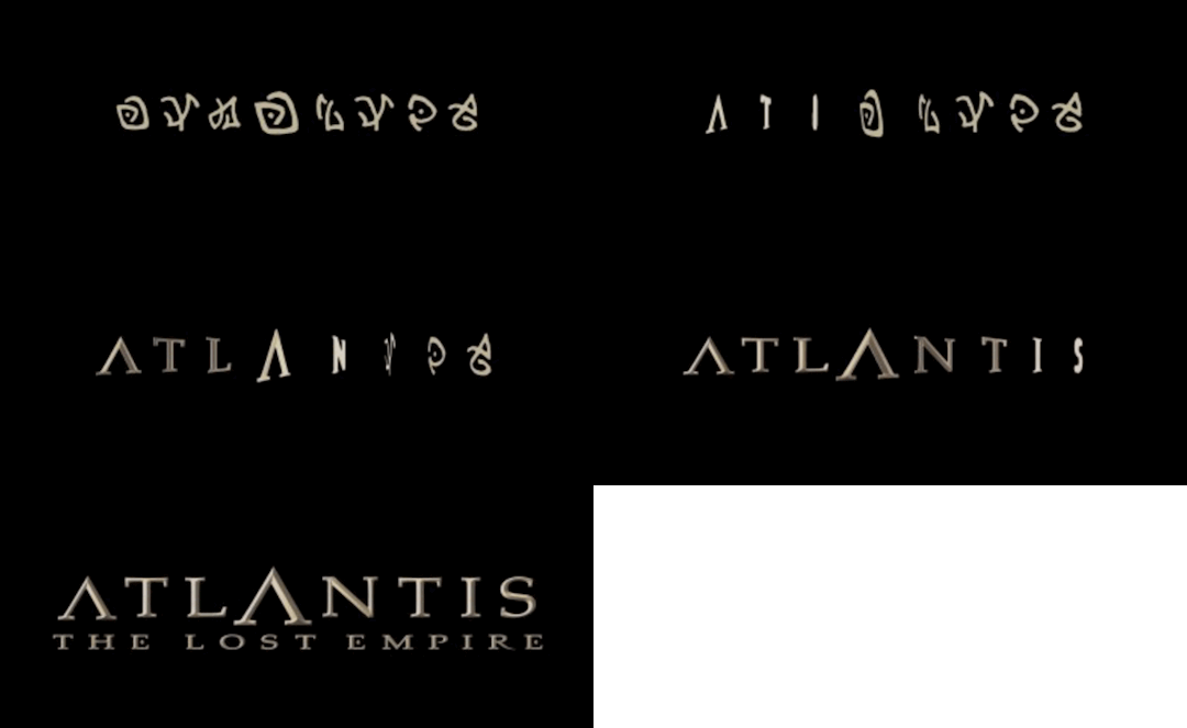
This movie ROCKS in the world building department. Everything is well rounded out and looks stunning. One of the things that I found most exciting was the fact that they made a WHOLE FRICKEN USEABLE LANGUAGE FOR THIS MOVIE!!!!!! They actually brought in a linguist to make it!!!! That's how committed they were!!! Do you hear about Disney doing this nowadays? NOOOOOOOOOOO!
Also, THE STEAMPUNK AESTHETIC.
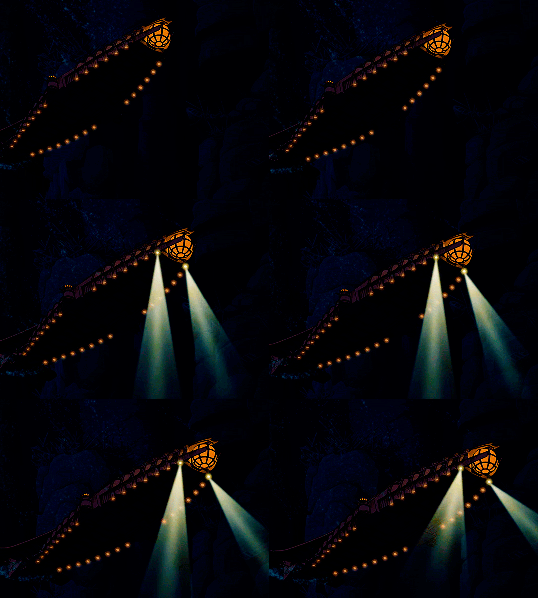
LOOK AT THIS SUB!!!! LOOK AT IT!!!!!
It's so detailed and cool looking!!!! If I saw this in love action, I think I'd freak! How can steam powered vessel go below the crush depth?
I DON'T CARE!!! IT'S AWESOME!!! (I especially like that bubble in the front. How fun! I'd definitely be looking out of that thing all the time!) I heard people say that watched the scene with the Leviathan attacking the sub thought it looked so real, that some people who worked on army subs got FLASHBACKS!!! I'm not even kidding! Everything during those scenes felt so real and immersive! You can tell Disney did their home work!
Okay now Atlantis itself!
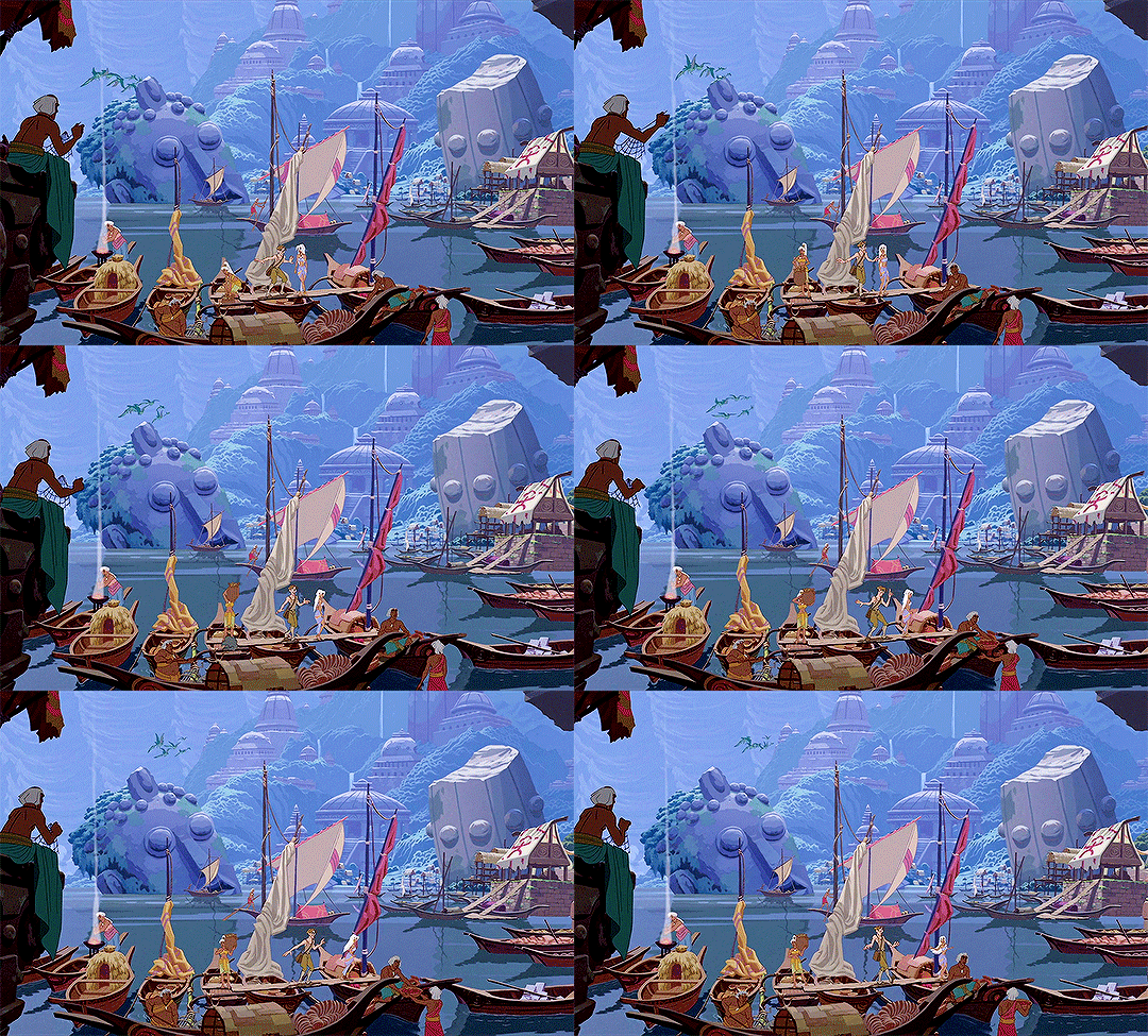
It feels like it's own culture. It's feels real. It doesn't feel or look like a lazy combination of two cultures. It's distinct and interesting looking. And the people are very unique in appearance too. With their blue eyes, white hair, and coppery brown skin. It's a beautiful combination. And their clothes are nice as well. Lots of bright colors. Mostly blues, purples, magentas, etc. Very beautiful.���️

OH! OH! AND THEIR TECHNOLOGY!!!! Oh my gosh!!! That leviathan and those fish shaped flying machines?!! HECKIN RAD!!!! How are they made?!?? What are they made out of?!??? So many QUESTIONS!!!!!!
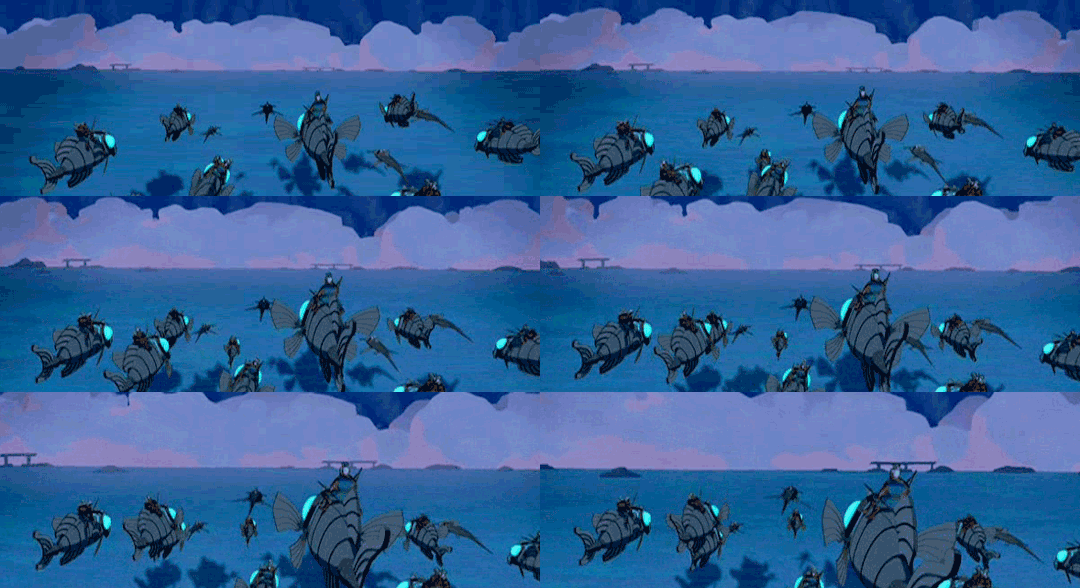
I especially love the use of crystals in the Atlantian technology. I actually studied stuff like that and from what I've found in my research, it was actually entirely possible that ancient civilizations, like Atlantis used Crystals in somes ways of energy. Which is amazing! I don't know if that's where they got inspiration. But I found it intriguing none the less!
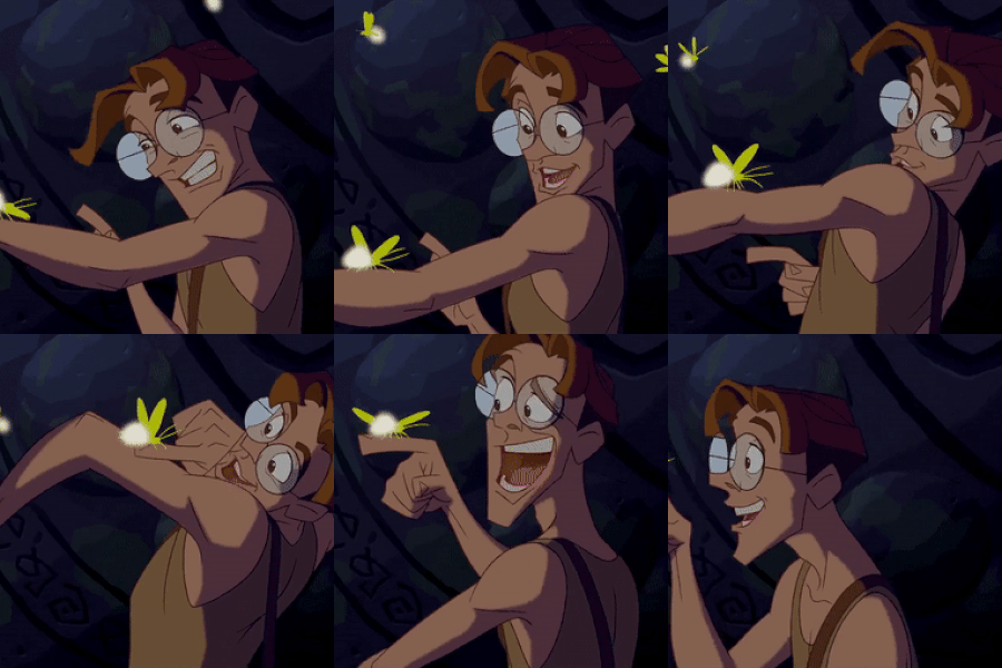
And the Creatures were also cool! They felt almost alien or prehistoric in appearance! It was really cool. Some of the creatures looked like they came straight from Pandora from the movie Avatar! I'm a sucker for fantasy creatures and speculative biology. So I'd love to see If I could figure out everything about the ecosystem of Atlantis! To bad they didn't go into more detail about it, but the movie wasn't about the critters. Still, hats of to the crew for giving them such interesting designs!
Okay, Onto more stuff!
THE CHARACTERS
Milo. He's adorkable.
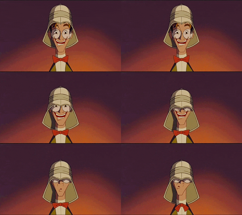


That's it. He's perfect. I love him.
Okay, lol. Actually I have a lot to say. They gave him SOOOOOOOOO much personality! He's dynamic and easy to read! He's allowed to push his expressions and be exaggerated! He's just so fun to watch! Big thumbs up to his animator(s). And look at those glasses! And that hair! Such a good character design! He's just so fun and loveable looking!❤️
And he's allowed to show a full range of emotions! I know this one sounds weird. But it drive me crazy when a character is only allowed to show one emotion and by completely defined by it. Like being sickingly happy go lucky, or dark and moody. It's like, that's all you're going to do with them? But Milo, goes through the full range of emotions in the movie. He's got excitement from going into the unknown. Sadness and grief from the loss of his grandpa and parents. Anger at Commander Rourke's betrayal and utter disregard for the Atlantian people's lives. He experiences everything and it all feels so relatable. He's just the best. I also love how enthusiastic and kind hearted he is. He has the heart of a hero despite his first impressions. And his cute crush on Kida is the best. He's such a goober. He needs to be considered a Disney Prince. He deserves it more than most.
✨KIDA.✨ Just KIDA.🤩
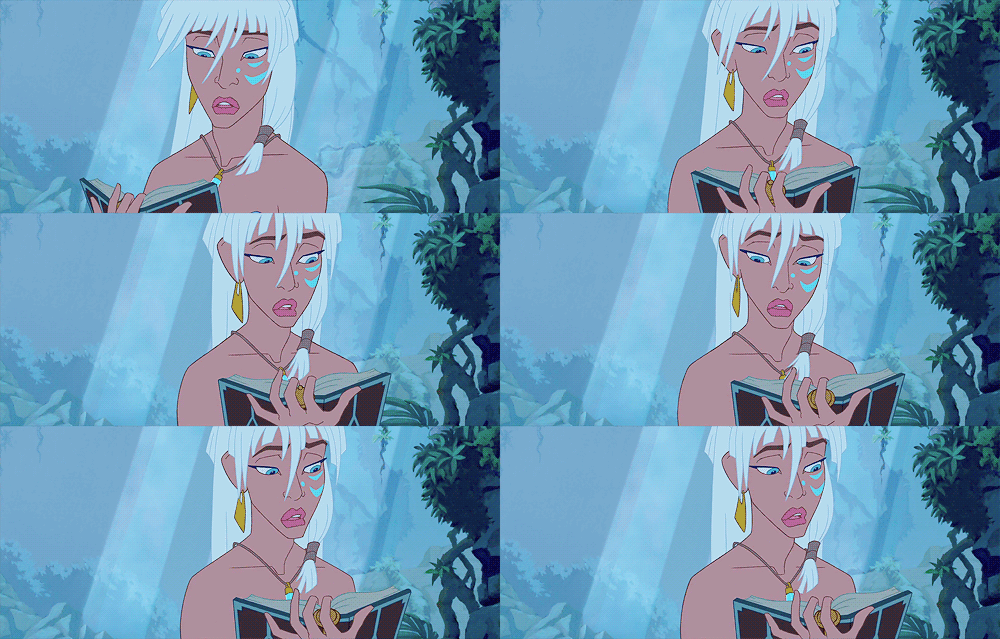
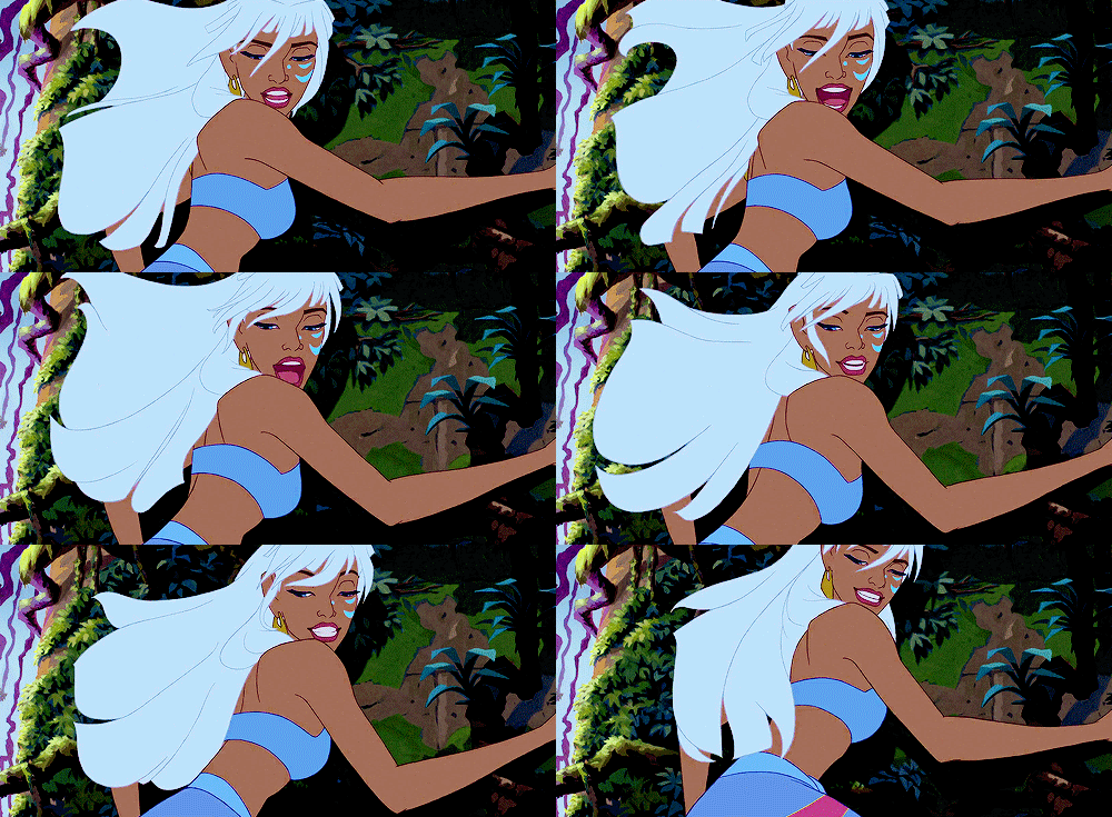
Kida is GORGEOUS. 🤩🤩🤩🤩❤️❤️❤️❤️❤️❤️❤️❤️❤️❤️❤️❤️❤️❤️❤️❤️❤️❤️❤️❤️ LOOK AT HER DESIGN! IT ROCKS!!!! WHY THE HECK IS SHE NOT AN OFFICIAL DISNEY PRINCESS!?!??!? SHAME ON YOU DISNEY!!!! She has ALL the qualifications!!!!
She's strong! Mentally, emotionally, AND fricken physically!!! She cares deeply about her people and her culture!!!! She is ROYALTY. She is a WARRIOR!!! She is a QUEEN!!! If any of the "forgotten Disney Princesses" deserved the title of official princess, it HER! FORGET RAYA!!! You're telling me that the Disney heroin that taught people to trust their abusers, EVEN AFTER THEY'VE HURT THEM MULTIPLE TIMES and then GUILT TRIPS THEM, deserved the title of Disney Princess more than THIS WOMAN?!??! BULL! ABSOLUTE BULL! (Sorry for the rant. I have to refrain myself for going on a lecture about how Raya never deserved that title. She is my least favorite Disney princess. 😖👎 KIDA ALL THE WAY!!!!😄👍💕)
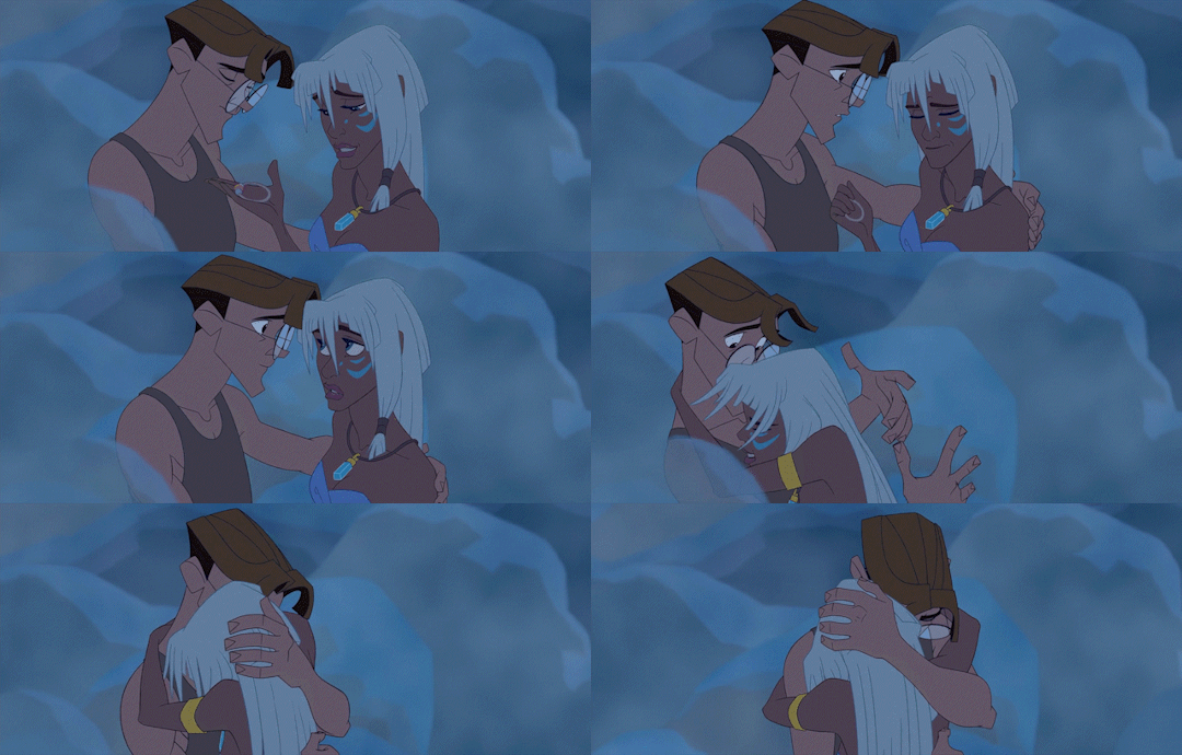
Oh, and her and Milo are the cutest couple. I heard people were upset because they didn't get a big kiss at the end. NO! They didn't kiss at the end of the movie! They didn't need to! They just FLIPPEN met!!! I wouldn't either! We're they still an adorable couple? HECK YES!!! They cared about each other and learned from each other and UGH! They so CUTE!!!!! And Milo gets to be King Consort of the Kingdom he spent his entire life searching for alongside his Queen who is also the woman he loves! How great an ending is that?! He knows they were both great rulers. You know it.
Commander Rourke. I hate this man.
I can't even find any good gifs of him. THAT'S HOW MUCH PEOPLE DESPISE HIM! Rourke is the DEVIL! Hidden under the guise of a good old American Army Commander! Which is why he is one of the BEST if not THE BEST Disney villains! He was about to let an entire lost civilization of people die, just because he wanted their LIFE FORCE!!! He definitely deserved to be transformed into a crystal creature then shattered. What a complete MONSTER!!!
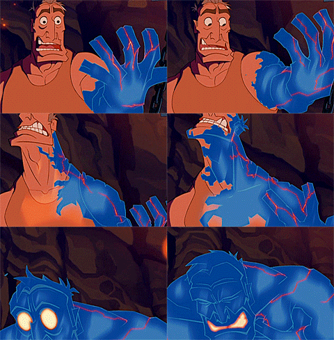
I have to admit, I was actually already spoiled by the twist ending. I already knew about it from multiple sources. But somehow, that didn't matter! I watched it and I still felt connected to Rourke, even though I knew what was coming! It was so good! Rourke was written as the stereotypical brave army commander. Down to the last detail. Making a memorial for the lost crew mates. Being friendly with the main cast. Acting like a true gentleman. This is why he makes such a good villain. Nobody expects someone like him to be in league with the NAZIS of all things! Ultimately, he was an absolutely cruel and insane man, that nobody saw coming. It is probably the BEST twist villain I have EVER seen. Incredible writing. Wow.
Now, I'm not sure If I want to go through every single character. But I loved the all and definitely have thoughts on them, so I'm gonna speed run this.
Lieutenant Helga Katrina Sinclair. MA'AM??? Just what do you think you're doing in a kids movie?!!??
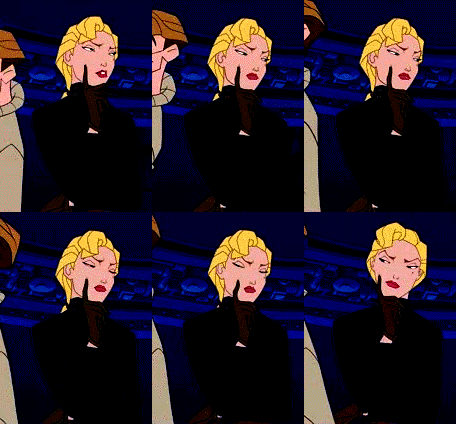
🤣 Okay, in all seriousness. She was actually a cool character. She was tough as nails, beautiful, confident. To bad she was that jerk Rourke's head lackey. I mean, she sort redeemed herself toward the end. But it was mostly because she was mad at Rourke for betraying her. Not because she cared about the Atlantis or Kida. Soooooooo... I don't know.🤔
Audrey Rocio Ramirez. LOVE HER!!!!

Her backstory his incredible. Her dad wanted sons. He got two daughters. Audrey and her sister. But you know what? That didn't stop them! He wanted someone to run the garage with him? HE GOT IT! And she's good too! I also love the little detail in her backstory that says her sister is a literal heavy weight boxing champion. You go girl! Show'm what's up! I wish they had given her a name. (I'm gonna give her the name Rosa. That feels right.)
Wilhelmina Bertha Packard. Honestly the most relatable character in the movie.😂 This one gif pretty much sums it up for me.

Somehow, I feel like me and old Mrs. Packard would get along just fine.🤣

Vincenzo "Vinny" Santorini. I'm not sure whether he's crazy or just like explosives a whole lot. Lol.

I actually thought he was Russian the first time I saw him. It wasn't until I found out he was Italian that I realized I made a horrible mistake in identifying his accent. 😂 His almost always neutral expression is helirious. I guess once you've blow up a lot of stuff, nothing phases you. Haha!
Dr. Joshua Strongbear Sweet. *Squeees*
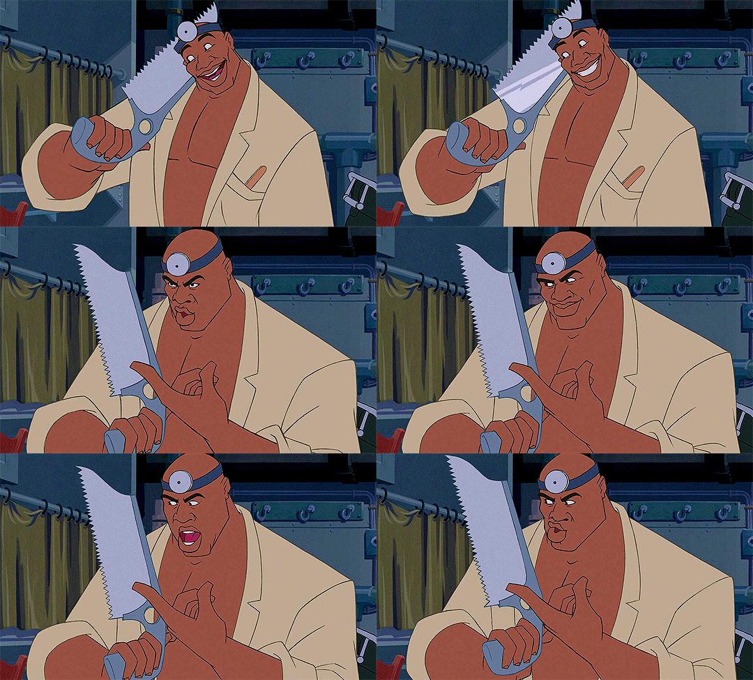
As someone who has Native American ancestry, (my grandfather is Apache,) I was SO excited to see a someone who is half Native American in this film! I mean, half Black and half Native American?! That's INCREDIBLE! I can safely say I've never seen that type of representation in a film before. And he's also one of my favorite characters.
Gaetan "Mole" Molière. This dude is WEIRD... And of course I love him. Haha!
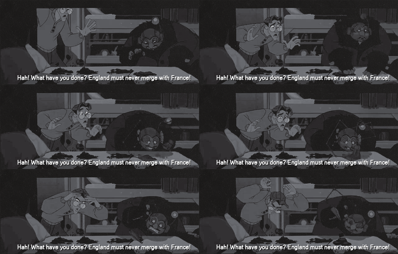
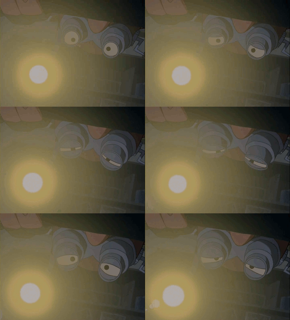
"You have disturbed the dirt." - Mole
I was laughing so hard when I first saw this guy come on screen. He's so dramatic! But he's french, so I guess that fits.
Jebidiah Allardyce "Cookie" Farnsworth. He said this.👇
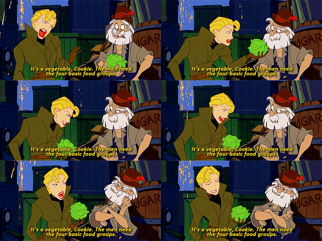
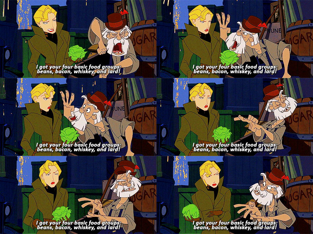
That's one of the best lines in the film. ☝️😂 But seriously, what can I say? Crazy southern chuckwagon cook with as many unhinged stories as he has pounds of bacon grease. How could I not love him? 😂❤️ One thing I wondered was if this was such a high budget expedition, why couldn't they get like a five star chef instead? NOT THAT I'D WANT THAT BESIDES COOKIE!!! I'd be so mad if they replaced him. I was just curious. But I'm not gonna question it. He's the best and I love him. No five star chef could ever top Cookie.
Kashekim Nedakh i.e The King of Atlantis! WOW.

LEONARD NIMOY?!!?!?? That was pretty much my reaction when I found out who played Kida's father. Who would have guessed that Spock would end up playing a king from a lost empire?! The crew that worked on this movie said that while he was in the recording both, they were stunned. He put his whole heart into the role. They felt like the king was standing there in the room with them! And I FELT that. He sounded just so real! It actually sounded like I was listening to a real ancient king speaking. He was amazing for the role. I'm floored.
THE STORY
The story was amazing. I got a lot of Jules Vern Journey to The Center of The Earth vibes. It was clearly inspired by it.

Milo felt very much like the Axel of the story. Despite being much braver then him. The whole thing felt so cinematic and thrilling! Me and my family were either screaming with excitement or laughing super hard the whole way though.
As the for the moral? Well, it's actually kinda hard to pinpoint exactly. But I think that because unlike other movies, it lets the story show the moral instead of the characters telling us directly.
I would say it shows what happens when people value money and power over human life. Which is important in the time we live in. And that people's culture should be respected.
In all. A very good movie and I highly recommend it. It's a fun, bold, thrilling adventure that you will love.
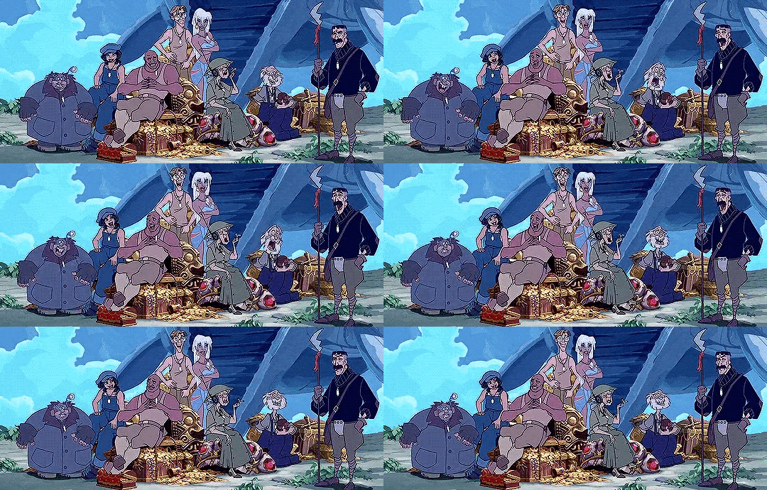
✨Thanks for reading my review! Bye!✨
#Atlantis The Lost Empire#disney atlantis#disney 2000s#Disney reviews#movies reviews#H#JP speaks#cult classic#milo thatch#princess kida#commander rourke#atlantis disney#leonard nimoy#disney princesses#disney animation#disney princess#disney movies#Disney
44 notes
·
View notes
Text
Anon suggested I do this so here you go! (Sorry if you came to my blog for normal reasons✌️here we are cringe and free)

This isn't a design tier list (I think most of their personas have cool designs). It's purely about how fast it takes me to decide whether to smash or pass. Some of them i just dont know how it would even work. And some of them, well..... just one chance please. please.
More detailed explanations below the cut. Warning: long and sort of nsfw? You know what they say, "no sideblog, we lose followers like men"
I've talked about Akechi's personas a lot before but Im gonna do it again since theyre just so good. Loki is a definitive no.1 for me both in terms of fuckability (snatched waist, claws, hypnotizing pattern) and also design. Compared to other personas, he doesnt wear an outfit or additional accessories, it's just the braids and gold pumps and the huge sword. It's a simpler design which makes it more sleek and powerful and lethal (since the emphasis is on his sharp edges). Plus sticking to minimal colors makes him more memorable
Arsène is second place for the exact same reasons as Loki (minimal colors and accessories) plus he got the childbearing hips. Both Arsene and Loki got that freak in them but my headcanon is that Loki is openly freaky while Arsene acts like a gentleman to conceal his freakishness until the right moment. And personally I find open freakiness hotter in personas. Sidenote: Closet freak x Open freak is a peak dynamic and this is why I'm an Arsene/Loki truther


Célestine is a total baddie. Look at her... I love the huge braids that form a heart (similar to Loki, maybe I just like big-ass braids). I think her off-shoulder top and tights are so hot. She's wearing glasses and glasses are sexy. She's stepping on someone and I wish it was me.
Hereward is here for one thing: fat ass. I couldn't find a back shot of him but when you use him at the end of the game we see everything from a backwards angle and well,,., it's very thicc. And i'm an ass + thighs guy at the end of the day, so. (Also design-wise I think it does a great job combining the lethal vibes of Loki with the noble dignity of Robin Hood. It's the perfect representation of Akechi's character growth)


Satanael is huge which means he definitely has that monster dick. I like that his hands and feet look like bony claws. He's terrifying and demonic and that's what I'm here for. Robin Hood has huge boobs. I kinda wanna feel them up 🥺👉👈 if he'd let me. He's lower ranked than Akechi's other personas because ppl interpret him as the 'good/nice' one as opposed to Loki's nightmare fuel. And I just find freakish personas hotter. Thats just me tho. Raoul is at the bottom of S-tier because he's like Arsene but less childbearing hips :( They also replaced the top hat with a fedora(?) which is so funny


"Hot" tier means I think they're hot but i had to think about it first (aka not an instant smash). It's Carmen, William, and Vanadis. Carmen is still sexy but less cunty than Celestine (Carmen doesnt have the huge braids rip). William has great drip and a hot skull face but he's stick thin so i banished him to this tier. That guy has no thighs. Vanadis looks sinister, but has too many patterns going on for me. I like everything from her waist up tho


"Eye-candy" tier means I wouldn't smash but they still look hot. I put Captain Kidd, Hecate, Kamu Susano-o, Zorro, and Ella. They all have the same issue. Too many accessories or patterns/colors is apparently a turn off for me? Captain Kidd and Hecate at least look terrifying in the sexy way. Zorro is dorito-shaped which is more funny than hot. Ella just looks pleasant, which makes her pretty but not fuckable. If I wanted pleasant I'd go after a nice normal human. But these are personas, I'm here for quasi-monster fuckery. Give me terrifying and freaky
"Maybe if you paid me" tier means I'd definitely pass but I'm not that opposed to it. I put Gorokichi, Cendrillon, Seiten Taisei, Mercurius, Diego, Agnes, and Astarte. These have the same issues as the "eye candy" tier (too many accessories, patterns/colors, etc.) and also noticably diminished in their lower halves (I told u I'm an ass + thighs guy lol). I'm so sad that Seiten Taisei doesnt have a scary skull face like ryuji's other personas. Astarte is Haru's hottest persona by far and I got so upset that her third awakening brought back the big dress noooo give me back the golden bra lady.
"Pass" is self-explanatory. Every other persona is unfuckable to me. I feel like the most controversial ones in this tier might be Johanna and Anat? Sorry, I know some people are into robots but personally I'm not.
This was fun! Thanks for the suggestion anon. All my personal preferences obviously, I hope no one gets offended (?). If you've read all the way to the end for some reason then congrats, you are officially one of my strongest soldiers
#in reality fucking any of these personas would probably kill me but at least id die doing what i loved#(says someone that does not fuck and doesnt want to irl lol)#Also making this tier list made me realize that none of the female characters' personas are muscular or thicc. i wonder why#also sorry that i gave up finding pics of the personas for the lower tiers#my post#persona 5#persona 5 royal#phantom thieves#shuake#i shipped arsene and loki in the post. does that count#p5#p5r#there are too many personas to tag#p5r loki#p5r arsene#p5 arsene#long post
9 notes
·
View notes
Text

once upon a time...

lili | 22 | she/her | infp
hii, welcome to my blog! i'm lili, and it's so nice to meet you 🫶
this is my personal blog where i post about my life, thoughts, and interests. and who knows what else! i love books and writing a lot, as well as a lot of fandoms and other things like pretty aesthetics. if we have any interests in common, feel free to hang out here for as long as you’d like and come say hi! i’d love to be mutuals and i love making new friends 💕
below you can find info about me, my fandoms and interests, and my blogs!
side blogs: @onceuponaneverafter (OUABH, active), @seeyouinthestars (the aurora cycle, inactive), @legendarydante (caraval rp, active), @rosegoldscrimson (caraval/ouabh rp, active), @the-maidendeath (caraval/ouabh rp, active)

...there was a girl...
𝓐𝐁𝐎𝐔𝐓 𝐌𝐄
to put it shortly, i'm a hopeless romantic with a love for everything creative! you will most likely find me procrastinating on something, impulsively starting a new project, or falling in love with fictional characters and daydreaming. or all of them at the same time.
i'm a university student, working part time and trying to write a BA thesis - so if i disappear from time to time, i'm probably busy and stressed, and will be back soon!
out of fictional characters, evangeline fox and cress darnel are very relatable to me. if they are to you as well, i love that for us!! this is a safe space for shared fictional crushes, too - if we love the same character, we both have good taste 🫶

...who loved deeply...
𝓕𝐀𝐍𝐃𝐎𝐌𝐒 & 𝐈𝐍𝐓𝐄𝐑𝐄𝐒𝐓𝐒
my fandoms :: once upon a broken heart (OUABH), caraval, the aurora cycle, acotar (the fandom scares me but i've read the books), shatter me, divine rivals, the lunar chronicles, the rosewood chronicles (RWCH), star wars (+ the mandalorian), star trek (movies + next generation s1), shadow and bone, six of crows (first book), minecraft story mode (old fandom but i sometimes reblog stuff from it!), mystreet (also old fandom but i’ve seen it many times), the selection, the hunger games, divergent, she-ra, gilmore girls & more, feel free to ask if i know a fandom!
other things i love :: my friends, giggling over fictional characters and fandoms, taylor swift's music, minecraft, aesthetics, tea, pretty skies and clouds, fairy lights, fangirling, roleplaying, houseplants, writing, reading, dancing, arts and crafts (including drawing, painting, knitting, sewing, graphic design...), singing, baking, the colors purple and pink, flowers, all things soft and cozy, sparkles, pretty dresses, girls (as in i’m bi,, i think, it’s an ongoing crisis but i know i like girls), interior design, and honorable mention goes to the rivals to lovers and sunshine character x villain tropes 💕
my writing :: i sometimes write fanfiction for fun, and make rather slow progress on bigger projects that i'd love to turn into full novels and publish someday! my favorite genres to write are fantasy, romance, and sci-fi - sometimes combined. i also roleplay many of my fandoms, please dm if you’re interested!

...and dreamed big
𝓜𝐘 𝐁𝐋𝐎𝐆𝐒
crenna - main blog :: this is where you'll most often see me hanging out! i post about books, writing, and my life, i reblog posts i like, and i've been trying my hand at graphics (such as dividers) so i might post those at some point too.
onceuponaneverafter - side blog :: this blog is dedicated to the OUABH series, and only has content related to it. a more detailed blog introduction is pinned there! i post theories, general thoughts and observations about the series, and fanfiction (working on it hehe).
seeyouinthestars - side blog :: dedicated to the aurora cycle series, currently inactive until i reread the books haha. only contains reblogs as of right now.
legendarydante - side blog :: roleplay blog for dante/legend from the caraval series. i sincerely apologize for the absolute chaos that rp has become.
𝓠 & 𝐀
do you rp your fandoms? // yes, i do! i'm currently not actively looking for new roleplays, but if we both love a fandom, feel free to dm me with your ideas.
can i tag you in tag games? // absolutely! don't be shy, i love them 🫶
why have you not responded to my message/tag/ask even though you've been active? // even though i try to respond frequently, sometimes it takes me a while to get to individual notifications when i’m not in the right headspace. i might also have just forgotten. so sorry if that happens!
can we be friends? // yes!! i love chatting and meeting new people - especially if we're mutuals, feel free to interact/message me anytime, i promise i'm more scared to interact with you 🫶


— 24.2.2024. 🤍
15 notes
·
View notes
Note
I'm so sorry if it's too long but I just did a reread and decided to take a look at the designs on Toyhouse and it reminded me how much I love IHS.
I love all the designs of your characters, they are so deliberate. Take the Golden Grove family for example. Their fur colours perfectly match the name of this pride - all characters from this place are golden/have fur that's a certain shade of gold. Just by looking at them you can tell that they're related. But that's not everything.
I looked at the designs of three sisters and their parents and I noticed how some of the traits of their parents can be found in their daughters. Vicious is almost a copy of her mother Watchful, while Clever looks so much like her father Wild. They all have respectively a similar coIours and face shapes. In all of that Careful, the middle child here, is a perfect combination of her parents - she has her father's muzzle shape and eyes shape but her colour palette is more like her mother's. All marks are placed with so much thought that they help to recognise a character. The funny thing about the similarities with parents is that you probably created sisters first and then their parents - so you actually had to take a look at the sisters and then create their parents. While making sure everything made sense.
I tried to find similarities with Hope, Adamant and Quiet but I find it a bit harder, maybe cause they're still young. But older Hope definitely reminds me of Clever and Careful, rather than Vicious. Maybe it's the fur on her cheeks. I noticed that Adamant has the same fur colour as her grandfather, Jasper the First and I find it cute. And of course, how could I not mention Breccia and her freckles that she gave to all of her grandchildren. I love them <3
What I mean to say is that I adore how much thought and effort you put into your story. Every time I reread I find something new to adore. I love the plot and world, but I really like how you also put effort into your designs. You manage to make all characters stand out and be easy to recognise but you also find a way to make sure that audience can tell who is related to who. Thank you so much <3
And tbh I really like the new schedule with a page for week.
Well first of all, I do love a good wall of text, so don't apologize haha
Second, I'm glad you like the new schedule. It's actually activated the speculation part of the fandom, which we also love LOL
Third, THIS MAKES ME HAPPY! I love when people go back and notice the details we included. I did work backwards from the sisters to the parents, just because we had no intention on showing the grandparents, but people asked and I thought they'd be fun to design too. And they were! (This is to go with a previous ask, but this is also part of why we did away with color-coding, just cuz Wildfire looked great as a blonde, but maybe he's from somewhere sandy, who knows.) And it was interesting distributing all the different characteristics of them. Still not satisfied with Careful, I wish I'd thought on her a biiiiiiiit longer. I just didn't think anyone would care about her LOL
Hope will look more like Clever when she gets older, so once I can properly elongate her face, it'll be more obvious. I'm slowwwwwly gonna show them aging, Storm's hair will get longer, Adamant will be more buff, stuff like that. Right now (and people will see this on next week's page) Hope actually looks pretty similar to Careful. Careful just has to pull some more... Hopelike faces first for it to be obvious haha
Overall I'm happy with the designs and it brings me much joy to have people analyze them. Character concept is one of my favorite things to do, and I like being creative while being limited at the same time. Lions are a good way to practice that. So thank you again! - Cat
#ask#ask us stuff#cat answers#golden grove#vicious#careful#wild#watchful#clever#hopeful#adamant#jasper the first#breccia#thundering mountains
35 notes
·
View notes
Note
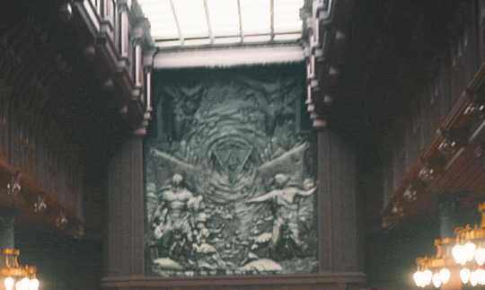
Have you ever took notice of the odd mural in the dining saloon. When Eyk goes to announce the change of course to the 1st class passengers, the first shot is of him with his back towards the camera and the crowd looking at him, and over their heads is this grey mural depicting what seem to be two giants (they appear to be giants to me, at least), the Earth symbol, and the vortex of water that Ling Yi witnessed. Have you any thoughts about that? It's too peculiar to not mean anything!
hi anon and thanks for the ask! here's the mural in question, on the kerberos:

and on the prometheus:

broadly speaking, this is such a great example of the level of attention to detail on this show and how everything, from the writing to the costume and set design to the creepy music and sound effects, was so meticulously crafted to breathe life into this world and give us clues for how this story would unfold.
as far as the mural itself, it’s chock full of foreshadowing and references to greek mythology, but before we dive into that, it’s worth mentioning that the mural is a relief sculpture, that is, a piece of art where the figures project outward from a flat background. this sculpted marble look of the mural ties in nicely with the opening credits which shows the characters as statues:


and statues, of course, are a physical, three-dimensional representation of a moment suspended in time, which turns out to be the twist with all the countless repeating simulations. it’s such a small detail that, combined with all these other small, subtle details, really sets the mood and tone for the rest of the show. immaculate vibes, truly.
but back to the mural, here’s a clearer image that emily beecham posted on twitter (with a bit of color correction and added sharpness):
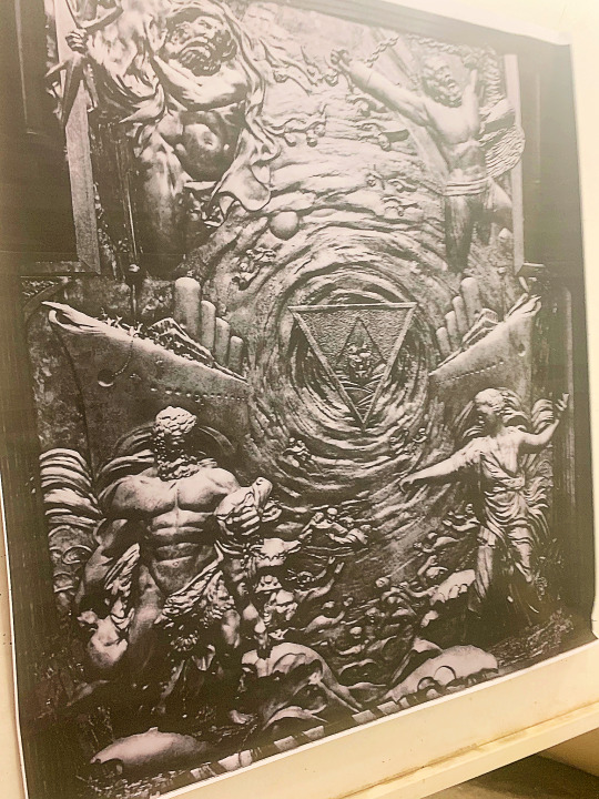
you have the two ships, prometheus and kerberos, flanking the the triangle/earth symbol (with what looks to be parents and a child in the center) in the middle of a swirling vortex, which all foreshadow the ending where the failed simulations/ships are swept up in the vortex into the graveyard.
in each of the corners, you have a significant figure from greek mythology:
starting from the top left, there is zeus with his lightning bolt, who curses prometheus to his punishment in the top right, who is ultimately saved by hercules in the bottom left, who is depicted wrestling cerberus in the last of his 12 labors. in the bottom right is nyx, the goddess of night who is mother to hypnos (sleep), oneiros (dreams), and the moirai (the three fates), to name a few, and she is feared by zeus because she is older and more powerful than him.
and finally, you have the smaller figures scattered throughout of other people being swept into the vortex, referencing both the dead passengers from the mass suicide as well as the river styx, which dead souls must cross in order to reach the underworld. the figures in the river actually reminds me specifically of the scene in disney’s hercules and the visual is incredibly effective and striking in both cases:

i’ve mentioned a lot of doom and gloom so far but rest assured there are some glimmers of hope as well.
prometheus is ultimately freed from his eternal punishment by hercules. after completing his final task of subduing cerberus, hercules is able to atone for his crime of murdering his wife and children. nyx also gave birth to aether (brightness) and hemera (day). and i have nothing nice to say about zeus.
i really love all these references to greek mythology that were woven into the show, and in fact, the story itself plays out as a greek tragedy on multiple levels as well.
if you take the ship story at face value, you have these tragic, flawed characters who are all trying to escape their own traumas who end up dying at sea while trying to help a sister ship.
if you look at it from the simulation level, the tragedy only deepens as you have these characters who are doomed to repeat the same simulation over and over again, failing every time, unable to escape their fates. it’s only at the end that it seems like maura may have broken the cycle, but there are also plenty of clues to suggest that she has only traded one simulation for another.
and of course, if you look at it from a meta level, you have this big-budget, ambitious show that was created by an acclaimed director and screenwriter duo that was well received by critics and viewers alike and was canceled with little explanation less than two months after its release.
i will never get over this so thank you anon for giving me another excuse to talk about this show.
98 notes
·
View notes
Note
Ky design tier list?
Thank you for giving me an excuse to look at anything besides Komodo Edit; HTML/CSS were robbing me at gunpoint trying to figure out this code. As much as I bully/defend Ky on here, I don't look at him willingly very often so I'm probably going to miss some designs haha
9
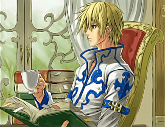
Accent Core Plus Ending 2: Who in the hell let this guy into one of those combination cowboy/Christian mall outlet stores. This is bad. I know people IRL that would unironically wear a shirt like this and it activates my fight response.
8
Holy Order Outfit Without The Cape aka The Babygirl Special: I don't really have anything to say about this one. It's funny, it's weirdly slutty, it will give Ky's pasty ass interesting tan lines. I wanna know what the general reaction was when the Holy Order uniforms were first revealed and everyone saw those shoulderless sleeves.
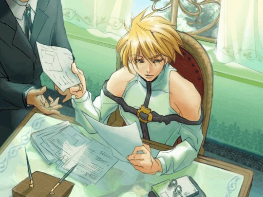
7
Isuka Arcade Illustration: This one isn't bad at all, he just looks like a dad. It's interesting seeing very designed characters in casual everyday clothing.

6
Strive: Ky's Strive design isn't bad either, it's just that all the designs coming next are really good. I like that this is his most casual mainline game outfit. It fits his story arc.

5
Vastedge: I like the gun from this design, it's so... not Ky haha. The attempt to mix up the classic design isn't bad, but I'm not a fan of the asymmetry here. It leans a little too much towards the side that still has a sleeve, like he put his outfit on before it was done being made or something. The long hair redeems it.

4
Classic Ky: Daisuke really nailed it with Ky's first design. It shares some motifs with Sol's (collar shape, the loin cloth, sometimes the gloves) and does well to connect their characters' pasts and their rivalry in the present timeline of the early games. It's also a relatively simple design that still stands out amongst characters of similar archetypes from other series. White+primary color is a little generic as a palette, but in this case I think it fits Ky because of his Christianity-influenced themes/motifs. This one is good.

3
Midnight Carnival Burst Encyclopedia Illustration: I don't have anything to say about this one, I just like it.

2
Overture Ky: Elements of this design seemed to have really resonated with Daisuke because they come back in the Vastedge and Xrd designs. It's a little busy, but all the Overture designs were really detailed to take advantage of those fully 3D models. It's the only design he's had that makes him look like he's a king.

1
Xrd: This design has everything I like about the classic design with the long hair from the Vastedge design. There's not a single thing I would change about this.

#asks#long post#I didn't include his DI in this because it doesn't change his Strive design enough to warrant adding it#'It's Strive Ky but he's slightly bluer' would be what I'd say about it
35 notes
·
View notes
Note
Hey Dook, I really hope the upcoming year brings you nothing but good vibes and a perfect harmony in your awesome art! Your new pieces always make my day, seriously. You're such an inspiration, so dang talented.
Quick question for you: I often find myself stuck when I try to draw in my free time. How do you always come up with such cool ideas? Share your secrets on finding inspiration and drawing as expressively as you do, please!
(´。• ω •。`) Ah, you're so kind. Thank you for the good wishes. I wish you an awesome upcoming year as well.
. . . . . . . . . . . . . . . . . . . . . . . . . . .
That's a good question! It's relevant for many fellow artists out there.
SUMMARY: Mix: your passion, your favs, a theme, portfolio and art goals. Power up with your references collection.
In details ⤵️
For me, stumbling onto those bright ideas that really click, started with digging into who I am and what I love.
It's mainly about recognizing the roadblocks and figuring out a fix that fits you. And it's like having a chill heart-to-heart with yourself:
you: I'm stuck. Can't figure out what to draw! mind: Okay. What is your main objective? Work or hobby? you: Feeling a bit rusty. Maybe I should start with something personal, you know, for practice. mind: Got it. First things first, let's jot down your favorite things. Got a list handy? you: Uh, not really. They're all up in my head. mind: No biggie. We can roll with that. It might spark some inspiration. But hey, to spice it up, let's create a visual board of you as an artist. Your focus, your style, your values — everything. Think of it like a moodboard. you: Sounds kinda complex. I just wanted to doodle in my downtime. mind: Trust me, this won't eat up much of your time. It's a breeze, and the result might just be the secret sauce for your future drawings. Start a bit now, pick it up later.
. . . . . . . . . . . . . . . . . . . . . . . . . . .
I, actually, aided it further.
All my ideas that wake me up or keep boiling in my head, I write into digital lists (in my case is TickTick app). Because when I see something inspiring (or someone) I can attach a link where needed, or add a custom note with markdown available.
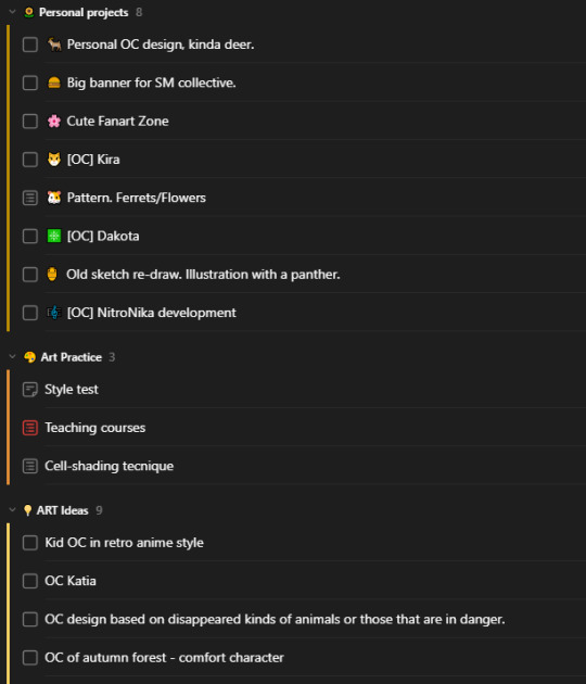
Then I began to fill up my reference folders. I work on them from time to time with a timer (20-30 mins). In my case, when I focus on character design, I have a collection of styles I want to try (including art from my favorite games cuz sure I want to learn how pro artists do it), coloring and drawing tutorials, educational (anatomy and all that), poses/faces/expressions, fashion, etc. *can be on your device, online drive, or a platform like Pinterest. Each set is not enough on its own. To make it work - combine things. Example: pick a pose, add a face to it, choose something trendy and fashionable, add your favorite colors/items/theme, throw some VFX. Mix and mash, don't be afraid to combine incompatible.
By establishing my priorities, I made lists (yet again, my obsession) of what I want to practice and then added each category in a randomizator to pick for me 3 elements to match and challenge. Here is my approximate plan (WIP). Random color generator (one of many out there)
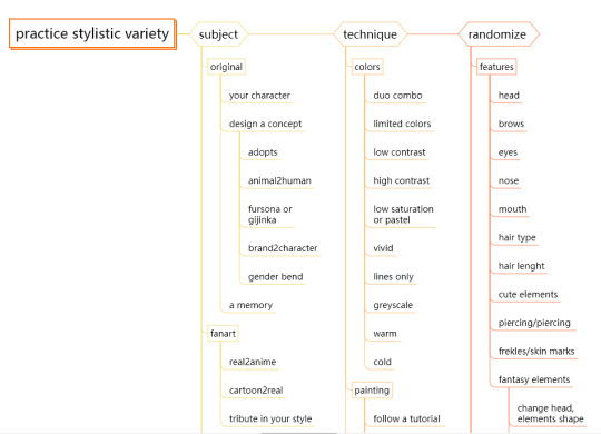

I trained myself not to take too broad themes and stick to what I want to have in my portfolio (what drives my future commissions) while staying versatile. Takes practice.
I hope it helps somehow. It's something that works for me these days but might change in the future.
Find your own way because no one knows you like you do, so the most comfortable way to resolve an issue is the one that's crafted by you. Believe, your mind can find shortcuts and tips for you if tasked to do so. Don't forget to research and store.
8 notes
·
View notes
Text
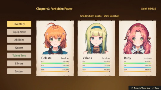
Eternal Radiance: A Cute Action-RPG and Visual Novel
April 20, 2024

I finished playing Eternal Radiance last night. I'm pretty sure I found this game when I used to scope the Nintendo eShop looking for cute indie games. This one immediately stood out because of cover and it's description: "inspired by classic action JRPGs."
Game: Eternal Radiance First Time/Replaying: First Time Game Time: 16 hours Console: Nintendo Switch Started: March 31, 2024 Finished: April 19, 2024
Eternal Radiance is hybrid action-RPG and visual novel. I have never played a visual novel before, so this was a new experience. It's heavily story-driven and there is so much to read, but as a reader, I enjoyed it very much.

The narrative is well-paced and immersive. I didn't feel like the Player controlling the main lead, it felt more like I was there alongside them. (As silly as that sounds.)
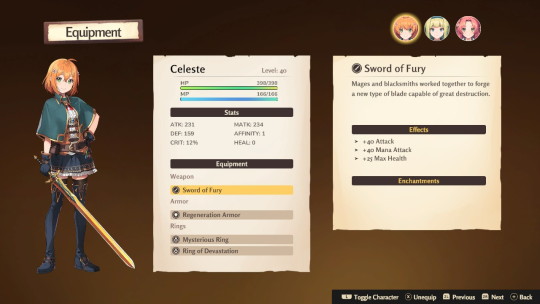
The story is about a squire named Celeste who is trying to prove herself worthy of becoming a knight. Along the way, she meets many different characters, two of which join your main party.
I love how the friendships that Celeste forms are at the forefront of the story. It is a heartwarming game with beautiful artwork and great music that adds to the ambiance of the setting and situation.
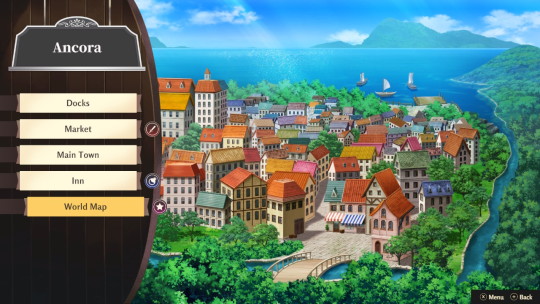
As you can see below, the background art of the locations are vibrant and detailed. The designs of the characters are equally appealing.

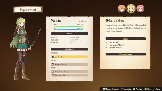
There is item/weapon customization, but I completely neglected it. I didn't buy any weapons or armor either, I just used whatever I found in treasure chests.
Speaking of treasure chests, there is a lot of loot in this game! When you defeat enemies, they drop items and green, yellow, & blue colored orbs that replenish your HP, MP, and limit break gauges.
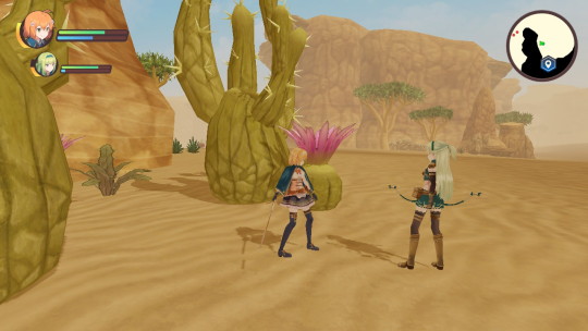
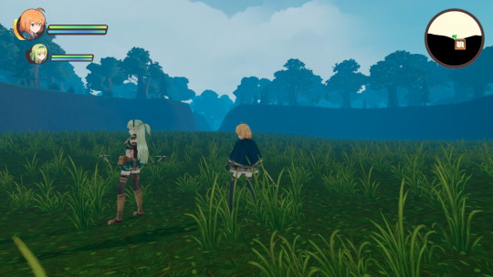
I liked the action-RPG battles. They are fast-paced and TOUGH! I actually lowered my Difficulty level from Normal to Easy because I kept dying a little too often. I struggled with the boss fights, even on Easy, but they are doable.
Things I didn't like:
The camera is a bit awkward, but thankfully the settings are easy to change. I lowered the camera turn speed and everything was great!
When you fast-run (which is done automatically after walking for a certain amount of time), the camera adjusts in a way that you can look up Celeste's skirt. That is weird.
In boss fights, which are very fast-paced, healing seems to take forever. Hint: defend and use items!

Overall:
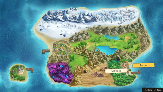
Eternal Radiance is a cute action-RPG and visual novel game, "inspired by classic action JRPGs." The battles are fast-paced, the characters are endearing, and the story is a wholesome adventure of a determined squire's quest to become a knight. I really enjoyed the narrative and story-focused segments combined with a variety of open areas to explore and fight.
Here are my endgame stats:

2 notes
·
View notes
Text
Tom and Jerry (Singapore) Series Review
So a few hours back, I watched all seven episodes (pilot included) of the Singapore-based Tom and Jerry cartoon released so far. I won't go into details for each episode, but I will voice out my general thoughts on the series overall.
STORY AND SETTING
As the title suggests, this take on the titular team of troublemakers is set in the state of Singapore. As a result, various references to Singapore's history, culture and national landmarks and locations are sprinkled throughout this mini-series. These settings serve as set pieces for with the cat and mouse carnage is carried out. While I am not Singaporean myself (far from it), I do know for sure that Singapore is represented quite well. However, while prevalent, the references are not overbearing and share centre stage with the stars of the show quite effectively, giving Tom and Jerry both fresh and familiar settings, situations and props to play with.
As for the stories, while not exactly far removed from the Tom and Jerry formula (some episodes even bringing to mind scenarios from the classic era), there's enough of a fresh spin on it to keep it from just being a retread of said classic scenarios. And while the 3 minute of runtime does mean that the pacing is a bit more frantic than in most other versions of the series, this also means that the episodes don't outstay their welcome. Think the earlier episodes of Paul Rudish's Mickey Mouse shorts.
ART AND ANIMATION
Okay, now for the aspect that will most likely draw the most ire of the fanbase, as well as perhaps slight confusion from the average casual viewer. Let's start with the Elephant in the Room: The character designs. They're fine. Sure, they are markedly different from what one normally associates with the franchise, but it's far from bad. The titular characters, as well as Spike who appears in about two episodes in minor roles, are rounder and cuter looking, but also highly expressive and with enough of a wacky edge that can play into the comedy aspect of the show; AND they're still recognizable as who they are supposed to be. As silhouettes together, you can tell the art-style is different, but it's still Tom and Jerry (less so with Spike, who is proportioned a bit more like an actual bulldog). Their colors are also brighter and more saturated; Tom has never looked bluer (and Jerry has never looked more orange. Spike is still gray though.) The characters are also (almost) consistently shaded, unless the situation or setting permits otherwise, which isn't often.
The backgrounds in this series are rich and vibrant, much like everything else in this series, but they somehow find a way not to overpower or compete with the characters that inhabit them. And now the animation: which is most likely the best thing about the show from a visual standpoint. It is definitely not cheap looking at all, and is consistently fluid and snappy when it needs to be. Clearly, a lot of love was poured into this aspect of the show. As for the actual slapstick being animated, it's serviceable. There are points where I actually found myself audibly giggling or laughing, or at least quietly acknowledging how well put together some of it is. Clearly, whoever choreographed the slapstick at least understood Tom and Jerry enough that this aspect was done so serviceably.
SOUND AND MUSIC
Ah, now for the more mixed aspect of the show: the audio.
I'm not sure if it's the print I watched that had a compromised mix, but well... that was just it. The audio mixing was 60% of the time good and 40% of the time kind of iffy. While previous versions of Tom and Jerry have grappled with this hurdle to some extent (what with combining archived audio from William Hanna and Mel Blanc with more modern sounds), this is probably the worst it's gotten. It's not unbearable, but it is distracting enough when certain sounds and vocals either don't fit, stand out too much, or are simply missing. And it's like that for almost all seven episodes. And as for the character's yelps, laughs, screams and gasps, mostly original, new clips are used. But as the episodes go on, more and more classic screams are heard in the episodes. Normally I don't mind this, especially if it's handled masterfully, but this is one of those instances where I wish they stuck to a lane, and I note that the lane more suited for this cartoon's presentation is the lane of new screams and yells. Though they can have one or two classic "̷̢̦̩̋̔̌Ạ̴̉̽Ă̸̧̜̬͑̏Ä̸̯̥́̅̓ͅÀ̶̪̺͝ͅĀ̴̝͌̂A̴͕̅A̴̝̺̒̈́Ȃ̸̼Ą̶̤̠̏͛A̸̢͓̿̃̅A̶̛̯͂̌Ă̵̰̥͠A̸̰̳͆̎Ạ̸̥͖̀A̶̞̦̩͌̾́H̴̛̻̬̿̏Ḥ̸̟̙̀H̵̛̛̠̙͌"̴̠̲̓̂'s. Just as a treat.
Now, the music on the other hand is pleasant to listen to. Some instances and phrases of it are even evocative, or even outright reference certain notable stings and melodies from the classic Tom and Jerry series; even down to the tempo becoming more frantic to match the actions of the characters. That aspect, I admired. Unfortunately, sometimes that too falls victim to some of the questionable mixing that runs through this series.
FINAL THOUGHTS
Nothing beats the classics, that much is true. In fact, this wouldn't be here if not for it. But you cannot go wrong with giving this mini-series a try. It is a well made, well put together (for the most part) labor of love, or at least respect, for both Tom and Jerry and the world they inhabit. So if you're a fan of Tom and Jerry, or at least just want something well made for the kids, or you always asked yourself "What if Tom and Jerry lived in Singapore?", then this series will do you no wrong.
FAVORITE EPISODES (SO FAR)
Sky's the Limit - A fun little romp with kites and drones.
Count on Merli - Features a cute iteration of Merli, Singapore's Mascot, who just wants Tom and Jerry to get along. But they don't seem to wanna listen. Poor Merli.
Colorful Chase - Simple for the plot point that they used, while they could have done more with the concept, it was only three minutes. And for three minutes, they did good.
LEAST FAVORITE EPISODE
What's that Smell? - The pilot. Passable on its own, but isn't as Tom and Jerry as the other episodes. Also it's the pilot. Things are bound to be weird.
5 notes
·
View notes
Note
hi i love love ur designs ive been following u for probably years now n theyre so good i can and do stare at them for minutes. i picked up drawing early last year n rly enjoy designing characters n i was just wondering if there was anything u did to improve at picking color palettes or if it just naturally happened from designing so many characters. also where do u find inspiration for the outfits ur art is so cool<3
Thank you very much i'm always flattered when people enjoy my designs. Please take everything I say with a grain of salt, ive never been trained formally in designing characters or anything like that and i'm a fully self taught artist for digital art.
I would have to say, a good key part of designs is not JUST in color palettes but in contrast and hue values [darks and lights]
i would suggest you can work on contrast and your values, by working with monochrome palettes of any color of your choosing- working from light and dark from there Also a lot of color palettes, ill be honest its kind of a hack, its like, complementary/contrasting colors often together either be it in equal terms or using one main color and then using its complementary color for 'accents'. Smaller details to pop. I like to make sure accent colors have more than just one tie into the design so it feels like it fits into the design. Like imagine a wholly green outfit in different shades of green with ONLY a bold red lip. that looks tacky, it would need more accents of red to tie in to balance the design
or analogous color schemes like Pink and Yellow with some orange, or my favorite is "Peacock" Green, Blue and Purple i love those colors together so much and im sure many notice it with the frequency i like to utilize those colors
While working with colors i like to hide my lineart layer to check and see if colors are distinct and readable without just the lineart as well
A lot in designing also has to do with your own style, ive grown and adapted a more simple style and so my clothes are typically more on the simple style but i try to make a good silhoutte shape with them, silhoutte is a great part of character design too but when youre just starting out I don't think it's that highly important.
Of course, references. I enjoy looking through a lot of fashion of many different time periods, i love hanboks, i love hanfus, i love medieval headpieces, i love punk and the best part is you can just make a combination of multiple different facets of a piece and stitch them together to work out .
11 notes
·
View notes
Text
Blog Post 14: Pushing Boundaries, Phase 3 Finalization
This final blog post comes with a content warning for readers who experience arachnophobia, as the project and this blog contain details involving spiders. In this post, I’ll cover the complete process of creating the final project, explaining design choices, aesthetics, and the final lighting setup that brought it all together.

It's truly remarkable how much a project can evolve throughout its development. Each element—from the project scope to color schemes, asset placement, and even post-processing choices—contributes to a dynamic process of creation. This particular project required us to develop a sample based on any prompt from a recognized competition, with the goal not just to participate, but to stand out. As it developed, my ambitious idea shaped into a refined project that, though not flawless, effectively showcases the original concept.
Having reflected on last week’s challenges, I started this project with a solid foundation that kept the main purpose of the assignment in focus. The goal was to employ all my skills to create a piece capable of competing against industry experts. I’ve always been drawn to environments that invoke tension and dread, so I chose to channel these elements into a scene that combined both custom and pre-made assets. I envisioned a desolate, abandoned medieval castle, now occupied by a Spider Queen and her brood, setting the stage for a brave knight’s journey to defeat her and reclaim the castle.

While much of the original concept stayed intact, I adjusted the scope to two rooms: one containing the warrior, and the other, a dimly lit chamber inhabited by the Spider Queen. The knight character became a “warrior-for-hire” with a nod to The Witcher by equipping two swords. I also chose to simplify the spider animations, setting aside the idea of using Unreal’s Niagara System for realistic scurrying spiders, which would have been too time-consuming in a static environment.
With the revised concept, I set to work modeling the two castle rooms. The narrow corridor housing the warrior is brighter, illuminated by torches and adorned with cobwebs. The larger, central chamber, reserved for the Spider Queen, is bathed in shadow with only a touch of moonlight shining through an upper window. I purposefully kept the Spider Queen in low light to build a sense of dread, leaving viewers to wonder what might lurk just beyond their line of sight.

Lighting was essential here to set the contrasting moods of the two rooms. In the corridor, I used warm tones like orange, red, and yellow to create a fiery, intense atmosphere. In the chamber, the palette shifted to cool tones—blue, green, and white—to evoke a sense of cold and danger. Post-processing adjustments, including tweaks to contrast and bloom, helped lower the overall brightness while keeping the light sources vivid. I also applied subtle backlighting behind the spider’s legs to hint at its massive form looming over the warrior, further enhancing the scene’s tension.

A significant amount of time was also spent on modeling and designing the environment itself with a special attention to the cobwebs that adorned the entire environment. While not difficult to create, the cobwebs were albeit a challenge to learn and something I enjoyed doing. The fires in the scene as well as the fog in the central chambers are both part of asset packs that were bought from Unreal Marketplace and were tweaked and modified in order to best suit the scene. Finally, after adjusting the camera to get the best viewing angle, the scene was rendered in cinematic viewing angle in order to best capture the essence of the project itself.
Looking back, this project feels like a milestone. Not only did I explore new skills, such as character rigging, visual effects, and post-processing, but I also managed to finish everything within three days. This experience highlights my progress over the past month, and I’m excited to see just how much I can accomplish in the next five.
0 notes
Text

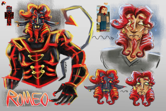
fully going to take this opportunity to ramble about this design because . i'm still Really happy with how it turned out!! i tried to keep my romeo design interpretation somewhat similar to canon while still putting my own spin on it , and i think i got a good combination of that ! i've seen a lot of headcanons about each admin's design representing the different dimensions/realms in minecraft, with Romeo's being the Nether, so i wanted to emphasize that more! it wasn't really hard to do with his color palette, lol :-] anywho! there's a handful of details in there i really enjoyed adding. while looking at mobs in the Nether, i realized that there's a whole lot of pig-inspired mobs in there, so i gave Romeo bottom teeth tusks similar to a piglin! the floppy ears were also somewhat inspired by piglins, but i've also seen other fanartists draw Romeo with long ears, and i adored it so . i added that to my design too :-] the gold earrings + other gold accents (like the buttons + chains) are also connected to how much piglins adore gold. it also fit well with his color palette! i added horns and a tail because i really wanted to give him more non-human traits, and i felt like it complimented his somewhat devilish personality + overall design. and i don't know if they're suuuper noticeable, but i added tear marks coming from his eyes, similar to ones that a ghast has! this is my . personal favorite detail from the design , because it hints towards Romeo still being effected by his grief over Fred, and just like... everything in general. even if he doesn't like to show it.
his armor didn't really have an exact plan, i just wanted it to look like a mix of actual armor and a military-ish uniform. i think it adds to the fact that he really does have a hunger for power and control. and for his ringlets: i just thought it would be really fun. i was having a hard time interpreting his hair, but i really enjoy drawing spirals and curls and whatnot, so i thought it would be a fun thing to add! i feel like it compliments his eccentricness. the human design .. it's not fully formed right now, and it was just me pulling from the admin design i had made and like... making Romeo look like a normal person. it's very similar to his canon one! i just kept the earrings, added the ringlets, and gave him a little bit of acne/blemishing on his face because i think it fits. i gave him green eyes because i noticed that a Lot of mcsm characters have black eyes, and i think it's kinda boring . sorry . the green eyes are somewhat similar to the yellow irises in his admin design!
i'm planning to draw fullbodies soon, after i get a basic idea of my Xara and Fred designs! fullbody human Romeo is gonna have bell bottoms and boots instead of his sneakers, because my mental image of him constantly imagines boots instead of the sneakers. he likes to be tall.
anyways sorry this is so long and thank you for wanting to hear about it !!!!!! i'm always happy to talk about character design lalalala :-]
i don't think we can "Toodles!" our way out of this one
#my textbox#my art#mcsm#romeo mcsm#THANK YOU !!!!!!!!!!!!!!!!!!!!!!!!!!!!!!!#i don't normally get so giddy over designs i make but i've like#been having a BALL with designing the admins#(working on Xara rn)#so i REALLY like talking about them !!!!!#i can't really explain the color patterning on him much other than#if it looks nice i keep it. i liked the red fade on his ears and horns#because it made them more visually interesting . lol!#and yeah i think this guy has a bony face. slap some cheekbones on him!
133 notes
·
View notes