#THE ANIMATION!!! THE STORY!!! THE COLORS AND DETAILS!!!
Explore tagged Tumblr posts
Note
Is there anything more about that blue fox from the Die Young amv that became the furry awakening for so many?
I should still have lots of JayJay art to post, but you can check her tag for what I already have if you're interested! If you're looking for more of a basic info overview, keep reading.
JayJay was originally named JiJi and she was a source of controversy for Viv because Viv didn't actually create JayJay. JayJay was a sparkle dog adopt that DollCreep purchased then redesigned. (I can't recall the original artist off the top of my head, unfortunately, and, if I'm remembering right, JiJi was purchased from someone who purchased her from the original artist before she even reached DollCreep.)


DollCreep, a friend of Viv's at the time, then sold JiJi to Viv who went on to use her in the infamous Die Young video. But there were disputes between the two about characters given or sold to Viv and where ownership laid. I'm not gonna get too into it, but in my personal opinion, this was just a case of not communicating the terms of sale well between friends. In the end, Viv renamed JiJi to JayJay and altered her design very slightly.

In terms of her purpose in Viv's Zoophbobia, she was supposed to show up in Book Two of the webcomic. Zoophobia didn't make it that far, though, so what we do know of her is mostly gleaned from Viv's art and posts about her.
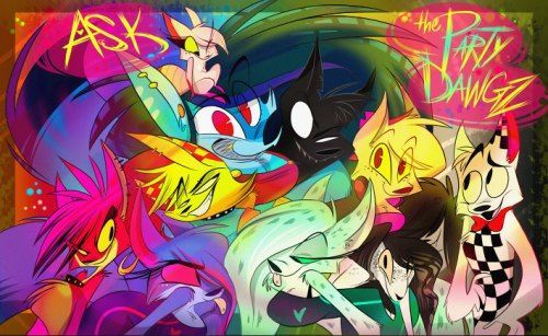
She was part of a group of werewolf and canine characters Viv dubbed Party Dawgz in some posts and was close to the Queen of Werewolves. She's known for being a party animal, obviously, but cares about her packmates and friends deeply and just wants to have fun.
DollCreep also portrayed her as a party animal, but leaned into a more comedic and sexualized depiction of her. Viv tried to tone that part of her personality down a lot which was something she stated directly once.
I believe some more specific details of JayJay's story (such as her being a farm girl who got stuck as a werewolf) were changed along the way. But, in general, being a party animal is what has stuck with her the longest as her primary trait.
Fitting for a sparkle dog adopt.
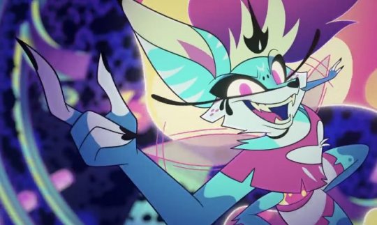
Queen Bee from Helluva Boss is a big blaring neon throw back to JayJay and is probably near-identical in personality if you strip away the world-building specific aspects of both. Viv even referenced JayJay's original colors during Cotton Candy and obtained Kesha as her voice actress. So, in the end, this is where JayJay ended up in spirit.
Disclaimer: I was not around to witness the controversy of her ownership of JayJay in real time, but I have researched it for myself to reach my own conclusions about the situation. For me, it comes across as a messy falling out between friends, and I have sympathy for both sides.
As an archivist, I never want to shy away from the more controversial things that happened in Viv's history. But I also don't want a lot of discourse on this post about it, so I may block if I feel people are veering into overly aggressive and nonconstructive anti territory. Just try to be civil with any discussion if you want to avoid being blocked.
23 notes
·
View notes
Note
hello! hope you're having a good day :)
I'm slowly introducing my girlfriend to arthurian legend and I was wondering what films you would recommend for a complete beginner (her). I will be next to her explaining things but I also wanted to start off with something more digestible. We've already watched the green knight (2021) (I know) and excalibur (1981) together. thank you for all you do!
Hello, I am and I hope you are too!
Oh yayyy this is so awesome. I'm going to suggest things that I personally feel really give a newbie a grasp of the characters in such a way that if they were to watch something else afterward, it would actually aid them in understanding. There are some films that are so experimental they're unrecognizable (like Knightriders (1981) or Shadow of the Raven (1988)). Those are amazing, visionary films. But they're entrenched in their respective cultures (American and Icelandic respectively) so they don't really help someone new grasp the foundational lore like the things I'll be suggesting will. This list offers self-contained stories with solid writing, great acting, and entertainment enough to keep one engaged, without any requirement for prior knowledge to appreciate.
Here are the beginner friendly options listed in order of release:
Knights of the Round Table (1953)
Details the rise & fall of Camelot from Arthur pulling the sword from the stone to his & Mordred's deaths. It has everything, the A/G/L of all time, adorable Percival & Elaine as siblings, Orkney bros Gawain, Agravaine, Gareth, & Mordred (who is not a product of incest), sassy clever Morgan beefing with fatherly sweet Merlin, gorgeous costuming, moving script.
BBC The Legend of King Arthur (1979)
This is technically a show but hear me out. It's only 8 episodes, half hour each, & covers the full Arthurian story from Uther's battle with Gorlois to take Igraine all the way to Arthur's passing. Morgan is a central character & fascinating. Arthur raised by Ector alongside Kay. Goes to battle against Lot & Accolon & the other rebellious lords. Great Lancelot & Bors. Guinevere is strong & interesting & sympathetic. Orkney bros Gawain, Agravain, Gareth, & Mordred (who is not a product of incest). Elaine of Corbenic & Elaine of Astolat both present as separate women. Grail quest led by Galahad (no Percival unfortunately). Mador’s brother Guido poisoned “by Guinevere” like in Le Morte d’Arthur & a trial by combat ensues. It’s a really compelling version of events that can give a beginner a great overview of the legends.
Sword of Lancelot (1963)
Opens with an older Arthur looking to marry. Lancelot is his bestie & champion. Other knights include Gawain, Mordred (who is not a product of incest), Bedivere, Dagonet the jester, Lamorak, Kay the seneschal, & eventually Tor. Lancelot/Guinevere have great chemistry they were married irl.
Gawain and the Green Knight (1991)
Faithful adaptation of SGATGK complete with three days of kissing! Unique by having Gawain recount the reason for his journey as he’s already on it. Flashbacks show Gawain at the high table with Arthur & Guinevere, sitting next to his brother Agravaine, when the Green Knight comes in, & is beheaded. The events at Bertilak’s castle play out just like the poem with the lady coming to tempt Gawain & then he forwards those kisses to Bertilak in exchange for the animal of the hunt. Colorful & fun!
Tristan & Isolde (2006)
One of my favorites. I think the leads have great chemistry & gives a decent overview of the Medieval story without too much access. Mark here is morally way better than in Medlit but it does make the live triangle more juicy. Brangain is really funny here too. There is no magic in this version, so no love potion. Just pure unaided adultery.
Sir Lanval (2011)
Short & sweet indie movie adapting Marie of France’s lay of the same name. Great casting, beautiful costuming, pretty sets. Lanval’s rags to riches story thanks to his fairy lady Tryamour. Sport but well-meaning Arthur not doing his marital duties gives Guinevere sufficient motivation to try & seduce Lanval. Kay is here as Arthur’s foster brother & seneschal but sort of acts like an attorney? Lol? Great movie.
Sire Gauvain et le Chevalier Vert (2014)
Another SGATGK poem adaptation, this time in French (with English subtitles) & condensed to a mere 28 minutes run time. Visually stunning & beautifully acted. A little more mature than the 1991 version, bc of course the French have to get freaky with it sexual style (this is a good thing). Another awesome adaptation worth checking out.
Okay I think those are all my suggestions! Hope that gives you and your girlfriend a solid watch list and you both enjoy them. Take care!
#arthuriana#arthurian legend#arthurian mythology#king arthur#queen guinevere#sir lancelot#sir gawain#morgan le fay#sir mordred#sir lanval#ask#mordred-galahad
23 notes
·
View notes
Text

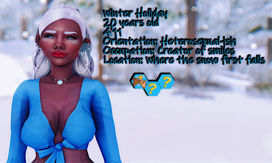
Winter Holiday 20 years old 4'11 Orientation: Heterosexual-ish Occupation: Creator of smiles Location: Where the snow first falls
Winter Holiday is an unique individual who over the last few months has started to show, shall we say some interesting characteristics. For the moment though she is mostly human. She knows that she will have an interesting road a head of her and as her parents have made her aware, a partner during this journey will be essential. Mainly because no-one knows what to expect. Her parents defied the rules and loved each other and if that wasn't bad enough did what was thought impossible, create new life. See Winter has some magical lineage, her fathers, yes fathers, are a touch legendary and her mother seemingly just human was found to be a bit more than anyone could guess.
But we are not here today to talk about them. Winter is very much a mystery and as such, details about her will become known as we progress.
Here are some fun Winter facts: ❄️she absolutely LOVES the cold and snow ❄️oddly almost anywhere Winter goes there's either a drop in temp / starts to snow ❄️The birthmarks on her cheeks slowly appeared over the years and are cool to the touch ❄️She loves the color blue ❄️Dancing is her religion
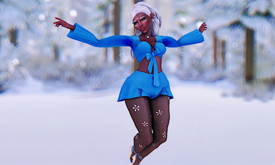
More info will be forthcoming as we lead up to the submission deadline
Contestant Entry Rules:
❄️YA males only, any ethnicity or size welcome ❄️No Occults - caveat- winner will become immortal/long lifespan as Winter will be walking this rock of a planet for a very long time. ❄️Bio/brief backstory ❄️1 negative trait/ no custom traits ❄️No in game jobs assigned please ( totally fine for them to have one listed in their bio) ❄️3 skills of your choosing, max level 5 ❄️Likes/Dislikes please - 10 max ❄️Turn-on/off optional ❄️light /med CC or Vanilla is OK ❄️NO ALPHA hair ❄️No body presets ❄️Attire: 2 everyday/ 1 cold weather. If you don't have seasons please add your sims cold weather outfit as their 3rd everyday and I will change it over to the appropriate slot in CAS. All other you can leave in underwear and I will supply outfit if/when needed. Please keep in mind we will be almost always in cold weather when outside.
Side note: I use default skin (Bare by Lamatisse) and eyes (jack eyes remastered - but i had to "fix" them to work after some patch so your simmies will be using those in game Sliders are ok as I have the most popular ones. Note I will not add any new ones in my game so small tweaks may be made to compensate
❄️ I own ALL packs ❄️
Quick Questions for the potential hopefuls What is your favorite color Tell us what makes you naughty and what makes you nice ( yes answer both) Sims height
Contestant Submissions
Submissions deadline: Saturday Feb 15th @10pm CST. If I end up with more than 7 candidates , 7 will be chosen from the submissions. More to come if this ends up being the case
Remember to tag me or use #HTDF or #KillerBC So I can see your entry and reblog
Friendly reminder this is an 18+ blog, there will be mature themes involved. So the watcher needs to be at least 18 to enter 🫡
Not everyone will make it out alive.👀☠️ Some may even disappear. There will be chaos and drama and what ever else these damn sims throw my way.
Gameplay: There will be various gameplay mods being used throughout this BC including and not limited to Wicked Whims, and several Sacrificial Mods including extreme violence There will be some storytelling component to this, As with most BC there will be some challenges, group activities/dates and solo opportunities. Interactions will predominately be autonomous and I will use that to help build the story and game play. Some scenes/interactions may be replayed out using poses/animations Winter is looking for love but keep in mind there is a story playing out along side this and its a little on the dark side and yes not everyone will make it out alive. The only ones immune to the Grimms kiss will be Winter and her parents.
#my first BC yall pray for me#HTDF#KillerBC#Winter Holiday#ts4 bachelorette challenge#sims 4 bachelorette challenge#bachelorette#black simblr#black simmer#the sims 4#ts4 simblr
26 notes
·
View notes
Text
TRANSFORMERS ONE IS SO GOOD YALL
#tom talks#i just got out of the theater AND IT'S SO GOOD#reviving the blog from the dust from one good transformers movie#THE ANIMATION!!! THE STORY!!! THE COLORS AND DETAILS!!!#it's a movie made by transformers fans for transformers fans#there's a lot of love put in this movie#and i highly recommend going and seeing it
32 notes
·
View notes
Text


‘Osamu Dezaki’s aesthetic is to let the landscape speak for itself’
#only in Japan#even if the anime is set in a different country the way the story is told is so so Japanese#the vibrant colors and the intricate details of the landscapes#all these things that feel like discovering a hidden world#everything feels like a proper tribute to riyoko ikeda’s original work#how fantastic. she deserves it#rose of versailles#japanese art really is the best in the world#versailles no bara
195 notes
·
View notes
Text
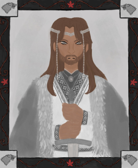
— Bran thought about it. ❝ Can a man still be brave if he's afraid? ❞
❝ That is the only time a man can be brave, ❞ his father told him.
Ned Stark, Lord of Winterfell
#first piece of my asoiaf series#FINALLY FINISHED THIS AFTER A MONTH#it looks off because i had to change the colors for mobile#OH ALSO#outfit is mostly kazakh inspired especially the embroidery#this lead me down a rabbit hole of embroidery inspired by animals#found the name of a wolf one but couldn’t find pictures sadly#so i went with a more snowflake looking one since that still matches the starks#the headdress is supposed to be yakut inspired but the men don’t really wear them#and the beads are more similar in tibet headdresses#so not the most accurate and i’m so sorry for that#i just had a hard time finding references#speaking of references the hands are barely drawn because i couldn’t find a good reference since its my first time really coloring in hands#hairs not my favorite either but it works?? ig??#also border has rose vines to symbolize lyanna since she’s such a major part of ned’s story#weirwood leaves for the weirdwood tree he used to hang out at#also didn’t realize until i finished that i used the show’s sigil for house stark instead of the book one?#whoops!#idk how i feel about this piece#definitely my most detailed one tho#ok enough rambling#a song of ice and fire#game of thrones#ned stark#house stark#valyrianscrolls#asoiaf
52 notes
·
View notes
Text
I hate having really pretty visually interesting dreams because I know I'll wake up and forget it and even if I try to draw them before I forget I won't be able to recreate the style :(
#i had two dreams like this last night#don't remember that much of what was happening in the first one other than taking a test at school#but everyone was don bluth style animals (specifically All Dogs Go to Heaven) and all the coloring was done in beautiful pale watercolors#and my second dream was vaguely about Dungeon Meshi and the legend of the Golden Kingdom#(it was a really inaccurate portrayal but that makes sense since it was just a dream‚ i can't expect it to be 100% at all times lol)#but it was done in a really fluid and bouncy vintage anime style that was so pretty (don't know what to compare the more detailed parts to)#(maybe like The Rose of Versailles style? not sure haven't watched it BUT the small parts of the dream were done in old Hello Kitty style)#(i specifically remember Thistle looking very similar to Kuromi whenever they smiled or laughed)#but ANYWAYS i mostly remember two scenes#where we're at a fountain with a statue of Delgal‚ which twists and shifts into the cloaked 'mad mage' imagined portrayal-#and then the cloak twirls again to shift into Thistle themselves in a very fancy jester outfit and then they take a big bow to the camera#the second scene i remember was with Thistle close up to the camera and smiling as they held a little spinning music box of the Winged Lion#and then the characters both shifted again so that it ended up as being the Winged Lion holding up a tiny music box of Thistle#uhhhhhh. i also remember some bit where Thistle was being very mean and laughing from atop the fountain but i don't remember what was said#anyways the dreams weren't that good story wise but i can't emphasize enough how pretty they looked and I'll never be able to recreate them#dungeon meshi spoilers#delicious in dungeon spoilers#just in case lmao?
8 notes
·
View notes
Text
ಥ‿ಥ
#God this episode is so so good.#Tachihara sweetie I'm sorry I never talk about you. I swear I love him so so much he's an amazing character. I love his story and conflict–#so much.#This arc is peak bsd writing / meta literature plot. The tearing page moment is insane. The sentiments expressed here are so–#deep and emotional. The theme of the ordinary man. God and the force of human spirit.#Fighting against one's own destiny and finding the reason for own's existence. It's all subjects that are so interesting to reflect over–#and they're elaborated on in such a cool and compelling way. I love Dazai's quote on the strength of humans who–#“are caught in the tempest of contingency and scream‚ run and shed blood” so much. It moves me deeply.#The animation was really neat. A lot of detailed sequences. The wind was animated beautifully. The colors were so pretty and the stained–#glass visuals still go so hard.#Again I love Tachihara's conflict so much!!! I'm so into tachi/gin too... I know it's more of a Tachihara x oc since. Well.#We know little to nothing about Gin. But there's still so much spice to it... What do you MEAN Tachihara stabbed Gin !!!!!!#I'm so into the drama. AND the kind of relationship born from the big brother complex™ they both (may) share. AND the work partners.#AND the hiding their true identities to the other. How could I not love them...#Still believe season 4 should have ended where episode 11 ends but spreading it all in 12 episodes to allow it all better pacing.#I really think this season is great but the pacing really is its weakest point.#Of the sky casino arc they could have made a movie if they wanted to. Or just a cool arc at the start of season 5 that can work too!!#(((and not put ch 84-88 at only ep3. And then animate it grossly. But that's another talk.)))#Anyways 100000/10 what a good episode. This really was peak B/ungou Stray Dogs. And Akutagawa isn't even in it!!!#random rambles#Very hot take but I don't think Lucy should jump off a sky casino for a man. Sorry#My feelings for atsu/lucy are so fluctuating. I could write a whole other tags rant on it.#Actually I will
5 notes
·
View notes
Text
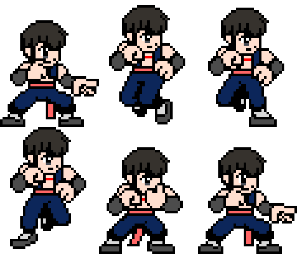
Zhouping - "Making his way to Zan Evolution Butouden..."
Zhou is his name. He is meant to be a Bruce Lee Archetype for my Fighting Game MUGEN. I thought of making one based on the Jeet Kune Do Style of martial arts since there are a couple who fit within their rights in the Fighting Game Cast. His introduction to my roster... He has relations with another Chinese kung fu girl, Fanhua. They both sparred together in the same realm school. Fanhua was responsible for looking after him since both lost their parents through reasons backstory. Zhouping had a lot to owe her. Both later studied at college since the master had retired. And I just remembered that I had to talk about one thing... How did Zhou get that scar on his body? Since the Fighting Bandit Mafia began running on raids, making a mess out of China, Zhou had a lot to beat up for all the violence and scorn that he was tormented by as a child... He knows, "In the world where the weak cannot survive, only strength can help him prevail. And prevail he did through sheer willpower and training."
#fighting games#zan evolution butouden#original character#mugen#ikemen go#pixel art#neo geo pocket color#aseprite#sprite art#sprite animation#oc: zhouping#kung fu#martial arts#jeet kune do#bruce lee#fighting archetype#story lore#character details#character introduction
6 notes
·
View notes
Text
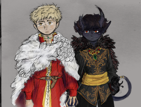
um. concept art <3
king of the golden country and king of the dungeons surrounding it let's fucking go <3
#this was just supposed to be a sketch 😭 😭 😭 i don't know what possessed me to color it and detail red's outfit so much. god#also red's tail <3 i like his tail a lot sorry hwshkjdsgbsh ideally he has it twined around his leg (or holding onto lai.os hwdjkfsgj) but i#wanted to show it. because because#i will be so honest i don't know what color lai.os's cape was supposed to be. but he seems to like white wolves. and the animal resembles a#wolf more than a lion so i went with that. also let's just say the lion bitch pin is under the snout because im still too bitter to include#that on the drawing :P too annoying to draw#re the caption i considered king and queen(gender neutral) but then i also considered. red's kingdom is separate. his subjects are the#monsters that circle the country through the dungeons and caverns 🤔 they did mention that the presence of the monsters keep the place safe#so it felt fitting#anyway yeah im rather proud of this one. hi jdsjkgsfhj#ari.art#mine#keep my head above water.♡#EXTRA extra note red's broken green stone is the illusion stone that used to allow him a human form for most of the story. im wondering if i#should really break it or not. but he's keeping it because he matches with navi. not that he'll openly admit it
6 notes
·
View notes
Text

^ me watching across the spider-verse for the first time just now and being in actual genuine awe at how fucking amazing it is from an artistic standpoint
#LIKE GOOD GOD THE ANIMATION???? THE COLORING AND STYLE DIFFERENCES BETWEEN WORLDS???? THE WAY BOTH OF THOSE PLAY INTO FORESHADOWING AND#THE STORY AS A WHOLE??????#AND THATS NOT EVEN MENTIONING THE SOUNDTRACK.#THE ATTENTION TO DETAIL W THIS MOVIE IS ACTUALLY SO SO INCREDIBLE#LIKE DUH THE WRITING IS GOOD BUT THE ART IS SOOO AMAZING IT TAKES IT TO A WHOLE OTHER LEVEL#ik im STUPID late to it but good god this movie is so unbelievably good#i am speaking
3 notes
·
View notes
Text

The Ghost's Bully (1934). Fanmade cartoon idea. Shot in two-strip Technicolor. Summary: A ghost comes across a bully, who wants to make ectoplasm out of him. It's up to the ghost to outsmart his opponent through a string of gags in a boxing match.
#two strip technicolor#two color#art#digital#firealpaca#rubber hose#details#color#the ghost's bully#ghost#bully#forest#cartoon#animation#fan art#golden age#story idea#1930s#1934
2 notes
·
View notes
Text
Why The Dungeon Meshi Adaptation Worked So Well
The final episode of Dungeon Meshi season 1, (ep. 24) is like if you took all the best parts of the series so far, all the elements that make it what it is, arranged them all into a luscious charcuterie board, and scraped the whole thing into your mouth in one go like the hungry little bastard ye are.
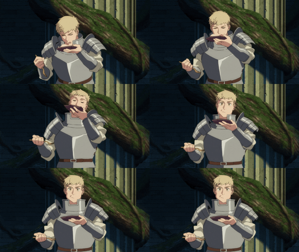
Series director Yoshihiro Miyajima has shown his dedication to the story and ability to stay true to the source material while enhancing the most important elements and making adjustments when needed to better fit the medium, and that's on full display here with the final two anime original scenes that hint toward the future of the plot and take what would have been a good but not amazing ending for the season and turn it into a great one.


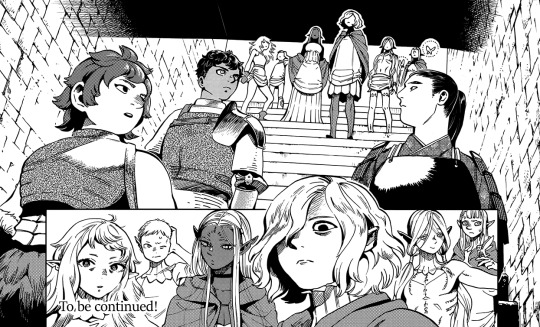
As well as Nobutoshi Ogura's storyboards, whose symmetry and point-of-view and reflection shots always add a touch of foreboding and personality to what's already there in the manga.

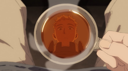
Or the addition of color to the scene in the tram where the deep green benches and warm orange glow of electric lighting gives it the comforting atmosphere of respite from the hectic action that came before it -- or a calm before the storm (?)...
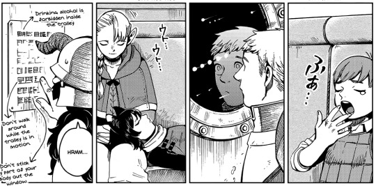

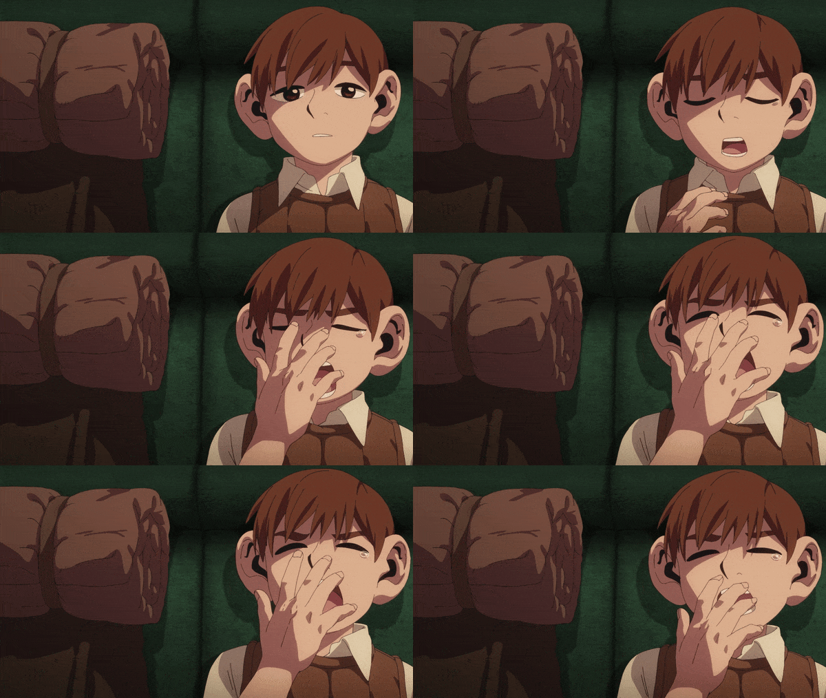
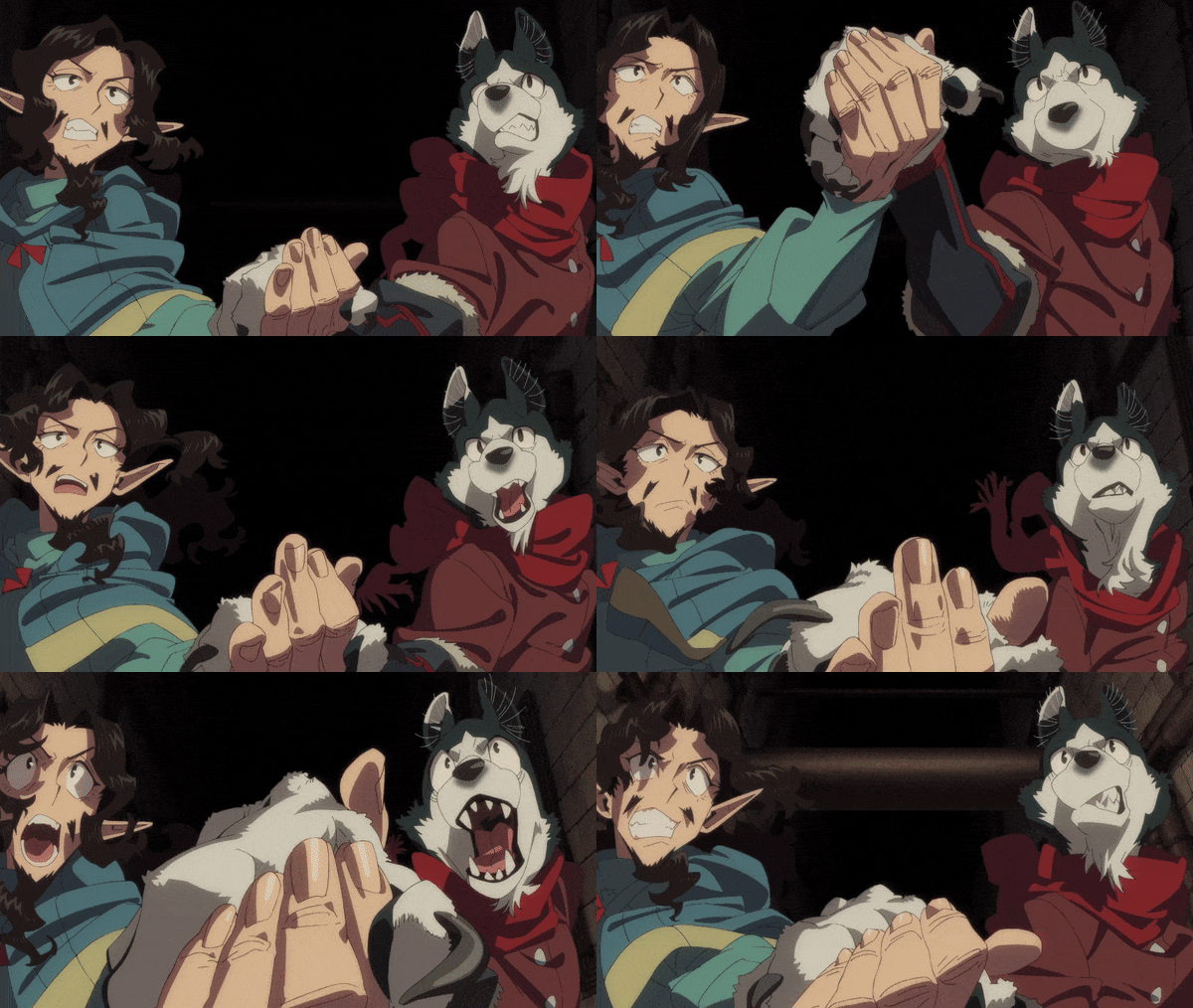
But most obvious to me in particular was they carved out a spot for many of the eccentric key animators who have defined the visual style of the show (and who I've pointed out specifically in past episodes of my breakdown series) to go nuts and do what they do best.
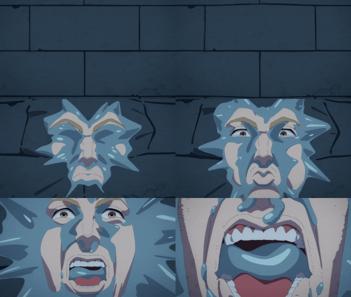
Ichigo Kanno's bombastic action with stylized character designs and insanely detailed wrinkles and shadows:
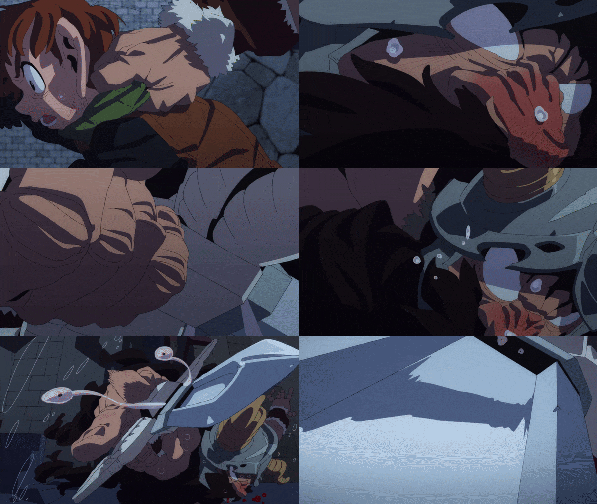
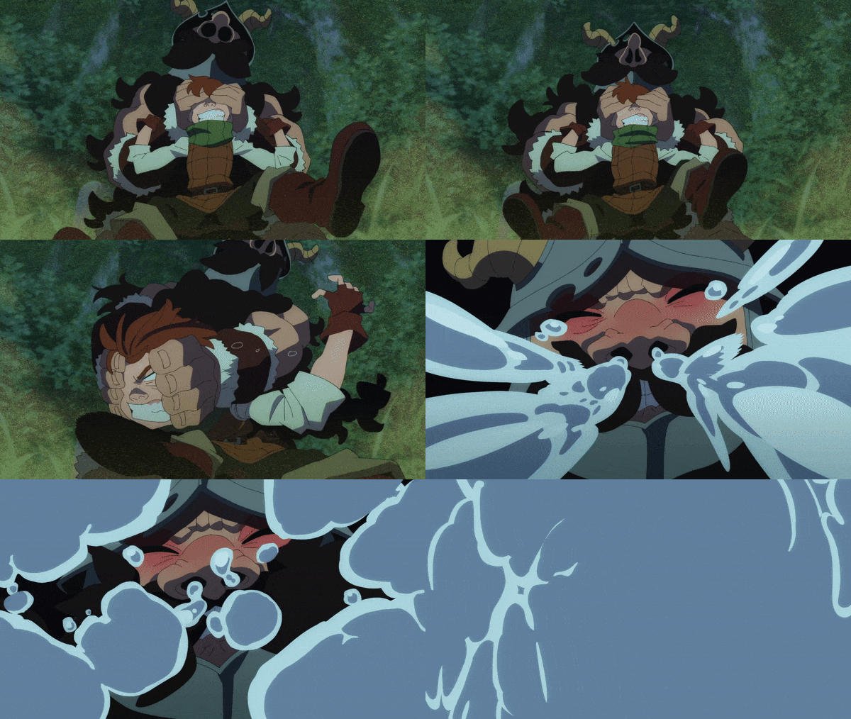
Atsushi Yoneda's clean line work and uncomfortable realism:
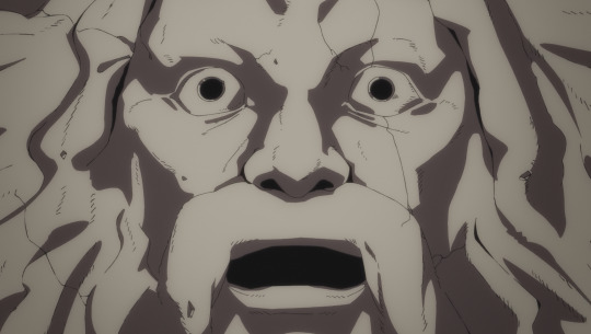
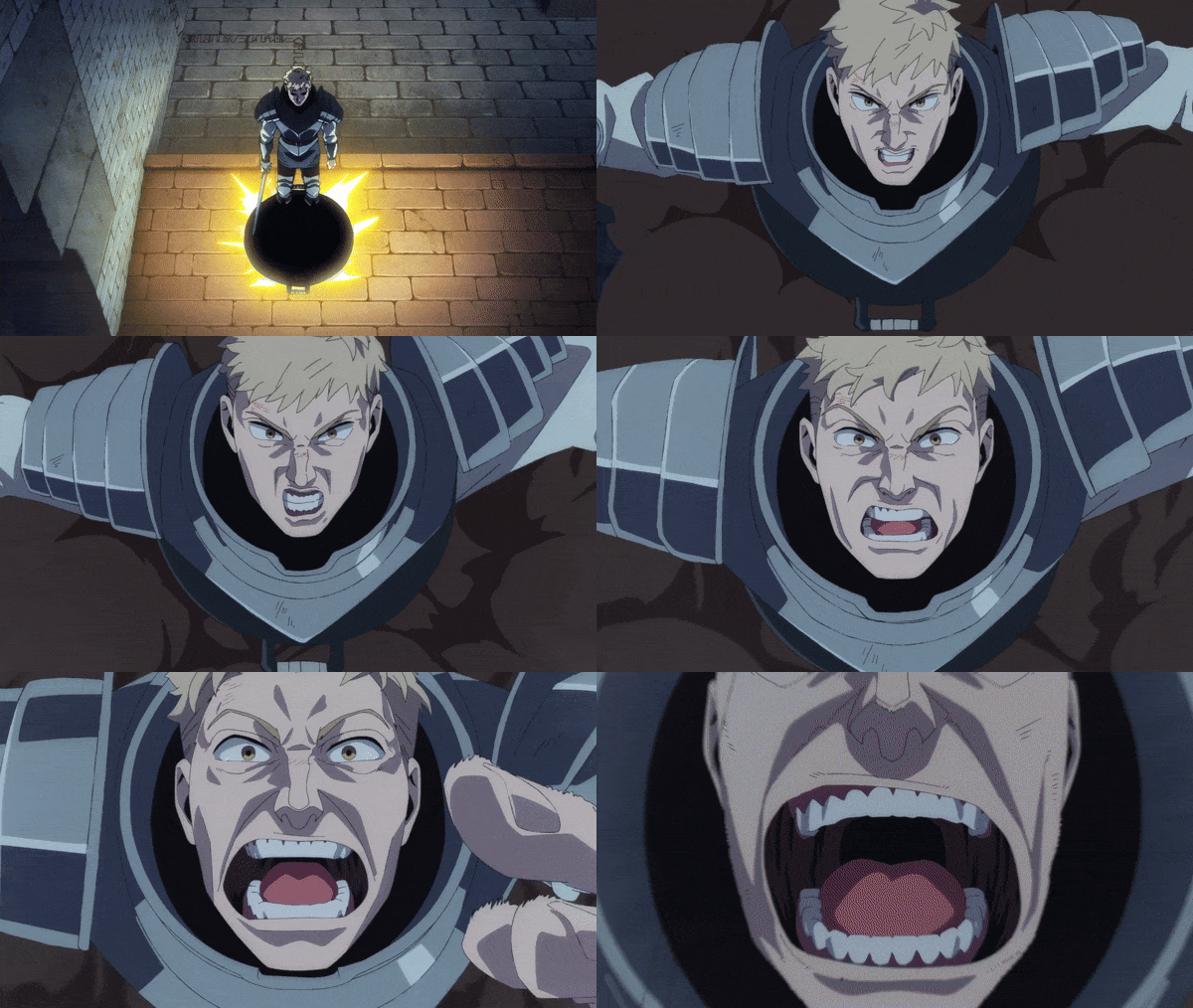
Haruki's character acting and subtlety:
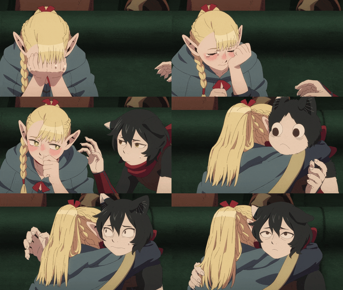
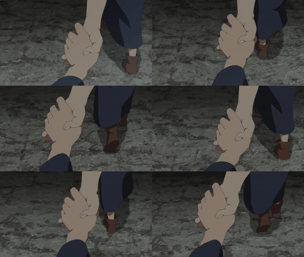
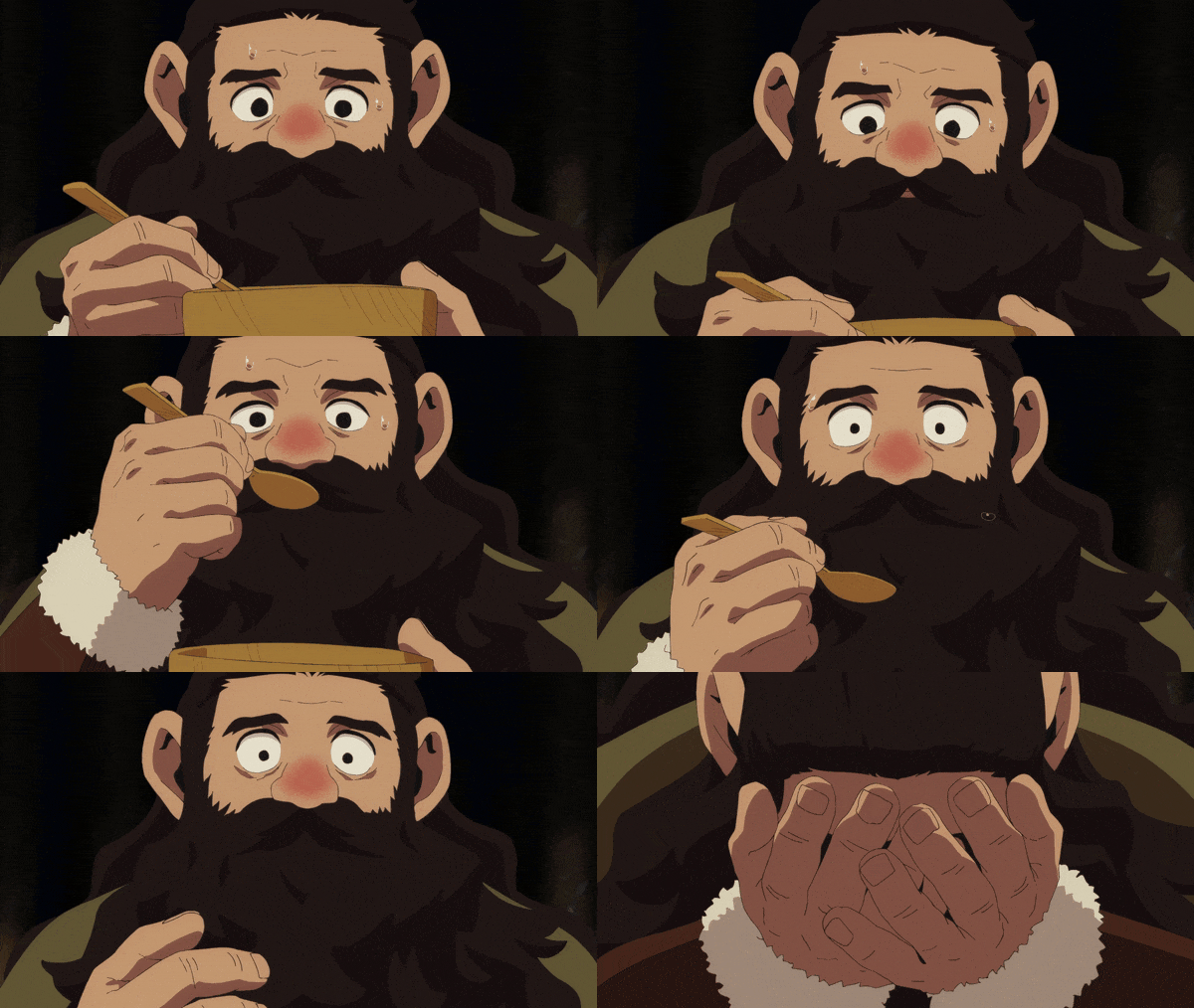
Despite the slight awkwardness of having to finish off the changeling plot in the first half, this really is a culmination of everything that's come before and a great end to the season.
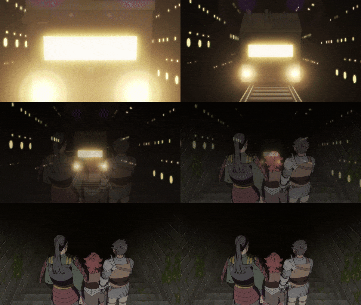
There's a whole lot more where this came from, and I get a lot more into the details of the animation in this video where I broke down the entire episode in detail, so if that's something you're interested in, check it out!
youtube
Thank you for reading, and double-dog-thank you if you've been here through this whole series -- I had just started trying to figure out how to use tumblr when I started making these breakdown posts and the response has been amazing both on here and on youtube, so thanks!
#dungeon meshi#laios touden#marcille donato#senshi#chilchuck#izutsumi#video#animation analysis#mini essay#youtube#delicious in dungeon#video essay#gif warning#anime#Youtube
3K notes
·
View notes
Text
Some doll stories part 1: Marigold 1 & 2
I usually tell stories about the stuffed animals at the hospital, but I also take care of cloth dolls. Lots of Raggedy Anns and Andys, and occassionally others. This is a two part miniseries about two pairs of non-raggedy cloth dolls who visited the hospital this year.
First up are Marigold 1 & 2. Here is the original diagnosis photo their person sent:

The original, in pink, was made by their human's great grandmother. The blue one was made by her mother when the pink one got a bit over worn. She was looking to rejuvenate the pair: cleaning, hair, and a new face for the older Marigold. Plus wound repairs and a new pink dress for Marigold 1.
They arrived safe and sound and sound and immediately jumped into the bubble baths:


Then surgery began. Stitching wounds, adding stuffing, figuring out the details for the older Marigold 1's face. An old family photo gave an idea of their original hair color and style, as well as suggesting there were ribbons at their ankles.
Of course, both got hearts of their original stuffing too:
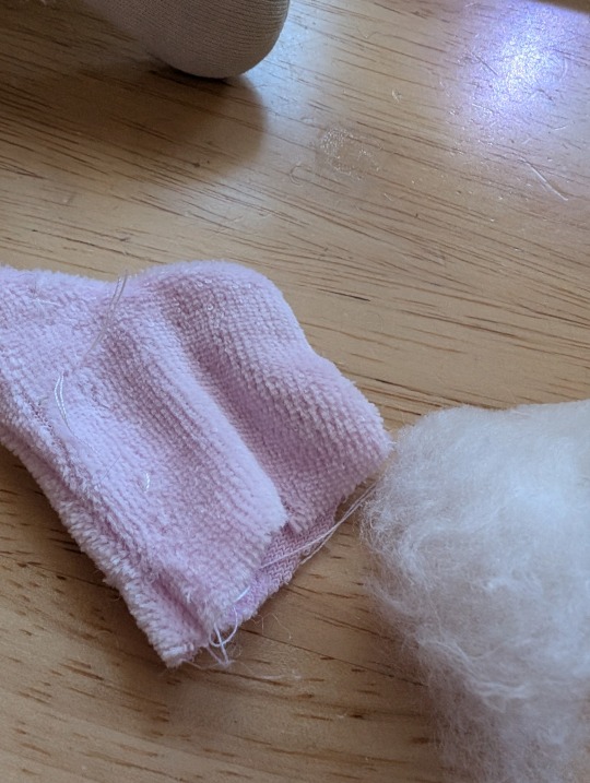


Here they are, all rejuvenated, and Marigold 1 is wearing her new dress and pantaloons:


Happy twins ready for new hugs and adventures!
They flew home to Utah where their person wrote: OMG! They look great!!!
#doll hospital#doll repair#cloth dolls#handmade dolls#cloth doll repair#cloth doll hospital#rag dolls#rag doll#doll#dolly
1K notes
·
View notes
Note
hi, i ireally love your work and i don't know if you've answered this before but, what kinds of studies do you do or how did you learn color theory? i wanna get better at rendering and anatomy but im having trouble TT TT
Hi! Long answer alert. Once a chatterbox, always a chatterbox.
When I started actively learning how to draw about 10 1/2 years ago, I exclusively did graphite studies in sketchbooks. Here's a few examples—I mostly stuck to doing line drawings to drill basic shapes/contours and proportions into my brain. The more rendered sketches helped me practice edge control & basic values, and they were REALLY good for learning the actual 3D structure behind what I was drawing.

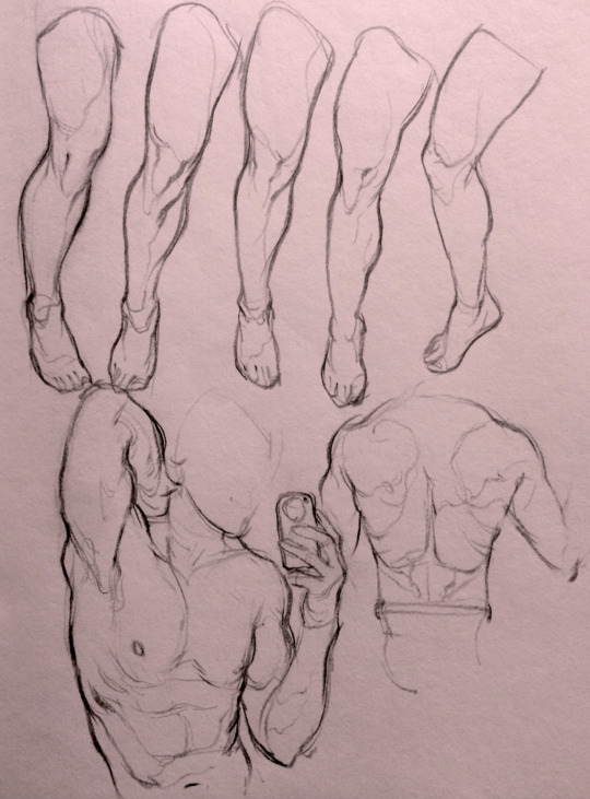

I'd use reference images that I grabbed from fitness forums, Instagram, Tumblr, Pinterest, and some NSFW places, but you could find adequate ref material from figure drawing sites like Line of Action. LoA has refs for people (you can filter by clothed/unclothed, age, & gender), animals, expressions, hands/feet, and a few other useful things as well. Love them.
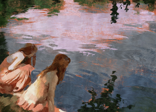
Learning how to render digitally was a similar story; it helped a lot that I had a pretty strong foundation for value/anatomy going in. I basically didn't touch color at all for ~2 years (except for a few attempts at bad digital or acrylic paint studies), which may not have been the best idea. I learned color from a lot of trial and error, honestly, and I'm pretty sure this process involved a lot of imitation—there were a number of digital/traditional painters whose styles I really wanted to emulate (notably their edge control, color choices, value distributions, and shape design), so I kiiind of did a mixture of that + my own experimentation.
For example, I really found Benjamin Björklund's style appealing, especially his softened/lost edges & vibrant pops of saturated color, so here's a study I did from some photograph that I'm *pretty* sure was painted with him in mind.
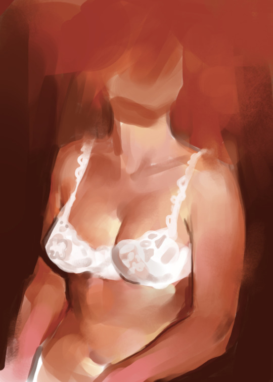
Learning how to detail was definitely a slow process, and like all the aforementioned things (anatomy/color/edge control/values/etc.) I'm still figuring it out. Focusing on edge control first (that is, deciding on where to place hard/soft edges for emphasizing/de-emphasizing certain areas of the image) is super useful, because you can honestly fool a viewer into thinking there's more detail in a piece than there actually is if you're very economical about where you place your hard edges.
The most important part, to me, is probably just doing this stuff over and over again. You're likely not going to see improvement in a few weeks or even a few months, so don't fret about not getting the exact results you want and just keep studying + making art. I like to think about learning art as a process where you *need* to fail and make crappy art/studies—there's literally no way around it—so you might as well fail right now. See, by making bad art you're actually moving forward—isn't that a fun prospect!!
It's useful to have a folder with art you admire, especially if you can dissect the pieces and understand why you like them so much. You can study those aspects (like, you can redraw or repaint that person's work) and break down whether this is art that you just like to look at, or if it's the kind of art that you want to *make.* There's a LOT of art out there that I love looking at, probably tens of thousands of styles/mediums, but there's a very narrow range that I want to make myself.
I've mentioned it in some ask reply in the past, but I really do think looking at other artist's work is such a cheat code for improving your own skills—the other artist does the work to filter reality/ideas for you, and this sort of allows you to contact the subject matter more directly. I can think of so many examples where an artist I admired exaggerated, like, the way sunlight rested on a face and created that orange fringe around its edge, or the greys/dull blues in a wheat field, or the bright indigo in a cast shadow, or the red along the outside of a person's eye, and it just clicked for me that this was a very available & observable aspect of reality, which had up until that point gone completely unnoticed! If you're really perceptive about the art you look at, it's shocking how much it can teach you about how to see the world (in this particular case I mean this literally, in that the art I looked at fully changed the way I visually processed the world, but of course it has had a strong effect on my worldviews/relationships/beliefs).
Thanks so much for sending in a question (& for reading, if you got this far)! I read every single ask I receive, including the kind words & compliments, which I genuinely always appreciate. Best of luck with learning, my friend :)
3K notes
·
View notes
Text
Actually while I'm thinking about it, I just wanna say that the more live-action remakes Disney shlups out like shoveled manure, the more amazed I am that Cinderella (2015) exists. It breaks literally every standard of Disney's LA remakes.
It's not a shot-for-shot remake of the original 1950 animated film, though it does include small references and homages to it, but only when such things can be incorporated organically into the story.
The creators understood and respected the cross-cultural significance of the Cinderella story. They didn't want to "fix" it, or add some wacky twist to it, they just wanted to make the best possible version of the Quintessential Cinderella that they could.
Everything that could be done practically was done practically. The carriage was a real, the horses pulling it were real, and all of the other animals (with the exception of the mice and lizards, since their performance was a lot more involved than the others') were real living animals, the lizard footman and goose carriage driver were wearing prosthetics instead of just having their animal features added in post, the Fairy Godmother's dress had little LED lights sewn into it so that it would actually glow for real, the ballroom set was built by hand and included real chandeliers with more than 2000 total candles that were all actually lit for the scene, and I could go on but you get the point.
There's a ton of attention paid to little details that make the world feel real and lived in. Ella's shoes are always a little scuffed and dirty. Her farm dress is faded and wrinkled. When she breaks down and runs away to the woods, she rides her horse bareback (which, once again, was a thing Lily James actually did, no stunt-double or editing in post), because not only is that something a country girl like her would know how to do, but it also makes sense that with as upset as she is, she wouldn't want to waste time with saddling the horse. When she's dancing with the prince, it's visually obvious that he is leading her and giving her cues because of course Ella wouldn't know the latest ballroom dances, and would need him to guide her through it.
Hey speaking of dancing, y'know what else this movie does that no other LA remake has been allowed to do (at least not to this extent)? ROMANCE. Land sakes alive, this is one of the most unabashedly and yet still tastefully romantic movies I've ever seen. Ella and Kit are just oozing romantic chemistry from the moment they lock eyes for the first time. It all comes down to the fact that these two characters both have the same core values of courage and kindness, which makes their admiration for each other feel grounded and believable. Richard Madden also really sells Kit's feelings for Ella with the way his eyes go all big and soft whenever he looks at her. And don't even get me started on Lily's performance as Ella. Her quiet awe that someone as powerful as the prince loves her. The timidity and fear that she's not really worthy of that. The selfless determination to protect him from her family's cruelty, even if it means she'll never see him again, I'm just-- *banging my fist against the table and screaming into a pillow*
Absolutely god-tier costume design. No notes, I think Sandy Powell's work speaks for itself. Btw, in case you were somehow still wondering, yes, Ella's ballgown is fully practical--those layers upon layers of dreamy silk skirts are real. CG was only used to brighten up the blue color to make her stand out from the crowd more.
Wicked stepmother was allowed to actually be wicked. The movie never tries to make you sympathize with Lady Tremaine, or shift the blame off to someone else. And her villainy is given an extra layer of depth with the reveal that she is a dark reflection of Ella. They've both lost people they loved, but where Ella refused to let her grief get in the way of kindness, Lady Tremaine became utterly consumed by it. She views the death of her first husband as a sort of twisted justification for pursuing all her worst impulses. She despises Ella for her ability to flourish even while enduring terrible suffering, for being everything Lady Tremaine was either unable or flat-out refused to be.
Also Cate Blanchet absolutely SLAYS in this role. Hands-down my favorite portrayal of the wicked stepmother character.
Anyways, TLDR: Cinderella (2015) is the only Disney live-action remake that can justify its own existence and that's because it actively defies everything the LA remakes are today.
2K notes
·
View notes