#Shading process
Explore tagged Tumblr posts
Text
Guess Who's been rewatching cutscenes of Ratchet & Clank lately? 😁🔧
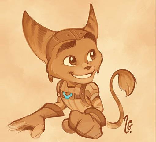
I was looking for a character to illustrate as a quick demonstration in response to a previous ask, and it just so happened that this franchise was one of the many I suddenly remembered I once had quite a fondness for; hence the little tribute.^^
So here's how I proceed for the shading process!
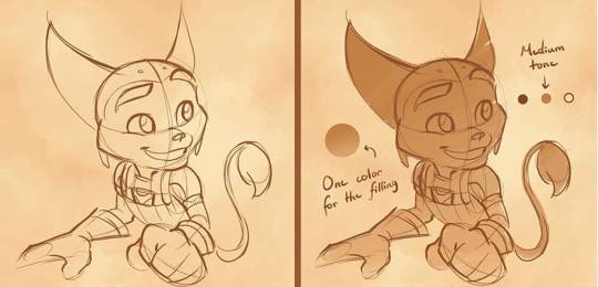
When it comes to monochromatic sketches, I have a special liking for warm and earthy tones, but any color can work really well depending on the atmosphere needed. When choosing one, I pick the background first as a general indicator, then follow it up with the contour lines. This helps me find the base for the character itself, which is always somewhere in-between. That way, the figure stands out reasonably while also having visible details even at this stage. :3
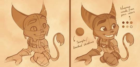
From there, I separate each darker and lighter zone by using the already existing tones that I have and creating blends. Same goes for the shadows, which I keep fairly subtle and only emphasize in some key areas for a softer effect. 🎨
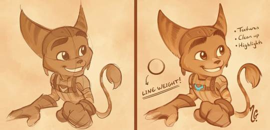
Depending on the complexity of the piece (and especially when using a more diverse palette), I will often trace the final version first, but in the case of a simpler drawing like this one, I usually apply most of the shading on the rough sketch instead and make the remaining adjustments from there. When cleaning up the lines, I use pen pressure to obtain varying thickness and create a more dynamic result. Sometimes, I will also include a few tiny elements outside of the color range I'm working with as a fun bit of contrast and finishing touch. ✨
Aaand that's about it! Not much else to it. 🤗✏️
#I've been having so much fun revisiting old interests of mine lately 🥲😄#I had forgotten how cool these games were 🧡⚙️#Ratchet and Clank#Fanarts and fanwork#Shading process#Thoughts and ramblings
228 notes
·
View notes
Text
I want to step away from the art-vs-artist side of the Gaiman issue for a bit, and talk about, well, the rest of it. Because those emotions you're feeling would be the same without the art; the art just adds another layer.
Source: I worked with a guy who turned out to be heavily involved in an international, multi-state sex-slavery/trafficking ring.
He was really nice.
Yeah.
It hits like a dumptruck of shit. You don't feel stable in your world anymore. How could someone you interacted with, liked, also be a truly horrible person? How could your judgement be that bad? How can real people, not stylized cartoon bogeymen, be actually doing this shit?
You have to sit with the fact that you couldn't, or probably couldn't, have known. You should have no guilt as part of this horror — but guilt is almost certainly part of that mess you're feeling, because our brains do this associative thing, and somehow "I liked [the version of] the guy [that I knew]", or his creations, becomes "I made a horrible mistake and should feel guilty."
You didn't, loves, you didn't.
We're human, and we can only go by the information we have. And the information we have is only the smallest glimpse into someone else's life.
I didn't work closely with the guy I knew at work, but we chatted. He wasn't just nice; he was one of the only people outside my tiny department who seemed genuinely nice in a workplace that was rapidly becoming incredibly toxic. He loaned me a bike trainer. Occasionally he'd see me at the bus stop and give me a lift home.
Yup. I was a young woman in my twenties and rode in this guy's car. More than once.
When I tell this story that part usually makes people gasp. "You must feel so scared about what could have happened to you!" "You're so lucky nothing happened!"
No, that's not how it worked. I was never in danger. This guy targeted Korean women with little-to-no English who were coerced and powerless. A white, fluent, US citizen coworker wasn't a potential victim. I got to be a person, not prey.
Y'know that little warning bell that goes off, when you're around someone who might be a danger to you? That animal sense that says "Something is off here, watch out"?
Yeah, that doesn't ping if the preferred prey isn't around.
That's what rattled me the most about this. I liked to think of myself as willing to stand up for people with less power than me. I worked with Japanese exchange students in college and put myself bodily between them and creeps, and I sure as hell got that little alarm when some asian-schoolgirl fetishist schmoozed on them. But we were all there.
I had to learn that the alarm won't go off when the hunter isn't hunting. That it's not the solid indicator I might've thought it was. That sometimes this is what the privilege of not being prey does; it completely masks your ability to detect the horrors that are going on.
A lot of people point out that 'people like that' have amazing charisma and ability to lie and manipulate, and that's true. Anyone who's gotten away with this shit for decades is going to be way smoother than the pathetic little hangers-on I dealt with in university. But it's not just that. I seriously, deeply believe that he saw me as a person, and he did not extend personhood to his victims. We didn't have a fake coworker relationship. We had a real one. And just like I don't know the ins-and-outs of most of my coworkers lives, I had no idea that what he did on his down time was perpetrate horrors.
I know this is getting off the topic, but it's so very important. Especially as a message to cis guys: please understand that you won't recognize a creep the way you might think you will. If you're not the preferred prey, the hind-brain alarm won't go off. You have to listen to victims, not your gut feeling that the person seems perfectly nice and normal. It doesn't mean there's never a false accusation, but face the fact that it's usually real, and you don't have enough information to say otherwise.
So, yeah. It fucking sucks. Writing about this twists my insides into tense knots, and it was almost a decade ago. I was never in danger. No one I knew was hurt!
Just countless, powerless women, horrifically abused by someone who was nice to me.
You don't trust your own judgement quite the same way, after. And as utterly shitty as it is, as twisted up and unstead-in-the-world as I felt the day I found out — I don't actually think that's a bad thing.
I think we all need to question our own judgement. It makes us better people.
I don't see villains around every corner just because I knew one, once. But I do own the fact that I can't know, really know, about anyone except those closest to me. They have their own full lives. They'll go from the pinnacles of kindness to the depths of depravity — and I won't know.
It's not a failing. It's just being human. Something to remember before you slap labels on people, before you condemn them or idolize them. Think about how much you can't know, and how flawed our judgement always is.
Grieve for victims, and the feeling of betrayal. But maybe let yourself off the hook, and be a bit slower to skewer others on it.
#listen to old auntie Shades#serious#fuck I don't know how to tag this#I should probably read-more this but I'm not sure where#and now I need to go take a walk for my stupid mental health#you never stop processing#you do it over and over and over and over#and hope it gets a bit easier each time#Someone might get upset by using prey#but 'preferred prey' is an important concept from the predator's view#it doesn't mean the people are inherently prey#you feel me?#it's the best word I can find for the concept#neil gaiman#adjacent
27K notes
·
View notes
Text
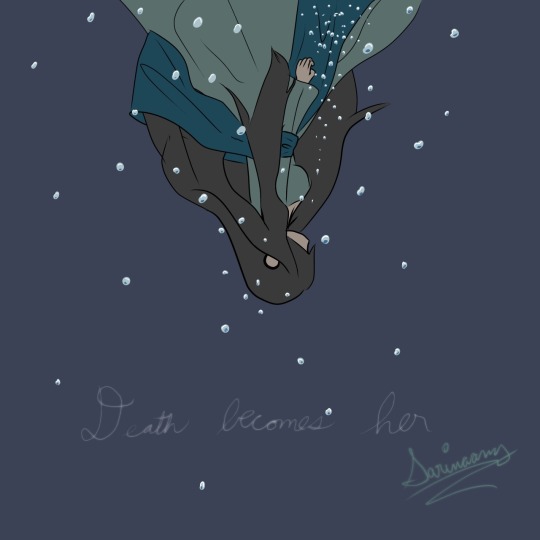


Shading is so fun! Lately I’ve been going back and comparing my drawings at different stages of shading just to see the differences, shading is magic!!
#digital art#art#oc#oc art#original work#original artwork#original art#art process#shading#shading process#Drawing a lot more lately#maybe I’ll do more today
0 notes
Text

close call
#ash williams#bruce campbell#evil dead#my art#artists on tumblr#littol bright and silly. rly like the ear shading?#process for this is in the august vid on my 'treon
3K notes
·
View notes
Text


This took way too long for a comic that's supposed to be self-indulgent and quick,, Apologies if the chat bubbles are confusing on who's talkin..
Anyway another comic for my AU! I'm not sorry for the lack of background cause I really wanted to just focus on the dialogue lawl
Extra doodles I did while making the comic if ya'll want some of it:


#During the process of making this it reminded me why I'd rather stick to making short comics than a full series#my artstyle losing and gaining quality each panel over and over#this isn't even fully shaded and i already took way too long for my taste#Anyway another session of me yapping in tags#it's the fact i had to post this in my laptop and not my phone cause of the photo limit#which i didn't even know Tumblr had#not too happy with the results maybe i should've not coloured this help#hope it's okay ajkds#field research au#dandys world#dandy's world#dandys world fanart#dandys world sprout#dandys world au#dandys world brightney#dandys world connie#dandys world goob#dandys world looey#ronu's artwork
3K notes
·
View notes
Text
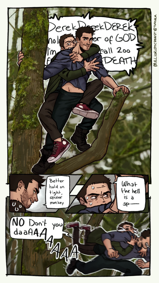
"DerekDerekDEREK holy mother of GOD I'm about to fall 200 feet to my DEATH" "Better hold on tight, spider monkey" "What the hell is a sp- NO don't you daaAAA"
Another of my friend K's suggestions - when she found out I'd never watched twilight she suggested we do so together, but she keeps insisting she won't tell me what happens in the last ones in advance because then I'll 'never agree to watch them'. i am afraid.
#teen wolf#stiles stilinski#derek hale#sterek#sterek fanart#twilight#these movies are so BLAND colorwise#why were all of their clothes in this scene the exact shades of green/brown the background was#anyway#whenever there was a shot of an actor on wires their body language screamed “I WAS NOT AWARE IT WOULD BE GOING THIS FAST”#hilarious#Tried for a more stylized look here#which I'm hmm about#but hey#it's a process#my art#OOPS only noticing 4 hours after posting that the layer with derek's beard on the last panel disappeared at some point LOL#he went so fast it fell off ig ¯\_(ツ)_/¯
2K notes
·
View notes
Text
A rocky intervention
(a sonic boom agent stone AU)
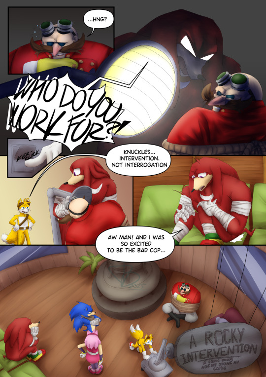
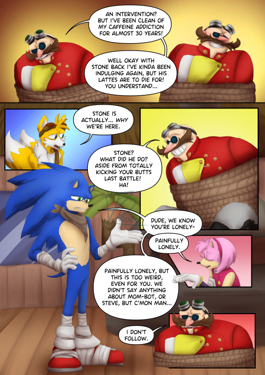
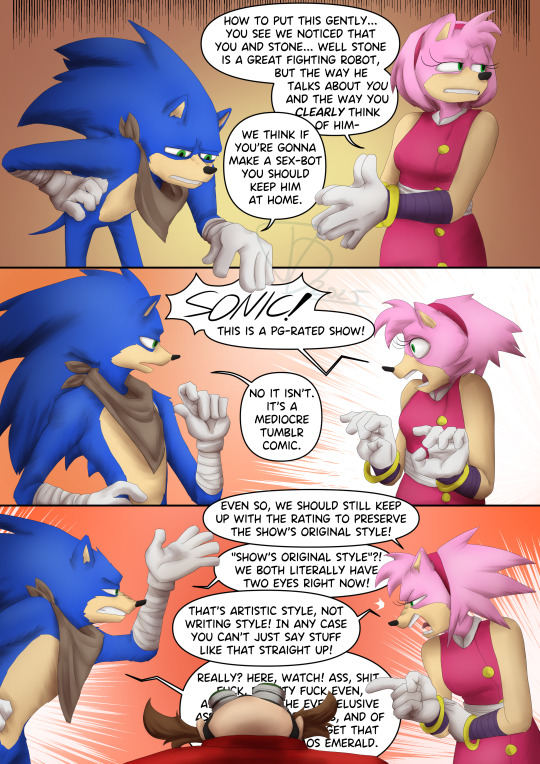

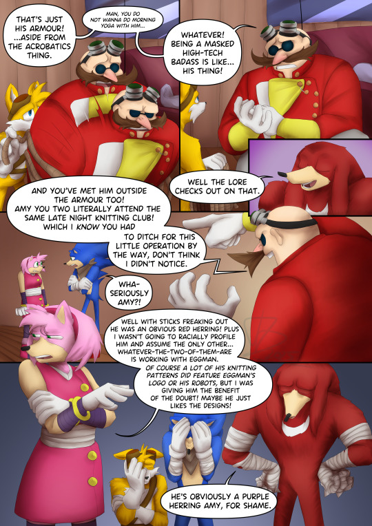
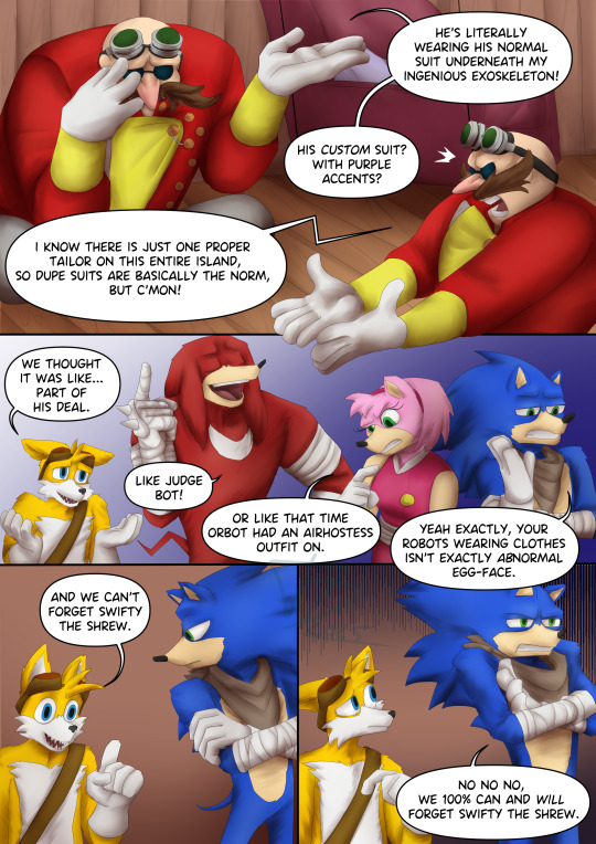
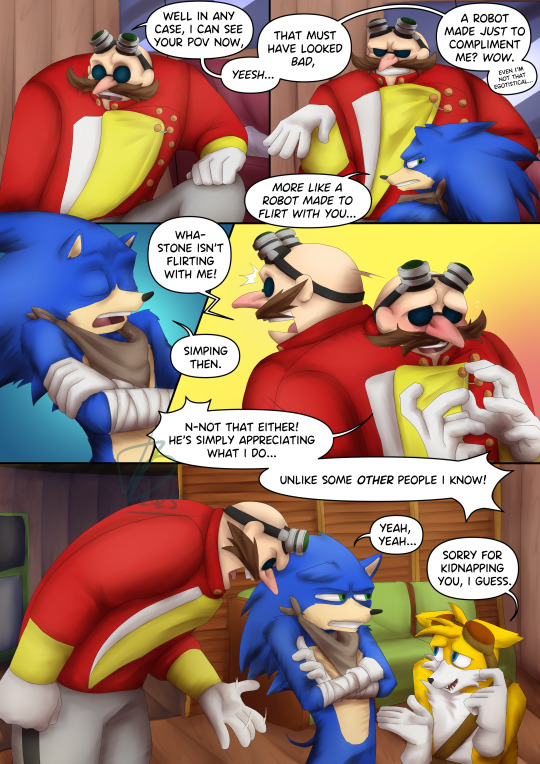
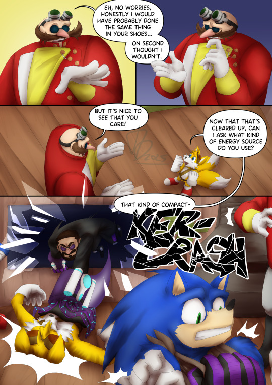
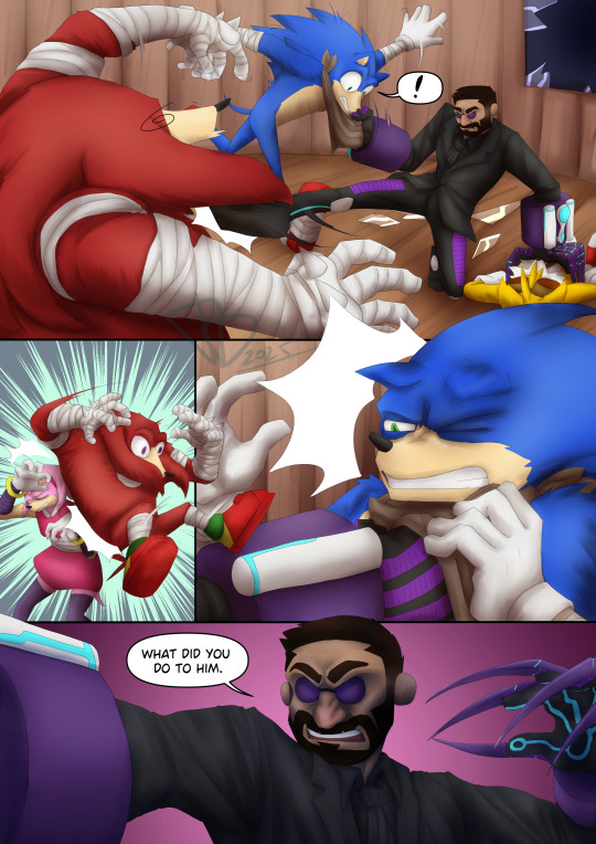
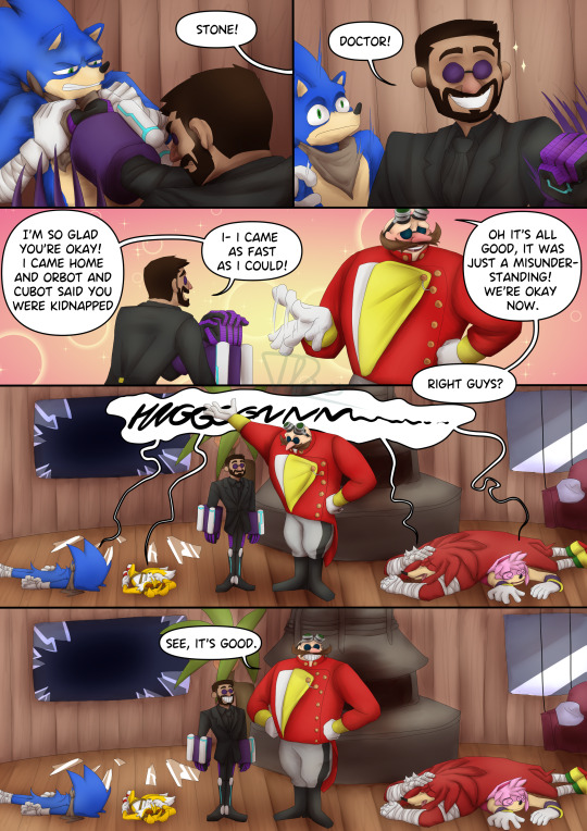
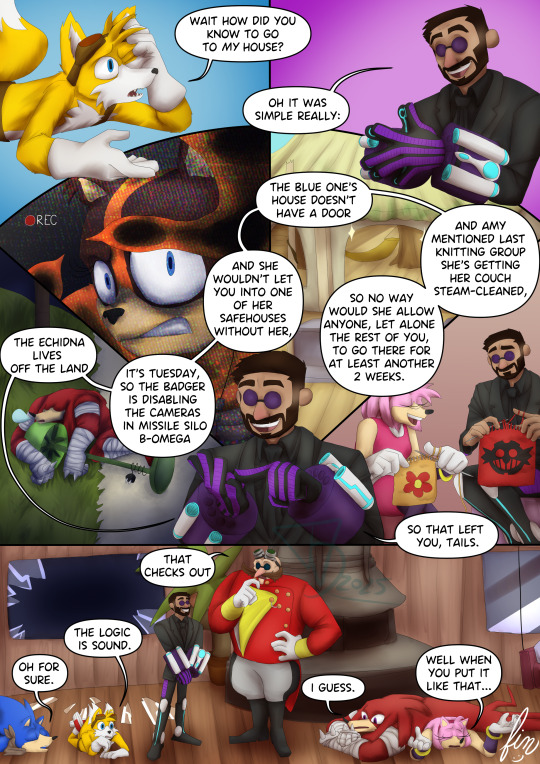
the making of this took something from me.
but anyway! the silly intervention idea i mentioned in the original post pitching the boom!stone au kinda uhhh given a lil something more! :)
#sonic the hedgehog#sonic boom#sth#dr eggman#boom eggman#agent stone#sonic agent stone#stobotnik#tails the fox#amy rose#knuckles the echidna#my art#digital art#a loser tip! if you plan on making a silly cartoon comic!! use chonkier lineart!!!#because then the colouring and shading process wont want to actively kill you#anyway. looks like ass a lil bit but i hope its funny enough to make up for that xd
1K notes
·
View notes
Text
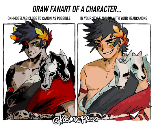
one of those canon vs art style thingies but its how i draw zag
template on twitter
#i blacked out during the on model zag one#drawing him in my style afterwards was sooo disorienting#semi realisting cel shaded zag vs. my anime ass style zag#the most drastic art style ever dawggg#my art#artists on tumblr#digital art#art#illustration#prlzy art#hades fanart#hades game#hades supergiant#zagreus hades#hades game fanart#zagreus#art timelapse#process video#clip studio ex
277 notes
·
View notes
Text
I think 90% of my gripes with how modern anime looks comes down to flat color design/palettes.
Non-cohesive, washed-out color palettes can destroy lineart quality. I see this all the time when comparing an anime's lineart/layout to its colored/post-processed final product and it's heartbreaking. Compare this pre-color vs. final frame from Dungeon Meshi's OP.
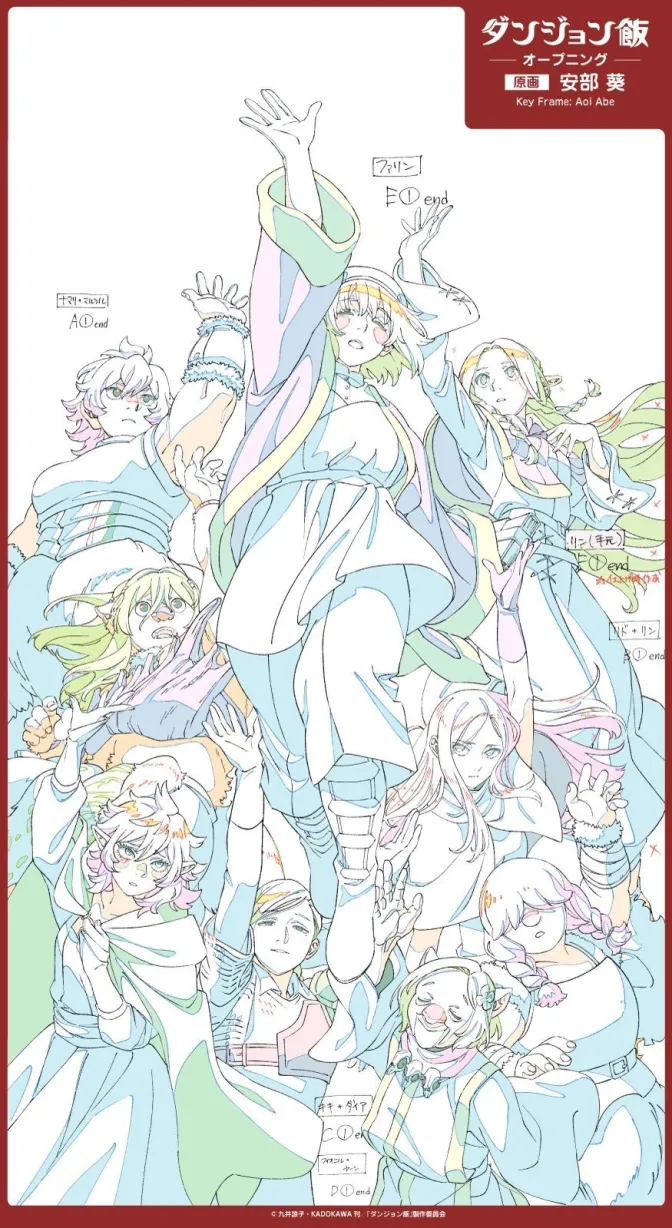
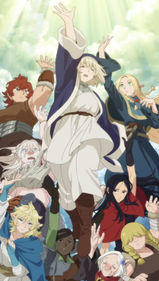
So much sharpness and detail and weight gets washed out and flattened by 'meh' color design. I LOVE the flow and thickness and shadows in the fabrics on the left. The white against pastel really brings it out. Check out all the detail in their hair, the highlights in Rin's, the different hues to denote hair color, the blue tint in the clothes' shadows, and how all of that just gets... lost. It works, but it's not particularly good and does a disservice to the line-artist.
I'm using Dungeon Meshi as an example not because it's bad, I'm just especially disappointed because this is Studio Trigger we're talking about. The character animation is fantastic, but the color design is usually much more exciting. We're not seeing Trigger at their full potential, so I'm focusing on them.
Here's a very quick and messy color correct. Not meant to be taken seriously, just to provide comparison to see why colors can feel "washed out." Top is edit, bottom is original.
You can really see how desaturated and "white fluorescent lighting" the original color palettes are.
[Remember: the easiest way to make your colors more lively is to choose a warm or cool tint. From there, you can play around with bringing out complementary colors for a cohesive palette (I warmed Marcille's skintone and hair but made sure to bring out her deep blue clothes). Avoid using too many blend mode layers; hand-picking colors will really help you build your innate color sense and find a color style. Try using saturated colors in unexpected places! If you're coloring a night scene, try using deep blues or greens or magentas. You see these deep colors used all the time in older anime because they couldn't rely on a lightness scale to make colors darker, they had to use darker paints with specific hues. Don't overthink it, simpler is better!]
#not art#dungeon meshi#rant#i'm someone who can get obsessive over colors in my own art#will stare at the screen adjusting hues/saturation for hours#luckily i've gotten faster at color picking#but yeah modern anime's color design is saddening to me. the general trend leans towards white/grey desaturated palettes#simply because they're easier to pick digitally#this is not the colorists fault mind you. the anime industry's problems are also labor problems. artists are severely underpaid#and overworked. colorists literally aren't paid enough to do their best#there isn't a “creative drought” in the anime industry. this trend is widespread across studios purely BECAUSE it's not up to individuals#until work conditions improve anime will unfortunately continue to miss its fullest potential visually#don't even GET ME STARTED ON THE USE OF POST-PROCESSING FILTERS AND LIGHTING IN ANIME THOUGH#SOMEONE HOLD ME BACK. I HATE LENS FLARES I HATE GRADIENT SHADING I HATE CHROMATIC ABBERATION AND BLUR
2K notes
·
View notes
Text
Here take very sloppy and unfinished animation of divorced monkey men,
I was gonna wait until at least Mac’s lineart was done but I’m 7days into a 10 day work streak and got pulled over on my way into work today so i’m probably not gonna have the energy to do anymore lineart today Lol
Tried to do a gif and tumblr does not like me Lol
Also procreate dreams is the bane of my existence, i’ve been working on a different project while trying to learn it and it feels like pulling goddamn teeth, this was done in my baby flipaclip
#Please my animation looks baaaddd i gotta relearn so much uuugggghhhh#trust the process trust the process trusttheprocess#nyoooomart#lmk macaque#lmk sun wukong#lmk monkey king#lmk fanart#lego monkie kid#animation#wip#i AM finishing this#at least cleaning it up and adding shading#uggghhhhhhhghhhhhhhh#i’m so tired#shadowpeach
214 notes
·
View notes
Text

Art Process GIF of "Malon ... grown up, of course :)"
#zelda fanart#the legend of zelda#tloz#rough sketch#art process#concept art#art timelapse#art#figuredrawing#zelda#malon#malink#oot#ocarina of time#lon lon ranch#hyrule#sketch#doodle#shading#lighting#coloring#gradient map
169 notes
·
View notes
Text
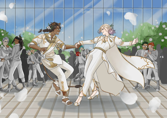
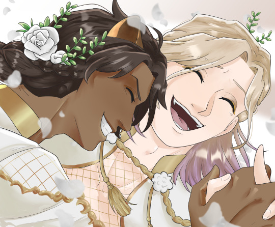
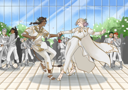
@leovilweek Day 7-ish: Gala
I'M LATE BUT IT'S FINALLY HERE.
I had so much fun with this ship week and it was really cool seeing what others created!!
The pose is from here.
More under the cut:
+ me being shamelessly self-indulgent by adding my other twst ships
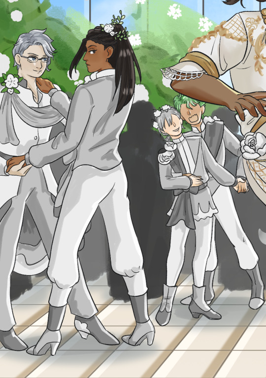
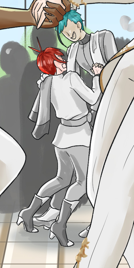
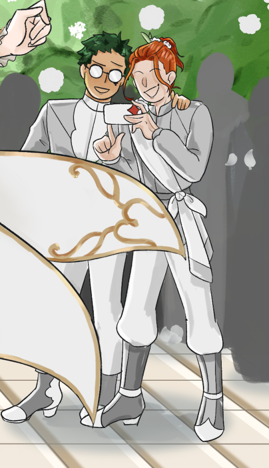
++ clean version of pt 1
+++ flat colours for pt 2 because I like how it looks
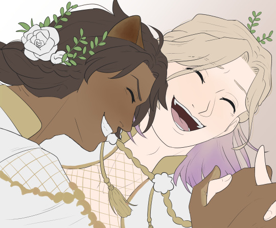
#leovilweek24#twisted wonderland#twst#leona kingscholar#vil schoenheit#leovil#i'm just gonna tag the other ships#azujami#silbek#florid#treycater#i had to repeat to myself TRUST THE PROCESS TRUST THE PROCESS many times while shading bc it was not looking good for me#jazzie's art#jazzie's stuff#guys i think i'm gonna become a twst artist this was fun#edit: so no one was gonna tell me i completely forgot to draw leona's tail huh
1K notes
·
View notes
Text
Part of the reason Melinoe does not Care about mortals is cause her domain is literally ghosts. That is, shades. It's not a coincidence that every shade - Homer, Od, Icarus, etc etc love her. She is their Ruler and she treats them generously. Living mortals do not factor into her domain she presides over a kingdom of the Dead she of course in her Royal Arrogance, prefers those who are her Subjects over those who are not. And thus, it is better for mortals to die, they "gain sense" (side with her, the goddess of Ghosts who is against Chronos) and thus can be under her protection. I doubt Mel is ever gonna 180 on that.
Melinoe's arc is ultimately about questioning why she's fighting. Is it worth it (for her), does she care enough for the people she's fighting for do they deserve this as much as she does. Hence antagonism from Eris, from Nemesis (who asks does she deserve this? Both in the pity sense as in the earning sense), from Prometheus, etc. It's not about her "hatred" (it's more like arrogant indifference actually) of mortals they are supposed to fear her, the Goddess of Nightmares and Ghosts, as much as they fear death anyways.
#Melinoe#hades 2#hades II#hades II spoilers#If Hades is the guy who processes the dead after they die (ie the paperwork)#Melinoe is the one who looks after them once that is said and done#hence why she worries so much about the shades being out and about and rather they be safe locked away in the Underworld#They are her subjects the Mortals should listen to *their* rulers - that is the Olympians
389 notes
·
View notes
Text
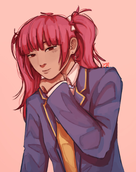
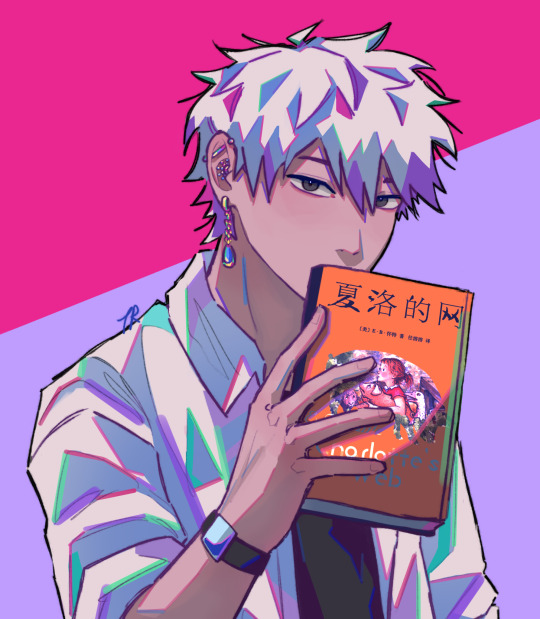
li tianxi in my more painterly style + lu guang inplick colour study !!
#😊😐#the difference between my regular colouring and the inplick one is kinda insane#my regular colours look so warm but thats cause i mostly use orange-red to build up & shade😭😭#NEVER used that shade of green before so had fun stepping out of my comfort zone w the second one#li tianxi#lu guang#link click#shiguang dailiren#sgdlr#link click fanart#fanart#my art#art#style study#art practice#anyways very happy with both real talk tho i think i dislike digital painting uhhhh😨😨😨#despite thinking it looks so good#the process is so. im neutral i think im neutral but it just takes longer than slapping a multiply layer on top with a pink or a red so#i just notice how much longer it takes#and i think when shading clothes specifically like that is such a large portion of my process im less eager to do it#im starting to understand why everyone is always naked in paintings like i hate you fabric i hate you clothing folds
219 notes
·
View notes
Text
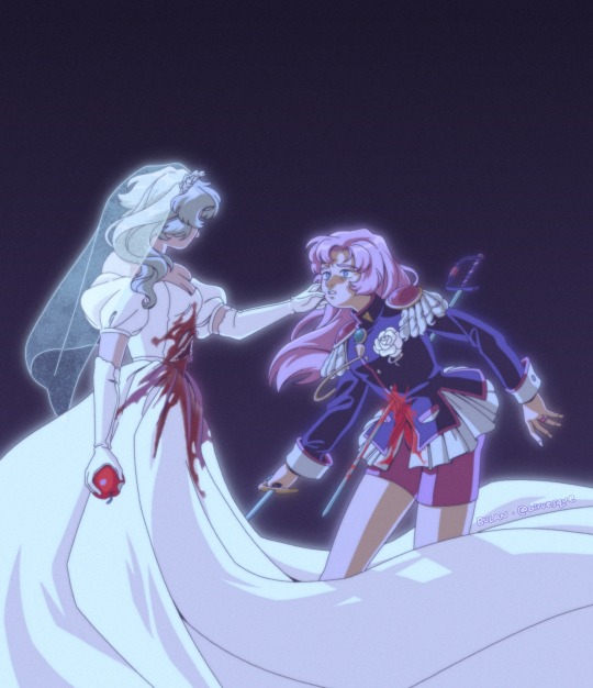
winter
timelapse under the cut
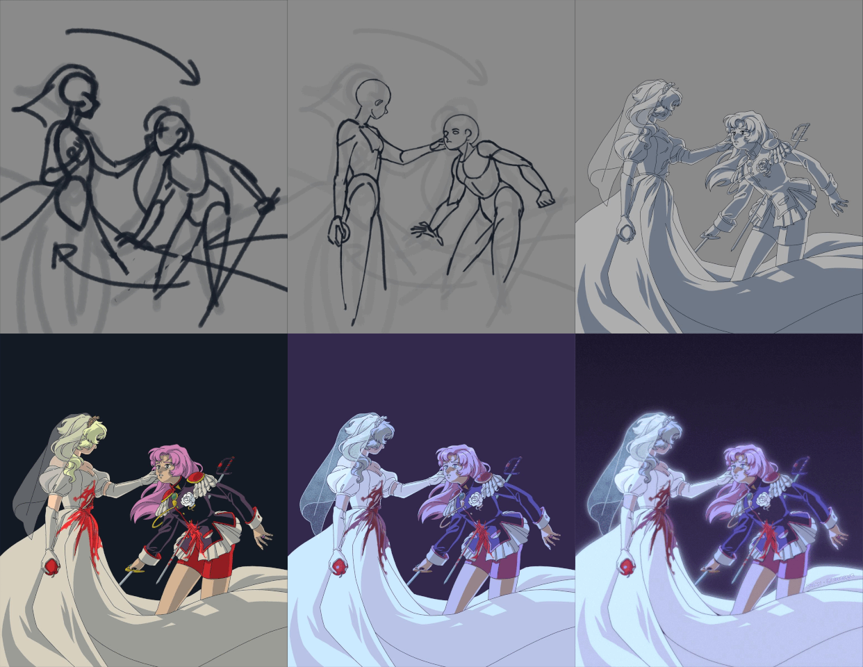
#revolutionary girl utena#utena tenjou#kanae ohtori#rgu#biruesque art#cw: blood#this was so fun to make!!!!!!!!!!!!!!!!!!!#i should also make timelapses more often#even tho my process isnt too interesting to look at since it's the standard sketch > lineart > base color > shading
2K notes
·
View notes
Text
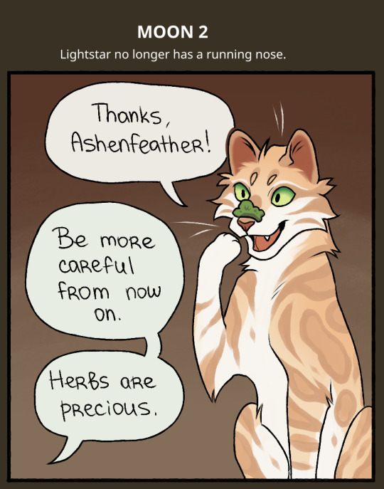
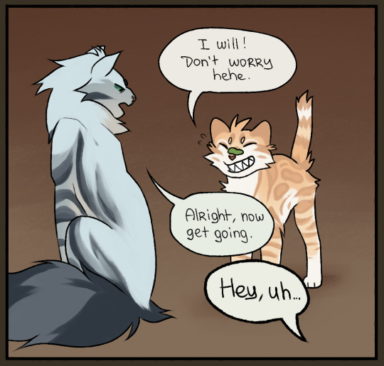
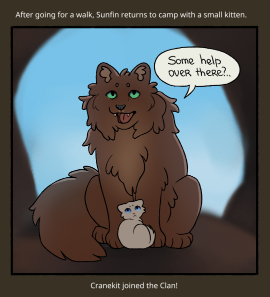
MOON 2
Oh?
PREVIOUS | NEXT
#cloudclangen#warriorcats#warriors#clangen comic#warrior cats clangen#clan generator#clangen#lightstar#ashenfeather#sunfin#cranekit#he's so adorable isn't he#i'm trying to optimize the process of drawing these comics so that it's a little less time-consuming#here for example i did just a bare minimum of shading#and i switched to a different lining brush#previous one was a little funky#i also decided to write the text by hand instead of typing#don't have to worry about spacing this way
170 notes
·
View notes