#SW Layout
Explore tagged Tumblr posts
Photo


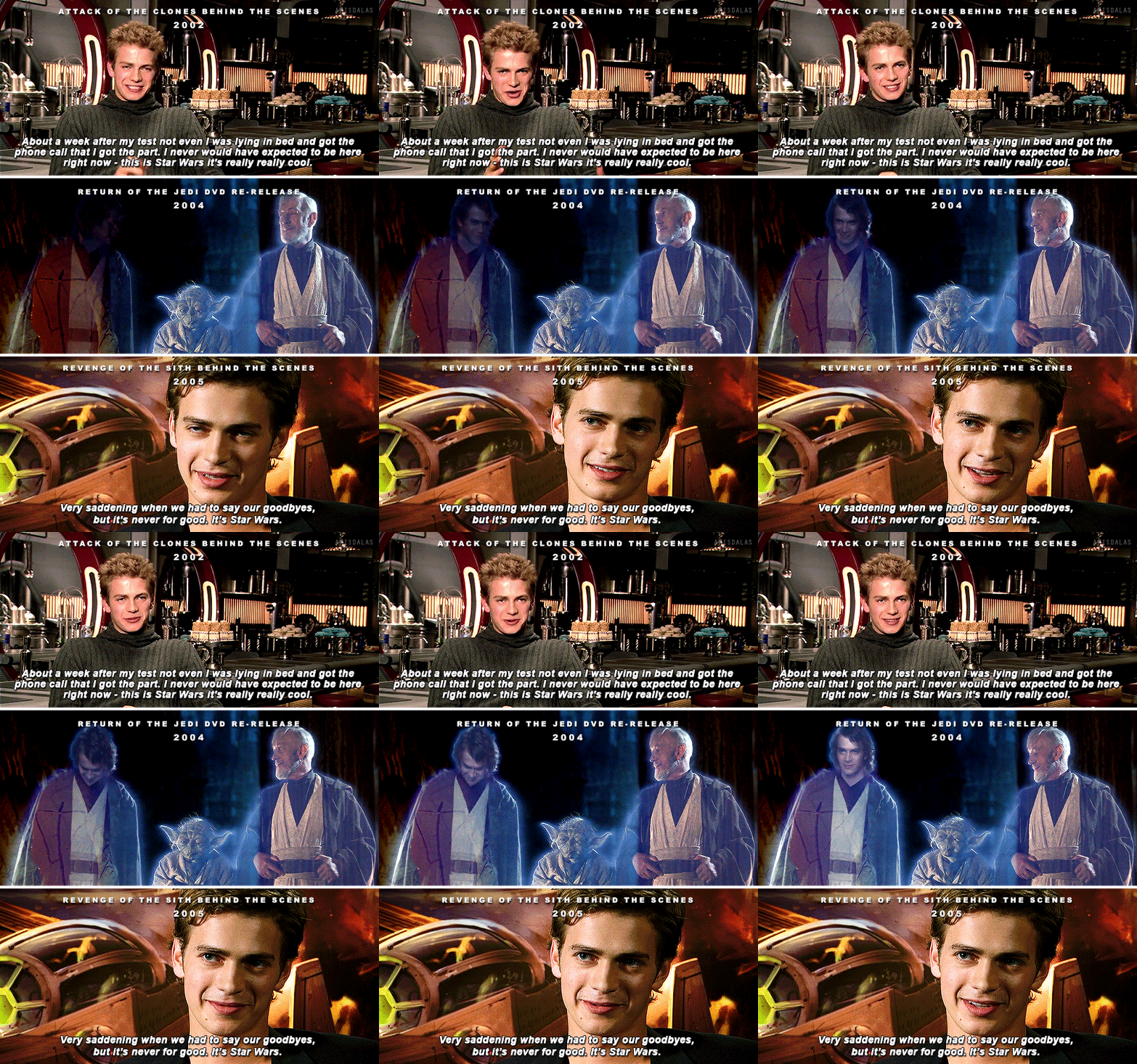

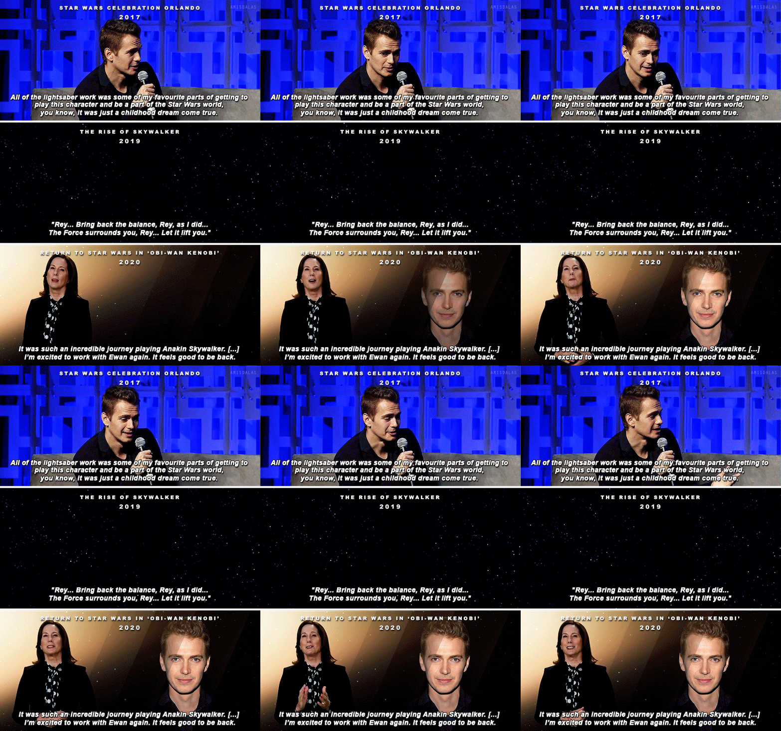

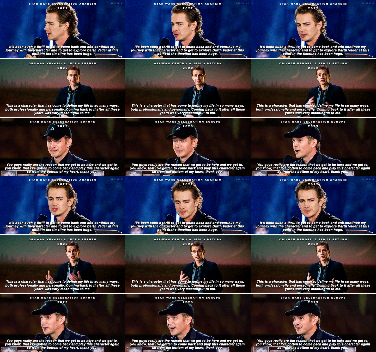
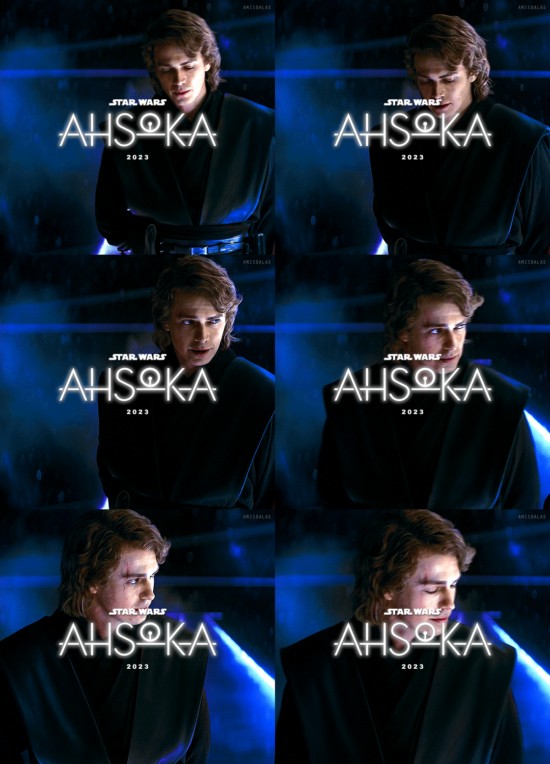
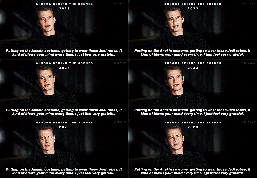
STAR WARS APPRECIATION WEEK 2023 MAY 22: CAST | FAVOURITE CHARACTER ARC | FREE SPACE ▸ HAYDEN CHRISTENSEN AS ANAKIN SKYWALKER/DARTH VADER (2002 - )
I remember auditioning for the films with no concept that I could actually get the part. He cast me in the role, and it was a dream come true, you know.
#swaw2023#hayden christensen#hchristensenedit#haydenchristensenedit#swcastedit#sw cast#star wars#swedit#anakin skywalker#darth vader#starwarsblr#*mine#*2023#*gifs#[layout]#2k#absolute shocker of a choice that no one saw coming !!#GOD ALL THE FEELSSS
2K notes
·
View notes
Text


( ❛ .ɞ❛ )ㅤ ㅤㅤㅤ ⃨۪۪̃۟ㅤㅤㅤ ۪۟ㅤ˖ㅤㅤㅤㅤㅤ ۪۟ ㅤ 3༏ྀ𑇒


#ㅤ🥂sw🧿◉sw🍨sw sweet c-andy ❜❜❜❜ 𝛛𝛛❛•᷄ ɞ•᷅ ( •.ɞ•) ㅤㅤౢㅤㅤ.ະ ꒪embracceㅤ⬚..❜#ㅤ ㅤ#haenxn#jisung#park jisung#nct#nct dream#nct dream moodboard#kpop#clean moodboard#moodboard#yellow moodboard#bright moodboard#colorful moodboard#pink moodboard#kpop moodboard#messy moodboard#y2k moodboard#aesthetic#sweet moodboard#aesthetic moodboard#kpop layouts#nct moodboard#nct jisung#krp#kpop icons#kpop bg#kpop boys#kpop bg moodboard#cute moodboard
228 notes
·
View notes
Text
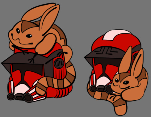
Wanting to make another Fox charm but stuck in which design feels better: Tooka on top of helmet or curled around the helmet.
#star wars#sw fox#commander fox#star wars fox#tooka#myart#i will be redoing since helmet is off but basic layout of it!
411 notes
·
View notes
Photo

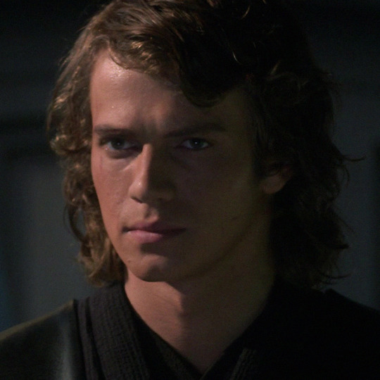
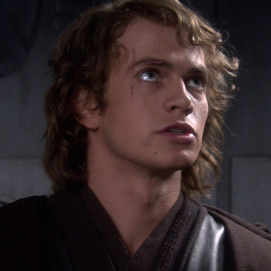
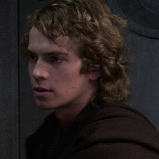
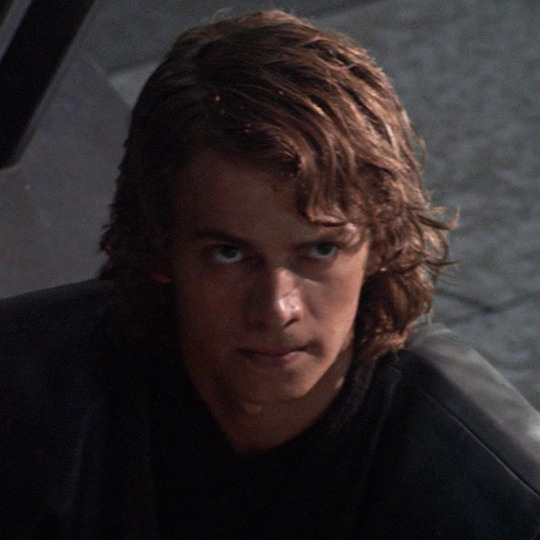
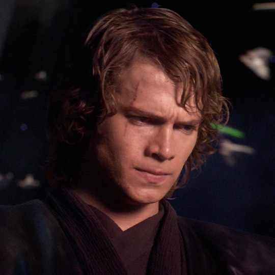
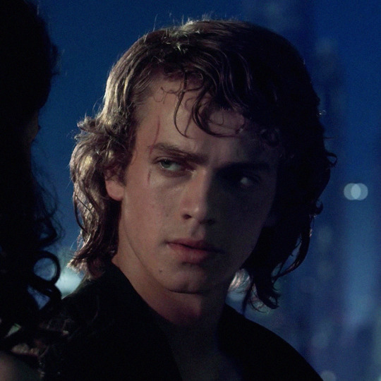
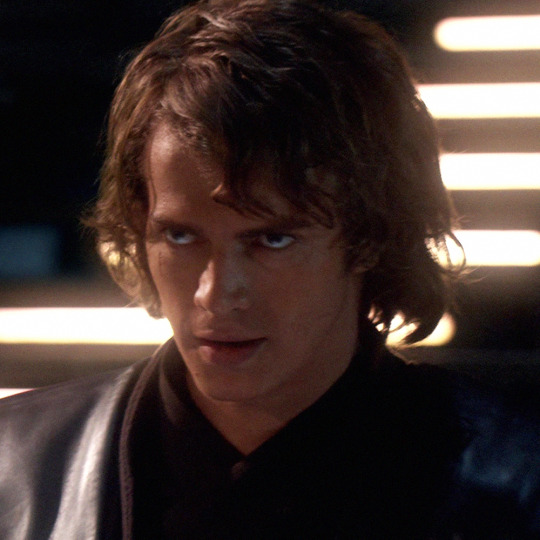
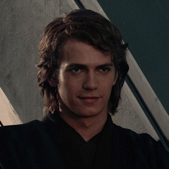
anakin skywalker icons
“♡” or reblog if you save/use — follow me.
twt: @szamofada
#anakin skywalker#anakin skywalker icons#anakin skywalker headers#hayden christensen#hayden christensen icons#hayden christensen headers#star wars#star wars revenge of the sith#revenge of the sith#swedit#sw#icons#layouts#without psd
438 notes
·
View notes
Text


So I never uploaded the final version of the Captain Rex I drew a looong time ago for that last Uniqlo contest, the one that encompassed all Disney-related properties. My original concept for this was to include More Clones, but I did everything at the last minute and of course the design suffered for my lack of management.
Personal opinion is 'It's not bad! It could've been better! But it is what it is, we're working with that.'
#I'm just annoyed that the colors always seem to be off#Also doing layouts and thumbnails are always hit or miss for me so that adds to the wonkiness here#captain rex#star wars#sw: tcw#the clone wars#art MK
52 notes
·
View notes
Text
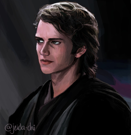
I am so so normal about Anakin Skywalker (lying)
Reblogs are very appreciated!
#I got distracted bc I was so mad about the layout thing but I actually wanted to post art today LOL#Look at him he’s my little babygirl#star wars prequels#star wars prequels fanart#anakin skywalker#anakin skywalker fanart#Star wars#Star Wars fanart#revenge of the sith#digital painting#hayden christensen#hayden Christensen fanart#Rots#my art#digital drawing#digital art#sw prequels#jeida-chi#burntblueberrywaffles
231 notes
·
View notes
Text


Painting excercise using this frame from Battle Scars
#myart#the bad batch#tbb#clone trooper tech#star wars#sw#tcw#clone trooper crosshair#sargeant hunter#clone trooper wrecker#clone trooper echo#captain rex#battle scars#tbb 1x7#digital paiting#i actually painted this a few months ago but completely forgot about it#Bracca in tbb had some of the most beautiful layouts i´ve seen
24 notes
·
View notes
Text


suki upwind, zabrak rebel and crack shot with a blaster ( x x x )
#star wars#star wars oc#oc: suki upwind#mine*#mine*sw#told you it was just a matter of time until i started posting my swocs#also i just love this graphic layout sry#mine*edit
7 notes
·
View notes
Text

STEP RIGHT UP FOR...

⸺ ANGEL'S EDITING CHALLENGE !!


✧ ﹒ opening words ﹕
✿ this event is the culmination of an idea i had for a pretty cool and unique event, but also to celebrate hitting 1000+ followers! i am eternally grateful for your continuous support, thank you to all my mutuals, anyone who's ever sent in a request, or interacted with any of my content. I'm so happy to be here and to have reached this milestone.

﹒ 𝜗 ₊ event info ﹕
✿ our event is a regular prompt event. the themes will be based around editing without certain elements that are supposed to be integral to edits. frames? coloring? characters? you can throw all those out the window because those will not be used here! for any further questions, please shoot me an ask.
𓎢𓎟𓎟𓎟 . ♡ . 𓎟𓎟𓎟𓎢
✿ the first 4 days will have "THIS or THAT" prompt questions and you must choose which theme you prefer to edit. the rest of the days have singular prompts for you to follow.
𓎢𓎟𓎟𓎟 . ♡ . 𓎟𓎟𓎟𓎢
✿ for days 5 and 6 (editing without time) you must finish your edit within 5 minutes. post proof that you made your edit in 5 minutes (such as showing the project's timestamp within your editing program). despite the time limit, you must still try to put effort and create something that resembles your usual edits.
𓎢𓎟𓎟𓎟 . ♡ . 𓎟𓎟𓎟𓎢
✿ tag me in your posts and use the tag #moon1010.
𓎢𓎟𓎟𓎟 . ♡ . 𓎟𓎟𓎟𓎢
✿ this event will run from 14th July to 28th July, giving you 2 weeks or 14 days to complete the event. the event starts in a day to give people time to prepare. i can accept late submissions. in the event a strike occurs while my event is ongoing, please send me your edits in my inbox and post them when the strike is over. you're free to skip a day, but do the days in order.
𓎢𓎟𓎟𓎟 . ♡ . 𓎟𓎟𓎟𓎢
✿ i'll choose the 1st, 2nd, and 3rd winners through spinning a wheel, with editors who finished all/most days of the event. 1st winner gets two layout sets and two graphics sets. 2nd winner gets a graphics set. 3rd winner gets a layout set. i may select extra winners who will get icon sets.

✧ ﹒ prompts list ﹕
➤ EDITING WITHOUT... 🎀
⸺ A CHARACTER !!
♡ DAY 1﹕ WINTER or SPRING
♡ DAY 2﹕ NIGHT or DAY
♡ DAY 3﹕ OCEAN or SKY
♡ DAY 4﹕ VINTAGE or MODERN

➤ EDITING WITHOUT... 🌸
⸺ TIME !!
♡ DAY 5﹕ a character that's most special to you
♡ DAY 6﹕ a character you heavily relate to

➤ EDITING WITHOUT... 🧁
⸺ FRAMES !!
♡ DAY 7﹕ a character with a design you dislike
♡ DAY 8﹕ a character you love from a media you hate

➤ EDITING WITHOUT... 💌
⸺ COLORING !!
♡ DAY 9﹕ a character from your earliest blog layout (that you can remember)
♡ DAY 10﹕ a character you want to retheme to

﹒ 𝜗 ₊ promo? ﹕
@lavendergalactic @kanakitos @sw-etheart
@kiochisato @murcuor @pien-chan
@doveish @whisfer @herrscherofmemories
@eskeys @promoblr @rookmeo
@meowrette @pink-sugar @c-ralique
@battampria @strawberrysnipes @thydragoness
@llocket @skaternpd @mischiefesse
@miaufleur @mischiefesse @akitoyatism
@mysterialss @editclub

243 notes
·
View notes
Text


I'm fascinated by this industrial loft. I don't know if the architect was being creative b/c of the architectural layout of the building, or what. But, I'm also impressed by the size of it in comparison to the price. It's a 2bd, 3ba, unit in a 1929 building in Atlanta, GA and it's listed for $650K, (reduced $15K), + $330mo. HOA.


The entrance from the parking garage.

The lobby with the mailboxes is very unattractive.

And, I think that this is the direct entrance into the unit from the street.

When I first saw this, I thought it was the lobby, but it's actually the unit.


It's gigantic. Look at the size of this. It's hard to tell what the rooms are, but this looks like the living room.


The kitchen is a very large galley style. I dont think that the counters are granite, they look like a composite, and there's no backsplash.


That black area is interesting. I don't know what you'd put in there.

Lots of metal railings. I would think that this is a dining area.

That wood floor area is elevated, so it must be the dining room.


I would imagine that these are bedrooms, but there are only 2.

And, there's also a 3rd level. This is confusing.

Here's the laundry room.

This is definitely a bedroom.

Those are steps to the en-suite.

I can't tell if that's a catwalk, but there's part of the HVAC system up here.

I don't like how the sink has exposed pipes.

Why is the tub so high?

I think that this is a private patio.


I don't know if this belongs to the unit or if it's a shared area.
https://www.zillow.com/homedetails/320-Peters-St-SW-UNIT-3-Atlanta-GA-30313/55016923_zpid/?
78 notes
·
View notes
Text
i've never understood the aversion for reuse of assets. This is probably because i spent way too long coding and know damn well not to reinvent the wheel. its an extreme waste of time and resources when youve got models already here, and animations already here.
Not to defend game freak here, because i personally have my own issues with them and how they run their teams, but alot of the criticisms about them arent really even products of crunch but are just regular game design things that no one ever seems to pick on except when its pokemon.
there are legitimate issues with the current game that i myself recognize and know were purely due to lack of actual development time (how you pop out of buildings, the camera sometimes struggling to keep you from clipping in places, getting stuck on physics objects, etc) but none of that has anything to do with the planning and scope, which is what this post is about.
what alot of folks dont recognize is that there is months of planning and work to be done before you even start coding. you need to know the base plot, the character and pokemon designs (which will revolve around the locations so you need to research that), make sure youre working for your target audience (both children and adult casual and competitive players), confirm theres no patents for things you dont own in the game (infringement is no joke). All of this BEFORE you even touch a computer to start coding.
Just skipping to the modeling section, ignoring even the difficulty of making new pokemon to fit your new region thematically and story-wise, you will need at MINIMUM 4 animations -Idle -Attack (lets be lazy and not even make two move animations between physical and status/special moves here) -Hit -Faint for every single pokemon in our, again lets be lazy here, 150 roster dex. thats 600 animations, spread across 150 models. were not even counting walking (because again were being lazy here so no out-of-ball experiences lest you add three new criteria for Starting - Movement - Stopping. an additonal fourth if you include 'running' as not a sped-up version of 'walking'). We are ALSO not counting NPC's, or the player character (which need walking, standing, defeat. again we're being lazy so no ball throwing here. lest we add even more to our pile of the ground up animations and models we must make for every game)
and all of that was JUST animation. we havent even started on route placement (must attempt to be relevant to the location it was found in, but not so difficult that its inaccessible to most players. looking at you Feebas), encounter rates (depending on the location the level must fit the player's assumed levels. cant be too high (hard on casuals and requiring forced grinding) or too low (easy on competitive players who will call this a baby game. Children cant buy things, your adult market is also important to consider), moveset balancing (must be fun for casuals but not abusively good for competitive play). again, for each of the 150 pokemon you include, you have to go through this process.
by the way we havent even touched on the Gimmick of the region, be it contests (now theres an entirely secondary condition for every move and nature in the game, as well as a second stat wheel to track), Battle augmentation (gotta make sure the hats arent TOO Overpowered, limit their use, cant go around Z-moving willy-nilly again, we learned our lesson there, as well STAB changes alot now so movesets have to be curated to not allow abuse of one pokemon in the meta)
All of this. for every pokemon you include. From scratch every time, because asset reuse is bad and we shouldnt be doing it.
my most controversial pokemon opinion is that people were cowards to complain about black and white having a whole new dex, there should 100% be less pokemon in any given game than All Of Them Forever And Ever, and if you unironically call yourself a dexiter i’ll steal your kneecaps
#hey. crunch is bad. i also want game freak to cut that shit out. i also want them to take longer between games actually!#let the meta settle a bit before you shake it up. i still play both sw/sh and arceus. i would be playing bdsp if ateru#didnt borrow my copy. but i digress. the issues youre talking about are not crunch. they arent 'not enough time' either. its scope.#i left out a LOT up there. we didnt touch on rigging. on textures. we left out a LOT OF STEPS#and it was STILL an ungodly long post. and you want that....for everything. are you sure about that.#i know you didnt but people often hold up the colosseum games as like a bastion of what they want in a pokemon game.#and like. no you dont. no the whole fuck you do not.#do you know how many pokemon were in XD? 131. they didnt even make it to 150.#and you want that? you. want that. and we didnt even touch fucking locations! we didnt even get there.#we didnt even get to terrain. to route layout. to building and interior designs.#we havent even touched on gyms or any of that. we ONLY TALKED POKEMON. and you WANT THIS?#crunch is bad. you know whats actually worse? being told to scrap something you spent years on knowing that this new thing#will have to also be scrapped once youre done with it. 'its years of work thrown into the trash for next time' is a VERY good argument#for developers and rights of folks who work on these games i think....
1K notes
·
View notes
Text
So in light of Tumblr's "Core Product Strategy"
(Yes, this is a copy and paste from a post I made with a reblog, but it's under a cut and I want this to be seen by as many people as possible.) None of the Tumblr experience is confusing, and claiming it's confusing is disingenuous. There is a clear and obvious search function, everyone knows how a tag works in the modern era, and no one wants to see anything out of chronological order. Just because your programmers can't code a working search function doesn't mean it's confusing, it means your team is incompetent. The strength of Tumblr is the ability to curate your experience, there is a reason the community has given extreme backlash any time this has been compromised even to the slightest degree. Remove this, and Tumblr is no longer unique and loses its draw. People like Tumblr because there is not a content algorithm shoving things down their throats at all times. For anyone looking to abandon ship in light of this shitty, online homogenization shit: Reminder that Pillowfort still very much exists, and despite the rocky beginning (People forget that no site just starts out in its final state); is maturing as a platform. Pillowfort also allows adult/SW content, and allows easy filtering of it. Getting an invitation link isn't hard, either, they're spread pretty liberally by the user base on their Twitter. Of course, there is also Neocities, my preference, given it allows an authentic old-web experience complete with web rings if you desire. Anyone who's coded a layout will feel right at home there, and of course it creates the opportunity to learn how to code in HTML/CSS if one desires, though there is plenty of premade stuff if you don't want to go that route. Here is my site for example. The whole point of Neocities is to make your own little space on the web, and it has functionality that allows you to follow other sites as well, or in short a feed you can curate yourself.
If a site makes shitty decisions, don't stay out of comfort or familiarity, move on to prove you won't stand for it. Sites wind up being de facto and running the web when people complain but don't actually make a stand and leave.
42 notes
·
View notes
Text





han solos messy headers
“♡” or reblog if you save/use — follow me.
twt: @szamofada
#han solo#han solo headers#messy#messy headers#messy icons#star wars#sw#swedit#harrison ford#harrison ford messy headers#icons#layouts#moodboard#meme#headers
86 notes
·
View notes
Text
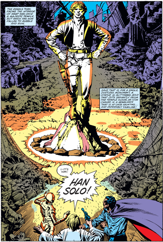
November 1982. The second Annual in the original Marvel STAR WARS series, published almost a year before the release of RETURN OF THE JEDI, featured a flashback tale of Han Solo with the unusual artistic combination of Carmine Infantino and Rudy Nebres. The credits describe Nebres (whose first name is here spelled "Rudi") as the inker, but looking at the art itself, "finisher" might have been more apt: You can see Infantino's hand in the layouts and character designs, but the finished art looks to be at least 60 percent Nebres:
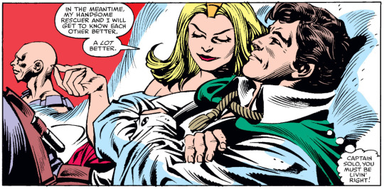
The assortment of bald guys among the supporting characters and villains is a common Infantino trope, but Nebres makes Han Solo look remarkably like '70s Michael Caine, which is not true of the Infantino SW stories inked by Bob Wiacek or Gene Day:

One of the odd details of this issue is that original colorist George Roussos colored Han's eyes blue in some of the close-ups, something that the digital reconstruction exaggerates:
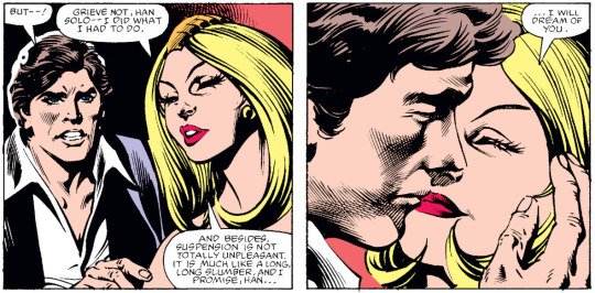
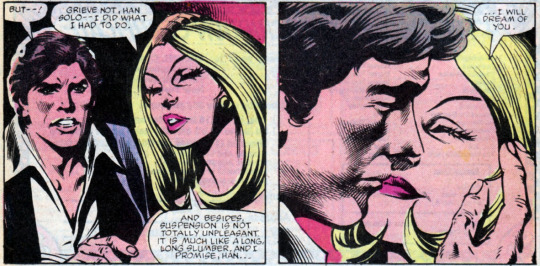
His eyes are however colored brown in the story's last panel (in both versions):

This raises a complex question: Should digital color reconstruction try to correct coloring errors in the original, or should it preserve them in the interests of fidelity? I increasingly lean toward the latter, but there are arguments to be made in both directions.
#comics#star wars#marvel star wars#david michelinie#carmine infantino#rudy nebres#han solo#michael caine#george roussos#the idea of michael caine playing han solo is *fascinating*
7 notes
·
View notes
Text
funny thing about that megamind post. i wrote that post the exact same way i would have written a star wars meta/fanonization critique. i just forgot that megamind is a smaller fandom with a significantly smaller canon, and the character of megamind is himself the lead and not a random side character everybody feels obligated to write but nobody bothers to do the research to write properly.
like if that post had been same tone/phrasing/layout but was centered around literally any clone character or an annoyance with obi-wan fanon or something? totally different response. i know that because i have made those posts. are sw fans all assholes or do we just approach fandom with more aggression and suspicion due to seeing our favorites dragged through the mud so often? or maybe it's something about larger fandoms being more fractured and smaller fandoms more tight knit?
#all my nice megamind posts were on my old account lol#i'm sorry i seem to have pissed off some people but it's also very funny to me seeing these differences live
15 notes
·
View notes
Text
Have not forgotten about this, it's been done for about a month now and I'm SO excited to share it with y'all, but I want to wait till the season 3 trailer drops so it doesn't flop cause it took me so long and I worked so hard it would make me sad lol

Little sneak peak cause I just have to tweak the colours a bit and it's done
#my art#tbb#the bad batch#the havoc marauder#star wars#sw#tcw#i worked really hard in this and I'm so happy with how it turned out#literally more than 40 hours of work#parallax#it's been my pc wallpaper for the last month and i can't believe i actually finished it#had to watch all the marauder scenes basically frame by frame just to get an accurate layout of it#also#can confirm#the marauder has no bathroom 💀#it has 3 bunk beds#and some weird empty spaces
37 notes
·
View notes