#Rum did the lineart
Explore tagged Tumblr posts
Text
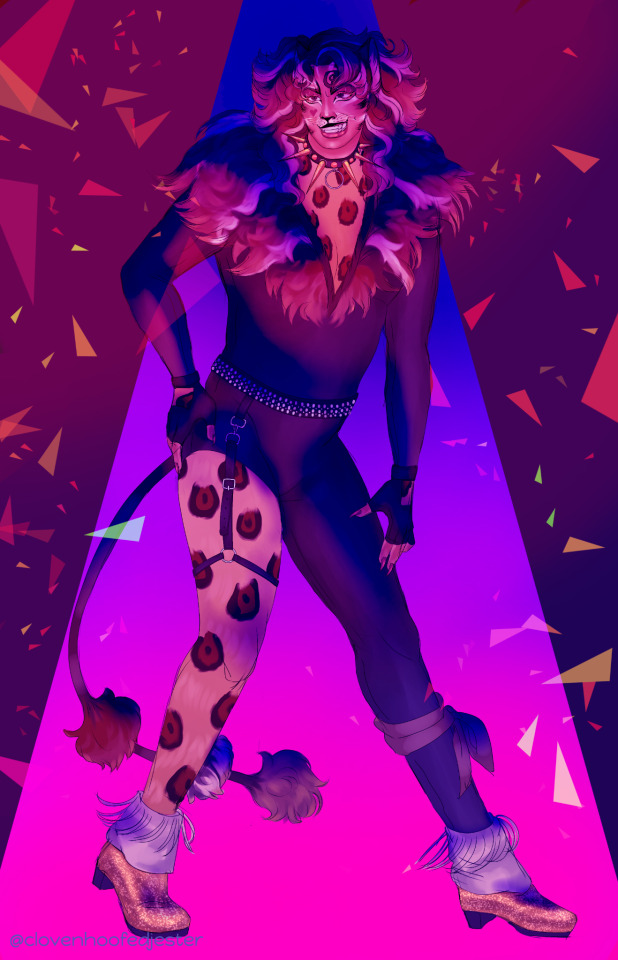
stars when you shine, you know how i feel

a close-up of his mug, unblasted by colors and lighting and stuff. it was surprisingly difficult to color his fur in a way i liked
#cats the musical#the rum tum tugger#my art#illustration#digital art#eyestrain#<- potentially#ok time to ramble#did you know that john partridge did a cover of feeling good#i died watching it i think#also the bare leg + garter belt wasnt my idea theres a production that just made him look like that and i was like#well i cant NOT draw him gayer . who do you take me for#gold lashes and lil heart are taken from il sistina iliterally love it awww so cayoot#also dont look too hard at this drawing#detailed for some parts of it and sloppy as hell for others#case in point the lineart for the face vs the lineart for the legs#a tragedy really ! but i wanted to post an art and my tablet was crying for me to stop working on the canvas#so messy lineart it is#OH ALSO HE HAS LIPSTICK#the toms deserve lipstick so much. its true
210 notes
·
View notes
Photo

Here, have a Wiki page for Aether.
And here we have the titles of his recruitment quest, his side-quest, and his two personal quests (because yes he has two)
Big thanks go to @tk-duveraun for making the template! Check it out and make your own.
EDIT: Thank you to @vilemie for pointing out the error I made. Fixed :D
#numin-lavellan#Rum did the lineart#all I did was color the art#commission her!#also thanks goes to#tk-duveraun#for making the template#tis wonderful#aether
9 notes
·
View notes
Text
just a little cat design tutorial/exercise by yours truly
as someone who frequently watches animation and art on places like youtube cough warriors cough, I love seeing interesting character designs. we always need more diversity in design, so I was hoping this could be a helpful little guide for people looking to improve and practice how they draw cats.
to start, here’s the most-needed design tip, imo:
if you take away the colors, you should be able to identify the character.
too often characters, especially animals, have same-face syndrome - where every character looks the same apart from their colors/markings. this is fine for beginners, but if you’re looking to take your art to the next level, you should be looking to diversify your designs.
so if you’re interested in some practice, let’s have a go!
1. download/save this base (free! use it as you please with credit):

this base will serve as an average cat reference. smooth fur, not too stocky or slim, no add-ons or anything interesting. just an average cat.
2. open it in your preferred art program (it’s a transparent .png, so it should be usable pretty much anywhere! you can/should size it up on a bigger canvas, the quality won’t matter since you’ll be drawing over it anyway).
3. make a copy of the layer.
4. turn down the opacity of the first layer to about 30%. you want to be able to see it, but not enough that it will distract you from your working layer.
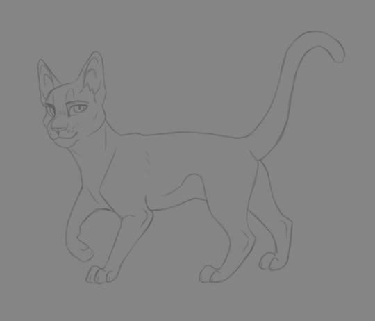
5. switch to the second layer. this is when you’ll start erasing areas where you want your character to have differences from the average cat.

for example, I’m going to use my design for Rum Tum Tugger (from Cats [the musical], who has a very distinct silhouette. I want to use his costume design and actor as a reference for his attributes, so I’m going to make him slimmer in the middle (I love you John Partridge), keep him smooth for the most part, and leave room for some serious tufts around the head and tail. his eye shape is also going to change, and his expression. [see above]
6. alright, now comes the fun part! on a new layer, start drawing everything and building up your character! the bottom layer will serve as a guide for you so you can keep an eye on anatomical changes as you go.
some tips: - don’t be afraid of big shapes! - add some flair in the expression! - try some things, and if you aren’t sure if they look good, save that layer, make it transparent, and try again on a new layer, then compare the two to see which you like more. - think about your character’s personality as you draw: are they cold? use more smooth and/or angular shapes. are they flamboyant? poof them out more, like good ol’ Tugger here. are they friendly and lovable? try some rounder and fuzzier stuff. associations and shape can take a design to the next level.
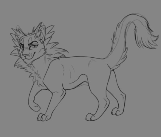
7. delete the bottom layer and make some final touch-ups on your design. you’ll most likely want to draw a new layer over it to make sure everything is smooth. the lineart should be fairly clean and easy to see. (mine here is a little sketchy but that’s ok)

8. now it’s time to add color!
remember some basics: - don’t oversaturate - if you want, say, gold, tone it down to a more muted gold. same goes for any color. you’ll thank me later. - pick complementary colors. there’s all kinds of color guides for this with a quick google search. - never use straight black (except for lineart). always go to a different color as the base and pick a shade that’s a very dark version of it. for example, for a black cat I’d use a dark, desaturated blue that’s almost gray. it looks like black, but brings more life to the design. - less is more with markings. Tugger may be a bad example, because I wanted to get him similar to the pretty elaborate costume; but you don’t have to put a million bells and whistles on your design to make it interesting and good. simple is often better, as it’s more memorable and easier to look at, as well as easier to draw (especially if you’re animating, oh boy). - with more complex designs, like Tugger and his spots, it helps to have something that brings out the expression and face. in this case I used white (well, off-white) around his eyes and mouth, so your eye goes straight to it and can pick out his facial details better.
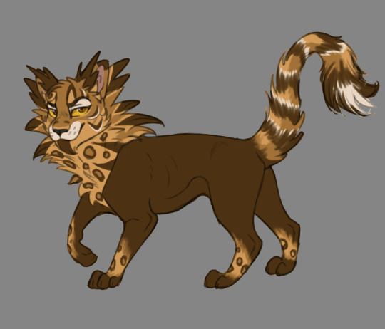
and that’s all folks!
for reference, here’s another design I did using the same method and base:
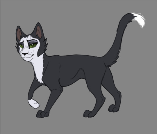
for Mr. Mistoffelees, I slimmed him up a lot more in the middle and legs, gave him some little tufties, and went for shorter, more equidistant triangular ears to pull off his original costume design. I also copied some of the makeup design around his eyes, giving a more pronounced expression. (it really helps that people have already designed the costumes to stand out well at a distance).
don’t be afraid to play around! that’s the fun of it, and no matter how many designs you scrap, you’ll be building your skills just doing it. tracing and re-tracing is the #1 best way to learn art - so long as you don’t present it as your own original work, of course c;
so go ahead and have some fun with it! feel free to tag me in any designs you make, I’d love to see them!
40 notes
·
View notes
Photo

Yesterday I made up the lineart, today I just did simple color fill and a tiny bit of detail. . All of your Gold and all of your Rum. . #drawing #illustration #procreate #digitalart #art #pirate #draweveryday #digitalartist https://www.instagram.com/p/CR2d2KgjB3X/?utm_medium=tumblr
0 notes
Video
youtube
2k17 Atedarian Saga: the sands ♦ speedpaint
Toyhou.se ♥ toyhou.se/988318.ruya & toyhou.se/990093.qadir YouTube ♥ youtu.be/3C-Z481e1kE Drawn June 23, 2017 Inspired by this photo www.bluemongolia.com/images/tr… But the art did not turn out like I hoped but meh since was just drawing to test my twitch and got lazy in a way since the canvas is really much smaller than what I usually draw on so rather stiff lineart work here. However this piece features two characters who you guys probably haven't seen yet but now you have hahahhah 2017 Commissions + Customs (OPEN) | Tumblr | RumCandyAdopt | Flavors.me | YouTube | Art Amino | RumbyFish @ PaigeeWorld | RumblyFish @ Furaffinity | Mini Black Velvet @ Gaia Online | Rumby @ Toyhou.se | Rum @ Picarto | Instagram | Rumby @ GASR | Rumbyfishy @ Twitch | Art Quest ♥ patreon Art + Characters © RumbyFishy / RumCandyAdopt / @rumblyfish
#art#digital#love#couple#speedpaint#youtube#otp#ruya#qadir#atedarian saga#oc#rumbyoc#rumbyart#my art#digi#boy#girl#male#female#bird
5 notes
·
View notes
Text
rum-inspector replied to your post : looking at other people’s art, i feel like my art...
you could always experiment ofc but your art is your art it’s unique and you have your own style and i for one love it! I had a teacher who said “real life doesn’t have outlines so don’t draw them” but I can’t help that personally I still like looking at comic books style art the best
tru, i could experiment, see how much my hand shakes. some art programs have stabilizers, but not mine. im in the shop for a new art program tho. maybe ill buy one if/when i get my grant money in
i am glad u love my art style :P
I like outlined art the best too mostly. I love some comic book styles, but not like... stereotypical DC comics for some reason*? (I feel they don’t differentiate the faces very much). i know i love the people who did the first ‘legacy” comic book and the first issue of runaways tho.
but to be perfectly egotistically and honest, my favorite style is my art, but maybe with the lines a little thinner and anatomy and positioning a little better and shading better. I draw my art in the style I like looking at best, so I’m like of course my art is my favorite style! Otherwise i would change it!
not to say i dont love other people’s art, i do. but i have a certain look i like for mine.
But I feel outlines can just give you strong personalities on characters features. Like the width of the line you use to indicate an eyelid or a nose changing different things about the face, the tapering of the lineart on a jaw changing whether it looks softer or harder... its just Good IMO.
*like i guess what you imagine for the Big Two comic houses typical arts are what im talkign about, there are great artists in DC-verse as well tho
3 notes
·
View notes