#Restyling
Explore tagged Tumblr posts
Text
@streetdevil96: help! I can't make the designs any better! 😢
me:


#2000s aesthetic#2000s style#oc#art#artists on tumblr#artwork#2000s#2000s nostalgia#2010s#sora#beltz#character sketch#original character#character design#bunny#cat#redesign#restyling#traditional drawing#traditional sketch#character sheet#original characters#creating#bunny oc#bunny girl
8 notes
·
View notes
Text
Rethinking Taylor Swift's "Lover" Bodysuit
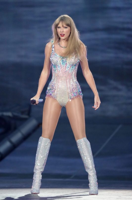
Image from Vogue, shot by Jeff Kravitz
When Taylor Swift began her Era's tour last year in March, it quickly swept the nation. The movie was a hit, she was topping charts, and everyone and their mother was trying to get tickets. One costume in particular from this tour (okay, a lot of them) became a big hit: namely, the "Lover" era bodysuit. Made by Versace, beaded to the nines and sparkly as a disco ball, there's no denying this bodysuit is a beautiful showstopper. But is it the right choice in costume for Taylor and her "Lover" album? Now, take all this with a grain of salt. Taylor Swift is beautiful no matter what she wears, and the costume is undoubtedly gorgeous. However, I think with a little more intentionality and thought towards the album she's performing for, her look for Lover could be an absolute showstopper.
In my personal opinion, the "Lover" bodysuit simply isn't suited to the album it's for, nor does it work as well on Taylor as it should. It's a beautiful costume, but it isn't styled on her at all. Her hair is straight with bangs, and her makeup is a light shimmer look with a red lip- an iconic and gorgeous look for Taylor, but not one that can stand up to how bold the bodysuit is. This combined with the lack of accessory beyond a necklace, and the bodysuit unfortunately drowns Taylor out.
I'll get into why I think the bodysuit doesn't work for the album and the direction I think her team should have taken in a moment, but I first want to focus on how this bodysuit COULD have been made to work if their hearts were really set on it. The bodysuit is bold. It's festival wear, something you might wear for a show out in Vegas. A bold costume needs bold styling. A little hair and makeup goes a long way. Bringing back her windswept curls from her initial Fearless era, using a pinker shade of lipstick and a darker tone of eyeshadow would have done wonders for this look. (Getty Images)
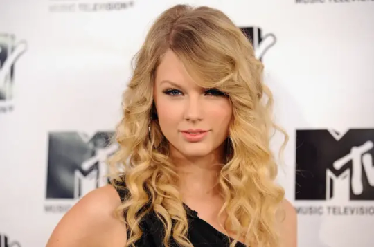
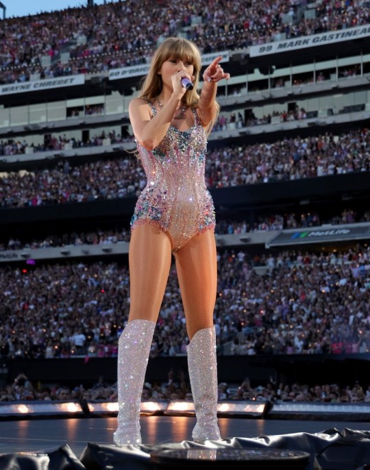
I want to point out again that Taylor's accessories are very minimal for this costume. The boots are a good accessory on their own, and the necklace is nice, but there's a lack of balance: there's nothing on her arms or her ears. (Kevin Mazur via Getty Images)
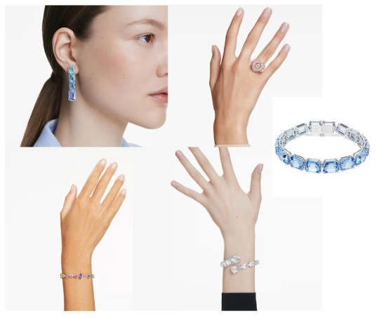
With a little more accessorizing, this costume would be taken to the next level. Gloves are a fun way to do it, but for the soft romantic vibe of "Lover" and the playfulness of this costume, the way to go is some crystal jewelry. Think big. I've chosen some pieces from Swarovski to compliment the look. Some fun blue earrings, some bracelets to layer, and you can never go wrong with a big ring. (There's a million ways to go for this, of course- these are just examples.)
And there's way to go further with it. A big fur coat, to really play into the vintage romantic feel! Hair gems! Really fun nails! This is a costume that I feel has a lot of wasted potential: While I still don't think it suits "Lover", I think it really could've been an even bigger moment than, admittedly, it already was. I have a different vision for the "Lover" costume, though! Now, I'm no pop star stylist who works with Versace... but I do love to offer my own two cents. First things first, we need to consider the 'vibe.' "Lover" is a soft and romantic album with a little pop playfulness. Think "Cruel Summer" and "Paper Rings". It's fun music, but it's not quite the same vibe as "Lady Gaga in Vegas" as the costume might lead you to believe.
I also want to consider Taylor's general vibe over the years. Her fashion, her music, her marketing- it's very light and airy, and she has an almost vintage feel to her look.
I think there's a way to combine the bold, sexy and playful feel of the Versace bodysuit while fitting the vibe of the album and Taylor's personal look: Go for the old Hollywood look. Silken robes, soft wavy hair, and Taylor's signature red lip. Maybe even a feather boa, if we're really feeling fun!
These are some example pieces I think would make for a fantastic "Lover" look. (They're silk lingerie gowns and robes from Apilat Wedding, a custom wear lingerie and boudoir wear brand.)
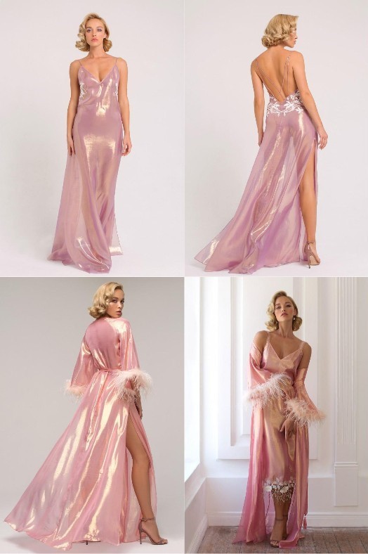
I think the flirty and playful lingerie look could work really well for the "Lover" album, especially considering her ever so romantic performance of the song "Lover" with the dancing couples on stage. Pair it with square cut diamond earrings and some sparkly stiletto heels, and you've got a certified Moment on your hands.
I want to reiterate that I think the iconic bodysuit IS a cute look. I just think it could have been styled better, or perhaps used in a context it makes more sense for.
I want to cap this off by pointing out a costume from the Era's tour that I think Taylor's styling team did a fantastic job on: Her brand new "Midnights" bodysuit by Zuhair Murad. (Getty Images)
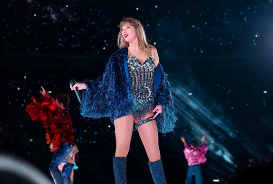
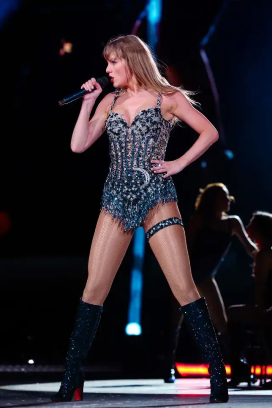
This is a costume that's well styled, well suited to Taylor, and fits the vibe of the album it's for. "Midnights" has more of a mysterious diva vibe to it than "Lover" does, and this costume embodies that. It's styled well- the fringe jacket is very "Taylor", the bold red lip fits the deep blue of the costume well, and while I still think it could use a little more jewelry without the jacket, the garter and the slight mussed up hair goes a long way in making this look like a cohesive look. Plus, I won't lie, I'm a sucker for a starry motif. <3
What do you think about Taylor's "Lover" era costume? Do you have any thoughts on how you'd style it? Do you think it works as is? If so, why? Reply, send in asks, get discussing! <3 Stay cute, Ky
#fashion#restyling#taylor swift#taylor swift eras#celebrity fashion#lover#taylor swift lover#fashion restyle
5 notes
·
View notes
Text

My work (restauro conservativo)
4 notes
·
View notes
Text

I did a redraw of Wolfysphere N ( for my alternative version of his back story it is with the old wolfysphere design of wolfysphere N )
#wolfyshere#alternative universe#murder drones au#alternative serial désignation n#murder drones n#multifandom au#restyling#fanart#alien Serial désignation N#n doorman#md n#serial designation n#n murder drones#disassembly drone
5 notes
·
View notes
Text


so while yall are waiting for the season 4 rewrite and wizards redesigns I've decided to post some ideas i had for a remake if fate the Winx saga. I've been working on a sort of rewrite but i gave up on it long ago because the point of that rewrite was to keep everything as intact as possible and still tell a good story.
long story short i failed : D miserably
so all my ideas amounted to was a few mood boards of the girl's looks, il run you through them :3
Bloom :
her casual form is quite simple and monochromatic, I like to imagine my version of Bloom fixated on the idea of fairies so much that it became a sort of coping mechanism. thinking of herself as a fairy as a sort of confidence boost has been her go to so her look includes lots of pastels, cute skirts , simple shapes and butterfly motifs. her whole point is : mi like fairies , mi want to look cute :3.
her fairy form is low key a funny story XD basically in my cancelled rewrite, the only thing you get when you transform are your wings. making your outfit is a requirement in order to become a guardian fairy. its sort of like a uniform. it actively shows that you're using your magic and what your here to do. its not taken lightly. a fairy transforming to fight basically means: u, my friend, are fucked :D
this is done ether during your fairy education or right before graduation. and since in my version Enchantix vanished a long time ago, any Enchantix fairies lost the power and any fairies in training have lost the hope of receiving it your base form is treated like your final form since for many fairies of that past, it was. all fairies thus are told
"make your fairy form fancy as shit, people gatta look at you and piss themsleves bc of how badass you looks"
but since Bloom didn't get the memo she made hers incredibly simple, which low key makes her a laughing stock in Alfea. my plan was to use this to deepen hers and Stella's bond since ide like to imagine Stella would help her redesign her outfit XD also I'm diversifying the body types, Bloom is now skinny fat
her form very closely based off of her OG form bc of that since their base form was quite simple.
Stella :
her casual form is very in line with the types of things her og counterpart would wear, since in my version Solaria would be called the crescent queendom with fate version of Luna running it. were keeping the whole her mom is abusive thing but where changing a few things.
Stella grows into her own in the Winx club and thus begins showing off her sunny disposition which in a moon queendom is looked down upon. but her outfits would do a 180 once her mom is present. she's suddenly in dark blues, purples ,and silver.
her fairy form is her trying to morph herself to be exactly what her mother wants, everything is moon themed. again dark blues and silver everywhere. Also i changed her body type to being Chubby bc yes :3
Flora :
she's pretty straight forward, her fairy form and casual form follow the same theme of nature. I just made her main colour for her casual form sage while her transformation pink just like in the OG. also I kept her plus sized bc plus sized Flora was a great idea, and than they white washed her :,)
in terms of her fairy form, I leaned in to the cute pink girl horror rpg asthetic aka pocket mirror. i want her to be as custey as possible bc
y e s
Musa :
oh boy her casual form was fun : D , i hate how they feminised her in the later seasons and took this as an opportunity to go FULL IN to the alt fashion she was meant to wear uwu she a lil alt girlie, she's quirky like that uwu.
her fairy form is based more on her culture but still has the edge of her alt fashion sense ^^ I've decided to keep her as skinny since most of the cast now are leaning heavily to the plus sized of the spectrum, I thought ide include the skinny girls in here too ^^ and when i say Skinny i don't mean an hour glass, i mean no boobs, no butt, no nata.
Tecna :
i decided to dive into the hacker aesthetic but make it fairy :3 her wings ( in her base form at least) don't flap, they put her body into a 0G state which allows her to "fly". lots of neon lights with her uwu
her casually outfits are just generally geometric. also i decided to make her thin but to an unhealthy degree. perhaps she could be dealing an illness and we could explore how she feels being mostly in solitude for most of her life :p
Aisha :
she's basically the sporty girl aesthetic incarnate. lots of neutral tones with hints of green and pink :D her basic form is simply meant to be kind of mermaid inspired, also ide like to imagine her Enchantix would give her afro with cute water drops in it and pearls :3
Jesus that was long. anyhow as stated, this rewrite isn't being made anymore bc I've concluded that my challenge wouldn't work. keeping most of it intact and making it good would just simply result in a decent at best show. and us in the Winx fandom aren't going for just fine were going for MAJESTIC UWU
#winx club#winx club restyling#fate the winx club#fate the winx saga#restyling#winx bloom#stella winx#winx musa#winx tecna#flora winx#aisha winx#layla winx
28 notes
·
View notes
Text
Recent events had me considering the possibility of restyling my blog.... Idk, I feel like I haven't put enough effort in showing the aesthetic I wanted to convey and introducing my true self.... I feel like this aesthetic is a lil dull and anonymous...
I even plan to modify some contents...adding essays and insight on character analysis...idk so many ideas, too little time to write😅
New aesthetic coming soon...
2 notes
·
View notes
Text

4 notes
·
View notes
Text
youtube
ARTEFISIO es un centro de fisioterapia que ha operado durante más de 15 años en el centro de Pamplona, y ahora ha confiado en el equipo de Lady Moustache para la actualización de su página web.
Este centro, además de ofrecer servicios en el centro o a domicilio, también atiende a personas peregrinas del Camino de Santiago a su paso por Pamplona.
El diseño tiene un punto artístico porque el centro ARTEFISIO, como también indica su nombre, está muy vinculado a las artes escénicas, por atender a personas de este ámbito por dolencias y mejoras en esas actividades.
Se pueden ver los servicios de Artefisio, las tarifas y reservar cita online en www.artefisio.es/.
En Lady Moustache desarrollamos páginas webs desde cero y actualizamos webs ya existentes, adaptándolas a las necesidades reales de las empresas y autónomos. Todos los proyectos de web en www.ladymoustache.es.
#Artefisio#Fisioterapia#FisioterapiaPamplona#DiseñoWeb#DesarrolloWeb#PáginaWeb#DiseñoOn#DiseñoGráfico#ActualizaciónWeb#Restyling#Arte#Pamplona#Navarra#LittleBrandStories#Youtube
2 notes
·
View notes
Text
man, it's like I'm doing car designs🤦♂

(beltz belongs to @streetdevil96)
#oc#art#artists on tumblr#artwork#beltz#toyota#land cruiser#prado#suv#tumblr memes#meme#design#restyling#cars#car design#character sketch#character design#bunny girl#bunny oc#bunny
4 notes
·
View notes
Text
ECLECTICLYSM
eclectic - deriving ideas, style or taste from a broad and diverse range of sources.

Fashion is an art form- a mode of self expression. There's no one right way to do it. It's not about the clothes you wear, it's how you wear them.
TAG GUIDE
#fashion all around us - On the spot street interviews with the fashionable people that make up our world.
#fashion history - Exploring historical fashion trends and the events around them.
#restyling - Revisiting fashion moments that didn't just quite work out and talking about how to spruce them up.
#new faces of fashion - Interviews with indie fashion designers, aspiring models and all the new faces breaking into fashion.
#the latest in fashion - Fashion week, The Met Gala, the newest issue of Vogue. General fashion coverage goes here!
3 notes
·
View notes
Text
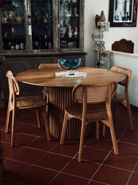
My home 🏠
#aesthetic#salento#home & lifestyle#design#home decor#decor#vintagedecor#modern age#space age#tabledesign#murano#restyling
5 notes
·
View notes
Text
Rinnovare casa in primavera: i consigli di Westwing
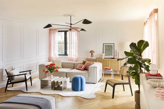
La primavera è arrivata e con lei anche la voglia di rinnovare casa. Questa stagione è tutta all’insegna del colore e delle forme, lascia alle spalle i toni più neutri e pallidi e abbraccia tonalità accese e forme audaci, in un mix&match che veste la casa di buon umore e serenità. Gli esperti di Westwing raccontano come trasformare gli spazi di casa con poche e semplici mosse, senza stravolgerli ma, allo stesso tempo, facendoli sembrare completamente nuovi.
Rinnovare il salotto
Il salotto, spesso, è l’epicentro della casa: la zona dove ci si rilassa soli davanti a un libro o a un film, ma anche lo spazio della casa che spesso viviamo con la famiglia o con ospiti. Rinnovarlo con un look primaverile è semplice: bastano piccoli accenti, come pouf e cuscini colorati sul divano (facilmente intercambiabili e modulari) e il salotto abbraccerà già l’atmosfera calda e gioiosa della nuova stagione. Si può poi facilmente sostituire qualche piccola decorazione su madie e piani d’appoggio con accessori nuovi e colorati, come ciotole, candele e libri.
Rinnovare cucina e tavola
Anche in cucina e sulla tavola non si deve avere paura di giocare con accenti pop e colorati, che porteranno subito una ventata di buon umore e stupiranno gli ospiti. Qui giocano un ruolo importante i fiori di stagione (freschi o secchi), ma anche piccole decorazioni qua e là, come vasi e candele dalle forme insolite, renderanno la mise-en-place unica. Un elemento molto in trend che si può facilmente aggiungere sulla tavola sono i bicchieri iridescenti, che con la luce del sole creeranno un bellissimo effetto arcobaleno.
Rinnovare casa, la camera da letto
Anche la camera da letto vuole la sua parte. Essendo questa la stanza dedicata al riposo, per questo spazio è meglio optare per toni pastello. Un abbinamento vincente è quello del giallo e del lilla, e in camera da letto il modo più semplice di rinnovare lo spazio è quello di puntare su un set di lenzuola e qualche cuscino decorativo sul letto, in questo modo è più semplice e veloce portare una ventata di novità agli spazi.

Grazie a Westwing per i preziosi consigli. Ora non resta che dare un'occhiata alle offerte giornaliere di Westwing.it, o scoprire le novità nel catalogo fisso WestwingNow.it, con prodotti sempre disponibili in consegna veloce e una sezione organizzata in shoppable looks. Read the full article
2 notes
·
View notes
Photo

PRIMA PAGINA Tirreno di Oggi giovedì, 27 febbraio 2025
#PrimaPagina#tirreno quotidiano#giornale#primepagine#frontpage#nazionali#internazionali#news#inedicola#oggi cecina#ecco#porto#traffici#isole#arcipelago#calo#tila#trump#papa#regolare#francesco#lieve#isola#maltempo#marciana#restyling#mediceo#ponte#livorno#demolizione
0 notes
Text
Restyling per la Basilica della Pietrasanta
Nuovo restyling per la Basilica della Pietrasanta in occasione della mostra Impressionisti e la Parigi fin de siècle CITTÀ METROPOLITANA DI NAPOLI – La Basilica di Santa Maria Maggiore alla Pietrasanta rinnova lo stile. La prestigiosa sede della mostra Impressionisti e la Parigi fin de siècle, in corso fino al 27 aprile, si arricchisce da oggi di un nuovo elemento strutturale amovibile, che…
0 notes
Text
Per essere competitivo sul mercato dell'ospitalità, rinnovare gli ambienti è un aspetto fondamentale, sia per aumentare i servizi offerti sia per creare un identità unica e distinguibile al passo con i tempi.
Progetto Restyling, Impruneta (FI)
0 notes