#Rentry square frame
Explore tagged Tumblr posts
Text

silly frame i made again , f2u , credit appreciated but not needed ^_^"


pls reblog if u use!

#rentry graphics#rentry resources#carrd frames#rentry mask#rentry decor#rentry inspo#rentry frame#angel wings#wings png#blue rentry#blue carrd#blue#carrd decor#heart frame#square frame#Rentry heart frame#Rentry square frame#carrd square frame#carrd heart frame#Carrd angelic#rentry angelic#carrd graphics#decor#f2u graphics#f2u#credit not needed#please reblog
315 notes
·
View notes
Text


✦ㅤStamp Image Mask
Created by me, credit when using/sharing
Link to layers
After downloading, open file in IbisPaint X

#mine#masks#rentry#carrd#rentry graphics#carrd graphics#rentry resources#carrd resources#resources#stamp#square#pfp mask#rentry mask#clipping mask#frame#mask frame#simple
196 notes
·
View notes
Note
hi !!! with your gifs, theres also video with the rentry-like mask/frame, please can i get a tut ?? i love your graphics sooooo CUTE !!! ٩( 'ω' )و keep up the good work !!

Of course !!!! If I said no, you can throw bricks at my window
And thank you for the compliment anon (❁´◡`❁)
Anyways HERE WE GO---

Before we begin, I would like to let you know that I'm using Photopea for all of the edits that have gifs in them. It's free and you can use it on your device's browser. [ Better to use on a big screen, less of a hassle to work ]
For my example I will be using this random frame I found on Google and a gif of Blind Obsession Ishmael !
But, you can use this tutorial for any Rentry frame or gif of your choosing. [ Though, if both are squared shape then it'll be a lot easier because you just put the gif under the frame with some resizing ]


Import them into Photopea in different canvases
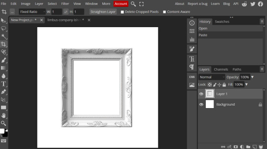
Go to the canvas where your gif is and then click on layer at the top and then ' Duplicate into '
A pop will appear and then click on ' Destination ' and select the one where your frame is [ for me it's New Project.psd, I was too lazy to name it LMAO ]


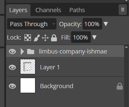
Boom ! There's Ishy with all her frames in a nice folder :D
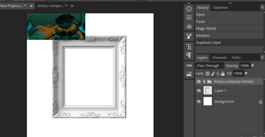
Now, if your gif is like mine where it's too small or too big, use the transformation tool to fit and arrange ! [ Edit > Free Transform ]
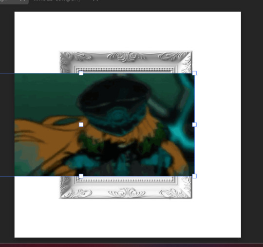
Now, click on the layer the frame is on, and then select the wand tool on the side. Then click on the area where you want your gif to show up
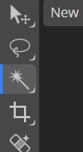
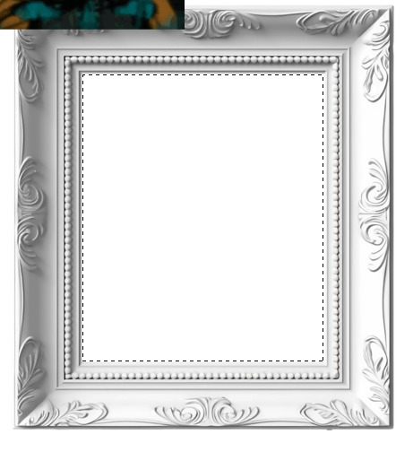
Click on the folder where it has the frames of your gif, then click on 'Layer' at the very top, go down to ' Raster Mask ' and click on ' Reveal Selection '

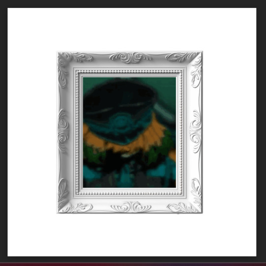
Boom ! Here is Ishy in her little frame :3
To save it, go to ' File ' at the top then down to ' Export as ' and choose GIF

And all done !


I hope this helps anon ! If you have any question, then please do not hesitate to ask me, I'm always happy to help ^-^

#( 🍓 ) request . . .#( 🍰 ) tutorial#rentry#rentry resources#gif#rentry tutorial#tutorial#rentry graphics
71 notes
·
View notes
Note
Anon here!! How did you make the heart graphic for the power rentry?

hi!! i’ll put it under the cut since there’s quite a few steps. lmk if you need a more specific tutorial or images for any of the steps!!

1) finding the base
find the shaping mask you wanna use. you can look up “shaping mask png” or “mask png” on pinterest to find some. this is the one i used:
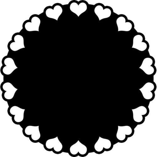
2) removing the background
to remove the background, use the selection layer in ibis paint x. to find this layer, go to the layers panel and it should be the one all the way at the top. it is titled “selection layer.” to remove the white background, select the bucket tool and select the white background. it should turn blue. then switch from the selection layer to the layer you’re removing the background from. look at the top middle of the screen. there should be a square composed of dotted lines that looks like this:
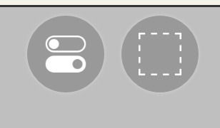
click on it and select “cut.” this will remove the white background. click on it again and select “remove selection area.” now you’re ready to continue!
3) creating a cleaner base layer
you might want to do this if you plan to add a stroke, as once the background is removed from the mask, it tends to leave some remnants behind. this makes the stroke look choppy and pixelated. to do this, take the paint bucket tool on a new, blank layer, and fill in the black part of the base with black. then, delete the base layer underneath the new layer. the hearts will become transparent (to see this better, change the canvas from white to transparent in the layer menu) and the base will hold its shape. you can also remove the hearts in the previous step, but this tackles two birds with one stone and (in my opinion) looks cleaner.
4) filtering manga panels
to make the manga panels pink, i looked up “pink manga polarr code.” pretty much any one will do, but this is the one i used:
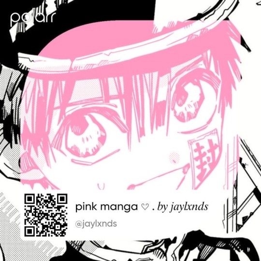
for the rest of this step, you’ll need the app polarr. once you get the app, go to the edit section of the menu on the bottom. click “open photos” and insert the manga panels you wish to change the colors of. then, click “filters” and “import filter.” from there, click “import qr code” and click on the filter in your gallery. the filter will go into polarr, and you can just click instant export or you can save it and then export it. it’s up to you.
5) masking the panels
import the images you just filtered into your canvas. now we’ll use a clipping layer to have them take the shape of the base. click on the image layer you want to do this with, and then hit the clipping option in the layer menu. this will have it take the shape of the base.
6) coloring the hearts
now we’ll add a new blank layer atop the clipping layers. i color picked the pink color from the image, and then used the bucket tool to fill in each of the hearts.
7) adding the extra pngs
for this step i used the sticker option in picsart and a transparent canvas to collect the pngs. i believe i looked up “pink png” in the search bar, but i’m not sure. then i imported them into the ibis paint x project and positioned them where i wanted them to go. download transparent pngs of the project (one of each image you added). toggle the eyes on and off so that you can save the different versions (not individual layers. i just mean if you added two manga panels, make sure you get one with one manga panel and one with the other).
8) creating the gif
search up ezgif animated gif maker. it should be the first option that comes up. for this, i typically switch to “manually ordered upload” opposed to “alphabetically ordered opload” (the default) so i have more control over the order of the images in the gif. once you upload them into the site and you get to the editing menu, set the delay time to 100 and click the box that says crossfade frames.
andddd you’re done!!! i hope this was somewhat comprehensible and i didn’t miss any steps xD

195 notes
·
View notes
Note
please please please ive always wanted to be a a part of editblr but idk how to even start like with the coloring and the editing so a tutorial or any tips would be greatly appreciated i really want to start making grahlpgics and rentrys but i just don't know how 😞
also i love your stuff !
Heyyyya! So, first of all, I unfortunately don't use PSDs which is most likely what you've been seein everywhere. I'd suggest askin someone else about those bc I dunno 😭
BUT! I can show you how I color mine using photopea.
There's a search (magnifying glass) icon, and you search up "gradient map." For me there are two options, the correct one will gateway to this:
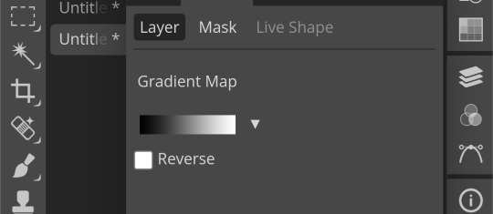
Then, just for practice, here's a color pallette to practice with. For me, it's easier to copy the lightest color first then the darkest one last because you start off with the darkest usually when putting them into the gradient map.

Hex codes for this: 400E2B A61439 018868 FE5C43 FEB17D
(Note: you can find lots of great color pallettes on Pinterest, and add as many colors as you want. It will just be easier with less!)
So now that you have your colors, you press on the gradient map. These two things circles are what you press, the square part of the gradient comes first and then the second thing circled will be accessible.
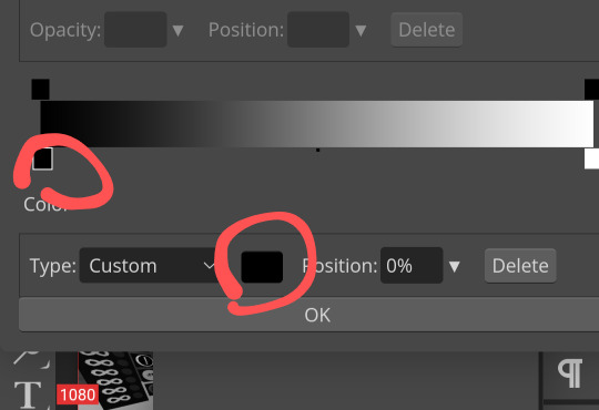
Once you press it, you can paste your hex code in here:
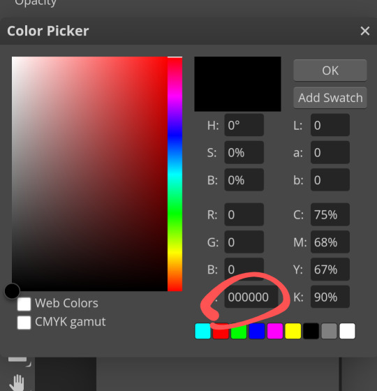
Then repeat this with the other colors, going down the gradient line as you do!
Here's what the gradient map should look like:
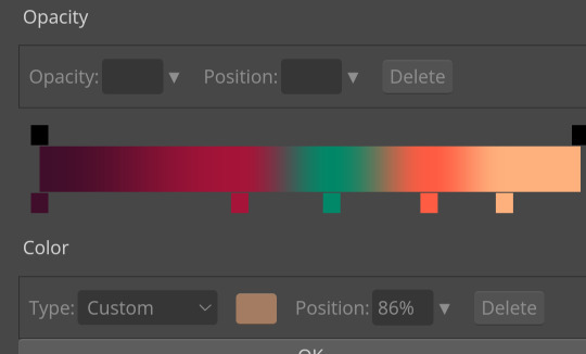
Ofc, when you aren't just practicing, you can order or however you want.
Again, I would ask someone abt PSDs because this isn't the most efficient 😔
Now, for tips on editing. I've gotten asked for a lotta tutorials but they're too hard for me to manage so I'll squeeze some answers into here.
1. For resources, there are a lot on Tumblr. However! You can search up "rentry resources" on Pinterest, and there will be pins that you can click that will take you to plenty of resources. However, if it says to credit when using a resource, obviously do that lmao 😭
2. When it comes to gif graphics, ezgif.com is a go-to. When it comes to putting already moving gifs into a frame and not wanting a background, I usually use the "remove background" feature that can be located after pressing "effects" on the home screen. Now, I wanna make this VERY clear before we continue: color in the background/around your frame before putting the gif behind it. Make sure!!! Make sure that the background is a UNIQUE color compared to the actual graphic. If it isn't, the background remover will remove parts of the actual graphic.
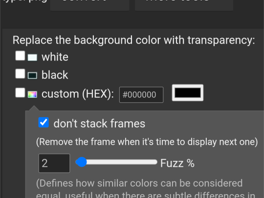
This is where you'll put the color of what you want to be REMOVED from the graphic. You might have to play around with it for a bit though.
As for making the gif graphic that goes into this, I use inshot personally. Since the canvas won't always fit and inshots default background is black, I say try to aim for a black background to remove. If not, make sure that the graphic will fit so that it covers the entire canvas.
Example/walkthrough:
4. You can always make differences if you dislike your graphic. It's okay to take a while and go back, and even restart. You'll see a lotta people here talk about how some ways are easier than others, but honestly just play around because you might find things better for yourself compared to others.
5. When starting out on Editblr, I'd suggest NOT immediately beginning with having requests open. It can make it start out as stressful and drive you away from it. Begin with just making graphics for yourself or of things YOU'RE passionate about. Editing should be more about your enjoyment than having something shiny to show off, y'know? (That was cheesy asf)
ANYWAYS! I HAAAATE EXPLAINING THINGS! (Because I'm bad at it lmao, not in general, you're all good dw❤ /p.) Even I can't decipher what I've said here, but to be fair I wrote this during a meltdown so I get an A for effort.
Also, if you make a promo post, PLEASE TAG ME!!! /NF!!! I'll be more than happy to follow you 😮
#“dont use the same color for the removable background” *PROCEEDS TO DO JUST THAT IN THE EXAMPLE*#im a bad example kids. dont do what i did😭#⛓️┈┈┈•༶ talking
26 notes
·
View notes
Text

errr ,, supa simple mask i js made! f2u w/o cred (however it is still appreciated!) ,, reblog is using ^__^"


#ℐ mask#ℐ decor#rentry graphics#rentry resources#Rentry#rentry mask#rentry decor#rentry frame#rentry square#Rentry square frame#Rentry red#red#square frame#Frame#carrd masks#carrd frames#carrd resources#carrd decor#carrd mask#rentry frames#f2u#f2u without credit#f2u w/o credit#please reblog#reblog if using
167 notes
·
View notes