#Publishers' Bindings
Explore tagged Tumblr posts
Text


Publishers' Binding Thursday
This week we're sharing a book with a beautiful cover and beautiful illustrations. This is The Bells and Other Poems by American writer and poet Edgar Allan Poe (1809-1849) with illustrations by French-British illustrator Edmund Dulac (1882-1953). It was published by Hodder and Stoughton internationally circa 1912. Poe is best known for his Gothic short fiction and poetry while Dulac was known mainly for his illustrations for books like Jane Eyre, The Tempest, various fairy tales and more—many through an association with Hodder and Stoughton.
The cover features a pattern featuring bells and flourishes stamped in gold that matches the endpapers. The illustrations are dark and ethereal, sometimes to the point of creepiness, and really bring out the gothic elements of Poe's poems.
I wanted to post something I really like for my last post here at UWM Special Collections and this book fits the bill! I love a gothic vibe and some beautiful decoration! I am also sad that I won't get to work with materials like these as often and that I will be leaving all the wonderful folks here. But I have very much enjoyed my 8 and a half years here and sharing all of the amazing things in our collections with our friends on social media!
Signing off,
-- Alice, Special Collections Department Manager
View more Publishers' Binding Thursday posts.
#Publishers' Binding Thursday#publishers' bindings#Edgar Allan Poe#Edmund Dulac#The Bells#poetry#poems#Poe#gothic poetry#Alice#farewell#illustrations#gothic art
250 notes
·
View notes
Text
50 Free Typesets

New achievement unlocked! I now have 50 public domain books/typesets available for FREE in my library! 🥳 Above is a collage of all 50 title pages.
What does this mean? It means that these classic books have been typeset (typographic, book design, layout work done), and are ready as pdfs that can be used to read, print out, book bind, or burn at your pleasure! (Just keep it to personal use only!)
The full list (with page sizes now noted) of all 50 books available can be found here on my tumblrary directory/masterlist (which will update as I add more), and below the break of this post!
Please please feel free to request access to my library (aka, yee good ol' googly drive). I usually respond within 24 hours, and they are indeed free! Just leave credit if you use, and consider liking/reblogging!
Also, if you find any errors in the files, let me know! I made these in Affinity, not with an AI program, and typos are natural spawns XD
From Frankenstein to Pride and Prejudice, to Sherlock Holmes to a dude that wakes up as a bug, I've been honored to be able to typeset these books and share them with all of you.
A part of me wants to ramble on about the behind the scenes and my continuing personal journey of amateur typesetting...but I think the most important thing I can say is simply thank you! to everyone that's stopped by! So thank you all! (And should I try for 100? 🤔 Hmmm...)
Warning! Wall of text below the break!
All 50 typesets available (some have alternate versions in library):
Persuasion by Jane Austen (Letter Folio)
The Strange Case of Dr. Jekyll and Mr. Hyde by Robert Louis Stevenson (Letter Quarto)
Frankenstein by Mary Shelley (Letter Folio)
The Merry Adventures of Robinhood by Howard Pyle (Illustrated) (Letter Folio)
Peter Pan by J. M. Barrie (Letter Folio)
Dracula by Bram Stoker (Letter Folio)
The Call of Cthulhu by H. P. Lovecraft (Letter Quarto)
The Importance of Being Earnest by Oscar Wilde (Letter Folio)
The Adventures of Sherlock Holmes by Arthur Conan Doyle (Illustrated) (Letter Folio)
The Invisible Man by H. G. Wells (Letter Folio)
The Great Gatsby by F. Scott Fitzgerald (Letter Folio)
The Tragedy of Romeo and Juliet by William Shakespeare (Letter Folio)
The Picture of Dorian Gray by Oscar Wilde (Letter Folio)
The Divine Comedy by Dante Alighieri (Illustrated) (Letter Folio)
Pride and Prejudice by Jane Austen (Illustrated) (Letter Folio)
The Odyssey by Homer (Letter Folio)
Tales of Space and Time by H. G. Wells (Letter Folio)
The House of Mirth by Edith Wharton (Letter Folio)
A Christmas Carol by Charles Dickens (Illustrated) (Letter Folio)
The Book of Dragons by E. Nesbit (Illustrated) (Letter Folio)
Much Ado About Nothing by William Shakespeare (Letter Folio)
Twenty Thousand Leagues under the Sea by Jules Verne (Illustrated) (Letter Folio)
Crime and Punishment by Fyodor Dostoevsky (Letter Folio)
Around the World in Eighty Days by Jules Verne (Letter Folio)
Alice's Adventures in Wonderland by Lewis Carroll (Illustrated) (Letter Folio)
Leave it to Psmith by P. G. Wodehouse (Letter Folio)
Lord Peter views the body by Dorothy L. Sayers (Letter Folio)
The Room in the Tower by E. F. Benson (Letter Folio)
Right Ho, Jeeves by P. G. Wodehouse (Letter Folio)
The Time Machine by H. G. Wells (Letter Folio)
Metamorphosis by Franz Kafka (Letter Quarto)
Poirot Investigates by Agatha Christie (Letter Folio)
Grimms' Fairy Tales by Jacob and Wilhelm Grimm (Letter Folio)
The Phantom of the Opera by Gaston Leroux (Letter Folio)
Andersen's Fairy Tales by Hans Christian Andersen (Letter Folio)
The Legend of Sleepy Hollow by Washington Irving (Letter Quarto)
Shakespeare's Sonnets by William Shakespeare (Letter Folio)
The Raven by Edgar Allan Poe (Illustrated) (Letter Octavo)
Anne of Green Gables by L. M. Montgomery (Letter Folio)
A Journey to the Centre of the Earth by Jules Verne (Letter Folio)
Sense and Sensibility by Jane Austen (Letter Folio)
Notre-Dame de Paris by Victor Hugo (Letter Folio)
Wuthering Heights by Emily Brontë (Letter Folio)
The Wonderful Wizard of Oz by L. Frank Baum (Letter Folio)
The Blue Fairy Book (Font Sampler Edition) edited by Andrew Lang (Letter Folio)
A Princess of Mars by Edgar Rice Burroughs (Letter Folio)
Ivanhoe by Sir Walter Scott (Illustrated) (Letter Folio)
The Mysterious Affair at Styles by Agatha Christie (Letter Folio)
Emma by Jane Austen (Letter Folio)
Paradise Lost by John Milton (Letter Folio)
#50 books done!#typesets#typesetting#book binding#book design#book#free to use#in_D Press#affinity publisher
558 notes
·
View notes
Text
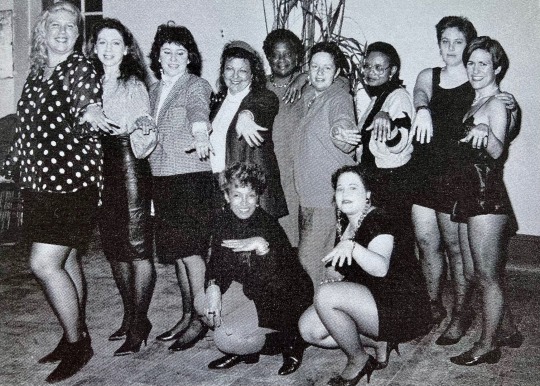
"The New York Femmes, 1991" by Morgan Gwenwald
source: The Persistent Desire: A Femme-Butch Reader, edited by Joan Nestle
#once i get a proper scanner it's over for all of you#unfortunately my printer is SHITE#also unfortunately the way a lot of these books are bound#i'm pretty sure getting a good scan would require taking the binding apart so i can get a clean scan of each pag#and i have found bookbinders in my area#i am admittedly very nervous to take these books apart though at least not without more knowledge#i'll have to ask for the advice and assistance of one of these bookbinders#let them tell me how before i ruin everything ya know#lesbian literature#lesbian#dyke#archived#thatbutcharchivist#femme#femme lesbian#femme dyke#black femme#black femme lesbian#poc femme#lesbian history#black lesbian history#black lesbian#poc lesbian#lesbian books#lesbian photography#author: joan nestle#the persistent desire#year: 1992#publisher: alyson publications inc.#photographer: morgan gwenwald
257 notes
·
View notes
Text


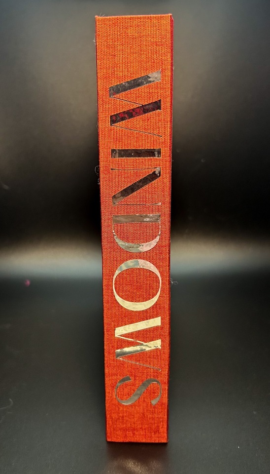
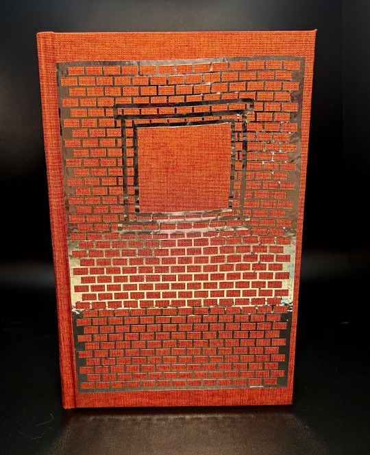

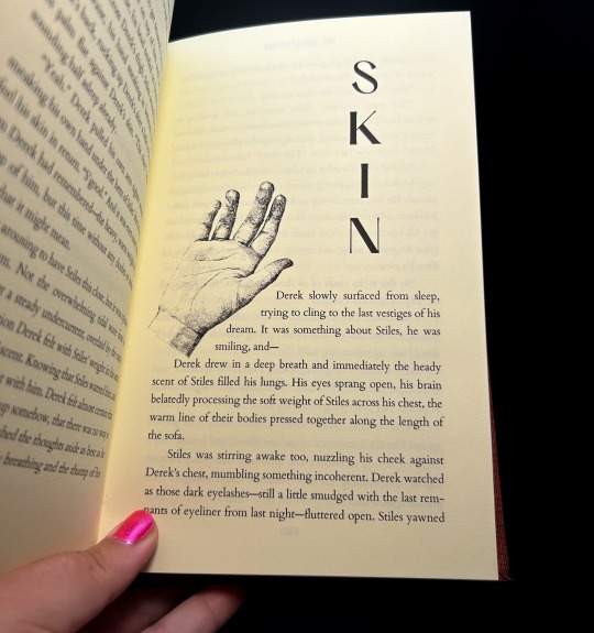
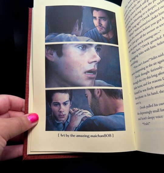


Windows by @drgrlfriend
Derek has a new neighbor who won't stop looking.
fic by @drgrlfriend
art by @maichan808 & @andavs-main
368 pages / 83,266 words
Title Font: PP Hatton
Body Fonts: Cardo, Geo
HAPPY FFWAD!!! Thank you @renegadepublishing for putting on this event in celebration!
More on the process below the cut!
I'm so excited to be posting this book! Super grateful @drgrlfriend was so down to let me bind Windows for Fan Fiction Writer Appreciation Day. This is one of my all-time favs, and I was thrilled to give it the treatment it deserves! @maichan808 & @andavs-main were also incredibly kind to allow me to include their stunning art pieces in the book <3 And thank you @renegadepublishing for putting this event together!
I wanted the typeset to be visually interesting and move around the page, without making it difficult to read. I created unique headers for each of the 28 chapters with royalty free art, and varied placement on the page in six different configurations. I also played with the text warp to make the text work as part of the image - one of my favorites is chapter 26, "Banshee", pictured above!
I used Brick duo for this bind, as part of the vision for the front cover, which was done in silver permanent vinyl. I think the rich rust color is perfect for how I would imagine Stiles & Derek's apartment building, and the silver is incredibly reflective - my favorite part is how the vinyl catches the light on the spine, and can reflect "Windows" on whatever surface it's on (pictured above). That's not an added effect, it's just doing that!
I did @tankbredgrunt's faux double-core headband with some Sulky Gutermann I bought at a secondhand store for $0.25, and it's so pretty! A bit thin to work with, but totally worth it for the multi-color effect it gives off.
And I finally got a proper crisp hinge! I think it really brings the whole book together, thank you knitting needles (even though you were a pain in the ass).
This project also marks my 100th book! I'm rapidly approaching the two year mark of my fanbinding career with no sign of stopping; thank you to this entire community, and all of the fandoms I've been able to bring this hobby to. I love how cross-fandom it is; and for an old floater like me, it's wonderful to bring all of my interests together and have something that transcends those lines.
HAPPY FAN FICTION WRITER APPRECIATION DAY!
#fanbinding#bookbinding#fanfic binding#fanficbinding#me myself and i#fanfic#ficbinding#renegade publishing#teen wolf#derek hale#sterek fic#sterek#stiles x derek#stiles stilinski#derek x stiles#drgrlfriend#ffwad#fanficwriterappreciationday#renegadelovesfic
560 notes
·
View notes
Text
@lieutenantkim replied to your post “hi freya! your work with the TLB series is...”:
I'm a little confused, what do you mean by "start as late as possible in the story" and then "have the main inciting incident take place within the first scene"? Did you mean the other way around or?
nope, I mean exactly that!
the TLB books are slightly unusual in that the real inciting incidents for all three involve the murder (even if obliquely, in book 3) of a third party, so they all begin with a kind of BBC-crime-drama pre-credits-scene chapter in which the murder occurs.
but the first chapter from a protagonist's perspective begins as close to the thing that Starts Their Story as possible. even after it. I could have showed you robin's daily home life, his parents' death, and then his receiving the notification of his new job at the home office. instead I started it RIGHT where he is introduced to the existence of magic, and then only introduced his home life & maud once he was already embroiled with worrying about magic and the curse.
I could have started ART with maud and mrs navenby getting on the ship, or even with maud on her initial voyage out to america. I started the moment AFTER her discovering the dead body: the plot is off! immediately! at once!
there is a tendency for first drafts to start with a character on their way to the plot: waking up on the day in question, or on a train to somewhere new, so the author can get comfy and wriggle around with some narration telling you who they are at the start of the story.
nope. start when they get off the train. or later. by the end of the very first scene, something new should have happened to them which gives the reader the story's first (or even central) unanswered question or point of conflict. you can fill in their backstory and personality and pre-story-status-quo in the narration as you go.
finding the right starting point is often a second-draft thing. and that's fine! but it gets easier with practice.
#writing advice#the last binding#is this a hard and fast rule for every story ever?#no#no piece of writing advice ever is#but if you're aiming for traditional publishing#having a fast-moving opening scene#that sets up the story and character/s well#can make a huge difference
190 notes
·
View notes
Text

National Book Lovers Day 2024!
From our stacks to your eyeballs: A small selection of gorgeous 19th century publisher's bindings.
58 notes
·
View notes
Text


The Song of Achilles by Madeline Miller
🏺
A rebind of one of my favorite books. I’m so pleased with this design, and how crisp it turned out. It’s still pretty imperfect, so I’ll probably do another copy and see if I can tweak some things.
Just to be clear, there is no HTV on this book. The whole thing (the blue and the yellow) was printed on plain white inkjet canvas.
———
In the meantime, please check out my Instagram.
#bookbinding#handmade#handbound book#song of achilles#arts and crafts#madeline miller#the song of achilles#circe madeline miller#book binding#hand bound book#renegade bookbinding#renegade bindery#renegade publishing#renegade bookbinding guild
30 notes
·
View notes
Text


My conclusion after reading most of the eng hexorcists fics on ao3: their writers sure knows grief like it's the back of their own hands
#be it about shuuichi and being ostracized by the very world where he was supposed to be accepted for his powers and clan name#or about seiji and the humongous bitterness that came in not being able to form any meaningful relationship with any form of being#each portrayal of their grief is just so gut-wrenching no matter who the ao3 writer is. it devastates me each time but i love the realness#what brought this up you may ask? i'm reading “as measured” by eizi. it's a newly-published fic and i'm halfway through it! 🥲👍#and i got to the part about seiji telling shuuichi about fuku the calico cat... i'm gonna pass out 😭💔#“could i bind her? would she want to?” “being an exorcist isn't about love” i'm going to be thinking about this all weekend 🥲#horrible exorcists#matonato#natomato#matoba seiji#natori shuuichi#matoba x natori
20 notes
·
View notes
Text
PAPERBACK VERSION AVAILABLE!!
Exciting news! Both the paperback and ebook versions of The Binds That Break Us are now available on Amazon here!
And, for everyone who hasn't yet read the first book, here's the link for The Bonds That Bind Us!


#writers on tumblr#writing#writeblr#writeblr community#lgbtqia#tbtbu#the bonds that bind us#the binds that break us#the forever bound trilogy#jackson alexander#luke o'neill#indie author#queer books#queer author#gay romance#mlm#sequel#queer lit#lgbtq+ author#lgbtq+ books#self publication#self published#kdp publishing#self published books#published author#literary fiction#contemporary fiction#fluff#angst
25 notes
·
View notes
Text


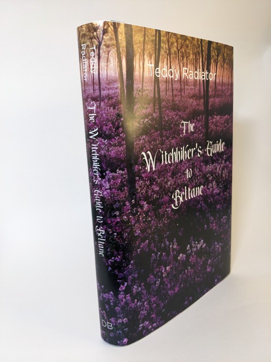

I had a lot of fun participating in @renegadepublishing Fanfiction Writer Appreciation Day (FFWAD) this year!
The Witchhiker's Guide to Beltane by Teddy Radiator. This story has a lot of Spring (Beltane) vibes and I wanted to bring that to life in the binding of it.
This is an in-boards bradel bind. (My first) The paper is a lokta that's beautifully textured. The spine is made of green & purple color shifting duo "Skarabaus". The edges have been sprinkled with ink and the headbands are soie perlee thread. (That handles beautifully, I understand why it's a favorite now)
#bookbinding#sevmione#snamione#fanfiction#fanfic binding#fanbinding#renegade publishing#renegade loves fic#renegadelovesfic#harry potter#beltane#ffwad#fanfictionwriterappreciationday
160 notes
·
View notes
Text


During the weekend, I bound Pride or what goeth before a fall by Toodleoo. Tood's pen is witty, smart and funny, with a good use of irony and humour. I miss her, we were friends for long, and we have the opportunity to meet each other when she travelled. We lost contact during the pandemic. That's why I want to have one of her stories on my bookshelf as a way to honour her.
Toodleoo has always been a lot of fun to read, and this story is no exception. In this one, Hermione Granger, considers herself an excellent evaluator of the character of others. Guided by a series of stereotypes, she decides that Snape is gay and wants to support him. Thus begins this amusing comedy of errors.
Summary:
When it came to reading people, Hermione Granger was almost always right. How did she miss the fact that Snape was gay?
The binding process: It took some time to bind, as I was rusty from being away from my tools for so long. I had to re made the cover a few times, but I'm happy with the result. The fic is very tongue in cheek and I wish to show that in the design. I didn't have any rainbow like stuff, so I chose a cheerful yellow book cloth. The title had a complicated an imbricated font (the one I for chapter titles), and screwed I up badly while weeding it, so I humbly restarted with a conservative and safer cover design.
Fonts:
Chapter titles: GluckMixer Font.
Text: Palatino Linotype family.
As always, this fic was bound for personal use and fandom heritage preservation in mind. You can read Toodleoo's fics for free at AO3 and Live Journal.
#my stuff#my workshop#fanbinding#ficbook#ficbinding#fic binding#fic binders#bookbinding#fanbind#fanbook#my work#ficbooks#ficbind#renegade publishing#snape/granger#hermione/snape#snape x hermione#hermione granger#fanbound#fan binders#fan bound#fan binding#my fanbinding#fan art#fanfiction book binding#fanfiction binding#renegade bindery#toodleoo
50 notes
·
View notes
Text


Publishers' Binding Thursday
This week's choice from the stacks is a 1928 edition of French novelist Gustave Flaubert's (1821-1880) Madame Bovary, published in London by John Lane The Bodley Head, Ltd. and in New York by Dodd, Mead and Company. Flaubert's work strives for a sense of realism and of perfection, always seeking "le mot juste"—"the right word." He famously said that "an author in his book must be like God in the universe, present everywhere and visible nowhere."
Madame Bovary was originally serialized in the Revue de Paris in 1856 and as a book in two volumes in 1857. There was an obscenity trial about the contents of the novel, which gained the novel notoriety. This edition features an English translation by British critic and translator J. Lewis May and illustrations by British illustrator John Austen (1886-1948). I believe that Austen did all of the illustrations for the book, including the charming wood-engraved tulip endpapers and the head and tailpieces at the beginning and end of each chapter. It is also likely that he designed the figure on the cover, which also appears on the dust jacket of the book (not pictured).
View more Publishers' Binding Thursday posts.
View more posts with work by John Austen.
-- Alice, Special Collections Department Manager
#Publishers' Binding Thursday#Gustave Flaubert#Madame Bovary#J. Lewis May#John Austen#Revue de Paris#publishers' bindings#publishers' binding#art deco#wood engraving
111 notes
·
View notes
Text
*breathing hard* I just wrote 800 wordsd I . . . I'm so sleepy. Kidnapping AU, attempted excerpt, love me a symbolic dream yessir
There were always leaves here in the shadow of the forest’s border, whatever the season may be. The distinction of spring were the soft slips of pink resting gently on the cracking, ragged leaves. Her fingers ran along the edge of a petal, soft, rounded, moist from the damp sheltered in the shade. A chill of fear seeped into her fingertips, sweeping up her arm and over her heart, making it ache with each beat. This was wrong. Touching the fresh smoothness was wrong. Dangerous. No good could come of touching the petals.
She couldn’t pull herself away.
Where the outline of the petal met and dipped down to form twin arches, a tiny tear appeared. Her heart beat faster and she was certain that if the tear grew to reach her fingers it would rip her hand apart too. Already her hand throbbed with the anticipation of pain, as if she had felt the pain before, made the same mistake of touching the tempting sweetness of the petal before and learned nothing from it.
The tear grew, the petal curling into two halves. From the raw wound welled up red drops of blood that stained the pink, racing the tear to reach her fingers.
She couldn’t let go.
Except for the painfully quick breath that rasped in her throat her body wouldn’t move. The flower had been so beautiful she had taken it in without a thought. In the desolation of the forest it had been the promise of softness. How it was a pink heart ripped in two and sodden with warm blood.
The fresh red was frighteningly beautiful.
She couldn’t let go.
It hurt so much and she wanted it so much. A split formed between her finger and thumb and she gasped then sobbed but she couldn’t let go. Her fingers clenched it more tightly. She didn’t want to let go. It was beautiful and it hurt and it was hers and she wanted it.
A shadow from the leaves, jagged and unbeautiful, slipped over the dripping mess of the petal and her hand. She gasped again, even the illusion of losing the petal causing as much, maybe more, pain than the tear in her skin.
The shadow settled over her hand, washing away the throbbing pain in soft darkness. It should have been cool, but it was warm. Not the ugly heat of the bleeding petal, it was a firm handclasp where before she had grasped only dissolving pink. The pink was white now, the blood almost completely consuming it as it wrapped around her hand and the comforting shadow. Between her hand and the shadow beat what felt like a small heart and the blood no longer feel senselessly on the ground but circulated, sustaining some tiny little life.
“May what has been bound never again be parted.”
Fire smoldered in her hand, consuming petal, blood, fingers, and shadow. It ate away at her skin, leaving burnt nothing and she became indistinguishable from everything else in the heart of the flame.
It hurt so much.
It was so beautiful.
-----------------
Marianne wheezed out a small gasp that set off a spasm of coughing. Once that was finished she was awake enough to be uncomfortable and to feel her fingers unconsciously tracing the scar of her marriage oath on her right hand. It was still deep winter and the bloom of flowers, primrose or otherwise, was a long, long way off.
A rumbling snore raised prickles on Marianne’s skin. Nobody she knew that might possibly me that close to her at night snored like that. Not even with Dawn’s worst cold produced that deep a sound. A flash of hot-cold panic coincided almost immediately with confusing realization and she froze while she tried to process it.
She was wrapped up in about twenty layers of blankets, typical of her life recently, with even a nightcap pulled snugly over her ears. Yes, that was to be expected. It was the rigid frame underneath all this over-protective padding that was unexpected. The large fingers that petted the top of her nightcap when she had stirred were completely and totally unexpected.
After a brief internal struggle Marianne expelled a wheezy breath and let herself relax. This was fine. This was good. This was normal. Or had been for the past two whole days and nights. Every since they had fallen asleep talking and she’d woken up hours later with her head on Bog’s lap—albeit separated by multiple pillows. Pillows and blankets seemed to be breeding among themselves lately and producing offspring more quickly than rabbits.
Bog had succumbed to the illness going around the castle—because everyone was getting it, there was no connection between kissing and catching it. There wasn’t.
#a butterfly obsesses#strange magic#kidnapping au#those chains that bind you#my crummy writing#(that's a tag not a self-slam)#that was exhausting and incoherent#I need to reread my own fic even if I've had ideas of what happens next#ever since that long ago time i published the last chapter
19 notes
·
View notes
Text
Original Work Binding: When You Are Old

an anthology of works by me, my siblings, and my parents, created for my mom for mother's day!
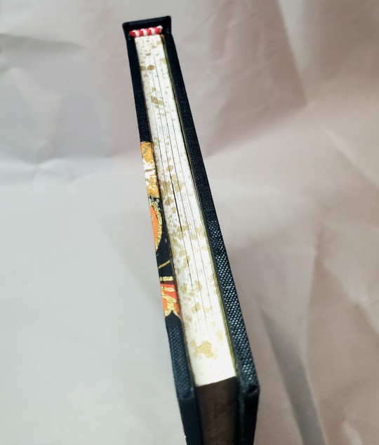
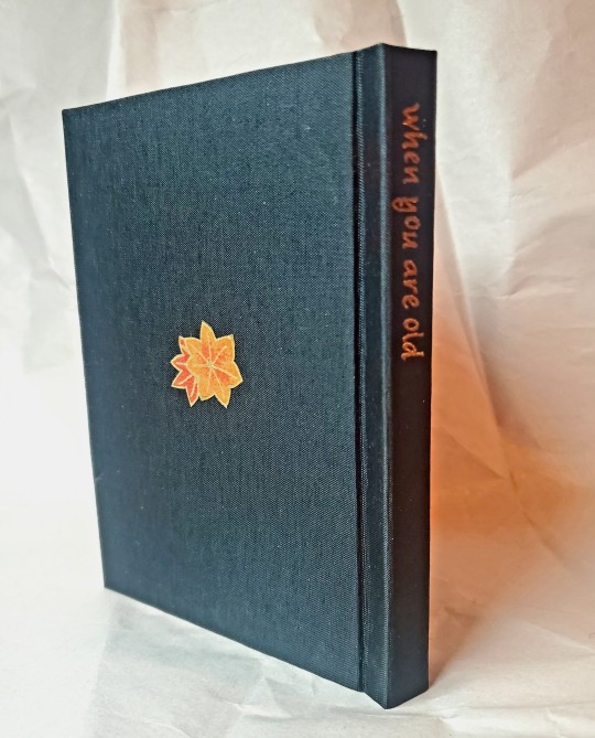
I really wanted to use this pretty fall chiyogami paper for the cover, so I leaned hard into that motif for the design. In searching for a title, I found the William Yeats poem by the same name, and decided to use that (and included it as a preface).

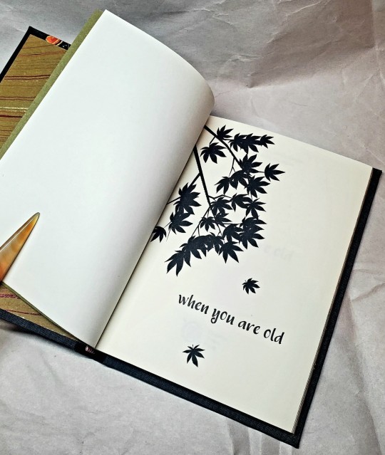
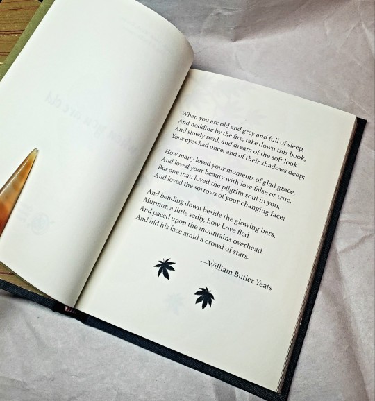
I continued the maple leaf pattern throughout, and I did gold acrylic splattered edges, which I felt came out very nicely! They look a bit like sunlight dappled through leaves.
The cloth for this project is black colibri, which I think came out very well and foiled fairly nicely.
I do think one of the really cool things about this hobby is being able to go: yes, I *can* choose to elevate whatever writing I want to the level of Published Book.
#bookbinding#celestial sphere press#original work binding#yes yes back to the 'bookbinding is a political statement about the value of non-traditionally published writing'
222 notes
·
View notes
Text
anyway if yall want something greek-mythology inspired to read, please pick up Threads that Bind by Kika Hatzopoulou. It's a post-apocalyptic fantasy romance (soulmates!) with lots of queerness in it, inspired by various mythologies but centered around greek mythology, with a greek-coded protag & cultural elements strewn across, and written by an actual greek woman who lives in Greece. It's also the first book I see by a greek author to be written & published in English/abroad first, and to go semi-popular on western reading circles.
we need more like this. please support her.
#threads that bind#kika hatzopoulou#greek mythology#bookblr#also the sequel comes out in less than a month and im SO hyped#i literally just finished the book and cant wait for the sequel. the pain and plot twjst at the end. THE CLIFFHANGER HHHH#it's also the first fantasy book by a greek author i read that has queer ppl in it#as much as i love our fantasy authors they rarely if at all include queerness in their work...#probably bc they know it would tank their sales here (since most of them publish here first. kika is an exception)#and the largely homophobic conservative country would target them to hell and back#anyway pls support miss kika i love her work!!!
43 notes
·
View notes
Text

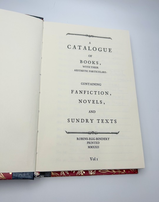
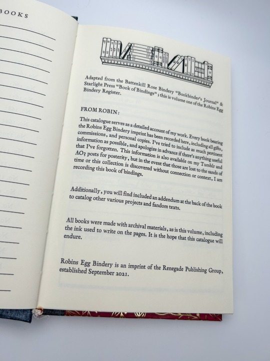


Bookbinding Register by @robins-egg-bindery, adapted from @chocolatepot's "Bookbinder's Journal" & Starlight Press' "Book of Bindings"
228 pages
Title Font: Sughayer Separates
Body Fonts: 1782 Thurneysen
More on the process below the cut!
I never posted about my bookbinding register! I adapted it from two free-to-use templates provided generously by @chocolatepot and Starlight Press (I apologize, I could not find Starlight's Tumblr!)
I added enough space for 200 books, but I'm about 60 deep already; probably going to need a new register by 2025, I'm betting? I like the cover paper and book cloth sample areas; it's nice to have a physical record of the books, something tactile!
I also have space in the back for any additional fandom texts in my collection (that's where I write down my zines and exchange books!), or anything else that I create under my imprint (sketchbooks, journals, etc). When I'm gone, there will be a complete record of every book I made, and everything in my personal collection.
I also write in this with an archival ink pen; everything I make is built to last, and this register is no exception! What we're doing as fanbinders is important, it's both a profound act of love as part of the gift economy of fandom, and also an archival endeavor (as if archival endeavors aren't inherently profound acts of love <3 )
#fanbinding#bookbinding#fanfic binding#fanficbinding#me myself and i#fanfic#ficbinding#renegade publishing
117 notes
·
View notes