#Pixel Square Icon Masks
Explore tagged Tumblr posts
Text
Tidbit: Placronym Pixelation

So you got this fresh placroynm that you don't want engraved with a sophomoric name? Not a problem. You can reject that stupid shit with a pixelize/pixelate filter.
Photoshop
First, you will have to make two more duplicates of your name text layer, so three text layers in total. One for when it's first displayed, one for the first frame of pixelation, and one for the second frame.
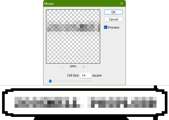
With your first duplicate layer selected, go to Filters>Pixelate>Mosaic..., which is a terrible name for it, but hey, I'm no Photoshop developer. Set the cell size to 11.

For the second duplicate layer, set it to 14.
GIMP
Pretty much the exact same steps as in Photoshop, this time the filter is located under Filters>Blur>Pixelize...


I would suggest right-clicking on the text layer and choosing Composite Space>RGB (perceptual) instead of the default (Auto), or going to the top-right corner of the Layers tab and switching the group of blend modes from Default to Legacy. Basically, doing so will make the semi-transparent pixels as dark as they are in Photoshop, otherwise they will appear too light.


Check out the read-more link below for bonus information on easily animating the name being typed out in Photoshop.
ADDENDUM
Typing animation (Photoshop)
Photoshop's frame animation timeline makes doing this a breeze. First, add a layer mask to your text layer. This will add a white box next to the layer's thumbnail.
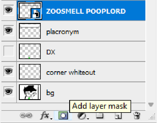
With that layer mask selected (click on it and it will be highlighted in the layers tab), use the marquee tool to make a rectangle selection around the text, then use the paint bucket tool to fill it in with the color black. This will make the text invisible until the layer mask is moved.

Go to Window>Animation if you do not already have the animation timeline open. Click on the little sticky note icon to duplicate the first frame. In newer versions of Photoshop, you will probably first have to click on a button that reads "Create Frame Animation", and the duplicate frames button icon is the "+" in a little square.
Making sure you still have the layer mask selected and not the entire layer, use the move tool and arrow keys to move it all the way to the right, revealing the text on the second frame you've just made. Don't move it too far off now.
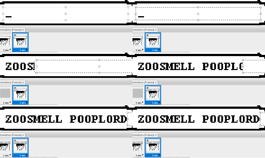
Move the typing cursor layer to the right as well, except you don't have to move it all the way at the end, only where it will be last seen.
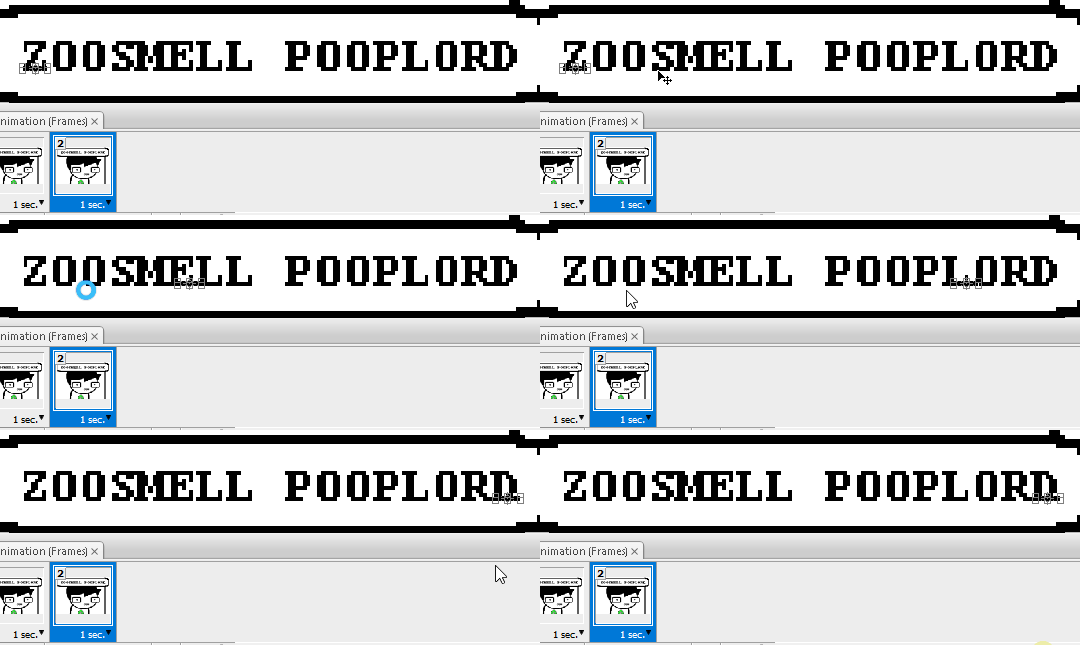
Make the typing cursor layer visible on the first frame, and not visible on the second.
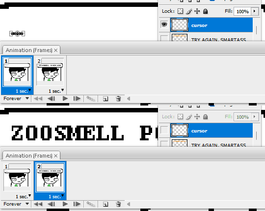
Select the first frame the animation and click on the tween button. This will add all of the frames in between the first and the second one for you. Make sure you only have "Position" checked under "Parameters". For the numbers of frames to add, here's a neat trick for finding the right amount: count the amount of letters in the name. "ZOOSMELL POOPLORD" is 16 letters, so add 16 frames.
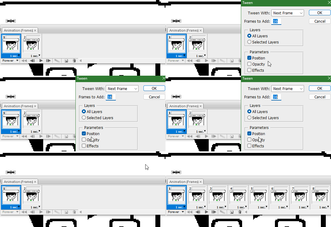
Most of the work is already done, though there might be a couple frames that will need some minor tweaks. Just use the move tool and arrow keys again to finetune the layers' positioning.
This is why it was important to not move the layer mask too far to the right away from the end of the text. Tweening the position spaces it out linearly, evenly, so the farther away the end goal is, the more space each frame will use. Thankfully the font this panel uses is mostly monospaced, and I got a little lucky with my positioning, so I needed to only adjust three or four frames. Way less tedious than having to create each frame of animation myself, at least.

To change the frame delay (the time duration each frame takes up) of the newly created frames, click on the first frame you want to retime, hold down the Shift key, and then click on the last frame. This will make a selection spanning all frames in between. Click on the little dropdown arrow and select 0.1 seconds (100 milliseconds).

Here's the original panel:
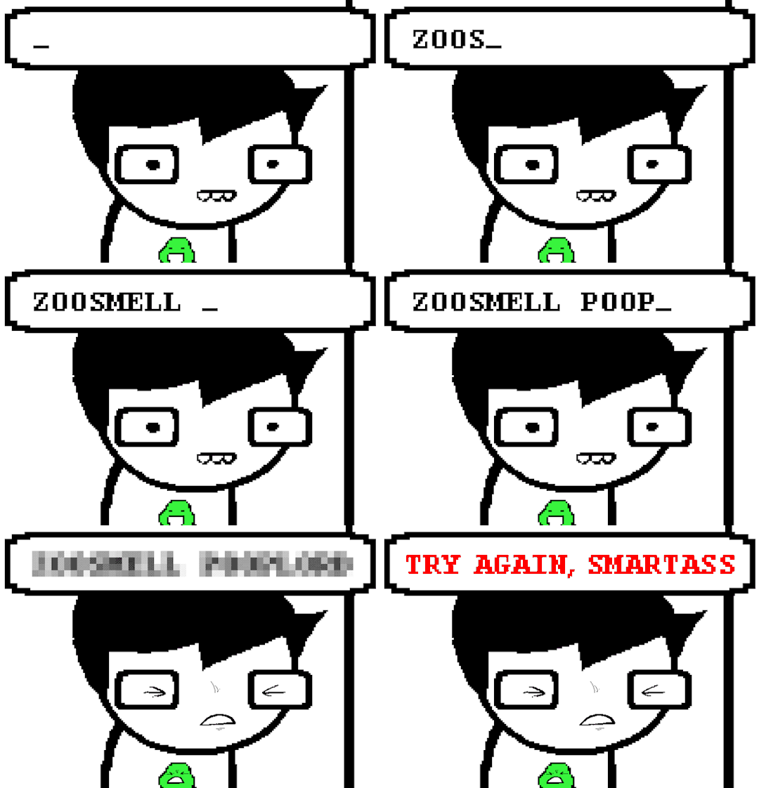
And here's my recreation:

Here's the PSD, too.
76 notes
·
View notes
Note
hiii so sorry if this is a stupid question but how do you make icons that aren’t squares? the only canvas i can make Is square 🥲

how to make shaped icons!
no worries anon! things like this can be a little confusing at first, so i get you. let’s get into it!
first thing’s first is creating a new project in photopea. i tend to make my icons 300x300, but it doesn’t really matter the dimensions as long as they match (so you shouldn’t do 750x700, for example.) make sure your background is set to transparent (no worries if you forgot this step—just delete the colored background layer!)
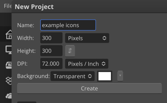
next thing is getting the shape! i tend to use photopea’s shape tool for this, since it’s easiest for me, but you can also just google “circle png” or something. (make sure your image is actually transparent, though. click and drag or click and hold and see if the dotted background lingers or goes away!)
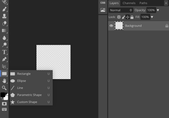
for the first icon, i’m going to use the ellipse tool. feel free to change the color of your shape—i usually set backgrounds later, but that’s up to you. the exact dimensions of this shape don’t matter, but like your canvas, they have to match so the circle is even. click and drag to make your shape
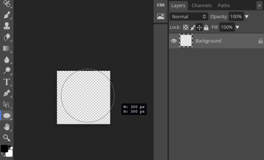
as you can see, my shape isn’t centered just yet—but i corrected that by using the click and drag tool: the one at very top of your sidebar. photopea will center and align your shape for you if you move it towards the middle
now you have your base! time to start adding backgrounds and such things. i used my usual method for the background, but you can do whatever. one thing to make sure for this step is to set all your layers to clipping mask (putting the shape below all your other layers)
to find clipping mask click the button that says layer at the top
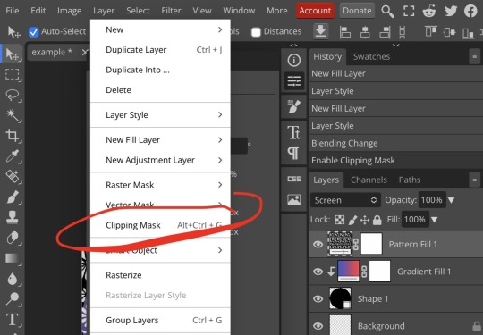
as you can see, my gradient fill is already clipped mask’ed. if for whatever reason you want your layers un-clipping mask’ed later, just go back and click the clipping mask button again. (i’ve said clipping mask too many times. it feels like a fake word.)

(hello, haruka!) this is how my icon looks so far! everything is clipped mask’ed to my circle. if you’d like, you can stop here, and download your image. i went ahead and added a psd. unless you’re using a color fill later or something similar in your psd, that doesn’t really need to be clipping mask’ed.
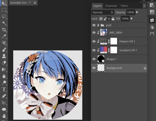
(the psd i used here is really simple and i didn’t save it, but always put your psds in folders, just to make your life easier.)
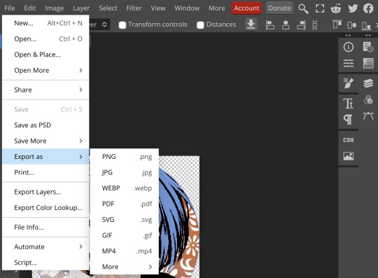
now that we’ve got that done, time to export! make sure that you export as a png. otherwise, your icon will still be square.
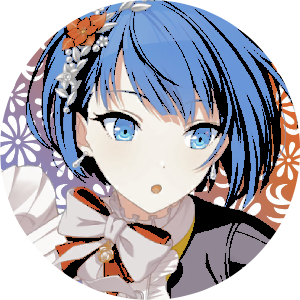
the finished product! pretty simple, right? you can use this method for all sorts of shapes. i went ahead and did two other kinds—bordered and faded.
for the border, i copied my original shape (a square in this instance) and switched the fill mode to the icon with an x through it, and switched the stroke mode to a solid color, and set the stroke to seven pixels. i think for bordered icons you can also shift the border so that there’s a space between it and your icon, but i left it where it was this time
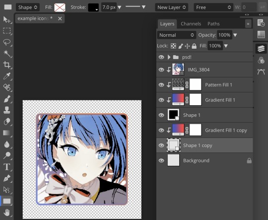
as you can see, i didn’t change any other layers, except that i duplicated my gradient fill! this is the same project i was working on before, just with a different base.

now for the faded icon! i used a heart shape for this, as that’s pretty standard, “but wait! photopea’s shape tool doesn’t have a heart option!” it does, actually! it’s just hidden. click your shape tool and go down to custom shapes. then scroll at the top until you see the little arrow with the star beneath it (which should be as far right as you can scroll.)
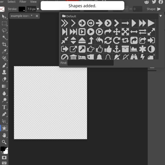
wow! so many shapes!! i scrolled down until i found the heart, and added it. the heart i didn’t worry too much about the numbers—i just adjusted it until it looked nice.
now to make our heart faded! first thing to do is to rasterize your shape layer. make sure you have your dimensions and everything set before you do this, as you won’t be able to correct them after your shape is rasterized.
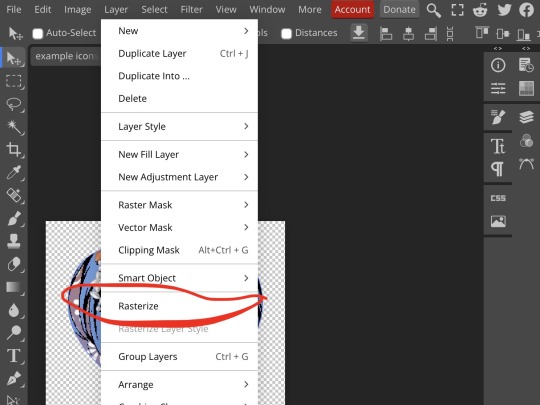
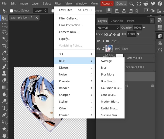
rasterize can be found in the layer drop-down menu, where you found clipping mask. click that, and now you can blur your shape! the blur tool can be found in filter > blur > gaussian blur. you can also use motion blur or radial blur, but i like gaussian blur
clicking gaussian blur will give you one of our old friends the sliders. just mess with that until it looks about right. click “ok” once you’ve got it set how you want it
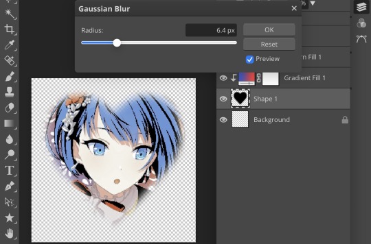
i also adjusted my heart’s sizing a bit by going to edit > free transform and making it bigger. just do what looks good to you!
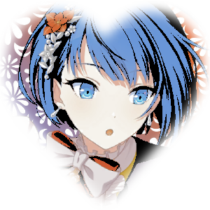
and there’s your faded icon!
i hope this is helpful!! feel free to ask if you have any questions :3
sincerely, eos
80 notes
·
View notes
Text
I'm bored, so here's a step-by-step how I made my icon:
This got way too long, so I put the whole thing under a cut.
Step 1: Download the original tumblr icon from my blog.

Step two: Create a square photoshop canvas with roughly the same size as the icon file so I don't fuck up the resolution or blur it, load the image.
Step three: Search for a png of a stylized GL mask with clear background. (No way in hell am I making that myself.)

Step four: Load the mask in the photoshop file. Resize the mask so it fits over the eyes, use the color picking tool to get the masks color and paint over those two tiny round holes over.

Step five: Create new layer, adjust layer order so the new layer is in between the mask layer and the icon layer. Colour the eyes in white.

(this is what happens if you turn the mask layer invisible)
Result:

Then a while later, I got bored of the background and decided to adjust it:
Step six: use the wand tool to select the background.
Step seven: expand the selection by 8 pixels because it includes to much background)


(before and after adjusting the selection)
Step eight: erase the background from the icon.
Step nine: google pictures of space, select one that is pretty. Load into photoshop, resize & reposition until happy.
Result:

#I know none of this is like... particularly impressive#but I thought I'd share anyway#...now I kinda want to exchange the background#my stuff
2 notes
·
View notes
Text
26/02 Notes
Layers, masks and selecting
**Always check units eg. pixels when creating a file
Shortcuts
V = move
B= brush
E = erase
[ ] = brush size bigger smaller
Numbers change opacity (1 = 10% opacity etc)
Auto select toggle – layers/group selection
Cmmnd + T = Transform controls/selection
I = eyedropper
M = rectangular marque tool – selecting
Cmmnd + D = deselect
Option + click = into layer mask
Foreground colour & Background colour (squares instead of fill/stroke)
X = swap Fg & Bg
Tap on square to get colour picker
To add to an existing selection: hold shift and then drag
To subtract from an existing selection: hold option then drag
Black = foreground colour when mask painting (erases mask/image)
White = restore painting mask


Ships/smoke
Fade it into the background for depth, opacity in layers window
Can right click on layer mask and select disable layer mask to turn it off


Orange
Use marquee tool (can change shape), and polygonal lasso tool for selecting straight lines
Selection hold option/shift for subtract and add
Have to click bottom left option on hue panel to only apply effect to one layer under hue mask.

Plant
Select section using pen tool
Direct selection tool (mouse icon) to edit anchors/paths
Turn into a selection (top bar) or open paths window
Duplicate background layer add mask

Hummingbird
Option + delete = fill selection with foreground colour
Cut out new wing shape with paths tool
Fill with black
Blur tool in tool bar for wing
Edges are white so can use brush tool to shade them
Drag onto background, flip, and adjust curves so it matches background


0 notes
Text
Masterlist of Denied Requests 5
Please take a crack at it everyone! Fifth Wave! More will be added later on!

Mogai
Coinings:
None Submitted

Editblr
Blinkies/Pixels/Stamps/Widgets:
None Yet

Userboxes:
None Submitted

Moodboard/Stimboards:
could I request a stimboard of Gangle from amazing digital circus? she’s my comfort character :> and just cooll! With themes of wood, ribbons, masks, water, tap shoes, and metal?
could you possibly do a matcha alcremie moodboard with nature and earthy themes?
may i request an aranea stimboard with psychic and nature themes?
could i get a william wisp(jrwi prime defenders) stimboard? id like ghost hunting and wolves and the color blue if possible. thanks! -for @/william-wisp
Can I have a BoTW/ToTK Link stimboard with lots of nature and swords. No slime please! -
May I request a stimboard of abandoned Disney attractions? Preferably gifs of exploration after closing, or if there is none, footage of it in operation is fine!
could i request a moodboard for dokuro chan from bludgeoning angel dokuro chan? don’t really care too much about themes or whatever buuuut if i had to give some ermm maybe angelcore, animecore?
Can I please have a moodboard for season 1 Steven from Steven universe? Can it have themes of adventuring with the gems and relaxing around beach city?
ould I,, maybe request a ririka from nnd compass stimboard? if it's okay, could it have a menhera/yami kawaii theme?
May I request a moodboard for Yato from 'Noragami'? Sky blue and inky black colors will do. As for theme.. maybe shedding an inner psychological darkness? -
Can you do a pine marten + pastel goth moodboard please?
Ishmael Limbus Company water slime board?
Could I ask for a Hajime Hinata stimboard?

Icon Requests:
if its okay, can i have some replycons for hawks (mha) ? i do prefer the manga but i wouldn’t mind the show at all
could i have a montgomery gator icon with either the dissociation agere flag or the Age Regressor flag?
wolf therian icons?
Can I request an icon/icons for Eclipse from FNAF with nonbinary and boyflux themes?
maybe some Gay Bowie (Total Drama) Icons? -
Can you do Death (Puss In Boots) Icons?
can I request icons for Peppino Spaghetti from Pizza Tower?
could I request some icons of the protagonist from persona 5 royal? (game)
Murdoc Niccals Gorillaz pfps perhaps?
can i please request The Collector (The owl house) icons with the stellaripped (https://www.tumblr.com/lunentity/747086228326940672?source=share) flag? circle or square is ok! thanks very much! -
can you do silver the hedgehog lesbian icons pls?
Can I rq for genderfae lesbian celestia icons from mlp?
May I please request black and white circle icons of Todoroki Shouto?
lesbian lottie mattthews icons from pre crash?
Can you please make a few icons of Guzma or a luxray with the Trans flag? -
can i request antarcticite from land of the lustrous w/ the oriented aroace flag?
may i please request faded heart iconw w/ this magicalgirlic flag w/ boothill!?
could you possibly do a Lacey from lacies game edits? Theme just webcore and lacey ofc :3 tysm!

Rentry Graphics:
May I please request some ticci toby graphics?
could i req linzer rentry graphics (from crk ofc !) ?
May I request a Jinx ( from arcane/league of legends) rentry graphics?
pleaese make chase total drama graphics?
zhongli rentry graphics pretty pelase?
graphics of any character from identity v? little girl/memory or gardener/emma woods preferred please? -
Hiii can I please request rentry graphics of jirai chan please?
i was wondering if i could please have some tim drake (any version! robin or red hood, any comics/games) rentry graphics?
May I request your take on some rentry graphics for a character named A.B.A from Guilty Gear -Strive- ?
shoto todoroki graphics?
can i rq some Bon from the Walten Files graphics? -
can i request a spinner (mha) graphic?
Can I get an Eevee rentry graphic?

NPTs/SNPTs/Usernames:
can ghost ask for princess peach titles please? (Titles)
Sigma from bsd Id Pack please?
Can I get some Name and Pronouns for smartass from toon patrol?
can i get name + pronouns reccs for hunter (TOH)?
Names for Captain Spaceboy from Omori? -
i just wanted to ask if u take requests for tgcf/heaven officials blessing? could i please request hualian (as a whole) themed npts? if you're not able to do hualian, a xie lian npt!
May I ask for a columbina (genshin) npt pack?
can you please do an id pack based off of monitoring by deco27?
May I request some ramuda amemura from hypnosis mic npts if possible?
could you pretty pretty please do red panda NPTS? tysmm

Dividers/Borders/Headers:
None Yet

Custom NPTs/SNPTs
None Submitted

PNG/Render/Mask Requests/Sprite Edits:
could i get a junko sprite edit/redesign with pink/blue heterochromia eyes? ✅
are u able to get nekomura iroha pngs/pixels or overlays?

Layout Requests:
Hello may I please request a layout for Black Swan from hsr?
If it's alright, may i request some Twitter layouts for nahida from genshin impact?
If possible could I please have a tumblr layout for Rin Okumura (Blue Exorcist)? -
could i please request a layout of Naruto from Naruto?
If it's alright, may i request an Indian inspired Tumblr layout for nahida from genshin?
Can I please request a Furina layout with themes of royalty?
selen tatsuki layouts please?
blue madara mikejima tumblr layouts ? -
can i request a kou minamoto discord layout?
can i request momoka sakurai/menhera-chan discord lays?
Could you do glisten from Dandy's Discord layout please?
could i req a habit (emh) discord layout please?
Can you make a Astro (from Dandy’s World) tumblr layout? -
HIIII can I request yuuna from love angel syndrome layout?
I was hoping if I could request Tumblr layouts with beartic?
could you do a naruto discord layout with a orange/redish color?

Package/Themepack Request:
will you make tumblr graphic / layout + replycons + graphic for pinned of draculaura from monster high (gen 1 or 3 please)?
can you do yuri lcb replycons and icons? with a red tech theme maybe?
s it possible that you could make a lunala themepack, please?

Template Request
can I get an oka ruto template?
helloooooo may i request a momo from dandadan template?

This is the fifth list, at this point, went back to surfing the past, please tell me if an ask has been shown twice by accident.
17 notes
·
View notes
Text
Get Your Art Fix!
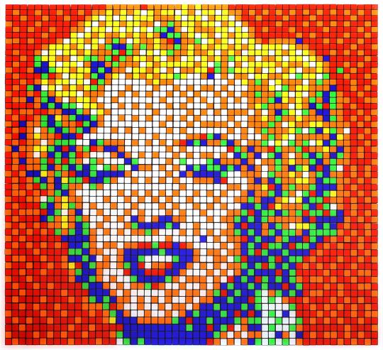
"I define myself as an UFA, an Unidentified Free Artist. I chose Invader as my pseudonym and I always appear behind a mask. As such, I can visit my own exhibitions without any visitors knowing who I really am even if I stand a few steps away from them." ~ Invader
"RUBIK SHOT RED MARILYN" by Invader, 2023
Series: Rubikcubism (Rubik Master Pieces)
Arty-Fact: Rubik Shot Red Marilyn derives from Invader’s series ‘Rubik Master Pieces’, in which he manipulates Rubik's Cubes to reproduce historical works of art as three-dimensional sculptures. Due to the restricted palette of the cubes (limited to six colours), the images are transformed into abstract, pointillist mosaics whose full forms can only be discerned from afar or, as Invader himself suggests, through a smartphone camera.
Invader reproduced some of Andy Warhol’s iconic portraits of Marilyn Monroe from 1967. In this image, Marylin’s face, composed of white and orange squares, emerges over a pixelated field of red and orange. Despite the heavily simplified design, Marilyn’s seductive gaze and smiling lips are immediately recognisable.
If Warhol’s original artwork is a comment on American society, its consumerism and its obsession with fame, Invader’s version represents a homage to both a global celebrity and a revolutionary artist who disrupted the art world.
Like Warhol, Invader is more concerned with artistic experimentation rather than critiquing society. Through this series Invader is playing with the history of art and making the viewer discover or rediscover iconic artworks. Moreover, the very term Rubikcubist is of course a reference to the cubist movement founded by Braque and Picasso at the beginning of the 20th century.
Source: HENI Editions
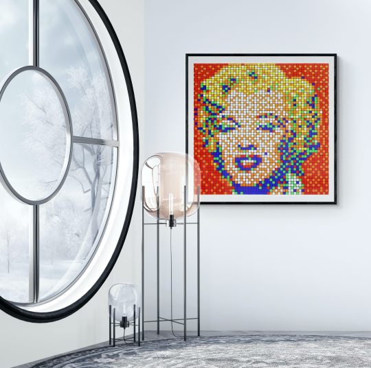
See It On Your Wall
1 note
·
View note
Text
so in light of my frustration with my own brain i’ve decided that for tonight sleep can suck it bc i was restless enough to get up and make a new icon so bye bye teeny monochrome mikleo commission ily it’s time for ✨aro mikleo✨
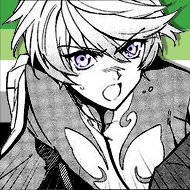
which I. perhaps. put more effort into than i meant to?? look at that lad. and the weirdly placed flag bc filling the square made it hard to see the whole thing even tho it’s still just around the edges alksdfjsljd
(more versions under the cut)
originally i was gonna do the flag colors overlaying him like i’ve done before but uhh
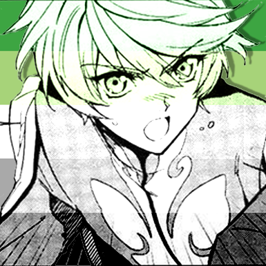
i decided that looked just a lil weird!! all things considered!!!
esp when I added the purble eyes.......
the things this meebo has seen alskfjklsdjkl
so in the end i was like sure we’ll just darken him with a full body black 41% opacity color overlay and keep the purble. also the drop shadow is important(?) idk. anyway. he’s here now. i precision selected and masked the pixels for his eyes for those color overlay layers that’s how much effort i put into this boy lol. lmao
#look at my lil guy!!!#sorry i won't be entirely a white and black blob now guys time to start associating me with a very small amount of color#only a lil tho don't worry#jay yells#jay edits#can you fucking believe i'm using that tag again#yet here we are#what will i do next while i lament that i do actually have to be somewhere at 1pm and haven't slept (it's almost 6 <3)#oh well#aro mikleo time instead#the funnest part is icons are small. the eye detail makes no difference#:3
0 notes
Text
Week Two: Photoshop Tutorial Notes
Set Up: Window > Workspace > Essentials OR Window > Workspace > Reset Essentials
Command I (File > Get Info) > Open with
Image > Mode > CMYK Colour
Destructive Process: greyscale gets rid of all colour information (when save and reopen, will not be able to return to the original colour of image)
Image > Mode > Grayscale
TIFF: Tag Image File Format to store raster graphics and image information
Colour Key Document
If background colour/text is similar colour
Creates consistency across the document
Ability to overlay colour to the black and white image (in InDesign)
Image > Mode >.Adjustments - destructive way of editing to the image
Layer > New Adjustment Layer > Choose - less destructive to image
Save as Photoshop File which saves the layers
Can adjust layer through the Preset on top of properties panel - (same as on hue & saturation)
Curves
Brightness/Contrast
Lasso Tool - Can add another selection SHIFT
Can subtract part of the selection through ALT/OPT
Marching axe (outline)
Select > Select and Mask
Mask: A nondestructive method to hide parts of an image or layer without having to remove seperate parts. Can develop various compositions by changing background colours, removing and cutting.
Eraser: destroys pixels
Make a selection > SQUARE W/ CIRCLE ICON > Adds Layer Mask
Black is what you can’t see, white you can
Paint Brush Selected can uncover the image depending on
Help > Hands-On Tutorials > Select and Mask
PHLearn - Free Tutorials (How to Learn Layers & Masks)
0 notes
Text
Week 6 Dancing Girl - 2
Keywords: Layer mask, type tool, shape tool, layer opacity vs. fill
Layer Mask
layer mask in a non-disruptive way to conceal some pixels on one layer/group.
You can create a layer mask by clicking the mask icon at the bottom of the layer panel -> a circle in a square
Add a mask that shows or hides the entire layer?
Click the New Layer Mask button in the Layers panel to create a mask that reveals the selection. Alt-click (Win) or Option-click (Mac) the Add Layer Mask button in the Layers panel to create a mask that hides the selection. Choose Layer > Layer Mask > Reveal Selection or Hide Selection.
Add a layer mask that hides part of a layer?
In the Layers panel, select the layer or group. Select the area in the image, and do one of the following: Click the New Layer Mask button in the Layers panel to create a mask that reveals the selection. Alt-click (Win) or Option-click (Mac) the Add Layer Mask button in the Layers panel to create a mask that hides the selection. Choose Layer > Layer Mask > Reveal Selection or Hide Selection.
To directly edit layer transparency, do the following and create a mask
In the Layers panel, select the layer. Choose Layer > Layer Mask > From Transparency.
Photoshop converts transparency into an opaque color, hidden by the newly created mask. The opaque color varies greatly, depending upon the filters and other processing previously applied to the layer. This technique is helpful for video and 3D workflows.
Apply a layer mask from another layer
To move the mask to another layer, drag the mask to the other layer. To duplicate the mask, Alt-drag (Win) or Option-drag (Mac) the mask to the other layer.
we'll use the second method to hide some parts of the color stripe. Lowering the transparency of the color stripe layer will help you identify the edges.
We need to hide the girl's right foot. Use the pen tool to select the right foot.
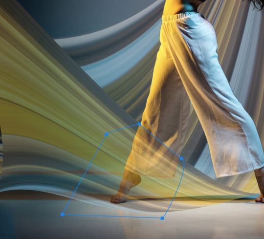
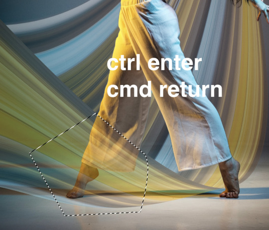
Pen tool
Ctrl + enter
Cmd + return
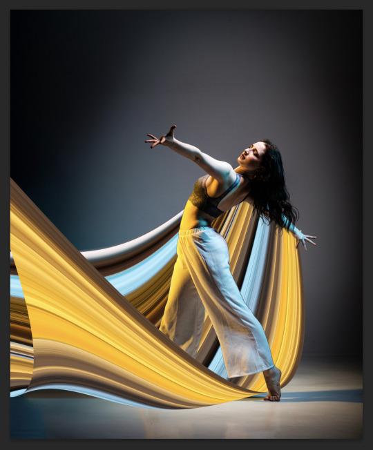
Now, we've done the swoosh thing. We can move on to add some text to our design.
Type Tool
Choose the Type Tool with a "T" icon. Click to create a point type
Type in "DANCE" in uppercase and choose a font
Edit the font size and weight.
Create another point type and type in "FOR THE NIGHT" in uppercase and a smaller font size.
Increase letter space for "for the night"
---------------How to increase letter space?
select all the text, hold Alt (Win) Opt (Mac) and hit -> arrow
Move them to the top left conner.
Shape Tool
Different from all the other layers we've dealt before, the Shape Tool creates vector Path instead of Raster elements composed of pixels.
Once we have a shape, or to put it in another way, a path, to edit like pixel layers, we need to right click on the path layer and rasterize it.
The shape tool is actually a tool group. By default, the icon is the rectangle.
You can change the fill and stroke styles from the control panel on top of your screen.
Now, you can add a box for your title "DANCE".
Layer Opacity vs. Fill?
When you look at your layer panel, you'll notice that you have two options to lower down the transparency of your layer: Opacity and Fill.
-----------------What is the difference?
Opacity will control the opacity of both the layer and layer effects.
Fill will control the opacity of the layer, but not layer effects.
Let's add a light strip to practice.
Create a long rectangle, double click on the layer tab area to add a outlow effect.
Change the perimeters to make the light strip look natural.
Lower down the fill to 0, and now you'll have something similar to my sample.
0 notes
Note
Hello! I was wondering if u wouldn’t mind sharing a tutorial on how u making ur icons?
Hi sure thing! This is long and screenshot heavy so the tutorial is below the cut :)
First I find a shot of the character I want for the icon and take a screenshot of it. Typically I look for shots where the character isn't obstructed by anything/anyone and make sure nothing is cut off in the cap
Then I put the screencap into this website and it removes the background for me. This works pretty well for most images :)
Then I open the image with the removed background into photoshop and crop it into a square.
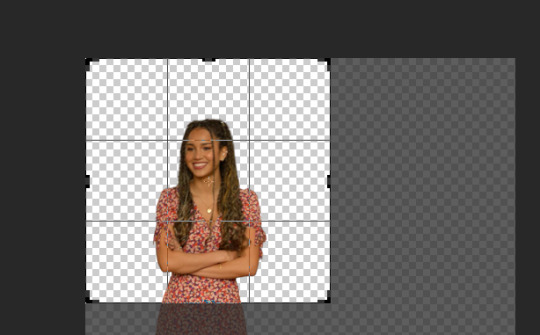
after cropping I resize the square to 200 x 200 pixels
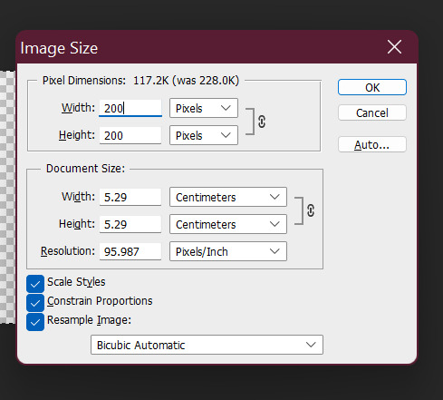
after resizing I run my sharpening on the image so it becomes clearer.

After sharpening, I colour the image with curves and vibrance (as per my basic gif tutorial)
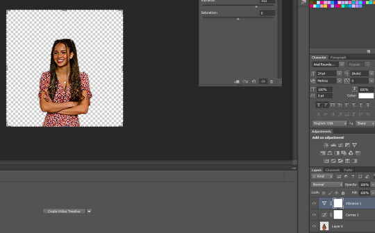
I then select all the layers and Convert to a Smart Object - this step isn't necessary but I just find it is easier for me.

After that I create a new layer underneath for the background and I use the gradient tool to add the background in.
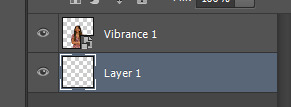

^ that is the gradient tool - if you can't find it right click on the paint bucket and you should be able to switch to it.
The settings for the gradient look like this. To change the colour click on the coloured gradient bar.

After clicking the gradient you will get a dialog box like this:

basically just click on the little colour tabs on the gradient bar to change your colour. Typically with my icons I like to go from the colour to black or white.
For this icon I am doing pink :)
After you have picked your colour click the ok button
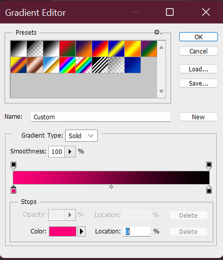
To draw you gradient click and drag a line on your canvas

This gives you comething like this:

I prefer the dark spot to be on the bottom of the icon so I'm going to redraw over it in the opposite direction

this gives us something that looks like this:
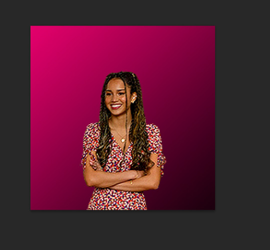
did it a couple of times to end up with this:

I like the colour background of my icon to match the clothes (I just think it's cute). So I'm going to use a bit of selective colour to make Gina's dress more pink.

So I create a selective colour layer (the one I've hovered over with the two triangles).

After making the layer I right click on it and select "Create Clipping Mask" so that the layer only changes the colours on Gina and not the background. Yow will know this has worked because there will be a little arrow pointing down.

Given Gina's dress is red I will be changing the reds in this image. When changing reds and yellow you have to be careful because they are the undertones of skin tones (why I chose this one as an example). As you can see below Gina's skin has changed with the dress and we obviously don't want that.

To fix this we use a layer mask so only the dress changes colour. The layer mask is the white square that shows up next to the layer name Selective Colour. We basically just grab a black paint brush and draw over the parts we don't want changed on the selective colour layer.

Then basically the icon is ready to be saved as a png for use!
If you want to make different colour versions of the same icon what I like to do is add another selective colour layer on top (no clipping mask this time) and change the colours again :)
So for example to turn this icon purple I adjusted the Magentas in the image like so:
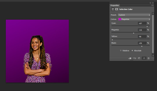
To turn it more of a blue-purple I added another Selective Colour on top and adjusted the Magentas again like so:

and basically I just play around until I get the colours I like :)
You can also add textures on top of the background if you like - typically I will just google something like "grunge icon texture" or "cute icon doodles" or whatever I might want to put on top and find one I like and use it.
So I copy and paste it and put it on top of our gradient layer and adjust the blending mode of the layer as I see fit. This is the texture on top without the blend mode adjusted.

Here I've changed it to Exclusion, which I like - but usually I just play around with the blend modes until I find one that looks good

Here's a heart one I found and put on. For this one I used the magic wand tool to remove the white bits of the background and then set it to Exclusion.

And that's my basic process - I hope it makes sense :)
#asks#resources#ps help#usergif#allresources#yeahps#completeresources#resourcemarket#dailyresources#tutorials#photoshop tutorial#*mine#ok hope this helps :)
58 notes
·
View notes
Text
icon tutorial
got a request from an anon for this so let’s make an icon for argyle <3 this is our end goal. mind you i went kinda fast for the tutorial’s sake so yknow, play around in photoshop for as long as you like to get an output you want!
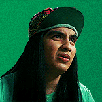
1. grab your screenshot, i tend to import frames to layers and then choose from there

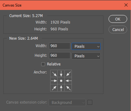
2. image > canvas size > equal width & height to make it square
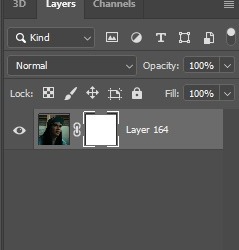
3. add a layer mask to the frame layer
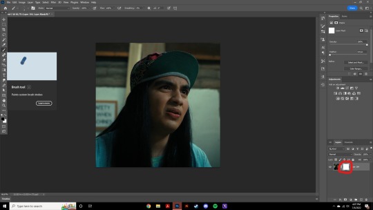
4. make sure the layer mask specifically is selected, and use the brush tool to erase around the figure. to take away pixels, use black, to add them back, use white. don’t use any other color; i like this method because if i mess up and erase too much i can just add it back no harm no foul
5. i usually start with a large brush size to get rid of the bulk of the image. once you just have these edges leftover, change your brush size to something smaller (this is just based on your image size but somewhere around 18px works for me) and increase the smoothing to 80% or above.
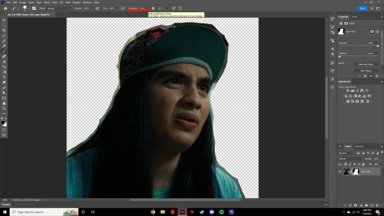
6. smoothing slows down the brush strokes so you can get a nice edge of the photo, and this is where we are after erasing the excess. don’t worry if it’s not perfect!
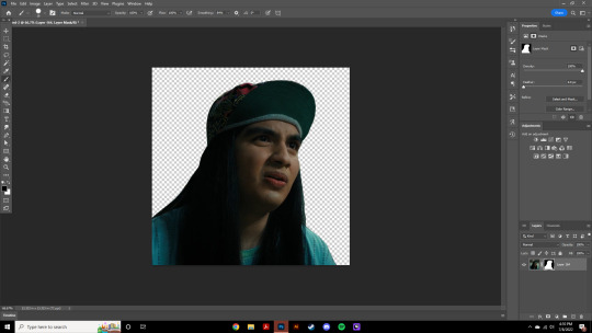
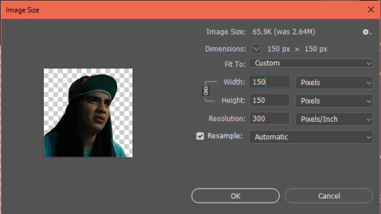
7. image > image size. i tend to go for 150x150, but you can do what you like!
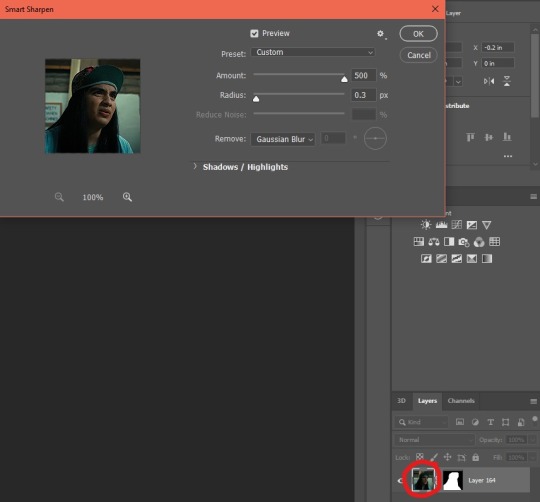
8. next we’re gonna go filter > sharpen > smart sharpen. for this, make sure the actual image — not the layer mask — is selected. these are the settings i use for icons.
9. add a layer and make sure it’s underneath our frame layer. i tend to go for gradients rather than full color underneath my icons, so pick a gradient or color you like and fill the bottom layer with it

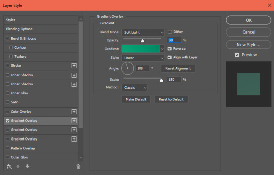
10. next we’re gonna select the frame layer again and go fx > gradient overlay. make the gradient overlay the same as the gradient/color you chose for the bottom layer. this helps add dimension to the icon so argyle doesn’t look like he’s just floating in a colorful space of nothing

adjust the settings as need be. you’ll probably be somewhere around 20-60% opacity for these gradients, as anything above tends to look unnatural. i lean lower for cool gradients and higher for warm gradients since most skin tones adhere better to warm lighting
11. alright this is where our icon is at now. i just hit the bottom layer with filter > noise > add noise > around 2.8 to give the background some texture. if you notice, argyle right now is greener than i’d like, so that’ll be fixed in the next step with some coloring

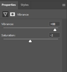
12. to make him more warm toned, I hit him with brightness, vibrance, & selective color layers. to warm his skin tone i fiddled with the ‘neutrals’ portion of selective color to add a bit of red and black. make sure this icon is selected, or else these adjustment layers will also affect our green gradient background
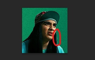
13. if you notice, there’s a bit of unnaturally colored background still left so real quick we’re just gonna select our layer mask again and hit it with the black paintbrush to get rid of those artifacts
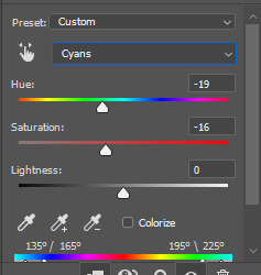
14. the very last thing i did was change his shirt & hat color to match the background. i don’t always do this, but sometimes it’s nice just to make the icon more on scheme. to avoid affecting the hue of the entire frame, make sure you have specifically the color of the item selected (in this case, cyan) before you change hues
15. and ta da! here’s our finished icon

these are the basics, but make sure to play around in photoshop and figure out how to make things work best for you. if you have any questions, feel free to ask!
35 notes
·
View notes
Note
hey can u tell how to make the profile like u but one photopea not on photoshop plz make a tutorial🙏🏻🙏🏻🙏🏻
Hi babe! I have never used Photopea before, but it looks similar to PS. I am going to do my best to explain what I think is the easiest way to make a PFP in it.
Before we start, you need 2 things:
1) A PNG image you would like to use. There are plenty of free PNG packs on Deviantart.com to choose a picture from. I am using one from this pack.
In case you don't have a RAR file opener (most PNG packs are compressed into a RAR file) you can convert RAR files to ZIP files here. Once it's converted to a ZIP file, open it and find the PNG you want to use. Keep it somewhere you can easily find it.
2) Download this PSD
Alright, here we go!
Step 1) Open Photopea at https://www.photopea.com/
Step 2) Open the PSD file in Photopea via File>Open, or by dragging the file and dropping it into the work area. Click on the layer called "png image".
Step 3) Drag your PNG into your workspace. It should be placed beneath the folder "Ky's PSD" and above the circle called "change color". Delete the original PNG image of Lisa from BP (I left it in so you could play around with the original file if you wanted)
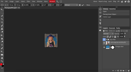
Step 4) Holding down the SHIFT key, click and drag any of the handles (the little squares) to resize your image to your preferred size. You can click anywhere on the image and move your mouse to reposition it or use your arrow keys to move it pixel by pixel.
TIP: If you accidentally click out of the transform mode image, go to Edit>Free Transform

Step 5) Holding down the Option/ALT key, click and drag the "change color" layer's Mask (the black and white circle square) to the png layer in the Layers Panel.
Now both layers should have a circle mask.
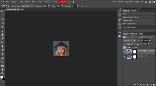
Step 6) Right-click the layer preview on the png image (literally right-click where the face is) and click "Select Pixels".
The original image outline should now have marching ants.
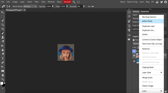
Step 7) Click the PNG layer's mask (black and white circle square) and click the paintbrush on your left-side toolbar. Make sure your forefront color is white in the bottom left corner.
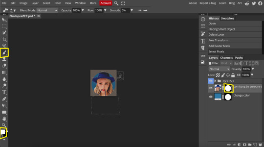
Step 8) Now paint back in the parts you want to show. For this icon, I want the hat to show, so I paint over where her hat is not showing. This brings it back into view.
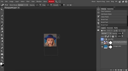
Step 9) Click Select>Deselect
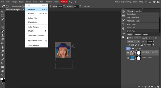
Step 10) Holding down the Option/ALT key, click and drag the mask on the PNG layer to the PSD folder (I put my PSD in this file, but you can download and use any PSD you want. Just open it in Photopea and copy and paste the layers into this file.) All 3 layers in the Layers panel should have a mask now.
Step 11) If you have extra transparent space that needs to be cropped out, click the Crop tool on the left toolbar. Holding down the SHIFT key, click a handle (square) and move it to where it touches the corners of the PNG or circle, whichever your particular image needs.
You can also use the arrow keys to move the crop circle around, or use your mouse tool. Once it is placed where you want, press the Enter key.
For this icon, I cropped out some extra space on the left and right sides.

Step 12) Select the PNG preview image again, and click Filter>Sharpen>Smart Sharpen, and set it to 200% and 0.3 pixels.

Step 13) Export your icon by clicking File>Export as>PNG and click save.
Your icon is now ready to upload. Here is how this one turned out:
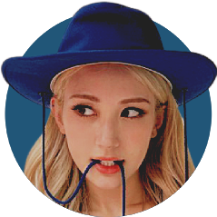
I hope this helped!
#photopea#photopea tutorial#tutorial#tutorials#icon#icons#icon tutorial#pfp#pfp tutorial#somi#kpop#ask#answered#anon#queue
126 notes
·
View notes
Photo
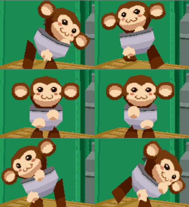
Guide to that elusive “PS1-pixelated-lowpoly”(but not really)
With the videogame playing population growing up we've finally broke from pixel-art nostalgia into the broadly called "low-poly" nostalgia. On closer look this broad categorization gets further described as “PS1 pixelated textures low-poly”, which is a bit better, but still is a really broad and a pretty wrong description of this style that’s so dear to a plenty of game-playing and game making individuals these days. I’ll try to dive into some of the technicalities and examples of this style in the attempt to find it’s characteristics and some actual technical requirements to meet this style.
Let’s start with the obvious, calling it PS1 low-poly is wrong, mostly because the same games were release on Nintendo 64, Dreamcast and PC. More so, games released later can be put into the same category, plenty of NDS or PSP games fit into the same style and adhere to the same economy principles. The only real surface level thing unifying these games is the game size, that is, the games came on CDs. The advent of a DVD format really changed up how the games look, so the graphical style we’re talking about here is called CD-3D in smaller circles.
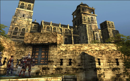
First let’s look at the games that fit the criteria would give you some information to describe the style, textures are obviously small enough to have visible pixelation (hidden by texture filtering) and models are obviously low-poly (that is around or less than 500 triangles for a character), but let’s see what doesn’t seem so obvious. Here’s Spyro and Crash, fan favorites
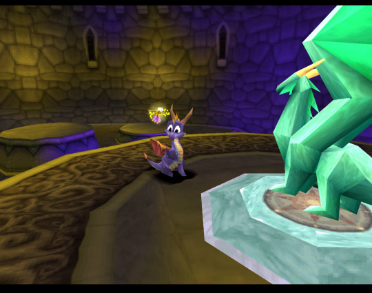
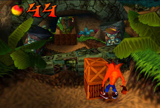
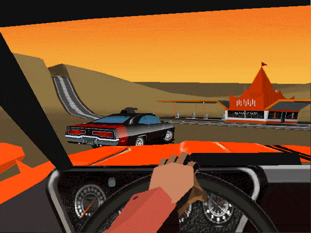
Both games check both points we’ve noted before, but what’s not obvious to an untrained eye is that these games both extensively use Vertex Color, the thing you’ll notice more and more in other games we’ll talk about. Vertex Color is absolutely simple, each vertex of a mesh can be assigned a RGBA value and they’re then linearly blended with other vertex colors. Notice how in Spyro the yellow and purple light is placed on places where texture is repeated, following that you can eyeball where the wireframe is and then you’ll see that the vertex color is used to simulate lighting. Crash himself is filled with Vertex Color, it’s a cheap way to avoid using textures, while having some control over the color of the thing, instead of it being a solid chunk. If you search-engine around you can also find some really fascinating notes on the development of the original Crash and the tricks they’ve pulled! The more ingenious way to use Vertex Color is to take a look at Spyro skyboxes:

Notice how the clouds are diamond-like in shape and are linearly gradiented to the next point in the wireframe.
Vertex color was used extensively and fell off with the increasing complexity of the meshes, delegated mostly to technical masking of stuff like foliage, it’s still a powerful tool for lower triangle counts.
Textures
Now, let’s talk about the textures. Pixelated textures look nice and crisp these days, at the age of 1080p being the norm, turning texture filtering really makes the games look crisp and feel right
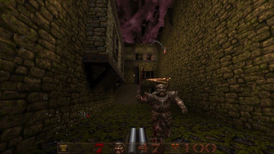
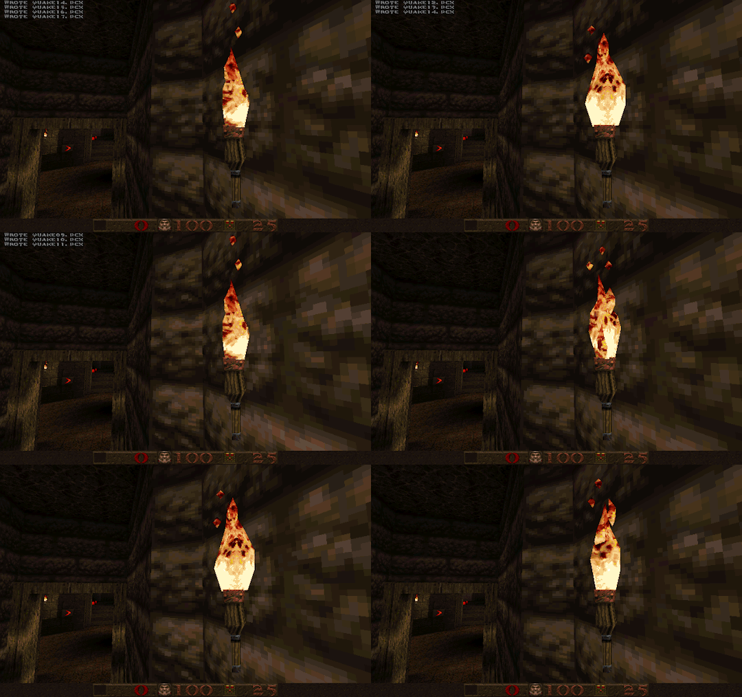
Quake 1 is a perfect example of CD-3D style, often undeservingly forgot in discussions about this style.
But this makes us forget that the textures were often authored with texture filtering in mind. Careful step gradienting to make textures seem smoother after being filtered is a craft in itself.
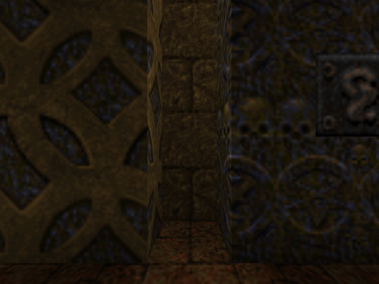
Texture filtering is not bad in itself, some games look better without it these days, because of the display resolutions, but it’s still a valid tool to apply, it can help push low-res texture a bit higher and produce a softening effect make those 4 pixels into a round circle or improve a visual effect.
Of course, some games took a deliberate approach of avoiding smudged look, like Megaman Legends, for example.
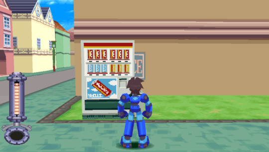
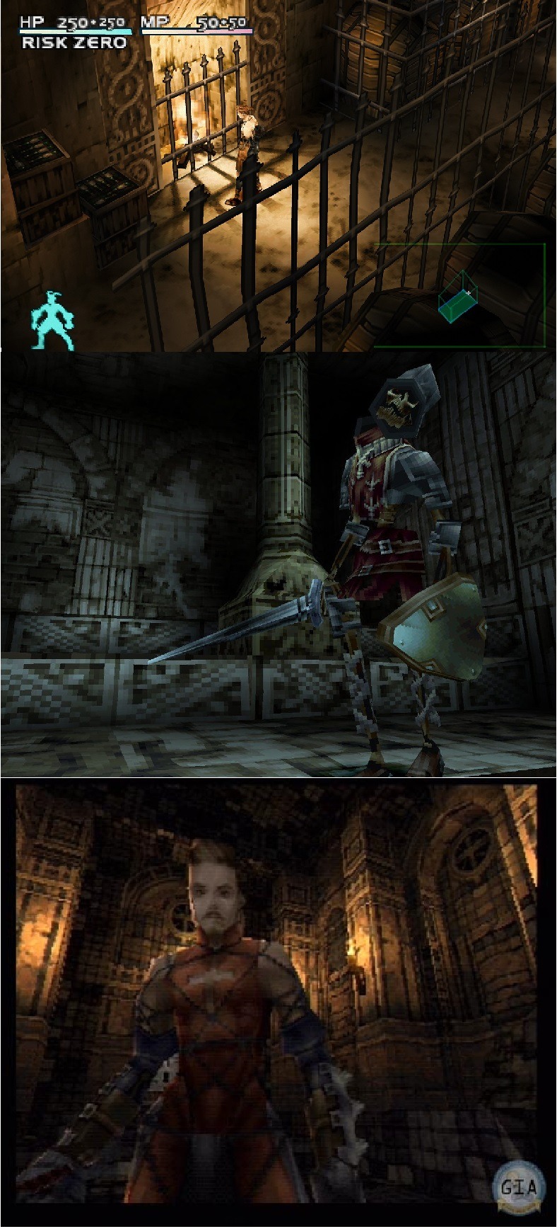
Via a very deliberate texture economy and unwrapping the developers were able to produce very crisp and pixel perfect textures (slightly warped by the infamous PS1 rendering), that look absolutely astounding when you render the game in a modern resolution. Pixel-aware UV Unwrapping, is being used in most games that are considered the pinnacle of CD-3D style, this technique is so powerful, that it was used to great effect in PS2 era games, PSP games and even modern games like Guilty Gear (for a different effect though). Let’s take a closer look,
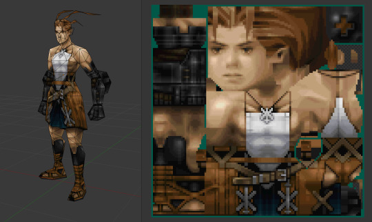
As you can see, our character is unwrapped in square pieces in such a way that a straight line on a texture will produce a straight line on a model. While Vagrant Story is an absolutely perfect in execution of this technique, it’s also used in a same way in Megaman Legends
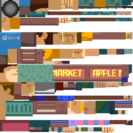
While I couldn’t find a reliable tool that works with modern 3D modeling software to allow pixel perfect alignment, just using a UV Checker will produce great results. This method also requires some thought put into your topology before unwrapping, but it’s strong point is that you can make changes into your unwrapping and geometry easily, making little tugs won’t break the whole thing.
As you can also note, Vagrant Story textures are authored in a single atlas, while Metal Gear Solid separates this atlas into smaller chunks like this:

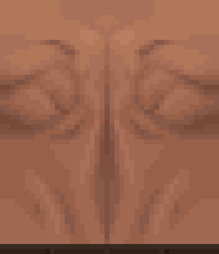
Allowing for easier unwrapping, since you can unwrap into the full UV space and then change the size of the texture to scale your results. The other important thing is that you probably want your characters in a T-pose when you’re unwrapping, since this allows for easier use of normal based unwrapping, considering your model would be authored with 4 to 8 sides for limbs and torso it could be box unwrapped and then tweaked for optimal results.
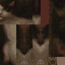
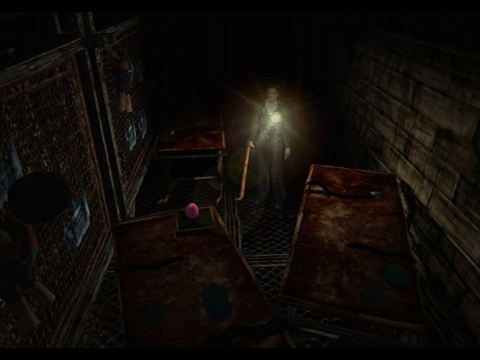
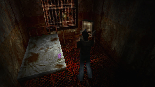
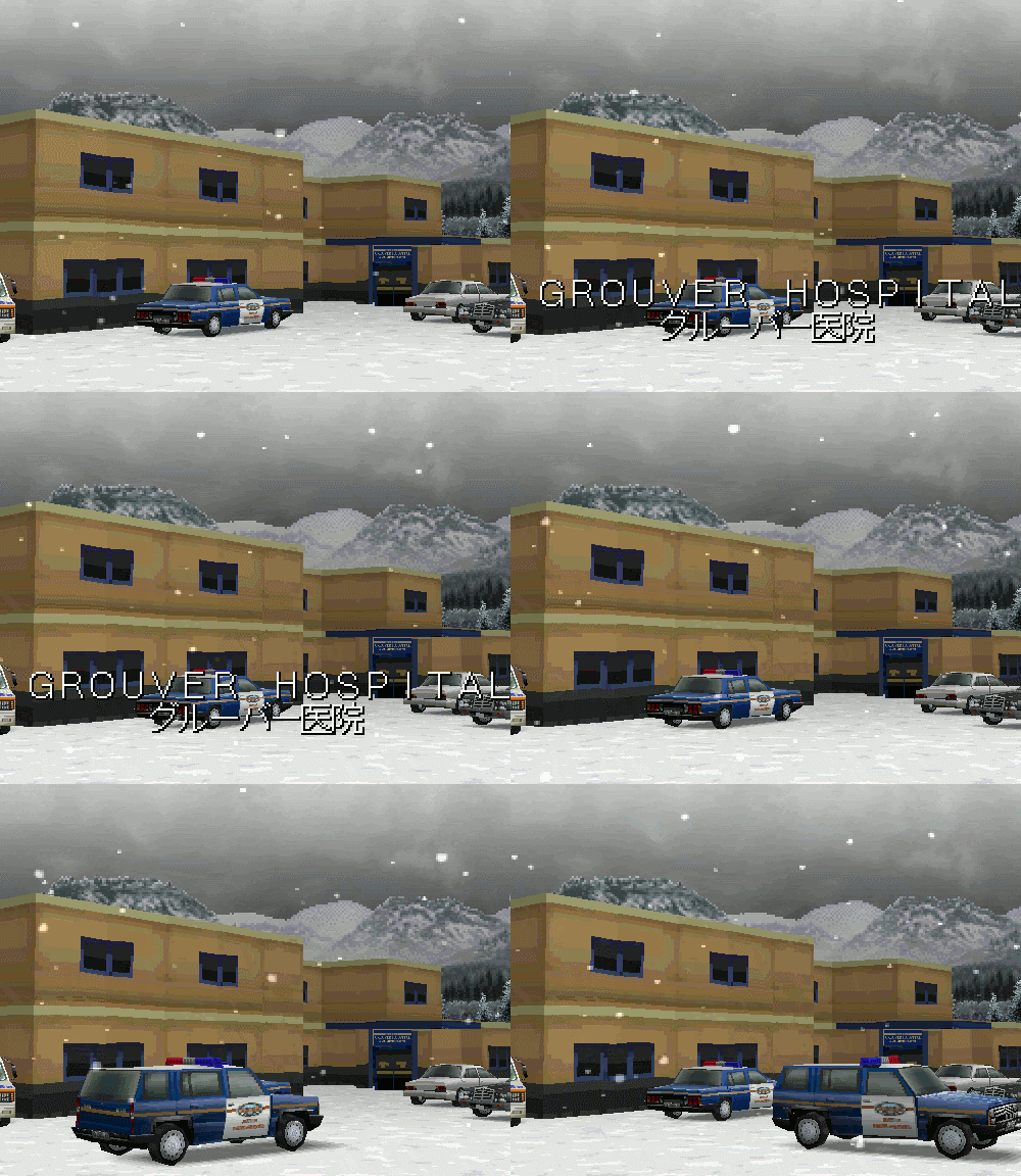
Silent Hill 1 used the same technique, and is also regarded as one of the best looking PS1 games.
While this is the best practice for this kind of look, it’s absolutely not required, Quake 1 used a really loose flat unwrap:
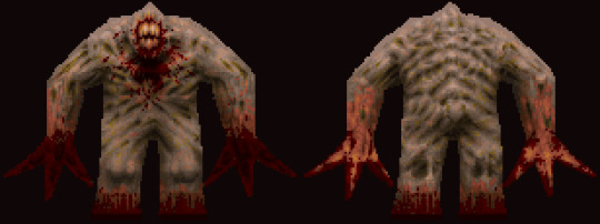
But it’s still looks bloody amazing in the end.
While the topic of using UV Unwrapping for crisper result is endless I’d also love to bring your attention to a certain Jet Set game
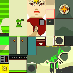
It also uses the same technique as Megaman Legends, but it tops it off with some cel-shading, producing crisp, stylish and iconic look.
Here’s some technicalities: Character textures are usually 256x256 for main characters, 128x128 for other characters, character usually have ~100-120 colors per full atlas. MGS breaks down the atlas into chunks so each chunks is usually 8 colors. So when authoring textures, make us of Indexed Color image mode or Save for Web.
Now let’s move from character textures to
World textures
Universally regarded as best looking CD-3D games share the same trait, not only the characters look amazing, but the environments too. Despite hard limitations, the environments look very much affected by lighting. A lot of the times this is achieved with this one simple trick that was only improved with modern technology. That is, a lot of the lighting is baked into the textures
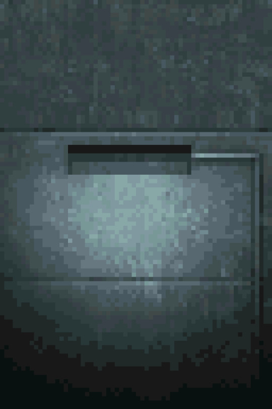
While this limits you on the amount of lighting scenarios or makes you produce more same-ish assets this certainly elevates the look. While nowadays baked lighting is not something that exciting, it’s also being done on a separate “layer”, so there’s no need to make a separate texture for every lighting scenario, however the resolution of a lightmap should not be higher than your texture, to not produce a cheap and uncanny effect. You still want to bake some fake lighting into your texture, which contradicts the rules of PBR, but since you’re not using normal maps, rules of PBR should not apply in the same way.
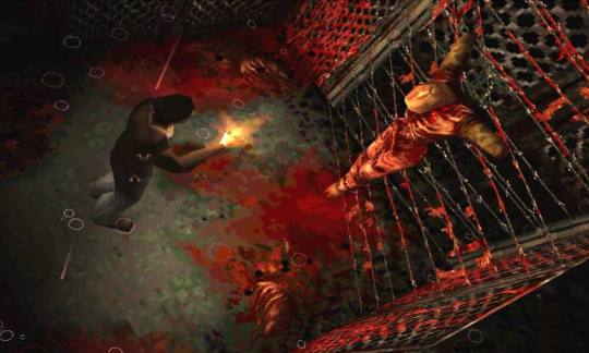
The other important tool to use, is the one we’ve talked about, that is, Vertex Color. Vagrant Story uses to great effect, while it’s environment textures don’t have lights baked, they use vertex color extensively to create a variety of moods and lighting scenarios.

Using best texturing practice, Vertex Color and making sure your lightmaps are matching resolution to your textures will produce the best results.
Now let’s talk why I don’t advise using a lot of normal maps for this style. The simple answer, it’s somewhat difficult to produce a normal map that will work with an unfiltered look, but it’s somewhat manageable to do it if you’re using texture filtering. The issue arises when you try make your normal maps unfiltered, this will make your result either a mess or a bunch of visual noise. If you’re trying to make sharp pixel-perfect textures and then will try to make normal maps to match you’ll get very harsh results. The only way I can see it working somewhat nice is to make a normal map that’s less detailed and then use it texture filtered to give some volume to your objects, while not trying to chase pixel details.
The suggested method is to do a rough sculpt -> bake it down -> use ambient occlusion and other masks to author a texture map with more details. Then use a detailed texture and less detailed normal map for optimal result.
As a closing thought, let’s talk about the
Meshes
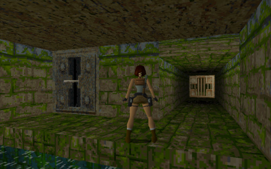
A lot of the time you can visually trace the wireframe of things, this makes it easy to pin the style as “low-poly”, but how lowpoly it really is?
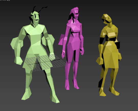
Characters in Vagrant story average 500 triangles per character. Characters in MGS go from ~450 for minor characters to ~650 for major characters. So 500-600 triangles is a solid baseline for a main character in a third person game.
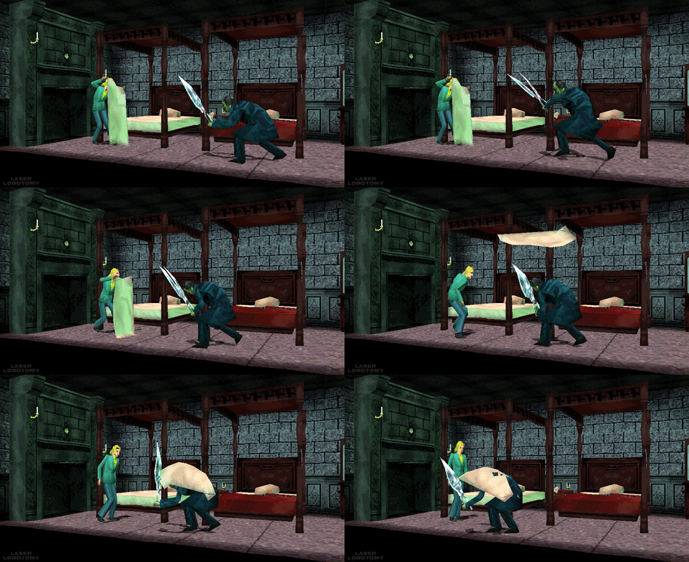
This limit brings out some great restriction for every aspiring 3D artist. You have to know your limb deformation techniques (search-engine “Limb Topology” and browse around the polycount wiki to find some great examples and deformation ready examples), but as you might’ve noticed, some games decided to not wrestle with skinning and deformation and straight up detached the limbs or even made their characters out of chunks. This is perfectly noticebla if you compare the OG Grim Fandango and the remaster, where they botched the shading and you can see the bits in all of their glory.
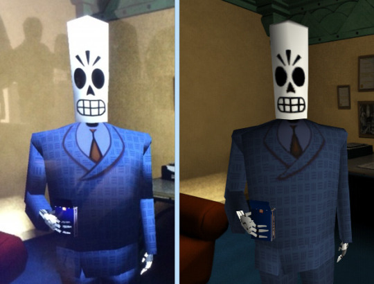
Another easy example is Metal Gear Solid. Characters arms are separate from their torse, but this is covered with other geometry or they’re of the same color and shaded closely.

This way of doing it was used in a number of other games and allows for unlimited range of motion, while not looking weird.
It’s easy to fall into the trap of adding more triangles and loops, but if you’ll follow the rule of “if it doesn’t add to the silhouette, you don’t need it”, you’ll keep to the style. Zoom out often and if an edge doesn’t add anything from the distance and is not critical to the deformation in a character, you really don’t need it.
These principles are so solid they’ve been alive for decades, in fact, one of the best looking PSP games “Peace Walker” sticks to these principles very closely, for example this soldier is just around 1500 triangles
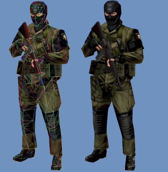
Spilling out of the “low-poly” territory it’s still made with the same economy principles used in CD-3D style, making use of every bit of texture and every triangle available.
Here’s another game of Metal Gear variety, Metal Gear Solid 2 is a direct heir to the design philosophy of MGS1, perfectly pixel-aligned unwraps allow for crisp detailing:
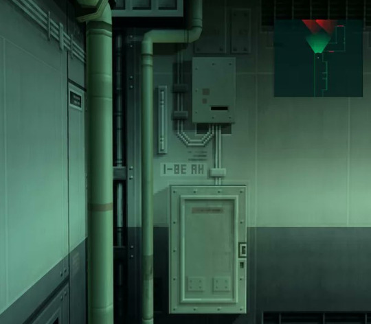
Another honorable mention goes to Animal Crossing on Nintendo 64
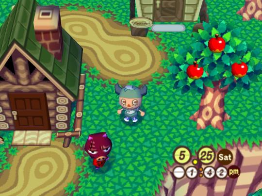
Animal Crossing combines meshes and sprites masterfully, uses pixel-aligned UV unwraps and makes up their own trick when creating landscape.
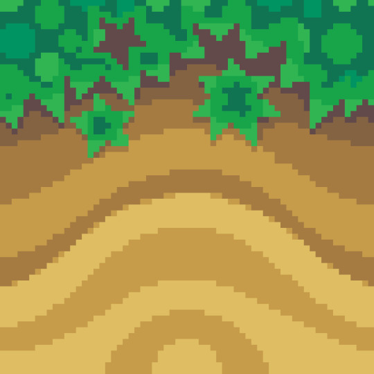
By unwrapping the repeating texture on each triangle of a hexagon they create these smooth patches of sand without the need for big or unique textures. It’s only 64x64 and 9 colors, but the mileage you can get out of it is insane!
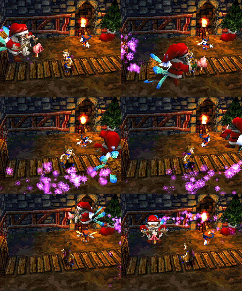
And this honestly sums up the CD-3D style perfectly, it’s the style governed by economy. There’s no need for insane textures for sharp lines, and millions of colors for smooth gradients. Now of course all of these are not rules, but recommendations, you can certainly bend the rules and improve on some aspects. Before we go, here’s some more pictures to get you inspired.
#playstation#psx games#psx#nintendo 64#low poly#3d#retro aesthetic#pixelated#gamedev#dreamcast#cd3d#retro
6K notes
·
View notes
Text
How to make that one type of image/meme where it's like a text based RPG and has green text- Or, How to make a Zorkpost
This is gonna be a long (but still pretty basic guide) on how to make a zorkpost, with an example below. I'm approaching this as a beginner introduction to using phtoediting programs, in this case a photoshop rip-off, https://www.photopea.com/ Before we start, this is the type of image/meme I'm talking about.

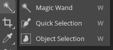
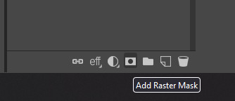
1.Hit "new project", here you'll define the size of the image. I'd recommend either a 1080x1080 square, or a slightly taller, 1080x1400, but the specific length and width is up to what you want to make. Also set the default background color to black, this'll just make it easier than adding a black background manually. Once you've done this, hit create. 2. It's a good idea to start with the image you'll be using as the focalpoint of the zork, paste the image into the project, and resize it as you see fit. You want enough space for some flavor text and ample space for the "actions" segment of the image. You may also want to paste a reference zork into a corner that you can use for reference. 3. Cropping, this one is important. The image you chose to be the focus of the zork will likely need to be cropped, either to get rid of the background, or to remove other unwanted parts of the original image. HOLD ALT TO ZOOM IN AND OUT/HOLD CONTROL TO MOVE LEFT AND RIGHT USING SCROLLWHEEL 3.1 If the desired part of the image is distinct from the unwanted sections, use the object select tool. You can find this by right clicking on the magic wand icon (see image A). Once you have the object select too activated, drag over what you want to be selected, the cross should be right over the desired selection. You may need to do this multiple times to select all of the segments you want, hold shift in order to add to the selection, otherwise it will discard the prvious selection and only have the new one. Make sure you have the desired segments of the image selected, you can see what is selected by seeing what is in the dotted shape. 3.2 The other method for cropping is the manual lasso select tool. This can be found by simply clicking on the symbol or by hitting "L". This is useful if the desired selection is not distinct from the background, or if you want to get a very prescice selection...... 3.2 Continued...Again, hold shift to add selections together. You can use object select to get the majority of the image selection, and then use lasso select to get the finer parts which the object select tool struggles to get. HOLD SHIFT TO ADD TO YOUR CURRENT SELECTION/HOLD ALT TO SUBTRACT FROM YOUR CURRENT SELECTION 3.3 Once you have a selection you're comfortable with, hit the "add raster mask button" (see image B), this will hide all parts of the image not selected. If the edges seem to jagged you can try to instead use the "refine edge" button (see image C). This will open a menu. The important parts to look at are where it says border, and new layer on the top segment of the menu. The number box next to "border" is the amount of pixels it will include to make the edge less jagged, for most you want either 1 to 3 no higher. Click where it says "new layer", change it to raster mask. This will allow you to adjust the cropping later on if you wish to. Finally, hit OK once you have the desired settings.
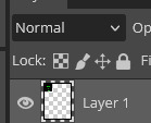
4. Now, we'll start creating the color filters. The characteristic green overlay can be done in a few ways, I'll go over what I think is the simplest method. Hit new layer, found on the bottom right side of the program (see image D). The new layer should be above the main image you cropped. Once you have it created and selected, use the eyedropper tool to grab the green from your reference image, or choose your own green. To do this click the color picker tool at the bottom of the tools list (see image E). Once you have the color, use the brush tool (shortcut is "B") to make and paint over the image, it does not have to be even remotely precise, as long as it's covering all parts of the image. Next, you will need to change the blending technique of the layer. This dictate how the color is applied from the current layer, to the layers below it. Click where it says "normal" on the top of the stack of layers (see image F). Now you can choose from several blending methods. The blending techniques of "Overlay" and "Color" generally are what are best suited for the zork image style, although "Soft light" works too. If the color is too intense, you can adjust the opacity of the color layer next to where you changed the blending method. 5. Often zork images will use a slight pixelation on the central image, I'll explain how to apply this to your own image of choice. Select the layer of the image (not the color) and click filter, on the top list of tools on the top of the program (see image G). Once you have this menu open, hover over the section labelled "Pixelate". Next click the tool called "Mosaic". This will open the window you will use to pixelate the layer. This menu is pretty simple, cell size is how large each segment is, larger cell size means less detail and a more chunky end result. Depending on your vision and the image you are using, you can adjust to your liking. I'd recommend a cell size of 4 to 14. When you have a cell size you like, hit OK to apply it.
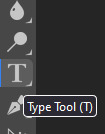
6. Now for the text of your zork. Click the text box tool found on on the left side of the program screen (see image H). While there are many fonts that are preloaded into photopea, there are only a handful of pixel based fonts. To filter by pixel fonts, click where it says "DejaVu Sans" at the top left of the program screen, then click on the button with three lines on it on the right side of the menu. (see image I) Click the checkmarked box for "All" in the submenu, then scroll down and click the box for the "Pixel section". I'd recommend the font "VT323". Since the background is black you won't be able to see the text you are typing, to change the color highlight the text in the box. Then, on the top of your screen, click the color select menu (see image J), once you have this open you can choose any color you prefer, or you can use the eyedropper tool to select a color from your reference zork. (edited) 6.1 You may want to import fonts into the program to use. To do this, download the desired font, then open the font select menu and hit the button labelled "load font". Simply find the file and hit open. If it loaded successfully it should say the font name loaded in the program. To finally apply the font to your text, open the font menu once again and type the font name in the search menu. CHECK THE BOXES FOR AUTO-SELECT AND TRANSFORM CONTROLS AT THE TOP OF THE PROGRAM SCREEN (you should make sure these are checked every time from the start of the project) ((see image K)) 6.2 To resize the text or any image layer, simple drag on one of the corners of the layer if you don't see the box outlining the layer, make sure you have the layer selected, and have transform controls on). By default it will maintain the image size ratio, if for some reason you don't want this, hold shift while you drag. This should be the extent that you need to know about text in photopea, but there are many more options should you not be satisfied, ask if you'd like an overview. 7. We are nearing the end. Here I'll explain how to do the little lines both for outlining the border of the image, as well as for the "actions" menu you will likely include. 7.1 First, the border outline. To do this, doubly click the background layer to open the "layering style" menu (see image L). If you only opened the option to rename the layer, double click a little further to the right of the layer name. With this menu, click "stroke". Where it says "position" change it from outside, to inside. Then, choose the desired border color at the bottom of the stroke menu options. You can adjust the thickness of the outline with the size option at the top of this menu. Once you have something you like, hit OK. 7.2 I will explain the basics of the pen tool for any lines you may want to include. First select the pen tool on the left side of the program screen (below the text box tool). Then, at the top of your program screen, change the fill type from a solid color, to the icon with the white box with an "x" over it (see image M). Next to where it says fill, change the stroke color to a color you'd want for the line (generally the same color as the text), once again you can use the eyedropper tool once you have the color picker menu open. I recommend increasing the thickness of the line before you start, as the default 1 pixel thickness makes it hard to see the lines you are creating, around 10 pixels should be fine for now.
7.3 Make sure you are creating a new layer for this, on top of the background, otherwise it will be hidden by the background. Now, click where you want the line/shape to start. You have just created an anchor point, anchoring this line in the fabric of reality which is the editing program. From here, I recommend you work downward. Hold shift to make straight lines and perfect angles. The pen tool is very versatile, but I'd strongly recommend sticking to only using shift to make lines as making curved lines takes some amount of practice. Once you have one side of the line done, switch to the default move and select tool (shortcut "V"). You can right click on the layer in the layer list to duplicate it. In addition, if you have the layer selected, you can left click, then right click on the sizing border of the layer to rotate in any way you like. (see image N). You may need to zoom in on the line to be able to move it by dragging your mouse. You can adjust the thickness of the line after you have finished the shape by selecting the tool under the pen tool and right clicking, the tool is called "Direct select". With this you can move the anchor points, and adjust the thickness. This covers all the tools needed to create your zork image. Finally, I'll be going over exporting your project. 8. Once you are satisfied with your project, hit file, on the top left of the program. Next, hover over "export as" and select the preferred file format. I'd recommend jpeg to achieve the crunchy look and feel that is characteristic of the zork image. Click on the desired file format to open the export menu. Here you can change the name of the project, and and the file format. You can also see a preview of what your project will look like once exported. Use scrollwheel to zoom in and out. To get the image to look "crunchy" decrease the quality of the image. If there is not much in the project, decreasing the quality will not have much effect. Keep in mind that decreasing the quality under the PNG format will not achieve the crunchy feel. Lastly, hit save once you are satisfied, and you have now downloaded your project. If you wish to save your progress without merging all the files together, click file, and hit save as PSD. Load this PSD file into the program next time you want to work on it, it will preserve each layer individually. Now for the image directory:
A:
B:
C:

D:

E:

F:
G:

H:
I:
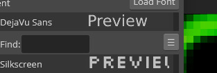
J:

K:

L:

M:

N:

Congratulations if you made it through this long guide. Now, you should have all the tools to create your very own zorkpost.
4 notes
·
View notes
Photo

so i do a lot of shading like this in my art (or try to) and i asked if anyone in my discord server wanted a tutorial.... and they said yes!
so im gonna do my best to explain how i shade things under the cut....
(i use clip studio paint but honestly this should work in any art program i think)

1. FIRST- have your drawing. have Layer. I usually have three layers at LEAST when im doing this- and i keep them stacked in this order: top is lineart, middle is flat colors, and bottom is the background.
the purple circle shows the icon for making a layer into a clipping layer- IMPORTANT
the pink circle shows the icon for locking transparent pixels- helpful! it makes sure you don’t “go outside the lines”

(in case you’re curious this is my csp layout)
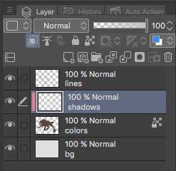
2. create a new layer above your flat colors, and press the two little squares. this makes a clipping layer! it basically makes a mask of the layer below it, and you can draw whatever (in this case shadows) and it only follows the filled in areas of the layer below it. so if i drew a bunch of yellow stripes on the clipping/shadow layer, it would only follow the form of the werewolf flat colors and not anything else. i hope that makes sense!
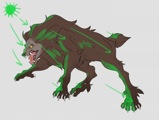
3. decide where your light source is coming from! ngl i totally draw a little sun to remind myself where the light is coming from in a piece.... in this case the green shows where i think the light would be hitting the werewolf, and therefore i would draw shadows opposite/adjacent to that. im not the best at explaining lighting though, so heres a good reference.
heres another.

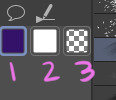
4. SHADING TIME..... so for my shading i just use the default pen tool in clip studio. g-pen, i believe. Stabilisation!!! between the two pink stars!!! use it. its so good for lineart, and for drawing smooth, non trash lines and shapes. it has Saved my life. the higher the number, the ‘slower’ your brush moves, and the smoother your lines become. i tend to keep mine around 60-70 but play around with it....
i usually shade with a bright annoying color so i can tell what im doing. (purple usually), as shown in box one. thats your foreground color. 2 is your secondary (background) color, i dont usually mess with it and leave it white. hitting box three turns your current pen into an eraser version of itself... i use it a lot! dont forget about this box

i usually tend to think of shadows as shapes.... in the werewolf’s eyebrow/spot/thing you can see where ive drawn a line.....
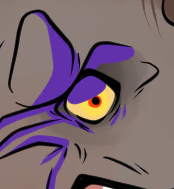
and then filled it in! i dont normally use the paint bucket to fill in areas... just the pen. it gets too hard
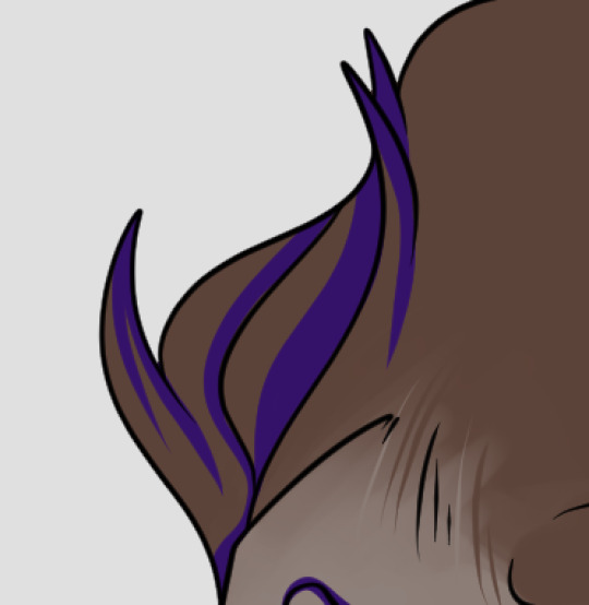
hair/tufts are the fun part!!! you can see that ive drawn solid chunks of shadow in the werewolf’s mane....

...then i click square three to turn my brush into an eraser and carve out little details

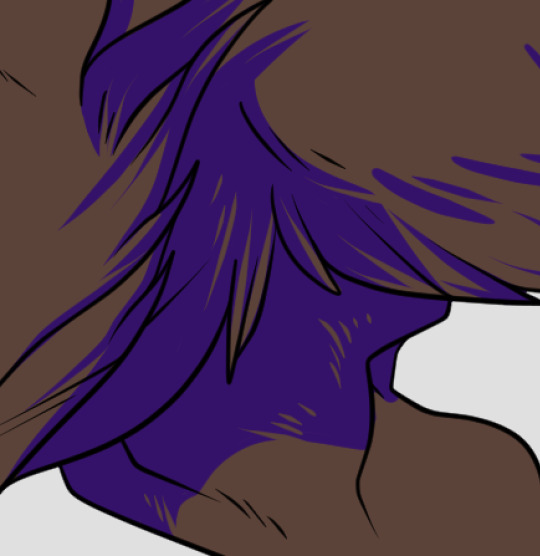

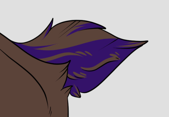
here are some more examples of that... i use it a lot. A LOT.
go wild. go crazy. sometimes i dont think my shading follows like TRADITIONAL physical rules of the laws of light but just. dewit

5. SO YOURE DONE SHADING..... if you refer back to your Layers window, you’ll see a drop down box that usually says normal and a slider.... knock that slider down to like. 50, or 30 (what i usually do). this lowers the opacity on the shadows layer so you can see through it kinda. the drop down box is the layer styles... play around with it!! you can do some really cool stuff with overlay/multiply/etc and make your shading layer super funky.....
if you hit the lock transparent pixels button, you can color your shadows differently if you want! sometimes ill duplicate the shadow layer and color it differently and run it through the gaussian blur filter... it can make it look a little softer and less hard.
usually in my art, when im done i merge all the layers together so you just have one layer left. i duplicate that layer, run it through the gaussian blur filter and drop the opacity down to like.... 20 maybe so everything looks soft. on this picture, i duplicated the werewolf layer (without the bg) and did a motion blur on it to make it look like he was moving....

.... and here he is after dropping the shadow opacity/adding other little details and running it through 5000 filters
i really hope that gave you some kind of idea on how cel shading works!! i am by no means the master, but if you have questions or tips please don’t hesitate to ask me ;a; im really not good at explaining things lol
thank you for reading!!! <3
30 notes
·
View notes
Note
how did you do the effect with the text and the blur here? /post/625484146810224640/invisible-string-taylor-swift
hey! unfortunately i don't have the original files saved for that edit (this one) as i've had a laptop change since then but i'll walk you through another gif of that effect. to make this:

first step is to make a gif like usual. color it, sharpen it, set the delay time, etc. and then save the gif. open the gif again. i personally find it cleaner to work that way instead of doing everything on one canvas from the start.
currently, i have my main background gif:

i'm using timeline for this next step. so you convert to it (click the four little lines on the frame animation, then 'convert to timeline') and then do 'convert for smart filters' from the 'filters' tab to make it easier to work with all the frames. set your font and text. mine looks like this right now

at this point, in my original set, i used the same gif for the background and for the font. if you'd like to do that, you can duplicate the gif layer in your layers panel. for this gif, i'm using another scene. for that, open another canvas, make the gif, color it, sharpen it, etc. i used the same dimension as the first gif. and save it. make sure it has the same # of frames as the first gif!
open that gif, and again, convert to timeline and smart filters. then click and drag that layer onto your first gif canvas and have it above your text in your layers panel. use the transform controls to make the gif small and to just cover the text. like this

now, add a layer mask on your text layer. the icon for it will look like a square with a circle within it. then, hold down the 'alt' key and hover your mouse between the text layer and the 2nd gif layer. you'll see an icon appear as your cursor, click it, and your 2nd gif will be within the text.

my layers panel currently looks like this

now, to add blur on the background gif, have it selected in the layers panel, then go to 'filter' tab, 'sharpen', then pick 'gaussian blur.' you can choose how much you'd like to blur it. i don't remember my original settings but this time, i did 2.0 pixels. which makes my gif now look like this:

i want the text to stand out more so i add a white outer glow with opacity 100% and add a black drop shadow of 75% which results in my final gif and layers panel looking like this!

make sure, once you've saved the gif, you reopen it and adjust the frame delay rate to your liking as photoshop automatically changes it once you covert to timeline!
15 notes
·
View notes