#Photo of a spacious master bedroom with a light wood ceiling and walls in a mountain style log home
Explore tagged Tumblr posts
Photo
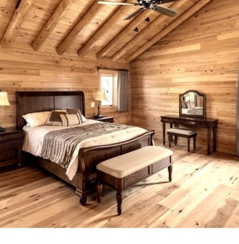
Bedroom - Rustic Bedroom
#Photo of a spacious master bedroom with a light wood ceiling and walls in a mountain style log home#rustic wood#vaulted ceilings#exposed wood beams#mountain home#rustic bedroom
4 notes
·
View notes
Photo

Kansas City Master Photo of a spacious, minimalist master bedroom with a light wood floor and a vaulted ceiling and white walls
0 notes
Photo

Kansas City Master Bedroom Photo of a spacious, minimalist master bedroom with a light wood floor and a vaulted ceiling and white walls
1 note
·
View note
Text
Dad?

Reblog from Takeover Tales
I spent the weekend with my dad’s who had grown a lot since I last saw him. Isn’t he the one who is supposed to tell me that? His body mass was much larger and now he looked like he could kick my ass while sitting. It didn’t bother me, I kind of liked it. You see, my parents got a divorce after my dad started acting a little strange and that was about three years go. I hadn’t seen him since. It’s almost as if he appeared out of nowhere after disappearing out of my life.
My mother dropped me off outside, failing to build up enough courage from the drive to come in and at least say hello. I didn’t blame her, she had been through a lot and I wasn’t going to give her any more shit than she deserved. That was very little. I stood outside with my bag hung over my shoulder and my book bag leaning against my leg. I pulled the strap over my body and walked right up to the door. Without hesitation, the door opened and I was greeted by a bear of a man. This was my father.
“Dad?” I asked, he looked nothing like he used to but I could still see it in his face. I think it was the nose because it was the same as mine.
“Yeah. I would hope so. Look at you! Man do we have some catching up.” He grabbed my bags and then placed them on the sofa. Beyond the foyer we passed an office with an executives desk placed in the center and an apple computer’s apple light glowing in the dark. I could make out various office items such as books leaning against each other underneath a lamp and a cup filled with mechanical pencils, each one with a brand new eraser. To the right there was the door that lead to the garage. As we moved along we reached a hallways leading to the guest bedroom which belonged to me for the weekend and the guest bathroom at the end which was beach themed with bowls of shells on shelves and sand dollar soaps. We reached the kitchen and living room combo after the hallway and the roof grew immensely, a giant fan centering the ceiling. The marble counter tops reflected the light from the center of the fan and there were pots and pans filled with the meal for the evening. In the living are, two sofas faced each other with a table in the center, a vase with orange flowers was a nice addition. On the wall was an abstract orange painting with streaks of paint thrown across the canvas. The dining room matched the dark wood of the kitchen cabinets and down the center was a fabric accent with orange stripes and on top of it was a bowl or oranges. Behind the table was the view of the backyard with its green grass and carefully placed lawn chairs. The master bedroom wasn’t for my eyes.
“It smells great!” I let the aroma of the spinach and cheese pasta fill my nose as he pulled it off. The Asiago cheese was gooey as he set the table and the sound of water pouring into my glass made me smile.
“So, how have you been. I know that the last time I saw you we weren’t really on good terms.” He took a sip of water before placing a piece of ravioli in his mouth, a single strand of cheese stretching from plate to lips.
“Well, you weren’t on good terms with mom but I’ve been busy. I got into Yale and I will be going this fall.” I sipped to the accomplishments.
“Yale? Wow. When I was al…well, I’m proud of you.” He smiled. It was still odd seeing his face work since it was a bit rounder. His skin moved differently.
“I’m also gay.” I tried to avoid eye contact as I put a ravioli in my mouth. If he yelled at me it would give me something to do while I listened. In fact, I would have just chewed it and ignored his torment.
“Interesting.” He smiled.
“Yeah.” I gulped down the cheese and looked at him. He wasn’t going to yell or maybe I had spoken too soon?
“You aren’t going to be treated differently.” He said. I found out that weekend was that what he really meant was: “I’m not going to beat you or scream like other dads but that doesn’t mean I won’t do other things.”
I was in bed when I heard the whispers. We had just finished watching a movie together and as the credits rolled past I yawned, cuing us to sleep. I followed the whispers past the kitchen with its spacious cooking area and the dining room with its orange accents and to the crack in the master bedroom door. There was a perfect view of the bed which had my father sprawled out on top of it. His cock was erect and flowing out from it was a white cloud, coming together just above his body. My dad’s back was arched as this white mist flew out of him and then he fell back onto the comforter as it started to turn into what looked like a human being. Then the guess was confirmed, floating above my father was the ghostly form of a burly man.
“Man, I can’t wait to screw your son. I Just have to figure out how to let him let me.” He was talking to himself as he floated around the room. My father snored on the bed and rolled to get comfortable. “Oh no you don’t.” He shoved himself back into my father’s erect cock, causing him to arch his back once more. His hands wrapped themselves up in the blankets as he grabbed them, moaning and writhing as this spirit took his body. He took control quickly, I could tell from the way he looked at his hands. “Man, you’re one hot fucking catch. Three years of shaping you to be the perfect host and now you fit like a glove.” He patted his stomach and then rolled over. I waited quietly trying to listen to him and then I heard his snoring and took that as a reason to leave.
The following morning I received a text in my phone, the vibrations on the wood causing me to wake up. I groggily looked at the photo and it was my father. He was only wearing underwear and had his arm above his head. He was posing for me. For a second I almost passed off the previous night as a dream but the moment I saw the picture I knew that he wasn’t my dad. He quickly came into my room to apologize for that and made up this story about how it was supposed to go to someone he had been dating or whatever but I saw right through that bullshit.
“You can stop acting. I know it’s not you in there.”
“What?”
“I know you’re a ghost or something.” I could see his cock pressing against the inside of his pajama pants and then I felt my own beginning to grow.
“I have no idea what you’re talking about.”
“You can pretend all you want but I saw you last night. Not you my dad but the you that can float in and out of his body. ‘Like a glove’ is what you said, I think.” I was desperately trying to hide my boner from him.
“Aha. You sneaky bastard. I knew I liked you the moment I saw you.” He sat down on the bed and I moved over to make room.
“So, what do you want?” I asked.
“I’ve gotten everything I wanted. I’m living again and your dad is the perfect body. You think so too.” He reached over and touched the tenting blanket. I tried to pull away but he grabbed it and I cringed. It felt good.
“Stop.”
“You like it. If you didn’t you wouldn’t have popped one the moment you saw me.”
“I don’t think that’s how that works.”
“C’mon, son. You want it.” He had started crawling over me, his heavy body causing the bed to have an even bigger indention. I could feel the heat of his own cock and he pushed himself against me, his bulge rubbing against my own. He repeated this and then lowered his face to mine, kissing me passionately. I didn’t refuse and instead of pushing him away I reached up and pulled him in. He ripped off the blanket and pulled off everything that I was wearing, almost ripping it because of his strength. It was easy for my to push off his bottoms with my leg and I felt his massive meat land just above my own. I chuckled as he smiled and then he forcibly flipped me over. I used the pillow to muffle my screams as he plowed me with his rod, slamming me into the headboard as he penetrated my hole. He rhythimcally fucked me in the guest bedroom and he grabbed my hair like he was riding me like an animal. I grabbed at the pillow pressing it harder and harder, biting into the cotton to keep me from screaming. It felt amazing as he rammed me with his cock and out of the combination of happiness and pain, a tear dropped onto the pillow case.
“Oh fuck YES!” I screamed finally. I couldn’t hold it any longer.
“Your hole is so tight it feels fucking amazing.” He grunted and I tightened just to milk it out of him. I moaned as I started to push myself away from the headboard to keep myself from hitting it and I could feel his pulsating cock being to blow. He filled me up with his sweet fluid and let out a roar as he came. The thrusts slowed down and eventually he pulled out. I rolled over and curled up into him, his hairy body laid out before me. I circled his nipple with my finger and he used his arm to bring me in for a kiss. We laid there blissfully and I almost wanted to smoke a cigarette like most people do in the movies but instead, I kissed him this time.
“You can keep my dad. I wasn’t a big fan of him before anyways. I was too scared to come out of the closet and he were in control he probably would have kicked my ass.”
“If it makes you feel any better he would have. I could feel it.” He tapped his forehead.
“It does make me feel better.” I curled back up into him and I didn’t want this weekend to end.
Well, it did. Yale was coming up and I wasn’t going to be seeing my dad as often so I was going to have to fill up the rest of the summer with him. My mom didn’t mind and my dad definitely didn’t mind.
374 notes
·
View notes
Text
The Ranch in Orlando, Florida
The Ranch, Orlando House, Florida Real Estate, American Luxury Architecture Interior, Images
The Ranch in Orlando
Aug 31, 2020
The Ranch in Florida
Architects: VSHD Design
Location: Orlando, Florida, USA
Tuscan Transformation: Dubai-based VSHD Design expands its international portfolio with the completion of their first U.S. residential project – The Ranch
VSHD Design, a Dubai-based interior architecture firm specializing in residential and commercial projects, is proud to unveil a luxurious residential design within the Four Seasons Orlando Resort in Florida. With 22,000 sq. ft. this project marks the first residential undertaking of the firm in the United States.
“From the onset, we realized that we were facing numerous challenges with this project,” notes Rania Hamed, interior architect and founder of VSHD Design. “In addition to strict regional building and environmental codes, there were requirements imposed by Four Seasons Resorts to ensure that the residence blended stylistically with its neighboring properties.”
A modern Tuscan approach In approaching the external Tuscan theme exhibited by homes within the exclusive development, the challenge was to maintain some existing structural elements, while delivering on the client’s vision of a modern home that would be luxurious, yet warm, comfortable, and ideal for entertaining guests. The client envisioned a sort of boutique-style hotel environment that would provide family and friends with privacy and luxurious amenities, even in the absence of its owners. To achieve that challenging balance, Hamed embarked on a mission to modernize the external Tuscan façade, while infusing contemporary luxury into the home’s interior to align with the client’s vision.
While Tuscan architecture in its purest form embraces natural, rustic elements, VSHD Design avoided abundant use of materials such as brick and wrought iron in lieu of a modern interpretation. Gray brick overhangs positioned above the external façade’s windows and passages pay homage to Tuscan influences. Black frames of expansive French windows, certified to hurricane standards, provide contemporary contrasts to the façade’s white walls, culminating in a modern Mediterranean style that adheres to the Four Seasons aesthetic requirements.
To complement the structural design, VSHD Design developed all of the home’s outdoor spaces, beginning with its swimming pool. European limestone tiles, stylistic planters, and luxurious sunbeds from the Italian design house, Gervasoni, provide the exterior spaces with an authentic Mediterranean look and feel.
Seamless transitions While the exterior exudes modern interpretations of mandated styles and standards, VSHD Design approached the interior of the house as somewhat of a blank canvas. Working with a timber structure, as opposed to concrete columns and beams, was a new experience, however, Hamed found inspiration in the challenge.
“I saw beauty in some of the original structural elements and I wanted to maintain as many of them as possible,” she explains. “I decided to leave some of the exposed beams intact, as opposed to hiding them behind a layer of gypsum.”
Exposed wooden beams reflecting the original structure’s integrity were maintained, with layers of dark stain and black metal trim added to provide a more industrial feel. Hamed also focused on ensuring seamless continuity between the home’s interior and exterior spaces. Upon entering the house, Carrara marble flooring carries the influences inward, where Tuscan-style arches define the separation of the home’s interior spaces, reinforced by clean, modern, and slightly protruding architraves. The architraves, composed of black matte stained oak, contrast with the interior’s white walls and light gray marble flooring, providing the home’s public areas with a very contemporary look and feel. In living spaces designed for more intimate experiences, Carrara marble flooring gives way to hardwood floors.
“Marble can have a bit of a cold feel to it, particularly when framed by white ceilings and walls,” explains Hamed. “We created a transition to hardwood floors to provide certain spaces, like the living room and the study, with a much warmer ambiance.”
Boutique-style accommodations The main floor houses the master bedroom, highlighted by a luxurious contemporary décor and direct access to the adjacent pool area and outdoor shower, designed as part of VSHD’s vision of an indoor/outdoor lifestyle. The master bedroom’s spa-inspired adjoining spaces include a freestanding bathtub as the centerpiece of a spacious bathroom that also features an individual toilet and shower cubicles. The bathtub is flanked by a wall of floor-to-ceiling French windows on one side and dual washbasins with custom-designed mirrors on the other. Completing the spa-like theme, a small spiral staircase leads to an upper-level gym area featuring a steam room and waterjet shower.
The spa-like feel and amenities extend to the home’s 6 upper-level guest suites, half of which offer private external access for guest stays while the owners are away. Each self-sufficient guest suite features a unique decorative style and is equipped with a mini kitchen, a small pantry, and a spa-inspired bathroom.
“The client’s brief focused on a concept where each room should have a completely different, yet thoroughly modern theme,” explains Hamed. “We incorporated Chinese, Spanish, and multiple other influences in order to provide each suite with its own distinct character and mood.”
The client’s vision of a boutique-style hotel extends to the home’s main dining room, inspired by Italian architect Ettore Sottsass. A ‘modern-retro’ black and white console from Italy contrasts against a wall panel of gold leaf wallpaper, bordered by marble. The panel’s adjacent walls are characterized by ribbed white paneling with a stained wood base, while a cloud lighting fixture from New York’s Apparatus Studio provides adds a celestial touch to the room.
Pièce de résistance In order to tie the interior spaces together, VSHD Design embarked on an ambitious plan to develop a new patio space at the center of the house to create stimulating visual links between multiple areas of the house. To separate the pool area from the patio, and to connect the master bedroom to the living spaces, the design team built an enclosed lanai with four expansive French windows on each side, which infuse the passage with natural light. The abundantly lit corridor is lined with wicker chairs, creating a fabulous reading room with the feel of an open space courtesy of pool views to the left, and patio views and greenery to the right. At the end of the passageway, a staircase to the left ascends to the second level of the home alongside floor-to-ceiling windows that overlook the patio and offer views of the lanai and other external spaces.
“By blending traditional elements with a modern contemporary mix, we succeeded in achieving a contrast that works well,” notes Rania Hamed. “We didn’t want that contrast to be too soft, so the use of black and white, with Carrera marble flooring, provides the home with a strong modern-vintage look.”
The Ranch, Orlando, FL – Building Information
Architects: VSHD Design Location: Orlando, FL, USA Area: 2200 sqm Lead Designer: Rania M Hamed
About VSHD Design Founded in Dubai in 2007 by interior architect, Rania Hamed, VSHD Design is a multiple award-winning interior architecture firm renowned for the style, functionality, quality, and attention to detail of its projects in Dubai, Abu Dhabi, Cairo, London, Amman, and Florida. The firm combines extraordinary talent and global experiences to create exceptional spaces that are as “cutting edge” or “timeless” as each client’s vision.
VSHD’s mission is to develop architectural and interior design experiences that are distinctive, compelling, and of superb quality. Infusing modesty and elegance into the transformation and repurposing of spaces, the firm has garnered international recognition for the beauty and subtle luxury of its projects.
Photographer: Koen Van Damme
The Ranch in Orlando images / information received 310820
Location: Orlando, Florida, USA
Orlando Architecture
Orlando International Airport South Terminal Complex, Florida Design: Fentress Architects image from architecture office Orlando International Airport Building
1600 Lakeside Residence, Audubon Park Design: Interstruct, Inc. photograph : Steven Allen 1600 Lakeside Residence in Audubon Park, Orlando
Guidewell Innovation Orlando, Lake Nona Medical City Design: Affiniti Architects & Marc Thee image from architects Guidewell Innovation Orlando Building
Citrus Bowl Stadium, Orlando Design: HOK Sport image : HOK Sport Orlando Venues Building
Florida Architecture
Grove at Grand BayBuildings, Miami Beach Design: BIG architects image from architects firm This sold-out development mark Bjarke Ingels’ first completed condominium design in the USA. The pair of twisting 20-story glass towers is helping to lead the rejuvenation of Coconut Grove’s business district.
Miami Marine Stadium Building Renovation photo : Rick Bravo
Georgia Architecture
Comments / photos for the The Ranch in Orlando page welcome
Website: Orlando
The post The Ranch in Orlando, Florida appeared first on e-architect.
1 note
·
View note
Text
Lazard Avenue is a project designed by Newsam Construction + Catlin Stothers Design and is located in Mont-Royal, Québec, Canada. Photography by Drew Hadley.
#gallery-0-6 { margin: auto; } #gallery-0-6 .gallery-item { float: left; margin-top: 10px; text-align: center; width: 25%; } #gallery-0-6 img { border: 2px solid #cfcfcf; } #gallery-0-6 .gallery-caption { margin-left: 0; } /* see gallery_shortcode() in wp-includes/media.php */
The option to downsize was not an option for the empty nesters who have resided in this home for over twenty-five years. Situated in a prestigious neighbourhood in Montreal, the sprawling residence has been the venue for many social events, dinner parties and family gatherings. With grandchildren on the way, the homeowners elected to embark on a renovation that included several rooms in the home. The objective was to inject a modern aesthetic into a new kitchen, library, master bedroom and en suite, while respecting the classic architectural details throughout the rest of the home.
The kitchen had been relocated to the garage in a previous renovation, which presented several design challenges. Low concrete ceilings, ventilation ducts and cinderblock walls required diligence in achieving a plan that would create the illusion of height and light. Sombre cabinetry from the previous kitchen gave way to a brighter palette of white and bleached butternut. White surface-mounted monopoints add architectural interest and juxtapose a sculptural suspension with an industrial influence, over the dining table. Concealed LED strips add ambient lighting for evenings.
Creating a highly efficient space for cooking and an atmosphere conducive to entertaining both large and intimate gatherings were the primary design criteria for the kitchen. The floor to ceiling matte white cabinetry conceal appliances and an abundance of storage, while providing contrast to the warm hues of the blonde wood. Handle free cabinetry maintains a minimal design while an integrated ash butcher block in the island allows two people to simultaneously prep meals.
Floating wood picture rails create a mini-gallery that enable the homeowners, avid art collectors, to easily display and interchange different pieces of art at various times.
Walls were relocated on the second-floor plan and reconfigured to include a library, spacious closets, and a luxurious en suite of dramatic proportions. The custom teak library leading into the master bedroom, stores a prolific collection of drawings and art books. To eliminate the feeling of separate rooms, all door openings were raised to full height and maximum widths.
The minimal design of the master bedroom marries old and new, and is anchored by white oak engineered floors. A shortage of closet space had previously forced the homeowners to use other bedroom closets for storage. Reclaiming a third of the library, created a spacious walk-in closet for her, and a generous wall of closets for him in the master bedroom.
Large white oak panels dominate the bedroom and wrap around the partition wall into the master en suite. Consistent materials create a visual flow and unify the two rooms as a single volume. The en suite is easily accessed from two entries, with full-height pocket doors providing privacy as needed.
Spacious yet intimate, the master en suite features materials selected for their respective organic compositions, which enhance an inviting atmosphere. Oversized porcelain tiles maintain classic characteristics in a modern format. The veining of each tile was scrutinized in advance of the installation to ensure both a sense of movement and a seamless flow between the walls and floors. Radiant floors transition seamlessly into the European shower and towards a concealed linear drain.
Data Sheet: Official name of the project: L A Z A R D Location: Mont-Royal, Québec, Canada Budget: $250,000+ Project end date: May 1, 2016 Principal Designer: Catlin Stothers, Catlin Stothers Design Designer: Talia Kirschner, Catlin Stothers Design Contractor: Newsam Construction Project Managers: Paul Schapira & Fida Khouri
Collaborators: Photo credits/Photographer: Drew Hadley Millwork: KB Signature Electrician: Joe Mucci, Falcon Electric Plumber: Robert Saracino, Saracino plumbing Quartz/Bathroom Ceramic: Ceragres Kitchen ceramic: Stone Tile Bathroom and Kitchen Fixtures: Batimat Appliances: Signature Bachand Lighting: Homier Luminaire, Bocci, Lambert & Fils
Lazard Avenue by Newsam Construction + Catlin Stothers Design Lazard Avenue is a project designed by Newsam Construction + Catlin Stothers Design and is located in Mont-Royal, Québec, Canada.
#apartment#bathroom#bedroom#Catlin Stothers Design#house idea#houseidea#kitchen#Lazard Avenue#living#myhouseidea#Newsam Construction
6 notes
·
View notes
Text
Beautiful Homes of Instagram: Painted Brick Exterior
Hi, everyone! How are you today? I had such a wonderful weekend. I baked with my husband and even attempted to make some cheese… but don’t ask about that! LOL. Anyway, I am super happy and excited because the weather is finally changing and the sun is shinning. I am also so very happy because I adore Callie of ceshome6 and her style so much that this is the second time I have her on my “Beautiful Homes of Instagram” series. The first time, I shared her formal home (you can see it here) and it became one of my most-pinned posts! Today, I am proud to be sharing Callie’s new home and I am sure you will enjoy seeing and knowing all details as much as I did!
“My husband and I were originally from a small town in North Texas near Oklahoma. We have known each other since kindergarten but didn’t start dating until our junior year of high school. After graduation we moved to the Dallas area for college and have stayed close ever since. We will have been married for 15 years this July and have 4 beautiful children; a 17 year old daughter, a 14 year old daughter, a 9 year old son, and a 5 year old daughter. I feel very blessed to be able to stay at home with them and take care of our family and home.
We had planned to build a home again but during our search I found this spec home and the moment I walked in I loved it. It was my style with the color selections and it was the perfect size for our family. Another bonus was that it was already complete and ready to move in. We went for it and two months later we moved into our new home.
My favorite part of the home is the long open kitchen, dining and living space in one and we spend the most time gathered in this area as a family. I’ve always loved to decorate my homes to really feel cozy and welcoming. I don’t have one specific design style but like to incorporate in different pieces I like. My home is a mix of modern, rustic, farmhouse and french country. I also try to be minimal in my decor because with having 4 kids I don’t want to have to worry so much about moving things all the time or things getting broken.”
I hope you enjoy our house tour!

Beautiful Homes of Instagram: Painted Brick Exterior
What first caught my eye about this home was definitely the white exterior. There’s something about a white home! I was sold before I even walked in. The 2 porches in the front were also a huge selling point because we love to sit outside and watch the kids play. We have a huge open space in the front of our home that’s almost the size of a football field and perfect for football, baseball or soccer.
The exterior brick paint color is PPG Atrium White and shutters are PPG Black Forest.
Front Porch
We love that this home has 3 outdoor spaces including a front porch, a patio balcony and a side patio.
Sunshine
A pair of outdoor chairs make this front porch feel even more inviting.
Beautiful Patio Sets: here, here, here, here, here & here.
Brick
The front porch also features brick flooring in a beautiful pattern.
Adirondack Rocking Chairs: here – similar.
Home-Sweet-Home
Callie’s home feel happy and welcoming from all angles!
“Home-Sweet-Home” Doormat: Target.
Kitchen
I absolutely love Callie’s kitchen. It’s open and spacious without feeling overwhelming.
White Kitchen with Character
The kitchen backsplash tile is Emser Tile 4×10 Metro Honed with an accent over the stove in Emser 12×12 Metro Mosaic.
Counterstools: Target – no longer available – similar here – Others: here, here, here & here.
Magnolia Wreath: here – similar.
Countertop
The kitchen countertops are Granite in Lennon.
Beautiful 3 Tiered Wooden Trays: here & here.
Kitchen Cabinet
The best part of the kitchen is the long buffet countertop that’s perfect for entertaining because we like to host parties. This counter space runs almost 15 feet long so it holds all the food you could eat.
Cabinet Paint Color
The cabinet paint color is PPG Gypsum in semi-gloss.
Appliances: GE.
Dining Room
This entire space is perfect for entertaining.
Linen Chairs: RH – similar here & here.
Dining Room Furniture
Kitchen Table: Restoration Hardware – Other Beautiful Dining Tables: here, here, here & here.
X-back Dining Chairs: RH – similar here (huge sale!).
Vases: here – similar.
Fruit Spray Olive Branches: here.
Table Runner: here & here – similar.
Great Room
The floors in the main living areas are Red Oak hardwoods scraped lightly with the grain and stained ebony.
Beautiful Hardwood Flooring: here, here & here.
Splash of Color
I keep with a pretty neutral theme throughout the year and add in pops of color depending on the season using florals, pillows or artwork. For spring this year I’ve added in light pink, yellow, and teal.
A Little Friend
This is Jinger – pronounced Ginger… we had to change it to a “J” so she would have the same as the other kids!! I got her own couch for her to go in the living room because she’s been scratching up our leather couch with her nails and she loves it!! Target has the cutest doggie beds! I loved this buffalo plaid one and it goes so well with all my other decor!
Metal Cabinet: Universal Furniture Bannister Display Cabinet – similar here & here.
Chairs: Ashley HomeStore.
Side table: Target – similar here.
Furniture Layout
What an inspiring furniture layout! The large leather sectional is perfect for the entire family to relax and watch something at the end of the day.
Credenza: Bassett Furniture Emporium 92″ in Compass Northern Grey – Others: here, here, here & here.
Rug: here (9×12)- Other Beautiful Rugs: here, here, here, here, here & here.
Wall & Trim Paint Color
The walls and ceilings throughout the home are painted PPG Whiskers in flat. The trim throughout is PPG Gypsum in semi-gloss.
Home Ideas
This home is a little unique because when you first walk in the front door you walk right into the living room, dining room and then the kitchen area. It’s one long space.
The leather sectional is Bassett Furniture Ellery L-shaped sectional in Stone – similar here, here, here & here.
Side table is from At Home – similar here.
Beautiful Coffee Tables: here, here, here, here & here.
Furniture & Decor
I like to shop for larger furniture pieces at Bassett Furniture, Nebraska Furniture Mart or Restoration Hardware. I’ve found that they all have great quality furniture. Most all of my small furniture and decor pieces come from Hobby Lobby, Kirkland’s, Homegoods or Target.
Decor: Console table – RH – similar here.
Throw: Target – Others: here & here.
Floral Pillow: here & here– similar
Blush Pink Pillow: here – similar.
Wood Scrabble Letter Tiles
My gallery wall is still one of my favorite things in the house!! The way this house is built this wall is hidden unless you go up the stairs! Sometimes I’ll go up there just to look at it!

The wood Scrabble letter tiles feature our names and birth dates.
Wood Scrabble Letters: here – similar.
Master Bedroom
The master bedroom is located in the back of the house.
Magnolia Inspiration
I decided I wanted a black a white theme when I saw a photo from Magnolia Home that had beautiful black wood arched frames behind the nightstands. I like to save money when possible so I found my own version from Kirkland’s (similar here) and spray painted them black to get the same look for over half the cost.
Bed & Bedding
The bed set is from the Magnolia Home line at Nebraska Furniture Mart. The bedding and lamps are from Target.
Decor
There’s a small corner in the room that was bare so I found this cute macrame wall hanging (similar here) and an olive plant at Homegoods. It’s very simple but I love it.
Faux Olive Plant: here.
Study
The study is in the front of the home off to the side when you come in the front door. I recently completed a makeover in my study by adding Weaber Lumber white washed wall boards from Home Depot to a focal wall and I love how the transformation turned out. It makes the room so bright and open. I also added greenery with these hanging macrame plant hangers from amazon. I decided to save some money by painting a few terra cotta pots from Hobby Lobby to match my decor and filled them with IKEA plants.
To really make the room pop I changed out the lighting to a beautiful wood bead chandelier from World Market. I found this desk at Restoration Hardware a few years ago and both the chair and rug are from Nebraska Furniture Mart.
Similar Desk: here – Others: here, here, here & here.
Similar Desk Chair: here.
John 10:10
Metal Sign: Vintage Metal Co.
I hope you enjoyed the tour of my home!

Many thanks to Callie for sharing all of the details above.
Make sure to follow Callie on Instagram to see more of her beautiful home!
Best Sales of the Month:
Thank you for shopping through Home Bunch. I would be happy to assist you if you have any questions or are looking for something in particular. Feel free to contact me and always make sure to check dimensions before ordering. Happy shopping!
Serena & Lily: New Spring Arrivals! Gorgeous Pillows, Bedding & Rugs!
Wayfair: Up to 75% OFF – Huge Sales on Decor, Furniture, Rugs & Outdoor Furniture!!!
Joss & Main: Up to 65% Off on Outdoor Furniture & Decor!
Pottery Barn: 20% Off Furniture, 25% Off Everything Else + Free Shipping. Use Code: LUCKY
One Kings Lane: High Quality Design Decor for Less – Limited time only: 20% Off Furniture with Code OKLFURNISH
West Elm: 20% Off your entire Purchase + Free Shipping: Use Code: EARNEDIT
Anthropologie: Take an extra 40% off all sale items! See Joanna Gaines Exclusive line here!
Urban Outfitters: Hip & Affordable Home Decor.
Horchow: The Big Sale: 25% Off Furniture & 30% Off Sitewide!
Nordstrom: Up to 40% OFF – Free Shipping!
Arhaus: Save up to 30% plus Buy More Save More!
Posts of the Week:
Beautiful Homes of Instagram: Fixer Upper.
Home Bunch’s Top 5: Kitchen Design Ideas.
Before & After Bathroom Renovation.
2019 New Year Home Tour.
Full-scale Home Remodel Inspiration.
Kitchen Renovation with Before & After Pictures.
Beautiful Homes of Instagram: How to Build your own Home.
Connecticut Beach House.
Interior Design Ideas: Colorful Interiors.
New England Home.
Interior Design Ideas: Home Renovation.Classic Colonial Home Design. Family-friendly Home Design.
New Year, New Beautiful Homes of Instagram. Georgian-Style Manor with Traditional Interiors.
Transitional Home Design.
Grey Kitchen Paint Colors.
Follow me on Instagram: @HomeBunch
You can follow my pins here: Pinterest/HomeBunch
See more Inspiring Interior Design Ideas in my Archives.
“Dear God,
If I am wrong, right me. If I am lost, guide me. If I start to give-up, keep me going.
Lead me in Light and Love”.
Have a wonderful day, my friends and we’ll talk again tomorrow.”
with Love,
Luciane from HomeBunch.com
Come Follow me on
Come Follow me on
Get Home Bunch Posts Via Email
Contact Luciane
“For your shopping convenience, this post might contain links to retailers where you can purchase the products (or similar) featured. I make a small commission if you use these links to make your purchase so thank you for your support!”
from Home http://www.homebunch.com/beautiful-homes-of-instagram-painted-brick-exterior/ via http://www.rssmix.com/
2 notes
·
View notes
Text
2 young ct airmount

#2 young ct airmount for free
#2 young ct airmount full
A high-rise property at 2 Oxford Ct, Airmont, NY. The registry's primary goal is understanding the biology of DIPGs in the interest of developing more effective therapies and approaches to diagnosis, assessment and treatments that will improve patient outcomes. Bedrooms: 1Bathrooms: 1Lot: 800 square feet. All proceeds will be provided to Cincinnati Children's Hospital Medical Center to continue support of their International DIPG registry. Lauren and her family selected The Cure Starts Now Foundation as the recipient of the funds raised.
#2 young ct airmount for free
Fans can download the mobile app for free from the iTunes App Store, Google Play, Amazon App Store and Windows Store. :ct him tn draw l1i11 fountain fXn, le-II him tlw lalCs joke. The game will also be available to all users on FOX Sports GO, the app that provides live streaming video of FOX Sports content. View Property & Ownership Information, property sales history, liens, taxes, zoning. only organization of its kind for young women at Fairmount. Many updates including new roof, trex deck, outdoor lighting, young. Other amenities this home offers are central air conditioning, 2 zone baseboard heat, young hot water heater, young roof, security system, upgraded electric. To accommodate interest from those who missed the opportunity to purchase a game ticket, FOX Sports Ohio will televise the game live. 5 Vermeer Ct, Airmont, NY 10901 is a 4 bed, 2 / 1 bath, 2070 sqft home in Amsterdam. Lauren was diagnosed last October with Diffuse Intrinsic Pontine Glioma (DIPG), a form of brain cancer which is currently an incurable condition.īecause of the public's overwhelming demand for tickets to the game, Xavier University officials offered the use of the Cintas Center, and tickets sold out within 30 minutes. Joseph an exemption to play the game earlier than originally scheduled to accommodate the wish of Lauren Hill to achieve her dream of playing in one college basketball game. Joseph University and Hiram College on Sunday, November 2nd at 2:00pm. View details, map and photos of this single family property with 4 bedrooms and 3 total baths. Get creative with the spacious den next to laundry room downstairs, with private side entrance.Game will also be streamed live on FOX Sports GOįOX Sports Ohio will televise live the Big East's production of the women's basketball game between Mount St. Sold - 2 Skylane Ct, Airmont, NY - 407,500. Downstairs, cozy up in front of the brick wall wood-burning fireplace in the family room with kitchenette.
#2 young ct airmount full
Two additional bedrooms can be found downstairs as well, with full bath. This property is currently available for sale and was listed on May 9, 2022. 15 Young Ct, Alamogordo, NM 88310 is a 2 bedroom, 3 bathroom, 3,300 sqft single-family home built in 1997. In addition, the property is equipped with an attached garage. Property information includes the names of FIFTEEN recent tenants. Central air 2 Attached garage spaces 0. Last assessment was made in 2014 and makes 75k. The building is additionally equipped with an attached garage. Historical records for this building show one business that may no longer be recorded at this address. The city records show that last assessment was made in 2014 and makes 76k. The colonial style estate stands at 2 Sonia Ct, Airmont, New York. single family home built in 1966 that was last sold on. This is a colonial style possession, which is situated at 2 Skylane Ct, Airmont, New York. A Master bedroom complete with full master bath with updated vanity. Step inside and you are welcomed by the 2 story entry foyer, custom moldings, raised panel walls, tray ceilings, hardwood floors, amazing quality details. It is not subject to a listing agreement with Zillow, Inc. See sales history and home details for 2 Bell Ct, Airmont, NY 10901, a 3 bed, 3 bath, 1,902 Sq. Host on wooden deck by the pool and lounge area. 2 zone baseboard heat, young hot water heater, young roof, security system. 88 acre of flat, fenced backyard & stunning heated in-ground pool, with new heating system and pool cover. Single Family Homes for Sale at Airmont, Monsey, NY 10952. Relax in dazzling sunroom off kitchen overlooking the magnificent. Enjoy cooking in the large eat-in-kitchen with featured stainless steel appliances. Foyer entrance opens to living room and dining room with cathedral ceilings, beautifully exposed beams, and hardwood floors throughout. Brick pathway leads to the entrance of the house. Learn more about this Single Family Home located at 19 Farview Terrace which has 5 Beds, 3 Baths, 2,466 Square Feet and has been on the market for 10 Days. 2 S Amundsen Lane, Airmont, NY 10901: Your search is finally over! Welcome to this bright and airy extended bi-level in Airmont.

1 note
·
View note
Text
6765 County Line Lane, Burr Ridge, IL 60527 | Home for Sale
Ultimate privacy and retreat in an exquisite two-story property
Nestled in the greenery-filled County Line Lane is one of the most stunning homes in Burr Ridge, IL!

Boasting an impressive 4593 square feet of living space, 5 bedrooms, 3 full bathrooms and 2 half bathrooms, this is a home you will love to call your own. Every part of this elegant home is meticulously designed, from the lovely brick front patio that blends well with the lush foliage outside to the state-of-the-art inground pool at the back.
Well-maintained, this home will ensure you will have a wonderfully comfortable living experience.

(Staged Photo)
Fenced yet inviting, this sophisticated colonial home will welcome you to a gorgeous brick patio. If you love to spend your mornings looking at scenic views, you can simply set up a sitting area centered around the beautiful tree.
The white front door already hints at the home’s simplicity and serenity. A few steps will lead to a sophisticated foyer, which features a pendant chandelier, curved staircase, and decorative wallpaper, all adding to the depth and style of this luxurious home’s main level.

(Staged Photo)
Bright and airy, the carpeted living room effortlessly exudes a cozy vibe. Large windows bring in natural light, perfectly combining with recessed lighting to highlight the charming interior.

(Staged Photo)
You will quickly be drawn to the classy chandelier as you move into the dining room. Whether it’s casual family dinners or special celebrations, this spacious area is a great place for entertaining. This dining room is open to the living room and the kitchen, making its location highly convenient.

Embellished with gold and white, the cabinetry and furniture alluringly contrast with the attractive ceramic tiles in the kitchen of this Burr Ridge IL home. It also features an eat-in area opposite large windows where you can relaxingly bask in the sunlight while enjoying a delicious breakfast.

(Staged Photo)
Winter days are best enjoyed in this cozy family room
The modern-looking black-bricked fireplace of this family room will make your cold days warmer. It’s an awesome spot when you simply want to chill at home with a hot beverage in hand. White cabinetry, carpeted flooring, and aesthetic ceilings all contribute to the room’s snug ambiance.
Also found on the main level is a neat half bathroom with sink and artistic wall lighting placed on either side of the hexagonal mirror.
The walkout basement of this Burr Ridge IL home is made unique and chic. Basements are typically unfinished and unstyled, but this basement is extraordinary because every part of it is transformed into an additional living space.
Matching the matte wood texture of the walls, the mini bar on the corner features black accents and layered wooden ceilings- a fantastic spot for showcasing your collection of drinks.
The basement hall is decorous, showcasing an attractive blend of wooden brown and white colors.

(Staged Photo)
The basement also has a customizable den which you can turn into a home office or playroom.
Ample-spaced and well-lit, the rest of the basement space can also be turned into a recreation room, gym, or whatever you like.
The basement bathroom has everything you need for pampering. It features a sink, mirror, and an enclosed shower, perfect for washing up after spending hours at your own basement gym.
Climb up the foyer, and you will be ushered into four carpeted and comfy bedrooms. Light-colored wallpapers continue from the main level, pleasantly contrasting with the dark wood color of the doors. Natural light also fills the halls, adding to the upper level’s relaxing ambiance.

(Staged Photo)
Peace of mind and restful evenings are what the master bedroom offers, with fresh air and beautiful views through the large windows. It also features a ceiling fan, ample closet space, and plenty of room for additional furniture.
Shed off all the tiredness of an eventful day in the master bathroom of this Burr Ridge IL home. Featuring a tub, vanity, and beautiful wall-mounted lighting, you will surely enjoy bathing in style.

(Staged Photo)
Found on the same level are three more bedrooms that all provide the best of comfort and privacy. Each has ceiling fans and windows that provide easy access to the picturesque view outside.
The second bedroom also has an en suite bath complete with a shower, tub, sink, and cabinetry.
There is a spacious Jack and Jill bathroom between bedrooms 3 and 4. It features plenty of cabinetry and aesthetic pendant lighting.

Every part of the spacious backyard is an outdoor haven!
The right part of the backyard will make you appreciate nature even more. You can either swim all your stresses away in the inground pool or simply climb up the deck and bathe in nature’s beauty.
The left part of the yard can be landscaped so young loved ones have more space to run around, or you can also build your very own garden! You can also construct a modern backyard patio- great for hosting afternoon barbecue parties with a group of friends.
Additional features of the home include an in-unit laundry closet and an attached garage.
Primely located, this rare Burr Ridge IL property is conveniently near parks, restaurants, coffee shops, and top-rated schools like Elm Elementary School and Burr Ridge Middle School.
This fantastic home won’t last long on the market. Grab the chance to be its proud owner today!
Call me, Teresa Ryan, Managing Broker and Team Leader of Ryan Hill Group (Century 21 Affiliated), at 630-718-0424 to schedule your showing.
#Burr Ridge IL Homes for Sale#Homes in Burr Ridge#Real Estate Properties in Burr Ridge IL#Burr Ridge Real Estate
0 notes
Text
Emmy Award Winner Betty Thomas Lists $7M Hollywood Hills Home
Greg Doherty/Getty Images/realtor.com
You may know Betty Thomas as the Emmy-winning actress from “Hill Street Blues.” She’s also the director of hit films including “Dr. Dolittle,” “The Brady Bunch Movie,” and “Alvin and the Chipmunks: The Squeakquel.” Her current role is home seller. She’s just listed her cool Hollywood Hills compound for $6,995,000.
And is this Los Angeles home ever a star! Originally built in 1954, the standout structure has been the home of numerous luminaries. The Italian artist Alberto Burri owned it for a spell, as did the comedian Billy Connolly. The structure was also captured by the celebrated photographer Julius Shulman.
Julius Shulman’s photo of the home in the Hollywood Hills
realtor.com
Like many a Hollywood star, this home has had some work done. It was renovated by John Powell in 1993, and again in 2004. Thomas, who bought the property in 2004 for $3,905,000, was responsible for the second renovation.
The listing agent, Deedee Howard of The Agency, says you’ll notice something special about the home the second you drive onto the property.
“Upon entry, the gated compound unfolds to a large grassy yard at the front of the home—the elegant motor court makes for a grand arrival,” says Howard.
“The unique Memphis-style architecture allows for the warm California sun to stream in via perfectly positioned skylights and sets the stage to enjoy jetliner views across the City of Angels from the expansive outdoor terrace.”
“Jetliner” views from the terrace
realtor.com
The grounds are certainly impressive. The nearly 1-acre site is made up of three parcels.
A modern, solar-heated pool, spa and and an expansive terrace offer views for days, from Griffith Observatory to the distant western Valley. A fire pit lounge area is ideal for noshing, chatting, or just enjoying the surrounding nature and views.
Back exterior
realtor.com
The interior of this solar-powered house is equally impressive.
Five bedrooms and 4.5 bathrooms are spread across 5,696 square feet of light, bright, indoor living space, which includes the main residence, guesthouse and guest studio. Floating windows, walls of glass, and skylights, typical of the Memphis style, enhance the sunlight.
The home has soaring ceilings throughout, and gallery-sized walls for displaying art. It is designed for gatherings, with dual living rooms with fireplaces on the first floor.
A gourmet chef’s kitchen has a large center island, Corian quartz countertops, and premier appliances by Wolf, Fisher & Paykel, and Sub-Zero. The entertaining room, which has a bar and built-in wine fridge, is built for partying.
One of the living rooms
realtor.com
Second living room
realtor.com
Kitchen and dining area
realtor.com
The master suite, which covers the entire second floor, features pitched ceilings, a wood-burning fireplace, a spacious walk-in closet and dressing room, and a spa-style bathroom with dual vanities, a Japanese wet room with a dual shower, and a spa tub. Don’t forget those remarkable views.
Master bedroom
realtor.com
No expense has been spared on the guesthouse, which has walls of glass, a view balcony, kitchenette, and a full bath with a spa tub and shower.
Down below is a guest studio with a Murphy bed, kitchen area, bath and balcony, as well as a path leading down the property to another viewing deck.
Guest studio
realtor.com
All this, and an excellent location as well?
“Woodrow Wilson Drive is one of the most star-studded enclaves in the Hollywood Hills, due to its close proximity to studios, fine dining, shopping, entertainment, and more,” Howard says.
In addition to her acting and directing credits, the multitalented Thomas has directed episodes of TV shows including “Parenthood, “Sons and Daughters,” and “Grace and Frankie.” She’s also produced films including “Charlie’s Angels,” “I Spy,” and “John Tucker Must Die.”
The post Emmy Award Winner Betty Thomas Lists $7M Hollywood Hills Home appeared first on Real Estate News & Insights | realtor.com®.
from https://www.realtor.com/news/celebrity-real-estate/emmy-award-winner-betty-thomas-lists-7m-hollywood-hills-home/
0 notes
Photo

#realestate #realtor #listings
One Of My Property Descriptions ($25.), With Optional Captions For Photos ($12.50)
Gracious traditional brick home at end of cul-de-sac, Fairway Village at Silverlake, Pearland! Single story, nearly 2,300 sq ft, 4 bed, 2 bath. Beautiful professional landscaping. Gorgeous curb appeal! 2 car attached garage. Formal entrance. Breathtaking interior is lovely: wide open floor plan; modern paint schemes; high ceilings; crown moldings; ceiling fans; recessed lighting; gleaming wood laminate flooring throughout. Formal dining area. Wonderful, bright, open kitchen/huge dining nook/family room: gas log fireplace; wall of big windows; gleaming hard wood flooring; gas range; double ovens; granite counter tops; breakfast bar; walk-in pantry. Carpeted master suite: wall of floor to ceiling bay window; dual vanities; soaking tub; walk-in shower. 2 exits to enormous patio and fully privacy fenced backyard. Yours pets, family, and guests will love this space! Near huge community pool, Hwy 90, Magnolia Pkwy, and Southwyck Golf Club! This well loved, fine home is move-in ready!
Gracious traditional brick home. Gorgeous curb appeal! 2-car attached garage. Long driveway. Breathtaking, beautiful interior. Very bright! Modern paint schemes. Crown moldings! Open floor plan. Office, front bedroom, or parlor. Huge kitchen/dining nook/family room! Wonderful gas log fireplace! Wall of windows, gleaming hard wood flooring! Big dining nook. High ceilings. Granite counter tops, walk-in pantry. Formal dining area. Island. Large window, double sinks. Breakfast bar, recessed lighting. Great master suite, floor to ceiling wall of bay window! Newer carpet. Spacious. Soaking tub. Walk-in shower. Dual vanities. Other bedrooms are super nice! Ceiling fans. Well maintained. Great bathroom! Enormous patio, with 2 entrance doors. Fully privacy fenced backyard. Entertain in style! Your pets will love this backyard! So will your family and guests!
$25. per description; optional captions for photos, add $12.50. [email protected]
“The listing you rewrote on Hampton has begun to attract attention when we had received NO attention so far. Also, Lawton and Westminister both got multiple offers and are pending . . . thanks! -s)” Sam, Broker.
0 notes
Text
the wabi-sabi ukrainian shkrub house take cues from japanese philosophy and the ancient era
shkrub house was built by the ukrainian architect sergey makhno situated in kozyn, a village in the suburbs of kyiv. the house is built in contemporary ukrainian style under the influence of japanese philosophy of wabi-sabi that finds beauty and harmony in imperfections.


being almost completely enclosed by a minimalist concrete fence, its character can be seen with half an eye — a proud thatched roof hangs over the wooden rails on the walls. these materials are traditional for both ukrainian and japanese cultures.

“thanks to japan, i learned to love ukraine. when i went to japan for the first time and saw how they appreciate their heritage, i understood that ukrainian culture is extremely rich but we rarely rate it highly. japan has given my country back to me. it has opened my eyes and, most importantly, my heart to the wealth i have always had — my homeland. i create ukrainian design transmitted through the lens of japanese perception of beautiful”, — says sergey makhno.


the walls are decorated in the technique used by our great-grandparents for their huts. the space is divided into three parts: an open kitchen, dining area, and living room. this part underwent major changes during the redevelopment of the original house that was here before the architect became its owner.
also read:
foggy tone for a warm and quite brit apartment by sergey makhno architects
sergey makhno's vatra home is a homage to childhood memories
meet obitovana 5019, a highly futuristic product design from year 5019
the ceiling is decorated with wood — we just dismantled 11 old abandoned houses. giving a second life to things is the best we can do for our planet. as you may have noticed, sergey is an enthusiastic collector. the most significant part of sergey's collections is represented at this wall — there are clay products from trypillia, 5–2nd millenium bc.


uniting two floors was the only right solution for this object. all the architects understand that space and light are the best things you can give to any place. a panoramic view of the garden is offered by a huge window.
in a garden gallery japanese maples and cherry trees met traditional ukrainian zoomorphic pottery and contemporary art. here, there are 250 tons of stones and several perspectives, as common for japanese gardens.

second-floor planning is simple and ergonomic. there are gallery-hall and bedrooms for the residents. the hall ends with a balcony overlooking the living room and garden — the first thing owners see when they leave their rooms in the morning.
the main focus in his bedroom of sergey’s eldest son is the floor made of a 500-year-old oak. ivan shares his room with kaws and ceramic art-toys dido created by his father. at the head of the tatami bed — sumi-e-style monochrome art piece depicting distant landscapes, traditional for the wabi-sabi philosophy.

the wallpapers in the bedroom of the middle son are made by sergey makhno. he draws from early childhood, and still, most of his ideas appear on the paper first.
the room of the youngest son is also minimalistic and spacious. the wallpapers are designed by sergey makhno and painted by famous ukrainian artist and ceramist, serhii radko.


the head of a tatami bed in master’s bedroom is an allusion to a clay cliff as a symbol of all the primeval and its beauty.
“when in five thousand years, archaeologists from other planets will dismantle my house, they will say that it was built according to ancient ukrainian traditions. that there was a lot of nature, and a lot of life”, — says sergey makhno.


*shkrub is a fictitious word the spouses call each other — sergey and his wife vlada, who is also engaged in interior design. that's how they are named in each other's phone books.
courtesy of sergey makhno architects | photo by serhii kadulin | all copyrights reserved to their respective owners
0 notes
Text
The 10 Most Marvellous Modernist Homes Of The Year
The 10 Most Marvellous Modernist Homes Of The Year
Architecture
by Amelia Barnes
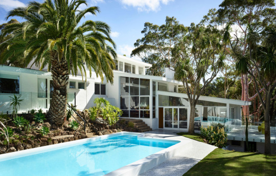
The Fender House in Mount Martha, with renovations from Whelan Project. Photo – Derek Swalwell.
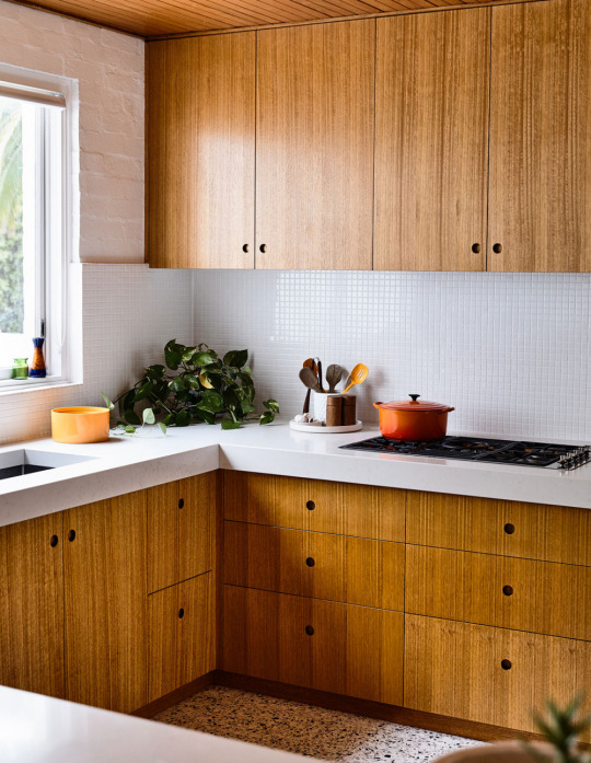
‘We love our kitchen, it’s so big and spacious and chunky. Cabinet maker Roman rebuilt all the cabinetry as it was rotting and about to fall through the floors. He skilfully managed to match the wood stain to the original wood panels.’ On the bench is the 1970s Le Creuset pot, and vintage orange bowl. Photo – Derek Swalwell.
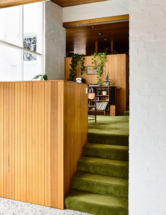
There are stairs and split levels everywhere in this house. These stairs lead from the sun-room to the music room then up another level to the kitchen. You can also see the original porthole lights in the ceilings and the very uniquely designed light boxes, which Katie and Ian re-furbished. Photo – Derek Swalwell.
A Lovingly Restored Mid-Century Marvel In Mount Martha
This circa 1973 home may look straight out of Palm Springs, but it’s actually located just outside Melbourne in Mount Martha.
Originally designed by Karl Fender (now one half of Fender Katsalidis), owner Katie Brannaghan and her husband Ian purchased the property in 2017 and have since returned the house to its former glory.
We shared this spectacular home back in October, and it’s already one of the popular mid-century homes we’ve published to date!
Revisit the original story here
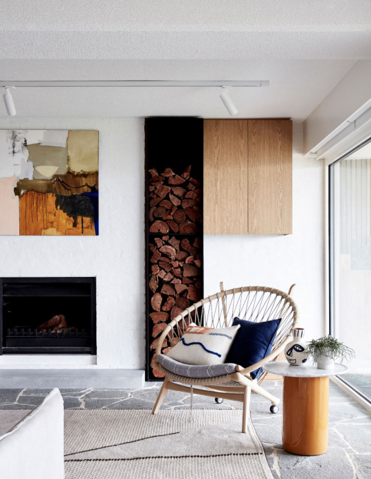
An elegant corner in the mid-century home. Photo – Sean Fennessy. Styling – Studio Esteta.
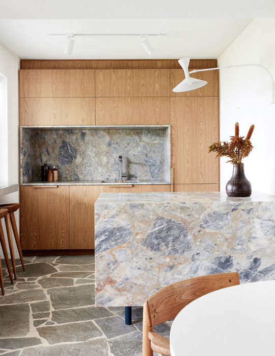
The wood and stone tones reflecting the colour palette of the surrounding environment. Photo – Sean Fennessy. Styling – Studio Esteta.
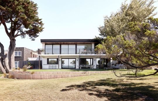
The Portsea Beach House by Studio Esteta. Photo – Sean Fennessey. Styling – Studio Esteta.
Avoiding The Coastal Cliché, With Mid Century Flair
This home on Victoria’s Mornington Peninsula is the ultimate combination of beach house, mid-century, and sophisticated modern design.
Studio Esteta recently updated the hilltop home to accommodate six bedrooms, without stripping it of modernist character. Among stunning features are the crazy interior paving and rich marbled surfaces, complemented by original mid-century furniture and decor.
Revisit the original story here
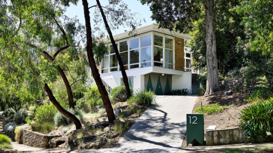
Looking stately, in Studley park. Photo – Derek Swalwell.
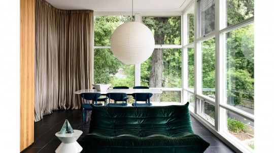
1950s windows, meet a contemporary couch. Photo – Derek Swalwell.
Enhancing The Past In Studley Park
Our Instagram went crazy upon posting the facade image of this home located on Studley Park, a tightly held pocket of Melbourne’s Kew!
The mid-century home was originally designed by influential Russian-born Australian architect Anatol Kagan, who was committed to designing buildings that had a positive impact on society.
Most recently, the 1950s home has been sympathetically renovated by Kennedy Nolan, who refreshed the architectural beauty of the property, and re-zoned the layout to reflect a more contemporary way of living.
Revisit the original story here
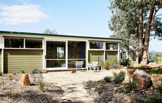
This original Robin Boyd-designed house in Warrandyte is now the family home of writer, strategist and podcast host Emma Clark Grattan, furniture maker Lee Grattan, and their children Archer and Jethro. The original house on the block burned down in 1962, and the owners commissioned Robin Boyd to design this new house in 1963. The house is clad with steel, which is quite unusual for the celebrated architect, but part of the brief was that the house was fire-resistant. Landscaping by Emma and Lee. Photo – Caitlin Mills. Styling – Annie Portelli.
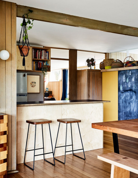
Original wall light and Tasmanian Oak flooring. The couple painted the pantry door to break up the timber in the house. Baskets collected over the years now hide the kids’ sports and winter clothing. Artwork next to the fridge was a gift from friends Ace Wagstaff and Sam George. Steel and timber stools made by Lee. Photo – Caitlin Mills. Styling – Annie Portelli.
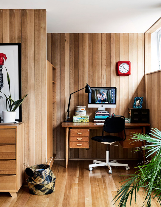
‘Lee got the desk from Great Dane, but it was broken and in pieces so they were going to throw it out. He managed to restore it and we’ve dragged it from house to house’. Lamp is an original Planet lamp bought for a dollar from a church sale in Warrandyte. Clock from IKEA. Geo dresser made by Lee. Photo – Caitlin Mills. Styling – Annie Portelli.
This Rare Robin Boyd Original Makes An Extraordinary Family Home
Among the many beautiful mid-century homes in Melbourne’s Warrandyte is this 1963 one designed by iconic Australian architect, Robin Boyd.
This home is owned by content strategist and writer Emma Clark Gratton, and her furniture making husband, Lee Gratton, who moved here in search of extra space for their young family.
The seasoned renovators couple have redone the kitchen, added new cabinetry and tiling, renovated the master bedroom, and installed solar panels among many other small tweaks.
We love the spectacular views appreciated via through floor-to-ceiling windows in every room, alongside the beautifully designed interiors full of Gratton furniture and retro finds.
Revisit the original story here
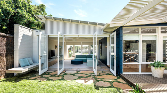
Perfect Portsea living. Photo – Michael Kai.
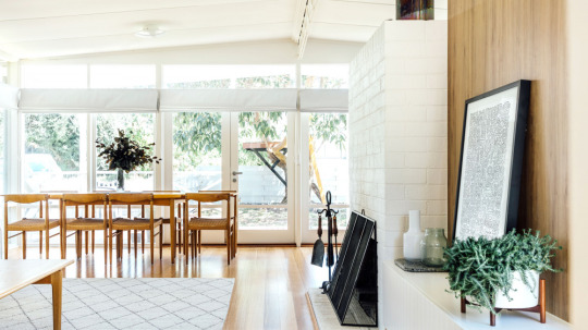
The new home is filled with light. Photo – Michael Kai.
A 1960s Portsea Shack Gets A Contemporary Revamp
Pleysier Perkins recently transformed this ‘tired beige’ ‘60s shack in Portsea, Victoria into a light and bright getaway that balances mid-century charm with modern family life.
The architects updated the kitchen, dining, and living area in the process to improve spatial flow, added a new playroom, and gave the interiors minor facelift.
Full-height doors at both ends of the new addition connect the space with the outdoors. The boundaries between these spaces are blurred with the use of crazy pavers that gently extend from the interiors to the grassy outdoor areas.
Revisit the original story here

Modernising A Mid-Century Stunner
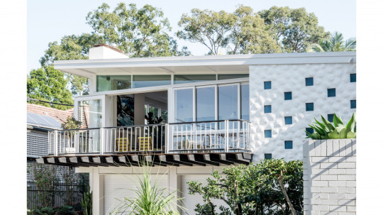
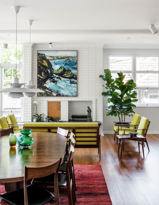
This mid-century home in St Lucia, Brisbane, features light and airy spaces to make the most of its subtropical climate.
The property was renovated by Lucy Jeffries as one of the first projects since establishing her own studio. Prior to this, she had been honing her skills with award winning residential architectural practices Vokes and Peters and Shaun Lockyer.
This home was all about paring back and returning the home to its essential form, with a few carefully considered contemporary updates.
Revisit the original story here
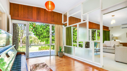
Photo – courtesy of Ouwens Casserly Real Estate.
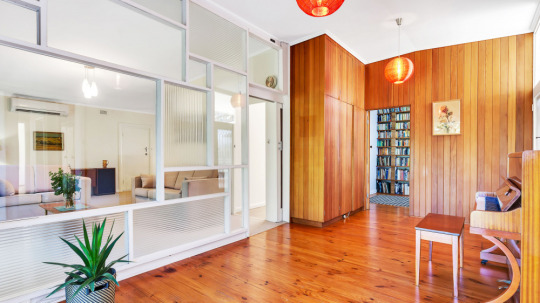
Photo – courtesy of Ouwens Casserly Real Estate.
A Corner-Block Mid-Century Classic
Our columnists over at Modernist Australia introduced this 1958 home in Klemzig, Adelaide, to us when it was on the market earlier in the year. It’s since been snapped up, and it’s not hard to see why!
The home has been sympathetically updated by its previous owners, who lived there since 1968. Many original features were retained over the decades, including a glassy window wall looking into the living room, and the wonderfully pink bathroom!
Revisit the original story here

The new century vibe! Artwork by Wilma Tabacco from Gallerysmith.hoto – Shannon McGrath. Styling – Swee Lim.
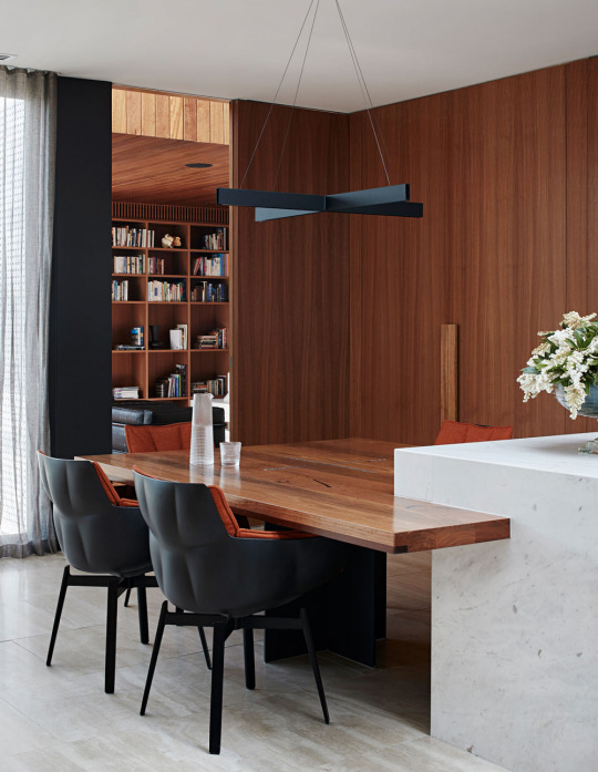
Clean mid-century lines, re-imagined for now. Photo – Shannon McGrath. Styling – Swee Lim.

The exterior maintains its strong 1960s facade. Photo – Shannon McGrath. Styling – Swee Lim.
Mid Century Meets Modern, In This Thoughtfully Renovated 1960s Home
This ‘60s home is pure mid-century from the street, but step inside and you’ll find some seriously glamorous interiors!
Bower Architecture and Interiors were responsible for recently updating this Caulfield property. The brief was to rediscover and celebrate the home’s original features, and create additional spaces with ‘hints of whimsy and glamour (but not glitz).’
Revisit the original story here
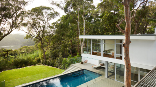
Photo – Prue Ruscoe.
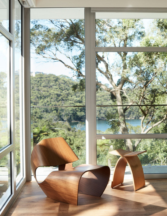
Photo – Prue Ruscoe.
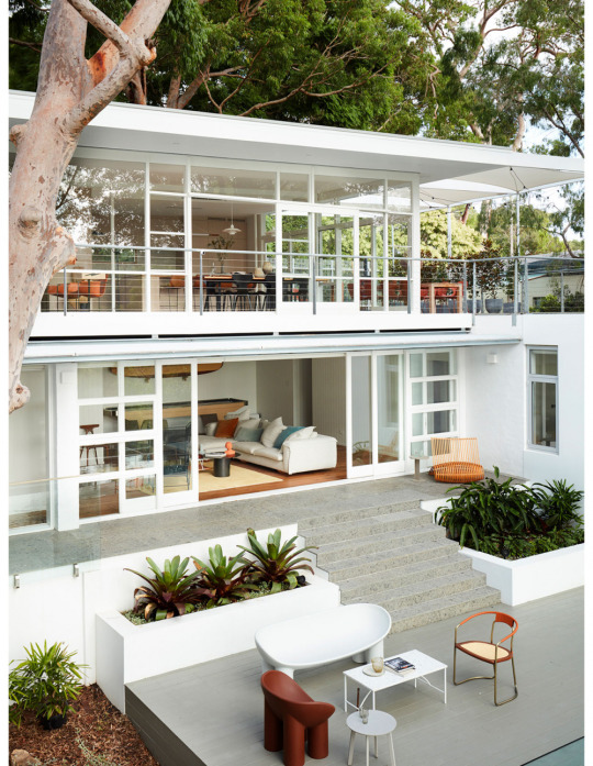
Photo – Prue Ruscoe.
An Amazing Mid-Century Home Gets A High-Tech Makeover!
A dreamy waterfront site meets classic mid-century in Sydney’s Middle Cove.
The house was originally designed by architect Glynn Nicholls (son of Eric Nicholls – Walter Burley Griffin’s Australian business partner) in 1959, but was recently extended by 8 Squared.
The interior design by Studio Gorman is just as impressive, combining ‘50s elements alongside the latest technology to take this home into the 21st century and beyond.
Revisit the original post here
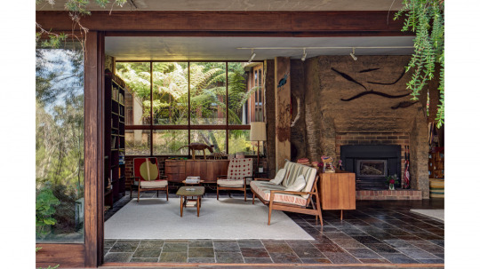
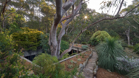
A Bohemian Blue Mountains Modernist Beauty
Trish from Modernist Australia recently shared with us this incredible find – a breathtaking Blue Mountains home, with Australian modern flavour, and a touch of bohemian flair.
Revisit the original post here
1 note
·
View note
Text
Beautiful Homes of Instagram: How to Build your own Home
Beautiful Homes of Instagram is truly one of my favorite type of posts I publish on Home Bunch. It’s certainly not the easiest, but it’s a favorite and I hope it is for you too. I feel very proud to be featuring so many talented homeowners and be able to not only see their homes but especially know their story and the process of designing their space.
I am very happy to have Kristin of @kristin_kgdesigns on the blog today and I really think you will feel inspired by her beautiful home, especially if you dream of building your own home but feel intimated by this big task. Here, the homeowner shares more details and some encouragement:
Hi everyone! Luciane asked me to write up my “story”… so it all began back in the late 1970’s when little Kristin came into the world… kidding. No one needs to hear that! Let’s talk about my house building story, shall we?
That story starts about 3.5 years ago. We were living in our dream house we had built ourselves and had worked so hard on. It was on 5 wooded acres and we loved it. Then my oldest started kindergarten. We loved our house and property but we were not in the best area and certainly not a good school district. I thought we could stick it out for another few years but after one day of volunteering in his class I came home and told my husband we had to move. He nearly killed me…but he eventually acquiesced and we decided to start looking in the “good” school district. Lucky for us one of the top districts in the state was only a 20 minute move.
We sold our dream house and started looking for a house in the area we wanted to be in. Turns out we totally couldn’t afford the area we wanted to be in. So that meant we’d have to build again to get the kind of house and property we wanted our kids to grow up in. We found a gorgeous 5 acre property that had a 1962 ranch house that had never been updated and had an unfinished basement. We bought that property and did a boundary line adjustment so that we had two separate properties. We lived in the ranch house while designing and permitting our new house on our own. We literally designed every inch of this new house ourselves. While doing this (and both working full time), we gutted and completely remodeled the ranch house.
Permitting took us 15 months to complete and we broke ground in August of 2017. We moved in 10 months later. We were the general contractor and my husband built most of the house while I was his laborer. We both worked full time during all of this so we would get home every night and walk out to the new house to work until bedtime. For over two years we said no to almost every social invitation we received. We worked on this labor of love every day. And we couldn’t be happier. We love this house and can’t wait to raise our kids here.
Beautiful Homes of Instagram: How to Build your own Home
This is Kristin, a talented landscape architect, with her beautiful family!

Front Porch
A cross fence-style railing adds a farmhouse feel to the exterior of Kristin’s home. Exterior paint color is Sherwin Williams Extra White.
Welcome mat from Target.
Rug under welcome mat from Target as well.
Raised Metal Planters: CB2.
The rocking chairs from Wayfair.
Home-Sweet-Home
What a dreamy foyer! I love how serene this space feels. Wall paint color is Agreeable Gray by Sherwin Williams.
Trim paint color: Extra White by Sherwin Williams.
Bench: HomeGoods – similar here.
Front entry rug: Target.
Similar Barn Artwork: here.
Front Door Paint Color
The front door paint color is Tricorn Black by Sherwin Williams.
Foyer Lighting: Wayfair.
Kitchen
We went with a simple shaker style in white for the kitchen cabinets.
Cabinets: Canyon Creek Cabinet Company.
Lighting & Pot Filler
The pot filler is from Wayfair.
Kitchen Lighting: Capital Lighting.
Kitchen Backsplash
The backsplash is a subway tile in a matte finish with a medium gray grout.
Refrigerator & Countertop
“I wanted to give you one of the best cost saving tips if you’re building or remodeling a kitchen. Our fridge looks and functions like an expensive unit but it’s really just two separate, simple units with a trim piece attached. Ours is by Frigidaire and we love it! Saved us a bunch of money but we still have the look and function of something much more expensive.”
Get the Look: Refrigerator, Freezer & Trim.
Quartz countertops: Coastal Gray from Pental Quartz.
Kitchen Hardware
The kitchen hardware is from Ikea BAGGANÄS Handle, black.
Runner carpets are from Target. Other Lovely Runners: here, here, here, here, here, here, here, here, here, here, here, here, here & here.
All appliances are LG.
Counterstools
Counterstools are from Target. They’re so sleek and practical!
Flooring
Flooring is DuChateau Youngscombe vinyl plank- similar here.
Ceiling Beams
The cathedral ceiling features beams and shiplap. Beams Old World Traditions – The Magnolia Faux Beam in Light Oak – similar here.
Windows are black painted vinyl by Prime Windows with a custom interior grid.
Dining Room
A warm and welcoming dining room is located between the kitchen and the family room.
Dining chairs are from Crate and Barrel.
Chandelier
Chandelier is by Capital Lighting.
Dining Table
From this angle you can see the beautiful combination of shiplap cathedral ceiling with the board and batten fireplace. This is an idea to keep in mind!
Dining table is from Crate and Barrel.
Living Room Console table: Silviano 84” Iron Console Table by Crate and Barrel.
Barn lights are from Recesso Lighting – similar here.
Living Room
Different types textures bring the right amount of warmth to this space. The leather section is a practical and timeless choice.
Leather Sectional: Custom-made by local company to the exact dimensions of the RH Maxwell – similar here & here.
Coffee Table: Drum Reclaimed Woodblock Barrel Coffee Table – similar here.
Chairs
Accent Chairs: Esters Wood Armchair by Project 62 in Millbrook Husk.
Mantel & Rug
The mantel was a DIY project the homeowner did from a Douglas Fir.
Rug was a find at Homegoods – Beautiful Rugs: here, here, here, here, here, here, here & here (my dream rug

).
Tile is Statements tile, Wide in color Fog – similar here.
Hallway Console Table
Console Table: Target.
Mirror: Here.
Powder Room
This is a dresser from Wayfair that my husband cut a hole in and installed this sink. It works just like I hoped it would!
Vanity is a retrofitted dresser from Wayfair.
Pendant light is from Wayfair.
Mirror: Here.
Sink & Faucet
Sink is from Wayfair.
Faucet: Derengge – similar here.
Home Office
The home office paint color is Dovetail by Sherwin Williams. The quartz countertop on built-in is Pental Quartz ‘Icelake’.
Round black table in the center is from Target.
Office desk is from Wayfair.
Office chairs are also from Wayfair.
Wall Gallery
Photos are from Shutterfly.
Bonus Room
Upstairs you will find a bonus room with plenty of space for entertaining.
Round table from Target.
Ping Pong table is from Wayfair.
Metal Dressers are from Urban Outfitters.
Brass round mirrors from Target.
Daughter’s Bedroom
Wall is a decal from Innovative Stencils (she loves owls and wanted a brown wall with a forest).
Bed is from Ikea – similar here.
Dresser
Dresser is by Tvilum.
Master Bedroom
Kristin’s bedroom features many great architectural details. Main wall color is Agreeable Gray by Sherwin Williams.
Lighting: Wayfair.
Barn Doors
The antique doors are from a local Architectural salvage store.
Bed & Nightstand
Bed is from Crate and Barrel.
Nightstands are from Crate and Barrel.
Table Lamps: Target.
Grid Board & Batten
Accent Wall: my husband built it by attaching trim in a grid right on to our textured, sheet- rocked walls and painting it all the same color. Accent wall color is Dovetail by Sherwin Williams.
Rug is from West Elm.
Bedding
Bedding is Nate Berkus for Target.
Master Bathroom
This master bathroom is all about symmetry and beauty. Now… imagine taking a bath with that peaceful view. I feel more relaxed just by looking at this picture.

Freestanding Tub: Anzzi.
Tub Filler: Vanity Art.
Lighting
Chandelier is from Wayfair.
Sconces are also from Wayfair.
Vanities
Vanities are the 60” Malibu vanity by James Martin – available here in 48″.
Flooring & Wall Tile
Tile is Statements tile, Wide in color Fog – similar here.
Accent tile is a subway tile.
Mirrors: Here.
Mudroom
This is the kind mudroom / laundry room that anyone would love to have. It is almost the size of a NYC apartment!

Faux leather storage bins from Target.
Mudroom Bench & Windows
The mudroom bench is actually Ikea butcher block. Brilliant!
Lighting: Wayfair.
Floor Tile
Tile is Statements tile, Wide in color Fog – similar here.
Paint Color
The paint color is Sherwin Williams Agreeable Gray.
The laundry room backsplash tile is Bedrosians Enchante Charm.
Outdoor Dining
The living room opens to a very spacious back porch.
Picnic Table: Cost Plus.
Dining Bench: Cost Plus.
Dining chairs are from CB2.
Chandelier
Chandelier from Wayfair.
Outdoor Fireplace
The outdoor fireplace mimics the living room’s fireplace, featuring tile and board and batten paneling.
Many thanks to Kristin for sharing the details above. Make sure to follow her on Instagram to see more pictures of her stunning home!
Have a Blessed week, my friends!
Best Sales of the Month:
Thank you for shopping through Home Bunch. I would be happy to assist you if you have any questions or are looking for something in particular. Feel free to contact me and always make sure to check dimensions before ordering. Happy shopping!
Wayfair: Up to 70% OFF Black Friday in July!!!
Serena & Lily: 30% OFF Pillows and 20% OFF Custom Furniture!
Joss & Main: Up to 70% off “Don’t Think Twice Sale”!
Pottery Barn: 20% OFF your order plus free shipping. Use code: SUMMER.
One Kings Lane :20% Off on order over $600 with code OKLSTYLISH20
West Elm: 30% Off Bedding, Bath, Rugs & more!
Anthropologie: Take an Extra 50% Off Sale!
Urban Outfitters: Take an extra 40% off all sale items.
Horchow: Up to 30% off the entire site!
Neiman Marcus: Take an Extra 40 to 50% off !!!
Saks Fifth Avenue: The Designer Sale: up to 75% off!
Nordstrom: Anniversary Sale – Incredible Prices!!!
Posts of the Week:
Florida Beach Cottage.
2019 New Year Home Tour.
Classic Colonial Home Design.
Empty-Nester Modern Farmhouse.
Interior Design Ideas: Home Renovation.
Stone Lake House.
Beautiful Homes of Instagram: Building a Forever Home.
Newport Island Beach House.
Belgian-style Modern Farmhouse.
Stone Cottage-style Home Design.
New Year, New Beautiful Homes of Instagram.
Before & After Home Renovation.
California Duplex Home Design.
Australian Beach House.
Family-friendly Home Design.
Beautiful Homes of Instagram: Canada.
Beautiful Homes of Instagram.
Georgian-Style Manor with Traditional Interiors.
Transitional Home Design.
Interior Design Ideas.
Grey Kitchen Paint Colors.
Beautiful Homes of Instagram: California Beach House.
Follow me on Instagram: @HomeBunch
You can follow my pins here: Pinterest/HomeBunch
See more Inspiring Interior Design Ideas in my Archives.
“Dear God,
If I am wrong, right me. If I am lost, guide me. If I start to give-up, keep me going.
Lead me in Light and Love”.
Have a wonderful day, my friends and we’ll talk again tomorrow.”
with Love,
Luciane from HomeBunch.com
Come Follow me on
Come Follow me on
Get Home Bunch Posts Via Email
Contact Luciane
“For your shopping convenience, this post might contain links to retailers where you can purchase the products (or similar) featured. I make a small commission if you use these links to make your purchase so thank you for your support!”
from Home http://www.homebunch.com/beautiful-homes-of-instagram-how-to-build-your-own-home/ via http://www.rssmix.com/
0 notes
Text
Memories Apartment, Moscow Interior
Memories Apartment, Moscow Home, Real Estate, Russian Architecture Photos
Memories Apartment Interior in Moscow
31 May 2022
Design: O&A London
Location: Moscow, Russia
Memories Apartment, Russia
The apartment of the Architect Oleg Klodt, O&A London Co-Founder.
Memories of his ancestral home helped architect Oleg Klodt create the interior where his own children are now growing up.
Oleg Klodt and Anna Agapova love interiors with a story. Most of the time they have to recreate this atmosphere from scratch, which in a new-built house means bare walls.
As Oleg Klodt himself admits he would never purchase a property in a newly built development for himself, he chose an apartment in the four-storey house near Gruzinskaya street, Moscow for two reasons: high ceilings and the number of windows.
“A bathroom window is very important for me, and this bathroom has two” – says the architect. There are no curtains on the windows but instead they are fitted with wooden shutters. “I wanted to keep it airy and emphasise the arched windows so nothing gets in the way.” – explains Oleg.
One of the aspects that makes the architect’s home different from the projects he works on for his clients is that everything is simpler and more earthy. For example, the oak floor boards are deliberately rougher and instead of a fire place there is — unexpectedly for a city-dwelling — a stove.
“Our first thought was to put a fireplace in the corner, but I didn’t want to have an ordinary corner fire place as a centrepiece of the reception room” says the architect. “In the meantime we went on holiday to the Italian Alps with the children. The snow falls were so bad it was impossible to ski. We went for a walk and found ourselves in a restaurant where they had a stove like the one on the picture and immediately agreed that this was exactly what we needed”.
The apartment itself helped to create a story behind the interior. Two arch shaped alcoves were discovered during the refurbishment works. Oleg decided to convert them into accentuated niches rather than hiding them. One can be found in the master bedroom and another one in a children’s room.
The apartment has 4 bedrooms and is occupied by 3 of the architect’s children aged eighteen, sixteen and fifteen.
Therefore, the apartment is equally divided into areas: private quarters and a spacious reception which also has three areas branching off it – study, hallway and kitchen. The study room is designed in darker colours, hence looks visually separated from the reception, and the kitchen is partly “dissolved” in the space. The centrepiece of this area is a large wood-covered island with an original pending light fixture above it.
The lack of a large group of sofas makes this apartment different from others. The only small sofa is hiding by the wall next to an antique cupboard.
The centrepiece of the reception room is a large dining table, not a TV-set. There are none in the entire apartment. The family spend a lot of time at the table, talking and playing board games. Oleg Klodt says that the apartment’s occupants passed the self-isolation challenge with flying colours.
Designers: O&A London – https://oa-london.com/
Memories Apartment, Moscow information / images received 310522
Location: Moscow, Russia
Moscow Property
Contemporary Moscow Homes
Moscow Houses
n.n. – Residence near Moscow, beside the River Moskva Design: J. MAYER H. und Partner, Architekten mbB, with Alexander Erman architecture & design photo : Ilya Ivanov n.n. – Residence near Moscow
Capital Hill Residence Design: Zaha Hadid Architects image courtesy of ZHA Capital Hill Residence in Moscow
Parametric Residence, Uspenskoe Village, Odintsovo District, Moscow Oblast Design: Simon Rastorguev design group image from architecture office Parametric Residence
Gorki House
Vidnoe Townhouse
Moscow Architecture Developments
Contemporary Moscow Buildings
Moscow Building Developments – chronological list
Russian Architectural Tours by e-architect
Moscow Architects Studios – design firm listings
Barkli Park Homes, Sovetskoi Armii str 6 Architects: Atrium photograph : Uriy Palmin, Anton Nadtochiy, Ilya Egorkin, Ilya Ivanov, Pavel Iovik Barkli Park Homes in Moscow
Sberbank Activity Based Working in Moscow Design: Evolution Design photography : Evgeny Luchin and Leonid Somov Sberbank Activity Based Working in Moscow
Comments / photos for the Memories Apartment, Moscow in Russia design by O&A London page welcome
The post Memories Apartment, Moscow Interior appeared first on e-architect.
0 notes
Text
Before-and-After: How 5 Homes Went from Plain to Perfect
Basically, Cinderella-style transformations.
A home isn’t just a shelter – it’s where you and your loved ones live and grow together in. So naturally, it should look and function great. And while it does take time and effort to turn a regular apartment into an ideal home, we can all agree that the results are worth it.

Here, we’ve gathered 5 stunning examples that show exactly what a successful renovation can achieve. Keep scrolling to see what these beautiful homes look like pre- and post-transformation. And, who knows? Maybe you’ll be inspired to pull off your own magical makeover too.
1. River Place – 19EightyThree

Interior Firm: 19 Eighty Three
With its circular, porthole-like window and free flowing layout, the inside of this contemporary family home closely resembles that of a luxury yacht after its makeover. But even before that, it doesn’t look half-bad either – which is the reason why some of its original interior features were kept.
Before/After (Living Room)


As part of the living room’s revival, a new lighting scheme was devised, which bathes the surroundings in a cosy, welcoming glow. Joining it are a new false ceiling and classy window drapes that similarly serve as sleek replacements within the space.
Before/After (Dining Area)


Taking the place of a toddler table and chair set, a full-sized dining area currently occupies the back of the living room, turning it into a family space for all. The open kitchen’s island counter was given a revamp as well – now clad in white, the fixture blends perfectly into a backdrop of storage cabinets.
Before/After (Entryway)


To maximise the corridor leading into the bedrooms, an entire stretch of storage cabinets was built into the area. And while it results in a (slightly) narrower walkway, the trade-off is worth it because of how much extra storage space was gained.
Before/After (Stairway)


Similar to the bedroom corridor, the bottom of the apartment’s internal staircase was also equipped with extra storage cabinets, thus maximising what would have been a dead space. Meanwhile, discreet, pull-down blinds were installed to provide privacy and conceal a pair of side windows alongside the dining area and stairway.
2. Edgefield Plains – Aart Boxx Interior

Interior Firm: Aart Boxx Interior
Belonging to Aart Boxx Interior designer couple, Ivan and Katherine, this resale flat at Edgefield Plains was transformed from an apartment with mid-century modern influences into a fancy, but functional abode that its owners are proud to call home.
Before/After (Living Room)


The revamp of Ivan and Katherine’s home saw the addition of several new features with classic details. In the living room, a wainscoted accent wall as well as a tufted entryway seat now occupy the front of the space. Joining them is a row of suspended shoe cabinets, similarly framed with wood panelling.
Before/After (Entryway/Dining Area)


Probably the area where the biggest changes took place, the area bordering the dining space and the kitchen’s exterior were completely revamped. Originally closed off, the kitchen was opened up while the adjoining feature wall was transformed into a row of herringbone storage cabinets. For hosting purposes, an island-cum-dining table was installed.
Before/After (Bathroom)

The common bathroom was given a simple, but effective update, transforming it from a dull, unappealing space into a brighter and cleaner one. Completing the look are new fixtures, such as matte black shower fittings, a compact suspended sink and a minimalist WC.
3. Serangoon Central – The Local INN.terior

Interior Firm: The Local INN.terior
The Local INN.terior’s work on this 4-room HDB apartment at Serangoon Centralis nothing short of inspiring. Aside from giving it a classy makeover that incorporates contemporary decor elements, the designers handling this project also created a daring, new layout that breaks away from the usual, cookie-cutter floor plan.
Before/After (Living Room)


Once a blank slate, the front of the flat’s living space was transformed into a modern highlight. Here, an accent wall clad in black, vertical timber strips demonstrates the magic of high contrast decor in an (almost) all-white space.
Before/After (Master Bedroom Exterior)


Adding a see-through element to the home, an indoor window framed in black reveals the insides of the master bedroom to all. This one-of-a-kind fixture takes the place of a (boring) whitewashed wall that once bordered the living room, while serving as a statement-maker all on its own.
Before/After (Master Bedroom Interior)


Receiving a classy makeover as well are the insides of the master bedroom, which features upgrades such as a platform bed with cove lights and warm wood flooring for a touch of cosiness. To make way for the home’s indoor window, the bedroom’s original entrance was also shifted (from where the bed’s headboard is currently) to its new position.
Before/After (Walk-in Wardrobe)


Working around the awkward confines of its surroundings, The Local INN.terior outfitted one of the flat’s bedrooms with an array of dark wood storage fixtures, transforming it into a classy walk-in wardrobe that has both looks and functionality going for it.
4. Dorset Road – Third Avenue Studio

As Third Avenue Studio’s work on this Dorset Road resale flat proves, all it takes to refresh an old home with good bones (read: well-proportioned rooms and a good layout) is some proper space-planning and a bold, new look.
Before/After (Living Room)


Save for the TV’s recess (that ensures sufficient walkway space), the living room is laid out as one would imagine it to be pre-revamp. Here, cosy wood flooring takes the place of classic retro tiles, while sleek, modern furnishings lend the surroundings a cool, collected vibe that matches its monochrome palette.
Before/After (Master Bedroom)


Much like the living room, the master bedroom steps over to the dark side with its choice of wood flooring. Meanwhile, the new, all-white paint scheme does wonders in brightening up the bedroom’s surroundings during the day.
Before/After (Kitchen)

The newly revamped kitchen now features a more open look with its sliding glass doors, which allow natural light to penetrate the rest of the house. The L-shaped configuration of the kitchen counter was also kept, which aids in maximising an entire stretch of wall space along the right.
Before/After (Study)


The flat’s study occupies an entryway alcove that faces the corridor outside. Post-revamp, the area serves as the perfect work corner with its simple, but efficient furnishings consisting of a rear bookshelf and a work desk. Meanwhile, a vibrant painting draws the eye towards the far end of the space, creating the illusion of depth.
5. Elias Road – Zenith Arc

Interior Firm: Zenith Arc
While we aren’t exactly sure what this resale flat at Elias Road looked like before its renovation (because its makeover was already underway when the ‘before’ photos were taken), one thing that we’re certain of is that it has been transformed into a clean, spacious abode in the hands of design firm Zenith Arc.
Before/After (Living Area)


Part of the revamp saw the construction of a handy island/preparation corner along the outside of the flat’s open kitchen as well as a new TV feature wall in the living area that’s right beside it. And while this part of the house hasn’t changed much structurally (based on the pictures), its transformation into a comfortable space is evident.
Before/After (Gym)


Fronted by a cosy dining area and a privacy barrier for the main entrance is one of the apartment’s former bedrooms, which is now a home gym. New additions to this space also include a see-through display cabinet as well as blonde wood flooring that extends throughout the house for an undeniably chic look.
Before/After (Bathroom)

While it isn’t the most impressive example, the before-and-after transformation of this bathroom certainly shows how much renovation matters in creating liveable home spaces. Here, a raw, empty corner was transformed into an elegant loo, complete with all the amenities of modern life.
Create a space you love
Embarking on a renovation journey? Request for a quote here, and we can match you up with 5 interior firms - based on your budget and style - to get quotes.
About Qanvast: Create a space you love today with Singapore’s first mobile platform. Qanvast (pronounced as ‘canvas’) connects homeowners to trusted home professionals. Browse for reviews, renovation prices and portfolios from interior designer firms in Singapore at your fingertips!
#qanvast#interior design#interior designer#renovation#singapore interior designers#interior firms#ideal home#19 eighty three#contemporary design#Aart Boxx interior#river place#edgefield plain#resale flat#serangoon central#the local inn.terior#4-room HDBs apartment#dorset road#third avenue studio#Elias road#zenith arc
0 notes